@marco.colia/react-fast-scheduler 2.0.0 → 2.1.1
This diff represents the content of publicly available package versions that have been released to one of the supported registries. The information contained in this diff is provided for informational purposes only and reflects changes between package versions as they appear in their respective public registries.
- package/LICENSE +22 -22
- package/README.md +279 -251
- package/dist/index.cjs +724 -379
- package/dist/index.cjs.map +1 -1
- package/dist/index.d.cts +10 -2
- package/dist/index.d.ts +10 -2
- package/dist/index.js +724 -379
- package/dist/index.js.map +1 -1
- package/dist/styles.css +1 -1
- package/package.json +86 -86
package/LICENSE
CHANGED
|
@@ -1,22 +1,22 @@
|
|
|
1
|
-
MIT License
|
|
2
|
-
|
|
3
|
-
Copyright (c) 2026 marco
|
|
4
|
-
|
|
5
|
-
Permission is hereby granted, free of charge, to any person obtaining a copy
|
|
6
|
-
of this software and associated documentation files (the "Software"), to deal
|
|
7
|
-
in the Software without restriction, including without limitation the rights
|
|
8
|
-
to use, copy, modify, merge, publish, distribute, sublicense, and/or sell
|
|
9
|
-
copies of the Software, and to permit persons to whom the Software is
|
|
10
|
-
furnished to do so, subject to the following conditions:
|
|
11
|
-
|
|
12
|
-
The above copyright notice and this permission notice shall be included in all
|
|
13
|
-
copies or substantial portions of the Software.
|
|
14
|
-
|
|
15
|
-
THE SOFTWARE IS PROVIDED "AS IS", WITHOUT WARRANTY OF ANY KIND, EXPRESS OR
|
|
16
|
-
IMPLIED, INCLUDING BUT NOT LIMITED TO THE WARRANTIES OF MERCHANTABILITY,
|
|
17
|
-
FITNESS FOR A PARTICULAR PURPOSE AND NONINFRINGEMENT. IN NO EVENT SHALL THE
|
|
18
|
-
AUTHORS OR COPYRIGHT HOLDERS BE LIABLE FOR ANY CLAIM, DAMAGES OR OTHER
|
|
19
|
-
LIABILITY, WHETHER IN AN ACTION OF CONTRACT, TORT OR OTHERWISE, ARISING FROM,
|
|
20
|
-
OUT OF OR IN CONNECTION WITH THE SOFTWARE OR THE USE OR OTHER DEALINGS IN THE
|
|
21
|
-
SOFTWARE.
|
|
22
|
-
|
|
1
|
+
MIT License
|
|
2
|
+
|
|
3
|
+
Copyright (c) 2026 marco
|
|
4
|
+
|
|
5
|
+
Permission is hereby granted, free of charge, to any person obtaining a copy
|
|
6
|
+
of this software and associated documentation files (the "Software"), to deal
|
|
7
|
+
in the Software without restriction, including without limitation the rights
|
|
8
|
+
to use, copy, modify, merge, publish, distribute, sublicense, and/or sell
|
|
9
|
+
copies of the Software, and to permit persons to whom the Software is
|
|
10
|
+
furnished to do so, subject to the following conditions:
|
|
11
|
+
|
|
12
|
+
The above copyright notice and this permission notice shall be included in all
|
|
13
|
+
copies or substantial portions of the Software.
|
|
14
|
+
|
|
15
|
+
THE SOFTWARE IS PROVIDED "AS IS", WITHOUT WARRANTY OF ANY KIND, EXPRESS OR
|
|
16
|
+
IMPLIED, INCLUDING BUT NOT LIMITED TO THE WARRANTIES OF MERCHANTABILITY,
|
|
17
|
+
FITNESS FOR A PARTICULAR PURPOSE AND NONINFRINGEMENT. IN NO EVENT SHALL THE
|
|
18
|
+
AUTHORS OR COPYRIGHT HOLDERS BE LIABLE FOR ANY CLAIM, DAMAGES OR OTHER
|
|
19
|
+
LIABILITY, WHETHER IN AN ACTION OF CONTRACT, TORT OR OTHERWISE, ARISING FROM,
|
|
20
|
+
OUT OF OR IN CONNECTION WITH THE SOFTWARE OR THE USE OR OTHER DEALINGS IN THE
|
|
21
|
+
SOFTWARE.
|
|
22
|
+
|
package/README.md
CHANGED
|
@@ -1,251 +1,279 @@
|
|
|
1
|
-
# react-fast-scheduler
|
|
2
|
-
|
|
3
|
-
A lightweight React scheduling library scaffold with CI/CD publishing.
|
|
4
|
-
|
|
5
|
-
|
|
6
|
-
|
|
7
|
-
## Install
|
|
8
|
-
|
|
9
|
-
```bash
|
|
10
|
-
npm i @marco.colia/react-fast-scheduler
|
|
11
|
-
```
|
|
12
|
-
|
|
13
|
-
## Usage
|
|
14
|
-
|
|
15
|
-
```tsx
|
|
16
|
-
import { useState } from "react";
|
|
17
|
-
import { Scheduler } from "@marco.colia/react-fast-scheduler";
|
|
18
|
-
import "@marco.colia/react-fast-scheduler/styles.css";
|
|
19
|
-
import type { BaseSchedulerResource } from "@marco.colia/react-fast-scheduler";
|
|
20
|
-
|
|
21
|
-
type Staff = BaseSchedulerResource<number> & {
|
|
22
|
-
firstName: string;
|
|
23
|
-
lastName: string;
|
|
24
|
-
};
|
|
25
|
-
|
|
26
|
-
type Appointment = {
|
|
27
|
-
id: number;
|
|
28
|
-
staffId: number;
|
|
29
|
-
description?: string;
|
|
30
|
-
customerName: string;
|
|
31
|
-
title: string;
|
|
32
|
-
start: string; // ISO string
|
|
33
|
-
end: string; // ISO string
|
|
34
|
-
};
|
|
35
|
-
|
|
36
|
-
const initialStaff: Staff[] = [
|
|
37
|
-
{ id: 1, label: "Room A", firstName: "Anna", lastName: "Rossi" },
|
|
38
|
-
{ id: 2, label: "Room B", firstName: "Luca", lastName: "Bianchi" }
|
|
39
|
-
];
|
|
40
|
-
|
|
41
|
-
const initialAppointments: Appointment[] = [
|
|
42
|
-
{
|
|
43
|
-
id: 100,
|
|
44
|
-
staffId: 1,
|
|
45
|
-
description: "First consultation",
|
|
46
|
-
customerName: "Mario Rossi",
|
|
47
|
-
title: "Consultation",
|
|
48
|
-
start: "2026-03-20T09:00:00.000Z",
|
|
49
|
-
end: "2026-03-20T09:30:00.000Z"
|
|
50
|
-
}
|
|
51
|
-
];
|
|
52
|
-
|
|
53
|
-
export function SchedulerExample() {
|
|
54
|
-
const [selectedDate, setSelectedDate] = useState(new Date("2026-03-20T00:00:00.000Z"));
|
|
55
|
-
const [appointments, setAppointments] = useState<Appointment[]>(initialAppointments);
|
|
56
|
-
|
|
57
|
-
return (
|
|
58
|
-
<Scheduler<Appointment, Staff, number>
|
|
59
|
-
resources={initialStaff}
|
|
60
|
-
appointments={appointments}
|
|
61
|
-
selectedDate={selectedDate}
|
|
62
|
-
onSelectedDateChange={setSelectedDate}
|
|
63
|
-
prevButtonLabel="Previous day"
|
|
64
|
-
nextButtonLabel="Next day"
|
|
65
|
-
adapter={{
|
|
66
|
-
getId: (a) => a.id,
|
|
67
|
-
getResourceId: (a) => a.staffId,
|
|
68
|
-
getStart: (a) => a.start,
|
|
69
|
-
getEnd: (a) => a.end,
|
|
70
|
-
getTitle: (a) => `${a.customerName} - ${a.title}`
|
|
71
|
-
}}
|
|
72
|
-
onAppointmentChange={async ({ appointment, next }) => {
|
|
73
|
-
setAppointments((prev) =>
|
|
74
|
-
prev.map((a) =>
|
|
75
|
-
a.id === appointment.id
|
|
76
|
-
? { ...a, staffId: next.resourceId, start: next.start.toISOString(), end: next.end.toISOString() }
|
|
77
|
-
: a
|
|
78
|
-
)
|
|
79
|
-
);
|
|
80
|
-
}}
|
|
81
|
-
resourceAppointmentClassMap={{
|
|
82
|
-
"1": "bg-amber-100 dark:bg-amber-950/40",
|
|
83
|
-
"2": "bg-blue-100 dark:bg-blue-950/40"
|
|
84
|
-
}}
|
|
85
|
-
dayStart="09:00"
|
|
86
|
-
dayEnd="18:00"
|
|
87
|
-
/>
|
|
88
|
-
);
|
|
89
|
-
}
|
|
90
|
-
```
|
|
91
|
-
|
|
92
|
-
`renderAppointment` is optional. If you omit it, the scheduler uses the built-in appointment card with light/dark mode support.
|
|
93
|
-
`
|
|
94
|
-
`
|
|
95
|
-
|
|
96
|
-
|
|
97
|
-
|
|
98
|
-
- `
|
|
99
|
-
- `
|
|
100
|
-
- `
|
|
101
|
-
- `
|
|
102
|
-
- `
|
|
103
|
-
- `
|
|
104
|
-
- `
|
|
105
|
-
- `
|
|
106
|
-
- `
|
|
107
|
-
- `
|
|
108
|
-
- `
|
|
109
|
-
- `
|
|
110
|
-
- `
|
|
111
|
-
|
|
112
|
-
|
|
113
|
-
|
|
114
|
-
|
|
115
|
-
|
|
116
|
-
|
|
117
|
-
|
|
118
|
-
|
|
119
|
-
|
|
120
|
-
|
|
121
|
-
|
|
122
|
-
|
|
123
|
-
|
|
124
|
-
|
|
125
|
-
|
|
126
|
-
|
|
127
|
-
|
|
128
|
-
|
|
129
|
-
|
|
130
|
-
|
|
131
|
-
|
|
132
|
-
|
|
133
|
-
|
|
134
|
-
|
|
135
|
-
|
|
136
|
-
|
|
137
|
-
|
|
138
|
-
|
|
139
|
-
|
|
140
|
-
|
|
141
|
-
|
|
142
|
-
|
|
143
|
-
|
|
144
|
-
|
|
145
|
-
|
|
146
|
-
|
|
147
|
-
|
|
148
|
-
|
|
149
|
-
|
|
150
|
-
|
|
151
|
-
|
|
152
|
-
|
|
153
|
-
|
|
154
|
-
|
|
155
|
-
|
|
156
|
-
|
|
157
|
-
|
|
158
|
-
|
|
159
|
-
|
|
160
|
-
|
|
161
|
-
|
|
162
|
-
|
|
163
|
-
|
|
164
|
-
|
|
165
|
-
|
|
166
|
-
|
|
167
|
-
|
|
168
|
-
|
|
169
|
-
|
|
170
|
-
|
|
171
|
-
|
|
172
|
-
|
|
173
|
-
|
|
174
|
-
|
|
175
|
-
|
|
176
|
-
|
|
177
|
-
|
|
178
|
-
|
|
179
|
-
|
|
180
|
-
|
|
181
|
-
|
|
182
|
-
|
|
183
|
-
|
|
184
|
-
|
|
185
|
-
|
|
186
|
-
|
|
187
|
-
|
|
188
|
-
</
|
|
189
|
-
</
|
|
190
|
-
)}
|
|
191
|
-
|
|
192
|
-
```
|
|
193
|
-
|
|
194
|
-
|
|
195
|
-
|
|
196
|
-
|
|
197
|
-
|
|
198
|
-
|
|
199
|
-
import "
|
|
200
|
-
|
|
201
|
-
|
|
202
|
-
|
|
203
|
-
|
|
204
|
-
|
|
205
|
-
|
|
206
|
-
|
|
207
|
-
|
|
208
|
-
|
|
209
|
-
|
|
210
|
-
|
|
211
|
-
|
|
212
|
-
|
|
213
|
-
|
|
214
|
-
|
|
215
|
-
|
|
216
|
-
|
|
217
|
-
|
|
218
|
-
|
|
219
|
-
|
|
220
|
-
|
|
221
|
-
|
|
222
|
-
|
|
223
|
-
|
|
224
|
-
|
|
225
|
-
|
|
226
|
-
|
|
227
|
-
|
|
228
|
-
|
|
229
|
-
|
|
230
|
-
|
|
231
|
-
|
|
232
|
-
|
|
233
|
-
|
|
234
|
-
|
|
235
|
-
|
|
236
|
-
|
|
237
|
-
|
|
238
|
-
|
|
239
|
-
|
|
240
|
-
|
|
241
|
-
|
|
242
|
-
|
|
243
|
-
|
|
244
|
-
|
|
245
|
-
|
|
246
|
-
|
|
247
|
-
|
|
248
|
-
|
|
249
|
-
|
|
250
|
-
|
|
251
|
-
|
|
1
|
+
# react-fast-scheduler
|
|
2
|
+
|
|
3
|
+
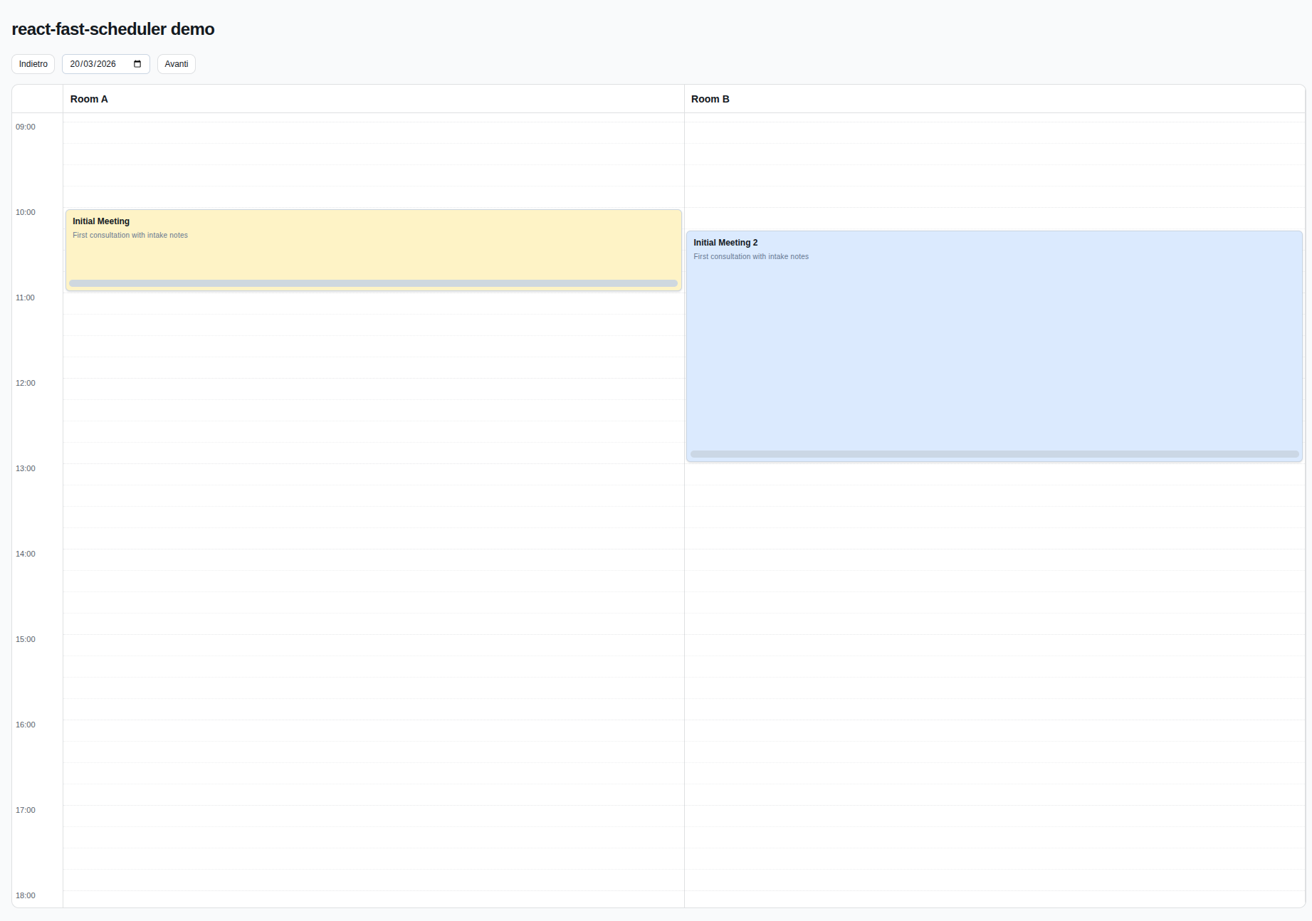
A lightweight React scheduling library scaffold with CI/CD publishing.
|
|
4
|
+
|
|
5
|
+

|
|
6
|
+
|
|
7
|
+
## Install
|
|
8
|
+
|
|
9
|
+
```bash
|
|
10
|
+
npm i @marco.colia/react-fast-scheduler
|
|
11
|
+
```
|
|
12
|
+
|
|
13
|
+
## Usage
|
|
14
|
+
|
|
15
|
+
```tsx
|
|
16
|
+
import { useState } from "react";
|
|
17
|
+
import { Scheduler } from "@marco.colia/react-fast-scheduler";
|
|
18
|
+
import "@marco.colia/react-fast-scheduler/styles.css";
|
|
19
|
+
import type { BaseSchedulerResource } from "@marco.colia/react-fast-scheduler";
|
|
20
|
+
|
|
21
|
+
type Staff = BaseSchedulerResource<number> & {
|
|
22
|
+
firstName: string;
|
|
23
|
+
lastName: string;
|
|
24
|
+
};
|
|
25
|
+
|
|
26
|
+
type Appointment = {
|
|
27
|
+
id: number;
|
|
28
|
+
staffId: number;
|
|
29
|
+
description?: string;
|
|
30
|
+
customerName: string;
|
|
31
|
+
title: string;
|
|
32
|
+
start: string; // ISO string
|
|
33
|
+
end: string; // ISO string
|
|
34
|
+
};
|
|
35
|
+
|
|
36
|
+
const initialStaff: Staff[] = [
|
|
37
|
+
{ id: 1, label: "Room A", firstName: "Anna", lastName: "Rossi" },
|
|
38
|
+
{ id: 2, label: "Room B", firstName: "Luca", lastName: "Bianchi" }
|
|
39
|
+
];
|
|
40
|
+
|
|
41
|
+
const initialAppointments: Appointment[] = [
|
|
42
|
+
{
|
|
43
|
+
id: 100,
|
|
44
|
+
staffId: 1,
|
|
45
|
+
description: "First consultation",
|
|
46
|
+
customerName: "Mario Rossi",
|
|
47
|
+
title: "Consultation",
|
|
48
|
+
start: "2026-03-20T09:00:00.000Z",
|
|
49
|
+
end: "2026-03-20T09:30:00.000Z"
|
|
50
|
+
}
|
|
51
|
+
];
|
|
52
|
+
|
|
53
|
+
export function SchedulerExample() {
|
|
54
|
+
const [selectedDate, setSelectedDate] = useState(new Date("2026-03-20T00:00:00.000Z"));
|
|
55
|
+
const [appointments, setAppointments] = useState<Appointment[]>(initialAppointments);
|
|
56
|
+
|
|
57
|
+
return (
|
|
58
|
+
<Scheduler<Appointment, Staff, number>
|
|
59
|
+
resources={initialStaff}
|
|
60
|
+
appointments={appointments}
|
|
61
|
+
selectedDate={selectedDate}
|
|
62
|
+
onSelectedDateChange={setSelectedDate}
|
|
63
|
+
prevButtonLabel="Previous day"
|
|
64
|
+
nextButtonLabel="Next day"
|
|
65
|
+
adapter={{
|
|
66
|
+
getId: (a) => a.id,
|
|
67
|
+
getResourceId: (a) => a.staffId,
|
|
68
|
+
getStart: (a) => a.start,
|
|
69
|
+
getEnd: (a) => a.end,
|
|
70
|
+
getTitle: (a) => `${a.customerName} - ${a.title}`
|
|
71
|
+
}}
|
|
72
|
+
onAppointmentChange={async ({ appointment, next }) => {
|
|
73
|
+
setAppointments((prev) =>
|
|
74
|
+
prev.map((a) =>
|
|
75
|
+
a.id === appointment.id
|
|
76
|
+
? { ...a, staffId: next.resourceId, start: next.start.toISOString(), end: next.end.toISOString() }
|
|
77
|
+
: a
|
|
78
|
+
)
|
|
79
|
+
);
|
|
80
|
+
}}
|
|
81
|
+
resourceAppointmentClassMap={{
|
|
82
|
+
"1": "bg-amber-100 dark:bg-amber-950/40",
|
|
83
|
+
"2": "bg-blue-100 dark:bg-blue-950/40"
|
|
84
|
+
}}
|
|
85
|
+
dayStart="09:00"
|
|
86
|
+
dayEnd="18:00"
|
|
87
|
+
/>
|
|
88
|
+
);
|
|
89
|
+
}
|
|
90
|
+
```
|
|
91
|
+
|
|
92
|
+
`renderAppointment` is optional. If you omit it, the scheduler uses the built-in appointment card with light/dark mode support.
|
|
93
|
+
`renderToolbar` is optional. If you omit it, the scheduler uses a built-in shadcn-style toolbar with prev/next buttons and a calendar popover date picker.
|
|
94
|
+
`renderDatePicker` is optional. If you omit it, the default toolbar uses the built-in calendar popover date picker.
|
|
95
|
+
`onAppointmentChange` is a simple callback: use it to update your state and run your own side effects.
|
|
96
|
+
|
|
97
|
+
Main props you need to pass:
|
|
98
|
+
- `resources`: your columns (staff, rooms, etc), each with at least `{ id, label }`.
|
|
99
|
+
- `appointments`: raw items from your backend.
|
|
100
|
+
- `adapter`: functions that map your raw appointment shape to scheduler fields.
|
|
101
|
+
- `onAppointmentChange`: optional generic callback fired after move/resize drop.
|
|
102
|
+
- `onPersistMoveResize`: optional legacy persistence callback (used if `onAppointmentChange` is not provided).
|
|
103
|
+
- `resourceAppointmentClassMap`: optional map of `resourceId -> className` for per-resource appointment colors/styles.
|
|
104
|
+
- `getResourceAppointmentColorToken`: optional function to provide a semantic color token per resource (for example `"amber"`).
|
|
105
|
+
- `appointmentColorTokenClassMap`: optional map to override token -> class resolution.
|
|
106
|
+
- `getResourceAppointmentAppearance`: optional low-level function to provide appointment `className` per resource.
|
|
107
|
+
- `getResourceAppointmentBackground`: legacy optional function to provide appointment background as a string.
|
|
108
|
+
- `renderToolbar`: optional render hook to replace the entire scheduler toolbar/header controls.
|
|
109
|
+
- `prevButtonLabel` and `nextButtonLabel`: custom labels for toolbar navigation buttons.
|
|
110
|
+
- `renderDatePicker`: optional render hook for the date picker slot used by the default toolbar.
|
|
111
|
+
- `renderResourceHeader`: optional render hook for resource column headers.
|
|
112
|
+
- `renderAppointment`: optional render hook to fully customize appointment cards.
|
|
113
|
+
|
|
114
|
+
### Resource classes by id (recommended)
|
|
115
|
+
|
|
116
|
+
```tsx
|
|
117
|
+
<Scheduler
|
|
118
|
+
// ...other props
|
|
119
|
+
resourceAppointmentClassMap={{
|
|
120
|
+
"room-a": "bg-yellow-100 dark:bg-yellow-950/40",
|
|
121
|
+
"room-b": "bg-rose-100 dark:bg-rose-950/40"
|
|
122
|
+
}}
|
|
123
|
+
/>
|
|
124
|
+
```
|
|
125
|
+
|
|
126
|
+
### Resource color tokens (optional)
|
|
127
|
+
|
|
128
|
+
```tsx
|
|
129
|
+
<Scheduler
|
|
130
|
+
// ...other props
|
|
131
|
+
getResourceAppointmentColorToken={(resource) => resource.category}
|
|
132
|
+
appointmentColorTokenClassMap={{
|
|
133
|
+
vip: "bg-yellow-100 dark:bg-yellow-950/40",
|
|
134
|
+
urgent: "bg-rose-100 dark:bg-rose-950/40"
|
|
135
|
+
}}
|
|
136
|
+
/>
|
|
137
|
+
```
|
|
138
|
+
|
|
139
|
+
### Custom appointment renderer (optional)
|
|
140
|
+
|
|
141
|
+
```tsx
|
|
142
|
+
<Scheduler
|
|
143
|
+
// ...other props
|
|
144
|
+
renderAppointment={({ appointment, onPointerDown, onResizePointerDown, appointmentAppearance, appointmentBackgroundColor }) => (
|
|
145
|
+
<div
|
|
146
|
+
onPointerDown={onPointerDown}
|
|
147
|
+
className={`relative h-full cursor-grab overflow-hidden rounded-md border border-slate-300 p-2 pb-5 ${
|
|
148
|
+
appointmentAppearance?.className ?? appointmentBackgroundColor ?? "bg-slate-100"
|
|
149
|
+
}`}
|
|
150
|
+
>
|
|
151
|
+
<div className="text-xs font-semibold">{appointment.title}</div>
|
|
152
|
+
{appointment.raw.description ? (
|
|
153
|
+
<div className="mt-1 text-[10px] font-medium text-slate-500">{appointment.raw.description}</div>
|
|
154
|
+
) : null}
|
|
155
|
+
<div
|
|
156
|
+
role="button"
|
|
157
|
+
aria-label="Resize appointment"
|
|
158
|
+
onPointerDown={(e) => {
|
|
159
|
+
e.stopPropagation();
|
|
160
|
+
onResizePointerDown(e);
|
|
161
|
+
}}
|
|
162
|
+
className="absolute inset-x-1 bottom-1 h-2 cursor-ns-resize rounded-full bg-slate-300/90 hover:bg-slate-400"
|
|
163
|
+
/>
|
|
164
|
+
</div>
|
|
165
|
+
)}
|
|
166
|
+
/>
|
|
167
|
+
```
|
|
168
|
+
|
|
169
|
+
### Custom toolbar
|
|
170
|
+
|
|
171
|
+
```tsx
|
|
172
|
+
<Scheduler
|
|
173
|
+
// ...other props
|
|
174
|
+
renderToolbar={({ selectedDate, goToPreviousDay, goToNextDay, defaultDatePicker }) => (
|
|
175
|
+
<div className="mb-4 flex items-center justify-between gap-3 rounded-xl border border-border bg-card px-4 py-3">
|
|
176
|
+
<div>
|
|
177
|
+
<div className="text-sm font-medium">{selectedDate.toDateString()}</div>
|
|
178
|
+
<div className="text-xs text-muted-foreground">Team schedule</div>
|
|
179
|
+
</div>
|
|
180
|
+
<div className="flex items-center gap-2">
|
|
181
|
+
<button className="rounded-md border px-3 py-2 text-sm" type="button" onClick={goToPreviousDay}>
|
|
182
|
+
Previous
|
|
183
|
+
</button>
|
|
184
|
+
{defaultDatePicker}
|
|
185
|
+
<button className="rounded-md border px-3 py-2 text-sm" type="button" onClick={goToNextDay}>
|
|
186
|
+
Next
|
|
187
|
+
</button>
|
|
188
|
+
</div>
|
|
189
|
+
</div>
|
|
190
|
+
)}
|
|
191
|
+
/>
|
|
192
|
+
```
|
|
193
|
+
|
|
194
|
+
### Custom date picker slot
|
|
195
|
+
|
|
196
|
+
```tsx
|
|
197
|
+
import { Button } from "@/components/ui/button";
|
|
198
|
+
import { Calendar } from "@/components/ui/calendar";
|
|
199
|
+
import { Popover, PopoverContent, PopoverTrigger } from "@/components/ui/popover";
|
|
200
|
+
|
|
201
|
+
<Scheduler
|
|
202
|
+
// ...other props
|
|
203
|
+
renderDatePicker={({ selectedDate, onSelectedDateChange }) => (
|
|
204
|
+
<Popover>
|
|
205
|
+
<PopoverTrigger asChild>
|
|
206
|
+
<Button variant="outline">{selectedDate.toDateString()}</Button>
|
|
207
|
+
</PopoverTrigger>
|
|
208
|
+
<PopoverContent className="w-auto p-0">
|
|
209
|
+
<Calendar
|
|
210
|
+
mode="single"
|
|
211
|
+
selected={selectedDate}
|
|
212
|
+
onSelect={(date) => date && onSelectedDateChange(date)}
|
|
213
|
+
initialFocus
|
|
214
|
+
/>
|
|
215
|
+
</PopoverContent>
|
|
216
|
+
</Popover>
|
|
217
|
+
)}
|
|
218
|
+
/>;
|
|
219
|
+
```
|
|
220
|
+
|
|
221
|
+
## Styles
|
|
222
|
+
|
|
223
|
+
The package ships a precompiled CSS file generated from Tailwind:
|
|
224
|
+
|
|
225
|
+
```tsx
|
|
226
|
+
import "@marco.colia/react-fast-scheduler/styles.css";
|
|
227
|
+
```
|
|
228
|
+
|
|
229
|
+
Minimal app entry example:
|
|
230
|
+
|
|
231
|
+
```tsx
|
|
232
|
+
import React from "react";
|
|
233
|
+
import ReactDOM from "react-dom/client";
|
|
234
|
+
import { SchedulerExample } from "./SchedulerExample";
|
|
235
|
+
import "@marco.colia/react-fast-scheduler/styles.css";
|
|
236
|
+
|
|
237
|
+
ReactDOM.createRoot(document.getElementById("root")!).render(<SchedulerExample />);
|
|
238
|
+
```
|
|
239
|
+
|
|
240
|
+
If you work inside this library repo (local demo), import the Tailwind v4 source entry:
|
|
241
|
+
|
|
242
|
+
```tsx
|
|
243
|
+
import "../src/global.css";
|
|
244
|
+
```
|
|
245
|
+
|
|
246
|
+
You can override tokens in your app:
|
|
247
|
+
|
|
248
|
+
```css
|
|
249
|
+
:root {
|
|
250
|
+
--rfs-bg: #f8fafc;
|
|
251
|
+
--rfs-surface: #ffffff;
|
|
252
|
+
--rfs-border: #e2e8f0;
|
|
253
|
+
--rfs-text: #0f172a;
|
|
254
|
+
--rfs-muted: #64748b;
|
|
255
|
+
}
|
|
256
|
+
```
|
|
257
|
+
|
|
258
|
+
## Development
|
|
259
|
+
|
|
260
|
+
```bash
|
|
261
|
+
npm install
|
|
262
|
+
npm run dev:demo
|
|
263
|
+
npm run lint
|
|
264
|
+
npm run test
|
|
265
|
+
npm run build
|
|
266
|
+
```
|
|
267
|
+
|
|
268
|
+
`dev/main.tsx` contains a minimal runnable scheduler demo used by `npm run dev:demo`.
|
|
269
|
+
Tailwind v4 source styles are in `src/global.css`, and the demo imports them from `dev/main.tsx`.
|
|
270
|
+
|
|
271
|
+
## Releasing
|
|
272
|
+
|
|
273
|
+
This repo uses [Changesets](https://github.com/changesets/changesets) and GitHub Actions.
|
|
274
|
+
|
|
275
|
+
1. Create a changeset: `npx changeset`
|
|
276
|
+
2. Merge to `main`
|
|
277
|
+
3. The `Release` workflow opens/updates a release PR
|
|
278
|
+
4. Merging that PR publishes to npm via npm Trusted Publishing and GitHub OIDC
|
|
279
|
+
4. Merging that PR publishes to npm via npm Trusted Publishing and GitHub OIDC
|