@manik02/vue3-timepicker 0.4.4 → 0.4.6
This diff represents the content of publicly available package versions that have been released to one of the supported registries. The information contained in this diff is provided for informational purposes only and reflects changes between package versions as they appear in their respective public registries.
- package/README.md +571 -227
- package/package.json +20 -4
package/README.md
CHANGED
|
@@ -1,22 +1,32 @@
|
|
|
1
|
-
#
|
|
1
|
+
# Vue 3 Time Picker
|
|
2
2
|
|
|
3
3
|
[](https://manos02.github.io/vue3-time-picker/) [](https://www.npmjs.com/package/@manik02/vue3-timepicker) [](LICENSE)
|
|
4
4
|
|
|
5
|
-
A
|
|
6
|
-
|
|
7
|
-
|
|
5
|
+
A Vue 3 time picker component with TypeScript support, multiple display formats, range selection, min/max constraints, disabled times, validation events, and full CSS variable theming.
|
|
6
|
+
|
|
7
|
+
- Live docs: [Interactive Playground](https://manos02.github.io/vue3-time-picker/)
|
|
8
|
+
- Package page: [npm package](https://www.npmjs.com/package/@manik02/vue3-timepicker)
|
|
9
|
+
- Issues: [GitHub issues](https://github.com/manos02/vue3-time-picker/issues)
|
|
10
|
+
|
|
11
|
+
If this project helps you, a [GitHub star](https://github.com/manos02/vue3-time-picker) helps a lot.
|
|
12
|
+
|
|
8
13
|
| Demo | Default | Dark |
|
|
9
|
-
|
|
|
14
|
+
| --- | --- | --- |
|
|
10
15
|
| 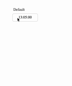 | 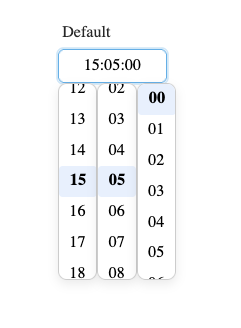 | 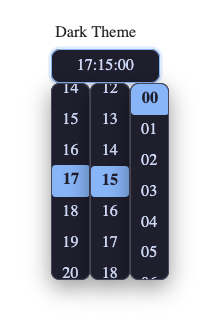 |
|
|
11
16
|
|
|
12
17
|
|
|
13
18
|
|
|
19
|
+
## Features
|
|
20
|
+
|
|
14
21
|
- Single and range time selection
|
|
15
|
-
-
|
|
22
|
+
- 24-hour, 12-hour, and `k`/`kk` 1-24 hour display formats
|
|
16
23
|
- Optional seconds
|
|
17
|
-
-
|
|
24
|
+
- Typing support with an overwrite-only masked input
|
|
18
25
|
- Step intervals for hours, minutes, and seconds
|
|
19
|
-
-
|
|
26
|
+
- `minTime`, `maxTime`, `disabledTimes`, and callback-based disable rules
|
|
27
|
+
- Validation and error events for form workflows
|
|
28
|
+
- Size presets, width control, custom classes, and CSS variable theming
|
|
29
|
+
- TypeScript types exported with the package
|
|
20
30
|
|
|
21
31
|
## Installation
|
|
22
32
|
|
|
@@ -24,12 +34,12 @@ Found a bug? Please open an issue on [GitHub](https://github.com/manos02/vue3-ti
|
|
|
24
34
|
npm install @manik02/vue3-timepicker
|
|
25
35
|
```
|
|
26
36
|
|
|
27
|
-
|
|
37
|
+
This package expects Vue 3 as a peer dependency.
|
|
28
38
|
|
|
29
|
-
## Quick
|
|
39
|
+
## Quick Start
|
|
30
40
|
|
|
31
41
|
```vue
|
|
32
|
-
<script setup>
|
|
42
|
+
<script setup lang="ts">
|
|
33
43
|
import { ref } from "vue";
|
|
34
44
|
import { TimePicker } from "@manik02/vue3-timepicker";
|
|
35
45
|
import "@manik02/vue3-timepicker/style.css";
|
|
@@ -38,313 +48,520 @@ const time = ref("14:30:00");
|
|
|
38
48
|
</script>
|
|
39
49
|
|
|
40
50
|
<template>
|
|
41
|
-
<TimePicker v-model="time" format="HH:mm
|
|
51
|
+
<TimePicker v-model="time" format="HH:mm" />
|
|
42
52
|
</template>
|
|
43
53
|
```
|
|
44
54
|
|
|
45
|
-
|
|
55
|
+
### Important Value Behavior
|
|
46
56
|
|
|
47
|
-
|
|
57
|
+
- `format` only changes how the value is displayed and edited.
|
|
58
|
+
- The bound `v-model` value is always normalized as `HH:mm:ss` when present.
|
|
59
|
+
- In single mode, use `string | null | undefined`.
|
|
60
|
+
- In range mode, use `[string, string] | null | undefined`.
|
|
61
|
+
|
|
62
|
+
Example: with `format="HH:mm"`, the UI may show `14:30`, but `v-model` still contains `14:30:00`.
|
|
63
|
+
|
|
64
|
+
## Playground
|
|
65
|
+
|
|
66
|
+
Run Storybook locally:
|
|
48
67
|
|
|
49
68
|
```bash
|
|
50
69
|
npm run storybook
|
|
51
70
|
```
|
|
52
71
|
|
|
53
|
-
Build static
|
|
72
|
+
Build the static docs site:
|
|
54
73
|
|
|
55
74
|
```bash
|
|
56
75
|
npm run build-storybook
|
|
57
76
|
```
|
|
58
77
|
|
|
59
|
-
The
|
|
78
|
+
The repo includes a GitHub Pages workflow for publishing Storybook from `.github/workflows/storybook.yml`.
|
|
60
79
|
|
|
61
|
-
##
|
|
80
|
+
## Examples
|
|
62
81
|
|
|
63
|
-
|
|
64
|
-
| ---------------- | ----------------------------------------------- | --------------- | --------------------------------------------------------------------------------------- |
|
|
65
|
-
| `modelValue` | `string \| [string, string] \| null` | `undefined` | Time value in `HH:mm:ss` format. Use a two-element array for range mode. |
|
|
66
|
-
| `format` | `TimeFormat` | `"HH:mm"` | Display format (see format tokens below). |
|
|
67
|
-
| `placeholder` | `string` | `"Select time"` | Placeholder text shown when input is empty. |
|
|
68
|
-
| `id` | `string` | `undefined` | Input id. In range mode, second input uses `${id}-end`. |
|
|
69
|
-
| `name` | `string` | `undefined` | Input name. In range mode, second input uses `${name}-end`. |
|
|
70
|
-
| `tabindex` | `number` | `0` | Tab order index applied to input field(s). |
|
|
71
|
-
| `autocomplete` | `string` | `"off"` | Native HTML autocomplete attribute for input field(s). |
|
|
72
|
-
| `inputClass` | `string \| string[] \| Record<string, boolean>` | `undefined` | Extra class(es) applied to the input field(s). |
|
|
73
|
-
| `inputWidth` | `string \| number` | `undefined` | Width for each input field. Number values are treated as `px`. |
|
|
74
|
-
| `minInputWidth` | `string \| number` | `undefined` | Minimum width for each input field. Number values are treated as `px`. |
|
|
75
|
-
| `maxInputWidth` | `string \| number` | `undefined` | Maximum width for each input field. Number values are treated as `px`. |
|
|
76
|
-
| `componentWidth` | `string \| number` | `undefined` | Width of the outer component shell. Number values are treated as `px`. |
|
|
77
|
-
| `range` | `boolean` | `false` | Enable range selection with two time inputs. |
|
|
78
|
-
| `disabled` | `boolean` | `false` | Disables the timepicker input(s) and prevents opening/selecting. |
|
|
79
|
-
| `hideDropdown` | `boolean` | `false` | Hides time columns so selection is typing-only. |
|
|
80
|
-
| `hourStep` | `number` | `1` | Step interval for the hour column. |
|
|
81
|
-
| `minuteStep` | `number` | `1` | Step interval for the minute column. |
|
|
82
|
-
| `secondStep` | `number` | `1` | Step interval for the second column. |
|
|
83
|
-
| `minTime` | `string` | `undefined` | Lower bound in `HH:mm` or `HH:mm:ss`; input and dropdown are constrained. |
|
|
84
|
-
| `maxTime` | `string` | `undefined` | Upper bound in `HH:mm` or `HH:mm:ss`; input and dropdown are constrained. |
|
|
85
|
-
| `disabledTimes` | `(string \| [string, string])[]` | `undefined` | Disabled points/ranges in `HH:mm:ss`; e.g. `"12:00:00"` or `[["13:00:00","14:00:00"]]`. |
|
|
86
|
-
| `isTimeDisabled` | `(time: InternalFormat) => boolean` | `undefined` | Callback for custom disable rules. Return `true` to block a time. |
|
|
87
|
-
| `size` | `"xs" \| "sm" \| "md" \| "lg" \| "xl"` | `"md"` | Size preset that maps to CSS variables. |
|
|
88
|
-
|
|
89
|
-
### Autocomplete notes
|
|
90
|
-
|
|
91
|
-
- `autocomplete` is passed directly to the native `<input>` element(s).
|
|
92
|
-
- In range mode, both inputs receive the same `autocomplete` value.
|
|
93
|
-
- Browser autofill behavior depends on form context and input metadata (`id`, `name`, surrounding `<form>`).
|
|
94
|
-
- Specific tokens (when useful for your form): e.g. `"one-time-code"`.
|
|
82
|
+
Unless noted otherwise, the examples below assume this shared setup:
|
|
95
83
|
|
|
96
|
-
|
|
84
|
+
```vue
|
|
85
|
+
<script setup lang="ts">
|
|
86
|
+
import { computed, ref } from "vue";
|
|
87
|
+
import { TimePicker } from "@manik02/vue3-timepicker";
|
|
88
|
+
import "@manik02/vue3-timepicker/style.css";
|
|
89
|
+
</script>
|
|
90
|
+
```
|
|
97
91
|
|
|
98
|
-
|
|
92
|
+
### Basic Single Picker
|
|
99
93
|
|
|
100
|
-
|
|
101
|
-
|
|
94
|
+
```vue
|
|
95
|
+
<script setup lang="ts">
|
|
96
|
+
import { ref } from "vue";
|
|
102
97
|
|
|
103
|
-
|
|
104
|
-
|
|
105
|
-
|
|
106
|
-
|
|
107
|
-
|
|
108
|
-
|
|
109
|
-
}
|
|
98
|
+
const time = ref("09:30:00");
|
|
99
|
+
</script>
|
|
100
|
+
|
|
101
|
+
<template>
|
|
102
|
+
<TimePicker v-model="time" format="HH:mm" />
|
|
103
|
+
</template>
|
|
110
104
|
```
|
|
111
105
|
|
|
112
|
-
|
|
113
|
-
|
|
106
|
+
### 24-Hour Format with Seconds
|
|
107
|
+
|
|
108
|
+
```vue
|
|
109
|
+
<script setup lang="ts">
|
|
110
|
+
import { ref } from "vue";
|
|
114
111
|
|
|
115
|
-
|
|
112
|
+
const time = ref("14:30:45");
|
|
113
|
+
</script>
|
|
114
|
+
|
|
115
|
+
<template>
|
|
116
|
+
<TimePicker v-model="time" format="HH:mm:ss" />
|
|
117
|
+
</template>
|
|
118
|
+
```
|
|
119
|
+
|
|
120
|
+
### 12-Hour Format
|
|
116
121
|
|
|
117
122
|
```vue
|
|
118
123
|
<script setup lang="ts">
|
|
119
124
|
import { ref } from "vue";
|
|
120
125
|
|
|
121
|
-
const time = ref("
|
|
122
|
-
|
|
126
|
+
const time = ref("14:30:00");
|
|
127
|
+
</script>
|
|
123
128
|
|
|
124
|
-
|
|
125
|
-
|
|
126
|
-
|
|
127
|
-
|
|
128
|
-
|
|
129
|
-
|
|
129
|
+
<template>
|
|
130
|
+
<TimePicker v-model="time" format="hh:mm A" />
|
|
131
|
+
</template>
|
|
132
|
+
```
|
|
133
|
+
|
|
134
|
+
While the input is focused, press `a` or `p` to toggle AM/PM.
|
|
135
|
+
|
|
136
|
+
### Lowercase am/pm
|
|
137
|
+
|
|
138
|
+
```vue
|
|
139
|
+
<template>
|
|
140
|
+
<TimePicker v-model="time" format="hh:mm a" />
|
|
141
|
+
</template>
|
|
142
|
+
```
|
|
143
|
+
|
|
144
|
+
### `k` Format (1-24 Hours)
|
|
145
|
+
|
|
146
|
+
```vue
|
|
147
|
+
<script setup lang="ts">
|
|
148
|
+
import { ref } from "vue";
|
|
149
|
+
|
|
150
|
+
const time = ref("23:00:00");
|
|
130
151
|
</script>
|
|
131
152
|
|
|
132
153
|
<template>
|
|
133
|
-
<TimePicker
|
|
134
|
-
|
|
135
|
-
|
|
136
|
-
|
|
137
|
-
|
|
138
|
-
|
|
139
|
-
|
|
154
|
+
<TimePicker v-model="time" format="kk:mm" />
|
|
155
|
+
</template>
|
|
156
|
+
```
|
|
157
|
+
|
|
158
|
+
### Start Empty and Clear Programmatically
|
|
159
|
+
|
|
160
|
+
```vue
|
|
161
|
+
<script setup lang="ts">
|
|
162
|
+
import { ref } from "vue";
|
|
140
163
|
|
|
141
|
-
|
|
164
|
+
const time = ref<string | null>(null);
|
|
165
|
+
|
|
166
|
+
function clearTime() {
|
|
167
|
+
time.value = null;
|
|
168
|
+
}
|
|
169
|
+
</script>
|
|
170
|
+
|
|
171
|
+
<template>
|
|
172
|
+
<TimePicker v-model="time" format="HH:mm" placeholder="Select a time" />
|
|
173
|
+
<button type="button" @click="clearTime">Clear</button>
|
|
174
|
+
<pre>{{ time }}</pre>
|
|
142
175
|
</template>
|
|
143
176
|
```
|
|
144
177
|
|
|
145
|
-
### Range
|
|
178
|
+
### Range Picker
|
|
146
179
|
|
|
147
180
|
```vue
|
|
148
181
|
<script setup lang="ts">
|
|
149
182
|
import { ref } from "vue";
|
|
150
183
|
|
|
151
184
|
const range = ref<[string, string]>(["09:00:00", "17:00:00"]);
|
|
152
|
-
|
|
185
|
+
</script>
|
|
153
186
|
|
|
154
|
-
|
|
155
|
-
|
|
156
|
-
|
|
157
|
-
|
|
158
|
-
|
|
159
|
-
|
|
160
|
-
|
|
187
|
+
<template>
|
|
188
|
+
<TimePicker v-model="range" :range="true" format="HH:mm" />
|
|
189
|
+
</template>
|
|
190
|
+
```
|
|
191
|
+
|
|
192
|
+
### Range Picker with 30-Minute Intervals
|
|
193
|
+
|
|
194
|
+
```vue
|
|
195
|
+
<script setup lang="ts">
|
|
196
|
+
import { ref } from "vue";
|
|
197
|
+
|
|
198
|
+
const range = ref<[string, string]>(["09:00:00", "17:00:00"]);
|
|
161
199
|
</script>
|
|
162
200
|
|
|
163
201
|
<template>
|
|
164
202
|
<TimePicker
|
|
165
203
|
v-model="range"
|
|
166
204
|
:range="true"
|
|
167
|
-
|
|
168
|
-
:
|
|
169
|
-
@validate="onValidate"
|
|
205
|
+
format="HH:mm"
|
|
206
|
+
:minute-step="30"
|
|
170
207
|
/>
|
|
208
|
+
</template>
|
|
209
|
+
```
|
|
210
|
+
|
|
211
|
+
### Typing-Only Input
|
|
212
|
+
|
|
213
|
+
```vue
|
|
214
|
+
<script setup lang="ts">
|
|
215
|
+
import { ref } from "vue";
|
|
171
216
|
|
|
172
|
-
|
|
217
|
+
const time = ref("13:45:00");
|
|
218
|
+
</script>
|
|
219
|
+
|
|
220
|
+
<template>
|
|
221
|
+
<TimePicker
|
|
222
|
+
v-model="time"
|
|
223
|
+
format="HH:mm:ss"
|
|
224
|
+
:hide-dropdown="true"
|
|
225
|
+
placeholder="Type time (e.g. 13:45:00)"
|
|
226
|
+
/>
|
|
173
227
|
</template>
|
|
174
228
|
```
|
|
175
229
|
|
|
176
|
-
|
|
230
|
+
### Step Intervals
|
|
231
|
+
|
|
232
|
+
```vue
|
|
233
|
+
<script setup lang="ts">
|
|
234
|
+
import { ref } from "vue";
|
|
177
235
|
|
|
178
|
-
|
|
179
|
-
|
|
180
|
-
| `HH` | `00`-`23` | 24-hour, zero-padded |
|
|
181
|
-
| `H` | `0`-`23` | 24-hour |
|
|
182
|
-
| `hh` | `01`-`12` | 12-hour, zero-padded |
|
|
183
|
-
| `h` | `1`-`12` | 12-hour |
|
|
184
|
-
| `kk` | `01`-`24` | 1-24 hour, zero-padded |
|
|
185
|
-
| `k` | `1`-`24` | 1-24 hour |
|
|
186
|
-
| `mm` | `00`-`59` | Minutes, zero-padded |
|
|
187
|
-
| `m` | `0`-`59` | Minutes |
|
|
188
|
-
| `ss` | `00`-`59` | Seconds, zero-padded |
|
|
189
|
-
| `s` | `0`-`59` | Seconds |
|
|
190
|
-
| `A` / `a` | `AM`/`PM` or `am`/`pm` | AM/PM indicator |
|
|
236
|
+
const time = ref("10:00:00");
|
|
237
|
+
</script>
|
|
191
238
|
|
|
192
|
-
|
|
239
|
+
<template>
|
|
240
|
+
<TimePicker
|
|
241
|
+
v-model="time"
|
|
242
|
+
format="HH:mm:ss"
|
|
243
|
+
:hour-step="2"
|
|
244
|
+
:minute-step="15"
|
|
245
|
+
:second-step="10"
|
|
246
|
+
/>
|
|
247
|
+
</template>
|
|
248
|
+
```
|
|
193
249
|
|
|
194
|
-
|
|
250
|
+
### Working-Hours Bounds
|
|
195
251
|
|
|
196
252
|
```vue
|
|
197
|
-
<script setup>
|
|
253
|
+
<script setup lang="ts">
|
|
198
254
|
import { ref } from "vue";
|
|
199
|
-
import { TimePicker } from "@manik02/vue3-timepicker";
|
|
200
|
-
import "@manik02/vue3-timepicker/style.css";
|
|
201
255
|
|
|
202
|
-
const
|
|
256
|
+
const time = ref("08:00:00");
|
|
203
257
|
</script>
|
|
204
258
|
|
|
205
259
|
<template>
|
|
206
|
-
<TimePicker
|
|
260
|
+
<TimePicker
|
|
261
|
+
v-model="time"
|
|
262
|
+
format="HH:mm"
|
|
263
|
+
min-time="09:00:00"
|
|
264
|
+
max-time="18:00:00"
|
|
265
|
+
/>
|
|
207
266
|
</template>
|
|
208
267
|
```
|
|
209
268
|
|
|
210
|
-
|
|
269
|
+
If the user enters a value outside the allowed bounds, the component clamps it and emits `out-of-range` validation.
|
|
211
270
|
|
|
212
|
-
|
|
271
|
+
### Disable Specific Times and Ranges
|
|
213
272
|
|
|
214
273
|
```vue
|
|
215
|
-
<
|
|
216
|
-
|
|
217
|
-
|
|
218
|
-
|
|
274
|
+
<script setup lang="ts">
|
|
275
|
+
import { ref } from "vue";
|
|
276
|
+
|
|
277
|
+
const time = ref("09:00:00");
|
|
278
|
+
</script>
|
|
279
|
+
|
|
280
|
+
<template>
|
|
281
|
+
<TimePicker
|
|
282
|
+
v-model="time"
|
|
283
|
+
format="HH:mm"
|
|
284
|
+
:disabled-times="[
|
|
285
|
+
'10:30:00',
|
|
286
|
+
['12:00:00', '13:00:00'],
|
|
287
|
+
['15:15:00', '15:45:00']
|
|
288
|
+
]"
|
|
289
|
+
/>
|
|
290
|
+
</template>
|
|
219
291
|
```
|
|
220
292
|
|
|
221
|
-
|
|
293
|
+
### Disable Times with a Callback
|
|
294
|
+
|
|
295
|
+
```vue
|
|
296
|
+
<script setup lang="ts">
|
|
297
|
+
import { ref } from "vue";
|
|
222
298
|
|
|
223
|
-
|
|
299
|
+
const time = ref("09:15:00");
|
|
300
|
+
|
|
301
|
+
function isTimeDisabled(value: { h: number; m: number; s: number }) {
|
|
302
|
+
return value.m === 45 || (value.h >= 11 && value.h <= 12);
|
|
303
|
+
}
|
|
304
|
+
</script>
|
|
305
|
+
|
|
306
|
+
<template>
|
|
307
|
+
<TimePicker
|
|
308
|
+
v-model="time"
|
|
309
|
+
format="HH:mm"
|
|
310
|
+
:is-time-disabled="isTimeDisabled"
|
|
311
|
+
/>
|
|
312
|
+
</template>
|
|
313
|
+
```
|
|
314
|
+
|
|
315
|
+
### React to Validation State
|
|
224
316
|
|
|
225
317
|
```vue
|
|
226
|
-
<
|
|
318
|
+
<script setup lang="ts">
|
|
319
|
+
import { computed, ref } from "vue";
|
|
320
|
+
|
|
321
|
+
const time = ref("08:00:00");
|
|
322
|
+
const validationState = ref<"valid" | "invalid" | "out-of-range">("valid");
|
|
323
|
+
|
|
324
|
+
const message = computed(() => {
|
|
325
|
+
if (validationState.value === "out-of-range") {
|
|
326
|
+
return "Adjusted to the nearest allowed time";
|
|
327
|
+
}
|
|
328
|
+
if (validationState.value === "invalid") {
|
|
329
|
+
return "Please enter a valid time";
|
|
330
|
+
}
|
|
331
|
+
return "Looks good";
|
|
332
|
+
});
|
|
333
|
+
</script>
|
|
334
|
+
|
|
335
|
+
<template>
|
|
336
|
+
<TimePicker
|
|
337
|
+
v-model="time"
|
|
338
|
+
v-model:validationState="validationState"
|
|
339
|
+
format="HH:mm"
|
|
340
|
+
min-time="09:00:00"
|
|
341
|
+
max-time="17:00:00"
|
|
342
|
+
/>
|
|
343
|
+
|
|
344
|
+
<small>{{ message }}</small>
|
|
345
|
+
</template>
|
|
346
|
+
```
|
|
347
|
+
|
|
348
|
+
### Listen to Validation and Error Events
|
|
349
|
+
|
|
350
|
+
```vue
|
|
351
|
+
<script setup lang="ts">
|
|
352
|
+
import { ref } from "vue";
|
|
353
|
+
import type { ValidationReason, ValidationState } from "@manik02/vue3-timepicker";
|
|
354
|
+
|
|
355
|
+
const time = ref("12:00:00");
|
|
356
|
+
const validationState = ref<ValidationState>("valid");
|
|
357
|
+
|
|
358
|
+
function onValidate(payload: {
|
|
359
|
+
target: "first" | "second";
|
|
360
|
+
state: ValidationState;
|
|
361
|
+
reason?: ValidationReason;
|
|
362
|
+
value: string | null;
|
|
363
|
+
}) {
|
|
364
|
+
console.log("validate", payload);
|
|
365
|
+
}
|
|
366
|
+
|
|
367
|
+
function onError(payload: { code: ValidationReason; message: string }) {
|
|
368
|
+
console.log("error", payload);
|
|
369
|
+
}
|
|
370
|
+
</script>
|
|
371
|
+
|
|
372
|
+
<template>
|
|
373
|
+
<TimePicker
|
|
374
|
+
v-model="time"
|
|
375
|
+
v-model:validationState="validationState"
|
|
376
|
+
format="HH:mm"
|
|
377
|
+
min-time="09:00:00"
|
|
378
|
+
max-time="18:00:00"
|
|
379
|
+
@validate="onValidate"
|
|
380
|
+
@error="onError"
|
|
381
|
+
/>
|
|
382
|
+
</template>
|
|
227
383
|
```
|
|
228
384
|
|
|
229
|
-
|
|
385
|
+
### Range Validation Example
|
|
386
|
+
|
|
387
|
+
```vue
|
|
388
|
+
<script setup lang="ts">
|
|
389
|
+
import { ref } from "vue";
|
|
390
|
+
import type { ValidationState } from "@manik02/vue3-timepicker";
|
|
391
|
+
|
|
392
|
+
const range = ref<[string, string]>(["09:00:00", "17:00:00"]);
|
|
393
|
+
const validationState = ref<ValidationState>("valid");
|
|
394
|
+
</script>
|
|
395
|
+
|
|
396
|
+
<template>
|
|
397
|
+
<TimePicker
|
|
398
|
+
v-model="range"
|
|
399
|
+
:range="true"
|
|
400
|
+
format="HH:mm"
|
|
401
|
+
:disabled-times="[['12:00:00', '13:00:00']]"
|
|
402
|
+
v-model:validationState="validationState"
|
|
403
|
+
/>
|
|
404
|
+
|
|
405
|
+
<small>Validation: {{ validationState }}</small>
|
|
406
|
+
</template>
|
|
407
|
+
```
|
|
230
408
|
|
|
231
|
-
|
|
409
|
+
### Form-Friendly Attributes
|
|
232
410
|
|
|
233
411
|
```vue
|
|
412
|
+
<script setup lang="ts">
|
|
413
|
+
import { ref } from "vue";
|
|
414
|
+
|
|
415
|
+
const time = ref("09:30:00");
|
|
416
|
+
</script>
|
|
417
|
+
|
|
234
418
|
<template>
|
|
235
|
-
<
|
|
236
|
-
<
|
|
237
|
-
<TimePicker
|
|
238
|
-
|
|
239
|
-
|
|
240
|
-
|
|
241
|
-
|
|
419
|
+
<form>
|
|
420
|
+
<label for="meeting-time">Meeting time</label>
|
|
421
|
+
<TimePicker
|
|
422
|
+
v-model="time"
|
|
423
|
+
id="meeting-time"
|
|
424
|
+
name="meetingTime"
|
|
425
|
+
autocomplete="off"
|
|
426
|
+
format="HH:mm"
|
|
427
|
+
/>
|
|
428
|
+
</form>
|
|
242
429
|
</template>
|
|
243
430
|
```
|
|
244
431
|
|
|
245
|
-
|
|
432
|
+
In range mode, the second input automatically uses `${id}-end` and `${name}-end`.
|
|
433
|
+
|
|
434
|
+
### Custom Input Class
|
|
435
|
+
|
|
436
|
+
```vue
|
|
437
|
+
<script setup lang="ts">
|
|
438
|
+
import { ref } from "vue";
|
|
439
|
+
|
|
440
|
+
const time = ref("11:20:00");
|
|
441
|
+
</script>
|
|
442
|
+
|
|
443
|
+
<template>
|
|
444
|
+
<TimePicker
|
|
445
|
+
v-model="time"
|
|
446
|
+
format="HH:mm"
|
|
447
|
+
input-class="my-time-input"
|
|
448
|
+
/>
|
|
449
|
+
</template>
|
|
246
450
|
|
|
247
|
-
|
|
451
|
+
<style>
|
|
452
|
+
.my-time-input {
|
|
453
|
+
letter-spacing: 0.04em;
|
|
454
|
+
font-variant-numeric: tabular-nums;
|
|
455
|
+
}
|
|
456
|
+
</style>
|
|
457
|
+
```
|
|
248
458
|
|
|
249
|
-
|
|
459
|
+
### Width Control
|
|
250
460
|
|
|
251
461
|
```vue
|
|
252
|
-
<
|
|
253
|
-
|
|
254
|
-
|
|
255
|
-
|
|
256
|
-
|
|
257
|
-
|
|
258
|
-
|
|
259
|
-
|
|
462
|
+
<script setup lang="ts">
|
|
463
|
+
import { ref } from "vue";
|
|
464
|
+
|
|
465
|
+
const time = ref("11:20:00");
|
|
466
|
+
</script>
|
|
467
|
+
|
|
468
|
+
<template>
|
|
469
|
+
<TimePicker
|
|
470
|
+
v-model="time"
|
|
471
|
+
format="hh:mm A"
|
|
472
|
+
:input-width="220"
|
|
473
|
+
min-input-width="12ch"
|
|
474
|
+
max-input-width="320px"
|
|
475
|
+
component-width="100%"
|
|
476
|
+
/>
|
|
477
|
+
</template>
|
|
260
478
|
```
|
|
261
479
|
|
|
262
480
|
Width precedence for each input field:
|
|
263
481
|
|
|
264
482
|
1. `inputWidth` prop
|
|
265
483
|
2. `--vtp-input-width` CSS variable
|
|
266
|
-
3. Built-in heuristic
|
|
484
|
+
3. Built-in width heuristic based on `format` and `placeholder`
|
|
267
485
|
|
|
268
|
-
|
|
486
|
+
### Size Presets
|
|
269
487
|
|
|
270
|
-
|
|
488
|
+
```vue
|
|
489
|
+
<script setup lang="ts">
|
|
490
|
+
import { ref } from "vue";
|
|
271
491
|
|
|
272
|
-
|
|
273
|
-
|
|
274
|
-
|
|
275
|
-
|
|
276
|
-
|
|
277
|
-
|
|
278
|
-
|
|
279
|
-
|
|
280
|
-
|
|
281
|
-
|
|
282
|
-
|
|
283
|
-
|
|
284
|
-
|
|
285
|
-
|
|
286
|
-
|
|
287
|
-
|
|
288
|
-
|
|
289
|
-
--vtp-separator-color: #9ca3af;
|
|
290
|
-
--vtp-dropdown-bg: #fff;
|
|
291
|
-
--vtp-dropdown-border: #e5e7eb;
|
|
292
|
-
--vtp-dropdown-shadow: 0 4px 12px rgba(0, 0, 0, 0.1);
|
|
293
|
-
--vtp-dropdown-radius: 8px;
|
|
294
|
-
--vtp-dropdown-max-height: 240px;
|
|
295
|
-
--vtp-option-padding: 0.375rem 0.75rem;
|
|
296
|
-
--vtp-option-radius: 6px;
|
|
297
|
-
--vtp-option-hover-bg: #f3f4f6;
|
|
298
|
-
--vtp-option-active-bg: #dbeafe;
|
|
299
|
-
--vtp-option-active-color: #1e40af;
|
|
300
|
-
--vtp-option-active-weight: 600;
|
|
301
|
-
--vtp-columns-gap: 0.5rem;
|
|
492
|
+
const time = ref("09:30:00");
|
|
493
|
+
</script>
|
|
494
|
+
|
|
495
|
+
<template>
|
|
496
|
+
<div class="sizes">
|
|
497
|
+
<TimePicker v-model="time" format="HH:mm" size="xs" />
|
|
498
|
+
<TimePicker v-model="time" format="HH:mm" size="sm" />
|
|
499
|
+
<TimePicker v-model="time" format="HH:mm" size="md" />
|
|
500
|
+
<TimePicker v-model="time" format="HH:mm" size="lg" />
|
|
501
|
+
<TimePicker v-model="time" format="HH:mm" size="xl" />
|
|
502
|
+
</div>
|
|
503
|
+
</template>
|
|
504
|
+
|
|
505
|
+
<style>
|
|
506
|
+
.sizes {
|
|
507
|
+
display: grid;
|
|
508
|
+
gap: 0.75rem;
|
|
302
509
|
}
|
|
510
|
+
</style>
|
|
303
511
|
```
|
|
304
512
|
|
|
305
|
-
|
|
306
|
-
|
|
307
|
-
### Dark theme example
|
|
513
|
+
### CSS Variables Theme Example
|
|
308
514
|
|
|
309
515
|
```vue
|
|
516
|
+
<script setup lang="ts">
|
|
517
|
+
import { ref } from "vue";
|
|
518
|
+
|
|
519
|
+
const time = ref("19:45:00");
|
|
520
|
+
</script>
|
|
521
|
+
|
|
310
522
|
<template>
|
|
311
|
-
<div class="
|
|
523
|
+
<div class="night-theme">
|
|
312
524
|
<TimePicker v-model="time" format="HH:mm:ss" />
|
|
313
525
|
</div>
|
|
314
526
|
</template>
|
|
315
527
|
|
|
316
528
|
<style>
|
|
317
|
-
.
|
|
318
|
-
--vtp-bg: #
|
|
319
|
-
--vtp-color: #
|
|
320
|
-
--vtp-border: #
|
|
529
|
+
.night-theme .timepicker-shell {
|
|
530
|
+
--vtp-bg: #0f172a;
|
|
531
|
+
--vtp-color: #e2e8f0;
|
|
532
|
+
--vtp-border: #334155;
|
|
321
533
|
--vtp-border-radius: 10px;
|
|
322
|
-
--vtp-focus-border: #
|
|
323
|
-
--vtp-focus-ring: 0 0 0 3px rgba(
|
|
324
|
-
--vtp-separator-color: #
|
|
325
|
-
--vtp-dropdown-bg: #
|
|
326
|
-
--vtp-dropdown-border: #
|
|
327
|
-
--vtp-dropdown-shadow: 0
|
|
328
|
-
--vtp-option-hover-bg: #
|
|
329
|
-
--vtp-option-active-bg: #
|
|
330
|
-
--vtp-option-active-color: #
|
|
534
|
+
--vtp-focus-border: #38bdf8;
|
|
535
|
+
--vtp-focus-ring: 0 0 0 3px rgba(56, 189, 248, 0.2);
|
|
536
|
+
--vtp-separator-color: #94a3b8;
|
|
537
|
+
--vtp-dropdown-bg: #0b1220;
|
|
538
|
+
--vtp-dropdown-border: #1e293b;
|
|
539
|
+
--vtp-dropdown-shadow: 0 10px 30px rgba(2, 6, 23, 0.45);
|
|
540
|
+
--vtp-option-hover-bg: #1e293b;
|
|
541
|
+
--vtp-option-active-bg: #38bdf8;
|
|
542
|
+
--vtp-option-active-color: #082f49;
|
|
331
543
|
}
|
|
332
544
|
</style>
|
|
333
545
|
```
|
|
334
546
|
|
|
335
|
-
### Minimal
|
|
547
|
+
### Rounded Minimal Theme Example
|
|
336
548
|
|
|
337
549
|
```vue
|
|
550
|
+
<script setup lang="ts">
|
|
551
|
+
import { ref } from "vue";
|
|
552
|
+
|
|
553
|
+
const time = ref("08:15:00");
|
|
554
|
+
</script>
|
|
555
|
+
|
|
338
556
|
<template>
|
|
339
557
|
<div class="rounded-theme">
|
|
340
|
-
<TimePicker v-model="time" format="
|
|
558
|
+
<TimePicker v-model="time" format="hh:mm A" />
|
|
341
559
|
</div>
|
|
342
560
|
</template>
|
|
343
561
|
|
|
344
562
|
<style>
|
|
345
563
|
.rounded-theme .timepicker-shell {
|
|
346
|
-
--vtp-font-family:
|
|
347
|
-
--vtp-font-size: 16px;
|
|
564
|
+
--vtp-font-family: Georgia, serif;
|
|
348
565
|
--vtp-border: #a78bfa;
|
|
349
566
|
--vtp-border-radius: 999px;
|
|
350
567
|
--vtp-padding: 0.5rem 1.25rem;
|
|
@@ -358,53 +575,180 @@ All properties have sensible defaults and the component inherits font and colour
|
|
|
358
575
|
</style>
|
|
359
576
|
```
|
|
360
577
|
|
|
361
|
-
|
|
578
|
+
## Props
|
|
362
579
|
|
|
363
|
-
|
|
364
|
-
|
|
365
|
-
|
|
366
|
-
|
|
367
|
-
|
|
368
|
-
|
|
580
|
+
| Prop | Type | Default | Description |
|
|
581
|
+
| --- | --- | --- | --- |
|
|
582
|
+
| `modelValue` | `string \| [string, string] \| null` | `undefined` | Current value. In range mode use a two-item tuple. |
|
|
583
|
+
| `format` | `TimeFormat` | `"HH:mm"` | Display and input format. |
|
|
584
|
+
| `placeholder` | `string` | `"Select time"` | Placeholder text for empty input(s). |
|
|
585
|
+
| `id` | `string` | `undefined` | Input id. In range mode the second input uses `${id}-end`. |
|
|
586
|
+
| `name` | `string` | `undefined` | Input name. In range mode the second input uses `${name}-end`. |
|
|
587
|
+
| `tabindex` | `number` | `0` | Tab index for input field(s). |
|
|
588
|
+
| `autocomplete` | `string` | `"off"` | Native HTML autocomplete value. |
|
|
589
|
+
| `inputClass` | `string \| string[] \| Record<string, boolean>` | `undefined` | Extra class or classes applied to each input. |
|
|
590
|
+
| `inputWidth` | `string \| number` | `undefined` | Explicit width for each input. Numeric values are treated as `px`. |
|
|
591
|
+
| `minInputWidth` | `string \| number` | `undefined` | Minimum width for each input. Numeric values are treated as `px`. |
|
|
592
|
+
| `maxInputWidth` | `string \| number` | `undefined` | Maximum width for each input. Numeric values are treated as `px`. |
|
|
593
|
+
| `componentWidth` | `string \| number` | `undefined` | Width for the outer shell. Numeric values are treated as `px`. |
|
|
594
|
+
| `range` | `boolean` | `false` | Enables two inputs for a time range. |
|
|
595
|
+
| `disabled` | `boolean` | `false` | Disables typing and dropdown interaction. |
|
|
596
|
+
| `hideDropdown` | `boolean` | `false` | Hides the column picker and keeps the input typing-only. |
|
|
597
|
+
| `hourStep` | `number` | `1` | Hour interval in the dropdown. |
|
|
598
|
+
| `minuteStep` | `number` | `1` | Minute interval in the dropdown. |
|
|
599
|
+
| `secondStep` | `number` | `1` | Second interval in the dropdown. |
|
|
600
|
+
| `minTime` | `string` | `undefined` | Minimum allowed time in `HH:mm` or `HH:mm:ss`. |
|
|
601
|
+
| `maxTime` | `string` | `undefined` | Maximum allowed time in `HH:mm` or `HH:mm:ss`. |
|
|
602
|
+
| `disabledTimes` | `(string \| [string, string])[]` | `undefined` | Disabled time points or ranges. |
|
|
603
|
+
| `isTimeDisabled` | `(time: InternalFormat) => boolean` | `undefined` | Callback for custom disabled-time rules. Return `true` to block a time. |
|
|
604
|
+
| `size` | `"xs" \| "sm" \| "md" \| "lg" \| "xl"` | `"md"` | Size preset mapped to CSS variables. |
|
|
605
|
+
|
|
606
|
+
### Autocomplete Notes
|
|
607
|
+
|
|
608
|
+
- `autocomplete` is forwarded directly to the native `<input>` element.
|
|
609
|
+
- In range mode, both inputs receive the same `autocomplete` value.
|
|
610
|
+
- Browser autofill behavior also depends on the surrounding form, `id`, and `name` attributes.
|
|
369
611
|
|
|
370
|
-
|
|
371
|
-
|
|
372
|
-
|
|
373
|
-
|
|
374
|
-
|
|
375
|
-
|
|
376
|
-
|
|
377
|
-
|
|
378
|
-
|
|
379
|
-
|
|
380
|
-
|
|
381
|
-
|
|
382
|
-
|
|
383
|
-
|
|
384
|
-
|
|
385
|
-
|
|
386
|
-
|
|
387
|
-
--vtp-option-active-bg: #0ea5e9;
|
|
388
|
-
--vtp-option-active-color: #fff;
|
|
389
|
-
--vtp-option-active-weight: 500;
|
|
612
|
+
## Events
|
|
613
|
+
|
|
614
|
+
| Event | Payload | Description |
|
|
615
|
+
| --- | --- | --- |
|
|
616
|
+
| `update:modelValue` | `string \| [string, string] \| null` | Emitted when the value changes. |
|
|
617
|
+
| `update:validationState` | `"valid" \| "invalid" \| "out-of-range"` | Emitted whenever the aggregated validation state changes. |
|
|
618
|
+
| `validate` | `{ target, state, reason?, value }` | Emitted after validation runs for one input. |
|
|
619
|
+
| `error` | `{ code, message }` | Emitted when invalid or disabled input is encountered. |
|
|
620
|
+
|
|
621
|
+
### `validate` Payload
|
|
622
|
+
|
|
623
|
+
```ts
|
|
624
|
+
{
|
|
625
|
+
target: "first" | "second";
|
|
626
|
+
state: "valid" | "invalid" | "out-of-range";
|
|
627
|
+
reason?: "BAD_TIME" | "OUT_OF_RANGE" | "DISABLED";
|
|
628
|
+
value: string | null;
|
|
390
629
|
}
|
|
391
|
-
</style>
|
|
392
630
|
```
|
|
393
631
|
|
|
394
|
-
|
|
632
|
+
- `value` is always normalized to `HH:mm:ss` when present.
|
|
633
|
+
- `target` is always included, even in single-input mode.
|
|
634
|
+
|
|
635
|
+
### Validation States
|
|
636
|
+
|
|
637
|
+
- `valid`: the value is accepted.
|
|
638
|
+
- `invalid`: the value is incomplete, malformed, or blocked by disable rules.
|
|
639
|
+
- `out-of-range`: the value was outside `minTime`/`maxTime` and was clamped.
|
|
640
|
+
|
|
641
|
+
## Format Tokens
|
|
642
|
+
|
|
643
|
+
| Token | Output | Description |
|
|
644
|
+
| --- | --- | --- |
|
|
645
|
+
| `HH` | `00`-`23` | 24-hour, zero-padded |
|
|
646
|
+
| `H` | `0`-`23` | 24-hour |
|
|
647
|
+
| `hh` | `01`-`12` | 12-hour, zero-padded |
|
|
648
|
+
| `h` | `1`-`12` | 12-hour |
|
|
649
|
+
| `kk` | `01`-`24` | 1-24 hour, zero-padded |
|
|
650
|
+
| `k` | `1`-`24` | 1-24 hour |
|
|
651
|
+
| `mm` | `00`-`59` | Minutes, zero-padded |
|
|
652
|
+
| `m` | `0`-`59` | Minutes |
|
|
653
|
+
| `ss` | `00`-`59` | Seconds, zero-padded |
|
|
654
|
+
| `s` | `0`-`59` | Seconds |
|
|
655
|
+
| `A` / `P` | `AM` / `PM` | Uppercase AM/PM |
|
|
656
|
+
| `a` / `p` | `am` / `pm` | Lowercase am/pm |
|
|
657
|
+
|
|
658
|
+
Examples:
|
|
659
|
+
|
|
660
|
+
- `HH:mm`
|
|
661
|
+
- `HH:mm:ss`
|
|
662
|
+
- `hh:mm A`
|
|
663
|
+
- `hh:mm:ss a`
|
|
664
|
+
- `kk:mm`
|
|
665
|
+
|
|
666
|
+
## Keyboard Behavior
|
|
667
|
+
|
|
668
|
+
- Typing is overwrite-only rather than free-form insertion.
|
|
669
|
+
- The mask auto-inserts `:` separators.
|
|
670
|
+
- In 12-hour mode, press `a` or `p` while focused to toggle AM/PM.
|
|
671
|
+
- `Backspace` moves the cursor left without clearing the entire value.
|
|
672
|
+
- `Escape` closes the dropdown columns.
|
|
673
|
+
|
|
674
|
+
## Styling
|
|
675
|
+
|
|
676
|
+
The component exposes CSS custom properties on `.timepicker-shell`, so you can theme it from any parent container.
|
|
677
|
+
|
|
678
|
+
```css
|
|
679
|
+
.my-theme .timepicker-shell {
|
|
680
|
+
--vtp-font-family: Inter, sans-serif;
|
|
681
|
+
--vtp-font-size: 14px;
|
|
682
|
+
--vtp-bg: #ffffff;
|
|
683
|
+
--vtp-color: #111827;
|
|
684
|
+
--vtp-border: #d1d5db;
|
|
685
|
+
--vtp-border-radius: 8px;
|
|
686
|
+
--vtp-padding: 0.5rem 0.75rem;
|
|
687
|
+
--vtp-focus-border: #2563eb;
|
|
688
|
+
--vtp-focus-ring: 0 0 0 3px rgba(37, 99, 235, 0.18);
|
|
689
|
+
--vtp-error-border: #ef4444;
|
|
690
|
+
--vtp-error-ring: 0 0 0 3px rgba(239, 68, 68, 0.15);
|
|
691
|
+
--vtp-component-width: auto;
|
|
692
|
+
--vtp-input-width: 12ch;
|
|
693
|
+
--vtp-input-min-width: 0;
|
|
694
|
+
--vtp-input-max-width: none;
|
|
695
|
+
--vtp-separator-color: #9ca3af;
|
|
696
|
+
--vtp-dropdown-bg: #ffffff;
|
|
697
|
+
--vtp-dropdown-border: #e5e7eb;
|
|
698
|
+
--vtp-dropdown-shadow: 0 4px 12px rgba(0, 0, 0, 0.1);
|
|
699
|
+
--vtp-dropdown-radius: 8px;
|
|
700
|
+
--vtp-dropdown-max-height: 240px;
|
|
701
|
+
--vtp-option-padding: 0.375rem 0.75rem;
|
|
702
|
+
--vtp-option-radius: 6px;
|
|
703
|
+
--vtp-option-hover-bg: #f3f4f6;
|
|
704
|
+
--vtp-option-active-bg: #dbeafe;
|
|
705
|
+
--vtp-option-active-color: #1e40af;
|
|
706
|
+
--vtp-option-active-weight: 600;
|
|
707
|
+
--vtp-columns-gap: 0.5rem;
|
|
708
|
+
}
|
|
709
|
+
```
|
|
710
|
+
|
|
711
|
+
Common styling variables:
|
|
712
|
+
|
|
713
|
+
| Variable | Purpose |
|
|
714
|
+
| --- | --- |
|
|
715
|
+
| `--vtp-bg` | Input background |
|
|
716
|
+
| `--vtp-color` | Input text color |
|
|
717
|
+
| `--vtp-border` | Input border color |
|
|
718
|
+
| `--vtp-focus-border` | Focused border color |
|
|
719
|
+
| `--vtp-focus-ring` | Focus ring shadow |
|
|
720
|
+
| `--vtp-dropdown-bg` | Dropdown background |
|
|
721
|
+
| `--vtp-dropdown-border` | Dropdown border color |
|
|
722
|
+
| `--vtp-option-hover-bg` | Hovered option background |
|
|
723
|
+
| `--vtp-option-active-bg` | Active option background |
|
|
724
|
+
| `--vtp-option-active-color` | Active option text color |
|
|
725
|
+
| `--vtp-input-width` | Default input width |
|
|
726
|
+
| `--vtp-component-width` | Outer shell width |
|
|
395
727
|
|
|
396
728
|
## TypeScript
|
|
397
729
|
|
|
398
|
-
The package exports
|
|
730
|
+
The package exports these useful types:
|
|
399
731
|
|
|
400
732
|
```ts
|
|
401
733
|
import type {
|
|
402
|
-
|
|
734
|
+
DisabledTimeInput,
|
|
403
735
|
InternalFormat,
|
|
736
|
+
TimeFormat,
|
|
404
737
|
TimePickerProps,
|
|
738
|
+
ValidationReason,
|
|
739
|
+
ValidationState,
|
|
405
740
|
} from "@manik02/vue3-timepicker";
|
|
406
741
|
```
|
|
407
742
|
|
|
743
|
+
## Development
|
|
744
|
+
|
|
745
|
+
```bash
|
|
746
|
+
npm run dev
|
|
747
|
+
npm run storybook
|
|
748
|
+
npm run test
|
|
749
|
+
npm run build
|
|
750
|
+
```
|
|
751
|
+
|
|
408
752
|
## License
|
|
409
753
|
|
|
410
754
|
MIT
|
package/package.json
CHANGED
|
@@ -1,9 +1,16 @@
|
|
|
1
1
|
{
|
|
2
2
|
"name": "@manik02/vue3-timepicker",
|
|
3
|
-
"version": "0.4.
|
|
4
|
-
"description": "
|
|
3
|
+
"version": "0.4.6",
|
|
4
|
+
"description": "Vue 3 time picker component with multiple formats, range selection, min/max constraints, disabled times, validation, custom styling, TypeScript support and more.",
|
|
5
5
|
"license": "MIT",
|
|
6
|
-
"author":
|
|
6
|
+
"author": {
|
|
7
|
+
"name": "Manos Savvides",
|
|
8
|
+
"url": "https://github.com/manos02"
|
|
9
|
+
},
|
|
10
|
+
"homepage": "https://manos02.github.io/vue3-time-picker/",
|
|
11
|
+
"bugs": {
|
|
12
|
+
"url": "https://github.com/manos02/vue3-time-picker/issues"
|
|
13
|
+
},
|
|
7
14
|
"repository": {
|
|
8
15
|
"type": "git",
|
|
9
16
|
"url": "git+https://github.com/manos02/vue3-time-picker.git"
|
|
@@ -27,15 +34,24 @@
|
|
|
27
34
|
"keywords": [
|
|
28
35
|
"vue",
|
|
29
36
|
"vue3",
|
|
37
|
+
"vue-3",
|
|
38
|
+
"vue-timepicker",
|
|
39
|
+
"vue-time-picker",
|
|
30
40
|
"timepicker",
|
|
31
41
|
"time-picker",
|
|
42
|
+
"time-input",
|
|
43
|
+
"time-range-picker",
|
|
44
|
+
"time-selector",
|
|
45
|
+
"time-select",
|
|
32
46
|
"time",
|
|
33
47
|
"component",
|
|
48
|
+
"typescript",
|
|
49
|
+
"form",
|
|
34
50
|
"range",
|
|
35
51
|
"12h",
|
|
36
52
|
"24h",
|
|
37
53
|
"input",
|
|
38
|
-
"
|
|
54
|
+
"ui"
|
|
39
55
|
],
|
|
40
56
|
"scripts": {
|
|
41
57
|
"dev": "vite",
|