@lobehub/icons-rn 1.0.0
This diff represents the content of publicly available package versions that have been released to one of the supported registries. The information contained in this diff is provided for informational purposes only and reflects changes between package versions as they appear in their respective public registries.
- package/README.md +371 -0
- package/package.json +38 -0
package/README.md
ADDED
|
@@ -0,0 +1,371 @@
|
|
|
1
|
+
<a name="readme-top"></a>
|
|
2
|
+
|
|
3
|
+
<div align="center">
|
|
4
|
+
|
|
5
|
+
<img height="120" src="https://registry.npmmirror.com/@lobehub/assets-logo/1.0.0/files/assets/logo-3d.webp">
|
|
6
|
+
<img height="120" src="https://gw.alipayobjects.com/zos/kitchen/qJ3l3EPsdW/split.svg">
|
|
7
|
+
<img height="120" src="https://registry.npmmirror.com/@lobehub/fluent-emoji-3d/1.1.0/files/assets/1f968.webp">
|
|
8
|
+
|
|
9
|
+
# Lobe Icons React Native
|
|
10
|
+
|
|
11
|
+
`React Native Package`
|
|
12
|
+
|
|
13
|
+
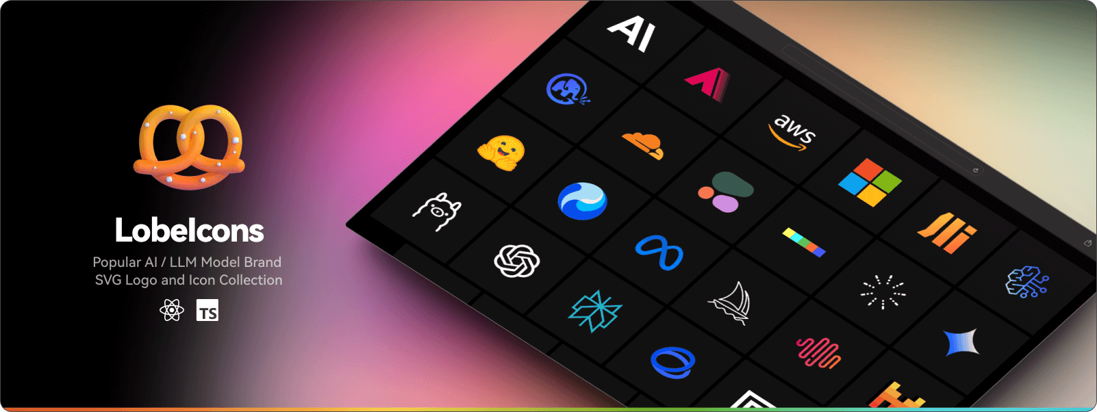
Popular AI / LLM Model Brand Icons for React Native and Expo. See them all on one page at [icons.lobehub.com](https://icons.lobehub.com/).<br/>
|
|
14
|
+
Contributions, corrections & requests can be made on GitHub.
|
|
15
|
+
|
|
16
|
+
[Changelog](./CHANGELOG.md) · [Report Bug][github-issues-link] · [Request Feature][github-issues-link]
|
|
17
|
+
|
|
18
|
+
<!-- SHIELD GROUP -->
|
|
19
|
+
|
|
20
|
+
[![][npm-release-shield]][npm-release-link]
|
|
21
|
+
[![][vercel-shield]][vercel-link]
|
|
22
|
+
[![][discord-shield]][discord-link]
|
|
23
|
+
[![][npm-downloads-shield]][npm-downloads-link]<br/>
|
|
24
|
+
[![][github-releasedate-shield]][github-releasedate-link]
|
|
25
|
+
[![][github-action-test-shield]][github-action-test-link]
|
|
26
|
+
[![][github-action-release-shield]][github-action-release-link]<br/>
|
|
27
|
+
[![][github-contributors-shield]][github-contributors-link]
|
|
28
|
+
[![][github-forks-shield]][github-forks-link]
|
|
29
|
+
[![][github-stars-shield]][github-stars-link]
|
|
30
|
+
[![][github-issues-shield]][github-issues-link]
|
|
31
|
+
[![][github-license-shield]][github-license-link]
|
|
32
|
+
|
|
33
|
+
|
|
34
|
+
|
|
35
|
+
</div>
|
|
36
|
+
|
|
37
|
+
## 🚀 Installation
|
|
38
|
+
|
|
39
|
+
```bash
|
|
40
|
+
npm install @lobehub/icons-rn
|
|
41
|
+
# or
|
|
42
|
+
yarn add @lobehub/icons-rn
|
|
43
|
+
# or
|
|
44
|
+
pnpm add @lobehub/icons-rn
|
|
45
|
+
```
|
|
46
|
+
|
|
47
|
+
### Peer Dependencies
|
|
48
|
+
|
|
49
|
+
This package requires the following peer dependencies:
|
|
50
|
+
|
|
51
|
+
```bash
|
|
52
|
+
npm install react-native-svg
|
|
53
|
+
# or
|
|
54
|
+
yarn add react-native-svg
|
|
55
|
+
# or
|
|
56
|
+
pnpm add react-native-svg
|
|
57
|
+
```
|
|
58
|
+
|
|
59
|
+
#### Optional: Gradient Support
|
|
60
|
+
|
|
61
|
+
For gradient background support in Avatar components, install `react-native-linear-gradient`:
|
|
62
|
+
|
|
63
|
+
```bash
|
|
64
|
+
npm install react-native-linear-gradient
|
|
65
|
+
# or
|
|
66
|
+
yarn add react-native-linear-gradient
|
|
67
|
+
# or
|
|
68
|
+
pnpm add react-native-linear-gradient
|
|
69
|
+
```
|
|
70
|
+
|
|
71
|
+
> 💡 **Note**: If `react-native-linear-gradient` is not installed, gradient backgrounds will automatically fallback to solid colors.
|
|
72
|
+
|
|
73
|
+
## 📖 Usage
|
|
74
|
+
|
|
75
|
+
> 💡 **API Compatibility**: The React Native package API is almost identical to the web version. You can refer to the [web documentation](https://icons.lobehub.com) for comprehensive usage examples and advanced patterns.
|
|
76
|
+
|
|
77
|
+
### Basic Usage
|
|
78
|
+
|
|
79
|
+
```tsx
|
|
80
|
+
import { Adobe } from '@lobehub/icons-rn';
|
|
81
|
+
|
|
82
|
+
export default function App() {
|
|
83
|
+
return (
|
|
84
|
+
<View style={styles.container}>
|
|
85
|
+
<Adobe size={32} />
|
|
86
|
+
</View>
|
|
87
|
+
);
|
|
88
|
+
}
|
|
89
|
+
```
|
|
90
|
+
|
|
91
|
+
### With Styling
|
|
92
|
+
|
|
93
|
+
```tsx
|
|
94
|
+
import { Adobe } from '@lobehub/icons-rn';
|
|
95
|
+
|
|
96
|
+
export default function App() {
|
|
97
|
+
return (
|
|
98
|
+
<View style={styles.container}>
|
|
99
|
+
<Adobe size={24} style={{ marginRight: 8, color: '#007AFF' }} />
|
|
100
|
+
</View>
|
|
101
|
+
);
|
|
102
|
+
}
|
|
103
|
+
```
|
|
104
|
+
|
|
105
|
+
### Color Version
|
|
106
|
+
|
|
107
|
+
```tsx
|
|
108
|
+
import { Adobe } from '@lobehub/icons-rn';
|
|
109
|
+
|
|
110
|
+
export default function App() {
|
|
111
|
+
return (
|
|
112
|
+
<View style={styles.container}>
|
|
113
|
+
<Adobe.Color size={32} />
|
|
114
|
+
</View>
|
|
115
|
+
);
|
|
116
|
+
}
|
|
117
|
+
```
|
|
118
|
+
|
|
119
|
+
### Text Version
|
|
120
|
+
|
|
121
|
+
```tsx
|
|
122
|
+
import { Adobe } from '@lobehub/icons-rn';
|
|
123
|
+
|
|
124
|
+
export default function App() {
|
|
125
|
+
return (
|
|
126
|
+
<View style={styles.container}>
|
|
127
|
+
<Adobe.Text size={32} />
|
|
128
|
+
</View>
|
|
129
|
+
);
|
|
130
|
+
}
|
|
131
|
+
```
|
|
132
|
+
|
|
133
|
+
### Avatar Version
|
|
134
|
+
|
|
135
|
+
```tsx
|
|
136
|
+
import { Adobe } from '@lobehub/icons-rn';
|
|
137
|
+
|
|
138
|
+
export default function App() {
|
|
139
|
+
return (
|
|
140
|
+
<View style={styles.container}>
|
|
141
|
+
<Adobe.Avatar size={48} />
|
|
142
|
+
</View>
|
|
143
|
+
);
|
|
144
|
+
}
|
|
145
|
+
```
|
|
146
|
+
|
|
147
|
+
### Avatar with Gradient Background
|
|
148
|
+
|
|
149
|
+
```tsx
|
|
150
|
+
import { Adobe } from '@lobehub/icons-rn';
|
|
151
|
+
|
|
152
|
+
export default function App() {
|
|
153
|
+
return (
|
|
154
|
+
<View style={styles.container}>
|
|
155
|
+
{/* CSS gradient format - requires react-native-linear-gradient */}
|
|
156
|
+
<Adobe.Avatar
|
|
157
|
+
size={48}
|
|
158
|
+
background="linear-gradient(45deg, #9AD8F8, #3D8FFF, #6350FB)"
|
|
159
|
+
/>
|
|
160
|
+
|
|
161
|
+
{/* Automatic fallback to solid color if gradient library not available */}
|
|
162
|
+
<Adobe.Avatar
|
|
163
|
+
size={48}
|
|
164
|
+
background="linear-gradient(to right, #FF6B35, #F7931E)"
|
|
165
|
+
/>
|
|
166
|
+
</View>
|
|
167
|
+
);
|
|
168
|
+
}
|
|
169
|
+
```
|
|
170
|
+
|
|
171
|
+
### Combine Version (Icon + Text)
|
|
172
|
+
|
|
173
|
+
```tsx
|
|
174
|
+
import { Adobe } from '@lobehub/icons-rn';
|
|
175
|
+
|
|
176
|
+
export default function App() {
|
|
177
|
+
return (
|
|
178
|
+
<View style={styles.container}>
|
|
179
|
+
<Adobe.Combine size={32} text="Adobe" textColor="#000000" />
|
|
180
|
+
</View>
|
|
181
|
+
);
|
|
182
|
+
}
|
|
183
|
+
```
|
|
184
|
+
|
|
185
|
+
## 🎨 API Reference
|
|
186
|
+
|
|
187
|
+
### Icon Props
|
|
188
|
+
|
|
189
|
+
| Prop | Type | Default | Description |
|
|
190
|
+
| ------- | ----------- | -------------- | ------------------- |
|
|
191
|
+
| `size` | `number` | `24` | Icon size in pixels |
|
|
192
|
+
| `style` | `ViewStyle` | `undefined` | Additional styles |
|
|
193
|
+
| `color` | `string` | `currentColor` | Icon color |
|
|
194
|
+
|
|
195
|
+
### Avatar Props
|
|
196
|
+
|
|
197
|
+
| Prop | Type | Default | Description |
|
|
198
|
+
| -------------- | -------- | ----------- | ------------------------------------------------------------------ |
|
|
199
|
+
| `size` | `number` | `24` | Avatar size in pixels |
|
|
200
|
+
| `background` | `string` | Brand color | Background color or CSS gradient (e.g., `linear-gradient(...)`) |
|
|
201
|
+
| `color` | `string` | `#FFFFFF` | Icon color |
|
|
202
|
+
| `iconMultiple` | `number` | `0.6` | Icon size multiplier |
|
|
203
|
+
|
|
204
|
+
### Text Props
|
|
205
|
+
|
|
206
|
+
| Prop | Type | Default | Description |
|
|
207
|
+
| ----------- | -------- | ---------- | ------------------- |
|
|
208
|
+
| `size` | `number` | `24` | Text size in pixels |
|
|
209
|
+
| `text` | `string` | Brand name | Custom text |
|
|
210
|
+
| `textColor` | `string` | `#000000` | Text color |
|
|
211
|
+
|
|
212
|
+
### Combine Props
|
|
213
|
+
|
|
214
|
+
| Prop | Type | Default | Description |
|
|
215
|
+
| --------------- | -------- | ---------- | --------------------------- |
|
|
216
|
+
| `size` | `number` | `24` | Icon size in pixels |
|
|
217
|
+
| `text` | `string` | Brand name | Custom text |
|
|
218
|
+
| `textColor` | `string` | `#000000` | Text color |
|
|
219
|
+
| `spaceMultiple` | `number` | `0.1` | Space between icon and text |
|
|
220
|
+
| `textMultiple` | `number` | `0.6` | Text size multiplier |
|
|
221
|
+
|
|
222
|
+
## 🔧 TypeScript Support
|
|
223
|
+
|
|
224
|
+
This package includes full TypeScript support:
|
|
225
|
+
|
|
226
|
+
```tsx
|
|
227
|
+
import { Adobe, type AdobeProps } from '@lobehub/icons-rn';
|
|
228
|
+
|
|
229
|
+
// All props are properly typed
|
|
230
|
+
const MyComponent: React.FC = () => {
|
|
231
|
+
return <Adobe size={32} />;
|
|
232
|
+
};
|
|
233
|
+
```
|
|
234
|
+
|
|
235
|
+
## 🎨 Gradient Background Support
|
|
236
|
+
|
|
237
|
+
Avatar components support CSS `linear-gradient` format for rich visual effects:
|
|
238
|
+
|
|
239
|
+
### Supported Gradient Formats
|
|
240
|
+
|
|
241
|
+
```tsx
|
|
242
|
+
// Direction keywords
|
|
243
|
+
<Adobe.Avatar background="linear-gradient(to right, #FF6B35, #F7931E)" />
|
|
244
|
+
<Adobe.Avatar background="linear-gradient(to bottom, #667eea, #764ba2)" />
|
|
245
|
+
|
|
246
|
+
// Degree angles
|
|
247
|
+
<Adobe.Avatar background="linear-gradient(45deg, #9AD8F8, #3D8FFF, #6350FB)" />
|
|
248
|
+
<Adobe.Avatar background="linear-gradient(135deg, #667eea, #764ba2)" />
|
|
249
|
+
|
|
250
|
+
// Multiple colors with positions
|
|
251
|
+
<Adobe.Avatar background="linear-gradient(90deg, #FF6B35 0%, #F7931E 50%, #C02425 100%)" />
|
|
252
|
+
```
|
|
253
|
+
|
|
254
|
+
### Automatic Fallback
|
|
255
|
+
|
|
256
|
+
If `react-native-linear-gradient` is not installed or gradient parsing fails:
|
|
257
|
+
|
|
258
|
+
- **Extracts first color** from gradient as solid background
|
|
259
|
+
- **Graceful degradation** - no crashes or broken UI
|
|
260
|
+
- **Development-friendly** - works without additional setup
|
|
261
|
+
|
|
262
|
+
Example fallback behavior:
|
|
263
|
+
```tsx
|
|
264
|
+
// With library: Shows beautiful gradient
|
|
265
|
+
// Without library: Shows solid #9AD8F8 background
|
|
266
|
+
<Adobe.Avatar background="linear-gradient(45deg, #9AD8F8, #3D8FFF, #6350FB)" />
|
|
267
|
+
```
|
|
268
|
+
|
|
269
|
+
## 📦 Available Icons
|
|
270
|
+
|
|
271
|
+
This package includes **225+ AI/LLM brand icons** across three main categories:
|
|
272
|
+
|
|
273
|
+
### 🤖 Model Icons
|
|
274
|
+
|
|
275
|
+
Popular AI models including:
|
|
276
|
+
|
|
277
|
+
- **Claude** (Anthropic), **GPT** (OpenAI), **Gemini** (Google)
|
|
278
|
+
- **Qwen** (Alibaba), **DeepSeek**, **ChatGLM** (Zhipu)
|
|
279
|
+
- **Llama** (Meta), **Mistral**, **RWKV**, and many more
|
|
280
|
+
|
|
281
|
+
### 🏢 Provider Icons
|
|
282
|
+
|
|
283
|
+
AI service providers such as:
|
|
284
|
+
|
|
285
|
+
- **OpenAI**, **Anthropic**, **Google**, **Microsoft**
|
|
286
|
+
- **AWS Bedrock**, **Azure AI**, **Hugging Face**
|
|
287
|
+
- **Groq**, **Together AI**, **Fireworks**, and others
|
|
288
|
+
|
|
289
|
+
### 🛠️ Application Icons
|
|
290
|
+
|
|
291
|
+
AI-powered applications including:
|
|
292
|
+
|
|
293
|
+
- **Adobe Firefly**, **Midjourney**, **Cursor**
|
|
294
|
+
- **GitHub Copilot**, **Notion**, **Figma**
|
|
295
|
+
- **ComfyUI**, **Gradio**, **LangChain**, and more
|
|
296
|
+
|
|
297
|
+
### 🌐 Complete Icon Gallery
|
|
298
|
+
|
|
299
|
+
View all available icons with interactive examples at [icons.lobehub.com](https://icons.lobehub.com).
|
|
300
|
+
|
|
301
|
+
Each icon supports multiple variants:
|
|
302
|
+
|
|
303
|
+
- **Monochrome** - Inherits color from parent
|
|
304
|
+
- **Color** - Brand-specific colors
|
|
305
|
+
- **Avatar** - Circular background style
|
|
306
|
+
- **Text** - Brand name text
|
|
307
|
+
- **Combine** - Icon + text combination
|
|
308
|
+
|
|
309
|
+
## 🔗 Web Compatibility
|
|
310
|
+
|
|
311
|
+
This React Native package maintains **API compatibility** with the web version. For comprehensive documentation, advanced usage patterns, and live examples, visit:
|
|
312
|
+
|
|
313
|
+
- 📚 **Documentation**: [icons.lobehub.com](https://icons.lobehub.com)
|
|
314
|
+
- 🎮 **Interactive Examples**: All usage examples from the web docs work with React Native
|
|
315
|
+
- 🔧 **Advanced Patterns**: Component composition, theming, and customization guides
|
|
316
|
+
- 🎨 **Design Guidelines**: Icon sizing, spacing, and accessibility best practices
|
|
317
|
+
|
|
318
|
+
The main differences are:
|
|
319
|
+
|
|
320
|
+
- Uses `react-native-svg` instead of regular SVG
|
|
321
|
+
- Requires `ViewStyle` instead of `CSSProperties` for styling
|
|
322
|
+
- Uses React Native's theming instead of CSS variables
|
|
323
|
+
|
|
324
|
+
## 🆚 Comparison with Other Packages
|
|
325
|
+
|
|
326
|
+
| Package | Target | Bundle Size | Features |
|
|
327
|
+
| --------------------------- | ------ | ----------- | --------------------- |
|
|
328
|
+
| `@lobehub/icons` | Web | Larger | Full React components |
|
|
329
|
+
| `@lobehub/icons-static-svg` | Static | Small | SVG files only |
|
|
330
|
+
| `@lobehub/icons-rn` | Mobile | Optimized | RN components |
|
|
331
|
+
|
|
332
|
+
## 🤝 Contributing
|
|
333
|
+
|
|
334
|
+
We welcome contributions! Please see our [contributing guide](https://github.com/lobehub/lobe-icons/blob/master/CONTRIBUTING.md) for details.
|
|
335
|
+
|
|
336
|
+
## 📄 License
|
|
337
|
+
|
|
338
|
+
[![][fossa-license-shield]][fossa-license-link]
|
|
339
|
+
|
|
340
|
+
Copyright © 2023 [LobeHub][profile-link]. <br />
|
|
341
|
+
This project is [MIT](./LICENSE) licensed.
|
|
342
|
+
|
|
343
|
+
<!-- LINK GROUP -->
|
|
344
|
+
|
|
345
|
+
[discord-link]: https://discord.gg/AYFPHvv2jT
|
|
346
|
+
[discord-shield]: https://img.shields.io/discord/1127171173982154893?color=5865F2&label=discord&labelColor=black&logo=discord&logoColor=white&style=flat-square
|
|
347
|
+
[fossa-license-link]: https://app.fossa.com/projects/git%2Bgithub.com%2Flobehub%2Flobe-icons
|
|
348
|
+
[fossa-license-shield]: https://app.fossa.com/api/projects/git%2Bgithub.com%2Flobehub%2Flobe-icons.svg?type=large
|
|
349
|
+
[github-action-release-link]: https://github.com/actions/workflows/lobehub/lobe-icons/release.yml
|
|
350
|
+
[github-action-release-shield]: https://img.shields.io/github/actions/workflow/status/lobehub/lobe-icons/release.yml?label=release&labelColor=black&logo=githubactions&logoColor=white&style=flat-square
|
|
351
|
+
[github-action-test-link]: https://github.com/actions/workflows/lobehub/lobe-icons/test.yml
|
|
352
|
+
[github-action-test-shield]: https://img.shields.io/github/actions/workflow/status/lobehub/lobe-icons/test.yml?label=test&labelColor=black&logo=githubactions&logoColor=white&style=flat-square
|
|
353
|
+
[github-contributors-link]: https://github.com/lobehub/lobe-icons/graphs/contributors
|
|
354
|
+
[github-contributors-shield]: https://img.shields.io/github/contributors/lobehub/lobe-icons?color=c4f042&labelColor=black&style=flat-square
|
|
355
|
+
[github-forks-link]: https://github.com/lobehub/lobe-icons/network/members
|
|
356
|
+
[github-forks-shield]: https://img.shields.io/github/forks/lobehub/lobe-icons?color=8ae8ff&labelColor=black&style=flat-square
|
|
357
|
+
[github-issues-link]: https://github.com/lobehub/lobe-icons/issues
|
|
358
|
+
[github-issues-shield]: https://img.shields.io/github/issues/lobehub/lobe-icons?color=ff80eb&labelColor=black&style=flat-square
|
|
359
|
+
[github-license-link]: https://github.com/lobehub/lobe-icons/blob/master/LICENSE
|
|
360
|
+
[github-license-shield]: https://img.shields.io/github/license/lobehub/lobe-icons?color=white&labelColor=black&style=flat-square
|
|
361
|
+
[github-releasedate-link]: https://github.com/lobehub/lobe-icons/releases
|
|
362
|
+
[github-releasedate-shield]: https://img.shields.io/github/release-date/lobehub/lobe-icons?labelColor=black&style=flat-square
|
|
363
|
+
[github-stars-link]: https://github.com/lobehub/lobe-icons/network/stargazers
|
|
364
|
+
[github-stars-shield]: https://img.shields.io/github/stars/lobehub/lobe-icons?color=ffcb47&labelColor=black&style=flat-square
|
|
365
|
+
[npm-downloads-link]: https://www.npmjs.com/package/@lobehub/icons-rn
|
|
366
|
+
[npm-downloads-shield]: https://img.shields.io/npm/dt/@lobehub/icons-rn?labelColor=black&style=flat-square
|
|
367
|
+
[npm-release-link]: https://www.npmjs.com/package/@lobehub/icons-rn
|
|
368
|
+
[npm-release-shield]: https://img.shields.io/npm/v/@lobehub/icons-rn?color=369eff&labelColor=black&logo=npm&logoColor=white&style=flat-square
|
|
369
|
+
[profile-link]: https://github.com/lobehub
|
|
370
|
+
[vercel-link]: https://icons.lobehub.com
|
|
371
|
+
[vercel-shield]: https://img.shields.io/website?down_message=offline&label=vercel&labelColor=black&logo=vercel&style=flat-square&up_message=online&url=https%3A%2F%2Fui.lobehub.com
|
package/package.json
ADDED
|
@@ -0,0 +1,38 @@
|
|
|
1
|
+
{
|
|
2
|
+
"name": "@lobehub/icons-rn",
|
|
3
|
+
"version": "1.0.0",
|
|
4
|
+
"description": "Popular AI / LLM Model Brand Icons for React Native and Expo",
|
|
5
|
+
"keywords": [
|
|
6
|
+
"lobehub",
|
|
7
|
+
"llm icons",
|
|
8
|
+
"llm brand logo",
|
|
9
|
+
"react-native",
|
|
10
|
+
"expo",
|
|
11
|
+
"react-native-svg",
|
|
12
|
+
"mobile icons"
|
|
13
|
+
],
|
|
14
|
+
"homepage": "https://github.com/lobehub/lobe-icons",
|
|
15
|
+
"bugs": {
|
|
16
|
+
"url": "https://github.com/lobehub/lobe-icons/issues/new"
|
|
17
|
+
},
|
|
18
|
+
"repository": {
|
|
19
|
+
"type": "git",
|
|
20
|
+
"url": "https://github.com/lobehub/lobe-icons.git"
|
|
21
|
+
},
|
|
22
|
+
"license": "MIT",
|
|
23
|
+
"author": "LobeHub <i@lobehub.com>",
|
|
24
|
+
"sideEffects": false,
|
|
25
|
+
"main": "dist/index.js",
|
|
26
|
+
"module": "dist/index.js",
|
|
27
|
+
"react-native": "dist/index.js",
|
|
28
|
+
"types": "dist/index.d.ts",
|
|
29
|
+
"files": [
|
|
30
|
+
"dist"
|
|
31
|
+
],
|
|
32
|
+
"peerDependencies": {
|
|
33
|
+
"react": ">=16.8.0",
|
|
34
|
+
"react-native": ">=0.76.9",
|
|
35
|
+
"react-native-linear-gradient": ">=2.8.0",
|
|
36
|
+
"react-native-svg": ">=15.8.0"
|
|
37
|
+
}
|
|
38
|
+
}
|