@lcars-gui/romulus 0.1.0 → 0.1.1
This diff represents the content of publicly available package versions that have been released to one of the supported registries. The information contained in this diff is provided for informational purposes only and reflects changes between package versions as they appear in their respective public registries.
- package/README.md +20 -20
- package/dist/index.d.ts +15 -15
- package/dist/react/index.d.ts +34 -34
- package/dist/themes/free-state.css +3 -3
- package/dist/themes/tal-shiar.css +3 -3
- package/dist/themes/warbird.css +3 -3
- package/dist/ui.css +32 -32
- package/package.json +3 -3
package/README.md
CHANGED
|
@@ -1,9 +1,9 @@
|
|
|
1
1
|
# @lcars-gui/romulus
|
|
2
2
|
|
|
3
|
-
UI
|
|
4
|
-
|
|
3
|
+
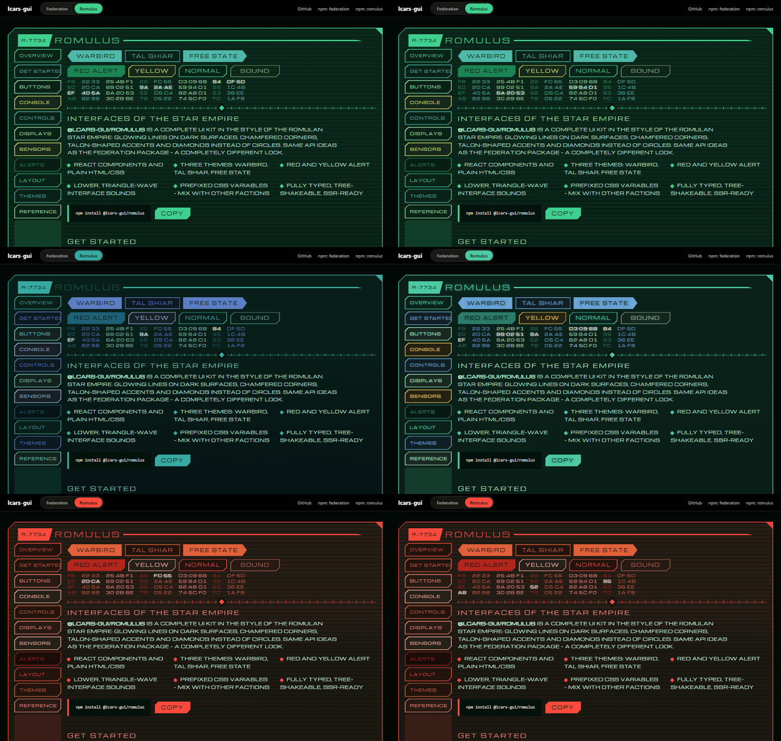
UI components in the style of the Romulan Star Empire: glowing lines on dark surfaces,
|
|
4
|
+
chamfered corners, talon-shaped panel corners, diamonds instead of circles.
|
|
5
5
|
|
|
6
|
-
**[Live
|
|
6
|
+
**[▶ Live demo & docs](https://aarondnas.github.io/lcars-gui/#romulus)**
|
|
7
7
|
|
|
8
8
|
|
|
9
9
|
|
|
@@ -13,16 +13,16 @@ abgeschrägte Ecken, Krallen-Ecken an Panels, Rauten statt Kreisen.
|
|
|
13
13
|
npm install @lcars-gui/romulus
|
|
14
14
|
```
|
|
15
15
|
|
|
16
|
-
##
|
|
16
|
+
## Usage
|
|
17
17
|
|
|
18
|
-
```
|
|
18
|
+
```tsx
|
|
19
19
|
// React
|
|
20
20
|
import "@lcars-gui/romulus/ui.css";
|
|
21
21
|
import { Panel, Button, RomulusRoot, SoundProvider } from "@lcars-gui/romulus/react";
|
|
22
22
|
|
|
23
23
|
<SoundProvider>
|
|
24
24
|
<RomulusRoot theme="warbird">
|
|
25
|
-
<Panel code="R-7734" title="
|
|
25
|
+
<Panel code="R-7734" title="Tactical" sidebar={<Button>Cloak</Button>}>
|
|
26
26
|
…
|
|
27
27
|
</Panel>
|
|
28
28
|
</RomulusRoot>
|
|
@@ -30,7 +30,7 @@ import { Panel, Button, RomulusRoot, SoundProvider } from "@lcars-gui/romulus/re
|
|
|
30
30
|
```
|
|
31
31
|
|
|
32
32
|
```html
|
|
33
|
-
<!--
|
|
33
|
+
<!-- Plain HTML/JS -->
|
|
34
34
|
<link rel="stylesheet" href="https://unpkg.com/@lcars-gui/romulus/dist/ui.css">
|
|
35
35
|
<script src="https://unpkg.com/@lcars-gui/romulus/dist/index.global.js"></script>
|
|
36
36
|
<script>const ui = LcarsRomulus.initRomulus({ sound: true });</script>
|
|
@@ -38,22 +38,22 @@ import { Panel, Button, RomulusRoot, SoundProvider } from "@lcars-gui/romulus/re
|
|
|
38
38
|
|
|
39
39
|
## Themes
|
|
40
40
|
|
|
41
|
-
| Theme |
|
|
42
|
-
|
|
43
|
-
| `warbird` | TNG, D'deridex
|
|
44
|
-
| `tal-shiar` |
|
|
45
|
-
| `free-state` | Picard
|
|
41
|
+
| Theme | Style | Extras (`themes/<name>.css`) |
|
|
42
|
+
|--------------|---------------------------------------|--------------------------------|
|
|
43
|
+
| `warbird` | TNG, D'deridex class (default) | scanlines on panels |
|
|
44
|
+
| `tal-shiar` | cooler, blue-green | flickering titles and ID codes |
|
|
45
|
+
| `free-state` | Picard era, with a gold accent | glow on text and contacts |
|
|
46
46
|
|
|
47
|
-
##
|
|
47
|
+
## Font
|
|
48
48
|
|
|
49
|
-
|
|
50
|
-
|
|
49
|
+
No font is bundled. [Michroma](https://fonts.google.com/specimen/Michroma) (Google Fonts, free) fits well;
|
|
50
|
+
without it Eurostile, Bahnschrift or Arial Narrow are used.
|
|
51
51
|
|
|
52
|
-
## CSS
|
|
52
|
+
## CSS variables
|
|
53
53
|
|
|
54
|
-
|
|
55
|
-
|
|
54
|
+
All variables use the `--rom-` prefix (e.g. `--rom-colors-color1`), so Romulus and other factions
|
|
55
|
+
can live on the same page without conflicts.
|
|
56
56
|
|
|
57
|
-
##
|
|
57
|
+
## License
|
|
58
58
|
|
|
59
|
-
MIT. Star Trek
|
|
59
|
+
MIT. Star Trek is a trademark of CBS Studios / Paramount; this is an unofficial fan project.
|
package/dist/index.d.ts
CHANGED
|
@@ -7,7 +7,7 @@ type RomulusTheme = "warbird" | "tal-shiar" | "free-state";
|
|
|
7
7
|
type AlertLevel = "red" | "yellow";
|
|
8
8
|
type StatusKind = "ok" | "warn" | "error" | "off";
|
|
9
9
|
type Orientation = "horizontal" | "vertical";
|
|
10
|
-
/** data-color
|
|
10
|
+
/** Sets data-color only when a color is given (otherwise the CSS default applies). */
|
|
11
11
|
declare function colorAttribute(color?: RomulusColor): {
|
|
12
12
|
"data-color": string;
|
|
13
13
|
} | {
|
|
@@ -19,8 +19,8 @@ type ButtonShape = "chamfer" | "rect" | "point-left" | "point-right";
|
|
|
19
19
|
type ButtonVariant = "outline" | "solid";
|
|
20
20
|
type ButtonAlign = "center" | "start";
|
|
21
21
|
/**
|
|
22
|
-
*
|
|
23
|
-
*
|
|
22
|
+
* Platform-neutral button props (without events/children,
|
|
23
|
+
* those come from the respective renderer).
|
|
24
24
|
*/
|
|
25
25
|
interface ButtonProps {
|
|
26
26
|
color?: RomulusColor;
|
|
@@ -31,10 +31,10 @@ interface ButtonProps {
|
|
|
31
31
|
align?: ButtonAlign;
|
|
32
32
|
disabled?: boolean;
|
|
33
33
|
}
|
|
34
|
-
/** CSS
|
|
34
|
+
/** CSS class from ui.css */
|
|
35
35
|
declare const buttonClassName = "rom-btn";
|
|
36
36
|
/**
|
|
37
|
-
*
|
|
37
|
+
* Returns the data attributes the CSS reacts to.
|
|
38
38
|
*/
|
|
39
39
|
declare function buttonDataAttributes({ color, size, length, shape, variant, align }: ButtonProps): {
|
|
40
40
|
"data-align"?: "start" | undefined;
|
|
@@ -63,7 +63,7 @@ interface BlockProps {
|
|
|
63
63
|
color?: RomulusColor;
|
|
64
64
|
fill?: boolean;
|
|
65
65
|
}
|
|
66
|
-
/** CSS
|
|
66
|
+
/** CSS classes from ui.css */
|
|
67
67
|
declare const panelClassNames: {
|
|
68
68
|
readonly panel: "rom-panel";
|
|
69
69
|
readonly header: "rom-panel-header";
|
|
@@ -95,7 +95,7 @@ declare function blockDataAttributes({ color, fill }: BlockProps): {
|
|
|
95
95
|
"data-color"?: undefined;
|
|
96
96
|
};
|
|
97
97
|
|
|
98
|
-
/** CSS
|
|
98
|
+
/** CSS classes from ui.css */
|
|
99
99
|
declare const displayClassNames: {
|
|
100
100
|
readonly cascade: "rom-cascade";
|
|
101
101
|
readonly cascadeCol: "rom-cascade-col";
|
|
@@ -126,25 +126,25 @@ declare const controlClassNames: {
|
|
|
126
126
|
readonly keypadDisplay: "rom-keypad-display";
|
|
127
127
|
};
|
|
128
128
|
/**
|
|
129
|
-
*
|
|
130
|
-
* (
|
|
129
|
+
* Columns of hex groups like "3F·A9", random but reproducible
|
|
130
|
+
* (same seed → same values, important for server rendering).
|
|
131
131
|
*/
|
|
132
132
|
declare function cascadeGlyphs(columns: number, rows: number, seed?: number): string[][];
|
|
133
|
-
/**
|
|
133
|
+
/** Which segments of a level bar are lit. */
|
|
134
134
|
declare function levelSegments(value: number, segments?: number, max?: number): boolean[];
|
|
135
|
-
/**
|
|
135
|
+
/** Converts a value to 0–100 % (for the gauge). */
|
|
136
136
|
declare function toPercent(value: number, max?: number): number;
|
|
137
137
|
|
|
138
|
-
/**
|
|
138
|
+
/** Romulan interface sounds: lower pitch, triangle wave, descending patterns. */
|
|
139
139
|
declare const romulanSound: LcarsSoundOptions;
|
|
140
140
|
|
|
141
141
|
type InitRomulusOptions = InitBehaviorsOptions;
|
|
142
142
|
/**
|
|
143
|
-
*
|
|
144
|
-
*
|
|
143
|
+
* Makes static Romulan markup interactive.
|
|
144
|
+
* The returned controller plays sounds and removes the listeners again.
|
|
145
145
|
*/
|
|
146
146
|
declare function initRomulus(options?: InitRomulusOptions): LcarsController;
|
|
147
|
-
/**
|
|
147
|
+
/** Fills empty data cascades (data-columns / data-rows / data-seed) with hex groups. */
|
|
148
148
|
declare function fillCascades(root?: Document | HTMLElement): void;
|
|
149
149
|
|
|
150
150
|
export { barDataAttributes, blockDataAttributes, buttonClassName, buttonDataAttributes, cascadeGlyphs, colorAttribute, controlClassNames, displayClassNames, fillCascades, initRomulus, levelSegments, panelClassNames, romulanSound, toPercent };
|
package/dist/react/index.d.ts
CHANGED
|
@@ -17,8 +17,8 @@ type ButtonShape = "chamfer" | "rect" | "point-left" | "point-right";
|
|
|
17
17
|
type ButtonVariant = "outline" | "solid";
|
|
18
18
|
type ButtonAlign = "center" | "start";
|
|
19
19
|
/**
|
|
20
|
-
*
|
|
21
|
-
*
|
|
20
|
+
* Platform-neutral button props (without events/children,
|
|
21
|
+
* those come from the respective renderer).
|
|
22
22
|
*/
|
|
23
23
|
interface ButtonProps$1 {
|
|
24
24
|
color?: RomulusColor;
|
|
@@ -43,40 +43,40 @@ interface BlockProps$1 {
|
|
|
43
43
|
}
|
|
44
44
|
|
|
45
45
|
type ButtonProps = ButtonProps$1 & Omit<ButtonHTMLAttributes<HTMLButtonElement>, "color"> & {
|
|
46
|
-
/**
|
|
46
|
+
/** Sound on click (only inside a SoundProvider); false = silent */
|
|
47
47
|
sound?: LcarsSoundKind | false;
|
|
48
48
|
};
|
|
49
49
|
declare const Button: react.ForwardRefExoticComponent<ButtonProps$1 & Omit<ButtonHTMLAttributes<HTMLButtonElement>, "color"> & {
|
|
50
|
-
/**
|
|
50
|
+
/** Sound on click (only inside a SoundProvider); false = silent */
|
|
51
51
|
sound?: LcarsSoundKind | false;
|
|
52
52
|
} & react.RefAttributes<HTMLButtonElement>>;
|
|
53
53
|
|
|
54
54
|
type DivProps$1 = Omit<HTMLAttributes<HTMLDivElement>, "color">;
|
|
55
55
|
type BarProps = BarProps$1 & DivProps$1;
|
|
56
|
-
/**
|
|
56
|
+
/** Glowing line, optionally with pointed ends or dashed. */
|
|
57
57
|
declare function Bar({ color, cap, length, segmented, className, ...rest }: BarProps): react.JSX.Element;
|
|
58
58
|
type BlockProps = BlockProps$1 & DivProps$1;
|
|
59
|
-
/**
|
|
59
|
+
/** Filled segment with chamfered corners; the label sits bottom left. */
|
|
60
60
|
declare function Block({ color, fill, className, ...rest }: BlockProps): react.JSX.Element;
|
|
61
61
|
type TitleProps = {
|
|
62
62
|
color?: RomulusColor;
|
|
63
63
|
} & Omit<HTMLAttributes<HTMLHeadingElement>, "color">;
|
|
64
|
-
/**
|
|
64
|
+
/** Letter-spaced title in the header. */
|
|
65
65
|
declare function Title({ color, className, ...rest }: TitleProps): react.JSX.Element;
|
|
66
|
-
/**
|
|
66
|
+
/** Vertical stack of buttons/blocks with even gaps. */
|
|
67
67
|
declare function Stack({ className, ...rest }: HTMLAttributes<HTMLDivElement>): react.JSX.Element;
|
|
68
68
|
interface PanelProps extends Omit<DivProps$1, "title"> {
|
|
69
69
|
color?: RomulusColor;
|
|
70
70
|
title?: ReactNode;
|
|
71
|
-
/**
|
|
71
|
+
/** ID code in the filled trapezoid at the start of the header, e.g. "R-7734" */
|
|
72
72
|
code?: ReactNode;
|
|
73
|
-
/**
|
|
73
|
+
/** Sidebar content (buttons/blocks); filled up to the bottom */
|
|
74
74
|
sidebar?: ReactNode;
|
|
75
|
-
/**
|
|
75
|
+
/** Replaces the default line in the header or footer; footer={null} hides the footer */
|
|
76
76
|
header?: ReactNode;
|
|
77
77
|
footer?: ReactNode;
|
|
78
78
|
}
|
|
79
|
-
/**
|
|
79
|
+
/** Romulan console: chamfered corners, talon corners, header with ID code, optional sidebar. */
|
|
80
80
|
declare function Panel({ color, title, code, sidebar, header, footer, className, children, ...rest }: PanelProps): react.JSX.Element;
|
|
81
81
|
|
|
82
82
|
interface ToggleProps extends ButtonProps {
|
|
@@ -84,12 +84,12 @@ interface ToggleProps extends ButtonProps {
|
|
|
84
84
|
defaultPressed?: boolean;
|
|
85
85
|
onPressedChange?: (pressed: boolean) => void;
|
|
86
86
|
}
|
|
87
|
-
/** Button
|
|
87
|
+
/** Button with an on/off state (aria-pressed). */
|
|
88
88
|
declare function Toggle({ pressed, defaultPressed, onPressedChange, onClick, ...rest }: ToggleProps): react.JSX.Element;
|
|
89
89
|
type SliderProps = {
|
|
90
90
|
color?: RomulusColor;
|
|
91
91
|
} & Omit<InputHTMLAttributes<HTMLInputElement>, "type" | "color">;
|
|
92
|
-
/**
|
|
92
|
+
/** Slider (native input type="range") with a diamond thumb. */
|
|
93
93
|
declare const Slider: react.ForwardRefExoticComponent<{
|
|
94
94
|
color?: RomulusColor;
|
|
95
95
|
} & Omit<InputHTMLAttributes<HTMLInputElement>, "color" | "type"> & react.RefAttributes<HTMLInputElement>>;
|
|
@@ -97,7 +97,7 @@ type InputProps = {
|
|
|
97
97
|
color?: RomulusColor;
|
|
98
98
|
label?: ReactNode;
|
|
99
99
|
} & Omit<InputHTMLAttributes<HTMLInputElement>, "color">;
|
|
100
|
-
/**
|
|
100
|
+
/** Text field with a filled trapezoid label. */
|
|
101
101
|
declare const Input: react.ForwardRefExoticComponent<{
|
|
102
102
|
color?: RomulusColor;
|
|
103
103
|
label?: ReactNode;
|
|
@@ -115,18 +115,18 @@ interface TabsProps extends Omit<HTMLAttributes<HTMLDivElement>, "color"> {
|
|
|
115
115
|
onValueChange?: (id: string) => void;
|
|
116
116
|
color?: RomulusColor;
|
|
117
117
|
}
|
|
118
|
-
/**
|
|
118
|
+
/** Tabs as parallelograms above a glowing line. */
|
|
119
119
|
declare function Tabs({ items, value, defaultValue, onValueChange, color, className, ...rest }: TabsProps): react.JSX.Element;
|
|
120
120
|
interface KeypadProps extends Omit<HTMLAttributes<HTMLDivElement>, "color" | "onSubmit"> {
|
|
121
121
|
color?: RomulusColor;
|
|
122
|
-
/**
|
|
122
|
+
/** Maximum code length */
|
|
123
123
|
length?: number;
|
|
124
|
-
/**
|
|
124
|
+
/** Show the code as dots */
|
|
125
125
|
mask?: boolean;
|
|
126
|
-
/**
|
|
126
|
+
/** Called with the code; true = accepted, false = denied */
|
|
127
127
|
onSubmit?: (code: string) => boolean | void;
|
|
128
128
|
}
|
|
129
|
-
/**
|
|
129
|
+
/** Number pad with display, e.g. for access codes. */
|
|
130
130
|
declare function Keypad({ color, length, mask, onSubmit, className, ...rest }: KeypadProps): react.JSX.Element;
|
|
131
131
|
|
|
132
132
|
type DivProps = Omit<HTMLAttributes<HTMLDivElement>, "color">;
|
|
@@ -135,7 +135,7 @@ interface DataCascadeProps extends DivProps {
|
|
|
135
135
|
rows?: number;
|
|
136
136
|
seed?: number;
|
|
137
137
|
}
|
|
138
|
-
/**
|
|
138
|
+
/** Columns of hex groups that flicker one by one. */
|
|
139
139
|
declare function DataCascade({ columns, rows, seed, className, ...rest }: DataCascadeProps): react.JSX.Element;
|
|
140
140
|
interface ReadoutItem {
|
|
141
141
|
label: ReactNode;
|
|
@@ -146,21 +146,21 @@ interface ReadoutProps extends Omit<HTMLAttributes<HTMLDListElement>, "color"> {
|
|
|
146
146
|
items: ReadoutItem[];
|
|
147
147
|
color?: RomulusColor;
|
|
148
148
|
}
|
|
149
|
-
/**
|
|
149
|
+
/** Value table: label, dotted leader line, value. */
|
|
150
150
|
declare function Readout({ items, color, className, ...rest }: ReadoutProps): react.JSX.Element;
|
|
151
151
|
type NumberCodeProps = {
|
|
152
152
|
color?: RomulusColor;
|
|
153
153
|
} & Omit<HTMLAttributes<HTMLSpanElement>, "color">;
|
|
154
|
-
/**
|
|
154
|
+
/** ID code like "R-7734". */
|
|
155
155
|
declare function NumberCode({ color, className, ...rest }: NumberCodeProps): react.JSX.Element;
|
|
156
|
-
/**
|
|
156
|
+
/** Line with tick marks and a diamond in the middle. */
|
|
157
157
|
declare function Divider({ color, className, ...rest }: {
|
|
158
158
|
color?: RomulusColor;
|
|
159
159
|
} & DivProps): react.JSX.Element;
|
|
160
160
|
interface ButtonGridProps extends HTMLAttributes<HTMLDivElement> {
|
|
161
161
|
columns?: number;
|
|
162
162
|
}
|
|
163
|
-
/**
|
|
163
|
+
/** Grid of buttons. */
|
|
164
164
|
declare function ButtonGrid({ columns, className, style, ...rest }: ButtonGridProps): react.JSX.Element;
|
|
165
165
|
interface LevelBarProps extends DivProps {
|
|
166
166
|
value: number;
|
|
@@ -169,7 +169,7 @@ interface LevelBarProps extends DivProps {
|
|
|
169
169
|
orientation?: Orientation;
|
|
170
170
|
color?: RomulusColor;
|
|
171
171
|
}
|
|
172
|
-
/**
|
|
172
|
+
/** Level bar of slanted segments (vertical: chevrons). */
|
|
173
173
|
declare function LevelBar({ value, max, segments, orientation, color, className, ...rest }: LevelBarProps): react.JSX.Element;
|
|
174
174
|
interface GaugeProps extends DivProps {
|
|
175
175
|
value: number;
|
|
@@ -178,7 +178,7 @@ interface GaugeProps extends DivProps {
|
|
|
178
178
|
label?: ReactNode;
|
|
179
179
|
color?: RomulusColor;
|
|
180
180
|
}
|
|
181
|
-
/**
|
|
181
|
+
/** Ring gauge made of segments, value in the center. */
|
|
182
182
|
declare function Gauge({ value, max, segments, label, color, className, style, ...rest }: GaugeProps): react.JSX.Element;
|
|
183
183
|
interface Blip {
|
|
184
184
|
x: number;
|
|
@@ -187,34 +187,34 @@ interface Blip {
|
|
|
187
187
|
}
|
|
188
188
|
interface SensorProps extends DivProps {
|
|
189
189
|
blips?: Blip[];
|
|
190
|
-
/** Radar
|
|
190
|
+
/** Radar sweep around the center */
|
|
191
191
|
scan?: boolean;
|
|
192
192
|
color?: RomulusColor;
|
|
193
193
|
}
|
|
194
|
-
/**
|
|
194
|
+
/** Sensor display with a triangular grid, crosshair and diamond contacts. */
|
|
195
195
|
declare function Sensor({ blips, scan, color, className, children, ...rest }: SensorProps): react.JSX.Element;
|
|
196
196
|
interface StatusIndicatorProps extends HTMLAttributes<HTMLSpanElement> {
|
|
197
197
|
status?: StatusKind;
|
|
198
198
|
blink?: boolean;
|
|
199
199
|
}
|
|
200
|
-
/**
|
|
200
|
+
/** Diamond indicator light with label. */
|
|
201
201
|
declare function StatusIndicator({ status, blink, className, ...rest }: StatusIndicatorProps): react.JSX.Element;
|
|
202
202
|
interface AlertBannerProps extends Omit<DivProps, "title"> {
|
|
203
203
|
level?: AlertLevel;
|
|
204
204
|
title?: ReactNode;
|
|
205
205
|
}
|
|
206
|
-
/**
|
|
206
|
+
/** Hexagonal, blinking alert banner. */
|
|
207
207
|
declare function AlertBanner({ level, title, children, className, ...rest }: AlertBannerProps): react.JSX.Element;
|
|
208
208
|
|
|
209
209
|
interface RomulusRootProps extends HTMLAttributes<HTMLDivElement> {
|
|
210
210
|
theme?: RomulusTheme;
|
|
211
|
-
/**
|
|
211
|
+
/** Turns everything below red/yellow and makes the lines pulse */
|
|
212
212
|
alert?: AlertLevel | null;
|
|
213
213
|
}
|
|
214
|
-
/**
|
|
214
|
+
/** Sets the color theme and alert state for all components below. */
|
|
215
215
|
declare function RomulusRoot({ theme, alert, ...rest }: RomulusRootProps): react.JSX.Element;
|
|
216
216
|
|
|
217
|
-
/**
|
|
217
|
+
/** Enables interface sounds (Romulan patterns) for all components below. */
|
|
218
218
|
declare function SoundProvider(props: SoundProviderProps): react.JSX.Element;
|
|
219
219
|
|
|
220
220
|
export { AlertBanner, Bar, Block, Button, ButtonGrid, DataCascade, Divider, Gauge, Input, Keypad, LevelBar, NumberCode, Panel, Readout, RomulusRoot, Sensor, Slider, SoundProvider, Stack, StatusIndicator, Tabs, Title, Toggle };
|
|
@@ -1,6 +1,6 @@
|
|
|
1
|
-
/* Theme
|
|
2
|
-
|
|
3
|
-
|
|
1
|
+
/* Theme extras: Romulan Free State (Picard era)
|
|
2
|
+
Published as @lcars-gui/romulus/themes/free-state.css.
|
|
3
|
+
Soft glow on text and contacts. */
|
|
4
4
|
|
|
5
5
|
[data-theme="free-state"] :is(.rom-btn, .rom-title, .rom-tab, .rom-number) {
|
|
6
6
|
text-shadow: 0 0 0.6em color-mix(in srgb, currentColor 70%, transparent);
|
|
@@ -1,6 +1,6 @@
|
|
|
1
|
-
/* Theme
|
|
2
|
-
|
|
3
|
-
|
|
1
|
+
/* Theme extras: Tal Shiar – intelligence service
|
|
2
|
+
Published as @lcars-gui/romulus/themes/tal-shiar.css.
|
|
3
|
+
Titles and ID codes flicker irregularly, as if the signal were jammed. */
|
|
4
4
|
|
|
5
5
|
[data-theme="tal-shiar"] :is(.rom-title, .rom-panel-code) {
|
|
6
6
|
animation: rom-flicker 7s infinite;
|
package/dist/themes/warbird.css
CHANGED
|
@@ -1,6 +1,6 @@
|
|
|
1
|
-
/* Theme
|
|
2
|
-
|
|
3
|
-
|
|
1
|
+
/* Theme extras: Warbird – D'deridex class (TNG)
|
|
2
|
+
Published as @lcars-gui/romulus/themes/warbird.css.
|
|
3
|
+
Fine scanlines on the panels, like the green bridge screens. */
|
|
4
4
|
|
|
5
5
|
[data-theme="warbird"] .rom-panel {
|
|
6
6
|
background-image:
|
package/dist/ui.css
CHANGED
|
@@ -135,9 +135,9 @@
|
|
|
135
135
|
|
|
136
136
|
/* ==================== 00-base.css ==================== */
|
|
137
137
|
|
|
138
|
-
/*
|
|
139
|
-
|
|
140
|
-
|
|
138
|
+
/* Romulan design: glowing lines on a dark background, chamfered corners,
|
|
139
|
+
diamonds instead of circles. No bundled font – "Michroma" (Google Fonts)
|
|
140
|
+
fits well, otherwise Eurostile/Bahnschrift/Arial Narrow are used. */
|
|
141
141
|
|
|
142
142
|
[class*="rom-"] {
|
|
143
143
|
box-sizing: border-box;
|
|
@@ -152,8 +152,8 @@
|
|
|
152
152
|
line-height: 1;
|
|
153
153
|
}
|
|
154
154
|
|
|
155
|
-
/*
|
|
156
|
-
|
|
155
|
+
/* Chamfer top left + bottom right: --rom-c = size of the chamfer.
|
|
156
|
+
Two gradients trace the slanted edges (an inset shadow draws the straight ones). */
|
|
157
157
|
.rom-btn, .rom-block, .rom-panel, .rom-panel::before, .rom-sensor, .rom-sensor::before,
|
|
158
158
|
.rom-keypad-display {
|
|
159
159
|
clip-path: polygon(
|
|
@@ -191,7 +191,7 @@
|
|
|
191
191
|
|
|
192
192
|
/* #################### BUTTON #################### */
|
|
193
193
|
|
|
194
|
-
/* Base style:
|
|
194
|
+
/* Base style: dark fill with a glowing outline (variant "outline") */
|
|
195
195
|
.rom-btn {
|
|
196
196
|
--rom-c: var(--rom-chamfer-m);
|
|
197
197
|
--rom-line: var(--rom-bg, var(--rom-colors-color1));
|
|
@@ -233,7 +233,7 @@
|
|
|
233
233
|
opacity: 0.35;
|
|
234
234
|
}
|
|
235
235
|
|
|
236
|
-
/* Variant:
|
|
236
|
+
/* Variant: filled, with dark text */
|
|
237
237
|
.rom-btn[data-variant="solid"] {
|
|
238
238
|
background: var(--rom-line);
|
|
239
239
|
box-shadow: none;
|
|
@@ -257,7 +257,7 @@
|
|
|
257
257
|
/* Shape Variants (default: chamfer) */
|
|
258
258
|
.rom-btn[data-shape="rect"] { --rom-c: 0px; }
|
|
259
259
|
|
|
260
|
-
/*
|
|
260
|
+
/* Arrow points: always filled, the slanted edges would otherwise have no outline */
|
|
261
261
|
.rom-btn[data-shape="point-left"],
|
|
262
262
|
.rom-btn[data-shape="point-right"] {
|
|
263
263
|
background: var(--rom-line);
|
|
@@ -273,7 +273,7 @@
|
|
|
273
273
|
padding-right: 1.8em;
|
|
274
274
|
}
|
|
275
275
|
|
|
276
|
-
/* Label
|
|
276
|
+
/* Label on the left */
|
|
277
277
|
.rom-btn[data-align="start"] { justify-content: flex-start; }
|
|
278
278
|
|
|
279
279
|
/* Toggle: aria-pressed */
|
|
@@ -288,8 +288,8 @@
|
|
|
288
288
|
|
|
289
289
|
/* #################### PANEL #################### */
|
|
290
290
|
|
|
291
|
-
/*
|
|
292
|
-
|
|
291
|
+
/* Console with chamfered corners (top left / bottom right)
|
|
292
|
+
and talon corners (top right / bottom left).
|
|
293
293
|
Order: header, sidebar (optional), content, footer (optional) */
|
|
294
294
|
.rom-panel {
|
|
295
295
|
--rom-c: var(--rom-chamfer-l);
|
|
@@ -306,7 +306,7 @@
|
|
|
306
306
|
var(--rom-colors-surface) 40%);
|
|
307
307
|
}
|
|
308
308
|
|
|
309
|
-
/*
|
|
309
|
+
/* Outline including the slanted edges */
|
|
310
310
|
.rom-panel::before {
|
|
311
311
|
content: "";
|
|
312
312
|
position: absolute;
|
|
@@ -318,7 +318,7 @@
|
|
|
318
318
|
box-shadow: inset 0 0 0 var(--rom-line-std) var(--rom-line);
|
|
319
319
|
}
|
|
320
320
|
|
|
321
|
-
/*
|
|
321
|
+
/* Talon corners */
|
|
322
322
|
.rom-panel::after {
|
|
323
323
|
content: "";
|
|
324
324
|
position: absolute;
|
|
@@ -333,7 +333,7 @@
|
|
|
333
333
|
|
|
334
334
|
.rom-panel > * { position: relative; z-index: 1; }
|
|
335
335
|
|
|
336
|
-
/*
|
|
336
|
+
/* Without a sidebar: content spans the full width */
|
|
337
337
|
.rom-panel:not(:has(> .rom-panel-sidebar)) {
|
|
338
338
|
grid-template-columns: minmax(0, 1fr);
|
|
339
339
|
}
|
|
@@ -350,7 +350,7 @@
|
|
|
350
350
|
.rom-panel-header > .rom-bar { margin-right: var(--rom-panel-talon-size); }
|
|
351
351
|
.rom-panel-footer > .rom-bar:first-child { margin-left: var(--rom-panel-talon-size); }
|
|
352
352
|
|
|
353
|
-
/*
|
|
353
|
+
/* ID code as a filled trapezoid at the start of the header */
|
|
354
354
|
.rom-panel-code {
|
|
355
355
|
flex: none;
|
|
356
356
|
display: flex;
|
|
@@ -384,12 +384,12 @@
|
|
|
384
384
|
.rom-bar[data-length="l"] { flex: none; width: var(--rom-width-l); }
|
|
385
385
|
.rom-bar[data-length="xl"] { flex: none; width: var(--rom-width-xl); }
|
|
386
386
|
|
|
387
|
-
/*
|
|
387
|
+
/* Pointed ends */
|
|
388
388
|
.rom-bar[data-cap="left"] { clip-path: polygon(1.2rem 0, 100% 0, 100% 100%, 0 100%); }
|
|
389
389
|
.rom-bar[data-cap="right"] { clip-path: polygon(0 0, calc(100% - 1.2rem) 0, 100% 100%, 0 100%); }
|
|
390
390
|
.rom-bar[data-cap="both"] { clip-path: polygon(1.2rem 0, calc(100% - 1.2rem) 0, 100% 100%, 0 100%); }
|
|
391
391
|
|
|
392
|
-
/*
|
|
392
|
+
/* Dashed */
|
|
393
393
|
.rom-bar[data-segmented] {
|
|
394
394
|
background: repeating-linear-gradient(90deg, var(--rom-line) 0 1.4rem, transparent 0 1.8rem);
|
|
395
395
|
}
|
|
@@ -417,7 +417,7 @@
|
|
|
417
417
|
|
|
418
418
|
/* #################### DIVIDER #################### */
|
|
419
419
|
|
|
420
|
-
/*
|
|
420
|
+
/* Line with tick marks and a diamond in the middle */
|
|
421
421
|
.rom-divider {
|
|
422
422
|
--rom-line: var(--rom-bg, var(--rom-colors-color2));
|
|
423
423
|
position: relative;
|
|
@@ -455,7 +455,7 @@
|
|
|
455
455
|
font-size: var(--rom-panel-label-size);
|
|
456
456
|
}
|
|
457
457
|
|
|
458
|
-
/*
|
|
458
|
+
/* Filler segment: muted so it doesn't compete with the buttons */
|
|
459
459
|
.rom-block[data-fill] {
|
|
460
460
|
flex: 1 1 auto;
|
|
461
461
|
background: color-mix(in srgb, var(--rom-bg, var(--rom-colors-color2)) 22%, var(--rom-colors-surface));
|
|
@@ -508,7 +508,7 @@
|
|
|
508
508
|
gap: 0.2rem;
|
|
509
509
|
}
|
|
510
510
|
|
|
511
|
-
/* Tabs
|
|
511
|
+
/* Tabs as parallelograms */
|
|
512
512
|
.rom-tab {
|
|
513
513
|
--rom-line: var(--rom-bg, var(--rom-colors-color1));
|
|
514
514
|
min-width: 7rem;
|
|
@@ -585,7 +585,7 @@
|
|
|
585
585
|
|
|
586
586
|
/* #################### SLIDER (native range) #################### */
|
|
587
587
|
|
|
588
|
-
/*
|
|
588
|
+
/* Thin scale, diamond thumb */
|
|
589
589
|
.rom-range {
|
|
590
590
|
--rom-line: var(--rom-bg, var(--rom-colors-color1));
|
|
591
591
|
-webkit-appearance: none;
|
|
@@ -675,7 +675,7 @@
|
|
|
675
675
|
|
|
676
676
|
/* #################### DATA CASCADE #################### */
|
|
677
677
|
|
|
678
|
-
/* Hex
|
|
678
|
+
/* Hex groups that flicker one by one */
|
|
679
679
|
.rom-cascade {
|
|
680
680
|
display: flex;
|
|
681
681
|
max-width: 100%;
|
|
@@ -708,7 +708,7 @@
|
|
|
708
708
|
|
|
709
709
|
/* #################### READOUT #################### */
|
|
710
710
|
|
|
711
|
-
/* Label,
|
|
711
|
+
/* Label, dotted leader line, value */
|
|
712
712
|
.rom-readout {
|
|
713
713
|
display: grid;
|
|
714
714
|
grid-template-columns: minmax(0, 1fr) auto;
|
|
@@ -742,7 +742,7 @@
|
|
|
742
742
|
|
|
743
743
|
/* #################### LEVEL BAR #################### */
|
|
744
744
|
|
|
745
|
-
/*
|
|
745
|
+
/* Slanted segments */
|
|
746
746
|
.rom-level {
|
|
747
747
|
--rom-line: var(--rom-bg, var(--rom-colors-color1));
|
|
748
748
|
display: flex;
|
|
@@ -762,7 +762,7 @@
|
|
|
762
762
|
box-shadow: 0 0 0.4rem color-mix(in srgb, var(--rom-line) 60%, transparent);
|
|
763
763
|
}
|
|
764
764
|
|
|
765
|
-
/*
|
|
765
|
+
/* Vertical: stacked chevrons */
|
|
766
766
|
.rom-level[data-orientation="vertical"] {
|
|
767
767
|
flex-direction: column-reverse;
|
|
768
768
|
width: 1.8rem;
|
|
@@ -776,7 +776,7 @@
|
|
|
776
776
|
|
|
777
777
|
/* #################### GAUGE (set --value 0–100) #################### */
|
|
778
778
|
|
|
779
|
-
/*
|
|
779
|
+
/* Full ring of segments, value in the center */
|
|
780
780
|
.rom-gauge {
|
|
781
781
|
--value: 0;
|
|
782
782
|
--segments: 24;
|
|
@@ -810,7 +810,7 @@
|
|
|
810
810
|
mask-composite: intersect;
|
|
811
811
|
}
|
|
812
812
|
|
|
813
|
-
/*
|
|
813
|
+
/* Inner ring */
|
|
814
814
|
.rom-gauge::after {
|
|
815
815
|
content: "";
|
|
816
816
|
position: absolute;
|
|
@@ -828,7 +828,7 @@
|
|
|
828
828
|
|
|
829
829
|
/* #################### SENSOR / BLIP / SCAN #################### */
|
|
830
830
|
|
|
831
|
-
/*
|
|
831
|
+
/* Triangular grid with crosshair */
|
|
832
832
|
.rom-sensor {
|
|
833
833
|
--rom-c: var(--rom-chamfer-l);
|
|
834
834
|
--rom-line: var(--rom-bg, var(--rom-colors-color6));
|
|
@@ -857,7 +857,7 @@
|
|
|
857
857
|
box-shadow: inset 0 0 0 var(--rom-line-std) var(--rom-line);
|
|
858
858
|
}
|
|
859
859
|
|
|
860
|
-
/* --x / --y: position in percent (0–100) –
|
|
860
|
+
/* --x / --y: position in percent (0–100) – contacts as diamonds */
|
|
861
861
|
.rom-blip {
|
|
862
862
|
position: absolute;
|
|
863
863
|
left: calc(var(--x, 50) * 1%);
|
|
@@ -873,7 +873,7 @@
|
|
|
873
873
|
|
|
874
874
|
.rom-blip:not([data-color]) { --rom-bg: var(--rom-colors-color5); }
|
|
875
875
|
|
|
876
|
-
/* Radar
|
|
876
|
+
/* Radar sweep around the center */
|
|
877
877
|
.rom-scan::after {
|
|
878
878
|
content: "";
|
|
879
879
|
position: absolute;
|
|
@@ -902,7 +902,7 @@
|
|
|
902
902
|
color: var(--rom-colors-color5);
|
|
903
903
|
}
|
|
904
904
|
|
|
905
|
-
/*
|
|
905
|
+
/* Diamond lamp */
|
|
906
906
|
.rom-status::before {
|
|
907
907
|
content: "";
|
|
908
908
|
width: 0.65em;
|
|
@@ -924,7 +924,7 @@
|
|
|
924
924
|
|
|
925
925
|
/* #################### ALERT #################### */
|
|
926
926
|
|
|
927
|
-
/*
|
|
927
|
+
/* Hexagonal banner with chevrons on both sides */
|
|
928
928
|
.rom-alert {
|
|
929
929
|
--rom-bg: var(--rom-alert-red);
|
|
930
930
|
display: inline-flex;
|
package/package.json
CHANGED
|
@@ -1,7 +1,7 @@
|
|
|
1
1
|
{
|
|
2
2
|
"name": "@lcars-gui/romulus",
|
|
3
|
-
"version": "0.1.
|
|
4
|
-
"description": "UI
|
|
3
|
+
"version": "0.1.1",
|
|
4
|
+
"description": "UI components in the style of the Romulan Star Empire for React and plain HTML/CSS/JS",
|
|
5
5
|
"keywords": [
|
|
6
6
|
"lcars",
|
|
7
7
|
"star-trek",
|
|
@@ -53,7 +53,7 @@
|
|
|
53
53
|
"dev": "tsup --watch"
|
|
54
54
|
},
|
|
55
55
|
"dependencies": {
|
|
56
|
-
"@lcars-gui/core": "^0.1.
|
|
56
|
+
"@lcars-gui/core": "^0.1.1"
|
|
57
57
|
},
|
|
58
58
|
"peerDependencies": {
|
|
59
59
|
"react": ">=18",
|