@lcars-gui/federation 0.1.0 → 0.1.1
This diff represents the content of publicly available package versions that have been released to one of the supported registries. The information contained in this diff is provided for informational purposes only and reflects changes between package versions as they appear in their respective public registries.
- package/README.md +19 -18
- package/dist/index.d.ts +18 -18
- package/dist/react/index.d.ts +38 -38
- package/dist/themes/ds9.css +5 -5
- package/dist/themes/picard.css +5 -5
- package/dist/themes/tng.css +5 -5
- package/dist/ui.css +1 -1
- package/package.json +3 -3
package/README.md
CHANGED
|
@@ -1,10 +1,10 @@
|
|
|
1
1
|
# @lcars-gui/federation
|
|
2
2
|
|
|
3
|
-
LCARS
|
|
3
|
+
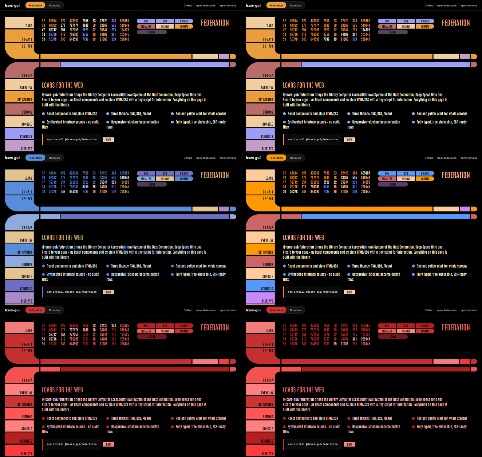
LCARS UI components in the style of the Federation – for React and plain HTML/CSS/JS.
|
|
4
4
|
|
|
5
|
-
**[Live
|
|
5
|
+
**[▶ Live demo & docs](https://aarondnas.github.io/lcars-gui/#federation)**
|
|
6
6
|
|
|
7
|
-
|
|
8
8
|
|
|
9
9
|
## Installation
|
|
10
10
|
|
|
@@ -12,7 +12,7 @@ LCARS-UI-Komponenten im Stil der Föderation – für React und reines HTML/CSS/
|
|
|
12
12
|
npm install @lcars-gui/federation
|
|
13
13
|
```
|
|
14
14
|
|
|
15
|
-
##
|
|
15
|
+
## Usage
|
|
16
16
|
|
|
17
17
|
```tsx
|
|
18
18
|
// React
|
|
@@ -21,7 +21,7 @@ import { Frame, Button, LcarsRoot, SoundProvider } from "@lcars-gui/federation/r
|
|
|
21
21
|
|
|
22
22
|
<SoundProvider>
|
|
23
23
|
<LcarsRoot theme="tng">
|
|
24
|
-
<Frame title="
|
|
24
|
+
<Frame title="Bridge" topLabel="47-1138" sidebar={<Button shape="rect" align="bottom-right">Tactical</Button>}>
|
|
25
25
|
…
|
|
26
26
|
</Frame>
|
|
27
27
|
</LcarsRoot>
|
|
@@ -29,7 +29,7 @@ import { Frame, Button, LcarsRoot, SoundProvider } from "@lcars-gui/federation/r
|
|
|
29
29
|
```
|
|
30
30
|
|
|
31
31
|
```html
|
|
32
|
-
<!--
|
|
32
|
+
<!-- Plain HTML/JS, no bundler -->
|
|
33
33
|
<link rel="stylesheet" href="https://unpkg.com/@lcars-gui/federation/dist/ui.css">
|
|
34
34
|
<button class="lcar-btn-std" data-color="2" data-shape="rect">Warp</button>
|
|
35
35
|
|
|
@@ -37,22 +37,23 @@ import { Frame, Button, LcarsRoot, SoundProvider } from "@lcars-gui/federation/r
|
|
|
37
37
|
<script>const ui = LcarsFederation.initLcars({ sound: true });</script>
|
|
38
38
|
```
|
|
39
39
|
|
|
40
|
-
`initLcars()`
|
|
40
|
+
`initLcars()` makes toggles, tabs, keypads, data cascades and interface sounds in static markup interactive.
|
|
41
41
|
|
|
42
|
-
## Themes &
|
|
42
|
+
## Themes & alert
|
|
43
43
|
|
|
44
|
-
`data-theme` (
|
|
44
|
+
`data-theme` (or `<LcarsRoot theme>`) switches the color palette; `data-alert="red" | "yellow"` recolors everything
|
|
45
|
+
below and makes the bars pulse.
|
|
45
46
|
|
|
46
|
-
| Theme |
|
|
47
|
-
|
|
48
|
-
| `tng` | Enterprise-D (
|
|
49
|
-
| `ds9` |
|
|
50
|
-
| `picard` |
|
|
47
|
+
| Theme | Style | Extras |
|
|
48
|
+
|----------|----------------------------|-------------------------------------------|
|
|
49
|
+
| `tng` | Enterprise-D (default) | `@lcars-gui/federation/themes/tng.css` |
|
|
50
|
+
| `ds9` | Deep Space Nine station | `@lcars-gui/federation/themes/ds9.css` |
|
|
51
|
+
| `picard` | 25th century | `@lcars-gui/federation/themes/picard.css` |
|
|
51
52
|
|
|
52
|
-
##
|
|
53
|
+
## Font
|
|
53
54
|
|
|
54
|
-
|
|
55
|
+
The package bundles [Antonio](https://github.com/googlefonts/antonioFont) (SIL Open Font License 1.1, see `dist/fonts/Antonio/OFL.txt`).
|
|
55
56
|
|
|
56
|
-
##
|
|
57
|
+
## License
|
|
57
58
|
|
|
58
|
-
MIT. Star Trek
|
|
59
|
+
MIT. Star Trek and LCARS are trademarks of CBS Studios / Paramount; this is an unofficial fan project.
|
package/dist/index.d.ts
CHANGED
|
@@ -3,7 +3,7 @@ export { LcarsController, LcarsSound, LcarsSoundKind, createLcarsSound, pressedC
|
|
|
3
3
|
|
|
4
4
|
type LcarsColor = 1 | 2 | 3 | 4 | 5 | 6 | 7;
|
|
5
5
|
type LcarsLength = "xs" | "s" | "m" | "l" | "xl";
|
|
6
|
-
/** data-color
|
|
6
|
+
/** Sets data-color only when a color is given (otherwise the CSS default applies). */
|
|
7
7
|
declare function colorAttribute(color?: LcarsColor): {
|
|
8
8
|
"data-color": string;
|
|
9
9
|
} | {
|
|
@@ -16,8 +16,8 @@ type ButtonLength = LcarsLength;
|
|
|
16
16
|
type ButtonShape = "capsule" | "rect" | "cap-left" | "cap-right";
|
|
17
17
|
type ButtonAlign = "center" | "bottom-right";
|
|
18
18
|
/**
|
|
19
|
-
*
|
|
20
|
-
*
|
|
19
|
+
* Platform-neutral button props (without events/children,
|
|
20
|
+
* those come from the respective renderer).
|
|
21
21
|
*/
|
|
22
22
|
interface ButtonProps {
|
|
23
23
|
color?: ButtonColor;
|
|
@@ -28,15 +28,15 @@ interface ButtonProps {
|
|
|
28
28
|
disabled?: boolean;
|
|
29
29
|
}
|
|
30
30
|
/**
|
|
31
|
-
*
|
|
32
|
-
* (
|
|
31
|
+
* Default values, the single source of truth
|
|
32
|
+
* (used by all renderers).
|
|
33
33
|
*/
|
|
34
34
|
declare const defaultButtonProps: Required<Omit<ButtonProps, "length">>;
|
|
35
|
-
/** CSS
|
|
35
|
+
/** CSS class from ui.css */
|
|
36
36
|
declare const buttonClassName = "lcar-btn-std";
|
|
37
37
|
/**
|
|
38
|
-
*
|
|
39
|
-
*
|
|
38
|
+
* Merges and normalizes props
|
|
39
|
+
* before the renderers use them.
|
|
40
40
|
*/
|
|
41
41
|
declare function normalizeButtonProps<T extends ButtonProps>(props: T): {
|
|
42
42
|
color: ButtonColor;
|
|
@@ -46,7 +46,7 @@ declare function normalizeButtonProps<T extends ButtonProps>(props: T): {
|
|
|
46
46
|
disabled: boolean;
|
|
47
47
|
} & T;
|
|
48
48
|
/**
|
|
49
|
-
*
|
|
49
|
+
* Returns the data attributes the CSS reacts to.
|
|
50
50
|
*/
|
|
51
51
|
declare function buttonDataAttributes(props: ButtonProps): {
|
|
52
52
|
"data-align"?: string | undefined;
|
|
@@ -71,7 +71,7 @@ interface BlockProps {
|
|
|
71
71
|
color?: LcarsColor;
|
|
72
72
|
fill?: boolean;
|
|
73
73
|
}
|
|
74
|
-
/** CSS
|
|
74
|
+
/** CSS classes from ui.css */
|
|
75
75
|
declare const frameClassNames: {
|
|
76
76
|
readonly elbow: "lcar-elbow";
|
|
77
77
|
readonly bar: "lcar-bar";
|
|
@@ -112,7 +112,7 @@ type LcarsTheme = "tng" | "ds9" | "picard";
|
|
|
112
112
|
type AlertLevel = "red" | "yellow";
|
|
113
113
|
type StatusKind = "ok" | "warn" | "error" | "off";
|
|
114
114
|
type Orientation = "horizontal" | "vertical";
|
|
115
|
-
/** CSS
|
|
115
|
+
/** CSS classes from ui.css */
|
|
116
116
|
declare const displayClassNames: {
|
|
117
117
|
readonly cascade: "lcar-cascade";
|
|
118
118
|
readonly cascadeCol: "lcar-cascade-col";
|
|
@@ -143,22 +143,22 @@ declare const controlClassNames: {
|
|
|
143
143
|
readonly keypadDisplay: "lcar-keypad-display";
|
|
144
144
|
};
|
|
145
145
|
/**
|
|
146
|
-
*
|
|
147
|
-
* (
|
|
146
|
+
* Random but reproducible number columns for the data cascade
|
|
147
|
+
* (same seed → same numbers, important for server rendering).
|
|
148
148
|
*/
|
|
149
149
|
declare function cascadeNumbers(columns: number, rows: number, seed?: number): string[][];
|
|
150
|
-
/**
|
|
150
|
+
/** Which segments of a level bar are lit. */
|
|
151
151
|
declare function levelSegments(value: number, segments?: number, max?: number): boolean[];
|
|
152
|
-
/**
|
|
152
|
+
/** Converts a value to 0–100 % (for the gauge). */
|
|
153
153
|
declare function toPercent(value: number, max?: number): number;
|
|
154
154
|
|
|
155
155
|
type InitLcarsOptions = InitBehaviorsOptions;
|
|
156
156
|
/**
|
|
157
|
-
*
|
|
158
|
-
*
|
|
157
|
+
* Makes static LCARS markup interactive.
|
|
158
|
+
* The returned controller plays sounds and removes the listeners again.
|
|
159
159
|
*/
|
|
160
160
|
declare function initLcars(options?: InitLcarsOptions): LcarsController;
|
|
161
|
-
/**
|
|
161
|
+
/** Fills empty data cascades (data-columns / data-rows / data-seed) with numbers. */
|
|
162
162
|
declare function fillCascades(root?: Document | HTMLElement): void;
|
|
163
163
|
|
|
164
164
|
export { barDataAttributes, blockDataAttributes, buttonClassName, buttonDataAttributes, cascadeNumbers, colorAttribute, controlClassNames, defaultButtonProps, displayClassNames, elbowDataAttributes, fillCascades, frameClassNames, initLcars, levelSegments, normalizeButtonProps, toPercent };
|
package/dist/react/index.d.ts
CHANGED
|
@@ -13,8 +13,8 @@ type ButtonLength = LcarsLength;
|
|
|
13
13
|
type ButtonShape = "capsule" | "rect" | "cap-left" | "cap-right";
|
|
14
14
|
type ButtonAlign = "center" | "bottom-right";
|
|
15
15
|
/**
|
|
16
|
-
*
|
|
17
|
-
*
|
|
16
|
+
* Platform-neutral button props (without events/children,
|
|
17
|
+
* those come from the respective renderer).
|
|
18
18
|
*/
|
|
19
19
|
interface ButtonProps$1 {
|
|
20
20
|
color?: ButtonColor;
|
|
@@ -47,61 +47,61 @@ type StatusKind = "ok" | "warn" | "error" | "off";
|
|
|
47
47
|
type Orientation = "horizontal" | "vertical";
|
|
48
48
|
|
|
49
49
|
type ButtonProps = ButtonProps$1 & Omit<ButtonHTMLAttributes<HTMLButtonElement>, "color"> & {
|
|
50
|
-
/**
|
|
50
|
+
/** Sound on click (only inside a SoundProvider); false = silent */
|
|
51
51
|
sound?: LcarsSoundKind | false;
|
|
52
52
|
};
|
|
53
53
|
declare const Button: react.ForwardRefExoticComponent<ButtonProps$1 & Omit<ButtonHTMLAttributes<HTMLButtonElement>, "color"> & {
|
|
54
|
-
/**
|
|
54
|
+
/** Sound on click (only inside a SoundProvider); false = silent */
|
|
55
55
|
sound?: LcarsSoundKind | false;
|
|
56
56
|
} & react.RefAttributes<HTMLButtonElement>>;
|
|
57
57
|
|
|
58
58
|
type DivProps$1 = Omit<HTMLAttributes<HTMLDivElement>, "color">;
|
|
59
59
|
type ElbowProps = ElbowProps$1 & DivProps$1;
|
|
60
|
-
/** L-
|
|
60
|
+
/** L-shaped corner that connects the sidebar and a bar. */
|
|
61
61
|
declare function Elbow({ corner, color, className, ...rest }: ElbowProps): react.JSX.Element;
|
|
62
62
|
type BarProps = BarProps$1 & DivProps$1;
|
|
63
|
-
/**
|
|
63
|
+
/** Horizontal bar, optionally with a rounded end (end cap). */
|
|
64
64
|
declare function Bar({ color, cap, length, className, ...rest }: BarProps): react.JSX.Element;
|
|
65
65
|
type BlockProps = BlockProps$1 & DivProps$1;
|
|
66
|
-
/**
|
|
66
|
+
/** Rectangular segment, e.g. in the sidebar; the label sits bottom right. */
|
|
67
67
|
declare function Block({ color, fill, className, ...rest }: BlockProps): react.JSX.Element;
|
|
68
68
|
type TitleProps = {
|
|
69
69
|
color?: LcarsColor;
|
|
70
70
|
} & Omit<HTMLAttributes<HTMLHeadingElement>, "color">;
|
|
71
|
-
/**
|
|
71
|
+
/** Title in the bar row. */
|
|
72
72
|
declare function Title({ color, className, ...rest }: TitleProps): react.JSX.Element;
|
|
73
|
-
/**
|
|
73
|
+
/** Vertical stack of segments with even gaps. */
|
|
74
74
|
declare function Stack({ className, ...rest }: HTMLAttributes<HTMLDivElement>): react.JSX.Element;
|
|
75
75
|
interface FrameProps extends Omit<DivProps$1, "title"> {
|
|
76
76
|
color?: LcarsColor;
|
|
77
77
|
title?: ReactNode;
|
|
78
|
-
/** Label
|
|
78
|
+
/** Label in the top/bottom elbow, e.g. a number like "47-1138" */
|
|
79
79
|
topLabel?: ReactNode;
|
|
80
80
|
bottomLabel?: ReactNode;
|
|
81
|
-
/**
|
|
81
|
+
/** Sidebar content (buttons/blocks); filled up to the bottom */
|
|
82
82
|
sidebar?: ReactNode;
|
|
83
|
-
/**
|
|
83
|
+
/** Replaces the default bar at the top or bottom */
|
|
84
84
|
top?: ReactNode;
|
|
85
85
|
bottom?: ReactNode;
|
|
86
86
|
}
|
|
87
|
-
/**
|
|
87
|
+
/** Classic LCARS panel: sidebar, two elbows, bars and a content area. */
|
|
88
88
|
declare function Frame({ color, title, topLabel, bottomLabel, sidebar, top, bottom, className, children, ...rest }: FrameProps): react.JSX.Element;
|
|
89
89
|
interface SplitFrameProps extends Omit<DivProps$1, "title"> {
|
|
90
90
|
color?: LcarsColor;
|
|
91
91
|
title?: ReactNode;
|
|
92
|
-
/**
|
|
92
|
+
/** Content of the upper area (e.g. DataCascade, Readout) */
|
|
93
93
|
header?: ReactNode;
|
|
94
|
-
/**
|
|
94
|
+
/** Upper and lower sidebar (buttons/blocks); each is filled up */
|
|
95
95
|
headerSidebar?: ReactNode;
|
|
96
96
|
sidebar?: ReactNode;
|
|
97
|
-
/** Labels in
|
|
97
|
+
/** Labels in the two middle elbows */
|
|
98
98
|
upperLabel?: ReactNode;
|
|
99
99
|
lowerLabel?: ReactNode;
|
|
100
|
-
/**
|
|
100
|
+
/** Replaces the bars next to the middle elbows */
|
|
101
101
|
upperBar?: ReactNode;
|
|
102
102
|
lowerBar?: ReactNode;
|
|
103
103
|
}
|
|
104
|
-
/** TNG
|
|
104
|
+
/** TNG main layout: upper and lower area, separated by two elbows. */
|
|
105
105
|
declare function SplitFrame({ color, title, header, headerSidebar, sidebar, upperLabel, lowerLabel, upperBar, lowerBar, className, children, ...rest }: SplitFrameProps): react.JSX.Element;
|
|
106
106
|
|
|
107
107
|
interface ToggleProps extends ButtonProps {
|
|
@@ -109,20 +109,20 @@ interface ToggleProps extends ButtonProps {
|
|
|
109
109
|
defaultPressed?: boolean;
|
|
110
110
|
onPressedChange?: (pressed: boolean) => void;
|
|
111
111
|
}
|
|
112
|
-
/** Button
|
|
112
|
+
/** Button with an on/off state (aria-pressed). */
|
|
113
113
|
declare function Toggle({ pressed, defaultPressed, onPressedChange, onClick, ...rest }: ToggleProps): react.JSX.Element;
|
|
114
114
|
type SliderProps = {
|
|
115
115
|
color?: LcarsColor;
|
|
116
116
|
} & Omit<InputHTMLAttributes<HTMLInputElement>, "type" | "color">;
|
|
117
|
-
/**
|
|
117
|
+
/** Slider (native input type="range"). */
|
|
118
118
|
declare const Slider: react.ForwardRefExoticComponent<{
|
|
119
119
|
color?: LcarsColor;
|
|
120
|
-
} & Omit<InputHTMLAttributes<HTMLInputElement>, "
|
|
120
|
+
} & Omit<InputHTMLAttributes<HTMLInputElement>, "type" | "color"> & react.RefAttributes<HTMLInputElement>>;
|
|
121
121
|
type InputProps = {
|
|
122
122
|
color?: LcarsColor;
|
|
123
123
|
label?: ReactNode;
|
|
124
124
|
} & Omit<InputHTMLAttributes<HTMLInputElement>, "color">;
|
|
125
|
-
/**
|
|
125
|
+
/** Text field with a colored label as end cap. */
|
|
126
126
|
declare const Input: react.ForwardRefExoticComponent<{
|
|
127
127
|
color?: LcarsColor;
|
|
128
128
|
label?: ReactNode;
|
|
@@ -140,18 +140,18 @@ interface TabsProps extends Omit<HTMLAttributes<HTMLDivElement>, "color"> {
|
|
|
140
140
|
onValueChange?: (id: string) => void;
|
|
141
141
|
color?: LcarsColor;
|
|
142
142
|
}
|
|
143
|
-
/**
|
|
143
|
+
/** Tabs; the active tab flows into the bar below. */
|
|
144
144
|
declare function Tabs({ items, value, defaultValue, onValueChange, color, className, ...rest }: TabsProps): react.JSX.Element;
|
|
145
145
|
interface KeypadProps extends Omit<HTMLAttributes<HTMLDivElement>, "color" | "onSubmit"> {
|
|
146
146
|
color?: LcarsColor;
|
|
147
|
-
/**
|
|
147
|
+
/** Maximum code length */
|
|
148
148
|
length?: number;
|
|
149
|
-
/**
|
|
149
|
+
/** Show the code as dots */
|
|
150
150
|
mask?: boolean;
|
|
151
|
-
/**
|
|
151
|
+
/** Called with the code; true = accepted, false = denied */
|
|
152
152
|
onSubmit?: (code: string) => boolean | void;
|
|
153
153
|
}
|
|
154
|
-
/**
|
|
154
|
+
/** Number pad with display, e.g. for access codes. */
|
|
155
155
|
declare function Keypad({ color, length, mask, onSubmit, className, ...rest }: KeypadProps): react.JSX.Element;
|
|
156
156
|
|
|
157
157
|
type DivProps = Omit<HTMLAttributes<HTMLDivElement>, "color">;
|
|
@@ -160,7 +160,7 @@ interface DataCascadeProps extends DivProps {
|
|
|
160
160
|
rows?: number;
|
|
161
161
|
seed?: number;
|
|
162
162
|
}
|
|
163
|
-
/**
|
|
163
|
+
/** Cycling number columns – the "computer at work" effect. */
|
|
164
164
|
declare function DataCascade({ columns, rows, seed, className, ...rest }: DataCascadeProps): react.JSX.Element;
|
|
165
165
|
interface ReadoutItem {
|
|
166
166
|
label: ReactNode;
|
|
@@ -171,12 +171,12 @@ interface ReadoutProps extends Omit<HTMLAttributes<HTMLDListElement>, "color"> {
|
|
|
171
171
|
items: ReadoutItem[];
|
|
172
172
|
color?: LcarsColor;
|
|
173
173
|
}
|
|
174
|
-
/**
|
|
174
|
+
/** Value table: label on the left, value right-aligned. */
|
|
175
175
|
declare function Readout({ items, color, className, ...rest }: ReadoutProps): react.JSX.Element;
|
|
176
176
|
type NumberCodeProps = {
|
|
177
177
|
color?: LcarsColor;
|
|
178
178
|
} & Omit<HTMLAttributes<HTMLSpanElement>, "color">;
|
|
179
|
-
/**
|
|
179
|
+
/** ID number like "47-1138". */
|
|
180
180
|
declare function NumberCode({ color, className, ...rest }: NumberCodeProps): react.JSX.Element;
|
|
181
181
|
declare function Divider({ color, className, ...rest }: {
|
|
182
182
|
color?: LcarsColor;
|
|
@@ -184,7 +184,7 @@ declare function Divider({ color, className, ...rest }: {
|
|
|
184
184
|
interface ButtonGridProps extends HTMLAttributes<HTMLDivElement> {
|
|
185
185
|
columns?: number;
|
|
186
186
|
}
|
|
187
|
-
/**
|
|
187
|
+
/** Grid of buttons like a bridge console. */
|
|
188
188
|
declare function ButtonGrid({ columns, className, style, ...rest }: ButtonGridProps): react.JSX.Element;
|
|
189
189
|
interface LevelBarProps extends DivProps {
|
|
190
190
|
value: number;
|
|
@@ -193,7 +193,7 @@ interface LevelBarProps extends DivProps {
|
|
|
193
193
|
orientation?: Orientation;
|
|
194
194
|
color?: LcarsColor;
|
|
195
195
|
}
|
|
196
|
-
/**
|
|
196
|
+
/** Segmented level bar. */
|
|
197
197
|
declare function LevelBar({ value, max, segments, orientation, color, className, ...rest }: LevelBarProps): react.JSX.Element;
|
|
198
198
|
interface GaugeProps extends DivProps {
|
|
199
199
|
value: number;
|
|
@@ -202,7 +202,7 @@ interface GaugeProps extends DivProps {
|
|
|
202
202
|
label?: ReactNode;
|
|
203
203
|
color?: LcarsColor;
|
|
204
204
|
}
|
|
205
|
-
/**
|
|
205
|
+
/** Semicircular gauge made of arc segments. */
|
|
206
206
|
declare function Gauge({ value, max, segments, label, color, className, style, ...rest }: GaugeProps): react.JSX.Element;
|
|
207
207
|
interface Blip {
|
|
208
208
|
x: number;
|
|
@@ -214,27 +214,27 @@ interface SensorProps extends DivProps {
|
|
|
214
214
|
scan?: boolean;
|
|
215
215
|
color?: LcarsColor;
|
|
216
216
|
}
|
|
217
|
-
/**
|
|
217
|
+
/** Sensor display with grid, crosshair, contacts and optional scan. */
|
|
218
218
|
declare function Sensor({ blips, scan, color, className, children, ...rest }: SensorProps): react.JSX.Element;
|
|
219
219
|
interface StatusIndicatorProps extends HTMLAttributes<HTMLSpanElement> {
|
|
220
220
|
status?: StatusKind;
|
|
221
221
|
blink?: boolean;
|
|
222
222
|
}
|
|
223
|
-
/**
|
|
223
|
+
/** Indicator light with label. */
|
|
224
224
|
declare function StatusIndicator({ status, blink, className, ...rest }: StatusIndicatorProps): react.JSX.Element;
|
|
225
225
|
interface AlertBannerProps extends Omit<DivProps, "title"> {
|
|
226
226
|
level?: AlertLevel;
|
|
227
227
|
title?: ReactNode;
|
|
228
228
|
}
|
|
229
|
-
/**
|
|
229
|
+
/** Large, blinking alert banner. */
|
|
230
230
|
declare function AlertBanner({ level, title, children, className, ...rest }: AlertBannerProps): react.JSX.Element;
|
|
231
231
|
|
|
232
232
|
interface LcarsRootProps extends HTMLAttributes<HTMLDivElement> {
|
|
233
233
|
theme?: LcarsTheme;
|
|
234
|
-
/**
|
|
234
|
+
/** Turns everything below red/yellow and makes the bars pulse */
|
|
235
235
|
alert?: AlertLevel | null;
|
|
236
236
|
}
|
|
237
|
-
/**
|
|
237
|
+
/** Sets the color theme and alert state for all components below. */
|
|
238
238
|
declare function LcarsRoot({ theme, alert, ...rest }: LcarsRootProps): react.JSX.Element;
|
|
239
239
|
|
|
240
240
|
export { AlertBanner, Bar, Block, Button, ButtonGrid, DataCascade, Divider, Elbow, Frame, Gauge, Input, Keypad, LcarsRoot, LevelBar, NumberCode, Readout, Sensor, Slider, SplitFrame, Stack, StatusIndicator, Tabs, Title, Toggle };
|
package/dist/themes/ds9.css
CHANGED
|
@@ -1,5 +1,5 @@
|
|
|
1
|
-
/* Theme
|
|
2
|
-
|
|
3
|
-
|
|
4
|
-
|
|
5
|
-
|
|
1
|
+
/* Theme extras: DS9 – Deep Space Nine station
|
|
2
|
+
Published as @lcars-gui/federation/themes/ds9.css.
|
|
3
|
+
Add animations/effects here that only fit this theme.
|
|
4
|
+
Scope all rules under [data-theme="ds9"] so the file can safely be
|
|
5
|
+
loaded while other themes are active. */
|
package/dist/themes/picard.css
CHANGED
|
@@ -1,5 +1,5 @@
|
|
|
1
|
-
/* Theme
|
|
2
|
-
|
|
3
|
-
|
|
4
|
-
|
|
5
|
-
|
|
1
|
+
/* Theme extras: Picard – 25th century
|
|
2
|
+
Published as @lcars-gui/federation/themes/picard.css.
|
|
3
|
+
Add animations/effects here that only fit this theme.
|
|
4
|
+
Scope all rules under [data-theme="picard"] so the file can safely be
|
|
5
|
+
loaded while other themes are active. */
|
package/dist/themes/tng.css
CHANGED
|
@@ -1,5 +1,5 @@
|
|
|
1
|
-
/* Theme
|
|
2
|
-
|
|
3
|
-
|
|
4
|
-
|
|
5
|
-
|
|
1
|
+
/* Theme extras: TNG – Enterprise-D
|
|
2
|
+
Published as @lcars-gui/federation/themes/tng.css.
|
|
3
|
+
Add animations/effects here that only fit this theme.
|
|
4
|
+
Scope all rules under [data-theme="tng"] so the file can safely be
|
|
5
|
+
loaded while other themes are active. */
|
package/dist/ui.css
CHANGED
|
@@ -143,7 +143,7 @@
|
|
|
143
143
|
|
|
144
144
|
/* ==================== 00-base.css ==================== */
|
|
145
145
|
|
|
146
|
-
/* Antonio (SIL Open Font License 1.1,
|
|
146
|
+
/* Antonio (SIL Open Font License 1.1, see fonts/Antonio/OFL.txt) – variable font, weights 100–700 */
|
|
147
147
|
@font-face {
|
|
148
148
|
font-family: 'Antonio';
|
|
149
149
|
src: url('./fonts/Antonio/Antonio-latin.woff2') format('woff2');
|
package/package.json
CHANGED
|
@@ -1,7 +1,7 @@
|
|
|
1
1
|
{
|
|
2
2
|
"name": "@lcars-gui/federation",
|
|
3
|
-
"version": "0.1.
|
|
4
|
-
"description": "LCARS
|
|
3
|
+
"version": "0.1.1",
|
|
4
|
+
"description": "LCARS UI components in the style of the Federation (TNG, DS9, Picard) for React and plain HTML/CSS/JS",
|
|
5
5
|
"keywords": [
|
|
6
6
|
"lcars",
|
|
7
7
|
"star-trek",
|
|
@@ -53,7 +53,7 @@
|
|
|
53
53
|
"dev": "tsup --watch"
|
|
54
54
|
},
|
|
55
55
|
"dependencies": {
|
|
56
|
-
"@lcars-gui/core": "^0.1.
|
|
56
|
+
"@lcars-gui/core": "^0.1.1"
|
|
57
57
|
},
|
|
58
58
|
"peerDependencies": {
|
|
59
59
|
"react": ">=18",
|