@kamod-ch/ui 0.2.1 → 1.1.0
This diff represents the content of publicly available package versions that have been released to one of the supported registries. The information contained in this diff is provided for informational purposes only and reflects changes between package versions as they appear in their respective public registries.
- package/README.md +103 -16
- package/dist/{AlertDialog-ALB541qy.d.ts → AlertDialog-GadhKjPC.d.ts} +1 -1
- package/dist/{DialogContent-CK1t4m4e.d.ts → DialogContent-cQHSRQdT.d.ts} +1 -1
- package/dist/{Drawer-B3pZMn5j.d.ts → Drawer-CdjXZxxK.d.ts} +1 -1
- package/dist/{Sheet-s0xRF22F.d.ts → Sheet-DZ-p-aHY.d.ts} +1 -1
- package/dist/SidebarProvider-Bx7-BdQn.d.ts +160 -0
- package/dist/chunk-24QD2FTA.js +722 -0
- package/dist/chunk-24QD2FTA.js.map +1 -0
- package/dist/{chunk-MJG6UKD4.js → chunk-262EK2XT.js} +9 -17
- package/dist/chunk-262EK2XT.js.map +1 -0
- package/dist/{chunk-7AJT2E2Y.js → chunk-3LIT5GWF.js} +2 -2
- package/dist/chunk-3LIT5GWF.js.map +1 -0
- package/dist/chunk-B47B6KK6.js +59 -0
- package/dist/chunk-B47B6KK6.js.map +1 -0
- package/dist/{chunk-JKXSX67K.js → chunk-EMUPVA2F.js} +4 -4
- package/dist/chunk-EMUPVA2F.js.map +1 -0
- package/dist/{chunk-26CRIZXP.js → chunk-HCTZJYHK.js} +19 -17
- package/dist/chunk-HCTZJYHK.js.map +1 -0
- package/dist/{chunk-4BJJOHZT.js → chunk-HHLQYMPT.js} +3 -3
- package/dist/{chunk-4BJJOHZT.js.map → chunk-HHLQYMPT.js.map} +1 -1
- package/dist/{chunk-YJGECAOZ.js → chunk-IQH3XSOI.js} +4 -4
- package/dist/{chunk-YJGECAOZ.js.map → chunk-IQH3XSOI.js.map} +1 -1
- package/dist/{chunk-LFJF3M6M.js → chunk-JSHUWI3C.js} +3 -3
- package/dist/{chunk-LFJF3M6M.js.map → chunk-JSHUWI3C.js.map} +1 -1
- package/dist/{chunk-2BQ54337.js → chunk-MJQ6R345.js} +2 -2
- package/dist/{chunk-2BQ54337.js.map → chunk-MJQ6R345.js.map} +1 -1
- package/dist/{chunk-PZS2D2QM.js → chunk-NILG56Z7.js} +3 -3
- package/dist/{chunk-PZS2D2QM.js.map → chunk-NILG56Z7.js.map} +1 -1
- package/dist/{chunk-2HZCH73K.js → chunk-STRBBF45.js} +5 -5
- package/dist/chunk-STRBBF45.js.map +1 -0
- package/dist/{chunk-YVALXJRN.js → chunk-TXKPDNRD.js} +7 -8
- package/dist/chunk-TXKPDNRD.js.map +1 -0
- package/dist/{chunk-YTJRKLUR.js → chunk-UARVH66B.js} +4 -4
- package/dist/{chunk-YTJRKLUR.js.map → chunk-UARVH66B.js.map} +1 -1
- package/dist/{chunk-ROKLAZHC.js → chunk-UIA74JVN.js} +3 -3
- package/dist/{chunk-ROKLAZHC.js.map → chunk-UIA74JVN.js.map} +1 -1
- package/dist/{chunk-BQP4UA44.js → chunk-X2YUFNK7.js} +3 -3
- package/dist/{chunk-BQP4UA44.js.map → chunk-X2YUFNK7.js.map} +1 -1
- package/dist/{chunk-3DNIMQX6.js → chunk-XNYAQZIB.js} +15 -9
- package/dist/chunk-XNYAQZIB.js.map +1 -0
- package/dist/components/alert-dialog/index.d.ts +3 -3
- package/dist/components/alert-dialog/index.js +3 -2
- package/dist/components/command/index.js +4 -3
- package/dist/components/context-menu/index.d.ts +1 -1
- package/dist/components/context-menu/index.js +2 -1
- package/dist/components/dialog/index.d.ts +3 -3
- package/dist/components/dialog/index.js +3 -2
- package/dist/components/drawer/index.d.ts +3 -3
- package/dist/components/drawer/index.js +4 -3
- package/dist/components/dropdown/index.js +1 -1
- package/dist/components/hover-card/index.js +1 -1
- package/dist/components/radio-group/index.js +2 -2
- package/dist/components/selectable-card/index.js +2 -2
- package/dist/components/sheet/index.d.ts +3 -3
- package/dist/components/sheet/index.js +4 -3
- package/dist/components/sidebar/index.d.ts +15 -10
- package/dist/components/sidebar/index.js +13 -1
- package/dist/components/tabs/index.js +1 -1
- package/dist/components/theme-toggle/index.js +1 -1
- package/dist/index.d.ts +5 -5
- package/dist/index.js +18 -17
- package/package.json +15 -12
- package/LICENSE.md +0 -9
- package/dist/SidebarProvider-IAihmyD7.d.ts +0 -46
- package/dist/chunk-26CRIZXP.js.map +0 -1
- package/dist/chunk-2HZCH73K.js.map +0 -1
- package/dist/chunk-3DNIMQX6.js.map +0 -1
- package/dist/chunk-7AJT2E2Y.js.map +0 -1
- package/dist/chunk-JKXSX67K.js.map +0 -1
- package/dist/chunk-MJG6UKD4.js.map +0 -1
- package/dist/chunk-R565SY7K.js +0 -69
- package/dist/chunk-R565SY7K.js.map +0 -1
- package/dist/chunk-YVALXJRN.js.map +0 -1
package/README.md
CHANGED
|
@@ -1,9 +1,9 @@
|
|
|
1
1
|
<p align="center">
|
|
2
|
-
<img src="https://raw.githubusercontent.com/kamod-ch/kamod-ui/main/.github/assets/logo-kamod-ui-dark.svg#gh-light-mode-only" alt="Kamod UI" width="
|
|
3
|
-
<img src="https://raw.githubusercontent.com/kamod-ch/kamod-ui/main/.github/assets/logo-kamod-ui-light.svg#gh-dark-mode-only" alt="Kamod UI" width="
|
|
2
|
+
<img src="https://raw.githubusercontent.com/kamod-ch/kamod-ui/main/.github/assets/logo-kamod-ui-dark.svg#gh-light-mode-only" alt="Kamod UI" width="280" />
|
|
3
|
+
<img src="https://raw.githubusercontent.com/kamod-ch/kamod-ui/main/.github/assets/logo-kamod-ui-light.svg#gh-dark-mode-only" alt="Kamod UI" width="280" />
|
|
4
4
|
</p>
|
|
5
5
|
|
|
6
|
-
|
|
6
|
+
# Kamod UI
|
|
7
7
|
|
|
8
8
|
Lightweight UI components for **Preact** and **Tailwind**: composable primitives you can customize, extend, and ship without a heavy runtime. Open source; source is meant to be read and adapted.
|
|
9
9
|
|
|
@@ -16,6 +16,8 @@ Lightweight UI components for **Preact** and **Tailwind**: composable primitives
|
|
|
16
16
|
|
|
17
17
|
**[Demo](https://ui.kamod.ch/)** · **[Component docs](https://ui.kamod.ch/docs/button)** · **[npm](https://www.npmjs.com/package/@kamod-ch/ui)** · **[GitHub](https://github.com/kamod-ch/kamod-ui)** · **[Issues](https://github.com/kamod-ch/kamod-ui/issues)**
|
|
18
18
|
|
|
19
|
+
> Demo snippets in this repo use local aliases like `@/components/kamod-ui/*`. In your app, install `@kamod-ch/ui` and import from the package.
|
|
20
|
+
|
|
19
21
|
> If Kamod UI saves you time, **[star the repo](https://github.com/kamod-ch/kamod-ui)** — it helps others discover the project.
|
|
20
22
|
|
|
21
23
|
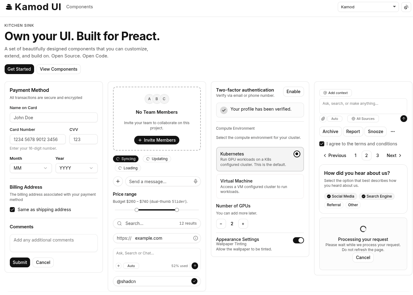
|
|
@@ -44,21 +46,104 @@ Many UI kits are heavier than necessary, overly opinionated, or tied to React. K
|
|
|
44
46
|
|
|
45
47
|
## Quick start
|
|
46
48
|
|
|
49
|
+
### Vite + Preact + Tailwind v4 starter
|
|
50
|
+
|
|
47
51
|
```bash
|
|
48
|
-
pnpm
|
|
52
|
+
pnpm create vite@latest my-app -- --template preact-ts
|
|
53
|
+
cd my-app
|
|
54
|
+
pnpm add @kamod-ch/ui @preact/signals
|
|
55
|
+
pnpm add -D tailwindcss @tailwindcss/vite
|
|
56
|
+
```
|
|
57
|
+
|
|
58
|
+
```ts
|
|
59
|
+
// vite.config.ts
|
|
60
|
+
import { defineConfig } from "vite";
|
|
61
|
+
import preact from "@preact/preset-vite";
|
|
62
|
+
import tailwindcss from "@tailwindcss/vite";
|
|
63
|
+
|
|
64
|
+
export default defineConfig({
|
|
65
|
+
plugins: [preact(), tailwindcss()],
|
|
66
|
+
});
|
|
49
67
|
```
|
|
50
68
|
|
|
51
69
|
```css
|
|
52
|
-
/* app.css */
|
|
70
|
+
/* src/app.css */
|
|
53
71
|
@import "tailwindcss";
|
|
54
72
|
@import "@kamod-ch/ui/theme.css";
|
|
73
|
+
|
|
74
|
+
:root {
|
|
75
|
+
font-family: Inter, system-ui, sans-serif;
|
|
76
|
+
}
|
|
77
|
+
```
|
|
78
|
+
|
|
79
|
+
```tsx
|
|
80
|
+
// src/main.tsx
|
|
81
|
+
import { render } from "preact";
|
|
82
|
+
import { App } from "./app";
|
|
83
|
+
import "./app.css";
|
|
84
|
+
|
|
85
|
+
render(<App />, document.getElementById("app")!);
|
|
55
86
|
```
|
|
56
87
|
|
|
57
88
|
```tsx
|
|
89
|
+
// src/app.tsx
|
|
58
90
|
import { Button } from "@kamod-ch/ui";
|
|
59
91
|
|
|
60
92
|
export function App() {
|
|
61
|
-
return
|
|
93
|
+
return (
|
|
94
|
+
<main class="p-6">
|
|
95
|
+
<Button>Click me</Button>
|
|
96
|
+
</main>
|
|
97
|
+
);
|
|
98
|
+
}
|
|
99
|
+
```
|
|
100
|
+
|
|
101
|
+
This is the smallest full setup. If you already have a Vite app, keep the `@kamod-ch/ui/theme.css` import and add `@kamod-ch/ui` + `@preact/signals`.
|
|
102
|
+
|
|
103
|
+
Browse the [live component docs](https://ui.kamod.ch/docs/button) for variants, composition, and RTL examples.
|
|
104
|
+
|
|
105
|
+
## Troubleshooting (Tailwind v4)
|
|
106
|
+
|
|
107
|
+
### Components look unstyled
|
|
108
|
+
|
|
109
|
+
Make sure your global CSS imports both files, in this order:
|
|
110
|
+
|
|
111
|
+
```css
|
|
112
|
+
@import "tailwindcss";
|
|
113
|
+
@import "@kamod-ch/ui/theme.css";
|
|
114
|
+
```
|
|
115
|
+
|
|
116
|
+
If `theme.css` is missing, Kamod's component classes and semantic tokens will not compile.
|
|
117
|
+
|
|
118
|
+
### Tailwind works in CSS but utility classes are missing in Vite
|
|
119
|
+
|
|
120
|
+
If you're using Vite, make sure the Tailwind v4 plugin is installed and enabled:
|
|
121
|
+
|
|
122
|
+
```ts
|
|
123
|
+
import tailwindcss from "@tailwindcss/vite";
|
|
124
|
+
|
|
125
|
+
export default defineConfig({
|
|
126
|
+
plugins: [tailwindcss()],
|
|
127
|
+
});
|
|
128
|
+
```
|
|
129
|
+
|
|
130
|
+
Without the plugin, Vite may not process the Tailwind v4 import pipeline correctly.
|
|
131
|
+
|
|
132
|
+
### You're on Tailwind v3
|
|
133
|
+
|
|
134
|
+
Kamod UI requires Tailwind CSS v4. Tailwind v3 does not support the import-based setup used here.
|
|
135
|
+
|
|
136
|
+
### Theme overrides do not apply
|
|
137
|
+
|
|
138
|
+
Override CSS variables after importing `theme.css`, not before it:
|
|
139
|
+
|
|
140
|
+
```css
|
|
141
|
+
@import "tailwindcss";
|
|
142
|
+
@import "@kamod-ch/ui/theme.css";
|
|
143
|
+
|
|
144
|
+
:root {
|
|
145
|
+
--primary: var(--color-fuchsia-700);
|
|
146
|
+
--radius: 0.75rem;
|
|
62
147
|
}
|
|
63
148
|
```
|
|
64
149
|
|
|
@@ -80,7 +165,7 @@ Browse the [live component docs](https://ui.kamod.ch/docs/button) for variants,
|
|
|
80
165
|
pnpm add @kamod-ch/ui preact @preact/signals
|
|
81
166
|
```
|
|
82
167
|
|
|
83
|
-
The published library on npm is **[`@kamod-ch/ui`](https://www.npmjs.com/package/@kamod-ch/ui)**. This monorepo root and `
|
|
168
|
+
The published library on npm is **[`@kamod-ch/ui`](https://www.npmjs.com/package/@kamod-ch/ui)**. This monorepo root and `packages/docs` are not published. The former package [`@kamod-ui/core`](https://www.npmjs.com/package/@kamod-ui/core) and the unscoped [`kamod-ui`](https://www.npmjs.com/package/kamod-ui) name are legacy — install `@kamod-ch/ui` instead.
|
|
84
169
|
|
|
85
170
|
Import the default theme once so Tailwind compiles component classes and semantic CSS tokens:
|
|
86
171
|
|
|
@@ -97,11 +182,11 @@ Import the default theme once so Tailwind compiles component classes and semanti
|
|
|
97
182
|
|
|
98
183
|
**Import signals yourself** when you use Kamod's lower-level helpers:
|
|
99
184
|
|
|
100
|
-
| Use case | Import
|
|
101
|
-
| ----------------------------------- |
|
|
185
|
+
| Use case | Import |
|
|
186
|
+
| ----------------------------------- | ------------------------------------------------------------------------------ |
|
|
102
187
|
| Custom controlled primitives | `@kamod-ch/ui/lib/signals` → `createControllableSignal` |
|
|
103
188
|
| Overlay dismiss / roving focus | `@kamod-ch/ui/lib/interactive` → `createDismissableLayer`, `createRovingFocus` |
|
|
104
|
-
| Advanced toast / sonner integration | `@kamod-ch/ui/toast` or `@kamod-ch/ui/sonner` stores
|
|
189
|
+
| Advanced toast / sonner integration | `@kamod-ch/ui/toast` or `@kamod-ch/ui/sonner` stores |
|
|
105
190
|
|
|
106
191
|
See the [**Signals** column in the component reference](https://github.com/kamod-ch/kamod-ui/blob/main/.docs/COMPONENTS.md) for which exports use signals internally (direct, indirect via Dialog/Popover, or none).
|
|
107
192
|
|
|
@@ -114,6 +199,8 @@ import { Button } from "@kamod-ch/ui"; // root barrel
|
|
|
114
199
|
import { Button } from "@kamod-ch/ui/button"; // per-component subpath
|
|
115
200
|
```
|
|
116
201
|
|
|
202
|
+
The demo docs in `packages/docs` rewrite the same examples to local aliases like `@/components/kamod-ui/button`. That alias only exists inside the demo app; in your app, install `@kamod-ch/ui` and import from the package.
|
|
203
|
+
|
|
117
204
|
The package ships a minimal `sideEffects` list (progress indeterminate keyframes and CSS only), so modern bundlers tree-shake the root barrel reliably.
|
|
118
205
|
|
|
119
206
|
### Component sizes
|
|
@@ -146,7 +233,7 @@ Override semantic tokens after importing the default theme:
|
|
|
146
233
|
}
|
|
147
234
|
```
|
|
148
235
|
|
|
149
|
-
For full control, copy from [`packages/core/src/theme.css`](https://github.com/kamod-ch/kamod-ui/blob/main/packages/core/src/theme.css) or see the demo's [`foundation.css`](https://github.com/kamod-ch/kamod-ui/blob/main/
|
|
236
|
+
For full control, copy from [`packages/core/src/theme.css`](https://github.com/kamod-ch/kamod-ui/blob/main/packages/core/src/theme.css) or see the demo's [`foundation.css`](https://github.com/kamod-ch/kamod-ui/blob/main/packages/docs/src/styles/foundation.css) and [`themes.css`](https://github.com/kamod-ch/kamod-ui/blob/main/packages/docs/src/styles/themes.css).
|
|
150
237
|
|
|
151
238
|
## Documentation
|
|
152
239
|
|
|
@@ -165,13 +252,13 @@ Open the URL printed in the terminal for the kitchen sink and component docs. Qu
|
|
|
165
252
|
|
|
166
253
|
## Contributing
|
|
167
254
|
|
|
168
|
-
| Workspace
|
|
169
|
-
|
|
|
170
|
-
| `@kamod-ch/ui`
|
|
171
|
-
| `
|
|
255
|
+
| Workspace | Path | Role |
|
|
256
|
+
| ------------------- | ---------------- | ---------------------------------------- |
|
|
257
|
+
| `@kamod-ch/ui` | `packages/core/` | Published library (65 component exports) |
|
|
258
|
+
| `@kamod-ch/ui-docs` | `packages/docs/` | Kitchen sink + interactive docs |
|
|
172
259
|
|
|
173
260
|
- Open issues for bugs and ideas; PRs welcome for components, docs, and examples.
|
|
174
|
-
- Key scripts: `pnpm dev`, `pnpm check`, `pnpm
|
|
261
|
+
- Key scripts: `pnpm dev`, `pnpm check`, `pnpm format`, `pnpm lint`, `pnpm docs:components`
|
|
175
262
|
- Tooling details: [`.docs/interna.md`](https://github.com/kamod-ch/kamod-ui/blob/main/.docs/interna.md)
|
|
176
263
|
|
|
177
264
|
Maintainers: see [`.docs/MAINTAINERS.md`](https://github.com/kamod-ch/kamod-ui/blob/main/.docs/MAINTAINERS.md) for npm release workflow.
|
|
@@ -3,7 +3,7 @@ import { ComponentChildren, JSX } from 'preact';
|
|
|
3
3
|
import { VariantProps } from 'tailwind-variants';
|
|
4
4
|
import { b as button } from './Button-vQnkiVTI.js';
|
|
5
5
|
import { e as DialogCloseProps, d as DialogTriggerProps, c as DialogProps } from './Dialog-BOIteLfe.js';
|
|
6
|
-
import { b as DialogContentProps } from './DialogContent-
|
|
6
|
+
import { b as DialogContentProps } from './DialogContent-cQHSRQdT.js';
|
|
7
7
|
|
|
8
8
|
type AlertDialogActionProps = DialogCloseProps & {
|
|
9
9
|
variant?: VariantProps<typeof button>["variant"];
|
|
@@ -19,6 +19,6 @@ type DialogContentProps = JSX.HTMLAttributes<HTMLDivElement> & {
|
|
|
19
19
|
* - **modal (default):** Backdrop + centered panel; use `class` only for sizing (e.g. `sm:max-w-sm`).
|
|
20
20
|
* - **slot:** Single root node — **required** for legacy/custom layouts that already implement `fixed inset-0` overlay + inner card (otherwise you stack two modals).
|
|
21
21
|
*/
|
|
22
|
-
declare const DialogContent: ({ forceMount, presentation, showCloseButton, class: className, children, onKeyDown, "data-slot": dataSlot, "aria-labelledby": ariaLabelledBy, "aria-describedby": ariaDescribedBy, ...rest }: DialogContentProps) => preact.VNode<
|
|
22
|
+
declare const DialogContent: ({ forceMount, presentation, showCloseButton, class: className, children, onKeyDown, "data-slot": dataSlot, "aria-labelledby": ariaLabelledBy, "aria-describedby": ariaDescribedBy, ...rest }: DialogContentProps) => JSX.Element | preact.VNode<{}> | null;
|
|
23
23
|
|
|
24
24
|
export { DialogContent as D, type DialogContentPresentation as a, type DialogContentProps as b };
|
|
@@ -2,7 +2,7 @@ import * as preact from 'preact';
|
|
|
2
2
|
import { ComponentChildren } from 'preact';
|
|
3
3
|
import { e as DialogCloseProps, d as DialogTriggerProps } from './Dialog-BOIteLfe.js';
|
|
4
4
|
import { c as DialogDescriptionProps, b as DialogTitleProps } from './DialogTitle-CerJD0oA.js';
|
|
5
|
-
import { g as SheetFooterProps, f as SheetHeaderProps, e as SheetContentProps, d as SheetProps } from './Sheet-
|
|
5
|
+
import { g as SheetFooterProps, f as SheetHeaderProps, e as SheetContentProps, d as SheetProps } from './Sheet-DZ-p-aHY.js';
|
|
6
6
|
|
|
7
7
|
type DrawerCloseProps = DialogCloseProps;
|
|
8
8
|
declare const DrawerClose: (props: DrawerCloseProps) => preact.JSX.Element;
|
|
@@ -19,7 +19,7 @@ type SheetContentProps = JSX.HTMLAttributes<HTMLDivElement> & {
|
|
|
19
19
|
children?: ComponentChildren;
|
|
20
20
|
"data-slot"?: string;
|
|
21
21
|
};
|
|
22
|
-
declare const SheetContent: ({ side, showCloseButton, children, class: className, forceMount, "data-slot": dataSlot, "aria-labelledby": ariaLabelledBy, "aria-describedby": ariaDescribedBy, ...rest }: SheetContentProps) => preact.VNode<
|
|
22
|
+
declare const SheetContent: ({ side, showCloseButton, children, class: className, forceMount, "data-slot": dataSlot, "aria-labelledby": ariaLabelledBy, "aria-describedby": ariaDescribedBy, ...rest }: SheetContentProps) => JSX.Element | preact.VNode<{}> | null;
|
|
23
23
|
|
|
24
24
|
type SheetProps = DialogProps & {
|
|
25
25
|
children?: ComponentChildren;
|
|
@@ -0,0 +1,160 @@
|
|
|
1
|
+
import * as tailwind_variants from 'tailwind-variants';
|
|
2
|
+
import { VariantProps } from 'tailwind-variants';
|
|
3
|
+
import { JSX, ComponentChildren } from 'preact';
|
|
4
|
+
import { a as InputProps } from './Input-Cem05el9.js';
|
|
5
|
+
import { a as SeparatorProps } from './Separator-DCQYrnpB.js';
|
|
6
|
+
|
|
7
|
+
type SidebarMenuProps = JSX.HTMLAttributes<HTMLUListElement> & {
|
|
8
|
+
children?: ComponentChildren;
|
|
9
|
+
};
|
|
10
|
+
declare const SidebarMenu: ({ class: className, children, ...rest }: SidebarMenuProps) => JSX.Element;
|
|
11
|
+
type SidebarMenuItemProps = JSX.HTMLAttributes<HTMLLIElement> & {
|
|
12
|
+
children?: ComponentChildren;
|
|
13
|
+
};
|
|
14
|
+
declare const SidebarMenuItem: ({ class: className, children, ...rest }: SidebarMenuItemProps) => JSX.Element;
|
|
15
|
+
declare const sidebarMenuButton: tailwind_variants.TVReturnType<{
|
|
16
|
+
variant: {
|
|
17
|
+
default: string;
|
|
18
|
+
outline: string;
|
|
19
|
+
};
|
|
20
|
+
size: {
|
|
21
|
+
default: string;
|
|
22
|
+
sm: string;
|
|
23
|
+
lg: string;
|
|
24
|
+
};
|
|
25
|
+
}, undefined, string[], {
|
|
26
|
+
variant: {
|
|
27
|
+
default: string;
|
|
28
|
+
outline: string;
|
|
29
|
+
};
|
|
30
|
+
size: {
|
|
31
|
+
default: string;
|
|
32
|
+
sm: string;
|
|
33
|
+
lg: string;
|
|
34
|
+
};
|
|
35
|
+
}, undefined, tailwind_variants.TVReturnType<{
|
|
36
|
+
variant: {
|
|
37
|
+
default: string;
|
|
38
|
+
outline: string;
|
|
39
|
+
};
|
|
40
|
+
size: {
|
|
41
|
+
default: string;
|
|
42
|
+
sm: string;
|
|
43
|
+
lg: string;
|
|
44
|
+
};
|
|
45
|
+
}, undefined, string[], unknown, unknown, undefined>>;
|
|
46
|
+
type SidebarMenuButtonProps = JSX.ButtonHTMLAttributes<HTMLButtonElement> & VariantProps<typeof sidebarMenuButton> & {
|
|
47
|
+
asChild?: boolean;
|
|
48
|
+
isActive?: boolean;
|
|
49
|
+
tooltip?: string | JSX.HTMLAttributes<HTMLDivElement>;
|
|
50
|
+
children?: ComponentChildren;
|
|
51
|
+
};
|
|
52
|
+
declare const SidebarMenuButton: ({ asChild, isActive, variant, size, tooltip, class: className, children, ...rest }: SidebarMenuButtonProps) => JSX.Element;
|
|
53
|
+
type SidebarMenuActionProps = JSX.ButtonHTMLAttributes<HTMLButtonElement> & {
|
|
54
|
+
asChild?: boolean;
|
|
55
|
+
showOnHover?: boolean;
|
|
56
|
+
children?: ComponentChildren;
|
|
57
|
+
};
|
|
58
|
+
declare const SidebarMenuAction: ({ class: className, asChild, showOnHover, children, ...rest }: SidebarMenuActionProps) => JSX.Element;
|
|
59
|
+
type SidebarMenuBadgeProps = JSX.HTMLAttributes<HTMLDivElement> & {
|
|
60
|
+
children?: ComponentChildren;
|
|
61
|
+
};
|
|
62
|
+
declare const SidebarMenuBadge: ({ class: className, children, ...rest }: SidebarMenuBadgeProps) => JSX.Element;
|
|
63
|
+
type SidebarMenuSkeletonProps = JSX.HTMLAttributes<HTMLDivElement> & {
|
|
64
|
+
showIcon?: boolean;
|
|
65
|
+
};
|
|
66
|
+
declare const SidebarMenuSkeleton: ({ class: className, showIcon, ...rest }: SidebarMenuSkeletonProps) => JSX.Element;
|
|
67
|
+
type SidebarMenuSubProps = JSX.HTMLAttributes<HTMLUListElement> & {
|
|
68
|
+
children?: ComponentChildren;
|
|
69
|
+
};
|
|
70
|
+
declare const SidebarMenuSub: ({ class: className, children, ...rest }: SidebarMenuSubProps) => JSX.Element;
|
|
71
|
+
type SidebarMenuSubItemProps = JSX.HTMLAttributes<HTMLLIElement> & {
|
|
72
|
+
children?: ComponentChildren;
|
|
73
|
+
};
|
|
74
|
+
declare const SidebarMenuSubItem: ({ class: className, children, ...rest }: SidebarMenuSubItemProps) => JSX.Element;
|
|
75
|
+
type SidebarMenuSubButtonProps = JSX.AnchorHTMLAttributes<HTMLAnchorElement> & {
|
|
76
|
+
asChild?: boolean;
|
|
77
|
+
size?: "sm" | "md";
|
|
78
|
+
isActive?: boolean;
|
|
79
|
+
children?: ComponentChildren;
|
|
80
|
+
};
|
|
81
|
+
declare const SidebarMenuSubButton: ({ asChild, size, isActive, class: className, children, ...rest }: SidebarMenuSubButtonProps) => JSX.Element;
|
|
82
|
+
|
|
83
|
+
type SidebarInputProps = InputProps;
|
|
84
|
+
declare const SidebarInput: ({ class: className, ...rest }: SidebarInputProps) => JSX.Element;
|
|
85
|
+
type SidebarSeparatorProps = SeparatorProps;
|
|
86
|
+
declare const SidebarSeparator: ({ class: className, ...rest }: SidebarSeparatorProps) => JSX.Element;
|
|
87
|
+
type SidebarGroupProps = JSX.HTMLAttributes<HTMLDivElement> & {
|
|
88
|
+
children?: ComponentChildren;
|
|
89
|
+
};
|
|
90
|
+
declare const SidebarGroup: ({ class: className, children, ...rest }: SidebarGroupProps) => JSX.Element;
|
|
91
|
+
type SidebarGroupLabelProps = JSX.HTMLAttributes<HTMLDivElement> & {
|
|
92
|
+
asChild?: boolean;
|
|
93
|
+
children?: ComponentChildren;
|
|
94
|
+
};
|
|
95
|
+
declare const SidebarGroupLabel: ({ class: className, asChild, children, ...rest }: SidebarGroupLabelProps) => JSX.Element;
|
|
96
|
+
type SidebarGroupActionProps = JSX.ButtonHTMLAttributes<HTMLButtonElement> & {
|
|
97
|
+
asChild?: boolean;
|
|
98
|
+
children?: ComponentChildren;
|
|
99
|
+
};
|
|
100
|
+
declare const SidebarGroupAction: ({ class: className, asChild, children, ...rest }: SidebarGroupActionProps) => JSX.Element;
|
|
101
|
+
type SidebarGroupContentProps = JSX.HTMLAttributes<HTMLDivElement> & {
|
|
102
|
+
children?: ComponentChildren;
|
|
103
|
+
};
|
|
104
|
+
declare const SidebarGroupContent: ({ class: className, children, ...rest }: SidebarGroupContentProps) => JSX.Element;
|
|
105
|
+
|
|
106
|
+
type SidebarRailProps = JSX.ButtonHTMLAttributes<HTMLButtonElement>;
|
|
107
|
+
declare const SidebarRail: ({ class: className, ...rest }: SidebarRailProps) => JSX.Element;
|
|
108
|
+
|
|
109
|
+
type SidebarInsetProps = JSX.HTMLAttributes<HTMLElement> & {
|
|
110
|
+
children?: ComponentChildren;
|
|
111
|
+
};
|
|
112
|
+
declare const SidebarInset: ({ class: className, children, ...rest }: SidebarInsetProps) => JSX.Element;
|
|
113
|
+
|
|
114
|
+
type SidebarFooterProps = JSX.HTMLAttributes<HTMLDivElement> & {
|
|
115
|
+
children?: ComponentChildren;
|
|
116
|
+
};
|
|
117
|
+
declare const SidebarFooter: ({ class: className, children, ...rest }: SidebarFooterProps) => JSX.Element;
|
|
118
|
+
|
|
119
|
+
type SidebarContentProps = JSX.HTMLAttributes<HTMLDivElement> & {
|
|
120
|
+
children?: ComponentChildren;
|
|
121
|
+
};
|
|
122
|
+
declare const SidebarContent: ({ class: className, children, ...rest }: SidebarContentProps) => JSX.Element;
|
|
123
|
+
|
|
124
|
+
type SidebarHeaderProps = JSX.HTMLAttributes<HTMLDivElement> & {
|
|
125
|
+
children?: ComponentChildren;
|
|
126
|
+
};
|
|
127
|
+
declare const SidebarHeader: ({ class: className, children, ...rest }: SidebarHeaderProps) => JSX.Element;
|
|
128
|
+
|
|
129
|
+
type SidebarTriggerProps = Omit<JSX.ButtonHTMLAttributes<HTMLButtonElement>, "size"> & {
|
|
130
|
+
class?: string;
|
|
131
|
+
};
|
|
132
|
+
declare const SidebarTrigger: ({ class: className, onClick, ...rest }: SidebarTriggerProps) => JSX.Element;
|
|
133
|
+
|
|
134
|
+
type SidebarProps = JSX.HTMLAttributes<HTMLDivElement> & {
|
|
135
|
+
side?: "left" | "right";
|
|
136
|
+
variant?: "sidebar" | "floating" | "inset";
|
|
137
|
+
collapsible?: "offcanvas" | "icon" | "none";
|
|
138
|
+
children?: ComponentChildren;
|
|
139
|
+
};
|
|
140
|
+
declare const Sidebar: ({ side, variant, collapsible, class: className, children, ...rest }: SidebarProps) => JSX.Element;
|
|
141
|
+
|
|
142
|
+
type SidebarContextValue = {
|
|
143
|
+
state: "expanded" | "collapsed";
|
|
144
|
+
open: boolean;
|
|
145
|
+
setOpen: (open: boolean | ((prev: boolean) => boolean)) => void;
|
|
146
|
+
openMobile: boolean;
|
|
147
|
+
setOpenMobile: (open: boolean | ((prev: boolean) => boolean)) => void;
|
|
148
|
+
isMobile: boolean;
|
|
149
|
+
toggleSidebar: () => void;
|
|
150
|
+
};
|
|
151
|
+
declare const useSidebar: () => SidebarContextValue;
|
|
152
|
+
type SidebarProviderProps = JSX.HTMLAttributes<HTMLDivElement> & {
|
|
153
|
+
defaultOpen?: boolean;
|
|
154
|
+
open?: boolean;
|
|
155
|
+
onOpenChange?: (open: boolean) => void;
|
|
156
|
+
children?: ComponentChildren;
|
|
157
|
+
};
|
|
158
|
+
declare const SidebarProvider: ({ defaultOpen, open: openProp, onOpenChange: setOpenProp, class: className, style, children, ...rest }: SidebarProviderProps) => JSX.Element;
|
|
159
|
+
|
|
160
|
+
export { type SidebarHeaderProps as A, type SidebarContentProps as B, type SidebarFooterProps as C, type SidebarInsetProps as D, type SidebarRailProps as E, type SidebarGroupProps as F, type SidebarMenuProps as G, Sidebar as S, SidebarContent as a, SidebarFooter as b, SidebarGroup as c, SidebarGroupAction as d, SidebarGroupContent as e, SidebarGroupLabel as f, SidebarHeader as g, SidebarInput as h, SidebarInset as i, SidebarMenu as j, SidebarMenuAction as k, SidebarMenuBadge as l, SidebarMenuButton as m, SidebarMenuItem as n, SidebarMenuSkeleton as o, SidebarMenuSub as p, SidebarMenuSubButton as q, SidebarMenuSubItem as r, type SidebarProps as s, SidebarProvider as t, type SidebarProviderProps as u, SidebarRail as v, SidebarSeparator as w, SidebarTrigger as x, useSidebar as y, type SidebarTriggerProps as z };
|