@jobber/design 0.27.9 → 0.28.0
This diff represents the content of publicly available package versions that have been released to one of the supported registries. The information contained in this diff is provided for informational purposes only and reflects changes between package versions as they appear in their respective public registries.
- package/CHANGELOG.md +46 -0
- package/buildColors.js +15 -0
- package/buildFoundation.js +15 -0
- package/buildIconStyles.js +44 -0
- package/colors.js +138 -0
- package/foundation.css +33 -26
- package/foundation.js +7 -7
- package/foundation.scss +6 -6
- package/foundation_config/postcss-filter-rules/index.js +17 -0
- package/foundation_config/postcss.config.js +58 -0
- package/jobberStyle.js +244 -0
- package/npm-shrinkwrap.json +8594 -0
- package/package.json +18 -11
- package/rollup.config.js +41 -0
- package/src/Borders.mdx +65 -0
- package/src/Colors.mdx +295 -0
- package/src/Elevations.mdx +107 -0
- package/src/Radii.mdx +40 -0
- package/src/ResponsiveBreakpoints.mdx +48 -0
- package/src/Spacing.mdx +121 -0
- package/src/Typography.mdx +191 -0
- package/src/animation.mdx +82 -0
- package/src/borders.css +6 -0
- package/src/colors.css +178 -0
- package/src/elevations.css +12 -0
- package/src/foundation.css +11 -0
- package/src/icons/Colors.css +187 -0
- package/src/icons/Colors.css.d.ts +51 -0
- package/src/icons/Icon.css +102 -0
- package/src/icons/Icon.css.d.ts +37 -0
- package/src/icons/Sizes.css +14 -0
- package/src/icons/Sizes.css.d.ts +7 -0
- package/src/icons/getIcon.test.ts +73 -0
- package/src/icons/getIcon.ts +116 -0
- package/src/icons/iconMap.ts +430 -0
- package/src/icons/iconStyles.d.ts +262 -0
- package/src/icons/iconStyles.ts +269 -0
- package/src/index.ts +10 -0
- package/src/radii.css +6 -0
- package/src/responsiveBreakpoints.css +3 -0
- package/src/shadows.css +13 -0
- package/src/spacing.css +13 -0
- package/src/styles.css +9 -0
- package/src/timings.css +7 -0
- package/src/typography.css +53 -0
- package/tsconfig.json +70 -0
package/src/Spacing.mdx
ADDED
|
@@ -0,0 +1,121 @@
|
|
|
1
|
+
---
|
|
2
|
+
name: Spacing
|
|
3
|
+
menu: Design
|
|
4
|
+
route: /space
|
|
5
|
+
---
|
|
6
|
+
|
|
7
|
+
# Spacing
|
|
8
|
+
|
|
9
|
+
Our spacing system exists to support the foundational visual design principle of
|
|
10
|
+
[proximity-based grouping:](https://www.nngroup.com/articles/gestalt-proximity/)
|
|
11
|
+
|
|
12
|
+
> Using varying amounts of whitespace to either unite or separate elements is
|
|
13
|
+
> key to communicating meaningful groupings.
|
|
14
|
+
|
|
15
|
+
In the shortest, simplest terms: the closer two elements are related, the
|
|
16
|
+
tighter the spacing between them should be.
|
|
17
|
+
|
|
18
|
+
With this in mind, let’s start small and work our way up.
|
|
19
|
+
|
|
20
|
+
## Design & usage guidelines
|
|
21
|
+
|
|
22
|
+
### Miniscule and Smallest
|
|
23
|
+
|
|
24
|
+
At their respective sizes (`1px` and `2px` equivalent), these values should
|
|
25
|
+
mostly be used to provide optical adjustments where an element is visually
|
|
26
|
+
misaligned.
|
|
27
|
+
|
|
28
|
+
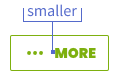
### Smaller
|
|
29
|
+
|
|
30
|
+
The `smaller` spacing value can be used between contents of a single component.
|
|
31
|
+
For example, see the spacing between an Icon and the label inside of a
|
|
32
|
+
[Button.](/components/button#icons)
|
|
33
|
+
|
|
34
|
+
|
|
35
|
+
|
|
36
|
+
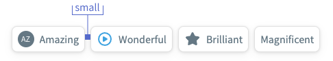
### Small
|
|
37
|
+
|
|
38
|
+
Sibling items within a container can be separated by the `small` value to
|
|
39
|
+
reflect their relation to each other. An example would be the spacing between
|
|
40
|
+
[Chips in a selection group.](/components/chips#single-select)
|
|
41
|
+
|
|
42
|
+
|
|
43
|
+
|
|
44
|
+
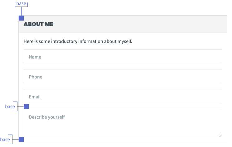
### Base
|
|
45
|
+
|
|
46
|
+
Use `base` as the default spacing in larger content containers with multiple
|
|
47
|
+
children of their own, such as [Card.](/components/card) This should also be
|
|
48
|
+
used as the default starting point for spacing between [Form](/components/form)
|
|
49
|
+
elements.
|
|
50
|
+
|
|
51
|
+
|
|
52
|
+
|
|
53
|
+
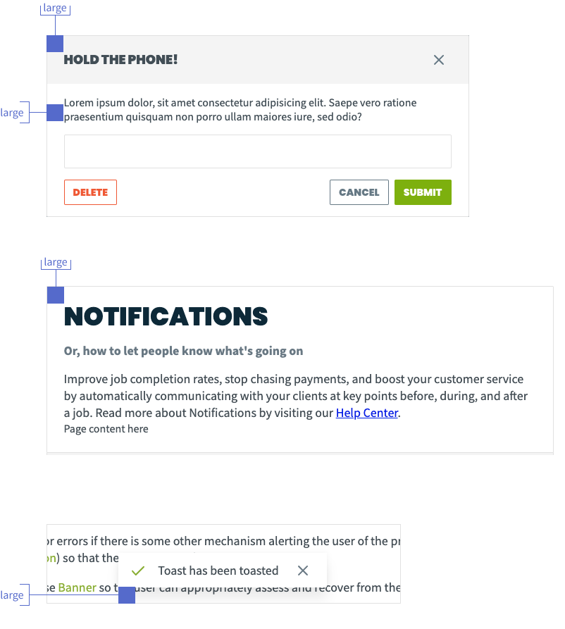
### Large
|
|
54
|
+
|
|
55
|
+
Use `large` spacing for higher-level "parent" containers.
|
|
56
|
+
[Modal](/components/modal) uses `large` spacing in its header and around the
|
|
57
|
+
edges to give itself a bit more prominence as a "standalone" view, in a similar
|
|
58
|
+
manner to [Page](/components/page).
|
|
59
|
+
|
|
60
|
+
`Large` can also be used to help give a "floating" element some clear separation
|
|
61
|
+
from the edge of its container, as seen in [Toast](/components/toast).
|
|
62
|
+
|
|
63
|
+
|
|
64
|
+
|
|
65
|
+
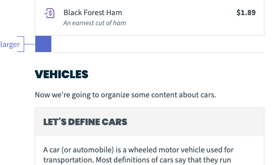
### Larger
|
|
66
|
+
|
|
67
|
+
`Larger` doubles the value of `base` to very clearly delineate two groups of
|
|
68
|
+
content that themselves use `base`. It may be useful if you have a long list of
|
|
69
|
+
mixed content types that need to be broken up.
|
|
70
|
+
|
|
71
|
+
|
|
72
|
+
|
|
73
|
+
### Largest and Extravagant
|
|
74
|
+
|
|
75
|
+
You’ll probably never need these unless you’re doing a custom layout, but
|
|
76
|
+
they’re here if you need ‘em. These values are equivalent to `48px` and `64px`
|
|
77
|
+
respectively.
|
|
78
|
+
|
|
79
|
+
---
|
|
80
|
+
|
|
81
|
+
## Implementation
|
|
82
|
+
|
|
83
|
+
### Content
|
|
84
|
+
|
|
85
|
+
Use the [Content component](/components/content) for any instances where you
|
|
86
|
+
need uniform spacing between elements.
|
|
87
|
+
|
|
88
|
+
Content can set its spacing to either `small`, `base`, or `large`; follow the
|
|
89
|
+
guidelines above as needed.
|
|
90
|
+
|
|
91
|
+
### Values
|
|
92
|
+
|
|
93
|
+
export function Example({ of: size }) {
|
|
94
|
+
const style = {
|
|
95
|
+
width: `var(--space-${size})`,
|
|
96
|
+
height: "var(--space-base)",
|
|
97
|
+
backgroundColor: "var(--color-indigo)",
|
|
98
|
+
};
|
|
99
|
+
return <div style={style} />;
|
|
100
|
+
}
|
|
101
|
+
|
|
102
|
+
export function Height({ of: size }) {
|
|
103
|
+
const element = document.createElement("div");
|
|
104
|
+
element.style.height = `var(--space-${size})`;
|
|
105
|
+
document.body.appendChild(element);
|
|
106
|
+
const value = getComputedStyle(element).height;
|
|
107
|
+
element.remove();
|
|
108
|
+
return value;
|
|
109
|
+
}
|
|
110
|
+
|
|
111
|
+
| Name | Visual | Value |
|
|
112
|
+
| :-------------------- | :--------------------------- | :-------------------------- |
|
|
113
|
+
| `--space-minuscule` | <Example of="minuscule" /> | <Height of="minuscule" /> |
|
|
114
|
+
| `--space-smallest` | <Example of="smallest" /> | <Height of="smallest" /> |
|
|
115
|
+
| `--space-smaller` | <Example of="smaller" /> | <Height of="smaller" /> |
|
|
116
|
+
| `--space-small` | <Example of="small" /> | <Height of="small" /> |
|
|
117
|
+
| `--space-base` | <Example of="base" /> | <Height of="base" /> |
|
|
118
|
+
| `--space-large` | <Example of="large" /> | <Height of="large" /> |
|
|
119
|
+
| `--space-larger` | <Example of="larger" /> | <Height of="larger" /> |
|
|
120
|
+
| `--space-largest` | <Example of="largest" /> | <Height of="largest" /> |
|
|
121
|
+
| `--space-extravagant` | <Example of="extravagant" /> | <Height of="extravagant" /> |
|
|
@@ -0,0 +1,191 @@
|
|
|
1
|
+
---
|
|
2
|
+
name: Typography
|
|
3
|
+
menu: Design
|
|
4
|
+
route: /typography
|
|
5
|
+
---
|
|
6
|
+
|
|
7
|
+
import { Playground } from "docz";
|
|
8
|
+
import { Heading } from "@jobber/components/Heading";
|
|
9
|
+
import { Text } from "@jobber/components/Text";
|
|
10
|
+
import { Emphasis } from "@jobber/components/Emphasis";
|
|
11
|
+
import { Content } from "@jobber/components/Content";
|
|
12
|
+
import { Button } from "@jobber/components/Button";
|
|
13
|
+
import { Checkbox } from "@jobber/components/Checkbox";
|
|
14
|
+
import { InputText } from "@jobber/components/InputText";
|
|
15
|
+
import { Table, Header, Row, Cell } from "@jobber/components/Table";
|
|
16
|
+
|
|
17
|
+
# Typography
|
|
18
|
+
|
|
19
|
+
When a designer is talking about "type", it's unlikely they're asking about the
|
|
20
|
+
latest Typescript linting rules! Typography is a core aspect of any user
|
|
21
|
+
interface, and we've built a system that should make it simple for our
|
|
22
|
+
interfaces to be built with consistent, considered typographic elements.
|
|
23
|
+
|
|
24
|
+
The Atlantis typography system is based on the core components of
|
|
25
|
+
[Heading](/packages-components-src-heading-heading) and
|
|
26
|
+
[Text](/packages-components-src-text-text).
|
|
27
|
+
|
|
28
|
+
<Playground>
|
|
29
|
+
<Content>
|
|
30
|
+
<Heading level={1}>
|
|
31
|
+
A <Emphasis variation="highlight">prominent</Emphasis> heading
|
|
32
|
+
</Heading>
|
|
33
|
+
<Text>
|
|
34
|
+
A longer body of text that's better suited for readabilty at smaller
|
|
35
|
+
sizes. Typically a paragraph should be displayed in a typeface that has a
|
|
36
|
+
moderate weight, and is <Emphasis variation="italic">relatively</Emphasis>{" "}
|
|
37
|
+
free of flourish.
|
|
38
|
+
</Text>
|
|
39
|
+
</Content>
|
|
40
|
+
</Playground>
|
|
41
|
+
|
|
42
|
+
Heading and Text are extended by the ability to add
|
|
43
|
+
[Emphasis](/packages-components-src-emphasis-emphasis) to these components as
|
|
44
|
+
needed.
|
|
45
|
+
|
|
46
|
+
There are some foundational elements that make up these components:
|
|
47
|
+
|
|
48
|
+
## Font families
|
|
49
|
+
|
|
50
|
+
### Display
|
|
51
|
+
|
|
52
|
+
Jobber Pro is Jobber's internal typeface and is only suitable for use in Jobber
|
|
53
|
+
products. It lends a hefty-but-professional face to larger usages such as page
|
|
54
|
+
titles and main section headings.
|
|
55
|
+
|
|
56
|
+
As Jobber Pro is a custom typeface licensed specifically for Jobber usage, it
|
|
57
|
+
will be rendered in any environments where it is licensed for use. In external
|
|
58
|
+
usages, [Poppins](https://fonts.google.com/specimen/Poppins) is Atlantis'
|
|
59
|
+
fallback display face. It has similar structural features and optical sizing as
|
|
60
|
+
Jobber Pro.
|
|
61
|
+
|
|
62
|
+
<Playground>
|
|
63
|
+
<Content>
|
|
64
|
+
<Heading level={2}>Jobber Pro is used for bold statements</Heading>
|
|
65
|
+
</Content>
|
|
66
|
+
</Playground>
|
|
67
|
+
|
|
68
|
+
### Base
|
|
69
|
+
|
|
70
|
+
[Inter](https://fonts.google.com/specimen/Inter) is our most broadly-used
|
|
71
|
+
typeface. It is used for body copy, most headings, data display, form inputs,
|
|
72
|
+
labels, and more!
|
|
73
|
+
|
|
74
|
+
<Playground>
|
|
75
|
+
<Content spacing="large">
|
|
76
|
+
<Heading level={3}>Inter is for less prominent headings</Heading>
|
|
77
|
+
<Text>
|
|
78
|
+
You can also use it for longer, more readable statements in paragraphs,
|
|
79
|
+
descriptive text, in lists, and more. If you've been paying careful
|
|
80
|
+
attention, you might have noticed that Atlantis even uses Inter for
|
|
81
|
+
presenting documentation!
|
|
82
|
+
</Text>
|
|
83
|
+
<Checkbox checked label="Inter can label inputs nicely"></Checkbox>
|
|
84
|
+
<InputText
|
|
85
|
+
defaultValue="It's great for input values too"
|
|
86
|
+
placeholder="Inter for labels"
|
|
87
|
+
/>
|
|
88
|
+
<Table>
|
|
89
|
+
<Header>
|
|
90
|
+
<Cell>Inter</Cell>
|
|
91
|
+
<Cell>Renders</Cell>
|
|
92
|
+
<Cell align="right">Data</Cell>
|
|
93
|
+
</Header>
|
|
94
|
+
<Row>
|
|
95
|
+
<Cell>Data point</Cell>
|
|
96
|
+
<Cell>More data</Cell>
|
|
97
|
+
<Cell align="right">$280</Cell>
|
|
98
|
+
</Row>
|
|
99
|
+
<Row>
|
|
100
|
+
<Cell>Another data point</Cell>
|
|
101
|
+
<Cell>Additional values</Cell>
|
|
102
|
+
<Cell align="right">$200</Cell>
|
|
103
|
+
</Row>
|
|
104
|
+
</Table>
|
|
105
|
+
</Content>
|
|
106
|
+
</Playground>
|
|
107
|
+
|
|
108
|
+
## Font sizes
|
|
109
|
+
|
|
110
|
+
At the default zoom level, our base font-size is equivalent to `14px`. Depending
|
|
111
|
+
on the context in which your typography is being used, font-size can be adjusted
|
|
112
|
+
to be larger or smaller than the base font-size.
|
|
113
|
+
|
|
114
|
+
Suggestions for when to use varying font-sizes are discussed in the
|
|
115
|
+
[Heading](/packages-components-src-heading-heading) component, and within the
|
|
116
|
+
[Sizes](/packages-components-src-text-text#sizes) section of the Text component.
|
|
117
|
+
|
|
118
|
+
export function Example({ of: size }) {
|
|
119
|
+
const style = {
|
|
120
|
+
fontSize: `var(--typography--fontSize-${size})`,
|
|
121
|
+
};
|
|
122
|
+
return <div style={style}>{size}</div>;
|
|
123
|
+
}
|
|
124
|
+
|
|
125
|
+
export function PixelSize({ of: size }) {
|
|
126
|
+
const element = document.createElement("div");
|
|
127
|
+
element.style.fontSize = `var(--typography--fontSize-${size})`;
|
|
128
|
+
document.body.appendChild(element);
|
|
129
|
+
const value = getComputedStyle(element).fontSize;
|
|
130
|
+
element.remove();
|
|
131
|
+
return value;
|
|
132
|
+
}
|
|
133
|
+
|
|
134
|
+
| Name | Visual | Value |
|
|
135
|
+
| :----------------------------------- | :--------------------------- | :----------------------------- |
|
|
136
|
+
| `--typography--fontSize-smaller` | <Example of="smaller" /> | <PixelSize of="smaller" /> |
|
|
137
|
+
| `--typography--fontSize-small` | <Example of="small" /> | <PixelSize of="small" /> |
|
|
138
|
+
| `--typography--fontSize-base` | <Example of="base" /> | <PixelSize of="base" /> |
|
|
139
|
+
| `--typography--fontSize-large` | <Example of="large" /> | <PixelSize of="large" /> |
|
|
140
|
+
| `--typography--fontSize-larger` | <Example of="larger" /> | <PixelSize of="larger" /> |
|
|
141
|
+
| `--typography--fontSize-largest` | <Example of="largest" /> | <PixelSize of="largest" /> |
|
|
142
|
+
| `--typography--fontSize-jumbo` | <Example of="jumbo" /> | <PixelSize of="jumbo" /> |
|
|
143
|
+
| `--typography--fontSize-extravagant` | <Example of="extravagant" /> | <PixelSize of="extravagant" /> |
|
|
144
|
+
|
|
145
|
+
## Line-height
|
|
146
|
+
|
|
147
|
+
Line-height, or
|
|
148
|
+
[leading](https://www.shillingtoneducation.com/blog/leading-typography/), is the
|
|
149
|
+
space between subsequent lines of type. The line-heights in the `Heading` and
|
|
150
|
+
`Text` components are optimized for each variation's unique combination of
|
|
151
|
+
font-size, weight, and family, so you don't need to adjust their line-height
|
|
152
|
+
manually when you use them.
|
|
153
|
+
|
|
154
|
+
At smaller sizes, a more generous line-height relative to the font-size allows
|
|
155
|
+
the user to more easily parse multiple lines of small text. As font-size
|
|
156
|
+
increases into "display" sizes such as a level 1 `Heading`, the ratio of
|
|
157
|
+
line-height to font-size decreases as the larger font-size is more readable and
|
|
158
|
+
requires less line-to-line breathing room.
|
|
159
|
+
|
|
160
|
+
export function Visual({ of: size }) {
|
|
161
|
+
const style = {
|
|
162
|
+
lineHeight: `var(--typography--lineHeight-${size})`,
|
|
163
|
+
};
|
|
164
|
+
return (
|
|
165
|
+
<div style={style}>
|
|
166
|
+
Line-height, or leading, is the space between subsequent lines of type.
|
|
167
|
+
The line-heights in the Heading and Text components are optimized for each
|
|
168
|
+
variation's unique combination of...
|
|
169
|
+
</div>
|
|
170
|
+
);
|
|
171
|
+
}
|
|
172
|
+
|
|
173
|
+
export function Value({ of: size }) {
|
|
174
|
+
const element = document.createElement("div");
|
|
175
|
+
element.style.lineHeight = `var(--typography--lineHeight-${size})`;
|
|
176
|
+
document.body.appendChild(element);
|
|
177
|
+
const value =
|
|
178
|
+
parseFloat(getComputedStyle(element).lineHeight) /
|
|
179
|
+
parseFloat(getComputedStyle(element).fontSize);
|
|
180
|
+
element.remove();
|
|
181
|
+
return parseFloat(value.toFixed(3));
|
|
182
|
+
}
|
|
183
|
+
|
|
184
|
+
| Name | Visual | Value |
|
|
185
|
+
| :----------------------------------- | :------------------------ | :----------------------- |
|
|
186
|
+
| `--typography--lineHeight-large` | <Visual of="large" /> | <Value of="large" /> |
|
|
187
|
+
| `--typography--lineHeight-base` | <Visual of="base" /> | <Value of="base" /> |
|
|
188
|
+
| `--typography--lineHeight-tight` | <Visual of="tight" /> | <Value of="tight" /> |
|
|
189
|
+
| `--typography--lineHeight-tighter` | <Visual of="tighter" /> | <Value of="tighter" /> |
|
|
190
|
+
| `--typography--lineHeight-tightest` | <Visual of="tightest" /> | <Value of="tightest" /> |
|
|
191
|
+
| `--typography--lineHeight-miniscule` | <Visual of="miniscule" /> | <Value of="miniscule" /> |
|
|
@@ -0,0 +1,82 @@
|
|
|
1
|
+
---
|
|
2
|
+
name: Animation
|
|
3
|
+
menu: Design
|
|
4
|
+
route: /animation
|
|
5
|
+
---
|
|
6
|
+
|
|
7
|
+
# Animation
|
|
8
|
+
|
|
9
|
+
## Patterns
|
|
10
|
+
|
|
11
|
+
Animations in Jobber fall under categories based on their purpose:
|
|
12
|
+
|
|
13
|
+
### Reveal
|
|
14
|
+
|
|
15
|
+
Reveals are used to show and hide information on the screen. For example,
|
|
16
|
+
toasts, modals, sidebars appearing and disappearing on the screen.
|
|
17
|
+
|
|
18
|
+
### State change
|
|
19
|
+
|
|
20
|
+
State changes are used to inform the user that a context change is taking place.
|
|
21
|
+
This is used when the object has changed state due to user interaction (e.g.
|
|
22
|
+
hover and focus states).
|
|
23
|
+
|
|
24
|
+
### Emphasis
|
|
25
|
+
|
|
26
|
+
Emphasis is used to bring attention to something on already on the screen. For
|
|
27
|
+
example, when you want to guide users to a particular part of the interface for
|
|
28
|
+
onboarding or learning purposes.
|
|
29
|
+
|
|
30
|
+
### Delighter
|
|
31
|
+
|
|
32
|
+
Delighters can be used occasionally to create surprise and delight, and can give
|
|
33
|
+
personality to our brand. These can be used to reinforce success in an important
|
|
34
|
+
milestones in a user's journey.
|
|
35
|
+
|
|
36
|
+
## Timing
|
|
37
|
+
|
|
38
|
+
Use judgement when determining the appropriate timing durations for animations.
|
|
39
|
+
This will depend on the size of the element and the distance it covers.
|
|
40
|
+
Animations for larger elements or longer distances should be longer than smaller
|
|
41
|
+
elements or shorter distances.
|
|
42
|
+
|
|
43
|
+
| Name | Value | Examples of use |
|
|
44
|
+
| :----------------- | :---- | :------------------------------------------------------ |
|
|
45
|
+
| `--timing-quick` | 100ms | smaller elements exiting, small elements, state changes |
|
|
46
|
+
| `--timing-base` | 200ms | larger elements exiting, small elements, state changes |
|
|
47
|
+
| `--timing-slow` | 300ms | modals, side panels |
|
|
48
|
+
| `--timing-slower` | 400ms | large elements traversing across large area |
|
|
49
|
+
| `--timing-slowest` | 500ms | page transitions |
|
|
50
|
+
|
|
51
|
+
## Easing
|
|
52
|
+
|
|
53
|
+
Animations are linear by default, but this lends an uncanny robotic feeling to
|
|
54
|
+
the motion of an element. Easing creates a more natural, pleasing transition
|
|
55
|
+
between animation states to mimic the acceleration and deceleration of objects
|
|
56
|
+
in the real world.
|
|
57
|
+
|
|
58
|
+
### Ease in
|
|
59
|
+
|
|
60
|
+
Starts slow and speeds up. Use for exiting elements that don’t fade out.
|
|
61
|
+
|
|
62
|
+
### Ease out
|
|
63
|
+
|
|
64
|
+
Starts fast and slows down. Use for entering elements. For example, opening a
|
|
65
|
+
toast, modal, or menu.
|
|
66
|
+
|
|
67
|
+
### Ease both
|
|
68
|
+
|
|
69
|
+
Combines features of ease in and out curves. Use for moving from point to point,
|
|
70
|
+
or for when the element disappears from the screen, but the user can return to
|
|
71
|
+
the previous place at any time. For example, opening and closing a side drawer,
|
|
72
|
+
side nav, or accordion.
|
|
73
|
+
|
|
74
|
+
### Linear
|
|
75
|
+
|
|
76
|
+
Use for color and opacity changes (things that don’t move).
|
|
77
|
+
|
|
78
|
+
| Name | Value |
|
|
79
|
+
| :------------ | :------------------------------ |
|
|
80
|
+
| `--ease-in` | cubic-bezier(0.4, 0, 1, 0.9, 0) |
|
|
81
|
+
| `--ease-out` | cubic-bezier (0, 0, 0.4, 1) |
|
|
82
|
+
| `--ease-both` | cubic-bezier(0.5, 0, 0.4, 1) |
|
package/src/borders.css
ADDED
package/src/colors.css
ADDED
|
@@ -0,0 +1,178 @@
|
|
|
1
|
+
:root {
|
|
2
|
+
/* Jobber Semantic Layer */
|
|
3
|
+
|
|
4
|
+
/* Interactive and States */
|
|
5
|
+
--color-interactive: var(--color-green);
|
|
6
|
+
--color-interactive--hover: var(--color-green--dark);
|
|
7
|
+
--color-destructive: var(--color-red);
|
|
8
|
+
--color-destructive--hover: var(--color-red--dark);
|
|
9
|
+
--color-interactive--subtle: var(--color-greyBlue);
|
|
10
|
+
--color-interactive--subtle--hover: var(--color-greyBlue--dark);
|
|
11
|
+
|
|
12
|
+
--color-disabled: var(--color-grey);
|
|
13
|
+
--color-disabled--secondary: var(--color-grey--lighter);
|
|
14
|
+
|
|
15
|
+
--color-focus: var(--color-yellow--light);
|
|
16
|
+
|
|
17
|
+
/* Status Colours */
|
|
18
|
+
|
|
19
|
+
--color-critical: var(--color-red);
|
|
20
|
+
--color-critical--surface: var(--color-red--lightest);
|
|
21
|
+
--color-critical--onSurface: var(--color-red--dark);
|
|
22
|
+
|
|
23
|
+
--color-warning: var(--color-yellow);
|
|
24
|
+
--color-warning--surface: var(--color-yellow--lightest);
|
|
25
|
+
--color-warning--onSurface: var(--color-yellow--dark);
|
|
26
|
+
|
|
27
|
+
--color-success: var(--color-green);
|
|
28
|
+
--color-success--surface: var(--color-green--lightest);
|
|
29
|
+
--color-success--onSurface: var(--color-green--dark);
|
|
30
|
+
|
|
31
|
+
--color-informative: var(--color-lightBlue);
|
|
32
|
+
--color-informative--surface: var(--color-lightBlue--lightest);
|
|
33
|
+
--color-informative--onSurface: var(--color-lightBlue--dark);
|
|
34
|
+
|
|
35
|
+
--color-inactive: var(--color-blue--light);
|
|
36
|
+
--color-inactive--surface: var(--color-blue--lightest);
|
|
37
|
+
--color-inactive--onSurface: var(--color-blue--dark);
|
|
38
|
+
|
|
39
|
+
/* Typography */
|
|
40
|
+
--color-heading: var(--color-blue);
|
|
41
|
+
--color-text: var(--color-greyBlue--dark);
|
|
42
|
+
--color-text--secondary: var(--color-greyBlue);
|
|
43
|
+
--color-text--reverse: var(--color-white);
|
|
44
|
+
--color-text--reverse--secondary: var(--color-greyBlue--lighter);
|
|
45
|
+
|
|
46
|
+
/* Surfaces and Borders */
|
|
47
|
+
--color-surface: var(--color-white);
|
|
48
|
+
--color-surface--hover: var(--color-yellow--lightest);
|
|
49
|
+
--color-surface--active: var(--color-green--lightest);
|
|
50
|
+
--color-surface--background: var(--color-grey--lightest);
|
|
51
|
+
--color-surface--reverse: var(--color-blue);
|
|
52
|
+
|
|
53
|
+
--color-border: var(--color-grey--lighter);
|
|
54
|
+
--color-border--section: var(--color-blue);
|
|
55
|
+
|
|
56
|
+
--color-overlay: rgba(var(--color-black--rgb), 0.32);
|
|
57
|
+
--color-overlay--dimmed: rgba(var(--color-white--rgb), 0.6);
|
|
58
|
+
|
|
59
|
+
/* Brand */
|
|
60
|
+
--color-brand: var(--color-green);
|
|
61
|
+
--color-brand--highlight: rgb(160, 215, 42);
|
|
62
|
+
|
|
63
|
+
/* Jobber Workflow Colors */
|
|
64
|
+
--color-request: var(--color-indigo);
|
|
65
|
+
--color-quote: var(--color-pink);
|
|
66
|
+
--color-job: var(--color-yellowGreen);
|
|
67
|
+
--color-visit: var(--color-green);
|
|
68
|
+
--color-task: var(--color-navy);
|
|
69
|
+
--color-event: var(--color-yellow);
|
|
70
|
+
--color-invoice: var(--color-purple);
|
|
71
|
+
--color-payments: var(--color-orange);
|
|
72
|
+
|
|
73
|
+
--color-client: var(--color-teal);
|
|
74
|
+
|
|
75
|
+
/* Jobber Base Palette */
|
|
76
|
+
--color-blue: rgb(1, 41, 57);
|
|
77
|
+
--color-blue--light: rgb(77, 105, 116);
|
|
78
|
+
--color-blue--lighter: rgb(153, 169, 176);
|
|
79
|
+
--color-blue--lightest: rgb(217, 223, 225);
|
|
80
|
+
--color-blue--dark: rgb(1, 27, 37);
|
|
81
|
+
|
|
82
|
+
--color-green: rgb(125, 176, 14);
|
|
83
|
+
--color-green--light: rgb(164, 200, 86);
|
|
84
|
+
--color-green--lighter: rgb(203, 223, 159);
|
|
85
|
+
--color-green--lightest: rgb(236, 243, 219);
|
|
86
|
+
--color-green--dark: rgb(81, 114, 9);
|
|
87
|
+
|
|
88
|
+
--color-lime: rgb(153, 193, 70);
|
|
89
|
+
--color-lime--light: rgb(184, 212, 126);
|
|
90
|
+
--color-lime--lighter: rgb(214, 230, 181);
|
|
91
|
+
--color-lime--lightest: rgb(240, 246, 227);
|
|
92
|
+
--color-lime--dark: rgb(99, 125, 46);
|
|
93
|
+
|
|
94
|
+
--color-yellowGreen: rgb(187, 197, 32);
|
|
95
|
+
--color-yellowGreen--light: rgb(207, 214, 99);
|
|
96
|
+
--color-yellowGreen--lighter: rgb(228, 232, 166);
|
|
97
|
+
--color-yellowGreen--lightest: rgb(245, 246, 222);
|
|
98
|
+
--color-yellowGreen--dark: rgb(122, 128, 21);
|
|
99
|
+
|
|
100
|
+
--color-yellow: rgb(221, 195, 15);
|
|
101
|
+
--color-yellow--light: rgb(231, 213, 87);
|
|
102
|
+
--color-yellow--lighter: rgb(241, 231, 159);
|
|
103
|
+
--color-yellow--lightest: rgb(250, 246, 219);
|
|
104
|
+
--color-yellow--dark: rgb(144, 127, 10);
|
|
105
|
+
|
|
106
|
+
--color-red: rgb(201, 66, 33);
|
|
107
|
+
--color-red--light: rgb(233, 141, 119);
|
|
108
|
+
--color-red--lighter: rgb(255, 206, 194);
|
|
109
|
+
--color-red--lightest: rgb(255, 226, 219);
|
|
110
|
+
--color-red--dark: rgb(128, 25, 0);
|
|
111
|
+
|
|
112
|
+
--color-grey: rgb(181, 181, 181);
|
|
113
|
+
--color-grey--light: rgb(203, 203, 203);
|
|
114
|
+
--color-grey--lighter: rgb(225, 225, 225);
|
|
115
|
+
--color-grey--lightest: rgb(244, 244, 244);
|
|
116
|
+
--color-grey--dark: rgb(118, 118, 118);
|
|
117
|
+
|
|
118
|
+
--color-greyBlue--rgb: 101, 120, 132;
|
|
119
|
+
--color-greyBlue: rgba(var(--color-greyBlue--rgb), 1);
|
|
120
|
+
--color-greyBlue--light: rgb(147, 161, 169);
|
|
121
|
+
--color-greyBlue--lighter: rgb(193, 201, 206);
|
|
122
|
+
--color-greyBlue--lightest: rgb(232, 235, 237);
|
|
123
|
+
--color-greyBlue--dark: rgb(66, 78, 86);
|
|
124
|
+
|
|
125
|
+
--color-lightBlue: rgb(60, 162, 224);
|
|
126
|
+
--color-lightBlue--light: rgb(119, 190, 233);
|
|
127
|
+
--color-lightBlue--lighter: rgb(177, 218, 243);
|
|
128
|
+
--color-lightBlue--lightest: rgb(226, 241, 250);
|
|
129
|
+
--color-lightBlue--dark: rgb(39, 105, 146);
|
|
130
|
+
|
|
131
|
+
--color-purple: rgb(136, 112, 196);
|
|
132
|
+
--color-purple--light: rgb(172, 155, 214);
|
|
133
|
+
--color-purple--lighter: rgb(207, 198, 231);
|
|
134
|
+
--color-purple--lightest: rgb(237, 234, 246);
|
|
135
|
+
--color-purple--dark: rgb(88, 73, 127);
|
|
136
|
+
|
|
137
|
+
--color-pink: rgb(179, 96, 150);
|
|
138
|
+
--color-pink--light: rgb(202, 144, 182);
|
|
139
|
+
--color-pink--lighter: rgb(225, 191, 213);
|
|
140
|
+
--color-pink--lightest: rgb(244, 231, 239);
|
|
141
|
+
--color-pink--dark: rgb(116, 62, 98);
|
|
142
|
+
|
|
143
|
+
--color-teal: rgb(62, 173, 146);
|
|
144
|
+
--color-teal--light: rgb(120, 198, 179);
|
|
145
|
+
--color-teal--lighter: rgb(178, 222, 211);
|
|
146
|
+
--color-teal--lightest: rgb(226, 243, 239);
|
|
147
|
+
--color-teal--dark: rgb(40, 112, 95);
|
|
148
|
+
|
|
149
|
+
--color-orange: rgb(243, 150, 36);
|
|
150
|
+
--color-orange--light: rgb(247, 182, 102);
|
|
151
|
+
--color-orange--lighter: rgb(250, 213, 167);
|
|
152
|
+
--color-orange--lightest: rgb(253, 239, 222);
|
|
153
|
+
--color-orange--dark: rgb(158, 98, 23);
|
|
154
|
+
|
|
155
|
+
--color-brown: rgb(130, 107, 70);
|
|
156
|
+
--color-brown--light: rgb(168, 151, 126);
|
|
157
|
+
--color-brown--lighter: rgb(205, 196, 181);
|
|
158
|
+
--color-brown--lightest: rgb(236, 233, 227);
|
|
159
|
+
--color-brown--dark: rgb(85, 70, 46);
|
|
160
|
+
|
|
161
|
+
--color-navy: rgb(75, 106, 150);
|
|
162
|
+
--color-navy--light: rgb(129, 151, 182);
|
|
163
|
+
--color-navy--lighter: rgb(183, 195, 213);
|
|
164
|
+
--color-navy--lightest: rgb(228, 233, 239);
|
|
165
|
+
--color-navy--dark: rgb(49, 69, 98);
|
|
166
|
+
|
|
167
|
+
--color-indigo: rgb(85, 106, 203);
|
|
168
|
+
--color-indigo--light: rgb(136, 151, 219);
|
|
169
|
+
--color-indigo--lighter: rgb(187, 195, 234);
|
|
170
|
+
--color-indigo--lightest: rgb(230, 233, 247);
|
|
171
|
+
--color-indigo--dark: rgb(55, 69, 132);
|
|
172
|
+
|
|
173
|
+
--color-white--rgb: 255, 255, 255;
|
|
174
|
+
--color-white: rgba(var(--color-white--rgb), 1);
|
|
175
|
+
|
|
176
|
+
--color-black--rgb: 0, 0, 0;
|
|
177
|
+
--color-black: rgba(var(--color-black--rgb), 1);
|
|
178
|
+
}
|
|
@@ -0,0 +1,12 @@
|
|
|
1
|
+
:root {
|
|
2
|
+
--elevation-base: 1;
|
|
3
|
+
--elevation-menu: 6;
|
|
4
|
+
--elevation-datepicker: 6;
|
|
5
|
+
/**
|
|
6
|
+
* Modal has this much z-index to overcome docz z-index. This can be lowered
|
|
7
|
+
* once we create our own docz theme
|
|
8
|
+
*/
|
|
9
|
+
--elevation-modal: 1001;
|
|
10
|
+
--elevation-tooltip: 1002;
|
|
11
|
+
--elevation-toast: 1003;
|
|
12
|
+
}
|
|
@@ -0,0 +1,11 @@
|
|
|
1
|
+
@import "./borders.css";
|
|
2
|
+
@import "./colors.css";
|
|
3
|
+
@import "./radii.css";
|
|
4
|
+
@import "./spacing.css";
|
|
5
|
+
@import "./shadows.css";
|
|
6
|
+
@import "./timings.css";
|
|
7
|
+
@import "./elevations.css";
|
|
8
|
+
@import "./typography.css";
|
|
9
|
+
@import "./responsiveBreakpoints.css";
|
|
10
|
+
@import "./styles.css";
|
|
11
|
+
@import "@jobber/fonts";
|