@jfvilas/react-file-manager 1.1.6 → 1.1.8
This diff represents the content of publicly available package versions that have been released to one of the supported registries. The information contained in this diff is provided for informational purposes only and reflects changes between package versions as they appear in their respective public registries.
- package/README.md +36 -32
- package/dist/react-file-manager.es.js +24125 -10540
- package/dist/react-file-manager.es.js.map +1 -0
- package/dist/style.css +1131 -1
- package/package.json +2 -1
package/README.md
CHANGED
|
@@ -1,10 +1,15 @@
|
|
|
1
|
-
#
|
|
1
|
+
# RFM
|
|
2
2
|
<p>
|
|
3
3
|
An open-source React package for easy integration of a file manager into applications. It provides a user-friendly interface for managing files and folders, including viewing, uploading, and deleting, with full UI and backend integration.
|
|
4
4
|
|
|
5
|
-
|
|
5
|
+
And our source code project is [here](https://github.com/jfvilas/react-file-manager) ([forked from](https://github.com/Saifullah-dev/react-file-manager)).
|
|
6
|
+
|
|
7
|
+
Since version 2 this package is no more just a file manager. It has been refactored to convert it into a very flexible **object manager**. This means that:
|
|
8
|
+
|
|
9
|
+
- RFM manages a **hierarchy of objects**, wherever they be files or any other thing with properties.
|
|
10
|
+
- Each object has its own properties nad its own behaviour.
|
|
11
|
+
- In addition, each one of them can have spscific icons and actions.
|
|
6
12
|
|
|
7
|
-
And our source code project is [here](https://github.com/jfvilas/react-file-manager).
|
|
8
13
|
</p>
|
|
9
14
|
|
|
10
15
|
## ✨ Features
|
|
@@ -13,8 +18,7 @@ And our source code project is [here](https://github.com/jfvilas/react-file-mana
|
|
|
13
18
|
- **Grid & List View**: Switch between grid and list views to browse files in your preferred layout.
|
|
14
19
|
- **Search**: the navigation pane includes a search feature for filtering files on current
|
|
15
20
|
directory.
|
|
16
|
-
- **Status bar**:
|
|
17
|
-
and info about current selection items is shown.
|
|
21
|
+
- **Status bar**: RFM has an optional status bar where info about current folder and current selection items is shown.
|
|
18
22
|
- **View options**: The file manager includes view options like classical desktop file managers.
|
|
19
23
|
- **Navigation**: Use the breadcrumb trail and sidebar navigation pane for quick directory
|
|
20
24
|
traversal.
|
|
@@ -30,7 +34,7 @@ And our source code project is [here](https://github.com/jfvilas/react-file-mana
|
|
|
30
34
|
making file organization effortless.
|
|
31
35
|
|
|
32
36
|
## 🚀 Installation
|
|
33
|
-
To install `
|
|
37
|
+
To install `RFM`, use the following command:
|
|
34
38
|
|
|
35
39
|
```bash
|
|
36
40
|
npm i @jfvilas/react-file-manager
|
|
@@ -38,7 +42,7 @@ npm i @jfvilas/react-file-manager
|
|
|
38
42
|
|
|
39
43
|
|
|
40
44
|
## 💻 Usage
|
|
41
|
-
Here’s a basic example of how to use
|
|
45
|
+
Here’s a basic example of how to use our RFM component in your React application (**using default options means that objects are exactly a hierarchy of files and folders**):
|
|
42
46
|
|
|
43
47
|
```jsx
|
|
44
48
|
import { useState } from "react";
|
|
@@ -67,7 +71,7 @@ function App() {
|
|
|
67
71
|
size: 2048, // File size in bytes (example: 2 KB)
|
|
68
72
|
class: 'image' // optional property for customization
|
|
69
73
|
},
|
|
70
|
-
])
|
|
74
|
+
])
|
|
71
75
|
|
|
72
76
|
return (
|
|
73
77
|
<>
|
|
@@ -81,17 +85,19 @@ export default App;
|
|
|
81
85
|
|
|
82
86
|
|
|
83
87
|
## Typescript Usage
|
|
84
|
-
If you plan to user react-file-manager in a Typescript project, you can add type management by adding a `.d.ts` file. What follows is a sample file,
|
|
88
|
+
If you plan to user react-file-manager in a Typescript project, you can add type management by adding a `.d.ts` file. What follows is a sample file,
|
|
89
|
+
but you can download a full module declaration file **[here](https://raw.githubusercontent.com/jfvilas/react-file-manager/refs/heads/main/frontend/public/jfvilas-react-file-manager.d.ts)**. Inside that file you will find a module declaration and a bunch of type and interface declarations. What follows is just a excerpt.
|
|
85
90
|
|
|
86
91
|
```typescript
|
|
87
92
|
declare module '@jfvilas/react-file-manager' {
|
|
88
|
-
export interface
|
|
93
|
+
export interface IFileObject {
|
|
89
94
|
name: string;
|
|
90
95
|
isDirectory: boolean;
|
|
91
96
|
path: string;
|
|
92
|
-
|
|
93
|
-
size?: number;
|
|
97
|
+
layout?: string;
|
|
94
98
|
class?: string;
|
|
99
|
+
children?: string|function;
|
|
100
|
+
data?: any
|
|
95
101
|
}
|
|
96
102
|
|
|
97
103
|
export interface IError {
|
|
@@ -106,7 +112,7 @@ declare module '@jfvilas/react-file-manager' {
|
|
|
106
112
|
...
|
|
107
113
|
```
|
|
108
114
|
|
|
109
|
-
In order to use this 'types' declaration file, just
|
|
115
|
+
In order to use this 'types' declaration file, just download and add it to your project inside your source folder (or any other folder and change your `package.json` accordingly).
|
|
110
116
|
|
|
111
117
|
## 📂 File Structure
|
|
112
118
|
The `files` prop accepts an array of objects, where each object represents a file or folder. You can
|
|
@@ -125,11 +131,13 @@ type File = {
|
|
|
125
131
|
```
|
|
126
132
|
|
|
127
133
|
## 🎬 Icons & Actions
|
|
128
|
-
By adding your own icons and specific actions for your items, you can think of react-file-manager as just a hierarchical object manager,
|
|
134
|
+
By adding your own icons and specific actions for your items, you can think of react-file-manager as just a hierarchical object manager,
|
|
135
|
+
that is, this package is no longer just a file manager, you can, for example, create a hierarchy of books and implement particular actions.
|
|
136
|
+
For example...:
|
|
129
137
|
|
|
130
|
-
- You can have a top level category that
|
|
138
|
+
- You can have a top level category that consists of types of books: novel, essay, history...
|
|
131
139
|
- On a second level you can add the topic: science-fiction, love, thriller...
|
|
132
|
-
- On a third level you can just store the book title.
|
|
140
|
+
- On a third level you can just store the book title and metadata.
|
|
133
141
|
|
|
134
142
|
You can also add specific icons for each object (category, topic, book).
|
|
135
143
|
|
|
@@ -138,10 +146,12 @@ Moreover, you can add specific actions for each type of object:
|
|
|
138
146
|
- For the top level, a sample action could be to show the list of books that belong to that category.
|
|
139
147
|
- For the third level, the book in itself, you could add some actions like: read, view details, share link...
|
|
140
148
|
|
|
141
|
-
You can build interfaces like this:
|
|
149
|
+
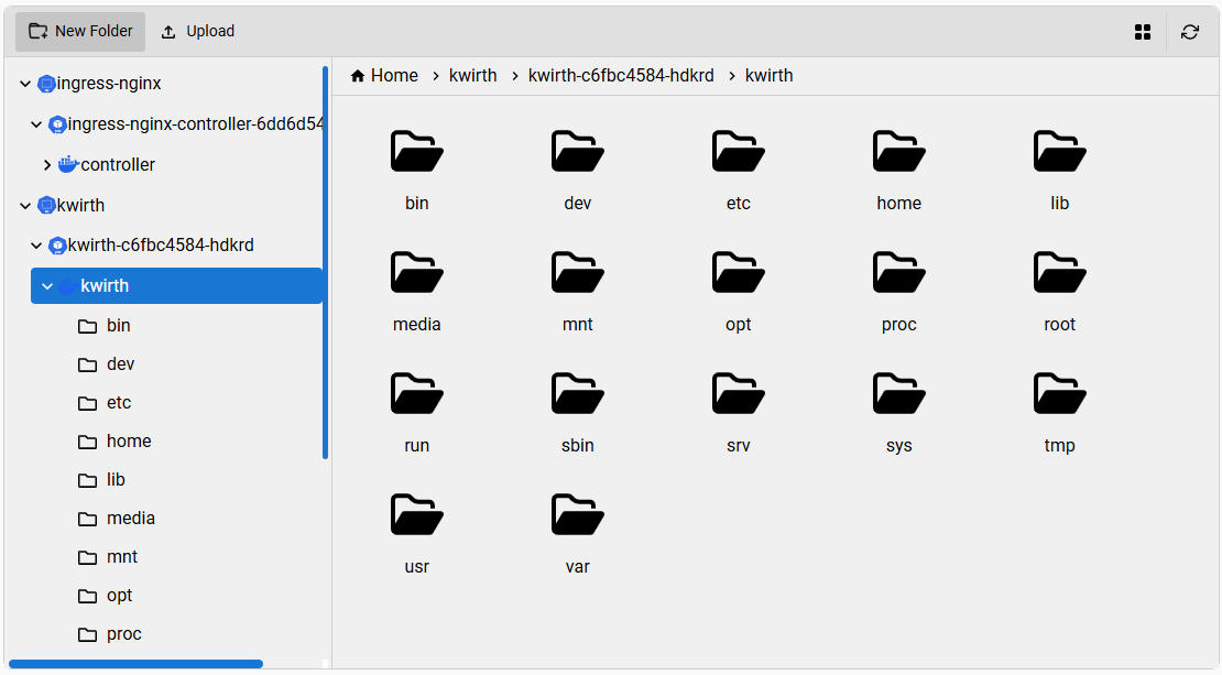
You can build interfaces like this (this one has been built for a kubernetes file navigator):
|
|
142
150
|
|
|
143
151
|
|
|
144
|
-
For achieving these objectives you need to add to each entry in the `files` object an **optional** property called `class`. So, for the top level,
|
|
152
|
+
For achieving these objectives you need to add to each entry in the `files` object an **optional** property called `class`. So, for the top level,
|
|
153
|
+
the class property could be `category`. For the second level, the value of `class` could be something like `topic`,
|
|
154
|
+
and for the third level it could be something like `book`.
|
|
145
155
|
|
|
146
156
|
The next step is to add the icons for these objects. You must create a Map like this one:
|
|
147
157
|
|
|
@@ -152,9 +162,10 @@ The next step is to add the icons for these objects. You must create a Map like
|
|
|
152
162
|
icons.set('book', { open: <JSX.Element />, closed: <JSX.Element /> })
|
|
153
163
|
```
|
|
154
164
|
|
|
155
|
-
This way, when rendering an object with the `class` `category`, react-file-manager will show the proper icon, in the folder tree and also in the file list,
|
|
165
|
+
This way, when rendering an object with the `class` `category`, react-file-manager will show the proper icon, in the folder tree and also in the file list,
|
|
166
|
+
wherever it be a grid or a list layout.
|
|
156
167
|
|
|
157
|
-
If you want to add specific actions for each `class`, you
|
|
168
|
+
If you want to add specific actions for each `class`, you must create an `actions` map like this:
|
|
158
169
|
|
|
159
170
|
```javascript
|
|
160
171
|
let actions = new Map();
|
|
@@ -176,7 +187,7 @@ If you want to add specific actions for each `class`, you can, for example, crea
|
|
|
176
187
|
])
|
|
177
188
|
```
|
|
178
189
|
|
|
179
|
-
|
|
190
|
+
The previous piece of code adds two actions to objects of class `book`:
|
|
180
191
|
|
|
181
192
|
- One for reading the book (the `onClick` method should open an ebook reader on screen).
|
|
182
193
|
- Another one for viewing book details.
|
|
@@ -200,7 +211,7 @@ What follows is an example with Kubernetes objects, icons and actions that we ha
|
|
|
200
211
|
|
|
201
212
|
|
|
202
213
|
## 🎨 UI Customization
|
|
203
|
-
`react-file-manager` can be easily customized to
|
|
214
|
+
`react-file-manager` can be easily customized to meet your React application UI styles.
|
|
204
215
|
|
|
205
216
|
The simplest way for customizing this component is as follows:
|
|
206
217
|
|
|
@@ -234,12 +245,12 @@ Et voilà !
|
|
|
234
245
|
| Name | Type | Description |
|
|
235
246
|
| - | - | - |
|
|
236
247
|
| `acceptedFileTypes` | string | (Optional) A comma-separated list of allowed file extensions for uploading specific file types (e.g., `.txt, .png, .pdf`). If omitted, all file types are accepted. |
|
|
237
|
-
| `actions` | Map<string Action[]> | (Optional) A map of custom actions that would be added to the proper file
|
|
248
|
+
| `actions` | Map<string Action[]> | (Optional) A map of custom actions that would be added to the proper file classes. |
|
|
238
249
|
| `className` | string | CSS class names to apply to the FileManager root element. |
|
|
239
250
|
| `collapsibleNav` | boolean | Enables a collapsible navigation pane on the left side. When `true`, a toggle will be shown to expand or collapse the navigation pane. `default: false`. |
|
|
240
251
|
| `defaultNavExpanded` | boolean | Sets the default expanded (`true`) or collapsed (`false`) state of the navigation pane when `collapsibleNav` is enabled. This only affects the initial render. `default: true`. |
|
|
241
252
|
| `enableFilePreview` | boolean | A boolean flag indicating whether to use the default file previewer in the file manager `default: true`. |
|
|
242
|
-
| `fileDownloadConfig` | { url: string; headers?: { [key: string]: string } } | Configuration object for file downloads. It includes the download URL prefix (`url`) and an optional `headers` object for setting custom HTTP headers in the download request (for adding
|
|
253
|
+
| `fileDownloadConfig` | { url: string; headers?: { [key: string]: string } } | Configuration object for file downloads. It includes the download URL prefix (`url`) and an optional `headers` object for setting custom HTTP headers in the download request (for adding Authorization, for example). The `headers` object can accept any standard or custom headers required by the server. This configuration object **is also used for file preview** |
|
|
243
254
|
| `filePreviewPath` | string | The base URL for file previews e.g.`https://example.com`, file path will be appended automatically to it i.e. `https://example.com/yourFilePath`. |
|
|
244
255
|
| `filePreviewComponent` | (file: [File](#-file-structure)) => React.ReactNode | (Optional) A callback function that provides a custom file preview. It receives the selected file as its argument and must return a valid React node, JSX element, or HTML. Use this prop to override the default file preview behavior. Example: [Custom Preview Usage](#custom-file-preview). |
|
|
245
256
|
| `fileUploadConfig` | { url: string; method?: "POST" \| "PUT"; headers?: { [key: string]: string } } | Configuration object for file uploads. It includes the upload URL (`url`), an optional HTTP method (`method`, default is `"POST"`), and an optional `headers` object for setting custom HTTP headers in the upload request. The `method` property allows only `"POST"` or `"PUT"` values. The `headers` object can accept any standard or custom headers required by the server. Example: `{ url: "https://example.com/fileupload", method: "PUT", headers: { Authorization: "Bearer " + TOKEN, "X-Custom-Header": "value" } }` |
|
|
@@ -247,7 +258,7 @@ Et voilà !
|
|
|
247
258
|
| `fontFamily` | string | The font family to be used throughout the component. Accepts any valid CSS font family (e.g., `'Arial, sans-serif'`, `'Roboto'`). You can customize the font styling to match your application's theme. `default: 'Nunito Sans, sans-serif'`. |
|
|
248
259
|
| `formatDate` | (date: string \| Date) => string | (Optional) A custom function used to format file and folder modification dates. If omitted, the component falls back to its built-in formatter from `utils/formatDate`. Useful for adapting the date display to different locales or formats.
|
|
249
260
|
| `height` | string \| number | The height of the component `default: 600px`. Can be a string (e.g., `'100%'`, `'10rem'`) or a number (in pixels). |
|
|
250
|
-
| `icons` | Map<string, { open:JSX.Element, closed:JSX.Element }> | (Optional) A map of custom icons that would be shown according to file
|
|
261
|
+
| `icons` | Map<string, { open:JSX.Element, closed:JSX.Element }> | (Optional) A map of custom icons that would be shown according to file classes. |
|
|
251
262
|
| `initialPath` | string | The path of the directory to be loaded initially e.g. `/Documents`. This should be the path of a folder which is included in `files` array. Default value is `""` |
|
|
252
263
|
| `isLoading` | boolean | A boolean state indicating whether the application is currently performing an operation, such as creating, renaming, or deleting a file/folder. Displays a loading state if set `true`. |
|
|
253
264
|
| `language` | string | A language code used for translations (e.g., `"en-US"`, `"fr-FR"`, `"tr-TR"`). Defaults to `"en-US"` for English. Allows the user to set the desired translation language manually. <br><br>**Available languages:** <br> 🇸🇦 `ar-SA` (Arabic, Saudi Arabia) <br> 🇩🇪 `de-DE` (German, Germany) <br> 🇺🇸 `en-US` (English, United States) <br> 🇪🇸 `es-ES` (Spanish, Spain) <br> 🇫🇷 `fr-FR` (French, France) <br> 🇮🇱 `he-IL` (Hebrew, Israel) <br> 🇮🇳 `hi-IN` (Hindi, India) <br> 🇮🇹 `it-IT` (Italian, Italy) <br> 🇯🇵 `ja-JP` (Japanese, Japan) <br> 🇰🇷 `ko-KR` (Korean, South Korea) <br> 🇧🇷 `pt-BR` (Portuguese, Brazil) <br> 🇵🇹 `pt-PT` (Portuguese, Portugal) <br> 🇷🇺 `ru-RU` (Russian, Russia) <br> 🇹🇷 `tr-TR` (Turkish, Turkey) <br> 🇺🇦 `uk-UA` (Ukrainian, Ukraine) <br> 🇵🇰 `ur-UR` (Urdu, Pakistan) <br> 🇻🇳 `vi-VN` (Vietnamese, Vietnam) <br> 🇨🇳 `zh-CN` (Chinese, Simplified) <br> 🇵🇱 `pl-PL` (Polish, Poland) |
|
|
@@ -367,10 +378,3 @@ function App() {
|
|
|
367
378
|
);
|
|
368
379
|
}
|
|
369
380
|
```
|
|
370
|
-
|
|
371
|
-
### Important notes
|
|
372
|
-
|
|
373
|
-
- `initialPath` is applied **only once** when the `files` state is first set.
|
|
374
|
-
- After that, folder changes are driven by `onFolderChange`.
|
|
375
|
-
- If you want to keep the path in sync with user navigation, use a controlled state (as shown
|
|
376
|
-
above).
|