@hybridlabor-api/aos 4.17.0 → 4.18.0
This diff represents the content of publicly available package versions that have been released to one of the supported registries. The information contained in this diff is provided for informational purposes only and reflects changes between package versions as they appear in their respective public registries.
- package/.claude/hooks/aos-bus.mjs +8 -4
- package/.claude/hooks/go-gate.mjs +1 -1
- package/.claude/hooks/go-token.mjs +17 -2
- package/.claude/hooks/memb-inject.mjs +61 -37
- package/.codex-plugin/plugin.json +1 -1
- package/.opencode/commands/bdb-aos-plan.md +1 -1
- package/README.md +1 -0
- package/THIRD_PARTY_NOTICES.md +2 -2
- package/bin/aos-acp.mjs +27 -1
- package/bin/aos-doctor.mjs +36 -1
- package/bin/aos-uninstall.mjs +16 -2
- package/bin/go-check.mjs +79 -0
- package/bin/guarded-patterns.json +106 -0
- package/commands/plan.md +1 -1
- package/docs/codenotch.md +44 -0
- package/docs/codex-gate-smoke.md +43 -0
- package/docs/delegation-routing.md +32 -0
- package/docs/go-check.md +60 -0
- package/docs/master-session-acp.md +2 -0
- package/docs/opencode-setup.md +18 -0
- package/installer.js +129 -70
- package/lib/codenotch.js +389 -0
- package/lib/retired-skills.js +101 -0
- package/mcps/mcsc/README.md +1 -1
- package/mcps/mcsc/packages/core/src/adapters/agy.js +3 -1
- package/mcps/mcsc/packages/core/src/adapters/codex.js +2 -1
- package/mcps/mcsc/packages/core/src/adapters/opencode.js +2 -1
- package/mcps/mcsc/packages/core/src/depth.js +16 -0
- package/mcps/mcsc/packages/mcp/server.js +15 -2
- package/package.json +2 -2
- package/plugin-commands.json +1 -2
- package/plugin.json +1 -4
- package/plugins/bdb-aos-codex/.codex-plugin/plugin.json +1 -1
- package/plugins/bdb-aos-codex/skills/plan/SKILL.md +1 -1
- package/scripts/codex-gate-smoke.mjs +73 -0
- package/skills/basic/master-session/SKILL.md +11 -0
- package/skills/global_config/agenttrail/SKILL.md +3 -1
- package/skills/global_config/agenttrail/bin/agenttrail.mjs +255 -117
- package/skills/global_config/agenttrail/bin/ensure.mjs +60 -40
- package/skills/global_config/agenttrail/bin/repoid.mjs +70 -0
- package/skills/global_config/agenttrail/public/index.html +9 -1
- package/skills/global_config/aos-setup/scripts/aos-doctor.mjs +1 -1
- package/skills/global_config/bdb-memb-mcp/SKILL.md +5 -4
- package/skills/global_config/bdb-visual-edit/SKILL.md +28 -32
- package/skills/global_config/bdb-visual-edit/references/vite-react-source-attr.md +2 -2
- package/skills/global_config/bdb-visual-edit/scripts/locate-source.mjs +135 -0
- package/skills/global_config/bdb-visual-edit/scripts/sanitize-element.mjs +30 -2
- package/skills/global_config/mcsc/SKILL.md +9 -1
- package/skills/global_config/plan-arbiter/SKILL.md +1 -1
- package/skills/global_config/plan-canvas/SKILL.md +42 -4
- package/skills/global_config/plan-canvas/scripts/lib/plan-builder/README.md +1 -1
- package/skills/global_config/plan-canvas/scripts/lib/plan-builder/render.js +2 -2
- package/skills/global_config/plan-canvas/scripts/lib/plan-canvas/annotate-client/geometry.js +76 -0
- package/skills/global_config/plan-canvas/scripts/lib/plan-canvas/annotate-client/index.js +596 -0
- package/skills/global_config/plan-canvas/scripts/lib/plan-canvas/annotate-client/model.js +192 -0
- package/skills/global_config/plan-canvas/scripts/lib/plan-canvas/annotate-client/toolbar.js +99 -0
- package/skills/global_config/plan-canvas/scripts/lib/plan-canvas/annotate-server.js +282 -0
- package/skills/global_config/plan-canvas/scripts/lib/plan-canvas/annotation-schema.js +210 -0
- package/skills/global_config/plan-canvas/scripts/lib/plan-canvas/route.js +10 -0
- package/skills/global_config/plan-canvas/scripts/lib/plan-canvas/sdk.js +6 -230
- package/skills/global_config/plan-canvas/scripts/lib/plan-canvas/server.js +45 -4
- package/skills/global_config/plan-canvas/scripts/lib/plan-canvas/sessions.js +60 -21
- package/skills/global_config/plan-canvas/scripts/lib/plan-canvas/trail-on-approve.js +103 -0
- package/skills/global_config/plan-canvas/scripts/lib/plan-canvas/ui.js +19 -7
- package/skills/global_config/plan-canvas/scripts/plan-canvas.js +118 -20
- package/skills/global_config/subagent-setup/SKILL.md +6 -0
- package/skills/global_config/subagent-setup/scripts/setup-subagents.mjs +20 -1
- package/skills/playbooks/pb-idea-to-launch/SKILL.md +2 -2
- package/skills/playbooks/pb-redesign-app/SKILL.md +3 -3
- package/skills/playbooks/pb-release-aos/SKILL.md +2 -2
- package/skills/playbooks/pb-ship/SKILL.md +2 -2
- package/skills/playbooks/pb-worktrees-land/SKILL.md +2 -2
- package/skills/global_config/bdb-visual-edit/scripts/pick-snippet.js +0 -27
- package/skills/global_config/visual-edit/README.md +0 -96
- package/skills/global_config/visual-edit/SKILL.md +0 -615
- package/skills/global_config/visual-plan/README.md +0 -93
- package/skills/global_config/visual-plan/SKILL.md +0 -544
- package/skills/global_config/visual-plan/references/canvas.md +0 -139
- package/skills/global_config/visual-plan/references/connection.md +0 -51
- package/skills/global_config/visual-plan/references/document-quality.md +0 -186
- package/skills/global_config/visual-plan/references/exemplar.md +0 -62
- package/skills/global_config/visual-plan/references/local-files.md +0 -99
- package/skills/global_config/visual-plan/references/wireframe.md +0 -319
- package/skills/global_config/visual-recap/README.md +0 -103
- package/skills/global_config/visual-recap/SKILL.md +0 -560
- package/skills/global_config/visual-recap/references/connection.md +0 -51
- package/skills/global_config/visual-recap/references/local-files.md +0 -99
- package/skills/global_config/visual-recap/references/wireframe.md +0 -319
|
@@ -1,319 +0,0 @@
|
|
|
1
|
-
# HTML wireframe quality — single source of truth
|
|
2
|
-
|
|
3
|
-
This file is the canonical quality bar for HTML wireframes / `<Screen>` /
|
|
4
|
-
`WireframeBlock` content, shared word for word by `/visual-plan` and
|
|
5
|
-
`/visual-recap`. Read it in full before authoring ANY wireframe; do not
|
|
6
|
-
author wireframes from memory or paraphrase these rules per command.
|
|
7
|
-
|
|
8
|
-
<!-- SHARED-CORE:wireframe-quality START -->
|
|
9
|
-
|
|
10
|
-
**A wireframe is an HTML mockup. The renderer owns the look; you write the
|
|
11
|
-
content.** Set `data.html` to a self-contained, semantic HTML fragment of the
|
|
12
|
-
screen and set `data.surface`. The renderer owns the surface footprint/aspect,
|
|
13
|
-
the dark/light theme, the hand-drawn font, and the rough.js sketch overlay — you
|
|
14
|
-
never write `<html>`/`<body>`/`<script>`/`<style>` tags or any
|
|
15
|
-
width/height/coordinates. You write real HTML layout and real product
|
|
16
|
-
content; the renderer styles and roughens it.
|
|
17
|
-
|
|
18
|
-
**A wireframe block's data is an HTML screen plus a surface:**
|
|
19
|
-
|
|
20
|
-
```json
|
|
21
|
-
{
|
|
22
|
-
"surface": "browser",
|
|
23
|
-
"html": "<div style=\"display:flex;flex-direction:column;gap:10px;padding:16px;height:100%\"><h1>Sign in</h1><p class=\"wf-muted\">Use your work email to continue.</p><div class=\"wf-card\" style=\"display:flex;flex-direction:column;gap:10px\"><label>Email<input value=\"jane@acme.co\" /></label><label>Password<input value=\"••••••••\" /></label><label style=\"display:flex;align-items:center;gap:8px\"><input type=\"checkbox\" checked /> Remember me</label><button class=\"primary\">Sign in</button></div><a href=\"#\">Forgot password?</a></div>"
|
|
24
|
-
}
|
|
25
|
-
```
|
|
26
|
-
|
|
27
|
-
**Write PLAIN semantic HTML and let the renderer style it.** Bare elements
|
|
28
|
-
(`h1`/`h2`/`h3`, `p`, `button`, `input`, `<input type="checkbox">`, `a`, `hr`)
|
|
29
|
-
are auto-themed — no classes needed. Helper classes carry the rest:
|
|
30
|
-
|
|
31
|
-
- `.wf-card` / `.wf-box` — a bordered, padded container (a panel, a list item).
|
|
32
|
-
- `.wf-pill` / `.wf-chip` — a rounded tag or filter; add `.accent`
|
|
33
|
-
(`<span class="wf-pill accent">`) for the accent-filled variant.
|
|
34
|
-
- `.wf-muted` — secondary/muted text (or use `<small>`).
|
|
35
|
-
- `button.primary` or any element with `[data-primary]` — the accent-filled
|
|
36
|
-
primary button.
|
|
37
|
-
|
|
38
|
-
**No decorative shadows around mockups.** Do not put `box-shadow`, `filter:
|
|
39
|
-
drop-shadow(...)`, Tailwind `shadow-*` classes, or other fake depth effects on a
|
|
40
|
-
wireframe frame, root container, `.wf-card` / `.wf-box`, or canvas artboard.
|
|
41
|
-
Mockups should read as flat, bordered surfaces; use spacing, borders, labels,
|
|
42
|
-
and annotations for separation. Only show a shadow when the real product UI
|
|
43
|
-
already has that shadow and it is essential to the change being reviewed.
|
|
44
|
-
|
|
45
|
-
**Use renderer icons, not visible icon words.** For icon-only buttons or leading
|
|
46
|
-
icons inside fields, chips, menu items, and toolbars, write an empty marker such
|
|
47
|
-
as `<span data-icon="mail" aria-label="Email"></span>` or
|
|
48
|
-
`<i data-icon="lock"></i>`. The renderer replaces it with a Tabler-style SVG and
|
|
49
|
-
the `.wf-icon` class sizes it to the surrounding text. Supported names and
|
|
50
|
-
aliases: `mail`/`email`, `lock`/`password`, `search`, `plus`/`add`, `x`/`close`,
|
|
51
|
-
`check`, `chevronDown`, `chevronUp`, `chevronLeft`, `chevronRight`, `dots`/`more`,
|
|
52
|
-
`chevron`/`caret`/`dropdown` (down chevron), `user`, `settings`, `calendar`,
|
|
53
|
-
`bell`, `send`, `edit`, `arrowLeft`, and `arrowRight`. Do not put visible words
|
|
54
|
-
like "email", "lock", "search", "chevron", or "more" where the product UI would
|
|
55
|
-
show an icon; use text only when it is a real label a user would read.
|
|
56
|
-
|
|
57
|
-
**Use the `--wf-*` tokens for any custom color, never hex.** The renderer flips
|
|
58
|
-
these on light/dark, so reading them is what keeps a mockup correct in both
|
|
59
|
-
themes. For any inline border, background, or text color, reference a token:
|
|
60
|
-
`style="border:1.4px solid var(--wf-line)"`. The tokens are `--wf-ink` (text),
|
|
61
|
-
`--wf-muted` (secondary text), `--wf-line` (borders/dividers), `--wf-paper`
|
|
62
|
-
(page background), `--wf-card` (container surface), `--wf-accent` /
|
|
63
|
-
`--wf-accent-fg` / `--wf-accent-soft` (brand action), `--wf-warn`, `--wf-ok`,
|
|
64
|
-
and `--wf-radius`. Never hard-code a hex color and never set `font-family` — the
|
|
65
|
-
renderer owns the sketch/clean font.
|
|
66
|
-
|
|
67
|
-
**Never use host/Tailwind theme classes in wireframe HTML.** Classes such as
|
|
68
|
-
`bg-white`, `bg-zinc-50`, `bg-slate-950`, `text-zinc-950`,
|
|
69
|
-
`text-slate-400`, `border-zinc-200`, `hover:bg-slate-800`, `shadow-xl`,
|
|
70
|
-
or arbitrary color utilities like `bg-[#fff]` leak the host app's CSS into the
|
|
71
|
-
mockup and can make dark-mode canvas frames unreadable. Use bare semantic
|
|
72
|
-
elements, `.wf-*` helper classes, and `--wf-*` color tokens instead. Before
|
|
73
|
-
publishing, scan every wireframe `class` and `style` attribute: if a class sets
|
|
74
|
-
background, text, border, ring, fill, stroke, gradient, placeholder, decoration,
|
|
75
|
-
or shadow color, rewrite it to renderer tokens or remove it. Layout-only classes
|
|
76
|
-
are still discouraged; inline flex/grid styles are safer and easier to review.
|
|
77
|
-
|
|
78
|
-
**Keep Rough.js sparse.** The renderer sketches the outer frame, standard
|
|
79
|
-
`.wf-*` primitives, controls, and inline border dividers by default. Do not add
|
|
80
|
-
`data-rough` to broad root wrappers, dialog shells, page panels, grid cells, or
|
|
81
|
-
nested containers unless that single container is the visual point. Use
|
|
82
|
-
`data-rough` only for a deliberate one-off shape. If a mockup starts looking
|
|
83
|
-
like stacked/overlapping sketch lines, remove rough targets from parent
|
|
84
|
-
containers and let backgrounds plus spacing separate the surfaces.
|
|
85
|
-
|
|
86
|
-
**Use literal CSS lengths for spacing.** The `--wf-*` tokens are for colors and
|
|
87
|
-
renderer-owned visual styling, not layout spacing. Do not use guessed spacing
|
|
88
|
-
tokens such as `var(--wf-space-4)`, Tailwind spacing classes, or theme spacing
|
|
89
|
-
variables inside wireframe HTML; if a token is unavailable in the Plan renderer,
|
|
90
|
-
padding collapses and content hugs the border. Use explicit CSS lengths for
|
|
91
|
-
layout: `padding:16px`, `gap:12px`, `margin-top:18px`, `minmax(0,1fr)`.
|
|
92
|
-
|
|
93
|
-
**Lay out with inline `style` flex/grid.** You write the real layout —
|
|
94
|
-
`display:flex; flex-direction:column; gap:10px; padding:16px` and so on — and the
|
|
95
|
-
renderer never repositions anything. Compose the actual product: reproduce the
|
|
96
|
-
current screen, then show the modification. Real labels, real counts, real dates,
|
|
97
|
-
real button text grounded in the screen you read; not lorem or gray bars.
|
|
98
|
-
|
|
99
|
-
**Surface presets — match the real footprint, never default to desktop+mobile.**
|
|
100
|
-
Pick the `surface` that matches what the user will actually see:
|
|
101
|
-
|
|
102
|
-
- `browser`: a web page that needs a browser chrome frame around it.
|
|
103
|
-
- `desktop`: a full desktop app page or app shell.
|
|
104
|
-
- `mobile`: a phone screen, only when the work is genuinely mobile.
|
|
105
|
-
- `popover`: a small floating menu, dropdown, or inline popover.
|
|
106
|
-
- `panel`: a side panel, inspector, or sidebar widget.
|
|
107
|
-
|
|
108
|
-
A sidebar popover renders as a small surface, not a desktop page and a phone
|
|
109
|
-
frame. Do not emit `desktop` + `mobile` variants unless responsive behavior
|
|
110
|
-
actually changes the layout. For a component or widget, show one broader
|
|
111
|
-
app-context frame only when placement affects understanding, then the focused
|
|
112
|
-
component states.
|
|
113
|
-
|
|
114
|
-
**Model the actual component shell for small surfaces.** A rendered UI change
|
|
115
|
-
belongs in a wireframe; reserve `diagram` for architecture, dependency, state,
|
|
116
|
-
or data-flow relationships. Popovers, dropdown menus, command palettes, and
|
|
117
|
-
context menus use `surface: "popover"` unless the surrounding page placement is
|
|
118
|
-
the point of the change. Dialogs, sheets, inspectors, sidebars, and long
|
|
119
|
-
property panels use the matching `panel` / `desktop` surface as appropriate.
|
|
120
|
-
Show the real chrome: trigger or anchor when it matters, title/header row,
|
|
121
|
-
top-right actions, separators, fields, options, selected states, body content,
|
|
122
|
-
and footer actions that are visible in the workflow.
|
|
123
|
-
|
|
124
|
-
**Modify, don't redesign.** When the task changes an existing screen, reproduce
|
|
125
|
-
the current screen's real layout and footprint FIRST, then change only the delta
|
|
126
|
-
and call it out with a single annotation. Do not restack the page into a new
|
|
127
|
-
layout. For net-new surfaces, compose from the real app shell. Inspect the
|
|
128
|
-
actual app components before drawing an existing product: sidebar density,
|
|
129
|
-
toolbar actions, overflow menus, property panels, and framework chrome should
|
|
130
|
-
match the product unless the plan intentionally changes them.
|
|
131
|
-
|
|
132
|
-
**Keep product screens pure.** A product wireframe shows the app state a user
|
|
133
|
-
would actually see. Do not embed file contracts, architecture arrows, repo pills,
|
|
134
|
-
mode explanations, or implementation callouts inside the screen just to explain
|
|
135
|
-
the plan. Put those in canvas annotations, a separate diagram, or the document
|
|
136
|
-
body. Secondary UI such as properties, history, sync, export, or agent controls
|
|
137
|
-
should appear where the real product would put them: an overflow popover, sheet,
|
|
138
|
-
panel, or separate framework sidebar state, not a generic permanent right
|
|
139
|
-
inspector unless that inspector is the actual design.
|
|
140
|
-
|
|
141
|
-
**Classify mockup scope before implementation.** Before turning a plan mockup
|
|
142
|
-
into source code, decide whether each artboard represents the whole page/app
|
|
143
|
-
shell, a route body inside an existing shell, or a component/sub-surface. If an
|
|
144
|
-
artboard includes navigation, sidebars, auth banners, or a signup/login form,
|
|
145
|
-
map those pieces to the real shared shell/auth components instead of nesting the
|
|
146
|
-
entire mockup inside the current page. When a mockup references the product's
|
|
147
|
-
standard signup/login page, find and reuse that existing implementation; do not
|
|
148
|
-
approximate it from the wireframe.
|
|
149
|
-
|
|
150
|
-
**Zoom in on sub-surfaces, don't redraw the page.** For a small sub-surface (a
|
|
151
|
-
popover, menu, dialog, toast), show the full screen once, then add a small
|
|
152
|
-
separate artboard whose `html` contains ONLY that sub-surface — do not re-draw
|
|
153
|
-
the whole page around it, and do not scale a duplicate up. Pick the matching
|
|
154
|
-
`surface` (e.g. `popover`) so the footprint is right; never widen a popover to
|
|
155
|
-
page width.
|
|
156
|
-
|
|
157
|
-
**Loading / skeleton states.** Set `data.skeleton: true` on the wireframe and
|
|
158
|
-
fill the `html` with neutral, textless placeholder geometry — boxes and bars
|
|
159
|
-
built as `<div>`s with `background:var(--wf-line)` and explicit heights/widths,
|
|
160
|
-
no labels or copy. The renderer drops borders, sketch, and color into the
|
|
161
|
-
skeleton register automatically. Never escape to a `custom-html` document block
|
|
162
|
-
to fake a loader.
|
|
163
|
-
|
|
164
|
-
**Editing an existing mockup.** In hosted mode, to change one element, text, or
|
|
165
|
-
color in an existing html mockup, do not regenerate the frame — call
|
|
166
|
-
`update-visual-plan` with
|
|
167
|
-
`contentPatches: [{ op: "patch-wireframe-html", blockId, edits: [{ find,
|
|
168
|
-
replace }] }]`. Each `find` is a unique snippet of the current html (read it
|
|
169
|
-
first with `get-visual-plan`); set `all: true` on an edit to replace every
|
|
170
|
-
occurrence. The result is re-sanitized. In local-files privacy mode, do not call
|
|
171
|
-
hosted Plan tools; edit the local MDX source directly and rerun the local
|
|
172
|
-
check/serve or verify command for `<plan-dir>`.
|
|
173
|
-
|
|
174
|
-
**Choose the outer frame deliberately.** Wireframe and diagram data accept
|
|
175
|
-
`frame: "auto" | "show" | "hide"` in block data (`<Screen frame="hide">` in
|
|
176
|
-
MDX wireframes, `<Diagram frame="hide">` for MDX diagrams). Leave it unset or
|
|
177
|
-
`auto` when the host context should decide: Plan and recap surfaces default to a
|
|
178
|
-
drawn outer frame; docs surfaces default to no outer frame. Use `show` for
|
|
179
|
-
standalone product screens, before/after recap comparisons, screenshot-like
|
|
180
|
-
artifacts, and visuals that need containment from surrounding prose. Use `hide`
|
|
181
|
-
when a docs page, tab, column, card, canvas artboard, or the visual's own
|
|
182
|
-
internal chrome already supplies the boundary. Do not use `hide` to compensate
|
|
183
|
-
for cramped content; fix the layout instead.
|
|
184
|
-
|
|
185
|
-
**Inner padding and borders still matter.** Always wrap HTML wireframe content
|
|
186
|
-
in a root container with real inner padding before drawing cards, fields, pills,
|
|
187
|
-
labels, or controls. Use at least 14-16px of padding, `box-sizing: border-box`,
|
|
188
|
-
`height: 100%`, and `gap` between child rows on the root node itself so the
|
|
189
|
-
first row never sits flush against the screen edge. Do not rely on padding on a
|
|
190
|
-
nested page section as the first visible inset; the outermost element must
|
|
191
|
-
create the breathing room. Keep text away from borders: every container, field,
|
|
192
|
-
button, menu item, and annotation needs enough padding and line-height to read
|
|
193
|
-
cleanly in the rendered Plan view.
|
|
194
|
-
|
|
195
|
-
**Center page-like content inside broad surfaces.** For browser or desktop
|
|
196
|
-
screens, let the outer root provide the full-width frame and padding, then keep
|
|
197
|
-
the page body in a centered wrapper such as
|
|
198
|
-
`width:100%;max-width:720px;margin-inline:auto`. Full-width app bars may span
|
|
199
|
-
the root, but onboarding, auth, settings, and other page-like content should
|
|
200
|
-
not hug the left border unless the real product does.
|
|
201
|
-
|
|
202
|
-
**For feature-cloud or abundance visuals, optimize the composition over line-by-line
|
|
203
|
-
reading.** Some marketing/product sections need to feel like a large surface area
|
|
204
|
-
of capability rather than a precise app workflow. In those cases, use one padded
|
|
205
|
-
root with a short headline and a dense, aesthetic cloud of short feature labels,
|
|
206
|
-
chips, rings, or columns. Vary scale and opacity with tokens, cluster by meaning,
|
|
207
|
-
and let many labels be glanceable rather than individually essential. Do not
|
|
208
|
-
force dozens of features into equal cards with long wrapped sentences; that
|
|
209
|
-
usually creates a messy unreadable mockup.
|
|
210
|
-
|
|
211
|
-
**Lay out children safely so they never collide.** Use HTML flex/grid with
|
|
212
|
-
`gap`, `min-width: 0`, and sensible overflow. Avoid negative margins, absolute
|
|
213
|
-
positioning, or fixed child widths that can collide when the renderer switches
|
|
214
|
-
between light/dark, sketch/clean, or different zoom levels.
|
|
215
|
-
|
|
216
|
-
**Do not wrap intentionally single-line labels.** For toolbars, tab rails,
|
|
217
|
-
breadcrumbs, chip/filter rows, branch and file names, file chips, and code
|
|
218
|
-
filenames — any deliberately single-line row — do not let long text wrap. Put
|
|
219
|
-
`white-space: nowrap` on the row (and `overflow: hidden; text-overflow: ellipsis`
|
|
220
|
-
on the individual labels that can grow), so the wireframe demonstrates the actual
|
|
221
|
-
layout behavior instead of producing ugly stacked or vertical text. Use
|
|
222
|
-
horizontally scrollable or clipped rails for overflow.
|
|
223
|
-
|
|
224
|
-
**Fill the frame; keep labels short.** Each artboard is a fixed-size surface — compose enough realistic HTML to fill it top to bottom with even vertical rhythm; never leave a large empty band. On desktop/app-shell sidebars, let the nav stack flex to fill (`flex:1`) and add any persistent bottom action/status after it so the rail reads complete in taller frames. On mobile especially, flow real rows down the whole screen (status bar, header, then list/detail content) rather than a header floating above a gap. Keep every label short enough to sit on one line within its column — shorten the copy rather than relying on the frame to absorb it (long labels wrap or clip).
|
|
225
|
-
|
|
226
|
-
**Persistent chrome bars span the full frame width.** Top bars, app headers,
|
|
227
|
-
toolbars, and bottom tab/nav bars are full-width chrome, not centered content.
|
|
228
|
-
Lay each one out as a single flex row that fills the frame
|
|
229
|
-
(`style="display:flex;align-items:center;width:100%"`) and push trailing actions
|
|
230
|
-
to the right edge with a flex spacer (`<div style="flex:1"></div>`) between the
|
|
231
|
-
leading group and the trailing group — never center a bar inside a narrow,
|
|
232
|
-
centered block, and never let it collapse to the width of its contents. In a
|
|
233
|
-
Before/After pair the bar stays full-width in BOTH states even when one state has
|
|
234
|
-
fewer controls; the spacer absorbs the difference so the remaining controls hold
|
|
235
|
-
their edge alignment instead of sliding to the center.
|
|
236
|
-
|
|
237
|
-
**Pin bottom bars to the bottom of the frame.** For mobile tab bars, footers, and
|
|
238
|
-
any persistent bottom action row, make the frame itself a flex column at
|
|
239
|
-
`height:100%` (`style="display:flex;flex-direction:column;height:100%"`), give the
|
|
240
|
-
scrolling body `flex:1` so it absorbs the slack, and place the bar as the LAST
|
|
241
|
-
child of the frame (or set `margin-top:auto` on it). The bar then sits flush at
|
|
242
|
-
the bottom of the surface instead of floating directly under the content with an
|
|
243
|
-
empty band beneath it.
|
|
244
|
-
|
|
245
|
-
**Before / after must be comparable.** When showing a state change, preserve the
|
|
246
|
-
unchanged controls in both states so the reviewer can see exactly what moved or
|
|
247
|
-
appeared; do not show an added control as a generic box floating elsewhere in
|
|
248
|
-
the surface. Place the new/changed affordance where the implementation puts it —
|
|
249
|
-
for example, a new `Edit with AI` action in a popover header belongs in the
|
|
250
|
-
top-right header slot, aligned with the title, not in the body or footer. Use
|
|
251
|
-
the same frame size, scale, outer padding, border radius, and visual density on
|
|
252
|
-
both sides unless the change itself alters those properties, and let the frame
|
|
253
|
-
height fit the content rather than leaving a tall empty lower half.
|
|
254
|
-
|
|
255
|
-
**Name the states with the column header, never inside the frame.** For
|
|
256
|
-
document-body wireframes (recaps), put the two
|
|
257
|
-
states in a `columns` block and set each column's `label` to `Before` and
|
|
258
|
-
`After` — the renderer draws that label as an `h4` heading above each frame. Do
|
|
259
|
-
NOT bake a `Before`/`After` pill, title, or heading into the wireframe `html`: a
|
|
260
|
-
label placed inside reads as part of the product UI, lands in a random corner,
|
|
261
|
-
and clutters the comparison. The column header is the one and only place the
|
|
262
|
-
state name belongs. On a canvas, place the two state artboards as neighbors with
|
|
263
|
-
frame labels — never encode Before/After inside the html.
|
|
264
|
-
|
|
265
|
-
**Let the surface choose side-by-side vs. stacked.** For document-body
|
|
266
|
-
wireframes (recaps), the `columns` renderer lays
|
|
267
|
-
narrow surfaces (`mobile`, `popover`, `panel`) out side by side, and
|
|
268
|
-
automatically stacks wide surfaces (`desktop`, `browser`) vertically at full
|
|
269
|
-
document width so a large frame is never crushed into a half-width column and
|
|
270
|
-
cropped. Author both wireframes with the real `surface` and the matching
|
|
271
|
-
`Before`/`After` column labels; do not hand-stack the pair into separate
|
|
272
|
-
top-level wireframes or duplicate the state name as body content.
|
|
273
|
-
|
|
274
|
-
**Good example — a contacts list, surface `browser`.** A small, real screen
|
|
275
|
-
composed from the helper classes and tokens, layout in inline flex, no fonts or
|
|
276
|
-
hex colors:
|
|
277
|
-
|
|
278
|
-
```html
|
|
279
|
-
<div
|
|
280
|
-
style="display:flex;flex-direction:column;gap:12px;padding:16px;height:100%"
|
|
281
|
-
>
|
|
282
|
-
<div style="display:flex;align-items:center;justify-content:space-between">
|
|
283
|
-
<h1>Contacts</h1>
|
|
284
|
-
<button class="primary">New contact</button>
|
|
285
|
-
</div>
|
|
286
|
-
<div style="display:flex;gap:6px">
|
|
287
|
-
<span class="wf-pill accent">All 128</span>
|
|
288
|
-
<span class="wf-pill">Favorites</span>
|
|
289
|
-
<span class="wf-pill">Archived</span>
|
|
290
|
-
</div>
|
|
291
|
-
<div
|
|
292
|
-
class="wf-card"
|
|
293
|
-
style="display:flex;flex-direction:column;gap:0;padding:0"
|
|
294
|
-
>
|
|
295
|
-
<div
|
|
296
|
-
style="display:flex;align-items:center;gap:10px;padding:10px 12px;border-bottom:1.4px solid var(--wf-line)"
|
|
297
|
-
>
|
|
298
|
-
<div
|
|
299
|
-
style="width:32px;height:32px;border-radius:999px;background:var(--wf-accent-soft)"
|
|
300
|
-
></div>
|
|
301
|
-
<div style="flex:1">
|
|
302
|
-
<strong>Jane Cooper</strong><br /><small>jane@acme.co</small>
|
|
303
|
-
</div>
|
|
304
|
-
<span class="wf-pill">Lead</span>
|
|
305
|
-
</div>
|
|
306
|
-
<div style="display:flex;align-items:center;gap:10px;padding:10px 12px">
|
|
307
|
-
<div
|
|
308
|
-
style="width:32px;height:32px;border-radius:999px;background:var(--wf-accent-soft)"
|
|
309
|
-
></div>
|
|
310
|
-
<div style="flex:1">
|
|
311
|
-
<strong>Marcus Lee</strong><br /><small>marcus@globex.io</small>
|
|
312
|
-
</div>
|
|
313
|
-
<span class="wf-pill">Customer</span>
|
|
314
|
-
</div>
|
|
315
|
-
</div>
|
|
316
|
-
</div>
|
|
317
|
-
```
|
|
318
|
-
|
|
319
|
-
<!-- SHARED-CORE:wireframe-quality END -->
|
|
@@ -1,103 +0,0 @@
|
|
|
1
|
-
# /visual-recap
|
|
2
|
-
|
|
3
|
-
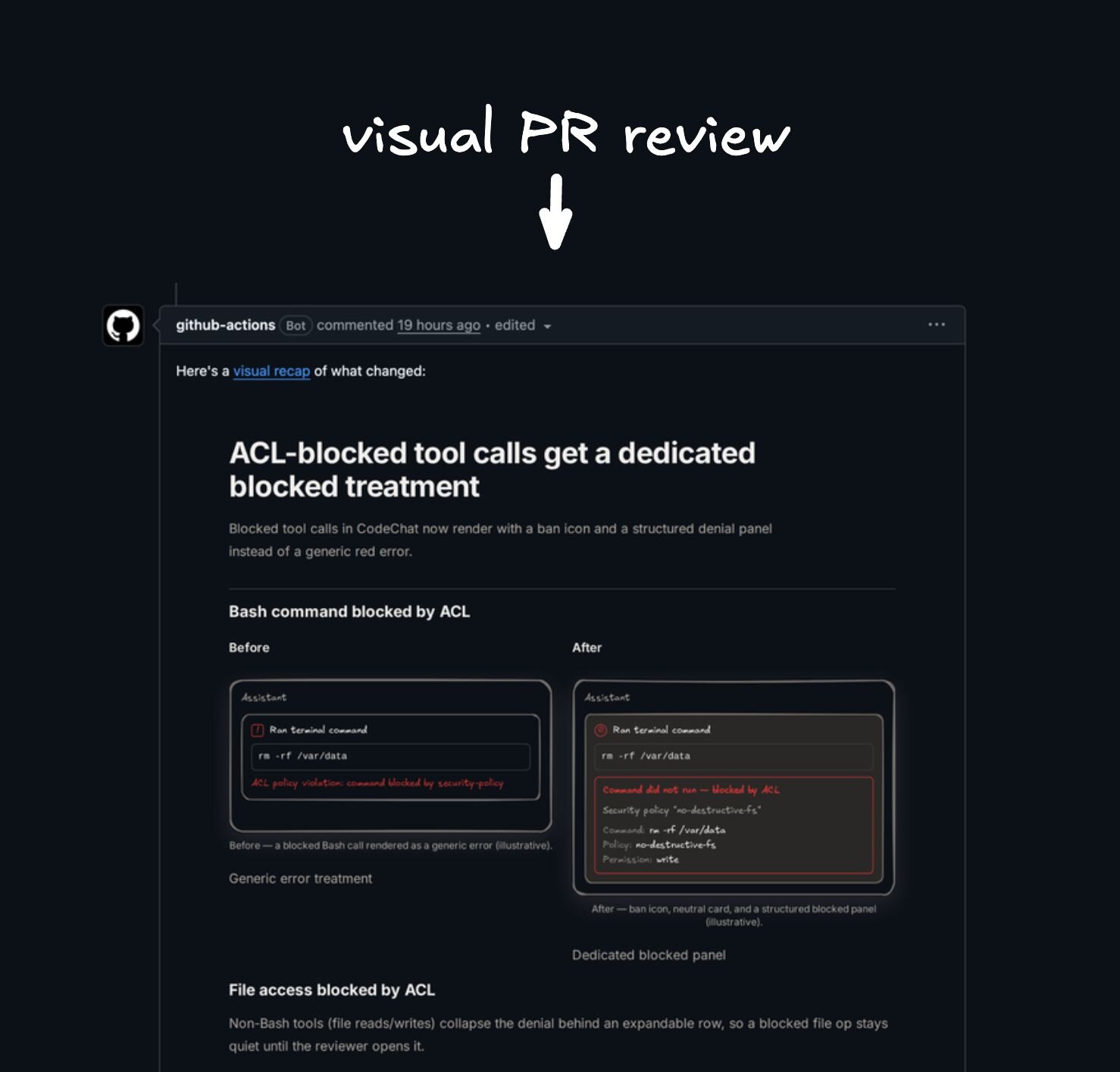
Turn a branch, commit, or PR diff into an interactive visual recap with
|
|
4
|
-
annotated diffs, diagrams, API/schema summaries, file maps, UI state summaries,
|
|
5
|
-
and focused review notes.
|
|
6
|
-
|
|
7
|
-
`/visual-recap` is the reverse of `/visual-plan`: instead of planning a future
|
|
8
|
-
change, it summarizes a diff, branch, commit, or PR after the work exists. The
|
|
9
|
-
goal is to help reviewers understand the shape of a change before they dive into
|
|
10
|
-
raw line-by-line diffs.
|
|
11
|
-
|
|
12
|
-
It solves for diffs that hide the shape of the change. Reviewers can understand
|
|
13
|
-
contracts, architecture moves, schema changes, and UI impact before diving into
|
|
14
|
-
raw line-by-line review.
|
|
15
|
-
|
|
16
|
-
The recap is a human-optimized MDX document with custom components for the
|
|
17
|
-
things raw diffs are bad at explaining: annotated diffs, diagrams, visual schema
|
|
18
|
-
maps, OpenAPI-style API diffs, file maps, UI state summaries, and focused review
|
|
19
|
-
notes.
|
|
20
|
-
|
|
21
|
-
Visual recaps are MDX, customizable with your own components, and viewed with
|
|
22
|
-
the [Agent-Native plans app](https://www.agent-native.com/docs/template-plan).
|
|
23
|
-
The hosted app is 100% free and open source; local-files mode writes the recap
|
|
24
|
-
MDX locally, starts a localhost bridge, and opens the hosted Plan UI with no
|
|
25
|
-
sharing.
|
|
26
|
-
[Source here](https://github.com/BuilderIO/agent-native/).
|
|
27
|
-
|
|
28
|
-
<picture>
|
|
29
|
-
<img alt="Visual recap review surface animation" src="../../media/visual-recap.gif">
|
|
30
|
-
</picture>
|
|
31
|
-
|
|
32
|
-
## What It Does
|
|
33
|
-
|
|
34
|
-
- Reads the actual changed files and diff.
|
|
35
|
-
- Publishes an interactive recap with file maps, diagrams, visual schema
|
|
36
|
-
maps, API diffs, annotated diffs, UI state summaries, and focused key changes.
|
|
37
|
-
- Keeps recaps substantial enough for real review without dumping every line.
|
|
38
|
-
- Makes large changes consumable before a reviewer opens raw GitHub diff view.
|
|
39
|
-
- Can be installed with a reusable GitHub Action for PR visual recaps.
|
|
40
|
-
|
|
41
|
-
## When To Use It
|
|
42
|
-
|
|
43
|
-
Use it for PRs or work units that are large, multi-file, UI-heavy, or touch
|
|
44
|
-
schema, API contracts, permissions, architecture, or review-critical behavior.
|
|
45
|
-
|
|
46
|
-
Skip it for tiny, obvious diffs that review faster directly in GitHub.
|
|
47
|
-
|
|
48
|
-
## What Reviewers Get
|
|
49
|
-
|
|
50
|
-
Reviewers get the shape of the change first: what moved, which contracts
|
|
51
|
-
changed, what data or API surfaces were touched, how UI states differ, and where
|
|
52
|
-
the risky lines are. Then they can review the raw diff with a map in their head.
|
|
53
|
-
|
|
54
|
-
## Modes
|
|
55
|
-
|
|
56
|
-
`/visual-recap` can run in three modes:
|
|
57
|
-
|
|
58
|
-
- **Hosted Plans, shareable links (recommended):** uses the free, open-source
|
|
59
|
-
Agent-Native plans app at plan.agent-native.com for shareable links, comments,
|
|
60
|
-
and the browser editor.
|
|
61
|
-
- **Local files only:** writes a local MDX folder, starts a localhost bridge,
|
|
62
|
-
and opens the hosted Plan UI against that local source. No sharing, all local,
|
|
63
|
-
and no recap content is written to the hosted database.
|
|
64
|
-
- **Self-hosted/custom URL:** connects the skill to your own Plan app or local
|
|
65
|
-
development tunnel.
|
|
66
|
-
|
|
67
|
-
Use hosted mode when you want comments and shareable links. Use local files mode
|
|
68
|
-
when the recap should live in source control or stay on your machine. Use
|
|
69
|
-
`plans/<slug>/` when you want to check the files in, or a temp/ignored folder
|
|
70
|
-
when you do not. The bridge URL works on the machine running it and is not a
|
|
71
|
-
share link.
|
|
72
|
-
|
|
73
|
-
## GitHub Action
|
|
74
|
-
|
|
75
|
-
When installed with `--with-github-action`, this repo writes a PR workflow that
|
|
76
|
-
can automatically generate a visual recap from every pull request diff.
|
|
77
|
-
Reviewers open the generated PR recap in the
|
|
78
|
-
[Plan app review surface](https://www.agent-native.com/docs/template-plan)
|
|
79
|
-
before moving into raw GitHub diff view.
|
|
80
|
-
|
|
81
|
-
The top-level installer also offers the PR action as an option:
|
|
82
|
-
|
|
83
|
-
```sh
|
|
84
|
-
npx @agent-native/skills@latest add
|
|
85
|
-
```
|
|
86
|
-
|
|
87
|
-
|
|
88
|
-
|
|
89
|
-
## Install
|
|
90
|
-
|
|
91
|
-
```sh
|
|
92
|
-
npx @agent-native/skills@latest add --skill visual-recap --with-github-action
|
|
93
|
-
```
|
|
94
|
-
|
|
95
|
-
The interactive installer asks whether to use hosted Plans or local files. To
|
|
96
|
-
force the no-sharing local path:
|
|
97
|
-
|
|
98
|
-
```sh
|
|
99
|
-
npx @agent-native/skills@latest add --skill visual-recap --mode local-files
|
|
100
|
-
```
|
|
101
|
-
|
|
102
|
-
The skill expects the [Plan MCP connector](https://www.agent-native.com/docs/template-plan)
|
|
103
|
-
to be available when hosted mode is used.
|