@gtkx/react 0.19.0 → 0.21.0
This diff represents the content of publicly available package versions that have been released to one of the supported registries. The information contained in this diff is provided for informational purposes only and reflects changes between package versions as they appear in their respective public registries.
- package/README.md +26 -62
- package/dist/components/compound.d.ts +40 -0
- package/dist/components/compound.d.ts.map +1 -0
- package/dist/components/compound.js +46 -0
- package/dist/components/compound.js.map +1 -0
- package/dist/components/list.d.ts +75 -0
- package/dist/components/list.d.ts.map +1 -0
- package/dist/components/list.js +81 -0
- package/dist/components/list.js.map +1 -0
- package/dist/components/slot-widget.d.ts +15 -0
- package/dist/components/slot-widget.d.ts.map +1 -0
- package/dist/components/slot-widget.js +37 -0
- package/dist/components/slot-widget.js.map +1 -0
- package/dist/errors.d.ts +6 -0
- package/dist/errors.d.ts.map +1 -1
- package/dist/errors.js +8 -6
- package/dist/errors.js.map +1 -1
- package/dist/generated/compounds.d.ts +2672 -0
- package/dist/generated/compounds.d.ts.map +1 -0
- package/dist/generated/compounds.js +2624 -0
- package/dist/generated/compounds.js.map +1 -0
- package/dist/generated/internal.d.ts +6 -7
- package/dist/generated/internal.d.ts.map +1 -1
- package/dist/generated/internal.js +3054 -1838
- package/dist/generated/internal.js.map +1 -1
- package/dist/generated/jsx.d.ts +2096 -4970
- package/dist/generated/jsx.d.ts.map +1 -1
- package/dist/generated/jsx.js +979 -3862
- package/dist/generated/jsx.js.map +1 -1
- package/dist/generated/registry.d.ts +1 -0
- package/dist/generated/registry.d.ts.map +1 -1
- package/dist/generated/registry.js +0 -1
- package/dist/generated/registry.js.map +1 -1
- package/dist/host-config.d.ts.map +1 -1
- package/dist/host-config.js +2 -0
- package/dist/host-config.js.map +1 -1
- package/dist/index.d.ts +2 -0
- package/dist/index.d.ts.map +1 -1
- package/dist/index.js +2 -0
- package/dist/index.js.map +1 -1
- package/dist/jsx.d.ts +157 -518
- package/dist/jsx.d.ts.map +1 -1
- package/dist/jsx.js +6 -393
- package/dist/jsx.js.map +1 -1
- package/dist/metadata.d.ts +1 -1
- package/dist/metadata.d.ts.map +1 -1
- package/dist/metadata.js +7 -3
- package/dist/metadata.js.map +1 -1
- package/dist/node.d.ts +0 -4
- package/dist/node.d.ts.map +1 -1
- package/dist/node.js +19 -41
- package/dist/node.js.map +1 -1
- package/dist/nodes/alert-dialog.d.ts +14 -0
- package/dist/nodes/alert-dialog.d.ts.map +1 -0
- package/dist/nodes/alert-dialog.js +41 -0
- package/dist/nodes/alert-dialog.js.map +1 -0
- package/dist/nodes/animation.d.ts +5 -4
- package/dist/nodes/animation.d.ts.map +1 -1
- package/dist/nodes/animation.js +65 -49
- package/dist/nodes/animation.js.map +1 -1
- package/dist/nodes/application.d.ts.map +1 -1
- package/dist/nodes/application.js +4 -0
- package/dist/nodes/application.js.map +1 -1
- package/dist/nodes/column-view-column.d.ts +19 -19
- package/dist/nodes/column-view-column.d.ts.map +1 -1
- package/dist/nodes/column-view-column.js +130 -119
- package/dist/nodes/column-view-column.js.map +1 -1
- package/dist/nodes/container-slot.d.ts +3 -1
- package/dist/nodes/container-slot.d.ts.map +1 -1
- package/dist/nodes/container-slot.js +28 -16
- package/dist/nodes/container-slot.js.map +1 -1
- package/dist/nodes/drawing-area.d.ts +3 -1
- package/dist/nodes/drawing-area.d.ts.map +1 -1
- package/dist/nodes/drawing-area.js +20 -22
- package/dist/nodes/drawing-area.js.map +1 -1
- package/dist/nodes/event-controller.d.ts.map +1 -1
- package/dist/nodes/event-controller.js +6 -16
- package/dist/nodes/event-controller.js.map +1 -1
- package/dist/nodes/fixed-child.d.ts +1 -0
- package/dist/nodes/fixed-child.d.ts.map +1 -1
- package/dist/nodes/fixed-child.js +13 -0
- package/dist/nodes/fixed-child.js.map +1 -1
- package/dist/nodes/grid-child.d.ts +1 -0
- package/dist/nodes/grid-child.d.ts.map +1 -1
- package/dist/nodes/grid-child.js +13 -0
- package/dist/nodes/grid-child.js.map +1 -1
- package/dist/nodes/internal/accessible.d.ts.map +1 -1
- package/dist/nodes/internal/accessible.js.map +1 -1
- package/dist/nodes/internal/bound-item.d.ts +4 -0
- package/dist/nodes/internal/bound-item.d.ts.map +1 -0
- package/dist/nodes/internal/bound-item.js +2 -0
- package/dist/nodes/internal/bound-item.js.map +1 -0
- package/dist/nodes/internal/construct.d.ts +1 -8
- package/dist/nodes/internal/construct.d.ts.map +1 -1
- package/dist/nodes/internal/construct.js +30 -54
- package/dist/nodes/internal/construct.js.map +1 -1
- package/dist/nodes/internal/widget.d.ts.map +1 -1
- package/dist/nodes/internal/widget.js +9 -10
- package/dist/nodes/internal/widget.js.map +1 -1
- package/dist/nodes/list-item-node.d.ts +12 -0
- package/dist/nodes/list-item-node.d.ts.map +1 -0
- package/dist/nodes/list-item-node.js +45 -0
- package/dist/nodes/list-item-node.js.map +1 -0
- package/dist/nodes/list.d.ts +100 -0
- package/dist/nodes/list.d.ts.map +1 -0
- package/dist/nodes/list.js +950 -0
- package/dist/nodes/list.js.map +1 -0
- package/dist/nodes/notebook-page.d.ts.map +1 -1
- package/dist/nodes/notebook-page.js +6 -2
- package/dist/nodes/notebook-page.js.map +1 -1
- package/dist/nodes/overlay-child.d.ts +2 -0
- package/dist/nodes/overlay-child.d.ts.map +1 -1
- package/dist/nodes/overlay-child.js +29 -8
- package/dist/nodes/overlay-child.js.map +1 -1
- package/dist/nodes/spin-row.d.ts +14 -0
- package/dist/nodes/spin-row.d.ts.map +1 -0
- package/dist/nodes/spin-row.js +46 -0
- package/dist/nodes/spin-row.js.map +1 -0
- package/dist/nodes/switch-row.d.ts +11 -0
- package/dist/nodes/switch-row.d.ts.map +1 -0
- package/dist/nodes/switch-row.js +15 -0
- package/dist/nodes/switch-row.js.map +1 -0
- package/dist/nodes/text-anchor.d.ts.map +1 -1
- package/dist/nodes/text-anchor.js +10 -0
- package/dist/nodes/text-anchor.js.map +1 -1
- package/dist/nodes/text-tag.d.ts.map +1 -1
- package/dist/nodes/text-tag.js +45 -39
- package/dist/nodes/text-tag.js.map +1 -1
- package/dist/nodes/toggle-group.d.ts +12 -6
- package/dist/nodes/toggle-group.d.ts.map +1 -1
- package/dist/nodes/toggle-group.js +53 -4
- package/dist/nodes/toggle-group.js.map +1 -1
- package/dist/nodes/widget.d.ts.map +1 -1
- package/dist/nodes/widget.js +16 -22
- package/dist/nodes/widget.js.map +1 -1
- package/dist/nodes/window.d.ts.map +1 -1
- package/dist/nodes/window.js +2 -2
- package/dist/nodes/window.js.map +1 -1
- package/dist/registry.d.ts +0 -2
- package/dist/registry.d.ts.map +1 -1
- package/dist/registry.js +11 -18
- package/dist/registry.js.map +1 -1
- package/dist/types.d.ts +3 -2
- package/dist/types.d.ts.map +1 -1
- package/dist/use-property.d.ts +29 -0
- package/dist/use-property.d.ts.map +1 -0
- package/dist/use-property.js +44 -0
- package/dist/use-property.js.map +1 -0
- package/dist/use-setting.d.ts +36 -0
- package/dist/use-setting.d.ts.map +1 -0
- package/dist/use-setting.js +68 -0
- package/dist/use-setting.js.map +1 -0
- package/package.json +5 -4
- package/src/components/compound.tsx +57 -0
- package/src/components/list.tsx +140 -0
- package/src/components/slot-widget.tsx +46 -0
- package/src/errors.ts +8 -7
- package/src/generated/compounds.ts +2741 -0
- package/src/generated/internal.ts +3059 -1840
- package/src/generated/jsx.ts +2509 -5350
- package/src/generated/registry.ts +2 -1
- package/src/host-config.ts +2 -0
- package/src/index.ts +2 -0
- package/src/jsx.ts +167 -581
- package/src/metadata.ts +7 -4
- package/src/node.ts +23 -39
- package/src/nodes/alert-dialog.ts +55 -0
- package/src/nodes/animation.ts +67 -60
- package/src/nodes/application.ts +5 -0
- package/src/nodes/column-view-column.ts +125 -128
- package/src/nodes/container-slot.ts +30 -17
- package/src/nodes/drawing-area.ts +23 -32
- package/src/nodes/event-controller.ts +6 -18
- package/src/nodes/fixed-child.ts +13 -0
- package/src/nodes/grid-child.ts +13 -0
- package/src/nodes/internal/accessible.ts +0 -1
- package/src/nodes/internal/bound-item.ts +4 -0
- package/src/nodes/internal/construct.ts +38 -68
- package/src/nodes/internal/widget.ts +9 -13
- package/src/nodes/list-item-node.ts +53 -0
- package/src/nodes/list.ts +1082 -0
- package/src/nodes/notebook-page.ts +6 -2
- package/src/nodes/overlay-child.ts +30 -9
- package/src/nodes/spin-row.ts +72 -0
- package/src/nodes/switch-row.ts +26 -0
- package/src/nodes/text-anchor.ts +9 -0
- package/src/nodes/text-tag.ts +45 -40
- package/src/nodes/toggle-group.ts +63 -9
- package/src/nodes/widget.ts +14 -26
- package/src/nodes/window.ts +2 -2
- package/src/registry.ts +18 -24
- package/src/types.ts +8 -2
- package/src/use-property.ts +58 -0
- package/src/use-setting.ts +96 -0
- package/dist/fiber-root.d.ts +0 -4
- package/dist/fiber-root.d.ts.map +0 -1
- package/dist/fiber-root.js +0 -6
- package/dist/fiber-root.js.map +0 -1
- package/dist/nodes/column-view.d.ts +0 -37
- package/dist/nodes/column-view.d.ts.map +0 -1
- package/dist/nodes/column-view.js +0 -205
- package/dist/nodes/column-view.js.map +0 -1
- package/dist/nodes/drop-down.d.ts +0 -37
- package/dist/nodes/drop-down.d.ts.map +0 -1
- package/dist/nodes/drop-down.js +0 -231
- package/dist/nodes/drop-down.js.map +0 -1
- package/dist/nodes/grid-view.d.ts +0 -30
- package/dist/nodes/grid-view.d.ts.map +0 -1
- package/dist/nodes/grid-view.js +0 -90
- package/dist/nodes/grid-view.js.map +0 -1
- package/dist/nodes/internal/base-item-renderer.d.ts +0 -28
- package/dist/nodes/internal/base-item-renderer.d.ts.map +0 -1
- package/dist/nodes/internal/base-item-renderer.js +0 -85
- package/dist/nodes/internal/base-item-renderer.js.map +0 -1
- package/dist/nodes/internal/grid-item-renderer.d.ts +0 -20
- package/dist/nodes/internal/grid-item-renderer.d.ts.map +0 -1
- package/dist/nodes/internal/grid-item-renderer.js +0 -66
- package/dist/nodes/internal/grid-item-renderer.js.map +0 -1
- package/dist/nodes/internal/header-item-renderer.d.ts +0 -23
- package/dist/nodes/internal/header-item-renderer.d.ts.map +0 -1
- package/dist/nodes/internal/header-item-renderer.js +0 -87
- package/dist/nodes/internal/header-item-renderer.js.map +0 -1
- package/dist/nodes/internal/header-renderer-manager.d.ts +0 -13
- package/dist/nodes/internal/header-renderer-manager.d.ts.map +0 -1
- package/dist/nodes/internal/header-renderer-manager.js +0 -20
- package/dist/nodes/internal/header-renderer-manager.js.map +0 -1
- package/dist/nodes/internal/list-item-renderer.d.ts +0 -27
- package/dist/nodes/internal/list-item-renderer.d.ts.map +0 -1
- package/dist/nodes/internal/list-item-renderer.js +0 -131
- package/dist/nodes/internal/list-item-renderer.js.map +0 -1
- package/dist/nodes/internal/list-store.d.ts +0 -21
- package/dist/nodes/internal/list-store.d.ts.map +0 -1
- package/dist/nodes/internal/list-store.js +0 -90
- package/dist/nodes/internal/list-store.js.map +0 -1
- package/dist/nodes/internal/sectioned-list-store.d.ts +0 -50
- package/dist/nodes/internal/sectioned-list-store.d.ts.map +0 -1
- package/dist/nodes/internal/sectioned-list-store.js +0 -250
- package/dist/nodes/internal/sectioned-list-store.js.map +0 -1
- package/dist/nodes/internal/selection-helpers.d.ts +0 -12
- package/dist/nodes/internal/selection-helpers.d.ts.map +0 -1
- package/dist/nodes/internal/selection-helpers.js +0 -25
- package/dist/nodes/internal/selection-helpers.js.map +0 -1
- package/dist/nodes/internal/selection-model-controller.d.ts +0 -26
- package/dist/nodes/internal/selection-model-controller.d.ts.map +0 -1
- package/dist/nodes/internal/selection-model-controller.js +0 -82
- package/dist/nodes/internal/selection-model-controller.js.map +0 -1
- package/dist/nodes/internal/simple-list-store.d.ts +0 -15
- package/dist/nodes/internal/simple-list-store.d.ts.map +0 -1
- package/dist/nodes/internal/simple-list-store.js +0 -110
- package/dist/nodes/internal/simple-list-store.js.map +0 -1
- package/dist/nodes/internal/tree-store.d.ts +0 -37
- package/dist/nodes/internal/tree-store.d.ts.map +0 -1
- package/dist/nodes/internal/tree-store.js +0 -253
- package/dist/nodes/internal/tree-store.js.map +0 -1
- package/dist/nodes/list-item.d.ts +0 -24
- package/dist/nodes/list-item.d.ts.map +0 -1
- package/dist/nodes/list-item.js +0 -83
- package/dist/nodes/list-item.js.map +0 -1
- package/dist/nodes/list-section.d.ts +0 -27
- package/dist/nodes/list-section.d.ts.map +0 -1
- package/dist/nodes/list-section.js +0 -43
- package/dist/nodes/list-section.js.map +0 -1
- package/dist/nodes/list-view.d.ts +0 -32
- package/dist/nodes/list-view.d.ts.map +0 -1
- package/dist/nodes/list-view.js +0 -123
- package/dist/nodes/list-view.js.map +0 -1
- package/dist/nodes/models/list.d.ts +0 -39
- package/dist/nodes/models/list.d.ts.map +0 -1
- package/dist/nodes/models/list.js +0 -207
- package/dist/nodes/models/list.js.map +0 -1
- package/src/fiber-root.ts +0 -20
- package/src/nodes/column-view.ts +0 -262
- package/src/nodes/drop-down.ts +0 -284
- package/src/nodes/grid-view.ts +0 -119
- package/src/nodes/internal/base-item-renderer.ts +0 -107
- package/src/nodes/internal/grid-item-renderer.ts +0 -78
- package/src/nodes/internal/header-item-renderer.ts +0 -105
- package/src/nodes/internal/header-renderer-manager.ts +0 -33
- package/src/nodes/internal/list-item-renderer.ts +0 -162
- package/src/nodes/internal/list-store.ts +0 -107
- package/src/nodes/internal/sectioned-list-store.ts +0 -287
- package/src/nodes/internal/selection-helpers.ts +0 -35
- package/src/nodes/internal/selection-model-controller.ts +0 -119
- package/src/nodes/internal/simple-list-store.ts +0 -116
- package/src/nodes/internal/tree-store.ts +0 -289
- package/src/nodes/list-item.ts +0 -107
- package/src/nodes/list-section.ts +0 -64
- package/src/nodes/list-view.ts +0 -164
- package/src/nodes/models/list.ts +0 -250
|
@@ -0,0 +1,2624 @@
|
|
|
1
|
+
import { createContainerSlotChild, createMenuChild, createNavigationPageChild, createVirtualChild } from "../components/compound.js";
|
|
2
|
+
import { createSlotWidget } from "../components/slot-widget.js";
|
|
3
|
+
/**
|
|
4
|
+
* A [`Gtk.ListBoxRow`](https://docs.gtk.org/gtk4/class.ListBoxRow.html) used to present actions.
|
|
5
|
+
*
|
|
6
|
+
* 
|
|
7
|
+
*
|
|
8
|
+
* The `AdwActionRow` widget can have a title, a subtitle and an icon. The row
|
|
9
|
+
* can receive additional widgets at its end, or prefix widgets at its start.
|
|
10
|
+
*
|
|
11
|
+
* It is convenient to present a preference and its related actions.
|
|
12
|
+
*
|
|
13
|
+
* `AdwActionRow` is unactivatable by default, giving it an activatable widget
|
|
14
|
+
* will automatically make it activatable, but unsetting it won't change the
|
|
15
|
+
* row's activatability.
|
|
16
|
+
*
|
|
17
|
+
* ## AdwActionRow as GtkBuildable
|
|
18
|
+
*
|
|
19
|
+
* The `AdwActionRow` implementation of the [`Gtk.Buildable`](https://docs.gtk.org/gtk4/iface.Buildable.html) interface
|
|
20
|
+
* supports adding a child at its end by specifying “suffix” or omitting the
|
|
21
|
+
* “type” attribute of a `<child>` element.
|
|
22
|
+
*
|
|
23
|
+
* It also supports adding a child as a prefix widget by specifying “prefix” as
|
|
24
|
+
* the “type” attribute of a `<child>` element.
|
|
25
|
+
*
|
|
26
|
+
* ## CSS nodes
|
|
27
|
+
*
|
|
28
|
+
* `AdwActionRow` has a main CSS node with name `row`.
|
|
29
|
+
*
|
|
30
|
+
* It contains the subnode `box.header` for its main horizontal box, and
|
|
31
|
+
* `box.title` for the vertical box containing the title and subtitle labels.
|
|
32
|
+
*
|
|
33
|
+
* It contains subnodes `label.title` and `label.subtitle` representing
|
|
34
|
+
* respectively the title label and subtitle label.
|
|
35
|
+
*
|
|
36
|
+
* ## Style classes
|
|
37
|
+
*
|
|
38
|
+
* `AdwActionRow` can use the `.property`
|
|
39
|
+
* style class to emphasize the row subtitle instead of the row title, which is
|
|
40
|
+
* useful for displaying read-only properties.
|
|
41
|
+
*
|
|
42
|
+
* 
|
|
43
|
+
*
|
|
44
|
+
* When used together with the `.monospace` style class, only the subtitle
|
|
45
|
+
* becomes monospace, not the title or any extra widgets.
|
|
46
|
+
*/
|
|
47
|
+
export const AdwActionRow = Object.assign(createSlotWidget("AdwActionRow", []), {
|
|
48
|
+
AddPrefix: createContainerSlotChild("addPrefix"),
|
|
49
|
+
AddSuffix: createContainerSlotChild("addSuffix"),
|
|
50
|
+
});
|
|
51
|
+
/**
|
|
52
|
+
* A dialog presenting a message or a question.
|
|
53
|
+
*
|
|
54
|
+
* 
|
|
55
|
+
*
|
|
56
|
+
* Alert dialogs have a heading, a body, an optional child widget, and one or
|
|
57
|
+
* multiple responses, each presented as a button.
|
|
58
|
+
*
|
|
59
|
+
* Each response has a unique string ID, and a button label. Additionally, each
|
|
60
|
+
* response can be enabled or disabled, and can have a suggested or destructive
|
|
61
|
+
* appearance.
|
|
62
|
+
*
|
|
63
|
+
* When one of the responses is activated, or the dialog is closed, the
|
|
64
|
+
* [`AlertDialog.:response`](https://gnome.pages.gitlab.gnome.org/libadwaita/doc/1-latest/signal.AlertDialog.response.html) signal will be emitted. This signal is
|
|
65
|
+
* detailed, and the detail, as well as the `response` parameter will be set to
|
|
66
|
+
* the ID of the activated response, or to the value of the
|
|
67
|
+
* [`AlertDialog.close-response`](https://gnome.pages.gitlab.gnome.org/libadwaita/doc/1-latest/property.AlertDialog.close-response.html) property if the dialog had been closed
|
|
68
|
+
* without activating any of the responses.
|
|
69
|
+
*
|
|
70
|
+
* Response buttons can be presented horizontally or vertically depending on
|
|
71
|
+
* available space.
|
|
72
|
+
*
|
|
73
|
+
* When a response is activated, `AdwAlertDialog` is closed automatically.
|
|
74
|
+
*
|
|
75
|
+
* An example of using an alert dialog:
|
|
76
|
+
*
|
|
77
|
+
* ```c
|
|
78
|
+
* AdwDialog *dialog;
|
|
79
|
+
*
|
|
80
|
+
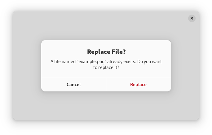
* dialog = adw_alert_dialog_new (_("Replace File?"), NULL);
|
|
81
|
+
*
|
|
82
|
+
* adw_alert_dialog_format_body (ADW_ALERT_DIALOG (dialog),
|
|
83
|
+
* _("A file named “%s” already exists. Do you want to replace it?"),
|
|
84
|
+
* filename);
|
|
85
|
+
*
|
|
86
|
+
* adw_alert_dialog_add_responses (ADW_ALERT_DIALOG (dialog),
|
|
87
|
+
* "cancel", _("_Cancel"),
|
|
88
|
+
* "replace", _("_Replace"),
|
|
89
|
+
* NULL);
|
|
90
|
+
*
|
|
91
|
+
* adw_alert_dialog_set_response_appearance (ADW_ALERT_DIALOG (dialog),
|
|
92
|
+
* "replace",
|
|
93
|
+
* ADW_RESPONSE_DESTRUCTIVE);
|
|
94
|
+
*
|
|
95
|
+
* adw_alert_dialog_set_default_response (ADW_ALERT_DIALOG (dialog), "cancel");
|
|
96
|
+
* adw_alert_dialog_set_close_response (ADW_ALERT_DIALOG (dialog), "cancel");
|
|
97
|
+
*
|
|
98
|
+
* g_signal_connect (dialog, "response", G_CALLBACK (response_cb), self);
|
|
99
|
+
*
|
|
100
|
+
* adw_dialog_present (dialog, parent);
|
|
101
|
+
* ```
|
|
102
|
+
*
|
|
103
|
+
* ## Async API
|
|
104
|
+
*
|
|
105
|
+
* `AdwAlertDialog` can also be used via the [`AlertDialog.choose`](https://docs.gtk.org/alertdialog/method.choose.html) method.
|
|
106
|
+
* This API follows the GIO async pattern, for example:
|
|
107
|
+
*
|
|
108
|
+
* ```c
|
|
109
|
+
* static void
|
|
110
|
+
* dialog_cb (AdwAlertDialog *dialog,
|
|
111
|
+
* GAsyncResult *result,
|
|
112
|
+
* MyWindow *self)
|
|
113
|
+
* {
|
|
114
|
+
* const char *response = adw_alert_dialog_choose_finish (dialog, result);
|
|
115
|
+
*
|
|
116
|
+
* // ...
|
|
117
|
+
* }
|
|
118
|
+
*
|
|
119
|
+
* static void
|
|
120
|
+
* show_dialog (MyWindow *self)
|
|
121
|
+
* {
|
|
122
|
+
* AdwDialog *dialog;
|
|
123
|
+
*
|
|
124
|
+
* dialog = adw_alert_dialog_new (_("Replace File?"), NULL);
|
|
125
|
+
*
|
|
126
|
+
* adw_alert_dialog_format_body (ADW_ALERT_DIALOG (dialog),
|
|
127
|
+
* _("A file named “%s” already exists. Do you want to replace it?"),
|
|
128
|
+
* filename);
|
|
129
|
+
*
|
|
130
|
+
* adw_alert_dialog_add_responses (ADW_ALERT_DIALOG (dialog),
|
|
131
|
+
* "cancel", _("_Cancel"),
|
|
132
|
+
* "replace", _("_Replace"),
|
|
133
|
+
* NULL);
|
|
134
|
+
*
|
|
135
|
+
* adw_alert_dialog_set_response_appearance (ADW_ALERT_DIALOG (dialog),
|
|
136
|
+
* "replace",
|
|
137
|
+
* ADW_RESPONSE_DESTRUCTIVE);
|
|
138
|
+
*
|
|
139
|
+
* adw_alert_dialog_set_default_response (ADW_ALERT_DIALOG (dialog), "cancel");
|
|
140
|
+
* adw_alert_dialog_set_close_response (ADW_ALERT_DIALOG (dialog), "cancel");
|
|
141
|
+
*
|
|
142
|
+
* adw_alert_dialog_choose (ADW_ALERT_DIALOG (dialog), GTK_WIDGET (self),
|
|
143
|
+
* NULL, (GAsyncReadyCallback) dialog_cb, self);
|
|
144
|
+
* }
|
|
145
|
+
* ```
|
|
146
|
+
*
|
|
147
|
+
* ## AdwAlertDialog as GtkBuildable
|
|
148
|
+
*
|
|
149
|
+
* `AdwAlertDialog` supports adding responses in UI definitions by via the
|
|
150
|
+
* `<responses>` element that may contain multiple `<response>` elements, each
|
|
151
|
+
* representing a response.
|
|
152
|
+
*
|
|
153
|
+
* Each of the `<response>` elements must have the `id` attribute specifying the
|
|
154
|
+
* response ID. The contents of the element are used as the response label.
|
|
155
|
+
*
|
|
156
|
+
* Response labels can be translated with the usual `translatable`, `context`
|
|
157
|
+
* and `comments` attributes.
|
|
158
|
+
*
|
|
159
|
+
* The `<response>` elements can also have `enabled` and/or `appearance`
|
|
160
|
+
* attributes. See [`AlertDialog.set_response_enabled`](https://docs.gtk.org/alertdialog/method.set_response_enabled.html) and
|
|
161
|
+
* [`AlertDialog.set_response_appearance`](https://docs.gtk.org/alertdialog/method.set_response_appearance.html) for details.
|
|
162
|
+
*
|
|
163
|
+
* Example of an `AdwAlertDialog` UI definition:
|
|
164
|
+
*
|
|
165
|
+
* ```xml
|
|
166
|
+
* <object class="AdwAlertDialog" id="dialog">
|
|
167
|
+
* <property name="heading" translatable="yes">Save Changes?</property>
|
|
168
|
+
* <property name="body" translatable="yes">Open documents contain unsaved changes. Changes which are not saved will be permanently lost.</property>
|
|
169
|
+
* <property name="default-response">save</property>
|
|
170
|
+
* <property name="close-response">cancel</property>
|
|
171
|
+
* <signal name="response" handler="response_cb"/>
|
|
172
|
+
* <responses>
|
|
173
|
+
* <response id="cancel" translatable="yes">_Cancel</response>
|
|
174
|
+
* <response id="discard" translatable="yes" appearance="destructive">_Discard</response>
|
|
175
|
+
* <response id="save" translatable="yes" appearance="suggested" enabled="false">_Save</response>
|
|
176
|
+
* </responses>
|
|
177
|
+
* </object>
|
|
178
|
+
* ```
|
|
179
|
+
*/
|
|
180
|
+
export const AdwAlertDialog = createSlotWidget("AdwAlertDialog", ["extraChild"]);
|
|
181
|
+
/**
|
|
182
|
+
* A freeform application window.
|
|
183
|
+
*
|
|
184
|
+
* 
|
|
185
|
+
*
|
|
186
|
+
* `AdwApplicationWindow` is a [`Gtk.ApplicationWindow`](https://docs.gtk.org/gtk4/class.ApplicationWindow.html) subclass providing
|
|
187
|
+
* the same features as [`Window`](https://gnome.pages.gitlab.gnome.org/libadwaita/doc/1-latest/class.Window.html).
|
|
188
|
+
*
|
|
189
|
+
* See [`Window`](https://gnome.pages.gitlab.gnome.org/libadwaita/doc/1-latest/class.Window.html) for details.
|
|
190
|
+
*
|
|
191
|
+
* Example of an `AdwApplicationWindow` UI definition:
|
|
192
|
+
*
|
|
193
|
+
* ```xml
|
|
194
|
+
* <object class="AdwApplicationWindow">
|
|
195
|
+
* <property name="content">
|
|
196
|
+
* <object class="AdwToolbarView">
|
|
197
|
+
* <child type="top">
|
|
198
|
+
* <object class="AdwHeaderBar"/>
|
|
199
|
+
* </child>
|
|
200
|
+
* <property name="content">
|
|
201
|
+
* <!-- ... -->
|
|
202
|
+
* </property>
|
|
203
|
+
* </object>
|
|
204
|
+
* </property>
|
|
205
|
+
* </object>
|
|
206
|
+
* ```
|
|
207
|
+
*
|
|
208
|
+
* Using [`Gtk.Application.menubar`](https://docs.gtk.org/gtk4/property.Application.menubar.html) is not supported and may result in
|
|
209
|
+
* visual glitches.
|
|
210
|
+
*/
|
|
211
|
+
export const AdwApplicationWindow = createSlotWidget("AdwApplicationWindow", ["content"]);
|
|
212
|
+
/**
|
|
213
|
+
* A bottom sheet with an optional bottom bar.
|
|
214
|
+
*
|
|
215
|
+
* 
|
|
216
|
+
*
|
|
217
|
+
* `AdwBottomSheet` has three child widgets. [`BottomSheet.content`](https://gnome.pages.gitlab.gnome.org/libadwaita/doc/1-latest/property.BottomSheet.content.html) is
|
|
218
|
+
* shown persistently. [`BottomSheet.sheet`](https://gnome.pages.gitlab.gnome.org/libadwaita/doc/1-latest/property.BottomSheet.sheet.html) is displayed above it when
|
|
219
|
+
* it's open, and [`BottomSheet.bottom-bar`](https://gnome.pages.gitlab.gnome.org/libadwaita/doc/1-latest/property.BottomSheet.bottom-bar.html) is displayed when it's not.
|
|
220
|
+
*
|
|
221
|
+
* Bottom sheet and bottom bar are attached to the bottom edge of the widget.
|
|
222
|
+
* They take the full width by default, but can only take a portion of it if
|
|
223
|
+
* [`BottomSheet.full-width`](https://gnome.pages.gitlab.gnome.org/libadwaita/doc/1-latest/property.BottomSheet.full-width.html) is set to `FALSE`. In this case,
|
|
224
|
+
* [`BottomSheet.align`](https://gnome.pages.gitlab.gnome.org/libadwaita/doc/1-latest/property.BottomSheet.align.html) determines where along the bottom edge they are
|
|
225
|
+
* placed.
|
|
226
|
+
*
|
|
227
|
+
* Bottom bar can be hidden using the [`BottomSheet.reveal-bottom-bar`](https://gnome.pages.gitlab.gnome.org/libadwaita/doc/1-latest/property.BottomSheet.reveal-bottom-bar.html)
|
|
228
|
+
* property.
|
|
229
|
+
*
|
|
230
|
+
* `AdwBottomSheet` can be useful for applications such as music players, that
|
|
231
|
+
* want to have a persistent bottom bar that expands into a bottom sheet when
|
|
232
|
+
* clicked. It's meant for cases where a bottom sheet is tightly integrated into
|
|
233
|
+
* the UI. For more transient bottom sheets, see [`Dialog`](https://gnome.pages.gitlab.gnome.org/libadwaita/doc/1-latest/class.Dialog.html).
|
|
234
|
+
*
|
|
235
|
+
* To open or close the bottom sheet, use the [`BottomSheet.open`](https://gnome.pages.gitlab.gnome.org/libadwaita/doc/1-latest/property.BottomSheet.open.html)
|
|
236
|
+
* property.
|
|
237
|
+
*
|
|
238
|
+
* By default, the bottom sheet has an overlaid drag handle. It can be disabled
|
|
239
|
+
* by setting [`BottomSheet.show-drag-handle`](https://gnome.pages.gitlab.gnome.org/libadwaita/doc/1-latest/property.BottomSheet.show-drag-handle.html) to `FALSE`. Note that the
|
|
240
|
+
* handle also controls whether the sheet can be dragged using a pointer.
|
|
241
|
+
*
|
|
242
|
+
* Bottom sheets are modal by default, meaning that the content is dimmed and
|
|
243
|
+
* cannot be accessed while the sheet is open. Set [`BottomSheet.modal`](https://gnome.pages.gitlab.gnome.org/libadwaita/doc/1-latest/property.BottomSheet.modal.html)
|
|
244
|
+
* to `FALSE` if this behavior is unwanted.
|
|
245
|
+
*
|
|
246
|
+
* To disable user interactions for opening or closing the bottom sheet (such as
|
|
247
|
+
* swipes or clicking the bottom bar or close button), set
|
|
248
|
+
* [`BottomSheet.can-open`](https://gnome.pages.gitlab.gnome.org/libadwaita/doc/1-latest/property.BottomSheet.can-open.html) or [`BottomSheet.can-close`](https://gnome.pages.gitlab.gnome.org/libadwaita/doc/1-latest/property.BottomSheet.can-close.html) to
|
|
249
|
+
* `FALSE`.
|
|
250
|
+
*
|
|
251
|
+
* In some cases, particularly when using a full-width bottom bar, it may be
|
|
252
|
+
* necessary to shift [`BottomSheet.content`](https://gnome.pages.gitlab.gnome.org/libadwaita/doc/1-latest/property.BottomSheet.content.html) upwards. Use the
|
|
253
|
+
* [`BottomSheet.bottom-bar-height`](https://gnome.pages.gitlab.gnome.org/libadwaita/doc/1-latest/property.BottomSheet.bottom-bar-height.html) and
|
|
254
|
+
* [`BottomSheet.sheet-height`](https://gnome.pages.gitlab.gnome.org/libadwaita/doc/1-latest/property.BottomSheet.sheet-height.html) for that.
|
|
255
|
+
*
|
|
256
|
+
* `AdwBottomSheet` is not adaptive, and for larger window sizes applications
|
|
257
|
+
* may want to replace it with another UI, such as a sidebar. This can be done
|
|
258
|
+
* using [`MultiLayoutView`](https://gnome.pages.gitlab.gnome.org/libadwaita/doc/1-latest/class.MultiLayoutView.html).
|
|
259
|
+
*
|
|
260
|
+
* ## Sizing
|
|
261
|
+
*
|
|
262
|
+
* Unlike [`Dialog`](https://gnome.pages.gitlab.gnome.org/libadwaita/doc/1-latest/class.Dialog.html) presented as a bottom sheet, `AdwBottomSheet` just
|
|
263
|
+
* follows the content's natural size, and it's up to the applications to make
|
|
264
|
+
* sure their content provides one. For example, when using
|
|
265
|
+
* [`Gtk.ScrolledWindow`](https://docs.gtk.org/gtk4/class.ScrolledWindow.html), make sure to set
|
|
266
|
+
* [`Gtk.ScrolledWindow.propagate-natural-height`](https://docs.gtk.org/gtk4/property.ScrolledWindow.propagate-natural-height.html) to `TRUE`.
|
|
267
|
+
*
|
|
268
|
+
* ## Header Bar Integration
|
|
269
|
+
*
|
|
270
|
+
* When placed inside an `AdwBottomSheet`, [`HeaderBar`](https://gnome.pages.gitlab.gnome.org/libadwaita/doc/1-latest/class.HeaderBar.html) will not show the
|
|
271
|
+
* title when [`BottomSheet.show-drag-handle`](https://gnome.pages.gitlab.gnome.org/libadwaita/doc/1-latest/property.BottomSheet.show-drag-handle.html) is `TRUE`, regardless of
|
|
272
|
+
* [`HeaderBar.show-title`](https://gnome.pages.gitlab.gnome.org/libadwaita/doc/1-latest/property.HeaderBar.show-title.html). This only applies to the default title,
|
|
273
|
+
* titles set with [`HeaderBar.title-widget`](https://gnome.pages.gitlab.gnome.org/libadwaita/doc/1-latest/property.HeaderBar.title-widget.html) will still be shown.
|
|
274
|
+
*
|
|
275
|
+
* ## `AdwBottomSheet` as `GtkBuildable`:
|
|
276
|
+
*
|
|
277
|
+
* The `AdwBottomSheet` implementation of the [`Gtk.Buildable`](https://docs.gtk.org/gtk4/iface.Buildable.html) interface
|
|
278
|
+
* supports setting the sheet widget by specifying “sheet” as the “type”
|
|
279
|
+
* attribute of a ``<child>`` element, and the bottom bar by specifying
|
|
280
|
+
* “bottom-bar”. Specifying “content” or omitting the child type results in
|
|
281
|
+
* setting the content child.
|
|
282
|
+
*/
|
|
283
|
+
export const AdwBottomSheet = createSlotWidget("AdwBottomSheet", ["bottomBar", "content", "sheet"]);
|
|
284
|
+
/**
|
|
285
|
+
* A [`Gtk.ListBoxRow`](https://docs.gtk.org/gtk4/class.ListBoxRow.html) with an embedded text entry.
|
|
286
|
+
*
|
|
287
|
+
* 
|
|
288
|
+
*
|
|
289
|
+
* `AdwEntryRow` has a title that doubles as placeholder text. It shows an icon
|
|
290
|
+
* indicating that it's editable and can receive additional widgets before or
|
|
291
|
+
* after the editable part.
|
|
292
|
+
*
|
|
293
|
+
* If [`EntryRow.show-apply-button`](https://gnome.pages.gitlab.gnome.org/libadwaita/doc/1-latest/property.EntryRow.show-apply-button.html) is set to `TRUE`, `AdwEntryRow` can
|
|
294
|
+
* show an apply button when editing its contents. This can be useful if
|
|
295
|
+
* changing its contents can result in an expensive operation, such as network
|
|
296
|
+
* activity.
|
|
297
|
+
*
|
|
298
|
+
* `AdwEntryRow` provides only minimal API and should be used with the
|
|
299
|
+
* [`Gtk.Editable`](https://docs.gtk.org/gtk4/iface.Editable.html) API.
|
|
300
|
+
*
|
|
301
|
+
* See also [`PasswordEntryRow`](https://gnome.pages.gitlab.gnome.org/libadwaita/doc/1-latest/class.PasswordEntryRow.html).
|
|
302
|
+
*
|
|
303
|
+
* ## AdwEntryRow as GtkBuildable
|
|
304
|
+
*
|
|
305
|
+
* The `AdwEntryRow` implementation of the [`Gtk.Buildable`](https://docs.gtk.org/gtk4/iface.Buildable.html) interface
|
|
306
|
+
* supports adding a child at its end by specifying “suffix” or omitting the
|
|
307
|
+
* “type” attribute of a `<child>` element.
|
|
308
|
+
*
|
|
309
|
+
* It also supports adding a child as a prefix widget by specifying “prefix” as
|
|
310
|
+
* the “type” attribute of a `<child>` element.
|
|
311
|
+
*
|
|
312
|
+
* ## CSS nodes
|
|
313
|
+
*
|
|
314
|
+
* `AdwEntryRow` has a single CSS node with name `row` and the `.entry` style
|
|
315
|
+
* class.
|
|
316
|
+
*/
|
|
317
|
+
export const AdwEntryRow = Object.assign(createSlotWidget("AdwEntryRow", []), {
|
|
318
|
+
AddPrefix: createContainerSlotChild("addPrefix"),
|
|
319
|
+
AddSuffix: createContainerSlotChild("addSuffix"),
|
|
320
|
+
});
|
|
321
|
+
/**
|
|
322
|
+
* A [`Gtk.ListBoxRow`](https://docs.gtk.org/gtk4/class.ListBoxRow.html) used to reveal widgets.
|
|
323
|
+
*
|
|
324
|
+
* 
|
|
325
|
+
*
|
|
326
|
+
* The `AdwExpanderRow` widget allows the user to reveal or hide widgets below
|
|
327
|
+
* it. It also allows the user to enable the expansion of the row, allowing to
|
|
328
|
+
* disable all that the row contains.
|
|
329
|
+
*
|
|
330
|
+
* ## AdwExpanderRow as GtkBuildable
|
|
331
|
+
*
|
|
332
|
+
* The `AdwExpanderRow` implementation of the [`Gtk.Buildable`](https://docs.gtk.org/gtk4/iface.Buildable.html) interface
|
|
333
|
+
* supports adding a child as an suffix widget by specifying “suffix” as the
|
|
334
|
+
* “type” attribute of a `<child>` element.
|
|
335
|
+
*
|
|
336
|
+
* It also supports adding it as a prefix widget by specifying “prefix” as the
|
|
337
|
+
* “type” attribute of a `<child>` element.
|
|
338
|
+
*
|
|
339
|
+
* ## CSS nodes
|
|
340
|
+
*
|
|
341
|
+
* `AdwExpanderRow` has a main CSS node with name `row` and the `.expander`
|
|
342
|
+
* style class. It has the `.empty` style class when it contains no children.
|
|
343
|
+
*
|
|
344
|
+
* It contains the subnodes `row.header` for its main embedded row,
|
|
345
|
+
* `list.nested` for the list it can expand, and `image.expander-row-arrow` for
|
|
346
|
+
* its arrow.
|
|
347
|
+
*
|
|
348
|
+
* ## Style classes
|
|
349
|
+
*
|
|
350
|
+
* `AdwExpanderRow` can use the `.`
|
|
351
|
+
* style class to emphasize the row subtitle instead of the row title, which is
|
|
352
|
+
* useful for displaying read-only properties.
|
|
353
|
+
*
|
|
354
|
+
* When used together with the `.monospace` style class, only the subtitle
|
|
355
|
+
* becomes monospace, not the title or any extra widgets.
|
|
356
|
+
*/
|
|
357
|
+
export const AdwExpanderRow = Object.assign(createSlotWidget("AdwExpanderRow", []), {
|
|
358
|
+
AddPrefix: createContainerSlotChild("addPrefix"),
|
|
359
|
+
AddSuffix: createContainerSlotChild("addSuffix"),
|
|
360
|
+
AddRow: createContainerSlotChild("addRow"),
|
|
361
|
+
AddAction: createContainerSlotChild("addAction"),
|
|
362
|
+
});
|
|
363
|
+
/**
|
|
364
|
+
* An adaptive container acting like a box or an overlay.
|
|
365
|
+
*
|
|
366
|
+
* 
|
|
367
|
+
* 
|
|
368
|
+
*
|
|
369
|
+
* The `AdwFlap` widget can display its children like a [`Gtk.Box`](https://docs.gtk.org/gtk4/class.Box.html) does or
|
|
370
|
+
* like a [`Gtk.Overlay`](https://docs.gtk.org/gtk4/class.Overlay.html) does, according to the
|
|
371
|
+
* [`Flap.fold-policy`](https://gnome.pages.gitlab.gnome.org/libadwaita/doc/1-latest/property.Flap.fold-policy.html) value.
|
|
372
|
+
*
|
|
373
|
+
* `AdwFlap` has at most three children: [`Flap.content`](https://gnome.pages.gitlab.gnome.org/libadwaita/doc/1-latest/property.Flap.content.html),
|
|
374
|
+
* [`Flap.flap`](https://gnome.pages.gitlab.gnome.org/libadwaita/doc/1-latest/property.Flap.flap.html) and [`Flap.separator`](https://gnome.pages.gitlab.gnome.org/libadwaita/doc/1-latest/property.Flap.separator.html). Content is the primary
|
|
375
|
+
* child, flap is displayed next to it when unfolded, or overlays it when
|
|
376
|
+
* folded. Flap can be shown or hidden by changing the
|
|
377
|
+
* [`Flap.reveal-flap`](https://gnome.pages.gitlab.gnome.org/libadwaita/doc/1-latest/property.Flap.reveal-flap.html) value, as well as via swipe gestures if
|
|
378
|
+
* [`Flap.swipe-to-open`](https://gnome.pages.gitlab.gnome.org/libadwaita/doc/1-latest/property.Flap.swipe-to-open.html) and/or [`Flap.swipe-to-close`](https://gnome.pages.gitlab.gnome.org/libadwaita/doc/1-latest/property.Flap.swipe-to-close.html) are set
|
|
379
|
+
* to `TRUE`.
|
|
380
|
+
*
|
|
381
|
+
* Optionally, a separator can be provided, which would be displayed between
|
|
382
|
+
* the content and the flap when there's no shadow to separate them, depending
|
|
383
|
+
* on the transition type.
|
|
384
|
+
*
|
|
385
|
+
* [`Flap.flap`](https://gnome.pages.gitlab.gnome.org/libadwaita/doc/1-latest/property.Flap.flap.html) is transparent by default; add the
|
|
386
|
+
* `.background` style class to it if this is
|
|
387
|
+
* unwanted.
|
|
388
|
+
*
|
|
389
|
+
* If [`Flap.modal`](https://gnome.pages.gitlab.gnome.org/libadwaita/doc/1-latest/property.Flap.modal.html) is set to `TRUE`, content becomes completely
|
|
390
|
+
* inaccessible when the flap is revealed while folded.
|
|
391
|
+
*
|
|
392
|
+
* The position of the flap and separator children relative to the content is
|
|
393
|
+
* determined by orientation, as well as the [`Flap.flap-position`](https://gnome.pages.gitlab.gnome.org/libadwaita/doc/1-latest/property.Flap.flap-position.html)
|
|
394
|
+
* value.
|
|
395
|
+
*
|
|
396
|
+
* Folding the flap will automatically hide the flap widget, and unfolding it
|
|
397
|
+
* will automatically reveal it. If this behavior is not desired, the
|
|
398
|
+
* [`Flap.locked`](https://gnome.pages.gitlab.gnome.org/libadwaita/doc/1-latest/property.Flap.locked.html) property can be used to override it.
|
|
399
|
+
*
|
|
400
|
+
* Common use cases include sidebars, header bars that need to be able to
|
|
401
|
+
* overlap the window content (for example, in fullscreen mode) and bottom
|
|
402
|
+
* sheets.
|
|
403
|
+
*
|
|
404
|
+
* ## AdwFlap as GtkBuildable
|
|
405
|
+
*
|
|
406
|
+
* The `AdwFlap` implementation of the [`Gtk.Buildable`](https://docs.gtk.org/gtk4/iface.Buildable.html) interface supports
|
|
407
|
+
* setting the flap child by specifying “flap” as the “type” attribute of a
|
|
408
|
+
* ``<child>`` element, and separator by specifying “separator”. Specifying
|
|
409
|
+
* “content” child type or omitting it results in setting the content child.
|
|
410
|
+
*
|
|
411
|
+
* ## CSS nodes
|
|
412
|
+
*
|
|
413
|
+
* `AdwFlap` has a single CSS node with name `flap`. The node will get the style
|
|
414
|
+
* classes `.folded` when it is folded, and `.unfolded` when it's not.
|
|
415
|
+
*/
|
|
416
|
+
export const AdwFlap = createSlotWidget("AdwFlap", ["content", "flap", "separator"]);
|
|
417
|
+
/**
|
|
418
|
+
* A title bar widget.
|
|
419
|
+
*
|
|
420
|
+
* 
|
|
421
|
+
*
|
|
422
|
+
* `AdwHeaderBar` is similar to [`Gtk.HeaderBar`](https://docs.gtk.org/gtk4/class.HeaderBar.html), but provides additional
|
|
423
|
+
* features compared to it. Refer to `GtkHeaderBar` for details. It is typically
|
|
424
|
+
* used as a top bar within [`ToolbarView`](https://gnome.pages.gitlab.gnome.org/libadwaita/doc/1-latest/class.ToolbarView.html).
|
|
425
|
+
*
|
|
426
|
+
* ## Dialog Integration
|
|
427
|
+
*
|
|
428
|
+
* When placed inside an [`Dialog`](https://gnome.pages.gitlab.gnome.org/libadwaita/doc/1-latest/class.Dialog.html), `AdwHeaderBar` will display the dialog
|
|
429
|
+
* title instead of window title. It will also adjust the decoration layout to
|
|
430
|
+
* ensure it always has a close button and nothing else. Set
|
|
431
|
+
* [`HeaderBar.show-start-title-buttons`](https://gnome.pages.gitlab.gnome.org/libadwaita/doc/1-latest/property.HeaderBar.show-start-title-buttons.html) and
|
|
432
|
+
* [`HeaderBar.show-end-title-buttons`](https://gnome.pages.gitlab.gnome.org/libadwaita/doc/1-latest/property.HeaderBar.show-end-title-buttons.html) to `FALSE` to remove it if it's
|
|
433
|
+
* unwanted.
|
|
434
|
+
*
|
|
435
|
+
* ## Navigation View Integration
|
|
436
|
+
*
|
|
437
|
+
* When placed inside an [`NavigationPage`](https://gnome.pages.gitlab.gnome.org/libadwaita/doc/1-latest/class.NavigationPage.html), `AdwHeaderBar` will display the
|
|
438
|
+
* page title instead of window title.
|
|
439
|
+
*
|
|
440
|
+
* When used together with [`NavigationView`](https://gnome.pages.gitlab.gnome.org/libadwaita/doc/1-latest/class.NavigationView.html) or [`NavigationSplitView`](https://gnome.pages.gitlab.gnome.org/libadwaita/doc/1-latest/class.NavigationSplitView.html),
|
|
441
|
+
* it will also display a back button that can be used to go back to the previous
|
|
442
|
+
* page. The button also has a context menu, allowing to pop multiple pages at
|
|
443
|
+
* once, potentially across multiple navigation views.
|
|
444
|
+
*
|
|
445
|
+
* Set [`HeaderBar.show-back-button`](https://gnome.pages.gitlab.gnome.org/libadwaita/doc/1-latest/property.HeaderBar.show-back-button.html) to `FALSE` to disable this behavior
|
|
446
|
+
* in rare scenarios where it's unwanted.
|
|
447
|
+
*
|
|
448
|
+
* ## Split View Integration
|
|
449
|
+
*
|
|
450
|
+
* When placed inside [`NavigationSplitView`](https://gnome.pages.gitlab.gnome.org/libadwaita/doc/1-latest/class.NavigationSplitView.html) or [`OverlaySplitView`](https://gnome.pages.gitlab.gnome.org/libadwaita/doc/1-latest/class.OverlaySplitView.html),
|
|
451
|
+
* `AdwHeaderBar` will automatically hide the title buttons other than at the
|
|
452
|
+
* edges of the window.
|
|
453
|
+
*
|
|
454
|
+
* ## Bottom Sheet Integration
|
|
455
|
+
*
|
|
456
|
+
* When played inside [`BottomSheet`](https://gnome.pages.gitlab.gnome.org/libadwaita/doc/1-latest/class.BottomSheet.html), `AdwHeaderBar` will not show the title
|
|
457
|
+
* unless [`BottomSheet.show-drag-handle`](https://gnome.pages.gitlab.gnome.org/libadwaita/doc/1-latest/property.BottomSheet.show-drag-handle.html) is set to `FALSE`, regardless
|
|
458
|
+
* of [`HeaderBar.show-title`](https://gnome.pages.gitlab.gnome.org/libadwaita/doc/1-latest/property.HeaderBar.show-title.html). This only applies to the default title,
|
|
459
|
+
* titles set with [`HeaderBar.title-widget`](https://gnome.pages.gitlab.gnome.org/libadwaita/doc/1-latest/property.HeaderBar.title-widget.html) will still be shown.
|
|
460
|
+
*
|
|
461
|
+
* ## Centering Policy
|
|
462
|
+
*
|
|
463
|
+
* [`HeaderBar.centering-policy`](https://gnome.pages.gitlab.gnome.org/libadwaita/doc/1-latest/property.HeaderBar.centering-policy.html) allows to enforce strict centering of
|
|
464
|
+
* the title widget. This can be useful for entries inside [`Clamp`](https://gnome.pages.gitlab.gnome.org/libadwaita/doc/1-latest/class.Clamp.html).
|
|
465
|
+
*
|
|
466
|
+
* ## Title Buttons
|
|
467
|
+
*
|
|
468
|
+
* Unlike `GtkHeaderBar`, `AdwHeaderBar` allows to toggle title button
|
|
469
|
+
* visibility for each side individually, using the
|
|
470
|
+
* [`HeaderBar.show-start-title-buttons`](https://gnome.pages.gitlab.gnome.org/libadwaita/doc/1-latest/property.HeaderBar.show-start-title-buttons.html) and
|
|
471
|
+
* [`HeaderBar.show-end-title-buttons`](https://gnome.pages.gitlab.gnome.org/libadwaita/doc/1-latest/property.HeaderBar.show-end-title-buttons.html) properties.
|
|
472
|
+
*
|
|
473
|
+
* ## CSS nodes
|
|
474
|
+
*
|
|
475
|
+
* ```
|
|
476
|
+
* headerbar
|
|
477
|
+
* ╰── windowhandle
|
|
478
|
+
* ╰── box
|
|
479
|
+
* ├── widget
|
|
480
|
+
* │ ╰── box.start
|
|
481
|
+
* │ ├── windowcontrols.start
|
|
482
|
+
* │ ├── widget
|
|
483
|
+
* │ │ ╰── [button.back]
|
|
484
|
+
* │ ╰── [other children]
|
|
485
|
+
* ├── widget
|
|
486
|
+
* │ ╰── [Title Widget]
|
|
487
|
+
* ╰── widget
|
|
488
|
+
* ╰── box.end
|
|
489
|
+
* ├── [other children]
|
|
490
|
+
* ╰── windowcontrols.end
|
|
491
|
+
* ```
|
|
492
|
+
*
|
|
493
|
+
* `AdwHeaderBar`'s CSS node is called `headerbar`. It contains a `windowhandle`
|
|
494
|
+
* subnode, which contains a `box` subnode, which contains three `widget`
|
|
495
|
+
* subnodes at the start, center and end of the header bar. The start and end
|
|
496
|
+
* subnodes contain a `box` subnode with the `.start` and `.end` style classes
|
|
497
|
+
* respectively, and the center node contains a node that represents the title.
|
|
498
|
+
*
|
|
499
|
+
* Each of the boxes contains a `windowcontrols` subnode, see
|
|
500
|
+
* [`Gtk.WindowControls`](https://docs.gtk.org/gtk4/class.WindowControls.html) for details, as well as other children.
|
|
501
|
+
*
|
|
502
|
+
* When [`HeaderBar.show-back-button`](https://gnome.pages.gitlab.gnome.org/libadwaita/doc/1-latest/property.HeaderBar.show-back-button.html) is `TRUE`, the start box also
|
|
503
|
+
* contains a node with the name `widget` that contains a node with the name
|
|
504
|
+
* `button` and `.back` style class.
|
|
505
|
+
*
|
|
506
|
+
* ## Accessibility
|
|
507
|
+
*
|
|
508
|
+
* `AdwHeaderBar` uses the `GTK_ACCESSIBLE_ROLE_GROUP` role.
|
|
509
|
+
*/
|
|
510
|
+
export const AdwHeaderBar = Object.assign(createSlotWidget("AdwHeaderBar", ["titleWidget"]), {
|
|
511
|
+
PackStart: createContainerSlotChild("packStart"),
|
|
512
|
+
PackEnd: createContainerSlotChild("packEnd"),
|
|
513
|
+
});
|
|
514
|
+
/**
|
|
515
|
+
* A dialog presenting a message or a question.
|
|
516
|
+
*
|
|
517
|
+
* 
|
|
518
|
+
*
|
|
519
|
+
* Message dialogs have a heading, a body, an optional child widget, and one or
|
|
520
|
+
* multiple responses, each presented as a button.
|
|
521
|
+
*
|
|
522
|
+
* Each response has a unique string ID, and a button label. Additionally, each
|
|
523
|
+
* response can be enabled or disabled, and can have a suggested or destructive
|
|
524
|
+
* appearance.
|
|
525
|
+
*
|
|
526
|
+
* When one of the responses is activated, or the dialog is closed, the
|
|
527
|
+
* [`MessageDialog.:response`](https://gnome.pages.gitlab.gnome.org/libadwaita/doc/1-latest/signal.MessageDialog.response.html) signal will be emitted. This signal is
|
|
528
|
+
* detailed, and the detail, as well as the `response` parameter will be set to
|
|
529
|
+
* the ID of the activated response, or to the value of the
|
|
530
|
+
* [`MessageDialog.close-response`](https://gnome.pages.gitlab.gnome.org/libadwaita/doc/1-latest/property.MessageDialog.close-response.html) property if the dialog had been
|
|
531
|
+
* closed without activating any of the responses.
|
|
532
|
+
*
|
|
533
|
+
* Response buttons can be presented horizontally or vertically depending on
|
|
534
|
+
* available space.
|
|
535
|
+
*
|
|
536
|
+
* When a response is activated, `AdwMessageDialog` is closed automatically.
|
|
537
|
+
*
|
|
538
|
+
* An example of using a message dialog:
|
|
539
|
+
*
|
|
540
|
+
* ```c
|
|
541
|
+
* GtkWidget *dialog;
|
|
542
|
+
*
|
|
543
|
+
* dialog = adw_message_dialog_new (parent, _("Replace File?"), NULL);
|
|
544
|
+
*
|
|
545
|
+
* adw_message_dialog_format_body (ADW_MESSAGE_DIALOG (dialog),
|
|
546
|
+
* _("A file named “%s” already exists. Do you want to replace it?"),
|
|
547
|
+
* filename);
|
|
548
|
+
*
|
|
549
|
+
* adw_message_dialog_add_responses (ADW_MESSAGE_DIALOG (dialog),
|
|
550
|
+
* "cancel", _("_Cancel"),
|
|
551
|
+
* "replace", _("_Replace"),
|
|
552
|
+
* NULL);
|
|
553
|
+
*
|
|
554
|
+
* adw_message_dialog_set_response_appearance (ADW_MESSAGE_DIALOG (dialog), "replace", ADW_RESPONSE_DESTRUCTIVE);
|
|
555
|
+
*
|
|
556
|
+
* adw_message_dialog_set_default_response (ADW_MESSAGE_DIALOG (dialog), "cancel");
|
|
557
|
+
* adw_message_dialog_set_close_response (ADW_MESSAGE_DIALOG (dialog), "cancel");
|
|
558
|
+
*
|
|
559
|
+
* g_signal_connect (dialog, "response", G_CALLBACK (response_cb), self);
|
|
560
|
+
*
|
|
561
|
+
* gtk_window_present (GTK_WINDOW (dialog));
|
|
562
|
+
* ```
|
|
563
|
+
*
|
|
564
|
+
* ## Async API
|
|
565
|
+
*
|
|
566
|
+
* `AdwMessageDialog` can also be used via the [`MessageDialog.choose`](https://docs.gtk.org/messagedialog/method.choose.html)
|
|
567
|
+
* method. This API follows the GIO async pattern, for example:
|
|
568
|
+
*
|
|
569
|
+
* ```c
|
|
570
|
+
* static void
|
|
571
|
+
* dialog_cb (AdwMessageDialog *dialog,
|
|
572
|
+
* GAsyncResult *result,
|
|
573
|
+
* MyWindow *self)
|
|
574
|
+
* {
|
|
575
|
+
* const char *response = adw_message_dialog_choose_finish (dialog, result);
|
|
576
|
+
*
|
|
577
|
+
* // ...
|
|
578
|
+
* }
|
|
579
|
+
*
|
|
580
|
+
* static void
|
|
581
|
+
* show_dialog (MyWindow *self)
|
|
582
|
+
* {
|
|
583
|
+
* GtkWidget *dialog;
|
|
584
|
+
*
|
|
585
|
+
* dialog = adw_message_dialog_new (GTK_WINDOW (self), _("Replace File?"), NULL);
|
|
586
|
+
*
|
|
587
|
+
* adw_message_dialog_format_body (ADW_MESSAGE_DIALOG (dialog),
|
|
588
|
+
* _("A file named “%s” already exists. Do you want to replace it?"),
|
|
589
|
+
* filename);
|
|
590
|
+
*
|
|
591
|
+
* adw_message_dialog_add_responses (ADW_MESSAGE_DIALOG (dialog),
|
|
592
|
+
* "cancel", _("_Cancel"),
|
|
593
|
+
* "replace", _("_Replace"),
|
|
594
|
+
* NULL);
|
|
595
|
+
*
|
|
596
|
+
* adw_message_dialog_set_response_appearance (ADW_MESSAGE_DIALOG (dialog), "replace", ADW_RESPONSE_DESTRUCTIVE);
|
|
597
|
+
*
|
|
598
|
+
* adw_message_dialog_set_default_response (ADW_MESSAGE_DIALOG (dialog), "cancel");
|
|
599
|
+
* adw_message_dialog_set_close_response (ADW_MESSAGE_DIALOG (dialog), "cancel");
|
|
600
|
+
*
|
|
601
|
+
* adw_message_dialog_choose (ADW_MESSAGE_DIALOG (dialog), NULL, (GAsyncReadyCallback) dialog_cb, self);
|
|
602
|
+
* }
|
|
603
|
+
* ```
|
|
604
|
+
*
|
|
605
|
+
* ## AdwMessageDialog as GtkBuildable
|
|
606
|
+
*
|
|
607
|
+
* `AdwMessageDialog` supports adding responses in UI definitions by via the
|
|
608
|
+
* `<responses>` element that may contain multiple `<response>` elements, each
|
|
609
|
+
* representing a response.
|
|
610
|
+
*
|
|
611
|
+
* Each of the `<response>` elements must have the `id` attribute specifying the
|
|
612
|
+
* response ID. The contents of the element are used as the response label.
|
|
613
|
+
*
|
|
614
|
+
* Response labels can be translated with the usual `translatable`, `context`
|
|
615
|
+
* and `comments` attributes.
|
|
616
|
+
*
|
|
617
|
+
* The `<response>` elements can also have `enabled` and/or `appearance`
|
|
618
|
+
* attributes. See [`MessageDialog.set_response_enabled`](https://docs.gtk.org/messagedialog/method.set_response_enabled.html) and
|
|
619
|
+
* [`MessageDialog.set_response_appearance`](https://docs.gtk.org/messagedialog/method.set_response_appearance.html) for details.
|
|
620
|
+
*
|
|
621
|
+
* Example of an `AdwMessageDialog` UI definition:
|
|
622
|
+
*
|
|
623
|
+
* ```xml
|
|
624
|
+
* <object class="AdwMessageDialog" id="dialog">
|
|
625
|
+
* <property name="heading" translatable="yes">Save Changes?</property>
|
|
626
|
+
* <property name="body" translatable="yes">Open documents contain unsaved changes. Changes which are not saved will be permanently lost.</property>
|
|
627
|
+
* <property name="default-response">save</property>
|
|
628
|
+
* <property name="close-response">cancel</property>
|
|
629
|
+
* <signal name="response" handler="response_cb"/>
|
|
630
|
+
* <responses>
|
|
631
|
+
* <response id="cancel" translatable="yes">_Cancel</response>
|
|
632
|
+
* <response id="discard" translatable="yes" appearance="destructive">_Discard</response>
|
|
633
|
+
* <response id="save" translatable="yes" appearance="suggested" enabled="false">_Save</response>
|
|
634
|
+
* </responses>
|
|
635
|
+
* </object>
|
|
636
|
+
* ```
|
|
637
|
+
*
|
|
638
|
+
* ## Accessibility
|
|
639
|
+
*
|
|
640
|
+
* `AdwMessageDialog` uses the `GTK_ACCESSIBLE_ROLE_DIALOG` role.
|
|
641
|
+
*/
|
|
642
|
+
export const AdwMessageDialog = createSlotWidget("AdwMessageDialog", ["extraChild"]);
|
|
643
|
+
/**
|
|
644
|
+
* A widget presenting sidebar and content side by side or as a navigation view.
|
|
645
|
+
*
|
|
646
|
+
* 
|
|
647
|
+
* 
|
|
648
|
+
*
|
|
649
|
+
* `AdwNavigationSplitView` has two [`NavigationPage`](https://gnome.pages.gitlab.gnome.org/libadwaita/doc/1-latest/class.NavigationPage.html) children: sidebar and
|
|
650
|
+
* content, and displays them side by side.
|
|
651
|
+
*
|
|
652
|
+
* When [`NavigationSplitView.collapsed`](https://gnome.pages.gitlab.gnome.org/libadwaita/doc/1-latest/property.NavigationSplitView.collapsed.html) is set to `TRUE`, it instead
|
|
653
|
+
* puts both children inside an [`NavigationView`](https://gnome.pages.gitlab.gnome.org/libadwaita/doc/1-latest/class.NavigationView.html). The
|
|
654
|
+
* [`NavigationSplitView.show-content`](https://gnome.pages.gitlab.gnome.org/libadwaita/doc/1-latest/property.NavigationSplitView.show-content.html) controls which child is visible
|
|
655
|
+
* while collapsed.
|
|
656
|
+
*
|
|
657
|
+
* See also [`OverlaySplitView`](https://gnome.pages.gitlab.gnome.org/libadwaita/doc/1-latest/class.OverlaySplitView.html).
|
|
658
|
+
*
|
|
659
|
+
* `AdwNavigationSplitView` is typically used together with an [`Breakpoint`](https://gnome.pages.gitlab.gnome.org/libadwaita/doc/1-latest/class.Breakpoint.html)
|
|
660
|
+
* setting the `collapsed` property to `TRUE` on small widths, as follows:
|
|
661
|
+
*
|
|
662
|
+
* ```xml
|
|
663
|
+
* <object class="AdwWindow">
|
|
664
|
+
* <property name="width-request">280</property>
|
|
665
|
+
* <property name="height-request">200</property>
|
|
666
|
+
* <property name="default-width">800</property>
|
|
667
|
+
* <property name="default-height">800</property>
|
|
668
|
+
* <child>
|
|
669
|
+
* <object class="AdwBreakpoint">
|
|
670
|
+
* <condition>max-width: 400sp</condition>
|
|
671
|
+
* <setter object="split_view" property="collapsed">True</setter>
|
|
672
|
+
* </object>
|
|
673
|
+
* </child>
|
|
674
|
+
* <property name="content">
|
|
675
|
+
* <object class="AdwNavigationSplitView" id="split_view">
|
|
676
|
+
* <property name="sidebar">
|
|
677
|
+
* <object class="AdwNavigationPage">
|
|
678
|
+
* <property name="title" translatable="yes">Sidebar</property>
|
|
679
|
+
* <property name="child">
|
|
680
|
+
* <!-- ... -->
|
|
681
|
+
* </property>
|
|
682
|
+
* </object>
|
|
683
|
+
* </property>
|
|
684
|
+
* <property name="content">
|
|
685
|
+
* <object class="AdwNavigationPage">
|
|
686
|
+
* <property name="title" translatable="yes">Content</property>
|
|
687
|
+
* <property name="child">
|
|
688
|
+
* <!-- ... -->
|
|
689
|
+
* </property>
|
|
690
|
+
* </object>
|
|
691
|
+
* </property>
|
|
692
|
+
* </object>
|
|
693
|
+
* </property>
|
|
694
|
+
* </object>
|
|
695
|
+
* ```
|
|
696
|
+
*
|
|
697
|
+
* ## Sizing
|
|
698
|
+
*
|
|
699
|
+
* When not collapsed, `AdwNavigationSplitView` changes the sidebar width
|
|
700
|
+
* depending on its own width.
|
|
701
|
+
*
|
|
702
|
+
* If possible, it tries to allocate a fraction of the total width, controlled
|
|
703
|
+
* with the [`NavigationSplitView.sidebar-width-fraction`](https://gnome.pages.gitlab.gnome.org/libadwaita/doc/1-latest/property.NavigationSplitView.sidebar-width-fraction.html) property.
|
|
704
|
+
*
|
|
705
|
+
* The sidebar also has minimum and maximum sizes, controlled with the
|
|
706
|
+
* [`NavigationSplitView.min-sidebar-width`](https://gnome.pages.gitlab.gnome.org/libadwaita/doc/1-latest/property.NavigationSplitView.min-sidebar-width.html) and
|
|
707
|
+
* [`NavigationSplitView.max-sidebar-width`](https://gnome.pages.gitlab.gnome.org/libadwaita/doc/1-latest/property.NavigationSplitView.max-sidebar-width.html) properties.
|
|
708
|
+
*
|
|
709
|
+
* The minimum and maximum sizes are using the length unit specified with the
|
|
710
|
+
* [`NavigationSplitView.sidebar-width-unit`](https://gnome.pages.gitlab.gnome.org/libadwaita/doc/1-latest/property.NavigationSplitView.sidebar-width-unit.html).
|
|
711
|
+
*
|
|
712
|
+
* By default, sidebar is using 25% of the total width, with 180sp as the
|
|
713
|
+
* minimum size and 280sp as the maximum size.
|
|
714
|
+
*
|
|
715
|
+
* ## Header Bar Integration
|
|
716
|
+
*
|
|
717
|
+
* When used inside `AdwNavigationSplitView`, [`HeaderBar`](https://gnome.pages.gitlab.gnome.org/libadwaita/doc/1-latest/class.HeaderBar.html) will
|
|
718
|
+
* automatically hide the window buttons in the middle.
|
|
719
|
+
*
|
|
720
|
+
* When collapsed, it also displays a back button for the content widget, as
|
|
721
|
+
* well as the page titles. See [`NavigationView`](https://gnome.pages.gitlab.gnome.org/libadwaita/doc/1-latest/class.NavigationView.html) documentation for details.
|
|
722
|
+
*
|
|
723
|
+
* ## Actions
|
|
724
|
+
*
|
|
725
|
+
* `AdwNavigationSplitView` defines the same actions as `AdwNavigationView`, but
|
|
726
|
+
* they can be used even when the split view is not collapsed:
|
|
727
|
+
*
|
|
728
|
+
* - `navigation.push` takes a string parameter specifying the tag of the page
|
|
729
|
+
* to push. If it matches the tag of the content widget, it sets
|
|
730
|
+
* [`NavigationSplitView.show-content`](https://gnome.pages.gitlab.gnome.org/libadwaita/doc/1-latest/property.NavigationSplitView.show-content.html) to `TRUE`.
|
|
731
|
+
*
|
|
732
|
+
* - `navigation.pop` doesn't take any parameters and sets
|
|
733
|
+
* [`NavigationSplitView.show-content`](https://gnome.pages.gitlab.gnome.org/libadwaita/doc/1-latest/property.NavigationSplitView.show-content.html) to `FALSE`.
|
|
734
|
+
*
|
|
735
|
+
* ## `AdwNavigationSplitView` as `GtkBuildable`
|
|
736
|
+
*
|
|
737
|
+
* The `AdwNavigationSplitView` implementation of the [`Gtk.Buildable`](https://docs.gtk.org/gtk4/iface.Buildable.html)
|
|
738
|
+
* interface supports setting the sidebar widget by specifying “sidebar” as the
|
|
739
|
+
* “type” attribute of a ``<child>`` element, Specifying “content” child type or
|
|
740
|
+
* omitting it results in setting the content widget.
|
|
741
|
+
*
|
|
742
|
+
* ## CSS nodes
|
|
743
|
+
*
|
|
744
|
+
* `AdwNavigationSplitView` has a single CSS node with the name
|
|
745
|
+
* `navigation-split-view`.
|
|
746
|
+
*
|
|
747
|
+
* When collapsed, it contains a child node with the name `navigation-view`
|
|
748
|
+
* containing both children.
|
|
749
|
+
*
|
|
750
|
+
* ```
|
|
751
|
+
* navigation-split-view
|
|
752
|
+
* ╰── navigation-view
|
|
753
|
+
* ├── [sidebar child]
|
|
754
|
+
* ╰── [content child]
|
|
755
|
+
* ```
|
|
756
|
+
*
|
|
757
|
+
* When not collapsed, it contains two nodes with the name `widget`, one with
|
|
758
|
+
* the `.sidebar-pane` style class, the other one with `.content-view` style
|
|
759
|
+
* class, containing the sidebar and content children respectively.
|
|
760
|
+
*
|
|
761
|
+
* ```
|
|
762
|
+
* navigation-split-view
|
|
763
|
+
* ├── widget.sidebar-pane
|
|
764
|
+
* │ ╰── [sidebar child]
|
|
765
|
+
* ╰── widget.content-pane
|
|
766
|
+
* ╰── [content child]
|
|
767
|
+
* ```
|
|
768
|
+
*
|
|
769
|
+
* ## Accessibility
|
|
770
|
+
*
|
|
771
|
+
* `AdwNavigationSplitView` uses the `GTK_ACCESSIBLE_ROLE_GROUP` role.
|
|
772
|
+
*/
|
|
773
|
+
export const AdwNavigationSplitView = Object.assign(createSlotWidget("AdwNavigationSplitView", ["content", "sidebar"]), {
|
|
774
|
+
Page: createNavigationPageChild("AdwNavigationSplitView"),
|
|
775
|
+
});
|
|
776
|
+
/**
|
|
777
|
+
* A page-based navigation container.
|
|
778
|
+
*
|
|
779
|
+
* 
|
|
780
|
+
*
|
|
781
|
+
* `AdwNavigationView` presents one child at a time, similar to
|
|
782
|
+
* [`Gtk.Stack`](https://docs.gtk.org/gtk4/class.Stack.html).
|
|
783
|
+
*
|
|
784
|
+
* `AdwNavigationView` can only contain [`NavigationPage`](https://gnome.pages.gitlab.gnome.org/libadwaita/doc/1-latest/class.NavigationPage.html) children.
|
|
785
|
+
*
|
|
786
|
+
* It maintains a navigation stack that can be controlled with
|
|
787
|
+
* [`NavigationView.push`](https://docs.gtk.org/navigationview/method.push.html) and [`NavigationView.pop`](https://docs.gtk.org/navigationview/method.pop.html). The whole
|
|
788
|
+
* navigation stack can also be replaced using [`NavigationView.replace`](https://docs.gtk.org/navigationview/method.replace.html).
|
|
789
|
+
*
|
|
790
|
+
* `AdwNavigationView` allows to manage pages statically or dynamically.
|
|
791
|
+
*
|
|
792
|
+
* Static pages can be added using the [`NavigationView.add`](https://docs.gtk.org/navigationview/method.add.html) method. The
|
|
793
|
+
* `AdwNavigationView` will keep a reference to these pages, but they aren't
|
|
794
|
+
* accessible to the user until [`NavigationView.push`](https://docs.gtk.org/navigationview/method.push.html) is called (except
|
|
795
|
+
* for the first page, which is pushed automatically). Use the
|
|
796
|
+
* [`NavigationView.remove`](https://docs.gtk.org/navigationview/method.remove.html) method to remove them. This is useful for
|
|
797
|
+
* applications that have a small number of unique pages and just need
|
|
798
|
+
* navigation between them.
|
|
799
|
+
*
|
|
800
|
+
* Dynamic pages are automatically destroyed once they are popped off the
|
|
801
|
+
* navigation stack. To add a page like this, push it using the
|
|
802
|
+
* [`NavigationView.push`](https://docs.gtk.org/navigationview/method.push.html) method without calling
|
|
803
|
+
* [`NavigationView.add`](https://docs.gtk.org/navigationview/method.add.html) first.
|
|
804
|
+
*
|
|
805
|
+
* ## Tags
|
|
806
|
+
*
|
|
807
|
+
* Static pages, as well as any pages in the navigation stack, can be accessed
|
|
808
|
+
* by their [`NavigationPage.tag`](https://gnome.pages.gitlab.gnome.org/libadwaita/doc/1-latest/property.NavigationPage.tag.html). For example,
|
|
809
|
+
* [`NavigationView.push_by_tag`](https://docs.gtk.org/navigationview/method.push_by_tag.html) can be used to push a static page that's
|
|
810
|
+
* not in the navigation stack without having to keep a reference to it manually.
|
|
811
|
+
*
|
|
812
|
+
* ## Header Bar Integration
|
|
813
|
+
*
|
|
814
|
+
* When used inside `AdwNavigationView`, [`HeaderBar`](https://gnome.pages.gitlab.gnome.org/libadwaita/doc/1-latest/class.HeaderBar.html) will automatically
|
|
815
|
+
* display a back button that can be used to go back to the previous page when
|
|
816
|
+
* possible. The button also has a context menu, allowing to pop multiple pages
|
|
817
|
+
* at once, potentially across multiple navigation views.
|
|
818
|
+
*
|
|
819
|
+
* Set [`HeaderBar.show-back-button`](https://gnome.pages.gitlab.gnome.org/libadwaita/doc/1-latest/property.HeaderBar.show-back-button.html) to `FALSE` to disable this behavior
|
|
820
|
+
* in rare scenarios where it's unwanted.
|
|
821
|
+
*
|
|
822
|
+
* `AdwHeaderBar` will also display the title of the `AdwNavigationPage` it's
|
|
823
|
+
* placed into, so most applications shouldn't need to customize it at all.
|
|
824
|
+
*
|
|
825
|
+
* ## Shortcuts and Gestures
|
|
826
|
+
*
|
|
827
|
+
* `AdwNavigationView` supports the following shortcuts for going to the
|
|
828
|
+
* previous page:
|
|
829
|
+
*
|
|
830
|
+
* - `Escape` (unless [`NavigationView.pop-on-escape`](https://gnome.pages.gitlab.gnome.org/libadwaita/doc/1-latest/property.NavigationView.pop-on-escape.html) is set to
|
|
831
|
+
* `FALSE`)
|
|
832
|
+
* - `Alt`+`←`
|
|
833
|
+
* - Back mouse button
|
|
834
|
+
*
|
|
835
|
+
* Additionally, it supports interactive gestures:
|
|
836
|
+
*
|
|
837
|
+
* - One-finger swipe towards the right on touchscreens
|
|
838
|
+
* - Scrolling towards the right on touchpads (usually two-finger swipe)
|
|
839
|
+
*
|
|
840
|
+
* These gestures have transitions enabled regardless of the
|
|
841
|
+
* [`NavigationView.animate-transitions`](https://gnome.pages.gitlab.gnome.org/libadwaita/doc/1-latest/property.NavigationView.animate-transitions.html) value.
|
|
842
|
+
*
|
|
843
|
+
* Applications can also enable shortcuts for pushing another page onto the
|
|
844
|
+
* navigation stack via connecting to the [`NavigationView.:get-next-page`](https://gnome.pages.gitlab.gnome.org/libadwaita/doc/1-latest/signal.NavigationView.get-next-page.html)
|
|
845
|
+
* signal, in that case the following shortcuts are supported:
|
|
846
|
+
*
|
|
847
|
+
* - `Alt`+`→`
|
|
848
|
+
* - Forward mouse button
|
|
849
|
+
* - Swipe/scrolling towards the left
|
|
850
|
+
*
|
|
851
|
+
* For right-to-left locales, the gestures and shortcuts are reversed.
|
|
852
|
+
*
|
|
853
|
+
* [`NavigationPage.can-pop`](https://gnome.pages.gitlab.gnome.org/libadwaita/doc/1-latest/property.NavigationPage.can-pop.html) can be used to disable them, along with the
|
|
854
|
+
* header bar back buttons.
|
|
855
|
+
*
|
|
856
|
+
* ## Actions
|
|
857
|
+
*
|
|
858
|
+
* `AdwNavigationView` defines actions for controlling the navigation stack.
|
|
859
|
+
* actions for controlling the navigation stack:
|
|
860
|
+
*
|
|
861
|
+
* - `navigation.push` takes a string parameter specifying the tag of the page to
|
|
862
|
+
* push, and is equivalent to calling [`NavigationView.push_by_tag`](https://docs.gtk.org/navigationview/method.push_by_tag.html).
|
|
863
|
+
*
|
|
864
|
+
* - `navigation.pop` doesn't take any parameters and pops the current page from
|
|
865
|
+
* the navigation stack, equivalent to calling [`NavigationView.pop`](https://docs.gtk.org/navigationview/method.pop.html).
|
|
866
|
+
*
|
|
867
|
+
* ## `AdwNavigationView` as `GtkBuildable`
|
|
868
|
+
*
|
|
869
|
+
* `AdwNavigationView` allows to add pages as children, equivalent to using the
|
|
870
|
+
* [`NavigationView.add`](https://docs.gtk.org/navigationview/method.add.html) method.
|
|
871
|
+
*
|
|
872
|
+
* Example of an `AdwNavigationView` UI definition:
|
|
873
|
+
*
|
|
874
|
+
* ```xml
|
|
875
|
+
* <object class="AdwNavigationView">
|
|
876
|
+
* <child>
|
|
877
|
+
* <object class="AdwNavigationPage">
|
|
878
|
+
* <property name="title" translatable="yes">Page 1</property>
|
|
879
|
+
* <property name="child">
|
|
880
|
+
* <object class="AdwToolbarView">
|
|
881
|
+
* <child type="top">
|
|
882
|
+
* <object class="AdwHeaderBar"/>
|
|
883
|
+
* </child>
|
|
884
|
+
* <property name="content">
|
|
885
|
+
* <object class="GtkButton">
|
|
886
|
+
* <property name="label" translatable="yes">Open Page 2</property>
|
|
887
|
+
* <property name="halign">center</property>
|
|
888
|
+
* <property name="valign">center</property>
|
|
889
|
+
* <property name="action-name">navigation.push</property>
|
|
890
|
+
* <property name="action-target">'page-2'</property>
|
|
891
|
+
* <style>
|
|
892
|
+
* <class name="pill"/>
|
|
893
|
+
* </style>
|
|
894
|
+
* </object>
|
|
895
|
+
* </property>
|
|
896
|
+
* </object>
|
|
897
|
+
* </property>
|
|
898
|
+
* </object>
|
|
899
|
+
* </child>
|
|
900
|
+
* <child>
|
|
901
|
+
* <object class="AdwNavigationPage">
|
|
902
|
+
* <property name="title" translatable="yes">Page 2</property>
|
|
903
|
+
* <property name="tag">page-2</property>
|
|
904
|
+
* <property name="child">
|
|
905
|
+
* <object class="AdwToolbarView">
|
|
906
|
+
* <child type="top">
|
|
907
|
+
* <object class="AdwHeaderBar"/>
|
|
908
|
+
* </child>
|
|
909
|
+
* <property name="content">
|
|
910
|
+
* <!-- ... -->
|
|
911
|
+
* </property>
|
|
912
|
+
* </object>
|
|
913
|
+
* </property>
|
|
914
|
+
* </object>
|
|
915
|
+
* </child>
|
|
916
|
+
* </object>
|
|
917
|
+
* ```
|
|
918
|
+
*
|
|
919
|
+
* 
|
|
920
|
+
*
|
|
921
|
+
* ## CSS nodes
|
|
922
|
+
*
|
|
923
|
+
* `AdwNavigationView` has a single CSS node with the name `navigation-view`.
|
|
924
|
+
*
|
|
925
|
+
* ## Accessibility
|
|
926
|
+
*
|
|
927
|
+
* `AdwNavigationView` uses the `GTK_ACCESSIBLE_ROLE_GROUP` role.
|
|
928
|
+
*/
|
|
929
|
+
export const AdwNavigationView = Object.assign(createSlotWidget("AdwNavigationView", []), {
|
|
930
|
+
Page: createNavigationPageChild("AdwNavigationView"),
|
|
931
|
+
});
|
|
932
|
+
/**
|
|
933
|
+
* A widget presenting sidebar and content side by side or as an overlay.
|
|
934
|
+
*
|
|
935
|
+
* 
|
|
936
|
+
* 
|
|
937
|
+
*
|
|
938
|
+
* `AdwOverlaySplitView` has two children: sidebar and content, and displays
|
|
939
|
+
* them side by side.
|
|
940
|
+
*
|
|
941
|
+
* When [`OverlaySplitView.collapsed`](https://gnome.pages.gitlab.gnome.org/libadwaita/doc/1-latest/property.OverlaySplitView.collapsed.html) is set to `TRUE`, the sidebar is
|
|
942
|
+
* instead shown as an overlay above the content widget.
|
|
943
|
+
*
|
|
944
|
+
* The sidebar can be hidden or shown using the
|
|
945
|
+
* [`OverlaySplitView.show-sidebar`](https://gnome.pages.gitlab.gnome.org/libadwaita/doc/1-latest/property.OverlaySplitView.show-sidebar.html) property.
|
|
946
|
+
*
|
|
947
|
+
* Sidebar can be displayed before or after the content, this can be controlled
|
|
948
|
+
* with the [`OverlaySplitView.sidebar-position`](https://gnome.pages.gitlab.gnome.org/libadwaita/doc/1-latest/property.OverlaySplitView.sidebar-position.html) property.
|
|
949
|
+
*
|
|
950
|
+
* Collapsing the split view automatically hides the sidebar widget, and
|
|
951
|
+
* uncollapsing it shows the sidebar. If this behavior is not desired, the
|
|
952
|
+
* [`OverlaySplitView.pin-sidebar`](https://gnome.pages.gitlab.gnome.org/libadwaita/doc/1-latest/property.OverlaySplitView.pin-sidebar.html) property can be used to override it.
|
|
953
|
+
*
|
|
954
|
+
* `AdwOverlaySplitView` supports an edge swipe gesture for showing the sidebar,
|
|
955
|
+
* and a swipe from the sidebar for hiding it. Gestures are only supported on
|
|
956
|
+
* touchscreen, but not touchpad. Gestures can be controlled with the
|
|
957
|
+
* [`OverlaySplitView.enable-show-gesture`](https://gnome.pages.gitlab.gnome.org/libadwaita/doc/1-latest/property.OverlaySplitView.enable-show-gesture.html) and
|
|
958
|
+
* [`OverlaySplitView.enable-hide-gesture`](https://gnome.pages.gitlab.gnome.org/libadwaita/doc/1-latest/property.OverlaySplitView.enable-hide-gesture.html) properties.
|
|
959
|
+
*
|
|
960
|
+
* See also [`NavigationSplitView`](https://gnome.pages.gitlab.gnome.org/libadwaita/doc/1-latest/class.NavigationSplitView.html).
|
|
961
|
+
*
|
|
962
|
+
* `AdwOverlaySplitView` is typically used together with an [`Breakpoint`](https://gnome.pages.gitlab.gnome.org/libadwaita/doc/1-latest/class.Breakpoint.html)
|
|
963
|
+
* setting the `collapsed` property to `TRUE` on small widths, as follows:
|
|
964
|
+
*
|
|
965
|
+
* ```xml
|
|
966
|
+
* <object class="AdwWindow">
|
|
967
|
+
* <property name="default-width">800</property>
|
|
968
|
+
* <property name="default-height">800</property>
|
|
969
|
+
* <child>
|
|
970
|
+
* <object class="AdwBreakpoint">
|
|
971
|
+
* <condition>max-width: 400sp</condition>
|
|
972
|
+
* <setter object="split_view" property="collapsed">True</setter>
|
|
973
|
+
* </object>
|
|
974
|
+
* </child>
|
|
975
|
+
* <property name="content">
|
|
976
|
+
* <object class="AdwOverlaySplitView" id="split_view">
|
|
977
|
+
* <property name="sidebar">
|
|
978
|
+
* <!-- ... -->
|
|
979
|
+
* </property>
|
|
980
|
+
* <property name="content">
|
|
981
|
+
* <!-- ... -->
|
|
982
|
+
* </property>
|
|
983
|
+
* </object>
|
|
984
|
+
* </property>
|
|
985
|
+
* </object>
|
|
986
|
+
* ```
|
|
987
|
+
*
|
|
988
|
+
* `AdwOverlaySplitView` is often used for implementing the
|
|
989
|
+
* utility pane
|
|
990
|
+
* pattern.
|
|
991
|
+
*
|
|
992
|
+
* ## Sizing
|
|
993
|
+
*
|
|
994
|
+
* When not collapsed, `AdwOverlaySplitView` changes the sidebar width
|
|
995
|
+
* depending on its own width.
|
|
996
|
+
*
|
|
997
|
+
* If possible, it tries to allocate a fraction of the total width, controlled
|
|
998
|
+
* with the [`OverlaySplitView.sidebar-width-fraction`](https://gnome.pages.gitlab.gnome.org/libadwaita/doc/1-latest/property.OverlaySplitView.sidebar-width-fraction.html) property.
|
|
999
|
+
*
|
|
1000
|
+
* The sidebar also has minimum and maximum sizes, controlled with the
|
|
1001
|
+
* [`OverlaySplitView.min-sidebar-width`](https://gnome.pages.gitlab.gnome.org/libadwaita/doc/1-latest/property.OverlaySplitView.min-sidebar-width.html) and
|
|
1002
|
+
* [`OverlaySplitView.max-sidebar-width`](https://gnome.pages.gitlab.gnome.org/libadwaita/doc/1-latest/property.OverlaySplitView.max-sidebar-width.html) properties.
|
|
1003
|
+
*
|
|
1004
|
+
* The minimum and maximum sizes are using the length unit specified with the
|
|
1005
|
+
* [`OverlaySplitView.sidebar-width-unit`](https://gnome.pages.gitlab.gnome.org/libadwaita/doc/1-latest/property.OverlaySplitView.sidebar-width-unit.html).
|
|
1006
|
+
*
|
|
1007
|
+
* By default, sidebar is using 25% of the total width, with 180sp as the
|
|
1008
|
+
* minimum size and 280sp as the maximum size.
|
|
1009
|
+
*
|
|
1010
|
+
* When collapsed, the preferred width fraction is ignored and the sidebar uses
|
|
1011
|
+
* [`OverlaySplitView.max-sidebar-width`](https://gnome.pages.gitlab.gnome.org/libadwaita/doc/1-latest/property.OverlaySplitView.max-sidebar-width.html) when possible.
|
|
1012
|
+
*
|
|
1013
|
+
* ## Header Bar Integration
|
|
1014
|
+
*
|
|
1015
|
+
* When used inside `AdwOverlaySplitView`, [`HeaderBar`](https://gnome.pages.gitlab.gnome.org/libadwaita/doc/1-latest/class.HeaderBar.html) will automatically
|
|
1016
|
+
* hide the window buttons in the middle.
|
|
1017
|
+
*
|
|
1018
|
+
* ## `AdwOverlaySplitView` as `GtkBuildable`
|
|
1019
|
+
*
|
|
1020
|
+
* The `AdwOverlaySplitView` implementation of the [`Gtk.Buildable`](https://docs.gtk.org/gtk4/iface.Buildable.html)
|
|
1021
|
+
* interface supports setting the sidebar widget by specifying “sidebar” as the
|
|
1022
|
+
* “type” attribute of a ``<child>`` element, Specifying “content” child type or
|
|
1023
|
+
* omitting it results in setting the content widget.
|
|
1024
|
+
*
|
|
1025
|
+
* ## CSS nodes
|
|
1026
|
+
*
|
|
1027
|
+
* `AdwOverlaySplitView` has a single CSS node with the name
|
|
1028
|
+
* `overlay-split-view`.
|
|
1029
|
+
*
|
|
1030
|
+
* It contains two nodes with the name `widget`, containing the sidebar and
|
|
1031
|
+
* content children.
|
|
1032
|
+
*
|
|
1033
|
+
* When not collapsed, they have the `.sidebar-view` and `.content-view` style
|
|
1034
|
+
* classes respectively.
|
|
1035
|
+
*
|
|
1036
|
+
* ```
|
|
1037
|
+
* overlay-split-view
|
|
1038
|
+
* ├── widget.sidebar-pane
|
|
1039
|
+
* │ ╰── [sidebar child]
|
|
1040
|
+
* ╰── widget.content-pane
|
|
1041
|
+
* ╰── [content child]
|
|
1042
|
+
* ```
|
|
1043
|
+
*
|
|
1044
|
+
* When collapsed, the one containing the sidebar child has the `.background`
|
|
1045
|
+
* style class and the other one has no style classes.
|
|
1046
|
+
*
|
|
1047
|
+
* ```
|
|
1048
|
+
* overlay-split-view
|
|
1049
|
+
* ├── widget.background
|
|
1050
|
+
* │ ╰── [sidebar child]
|
|
1051
|
+
* ╰── widget
|
|
1052
|
+
* ╰── [content child]
|
|
1053
|
+
* ```
|
|
1054
|
+
*
|
|
1055
|
+
* ## Accessibility
|
|
1056
|
+
*
|
|
1057
|
+
* `AdwOverlaySplitView` uses the `GTK_ACCESSIBLE_ROLE_GROUP` role.
|
|
1058
|
+
*/
|
|
1059
|
+
export const AdwOverlaySplitView = createSlotWidget("AdwOverlaySplitView", ["content", "sidebar"]);
|
|
1060
|
+
/**
|
|
1061
|
+
* A group of preference rows.
|
|
1062
|
+
*
|
|
1063
|
+
* 
|
|
1064
|
+
*
|
|
1065
|
+
* An `AdwPreferencesGroup` represents a group or tightly related preferences,
|
|
1066
|
+
* which in turn are represented by [`PreferencesRow`](https://gnome.pages.gitlab.gnome.org/libadwaita/doc/1-latest/class.PreferencesRow.html).
|
|
1067
|
+
*
|
|
1068
|
+
* To summarize the role of the preferences it gathers, a group can have both a
|
|
1069
|
+
* title and a description. The title will be used by [`PreferencesDialog`](https://gnome.pages.gitlab.gnome.org/libadwaita/doc/1-latest/class.PreferencesDialog.html)
|
|
1070
|
+
* to let the user look for a preference.
|
|
1071
|
+
*
|
|
1072
|
+
* The [`PreferencesGroup.separate-rows`](https://gnome.pages.gitlab.gnome.org/libadwaita/doc/1-latest/property.PreferencesGroup.separate-rows.html) property can be used to
|
|
1073
|
+
* separate the rows within the group, same as when using the
|
|
1074
|
+
* `.boxed-list-separate` style class
|
|
1075
|
+
* instead of `.boxed-list`.
|
|
1076
|
+
*
|
|
1077
|
+
* ## AdwPreferencesGroup as GtkBuildable
|
|
1078
|
+
*
|
|
1079
|
+
* The `AdwPreferencesGroup` implementation of the [`Gtk.Buildable`](https://docs.gtk.org/gtk4/iface.Buildable.html) interface
|
|
1080
|
+
* supports adding [`PreferencesRow`](https://gnome.pages.gitlab.gnome.org/libadwaita/doc/1-latest/class.PreferencesRow.html)s to the list by omitting "type". If "type"
|
|
1081
|
+
* is omitted and the widget isn't a [`PreferencesRow`](https://gnome.pages.gitlab.gnome.org/libadwaita/doc/1-latest/class.PreferencesRow.html) the child is added to
|
|
1082
|
+
* a box below the list.
|
|
1083
|
+
*
|
|
1084
|
+
* When the "type" attribute of a child is `header-suffix`, the child
|
|
1085
|
+
* is set as the suffix on the end of the title and description.
|
|
1086
|
+
*
|
|
1087
|
+
* ## CSS nodes
|
|
1088
|
+
*
|
|
1089
|
+
* `AdwPreferencesGroup` has a single CSS node with name `preferencesgroup`.
|
|
1090
|
+
*
|
|
1091
|
+
* ## Accessibility
|
|
1092
|
+
*
|
|
1093
|
+
* `AdwPreferencesGroup` uses the `GTK_ACCESSIBLE_ROLE_GROUP` role.
|
|
1094
|
+
*/
|
|
1095
|
+
export const AdwPreferencesGroup = createSlotWidget("AdwPreferencesGroup", ["headerSuffix"]);
|
|
1096
|
+
/**
|
|
1097
|
+
* A page from [`PreferencesDialog`](https://gnome.pages.gitlab.gnome.org/libadwaita/doc/1-latest/class.PreferencesDialog.html).
|
|
1098
|
+
*
|
|
1099
|
+
* 
|
|
1100
|
+
*
|
|
1101
|
+
* The `AdwPreferencesPage` widget gathers preferences groups into a single page
|
|
1102
|
+
* of a preferences window.
|
|
1103
|
+
*
|
|
1104
|
+
* ## CSS nodes
|
|
1105
|
+
*
|
|
1106
|
+
* `AdwPreferencesPage` has a single CSS node with name `preferencespage`.
|
|
1107
|
+
*
|
|
1108
|
+
* ## Accessibility
|
|
1109
|
+
*
|
|
1110
|
+
* `AdwPreferencesPage` uses the `GTK_ACCESSIBLE_ROLE_GROUP` role.
|
|
1111
|
+
*/
|
|
1112
|
+
export const AdwPreferencesPage = createSlotWidget("AdwPreferencesPage", ["banner"]);
|
|
1113
|
+
/**
|
|
1114
|
+
* A combined button and dropdown widget.
|
|
1115
|
+
*
|
|
1116
|
+
* 
|
|
1117
|
+
*
|
|
1118
|
+
* `AdwSplitButton` is typically used to present a set of actions in a menu,
|
|
1119
|
+
* but allow access to one of them with a single click.
|
|
1120
|
+
*
|
|
1121
|
+
* The API is very similar to [`Gtk.Button`](https://docs.gtk.org/gtk4/class.Button.html) and [`Gtk.MenuButton`](https://docs.gtk.org/gtk4/class.MenuButton.html), see
|
|
1122
|
+
* their documentation for details.
|
|
1123
|
+
*
|
|
1124
|
+
* ## CSS nodes
|
|
1125
|
+
*
|
|
1126
|
+
* ```
|
|
1127
|
+
* splitbutton[.image-button][.text-button]
|
|
1128
|
+
* ├── button
|
|
1129
|
+
* │ ╰── <content>
|
|
1130
|
+
* ├── separator
|
|
1131
|
+
* ╰── menubutton
|
|
1132
|
+
* ╰── button.toggle
|
|
1133
|
+
* ╰── arrow
|
|
1134
|
+
* ```
|
|
1135
|
+
*
|
|
1136
|
+
* `AdwSplitButton`'s CSS node is called `splitbutton`. It contains the css
|
|
1137
|
+
* nodes: `button`, `separator`, `menubutton`. See [`Gtk.MenuButton`](https://docs.gtk.org/gtk4/class.MenuButton.html)
|
|
1138
|
+
* documentation for the `menubutton` contents.
|
|
1139
|
+
*
|
|
1140
|
+
* The main CSS node will contain the `.image-button` or `.text-button` style
|
|
1141
|
+
* classes matching the button contents. The nested button nodes will never
|
|
1142
|
+
* contain them.
|
|
1143
|
+
*
|
|
1144
|
+
* ## Style classes
|
|
1145
|
+
*
|
|
1146
|
+
* `AdwSplitButton` can use some of the same style classes as [`Gtk.Button`](https://docs.gtk.org/gtk4/class.Button.html):
|
|
1147
|
+
*
|
|
1148
|
+
* - `.suggested-action`
|
|
1149
|
+
* - `.destructive-action`
|
|
1150
|
+
* - `.flat`
|
|
1151
|
+
* - `.raised`
|
|
1152
|
+
*
|
|
1153
|
+
* Other style classes, like `.pill`, cannot be used.
|
|
1154
|
+
*
|
|
1155
|
+
* ## Accessibility
|
|
1156
|
+
*
|
|
1157
|
+
* `AdwSplitButton` uses the `GTK_ACCESSIBLE_ROLE_GROUP` role.
|
|
1158
|
+
*/
|
|
1159
|
+
export const AdwSplitButton = createSlotWidget("AdwSplitButton", ["popover"]);
|
|
1160
|
+
/**
|
|
1161
|
+
* A tab bar for [`TabView`](https://gnome.pages.gitlab.gnome.org/libadwaita/doc/1-latest/class.TabView.html).
|
|
1162
|
+
*
|
|
1163
|
+
* 
|
|
1164
|
+
*
|
|
1165
|
+
* The `AdwTabBar` widget is a tab bar that can be used with conjunction with
|
|
1166
|
+
* `AdwTabView`. It is typically used as a top bar within [`ToolbarView`](https://gnome.pages.gitlab.gnome.org/libadwaita/doc/1-latest/class.ToolbarView.html).
|
|
1167
|
+
*
|
|
1168
|
+
* `AdwTabBar` can autohide and can optionally contain action widgets on both
|
|
1169
|
+
* sides of the tabs.
|
|
1170
|
+
*
|
|
1171
|
+
* When there's not enough space to show all the tabs, `AdwTabBar` will scroll
|
|
1172
|
+
* them. Pinned tabs always stay visible and aren't a part of the scrollable
|
|
1173
|
+
* area.
|
|
1174
|
+
*
|
|
1175
|
+
* ## CSS nodes
|
|
1176
|
+
*
|
|
1177
|
+
* `AdwTabBar` has a single CSS node with name `tabbar`.
|
|
1178
|
+
*
|
|
1179
|
+
* ## Style classes
|
|
1180
|
+
*
|
|
1181
|
+
* By default `AdwTabBar` look like a part of an `AdwHeaderBar` and is intended
|
|
1182
|
+
* to be used directly attached to one or used as a [`ToolbarView`](https://gnome.pages.gitlab.gnome.org/libadwaita/doc/1-latest/class.ToolbarView.html) toolbar.
|
|
1183
|
+
* The `.inline` style class removes its background,
|
|
1184
|
+
* so that it can be used in different contexts instead.
|
|
1185
|
+
*
|
|
1186
|
+
* 
|
|
1187
|
+
*/
|
|
1188
|
+
export const AdwTabBar = createSlotWidget("AdwTabBar", ["endActionWidget", "startActionWidget"]);
|
|
1189
|
+
/**
|
|
1190
|
+
* A widget containing a page, as well as top and/or bottom bars.
|
|
1191
|
+
*
|
|
1192
|
+
* 
|
|
1193
|
+
*
|
|
1194
|
+
* `AdwToolbarView` has a single content widget and one or multiple top and
|
|
1195
|
+
* bottom bars, shown at the top and bottom sides respectively.
|
|
1196
|
+
*
|
|
1197
|
+
* Example of an `AdwToolbarView` UI definition:
|
|
1198
|
+
* ```xml
|
|
1199
|
+
* <object class="AdwToolbarView">
|
|
1200
|
+
* <child type="top">
|
|
1201
|
+
* <object class="AdwHeaderBar"/>
|
|
1202
|
+
* </child>
|
|
1203
|
+
* <property name="content">
|
|
1204
|
+
* <object class="AdwPreferencesPage">
|
|
1205
|
+
* <!-- ... -->
|
|
1206
|
+
* </object>
|
|
1207
|
+
* </property>
|
|
1208
|
+
* </object>
|
|
1209
|
+
* ```
|
|
1210
|
+
*
|
|
1211
|
+
* The following kinds of top and bottom bars are supported:
|
|
1212
|
+
*
|
|
1213
|
+
* - [`HeaderBar`](https://gnome.pages.gitlab.gnome.org/libadwaita/doc/1-latest/class.HeaderBar.html)
|
|
1214
|
+
* - [`TabBar`](https://gnome.pages.gitlab.gnome.org/libadwaita/doc/1-latest/class.TabBar.html)
|
|
1215
|
+
* - [`ViewSwitcherBar`](https://gnome.pages.gitlab.gnome.org/libadwaita/doc/1-latest/class.ViewSwitcherBar.html)
|
|
1216
|
+
* - [`Gtk.ActionBar`](https://docs.gtk.org/gtk4/class.ActionBar.html)
|
|
1217
|
+
* - [`Gtk.HeaderBar`](https://docs.gtk.org/gtk4/class.HeaderBar.html)
|
|
1218
|
+
* - [`Gtk.PopoverMenuBar`](https://docs.gtk.org/gtk4/class.PopoverMenuBar.html)
|
|
1219
|
+
* - [`Gtk.SearchBar`](https://docs.gtk.org/gtk4/class.SearchBar.html)
|
|
1220
|
+
* - Any [`Gtk.Box`](https://docs.gtk.org/gtk4/class.Box.html) or a similar widget with the
|
|
1221
|
+
* `.toolbar` style class
|
|
1222
|
+
*
|
|
1223
|
+
* By default, top and bottom bars are flat and scrolling content has a subtle
|
|
1224
|
+
* undershoot shadow, same as when using the
|
|
1225
|
+
* `.undershoot-top` and
|
|
1226
|
+
* `.undershoot-bottom` style
|
|
1227
|
+
* classes. This works well in most cases, e.g. with [`StatusPage`](https://gnome.pages.gitlab.gnome.org/libadwaita/doc/1-latest/class.StatusPage.html) or
|
|
1228
|
+
* [`PreferencesPage`](https://gnome.pages.gitlab.gnome.org/libadwaita/doc/1-latest/class.PreferencesPage.html), where the background at the top and bottom parts of
|
|
1229
|
+
* the page is uniform. Additionally, windows with sidebars should always use
|
|
1230
|
+
* this style.
|
|
1231
|
+
*
|
|
1232
|
+
* [`ToolbarView.top-bar-style`](https://gnome.pages.gitlab.gnome.org/libadwaita/doc/1-latest/property.ToolbarView.top-bar-style.html) and
|
|
1233
|
+
* [`ToolbarView.bottom-bar-style`](https://gnome.pages.gitlab.gnome.org/libadwaita/doc/1-latest/property.ToolbarView.bottom-bar-style.html) properties can be used add an opaque
|
|
1234
|
+
* background and a persistent shadow to top and bottom bars, this can be useful
|
|
1235
|
+
* for content such as utility panes,
|
|
1236
|
+
* where some elements are adjacent to the top/bottom bars, or [`TabView`](https://gnome.pages.gitlab.gnome.org/libadwaita/doc/1-latest/class.TabView.html),
|
|
1237
|
+
* where each page can have a different background.
|
|
1238
|
+
*
|
|
1239
|
+
* 
|
|
1240
|
+
* 
|
|
1241
|
+
* 
|
|
1242
|
+
*
|
|
1243
|
+
* `AdwToolbarView` ensures the top and bottom bars have consistent backdrop
|
|
1244
|
+
* styles and vertical spacing. For comparison:
|
|
1245
|
+
*
|
|
1246
|
+
* 
|
|
1247
|
+
* 
|
|
1248
|
+
*
|
|
1249
|
+
* Any top and bottom bars can also be dragged to move the window, equivalent
|
|
1250
|
+
* to putting them into a [`Gtk.WindowHandle`](https://docs.gtk.org/gtk4/class.WindowHandle.html).
|
|
1251
|
+
*
|
|
1252
|
+
* Content is typically place between top and bottom bars, but can also extend
|
|
1253
|
+
* behind them. This is controlled with the
|
|
1254
|
+
* [`ToolbarView.extend-content-to-top-edge`](https://gnome.pages.gitlab.gnome.org/libadwaita/doc/1-latest/property.ToolbarView.extend-content-to-top-edge.html) and
|
|
1255
|
+
* [`ToolbarView.extend-content-to-bottom-edge`](https://gnome.pages.gitlab.gnome.org/libadwaita/doc/1-latest/property.ToolbarView.extend-content-to-bottom-edge.html) properties.
|
|
1256
|
+
*
|
|
1257
|
+
* Top and bottom bars can be hidden and revealed with an animation using the
|
|
1258
|
+
* [`ToolbarView.reveal-top-bars`](https://gnome.pages.gitlab.gnome.org/libadwaita/doc/1-latest/property.ToolbarView.reveal-top-bars.html) and
|
|
1259
|
+
* [`ToolbarView.reveal-bottom-bars`](https://gnome.pages.gitlab.gnome.org/libadwaita/doc/1-latest/property.ToolbarView.reveal-bottom-bars.html) properties.
|
|
1260
|
+
*
|
|
1261
|
+
* ## `AdwToolbarView` as `GtkBuildable`
|
|
1262
|
+
*
|
|
1263
|
+
* The `AdwToolbarView` implementation of the [`Gtk.Buildable`](https://docs.gtk.org/gtk4/iface.Buildable.html) interface
|
|
1264
|
+
* supports adding a top bar by specifying “top” as the “type” attribute of a
|
|
1265
|
+
* ``<child>`` element, or adding a bottom bar by specifying “bottom”.
|
|
1266
|
+
*
|
|
1267
|
+
* ## Accessibility
|
|
1268
|
+
*
|
|
1269
|
+
* `AdwToolbarView` uses the `GTK_ACCESSIBLE_ROLE_GROUP` role.
|
|
1270
|
+
*/
|
|
1271
|
+
export const AdwToolbarView = Object.assign(createSlotWidget("AdwToolbarView", ["content"]), {
|
|
1272
|
+
AddTopBar: createContainerSlotChild("addTopBar"),
|
|
1273
|
+
AddBottomBar: createContainerSlotChild("addBottomBar"),
|
|
1274
|
+
});
|
|
1275
|
+
/**
|
|
1276
|
+
* A view container for [`ViewSwitcher`](https://gnome.pages.gitlab.gnome.org/libadwaita/doc/1-latest/class.ViewSwitcher.html).
|
|
1277
|
+
*
|
|
1278
|
+
* `AdwViewStack` is a container which only shows one page at a time.
|
|
1279
|
+
* It is typically used to hold an application's main views.
|
|
1280
|
+
*
|
|
1281
|
+
* It doesn't provide a way to transition between pages.
|
|
1282
|
+
* Instead, a separate widget such as [`ViewSwitcher`](https://gnome.pages.gitlab.gnome.org/libadwaita/doc/1-latest/class.ViewSwitcher.html) can be used with
|
|
1283
|
+
* `AdwViewStack` to provide this functionality.
|
|
1284
|
+
*
|
|
1285
|
+
* `AdwViewStack` pages can have a title, an icon, an attention request, and a
|
|
1286
|
+
* numbered badge that [`ViewSwitcher`](https://gnome.pages.gitlab.gnome.org/libadwaita/doc/1-latest/class.ViewSwitcher.html) will use to let users identify which
|
|
1287
|
+
* page is which. Set them using the [`ViewStackPage.title`](https://gnome.pages.gitlab.gnome.org/libadwaita/doc/1-latest/property.ViewStackPage.title.html),
|
|
1288
|
+
* [`ViewStackPage.icon-name`](https://gnome.pages.gitlab.gnome.org/libadwaita/doc/1-latest/property.ViewStackPage.icon-name.html),
|
|
1289
|
+
* [`ViewStackPage.needs-attention`](https://gnome.pages.gitlab.gnome.org/libadwaita/doc/1-latest/property.ViewStackPage.needs-attention.html), and
|
|
1290
|
+
* [`ViewStackPage.badge-number`](https://gnome.pages.gitlab.gnome.org/libadwaita/doc/1-latest/property.ViewStackPage.badge-number.html) properties.
|
|
1291
|
+
*
|
|
1292
|
+
* Unlike [`Gtk.Stack`](https://docs.gtk.org/gtk4/class.Stack.html), transitions between views can only be animated via
|
|
1293
|
+
* a crossfade and size changes are always interpolated. Animations are disabled
|
|
1294
|
+
* by default. Use [`ViewStack.enable-transitions`](https://gnome.pages.gitlab.gnome.org/libadwaita/doc/1-latest/property.ViewStack.enable-transitions.html) to enable them.
|
|
1295
|
+
*
|
|
1296
|
+
* `AdwViewStack` maintains a [`ViewStackPage`](https://gnome.pages.gitlab.gnome.org/libadwaita/doc/1-latest/class.ViewStackPage.html) object for each added child,
|
|
1297
|
+
* which holds additional per-child properties. You obtain the
|
|
1298
|
+
* [`ViewStackPage`](https://gnome.pages.gitlab.gnome.org/libadwaita/doc/1-latest/class.ViewStackPage.html) for a child with [`ViewStack.get_page`](https://docs.gtk.org/viewstack/method.get_page.html) and you
|
|
1299
|
+
* can obtain a [`Gtk.SelectionModel`](https://docs.gtk.org/gtk4/iface.SelectionModel.html) containing all the pages with
|
|
1300
|
+
* [`ViewStack.get_pages`](https://docs.gtk.org/viewstack/method.get_pages.html).
|
|
1301
|
+
*
|
|
1302
|
+
* ## AdwViewStack as GtkBuildable
|
|
1303
|
+
*
|
|
1304
|
+
* To set child-specific properties in a .ui file, create
|
|
1305
|
+
* [`ViewStackPage`](https://gnome.pages.gitlab.gnome.org/libadwaita/doc/1-latest/class.ViewStackPage.html) objects explicitly, and set the child widget as a
|
|
1306
|
+
* property on it:
|
|
1307
|
+
*
|
|
1308
|
+
* ```xml
|
|
1309
|
+
* <object class="AdwViewStack" id="stack">
|
|
1310
|
+
* <child>
|
|
1311
|
+
* <object class="AdwViewStackPage">
|
|
1312
|
+
* <property name="name">overview</property>
|
|
1313
|
+
* <property name="title">Overview</property>
|
|
1314
|
+
* <property name="child">
|
|
1315
|
+
* <object class="AdwStatusPage">
|
|
1316
|
+
* <property name="title">Welcome!</property>
|
|
1317
|
+
* </object>
|
|
1318
|
+
* </property>
|
|
1319
|
+
* </object>
|
|
1320
|
+
* </child>
|
|
1321
|
+
* </object>
|
|
1322
|
+
* ```
|
|
1323
|
+
*
|
|
1324
|
+
* ## CSS nodes
|
|
1325
|
+
*
|
|
1326
|
+
* `AdwViewStack` has a single CSS node named `stack`.
|
|
1327
|
+
*
|
|
1328
|
+
* ## Accessibility
|
|
1329
|
+
*
|
|
1330
|
+
* `AdwViewStack` uses the `GTK_ACCESSIBLE_ROLE_TAB_PANEL` for the stack pages
|
|
1331
|
+
* which are the accessible parent objects of the child widgets.
|
|
1332
|
+
*/
|
|
1333
|
+
export const AdwViewStack = Object.assign(createSlotWidget("AdwViewStack", []), {
|
|
1334
|
+
Page: createVirtualChild("StackPage"),
|
|
1335
|
+
});
|
|
1336
|
+
/**
|
|
1337
|
+
* A freeform window.
|
|
1338
|
+
*
|
|
1339
|
+
* 
|
|
1340
|
+
*
|
|
1341
|
+
* The `AdwWindow` widget is a subclass of [`Gtk.Window`](https://docs.gtk.org/gtk4/class.Window.html) which has no
|
|
1342
|
+
* titlebar area. Instead, [`ToolbarView`](https://gnome.pages.gitlab.gnome.org/libadwaita/doc/1-latest/class.ToolbarView.html) can be used together with
|
|
1343
|
+
* [`HeaderBar`](https://gnome.pages.gitlab.gnome.org/libadwaita/doc/1-latest/class.HeaderBar.html) or [`Gtk.HeaderBar`](https://docs.gtk.org/gtk4/class.HeaderBar.html) as follows:
|
|
1344
|
+
*
|
|
1345
|
+
* ```xml
|
|
1346
|
+
* <object class="AdwWindow">
|
|
1347
|
+
* <property name="content">
|
|
1348
|
+
* <object class="AdwToolbarView">
|
|
1349
|
+
* <child type="top">
|
|
1350
|
+
* <object class="AdwHeaderBar"/>
|
|
1351
|
+
* </child>
|
|
1352
|
+
* <property name="content">
|
|
1353
|
+
* <!-- ... -->
|
|
1354
|
+
* </property>
|
|
1355
|
+
* </object>
|
|
1356
|
+
* </property>
|
|
1357
|
+
* </object>
|
|
1358
|
+
* ```
|
|
1359
|
+
*
|
|
1360
|
+
* Using [`Gtk.Window.titlebar`](https://docs.gtk.org/gtk4/property.Window.titlebar.html) or [`Gtk.Window.child`](https://docs.gtk.org/gtk4/property.Window.child.html)
|
|
1361
|
+
* is not supported and will result in a crash. Use [`Window.content`](https://gnome.pages.gitlab.gnome.org/libadwaita/doc/1-latest/property.Window.content.html)
|
|
1362
|
+
* instead.
|
|
1363
|
+
*
|
|
1364
|
+
* ## Dialogs
|
|
1365
|
+
*
|
|
1366
|
+
* `AdwWindow` can contain [`Dialog`](https://gnome.pages.gitlab.gnome.org/libadwaita/doc/1-latest/class.Dialog.html). Use [`Dialog.present`](https://docs.gtk.org/dialog/method.present.html) with the
|
|
1367
|
+
* window or a widget within a window to show a dialog.
|
|
1368
|
+
*
|
|
1369
|
+
* ## Breakpoints
|
|
1370
|
+
*
|
|
1371
|
+
* `AdwWindow` can be used with [`Breakpoint`](https://gnome.pages.gitlab.gnome.org/libadwaita/doc/1-latest/class.Breakpoint.html) the same way as
|
|
1372
|
+
* [`BreakpointBin`](https://gnome.pages.gitlab.gnome.org/libadwaita/doc/1-latest/class.BreakpointBin.html). Refer to that widget's documentation for details.
|
|
1373
|
+
*
|
|
1374
|
+
* Example:
|
|
1375
|
+
*
|
|
1376
|
+
* ```xml
|
|
1377
|
+
* <object class="AdwWindow">
|
|
1378
|
+
* <property name="content">
|
|
1379
|
+
* <object class="AdwToolbarView">
|
|
1380
|
+
* <child type="top">
|
|
1381
|
+
* <object class="AdwHeaderBar"/>
|
|
1382
|
+
* </child>
|
|
1383
|
+
* <property name="content">
|
|
1384
|
+
* <!-- ... -->
|
|
1385
|
+
* </property>
|
|
1386
|
+
* <child type="bottom">
|
|
1387
|
+
* <object class="GtkActionBar" id="bottom_bar">
|
|
1388
|
+
* <property name="revealed">True</property>
|
|
1389
|
+
* <property name="visible">False</property>
|
|
1390
|
+
* </object>
|
|
1391
|
+
* </child>
|
|
1392
|
+
* </object>
|
|
1393
|
+
* </property>
|
|
1394
|
+
* <child>
|
|
1395
|
+
* <object class="AdwBreakpoint">
|
|
1396
|
+
* <condition>max-width: 500px</condition>
|
|
1397
|
+
* <setter object="bottom_bar" property="visible">True</setter>
|
|
1398
|
+
* </object>
|
|
1399
|
+
* </child>
|
|
1400
|
+
* </object>
|
|
1401
|
+
* ```
|
|
1402
|
+
*
|
|
1403
|
+
* When breakpoints are used, the minimum size must be larger than the smallest
|
|
1404
|
+
* UI state. `AdwWindow` defaults to the minimum size of 360×200 px. If that's
|
|
1405
|
+
* too small, set the [`Gtk.Widget.width-request`](https://docs.gtk.org/gtk4/property.Widget.width-request.html) and
|
|
1406
|
+
* [`Gtk.Widget.height-request`](https://docs.gtk.org/gtk4/property.Widget.height-request.html) properties manually.
|
|
1407
|
+
*
|
|
1408
|
+
* ## Adaptive Preview
|
|
1409
|
+
*
|
|
1410
|
+
* `AdwWindow` has a debug tool called adaptive preview. It can be opened from
|
|
1411
|
+
* GTK Inspector or by pressing `Ctrl`+`Shift`+`M`,
|
|
1412
|
+
* and controlled via the [`Window.adaptive-preview`](https://gnome.pages.gitlab.gnome.org/libadwaita/doc/1-latest/property.Window.adaptive-preview.html) property.
|
|
1413
|
+
*/
|
|
1414
|
+
export const AdwWindow = createSlotWidget("AdwWindow", ["content"]);
|
|
1415
|
+
/**
|
|
1416
|
+
* Presents contextual actions.
|
|
1417
|
+
*
|
|
1418
|
+
* 
|
|
1419
|
+
*
|
|
1420
|
+
* `GtkActionBar` is expected to be displayed below the content and expand
|
|
1421
|
+
* horizontally to fill the area.
|
|
1422
|
+
*
|
|
1423
|
+
* It allows placing children at the start or the end. In addition, it
|
|
1424
|
+
* contains an internal centered box which is centered with respect to
|
|
1425
|
+
* the full width of the box, even if the children at either side take
|
|
1426
|
+
* up different amounts of space.
|
|
1427
|
+
*
|
|
1428
|
+
* # GtkActionBar as GtkBuildable
|
|
1429
|
+
*
|
|
1430
|
+
* The `GtkActionBar` implementation of the `GtkBuildable` interface supports
|
|
1431
|
+
* adding children at the start or end sides by specifying “start” or “end” as
|
|
1432
|
+
* the “type” attribute of a ``<child>`` element, or setting the center widget
|
|
1433
|
+
* by specifying “center” value.
|
|
1434
|
+
*
|
|
1435
|
+
* # CSS nodes
|
|
1436
|
+
*
|
|
1437
|
+
* ```
|
|
1438
|
+
* actionbar
|
|
1439
|
+
* ╰── revealer
|
|
1440
|
+
* ╰── box
|
|
1441
|
+
* ├── box.start
|
|
1442
|
+
* │ ╰── [start children]
|
|
1443
|
+
* ├── [center widget]
|
|
1444
|
+
* ╰── box.end
|
|
1445
|
+
* ╰── [end children]
|
|
1446
|
+
* ```
|
|
1447
|
+
*
|
|
1448
|
+
* A `GtkActionBar`'s CSS node is called `actionbar`. It contains a `revealer`
|
|
1449
|
+
* subnode, which contains a `box` subnode, which contains two `box` subnodes at
|
|
1450
|
+
* the start and end of the action bar, with `start` and `end` style classes
|
|
1451
|
+
* respectively, as well as a center node that represents the center child.
|
|
1452
|
+
*
|
|
1453
|
+
* Each of the boxes contains children packed for that side.
|
|
1454
|
+
*/
|
|
1455
|
+
export const GtkActionBar = Object.assign(createSlotWidget("GtkActionBar", []), {
|
|
1456
|
+
PackStart: createContainerSlotChild("packStart"),
|
|
1457
|
+
PackEnd: createContainerSlotChild("packEnd"),
|
|
1458
|
+
});
|
|
1459
|
+
/**
|
|
1460
|
+
* Arranges three children in a row, keeping the middle child
|
|
1461
|
+
* centered as well as possible.
|
|
1462
|
+
*
|
|
1463
|
+
* 
|
|
1464
|
+
*
|
|
1465
|
+
* To add children to `GtkCenterBox`, use [`Gtk.CenterBox.set_start_widget`](https://docs.gtk.org/gtk4/method.CenterBox.set_start_widget.html),
|
|
1466
|
+
* [`Gtk.CenterBox.set_center_widget`](https://docs.gtk.org/gtk4/method.CenterBox.set_center_widget.html) and
|
|
1467
|
+
* [`Gtk.CenterBox.set_end_widget`](https://docs.gtk.org/gtk4/method.CenterBox.set_end_widget.html).
|
|
1468
|
+
*
|
|
1469
|
+
* The sizing and positioning of children can be influenced with the
|
|
1470
|
+
* align and expand properties of the children.
|
|
1471
|
+
*
|
|
1472
|
+
* # GtkCenterBox as GtkBuildable
|
|
1473
|
+
*
|
|
1474
|
+
* The `GtkCenterBox` implementation of the `GtkBuildable` interface
|
|
1475
|
+
* supports placing children in the 3 positions by specifying “start”, “center”
|
|
1476
|
+
* or “end” as the “type” attribute of a ``<child>`` element.
|
|
1477
|
+
*
|
|
1478
|
+
* # CSS nodes
|
|
1479
|
+
*
|
|
1480
|
+
* `GtkCenterBox` uses a single CSS node with the name “box”,
|
|
1481
|
+
*
|
|
1482
|
+
* The first child of the `GtkCenterBox` will be allocated depending on the
|
|
1483
|
+
* text direction, i.e. in left-to-right layouts it will be allocated on the
|
|
1484
|
+
* left and in right-to-left layouts on the right.
|
|
1485
|
+
*
|
|
1486
|
+
* In vertical orientation, the nodes of the children are arranged from top to
|
|
1487
|
+
* bottom.
|
|
1488
|
+
*
|
|
1489
|
+
* # Accessibility
|
|
1490
|
+
*
|
|
1491
|
+
* Until GTK 4.10, `GtkCenterBox` used the [`Gtk.AccessibleRole.group`](https://docs.gtk.org/gtk4/enum.AccessibleRole.group.html) role.
|
|
1492
|
+
*
|
|
1493
|
+
* Starting from GTK 4.12, `GtkCenterBox` uses the [`Gtk.AccessibleRole.generic`](https://docs.gtk.org/gtk4/enum.AccessibleRole.generic.html)
|
|
1494
|
+
* role.
|
|
1495
|
+
*/
|
|
1496
|
+
export const GtkCenterBox = createSlotWidget("GtkCenterBox", ["centerWidget", "endWidget", "startWidget"]);
|
|
1497
|
+
/**
|
|
1498
|
+
* Allows the user to reveal or conceal a child widget.
|
|
1499
|
+
*
|
|
1500
|
+
* 
|
|
1501
|
+
*
|
|
1502
|
+
* This is similar to the triangles used in a `GtkTreeView`.
|
|
1503
|
+
*
|
|
1504
|
+
* Normally you use an expander as you would use a frame; you create
|
|
1505
|
+
* the child widget and use [`Gtk.Expander.set_child`](https://docs.gtk.org/gtk4/method.Expander.set_child.html) to add it
|
|
1506
|
+
* to the expander. When the expander is toggled, it will take care of
|
|
1507
|
+
* showing and hiding the child automatically.
|
|
1508
|
+
*
|
|
1509
|
+
* # Special Usage
|
|
1510
|
+
*
|
|
1511
|
+
* There are situations in which you may prefer to show and hide the
|
|
1512
|
+
* expanded widget yourself, such as when you want to actually create
|
|
1513
|
+
* the widget at expansion time. In this case, create a `GtkExpander`
|
|
1514
|
+
* but do not add a child to it. The expander widget has an
|
|
1515
|
+
* [`Gtk.Expander.expanded`](https://docs.gtk.org/gtk4/property.Expander.expanded.html) property which can be used to
|
|
1516
|
+
* monitor its expansion state. You should watch this property with
|
|
1517
|
+
* a signal connection as follows:
|
|
1518
|
+
*
|
|
1519
|
+
* ```c
|
|
1520
|
+
* static void
|
|
1521
|
+
* expander_callback (GObject *object,
|
|
1522
|
+
* GParamSpec *param_spec,
|
|
1523
|
+
* gpointer user_data)
|
|
1524
|
+
* {
|
|
1525
|
+
* GtkExpander *expander;
|
|
1526
|
+
*
|
|
1527
|
+
* expander = GTK_EXPANDER (object);
|
|
1528
|
+
*
|
|
1529
|
+
* if (gtk_expander_get_expanded (expander))
|
|
1530
|
+
* {
|
|
1531
|
+
* // Show or create widgets
|
|
1532
|
+
* }
|
|
1533
|
+
* else
|
|
1534
|
+
* {
|
|
1535
|
+
* // Hide or destroy widgets
|
|
1536
|
+
* }
|
|
1537
|
+
* }
|
|
1538
|
+
*
|
|
1539
|
+
* static void
|
|
1540
|
+
* create_expander (void)
|
|
1541
|
+
* {
|
|
1542
|
+
* GtkWidget *expander = gtk_expander_new_with_mnemonic ("_More Options");
|
|
1543
|
+
* g_signal_connect (expander, "notify::expanded",
|
|
1544
|
+
* G_CALLBACK (expander_callback), NULL);
|
|
1545
|
+
*
|
|
1546
|
+
* // ...
|
|
1547
|
+
* }
|
|
1548
|
+
* ```
|
|
1549
|
+
*
|
|
1550
|
+
* # GtkExpander as GtkBuildable
|
|
1551
|
+
*
|
|
1552
|
+
* An example of a UI definition fragment with GtkExpander:
|
|
1553
|
+
*
|
|
1554
|
+
* ```xml
|
|
1555
|
+
* <object class="GtkExpander">
|
|
1556
|
+
* <property name="label-widget">
|
|
1557
|
+
* <object class="GtkLabel" id="expander-label"/>
|
|
1558
|
+
* </property>
|
|
1559
|
+
* <property name="child">
|
|
1560
|
+
* <object class="GtkEntry" id="expander-content"/>
|
|
1561
|
+
* </property>
|
|
1562
|
+
* </object>
|
|
1563
|
+
* ```
|
|
1564
|
+
*
|
|
1565
|
+
* # CSS nodes
|
|
1566
|
+
*
|
|
1567
|
+
* ```
|
|
1568
|
+
* expander-widget
|
|
1569
|
+
* ╰── box
|
|
1570
|
+
* ├── title
|
|
1571
|
+
* │ ├── expander
|
|
1572
|
+
* │ ╰── <label widget>
|
|
1573
|
+
* ╰── <child>
|
|
1574
|
+
* ```
|
|
1575
|
+
*
|
|
1576
|
+
* `GtkExpander` has a main node `expander-widget`, and subnode `box` containing
|
|
1577
|
+
* the title and child widget. The box subnode `title` contains node `expander`,
|
|
1578
|
+
* i.e. the expand/collapse arrow; then the label widget if any. The arrow of an
|
|
1579
|
+
* expander that is showing its child gets the `:checked` pseudoclass set on it.
|
|
1580
|
+
*
|
|
1581
|
+
* # Accessibility
|
|
1582
|
+
*
|
|
1583
|
+
* `GtkExpander` uses the [`Gtk.AccessibleRole.button`](https://docs.gtk.org/gtk4/enum.AccessibleRole.button.html) role.
|
|
1584
|
+
*/
|
|
1585
|
+
export const GtkExpander = createSlotWidget("GtkExpander", ["labelWidget"]);
|
|
1586
|
+
/**
|
|
1587
|
+
* Places its child widgets at fixed positions and with fixed sizes.
|
|
1588
|
+
*
|
|
1589
|
+
* `GtkFixed` performs no automatic layout management.
|
|
1590
|
+
*
|
|
1591
|
+
* For most applications, you should not use this container! It keeps
|
|
1592
|
+
* you from having to learn about the other GTK containers, but it
|
|
1593
|
+
* results in broken applications. With `GtkFixed`, the following
|
|
1594
|
+
* things will result in truncated text, overlapping widgets, and
|
|
1595
|
+
* other display bugs:
|
|
1596
|
+
*
|
|
1597
|
+
* - Themes, which may change widget sizes.
|
|
1598
|
+
*
|
|
1599
|
+
* - Fonts other than the one you used to write the app will of course
|
|
1600
|
+
* change the size of widgets containing text; keep in mind that
|
|
1601
|
+
* users may use a larger font because of difficulty reading the
|
|
1602
|
+
* default, or they may be using a different OS that provides different fonts.
|
|
1603
|
+
*
|
|
1604
|
+
* - Translation of text into other languages changes its size. Also,
|
|
1605
|
+
* display of non-English text will use a different font in many
|
|
1606
|
+
* cases.
|
|
1607
|
+
*
|
|
1608
|
+
* In addition, `GtkFixed` does not pay attention to text direction and
|
|
1609
|
+
* thus may produce unwanted results if your app is run under right-to-left
|
|
1610
|
+
* languages such as Hebrew or Arabic. That is: normally GTK will order
|
|
1611
|
+
* containers appropriately for the text direction, e.g. to put labels to
|
|
1612
|
+
* the right of the thing they label when using an RTL language, but it can’t
|
|
1613
|
+
* do that with `GtkFixed`. So if you need to reorder widgets depending on
|
|
1614
|
+
* the text direction, you would need to manually detect it and adjust child
|
|
1615
|
+
* positions accordingly.
|
|
1616
|
+
*
|
|
1617
|
+
* Finally, fixed positioning makes it kind of annoying to add/remove
|
|
1618
|
+
* UI elements, since you have to reposition all the other elements. This
|
|
1619
|
+
* is a long-term maintenance problem for your application.
|
|
1620
|
+
*
|
|
1621
|
+
* If you know none of these things are an issue for your application,
|
|
1622
|
+
* and prefer the simplicity of `GtkFixed`, by all means use the
|
|
1623
|
+
* widget. But you should be aware of the tradeoffs.
|
|
1624
|
+
*/
|
|
1625
|
+
export const GtkFixed = Object.assign(createSlotWidget("GtkFixed", []), {
|
|
1626
|
+
Child: createVirtualChild("FixedChild"),
|
|
1627
|
+
});
|
|
1628
|
+
/**
|
|
1629
|
+
* Surrounds its child with a decorative frame and an optional label.
|
|
1630
|
+
*
|
|
1631
|
+
* 
|
|
1632
|
+
*
|
|
1633
|
+
* If present, the label is drawn inside the top edge of the frame.
|
|
1634
|
+
* The horizontal position of the label can be controlled with
|
|
1635
|
+
* [`Gtk.Frame.set_label_align`](https://docs.gtk.org/gtk4/method.Frame.set_label_align.html).
|
|
1636
|
+
*
|
|
1637
|
+
* `GtkFrame` clips its child. You can use this to add rounded corners
|
|
1638
|
+
* to widgets, but be aware that it also cuts off shadows.
|
|
1639
|
+
*
|
|
1640
|
+
* # GtkFrame as GtkBuildable
|
|
1641
|
+
*
|
|
1642
|
+
* An example of a UI definition fragment with GtkFrame:
|
|
1643
|
+
*
|
|
1644
|
+
* ```xml
|
|
1645
|
+
* <object class="GtkFrame">
|
|
1646
|
+
* <property name="label-widget">
|
|
1647
|
+
* <object class="GtkLabel" id="frame_label"/>
|
|
1648
|
+
* </property>
|
|
1649
|
+
* <property name="child">
|
|
1650
|
+
* <object class="GtkEntry" id="frame_content"/>
|
|
1651
|
+
* </property>
|
|
1652
|
+
* </object>
|
|
1653
|
+
* ```
|
|
1654
|
+
*
|
|
1655
|
+
* # CSS nodes
|
|
1656
|
+
*
|
|
1657
|
+
* ```
|
|
1658
|
+
* frame
|
|
1659
|
+
* ├── <label widget>
|
|
1660
|
+
* ╰── <child>
|
|
1661
|
+
* ```
|
|
1662
|
+
*
|
|
1663
|
+
* `GtkFrame` has a main CSS node with name “frame”, which is used to draw the
|
|
1664
|
+
* visible border. You can set the appearance of the border using CSS properties
|
|
1665
|
+
* like “border-style” on this node.
|
|
1666
|
+
*
|
|
1667
|
+
* # Accessibility
|
|
1668
|
+
*
|
|
1669
|
+
* `GtkFrame` uses the [`Gtk.AccessibleRole.group`](https://docs.gtk.org/gtk4/enum.AccessibleRole.group.html) role.
|
|
1670
|
+
*/
|
|
1671
|
+
export const GtkFrame = createSlotWidget("GtkFrame", ["labelWidget"]);
|
|
1672
|
+
/**
|
|
1673
|
+
* Arranges its child widgets in rows and columns.
|
|
1674
|
+
*
|
|
1675
|
+
* 
|
|
1676
|
+
*
|
|
1677
|
+
* It supports arbitrary positions and horizontal/vertical spans.
|
|
1678
|
+
*
|
|
1679
|
+
* Children are added using [`Gtk.Grid.attach`](https://docs.gtk.org/gtk4/method.Grid.attach.html). They can span multiple
|
|
1680
|
+
* rows or columns. It is also possible to add a child next to an existing
|
|
1681
|
+
* child, using [`Gtk.Grid.attach_next_to`](https://docs.gtk.org/gtk4/method.Grid.attach_next_to.html). To remove a child from the
|
|
1682
|
+
* grid, use [`Gtk.Grid.remove`](https://docs.gtk.org/gtk4/method.Grid.remove.html).
|
|
1683
|
+
*
|
|
1684
|
+
* The behaviour of `GtkGrid` when several children occupy the same grid
|
|
1685
|
+
* cell is undefined.
|
|
1686
|
+
*
|
|
1687
|
+
* # GtkGrid as GtkBuildable
|
|
1688
|
+
*
|
|
1689
|
+
* Every child in a `GtkGrid` has access to a custom [`Gtk.Buildable`](https://docs.gtk.org/gtk4/iface.Buildable.html)
|
|
1690
|
+
* element, called `<layout>`. It can by used to specify a position in the
|
|
1691
|
+
* grid and optionally spans. All properties that can be used in the `<layout>`
|
|
1692
|
+
* element are implemented by [`Gtk.GridLayoutChild`](https://docs.gtk.org/gtk4/class.GridLayoutChild.html).
|
|
1693
|
+
*
|
|
1694
|
+
* It is implemented by `GtkWidget` using [`Gtk.LayoutManager`](https://docs.gtk.org/gtk4/class.LayoutManager.html).
|
|
1695
|
+
*
|
|
1696
|
+
* To showcase it, here is a simple example:
|
|
1697
|
+
*
|
|
1698
|
+
* ```xml
|
|
1699
|
+
* <object class="GtkGrid" id="my_grid">
|
|
1700
|
+
* <child>
|
|
1701
|
+
* <object class="GtkButton" id="button1">
|
|
1702
|
+
* <property name="label">Button 1</property>
|
|
1703
|
+
* <layout>
|
|
1704
|
+
* <property name="column">0</property>
|
|
1705
|
+
* <property name="row">0</property>
|
|
1706
|
+
* </layout>
|
|
1707
|
+
* </object>
|
|
1708
|
+
* </child>
|
|
1709
|
+
* <child>
|
|
1710
|
+
* <object class="GtkButton" id="button2">
|
|
1711
|
+
* <property name="label">Button 2</property>
|
|
1712
|
+
* <layout>
|
|
1713
|
+
* <property name="column">1</property>
|
|
1714
|
+
* <property name="row">0</property>
|
|
1715
|
+
* </layout>
|
|
1716
|
+
* </object>
|
|
1717
|
+
* </child>
|
|
1718
|
+
* <child>
|
|
1719
|
+
* <object class="GtkButton" id="button3">
|
|
1720
|
+
* <property name="label">Button 3</property>
|
|
1721
|
+
* <layout>
|
|
1722
|
+
* <property name="column">2</property>
|
|
1723
|
+
* <property name="row">0</property>
|
|
1724
|
+
* <property name="row-span">2</property>
|
|
1725
|
+
* </layout>
|
|
1726
|
+
* </object>
|
|
1727
|
+
* </child>
|
|
1728
|
+
* <child>
|
|
1729
|
+
* <object class="GtkButton" id="button4">
|
|
1730
|
+
* <property name="label">Button 4</property>
|
|
1731
|
+
* <layout>
|
|
1732
|
+
* <property name="column">0</property>
|
|
1733
|
+
* <property name="row">1</property>
|
|
1734
|
+
* <property name="column-span">2</property>
|
|
1735
|
+
* </layout>
|
|
1736
|
+
* </object>
|
|
1737
|
+
* </child>
|
|
1738
|
+
* </object>
|
|
1739
|
+
* ```
|
|
1740
|
+
*
|
|
1741
|
+
* It organizes the first two buttons side-by-side in one cell each.
|
|
1742
|
+
* The third button is in the last column but spans across two rows.
|
|
1743
|
+
* This is defined by the `row-span` property. The last button is
|
|
1744
|
+
* located in the second row and spans across two columns, which is
|
|
1745
|
+
* defined by the `column-span` property.
|
|
1746
|
+
*
|
|
1747
|
+
* # CSS nodes
|
|
1748
|
+
*
|
|
1749
|
+
* `GtkGrid` uses a single CSS node with name `grid`.
|
|
1750
|
+
*
|
|
1751
|
+
* # Accessibility
|
|
1752
|
+
*
|
|
1753
|
+
* Until GTK 4.10, `GtkGrid` used the [`Gtk.AccessibleRole.group`](https://docs.gtk.org/gtk4/enum.AccessibleRole.group.html) role.
|
|
1754
|
+
*
|
|
1755
|
+
* Starting from GTK 4.12, `GtkGrid` uses the [`Gtk.AccessibleRole.generic`](https://docs.gtk.org/gtk4/enum.AccessibleRole.generic.html) role.
|
|
1756
|
+
*/
|
|
1757
|
+
export const GtkGrid = Object.assign(createSlotWidget("GtkGrid", []), {
|
|
1758
|
+
Child: createVirtualChild("GridChild"),
|
|
1759
|
+
});
|
|
1760
|
+
/**
|
|
1761
|
+
* Creates a custom titlebar for a window.
|
|
1762
|
+
*
|
|
1763
|
+
* 
|
|
1764
|
+
*
|
|
1765
|
+
* `GtkHeaderBar` is similar to a horizontal `GtkCenterBox`. It allows
|
|
1766
|
+
* children to be placed at the start or the end. In addition, it allows
|
|
1767
|
+
* the window title to be displayed. The title will be centered with respect
|
|
1768
|
+
* to the width of the box, even if the children at either side take up
|
|
1769
|
+
* different amounts of space.
|
|
1770
|
+
*
|
|
1771
|
+
* `GtkHeaderBar` can add typical window frame controls, such as minimize,
|
|
1772
|
+
* maximize and close buttons, or the window icon.
|
|
1773
|
+
*
|
|
1774
|
+
* For these reasons, `GtkHeaderBar` is the natural choice for use as the
|
|
1775
|
+
* custom titlebar widget of a `GtkWindow` (see [`Gtk.Window.set_titlebar`](https://docs.gtk.org/gtk4/method.Window.set_titlebar.html)),
|
|
1776
|
+
* as it gives features typical of titlebars while allowing the addition of
|
|
1777
|
+
* child widgets.
|
|
1778
|
+
*
|
|
1779
|
+
* ## GtkHeaderBar as GtkBuildable
|
|
1780
|
+
*
|
|
1781
|
+
* The `GtkHeaderBar` implementation of the `GtkBuildable` interface supports
|
|
1782
|
+
* adding children at the start or end sides by specifying “start” or “end” as
|
|
1783
|
+
* the “type” attribute of a ``<child>`` element, or setting the title widget by
|
|
1784
|
+
* specifying “title” value.
|
|
1785
|
+
*
|
|
1786
|
+
* By default the `GtkHeaderBar` uses a `GtkLabel` displaying the title of the
|
|
1787
|
+
* window it is contained in as the title widget, equivalent to the following
|
|
1788
|
+
* UI definition:
|
|
1789
|
+
*
|
|
1790
|
+
* ```xml
|
|
1791
|
+
* <object class="GtkHeaderBar">
|
|
1792
|
+
* <property name="title-widget">
|
|
1793
|
+
* <object class="GtkLabel">
|
|
1794
|
+
* <property name="label" translatable="yes">Label</property>
|
|
1795
|
+
* <property name="single-line-mode">True</property>
|
|
1796
|
+
* <property name="ellipsize">end</property>
|
|
1797
|
+
* <property name="width-chars">5</property>
|
|
1798
|
+
* <style>
|
|
1799
|
+
* <class name="title"/>
|
|
1800
|
+
* </style>
|
|
1801
|
+
* </object>
|
|
1802
|
+
* </property>
|
|
1803
|
+
* </object>
|
|
1804
|
+
* ```
|
|
1805
|
+
*
|
|
1806
|
+
* # CSS nodes
|
|
1807
|
+
*
|
|
1808
|
+
* ```
|
|
1809
|
+
* headerbar
|
|
1810
|
+
* ╰── windowhandle
|
|
1811
|
+
* ╰── box
|
|
1812
|
+
* ├── box.start
|
|
1813
|
+
* │ ├── windowcontrols.start
|
|
1814
|
+
* │ ╰── [other children]
|
|
1815
|
+
* ├── [Title Widget]
|
|
1816
|
+
* ╰── box.end
|
|
1817
|
+
* ├── [other children]
|
|
1818
|
+
* ╰── windowcontrols.end
|
|
1819
|
+
* ```
|
|
1820
|
+
*
|
|
1821
|
+
* A `GtkHeaderBar`'s CSS node is called `headerbar`. It contains a `windowhandle`
|
|
1822
|
+
* subnode, which contains a `box` subnode, which contains two `box` subnodes at
|
|
1823
|
+
* the start and end of the header bar, as well as a center node that represents
|
|
1824
|
+
* the title.
|
|
1825
|
+
*
|
|
1826
|
+
* Each of the boxes contains a `windowcontrols` subnode, see
|
|
1827
|
+
* [`Gtk.WindowControls`](https://docs.gtk.org/gtk4/class.WindowControls.html) for details, as well as other children.
|
|
1828
|
+
*
|
|
1829
|
+
* # Accessibility
|
|
1830
|
+
*
|
|
1831
|
+
* `GtkHeaderBar` uses the [`Gtk.AccessibleRole.group`](https://docs.gtk.org/gtk4/enum.AccessibleRole.group.html) role.
|
|
1832
|
+
*/
|
|
1833
|
+
export const GtkHeaderBar = Object.assign(createSlotWidget("GtkHeaderBar", ["titleWidget"]), {
|
|
1834
|
+
PackStart: createContainerSlotChild("packStart"),
|
|
1835
|
+
PackEnd: createContainerSlotChild("packEnd"),
|
|
1836
|
+
});
|
|
1837
|
+
/**
|
|
1838
|
+
* Displays a popup when clicked.
|
|
1839
|
+
*
|
|
1840
|
+
* 
|
|
1841
|
+
*
|
|
1842
|
+
* This popup can be provided either as a `GtkPopover` or as an abstract
|
|
1843
|
+
* `GMenuModel`.
|
|
1844
|
+
*
|
|
1845
|
+
* The `GtkMenuButton` widget can show either an icon (set with the
|
|
1846
|
+
* [`Gtk.MenuButton.icon-name`](https://docs.gtk.org/gtk4/property.MenuButton.icon-name.html) property) or a label (set with the
|
|
1847
|
+
* [`Gtk.MenuButton.label`](https://docs.gtk.org/gtk4/property.MenuButton.label.html) property). If neither is explicitly set,
|
|
1848
|
+
* a [`Gtk.Image`](https://docs.gtk.org/gtk4/class.Image.html) is automatically created, using an arrow image oriented
|
|
1849
|
+
* according to [`Gtk.MenuButton.direction`](https://docs.gtk.org/gtk4/property.MenuButton.direction.html) or the generic
|
|
1850
|
+
* “open-menu-symbolic” icon if the direction is not set.
|
|
1851
|
+
*
|
|
1852
|
+
* The positioning of the popup is determined by the
|
|
1853
|
+
* [`Gtk.MenuButton.direction`](https://docs.gtk.org/gtk4/property.MenuButton.direction.html) property of the menu button.
|
|
1854
|
+
*
|
|
1855
|
+
* For menus, the [`Gtk.Widget.halign`](https://docs.gtk.org/gtk4/property.Widget.halign.html) and [`Gtk.Widget.valign`](https://docs.gtk.org/gtk4/property.Widget.valign.html)
|
|
1856
|
+
* properties of the menu are also taken into account. For example, when the
|
|
1857
|
+
* direction is %GTK_ARROW_DOWN and the horizontal alignment is %GTK_ALIGN_START,
|
|
1858
|
+
* the menu will be positioned below the button, with the starting edge
|
|
1859
|
+
* (depending on the text direction) of the menu aligned with the starting
|
|
1860
|
+
* edge of the button. If there is not enough space below the button, the
|
|
1861
|
+
* menu is popped up above the button instead. If the alignment would move
|
|
1862
|
+
* part of the menu offscreen, it is “pushed in”.
|
|
1863
|
+
*
|
|
1864
|
+
* | | start | center | end |
|
|
1865
|
+
* | - | --- | --- | --- |
|
|
1866
|
+
* | **down** |  |  |  |
|
|
1867
|
+
* | **up** |  |  |  |
|
|
1868
|
+
* | **left** |  |  |  |
|
|
1869
|
+
* | **right** |  |  |  |
|
|
1870
|
+
*
|
|
1871
|
+
* # CSS nodes
|
|
1872
|
+
*
|
|
1873
|
+
* ```
|
|
1874
|
+
* menubutton
|
|
1875
|
+
* ╰── button.toggle
|
|
1876
|
+
* ╰── <content>
|
|
1877
|
+
* ╰── [arrow]
|
|
1878
|
+
* ```
|
|
1879
|
+
*
|
|
1880
|
+
* `GtkMenuButton` has a single CSS node with name `menubutton`
|
|
1881
|
+
* which contains a `button` node with a `.toggle` style class.
|
|
1882
|
+
*
|
|
1883
|
+
* If the button contains an icon, it will have the `.image-button` style class,
|
|
1884
|
+
* if it contains text, it will have `.text-button` style class. If an arrow is
|
|
1885
|
+
* visible in addition to an icon, text or a custom child, it will also have
|
|
1886
|
+
* `.arrow-button` style class.
|
|
1887
|
+
*
|
|
1888
|
+
* Inside the toggle button content, there is an `arrow` node for
|
|
1889
|
+
* the indicator, which will carry one of the `.none`, `.up`, `.down`,
|
|
1890
|
+
* `.left` or `.right` style classes to indicate the direction that
|
|
1891
|
+
* the menu will appear in. The CSS is expected to provide a suitable
|
|
1892
|
+
* image for each of these cases using the `-gtk-icon-source` property.
|
|
1893
|
+
*
|
|
1894
|
+
* Optionally, the `menubutton` node can carry the `.circular` style class
|
|
1895
|
+
* to request a round appearance.
|
|
1896
|
+
*
|
|
1897
|
+
* # Accessibility
|
|
1898
|
+
*
|
|
1899
|
+
* `GtkMenuButton` uses the [`Gtk.AccessibleRole.button`](https://docs.gtk.org/gtk4/enum.AccessibleRole.button.html) role.
|
|
1900
|
+
*/
|
|
1901
|
+
export const GtkMenuButton = Object.assign(createSlotWidget("GtkMenuButton", ["popover"]), {
|
|
1902
|
+
MenuItem: createMenuChild("MenuItem"),
|
|
1903
|
+
MenuSection: createMenuChild("MenuSection"),
|
|
1904
|
+
MenuSubmenu: createMenuChild("MenuSubmenu"),
|
|
1905
|
+
});
|
|
1906
|
+
/**
|
|
1907
|
+
* Switches between children using tabs.
|
|
1908
|
+
*
|
|
1909
|
+
* 
|
|
1910
|
+
*
|
|
1911
|
+
* There are many configuration options for `GtkNotebook`. Among
|
|
1912
|
+
* other things, you can choose on which edge the tabs appear
|
|
1913
|
+
* (see [`Gtk.Notebook.set_tab_pos`](https://docs.gtk.org/gtk4/method.Notebook.set_tab_pos.html)), whether, if there are
|
|
1914
|
+
* too many tabs to fit the notebook should be made bigger or scrolling
|
|
1915
|
+
* arrows added (see [`Gtk.Notebook.set_scrollable`](https://docs.gtk.org/gtk4/method.Notebook.set_scrollable.html)), and whether
|
|
1916
|
+
* there will be a popup menu allowing the users to switch pages.
|
|
1917
|
+
* (see [`Gtk.Notebook.popup_enable`](https://docs.gtk.org/gtk4/method.Notebook.popup_enable.html)).
|
|
1918
|
+
*
|
|
1919
|
+
* # GtkNotebook as GtkBuildable
|
|
1920
|
+
*
|
|
1921
|
+
* The `GtkNotebook` implementation of the `GtkBuildable` interface
|
|
1922
|
+
* supports placing children into tabs by specifying “tab” as the
|
|
1923
|
+
* “type” attribute of a ``<child>`` element. Note that the content
|
|
1924
|
+
* of the tab must be created before the tab can be filled.
|
|
1925
|
+
* A tab child can be specified without specifying a ``<child>``
|
|
1926
|
+
* type attribute.
|
|
1927
|
+
*
|
|
1928
|
+
* To add a child widget in the notebooks action area, specify
|
|
1929
|
+
* "action-start" or “action-end” as the “type” attribute of the
|
|
1930
|
+
* ``<child>`` element.
|
|
1931
|
+
*
|
|
1932
|
+
* An example of a UI definition fragment with `GtkNotebook`:
|
|
1933
|
+
*
|
|
1934
|
+
* ```xml
|
|
1935
|
+
* <object class="GtkNotebook">
|
|
1936
|
+
* <child>
|
|
1937
|
+
* <object class="GtkLabel" id="notebook-content">
|
|
1938
|
+
* <property name="label">Content</property>
|
|
1939
|
+
* </object>
|
|
1940
|
+
* </child>
|
|
1941
|
+
* <child type="tab">
|
|
1942
|
+
* <object class="GtkLabel" id="notebook-tab">
|
|
1943
|
+
* <property name="label">Tab</property>
|
|
1944
|
+
* </object>
|
|
1945
|
+
* </child>
|
|
1946
|
+
* </object>
|
|
1947
|
+
* ```
|
|
1948
|
+
*
|
|
1949
|
+
* # Shortcuts and Gestures
|
|
1950
|
+
*
|
|
1951
|
+
* `GtkNotebook` supports the following keyboard shortcuts:
|
|
1952
|
+
*
|
|
1953
|
+
* - `Shift`+`F10` or `Menu` opens the context menu.
|
|
1954
|
+
* - `Home` moves the focus to the first tab.
|
|
1955
|
+
* - `End` moves the focus to the last tab.
|
|
1956
|
+
*
|
|
1957
|
+
* Additionally, the following signals have default keybindings:
|
|
1958
|
+
*
|
|
1959
|
+
* - [`Gtk.Notebook.:change-current-page`](https://docs.gtk.org/gtk4/signal.Notebook.change-current-page.html)
|
|
1960
|
+
* - [`Gtk.Notebook.:focus-tab`](https://docs.gtk.org/gtk4/signal.Notebook.focus-tab.html)
|
|
1961
|
+
* - [`Gtk.Notebook.:move-focus-out`](https://docs.gtk.org/gtk4/signal.Notebook.move-focus-out.html)
|
|
1962
|
+
* - [`Gtk.Notebook.:reorder-tab`](https://docs.gtk.org/gtk4/signal.Notebook.reorder-tab.html)
|
|
1963
|
+
* - [`Gtk.Notebook.:select-page`](https://docs.gtk.org/gtk4/signal.Notebook.select-page.html)
|
|
1964
|
+
*
|
|
1965
|
+
* Tabs support drag-and-drop between notebooks sharing the same `group-name`,
|
|
1966
|
+
* or to new windows by handling the `::create-window` signal.
|
|
1967
|
+
*
|
|
1968
|
+
* # Actions
|
|
1969
|
+
*
|
|
1970
|
+
* `GtkNotebook` defines a set of built-in actions:
|
|
1971
|
+
*
|
|
1972
|
+
* - `menu.popup` opens the tabs context menu.
|
|
1973
|
+
*
|
|
1974
|
+
* # CSS nodes
|
|
1975
|
+
*
|
|
1976
|
+
* ```
|
|
1977
|
+
* notebook
|
|
1978
|
+
* ├── header.top
|
|
1979
|
+
* │ ├── [<action widget>]
|
|
1980
|
+
* │ ├── tabs
|
|
1981
|
+
* │ │ ├── [arrow]
|
|
1982
|
+
* │ │ ├── tab
|
|
1983
|
+
* │ │ │ ╰── <tab label>
|
|
1984
|
+
* ┊ ┊ ┊
|
|
1985
|
+
* │ │ ├── tab[.reorderable-page]
|
|
1986
|
+
* │ │ │ ╰── <tab label>
|
|
1987
|
+
* │ │ ╰── [arrow]
|
|
1988
|
+
* │ ╰── [<action widget>]
|
|
1989
|
+
* │
|
|
1990
|
+
* ╰── stack
|
|
1991
|
+
* ├── <child>
|
|
1992
|
+
* ┊
|
|
1993
|
+
* ╰── <child>
|
|
1994
|
+
* ```
|
|
1995
|
+
*
|
|
1996
|
+
* `GtkNotebook` has a main CSS node with name `notebook`, a subnode
|
|
1997
|
+
* with name `header` and below that a subnode with name `tabs` which
|
|
1998
|
+
* contains one subnode per tab with name `tab`.
|
|
1999
|
+
*
|
|
2000
|
+
* If action widgets are present, their CSS nodes are placed next
|
|
2001
|
+
* to the `tabs` node. If the notebook is scrollable, CSS nodes with
|
|
2002
|
+
* name `arrow` are placed as first and last child of the `tabs` node.
|
|
2003
|
+
*
|
|
2004
|
+
* The main node gets the `.frame` style class when the notebook
|
|
2005
|
+
* has a border (see [`Gtk.Notebook.set_show_border`](https://docs.gtk.org/gtk4/method.Notebook.set_show_border.html)).
|
|
2006
|
+
*
|
|
2007
|
+
* The header node gets one of the style class `.top`, `.bottom`,
|
|
2008
|
+
* `.left` or `.right`, depending on where the tabs are placed. For
|
|
2009
|
+
* reorderable pages, the tab node gets the `.reorderable-page` class.
|
|
2010
|
+
*
|
|
2011
|
+
* A `tab` node gets the `.dnd` style class while it is moved with drag-and-drop.
|
|
2012
|
+
*
|
|
2013
|
+
* The nodes are always arranged from left-to-right, regardless of text direction.
|
|
2014
|
+
*
|
|
2015
|
+
* # Accessibility
|
|
2016
|
+
*
|
|
2017
|
+
* `GtkNotebook` uses the following roles:
|
|
2018
|
+
*
|
|
2019
|
+
* - [`Gtk.AccessibleRole.group`](https://docs.gtk.org/gtk4/enum.AccessibleRole.group.html) for the notebook widget
|
|
2020
|
+
* - [`Gtk.AccessibleRole.tab_list`](https://docs.gtk.org/gtk4/enum.AccessibleRole.tab_list.html) for the list of tabs
|
|
2021
|
+
* - [`Gtk.AccessibleRole.tab`](https://docs.gtk.org/gtk4/enum.AccessibleRole.tab.html) role for each tab
|
|
2022
|
+
* - [`Gtk.AccessibleRole.tab_panel`](https://docs.gtk.org/gtk4/enum.AccessibleRole.tab_panel.html) for each page
|
|
2023
|
+
*/
|
|
2024
|
+
export const GtkNotebook = Object.assign(createSlotWidget("GtkNotebook", []), {
|
|
2025
|
+
Page: createVirtualChild("NotebookPage"),
|
|
2026
|
+
PageTab: createVirtualChild("NotebookPageTab"),
|
|
2027
|
+
});
|
|
2028
|
+
/**
|
|
2029
|
+
* Places “overlay” widgets on top of a single main child.
|
|
2030
|
+
*
|
|
2031
|
+
* 
|
|
2032
|
+
*
|
|
2033
|
+
* The position of each overlay widget is determined by its
|
|
2034
|
+
* [`Gtk.Widget.halign`](https://docs.gtk.org/gtk4/property.Widget.halign.html) and [`Gtk.Widget.valign`](https://docs.gtk.org/gtk4/property.Widget.valign.html)
|
|
2035
|
+
* properties. E.g. a widget with both alignments set to %GTK_ALIGN_START
|
|
2036
|
+
* will be placed at the top left corner of the `GtkOverlay` container,
|
|
2037
|
+
* whereas an overlay with halign set to %GTK_ALIGN_CENTER and valign set
|
|
2038
|
+
* to %GTK_ALIGN_END will be placed a the bottom edge of the `GtkOverlay`,
|
|
2039
|
+
* horizontally centered. The position can be adjusted by setting the margin
|
|
2040
|
+
* properties of the child to non-zero values.
|
|
2041
|
+
*
|
|
2042
|
+
* More complicated placement of overlays is possible by connecting
|
|
2043
|
+
* to the [`Gtk.Overlay.:get-child-position`](https://docs.gtk.org/gtk4/signal.Overlay.get-child-position.html) signal.
|
|
2044
|
+
*
|
|
2045
|
+
* An overlay’s minimum and natural sizes are those of its main child.
|
|
2046
|
+
* The sizes of overlay children are not considered when measuring these
|
|
2047
|
+
* preferred sizes.
|
|
2048
|
+
*
|
|
2049
|
+
* # GtkOverlay as GtkBuildable
|
|
2050
|
+
*
|
|
2051
|
+
* The `GtkOverlay` implementation of the `GtkBuildable` interface
|
|
2052
|
+
* supports placing a child as an overlay by specifying “overlay” as
|
|
2053
|
+
* the “type” attribute of a ``<child>`` element.
|
|
2054
|
+
*
|
|
2055
|
+
* # CSS nodes
|
|
2056
|
+
*
|
|
2057
|
+
* `GtkOverlay` has a single CSS node with the name “overlay”. Overlay children
|
|
2058
|
+
* whose alignments cause them to be positioned at an edge get the style classes
|
|
2059
|
+
* “.left”, “.right”, “.top”, and/or “.bottom” according to their position.
|
|
2060
|
+
*/
|
|
2061
|
+
export const GtkOverlay = Object.assign(createSlotWidget("GtkOverlay", []), {
|
|
2062
|
+
Child: createVirtualChild("OverlayChild"),
|
|
2063
|
+
});
|
|
2064
|
+
/**
|
|
2065
|
+
* Arranges its children in two panes, horizontally or vertically.
|
|
2066
|
+
*
|
|
2067
|
+
* 
|
|
2068
|
+
*
|
|
2069
|
+
* The division between the two panes is adjustable by the user
|
|
2070
|
+
* by dragging a handle.
|
|
2071
|
+
*
|
|
2072
|
+
* Child widgets are added to the panes of the widget with
|
|
2073
|
+
* [`Gtk.Paned.set_start_child`](https://docs.gtk.org/gtk4/method.Paned.set_start_child.html) and [`Gtk.Paned.set_end_child`](https://docs.gtk.org/gtk4/method.Paned.set_end_child.html).
|
|
2074
|
+
* The division between the two children is set by default from the size
|
|
2075
|
+
* requests of the children, but it can be adjusted by the user.
|
|
2076
|
+
*
|
|
2077
|
+
* A paned widget draws a separator between the two child widgets and a
|
|
2078
|
+
* small handle that the user can drag to adjust the division. It does not
|
|
2079
|
+
* draw any relief around the children or around the separator. (The space
|
|
2080
|
+
* in which the separator is called the gutter.) Often, it is useful to put
|
|
2081
|
+
* each child inside a [`Gtk.Frame`](https://docs.gtk.org/gtk4/class.Frame.html) so that the gutter appears as a
|
|
2082
|
+
* ridge. No separator is drawn if one of the children is missing.
|
|
2083
|
+
*
|
|
2084
|
+
* Each child has two options that can be set, "resize" and "shrink". If
|
|
2085
|
+
* "resize" is true then, when the `GtkPaned` is resized, that child will
|
|
2086
|
+
* expand or shrink along with the paned widget. If "shrink" is true, then
|
|
2087
|
+
* that child can be made smaller than its requisition by the user.
|
|
2088
|
+
* Setting "shrink" to false allows the application to set a minimum size.
|
|
2089
|
+
* If "resize" is false for both children, then this is treated as if
|
|
2090
|
+
* "resize" is true for both children.
|
|
2091
|
+
*
|
|
2092
|
+
* The application can set the position of the slider as if it were set
|
|
2093
|
+
* by the user, by calling [`Gtk.Paned.set_position`](https://docs.gtk.org/gtk4/method.Paned.set_position.html).
|
|
2094
|
+
*
|
|
2095
|
+
* # Shortcuts and Gestures
|
|
2096
|
+
*
|
|
2097
|
+
* The following signals have default keybindings:
|
|
2098
|
+
*
|
|
2099
|
+
* - [`Gtk.Paned.:accept-position`](https://docs.gtk.org/gtk4/signal.Paned.accept-position.html)
|
|
2100
|
+
* - [`Gtk.Paned.:cancel-position`](https://docs.gtk.org/gtk4/signal.Paned.cancel-position.html)
|
|
2101
|
+
* - [`Gtk.Paned.:cycle-child-focus`](https://docs.gtk.org/gtk4/signal.Paned.cycle-child-focus.html)
|
|
2102
|
+
* - [`Gtk.Paned.:cycle-handle-focus`](https://docs.gtk.org/gtk4/signal.Paned.cycle-handle-focus.html)
|
|
2103
|
+
* - [`Gtk.Paned.:move-handle`](https://docs.gtk.org/gtk4/signal.Paned.move-handle.html)
|
|
2104
|
+
* - [`Gtk.Paned.:toggle-handle-focus`](https://docs.gtk.org/gtk4/signal.Paned.toggle-handle-focus.html)
|
|
2105
|
+
*
|
|
2106
|
+
* # CSS nodes
|
|
2107
|
+
*
|
|
2108
|
+
* ```
|
|
2109
|
+
* paned
|
|
2110
|
+
* ├── <child>
|
|
2111
|
+
* ├── separator[.wide]
|
|
2112
|
+
* ╰── <child>
|
|
2113
|
+
* ```
|
|
2114
|
+
*
|
|
2115
|
+
* `GtkPaned` has a main CSS node with name paned, and a subnode for
|
|
2116
|
+
* the separator with name separator. The subnode gets a .wide style
|
|
2117
|
+
* class when the paned is supposed to be wide.
|
|
2118
|
+
*
|
|
2119
|
+
* In horizontal orientation, the nodes are arranged based on the text
|
|
2120
|
+
* direction, so in left-to-right mode, :first-child will select the
|
|
2121
|
+
* leftmost child, while it will select the rightmost child in
|
|
2122
|
+
* RTL layouts.
|
|
2123
|
+
*
|
|
2124
|
+
* ## Creating a paned widget with minimum sizes.
|
|
2125
|
+
*
|
|
2126
|
+
* ```c
|
|
2127
|
+
* GtkWidget *hpaned = gtk_paned_new (GTK_ORIENTATION_HORIZONTAL);
|
|
2128
|
+
* GtkWidget *frame1 = gtk_frame_new (NULL);
|
|
2129
|
+
* GtkWidget *frame2 = gtk_frame_new (NULL);
|
|
2130
|
+
*
|
|
2131
|
+
* gtk_widget_set_size_request (hpaned, 200, -1);
|
|
2132
|
+
*
|
|
2133
|
+
* gtk_paned_set_start_child (GTK_PANED (hpaned), frame1);
|
|
2134
|
+
* gtk_paned_set_resize_start_child (GTK_PANED (hpaned), TRUE);
|
|
2135
|
+
* gtk_paned_set_shrink_start_child (GTK_PANED (hpaned), FALSE);
|
|
2136
|
+
* gtk_widget_set_size_request (frame1, 50, -1);
|
|
2137
|
+
*
|
|
2138
|
+
* gtk_paned_set_end_child (GTK_PANED (hpaned), frame2);
|
|
2139
|
+
* gtk_paned_set_resize_end_child (GTK_PANED (hpaned), FALSE);
|
|
2140
|
+
* gtk_paned_set_shrink_end_child (GTK_PANED (hpaned), FALSE);
|
|
2141
|
+
* gtk_widget_set_size_request (frame2, 50, -1);
|
|
2142
|
+
* ```
|
|
2143
|
+
*/
|
|
2144
|
+
export const GtkPaned = createSlotWidget("GtkPaned", ["endChild", "startChild"]);
|
|
2145
|
+
/**
|
|
2146
|
+
* A subclass of `GtkPopover` that implements menu behavior.
|
|
2147
|
+
*
|
|
2148
|
+
* 
|
|
2149
|
+
*
|
|
2150
|
+
* `GtkPopoverMenu` treats its children like menus and allows switching
|
|
2151
|
+
* between them. It can open submenus as traditional, nested submenus,
|
|
2152
|
+
* or in a more touch-friendly sliding fashion.
|
|
2153
|
+
* The property [`Gtk.PopoverMenu.flags`](https://docs.gtk.org/gtk4/property.PopoverMenu.flags.html) controls this appearance.
|
|
2154
|
+
*
|
|
2155
|
+
* `GtkPopoverMenu` is meant to be used primarily with menu models,
|
|
2156
|
+
* using [`Gtk.PopoverMenu.new_from_model`](https://docs.gtk.org/gtk4/ctor.PopoverMenu.new_from_model.html). If you need to put
|
|
2157
|
+
* other widgets such as a `GtkSpinButton` or a `GtkSwitch` into a popover,
|
|
2158
|
+
* you can use [`Gtk.PopoverMenu.add_child`](https://docs.gtk.org/gtk4/method.PopoverMenu.add_child.html).
|
|
2159
|
+
*
|
|
2160
|
+
* For more dialog-like behavior, use a plain `GtkPopover`.
|
|
2161
|
+
*
|
|
2162
|
+
* ## Menu models
|
|
2163
|
+
*
|
|
2164
|
+
* The XML format understood by `GtkBuilder` for `GMenuModel` consists
|
|
2165
|
+
* of a toplevel `<menu>` element, which contains one or more ``<item>``
|
|
2166
|
+
* elements. Each ``<item>`` element contains ``<attribute>`` and `<link>`
|
|
2167
|
+
* elements with a mandatory name attribute. `<link>` elements have the
|
|
2168
|
+
* same content model as `<menu>`. Instead of `<link name="submenu">`
|
|
2169
|
+
* or `<link name="section">`, you can use `<submenu>` or `<section>`
|
|
2170
|
+
* elements.
|
|
2171
|
+
*
|
|
2172
|
+
* ```xml
|
|
2173
|
+
* <menu id='app-menu'>
|
|
2174
|
+
* <section>
|
|
2175
|
+
* <item>
|
|
2176
|
+
* <attribute name='label' translatable='yes'>_New Window</attribute>
|
|
2177
|
+
* <attribute name='action'>app.new</attribute>
|
|
2178
|
+
* </item>
|
|
2179
|
+
* <item>
|
|
2180
|
+
* <attribute name='label' translatable='yes'>_About Sunny</attribute>
|
|
2181
|
+
* <attribute name='action'>app.about</attribute>
|
|
2182
|
+
* </item>
|
|
2183
|
+
* <item>
|
|
2184
|
+
* <attribute name='label' translatable='yes'>_Quit</attribute>
|
|
2185
|
+
* <attribute name='action'>app.quit</attribute>
|
|
2186
|
+
* </item>
|
|
2187
|
+
* </section>
|
|
2188
|
+
* </menu>
|
|
2189
|
+
* ```
|
|
2190
|
+
*
|
|
2191
|
+
* Attribute values can be translated using gettext, like other `GtkBuilder`
|
|
2192
|
+
* content. ``<attribute>`` elements can be marked for translation with a
|
|
2193
|
+
* `translatable="yes"` attribute. It is also possible to specify message
|
|
2194
|
+
* context and translator comments, using the context and comments attributes.
|
|
2195
|
+
* To make use of this, the `GtkBuilder` must have been given the gettext
|
|
2196
|
+
* domain to use.
|
|
2197
|
+
*
|
|
2198
|
+
* The following attributes are used when constructing menu items:
|
|
2199
|
+
*
|
|
2200
|
+
* - "label": a user-visible string to display
|
|
2201
|
+
* - "use-markup": whether the text in the menu item includes Pango markup
|
|
2202
|
+
* - "action": the prefixed name of the action to trigger
|
|
2203
|
+
* - "target": the parameter to use when activating the action
|
|
2204
|
+
* - "icon" and "verb-icon": names of icons that may be displayed
|
|
2205
|
+
* - "submenu-action": name of an action that may be used to track
|
|
2206
|
+
* whether a submenu is open
|
|
2207
|
+
* - "hidden-when": a string used to determine when the item will be hidden.
|
|
2208
|
+
* Possible values include "action-disabled", "action-missing", "macos-menubar".
|
|
2209
|
+
* This is mainly useful for exported menus, see [`Gtk.Application.set_menubar`](https://docs.gtk.org/gtk4/method.Application.set_menubar.html).
|
|
2210
|
+
* - "custom": a string used to match against the ID of a custom child added with
|
|
2211
|
+
* [`Gtk.PopoverMenu.add_child`](https://docs.gtk.org/gtk4/method.PopoverMenu.add_child.html), [`Gtk.PopoverMenuBar.add_child`](https://docs.gtk.org/gtk4/method.PopoverMenuBar.add_child.html),
|
|
2212
|
+
* or in the ui file with `<child type="ID">`.
|
|
2213
|
+
*
|
|
2214
|
+
* The following attributes are used when constructing sections:
|
|
2215
|
+
*
|
|
2216
|
+
* - "label": a user-visible string to use as section heading
|
|
2217
|
+
* - "display-hint": a string used to determine special formatting for the section.
|
|
2218
|
+
* Possible values include "horizontal-buttons", "circular-buttons" and
|
|
2219
|
+
* "inline-buttons". They all indicate that section should be
|
|
2220
|
+
* displayed as a horizontal row of buttons.
|
|
2221
|
+
* - "text-direction": a string used to determine the `GtkTextDirection` to use
|
|
2222
|
+
* when "display-hint" is set to "horizontal-buttons". Possible values
|
|
2223
|
+
* include "rtl", "ltr", and "none".
|
|
2224
|
+
*
|
|
2225
|
+
* The following attributes are used when constructing submenus:
|
|
2226
|
+
*
|
|
2227
|
+
* - "label": a user-visible string to display
|
|
2228
|
+
* - "icon": icon name to display
|
|
2229
|
+
* - "gtk-macos-special": (macOS only, ignored by others) Add special meaning to a menu
|
|
2230
|
+
* in the macOS menu bar. See Using GTK on Apple macOS.
|
|
2231
|
+
*
|
|
2232
|
+
* Menu items will also show accelerators, which are usually associated
|
|
2233
|
+
* with actions via [`Gtk.Application.set_accels_for_action`](https://docs.gtk.org/gtk4/method.Application.set_accels_for_action.html),
|
|
2234
|
+
* [`WidgetClass.add_binding_action`](https://docs.gtk.org/widgetclass/method.add_binding_action.html) or
|
|
2235
|
+
* [`Gtk.ShortcutController.add_shortcut`](https://docs.gtk.org/gtk4/method.ShortcutController.add_shortcut.html).
|
|
2236
|
+
*
|
|
2237
|
+
* # Shortcuts and Gestures
|
|
2238
|
+
*
|
|
2239
|
+
* `GtkPopoverMenu` supports the following keyboard shortcuts:
|
|
2240
|
+
*
|
|
2241
|
+
* - `Space` activates the default widget.
|
|
2242
|
+
*
|
|
2243
|
+
* # CSS Nodes
|
|
2244
|
+
*
|
|
2245
|
+
* `GtkPopoverMenu` is just a subclass of `GtkPopover` that adds custom content
|
|
2246
|
+
* to it, therefore it has the same CSS nodes. It is one of the cases that add
|
|
2247
|
+
* a `.menu` style class to the main `popover` node.
|
|
2248
|
+
*
|
|
2249
|
+
* Menu items have nodes with name `button` and class `.model`. If a section
|
|
2250
|
+
* display-hint is set, the section gets a node `box` with class `horizontal`
|
|
2251
|
+
* plus a class with the same text as the display hint. Note that said box may
|
|
2252
|
+
* not be the direct ancestor of the item `button`s. Thus, for example, to style
|
|
2253
|
+
* items in an `inline-buttons` section, select `.inline-buttons button.model`.
|
|
2254
|
+
* Other things that may be of interest to style in menus include `label` nodes.
|
|
2255
|
+
*
|
|
2256
|
+
* # Accessibility
|
|
2257
|
+
*
|
|
2258
|
+
* `GtkPopoverMenu` uses the [`Gtk.AccessibleRole.menu`](https://docs.gtk.org/gtk4/enum.AccessibleRole.menu.html) role, and its
|
|
2259
|
+
* items use the [`Gtk.AccessibleRole.menu_item`](https://docs.gtk.org/gtk4/enum.AccessibleRole.menu_item.html),
|
|
2260
|
+
* [`Gtk.AccessibleRole.checkbox`](https://docs.gtk.org/gtk4/enum.AccessibleRole.checkbox.html) or [`Gtk.AccessibleRole.menu_item_radio`](https://docs.gtk.org/gtk4/enum.AccessibleRole.menu_item_radio.html)
|
|
2261
|
+
* roles, depending on the action they are connected to.
|
|
2262
|
+
*/
|
|
2263
|
+
export const GtkPopoverMenu = Object.assign(createSlotWidget("GtkPopoverMenu", []), {
|
|
2264
|
+
MenuItem: createMenuChild("MenuItem"),
|
|
2265
|
+
MenuSection: createMenuChild("MenuSection"),
|
|
2266
|
+
MenuSubmenu: createMenuChild("MenuSubmenu"),
|
|
2267
|
+
});
|
|
2268
|
+
/**
|
|
2269
|
+
* Presents a horizontal bar of items that pop up menus when clicked.
|
|
2270
|
+
*
|
|
2271
|
+
* 
|
|
2272
|
+
*
|
|
2273
|
+
* The only way to create instances of `GtkPopoverMenuBar` is
|
|
2274
|
+
* from a `GMenuModel`.
|
|
2275
|
+
*
|
|
2276
|
+
* # CSS nodes
|
|
2277
|
+
*
|
|
2278
|
+
* ```
|
|
2279
|
+
* menubar
|
|
2280
|
+
* ├── item[.active]
|
|
2281
|
+
* ┊ ╰── popover
|
|
2282
|
+
* ╰── item
|
|
2283
|
+
* ╰── popover
|
|
2284
|
+
* ```
|
|
2285
|
+
*
|
|
2286
|
+
* `GtkPopoverMenuBar` has a single CSS node with name menubar, below which
|
|
2287
|
+
* each item has its CSS node, and below that the corresponding popover.
|
|
2288
|
+
*
|
|
2289
|
+
* The item whose popover is currently open gets the .active
|
|
2290
|
+
* style class.
|
|
2291
|
+
*
|
|
2292
|
+
* # Accessibility
|
|
2293
|
+
*
|
|
2294
|
+
* `GtkPopoverMenuBar` uses the [`Gtk.AccessibleRole.menu_bar`](https://docs.gtk.org/gtk4/enum.AccessibleRole.menu_bar.html) role,
|
|
2295
|
+
* the menu items use the [`Gtk.AccessibleRole.menu_item`](https://docs.gtk.org/gtk4/enum.AccessibleRole.menu_item.html) role and
|
|
2296
|
+
* the menus use the [`Gtk.AccessibleRole.menu`](https://docs.gtk.org/gtk4/enum.AccessibleRole.menu.html) role.
|
|
2297
|
+
*/
|
|
2298
|
+
export const GtkPopoverMenuBar = Object.assign(createSlotWidget("GtkPopoverMenuBar", []), {
|
|
2299
|
+
MenuItem: createMenuChild("MenuItem"),
|
|
2300
|
+
MenuSection: createMenuChild("MenuSection"),
|
|
2301
|
+
MenuSubmenu: createMenuChild("MenuSubmenu"),
|
|
2302
|
+
});
|
|
2303
|
+
/**
|
|
2304
|
+
* Manages keyboard shortcuts and their activation.
|
|
2305
|
+
*
|
|
2306
|
+
* Most common shortcuts are using this controller implicitly, e.g. by
|
|
2307
|
+
* adding a mnemonic underline to a [`Gtk.Label`](https://docs.gtk.org/gtk4/class.Label.html), or by installing a key
|
|
2308
|
+
* binding using [`Gtk.WidgetClass.add_binding`](https://docs.gtk.org/gtk4/method.WidgetClass.add_binding.html), or by adding accelerators
|
|
2309
|
+
* to global actions using [`Gtk.Application.set_accels_for_action`](https://docs.gtk.org/gtk4/method.Application.set_accels_for_action.html).
|
|
2310
|
+
*
|
|
2311
|
+
* But it is possible to create your own shortcut controller, and add
|
|
2312
|
+
* shortcuts to it.
|
|
2313
|
+
*
|
|
2314
|
+
* `GtkShortcutController` implements [`Gio.ListModel`](https://docs.gtk.org/gio/iface.ListModel.html) for querying the
|
|
2315
|
+
* shortcuts that have been added to it.
|
|
2316
|
+
*
|
|
2317
|
+
* # GtkShortcutController as GtkBuildable
|
|
2318
|
+
*
|
|
2319
|
+
* `GtkShortcutController`s can be created in [`Gtk.Builder`](https://docs.gtk.org/gtk4/class.Builder.html) ui files, to set up
|
|
2320
|
+
* shortcuts in the same place as the widgets.
|
|
2321
|
+
*
|
|
2322
|
+
* An example of a UI definition fragment with `GtkShortcutController`:
|
|
2323
|
+
* ```xml
|
|
2324
|
+
* <object class='GtkButton'>
|
|
2325
|
+
* <child>
|
|
2326
|
+
* <object class='GtkShortcutController'>
|
|
2327
|
+
* <property name='scope'>managed</property>
|
|
2328
|
+
* <child>
|
|
2329
|
+
* <object class='GtkShortcut'>
|
|
2330
|
+
* <property name='trigger'><Control>k</property>
|
|
2331
|
+
* <property name='action'>activate</property>
|
|
2332
|
+
* </object>
|
|
2333
|
+
* </child>
|
|
2334
|
+
* </object>
|
|
2335
|
+
* </child>
|
|
2336
|
+
* </object>
|
|
2337
|
+
* ```
|
|
2338
|
+
*
|
|
2339
|
+
* This example creates a [`Gtk.ActivateAction`](https://docs.gtk.org/gtk4/class.ActivateAction.html) for triggering the
|
|
2340
|
+
* `activate` signal of the [`Gtk.Button`](https://docs.gtk.org/gtk4/class.Button.html). See [`Gtk.ShortcutAction.parse_string`](https://docs.gtk.org/gtk4/ctor.ShortcutAction.parse_string.html)
|
|
2341
|
+
* for the syntax for other kinds of [`Gtk.ShortcutAction`](https://docs.gtk.org/gtk4/class.ShortcutAction.html). See
|
|
2342
|
+
* [`Gtk.ShortcutTrigger.parse_string`](https://docs.gtk.org/gtk4/ctor.ShortcutTrigger.parse_string.html) to learn more about the syntax
|
|
2343
|
+
* for triggers.
|
|
2344
|
+
*/
|
|
2345
|
+
export const GtkShortcutController = Object.assign(createSlotWidget("GtkShortcutController", []), {
|
|
2346
|
+
Shortcut: createVirtualChild("Shortcut"),
|
|
2347
|
+
});
|
|
2348
|
+
/**
|
|
2349
|
+
* Subclass of [`Gtk.TextView`](https://docs.gtk.org/gtk4/class.TextView.html).
|
|
2350
|
+
*
|
|
2351
|
+
* `GtkSourceView` is the main class of the GtkSourceView library.
|
|
2352
|
+
* Use a [`Buffer`](https://docs.gtk.org/gtksource/class.Buffer.html) to display text with a `GtkSourceView`.
|
|
2353
|
+
*
|
|
2354
|
+
* This class provides:
|
|
2355
|
+
*
|
|
2356
|
+
* - Show the line numbers;
|
|
2357
|
+
* - Show a right margin;
|
|
2358
|
+
* - Highlight the current line;
|
|
2359
|
+
* - Indentation settings;
|
|
2360
|
+
* - Configuration for the Home and End keyboard keys;
|
|
2361
|
+
* - Configure and show line marks;
|
|
2362
|
+
* - And a few other things.
|
|
2363
|
+
*
|
|
2364
|
+
* An easy way to test all these features is to use the test-widget mini-program
|
|
2365
|
+
* provided in the GtkSourceView repository, in the tests/ directory.
|
|
2366
|
+
*
|
|
2367
|
+
* # GtkSourceView as GtkBuildable
|
|
2368
|
+
*
|
|
2369
|
+
* The GtkSourceView implementation of the [`Gtk.Buildable`](https://docs.gtk.org/gtk4/iface.Buildable.html) interface exposes the
|
|
2370
|
+
* [`View.completion`](https://docs.gtk.org/gtksource/property.View.completion.html) object with the internal-child "completion".
|
|
2371
|
+
*
|
|
2372
|
+
* An example of a UI definition fragment with GtkSourceView:
|
|
2373
|
+
* ```xml
|
|
2374
|
+
* <object class="GtkSourceView" id="source_view">
|
|
2375
|
+
* <property name="tab-width">4</property>
|
|
2376
|
+
* <property name="auto-indent">True</property>
|
|
2377
|
+
* <child internal-child="completion">
|
|
2378
|
+
* <object class="GtkSourceCompletion">
|
|
2379
|
+
* <property name="select-on-show">False</property>
|
|
2380
|
+
* </object>
|
|
2381
|
+
* </child>
|
|
2382
|
+
* </object>
|
|
2383
|
+
* ```
|
|
2384
|
+
*
|
|
2385
|
+
* # Changing the Font
|
|
2386
|
+
*
|
|
2387
|
+
* Gtk CSS provides the best way to change the font for a `GtkSourceView` in a
|
|
2388
|
+
* manner that allows for components like [`Map`](https://docs.gtk.org/gtksource/class.Map.html) to scale the desired
|
|
2389
|
+
* font.
|
|
2390
|
+
*
|
|
2391
|
+
* ```c
|
|
2392
|
+
* GtkCssProvider *provider = gtk_css_provider_new ();
|
|
2393
|
+
* gtk_css_provider_load_from_string (provider,
|
|
2394
|
+
* "textview { font-family: Monospace; font-size: 8pt; }");
|
|
2395
|
+
* gtk_style_context_add_provider (gtk_widget_get_style_context (view),
|
|
2396
|
+
* GTK_STYLE_PROVIDER (provider),
|
|
2397
|
+
* GTK_STYLE_PROVIDER_PRIORITY_APPLICATION);
|
|
2398
|
+
* g_object_unref (provider);
|
|
2399
|
+
* ```
|
|
2400
|
+
* ```python
|
|
2401
|
+
* provider = Gtk.CssProvider()
|
|
2402
|
+
* provider.load_from_string("textview { font-family: Monospace; font-size: 8pt; }")
|
|
2403
|
+
* style_context = view.get_style_context()
|
|
2404
|
+
* style_context.add_provider(provider, Gtk.STYLE_PROVIDER_PRIORITY_APPLICATION)
|
|
2405
|
+
* ```
|
|
2406
|
+
*
|
|
2407
|
+
* If you need to adjust the font or size of font within a portion of the
|
|
2408
|
+
* document only, you should use a [`Gtk.TextTag`](https://docs.gtk.org/gtk4/class.TextTag.html) with the [`Gtk.TextTag.family`](https://docs.gtk.org/gtk4/property.TextTag.family.html) or
|
|
2409
|
+
* [`Gtk.TextTag.scale`](https://docs.gtk.org/gtk4/property.TextTag.scale.html) set so that the font size may be scaled relative to
|
|
2410
|
+
* the default font set in CSS.
|
|
2411
|
+
*/
|
|
2412
|
+
export const GtkSourceView = Object.assign(createSlotWidget("GtkSourceView", []), {
|
|
2413
|
+
Tag: createVirtualChild("TextTag"),
|
|
2414
|
+
Anchor: createVirtualChild("TextAnchor"),
|
|
2415
|
+
Paintable: createVirtualChild("TextPaintable"),
|
|
2416
|
+
});
|
|
2417
|
+
/**
|
|
2418
|
+
* Shows one of its children at a time.
|
|
2419
|
+
*
|
|
2420
|
+
* 
|
|
2421
|
+
*
|
|
2422
|
+
* In contrast to `GtkNotebook`, `GtkStack` does not provide a means
|
|
2423
|
+
* for users to change the visible child. Instead, a separate widget
|
|
2424
|
+
* such as [`Gtk.StackSwitcher`](https://docs.gtk.org/gtk4/class.StackSwitcher.html) or [`Gtk.StackSidebar`](https://docs.gtk.org/gtk4/class.StackSidebar.html) can
|
|
2425
|
+
* be used with `GtkStack` to provide this functionality.
|
|
2426
|
+
*
|
|
2427
|
+
* Transitions between pages can be animated as slides or fades. This
|
|
2428
|
+
* can be controlled with [`Gtk.Stack.set_transition_type`](https://docs.gtk.org/gtk4/method.Stack.set_transition_type.html).
|
|
2429
|
+
* These animations respect the [`Gtk.Settings.gtk-enable-animations`](https://docs.gtk.org/gtk4/property.Settings.gtk-enable-animations.html)
|
|
2430
|
+
* setting.
|
|
2431
|
+
*
|
|
2432
|
+
* `GtkStack` maintains a [`Gtk.StackPage`](https://docs.gtk.org/gtk4/class.StackPage.html) object for each added
|
|
2433
|
+
* child, which holds additional per-child properties. You
|
|
2434
|
+
* obtain the `GtkStackPage` for a child with [`Gtk.Stack.get_page`](https://docs.gtk.org/gtk4/method.Stack.get_page.html)
|
|
2435
|
+
* and you can obtain a `GtkSelectionModel` containing all the pages
|
|
2436
|
+
* with [`Gtk.Stack.get_pages`](https://docs.gtk.org/gtk4/method.Stack.get_pages.html).
|
|
2437
|
+
*
|
|
2438
|
+
* # GtkStack as GtkBuildable
|
|
2439
|
+
*
|
|
2440
|
+
* To set child-specific properties in a .ui file, create `GtkStackPage`
|
|
2441
|
+
* objects explicitly, and set the child widget as a property on it:
|
|
2442
|
+
*
|
|
2443
|
+
* ```xml
|
|
2444
|
+
* <object class="GtkStack" id="stack">
|
|
2445
|
+
* <child>
|
|
2446
|
+
* <object class="GtkStackPage">
|
|
2447
|
+
* <property name="name">page1</property>
|
|
2448
|
+
* <property name="title">In the beginning…</property>
|
|
2449
|
+
* <property name="child">
|
|
2450
|
+
* <object class="GtkLabel">
|
|
2451
|
+
* <property name="label">It was dark</property>
|
|
2452
|
+
* </object>
|
|
2453
|
+
* </property>
|
|
2454
|
+
* </object>
|
|
2455
|
+
* </child>
|
|
2456
|
+
* ```
|
|
2457
|
+
*
|
|
2458
|
+
* # CSS nodes
|
|
2459
|
+
*
|
|
2460
|
+
* `GtkStack` has a single CSS node named stack.
|
|
2461
|
+
*
|
|
2462
|
+
* # Accessibility
|
|
2463
|
+
*
|
|
2464
|
+
* `GtkStack` uses the [`Gtk.AccessibleRole.tab_panel`](https://docs.gtk.org/gtk4/enum.AccessibleRole.tab_panel.html) role for the stack
|
|
2465
|
+
* pages, which are the accessible parent objects of the child widgets.
|
|
2466
|
+
*/
|
|
2467
|
+
export const GtkStack = Object.assign(createSlotWidget("GtkStack", []), {
|
|
2468
|
+
Page: createVirtualChild("StackPage"),
|
|
2469
|
+
});
|
|
2470
|
+
/**
|
|
2471
|
+
* Displays the contents of a [`Gtk.TextBuffer`](https://docs.gtk.org/gtk4/class.TextBuffer.html).
|
|
2472
|
+
*
|
|
2473
|
+
* 
|
|
2474
|
+
*
|
|
2475
|
+
* You may wish to begin by reading the conceptual overview,
|
|
2476
|
+
* which gives an overview of all the objects and data types related to the
|
|
2477
|
+
* text widget and how they work together.
|
|
2478
|
+
*
|
|
2479
|
+
* ## Shortcuts and Gestures
|
|
2480
|
+
*
|
|
2481
|
+
* `GtkTextView` supports the following keyboard shortcuts:
|
|
2482
|
+
*
|
|
2483
|
+
* - `Shift`+`F10` or `Menu` opens the context menu.
|
|
2484
|
+
* - `Ctrl`+`Z` undoes the last modification.
|
|
2485
|
+
* - `Ctrl`+`Y` or `Ctrl`+`Shift`+`Z`
|
|
2486
|
+
* redoes the last undone modification.
|
|
2487
|
+
* - `Clear` clears the content.
|
|
2488
|
+
*
|
|
2489
|
+
* Additionally, the following signals have default keybindings:
|
|
2490
|
+
*
|
|
2491
|
+
* - [`Gtk.TextView.:backspace`](https://docs.gtk.org/gtk4/signal.TextView.backspace.html)
|
|
2492
|
+
* - [`Gtk.TextView.:copy-clipboard`](https://docs.gtk.org/gtk4/signal.TextView.copy-clipboard.html)
|
|
2493
|
+
* - [`Gtk.TextView.:cut-clipboard`](https://docs.gtk.org/gtk4/signal.TextView.cut-clipboard.html)
|
|
2494
|
+
* - [`Gtk.TextView.:delete-from-cursor`](https://docs.gtk.org/gtk4/signal.TextView.delete-from-cursor.html)
|
|
2495
|
+
* - [`Gtk.TextView.:insert-emoji`](https://docs.gtk.org/gtk4/signal.TextView.insert-emoji.html)
|
|
2496
|
+
* - [`Gtk.TextView.:move-cursor`](https://docs.gtk.org/gtk4/signal.TextView.move-cursor.html)
|
|
2497
|
+
* - [`Gtk.TextView.:paste-clipboard`](https://docs.gtk.org/gtk4/signal.TextView.paste-clipboard.html)
|
|
2498
|
+
* - [`Gtk.TextView.:select-all`](https://docs.gtk.org/gtk4/signal.TextView.select-all.html)
|
|
2499
|
+
* - [`Gtk.TextView.:toggle-cursor-visible`](https://docs.gtk.org/gtk4/signal.TextView.toggle-cursor-visible.html)
|
|
2500
|
+
* - [`Gtk.TextView.:toggle-overwrite`](https://docs.gtk.org/gtk4/signal.TextView.toggle-overwrite.html)
|
|
2501
|
+
*
|
|
2502
|
+
* ## Actions
|
|
2503
|
+
*
|
|
2504
|
+
* `GtkTextView` defines a set of built-in actions:
|
|
2505
|
+
*
|
|
2506
|
+
* - `clipboard.copy` copies the contents to the clipboard.
|
|
2507
|
+
* - `clipboard.cut` copies the contents to the clipboard and deletes it from
|
|
2508
|
+
* the widget.
|
|
2509
|
+
* - `clipboard.paste` inserts the contents of the clipboard into the widget.
|
|
2510
|
+
* - `menu.popup` opens the context menu.
|
|
2511
|
+
* - `misc.insert-emoji` opens the Emoji chooser.
|
|
2512
|
+
* - `selection.delete` deletes the current selection.
|
|
2513
|
+
* - `selection.select-all` selects all of the widgets content.
|
|
2514
|
+
* - `text.redo` redoes the last change to the contents.
|
|
2515
|
+
* - `text.undo` undoes the last change to the contents.
|
|
2516
|
+
* - `text.clear` clears the content.
|
|
2517
|
+
*
|
|
2518
|
+
* ## CSS nodes
|
|
2519
|
+
*
|
|
2520
|
+
* ```
|
|
2521
|
+
* textview.view
|
|
2522
|
+
* ├── border.top
|
|
2523
|
+
* ├── border.left
|
|
2524
|
+
* ├── text
|
|
2525
|
+
* │ ╰── [selection]
|
|
2526
|
+
* ├── border.right
|
|
2527
|
+
* ├── border.bottom
|
|
2528
|
+
* ╰── [window.popup]
|
|
2529
|
+
* ```
|
|
2530
|
+
*
|
|
2531
|
+
* `GtkTextView` has a main css node with name textview and style class .view,
|
|
2532
|
+
* and subnodes for each of the border windows, and the main text area,
|
|
2533
|
+
* with names border and text, respectively. The border nodes each get
|
|
2534
|
+
* one of the style classes .left, .right, .top or .bottom.
|
|
2535
|
+
*
|
|
2536
|
+
* A node representing the selection will appear below the text node.
|
|
2537
|
+
*
|
|
2538
|
+
* If a context menu is opened, the window node will appear as a subnode
|
|
2539
|
+
* of the main node.
|
|
2540
|
+
*
|
|
2541
|
+
* ## Accessibility
|
|
2542
|
+
*
|
|
2543
|
+
* `GtkTextView` uses the [`Gtk.AccessibleRole.text_box`](https://docs.gtk.org/gtk4/enum.AccessibleRole.text_box.html) role.
|
|
2544
|
+
*/
|
|
2545
|
+
export const GtkTextView = Object.assign(createSlotWidget("GtkTextView", []), {
|
|
2546
|
+
Tag: createVirtualChild("TextTag"),
|
|
2547
|
+
Anchor: createVirtualChild("TextAnchor"),
|
|
2548
|
+
Paintable: createVirtualChild("TextPaintable"),
|
|
2549
|
+
});
|
|
2550
|
+
/**
|
|
2551
|
+
* A toplevel window which can contain other widgets.
|
|
2552
|
+
*
|
|
2553
|
+
* 
|
|
2554
|
+
*
|
|
2555
|
+
* Windows normally have decorations that are under the control
|
|
2556
|
+
* of the windowing system and allow the user to manipulate the window
|
|
2557
|
+
* (resize it, move it, close it,...).
|
|
2558
|
+
*
|
|
2559
|
+
* # GtkWindow as GtkBuildable
|
|
2560
|
+
*
|
|
2561
|
+
* The `GtkWindow` implementation of the [`Gtk.Buildable`](https://docs.gtk.org/gtk4/iface.Buildable.html) interface supports
|
|
2562
|
+
* setting a child as the titlebar by specifying “titlebar” as the “type”
|
|
2563
|
+
* attribute of a ``<child>`` element.
|
|
2564
|
+
*
|
|
2565
|
+
* # Shortcuts and Gestures
|
|
2566
|
+
*
|
|
2567
|
+
* `GtkWindow` supports the following keyboard shortcuts:
|
|
2568
|
+
*
|
|
2569
|
+
* - `F10` activates the menubar, if present.
|
|
2570
|
+
* - `Alt` makes the mnemonics visible while pressed.
|
|
2571
|
+
*
|
|
2572
|
+
* The following signals have default keybindings:
|
|
2573
|
+
*
|
|
2574
|
+
* - [`Gtk.Window.:activate-default`](https://docs.gtk.org/gtk4/signal.Window.activate-default.html)
|
|
2575
|
+
* - [`Gtk.Window.:activate-focus`](https://docs.gtk.org/gtk4/signal.Window.activate-focus.html)
|
|
2576
|
+
* - [`Gtk.Window.:enable-debugging`](https://docs.gtk.org/gtk4/signal.Window.enable-debugging.html)
|
|
2577
|
+
*
|
|
2578
|
+
* # Actions
|
|
2579
|
+
*
|
|
2580
|
+
* `GtkWindow` defines a set of built-in actions:
|
|
2581
|
+
*
|
|
2582
|
+
* - `default.activate` activates the default widget.
|
|
2583
|
+
* - `window.minimize` minimizes the window.
|
|
2584
|
+
* - `window.toggle-maximized` maximizes or restores the window.
|
|
2585
|
+
* - `window.close` closes the window.
|
|
2586
|
+
*
|
|
2587
|
+
* # CSS nodes
|
|
2588
|
+
*
|
|
2589
|
+
* ```
|
|
2590
|
+
* window.background [.csd / .solid-csd / .ssd] [.maximized / .fullscreen / .tiled]
|
|
2591
|
+
* ├── <child>
|
|
2592
|
+
* ╰── <titlebar child>.titlebar [.default-decoration]
|
|
2593
|
+
* ```
|
|
2594
|
+
*
|
|
2595
|
+
* `GtkWindow` has a main CSS node with name window and style class .background.
|
|
2596
|
+
*
|
|
2597
|
+
* Style classes that are typically used with the main CSS node are .csd (when
|
|
2598
|
+
* client-side decorations are in use), .solid-csd (for client-side decorations
|
|
2599
|
+
* without invisible borders), .ssd (used by mutter when rendering server-side
|
|
2600
|
+
* decorations). GtkWindow also represents window states with the following
|
|
2601
|
+
* style classes on the main node: .maximized, .fullscreen, .tiled (when supported,
|
|
2602
|
+
* also .tiled-top, .tiled-left, .tiled-right, .tiled-bottom).
|
|
2603
|
+
*
|
|
2604
|
+
* `GtkWindow` subclasses often add their own discriminating style classes,
|
|
2605
|
+
* such as .dialog, .popup or .tooltip.
|
|
2606
|
+
*
|
|
2607
|
+
* Generally, some CSS properties don't make sense on the toplevel window node,
|
|
2608
|
+
* such as margins or padding. When client-side decorations without invisible
|
|
2609
|
+
* borders are in use (i.e. the .solid-csd style class is added to the
|
|
2610
|
+
* main window node), the CSS border of the toplevel window is used for
|
|
2611
|
+
* resize drags. In the .csd case, the shadow area outside of the window
|
|
2612
|
+
* can be used to resize it.
|
|
2613
|
+
*
|
|
2614
|
+
* `GtkWindow` adds the .titlebar and .default-decoration style classes to the
|
|
2615
|
+
* widget that is added as a titlebar child.
|
|
2616
|
+
*
|
|
2617
|
+
* # Accessibility
|
|
2618
|
+
*
|
|
2619
|
+
* `GtkWindow` uses the [`Gtk.AccessibleRole.window`](https://docs.gtk.org/gtk4/enum.AccessibleRole.window.html) role.
|
|
2620
|
+
*
|
|
2621
|
+
* From GTK 4.12 to 4.18, it used the [`Gtk.AccessibleRole.application`](https://docs.gtk.org/gtk4/enum.AccessibleRole.application.html) role.
|
|
2622
|
+
*/
|
|
2623
|
+
export const GtkWindow = createSlotWidget("GtkWindow", ["titlebar"]);
|
|
2624
|
+
//# sourceMappingURL=compounds.js.map
|