@figma/code-connect 1.0.6 → 1.1.1
This diff represents the content of publicly available package versions that have been released to one of the supported registries. The information contained in this diff is provided for informational purposes only and reflects changes between package versions as they appear in their respective public registries.
- package/README.md +48 -541
- package/dist/client/figma_client.d.ts +1 -1
- package/dist/client/figma_client.js +9 -7
- package/dist/client/figma_client.js.map +1 -1
- package/dist/commands/connect.d.ts +4 -2
- package/dist/commands/connect.d.ts.map +1 -1
- package/dist/commands/connect.js +97 -49
- package/dist/commands/connect.js.map +1 -1
- package/dist/{common → connect}/api.d.ts +6 -87
- package/dist/connect/api.d.ts.map +1 -0
- package/dist/{common → connect}/api.js.map +1 -1
- package/dist/connect/create.d.ts.map +1 -1
- package/dist/connect/create.js +4 -0
- package/dist/connect/create.js.map +1 -1
- package/dist/connect/create_common.d.ts +7 -0
- package/dist/connect/create_common.d.ts.map +1 -0
- package/dist/connect/create_common.js +19 -0
- package/dist/connect/create_common.js.map +1 -0
- package/dist/connect/external_types.d.ts +8 -0
- package/dist/connect/external_types.d.ts.map +1 -0
- package/dist/connect/external_types.js +31 -0
- package/dist/connect/external_types.js.map +1 -0
- package/dist/connect/figma_connect.d.ts.map +1 -0
- package/dist/connect/figma_connect.js.map +1 -0
- package/dist/connect/figma_rest_api.d.ts +7 -0
- package/dist/connect/figma_rest_api.d.ts.map +1 -1
- package/dist/connect/figma_rest_api.js.map +1 -1
- package/dist/connect/index_common.d.ts +3 -0
- package/dist/connect/index_common.d.ts.map +1 -0
- package/dist/connect/index_common.js +23 -0
- package/dist/connect/index_common.js.map +1 -0
- package/dist/{common → connect}/intrinsics.d.ts +4 -3
- package/dist/connect/intrinsics.d.ts.map +1 -0
- package/dist/{common → connect}/intrinsics.js +48 -24
- package/dist/connect/intrinsics.js.map +1 -0
- package/dist/connect/parser_common.d.ts +144 -0
- package/dist/connect/parser_common.d.ts.map +1 -0
- package/dist/connect/parser_common.js +297 -0
- package/dist/connect/parser_common.js.map +1 -0
- package/dist/connect/parser_executable_types.d.ts +20 -23
- package/dist/connect/parser_executable_types.d.ts.map +1 -1
- package/dist/connect/parser_executable_types.js.map +1 -1
- package/dist/connect/parser_executables.js +1 -1
- package/dist/connect/parser_executables.js.map +1 -1
- package/dist/connect/project.d.ts +20 -5
- package/dist/connect/project.d.ts.map +1 -1
- package/dist/connect/project.js +79 -16
- package/dist/connect/project.js.map +1 -1
- package/dist/connect/upload.d.ts +1 -1
- package/dist/connect/upload.d.ts.map +1 -1
- package/dist/connect/validation.d.ts +1 -1
- package/dist/connect/validation.d.ts.map +1 -1
- package/dist/connect/wizard/helpers.d.ts.map +1 -1
- package/dist/connect/wizard/helpers.js +18 -14
- package/dist/connect/wizard/helpers.js.map +1 -1
- package/dist/connect/wizard/prop_mapping.d.ts +12 -7
- package/dist/connect/wizard/prop_mapping.d.ts.map +1 -1
- package/dist/connect/wizard/prop_mapping.js +88 -89
- package/dist/connect/wizard/prop_mapping.js.map +1 -1
- package/dist/connect/wizard/run_wizard.d.ts.map +1 -1
- package/dist/connect/wizard/run_wizard.js +8 -3
- package/dist/connect/wizard/run_wizard.js.map +1 -1
- package/dist/connect/wizard/signature_extraction.d.ts +7 -0
- package/dist/connect/wizard/signature_extraction.d.ts.map +1 -0
- package/dist/connect/wizard/signature_extraction.js +46 -0
- package/dist/connect/wizard/signature_extraction.js.map +1 -0
- package/dist/html/__test__/parser/examples/NoConfigObject.figma.d.ts +2 -0
- package/dist/html/__test__/parser/examples/NoConfigObject.figma.d.ts.map +1 -0
- package/dist/html/__test__/parser/examples/NoConfigObject.figma.js +9 -0
- package/dist/html/__test__/parser/examples/NoConfigObject.figma.js.map +1 -0
- package/dist/html/__test__/parser/examples/NoExample.figma.d.ts +2 -0
- package/dist/html/__test__/parser/examples/NoExample.figma.d.ts.map +1 -0
- package/dist/html/__test__/parser/examples/NoExample.figma.js +9 -0
- package/dist/html/__test__/parser/examples/NoExample.figma.js.map +1 -0
- package/dist/html/__test__/parser/examples/RegularFunctionExampleWithExtraCode.figma.d.ts +2 -0
- package/dist/html/__test__/parser/examples/RegularFunctionExampleWithExtraCode.figma.d.ts.map +1 -0
- package/dist/html/__test__/parser/examples/RegularFunctionExampleWithExtraCode.figma.js +33 -0
- package/dist/html/__test__/parser/examples/RegularFunctionExampleWithExtraCode.figma.js.map +1 -0
- package/dist/html/__test__/parser/examples/WrongSignatureJsx.figma.d.ts +2 -0
- package/dist/html/__test__/parser/examples/WrongSignatureJsx.figma.d.ts.map +1 -0
- package/dist/html/__test__/parser/examples/WrongSignatureJsx.figma.js +15 -0
- package/dist/html/__test__/parser/examples/WrongSignatureJsx.figma.js.map +1 -0
- package/dist/html/__test__/parser/examples/WrongSignatureNoHtmlTag.figma.d.ts +2 -0
- package/dist/html/__test__/parser/examples/WrongSignatureNoHtmlTag.figma.d.ts.map +1 -0
- package/dist/html/__test__/parser/examples/WrongSignatureNoHtmlTag.figma.js +15 -0
- package/dist/html/__test__/parser/examples/WrongSignatureNoHtmlTag.figma.js.map +1 -0
- package/dist/html/__test__/parser/parser.test.d.ts +2 -0
- package/dist/html/__test__/parser/parser.test.d.ts.map +1 -0
- package/dist/html/__test__/parser/parser.test.js +50 -0
- package/dist/html/__test__/parser/parser.test.js.map +1 -0
- package/dist/html/create.d.ts +4 -0
- package/dist/html/create.d.ts.map +1 -0
- package/dist/html/create.js +81 -0
- package/dist/html/create.js.map +1 -0
- package/dist/html/external.d.ts +8 -0
- package/dist/html/external.d.ts.map +1 -0
- package/dist/html/external.js +25 -0
- package/dist/html/external.js.map +1 -0
- package/dist/html/index_html.d.ts +77 -0
- package/dist/html/index_html.d.ts.map +1 -0
- package/dist/html/index_html.js +42 -0
- package/dist/html/index_html.js.map +1 -0
- package/dist/html/parser.d.ts +19 -0
- package/dist/html/parser.d.ts.map +1 -0
- package/dist/html/parser.js +487 -0
- package/dist/html/parser.js.map +1 -0
- package/dist/html/parser_template_helpers.d.ts +2 -0
- package/dist/html/parser_template_helpers.d.ts.map +1 -0
- package/dist/html/parser_template_helpers.js +68 -0
- package/dist/html/parser_template_helpers.js.map +1 -0
- package/dist/html/template_literal.d.ts +5 -0
- package/dist/html/template_literal.d.ts.map +1 -0
- package/dist/html/template_literal.js +8 -0
- package/dist/html/template_literal.js.map +1 -0
- package/dist/parser_scripts/get_swift_parser_dir.d.ts +1 -1
- package/dist/parser_scripts/get_swift_parser_dir.d.ts.map +1 -1
- package/dist/parser_scripts/get_swift_parser_dir.js +38 -10
- package/dist/parser_scripts/get_swift_parser_dir.js.map +1 -1
- package/dist/react/create.d.ts +5 -0
- package/dist/react/create.d.ts.map +1 -1
- package/dist/react/create.js +144 -42
- package/dist/react/create.js.map +1 -1
- package/dist/react/external.d.ts +9 -0
- package/dist/react/external.d.ts.map +1 -0
- package/dist/{common → react}/external.js +8 -28
- package/dist/react/external.js.map +1 -0
- package/dist/react/index_react.d.ts +94 -0
- package/dist/react/index_react.d.ts.map +1 -0
- package/dist/{index.js → react/index_react.js} +5 -19
- package/dist/react/index_react.js.map +1 -0
- package/dist/react/parser.d.ts +6 -38
- package/dist/react/parser.d.ts.map +1 -1
- package/dist/react/parser.js +137 -295
- package/dist/react/parser.js.map +1 -1
- package/dist/react/parser_template_helpers.d.ts +15 -15
- package/dist/react/parser_template_helpers.d.ts.map +1 -1
- package/dist/react/parser_template_helpers.js +51 -35
- package/dist/react/parser_template_helpers.js.map +1 -1
- package/dist/storybook/convert.d.ts +1 -1
- package/dist/storybook/convert.d.ts.map +1 -1
- package/dist/storybook/convert.js +6 -4
- package/dist/storybook/convert.js.map +1 -1
- package/dist/storybook/external.d.ts +1 -1
- package/dist/storybook/external.d.ts.map +1 -1
- package/dist/typescript/compiler.d.ts +2 -2
- package/dist/typescript/compiler.d.ts.map +1 -1
- package/dist/typescript/compiler.js +50 -23
- package/dist/typescript/compiler.js.map +1 -1
- package/package.json +28 -8
- package/dist/common/__test__/project.test.d.ts +0 -2
- package/dist/common/__test__/project.test.d.ts.map +0 -1
- package/dist/common/__test__/project.test.js +0 -14
- package/dist/common/__test__/project.test.js.map +0 -1
- package/dist/common/api.d.ts.map +0 -1
- package/dist/common/external.d.ts +0 -14
- package/dist/common/external.d.ts.map +0 -1
- package/dist/common/external.js.map +0 -1
- package/dist/common/figma_connect.d.ts.map +0 -1
- package/dist/common/figma_connect.js.map +0 -1
- package/dist/common/intrinsics.d.ts.map +0 -1
- package/dist/common/intrinsics.js.map +0 -1
- package/dist/index.d.ts +0 -9
- package/dist/index.d.ts.map +0 -1
- package/dist/index.js.map +0 -1
- /package/dist/{common → connect}/api.js +0 -0
- /package/dist/{common → connect}/figma_connect.d.ts +0 -0
- /package/dist/{common → connect}/figma_connect.js +0 -0
package/README.md
CHANGED
|
@@ -1,596 +1,103 @@
|
|
|
1
|
-
# Code Connect
|
|
1
|
+
# Code Connect
|
|
2
2
|
|
|
3
|
-
|
|
3
|
+
Code Connect is a tool for connecting your design system components in code with your design system in Figma. When using Code Connect, Figma's Dev Mode will display true-to-production code snippets from your design system instead of autogenerated code examples. In addition to connecting component definitions, Code Connect also supports mapping properties from code to Figma enabling dynamic and correct examples. This can be useful for when you have an existing design system and are looking to drive consistent and correct adoption of that design system across design and engineering.
|
|
4
4
|
|
|
5
|
-
|
|
5
|
+
Code Connect is easy to set up, easy to maintain, type-safe, and extensible. Out of the box Code Connect comes with support for React (and React Native), Storybook, HTML (e.g. Web Components, Angular and Vue), SwiftUI and Jetpack Compose.
|
|
6
6
|
|
|
7
|
-
|
|
8
|
-
|
|
9
|
-
Code Connect is used through a command line interface (CLI). The CLI comes bundled with the `@figma/code-connect` package, which you'll need to install through `npm`. This package also includes helper functions and types associated with Code Connect.
|
|
10
|
-
|
|
11
|
-
```sh
|
|
12
|
-
npm install @figma/code-connect
|
|
13
|
-
```
|
|
14
|
-
|
|
15
|
-
## Basic setup
|
|
16
|
-
|
|
17
|
-
To connect your first component go to Dev Mode in Figma and right-click on the component you want to connect, then choose `Copy link to selection` from the menu. Make sure you are copying the link to a main component and not an instance of the component. The main component will typically be located in a centralized design system library file. Using this link, run `figma connect create` from inside your React project. Note that depending on what terminal software you're using, you might need to wrap the URL in quotes.
|
|
18
|
-
|
|
19
|
-
```sh
|
|
20
|
-
npx figma connect create "https://..." --token <auth token>
|
|
21
|
-
```
|
|
22
|
-
|
|
23
|
-
This will create a Code Connect file with some basic scaffolding for the component you want to connect. By default this file will be called `<component-name>.figma.tsx` based on the name of the component in Figma. However, you may rename this file as you see fit. The scaffolding that is generated is based on the interface of the component in Figma. Depending on how closely this matches your code component you'll need to make some edits to this file before you publish it.
|
|
24
|
-
|
|
25
|
-
Some CLI commands, like `create`, require a valid [authentication token](https://help.figma.com/hc/en-us/articles/8085703771159-Manage-personal-access-tokens) with write permission for the Code Connect scope as well as the read permission for the File content scope. You can either pass this via the `--token` flag, or set the `FIGMA_ACCESS_TOKEN` environment variable. The Figma CLI reads this from a `.env` file in the same folder, if it exists.
|
|
26
|
-
|
|
27
|
-
To keep things simple, we're going to start by replacing the contents of the generated file with the most basic Code Connect configuration possible to make sure everything is set up and working as expected. Replace the contents of the file with the following, replacing the `Button` reference with a reference to whatever component you are trying to connect. The object called by `figma.connect` is your Code Connect doc.
|
|
28
|
-
|
|
29
|
-
```tsx
|
|
30
|
-
import figma from '@figma/code-connect'
|
|
31
|
-
import { Button } from 'src/components'
|
|
32
|
-
|
|
33
|
-
figma.connect(Button, 'https://...', {
|
|
34
|
-
example: () => {
|
|
35
|
-
return <Button />
|
|
36
|
-
},
|
|
37
|
-
})
|
|
38
|
-
```
|
|
39
|
-
|
|
40
|
-
Once you've made the edits you want to the Code Connect file you can simply publish it to Figma to have it show up when the corresponding component or instance is selected in Dev Mode.
|
|
41
|
-
|
|
42
|
-
```sh
|
|
43
|
-
npx figma connect publish --token <auth token>
|
|
44
|
-
```
|
|
45
|
-
|
|
46
|
-
Now go back to Dev Mode in Figma and select the component that you just connected. You should see a connected code snippet show up with a simple reference to your component.
|
|
7
|
+
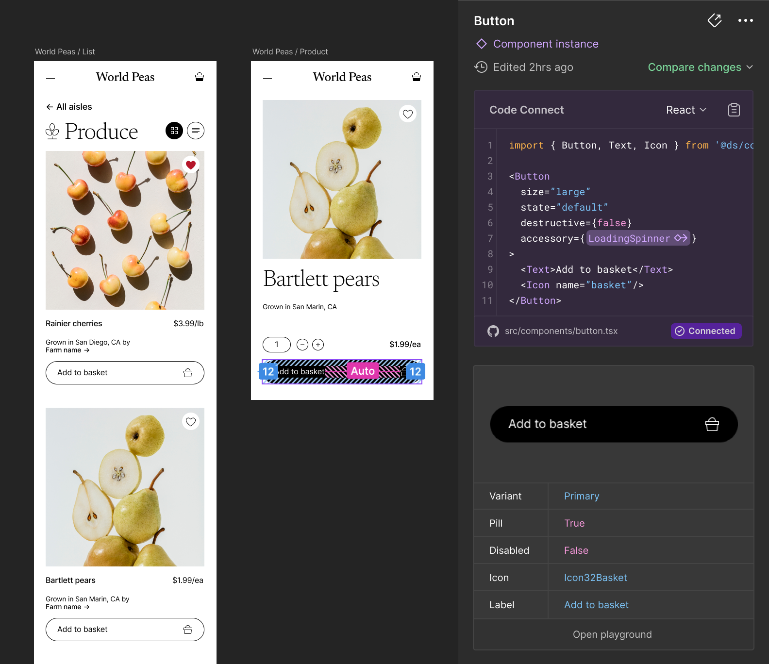
|
|
47
8
|
|
|
48
9
|
> [!NOTE]
|
|
49
|
-
> Code Connect
|
|
50
|
-
|
|
51
|
-
## Interactive setup
|
|
52
|
-
|
|
53
|
-
A step-by-step interactive flow is provided which makes it easier to connect a large codebase. Code Connect will attempt to automatically connect your codebase to your Figma design system components based on name, which you can then make any edits to before batch-creating Code Connect files.
|
|
10
|
+
> Code Connect is available on Organization and Enterprise plans and requires a full Design or Dev Mode seat to use.
|
|
54
11
|
|
|
55
|
-
|
|
12
|
+
## CLI installation
|
|
56
13
|
|
|
57
|
-
|
|
58
|
-
npx figma connect
|
|
59
|
-
```
|
|
60
|
-
|
|
61
|
-
## Integrating with Storybook
|
|
62
|
-
|
|
63
|
-
If you already have Storybook set up for your design system then we recommend using the Storybook integration that comes with Code Connect. Storybook and Code Connect complement each other nicely and with this integration they are easy to maintain in parallel. The syntax for integrating with Storybook is slightly different to ensure alignment with the Storybook API.
|
|
14
|
+
To install Code Connect locally to a React project, you can follow the instructions in the [React README](https://github.com/figma/code-connect/blob/main/cli/README.md#installation).
|
|
64
15
|
|
|
65
|
-
|
|
66
|
-
|
|
67
|
-
```tsx
|
|
68
|
-
export default {
|
|
69
|
-
component: Button,
|
|
70
|
-
parameters: {
|
|
71
|
-
design: {
|
|
72
|
-
type: 'figma',
|
|
73
|
-
url: 'https://...',
|
|
74
|
-
examples: [ButtonExample],
|
|
75
|
-
},
|
|
76
|
-
},
|
|
77
|
-
}
|
|
16
|
+
For other platforms, you first need to have Node.js v16 or newer installed on your computer. You can check if you already have Node.js installed and which version by running `node -v`. If you need to install Node.js, instructions for all platforms can be found [on the Node.js website](https://nodejs.org/en/download/package-manager).
|
|
78
17
|
|
|
79
|
-
|
|
80
|
-
export function ButtonExample() {
|
|
81
|
-
return <Button disabled />
|
|
82
|
-
}
|
|
83
|
-
```
|
|
18
|
+
Once you have Node.js installed, you can install Code Connect globally, so it can be run from anywhere on your machine, by running:
|
|
84
19
|
|
|
85
|
-
|
|
20
|
+
`npm install --global @figma/code-connect`
|
|
86
21
|
|
|
87
|
-
|
|
22
|
+
We hope to provide a way to install Code Connect without requiring Node.js soon.
|
|
88
23
|
|
|
89
|
-
|
|
90
|
-
npx figma connect publish --token <token>
|
|
91
|
-
```
|
|
24
|
+
## Setup
|
|
92
25
|
|
|
93
|
-
To
|
|
26
|
+
To learn how to implement Code Connect for your platform, please navigate to the platform-specific API usage and documentation.
|
|
94
27
|
|
|
95
|
-
|
|
96
|
-
|
|
97
|
-
|
|
28
|
+
- [React (or React Native)](https://github.com/figma/code-connect/blob/main/docs/react.md)
|
|
29
|
+
- [HTML (Web Components, Angular, Vue, etc.)](https://github.com/figma/code-connect/blob/main/docs/html.md)
|
|
30
|
+
- [SwiftUI](https://github.com/figma/code-connect/blob/main/docs/swiftui.md)
|
|
31
|
+
- [Jetpack Compose](https://github.com/figma/code-connect/blob/main/docs/compose.md)
|
|
98
32
|
|
|
99
|
-
|
|
33
|
+
## General configuration
|
|
100
34
|
|
|
101
|
-
|
|
102
|
-
- `-c --config <path>` Path to config file (by default looks for "figma.config.json" in the current directory).
|
|
103
|
-
- `-r --dir <folder>` Directory to parse (uses current directory by default)
|
|
104
|
-
- `--dry-run` Perform a dry run of publishing, returning errors if any exist but does not publish your connected components.
|
|
105
|
-
- `--skip-validation` By default, `publish` will validate your Code Connect file with the Figma component to ensure that their properties match. This flag can be used to skip this validation.
|
|
106
|
-
- `--verbose` Enable verbose logging for debugging
|
|
107
|
-
- `--node <node-url>` For unpublishing only a single specific component with `unpublish`
|
|
108
|
-
- `--label <label>` For publishing or unpublishing under a custom label
|
|
35
|
+
Code Connect can be configured with a `figma.config.json` file, which must be located in your project root (e.g. alongside the `package.json` or `.xcodeproj` file).
|
|
109
36
|
|
|
110
|
-
|
|
37
|
+
Every platform supports some common configuration options, in addition to any platform-specific options.
|
|
111
38
|
|
|
112
|
-
|
|
39
|
+
### `include` and `exclude`
|
|
113
40
|
|
|
114
|
-
|
|
41
|
+
`include` and `exclude` are lists of globs for where to parse Code Connect files, and for where to search for your component code when using the [interactive setup](https://github.com/figma/code-connect/blob/main/cli/README.md#interactive-setup). `include` and `exclude` paths must be relative to the location of the config file.
|
|
115
42
|
|
|
116
43
|
```jsonp
|
|
117
44
|
{
|
|
118
45
|
"codeConnect": {
|
|
119
|
-
"parser": "react",
|
|
120
46
|
"include": [],
|
|
121
|
-
"exclude": ["test/**", "docs/**", "build/**"]
|
|
122
|
-
"importPaths": {
|
|
123
|
-
"src/components/*": "@ui/components"
|
|
124
|
-
},
|
|
125
|
-
"paths": {
|
|
126
|
-
"@ui/components/*": ["src/components/*"]
|
|
127
|
-
}
|
|
47
|
+
"exclude": ["test/**", "docs/**", "build/**"]
|
|
128
48
|
}
|
|
129
49
|
}
|
|
130
50
|
```
|
|
131
51
|
|
|
132
|
-
### `
|
|
52
|
+
### `parser`
|
|
133
53
|
|
|
134
|
-
|
|
54
|
+
Code Connect will attempt to determine your project type by looking the first ancestor of the working directory which matches one of the following:
|
|
135
55
|
|
|
136
|
-
|
|
137
|
-
|
|
138
|
-
|
|
139
|
-
|
|
56
|
+
- If a `package.json` containing `react` is found, your project is detected as React
|
|
57
|
+
- If a `package.json` is found not containing `react`, your project is detected as HTML
|
|
58
|
+
- If a file matching `Package.swift` or `*.xcodeproj` is found, your project is detected as Swift
|
|
59
|
+
- If a file matching `build.gradle.kts` is found, your project is detected as Jetpack Compose
|
|
140
60
|
|
|
141
|
-
|
|
142
|
-
consider the full absolute path of the source file `Button.tsx`.
|
|
61
|
+
In case this does not correctly work for your project, you can override the project type by using the `parser` configuration key. Valid values are `react`, `html`, `swift` and `compose`.
|
|
143
62
|
|
|
144
|
-
```
|
|
63
|
+
```jsonp
|
|
145
64
|
{
|
|
146
65
|
"codeConnect": {
|
|
147
|
-
"
|
|
148
|
-
"src/components/*": "@ui/components"
|
|
149
|
-
}
|
|
66
|
+
"parser": "react"
|
|
150
67
|
}
|
|
151
68
|
}
|
|
152
69
|
```
|
|
153
70
|
|
|
154
|
-
|
|
71
|
+
### `label`
|
|
155
72
|
|
|
156
|
-
|
|
157
|
-
import { Button } from '@ui/components'
|
|
158
|
-
```
|
|
73
|
+
`label` allows you to specify the label used in Figma for your Code Connect docs. This defaults to the type of your project (e.g. `React`). You can override this to show a different name in the UI, which can be useful for e.g. showing different versions of the code.
|
|
159
74
|
|
|
160
|
-
### `
|
|
75
|
+
### `documentUrlSubstitutions`
|
|
161
76
|
|
|
162
|
-
|
|
77
|
+
`documentUrlSubstitutions` allows you to specify a set of substitutions which will be run on the `figmaNode` URLs when parsing or publishing documents.
|
|
163
78
|
|
|
164
|
-
|
|
79
|
+
This allows you to use different config files to switch publishing Code Connect between different files, without having to modify every Code Connect file (e.g. if you have a test version of your document you want to publish to). The substitutions are specified as an object, where the key is the string to be replaced, and the value is the string to replace that with.
|
|
165
80
|
|
|
166
|
-
|
|
81
|
+
For example, the config:
|
|
167
82
|
|
|
168
83
|
```
|
|
169
|
-
|
|
170
|
-
|
|
171
|
-
|
|
172
|
-
|
|
173
|
-
|
|
174
|
-
## Dynamic code snippets
|
|
175
|
-
|
|
176
|
-
With the basic setup as described above, you should have a connected code snippet visible in Dev Mode when inspecting instances of that component. However, the code snippet doesn't yet reflect the entirety of the design. For example, we see the same code snippet for a button whether it has the `type` variant set to `primary` or `secondary`.
|
|
177
|
-
|
|
178
|
-
To ensure the connected code snippet accurately reflects the design, we need to make use of property mappings. This enables you to link specific props in the design to props in code. In most cases, design and code props don't match 1:1, so it's necessary for us to configure this to ensure the correct code is shown in Dev Mode.
|
|
179
|
-
|
|
180
|
-
Here is a simple example for a button with a `label`, `disabled`, and `type` property.
|
|
181
|
-
|
|
182
|
-
```tsx
|
|
183
|
-
import figma from '@figma/code-connect'
|
|
184
|
-
|
|
185
|
-
figma.connect(Button, 'https://...', {
|
|
186
|
-
props: {
|
|
187
|
-
label: figma.string('Text Content'),
|
|
188
|
-
disabled: figma.boolean('Disabled'),
|
|
189
|
-
type: figma.enum('Type', {
|
|
190
|
-
Primary: 'primary',
|
|
191
|
-
Secondary: 'secondary',
|
|
192
|
-
}),
|
|
193
|
-
},
|
|
194
|
-
example: ({ disabled, label, type }) => {
|
|
195
|
-
return (
|
|
196
|
-
<Button disabled={disabled} type={type}>
|
|
197
|
-
{label}
|
|
198
|
-
</Button>
|
|
199
|
-
)
|
|
200
|
-
},
|
|
201
|
-
})
|
|
202
|
-
```
|
|
203
|
-
|
|
204
|
-
And this is how we would achieve the same thing using the Storybook integration. Notice how this works well with existing `args` configuration you may already be using in Storybook.
|
|
205
|
-
|
|
206
|
-
```tsx
|
|
207
|
-
import figma from "@figma/code-connect"
|
|
208
|
-
|
|
209
|
-
export default {
|
|
210
|
-
component: Button,
|
|
211
|
-
parameters: {
|
|
212
|
-
design: {
|
|
213
|
-
type: 'figma',
|
|
214
|
-
url: 'https://...',
|
|
215
|
-
examples: [ButtonExample],
|
|
216
|
-
props: {
|
|
217
|
-
label: figma.string('Text Content'),
|
|
218
|
-
disabled: figma.boolean('Disabled'),
|
|
219
|
-
type: figma.enum('Type', {
|
|
220
|
-
Primary: ButtonType.Primary,
|
|
221
|
-
Secondary: ButtonType.Secondary
|
|
222
|
-
},
|
|
223
|
-
},
|
|
224
|
-
},
|
|
225
|
-
argTypes: {
|
|
226
|
-
label: { control: 'string' },
|
|
227
|
-
disabled: { control: 'boolean' },
|
|
228
|
-
type: {
|
|
229
|
-
control: {
|
|
230
|
-
type: 'select',
|
|
231
|
-
options: [ButtonType.Primary, ButtonType.Secondary]
|
|
232
|
-
}
|
|
233
|
-
}
|
|
234
|
-
},
|
|
235
|
-
args: {
|
|
236
|
-
label: 'Hello world',
|
|
237
|
-
disabled: false,
|
|
238
|
-
type: ButtonType.Primary
|
|
84
|
+
{
|
|
85
|
+
"codeConnect": {
|
|
86
|
+
"documentUrlSubstitutions": {
|
|
87
|
+
"https://figma.com/design/1234abcd/File-1": "https://figma.com/design/5678dcba/File-2"
|
|
239
88
|
}
|
|
240
89
|
}
|
|
241
90
|
}
|
|
242
|
-
|
|
243
|
-
export function ButtonExample({ label, disabled, type }) {
|
|
244
|
-
return <Button disabled={disabled} type={type}>{ label }</Button>
|
|
245
|
-
}
|
|
246
91
|
```
|
|
247
92
|
|
|
248
|
-
|
|
249
|
-
|
|
250
|
-
### figma.connect
|
|
251
|
-
|
|
252
|
-
`figma.connect()` has two signatures for connecting components.
|
|
253
|
-
|
|
254
|
-
```
|
|
255
|
-
// connect a component in code to a Figma component
|
|
256
|
-
figma.connect(Button, "https://...")
|
|
93
|
+
would change Figma node URLs like `https://figma.com/design/1234abcd/File-1/?node-id=12:345` to `https://figma.com/design/5678dbca/File-2/?node-id=12:345`.
|
|
257
94
|
|
|
258
|
-
|
|
259
|
-
figma.connect("https://...")
|
|
260
|
-
```
|
|
261
|
-
|
|
262
|
-
The second option is useful if you want to just render a HTML tag instead of a React component. The first argument is used to determine where your component lives in code, in order to generate an import statement for the component. This isn't needed if you just want to render e.g a `button` tag.
|
|
263
|
-
|
|
264
|
-
```
|
|
265
|
-
figma.connect("https://...", {
|
|
266
|
-
example: () => <button>click me</button>
|
|
267
|
-
})
|
|
268
|
-
```
|
|
269
|
-
|
|
270
|
-
### Strings
|
|
271
|
-
|
|
272
|
-
Strings are the simplest value to map from Figma to code. Simply call `figma.string` with the Figma prop name you want to reference as a parameter. This is useful for things like button labels, header titles, tooltips, etc.
|
|
273
|
-
|
|
274
|
-
```tsx
|
|
275
|
-
figma.string('Title')
|
|
276
|
-
```
|
|
95
|
+
## Common issues
|
|
277
96
|
|
|
278
|
-
###
|
|
97
|
+
### Connectivity issues due to proxies or network security software
|
|
279
98
|
|
|
280
|
-
|
|
99
|
+
Some proxies or network security software can prevent Code Connect from communicating with Figma's servers. If you encounter issues, you may need to explicitly allow connections to `https://api.figma.com/`. Please reach out to [Figma support](https://help.figma.com/hc/en-us/requests/new) if you are still unable to use Code Connect.
|
|
281
100
|
|
|
282
|
-
|
|
283
|
-
// simple mapping of boolean from figma to code
|
|
284
|
-
figma.boolean('Has Icon')
|
|
101
|
+
### 413 errors due to too large uploads
|
|
285
102
|
|
|
286
|
-
|
|
287
|
-
figma.boolean('Has Icon', {
|
|
288
|
-
true: <Icon />,
|
|
289
|
-
false: <Spacer />,
|
|
290
|
-
})
|
|
291
|
-
```
|
|
292
|
-
|
|
293
|
-
In some cases, you only want to render a certain prop if it matches some value in Figma. You can do this either by passing a partial mapping object, or setting the value to `undefined`.
|
|
294
|
-
|
|
295
|
-
```tsx
|
|
296
|
-
// Don't render the prop if 'Has label' in figma is `false`
|
|
297
|
-
figma.boolean('Has label', {
|
|
298
|
-
true: figma.string('Label'),
|
|
299
|
-
false: undefined,
|
|
300
|
-
})
|
|
301
|
-
```
|
|
302
|
-
|
|
303
|
-
### Enums
|
|
304
|
-
|
|
305
|
-
Variants (or enums) in Figma are commonly used to control the look and feel of components that require more complex options than a simple boolean toggle. Variant properties are always strings in Figma but they can be mapped to any type in code. The first parameter is the name of the Variant in Figma, and the second parameter is a value mapping. The _keys_ in this object should match the different options of that Variant in Figma, and the _value_ is whatever you want to output instead.
|
|
306
|
-
|
|
307
|
-
```tsx
|
|
308
|
-
// maps the 'Options' variant in Figma to enum values in code
|
|
309
|
-
figma.enum('Options', {
|
|
310
|
-
'Option 1': Option.first,
|
|
311
|
-
'Option 2': Option.second,
|
|
312
|
-
})
|
|
313
|
-
|
|
314
|
-
// maps the 'Options' variant in Figma to sub-component values in code
|
|
315
|
-
figma.enum('Options', {
|
|
316
|
-
'Option 1': <Icon />,
|
|
317
|
-
'Option 2': <IconButton />,
|
|
318
|
-
})
|
|
319
|
-
|
|
320
|
-
// result is true for disabled variants otherwise undefined
|
|
321
|
-
figma.enum('Variant', { Disabled: true })
|
|
322
|
-
|
|
323
|
-
// enums mappings can be used to show a component based on a Figma variant
|
|
324
|
-
figma.connect(Modal, 'https://...', {
|
|
325
|
-
props: {
|
|
326
|
-
cancelButton: figma.enum('Type', {
|
|
327
|
-
Cancellable: <CancelButton />,
|
|
328
|
-
}),
|
|
329
|
-
// ...
|
|
330
|
-
},
|
|
331
|
-
example: ({ cancelButton }) => {
|
|
332
|
-
return (
|
|
333
|
-
<Modal>
|
|
334
|
-
<Title>Title</Title>
|
|
335
|
-
<Content>Some content</Content>
|
|
336
|
-
{cancelButton}
|
|
337
|
-
</Modal>
|
|
338
|
-
)
|
|
339
|
-
},
|
|
340
|
-
})
|
|
341
|
-
```
|
|
342
|
-
|
|
343
|
-
Mapping objects for `figma.enum` as well as `figma.boolean` allows nested references, which is useful if you want to conditionally render a nested instance for example. (see the next section for how to use `figma.instance`)
|
|
344
|
-
|
|
345
|
-
```tsx
|
|
346
|
-
// maps the 'Options' variant in Figma to enum values in code
|
|
347
|
-
figma.enum('Type', {
|
|
348
|
-
WithIcon: figma.instance('Icon'),
|
|
349
|
-
WithoutIcon: undefined,
|
|
350
|
-
})
|
|
351
|
-
```
|
|
352
|
-
|
|
353
|
-
Note that in contrast to `figma.boolean`, values are _not_ normalized for `figma.enum`. You always need to pass the exact literal values to the mapping object.
|
|
354
|
-
|
|
355
|
-
```tsx
|
|
356
|
-
// These two are equivalent for a variant with the options "Yes" and "No"
|
|
357
|
-
disabled: figma.enum("Boolean Variant", {
|
|
358
|
-
Yes: // ...
|
|
359
|
-
No: // ...
|
|
360
|
-
})
|
|
361
|
-
disabled: figma.boolean("Boolean Variant", {
|
|
362
|
-
true: // ...
|
|
363
|
-
false: // ...
|
|
364
|
-
})
|
|
365
|
-
```
|
|
366
|
-
|
|
367
|
-
### Instances
|
|
368
|
-
|
|
369
|
-
Instances is a Figma term for nested component references. For example, in the case of a `Button` containing an `Icon` as a nested component, we would call the `Icon` an instance. In Figma instances can be properties, (that is, inputs to the component), just like we have render props in code. Similarly to how we can map booleans, enums, and strings from Figma to code, we can also map these to instance props.
|
|
370
|
-
|
|
371
|
-
To ensure instance properties are as useful as possible with Code Connect, it is advised that you also provide Code Connect for the common components which you would expect to be used as values to this property. Dev Mode will automatically hydrate the referenced component's connected code snippet example and how changes it in Dev Mode for instance props.
|
|
372
|
-
|
|
373
|
-
```tsx
|
|
374
|
-
// maps an instance-swap property from Figma
|
|
375
|
-
figma.instance('PropName')
|
|
376
|
-
```
|
|
377
|
-
|
|
378
|
-
The return value of `figma.instance` is a JSX component and can be used in your example like a typical JSX component prop would be in your codebase.
|
|
379
|
-
|
|
380
|
-
```tsx
|
|
381
|
-
figma.connect(Button, 'https://...', {
|
|
382
|
-
props: {
|
|
383
|
-
icon: figma.instance('Icon'),
|
|
384
|
-
},
|
|
385
|
-
example: ({ icon }) => {
|
|
386
|
-
return <Button icon={icon}>Instance prop Example</Button>
|
|
387
|
-
},
|
|
388
|
-
})
|
|
389
|
-
```
|
|
390
|
-
|
|
391
|
-
You should then have a separate `figma.connect` call that connects the Icon component with the nested Figma component. Make sure to connect the backing component of that instance, not the instance itself.
|
|
392
|
-
|
|
393
|
-
```tsx
|
|
394
|
-
figma.connect(Icon32Add, 'https://...')
|
|
395
|
-
```
|
|
396
|
-
|
|
397
|
-
### Instance children
|
|
398
|
-
|
|
399
|
-
It's common for components in Figma to have child instances that aren't bound to an instance-swap prop. Similarly to `figma.instance`, we can render the code snippets for these nested instances with `figma.children`. This helper takes the _name of the instance layer within the parent component_ as its parameter, rather than a Figma prop name.
|
|
400
|
-
|
|
401
|
-
To illustrate this, consider the layer hierarchy in a component vs an instance of that component:
|
|
402
|
-
|
|
403
|
-
Button (Component)
|
|
404
|
-
Icon (Instance) -- "Icon" is the original name of the layer, this is what you should pass to `figma.children()`
|
|
405
|
-
|
|
406
|
-
Button (Instance)
|
|
407
|
-
RenamedIcon (Instance) -- here the instance layer was renamed, which won't break the mapping since we're not using this name
|
|
408
|
-
|
|
409
|
-
Note that the nested instance also must be connected separately.
|
|
410
|
-
|
|
411
|
-
> Layer names may differ between variants in a component set. To ensure the component (Button) can render a nested instance (Icon) for any of those variants, you must either use the wildcard option `figma.children("*")` or ensure that the layer name representing the instance (Icon) is the same across all variants of your component set (Button).
|
|
412
|
-
|
|
413
|
-
```tsx
|
|
414
|
-
// map one child instance with the layer name "Tab"
|
|
415
|
-
figma.children('Tab')
|
|
416
|
-
|
|
417
|
-
// map multiple child instances by their layer names to a single prop
|
|
418
|
-
figma.children(['Tab 1', 'Tab 2'])
|
|
419
|
-
```
|
|
420
|
-
|
|
421
|
-
### Wildcard match
|
|
422
|
-
|
|
423
|
-
`figma.children()` can be used with a single wildcard '\*' character, to partially match names or to render any nested child. Wildcards cannot be used with the array argument. Matches are case sensitive.
|
|
424
|
-
|
|
425
|
-
```tsx
|
|
426
|
-
// map any (all) child instances
|
|
427
|
-
figma.children('*')
|
|
428
|
-
|
|
429
|
-
// map any child instances that starts with "Icon"
|
|
430
|
-
figma.children('Icon*')
|
|
431
|
-
```
|
|
432
|
-
|
|
433
|
-
### Nested properties
|
|
434
|
-
|
|
435
|
-
In cases where you don't want to connect a child component, but instead map its properties on the parent level, you can use `figma.nestedProps()` to achieve this. This helper takes the name of the layer as it's first parameter, and a mapping object as the second parameter. These props can then be referenced in the example function. `nestedProps` will always select a **single** instance, and cannot be used to map multiple children.
|
|
436
|
-
|
|
437
|
-
```tsx
|
|
438
|
-
// map the properties of a nested instance named "Button Shape"
|
|
439
|
-
figma.connect(Button, "https://...", {
|
|
440
|
-
props: {
|
|
441
|
-
buttonShape: figma.nestedProps('Button Shape', {
|
|
442
|
-
size: figma.enum({ ... }),
|
|
443
|
-
})
|
|
444
|
-
},
|
|
445
|
-
example: ({ buttonShape }) => <Button size={buttonShape.size} />
|
|
446
|
-
}
|
|
447
|
-
```
|
|
448
|
-
|
|
449
|
-
### Text Content
|
|
450
|
-
|
|
451
|
-
A common pattern for design systems in Figma is to not use props for texts, but rather rely on instances overriding the text content. `figma.textContent()` allows you to select a child text layer and render its content. It takes a single parameter which is the name of the layer in the original component.
|
|
452
|
-
|
|
453
|
-
```tsx
|
|
454
|
-
figma.connect(Button, "https://...", {
|
|
455
|
-
props: {
|
|
456
|
-
label: figma.textContent("Text Layer")
|
|
457
|
-
},
|
|
458
|
-
example: ({ label }) => <Button>{label}</Button>
|
|
459
|
-
}
|
|
460
|
-
```
|
|
461
|
-
|
|
462
|
-
### className
|
|
463
|
-
|
|
464
|
-
For mapping figma properties to a className string, you can use the `figma.className` helper. It takes an array of strings and returns the concatenated string. Any other helper that returns a string (or undefined) can be used in conjunction with this. Undefined values or empty strings will be filtered out from the result
|
|
465
|
-
|
|
466
|
-
```tsx
|
|
467
|
-
figma.connect("https://...", {
|
|
468
|
-
props: {
|
|
469
|
-
className: figma.className([
|
|
470
|
-
'btn-base',
|
|
471
|
-
figma.enum("Size", { Large: 'btn-large' }),
|
|
472
|
-
figma.boolean("Disabled", { true: 'btn-disabled', false: '' }),
|
|
473
|
-
])
|
|
474
|
-
},
|
|
475
|
-
example: ({ className }) => <button className={className} />
|
|
476
|
-
}
|
|
477
|
-
```
|
|
478
|
-
|
|
479
|
-
In Dev Mode this will display as:
|
|
480
|
-
|
|
481
|
-
```
|
|
482
|
-
<button className="btn-base btn-large btn-disabled" />
|
|
483
|
-
```
|
|
484
|
-
|
|
485
|
-
## Variant restrictions
|
|
486
|
-
|
|
487
|
-
Sometimes a component in Figma is represented by more than one component in code. For example you may have a single `Button` in your Figma design system with a `type` property to switch between primary, secondary, and danger variants. However, in code this may be represented by three different components, a `PrimaryButton`, `SecondaryButton` and `DangerButton`.
|
|
488
|
-
|
|
489
|
-
To model this behaviour with Code Connect we can make use of something called variant restrictions. Variant restrictions allow you to provide entirely different code samples for different variants of a single Figma component. The keys and values used should match the name of the variant (or property) in Figma and it's options respectively.
|
|
490
|
-
|
|
491
|
-
```tsx
|
|
492
|
-
figma.connect(PrimaryButton, 'https://...', {
|
|
493
|
-
variant: { Type: 'Primary' },
|
|
494
|
-
example: () => <PrimaryButton />,
|
|
495
|
-
})
|
|
496
|
-
|
|
497
|
-
figma.connect(SecondaryButton, 'https://...', {
|
|
498
|
-
variant: { Type: 'Secondary' },
|
|
499
|
-
example: () => <SecondaryButton />,
|
|
500
|
-
})
|
|
501
|
-
|
|
502
|
-
figma.connect(DangerButton, 'https://...', {
|
|
503
|
-
variant: { Type: 'Danger' },
|
|
504
|
-
example: () => <DangerButton />,
|
|
505
|
-
})
|
|
506
|
-
```
|
|
507
|
-
|
|
508
|
-
This will also work for Figma properties that aren't variants (for example, boolean props).
|
|
509
|
-
|
|
510
|
-
```
|
|
511
|
-
figma.connect(IconButton, 'https://...', {
|
|
512
|
-
variant: { "Has Icon": true },
|
|
513
|
-
example: () => <IconButton />,
|
|
514
|
-
})
|
|
515
|
-
```
|
|
516
|
-
|
|
517
|
-
In some complex cases you may also want to map a code component to a combination of variants in Figma.
|
|
518
|
-
|
|
519
|
-
```tsx
|
|
520
|
-
figma.connect(DangerButton, 'https://...', {
|
|
521
|
-
variant: { Type: 'Danger', Disabled: true },
|
|
522
|
-
example: () => <DangerButton />,
|
|
523
|
-
})
|
|
524
|
-
```
|
|
525
|
-
|
|
526
|
-
You can achieve the same thing using the Storybook API.
|
|
527
|
-
|
|
528
|
-
```tsx
|
|
529
|
-
export default {
|
|
530
|
-
component: Button,
|
|
531
|
-
parameters: {
|
|
532
|
-
design: {
|
|
533
|
-
type: 'figma',
|
|
534
|
-
url: 'https://...',
|
|
535
|
-
examples: [
|
|
536
|
-
{ example: PrimaryButtonStory, variant: { Type: 'Primary' } },
|
|
537
|
-
{ example: SecondaryButtonStory, variant: { Type: 'Secondary' } },
|
|
538
|
-
{ example: DangerButtonStory, variant: { Type: 'Danger' } },
|
|
539
|
-
],
|
|
540
|
-
},
|
|
541
|
-
},
|
|
542
|
-
}
|
|
543
|
-
|
|
544
|
-
export function PrimaryButtonStory() {
|
|
545
|
-
return <PrimaryButton />
|
|
546
|
-
}
|
|
547
|
-
|
|
548
|
-
export function SecondaryButtonStory() {
|
|
549
|
-
return <SecondaryButton />
|
|
550
|
-
}
|
|
551
|
-
|
|
552
|
-
export function DangerButtonStory() {
|
|
553
|
-
return <DangerButton />
|
|
554
|
-
}
|
|
555
|
-
```
|
|
556
|
-
|
|
557
|
-
## Icons
|
|
558
|
-
|
|
559
|
-
For connecting a lot of icons, we recommend creating a script that pulls icons from a Figma file to generate an `icons.figma.tsx` file that includes all icons. You can use the script [here](./scripts/README.md) as a starting point. The script is marked with "EDIT THIS" in areas where you'll need to make edits for it to work with how your Figma design system is setup and how your icons are defined in code.
|
|
560
|
-
|
|
561
|
-
## CI / CD
|
|
562
|
-
|
|
563
|
-
The easiest way to get started using Code Connect is by using the CLI locally. However, once you have set up your first connected components it may be beneficial to integrate Code Connect with your CI/CD environment to simplify maintenance and to ensure component connections are always up to date. Using GitHub actions, we can specify that we want to publish new files when any PR is merged to the main branch. We recommend only running this on pull requests that are relevant to Code Connect to minimize impact on other pull requests.
|
|
564
|
-
|
|
565
|
-
```yml
|
|
566
|
-
on:
|
|
567
|
-
push:
|
|
568
|
-
paths:
|
|
569
|
-
- src/components/**/*.figma.tsx
|
|
570
|
-
branches:
|
|
571
|
-
- main
|
|
572
|
-
|
|
573
|
-
jobs:
|
|
574
|
-
code-connect:
|
|
575
|
-
name: Code Connect
|
|
576
|
-
runs-on: ubuntu-latest
|
|
577
|
-
steps:
|
|
578
|
-
- run: npx figma connect publish
|
|
579
|
-
```
|
|
580
|
-
|
|
581
|
-
## Co-locating Code Connect files
|
|
582
|
-
|
|
583
|
-
By default Code Connect creates a new file which lives alongside the components you want to connect to Figma. However, Code Connect may also be co-located with the component it is connecting in code. To do this, simply move the contents of the `<component-name>.figma.tsx` file into your component definition file.
|
|
584
|
-
|
|
585
|
-
```tsx
|
|
586
|
-
import figma from "@figma/code-connect"
|
|
587
|
-
|
|
588
|
-
interface ButtonProps { ... }
|
|
589
|
-
export function Button(props: ButtonProps) { ... }
|
|
590
|
-
|
|
591
|
-
figma.connect(Button, "https://...", {
|
|
592
|
-
example: () => {
|
|
593
|
-
return <Button />
|
|
594
|
-
}
|
|
595
|
-
})
|
|
596
|
-
```
|
|
103
|
+
Please rerun with the `--batch-size` parameter. This will upload the Code Connect in batches of documents of batch_size length. We suggest starting with 50 and decreasing until converging on a size that works for your Code Connect.
|