@faststore/core 2.0.151-alpha.0 → 2.0.153-alpha.0
This diff represents the content of publicly available package versions that have been released to one of the supported registries. The information contained in this diff is provided for informational purposes only and reflects changes between package versions as they appear in their respective public registries.
- package/.next/BUILD_ID +1 -1
- package/.next/build-manifest.json +44 -44
- package/.next/cache/.tsbuildinfo +1 -1
- package/.next/cache/config.json +3 -3
- package/.next/cache/eslint/.cache_1gneedd +1 -1
- package/.next/cache/webpack/client-production/0.pack +0 -0
- package/.next/cache/webpack/client-production/index.pack +0 -0
- package/.next/cache/webpack/server-production/0.pack +0 -0
- package/.next/cache/webpack/server-production/index.pack +0 -0
- package/.next/prerender-manifest.json +1 -1
- package/.next/react-loadable-manifest.json +5 -5
- package/.next/routes-manifest.json +1 -1
- package/.next/server/chunks/104.js +1 -1
- package/.next/server/chunks/{746.js → 289.js} +12 -8
- package/.next/server/chunks/312.js +35 -8
- package/.next/server/chunks/401.js +5 -5
- package/.next/server/chunks/74.js +30 -14
- package/.next/server/chunks/907.js +433 -353
- package/.next/server/middleware-build-manifest.js +1 -1
- package/.next/server/middleware-react-loadable-manifest.js +1 -1
- package/.next/server/pages/404.js.nft.json +1 -1
- package/.next/server/pages/500.js.nft.json +1 -1
- package/.next/server/pages/[...slug].js +30 -15
- package/.next/server/pages/[...slug].js.nft.json +1 -1
- package/.next/server/pages/[slug]/p.js.nft.json +1 -1
- package/.next/server/pages/_app.js.nft.json +1 -1
- package/.next/server/pages/account.js.nft.json +1 -1
- package/.next/server/pages/checkout.js.nft.json +1 -1
- package/.next/server/pages/en-US/404.html +2 -2
- package/.next/server/pages/en-US/500.html +2 -2
- package/.next/server/pages/en-US/account.html +2 -2
- package/.next/server/pages/en-US/checkout.html +2 -2
- package/.next/server/pages/en-US/login.html +2 -2
- package/.next/server/pages/en-US/s.html +2 -2
- package/.next/server/pages/en-US/s.json +1 -1
- package/.next/server/pages/en-US.html +2 -2
- package/.next/server/pages/index.js.nft.json +1 -1
- package/.next/server/pages/login.js.nft.json +1 -1
- package/.next/server/pages/s.js +30 -14
- package/.next/server/pages/s.js.nft.json +1 -1
- package/.next/server/pages-manifest.json +5 -5
- package/.next/static/Jdc52lXcDWIk2D0wQ-Z4p/_buildManifest.js +1 -0
- package/.next/static/chunks/0-0e3914d9fc148f74.js +1 -0
- package/.next/static/chunks/{366-4a0572a47e2225d9.js → 366-c0bfd9890048babf.js} +1 -1
- package/.next/static/chunks/377-b3616792e1f5f651.js +1 -0
- package/.next/static/chunks/495.0ecd099878b2a36d.js +1 -0
- package/.next/static/chunks/64.ebbe1d2b40f980c7.js +1 -0
- package/.next/static/chunks/pages/{[...slug]-3c749c7d8561eb90.js → [...slug]-bd1885159f7dfbba.js} +1 -1
- package/.next/static/chunks/pages/s-1cbe740b5b781d28.js +1 -0
- package/.next/static/chunks/webpack-eb5ed34c93d07fac.js +1 -0
- package/.next/static/css/{2e9de35e0cb999e0.css → 1323734429a8aa40.css} +1 -1
- package/.next/static/css/7d822a137c54a781.css +1 -0
- package/.next/static/css/a0feab89b7648c5c.css +1 -0
- package/.next/static/css/a13a9f9cd349d906.css +1 -0
- package/.next/static/css/a45618030b16a245.css +1 -0
- package/.next/static/css/bde408cc006e64f8.css +1 -0
- package/.next/static/css/d462d9478ce00021.css +1 -0
- package/.next/trace +69 -69
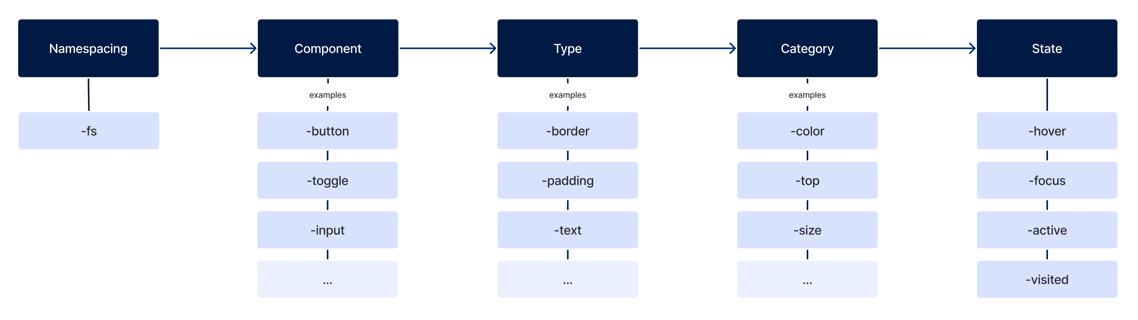
- package/.turbo/turbo-build.log +6 -6
- package/CHANGELOG.md +12 -0
- package/cms/faststore/content-types.json +96 -2
- package/cms/faststore/sections.json +176 -0
- package/package.json +4 -4
- package/src/components/navigation/Navbar/Navbar.tsx +14 -8
- package/src/components/product/ProductGrid/ProductGrid.tsx +8 -3
- package/src/components/search/Filter/Filter.tsx +22 -3
- package/src/components/search/Filter/FilterSlider.tsx +14 -4
- package/src/components/search/SearchDropdown/SearchDropdown.tsx +17 -7
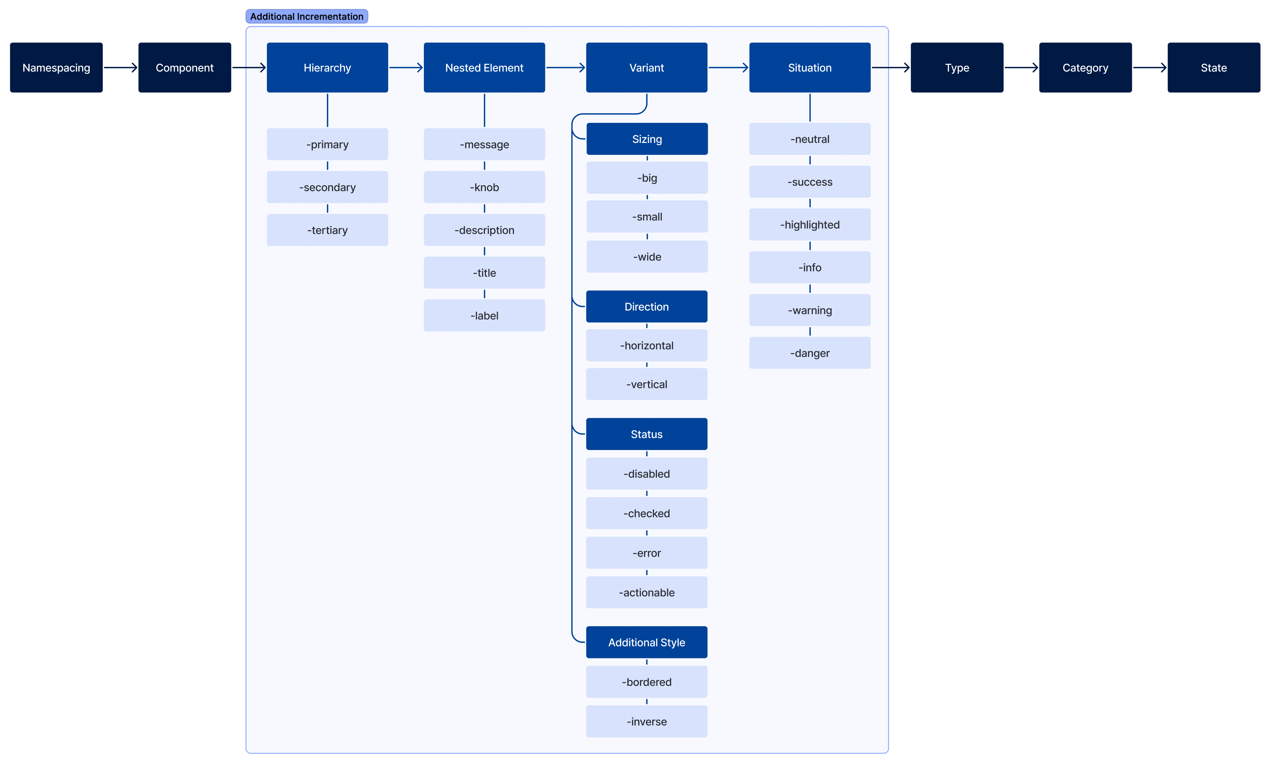
- package/src/components/search/SearchInput/SearchInput.tsx +10 -5
- package/src/components/search/SearchTop/SearchTop.tsx +17 -3
- package/src/components/search/Sort/Sort.tsx +21 -3
- package/src/components/sections/Navbar/Navbar.tsx +5 -0
- package/src/components/sections/ProductGallery/ProductGallery.tsx +44 -154
- package/src/components/ui/ProductGallery/ProductGallery.tsx +220 -0
- package/src/components/{sections → ui}/ProductGallery/ProductGalleryPage.tsx +9 -2
- package/src/components/ui/ProductGallery/index.ts +1 -0
- package/src/pages/[...slug].tsx +34 -17
- package/src/pages/s.tsx +38 -13
- package/src/sdk/search/formatSearchPath.ts +8 -1
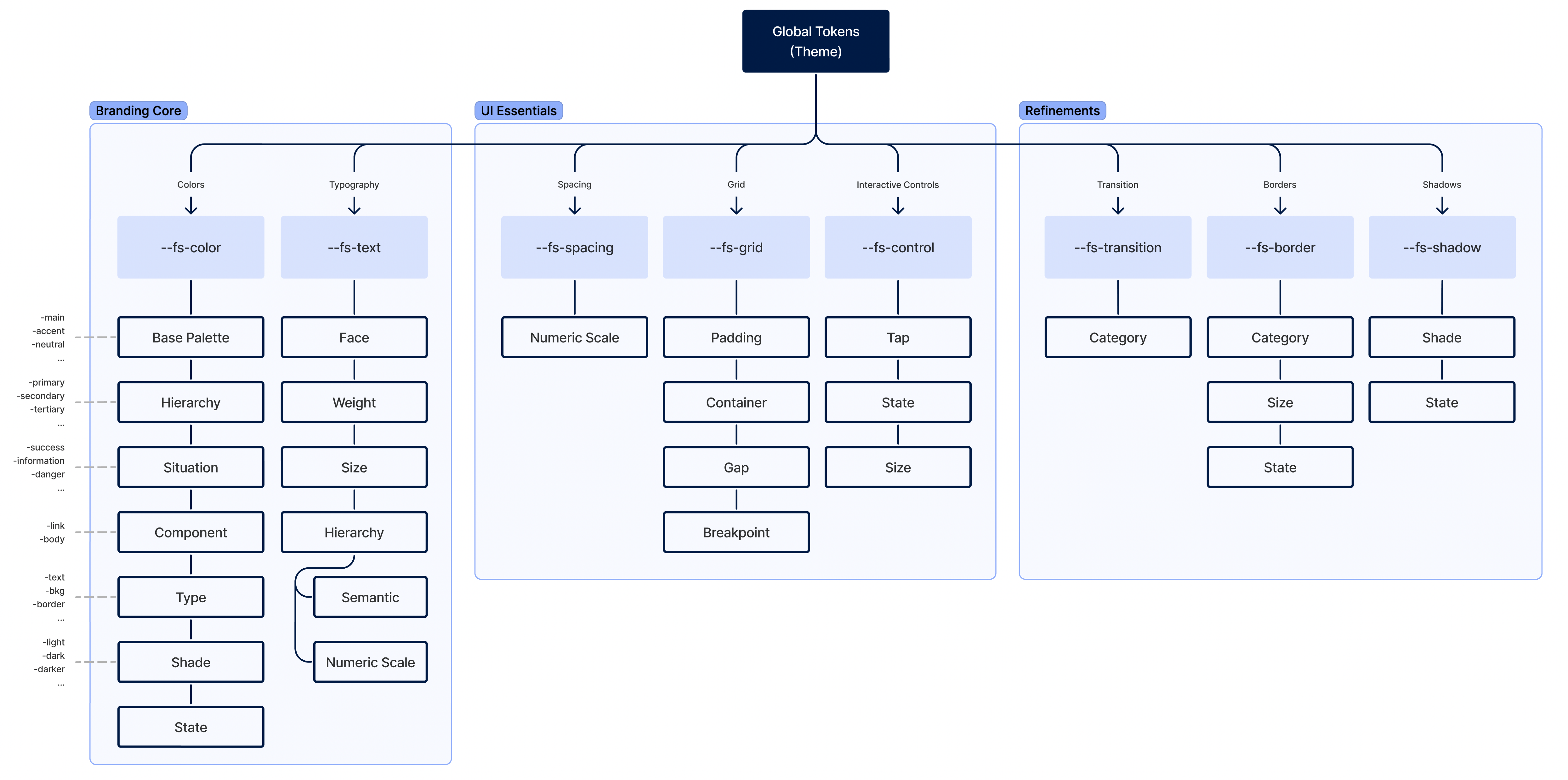
- package/src/server/cms.ts +11 -2
- package/.next/static/SPkTG9-gxU2UejLG7FvOw/_buildManifest.js +0 -1
- package/.next/static/chunks/170.c17ce564bb568265.js +0 -1
- package/.next/static/chunks/327-43715af4f3fffaf6.js +0 -1
- package/.next/static/chunks/377-61e89c711b136605.js +0 -1
- package/.next/static/chunks/495.8ffebac98e9475dc.js +0 -1
- package/.next/static/chunks/pages/s-890c0c4b88484224.js +0 -1
- package/.next/static/chunks/webpack-5051dce9659282f3.js +0 -1
- package/.next/static/css/1de3e7b6ba8daaac.css +0 -1
- package/.next/static/css/43b1b3821e21630c.css +0 -1
- package/.next/static/css/48af598df5fe042d.css +0 -1
- package/.next/static/css/923c4a942e57bc91.css +0 -1
- package/.next/static/css/e434797816e17065.css +0 -1
- package/.next/static/css/e7a6f3559cf45c62.css +0 -1
- package/src/stories/brandless.stories.mdx +0 -87
- package/src/stories/changelog-template.stories.mdx +0 -10
- package/src/stories/colors.stories.mdx +0 -306
- package/src/stories/customizing.stories.mdx +0 -113
- package/src/stories/getting-started.stories.mdx +0 -68
- package/src/stories/grid-layout.stories.mdx +0 -53
- package/src/stories/icons.stories.mdx +0 -237
- package/src/stories/interactive-controls.stories.mdx +0 -50
- package/src/stories/midnight.stories.mdx +0 -56
- package/src/stories/refinements.stories.mdx +0 -96
- package/src/stories/soft-blue.stories.mdx +0 -56
- package/src/stories/spacing.stories.mdx +0 -38
- package/src/stories/typography.stories.mdx +0 -224
- /package/.next/static/{SPkTG9-gxU2UejLG7FvOw → Jdc52lXcDWIk2D0wQ-Z4p}/_ssgManifest.js +0 -0
- /package/src/components/{sections → ui}/ProductGallery/useDelayedFacets.ts +0 -0
- /package/src/components/{sections → ui}/ProductGallery/useDelayedPagination.ts +0 -0
- /package/src/components/{sections → ui}/ProductGallery/usePageProducts.ts +0 -0
|
@@ -1,87 +0,0 @@
|
|
|
1
|
-
import { Description, Meta } from '@storybook/addon-docs'
|
|
2
|
-
|
|
3
|
-
import { LinkButton } from '@faststore/ui'
|
|
4
|
-
|
|
5
|
-
import Icon from '../components/ui/Icon'
|
|
6
|
-
|
|
7
|
-
<Meta
|
|
8
|
-
title="Theming/Brandless"
|
|
9
|
-
parameters={{ options: { showToolbar: false } }}
|
|
10
|
-
/>
|
|
11
|
-
|
|
12
|
-
<header className="sbdocs-hero">
|
|
13
|
-
|
|
14
|
-
# Brandless
|
|
15
|
-
|
|
16
|
-
This themeable structure is made of two complementary layers: a useful and assorted library of templates for the components and sections, alongside a comprehensive set of design tokens to further customize them.
|
|
17
|
-
|
|
18
|
-
<LinkButton
|
|
19
|
-
size="small"
|
|
20
|
-
variant="tertiary"
|
|
21
|
-
href="../?path=/docs/theming-customizing--page"
|
|
22
|
-
icon={<Icon name="ArrowRight" width="18" height="18" weight="bold" />}
|
|
23
|
-
iconPosition="right"
|
|
24
|
-
>
|
|
25
|
-
Customizing your store
|
|
26
|
-
</LinkButton>
|
|
27
|
-
|
|
28
|
-
</header>
|
|
29
|
-
|
|
30
|
-
**Structural Styles**, the first layer, has foundational styles that lay things out in common design patterns for different use cases. It also covers a component's fundamental interactions, like showing/hiding a dropdown or moving a toggle’s knob to make it active.
|
|
31
|
-
|
|
32
|
-
The second, **Theme**, is where the branding lives and what truly differentiates one UI from another. Graphic elements—like typography (and type scale), colors, imagery, borders, spacing, & more—are controlled by design tokens that a developer can easily tweak to create a unique look and feel.
|
|
33
|
-
|
|
34
|
-
<img
|
|
35
|
-
src="https://vtexhelp.vtexassets.com/assets/docs/src/theming-intro___1d021c8548ba2338faba6dd2995bf7ce.png"
|
|
36
|
-
align="right"
|
|
37
|
-
style={{ width: '70%', display: 'block', margin: '0 auto' }}
|
|
38
|
-
/>
|
|
39
|
-
|
|
40
|
-
Additional styles can be added to overwrite what was set in the Structure and/or Theme, reaching a state of total flexibility and freedom. Lastly, the developer can throw away all existing FastStore CSS altogether and build it from scratch.
|
|
41
|
-
|
|
42
|
-
---
|
|
43
|
-
|
|
44
|
-
## Theming architecture
|
|
45
|
-
|
|
46
|
-
Starting from the bottom up, we have the components: fully-featured UI blocks that belong to a larger whole system. The components have their own CSS that defines their overall appearance and how things are arranged; these scoped stylesheets are the Templates. The Templates' visual properties are tied to local variables—design tokens—that draw the final picture of the component; these local, scoped variables, on the other hand, are tied to global tokens, which form the Theme.
|
|
47
|
-
|
|
48
|
-
<img
|
|
49
|
-
src="https://vtexhelp.vtexassets.com/assets/docs/src/theming-architecture___f965569346d8d7d6a3de1f020f06ac99.png"
|
|
50
|
-
align="center"
|
|
51
|
-
style={{ width: '80%', display: 'block', margin: '0 auto' }}
|
|
52
|
-
/>
|
|
53
|
-
|
|
54
|
-
---
|
|
55
|
-
|
|
56
|
-
## Design tokens naming scheme
|
|
57
|
-
|
|
58
|
-
### Scoped Tokens (components)
|
|
59
|
-
|
|
60
|
-
All components' design tokens must follow a strict scheme to achieve predictability and cohesiveness. The tokens parts must tell:
|
|
61
|
-
|
|
62
|
-
- **Namespacing**: Where this token is coming from (is it a global or a component's local part);
|
|
63
|
-
- **Component**: Their semantic meaning;
|
|
64
|
-
- **Type**: What property type it affects;
|
|
65
|
-
- **Category** Which category of this type is going to be affected;
|
|
66
|
-
- **State**: Their interactive state.
|
|
67
|
-
|
|
68
|
-
|
|
69
|
-
|
|
70
|
-
If needed, we can use other additional incrementation to the token's name, such as:
|
|
71
|
-
|
|
72
|
-
- **Hierarchy**: Define its tier;
|
|
73
|
-
- **Nested Element**: To sytle elements contained inside the component;
|
|
74
|
-
- **Variant**: What differentiate it from the default;
|
|
75
|
-
- **Situation**: When they should be used;
|
|
76
|
-
|
|
77
|
-
|
|
78
|
-
|
|
79
|
-
### Theme (or global design tokens)
|
|
80
|
-
|
|
81
|
-
Global design tokens are parameters that affect all UI look 'n' feel. They are the main configuration file of a Theme. It's constituted of three main groups:
|
|
82
|
-
|
|
83
|
-
1. Branding Core
|
|
84
|
-
2. UI Essentials
|
|
85
|
-
3. Refinements
|
|
86
|
-
|
|
87
|
-
|
|
@@ -1,10 +0,0 @@
|
|
|
1
|
-
import { Description } from '@storybook/addon-docs'
|
|
2
|
-
import { Meta } from '@storybook/addon-docs'
|
|
3
|
-
import Changelog from '../../CHANGELOG.md'
|
|
4
|
-
|
|
5
|
-
<Meta
|
|
6
|
-
title="Releases/Changelog"
|
|
7
|
-
parameters={{ options: { showToolbar: false } }}
|
|
8
|
-
/>
|
|
9
|
-
|
|
10
|
-
<Description>{Changelog}</Description>
|
|
@@ -1,306 +0,0 @@
|
|
|
1
|
-
import { Meta, ColorPalette, ColorItem } from '@storybook/addon-docs'
|
|
2
|
-
import '/.storybook/storybook.css'
|
|
3
|
-
|
|
4
|
-
import {
|
|
5
|
-
TokenTable,
|
|
6
|
-
TokenRow,
|
|
7
|
-
TokenDivider,
|
|
8
|
-
} from 'src/../.storybook/components'
|
|
9
|
-
|
|
10
|
-
<Meta
|
|
11
|
-
title="Global Tokens/Colors"
|
|
12
|
-
parameters={{ options: { showToolbar: false } }}
|
|
13
|
-
/>
|
|
14
|
-
|
|
15
|
-
<header>
|
|
16
|
-
|
|
17
|
-
# Colors
|
|
18
|
-
|
|
19
|
-
The store palette with all the tones needed.
|
|
20
|
-
|
|
21
|
-
</header>
|
|
22
|
-
|
|
23
|
-
<ColorPalette>
|
|
24
|
-
<ColorItem
|
|
25
|
-
title="Main"
|
|
26
|
-
colors={{
|
|
27
|
-
'--fs-color-main-0': '#f1f2f3',
|
|
28
|
-
'--fs-color-main-1': '#e3e6e8',
|
|
29
|
-
'--fs-color-main-2': '#00419e',
|
|
30
|
-
'--fs-color-main-3': '#002c71',
|
|
31
|
-
'--fs-color-main-4': '#002155',
|
|
32
|
-
}}
|
|
33
|
-
/>
|
|
34
|
-
<ColorItem
|
|
35
|
-
title="Accent"
|
|
36
|
-
colors={{
|
|
37
|
-
'--fs-color-accent-0': '#f1f2f3',
|
|
38
|
-
'--fs-color-accent-1': '#e3e6e8',
|
|
39
|
-
'--fs-color-accent-2': '#74808b',
|
|
40
|
-
'--fs-color-accent-3': '#5d666f',
|
|
41
|
-
'--fs-color-accent-4': '#171a1c',
|
|
42
|
-
}}
|
|
43
|
-
/>
|
|
44
|
-
<ColorItem
|
|
45
|
-
title="Neutral"
|
|
46
|
-
colors={{
|
|
47
|
-
'--fs-color-neutral-0': '#ffffff',
|
|
48
|
-
'--fs-color-neutral-1': '#f1f2f3',
|
|
49
|
-
'--fs-color-neutral-2': '#e3e6e8',
|
|
50
|
-
'--fs-color-neutral-3': '#c7ccd1',
|
|
51
|
-
'--fs-color-neutral-4': '#9099a2',
|
|
52
|
-
'--fs-color-neutral-5': '#74808b',
|
|
53
|
-
'--fs-color-neutral-6': '#5d666f',
|
|
54
|
-
'--fs-color-neutral-7': '#171a1c',
|
|
55
|
-
}}
|
|
56
|
-
/>
|
|
57
|
-
</ColorPalette>
|
|
58
|
-
|
|
59
|
-
---
|
|
60
|
-
|
|
61
|
-
## Semantical tokens
|
|
62
|
-
|
|
63
|
-
### Hierarchy
|
|
64
|
-
|
|
65
|
-
<TokenTable title="Global Token" description="Value">
|
|
66
|
-
<TokenRow
|
|
67
|
-
token="--fs-color-primary-text"
|
|
68
|
-
value="var(--fs-color-text-inverse)"
|
|
69
|
-
isColor
|
|
70
|
-
/>
|
|
71
|
-
<TokenRow
|
|
72
|
-
token="--fs-color-primary-bkg"
|
|
73
|
-
value="var(--fs-color-main-2)"
|
|
74
|
-
isColor
|
|
75
|
-
/>
|
|
76
|
-
<TokenRow
|
|
77
|
-
token="--fs-color-primary-bkg-hover"
|
|
78
|
-
value="var(--fs-color-main-3)"
|
|
79
|
-
isColor
|
|
80
|
-
/>
|
|
81
|
-
<TokenRow
|
|
82
|
-
token="--fs-color-primary-bkg-active"
|
|
83
|
-
value="var(--fs-color-main-4)"
|
|
84
|
-
isColor
|
|
85
|
-
/>
|
|
86
|
-
<TokenRow
|
|
87
|
-
token="--fs-color-primary-bkg-light"
|
|
88
|
-
value="var(--fs-color-main-0)"
|
|
89
|
-
isColor
|
|
90
|
-
/>
|
|
91
|
-
<TokenRow
|
|
92
|
-
token="--fs-color-primary-bkg-light-active"
|
|
93
|
-
value="var(--fs-color-main-1)"
|
|
94
|
-
isColor
|
|
95
|
-
/>
|
|
96
|
-
<TokenDivider />
|
|
97
|
-
<TokenRow
|
|
98
|
-
token="--fs-color-secondary-text"
|
|
99
|
-
value="var(--fs-color-primary-bkg)"
|
|
100
|
-
isColor
|
|
101
|
-
/>
|
|
102
|
-
<TokenRow token="--fs-color-secondary-bkg" value="transparent" isColor />
|
|
103
|
-
<TokenRow
|
|
104
|
-
token="--fs-color-secondary-bkg-hover"
|
|
105
|
-
value="var(--fs-color-primary-bkg)"
|
|
106
|
-
isColor
|
|
107
|
-
/>
|
|
108
|
-
<TokenRow
|
|
109
|
-
token="--fs-color-secondary-bkg-active"
|
|
110
|
-
value="var(--fs-color-main-3)"
|
|
111
|
-
isColor
|
|
112
|
-
/>
|
|
113
|
-
<TokenRow
|
|
114
|
-
token="--fs-color-secondary-bkg-light"
|
|
115
|
-
value="var(--fs-color-main-0)"
|
|
116
|
-
isColor
|
|
117
|
-
/>
|
|
118
|
-
<TokenRow
|
|
119
|
-
token="--fs-color-secondary-bkg-light-active"
|
|
120
|
-
value="var(--fs-color-secondary-bkg-light)"
|
|
121
|
-
isColor
|
|
122
|
-
/>
|
|
123
|
-
<TokenDivider />
|
|
124
|
-
<TokenRow
|
|
125
|
-
token="--fs-color-tertiary-text"
|
|
126
|
-
value="var(--fs-color-link)"
|
|
127
|
-
isColor
|
|
128
|
-
/>
|
|
129
|
-
<TokenRow token="--fs-color-tertiary-bkg" value="transparent" isColor />
|
|
130
|
-
<TokenRow
|
|
131
|
-
token="--fs-color-tertiary-bkg-hover"
|
|
132
|
-
value="var(--fs-color-main-0)"
|
|
133
|
-
isColor
|
|
134
|
-
/>
|
|
135
|
-
<TokenRow
|
|
136
|
-
token="--fs-color-tertiary-bkg-active"
|
|
137
|
-
value="var(--fs-color-main-1)"
|
|
138
|
-
isColor
|
|
139
|
-
/>
|
|
140
|
-
<TokenRow
|
|
141
|
-
token="--fs-color-tertiary-bkg-light"
|
|
142
|
-
value="var(--fs-color-neutral-0)"
|
|
143
|
-
isColor
|
|
144
|
-
/>
|
|
145
|
-
<TokenRow
|
|
146
|
-
token="--fs-color-tertiary-bkg-light-active"
|
|
147
|
-
value="var(--fs-color-tertiary-bkg-light)"
|
|
148
|
-
isColor
|
|
149
|
-
/>
|
|
150
|
-
</TokenTable>
|
|
151
|
-
|
|
152
|
-
### Components & States
|
|
153
|
-
|
|
154
|
-
<TokenTable title="Global Token" description="Value">
|
|
155
|
-
<TokenRow
|
|
156
|
-
token="--fs-color-body-bkg"
|
|
157
|
-
value="var(--fs-color-neutral-0)"
|
|
158
|
-
isColor
|
|
159
|
-
/>
|
|
160
|
-
<TokenDivider />
|
|
161
|
-
<TokenRow
|
|
162
|
-
token="--fs-color-action-text"
|
|
163
|
-
value="var(--fs-color-text-inverse)"
|
|
164
|
-
isColor
|
|
165
|
-
/>
|
|
166
|
-
<TokenRow
|
|
167
|
-
token="--fs-color-action-bkg"
|
|
168
|
-
value="var(--fs-color-accent-4)"
|
|
169
|
-
isColor
|
|
170
|
-
/>
|
|
171
|
-
<TokenRow
|
|
172
|
-
token="--fs-color-action-bkg-hover"
|
|
173
|
-
value="var(--fs-color-accent-3)"
|
|
174
|
-
isColor
|
|
175
|
-
/>
|
|
176
|
-
<TokenRow
|
|
177
|
-
token="--fs-color-action-bkg-active"
|
|
178
|
-
value="var(--fs-color-accent-2)"
|
|
179
|
-
isColor
|
|
180
|
-
/>
|
|
181
|
-
<TokenRow
|
|
182
|
-
token="--fs-color-action-bkg-light"
|
|
183
|
-
value="var(--fs-color-neutral-0)"
|
|
184
|
-
isColor
|
|
185
|
-
/>
|
|
186
|
-
<TokenRow
|
|
187
|
-
token="--fs-color-action-bkg-light-active"
|
|
188
|
-
value="var(--fs-color-tertiary-bkg-light)"
|
|
189
|
-
isColor
|
|
190
|
-
/>
|
|
191
|
-
<TokenDivider />
|
|
192
|
-
<TokenRow token="--fs-color-link" value="var(--fs-color-main-2)" isColor />
|
|
193
|
-
<TokenRow
|
|
194
|
-
token="--fs-color-link-hover"
|
|
195
|
-
value="var(--fs-color-main-2)"
|
|
196
|
-
isColor
|
|
197
|
-
/>
|
|
198
|
-
<TokenRow
|
|
199
|
-
token="--fs-color-link-active"
|
|
200
|
-
value="var(--fs-color-main-4)"
|
|
201
|
-
isColor
|
|
202
|
-
/>
|
|
203
|
-
<TokenRow token="--fs-color-link-visited" value="#6058ba" isColor />
|
|
204
|
-
<TokenRow
|
|
205
|
-
token="--fs-color-link-inverse"
|
|
206
|
-
value="var(--fs-color-neutral-0)"
|
|
207
|
-
isColor
|
|
208
|
-
/>
|
|
209
|
-
<TokenDivider />
|
|
210
|
-
<TokenRow token="--fs-color-text" value="var(--fs-color-neutral-7)" isColor />
|
|
211
|
-
<TokenRow
|
|
212
|
-
token="--fs-color-text-light"
|
|
213
|
-
value="var(--fs-color-neutral-6)"
|
|
214
|
-
isColor
|
|
215
|
-
/>
|
|
216
|
-
<TokenRow
|
|
217
|
-
token="--fs-color-text-inverse"
|
|
218
|
-
value="var(--fs-color-neutral-0)"
|
|
219
|
-
isColor
|
|
220
|
-
/>
|
|
221
|
-
<TokenRow
|
|
222
|
-
token="--fs-color-text-display"
|
|
223
|
-
value="var(--fs-color-neutral-7)"
|
|
224
|
-
isColor
|
|
225
|
-
/>
|
|
226
|
-
<TokenDivider />
|
|
227
|
-
<TokenRow token="--fs-color-focus-ring" value="#8db6fa" isColor />
|
|
228
|
-
<TokenRow token="--fs-color-focus-ring-outline" value="#8db6fa80" isColor />
|
|
229
|
-
<TokenRow token="--fs-color-focus-ring-danger" value="#e1adad" isColor />
|
|
230
|
-
</TokenTable>
|
|
231
|
-
|
|
232
|
-
### Situations
|
|
233
|
-
|
|
234
|
-
<TokenTable title="Global Token" description="Value">
|
|
235
|
-
<TokenRow token="--fs-color-success-text" value="#1e493b" isColor />
|
|
236
|
-
<TokenRow token="--fs-color-success-bkg" value="#b3ebd5" isColor />
|
|
237
|
-
<TokenRow
|
|
238
|
-
token="--fs-color-success-border"
|
|
239
|
-
value="var(--fs-color-success-text)"
|
|
240
|
-
isColor
|
|
241
|
-
/>
|
|
242
|
-
<TokenDivider />
|
|
243
|
-
<TokenRow
|
|
244
|
-
token="--fs-color-warning-text"
|
|
245
|
-
value="var(--fs-color-text)"
|
|
246
|
-
isColor
|
|
247
|
-
/>
|
|
248
|
-
<TokenRow token="--fs-color-warning-bkg" value="#fdec8d" isColor />
|
|
249
|
-
<TokenRow
|
|
250
|
-
token="--fs-color-warning-border"
|
|
251
|
-
value="var(--fs-color-warning-text)"
|
|
252
|
-
isColor
|
|
253
|
-
/>
|
|
254
|
-
<TokenDivider />
|
|
255
|
-
<TokenRow token="--fs-color-danger-text" value="#cb4242" isColor />
|
|
256
|
-
<TokenRow
|
|
257
|
-
token="--fs-color-danger-bkg"
|
|
258
|
-
value="var(--fs-color-focus-ring-danger)"
|
|
259
|
-
isColor
|
|
260
|
-
/>
|
|
261
|
-
<TokenRow
|
|
262
|
-
token="--fs-color-danger-border"
|
|
263
|
-
value="var(--fs-color-danger-text)"
|
|
264
|
-
isColor
|
|
265
|
-
/>
|
|
266
|
-
<TokenDivider />
|
|
267
|
-
<TokenRow token="--fs-color-info-text" value="var(--fs-color-text)" isColor />
|
|
268
|
-
<TokenRow
|
|
269
|
-
token="--fs-color-info-bkg"
|
|
270
|
-
value="var(--fs-color-main-1)"
|
|
271
|
-
isColor
|
|
272
|
-
/>
|
|
273
|
-
<TokenDivider />
|
|
274
|
-
<TokenRow
|
|
275
|
-
token="--fs-color-highlighted-text"
|
|
276
|
-
value="var(--fs-color-text-display)"
|
|
277
|
-
isColor
|
|
278
|
-
/>
|
|
279
|
-
<TokenRow
|
|
280
|
-
token="--fs-color-highlighted-bkg"
|
|
281
|
-
value="var(--fs-color-accent-0)"
|
|
282
|
-
isColor
|
|
283
|
-
/>
|
|
284
|
-
<TokenDivider />
|
|
285
|
-
<TokenRow
|
|
286
|
-
token="--fs-color-neutral-text"
|
|
287
|
-
value="var(--fs-color-text)"
|
|
288
|
-
isColor
|
|
289
|
-
/>
|
|
290
|
-
<TokenRow
|
|
291
|
-
token="--fs-color-neutral-bkg"
|
|
292
|
-
value="var(--fs-color-neutral-1)"
|
|
293
|
-
isColor
|
|
294
|
-
/>
|
|
295
|
-
<TokenDivider />
|
|
296
|
-
<TokenRow
|
|
297
|
-
token="--fs-color-disabled-text"
|
|
298
|
-
value="var(--fs-color-neutral-6)"
|
|
299
|
-
isColor
|
|
300
|
-
/>
|
|
301
|
-
<TokenRow
|
|
302
|
-
token="--fs-color-disabled-bkg"
|
|
303
|
-
value="var(--fs-color-neutral-2)"
|
|
304
|
-
isColor
|
|
305
|
-
/>
|
|
306
|
-
</TokenTable>
|
|
@@ -1,113 +0,0 @@
|
|
|
1
|
-
import { Description, Meta } from '@storybook/addon-docs'
|
|
2
|
-
|
|
3
|
-
import { SectionList, SectionItem } from 'src/../.storybook/components'
|
|
4
|
-
|
|
5
|
-
<Meta
|
|
6
|
-
title="Theming/Customizing"
|
|
7
|
-
parameters={{ options: { showToolbar: false } }}
|
|
8
|
-
/>
|
|
9
|
-
|
|
10
|
-
<header className="sbdocs-hero">
|
|
11
|
-
|
|
12
|
-
# Customizing
|
|
13
|
-
|
|
14
|
-
**Design tokens** are parameters that affect all UI look 'n' feel and they are the **main configuration** file of a Theme. Component-specific tokens often inherit from global tokens but are named specifically to apply those tokens in component development.
|
|
15
|
-
|
|
16
|
-
</header>
|
|
17
|
-
|
|
18
|
-
## Global Tokens
|
|
19
|
-
|
|
20
|
-
FastStore uses a default theme called `Brandless`, which provides structural styles for your components and pages. Please read <a href="../?path=/docs/theming-brandless--page">Brandless's page</a> to further information about our themeable architecture.
|
|
21
|
-
|
|
22
|
-
Its presets are defined on `src/styles/global/tokens.scss` and it's separated in these main areas:
|
|
23
|
-
|
|
24
|
-
<SectionList grid="grid" classes="sbdocs-tokens-links">
|
|
25
|
-
<SectionItem
|
|
26
|
-
title="Colors"
|
|
27
|
-
actionPath="../?path=/docs/global-tokens-colors--page"
|
|
28
|
-
description={<>The store palette with all the tones needed.</>}
|
|
29
|
-
>
|
|
30
|
-
<FooterLinks />
|
|
31
|
-
</SectionItem>
|
|
32
|
-
<SectionItem
|
|
33
|
-
title="Typography"
|
|
34
|
-
actionPath="../?path=/docs/global-tokens-typography--page"
|
|
35
|
-
description={
|
|
36
|
-
<>
|
|
37
|
-
A standard scale and basic definitions for your text:{' '}
|
|
38
|
-
<code>font family</code>,<code>weight</code> and <code>sizes</code>.
|
|
39
|
-
</>
|
|
40
|
-
}
|
|
41
|
-
>
|
|
42
|
-
<IncentivesFooter />
|
|
43
|
-
</SectionItem>
|
|
44
|
-
<SectionItem
|
|
45
|
-
title="Spacing"
|
|
46
|
-
actionPath="../?path=/docs/global-tokens-spacing--page"
|
|
47
|
-
description={
|
|
48
|
-
<>
|
|
49
|
-
All tokens used for spacings on the store: <code>padding</code>,{' '}
|
|
50
|
-
<code>margins</code> and <code>sizes</code>. It's also used as base for
|
|
51
|
-
grid tokens.
|
|
52
|
-
</>
|
|
53
|
-
}
|
|
54
|
-
>
|
|
55
|
-
<FooterLinks />
|
|
56
|
-
</SectionItem>
|
|
57
|
-
<SectionItem
|
|
58
|
-
title="Grid & Layout"
|
|
59
|
-
actionPath="../?path=/docs/global-tokens-grid-layout--page"
|
|
60
|
-
description={
|
|
61
|
-
<>
|
|
62
|
-
<code>Padding</code>, <code>Container</code>, <code>Gaps</code> and{' '}
|
|
63
|
-
<code>Breakpoints</code> definitions.
|
|
64
|
-
</>
|
|
65
|
-
}
|
|
66
|
-
>
|
|
67
|
-
<IncentivesFooter />
|
|
68
|
-
</SectionItem>
|
|
69
|
-
<SectionItem
|
|
70
|
-
title="Interactive Controls"
|
|
71
|
-
actionPath="../?path=/docs/global-tokens-interactive-controls--page"
|
|
72
|
-
description={
|
|
73
|
-
<>
|
|
74
|
-
<code>Tap</code>, <code>States</code> and <code>Sizing</code>{' '}
|
|
75
|
-
definitions.
|
|
76
|
-
</>
|
|
77
|
-
}
|
|
78
|
-
>
|
|
79
|
-
<FooterLinks />
|
|
80
|
-
</SectionItem>
|
|
81
|
-
<SectionItem
|
|
82
|
-
title="Refinements"
|
|
83
|
-
actionPath="../?path=/docs/global-tokens-refinements--page"
|
|
84
|
-
description={
|
|
85
|
-
<>
|
|
86
|
-
<code>Transition</code>, <code>Borders</code> and <code>Shadow</code>{' '}
|
|
87
|
-
definitions.
|
|
88
|
-
</>
|
|
89
|
-
}
|
|
90
|
-
>
|
|
91
|
-
<IncentivesFooter />
|
|
92
|
-
</SectionItem>
|
|
93
|
-
</SectionList>
|
|
94
|
-
|
|
95
|
-
---
|
|
96
|
-
|
|
97
|
-
## Build your new theme
|
|
98
|
-
|
|
99
|
-
1. Create a new `.scss` file on `src/styles/themes` and overwrite the tokens you want: e.g. `my-theme.scss`
|
|
100
|
-
2. Import `my-theme.scss` file on `src/pages/_app.tsx`
|
|
101
|
-
|
|
102
|
-
```jsx
|
|
103
|
-
import '../styles/themes/my-theme.scss'
|
|
104
|
-
```
|
|
105
|
-
|
|
106
|
-
3. Go to `faststore.config.js` and change the `theme` to your file's name:
|
|
107
|
-
|
|
108
|
-
```js
|
|
109
|
-
// Theming
|
|
110
|
-
theme: 'my-theme',
|
|
111
|
-
```
|
|
112
|
-
|
|
113
|
-
If you want, you can work on `custom-theme.scss` file that's ready to use. Also, we provide two themes as examples: [soft-blue](?path=/docs/theming-themes-soft-blue--page) and [midnight](?path=/docs/theming-themes-midnight--page).
|
|
@@ -1,68 +0,0 @@
|
|
|
1
|
-
import { Description, Meta } from '@storybook/addon-docs'
|
|
2
|
-
import { Callout } from 'src/../.storybook/components'
|
|
3
|
-
|
|
4
|
-
import { LinkButton } from '@faststore/ui'
|
|
5
|
-
|
|
6
|
-
import Icon from '../components/ui/Icon'
|
|
7
|
-
|
|
8
|
-
<Meta
|
|
9
|
-
title="Getting Started"
|
|
10
|
-
parameters={{ options: { showToolbar: false } }}
|
|
11
|
-
/>
|
|
12
|
-
|
|
13
|
-
<header className="sbdocs-hero">
|
|
14
|
-
|
|
15
|
-
# Getting Started
|
|
16
|
-
|
|
17
|
-
FastStore NextJS Starter's components library is an ecommerce-focused library **created by VTEX** that provides best-of-breed components, blazing-fast performance, and a frictionless development experience to create storefronts using FastStore UI library as base.
|
|
18
|
-
|
|
19
|
-
<LinkButton
|
|
20
|
-
size="small"
|
|
21
|
-
variant="tertiary"
|
|
22
|
-
href="https://nextjs.vtex.app/"
|
|
23
|
-
icon={<Icon name="ArrowRight" width="18" height="18" weight="bold" />}
|
|
24
|
-
iconPosition="right"
|
|
25
|
-
>
|
|
26
|
-
NextJS Store Starter
|
|
27
|
-
</LinkButton>
|
|
28
|
-
|
|
29
|
-
<LinkButton
|
|
30
|
-
size="small"
|
|
31
|
-
variant="tertiary"
|
|
32
|
-
href="https://www.faststore.dev/reference/ui/faststore-ui"
|
|
33
|
-
icon={<Icon name="ArrowRight" width="18" height="18" weight="bold" />}
|
|
34
|
-
iconPosition="right"
|
|
35
|
-
>
|
|
36
|
-
FastStore UI library
|
|
37
|
-
</LinkButton>
|
|
38
|
-
|
|
39
|
-
</header>
|
|
40
|
-
|
|
41
|
-
<Callout>
|
|
42
|
-
When trying to switch between
|
|
43
|
-
<code>Sandbox</code> and <code>Docs</code> tabs, the <code>Sandbox</code> tab might
|
|
44
|
-
not be working properly, try to refresh the page after switching tabs. It seems
|
|
45
|
-
to be a <a href="https://github.com/storybookjs/storybook/issues/17625">
|
|
46
|
-
bug in the Storybook
|
|
47
|
-
</a>.
|
|
48
|
-
</Callout>
|
|
49
|
-
|
|
50
|
-
## Sections
|
|
51
|
-
|
|
52
|
-
This product is designed and built following the **Atomic Design pattern**. Atomic Design breaks user interfaces hierarchically into smaller and simpler components. In this Storybook, we organized our components in the following groups:
|
|
53
|
-
|
|
54
|
-
- Atoms
|
|
55
|
-
- Molecules
|
|
56
|
-
- Organisms
|
|
57
|
-
- Features: group of components related to a specific feature, such as `Regionalization`.
|
|
58
|
-
|
|
59
|
-
---
|
|
60
|
-
|
|
61
|
-
## Subsections
|
|
62
|
-
|
|
63
|
-
Also, on the component's pages we use the following terms:
|
|
64
|
-
|
|
65
|
-
- `Compound Components`: list components that compound it.
|
|
66
|
-
- `Related Components`: list components that are related.
|
|
67
|
-
- `Use Cases/Examples`: list examples of where the components are applied.
|
|
68
|
-
- `Components`: list components that are part of a Feature.
|
|
@@ -1,53 +0,0 @@
|
|
|
1
|
-
import { Meta, ColorPalette, ColorItem } from '@storybook/addon-docs'
|
|
2
|
-
import '/.storybook/storybook.css'
|
|
3
|
-
|
|
4
|
-
import {
|
|
5
|
-
TokenTable,
|
|
6
|
-
TokenRow,
|
|
7
|
-
TokenDivider,
|
|
8
|
-
} from 'src/../.storybook/components'
|
|
9
|
-
|
|
10
|
-
<Meta
|
|
11
|
-
title="Global Tokens/Grid & Layout"
|
|
12
|
-
parameters={{ options: { showToolbar: false } }}
|
|
13
|
-
/>
|
|
14
|
-
|
|
15
|
-
<header>
|
|
16
|
-
|
|
17
|
-
# Grid & Layout
|
|
18
|
-
|
|
19
|
-
`Padding`, `Container`, `Gaps` and `Breakpoints` definitions.
|
|
20
|
-
|
|
21
|
-
</header>
|
|
22
|
-
|
|
23
|
-
## Padding
|
|
24
|
-
|
|
25
|
-
<TokenTable title="Global Token" description="Value">
|
|
26
|
-
<TokenRow token="--fs-grid-padding" value="var(--fs-spacing-3)" />
|
|
27
|
-
</TokenTable>
|
|
28
|
-
|
|
29
|
-
## Container
|
|
30
|
-
|
|
31
|
-
<TokenTable title="Global Token" description="Value">
|
|
32
|
-
<TokenRow token="--fs-grid-max-width" value="var(--fs-spacing-3)" />
|
|
33
|
-
</TokenTable>
|
|
34
|
-
|
|
35
|
-
## Gaps
|
|
36
|
-
|
|
37
|
-
<TokenTable title="Global Token" description="Value">
|
|
38
|
-
<TokenRow token="--fs-grid-gap-0" value="var(--fs-spacing-1)" />
|
|
39
|
-
<TokenRow token="--fs-grid-gap-1" value="var(--fs-spacing-2)" />
|
|
40
|
-
<TokenRow token="--fs-grid-gap-2" value="var(--fs-spacing-3)" />
|
|
41
|
-
<TokenRow token="--fs-grid-gap-3" value="var(--fs-spacing-4)" />
|
|
42
|
-
<TokenRow token="--fs-grid-gap-4" value="var(--fs-spacing-5)" />
|
|
43
|
-
</TokenTable>
|
|
44
|
-
|
|
45
|
-
## Breakpoints
|
|
46
|
-
|
|
47
|
-
<TokenTable title="Global Token" description="Value">
|
|
48
|
-
<TokenRow token="--fs-grid-breakpoint-phone" value="320px" />
|
|
49
|
-
<TokenRow token="--fs-grid-breakpoint-phonemid" value="375px" />
|
|
50
|
-
<TokenRow token="--fs-grid-breakpoint-tablet" value="768px" />
|
|
51
|
-
<TokenRow token="--fs-grid-breakpoint-notebook" value="1280px" />
|
|
52
|
-
<TokenRow token="--fs-grid-breakpoint-desktop" value="1440px" />
|
|
53
|
-
</TokenTable>
|