@dynostack/react-grid 0.4.0 → 0.5.1
This diff represents the content of publicly available package versions that have been released to one of the supported registries. The information contained in this diff is provided for informational purposes only and reflects changes between package versions as they appear in their respective public registries.
- package/README.md +1096 -1096
- package/dist/index.cjs +148 -93
- package/dist/index.cjs.map +1 -1
- package/dist/index.d.cts +48 -0
- package/dist/index.d.ts +48 -0
- package/dist/index.js +148 -93
- package/dist/index.js.map +1 -1
- package/dist/styles.css +274 -228
- package/package.json +87 -87
package/README.md
CHANGED
|
@@ -1,1096 +1,1096 @@
|
|
|
1
|
-
<div align="center">
|
|
2
|
-
|
|
3
|
-
|
|
4
|
-
|
|
5
|
-
|
|
6
|
-
|
|
7
|
-
|
|
8
|
-
|
|
9
|
-
|
|
10
|
-
|
|
11
|
-
|
|
12
|
-
[
|
|
13
|
-
|
|
14
|
-
|
|
15
|
-
|
|
16
|
-
|
|
17
|
-
|
|
18
|
-
|
|
19
|
-
|
|
20
|
-
|
|
21
|
-
|
|
22
|
-
|
|
23
|
-
|
|
24
|
-
|
|
25
|
-
|
|
26
|
-
|
|
27
|
-
|
|
28
|
-
|
|
29
|
-
|
|
30
|
-
|
|
31
|
-
|
|
32
|
-
|
|
33
|
-
|
|
34
|
-
|
|
35
|
-
|
|
|
36
|
-
|
|
|
37
|
-
|
|
38
|
-
|
|
39
|
-
|
|
|
40
|
-
|
|
|
41
|
-
|
|
42
|
-
|
|
43
|
-
|
|
44
|
-
|
|
45
|
-
|
|
46
|
-
|
|
47
|
-
|
|
48
|
-
|
|
49
|
-
|
|
50
|
-
## Highlights
|
|
51
|
-
|
|
52
|
-
- **Layout and state controls** — `initialSorting`, `onSelectionChange`, `ariaLabel`, `striped`, `stickyHeader`, and `maxHeight`. Disabling pagination renders all matching loaded rows.
|
|
53
|
-
- **Safer exports and editing** — spreadsheet formulas in untrusted text are neutralized; row editing respects `meta.isEditable`; theme values cannot escape scoped CSS declarations.
|
|
54
|
-
|
|
55
|
-
- **Filters that actually filter** — text, number, date with operators (`contains`, `not contains`, `equals`, `before`, `after`, `in range`, `blank`, `not blank`, …), AND/OR combine of two conditions, and a set filter with search + select-all
|
|
56
|
-
- **Inline editing** — double-click cell to edit, or enter row-edit mode with `Save` / `Cancel`
|
|
57
|
-
- **Add row** — local optimistic insert, edit, then commit on save
|
|
58
|
-
- **Per-column sort, hide, pin, resize, drag-reorder** — pinned columns are fully opaque while you scroll horizontally
|
|
59
|
-
- **Selection + bulk actions** — pinned `__select` column with select-all, clear, bulk delete
|
|
60
|
-
- **Expandable rows** — provide a `renderSubRow` panel or use TanStack's nested `getSubRows`
|
|
61
|
-
- **CSV / Excel export** — selection-aware (export selected vs. all)
|
|
62
|
-
- **Built-in row Details panel** — `View` opens a scoped sheet with compact, relaxed, and comfy field layouts
|
|
63
|
-
- **Scoped delete confirmation** — row and bulk delete confirmations stay inside the table instead of covering the entire app
|
|
64
|
-
- **Theming that just works** — shadcn-compatible CSS variables, automatic OS dark-mode follow, cascade-layered defaults that never overwrite your app theme, full-repaint moded presets (`violet`, `emerald`, `amber`, `rose`, `sky`, `slate`, …), `buildPreset(hue)` for custom hues, and `isolate` to opt out of inheriting the app theme
|
|
65
|
-
- **Density** — `compact` · `default` · `comfortable`
|
|
66
|
-
- **i18n / labels** — every visible string is overridable
|
|
67
|
-
- **Feature flags** — turn off any toolbar control or table capability with a single boolean
|
|
68
|
-
- **Tiny API, full TypeScript** — one component, fully typed generics, no provider context to wire up
|
|
69
|
-
|
|
70
|
-
---
|
|
71
|
-
|
|
72
|
-
## Table of contents
|
|
73
|
-
|
|
74
|
-
- [Install](#install)
|
|
75
|
-
- [Showcase](#showcase)
|
|
76
|
-
- [Tailwind setup](#tailwind-setup)
|
|
77
|
-
- [Theme tokens](#theme-tokens)
|
|
78
|
-
- [Quick start](#quick-start)
|
|
79
|
-
- [Data fetching](#data-fetching)
|
|
80
|
-
- [Theming](#theming)
|
|
81
|
-
- [Density](#density)
|
|
82
|
-
- [Feature flags](#feature-flags)
|
|
83
|
-
- [Labels (i18n)](#labels-i18n)
|
|
84
|
-
- [Column meta](#column-meta)
|
|
85
|
-
- [Editing](#editing)
|
|
86
|
-
- [Filters](#filters)
|
|
87
|
-
- [Selection & bulk actions](#selection--bulk-actions)
|
|
88
|
-
- [Expandable rows](#expandable-rows)
|
|
89
|
-
- [Export](#export)
|
|
90
|
-
- [View sheet](#view-sheet)
|
|
91
|
-
- [Delete confirmation](#delete-confirmation)
|
|
92
|
-
- [Custom row actions](#custom-row-actions)
|
|
93
|
-
- [Server-side data](#server-side-data)
|
|
94
|
-
- [API reference](#api-reference)
|
|
95
|
-
- [Compatibility](#compatibility)
|
|
96
|
-
- [Roadmap](#roadmap)
|
|
97
|
-
- [Contributing](#contributing)
|
|
98
|
-
- [License](#license)
|
|
99
|
-
|
|
100
|
-
---
|
|
101
|
-
|
|
102
|
-
## Install
|
|
103
|
-
|
|
104
|
-
### Run the showcase locally
|
|
105
|
-
|
|
106
|
-
```sh
|
|
107
|
-
git clone https://github.com/wanted-coder-vijay/wcv-data-grid.git
|
|
108
|
-
cd wcv-data-grid
|
|
109
|
-
npm install
|
|
110
|
-
npm run build
|
|
111
|
-
npm install --prefix showcase
|
|
112
|
-
npm run showcase:dev
|
|
113
|
-
```
|
|
114
|
-
|
|
115
|
-
### New layout controls
|
|
116
|
-
|
|
117
|
-
```tsx
|
|
118
|
-
<DataTable
|
|
119
|
-
data={rows}
|
|
120
|
-
columns={columns}
|
|
121
|
-
initialSorting={[{ id: "name", desc: false }]}
|
|
122
|
-
onSelectionChange={(selectedRows) => setSelectedRows(selectedRows)}
|
|
123
|
-
ariaLabel="Project workspace"
|
|
124
|
-
striped
|
|
125
|
-
stickyHeader
|
|
126
|
-
maxHeight="480px"
|
|
127
|
-
/>
|
|
128
|
-
```
|
|
129
|
-
|
|
130
|
-
`onSelectionChange` returns selected **loaded** row objects; server-side exports and selection do not fetch unseen pages. Editing flags are UI controls: your server must also validate fields, values, and permissions. CSV/Excel exports neutralize formula prefixes in strings while preserving actual numeric values. Excel output remains an HTML-based `.xls`, not native XLSX. Theme tokens reject declaration delimiters, CSS comments, backslash escapes, and URL expressions.
|
|
131
|
-
|
|
132
|
-
```sh
|
|
133
|
-
npm i @dynostack/react-grid
|
|
134
|
-
# or
|
|
135
|
-
pnpm add @dynostack/react-grid
|
|
136
|
-
# or
|
|
137
|
-
yarn add @dynostack/react-grid
|
|
138
|
-
```
|
|
139
|
-
|
|
140
|
-
**Peer deps:** `react >= 18.2`, `react-dom >= 18.2`. All other runtime dependencies (`@tanstack/react-table`, `radix-ui`, `lucide-react`, `class-variance-authority`, `clsx`, `tailwind-merge`) are installed automatically and remain external to the package bundle.
|
|
141
|
-
|
|
142
|
-
## Tailwind setup
|
|
143
|
-
|
|
144
|
-
The component ships Tailwind class names verbatim, so your Tailwind build needs to know two things:
|
|
145
|
-
|
|
146
|
-
1. **Where to scan** for the class strings inside the bundle.
|
|
147
|
-
2. **Which semantic color tokens** (`bg-popover`, `bg-card`, `text-foreground`, …) exist.
|
|
148
|
-
|
|
149
|
-
The package's `styles.css` registers the tokens for you via Tailwind v4's `@theme inline`. You only need to wire scanning.
|
|
150
|
-
|
|
151
|
-
### Tailwind v4 — zero config
|
|
152
|
-
|
|
153
|
-
```css
|
|
154
|
-
/* your global stylesheet (e.g. src/index.css) */
|
|
155
|
-
@import "tailwindcss";
|
|
156
|
-
@source "../node_modules/@dynostack/react-grid/dist";
|
|
157
|
-
@import "@dynostack/react-grid/styles.css";
|
|
158
|
-
@import "@dynostack/react-grid/page.css"; /* optional: extend tokens to <body> */
|
|
159
|
-
```
|
|
160
|
-
|
|
161
|
-
That's the whole setup. No `tailwind.config.js`, no `@theme` block to copy-paste, no shadcn install required. Overlay surfaces (popovers, dropdowns, sheets, the row-actions menu) all render correctly out of the box.
|
|
162
|
-
|
|
163
|
-
### Tailwind v3
|
|
164
|
-
|
|
165
|
-
v3 doesn't read CSS `@theme` directives, so the semantic-color mapping has to live in your `tailwind.config.js`. The shadcn install guide for v3 covers the exact `theme.extend.colors` block you need — copy that, plus add the package's `dist` to your `content` array:
|
|
166
|
-
|
|
167
|
-
```js
|
|
168
|
-
// tailwind.config.{js,ts}
|
|
169
|
-
export default {
|
|
170
|
-
content: [
|
|
171
|
-
"./src/**/*.{ts,tsx}",
|
|
172
|
-
"./node_modules/@dynostack/react-grid/dist/**/*.{js,mjs,cjs}",
|
|
173
|
-
],
|
|
174
|
-
theme: {
|
|
175
|
-
extend: {
|
|
176
|
-
colors: {
|
|
177
|
-
// copy the shadcn v3 color mapping here
|
|
178
|
-
// (background, foreground, card, popover, primary, secondary,
|
|
179
|
-
// muted, accent, destructive, border, input, ring)
|
|
180
|
-
background: "hsl(var(--background))",
|
|
181
|
-
foreground: "hsl(var(--foreground))",
|
|
182
|
-
// … etc
|
|
183
|
-
},
|
|
184
|
-
},
|
|
185
|
-
},
|
|
186
|
-
}
|
|
187
|
-
```
|
|
188
|
-
|
|
189
|
-
Then import `styles.css` as usual:
|
|
190
|
-
|
|
191
|
-
```ts
|
|
192
|
-
import "@dynostack/react-grid/styles.css"
|
|
193
|
-
```
|
|
194
|
-
|
|
195
|
-
> Starting a new project? **Use Tailwind v4.** The v4 path above is meaningfully simpler — the package handles token registration for you.
|
|
196
|
-
|
|
197
|
-
## Theme tokens
|
|
198
|
-
|
|
199
|
-
The grid is built on **shadcn/ui CSS variables**. It auto-adjusts to whatever theme your app already has:
|
|
200
|
-
|
|
201
|
-
| Your app has… | What you do | What you get |
|
|
202
|
-
|---|---|---|
|
|
203
|
-
| Nothing (bare React) | `import "@dynostack/react-grid/styles.css"` | Clean light theme, auto-switches to dark on OS preference. |
|
|
204
|
-
| shadcn/ui (default theme) | Nothing | Grid inherits your `:root` tokens automatically. |
|
|
205
|
-
| shadcn/ui with a custom theme (Stone / Zinc / your own hue) | Nothing | Grid picks up your custom tokens automatically. |
|
|
206
|
-
| Custom theme using shadcn token names | Nothing | Same as above. |
|
|
207
|
-
| Custom theme with non-shadcn names | Pass [`theme` prop](#theming) | Per-instance override mapped to shadcn vars. |
|
|
208
|
-
| Want one grid to ignore the app theme | Pass `isolate` | Grid uses bundled defaults regardless of `:root`. |
|
|
209
|
-
|
|
210
|
-
**Why this just works.** The bundled `styles.css`:
|
|
211
|
-
|
|
212
|
-
1. **Registers Tailwind v4 utility tokens** via a top-level `@theme inline` block — so `bg-popover`, `text-foreground`, `border-border`, etc. resolve to your tokens without any consumer-side `@theme` block.
|
|
213
|
-
2. **Declares variable values inside the `dynostack-grid-defaults` cascade layer** — any unlayered consumer rule (which is where shadcn and most app CSS lives) automatically wins, regardless of import order. You can't accidentally overwrite your app's theme by importing the grid's stylesheet.
|
|
214
|
-
|
|
215
|
-
### Minimal install (Tailwind v4)
|
|
216
|
-
|
|
217
|
-
```css
|
|
218
|
-
/* your global stylesheet */
|
|
219
|
-
@import "tailwindcss";
|
|
220
|
-
@source "../node_modules/@dynostack/react-grid/dist";
|
|
221
|
-
@import "@dynostack/react-grid/styles.css";
|
|
222
|
-
```
|
|
223
|
-
|
|
224
|
-
See the [Tailwind setup](#tailwind-setup) section for v3.
|
|
225
|
-
|
|
226
|
-
### Optional: extend the theme to the page
|
|
227
|
-
|
|
228
|
-
By default the grid only styles itself, not the surrounding page. If you want `<body>` to use the same background/foreground as the grid:
|
|
229
|
-
|
|
230
|
-
```ts
|
|
231
|
-
import "@dynostack/react-grid/styles.css"
|
|
232
|
-
import "@dynostack/react-grid/page.css" // optional
|
|
233
|
-
```
|
|
234
|
-
|
|
235
|
-
### Dark mode
|
|
236
|
-
|
|
237
|
-
| Mode | How to enable | Behavior |
|
|
238
|
-
|---|---|---|
|
|
239
|
-
| Follow OS | Default — no action required | Light by day, dark by night via `prefers-color-scheme`. |
|
|
240
|
-
| Force light | Add `class="light"` to `<html>` | Stays light regardless of OS. |
|
|
241
|
-
| Force dark | Add `class="dark"` to `<html>` | Stays dark regardless of OS. |
|
|
242
|
-
| Per-instance | `<DataTable theme={themePresets.violet}>` | Grid auto-flips light/dark inside the moded preset. |
|
|
243
|
-
|
|
244
|
-
Either way you can still override any token per-instance via the [`theme`](#theming) prop.
|
|
245
|
-
|
|
246
|
-
---
|
|
247
|
-
|
|
248
|
-
## Quick start
|
|
249
|
-
|
|
250
|
-
```tsx
|
|
251
|
-
import { DataTable } from "@dynostack/react-grid"
|
|
252
|
-
import "@dynostack/react-grid/styles.css" // optional — only if you don't have shadcn tokens
|
|
253
|
-
|
|
254
|
-
type User = {
|
|
255
|
-
id: number
|
|
256
|
-
name: string
|
|
257
|
-
email: string
|
|
258
|
-
role: "admin" | "viewer"
|
|
259
|
-
joinedAt: string
|
|
260
|
-
}
|
|
261
|
-
|
|
262
|
-
const columns = [
|
|
263
|
-
{ accessorKey: "id", header: "ID", size: 70 },
|
|
264
|
-
{
|
|
265
|
-
accessorKey: "name",
|
|
266
|
-
header: "Name",
|
|
267
|
-
meta: { label: "Name", editor: "text", filterType: "text" },
|
|
268
|
-
},
|
|
269
|
-
{
|
|
270
|
-
accessorKey: "email",
|
|
271
|
-
header: "Email",
|
|
272
|
-
meta: { label: "Email", editor: "text", filterType: "text" },
|
|
273
|
-
},
|
|
274
|
-
{
|
|
275
|
-
accessorKey: "role",
|
|
276
|
-
header: "Role",
|
|
277
|
-
meta: {
|
|
278
|
-
label: "Role",
|
|
279
|
-
editor: "select",
|
|
280
|
-
filterType: "multi-select",
|
|
281
|
-
selectOptions: [
|
|
282
|
-
{ value: "admin", label: "Admin" },
|
|
283
|
-
{ value: "viewer", label: "Viewer" },
|
|
284
|
-
],
|
|
285
|
-
},
|
|
286
|
-
},
|
|
287
|
-
{
|
|
288
|
-
accessorKey: "joinedAt",
|
|
289
|
-
header: "Joined",
|
|
290
|
-
meta: { label: "Joined", editor: "date", filterType: "date" },
|
|
291
|
-
},
|
|
292
|
-
]
|
|
293
|
-
|
|
294
|
-
export function Users({ data }: { data: User[] }) {
|
|
295
|
-
return (
|
|
296
|
-
<DataTable<User>
|
|
297
|
-
data={data}
|
|
298
|
-
columns={columns}
|
|
299
|
-
onCellEdit={(row, columnId, value) => save({ ...row, [columnId]: value })}
|
|
300
|
-
onRowSave={(row, draft) => save({ ...row, ...draft })}
|
|
301
|
-
onAddRow={() => ({ name: "", email: "", role: "viewer", joinedAt: today() })}
|
|
302
|
-
onBulkDelete={(rows) => removeMany(rows.map((r) => r.id))}
|
|
303
|
-
initialColumnPinning={{ left: ["__select", "id", "name"], right: ["__actions"] }}
|
|
304
|
-
/>
|
|
305
|
-
)
|
|
306
|
-
}
|
|
307
|
-
```
|
|
308
|
-
|
|
309
|
-
That's it. You now have sort + filter + edit + add + delete + export + pin + resize + reorder + select.
|
|
310
|
-
|
|
311
|
-
---
|
|
312
|
-
|
|
313
|
-
## Data fetching
|
|
314
|
-
|
|
315
|
-
`DataTable` supports two data ownership models.
|
|
316
|
-
|
|
317
|
-
### 1. Controlled data from your page
|
|
318
|
-
|
|
319
|
-
Use this when your app already owns fetching with TanStack Query, SWR, Redux,
|
|
320
|
-
loader functions, or custom hooks. The table receives rows and loading flags as
|
|
321
|
-
props, and your app owns error/toast behavior.
|
|
322
|
-
|
|
323
|
-
```tsx
|
|
324
|
-
const usersQuery = useQuery({
|
|
325
|
-
queryKey: ["users"],
|
|
326
|
-
queryFn: fetchUsers,
|
|
327
|
-
})
|
|
328
|
-
|
|
329
|
-
<DataTable<User>
|
|
330
|
-
data={usersQuery.data ?? []}
|
|
331
|
-
columns={columns}
|
|
332
|
-
isLoading={usersQuery.isLoading}
|
|
333
|
-
isFetching={usersQuery.isFetching}
|
|
334
|
-
onRefresh={() => usersQuery.refetch()}
|
|
335
|
-
totalRecords={usersQuery.data?.length ?? 0}
|
|
336
|
-
/>
|
|
337
|
-
```
|
|
338
|
-
|
|
339
|
-
For blocking load errors, render your own page-level error state or pass an empty
|
|
340
|
-
array. For background errors, show a toast from your query/mutation callbacks.
|
|
341
|
-
|
|
342
|
-
### 2. Internal fetching with `dataSource`
|
|
343
|
-
|
|
344
|
-
Use this when you want the table to own fetch/loading/error/refresh state.
|
|
345
|
-
`fetchRows` receives the current table state and can return either an array or
|
|
346
|
-
`{ rows, totalRecords }`.
|
|
347
|
-
|
|
348
|
-
```tsx
|
|
349
|
-
<DataTable<User>
|
|
350
|
-
columns={columns}
|
|
351
|
-
dataSource={{
|
|
352
|
-
fetchRows: async ({ pageIndex, pageSize, sorting, columnFilters, globalFilter }) => {
|
|
353
|
-
const res = await fetch("/api/users", {
|
|
354
|
-
method: "POST",
|
|
355
|
-
headers: { "content-type": "application/json" },
|
|
356
|
-
body: JSON.stringify({
|
|
357
|
-
pageIndex,
|
|
358
|
-
pageSize,
|
|
359
|
-
sorting,
|
|
360
|
-
columnFilters,
|
|
361
|
-
q: globalFilter,
|
|
362
|
-
}),
|
|
363
|
-
})
|
|
364
|
-
|
|
365
|
-
if (!res.ok) throw new Error("Failed to load users")
|
|
366
|
-
return res.json() as Promise<{ rows: User[]; totalRecords: number }>
|
|
367
|
-
},
|
|
368
|
-
mode: "server",
|
|
369
|
-
onError: (error, context) => {
|
|
370
|
-
toast.error(context.message)
|
|
371
|
-
console.error(error)
|
|
372
|
-
},
|
|
373
|
-
}}
|
|
374
|
-
/>
|
|
375
|
-
```
|
|
376
|
-
|
|
377
|
-
Internal mode behavior:
|
|
378
|
-
|
|
379
|
-
- Initial load shows the table skeleton.
|
|
380
|
-
- Initial load failure shows an inline `Could not load rows` state with `Retry`.
|
|
381
|
-
- Refresh failure keeps the last successful rows visible and calls `onError`.
|
|
382
|
-
- `mode: "client"` expects the full row array and lets the table sort/filter/page in memory.
|
|
383
|
-
- `mode: "server"` expects the current page and uses `totalRecords` for pagination.
|
|
384
|
-
|
|
385
|
-
Keep using `onCellEdit`, `onRowSave`, `onAddRow`, and `onBulkDelete` for mutations.
|
|
386
|
-
The table does not assume your write API; this lets you choose optimistic updates,
|
|
387
|
-
rollback, toast notifications, and validation.
|
|
388
|
-
|
|
389
|
-
---
|
|
390
|
-
|
|
391
|
-
## Theming
|
|
392
|
-
|
|
393
|
-
The `theme` prop accepts **two shapes**. Pick whichever fits your use case.
|
|
394
|
-
|
|
395
|
-
### Shape 1 — Flat tokens
|
|
396
|
-
|
|
397
|
-
```tsx
|
|
398
|
-
<DataTable
|
|
399
|
-
theme={{
|
|
400
|
-
primary: "oklch(0.6 0.2 200)",
|
|
401
|
-
primaryForeground: "oklch(1 0 0)",
|
|
402
|
-
accent: "oklch(0.94 0.05 200)",
|
|
403
|
-
radius: "0.25rem",
|
|
404
|
-
fontFamily: "Inter, system-ui, sans-serif",
|
|
405
|
-
}}
|
|
406
|
-
/>
|
|
407
|
-
```
|
|
408
|
-
|
|
409
|
-
All shadcn tokens are supported plus `radius` and `fontFamily`. Anything you omit falls through to whatever your app's `:root` provides.
|
|
410
|
-
|
|
411
|
-
### Shape 2 — Moded `{ light, dark }`
|
|
412
|
-
|
|
413
|
-
A moded theme repaints the whole table **and** auto-flips on dark mode (OS preference *or* a `.dark` ancestor):
|
|
414
|
-
|
|
415
|
-
```tsx
|
|
416
|
-
<DataTable
|
|
417
|
-
theme={{
|
|
418
|
-
light: { background: "oklch(0.99 0.005 285)", primary: "oklch(0.55 0.22 285)", /* … */ },
|
|
419
|
-
dark: { background: "oklch(0.16 0.012 285)", primary: "oklch(0.7 0.18 285)", /* … */ },
|
|
420
|
-
}}
|
|
421
|
-
/>
|
|
422
|
-
```
|
|
423
|
-
|
|
424
|
-
The grid emits a
|
|
425
|
-
|
|
426
|
-
### Use a preset
|
|
427
|
-
|
|
428
|
-
Presets ship in **moded shape** — passing one repaints the entire table and follows dark mode automatically:
|
|
429
|
-
|
|
430
|
-
```tsx
|
|
431
|
-
import { DataTable, themePresets } from "@dynostack/react-grid"
|
|
432
|
-
|
|
433
|
-
<DataTable theme={themePresets.violet} />
|
|
434
|
-
```
|
|
435
|
-
|
|
436
|
-
Available presets:
|
|
437
|
-
|
|
438
|
-
| Preset | Hue |
|
|
439
|
-
|---|---|
|
|
440
|
-
| `neutral` | Grayscale (default appearance) |
|
|
441
|
-
| `light` | Force light, no dark variant |
|
|
442
|
-
| `dark` | Force dark, no light variant |
|
|
443
|
-
| `violet` | 285° |
|
|
444
|
-
| `emerald` | 162° |
|
|
445
|
-
| `amber` | 65° |
|
|
446
|
-
| `rose` | 15° |
|
|
447
|
-
| `sky` | 235° |
|
|
448
|
-
| `slate` | 240° (low chroma) |
|
|
449
|
-
|
|
450
|
-
### Build a custom preset from a single hue
|
|
451
|
-
|
|
452
|
-
```tsx
|
|
453
|
-
import { DataTable, buildPreset } from "@dynostack/react-grid"
|
|
454
|
-
|
|
455
|
-
const teal = buildPreset(180) // hue only
|
|
456
|
-
const subtleTeal = buildPreset(180, 0.015) // hue + custom chroma
|
|
457
|
-
|
|
458
|
-
<DataTable theme={teal} />
|
|
459
|
-
```
|
|
460
|
-
|
|
461
|
-
`buildPreset(hue, chroma?)` returns a full `{ light, dark }` token set tinted around the given OKLCH hue.
|
|
462
|
-
|
|
463
|
-
### Compose with a preset
|
|
464
|
-
|
|
465
|
-
```tsx
|
|
466
|
-
<DataTable
|
|
467
|
-
theme={{
|
|
468
|
-
...themePresets.violet,
|
|
469
|
-
light: { ...themePresets.violet.light, primary: "oklch(0.7 0.18 250)" },
|
|
470
|
-
}}
|
|
471
|
-
/>
|
|
472
|
-
```
|
|
473
|
-
|
|
474
|
-
### Isolate a grid from the app theme
|
|
475
|
-
|
|
476
|
-
When embedding inside a heavily-themed shell where you want the table to keep its own look:
|
|
477
|
-
|
|
478
|
-
```tsx
|
|
479
|
-
<DataTable isolate /* uses bundled neutral tokens, ignores app :root */ />
|
|
480
|
-
<DataTable isolate theme={themePresets.violet} /* isolated AND violet */ />
|
|
481
|
-
```
|
|
482
|
-
|
|
483
|
-
### Multiple grids, different themes
|
|
484
|
-
|
|
485
|
-
CSS variables are emitted on each table root, so this works:
|
|
486
|
-
|
|
487
|
-
```tsx
|
|
488
|
-
<DataTable theme={themePresets.violet} />
|
|
489
|
-
<DataTable theme={themePresets.emerald} />
|
|
490
|
-
<DataTable theme={{ primary: "oklch(0.6 0.2 200)" }} />
|
|
491
|
-
```
|
|
492
|
-
|
|
493
|
-
### Precedence summary
|
|
494
|
-
|
|
495
|
-
```
|
|
496
|
-
┌──────────────────────────────────────────────────────────┐
|
|
497
|
-
│
|
|
498
|
-
├──────────────────────────────────────────────────────────┤
|
|
499
|
-
│ Consumer's :root rules (shadcn, custom app CSS) │
|
|
500
|
-
├──────────────────────────────────────────────────────────┤
|
|
501
|
-
│ @layer dynostack-grid-defaults (bundled styles.css) │ ← lowest
|
|
502
|
-
└──────────────────────────────────────────────────────────┘
|
|
503
|
-
```
|
|
504
|
-
|
|
505
|
-
---
|
|
506
|
-
|
|
507
|
-
## Density
|
|
508
|
-
|
|
509
|
-
```tsx
|
|
510
|
-
<DataTable density="compact" /* tighter rows */ />
|
|
511
|
-
<DataTable density="default" /* shadcn defaults */ />
|
|
512
|
-
<DataTable density="comfortable" /* extra padding */ />
|
|
513
|
-
```
|
|
514
|
-
|
|
515
|
-
---
|
|
516
|
-
|
|
517
|
-
## Feature flags
|
|
518
|
-
|
|
519
|
-
Every toolbar control and table capability is a switch. Defaults are sensible — only set what you want to disable.
|
|
520
|
-
|
|
521
|
-
```tsx
|
|
522
|
-
<DataTable
|
|
523
|
-
features={{
|
|
524
|
-
search: true, // global search input
|
|
525
|
-
refresh: true, // refresh button (when onRefresh is provided)
|
|
526
|
-
columnVisibility: true, // columns popover
|
|
527
|
-
export: true, // CSV / Excel menu
|
|
528
|
-
addRow: true, // "Add row" button (when onAddRow is provided)
|
|
529
|
-
pagination: true, // bottom pagination bar
|
|
530
|
-
sorting: true, // sort headers
|
|
531
|
-
filtering: true, // per-column filter popovers
|
|
532
|
-
resizing: true, // resize handles
|
|
533
|
-
reordering: true, // drag-to-reorder columns
|
|
534
|
-
pinning: true, // pin / unpin column controls
|
|
535
|
-
}}
|
|
536
|
-
/>
|
|
537
|
-
```
|
|
538
|
-
|
|
539
|
-
---
|
|
540
|
-
|
|
541
|
-
## Labels (i18n)
|
|
542
|
-
|
|
543
|
-
Every user-facing string is overridable.
|
|
544
|
-
|
|
545
|
-
```tsx
|
|
546
|
-
<DataTable
|
|
547
|
-
labels={{
|
|
548
|
-
search: "Rechercher...",
|
|
549
|
-
addRow: "Ajouter",
|
|
550
|
-
delete: "Supprimer",
|
|
551
|
-
clear: "Effacer",
|
|
552
|
-
selected: "sélectionné(s)",
|
|
553
|
-
refresh: "Actualiser",
|
|
554
|
-
columns: "Colonnes",
|
|
555
|
-
export: "Exporter",
|
|
556
|
-
csv: "CSV",
|
|
557
|
-
excel: "Excel",
|
|
558
|
-
total: "Total",
|
|
559
|
-
noData: "Aucune donnée.",
|
|
560
|
-
noResults: "Aucun résultat.",
|
|
561
|
-
refreshing: "Actualisation",
|
|
562
|
-
rowsPerPage: "Lignes par page",
|
|
563
|
-
page: "Page",
|
|
564
|
-
of: "sur",
|
|
565
|
-
}}
|
|
566
|
-
/>
|
|
567
|
-
```
|
|
568
|
-
|
|
569
|
-
---
|
|
570
|
-
|
|
571
|
-
## Column meta
|
|
572
|
-
|
|
573
|
-
Each column can declare:
|
|
574
|
-
|
|
575
|
-
```ts
|
|
576
|
-
type ColumnMeta = {
|
|
577
|
-
label?: string // header label & filter title
|
|
578
|
-
editor?:
|
|
579
|
-
| "text" | "number" | "currency" | "date"
|
|
580
|
-
| "select" | "switch" | "checkbox"
|
|
581
|
-
filterType?:
|
|
582
|
-
| "text" | "number" | "date"
|
|
583
|
-
| "select" | "multi-select" | "boolean"
|
|
584
|
-
selectOptions?: { value: string; label: string }[]
|
|
585
|
-
align?: "left" | "right" | "center"
|
|
586
|
-
cellClassName?: string
|
|
587
|
-
headerClassName?: string
|
|
588
|
-
exportable?: boolean
|
|
589
|
-
isEditable?: boolean | ((row) => boolean)
|
|
590
|
-
badgeMap?: Partial<
|
|
591
|
-
Record<string,
|
|
592
|
-
"default" | "secondary" | "destructive" |
|
|
593
|
-
"success" | "warning" | "outline"
|
|
594
|
-
>
|
|
595
|
-
>
|
|
596
|
-
}
|
|
597
|
-
```
|
|
598
|
-
|
|
599
|
-
The default `filterFn` for a column is wired automatically from `meta.filterType`. You can still set a custom `filterFn` on the column to override it.
|
|
600
|
-
|
|
601
|
-
---
|
|
602
|
-
|
|
603
|
-
## Editing
|
|
604
|
-
|
|
605
|
-
Two modes, both prop-driven, both work simultaneously:
|
|
606
|
-
|
|
607
|
-
### Single cell — double-click
|
|
608
|
-
|
|
609
|
-
```tsx
|
|
610
|
-
<DataTable
|
|
611
|
-
onCellEdit={(row, columnId, value) =>
|
|
612
|
-
saveMutation.mutate({ ...row, [columnId]: value })
|
|
613
|
-
}
|
|
614
|
-
/>
|
|
615
|
-
```
|
|
616
|
-
|
|
617
|
-
### Whole row — Edit action → Save / Cancel
|
|
618
|
-
|
|
619
|
-
```tsx
|
|
620
|
-
<DataTable
|
|
621
|
-
onRowSave={(row, draft) =>
|
|
622
|
-
saveMutation.mutate({ ...row, ...draft })
|
|
623
|
-
}
|
|
624
|
-
/>
|
|
625
|
-
```
|
|
626
|
-
|
|
627
|
-
`isEditable` on `meta` can disable editing for individual rows or columns:
|
|
628
|
-
|
|
629
|
-
```tsx
|
|
630
|
-
{
|
|
631
|
-
accessorKey: "email",
|
|
632
|
-
meta: {
|
|
633
|
-
editor: "text",
|
|
634
|
-
isEditable: (row) => row.role !== "billing",
|
|
635
|
-
},
|
|
636
|
-
}
|
|
637
|
-
```
|
|
638
|
-
|
|
639
|
-
---
|
|
640
|
-
|
|
641
|
-
## Filters
|
|
642
|
-
|
|
643
|
-
The package exports the filter primitives so you can build custom panels too:
|
|
644
|
-
|
|
645
|
-
```ts
|
|
646
|
-
import {
|
|
647
|
-
textFilterFn,
|
|
648
|
-
numberFilterFn,
|
|
649
|
-
dateFilterFn,
|
|
650
|
-
setFilterFn,
|
|
651
|
-
booleanFilterFn,
|
|
652
|
-
type AdvFilter,
|
|
653
|
-
type SetFilter,
|
|
654
|
-
type TextOp,
|
|
655
|
-
type NumberOp,
|
|
656
|
-
type DateOp,
|
|
657
|
-
} from "@dynostack/react-grid"
|
|
658
|
-
```
|
|
659
|
-
|
|
660
|
-
| `filterType` | Operators | Value shape |
|
|
661
|
-
| -------------- | -------------------------------------------------------------------------------------------------------------------------- | ---------------------------------------------------- |
|
|
662
|
-
| `text` | `contains`, `notContains`, `equals`, `notEqual`, `startsWith`, `endsWith`, `blank`, `notBlank` | `AdvFilter<TextOp, string>` |
|
|
663
|
-
| `number` | `equals`, `notEqual`, `lessThan`, `lessThanOrEqual`, `greaterThan`, `greaterThanOrEqual`, `inRange`, `blank`, `notBlank` | `AdvFilter<NumberOp, number>` |
|
|
664
|
-
| `date` | `equals`, `notEqual`, `before`, `after`, `inRange`, `blank`, `notBlank` | `AdvFilter<DateOp, string>` |
|
|
665
|
-
| `select` | set filter | `SetFilter` (`{ selected: string[] }`) |
|
|
666
|
-
| `multi-select` | set filter | `SetFilter` (`{ selected: string[] }`) |
|
|
667
|
-
| `boolean` | `All` / `True` / `False` | `boolean \| undefined` |
|
|
668
|
-
|
|
669
|
-
Text/number/date panels also expose **AND/OR combine** of a second condition, ag-grid style.
|
|
670
|
-
|
|
671
|
-
The set filter automatically derives unique values from the visible rows when `selectOptions` is not declared — search box, "Select all (filtered)" with indeterminate state, individual checkboxes.
|
|
672
|
-
|
|
673
|
-
---
|
|
674
|
-
|
|
675
|
-
## Selection & bulk actions
|
|
676
|
-
|
|
677
|
-
Selection is on by default (`enableSelection: true`). When any row is selected the toolbar swaps in:
|
|
678
|
-
|
|
679
|
-
- A `<count> selected` badge
|
|
680
|
-
- `Delete` button → opens the confirmation dialog first, then calls `onBulkDelete?(rows)` after confirm
|
|
681
|
-
- `Clear` button → resets selection
|
|
682
|
-
|
|
683
|
-
```tsx
|
|
684
|
-
<DataTable
|
|
685
|
-
onBulkDelete={(rows) => removeMany(rows.map((r) => r.id))}
|
|
686
|
-
/>
|
|
687
|
-
```
|
|
688
|
-
|
|
689
|
-
---
|
|
690
|
-
|
|
691
|
-
## Expandable rows
|
|
692
|
-
|
|
693
|
-
### Sub-row panel (custom JSX)
|
|
694
|
-
|
|
695
|
-
```tsx
|
|
696
|
-
<DataTable
|
|
697
|
-
renderSubRow={(row) => <UserAuditPanel user={row} />}
|
|
698
|
-
/>
|
|
699
|
-
```
|
|
700
|
-
|
|
701
|
-
### Nested rows (TanStack `getSubRows`)
|
|
702
|
-
|
|
703
|
-
```tsx
|
|
704
|
-
<DataTable
|
|
705
|
-
getSubRows={(row) => row.children}
|
|
706
|
-
/>
|
|
707
|
-
```
|
|
708
|
-
|
|
709
|
-
When either is set, an `__expand` chevron column is added and pinned right next to `__select`.
|
|
710
|
-
|
|
711
|
-
---
|
|
712
|
-
|
|
713
|
-
## Export
|
|
714
|
-
|
|
715
|
-
```tsx
|
|
716
|
-
<DataTable exportFileName="users" />
|
|
717
|
-
```
|
|
718
|
-
|
|
719
|
-
Toolbar `Export` menu offers **CSV** and **Excel**. If any rows are selected, the menu becomes "Export N selected"; otherwise it exports all visible (filtered) rows.
|
|
720
|
-
|
|
721
|
-
Mark a column non-exportable via `meta.exportable: false`.
|
|
722
|
-
|
|
723
|
-
---
|
|
724
|
-
|
|
725
|
-
## View sheet
|
|
726
|
-
|
|
727
|
-
Click the row action "View" → a right-side `Sheet` slides in showing every visible column as a `{Label}: {value}` card. The user can switch layout density inline:
|
|
728
|
-
|
|
729
|
-
| Option | Layout | Intended use |
|
|
730
|
-
| --- | --- | --- |
|
|
731
|
-
| `Compact` | 3 columns, tighter cards | Scan more fields at once. |
|
|
732
|
-
| `Relaxed` | 2 columns, medium spacing | Balanced default for mixed values. |
|
|
733
|
-
| `Comfy` | 1 column, roomier cards | Read long values without cramped wrapping. |
|
|
734
|
-
|
|
735
|
-
The sheet is responsive and wider on desktop so the multi-column modes have enough room for real row data.
|
|
736
|
-
|
|
737
|
-
Works out of the box with no props. Customize via `viewSheet`:
|
|
738
|
-
|
|
739
|
-
```tsx
|
|
740
|
-
<DataTable
|
|
741
|
-
viewSheet={{
|
|
742
|
-
side: "right", // or "left"
|
|
743
|
-
defaultDensity: "relaxed", // initial layout density
|
|
744
|
-
hideDensityTabs: true, // hide the layout picker
|
|
745
|
-
fields: ["name", "email", "role"], // limit / reorder shown columns
|
|
746
|
-
renderField: ({ column, value, row }) => // override how a value renders
|
|
747
|
-
column.id === "phone" ? <a href={`tel:${value}`}>{String(value)}</a> : null,
|
|
748
|
-
renderHeader: (row) => <YourCustomHeader row={row} />,
|
|
749
|
-
labels: {
|
|
750
|
-
title: (row) => `${row.name} (${row.role})`,
|
|
751
|
-
description: (row) => `Joined ${row.joinedAt}`,
|
|
752
|
-
emptyValue: "—",
|
|
753
|
-
density: { compact: "3 cols", relaxed: "2 cols", comfy: "1 col" },
|
|
754
|
-
},
|
|
755
|
-
}}
|
|
756
|
-
onView={(row) => track("user.view", row)} // optional side-effect
|
|
757
|
-
/>
|
|
758
|
-
```
|
|
759
|
-
|
|
760
|
-
Disable the built-in sheet entirely:
|
|
761
|
-
|
|
762
|
-
```tsx
|
|
763
|
-
<DataTable viewSheet={false} onView={(row) => router.push(`/users/${row.id}`)} />
|
|
764
|
-
```
|
|
765
|
-
|
|
766
|
-
`onView` fires before the sheet opens, so you can navigate / log / fetch alongside it.
|
|
767
|
-
|
|
768
|
-
---
|
|
769
|
-
|
|
770
|
-
## Delete confirmation
|
|
771
|
-
|
|
772
|
-
Both the row-action "Delete" and the toolbar "Bulk delete" open a confirmation `AlertDialog` by default. The user must confirm before `onDelete` or `onBulkDelete` fires.
|
|
773
|
-
|
|
774
|
-
The dialog is mounted inside the DataTable portal container, so its blur / dim overlay covers only that table instance. It does not block or blur the rest of the page.
|
|
775
|
-
|
|
776
|
-
```tsx
|
|
777
|
-
<DataTable
|
|
778
|
-
onDelete={(row) => api.deleteUser(row.id)}
|
|
779
|
-
onBulkDelete={(rows) => api.bulkDelete(rows.map(r => r.id))}
|
|
780
|
-
confirmDelete={{
|
|
781
|
-
title: ({ rows, source }) =>
|
|
782
|
-
source === "bulk"
|
|
783
|
-
? `Delete ${rows.length} users?`
|
|
784
|
-
: `Delete ${rows[0].name}?`,
|
|
785
|
-
description: ({ rows }) =>
|
|
786
|
-
`${rows.length === 1 ? "This user" : "These users"} will be permanently removed. This cannot be undone.`,
|
|
787
|
-
confirmLabel: "Yes, delete",
|
|
788
|
-
cancelLabel: "Keep",
|
|
789
|
-
}}
|
|
790
|
-
/>
|
|
791
|
-
```
|
|
792
|
-
|
|
793
|
-
Use `onDelete` for the built-in row delete action. Do not put the actual delete mutation in `onRowAction("delete")`, because the built-in delete action is handled by the confirmation flow.
|
|
794
|
-
|
|
795
|
-
Skip the dialog (fire immediately):
|
|
796
|
-
|
|
797
|
-
```tsx
|
|
798
|
-
<DataTable confirmDelete={false} onDelete={(row) => softDelete(row)} />
|
|
799
|
-
```
|
|
800
|
-
|
|
801
|
-
---
|
|
802
|
-
|
|
803
|
-
## Custom row actions
|
|
804
|
-
|
|
805
|
-
```tsx
|
|
806
|
-
<DataTable
|
|
807
|
-
rowActions={["view", "edit", "duplicate", "delete"]}
|
|
808
|
-
customRowActions={[
|
|
809
|
-
{
|
|
810
|
-
id: "suspend",
|
|
811
|
-
label: "Suspend",
|
|
812
|
-
icon: <BanIcon />,
|
|
813
|
-
danger: true,
|
|
814
|
-
show: (r) => r.status !== "suspended",
|
|
815
|
-
},
|
|
816
|
-
{ id: "archive", label: "Archive", icon: <ArchiveIcon /> },
|
|
817
|
-
]}
|
|
818
|
-
onRowAction={(action, row) => {
|
|
819
|
-
if (action === "suspend") saveMutation.mutate({ ...row, status: "suspended" })
|
|
820
|
-
// ...
|
|
821
|
-
}}
|
|
822
|
-
onDelete={(row) => deleteMutation.mutate([row.id])}
|
|
823
|
-
/>
|
|
824
|
-
```
|
|
825
|
-
|
|
826
|
-
---
|
|
827
|
-
|
|
828
|
-
## Server-side data
|
|
829
|
-
|
|
830
|
-
You can do server-side data in either mode.
|
|
831
|
-
|
|
832
|
-
### Controlled server-side data
|
|
833
|
-
|
|
834
|
-
Own the API call in your page and pass the result into the table:
|
|
835
|
-
|
|
836
|
-
```tsx
|
|
837
|
-
const [q, setQ] = useState("")
|
|
838
|
-
const usersQuery = useQuery({
|
|
839
|
-
queryKey: ["users", q],
|
|
840
|
-
queryFn: () => fetchUsers({ q }),
|
|
841
|
-
})
|
|
842
|
-
|
|
843
|
-
<DataTable
|
|
844
|
-
data={usersQuery.data ?? []}
|
|
845
|
-
isLoading={usersQuery.isLoading}
|
|
846
|
-
isFetching={usersQuery.isFetching}
|
|
847
|
-
onRefresh={() => usersQuery.refetch()}
|
|
848
|
-
globalFilter={q}
|
|
849
|
-
onGlobalFilterChange={setQ}
|
|
850
|
-
totalRecords={usersQuery.data?.length ?? 0}
|
|
851
|
-
/>
|
|
852
|
-
```
|
|
853
|
-
|
|
854
|
-
Pair this with TanStack Query's pagination/cursor utilities when you want query
|
|
855
|
-
caching and mutation orchestration outside the grid.
|
|
856
|
-
|
|
857
|
-
### Built-in server-side data
|
|
858
|
-
|
|
859
|
-
Let the grid call your API by setting `dataSource.mode` to `"server"`:
|
|
860
|
-
|
|
861
|
-
```tsx
|
|
862
|
-
<DataTable<User>
|
|
863
|
-
columns={columns}
|
|
864
|
-
dataSource={{
|
|
865
|
-
mode: "server",
|
|
866
|
-
fetchRows: async (state) => {
|
|
867
|
-
const res = await fetch("/api/users/grid", {
|
|
868
|
-
method: "POST",
|
|
869
|
-
headers: { "content-type": "application/json" },
|
|
870
|
-
body: JSON.stringify(state),
|
|
871
|
-
})
|
|
872
|
-
|
|
873
|
-
if (!res.ok) throw new Error("Users request failed")
|
|
874
|
-
return res.json() as Promise<{ rows: User[]; totalRecords: number }>
|
|
875
|
-
},
|
|
876
|
-
onError: (_error, context) => {
|
|
877
|
-
toast.error(context.message)
|
|
878
|
-
},
|
|
879
|
-
}}
|
|
880
|
-
/>
|
|
881
|
-
```
|
|
882
|
-
|
|
883
|
-
`state` contains `pageIndex`, `pageSize`, `sorting`, `columnFilters`, and
|
|
884
|
-
`globalFilter`. In server mode the table assumes the API already applied those
|
|
885
|
-
operations and only renders the returned page.
|
|
886
|
-
|
|
887
|
-
---
|
|
888
|
-
|
|
889
|
-
## API reference
|
|
890
|
-
|
|
891
|
-
| Prop | Type | Default | Description |
|
|
892
|
-
| ------------------------- | ---------------------------------------------------------- | ---------------------- | ------------------------------------------------------ |
|
|
893
|
-
| `data` | `TData[]` | `[]` | Controlled row data. Use this when fetching outside the table. |
|
|
894
|
-
| `columns` | `ColumnDef<TData>[]` | — | TanStack column definitions. |
|
|
895
|
-
| `dataSource` | `DataTableDataSource<TData>` | — | Optional internal fetcher for client/server data loading. |
|
|
896
|
-
| `isLoading` | `boolean` | `false` | Initial skeleton state. |
|
|
897
|
-
| `isFetching` | `boolean` | `false` | Background-refresh indicator. |
|
|
898
|
-
| `onRefresh` | `() => void` | — | Refresh button handler. |
|
|
899
|
-
| `totalRecords` | `number` | `data.length` | Total count badge in toolbar. |
|
|
900
|
-
| `exportFileName` | `string` | `"export"` | Base filename for CSV / Excel export. |
|
|
901
|
-
| `enableSelection` | `boolean` | `true` | Show the `__select` column. |
|
|
902
|
-
| `renderSubRow` | `(row: TData) => ReactNode` | — | Custom expandable panel. |
|
|
903
|
-
| `getSubRows` | `(row: TData) => TData[] \| undefined` | — | Nested rows accessor. |
|
|
904
|
-
| `rowActions` | `("view" \| "edit" \| "duplicate" \| "delete")[]` | all four | Built-in row actions. |
|
|
905
|
-
| `customRowActions` | `CustomRowAction<TData>[]` | `[]` | Extra row actions. |
|
|
906
|
-
| `onRowAction` | `(action, row) => void` | — | Row action handler. |
|
|
907
|
-
| `onCellEdit` | `(row, columnId, value) => void` | — | Single-cell save handler. |
|
|
908
|
-
| `onRowSave` | `(row, draft) => void` | — | Row-edit save handler. |
|
|
909
|
-
| `onAddRow` | `() => Partial<TData>` | — | Returns the empty draft for "Add row". |
|
|
910
|
-
| `onBulkDelete` | `(rows: TData[]) => void` | — | Bulk delete handler. |
|
|
911
|
-
| `initialPageSize` | `number` | `10` | Initial pagination size. |
|
|
912
|
-
| `pageSizeOptions` | `number[]` | shadcn defaults | Page-size dropdown options. |
|
|
913
|
-
| `initialColumnPinning` | `ColumnPinningState` | `{ left: [], right: [] }` | Initial pinned columns. |
|
|
914
|
-
| `initialColumnVisibility` | `VisibilityState` | `{}` | Initial hidden columns. |
|
|
915
|
-
| `initialSorting` | `SortingState` | `[]` | Initial column sort order. |
|
|
916
|
-
| `onSelectionChange` | `(rows: TData[]) => void` | — | Observe selected loaded rows. |
|
|
917
|
-
| `ariaLabel` | `string` | `"Data table"` | Accessible name for the table. |
|
|
918
|
-
| `striped` | `boolean` | `false` | Alternate row backgrounds. |
|
|
919
|
-
| `stickyHeader` | `boolean` | `false` | Keep headers visible in the scroll viewport. |
|
|
920
|
-
| `maxHeight` | `CSSProperties["maxHeight"]` | — | Limit the vertical scroll viewport. |
|
|
921
|
-
| `globalFilter` | `string` | uncontrolled | Controlled global filter value. |
|
|
922
|
-
| `onGlobalFilterChange` | `(value: string) => void` | — | Controlled global filter setter. |
|
|
923
|
-
| `className` | `string` | — | Extra classes on the table root. |
|
|
924
|
-
| `toolbarSlot` | `ReactNode` | — | Custom JSX prepended into the toolbar. |
|
|
925
|
-
| `features` | `DataTableFeatures` | all on | Feature flags. |
|
|
926
|
-
| `labels` | `DataTableLabels` | English defaults | i18n labels. |
|
|
927
|
-
| `density` | `"compact" \| "default" \| "comfortable"` | `"default"` | Row density. |
|
|
928
|
-
| `theme` | `DataTableTheme` | inherits `:root` | Per-instance CSS-variable overrides. Accepts flat tokens **or** `{ light, dark }`. |
|
|
929
|
-
| `isolate` | `boolean` | `false` | Ignore the app's `:root` and render with bundled defaults. |
|
|
930
|
-
| `onView` | `(row: TData) => void` | — | Side-effect when "View" is clicked. Fires *before* the sheet opens. |
|
|
931
|
-
| `onDelete` | `(row: TData) => void` | — | Single-row delete handler. Fires *after* the confirm modal (or immediately if `confirmDelete={false}`). |
|
|
932
|
-
| `viewSheet` | `ViewSheetConfig<TData> \| false` | enabled | Configure or disable the built-in View sheet. |
|
|
933
|
-
| `confirmDelete` | `ConfirmDeleteConfig<TData> \| boolean` | `true` | Configure or disable the delete confirmation modal (applies to single + bulk). |
|
|
934
|
-
|
|
935
|
-
`TData` must extend `{ id: string \| number }`.
|
|
936
|
-
|
|
937
|
-
```ts
|
|
938
|
-
type DataTableDataSource<TData> = {
|
|
939
|
-
fetchRows: (params: {
|
|
940
|
-
pageIndex: number
|
|
941
|
-
pageSize: number
|
|
942
|
-
sorting: SortingState
|
|
943
|
-
columnFilters: ColumnFiltersState
|
|
944
|
-
globalFilter: string
|
|
945
|
-
}) => Promise<TData[] | { rows: TData[]; totalRecords?: number }>
|
|
946
|
-
mode?: "client" | "server"
|
|
947
|
-
enabled?: boolean
|
|
948
|
-
initialData?: TData[]
|
|
949
|
-
deps?: readonly unknown[]
|
|
950
|
-
onError?: (
|
|
951
|
-
error: unknown,
|
|
952
|
-
context: { type: "load" | "refresh"; message: string }
|
|
953
|
-
) => void
|
|
954
|
-
}
|
|
955
|
-
```
|
|
956
|
-
|
|
957
|
-
```ts
|
|
958
|
-
// Theme types
|
|
959
|
-
type DataTableTokens = {
|
|
960
|
-
background?: string
|
|
961
|
-
foreground?: string
|
|
962
|
-
card?: string
|
|
963
|
-
cardForeground?: string
|
|
964
|
-
popover?: string
|
|
965
|
-
popoverForeground?: string
|
|
966
|
-
primary?: string
|
|
967
|
-
primaryForeground?: string
|
|
968
|
-
secondary?: string
|
|
969
|
-
secondaryForeground?: string
|
|
970
|
-
muted?: string
|
|
971
|
-
mutedForeground?: string
|
|
972
|
-
accent?: string
|
|
973
|
-
accentForeground?: string
|
|
974
|
-
destructive?: string
|
|
975
|
-
destructiveForeground?: string
|
|
976
|
-
border?: string
|
|
977
|
-
input?: string
|
|
978
|
-
ring?: string
|
|
979
|
-
radius?: string
|
|
980
|
-
fontFamily?: string
|
|
981
|
-
}
|
|
982
|
-
|
|
983
|
-
type DataTableModedTheme = {
|
|
984
|
-
light?: DataTableTokens
|
|
985
|
-
dark?: DataTableTokens
|
|
986
|
-
}
|
|
987
|
-
|
|
988
|
-
type DataTableTheme = DataTableTokens | DataTableModedTheme
|
|
989
|
-
```
|
|
990
|
-
|
|
991
|
-
```ts
|
|
992
|
-
// Theme exports
|
|
993
|
-
import {
|
|
994
|
-
themePresets, // ready-made moded presets
|
|
995
|
-
buildPreset, // (hue, chroma?) => DataTableModedTheme
|
|
996
|
-
splitTheme, // (theme) => { light, dark }
|
|
997
|
-
tokensToStyle, // (tokens) => React.CSSProperties
|
|
998
|
-
tokensToCssBlock, // (tokens) => "var:val;var:val" string
|
|
999
|
-
ISOLATE_LIGHT_TOKENS,
|
|
1000
|
-
ISOLATE_DARK_TOKENS,
|
|
1001
|
-
} from "@dynostack/react-grid"
|
|
1002
|
-
```
|
|
1003
|
-
|
|
1004
|
-
```ts
|
|
1005
|
-
// View sheet types
|
|
1006
|
-
type ViewSheetDensity = "compact" | "relaxed" | "comfy"
|
|
1007
|
-
|
|
1008
|
-
type ViewSheetConfig<TData> = {
|
|
1009
|
-
side?: "right" | "left" | "top" | "bottom"
|
|
1010
|
-
defaultDensity?: ViewSheetDensity
|
|
1011
|
-
hideDensityTabs?: boolean
|
|
1012
|
-
fields?: string[]
|
|
1013
|
-
renderField?: (args: {
|
|
1014
|
-
column: Column<TData, unknown>
|
|
1015
|
-
value: unknown
|
|
1016
|
-
row: TData
|
|
1017
|
-
}) => React.ReactNode
|
|
1018
|
-
renderHeader?: (row: TData) => React.ReactNode
|
|
1019
|
-
labels?: {
|
|
1020
|
-
title?: (row: TData) => React.ReactNode
|
|
1021
|
-
description?: (row: TData) => React.ReactNode
|
|
1022
|
-
emptyValue?: string
|
|
1023
|
-
density?: { compact?: string; relaxed?: string; comfy?: string }
|
|
1024
|
-
}
|
|
1025
|
-
}
|
|
1026
|
-
|
|
1027
|
-
// Confirm-delete types
|
|
1028
|
-
type ConfirmDeleteContext<TData> = {
|
|
1029
|
-
rows: TData[]
|
|
1030
|
-
source: "single" | "bulk"
|
|
1031
|
-
}
|
|
1032
|
-
|
|
1033
|
-
type ConfirmDeleteConfig<TData> = {
|
|
1034
|
-
title?: (ctx: ConfirmDeleteContext<TData>) => React.ReactNode
|
|
1035
|
-
description?: (ctx: ConfirmDeleteContext<TData>) => React.ReactNode
|
|
1036
|
-
confirmLabel?: string
|
|
1037
|
-
cancelLabel?: string
|
|
1038
|
-
}
|
|
1039
|
-
```
|
|
1040
|
-
|
|
1041
|
-
---
|
|
1042
|
-
|
|
1043
|
-
## Compatibility
|
|
1044
|
-
|
|
1045
|
-
| Stack | Tested on |
|
|
1046
|
-
| ----------------- | -------------------------- |
|
|
1047
|
-
| React | 18.x · 19.x |
|
|
1048
|
-
| TanStack Table | 8.21+ |
|
|
1049
|
-
| Tailwind CSS | 3.x · 4.x |
|
|
1050
|
-
| Bundler | Vite · Next.js · Webpack 5 |
|
|
1051
|
-
|
|
1052
|
-
ESM and CJS bundles ship side-by-side. Tree-shakeable. Marked `"use client"` for Next.js App Router compatibility.
|
|
1053
|
-
|
|
1054
|
-
---
|
|
1055
|
-
|
|
1056
|
-
## Roadmap
|
|
1057
|
-
|
|
1058
|
-
- [ ] Server-side pagination/sorting helpers (controlled-state recipes)
|
|
1059
|
-
- [ ] Column groups (header rowSpan/colSpan)
|
|
1060
|
-
- [ ] Pivot mode
|
|
1061
|
-
- [ ] Aggregation row (sum, avg, min, max, count)
|
|
1062
|
-
- [ ] Saved view profiles (filter + visibility + pinning snapshots)
|
|
1063
|
-
- [ ] Virtualized rows (TanStack Virtual integration)
|
|
1064
|
-
- [ ] Storybook + visual regression tests
|
|
1065
|
-
- [ ] CodeSandbox / StackBlitz starter
|
|
1066
|
-
|
|
1067
|
-
Have a use case that isn't covered? [Open an issue](https://github.com/wanted-coder-vijay/wcv-data-grid/issues/new) — happy to consider it.
|
|
1068
|
-
|
|
1069
|
-
---
|
|
1070
|
-
|
|
1071
|
-
## Contributing
|
|
1072
|
-
|
|
1073
|
-
```sh
|
|
1074
|
-
git clone https://github.com/wanted-coder-vijay/wcv-data-grid.git
|
|
1075
|
-
cd wcv-data-grid
|
|
1076
|
-
npm install
|
|
1077
|
-
npm run dev # tsup --watch
|
|
1078
|
-
npm run typecheck # tsc --noEmit
|
|
1079
|
-
npm run build # produce dist/
|
|
1080
|
-
```
|
|
1081
|
-
|
|
1082
|
-
PRs welcome. Please keep the prop API additive — feature toggles over breaking changes.
|
|
1083
|
-
|
|
1084
|
-
---
|
|
1085
|
-
|
|
1086
|
-
## License
|
|
1087
|
-
|
|
1088
|
-
[Apache-2.0](./LICENSE) · Copyright © 2026 vijay kumar anchupogu (wanted-coder-vijay)
|
|
1089
|
-
|
|
1090
|
-
See [NOTICE](./NOTICE) for attribution requirements.
|
|
1091
|
-
|
|
1092
|
-
> **Package history.** This package was briefly published as
|
|
1093
|
-
> `@dynostack/gridstack@0.1.0` under the MIT license before being
|
|
1094
|
-
> renamed to `@dynostack/react-grid` and relicensed under Apache-2.0.
|
|
1095
|
-
> The old name is deprecated; new code should depend on
|
|
1096
|
-
> `@dynostack/react-grid` only.
|
|
1
|
+
<div align="center">
|
|
2
|
+
|
|
3
|
+
<picture>
|
|
4
|
+
<source media="(prefers-color-scheme: dark)" srcset="https://dynostack-react-grid.vercel.app/brand/dynostack-grid-wordmark-dark.svg">
|
|
5
|
+
<img src="https://dynostack-react-grid.vercel.app/brand/dynostack-grid-wordmark-light.svg" alt="Dynostack Grid" width="360">
|
|
6
|
+
</picture>
|
|
7
|
+
|
|
8
|
+
# @dynostack/react-grid
|
|
9
|
+
|
|
10
|
+
**Enterprise-grade React data grid. Drop-in.**
|
|
11
|
+
|
|
12
|
+
Built on [TanStack Table v8](https://tanstack.com/table) · [Radix UI](https://www.radix-ui.com/) · [Tailwind CSS](https://tailwindcss.com/) · ships shadcn/ui look-and-feel out of the box.
|
|
13
|
+
|
|
14
|
+
[](https://www.npmjs.com/package/@dynostack/react-grid)
|
|
15
|
+
[](https://bundlephobia.com/package/@dynostack/react-grid)
|
|
16
|
+
[](./LICENSE)
|
|
17
|
+
[](./dist/index.d.ts)
|
|
18
|
+
|
|
19
|
+
</div>
|
|
20
|
+
|
|
21
|
+
**[Live showcase](https://dynostack-react-grid.vercel.app)** · **[Interactive playground](https://dynostack-react-grid.vercel.app/playground)** · **[Setup and configuration docs](https://dynostack-react-grid.vercel.app/docs)**
|
|
22
|
+
|
|
23
|
+
Try every feature on real sample data, customize themes and density, share a configuration link, and copy the matching React props. The demo includes spring-based interactions and works on mobile.
|
|
24
|
+
|
|
25
|
+
---
|
|
26
|
+
|
|
27
|
+
A single `<DataTable />` component that gives you ag-grid–level functionality with a fraction of the API surface and a shadcn/ui aesthetic. Every behavior is opt-in via props — drop it in and it works; configure it and it scales.
|
|
28
|
+
|
|
29
|
+
Dynostack is a growing family of tools. Grid is the first product, with a shared brand system designed for future modules. [Download the Dynostack and Grid logos](https://dynostack-react-grid.vercel.app/brand.html).
|
|
30
|
+
|
|
31
|
+
## Showcase
|
|
32
|
+
|
|
33
|
+
A graphite studio for your data. Switch between light and dark, configure every feature, and copy the React configuration in the [live playground](https://dynostack-react-grid.vercel.app/playground).
|
|
34
|
+
|
|
35
|
+
| Graphite dark | Precision light |
|
|
36
|
+
| --- | --- |
|
|
37
|
+
| 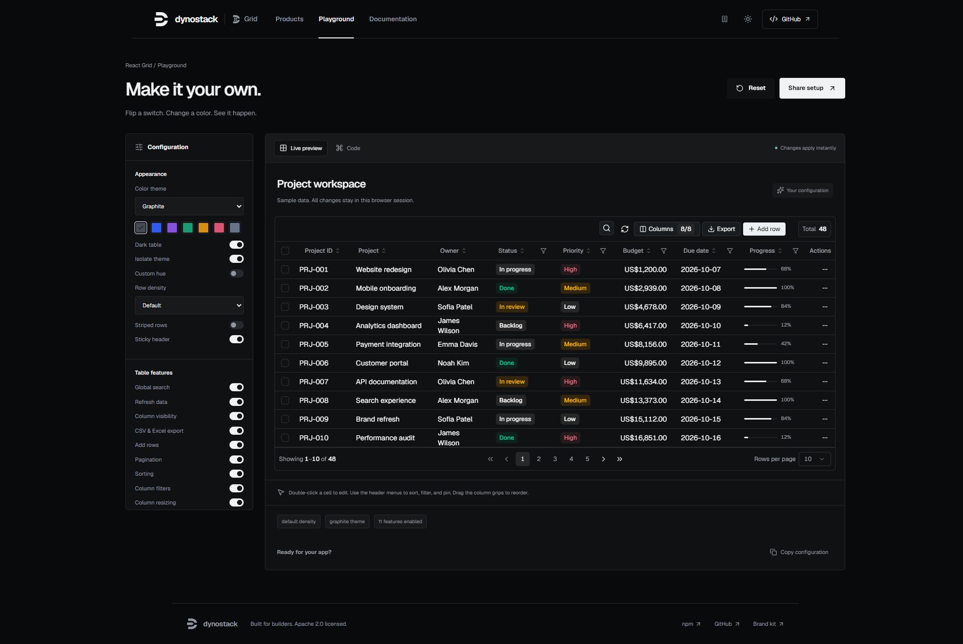 | 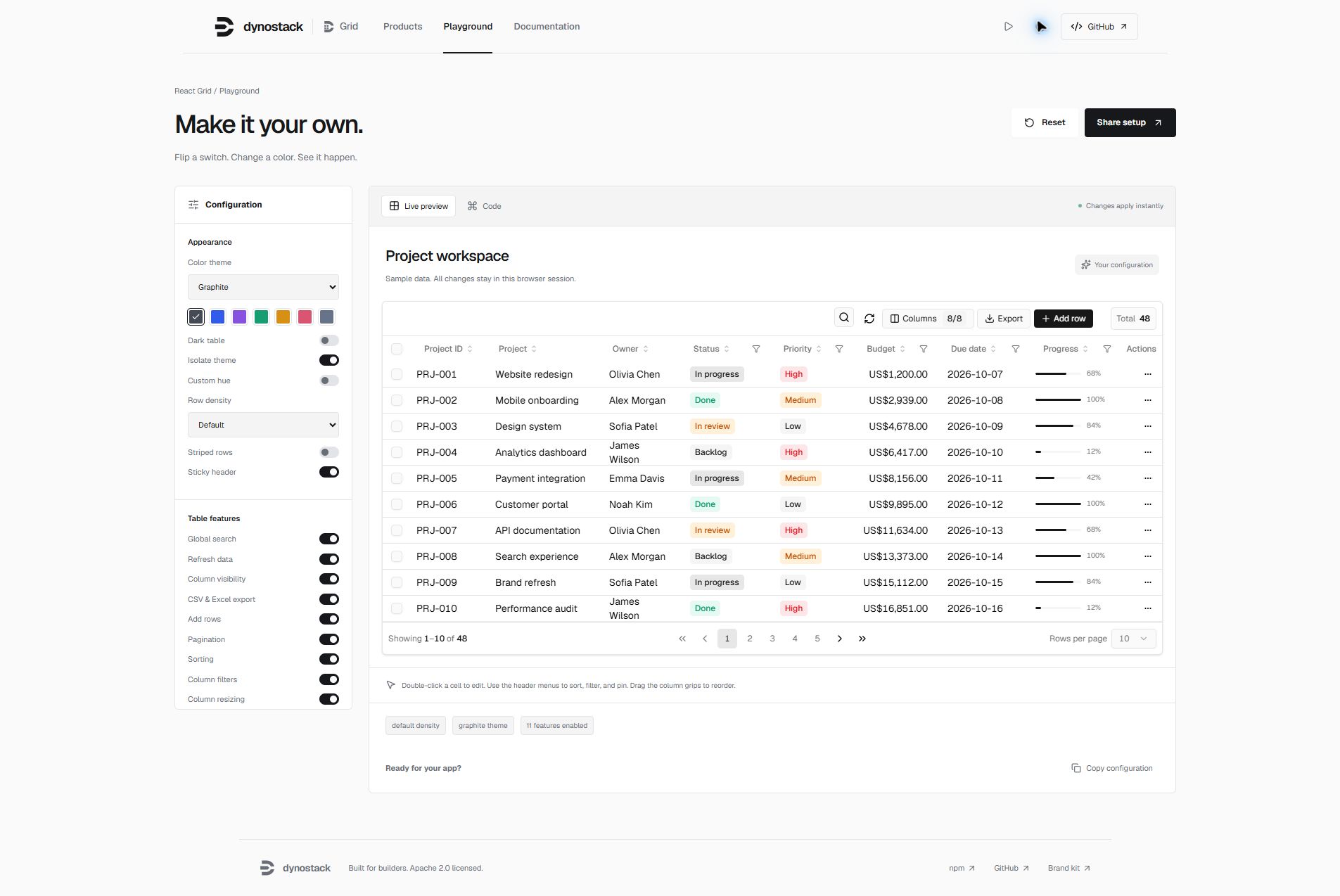 |
|
|
38
|
+
|
|
39
|
+
| Filter builder | Selection and export |
|
|
40
|
+
| --- | --- |
|
|
41
|
+
| 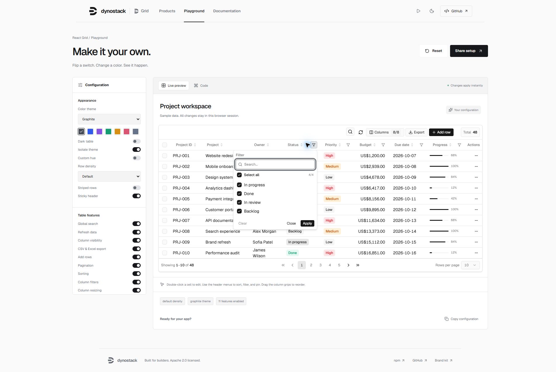 | 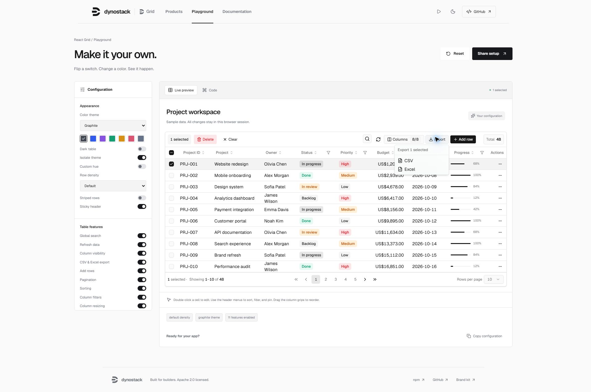 |
|
|
42
|
+
|
|
43
|
+
```tsx
|
|
44
|
+
import { DataTable, themePresets } from '@dynostack/react-grid'
|
|
45
|
+
|
|
46
|
+
// Add .dark to an ancestor for dark mode, or .light for light mode.
|
|
47
|
+
<DataTable data={rows} columns={columns} theme={themePresets.graphite} />
|
|
48
|
+
```
|
|
49
|
+
|
|
50
|
+
## Highlights
|
|
51
|
+
|
|
52
|
+
- **Layout and state controls** — `initialSorting`, `onSelectionChange`, `ariaLabel`, `striped`, `stickyHeader`, and `maxHeight`. Disabling pagination renders all matching loaded rows.
|
|
53
|
+
- **Safer exports and editing** — spreadsheet formulas in untrusted text are neutralized; row editing respects `meta.isEditable`; theme values cannot escape scoped CSS declarations.
|
|
54
|
+
|
|
55
|
+
- **Filters that actually filter** — text, number, date with operators (`contains`, `not contains`, `equals`, `before`, `after`, `in range`, `blank`, `not blank`, …), AND/OR combine of two conditions, and a set filter with search + select-all
|
|
56
|
+
- **Inline editing** — double-click cell to edit, or enter row-edit mode with `Save` / `Cancel`
|
|
57
|
+
- **Add row** — local optimistic insert, edit, then commit on save
|
|
58
|
+
- **Per-column sort, hide, pin, resize, drag-reorder** — pinned columns are fully opaque while you scroll horizontally
|
|
59
|
+
- **Selection + bulk actions** — pinned `__select` column with select-all, clear, bulk delete
|
|
60
|
+
- **Expandable rows** — provide a `renderSubRow` panel or use TanStack's nested `getSubRows`
|
|
61
|
+
- **CSV / Excel export** — selection-aware (export selected vs. all)
|
|
62
|
+
- **Built-in row Details panel** — `View` opens a scoped sheet with compact, relaxed, and comfy field layouts
|
|
63
|
+
- **Scoped delete confirmation** — row and bulk delete confirmations stay inside the table instead of covering the entire app
|
|
64
|
+
- **Theming that just works** — shadcn-compatible CSS variables, automatic OS dark-mode follow, cascade-layered defaults that never overwrite your app theme, full-repaint moded presets (`graphite`, `violet`, `emerald`, `amber`, `rose`, `sky`, `slate`, …), `buildPreset(hue)` for custom hues, and `isolate` to opt out of inheriting the app theme
|
|
65
|
+
- **Density** — `compact` · `default` · `comfortable`
|
|
66
|
+
- **i18n / labels** — every visible string is overridable
|
|
67
|
+
- **Feature flags** — turn off any toolbar control or table capability with a single boolean
|
|
68
|
+
- **Tiny API, full TypeScript** — one component, fully typed generics, no provider context to wire up
|
|
69
|
+
|
|
70
|
+
---
|
|
71
|
+
|
|
72
|
+
## Table of contents
|
|
73
|
+
|
|
74
|
+
- [Install](#install)
|
|
75
|
+
- [Showcase](#showcase)
|
|
76
|
+
- [Tailwind setup](#tailwind-setup)
|
|
77
|
+
- [Theme tokens](#theme-tokens)
|
|
78
|
+
- [Quick start](#quick-start)
|
|
79
|
+
- [Data fetching](#data-fetching)
|
|
80
|
+
- [Theming](#theming)
|
|
81
|
+
- [Density](#density)
|
|
82
|
+
- [Feature flags](#feature-flags)
|
|
83
|
+
- [Labels (i18n)](#labels-i18n)
|
|
84
|
+
- [Column meta](#column-meta)
|
|
85
|
+
- [Editing](#editing)
|
|
86
|
+
- [Filters](#filters)
|
|
87
|
+
- [Selection & bulk actions](#selection--bulk-actions)
|
|
88
|
+
- [Expandable rows](#expandable-rows)
|
|
89
|
+
- [Export](#export)
|
|
90
|
+
- [View sheet](#view-sheet)
|
|
91
|
+
- [Delete confirmation](#delete-confirmation)
|
|
92
|
+
- [Custom row actions](#custom-row-actions)
|
|
93
|
+
- [Server-side data](#server-side-data)
|
|
94
|
+
- [API reference](#api-reference)
|
|
95
|
+
- [Compatibility](#compatibility)
|
|
96
|
+
- [Roadmap](#roadmap)
|
|
97
|
+
- [Contributing](#contributing)
|
|
98
|
+
- [License](#license)
|
|
99
|
+
|
|
100
|
+
---
|
|
101
|
+
|
|
102
|
+
## Install
|
|
103
|
+
|
|
104
|
+
### Run the showcase locally
|
|
105
|
+
|
|
106
|
+
```sh
|
|
107
|
+
git clone https://github.com/wanted-coder-vijay/wcv-data-grid.git
|
|
108
|
+
cd wcv-data-grid
|
|
109
|
+
npm install
|
|
110
|
+
npm run build
|
|
111
|
+
npm install --prefix showcase
|
|
112
|
+
npm run showcase:dev
|
|
113
|
+
```
|
|
114
|
+
|
|
115
|
+
### New layout controls
|
|
116
|
+
|
|
117
|
+
```tsx
|
|
118
|
+
<DataTable
|
|
119
|
+
data={rows}
|
|
120
|
+
columns={columns}
|
|
121
|
+
initialSorting={[{ id: "name", desc: false }]}
|
|
122
|
+
onSelectionChange={(selectedRows) => setSelectedRows(selectedRows)}
|
|
123
|
+
ariaLabel="Project workspace"
|
|
124
|
+
striped
|
|
125
|
+
stickyHeader
|
|
126
|
+
maxHeight="480px"
|
|
127
|
+
/>
|
|
128
|
+
```
|
|
129
|
+
|
|
130
|
+
`onSelectionChange` returns selected **loaded** row objects; server-side exports and selection do not fetch unseen pages. Editing flags are UI controls: your server must also validate fields, values, and permissions. CSV/Excel exports neutralize formula prefixes in strings while preserving actual numeric values. Excel output remains an HTML-based `.xls`, not native XLSX. Theme tokens reject declaration delimiters, CSS comments, backslash escapes, and URL expressions.
|
|
131
|
+
|
|
132
|
+
```sh
|
|
133
|
+
npm i @dynostack/react-grid
|
|
134
|
+
# or
|
|
135
|
+
pnpm add @dynostack/react-grid
|
|
136
|
+
# or
|
|
137
|
+
yarn add @dynostack/react-grid
|
|
138
|
+
```
|
|
139
|
+
|
|
140
|
+
**Peer deps:** `react >= 18.2`, `react-dom >= 18.2`. All other runtime dependencies (`@tanstack/react-table`, `radix-ui`, `lucide-react`, `class-variance-authority`, `clsx`, `tailwind-merge`) are installed automatically and remain external to the package bundle.
|
|
141
|
+
|
|
142
|
+
## Tailwind setup
|
|
143
|
+
|
|
144
|
+
The component ships Tailwind class names verbatim, so your Tailwind build needs to know two things:
|
|
145
|
+
|
|
146
|
+
1. **Where to scan** for the class strings inside the bundle.
|
|
147
|
+
2. **Which semantic color tokens** (`bg-popover`, `bg-card`, `text-foreground`, …) exist.
|
|
148
|
+
|
|
149
|
+
The package's `styles.css` registers the tokens for you via Tailwind v4's `@theme inline`. You only need to wire scanning.
|
|
150
|
+
|
|
151
|
+
### Tailwind v4 — zero config
|
|
152
|
+
|
|
153
|
+
```css
|
|
154
|
+
/* your global stylesheet (e.g. src/index.css) */
|
|
155
|
+
@import "tailwindcss";
|
|
156
|
+
@source "../node_modules/@dynostack/react-grid/dist";
|
|
157
|
+
@import "@dynostack/react-grid/styles.css";
|
|
158
|
+
@import "@dynostack/react-grid/page.css"; /* optional: extend tokens to <body> */
|
|
159
|
+
```
|
|
160
|
+
|
|
161
|
+
That's the whole setup. No `tailwind.config.js`, no `@theme` block to copy-paste, no shadcn install required. Overlay surfaces (popovers, dropdowns, sheets, the row-actions menu) all render correctly out of the box.
|
|
162
|
+
|
|
163
|
+
### Tailwind v3
|
|
164
|
+
|
|
165
|
+
v3 doesn't read CSS `@theme` directives, so the semantic-color mapping has to live in your `tailwind.config.js`. The shadcn install guide for v3 covers the exact `theme.extend.colors` block you need — copy that, plus add the package's `dist` to your `content` array:
|
|
166
|
+
|
|
167
|
+
```js
|
|
168
|
+
// tailwind.config.{js,ts}
|
|
169
|
+
export default {
|
|
170
|
+
content: [
|
|
171
|
+
"./src/**/*.{ts,tsx}",
|
|
172
|
+
"./node_modules/@dynostack/react-grid/dist/**/*.{js,mjs,cjs}",
|
|
173
|
+
],
|
|
174
|
+
theme: {
|
|
175
|
+
extend: {
|
|
176
|
+
colors: {
|
|
177
|
+
// copy the shadcn v3 color mapping here
|
|
178
|
+
// (background, foreground, card, popover, primary, secondary,
|
|
179
|
+
// muted, accent, destructive, border, input, ring)
|
|
180
|
+
background: "hsl(var(--background))",
|
|
181
|
+
foreground: "hsl(var(--foreground))",
|
|
182
|
+
// … etc
|
|
183
|
+
},
|
|
184
|
+
},
|
|
185
|
+
},
|
|
186
|
+
}
|
|
187
|
+
```
|
|
188
|
+
|
|
189
|
+
Then import `styles.css` as usual:
|
|
190
|
+
|
|
191
|
+
```ts
|
|
192
|
+
import "@dynostack/react-grid/styles.css"
|
|
193
|
+
```
|
|
194
|
+
|
|
195
|
+
> Starting a new project? **Use Tailwind v4.** The v4 path above is meaningfully simpler — the package handles token registration for you.
|
|
196
|
+
|
|
197
|
+
## Theme tokens
|
|
198
|
+
|
|
199
|
+
The grid is built on **shadcn/ui CSS variables**. It auto-adjusts to whatever theme your app already has:
|
|
200
|
+
|
|
201
|
+
| Your app has… | What you do | What you get |
|
|
202
|
+
|---|---|---|
|
|
203
|
+
| Nothing (bare React) | `import "@dynostack/react-grid/styles.css"` | Clean light theme, auto-switches to dark on OS preference. |
|
|
204
|
+
| shadcn/ui (default theme) | Nothing | Grid inherits your `:root` tokens automatically. |
|
|
205
|
+
| shadcn/ui with a custom theme (Stone / Zinc / your own hue) | Nothing | Grid picks up your custom tokens automatically. |
|
|
206
|
+
| Custom theme using shadcn token names | Nothing | Same as above. |
|
|
207
|
+
| Custom theme with non-shadcn names | Pass [`theme` prop](#theming) | Per-instance override mapped to shadcn vars. |
|
|
208
|
+
| Want one grid to ignore the app theme | Pass `isolate` | Grid uses bundled defaults regardless of `:root`. |
|
|
209
|
+
|
|
210
|
+
**Why this just works.** The bundled `styles.css`:
|
|
211
|
+
|
|
212
|
+
1. **Registers Tailwind v4 utility tokens** via a top-level `@theme inline` block — so `bg-popover`, `text-foreground`, `border-border`, etc. resolve to your tokens without any consumer-side `@theme` block.
|
|
213
|
+
2. **Declares variable values inside the `dynostack-grid-defaults` cascade layer** — any unlayered consumer rule (which is where shadcn and most app CSS lives) automatically wins, regardless of import order. You can't accidentally overwrite your app's theme by importing the grid's stylesheet.
|
|
214
|
+
|
|
215
|
+
### Minimal install (Tailwind v4)
|
|
216
|
+
|
|
217
|
+
```css
|
|
218
|
+
/* your global stylesheet */
|
|
219
|
+
@import "tailwindcss";
|
|
220
|
+
@source "../node_modules/@dynostack/react-grid/dist";
|
|
221
|
+
@import "@dynostack/react-grid/styles.css";
|
|
222
|
+
```
|
|
223
|
+
|
|
224
|
+
See the [Tailwind setup](#tailwind-setup) section for v3.
|
|
225
|
+
|
|
226
|
+
### Optional: extend the theme to the page
|
|
227
|
+
|
|
228
|
+
By default the grid only styles itself, not the surrounding page. If you want `<body>` to use the same background/foreground as the grid:
|
|
229
|
+
|
|
230
|
+
```ts
|
|
231
|
+
import "@dynostack/react-grid/styles.css"
|
|
232
|
+
import "@dynostack/react-grid/page.css" // optional
|
|
233
|
+
```
|
|
234
|
+
|
|
235
|
+
### Dark mode
|
|
236
|
+
|
|
237
|
+
| Mode | How to enable | Behavior |
|
|
238
|
+
|---|---|---|
|
|
239
|
+
| Follow OS | Default — no action required | Light by day, dark by night via `prefers-color-scheme`. |
|
|
240
|
+
| Force light | Add `class="light"` to `<html>` | Stays light regardless of OS. |
|
|
241
|
+
| Force dark | Add `class="dark"` to `<html>` | Stays dark regardless of OS. |
|
|
242
|
+
| Per-instance | `<DataTable theme={themePresets.violet}>` | Grid auto-flips light/dark inside the moded preset. |
|
|
243
|
+
|
|
244
|
+
Either way you can still override any token per-instance via the [`theme`](#theming) prop.
|
|
245
|
+
|
|
246
|
+
---
|
|
247
|
+
|
|
248
|
+
## Quick start
|
|
249
|
+
|
|
250
|
+
```tsx
|
|
251
|
+
import { DataTable } from "@dynostack/react-grid"
|
|
252
|
+
import "@dynostack/react-grid/styles.css" // optional — only if you don't have shadcn tokens
|
|
253
|
+
|
|
254
|
+
type User = {
|
|
255
|
+
id: number
|
|
256
|
+
name: string
|
|
257
|
+
email: string
|
|
258
|
+
role: "admin" | "viewer"
|
|
259
|
+
joinedAt: string
|
|
260
|
+
}
|
|
261
|
+
|
|
262
|
+
const columns = [
|
|
263
|
+
{ accessorKey: "id", header: "ID", size: 70 },
|
|
264
|
+
{
|
|
265
|
+
accessorKey: "name",
|
|
266
|
+
header: "Name",
|
|
267
|
+
meta: { label: "Name", editor: "text", filterType: "text" },
|
|
268
|
+
},
|
|
269
|
+
{
|
|
270
|
+
accessorKey: "email",
|
|
271
|
+
header: "Email",
|
|
272
|
+
meta: { label: "Email", editor: "text", filterType: "text" },
|
|
273
|
+
},
|
|
274
|
+
{
|
|
275
|
+
accessorKey: "role",
|
|
276
|
+
header: "Role",
|
|
277
|
+
meta: {
|
|
278
|
+
label: "Role",
|
|
279
|
+
editor: "select",
|
|
280
|
+
filterType: "multi-select",
|
|
281
|
+
selectOptions: [
|
|
282
|
+
{ value: "admin", label: "Admin" },
|
|
283
|
+
{ value: "viewer", label: "Viewer" },
|
|
284
|
+
],
|
|
285
|
+
},
|
|
286
|
+
},
|
|
287
|
+
{
|
|
288
|
+
accessorKey: "joinedAt",
|
|
289
|
+
header: "Joined",
|
|
290
|
+
meta: { label: "Joined", editor: "date", filterType: "date" },
|
|
291
|
+
},
|
|
292
|
+
]
|
|
293
|
+
|
|
294
|
+
export function Users({ data }: { data: User[] }) {
|
|
295
|
+
return (
|
|
296
|
+
<DataTable<User>
|
|
297
|
+
data={data}
|
|
298
|
+
columns={columns}
|
|
299
|
+
onCellEdit={(row, columnId, value) => save({ ...row, [columnId]: value })}
|
|
300
|
+
onRowSave={(row, draft) => save({ ...row, ...draft })}
|
|
301
|
+
onAddRow={() => ({ name: "", email: "", role: "viewer", joinedAt: today() })}
|
|
302
|
+
onBulkDelete={(rows) => removeMany(rows.map((r) => r.id))}
|
|
303
|
+
initialColumnPinning={{ left: ["__select", "id", "name"], right: ["__actions"] }}
|
|
304
|
+
/>
|
|
305
|
+
)
|
|
306
|
+
}
|
|
307
|
+
```
|
|
308
|
+
|
|
309
|
+
That's it. You now have sort + filter + edit + add + delete + export + pin + resize + reorder + select.
|
|
310
|
+
|
|
311
|
+
---
|
|
312
|
+
|
|
313
|
+
## Data fetching
|
|
314
|
+
|
|
315
|
+
`DataTable` supports two data ownership models.
|
|
316
|
+
|
|
317
|
+
### 1. Controlled data from your page
|
|
318
|
+
|
|
319
|
+
Use this when your app already owns fetching with TanStack Query, SWR, Redux,
|
|
320
|
+
loader functions, or custom hooks. The table receives rows and loading flags as
|
|
321
|
+
props, and your app owns error/toast behavior.
|
|
322
|
+
|
|
323
|
+
```tsx
|
|
324
|
+
const usersQuery = useQuery({
|
|
325
|
+
queryKey: ["users"],
|
|
326
|
+
queryFn: fetchUsers,
|
|
327
|
+
})
|
|
328
|
+
|
|
329
|
+
<DataTable<User>
|
|
330
|
+
data={usersQuery.data ?? []}
|
|
331
|
+
columns={columns}
|
|
332
|
+
isLoading={usersQuery.isLoading}
|
|
333
|
+
isFetching={usersQuery.isFetching}
|
|
334
|
+
onRefresh={() => usersQuery.refetch()}
|
|
335
|
+
totalRecords={usersQuery.data?.length ?? 0}
|
|
336
|
+
/>
|
|
337
|
+
```
|
|
338
|
+
|
|
339
|
+
For blocking load errors, render your own page-level error state or pass an empty
|
|
340
|
+
array. For background errors, show a toast from your query/mutation callbacks.
|
|
341
|
+
|
|
342
|
+
### 2. Internal fetching with `dataSource`
|
|
343
|
+
|
|
344
|
+
Use this when you want the table to own fetch/loading/error/refresh state.
|
|
345
|
+
`fetchRows` receives the current table state and can return either an array or
|
|
346
|
+
`{ rows, totalRecords }`.
|
|
347
|
+
|
|
348
|
+
```tsx
|
|
349
|
+
<DataTable<User>
|
|
350
|
+
columns={columns}
|
|
351
|
+
dataSource={{
|
|
352
|
+
fetchRows: async ({ pageIndex, pageSize, sorting, columnFilters, globalFilter }) => {
|
|
353
|
+
const res = await fetch("/api/users", {
|
|
354
|
+
method: "POST",
|
|
355
|
+
headers: { "content-type": "application/json" },
|
|
356
|
+
body: JSON.stringify({
|
|
357
|
+
pageIndex,
|
|
358
|
+
pageSize,
|
|
359
|
+
sorting,
|
|
360
|
+
columnFilters,
|
|
361
|
+
q: globalFilter,
|
|
362
|
+
}),
|
|
363
|
+
})
|
|
364
|
+
|
|
365
|
+
if (!res.ok) throw new Error("Failed to load users")
|
|
366
|
+
return res.json() as Promise<{ rows: User[]; totalRecords: number }>
|
|
367
|
+
},
|
|
368
|
+
mode: "server",
|
|
369
|
+
onError: (error, context) => {
|
|
370
|
+
toast.error(context.message)
|
|
371
|
+
console.error(error)
|
|
372
|
+
},
|
|
373
|
+
}}
|
|
374
|
+
/>
|
|
375
|
+
```
|
|
376
|
+
|
|
377
|
+
Internal mode behavior:
|
|
378
|
+
|
|
379
|
+
- Initial load shows the table skeleton.
|
|
380
|
+
- Initial load failure shows an inline `Could not load rows` state with `Retry`.
|
|
381
|
+
- Refresh failure keeps the last successful rows visible and calls `onError`.
|
|
382
|
+
- `mode: "client"` expects the full row array and lets the table sort/filter/page in memory.
|
|
383
|
+
- `mode: "server"` expects the current page and uses `totalRecords` for pagination.
|
|
384
|
+
|
|
385
|
+
Keep using `onCellEdit`, `onRowSave`, `onAddRow`, and `onBulkDelete` for mutations.
|
|
386
|
+
The table does not assume your write API; this lets you choose optimistic updates,
|
|
387
|
+
rollback, toast notifications, and validation.
|
|
388
|
+
|
|
389
|
+
---
|
|
390
|
+
|
|
391
|
+
## Theming
|
|
392
|
+
|
|
393
|
+
The `theme` prop accepts **two shapes**. Pick whichever fits your use case.
|
|
394
|
+
|
|
395
|
+
### Shape 1 — Flat tokens
|
|
396
|
+
|
|
397
|
+
```tsx
|
|
398
|
+
<DataTable
|
|
399
|
+
theme={{
|
|
400
|
+
primary: "oklch(0.6 0.2 200)",
|
|
401
|
+
primaryForeground: "oklch(1 0 0)",
|
|
402
|
+
accent: "oklch(0.94 0.05 200)",
|
|
403
|
+
radius: "0.25rem",
|
|
404
|
+
fontFamily: "Inter, system-ui, sans-serif",
|
|
405
|
+
}}
|
|
406
|
+
/>
|
|
407
|
+
```
|
|
408
|
+
|
|
409
|
+
All shadcn tokens are supported plus `radius` and `fontFamily`. Anything you omit falls through to whatever your app's `:root` provides.
|
|
410
|
+
|
|
411
|
+
### Shape 2 — Moded `{ light, dark }`
|
|
412
|
+
|
|
413
|
+
A moded theme repaints the whole table **and** auto-flips on dark mode (OS preference *or* a `.dark` ancestor):
|
|
414
|
+
|
|
415
|
+
```tsx
|
|
416
|
+
<DataTable
|
|
417
|
+
theme={{
|
|
418
|
+
light: { background: "oklch(0.99 0.005 285)", primary: "oklch(0.55 0.22 285)", /* … */ },
|
|
419
|
+
dark: { background: "oklch(0.16 0.012 285)", primary: "oklch(0.7 0.18 285)", /* … */ },
|
|
420
|
+
}}
|
|
421
|
+
/>
|
|
422
|
+
```
|
|
423
|
+
|
|
424
|
+
The grid emits a scoped `<style>` block for each instance, so grids can use different moded themes. Set `className="dark"` or `className="light"` on a table to force its mode independently of the page. Moded light tokens live in the scoped stylesheet so they cannot override the dark declarations.
|
|
425
|
+
|
|
426
|
+
### Use a preset
|
|
427
|
+
|
|
428
|
+
Presets ship in **moded shape** — passing one repaints the entire table and follows dark mode automatically:
|
|
429
|
+
|
|
430
|
+
```tsx
|
|
431
|
+
import { DataTable, themePresets } from "@dynostack/react-grid"
|
|
432
|
+
|
|
433
|
+
<DataTable theme={themePresets.violet} />
|
|
434
|
+
```
|
|
435
|
+
|
|
436
|
+
Available presets:
|
|
437
|
+
|
|
438
|
+
| Preset | Hue |
|
|
439
|
+
|---|---|
|
|
440
|
+
| `neutral` | Grayscale (default appearance) |
|
|
441
|
+
| `light` | Force light, no dark variant |
|
|
442
|
+
| `dark` | Force dark, no light variant |
|
|
443
|
+
| `violet` | 285° |
|
|
444
|
+
| `emerald` | 162° |
|
|
445
|
+
| `amber` | 65° |
|
|
446
|
+
| `rose` | 15° |
|
|
447
|
+
| `sky` | 235° |
|
|
448
|
+
| `slate` | 240° (low chroma) |
|
|
449
|
+
|
|
450
|
+
### Build a custom preset from a single hue
|
|
451
|
+
|
|
452
|
+
```tsx
|
|
453
|
+
import { DataTable, buildPreset } from "@dynostack/react-grid"
|
|
454
|
+
|
|
455
|
+
const teal = buildPreset(180) // hue only
|
|
456
|
+
const subtleTeal = buildPreset(180, 0.015) // hue + custom chroma
|
|
457
|
+
|
|
458
|
+
<DataTable theme={teal} />
|
|
459
|
+
```
|
|
460
|
+
|
|
461
|
+
`buildPreset(hue, chroma?)` returns a full `{ light, dark }` token set tinted around the given OKLCH hue.
|
|
462
|
+
|
|
463
|
+
### Compose with a preset
|
|
464
|
+
|
|
465
|
+
```tsx
|
|
466
|
+
<DataTable
|
|
467
|
+
theme={{
|
|
468
|
+
...themePresets.violet,
|
|
469
|
+
light: { ...themePresets.violet.light, primary: "oklch(0.7 0.18 250)" },
|
|
470
|
+
}}
|
|
471
|
+
/>
|
|
472
|
+
```
|
|
473
|
+
|
|
474
|
+
### Isolate a grid from the app theme
|
|
475
|
+
|
|
476
|
+
When embedding inside a heavily-themed shell where you want the table to keep its own look:
|
|
477
|
+
|
|
478
|
+
```tsx
|
|
479
|
+
<DataTable isolate /* uses bundled neutral tokens, ignores app :root */ />
|
|
480
|
+
<DataTable isolate theme={themePresets.violet} /* isolated AND violet */ />
|
|
481
|
+
```
|
|
482
|
+
|
|
483
|
+
### Multiple grids, different themes
|
|
484
|
+
|
|
485
|
+
CSS variables are emitted on each table root, so this works:
|
|
486
|
+
|
|
487
|
+
```tsx
|
|
488
|
+
<DataTable theme={themePresets.violet} />
|
|
489
|
+
<DataTable theme={themePresets.emerald} />
|
|
490
|
+
<DataTable theme={{ primary: "oklch(0.6 0.2 200)" }} />
|
|
491
|
+
```
|
|
492
|
+
|
|
493
|
+
### Precedence summary
|
|
494
|
+
|
|
495
|
+
```
|
|
496
|
+
┌──────────────────────────────────────────────────────────┐
|
|
497
|
+
│ Scoped grid tokens / flat inline theme overrides │ ← highest
|
|
498
|
+
├──────────────────────────────────────────────────────────┤
|
|
499
|
+
│ Consumer's :root rules (shadcn, custom app CSS) │
|
|
500
|
+
├──────────────────────────────────────────────────────────┤
|
|
501
|
+
│ @layer dynostack-grid-defaults (bundled styles.css) │ ← lowest
|
|
502
|
+
└──────────────────────────────────────────────────────────┘
|
|
503
|
+
```
|
|
504
|
+
|
|
505
|
+
---
|
|
506
|
+
|
|
507
|
+
## Density
|
|
508
|
+
|
|
509
|
+
```tsx
|
|
510
|
+
<DataTable density="compact" /* tighter rows */ />
|
|
511
|
+
<DataTable density="default" /* shadcn defaults */ />
|
|
512
|
+
<DataTable density="comfortable" /* extra padding */ />
|
|
513
|
+
```
|
|
514
|
+
|
|
515
|
+
---
|
|
516
|
+
|
|
517
|
+
## Feature flags
|
|
518
|
+
|
|
519
|
+
Every toolbar control and table capability is a switch. Defaults are sensible — only set what you want to disable.
|
|
520
|
+
|
|
521
|
+
```tsx
|
|
522
|
+
<DataTable
|
|
523
|
+
features={{
|
|
524
|
+
search: true, // global search input
|
|
525
|
+
refresh: true, // refresh button (when onRefresh is provided)
|
|
526
|
+
columnVisibility: true, // columns popover
|
|
527
|
+
export: true, // CSV / Excel menu
|
|
528
|
+
addRow: true, // "Add row" button (when onAddRow is provided)
|
|
529
|
+
pagination: true, // bottom pagination bar
|
|
530
|
+
sorting: true, // sort headers
|
|
531
|
+
filtering: true, // per-column filter popovers
|
|
532
|
+
resizing: true, // resize handles
|
|
533
|
+
reordering: true, // drag-to-reorder columns
|
|
534
|
+
pinning: true, // pin / unpin column controls
|
|
535
|
+
}}
|
|
536
|
+
/>
|
|
537
|
+
```
|
|
538
|
+
|
|
539
|
+
---
|
|
540
|
+
|
|
541
|
+
## Labels (i18n)
|
|
542
|
+
|
|
543
|
+
Every user-facing string is overridable.
|
|
544
|
+
|
|
545
|
+
```tsx
|
|
546
|
+
<DataTable
|
|
547
|
+
labels={{
|
|
548
|
+
search: "Rechercher...",
|
|
549
|
+
addRow: "Ajouter",
|
|
550
|
+
delete: "Supprimer",
|
|
551
|
+
clear: "Effacer",
|
|
552
|
+
selected: "sélectionné(s)",
|
|
553
|
+
refresh: "Actualiser",
|
|
554
|
+
columns: "Colonnes",
|
|
555
|
+
export: "Exporter",
|
|
556
|
+
csv: "CSV",
|
|
557
|
+
excel: "Excel",
|
|
558
|
+
total: "Total",
|
|
559
|
+
noData: "Aucune donnée.",
|
|
560
|
+
noResults: "Aucun résultat.",
|
|
561
|
+
refreshing: "Actualisation",
|
|
562
|
+
rowsPerPage: "Lignes par page",
|
|
563
|
+
page: "Page",
|
|
564
|
+
of: "sur",
|
|
565
|
+
}}
|
|
566
|
+
/>
|
|
567
|
+
```
|
|
568
|
+
|
|
569
|
+
---
|
|
570
|
+
|
|
571
|
+
## Column meta
|
|
572
|
+
|
|
573
|
+
Each column can declare:
|
|
574
|
+
|
|
575
|
+
```ts
|
|
576
|
+
type ColumnMeta = {
|
|
577
|
+
label?: string // header label & filter title
|
|
578
|
+
editor?:
|
|
579
|
+
| "text" | "number" | "currency" | "date"
|
|
580
|
+
| "select" | "switch" | "checkbox"
|
|
581
|
+
filterType?:
|
|
582
|
+
| "text" | "number" | "date"
|
|
583
|
+
| "select" | "multi-select" | "boolean"
|
|
584
|
+
selectOptions?: { value: string; label: string }[]
|
|
585
|
+
align?: "left" | "right" | "center"
|
|
586
|
+
cellClassName?: string
|
|
587
|
+
headerClassName?: string
|
|
588
|
+
exportable?: boolean
|
|
589
|
+
isEditable?: boolean | ((row) => boolean)
|
|
590
|
+
badgeMap?: Partial<
|
|
591
|
+
Record<string,
|
|
592
|
+
"default" | "secondary" | "destructive" |
|
|
593
|
+
"success" | "warning" | "outline"
|
|
594
|
+
>
|
|
595
|
+
>
|
|
596
|
+
}
|
|
597
|
+
```
|
|
598
|
+
|
|
599
|
+
The default `filterFn` for a column is wired automatically from `meta.filterType`. You can still set a custom `filterFn` on the column to override it.
|
|
600
|
+
|
|
601
|
+
---
|
|
602
|
+
|
|
603
|
+
## Editing
|
|
604
|
+
|
|
605
|
+
Two modes, both prop-driven, both work simultaneously:
|
|
606
|
+
|
|
607
|
+
### Single cell — double-click
|
|
608
|
+
|
|
609
|
+
```tsx
|
|
610
|
+
<DataTable
|
|
611
|
+
onCellEdit={(row, columnId, value) =>
|
|
612
|
+
saveMutation.mutate({ ...row, [columnId]: value })
|
|
613
|
+
}
|
|
614
|
+
/>
|
|
615
|
+
```
|
|
616
|
+
|
|
617
|
+
### Whole row — Edit action → Save / Cancel
|
|
618
|
+
|
|
619
|
+
```tsx
|
|
620
|
+
<DataTable
|
|
621
|
+
onRowSave={(row, draft) =>
|
|
622
|
+
saveMutation.mutate({ ...row, ...draft })
|
|
623
|
+
}
|
|
624
|
+
/>
|
|
625
|
+
```
|
|
626
|
+
|
|
627
|
+
`isEditable` on `meta` can disable editing for individual rows or columns:
|
|
628
|
+
|
|
629
|
+
```tsx
|
|
630
|
+
{
|
|
631
|
+
accessorKey: "email",
|
|
632
|
+
meta: {
|
|
633
|
+
editor: "text",
|
|
634
|
+
isEditable: (row) => row.role !== "billing",
|
|
635
|
+
},
|
|
636
|
+
}
|
|
637
|
+
```
|
|
638
|
+
|
|
639
|
+
---
|
|
640
|
+
|
|
641
|
+
## Filters
|
|
642
|
+
|
|
643
|
+
The package exports the filter primitives so you can build custom panels too:
|
|
644
|
+
|
|
645
|
+
```ts
|
|
646
|
+
import {
|
|
647
|
+
textFilterFn,
|
|
648
|
+
numberFilterFn,
|
|
649
|
+
dateFilterFn,
|
|
650
|
+
setFilterFn,
|
|
651
|
+
booleanFilterFn,
|
|
652
|
+
type AdvFilter,
|
|
653
|
+
type SetFilter,
|
|
654
|
+
type TextOp,
|
|
655
|
+
type NumberOp,
|
|
656
|
+
type DateOp,
|
|
657
|
+
} from "@dynostack/react-grid"
|
|
658
|
+
```
|
|
659
|
+
|
|
660
|
+
| `filterType` | Operators | Value shape |
|
|
661
|
+
| -------------- | -------------------------------------------------------------------------------------------------------------------------- | ---------------------------------------------------- |
|
|
662
|
+
| `text` | `contains`, `notContains`, `equals`, `notEqual`, `startsWith`, `endsWith`, `blank`, `notBlank` | `AdvFilter<TextOp, string>` |
|
|
663
|
+
| `number` | `equals`, `notEqual`, `lessThan`, `lessThanOrEqual`, `greaterThan`, `greaterThanOrEqual`, `inRange`, `blank`, `notBlank` | `AdvFilter<NumberOp, number>` |
|
|
664
|
+
| `date` | `equals`, `notEqual`, `before`, `after`, `inRange`, `blank`, `notBlank` | `AdvFilter<DateOp, string>` |
|
|
665
|
+
| `select` | set filter | `SetFilter` (`{ selected: string[] }`) |
|
|
666
|
+
| `multi-select` | set filter | `SetFilter` (`{ selected: string[] }`) |
|
|
667
|
+
| `boolean` | `All` / `True` / `False` | `boolean \| undefined` |
|
|
668
|
+
|
|
669
|
+
Text/number/date panels also expose **AND/OR combine** of a second condition, ag-grid style.
|
|
670
|
+
|
|
671
|
+
The set filter automatically derives unique values from the visible rows when `selectOptions` is not declared — search box, "Select all (filtered)" with indeterminate state, individual checkboxes.
|
|
672
|
+
|
|
673
|
+
---
|
|
674
|
+
|
|
675
|
+
## Selection & bulk actions
|
|
676
|
+
|
|
677
|
+
Selection is on by default (`enableSelection: true`). When any row is selected the toolbar swaps in:
|
|
678
|
+
|
|
679
|
+
- A `<count> selected` badge
|
|
680
|
+
- `Delete` button → opens the confirmation dialog first, then calls `onBulkDelete?(rows)` after confirm
|
|
681
|
+
- `Clear` button → resets selection
|
|
682
|
+
|
|
683
|
+
```tsx
|
|
684
|
+
<DataTable
|
|
685
|
+
onBulkDelete={(rows) => removeMany(rows.map((r) => r.id))}
|
|
686
|
+
/>
|
|
687
|
+
```
|
|
688
|
+
|
|
689
|
+
---
|
|
690
|
+
|
|
691
|
+
## Expandable rows
|
|
692
|
+
|
|
693
|
+
### Sub-row panel (custom JSX)
|
|
694
|
+
|
|
695
|
+
```tsx
|
|
696
|
+
<DataTable
|
|
697
|
+
renderSubRow={(row) => <UserAuditPanel user={row} />}
|
|
698
|
+
/>
|
|
699
|
+
```
|
|
700
|
+
|
|
701
|
+
### Nested rows (TanStack `getSubRows`)
|
|
702
|
+
|
|
703
|
+
```tsx
|
|
704
|
+
<DataTable
|
|
705
|
+
getSubRows={(row) => row.children}
|
|
706
|
+
/>
|
|
707
|
+
```
|
|
708
|
+
|
|
709
|
+
When either is set, an `__expand` chevron column is added and pinned right next to `__select`.
|
|
710
|
+
|
|
711
|
+
---
|
|
712
|
+
|
|
713
|
+
## Export
|
|
714
|
+
|
|
715
|
+
```tsx
|
|
716
|
+
<DataTable exportFileName="users" />
|
|
717
|
+
```
|
|
718
|
+
|
|
719
|
+
Toolbar `Export` menu offers **CSV** and **Excel**. If any rows are selected, the menu becomes "Export N selected"; otherwise it exports all visible (filtered) rows.
|
|
720
|
+
|
|
721
|
+
Mark a column non-exportable via `meta.exportable: false`.
|
|
722
|
+
|
|
723
|
+
---
|
|
724
|
+
|
|
725
|
+
## View sheet
|
|
726
|
+
|
|
727
|
+
Click the row action "View" → a right-side `Sheet` slides in showing every visible column as a `{Label}: {value}` card. The user can switch layout density inline:
|
|
728
|
+
|
|
729
|
+
| Option | Layout | Intended use |
|
|
730
|
+
| --- | --- | --- |
|
|
731
|
+
| `Compact` | 3 columns, tighter cards | Scan more fields at once. |
|
|
732
|
+
| `Relaxed` | 2 columns, medium spacing | Balanced default for mixed values. |
|
|
733
|
+
| `Comfy` | 1 column, roomier cards | Read long values without cramped wrapping. |
|
|
734
|
+
|
|
735
|
+
The sheet is responsive and wider on desktop so the multi-column modes have enough room for real row data.
|
|
736
|
+
|
|
737
|
+
Works out of the box with no props. Customize via `viewSheet`:
|
|
738
|
+
|
|
739
|
+
```tsx
|
|
740
|
+
<DataTable
|
|
741
|
+
viewSheet={{
|
|
742
|
+
side: "right", // or "left"
|
|
743
|
+
defaultDensity: "relaxed", // initial layout density
|
|
744
|
+
hideDensityTabs: true, // hide the layout picker
|
|
745
|
+
fields: ["name", "email", "role"], // limit / reorder shown columns
|
|
746
|
+
renderField: ({ column, value, row }) => // override how a value renders
|
|
747
|
+
column.id === "phone" ? <a href={`tel:${value}`}>{String(value)}</a> : null,
|
|
748
|
+
renderHeader: (row) => <YourCustomHeader row={row} />,
|
|
749
|
+
labels: {
|
|
750
|
+
title: (row) => `${row.name} (${row.role})`,
|
|
751
|
+
description: (row) => `Joined ${row.joinedAt}`,
|
|
752
|
+
emptyValue: "—",
|
|
753
|
+
density: { compact: "3 cols", relaxed: "2 cols", comfy: "1 col" },
|
|
754
|
+
},
|
|
755
|
+
}}
|
|
756
|
+
onView={(row) => track("user.view", row)} // optional side-effect
|
|
757
|
+
/>
|
|
758
|
+
```
|
|
759
|
+
|
|
760
|
+
Disable the built-in sheet entirely:
|
|
761
|
+
|
|
762
|
+
```tsx
|
|
763
|
+
<DataTable viewSheet={false} onView={(row) => router.push(`/users/${row.id}`)} />
|
|
764
|
+
```
|
|
765
|
+
|
|
766
|
+
`onView` fires before the sheet opens, so you can navigate / log / fetch alongside it.
|
|
767
|
+
|
|
768
|
+
---
|
|
769
|
+
|
|
770
|
+
## Delete confirmation
|
|
771
|
+
|
|
772
|
+
Both the row-action "Delete" and the toolbar "Bulk delete" open a confirmation `AlertDialog` by default. The user must confirm before `onDelete` or `onBulkDelete` fires.
|
|
773
|
+
|
|
774
|
+
The dialog is mounted inside the DataTable portal container, so its blur / dim overlay covers only that table instance. It does not block or blur the rest of the page.
|
|
775
|
+
|
|
776
|
+
```tsx
|
|
777
|
+
<DataTable
|
|
778
|
+
onDelete={(row) => api.deleteUser(row.id)}
|
|
779
|
+
onBulkDelete={(rows) => api.bulkDelete(rows.map(r => r.id))}
|
|
780
|
+
confirmDelete={{
|
|
781
|
+
title: ({ rows, source }) =>
|
|
782
|
+
source === "bulk"
|
|
783
|
+
? `Delete ${rows.length} users?`
|
|
784
|
+
: `Delete ${rows[0].name}?`,
|
|
785
|
+
description: ({ rows }) =>
|
|
786
|
+
`${rows.length === 1 ? "This user" : "These users"} will be permanently removed. This cannot be undone.`,
|
|
787
|
+
confirmLabel: "Yes, delete",
|
|
788
|
+
cancelLabel: "Keep",
|
|
789
|
+
}}
|
|
790
|
+
/>
|
|
791
|
+
```
|
|
792
|
+
|
|
793
|
+
Use `onDelete` for the built-in row delete action. Do not put the actual delete mutation in `onRowAction("delete")`, because the built-in delete action is handled by the confirmation flow.
|
|
794
|
+
|
|
795
|
+
Skip the dialog (fire immediately):
|
|
796
|
+
|
|
797
|
+
```tsx
|
|
798
|
+
<DataTable confirmDelete={false} onDelete={(row) => softDelete(row)} />
|
|
799
|
+
```
|
|
800
|
+
|
|
801
|
+
---
|
|
802
|
+
|
|
803
|
+
## Custom row actions
|
|
804
|
+
|
|
805
|
+
```tsx
|
|
806
|
+
<DataTable
|
|
807
|
+
rowActions={["view", "edit", "duplicate", "delete"]}
|
|
808
|
+
customRowActions={[
|
|
809
|
+
{
|
|
810
|
+
id: "suspend",
|
|
811
|
+
label: "Suspend",
|
|
812
|
+
icon: <BanIcon />,
|
|
813
|
+
danger: true,
|
|
814
|
+
show: (r) => r.status !== "suspended",
|
|
815
|
+
},
|
|
816
|
+
{ id: "archive", label: "Archive", icon: <ArchiveIcon /> },
|
|
817
|
+
]}
|
|
818
|
+
onRowAction={(action, row) => {
|
|
819
|
+
if (action === "suspend") saveMutation.mutate({ ...row, status: "suspended" })
|
|
820
|
+
// ...
|
|
821
|
+
}}
|
|
822
|
+
onDelete={(row) => deleteMutation.mutate([row.id])}
|
|
823
|
+
/>
|
|
824
|
+
```
|
|
825
|
+
|
|
826
|
+
---
|
|
827
|
+
|
|
828
|
+
## Server-side data
|
|
829
|
+
|
|
830
|
+
You can do server-side data in either mode.
|
|
831
|
+
|
|
832
|
+
### Controlled server-side data
|
|
833
|
+
|
|
834
|
+
Own the API call in your page and pass the result into the table:
|
|
835
|
+
|
|
836
|
+
```tsx
|
|
837
|
+
const [q, setQ] = useState("")
|
|
838
|
+
const usersQuery = useQuery({
|
|
839
|
+
queryKey: ["users", q],
|
|
840
|
+
queryFn: () => fetchUsers({ q }),
|
|
841
|
+
})
|
|
842
|
+
|
|
843
|
+
<DataTable
|
|
844
|
+
data={usersQuery.data ?? []}
|
|
845
|
+
isLoading={usersQuery.isLoading}
|
|
846
|
+
isFetching={usersQuery.isFetching}
|
|
847
|
+
onRefresh={() => usersQuery.refetch()}
|
|
848
|
+
globalFilter={q}
|
|
849
|
+
onGlobalFilterChange={setQ}
|
|
850
|
+
totalRecords={usersQuery.data?.length ?? 0}
|
|
851
|
+
/>
|
|
852
|
+
```
|
|
853
|
+
|
|
854
|
+
Pair this with TanStack Query's pagination/cursor utilities when you want query
|
|
855
|
+
caching and mutation orchestration outside the grid.
|
|
856
|
+
|
|
857
|
+
### Built-in server-side data
|
|
858
|
+
|
|
859
|
+
Let the grid call your API by setting `dataSource.mode` to `"server"`:
|
|
860
|
+
|
|
861
|
+
```tsx
|
|
862
|
+
<DataTable<User>
|
|
863
|
+
columns={columns}
|
|
864
|
+
dataSource={{
|
|
865
|
+
mode: "server",
|
|
866
|
+
fetchRows: async (state) => {
|
|
867
|
+
const res = await fetch("/api/users/grid", {
|
|
868
|
+
method: "POST",
|
|
869
|
+
headers: { "content-type": "application/json" },
|
|
870
|
+
body: JSON.stringify(state),
|
|
871
|
+
})
|
|
872
|
+
|
|
873
|
+
if (!res.ok) throw new Error("Users request failed")
|
|
874
|
+
return res.json() as Promise<{ rows: User[]; totalRecords: number }>
|
|
875
|
+
},
|
|
876
|
+
onError: (_error, context) => {
|
|
877
|
+
toast.error(context.message)
|
|
878
|
+
},
|
|
879
|
+
}}
|
|
880
|
+
/>
|
|
881
|
+
```
|
|
882
|
+
|
|
883
|
+
`state` contains `pageIndex`, `pageSize`, `sorting`, `columnFilters`, and
|
|
884
|
+
`globalFilter`. In server mode the table assumes the API already applied those
|
|
885
|
+
operations and only renders the returned page.
|
|
886
|
+
|
|
887
|
+
---
|
|
888
|
+
|
|
889
|
+
## API reference
|
|
890
|
+
|
|
891
|
+
| Prop | Type | Default | Description |
|
|
892
|
+
| ------------------------- | ---------------------------------------------------------- | ---------------------- | ------------------------------------------------------ |
|
|
893
|
+
| `data` | `TData[]` | `[]` | Controlled row data. Use this when fetching outside the table. |
|
|
894
|
+
| `columns` | `ColumnDef<TData>[]` | — | TanStack column definitions. |
|
|
895
|
+
| `dataSource` | `DataTableDataSource<TData>` | — | Optional internal fetcher for client/server data loading. |
|
|
896
|
+
| `isLoading` | `boolean` | `false` | Initial skeleton state. |
|
|
897
|
+
| `isFetching` | `boolean` | `false` | Background-refresh indicator. |
|
|
898
|
+
| `onRefresh` | `() => void` | — | Refresh button handler. |
|
|
899
|
+
| `totalRecords` | `number` | `data.length` | Total count badge in toolbar. |
|
|
900
|
+
| `exportFileName` | `string` | `"export"` | Base filename for CSV / Excel export. |
|
|
901
|
+
| `enableSelection` | `boolean` | `true` | Show the `__select` column. |
|
|
902
|
+
| `renderSubRow` | `(row: TData) => ReactNode` | — | Custom expandable panel. |
|
|
903
|
+
| `getSubRows` | `(row: TData) => TData[] \| undefined` | — | Nested rows accessor. |
|
|
904
|
+
| `rowActions` | `("view" \| "edit" \| "duplicate" \| "delete")[]` | all four | Built-in row actions. |
|
|
905
|
+
| `customRowActions` | `CustomRowAction<TData>[]` | `[]` | Extra row actions. |
|
|
906
|
+
| `onRowAction` | `(action, row) => void` | — | Row action handler. |
|
|
907
|
+
| `onCellEdit` | `(row, columnId, value) => void` | — | Single-cell save handler. |
|
|
908
|
+
| `onRowSave` | `(row, draft) => void` | — | Row-edit save handler. |
|
|
909
|
+
| `onAddRow` | `() => Partial<TData>` | — | Returns the empty draft for "Add row". |
|
|
910
|
+
| `onBulkDelete` | `(rows: TData[]) => void` | — | Bulk delete handler. |
|
|
911
|
+
| `initialPageSize` | `number` | `10` | Initial pagination size. |
|
|
912
|
+
| `pageSizeOptions` | `number[]` | shadcn defaults | Page-size dropdown options. |
|
|
913
|
+
| `initialColumnPinning` | `ColumnPinningState` | `{ left: [], right: [] }` | Initial pinned columns. |
|
|
914
|
+
| `initialColumnVisibility` | `VisibilityState` | `{}` | Initial hidden columns. |
|
|
915
|
+
| `initialSorting` | `SortingState` | `[]` | Initial column sort order. |
|
|
916
|
+
| `onSelectionChange` | `(rows: TData[]) => void` | — | Observe selected loaded rows. |
|
|
917
|
+
| `ariaLabel` | `string` | `"Data table"` | Accessible name for the table. |
|
|
918
|
+
| `striped` | `boolean` | `false` | Alternate row backgrounds. |
|
|
919
|
+
| `stickyHeader` | `boolean` | `false` | Keep headers visible in the scroll viewport. |
|
|
920
|
+
| `maxHeight` | `CSSProperties["maxHeight"]` | — | Limit the vertical scroll viewport. |
|
|
921
|
+
| `globalFilter` | `string` | uncontrolled | Controlled global filter value. |
|
|
922
|
+
| `onGlobalFilterChange` | `(value: string) => void` | — | Controlled global filter setter. |
|
|
923
|
+
| `className` | `string` | — | Extra classes on the table root. |
|
|
924
|
+
| `toolbarSlot` | `ReactNode` | — | Custom JSX prepended into the toolbar. |
|
|
925
|
+
| `features` | `DataTableFeatures` | all on | Feature flags. |
|
|
926
|
+
| `labels` | `DataTableLabels` | English defaults | i18n labels. |
|
|
927
|
+
| `density` | `"compact" \| "default" \| "comfortable"` | `"default"` | Row density. |
|
|
928
|
+
| `theme` | `DataTableTheme` | inherits `:root` | Per-instance CSS-variable overrides. Accepts flat tokens **or** `{ light, dark }`. |
|
|
929
|
+
| `isolate` | `boolean` | `false` | Ignore the app's `:root` and render with bundled defaults. |
|
|
930
|
+
| `onView` | `(row: TData) => void` | — | Side-effect when "View" is clicked. Fires *before* the sheet opens. |
|
|
931
|
+
| `onDelete` | `(row: TData) => void` | — | Single-row delete handler. Fires *after* the confirm modal (or immediately if `confirmDelete={false}`). |
|
|
932
|
+
| `viewSheet` | `ViewSheetConfig<TData> \| false` | enabled | Configure or disable the built-in View sheet. |
|
|
933
|
+
| `confirmDelete` | `ConfirmDeleteConfig<TData> \| boolean` | `true` | Configure or disable the delete confirmation modal (applies to single + bulk). |
|
|
934
|
+
|
|
935
|
+
`TData` must extend `{ id: string \| number }`.
|
|
936
|
+
|
|
937
|
+
```ts
|
|
938
|
+
type DataTableDataSource<TData> = {
|
|
939
|
+
fetchRows: (params: {
|
|
940
|
+
pageIndex: number
|
|
941
|
+
pageSize: number
|
|
942
|
+
sorting: SortingState
|
|
943
|
+
columnFilters: ColumnFiltersState
|
|
944
|
+
globalFilter: string
|
|
945
|
+
}) => Promise<TData[] | { rows: TData[]; totalRecords?: number }>
|
|
946
|
+
mode?: "client" | "server"
|
|
947
|
+
enabled?: boolean
|
|
948
|
+
initialData?: TData[]
|
|
949
|
+
deps?: readonly unknown[]
|
|
950
|
+
onError?: (
|
|
951
|
+
error: unknown,
|
|
952
|
+
context: { type: "load" | "refresh"; message: string }
|
|
953
|
+
) => void
|
|
954
|
+
}
|
|
955
|
+
```
|
|
956
|
+
|
|
957
|
+
```ts
|
|
958
|
+
// Theme types
|
|
959
|
+
type DataTableTokens = {
|
|
960
|
+
background?: string
|
|
961
|
+
foreground?: string
|
|
962
|
+
card?: string
|
|
963
|
+
cardForeground?: string
|
|
964
|
+
popover?: string
|
|
965
|
+
popoverForeground?: string
|
|
966
|
+
primary?: string
|
|
967
|
+
primaryForeground?: string
|
|
968
|
+
secondary?: string
|
|
969
|
+
secondaryForeground?: string
|
|
970
|
+
muted?: string
|
|
971
|
+
mutedForeground?: string
|
|
972
|
+
accent?: string
|
|
973
|
+
accentForeground?: string
|
|
974
|
+
destructive?: string
|
|
975
|
+
destructiveForeground?: string
|
|
976
|
+
border?: string
|
|
977
|
+
input?: string
|
|
978
|
+
ring?: string
|
|
979
|
+
radius?: string
|
|
980
|
+
fontFamily?: string
|
|
981
|
+
}
|
|
982
|
+
|
|
983
|
+
type DataTableModedTheme = {
|
|
984
|
+
light?: DataTableTokens
|
|
985
|
+
dark?: DataTableTokens
|
|
986
|
+
}
|
|
987
|
+
|
|
988
|
+
type DataTableTheme = DataTableTokens | DataTableModedTheme
|
|
989
|
+
```
|
|
990
|
+
|
|
991
|
+
```ts
|
|
992
|
+
// Theme exports
|
|
993
|
+
import {
|
|
994
|
+
themePresets, // ready-made moded presets
|
|
995
|
+
buildPreset, // (hue, chroma?) => DataTableModedTheme
|
|
996
|
+
splitTheme, // (theme) => { light, dark }
|
|
997
|
+
tokensToStyle, // (tokens) => React.CSSProperties
|
|
998
|
+
tokensToCssBlock, // (tokens) => "var:val;var:val" string
|
|
999
|
+
ISOLATE_LIGHT_TOKENS,
|
|
1000
|
+
ISOLATE_DARK_TOKENS,
|
|
1001
|
+
} from "@dynostack/react-grid"
|
|
1002
|
+
```
|
|
1003
|
+
|
|
1004
|
+
```ts
|
|
1005
|
+
// View sheet types
|
|
1006
|
+
type ViewSheetDensity = "compact" | "relaxed" | "comfy"
|
|
1007
|
+
|
|
1008
|
+
type ViewSheetConfig<TData> = {
|
|
1009
|
+
side?: "right" | "left" | "top" | "bottom"
|
|
1010
|
+
defaultDensity?: ViewSheetDensity
|
|
1011
|
+
hideDensityTabs?: boolean
|
|
1012
|
+
fields?: string[]
|
|
1013
|
+
renderField?: (args: {
|
|
1014
|
+
column: Column<TData, unknown>
|
|
1015
|
+
value: unknown
|
|
1016
|
+
row: TData
|
|
1017
|
+
}) => React.ReactNode
|
|
1018
|
+
renderHeader?: (row: TData) => React.ReactNode
|
|
1019
|
+
labels?: {
|
|
1020
|
+
title?: (row: TData) => React.ReactNode
|
|
1021
|
+
description?: (row: TData) => React.ReactNode
|
|
1022
|
+
emptyValue?: string
|
|
1023
|
+
density?: { compact?: string; relaxed?: string; comfy?: string }
|
|
1024
|
+
}
|
|
1025
|
+
}
|
|
1026
|
+
|
|
1027
|
+
// Confirm-delete types
|
|
1028
|
+
type ConfirmDeleteContext<TData> = {
|
|
1029
|
+
rows: TData[]
|
|
1030
|
+
source: "single" | "bulk"
|
|
1031
|
+
}
|
|
1032
|
+
|
|
1033
|
+
type ConfirmDeleteConfig<TData> = {
|
|
1034
|
+
title?: (ctx: ConfirmDeleteContext<TData>) => React.ReactNode
|
|
1035
|
+
description?: (ctx: ConfirmDeleteContext<TData>) => React.ReactNode
|
|
1036
|
+
confirmLabel?: string
|
|
1037
|
+
cancelLabel?: string
|
|
1038
|
+
}
|
|
1039
|
+
```
|
|
1040
|
+
|
|
1041
|
+
---
|
|
1042
|
+
|
|
1043
|
+
## Compatibility
|
|
1044
|
+
|
|
1045
|
+
| Stack | Tested on |
|
|
1046
|
+
| ----------------- | -------------------------- |
|
|
1047
|
+
| React | 18.x · 19.x |
|
|
1048
|
+
| TanStack Table | 8.21+ |
|
|
1049
|
+
| Tailwind CSS | 3.x · 4.x |
|
|
1050
|
+
| Bundler | Vite · Next.js · Webpack 5 |
|
|
1051
|
+
|
|
1052
|
+
ESM and CJS bundles ship side-by-side. Tree-shakeable. Marked `"use client"` for Next.js App Router compatibility.
|
|
1053
|
+
|
|
1054
|
+
---
|
|
1055
|
+
|
|
1056
|
+
## Roadmap
|
|
1057
|
+
|
|
1058
|
+
- [ ] Server-side pagination/sorting helpers (controlled-state recipes)
|
|
1059
|
+
- [ ] Column groups (header rowSpan/colSpan)
|
|
1060
|
+
- [ ] Pivot mode
|
|
1061
|
+
- [ ] Aggregation row (sum, avg, min, max, count)
|
|
1062
|
+
- [ ] Saved view profiles (filter + visibility + pinning snapshots)
|
|
1063
|
+
- [ ] Virtualized rows (TanStack Virtual integration)
|
|
1064
|
+
- [ ] Storybook + visual regression tests
|
|
1065
|
+
- [ ] CodeSandbox / StackBlitz starter
|
|
1066
|
+
|
|
1067
|
+
Have a use case that isn't covered? [Open an issue](https://github.com/wanted-coder-vijay/wcv-data-grid/issues/new) — happy to consider it.
|
|
1068
|
+
|
|
1069
|
+
---
|
|
1070
|
+
|
|
1071
|
+
## Contributing
|
|
1072
|
+
|
|
1073
|
+
```sh
|
|
1074
|
+
git clone https://github.com/wanted-coder-vijay/wcv-data-grid.git
|
|
1075
|
+
cd wcv-data-grid
|
|
1076
|
+
npm install
|
|
1077
|
+
npm run dev # tsup --watch
|
|
1078
|
+
npm run typecheck # tsc --noEmit
|
|
1079
|
+
npm run build # produce dist/
|
|
1080
|
+
```
|
|
1081
|
+
|
|
1082
|
+
PRs welcome. Please keep the prop API additive — feature toggles over breaking changes.
|
|
1083
|
+
|
|
1084
|
+
---
|
|
1085
|
+
|
|
1086
|
+
## License
|
|
1087
|
+
|
|
1088
|
+
[Apache-2.0](./LICENSE) · Copyright © 2026 vijay kumar anchupogu (wanted-coder-vijay)
|
|
1089
|
+
|
|
1090
|
+
See [NOTICE](./NOTICE) for attribution requirements.
|
|
1091
|
+
|
|
1092
|
+
> **Package history.** This package was briefly published as
|
|
1093
|
+
> `@dynostack/gridstack@0.1.0` under the MIT license before being
|
|
1094
|
+
> renamed to `@dynostack/react-grid` and relicensed under Apache-2.0.
|
|
1095
|
+
> The old name is deprecated; new code should depend on
|
|
1096
|
+
> `@dynostack/react-grid` only.
|