@daypilot/daypilot-lite-react 4.7.0 → 4.8.0
This diff represents the content of publicly available package versions that have been released to one of the supported registries. The information contained in this diff is provided for informational purposes only and reflects changes between package versions as they appear in their respective public registries.
- package/README.md +48 -5
- package/daypilot-react.min.d.ts +2 -1
- package/daypilot-react.min.js +11 -11
- package/package.json +2 -2
package/README.md
CHANGED
|
@@ -31,6 +31,8 @@ Customize the scheduling components using an online [UI Builder](https://builder
|
|
|
31
31
|
* Event creation using drag and drop
|
|
32
32
|
* Drag and drop event moving and resizing
|
|
33
33
|
* Integrated delete icon
|
|
34
|
+
* Rendering JSX in Scheduler events
|
|
35
|
+
* Rendering JSX in Scheduler grid cells
|
|
34
36
|
* Event duration bar with customizable color
|
|
35
37
|
* Date picker with free/busy days highlighting, free-hand range selection, day cell customization
|
|
36
38
|
* CSS themes (use theme builder to create your own theme)
|
|
@@ -39,6 +41,7 @@ Customize the scheduling components using an online [UI Builder](https://builder
|
|
|
39
41
|
* Column header customization (background, images, text, HTML...)
|
|
40
42
|
* Built-in XSS protection
|
|
41
43
|
* Localization support
|
|
44
|
+
* Calendar RTL support
|
|
42
45
|
* TypeScript definitions
|
|
43
46
|
|
|
44
47
|
## Tutorials
|
|
@@ -127,6 +130,45 @@ Learn how to build a customized monthly calendar UI in Next.js 15 using the open
|
|
|
127
130
|
[React Calendar with Date Picker (Open-Source)](https://code.daypilot.org/10750/react-calendar-with-date-picker-open-source)
|
|
128
131
|
How to use a popup date picker to select a date displayed by the React Calendar component.
|
|
129
132
|
|
|
133
|
+
***
|
|
134
|
+
|
|
135
|
+
### React Scheduler: TypeScript Project
|
|
136
|
+
|
|
137
|
+
[](https://code.daypilot.org/34946/react-scheduler-typescript-project)
|
|
138
|
+
|
|
139
|
+
[React Scheduler: TypeScript Project (Open-Source)](https://code.daypilot.org/34946/react-scheduler-typescript-project)
|
|
140
|
+
This tutorial shows how to use the React Scheduler component to create a reservation application in React, using TypeScript language.
|
|
141
|
+
|
|
142
|
+
***
|
|
143
|
+
|
|
144
|
+
### React Scheduler: Next/Previous Buttons
|
|
145
|
+
|
|
146
|
+
[](https://code.daypilot.org/64293/react-scheduler-next-previous-buttons)
|
|
147
|
+
|
|
148
|
+
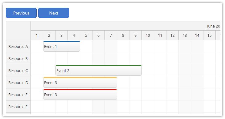
[React Scheduler: Next/Previous Buttons (Open-Source)](https://code.daypilot.org/64293/react-scheduler-next-previous-buttons)
|
|
149
|
+
Add "next" and "previous" buttons to your React application and let users switch the month displayed by the Scheduler component.
|
|
150
|
+
|
|
151
|
+
***
|
|
152
|
+
|
|
153
|
+
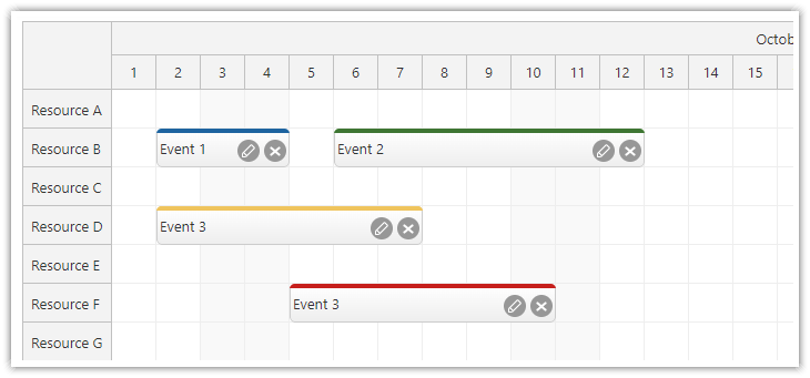
### React Scheduler: Rendering JSX in Events
|
|
154
|
+
|
|
155
|
+
[](https://code.daypilot.org/50584/react-scheduler-rendering-jsx-in-events)
|
|
156
|
+
|
|
157
|
+
[React Scheduler: Rendering JSX in Events (Open-Source)](https://code.daypilot.org/50584/react-scheduler-rendering-jsx-in-events)
|
|
158
|
+
How to render custom JSX in events displayed by the React Scheduler component.
|
|
159
|
+
|
|
160
|
+
***
|
|
161
|
+
|
|
162
|
+
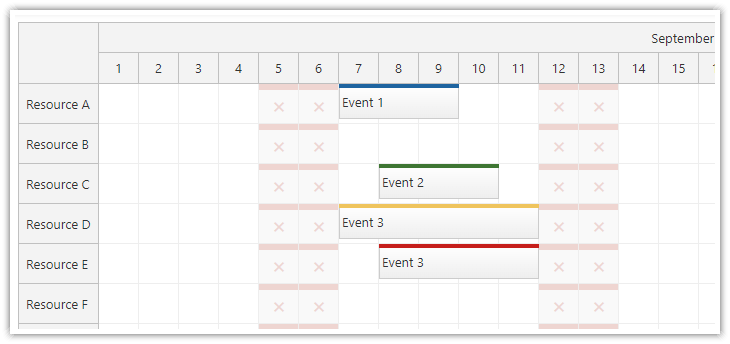
### React JSX Components in Scheduler Grid Cells
|
|
163
|
+
|
|
164
|
+
[](https://code.daypilot.org/43458/react-jsx-components-in-scheduler-grid-cells)
|
|
165
|
+
|
|
166
|
+
[React JSX Components in Scheduler Grid Cells (Open-Source)](https://code.daypilot.org/43458/react-jsx-components-in-scheduler-grid-cells)
|
|
167
|
+
How to render custom React JSX component in the Scheduler grid cells.
|
|
168
|
+
|
|
169
|
+
|
|
170
|
+
***
|
|
171
|
+
|
|
130
172
|
## Example
|
|
131
173
|
|
|
132
174
|
```javascript
|
|
@@ -142,14 +184,14 @@ function Calendar() {
|
|
|
142
184
|
{
|
|
143
185
|
id: 1,
|
|
144
186
|
text: "Event 1",
|
|
145
|
-
start: "
|
|
146
|
-
end: "
|
|
187
|
+
start: "2026-09-07T10:30:00",
|
|
188
|
+
end: "2026-09-07T13:00:00"
|
|
147
189
|
},
|
|
148
190
|
{
|
|
149
191
|
id: 2,
|
|
150
192
|
text: "Event 2",
|
|
151
|
-
start: "
|
|
152
|
-
end: "
|
|
193
|
+
start: "2026-09-08T09:30:00",
|
|
194
|
+
end: "2026-09-08T11:30:00",
|
|
153
195
|
barColor: "#6aa84f"
|
|
154
196
|
},
|
|
155
197
|
]);
|
|
@@ -168,7 +210,7 @@ function Calendar() {
|
|
|
168
210
|
return (
|
|
169
211
|
<DayPilotCalendar
|
|
170
212
|
viewType={"Week"}
|
|
171
|
-
startDate={"
|
|
213
|
+
startDate={"2026-09-07"}
|
|
172
214
|
timeRangeSelectedHandling={"Enabled"}
|
|
173
215
|
events={events}
|
|
174
216
|
onEventClick={onEventClick}
|
|
@@ -182,6 +224,7 @@ export default Calendar;
|
|
|
182
224
|
|
|
183
225
|
## Documentation
|
|
184
226
|
|
|
227
|
+
* [React scheduler with horizontal timeline](https://doc.daypilot.org/scheduler/react/)
|
|
185
228
|
* [React weekly calendar](https://doc.daypilot.org/calendar/react/)
|
|
186
229
|
* [React monthly calendar](https://doc.daypilot.org/month/react/)
|
|
187
230
|
* [React date picker](https://doc.daypilot.org/navigator/react/)
|
package/daypilot-react.min.d.ts
CHANGED
|
@@ -3,7 +3,7 @@ DayPilot Lite
|
|
|
3
3
|
Copyright (c) 2005 - 2025 Annpoint s.r.o.
|
|
4
4
|
https://www.daypilot.org/
|
|
5
5
|
Licensed under Apache Software License 2.0
|
|
6
|
-
Version: 2025.4.
|
|
6
|
+
Version: 2025.4.750-lite
|
|
7
7
|
*/
|
|
8
8
|
type GlobalDate = Date;
|
|
9
9
|
|
|
@@ -538,6 +538,7 @@ export module DayPilot {
|
|
|
538
538
|
loadingLabelHtml?: string;
|
|
539
539
|
loadingLabelVisible?: boolean;
|
|
540
540
|
locale?: string;
|
|
541
|
+
rtl?: boolean;
|
|
541
542
|
showToolTip?: boolean;
|
|
542
543
|
snapToGrid?: boolean;
|
|
543
544
|
startDate?: DayPilot.Date | string;
|