@daypilot/daypilot-lite-react 3.7.1 → 3.10.0
This diff represents the content of publicly available package versions that have been released to one of the supported registries. The information contained in this diff is provided for informational purposes only and reflects changes between package versions as they appear in their respective public registries.
- package/README.md +126 -13
- package/daypilot-react.min.js +7 -7
- package/package.json +1 -1
package/README.md
CHANGED
|
@@ -1,21 +1,134 @@
|
|
|
1
|
-
DayPilot Lite for React
|
|
2
|
-
===================================
|
|
1
|
+
# DayPilot Lite for React
|
|
3
2
|
|
|
4
|
-
|
|
3
|
+
[DayPilot Lite for JavaScript](https://javascript.daypilot.org/open-source/) is a library of JavaScript/HTML5 event calendar/scheduler components that can display day/week/month calendar views. It includes a React version.
|
|
5
4
|
|
|
6
|
-
|
|
7
|
-
--------
|
|
5
|
+
## What's New
|
|
8
6
|
|
|
9
|
-
|
|
10
|
-
|
|
11
|
-
|
|
7
|
+
[Release History](https://javascript.daypilot.org/daypilot-lite-history/)
|
|
8
|
+
|
|
9
|
+
## Online Demo
|
|
10
|
+
|
|
11
|
+
[](https://javascript.daypilot.org/demo/lite/)
|
|
12
|
+
|
|
13
|
+
[Online Demo](https://javascript.daypilot.org/demo/lite/)
|
|
14
|
+
|
|
15
|
+
## Features
|
|
16
|
+
|
|
17
|
+
* Calendar/scheduler views: day, week, work week, month, resource calendar
|
|
12
18
|
* Event creation using drag and drop
|
|
19
|
+
* Drag and drop event moving and resizing
|
|
13
20
|
* Integrated delete icon
|
|
21
|
+
* Event duration bar with customizable color
|
|
22
|
+
* Date picker with free/busy days highlighting, free-hand range selection, day cell customization
|
|
23
|
+
* CSS themes (use theme builder to create your own theme)
|
|
24
|
+
* Event customization (text, HTML, colors...)
|
|
25
|
+
* Built-in XSS protection
|
|
26
|
+
* Localization support
|
|
27
|
+
* TypeScript definitions
|
|
28
|
+
|
|
29
|
+
## Tutorials
|
|
30
|
+
|
|
31
|
+
### React Weekly Calendar Tutorial
|
|
32
|
+
|
|
33
|
+
[](https://code.daypilot.org/42221/react-weekly-calendar-tutorial)
|
|
34
|
+
|
|
35
|
+
[React Weekly Calendar Tutorial (Open-Source)](https://code.daypilot.org/42221/react-weekly-calendar-tutorial)
|
|
36
|
+
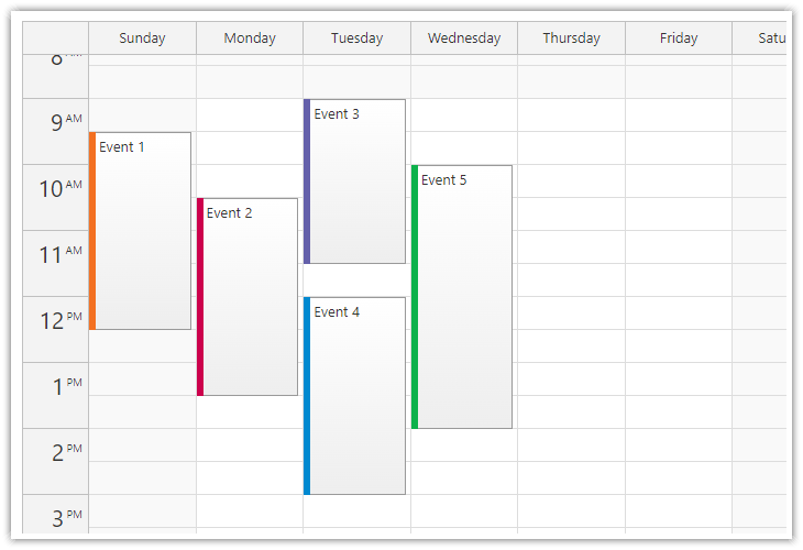
React application that displays a weekly event calendar using an open-source DayPilot React calendar component. Includes a date picker for changing the visible week. The calendar/scheduler appearance is customized using CSS.
|
|
37
|
+
|
|
38
|
+
### React Resource Calendar with Editable Columns
|
|
39
|
+
|
|
40
|
+
[](https://code.daypilot.org/62447/react-resource-calendar-open-source)
|
|
41
|
+
|
|
42
|
+
[React Resource Calendar with Editable Columns (Open-Source)](https://code.daypilot.org/62447/react-resource-calendar-open-source)
|
|
43
|
+
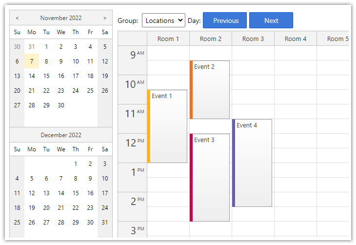
How to use the open-source React resource calendar component to create a scheduling application for multiple groups of resources (locations, people, tools). Add a date picker and next/previous buttons that let users change the visible date.
|
|
44
|
+
|
|
45
|
+
### React Calendar with Date Picker
|
|
46
|
+
|
|
47
|
+
[](https://code.daypilot.org/10750/react-calendar-with-date-picker-open-source)
|
|
48
|
+
|
|
49
|
+
[React Calendar with Date Picker (Open-Source)](https://code.daypilot.org/10750/react-calendar-with-date-picker-open-source)
|
|
50
|
+
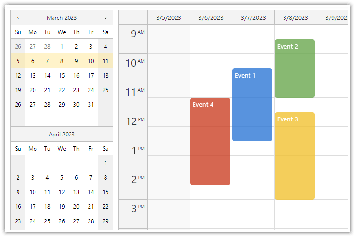
How to use a popup date picker to select a date displayed by the React Calendar component.
|
|
51
|
+
|
|
52
|
+
## Example
|
|
53
|
+
|
|
54
|
+
```javascript
|
|
55
|
+
import React, {Component} from 'react';
|
|
56
|
+
import {DayPilot, DayPilotCalendar} from "@daypilot/daypilot-lite-react";
|
|
57
|
+
|
|
58
|
+
class Calendar extends Component {
|
|
59
|
+
|
|
60
|
+
constructor(props) {
|
|
61
|
+
super(props);
|
|
62
|
+
|
|
63
|
+
this.calendarRef = React.createRef();
|
|
64
|
+
|
|
65
|
+
this.state = {
|
|
66
|
+
viewType: "Week",
|
|
67
|
+
timeRangeSelectedHandling: "Enabled",
|
|
68
|
+
onEventClick: async args => {
|
|
69
|
+
const modal = await DayPilot.Modal.prompt("Update event text:", args.e.text());
|
|
70
|
+
if (!modal.result) { return; }
|
|
71
|
+
const e = args.e;
|
|
72
|
+
e.data.text = modal.result;
|
|
73
|
+
this.calendar.events.update(e);
|
|
74
|
+
},
|
|
75
|
+
};
|
|
76
|
+
}
|
|
77
|
+
|
|
78
|
+
calendar() {
|
|
79
|
+
return this.calendarRef.current.control;
|
|
80
|
+
}
|
|
81
|
+
|
|
82
|
+
componentDidMount() {
|
|
83
|
+
|
|
84
|
+
// load event data
|
|
85
|
+
this.setState({
|
|
86
|
+
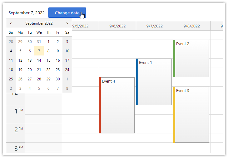
startDate: "2022-09-07",
|
|
87
|
+
events: [
|
|
88
|
+
{
|
|
89
|
+
id: 1,
|
|
90
|
+
text: "Event 1",
|
|
91
|
+
start: "2022-09-07T10:30:00",
|
|
92
|
+
end: "2022-09-07T13:00:00"
|
|
93
|
+
},
|
|
94
|
+
{
|
|
95
|
+
id: 2,
|
|
96
|
+
text: "Event 2",
|
|
97
|
+
start: "2022-09-08T09:30:00",
|
|
98
|
+
end: "2022-09-08T11:30:00",
|
|
99
|
+
barColor: "#6aa84f"
|
|
100
|
+
},
|
|
101
|
+
]
|
|
102
|
+
});
|
|
103
|
+
|
|
104
|
+
}
|
|
105
|
+
|
|
106
|
+
render() {
|
|
107
|
+
return (
|
|
108
|
+
<DayPilotCalendar
|
|
109
|
+
{...this.state}
|
|
110
|
+
ref={this.calendarRef}
|
|
111
|
+
/>
|
|
112
|
+
);
|
|
113
|
+
}
|
|
114
|
+
}
|
|
115
|
+
|
|
116
|
+
export default Calendar;
|
|
117
|
+
```
|
|
118
|
+
|
|
119
|
+
## Documentation
|
|
120
|
+
|
|
121
|
+
* [React weekly calendar](https://doc.daypilot.org/calendar/react/)
|
|
122
|
+
* [React monthly calendar](https://doc.daypilot.org/month/react/)
|
|
123
|
+
* [React date picker](https://doc.daypilot.org/navigator/react/)
|
|
124
|
+
|
|
125
|
+
## CSS Themes
|
|
126
|
+
|
|
127
|
+
The [Theme Designer](https://themes.daypilot.org/) lets you create and download your own CSS theme using an online visual tool.
|
|
128
|
+
|
|
129
|
+
## License
|
|
14
130
|
|
|
15
|
-
License
|
|
16
|
-
-------
|
|
17
131
|
Apache License 2.0
|
|
18
132
|
|
|
19
|
-
|
|
20
|
-
|
|
21
|
-
https://javascript.daypilot.org/
|
|
133
|
+
|
|
134
|
+
|