@daypilot/daypilot-lite-react 3.30.0 → 3.31.0
This diff represents the content of publicly available package versions that have been released to one of the supported registries. The information contained in this diff is provided for informational purposes only and reflects changes between package versions as they appear in their respective public registries.
- package/README.md +36 -8
- package/daypilot-react.min.d.ts +6 -0
- package/daypilot-react.min.js +8 -8
- package/package.json +2 -2
package/README.md
CHANGED
|
@@ -1,6 +1,13 @@
|
|
|
1
1
|
# DayPilot Lite for React
|
|
2
2
|
|
|
3
|
-
[DayPilot Lite for JavaScript](https://javascript.daypilot.org/open-source/) is a library of JavaScript/HTML5
|
|
3
|
+
[DayPilot Lite for JavaScript](https://javascript.daypilot.org/open-source/) is a library of JavaScript/HTML5 scheduling components that can display calendar/scheduler UI:
|
|
4
|
+
* day
|
|
5
|
+
* week
|
|
6
|
+
* month
|
|
7
|
+
* resource calendar (resources as columns)
|
|
8
|
+
* custom number of days as columns
|
|
9
|
+
|
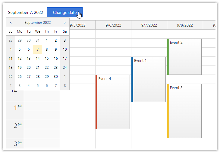
|
10
|
+
This is the DayPilot Lite for React package.
|
|
4
11
|
|
|
5
12
|
## What's New
|
|
6
13
|
|
|
@@ -25,7 +32,9 @@ Customize the scheduling components using an online [UI Builder](https://builder
|
|
|
25
32
|
* Event duration bar with customizable color
|
|
26
33
|
* Date picker with free/busy days highlighting, free-hand range selection, day cell customization
|
|
27
34
|
* CSS themes (use theme builder to create your own theme)
|
|
28
|
-
* Event customization (text, HTML, colors...)
|
|
35
|
+
* Event customization (text, HTML, colors, icons...)
|
|
36
|
+
* Cell customization (background, images, text, HTML...)
|
|
37
|
+
* Column header customization (background, images, text, HTML...)
|
|
29
38
|
* Built-in XSS protection
|
|
30
39
|
* Localization support
|
|
31
40
|
* TypeScript definitions
|
|
@@ -39,13 +48,17 @@ Customize the scheduling components using an online [UI Builder](https://builder
|
|
|
39
48
|
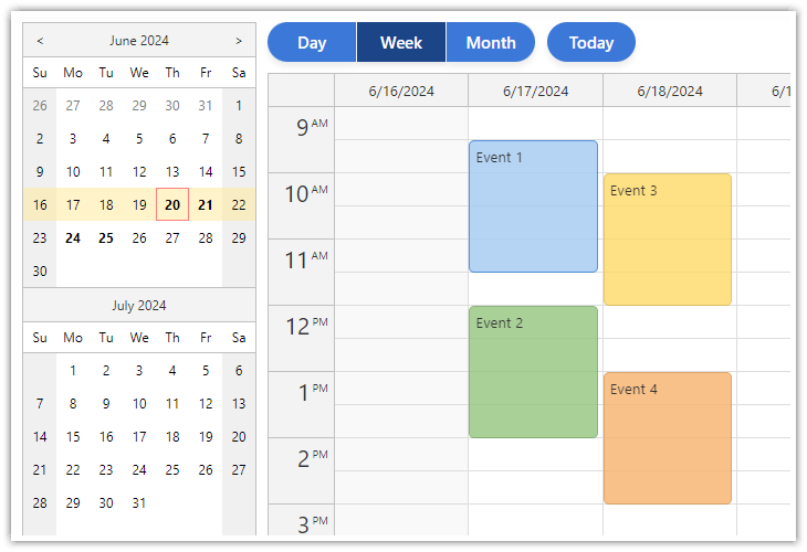
[React Weekly Calendar Tutorial (Open-Source)](https://code.daypilot.org/42221/react-weekly-calendar-tutorial)
|
|
40
49
|
React application that displays a weekly event calendar using an open-source DayPilot React calendar component. Includes a date picker for changing the visible week. The calendar/scheduler appearance is customized using CSS.
|
|
41
50
|
|
|
51
|
+
***
|
|
52
|
+
|
|
42
53
|
### React Resource Calendar with Editable Columns
|
|
43
54
|
|
|
44
|
-
[](https://code.daypilot.org/62447/react-resource-calendar-open-source)
|
|
45
56
|
|
|
46
57
|
[React Resource Calendar with Editable Columns (Open-Source)](https://code.daypilot.org/62447/react-resource-calendar-open-source)
|
|
47
58
|
How to use the open-source React resource calendar component to create a scheduling application for multiple groups of resources (locations, people, tools). Add a date picker and next/previous buttons that let users change the visible date.
|
|
48
59
|
|
|
60
|
+
***
|
|
61
|
+
|
|
49
62
|
### React Calendar with Day/Week/Month Views
|
|
50
63
|
|
|
51
64
|
[](https://code.daypilot.org/27556/react-day-week-month-calendar)
|
|
@@ -53,6 +66,8 @@ How to use the open-source React resource calendar component to create a schedul
|
|
|
53
66
|
[React Calendar with Day/Week/Month Views (Open-Source)](https://code.daypilot.org/27556/react-day-week-month-calendar)
|
|
54
67
|
This tutorial shows how to create a complex calendar component that displays integrated daily, weekly and monthly calendars in React.
|
|
55
68
|
|
|
69
|
+
***
|
|
70
|
+
|
|
56
71
|
### React Monthly Calendar
|
|
57
72
|
|
|
58
73
|
[](https://code.daypilot.org/26289/react-monthly-calendar-tutorial)
|
|
@@ -60,6 +75,8 @@ This tutorial shows how to create a complex calendar component that displays int
|
|
|
60
75
|
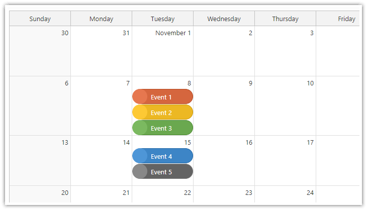
[React Monthly Calendar (Open-Source)](https://code.daypilot.org/26289/react-monthly-calendar-tutorial)
|
|
61
76
|
React application that displays a monthly event calendar. Calendar events use custom background to show event type. A context menu allows deleting events and changing color.
|
|
62
77
|
|
|
78
|
+
***
|
|
79
|
+
|
|
63
80
|
### Next.js Weekly Calendar Tutorial
|
|
64
81
|
|
|
65
82
|
[](https://code.daypilot.org/45330/next-js-weekly-calendar-open-source)
|
|
@@ -67,6 +84,17 @@ React application that displays a monthly event calendar. Calendar events use cu
|
|
|
67
84
|
[Next.js Weekly Calendar Tutorial (Open-Source)](https://code.daypilot.org/45330/next-js-weekly-calendar-open-source)
|
|
68
85
|
How to create a weekly calendar web application using a Next.js project with JavaScript source code for download.
|
|
69
86
|
|
|
87
|
+
***
|
|
88
|
+
|
|
89
|
+
### Next.js Monthly Calendar Tutorial
|
|
90
|
+
|
|
91
|
+
[](https://code.daypilot.org/37709/next-js-monthly-calendar-open-source)
|
|
92
|
+
|
|
93
|
+
[Next.js Monthly Calendar Tutorial (Open-Source)](https://code.daypilot.org/37709/next-js-monthly-calendar-open-source)
|
|
94
|
+
Learn how to build a customized monthly calendar UI in Next.js 15 using the open-source DayPilot scheduling library.
|
|
95
|
+
|
|
96
|
+
***
|
|
97
|
+
|
|
70
98
|
### React Calendar with Date Picker
|
|
71
99
|
|
|
72
100
|
[](https://code.daypilot.org/10750/react-calendar-with-date-picker-open-source)
|
|
@@ -89,14 +117,14 @@ function Calendar() {
|
|
|
89
117
|
{
|
|
90
118
|
id: 1,
|
|
91
119
|
text: "Event 1",
|
|
92
|
-
start: "
|
|
93
|
-
end: "
|
|
120
|
+
start: "2025-09-07T10:30:00",
|
|
121
|
+
end: "2025-09-07T13:00:00"
|
|
94
122
|
},
|
|
95
123
|
{
|
|
96
124
|
id: 2,
|
|
97
125
|
text: "Event 2",
|
|
98
|
-
start: "
|
|
99
|
-
end: "
|
|
126
|
+
start: "2025-09-08T09:30:00",
|
|
127
|
+
end: "2025-09-08T11:30:00",
|
|
100
128
|
barColor: "#6aa84f"
|
|
101
129
|
},
|
|
102
130
|
]);
|
|
@@ -115,7 +143,7 @@ function Calendar() {
|
|
|
115
143
|
return (
|
|
116
144
|
<DayPilotCalendar
|
|
117
145
|
viewType={"Week"}
|
|
118
|
-
startDate={"
|
|
146
|
+
startDate={"2025-09-07"}
|
|
119
147
|
timeRangeSelectedHandling={"Enabled"}
|
|
120
148
|
events={events}
|
|
121
149
|
onEventClick={onEventClick}
|
package/daypilot-react.min.d.ts
CHANGED
|
@@ -163,13 +163,17 @@ export module DayPilot {
|
|
|
163
163
|
readonly start: DayPilot.Date;
|
|
164
164
|
readonly end: DayPilot.Date;
|
|
165
165
|
readonly resource: ResourceId;
|
|
166
|
+
readonly x: number;
|
|
167
|
+
readonly y: number;
|
|
166
168
|
readonly properties: {
|
|
167
169
|
html: string;
|
|
168
170
|
business: boolean;
|
|
169
171
|
backColor: string;
|
|
170
172
|
backImage: string;
|
|
171
173
|
backRepeat: string;
|
|
174
|
+
fontColor: string;
|
|
172
175
|
cssClass: string;
|
|
176
|
+
text: string;
|
|
173
177
|
};
|
|
174
178
|
};
|
|
175
179
|
}
|
|
@@ -188,6 +192,7 @@ export module DayPilot {
|
|
|
188
192
|
html: string;
|
|
189
193
|
backColor: string;
|
|
190
194
|
cssClass?: string;
|
|
195
|
+
horizontalAlignment?: "left" | "center" | "right";
|
|
191
196
|
verticalAlignment?: "top" | "center" | "bottom";
|
|
192
197
|
toolTip: string;
|
|
193
198
|
areas: AreaData[];
|
|
@@ -1040,6 +1045,7 @@ export module DayPilot {
|
|
|
1040
1045
|
action?: "Default" | "None" | "ContextMenu" | "ResizeEnd" | "ResizeStart" | "Move";
|
|
1041
1046
|
backColor?: string;
|
|
1042
1047
|
background?: string;
|
|
1048
|
+
borderRadius?: number | string;
|
|
1043
1049
|
bottom?: number | string;
|
|
1044
1050
|
cssClass?: string;
|
|
1045
1051
|
fontColor?: string;
|