@daryasidorovich/modsen-datepicker 1.0.21 → 1.0.23
This diff represents the content of publicly available package versions that have been released to one of the supported registries. The information contained in this diff is provided for informational purposes only and reflects changes between package versions as they appear in their respective public registries.
- package/README.md +302 -302
- package/dist/index.cjs +9 -11
- package/dist/index.cjs.map +1 -1
- package/dist/index.js +9 -11
- package/dist/index.js.map +1 -1
- package/package.json +120 -120
package/README.md
CHANGED
|
@@ -1,302 +1,302 @@
|
|
|
1
|
-
<div align="center">
|
|
2
|
-
|
|
3
|
-
# Modsen DatePicker Library
|
|
4
|
-
|
|
5
|
-
**Three calendar components for React: BaseCalendar, DatePicker and RangePicker**
|
|
6
|
-
|
|
7
|
-
[Installation](#installation) • [Usage](#usage) • [API](#api) • [Types](#types) • [Demo](https://6a88497b3bbc2742a15109b2-cxguycdfyi.chromatic.com/)
|
|
8
|
-
|
|
9
|
-
</div>
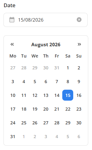
|
|
10
|
-
|
|
11
|
-
---
|
|
12
|
-
|
|
13
|
-
## Features
|
|
14
|
-
|
|
15
|
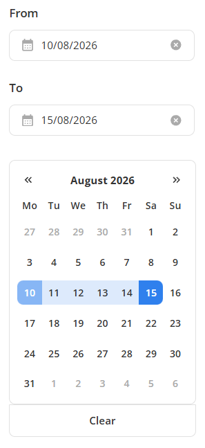
-
- **BaseCalendar** — a simple calendar for viewing and selecting dates
|
|
16
|
-
- **DatePicker** — single date selection via `selectedDate`
|
|
17
|
-
- **RangePicker** — range selection via `rangeStart` / `rangeEnd`
|
|
18
|
-
- **Flexible configuration** — `minDate`, `maxDate`, first day of week, display modes
|
|
19
|
-
- **Hide weekends** — `hideWeekends`
|
|
20
|
-
- **Holidays** — `showHolidays`, highlights public holidays based on the region (browser language)
|
|
21
|
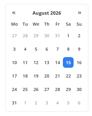
-
- **Tasks** — `enableTasks`, shows task indicators on dates and enables the built-in task manager- **Light and dark themes** — via CSS class on `<html>`
|
|
22
|
-
- **TypeScript** — fully typed props out of the box
|
|
23
|
-
|
|
24
|
-
---
|
|
25
|
-
|
|
26
|
-
## Installation
|
|
27
|
-
|
|
28
|
-
```bash
|
|
29
|
-
npm install @daryasidorovich/modsen-datepicker
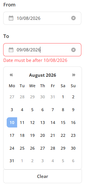
|
|
30
|
-
```
|
|
31
|
-
|
|
32
|
-
Or via yarn:
|
|
33
|
-
|
|
34
|
-
```bash
|
|
35
|
-
yarn add @daryasidorovich/mmodsen-datepicker
|
|
36
|
-
```
|
|
37
|
-
|
|
38
|
-
Requires **React 19+**.
|
|
39
|
-
|
|
40
|
-
---
|
|
41
|
-
|
|
42
|
-
## API
|
|
43
|
-
|
|
44
|
-
### Shared props (all components)
|
|
45
|
-
|
|
46
|
-
| Prop | Type | Default | Description |
|
|
47
|
-
| ---------------- | ------------------------- | ------------ | -------------------------------------------------- |
|
|
48
|
-
| `monthDate` | `Date` | `new Date()` | **Required.** The month being displayed |
|
|
49
|
-
| `minDate` | `Date` | — | Minimum selectable date |
|
|
50
|
-
| `maxDate` | `Date` | — | Maximum selectable date |
|
|
51
|
-
| `firstDayOfWeek` | `FIRST_DAY_OF_WEEK_TYPES` | `0` | First day of the week (`0` — Sunday, `1` — Monday) |
|
|
52
|
-
| `mode` | `MODES_TYPES` | `'month'` | Display mode: `'week'` or `'month'` |
|
|
53
|
-
| `hideWeekends` | `boolean` | `false` | Hide Saturday and Sunday |
|
|
54
|
-
| `showHolidays` | `boolean` | `false` | Highlight holidays |
|
|
55
|
-
| `enableTasks` | `boolean` | `false` | Enable task indicators and tasks manager |
|
|
56
|
-
|
|
57
|
-
---
|
|
58
|
-
|
|
59
|
-
## Usage
|
|
60
|
-
|
|
61
|
-
### DatePicker
|
|
62
|
-
|
|
63
|
-
Single date selection. Extends the shared props with:
|
|
64
|
-
|
|
65
|
-
| Prop | Type | Description |
|
|
66
|
-
| -------------- | ----------------------------------- | ----------------------------------------- |
|
|
67
|
-
| `selectedDate` | `Date` | The selected date |
|
|
68
|
-
| `onChange` | `(date: Date \| undefined) => void` | Called when a date is selected or cleared |
|
|
69
|
-
|
|
70
|
-
```tsx
|
|
71
|
-
import { useState } from 'react';
|
|
72
|
-
import { DatePicker } from 'modsen-datepicker';
|
|
73
|
-
|
|
74
|
-
const Example = () => {
|
|
75
|
-
const [selectedDate, setSelectedDate] = useState<Date | undefined>();
|
|
76
|
-
|
|
77
|
-
return (
|
|
78
|
-
<DatePicker
|
|
79
|
-
monthDate={new Date()}
|
|
80
|
-
selectedDate={selectedDate}
|
|
81
|
-
onChange={(date) => setSelectedDate(date)}
|
|
82
|
-
/>
|
|
83
|
-
);
|
|
84
|
-
};
|
|
85
|
-
```
|
|
86
|
-
|
|
87
|
-
<div align="center">
|
|
88
|
-
|
|
89
|
-
|
|
90
|
-
</div>
|
|
91
|
-
|
|
92
|
-
### RangePicker
|
|
93
|
-
|
|
94
|
-
Range selection. Extends the shared props with:
|
|
95
|
-
|
|
96
|
-
| Prop | Type | Description |
|
|
97
|
-
| --------------- | ----------------------- | -------------------------------------------------- |
|
|
98
|
-
| `rangeStart` | `Date` | Start of the range |
|
|
99
|
-
| `rangeEnd` | `Date` | End of the range |
|
|
100
|
-
| `onChangeStart` | `(date?: Date) => void` | Called when the start of the range changes |
|
|
101
|
-
| `onChangeEnd` | `(date?: Date) => void` | Called when the end of the range changes or clears |
|
|
102
|
-
|
|
103
|
-
```tsx
|
|
104
|
-
import { useState } from 'react';
|
|
105
|
-
import { RangePicker } from 'modsen-datepicker';
|
|
106
|
-
|
|
107
|
-
const Example = () => {
|
|
108
|
-
const [rangeStart, setRangeStart] = useState<Date | undefined>();
|
|
109
|
-
const [rangeEnd, setRangeEnd] = useState<Date | undefined>();
|
|
110
|
-
|
|
111
|
-
return (
|
|
112
|
-
<RangePicker
|
|
113
|
-
monthDate={new Date()}
|
|
114
|
-
rangeStart={rangeStart}
|
|
115
|
-
rangeEnd={rangeEnd}
|
|
116
|
-
onChangeStart={setRangeStart}
|
|
117
|
-
onChangeEnd={setRangeEnd}
|
|
118
|
-
/>
|
|
119
|
-
);
|
|
120
|
-
};
|
|
121
|
-
```
|
|
122
|
-
|
|
123
|
-
<div align="center">
|
|
124
|
-
|
|
125
|
-
|
|
126
|
-
</div>
|
|
127
|
-
|
|
128
|
-
### BaseCalendar
|
|
129
|
-
|
|
130
|
-
A simple calendar for viewing and selecting dates. It has no built-in selection logic — you control everything through `onDateClick`. Accepts `selectedDate`, `rangeStart` and `rangeEnd` purely for display.
|
|
131
|
-
|
|
132
|
-
| Prop | Type | Description |
|
|
133
|
-
| -------------- | -------------------------------------- | ----------------------------------------------------------------- |
|
|
134
|
-
| `selectedDate` | `Date` | The date to highlight as selected |
|
|
135
|
-
| `rangeStart` | `Date` | Start of the range to highlight |
|
|
136
|
-
| `rangeEnd` | `Date` | End of the range to highlight |
|
|
137
|
-
| `onDateClick` | `(e: MouseEvent) => void, date: Date)` | Called on every date click — define your own selection logic here |
|
|
138
|
-
|
|
139
|
-
```tsx
|
|
140
|
-
import { BaseCalendar, FIRST_DAY_OF_WEEK } from 'modsen-datepicker';
|
|
141
|
-
|
|
142
|
-
const Example = () => {
|
|
143
|
-
return (
|
|
144
|
-
<BaseCalendar
|
|
145
|
-
monthDate={new Date()}
|
|
146
|
-
selectedDate={new Date()}
|
|
147
|
-
firstDayOfWeek={FIRST_DAY_OF_WEEK.MONDAY}
|
|
148
|
-
onDateClick={(date, e) => {
|
|
149
|
-
if (e.ctrlKey) {
|
|
150
|
-
console.log('Ctrl + click', date);
|
|
151
|
-
} else {
|
|
152
|
-
console.log('Click', date);
|
|
153
|
-
}
|
|
154
|
-
}}
|
|
155
|
-
/>
|
|
156
|
-
);
|
|
157
|
-
};
|
|
158
|
-
```
|
|
159
|
-
|
|
160
|
-
<div align="center">
|
|
161
|
-
|
|
162
|
-
|
|
163
|
-
</div>
|
|
164
|
-
|
|
165
|
-
## Callbacks
|
|
166
|
-
|
|
167
|
-
All callbacks receive the **final, validated** value — never an intermediate state.
|
|
168
|
-
|
|
169
|
-
| Component | Callback | Signature | When it fires |
|
|
170
|
-
| ------------- | --------------- | ----------------------- | ----------------------------------------------- |
|
|
171
|
-
| `DatePicker` | `onChange` | `(date: Date | undefined) => void` | On date select or clear |
|
|
172
|
-
| `RangePicker` | `onChangeStart` | `(date?: Date) => void` | When the start of the range changes |
|
|
173
|
-
| `RangePicker` | `onChangeEnd` | `(date?: Date) => void` | When the end of the range changes or is cleared |
|
|
174
|
-
|
|
175
|
-
## Input validation
|
|
176
|
-
|
|
177
|
-
The input is `masked` (dd/mm/yyyy) and validated:
|
|
178
|
-
|
|
179
|
-
- **Mask** — accepts only digits and inserts separators automatically.
|
|
180
|
-
|
|
181
|
-
- **Invalid date**- — if the value cannot be parsed, the input shows Invalid date and the selection is cleared.
|
|
182
|
-
|
|
183
|
-
- **Out of range** — if minDate or maxDate is set and the value falls outside, the input shows the corresponding error and the value is rejected.
|
|
184
|
-
|
|
185
|
-
<div align="center">
|
|
186
|
-
|
|
187
|
-
|
|
188
|
-
</div>
|
|
189
|
-
|
|
190
|
-
## Interaction
|
|
191
|
-
|
|
192
|
-
### Single date (DatePicker)
|
|
193
|
-
|
|
194
|
-
A regular click selects a date and calls `onChange` with the new value.
|
|
195
|
-
|
|
196
|
-
```tsx
|
|
197
|
-
<DatePicker
|
|
198
|
-
monthDate={new Date()}
|
|
199
|
-
selectedDate={selectedDate}
|
|
200
|
-
onChange={(date) => setSelectedDate(date)}
|
|
201
|
-
/>
|
|
202
|
-
```
|
|
203
|
-
|
|
204
|
-
Clicking the same date again clears the selection and calls `onChange(undefined)`.
|
|
205
|
-
|
|
206
|
-
### Range (RangePicker)
|
|
207
|
-
|
|
208
|
-
Clicks build the range step by step:
|
|
209
|
-
|
|
210
|
-
1. First click sets `rangeStart` — `onChangeStart(date)` is called.
|
|
211
|
-
2. Second click sets `rangeEnd` — `onChangeEnd(date)` is called.
|
|
212
|
-
3. If the second click is earlier than `rangeStart`, the values are swapped and both callbacks receive the corrected pair.
|
|
213
|
-
4. If the range is already complete, the next click starts a new range — `onChangeStart(date)` and `onChangeEnd(undefined)`.
|
|
214
|
-
|
|
215
|
-
```tsx
|
|
216
|
-
<RangePicker
|
|
217
|
-
monthDate={new Date()}
|
|
218
|
-
rangeStart={rangeStart}
|
|
219
|
-
rangeEnd={rangeEnd}
|
|
220
|
-
onChangeStart={setRangeStart}
|
|
221
|
-
onChangeEnd={setRangeEnd}
|
|
222
|
-
/>
|
|
223
|
-
```
|
|
224
|
-
|
|
225
|
-
### Ctrl + click
|
|
226
|
-
|
|
227
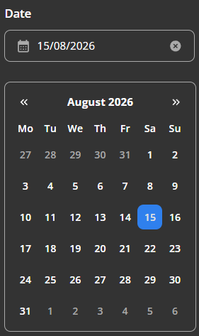
|
-
If the range is already selected and the user holds **Ctrl** while clicking, the end of the range is reset to the clicked date. The start stays the same. Only `onChangeEnd(date)` is called.
|
|
228
|
-
|
|
229
|
-
## Tasks
|
|
230
|
-
|
|
231
|
-
Tasks are disabled by default. Enable them with the `enableTasks` prop:
|
|
232
|
-
|
|
233
|
-
```tsx
|
|
234
|
-
<DatePicker enableTasks />
|
|
235
|
-
```
|
|
236
|
-
|
|
237
|
-
When `enableTasks` is on, a **double click** on any date opens a dialog where you can add, edit and delete tasks for that day.
|
|
238
|
-
|
|
239
|
-
Tasks are stored in `localStorage`, so they persist between sessions without any backend.
|
|
240
|
-
|
|
241
|
-
## Types
|
|
242
|
-
|
|
243
|
-
All types are exported from the package:
|
|
244
|
-
|
|
245
|
-
```ts
|
|
246
|
-
import type { FIRST_DAY_OF_WEEK_TYPES, MODES_TYPES } from 'modsen-datepicker';
|
|
247
|
-
|
|
248
|
-
import { FIRST_DAY_OF_WEEK, MODES } from 'modsen-datepicker';
|
|
249
|
-
```
|
|
250
|
-
|
|
251
|
-
### `FIRST_DAY_OF_WEEK`
|
|
252
|
-
|
|
253
|
-
Defines which day the week starts on.
|
|
254
|
-
|
|
255
|
-
| Constant | Value | Day |
|
|
256
|
-
| -------------------------- | ----- | ------ |
|
|
257
|
-
| `FIRST_DAY_OF_WEEK.SUNDAY` | `0` | Sunday |
|
|
258
|
-
| `FIRST_DAY_OF_WEEK.MONDAY` | `1` | Monday |
|
|
259
|
-
|
|
260
|
-
```ts
|
|
261
|
-
export type FIRST_DAY_OF_WEEK_TYPES = 0 | 1;
|
|
262
|
-
```
|
|
263
|
-
|
|
264
|
-
**Example:**
|
|
265
|
-
|
|
266
|
-
```tsx
|
|
267
|
-
<BaseCalendar
|
|
268
|
-
monthDate={new Date()}
|
|
269
|
-
firstDayOfWeek={FIRST_DAY_OF_WEEK.MONDAY}
|
|
270
|
-
/>
|
|
271
|
-
```
|
|
272
|
-
|
|
273
|
-
### `MODES`
|
|
274
|
-
|
|
275
|
-
Defines the calendar display mode.
|
|
276
|
-
|
|
277
|
-
| Constant | Value | Description |
|
|
278
|
-
| ------------- | --------- | ----------- |
|
|
279
|
-
| `MODES.WEEK` | `'week'` | Week view |
|
|
280
|
-
| `MODES.MONTH` | `'month'` | Month view |
|
|
281
|
-
|
|
282
|
-
```ts
|
|
283
|
-
export type MODES_TYPES = 'week' | 'month';
|
|
284
|
-
```
|
|
285
|
-
|
|
286
|
-
**Example:**
|
|
287
|
-
|
|
288
|
-
```tsx
|
|
289
|
-
<BaseCalendar monthDate={new Date()} mode={MODES.WEEK} />
|
|
290
|
-
```
|
|
291
|
-
|
|
292
|
-
## Theming
|
|
293
|
-
|
|
294
|
-
The library ships with light and dark themes out of the box — no extra configuration is required. The theme is applied automatically via a class on the `<html>` element:
|
|
295
|
-
|
|
296
|
-
- `theme-light` — light theme
|
|
297
|
-
- `theme-dark` — dark theme
|
|
298
|
-
|
|
299
|
-
<div align="center">
|
|
300
|
-
|
|
301
|
-
|
|
302
|
-
</div>
|
|
1
|
+
<div align="center">
|
|
2
|
+
|
|
3
|
+
# Modsen DatePicker Library
|
|
4
|
+
|
|
5
|
+
**Three calendar components for React: BaseCalendar, DatePicker and RangePicker**
|
|
6
|
+
|
|
7
|
+
[Installation](#installation) • [Usage](#usage) • [API](#api) • [Types](#types) • [Demo](https://6a88497b3bbc2742a15109b2-cxguycdfyi.chromatic.com/)
|
|
8
|
+
|
|
9
|
+
</div>
|
|
10
|
+
|
|
11
|
+
---
|
|
12
|
+
|
|
13
|
+
## Features
|
|
14
|
+
|
|
15
|
+
- **BaseCalendar** — a simple calendar for viewing and selecting dates
|
|
16
|
+
- **DatePicker** — single date selection via `selectedDate`
|
|
17
|
+
- **RangePicker** — range selection via `rangeStart` / `rangeEnd`
|
|
18
|
+
- **Flexible configuration** — `minDate`, `maxDate`, first day of week, display modes
|
|
19
|
+
- **Hide weekends** — `hideWeekends`
|
|
20
|
+
- **Holidays** — `showHolidays`, highlights public holidays based on the region (browser language)
|
|
21
|
+
- **Tasks** — `enableTasks`, shows task indicators on dates and enables the built-in task manager- **Light and dark themes** — via CSS class on `<html>`
|
|
22
|
+
- **TypeScript** — fully typed props out of the box
|
|
23
|
+
|
|
24
|
+
---
|
|
25
|
+
|
|
26
|
+
## Installation
|
|
27
|
+
|
|
28
|
+
```bash
|
|
29
|
+
npm install @daryasidorovich/modsen-datepicker
|
|
30
|
+
```
|
|
31
|
+
|
|
32
|
+
Or via yarn:
|
|
33
|
+
|
|
34
|
+
```bash
|
|
35
|
+
yarn add @daryasidorovich/mmodsen-datepicker
|
|
36
|
+
```
|
|
37
|
+
|
|
38
|
+
Requires **React 19+**.
|
|
39
|
+
|
|
40
|
+
---
|
|
41
|
+
|
|
42
|
+
## API
|
|
43
|
+
|
|
44
|
+
### Shared props (all components)
|
|
45
|
+
|
|
46
|
+
| Prop | Type | Default | Description |
|
|
47
|
+
| ---------------- | ------------------------- | ------------ | -------------------------------------------------- |
|
|
48
|
+
| `monthDate` | `Date` | `new Date()` | **Required.** The month being displayed |
|
|
49
|
+
| `minDate` | `Date` | — | Minimum selectable date |
|
|
50
|
+
| `maxDate` | `Date` | — | Maximum selectable date |
|
|
51
|
+
| `firstDayOfWeek` | `FIRST_DAY_OF_WEEK_TYPES` | `0` | First day of the week (`0` — Sunday, `1` — Monday) |
|
|
52
|
+
| `mode` | `MODES_TYPES` | `'month'` | Display mode: `'week'` or `'month'` |
|
|
53
|
+
| `hideWeekends` | `boolean` | `false` | Hide Saturday and Sunday |
|
|
54
|
+
| `showHolidays` | `boolean` | `false` | Highlight holidays |
|
|
55
|
+
| `enableTasks` | `boolean` | `false` | Enable task indicators and tasks manager |
|
|
56
|
+
|
|
57
|
+
---
|
|
58
|
+
|
|
59
|
+
## Usage
|
|
60
|
+
|
|
61
|
+
### DatePicker
|
|
62
|
+
|
|
63
|
+
Single date selection. Extends the shared props with:
|
|
64
|
+
|
|
65
|
+
| Prop | Type | Description |
|
|
66
|
+
| -------------- | ----------------------------------- | ----------------------------------------- |
|
|
67
|
+
| `selectedDate` | `Date` | The selected date |
|
|
68
|
+
| `onChange` | `(date: Date \| undefined) => void` | Called when a date is selected or cleared |
|
|
69
|
+
|
|
70
|
+
```tsx
|
|
71
|
+
import { useState } from 'react';
|
|
72
|
+
import { DatePicker } from 'modsen-datepicker';
|
|
73
|
+
|
|
74
|
+
const Example = () => {
|
|
75
|
+
const [selectedDate, setSelectedDate] = useState<Date | undefined>();
|
|
76
|
+
|
|
77
|
+
return (
|
|
78
|
+
<DatePicker
|
|
79
|
+
monthDate={new Date()}
|
|
80
|
+
selectedDate={selectedDate}
|
|
81
|
+
onChange={(date) => setSelectedDate(date)}
|
|
82
|
+
/>
|
|
83
|
+
);
|
|
84
|
+
};
|
|
85
|
+
```
|
|
86
|
+
|
|
87
|
+
<div align="center">
|
|
88
|
+
|
|
89
|
+

|
|
90
|
+
</div>
|
|
91
|
+
|
|
92
|
+
### RangePicker
|
|
93
|
+
|
|
94
|
+
Range selection. Extends the shared props with:
|
|
95
|
+
|
|
96
|
+
| Prop | Type | Description |
|
|
97
|
+
| --------------- | ----------------------- | -------------------------------------------------- |
|
|
98
|
+
| `rangeStart` | `Date` | Start of the range |
|
|
99
|
+
| `rangeEnd` | `Date` | End of the range |
|
|
100
|
+
| `onChangeStart` | `(date?: Date) => void` | Called when the start of the range changes |
|
|
101
|
+
| `onChangeEnd` | `(date?: Date) => void` | Called when the end of the range changes or clears |
|
|
102
|
+
|
|
103
|
+
```tsx
|
|
104
|
+
import { useState } from 'react';
|
|
105
|
+
import { RangePicker } from 'modsen-datepicker';
|
|
106
|
+
|
|
107
|
+
const Example = () => {
|
|
108
|
+
const [rangeStart, setRangeStart] = useState<Date | undefined>();
|
|
109
|
+
const [rangeEnd, setRangeEnd] = useState<Date | undefined>();
|
|
110
|
+
|
|
111
|
+
return (
|
|
112
|
+
<RangePicker
|
|
113
|
+
monthDate={new Date()}
|
|
114
|
+
rangeStart={rangeStart}
|
|
115
|
+
rangeEnd={rangeEnd}
|
|
116
|
+
onChangeStart={setRangeStart}
|
|
117
|
+
onChangeEnd={setRangeEnd}
|
|
118
|
+
/>
|
|
119
|
+
);
|
|
120
|
+
};
|
|
121
|
+
```
|
|
122
|
+
|
|
123
|
+
<div align="center">
|
|
124
|
+
|
|
125
|
+

|
|
126
|
+
</div>
|
|
127
|
+
|
|
128
|
+
### BaseCalendar
|
|
129
|
+
|
|
130
|
+
A simple calendar for viewing and selecting dates. It has no built-in selection logic — you control everything through `onDateClick`. Accepts `selectedDate`, `rangeStart` and `rangeEnd` purely for display.
|
|
131
|
+
|
|
132
|
+
| Prop | Type | Description |
|
|
133
|
+
| -------------- | -------------------------------------- | ----------------------------------------------------------------- |
|
|
134
|
+
| `selectedDate` | `Date` | The date to highlight as selected |
|
|
135
|
+
| `rangeStart` | `Date` | Start of the range to highlight |
|
|
136
|
+
| `rangeEnd` | `Date` | End of the range to highlight |
|
|
137
|
+
| `onDateClick` | `(e: MouseEvent) => void, date: Date)` | Called on every date click — define your own selection logic here |
|
|
138
|
+
|
|
139
|
+
```tsx
|
|
140
|
+
import { BaseCalendar, FIRST_DAY_OF_WEEK } from 'modsen-datepicker';
|
|
141
|
+
|
|
142
|
+
const Example = () => {
|
|
143
|
+
return (
|
|
144
|
+
<BaseCalendar
|
|
145
|
+
monthDate={new Date()}
|
|
146
|
+
selectedDate={new Date()}
|
|
147
|
+
firstDayOfWeek={FIRST_DAY_OF_WEEK.MONDAY}
|
|
148
|
+
onDateClick={(date, e) => {
|
|
149
|
+
if (e.ctrlKey) {
|
|
150
|
+
console.log('Ctrl + click', date);
|
|
151
|
+
} else {
|
|
152
|
+
console.log('Click', date);
|
|
153
|
+
}
|
|
154
|
+
}}
|
|
155
|
+
/>
|
|
156
|
+
);
|
|
157
|
+
};
|
|
158
|
+
```
|
|
159
|
+
|
|
160
|
+
<div align="center">
|
|
161
|
+
|
|
162
|
+

|
|
163
|
+
</div>
|
|
164
|
+
|
|
165
|
+
## Callbacks
|
|
166
|
+
|
|
167
|
+
All callbacks receive the **final, validated** value — never an intermediate state.
|
|
168
|
+
|
|
169
|
+
| Component | Callback | Signature | When it fires |
|
|
170
|
+
| ------------- | --------------- | ----------------------- | ----------------------------------------------- |
|
|
171
|
+
| `DatePicker` | `onChange` | `(date: Date | undefined) => void` | On date select or clear |
|
|
172
|
+
| `RangePicker` | `onChangeStart` | `(date?: Date) => void` | When the start of the range changes |
|
|
173
|
+
| `RangePicker` | `onChangeEnd` | `(date?: Date) => void` | When the end of the range changes or is cleared |
|
|
174
|
+
|
|
175
|
+
## Input validation
|
|
176
|
+
|
|
177
|
+
The input is `masked` (dd/mm/yyyy) and validated:
|
|
178
|
+
|
|
179
|
+
- **Mask** — accepts only digits and inserts separators automatically.
|
|
180
|
+
|
|
181
|
+
- **Invalid date**- — if the value cannot be parsed, the input shows Invalid date and the selection is cleared.
|
|
182
|
+
|
|
183
|
+
- **Out of range** — if minDate or maxDate is set and the value falls outside, the input shows the corresponding error and the value is rejected.
|
|
184
|
+
|
|
185
|
+
<div align="center">
|
|
186
|
+

|
|
187
|
+
|
|
188
|
+
</div>
|
|
189
|
+
|
|
190
|
+
## Interaction
|
|
191
|
+
|
|
192
|
+
### Single date (DatePicker)
|
|
193
|
+
|
|
194
|
+
A regular click selects a date and calls `onChange` with the new value.
|
|
195
|
+
|
|
196
|
+
```tsx
|
|
197
|
+
<DatePicker
|
|
198
|
+
monthDate={new Date()}
|
|
199
|
+
selectedDate={selectedDate}
|
|
200
|
+
onChange={(date) => setSelectedDate(date)}
|
|
201
|
+
/>
|
|
202
|
+
```
|
|
203
|
+
|
|
204
|
+
Clicking the same date again clears the selection and calls `onChange(undefined)`.
|
|
205
|
+
|
|
206
|
+
### Range (RangePicker)
|
|
207
|
+
|
|
208
|
+
Clicks build the range step by step:
|
|
209
|
+
|
|
210
|
+
1. First click sets `rangeStart` — `onChangeStart(date)` is called.
|
|
211
|
+
2. Second click sets `rangeEnd` — `onChangeEnd(date)` is called.
|
|
212
|
+
3. If the second click is earlier than `rangeStart`, the values are swapped and both callbacks receive the corrected pair.
|
|
213
|
+
4. If the range is already complete, the next click starts a new range — `onChangeStart(date)` and `onChangeEnd(undefined)`.
|
|
214
|
+
|
|
215
|
+
```tsx
|
|
216
|
+
<RangePicker
|
|
217
|
+
monthDate={new Date()}
|
|
218
|
+
rangeStart={rangeStart}
|
|
219
|
+
rangeEnd={rangeEnd}
|
|
220
|
+
onChangeStart={setRangeStart}
|
|
221
|
+
onChangeEnd={setRangeEnd}
|
|
222
|
+
/>
|
|
223
|
+
```
|
|
224
|
+
|
|
225
|
+
### Ctrl + click
|
|
226
|
+
|
|
227
|
+
If the range is already selected and the user holds **Ctrl** while clicking, the end of the range is reset to the clicked date. The start stays the same. Only `onChangeEnd(date)` is called.
|
|
228
|
+
|
|
229
|
+
## Tasks
|
|
230
|
+
|
|
231
|
+
Tasks are disabled by default. Enable them with the `enableTasks` prop:
|
|
232
|
+
|
|
233
|
+
```tsx
|
|
234
|
+
<DatePicker enableTasks />
|
|
235
|
+
```
|
|
236
|
+
|
|
237
|
+
When `enableTasks` is on, a **double click** on any date opens a dialog where you can add, edit and delete tasks for that day.
|
|
238
|
+
|
|
239
|
+
Tasks are stored in `localStorage`, so they persist between sessions without any backend.
|
|
240
|
+
|
|
241
|
+
## Types
|
|
242
|
+
|
|
243
|
+
All types are exported from the package:
|
|
244
|
+
|
|
245
|
+
```ts
|
|
246
|
+
import type { FIRST_DAY_OF_WEEK_TYPES, MODES_TYPES } from 'modsen-datepicker';
|
|
247
|
+
|
|
248
|
+
import { FIRST_DAY_OF_WEEK, MODES } from 'modsen-datepicker';
|
|
249
|
+
```
|
|
250
|
+
|
|
251
|
+
### `FIRST_DAY_OF_WEEK`
|
|
252
|
+
|
|
253
|
+
Defines which day the week starts on.
|
|
254
|
+
|
|
255
|
+
| Constant | Value | Day |
|
|
256
|
+
| -------------------------- | ----- | ------ |
|
|
257
|
+
| `FIRST_DAY_OF_WEEK.SUNDAY` | `0` | Sunday |
|
|
258
|
+
| `FIRST_DAY_OF_WEEK.MONDAY` | `1` | Monday |
|
|
259
|
+
|
|
260
|
+
```ts
|
|
261
|
+
export type FIRST_DAY_OF_WEEK_TYPES = 0 | 1;
|
|
262
|
+
```
|
|
263
|
+
|
|
264
|
+
**Example:**
|
|
265
|
+
|
|
266
|
+
```tsx
|
|
267
|
+
<BaseCalendar
|
|
268
|
+
monthDate={new Date()}
|
|
269
|
+
firstDayOfWeek={FIRST_DAY_OF_WEEK.MONDAY}
|
|
270
|
+
/>
|
|
271
|
+
```
|
|
272
|
+
|
|
273
|
+
### `MODES`
|
|
274
|
+
|
|
275
|
+
Defines the calendar display mode.
|
|
276
|
+
|
|
277
|
+
| Constant | Value | Description |
|
|
278
|
+
| ------------- | --------- | ----------- |
|
|
279
|
+
| `MODES.WEEK` | `'week'` | Week view |
|
|
280
|
+
| `MODES.MONTH` | `'month'` | Month view |
|
|
281
|
+
|
|
282
|
+
```ts
|
|
283
|
+
export type MODES_TYPES = 'week' | 'month';
|
|
284
|
+
```
|
|
285
|
+
|
|
286
|
+
**Example:**
|
|
287
|
+
|
|
288
|
+
```tsx
|
|
289
|
+
<BaseCalendar monthDate={new Date()} mode={MODES.WEEK} />
|
|
290
|
+
```
|
|
291
|
+
|
|
292
|
+
## Theming
|
|
293
|
+
|
|
294
|
+
The library ships with light and dark themes out of the box — no extra configuration is required. The theme is applied automatically via a class on the `<html>` element:
|
|
295
|
+
|
|
296
|
+
- `theme-light` — light theme
|
|
297
|
+
- `theme-dark` — dark theme
|
|
298
|
+
|
|
299
|
+
<div align="center">
|
|
300
|
+
|
|
301
|
+

|
|
302
|
+
</div>
|
package/dist/index.cjs
CHANGED
|
@@ -570,8 +570,8 @@ function withMinMax(calendar, minDate, maxDate) {
|
|
|
570
570
|
return calendar;
|
|
571
571
|
}
|
|
572
572
|
|
|
573
|
-
const HOLIDAY_API_URL =
|
|
574
|
-
const API_KEY =
|
|
573
|
+
const HOLIDAY_API_URL = 'https://holidayapi.com/v1';
|
|
574
|
+
const API_KEY = 'f36f54be-e335-4957-9c64-fde814074428';
|
|
575
575
|
const getHolidays = async (year = new Date().getFullYear(), signal) => {
|
|
576
576
|
try {
|
|
577
577
|
let holidayDates;
|
|
@@ -580,9 +580,7 @@ const getHolidays = async (year = new Date().getFullYear(), signal) => {
|
|
|
580
580
|
if (!countryCode) {
|
|
581
581
|
throw new Error('Cannot get your country code');
|
|
582
582
|
}
|
|
583
|
-
if (!API_KEY)
|
|
584
|
-
throw new Error('API key is not defined');
|
|
585
|
-
}
|
|
583
|
+
if (!API_KEY) ;
|
|
586
584
|
const url = `${HOLIDAY_API_URL}?key=${API_KEY}&country=${countryCode}&year=${year}`;
|
|
587
585
|
const response = await fetch(url, { signal });
|
|
588
586
|
if (!response.ok) {
|
|
@@ -6455,8 +6453,8 @@ const WeekDay = ({ firstDayOfWeek = 1, className = '', hideWeekends = false, })
|
|
|
6455
6453
|
}) }));
|
|
6456
6454
|
};
|
|
6457
6455
|
|
|
6458
|
-
var css$3 = ".
|
|
6459
|
-
var modules_efc4e723$3 = {"calendarGrid":"
|
|
6456
|
+
var css$3 = ".styles_module_calendarGrid__a4a27900 {\n border-style: solid;\n border-width: 1px;\n}\n.theme-light .styles_module_calendarGrid__a4a27900 {\n border-color: #e1e1e1;\n background-color: #ffffff;\n}\n.theme-dark .styles_module_calendarGrid__a4a27900 {\n border-color: #aaaaaa;\n background-color: #333333;\n}\n.styles_module_calendarGrid__a4a27900 {\n padding: 10px;\n border-radius: 8px;\n display: flex;\n flex-direction: column;\n gap: 2px;\n align-items: center;\n width: 262px;\n}";
|
|
6457
|
+
var modules_efc4e723$3 = {"calendarGrid":"styles_module_calendarGrid__a4a27900"};
|
|
6460
6458
|
n(css$3,{});
|
|
6461
6459
|
|
|
6462
6460
|
const BaseCalendar = ({ mode = MODES.MONTH, monthDate, firstDayOfWeek = 1, hideWeekends = false, ...props }) => {
|
|
@@ -6575,8 +6573,8 @@ function useValidate(selectedDate) {
|
|
|
6575
6573
|
};
|
|
6576
6574
|
}
|
|
6577
6575
|
|
|
6578
|
-
var css$2 = ".
|
|
6579
|
-
var modules_efc4e723$2 = {"datepicker":"
|
|
6576
|
+
var css$2 = ".styles_module_datepicker__56a414ad {\n display: flex;\n flex-direction: column;\n gap: 8px;\n padding: 8px;\n width: 262px;\n}\n.theme-light .styles_module_datepicker__56a414ad {\n background-color: #ffffff;\n}\n.theme-dark .styles_module_datepicker__56a414ad {\n background-color: #333333;\n}";
|
|
6577
|
+
var modules_efc4e723$2 = {"datepicker":"styles_module_datepicker__56a414ad"};
|
|
6580
6578
|
n(css$2,{});
|
|
6581
6579
|
|
|
6582
6580
|
const DatePicker = ({ selectedDate, monthDate = new Date(), onChange, ...props }) => {
|
|
@@ -6606,8 +6604,8 @@ const Clear = ({ onClick }) => {
|
|
|
6606
6604
|
return (jsxRuntime.jsx("button", { className: modules_efc4e723$1.clear, type: "button", onClick: onClick, children: "Clear" }));
|
|
6607
6605
|
};
|
|
6608
6606
|
|
|
6609
|
-
var css = ".
|
|
6610
|
-
var modules_efc4e723 = {"rangePicker":"
|
|
6607
|
+
var css = ".styles_module_rangePicker__2a1e1dc4 {\n display: flex;\n flex-direction: column;\n padding: 8px;\n width: 262px;\n}\n.theme-light .styles_module_rangePicker__2a1e1dc4 {\n background-color: #ffffff;\n}\n.theme-dark .styles_module_rangePicker__2a1e1dc4 {\n background-color: #333333;\n}\n\n.styles_module_calendar__2a1e1dc4 {\n margin-top: 15px;\n}\n\n.styles_module_inputs__2a1e1dc4 {\n display: flex;\n flex-direction: column;\n gap: 8px;\n}";
|
|
6608
|
+
var modules_efc4e723 = {"rangePicker":"styles_module_rangePicker__2a1e1dc4","calendar":"styles_module_calendar__2a1e1dc4","inputs":"styles_module_inputs__2a1e1dc4"};
|
|
6611
6609
|
n(css,{});
|
|
6612
6610
|
|
|
6613
6611
|
const RangePicker = ({ rangeStart, rangeEnd, monthDate = new Date(), onChangeStart, onChangeEnd, ...props }) => {
|