@cloudbase/weda-ui 1.0.24 → 2.0.10
This diff represents the content of publicly available package versions that have been released to one of the supported registries. The information contained in this diff is provided for informational purposes only and reflects changes between package versions as they appear in their respective public registries.
- package/package.json +2 -2
- package/src/configs/components/button.json +0 -2
- package/src/configs/components/calendar.json +5 -2
- package/src/configs/components/carousel.json +18 -9
- package/src/configs/components/chart/bar.json +12 -6
- package/src/configs/components/chart/line.json +8 -4
- package/src/configs/components/chart/pie.json +8 -4
- package/src/configs/components/dataView.json +10 -5
- package/src/configs/components/form/radio.json +27 -0
- package/src/configs/components/form/select.json +2 -2
- package/src/configs/components/graphicCard.json +6 -2
- package/src/configs/components/image.json +12 -6
- package/src/configs/components/link.json +6 -3
- package/src/configs/components/listView.json +20 -10
- package/src/configs/components/lottery.json +4 -2
- package/src/configs/components/navLayout.json +12 -6
- package/src/configs/components/richtextview.json +2 -1
- package/src/configs/components/scrollVeiw.json +24 -12
- package/src/configs/components/swiper.json +18 -9
- package/src/configs/components/tabs.json +4 -2
- package/src/configs/components/text.json +10 -5
- package/src/docs/common/format.tsx +112 -0
- package/src/docs/common/tableView.css +164 -0
- package/src/docs/common/tableView.tsx +273 -0
- package/src/docs/compsdocs/chart/Bar.mdx +159 -0
- package/src/docs/compsdocs/chart/Line.mdx +100 -0
- package/src/docs/compsdocs/chart/Pie.mdx +83 -0
- package/src/docs/compsdocs/chart/_category_.json +1 -0
- package/src/docs/compsdocs/chart/statisticsCard.mdx +51 -0
- package/src/docs/compsdocs/database/DataView.mdx +33 -0
- package/src/docs/compsdocs/database/ListView.mdx +33 -0
- package/src/docs/compsdocs/database/_category_.json +1 -0
- package/src/docs/compsdocs/form/Form.mdx +35 -0
- package/src/docs/compsdocs/form/FormCheckbox.mdx +35 -0
- package/src/docs/compsdocs/form/FormDate.mdx +30 -0
- package/src/docs/compsdocs/form/FormEmail.mdx +30 -0
- package/src/docs/compsdocs/form/FormImageUploader.mdx +31 -0
- package/src/docs/compsdocs/form/FormInput.mdx +30 -0
- package/src/docs/compsdocs/form/FormLocation.mdx +64 -0
- package/src/docs/compsdocs/form/FormPhone.mdx +30 -0
- package/src/docs/compsdocs/form/FormRadio.mdx +35 -0
- package/src/docs/compsdocs/form/FormRegion.mdx +30 -0
- package/src/docs/compsdocs/form/FormSelect.mdx +36 -0
- package/src/docs/compsdocs/form/FormSwitch.mdx +30 -0
- package/src/docs/compsdocs/form/FormTextarea.mdx +30 -0
- package/src/docs/compsdocs/form/FormTime.mdx +30 -0
- package/src/docs/compsdocs/form/FormUploadFile.mdx +30 -0
- package/src/docs/compsdocs/form/FormUrl.mdx +30 -0
- package/src/docs/compsdocs/form/_category_.json +1 -0
- package/src/docs/compsdocs/grid/Card.mdx +32 -0
- package/src/docs/compsdocs/grid/Container.mdx +42 -0
- package/src/docs/compsdocs/grid/Footer.mdx +31 -0
- package/src/docs/compsdocs/grid/GridLayout.mdx +32 -0
- package/src/docs/compsdocs/grid/Header.mdx +31 -0
- package/src/docs/compsdocs/grid/Layout.mdx +25 -0
- package/src/docs/compsdocs/grid/List.mdx +31 -0
- package/src/docs/compsdocs/grid/ScrollView.mdx +37 -0
- package/src/docs/compsdocs/grid/Swiper.mdx +58 -0
- package/src/docs/compsdocs/grid/_category_.json +1 -0
- package/src/docs/compsdocs/media/Icon.mdx +31 -0
- package/src/docs/compsdocs/media/Image.mdx +55 -0
- package/src/docs/compsdocs/media/_category_.json +1 -0
- package/src/docs/compsdocs/model/ModelCreate.mdx +20 -0
- package/src/docs/compsdocs/model/ModelDetail.mdx +20 -0
- package/src/docs/compsdocs/model/ModelTable.mdx +24 -0
- package/src/docs/compsdocs/model/ModelUpdate.mdx +21 -0
- package/src/docs/compsdocs/model/PageLayout.mdx +21 -0
- package/src/docs/compsdocs/model/_category_.json +1 -0
- package/src/docs/compsdocs/navmenu/Classification.mdx +38 -0
- package/src/docs/compsdocs/navmenu/NavBar.mdx +43 -0
- package/src/docs/compsdocs/navmenu/NavLayout.mdx +30 -0
- package/src/docs/compsdocs/navmenu/TabBar.mdx +43 -0
- package/src/docs/compsdocs/navmenu/TabBarItem.mdx +29 -0
- package/src/docs/compsdocs/navmenu/_category_.json +1 -0
- package/src/docs/compsdocs/senior/Lottery.mdx +48 -0
- package/src/docs/compsdocs/senior/Modal.mdx +58 -0
- package/src/docs/compsdocs/senior/SlotMachine.mdx +52 -0
- package/src/docs/compsdocs/senior/_category_.json +1 -0
- package/src/docs/compsdocs/show/Calendar.mdx +29 -0
- package/src/docs/compsdocs/show/Divider.mdx +31 -0
- package/src/docs/compsdocs/show/GraphicCard.mdx +30 -0
- package/src/docs/compsdocs/show/Item.mdx +32 -0
- package/src/docs/compsdocs/show/ItemList.mdx +47 -0
- package/src/docs/compsdocs/show/Media.mdx +25 -0
- package/src/docs/compsdocs/show/StatusTip.mdx +25 -0
- package/src/docs/compsdocs/show/Swiper.mdx +33 -0
- package/src/docs/compsdocs/show/Tabs.mdx +38 -0
- package/src/docs/compsdocs/show/_category_.json +1 -0
- package/src/docs/compsdocs/show/button.mdx +25 -0
- package/src/docs/compsdocs/text/Link.mdx +43 -0
- package/src/docs/compsdocs/text/RichTextView.mdx +36 -0
- package/src/docs/compsdocs/text/Text.mdx +31 -0
- package/src/docs/compsdocs/text/Title.mdx +32 -0
- package/src/docs/compsdocs/text/_category_.json +1 -0
- package/src/docs/compsdocs/wxOpen/Phone.mdx +60 -0
- package/src/docs/compsdocs/wxOpen/Share.mdx +46 -0
- package/src/docs/compsdocs/wxOpen/UserInfo.mdx +60 -0
- package/src/docs/compsdocs/wxOpen/_category_.json +4 -0
- package/src/mp/components/button/index.js +18 -2
- package/src/mp/components/button/index.wxml +6 -2
- package/src/mp/components/form/formcell/index.wxml +1 -1
- package/src/mp/components/form/formcell/index.wxss +17 -0
- package/src/mp/components/form/input/index.wxss +15 -0
- package/src/mp/components/form/location/index.wxss +4 -6
- package/src/mp/components/form/select/index.js +5 -3
- package/src/mp/components/form/select/index.wxss +6 -0
- package/src/mp/components/form/textarea/index.js +1 -1
- package/src/mp/components/form/textarea/index.wxss +4 -0
- package/src/mp/components/form/uploader/index.json +3 -2
- package/src/mp/components/form/uploader/index.wxml +11 -7
- package/src/mp/components/form/uploader/index.wxss +20 -2
- package/src/mp/components/form/uploader/weui-uploader.js +209 -0
- package/src/mp/components/form/uploader/weui-uploader.json +7 -0
- package/src/mp/components/form/uploader/weui-uploader.wxml +45 -0
- package/src/mp/components/form/uploader/weui-uploader.wxss +1 -0
- package/src/mp/components/form/uploaderFile/index.wxss +4 -4
- package/src/mp/components/image/index.wxss +3 -2
- package/src/mp/style/weda-ui.wxss +14 -0
- package/src/web/components/button/index.tsx +7 -7
- package/src/web/components/calendar/index.jsx +1 -1
- package/src/web/components/carousel/index.tsx +8 -8
- package/src/web/components/form/form/index.css +5 -1
- package/src/web/components/form/form/index.tsx +3 -1
- package/src/web/components/form/formcell/index.css +22 -1
- package/src/web/components/form/formcell/index.tsx +2 -2
- package/src/web/components/form/input/index.css +7 -12
- package/src/web/components/form/location/components/LocationH5/index.css +4 -7
- package/src/web/components/form/location/components/LocationH5/location.h5.jsx +1 -1
- package/src/web/components/form/select/index.css +11 -0
- package/src/web/components/form/textarea/index.css +4 -0
- package/src/web/components/form/textarea/index.tsx +2 -2
- package/src/web/components/form/uploader/index.css +26 -2
- package/src/web/components/form/uploader/uploader.h5.tsx +81 -56
- package/src/web/components/form/uploaderFile/index.css +2 -4
- package/src/web/components/image/index.css +5 -5
- package/src/web/components/image/index.tsx +6 -7
- package/src/web/components/link/index.tsx +2 -2
- package/src/web/components/listView/index.tsx +2 -2
- package/src/web/components/navLayout/index.tsx +2 -2
- package/src/web/components/navigationBar/index.tsx +0 -1
- package/src/web/components/picker/timePicker.tsx +2 -2
- package/src/web/components/slot/index.tsx +1 -1
- package/src/web/components/text/index.tsx +6 -6
- package/src/web/weda-ui.css +5 -1
|
@@ -0,0 +1,42 @@
|
|
|
1
|
+
# 普通容器
|
|
2
|
+
|
|
3
|
+
<TableLayoutView
|
|
4
|
+
componentKey="Container"
|
|
5
|
+
type="description"
|
|
6
|
+
origin="sourceCode"
|
|
7
|
+
></TableLayoutView>
|
|
8
|
+
|
|
9
|
+
## 使用说明
|
|
10
|
+
|
|
11
|
+
普通容器存在多种使用场景,对于应用的搭建有着重要的作用
|
|
12
|
+
|
|
13
|
+
### 使用普通容器进行组件样式的统一控制
|
|
14
|
+
|
|
15
|
+
普通容器常被作为其他组件的父级节点进行使用,当普通容器的样式属性修改时,其子节点的组件也会随之进行修改
|
|
16
|
+
|
|
17
|
+
|
|
18
|
+
|
|
19
|
+
### 使用普通容器进行组件的循环遍历展示
|
|
20
|
+
|
|
21
|
+
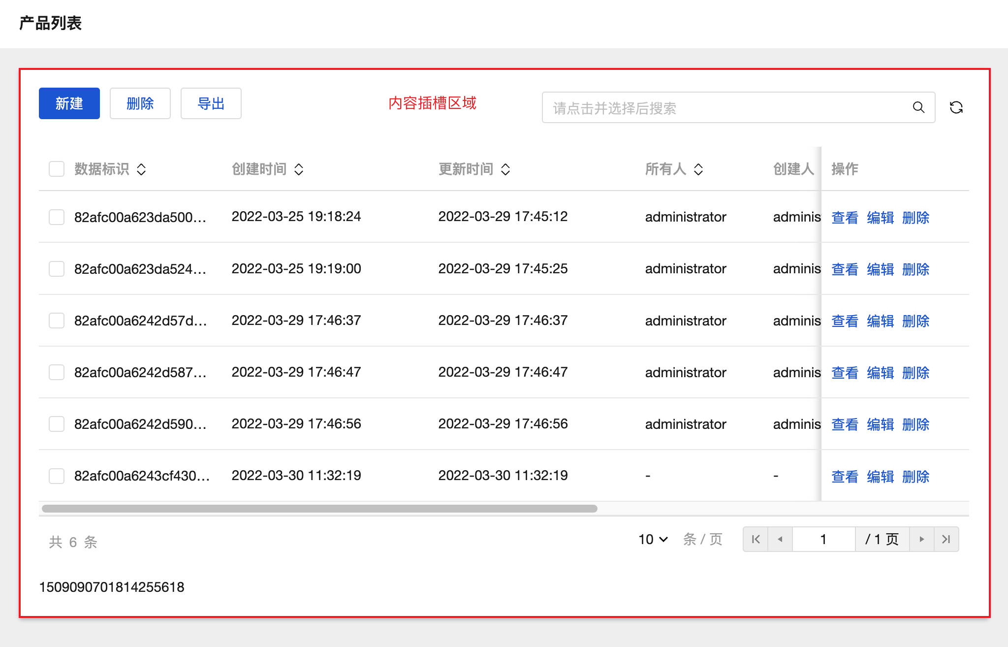
我们可以将普通容器绑定循环后,实现其子节点组件的循环展示,如下图所示,具体操作方式可参考文档: [组件循环说明](https://cloud.tencent.com/document/product/1301/58434)
|
|
22
|
+
|
|
23
|
+
|
|
24
|
+
|
|
25
|
+
|
|
26
|
+
## 属性介绍
|
|
27
|
+
|
|
28
|
+
import TableLayoutView from '../../common/tableView';
|
|
29
|
+
|
|
30
|
+
<TableLayoutView
|
|
31
|
+
componentKey="Container"
|
|
32
|
+
type="attribute"
|
|
33
|
+
origin="sourceCode"
|
|
34
|
+
></TableLayoutView>
|
|
35
|
+
|
|
36
|
+
## 事件介绍
|
|
37
|
+
|
|
38
|
+
<TableLayoutView
|
|
39
|
+
componentKey="Container"
|
|
40
|
+
type="event"
|
|
41
|
+
origin="sourceCode"
|
|
42
|
+
></TableLayoutView>
|
|
@@ -0,0 +1,31 @@
|
|
|
1
|
+
# 页脚容器
|
|
2
|
+
|
|
3
|
+
<TableLayoutView
|
|
4
|
+
componentKey="Footer"
|
|
5
|
+
type="description"
|
|
6
|
+
origin="lowCode"
|
|
7
|
+
></TableLayoutView>
|
|
8
|
+
|
|
9
|
+
## 使用说明
|
|
10
|
+
|
|
11
|
+
当组件放置在页脚容器中时,组件位置便会固定展示在页面的底部。
|
|
12
|
+
|
|
13
|
+
|
|
14
|
+
|
|
15
|
+
## 属性介绍
|
|
16
|
+
|
|
17
|
+
import TableLayoutView from '../../common/tableView';
|
|
18
|
+
|
|
19
|
+
<TableLayoutView
|
|
20
|
+
componentKey="Footer"
|
|
21
|
+
type="attribute"
|
|
22
|
+
origin="lowCode"
|
|
23
|
+
></TableLayoutView>
|
|
24
|
+
|
|
25
|
+
## 事件介绍
|
|
26
|
+
|
|
27
|
+
<TableLayoutView
|
|
28
|
+
componentKey="Footer"
|
|
29
|
+
type="event"
|
|
30
|
+
origin="lowCode"
|
|
31
|
+
></TableLayoutView>
|
|
@@ -0,0 +1,32 @@
|
|
|
1
|
+
# 网格布局
|
|
2
|
+
|
|
3
|
+
<TableLayoutView
|
|
4
|
+
componentKey="GridLayout"
|
|
5
|
+
type="description"
|
|
6
|
+
origin="lowCode"
|
|
7
|
+
></TableLayoutView>
|
|
8
|
+
|
|
9
|
+
## 使用说明
|
|
10
|
+
|
|
11
|
+
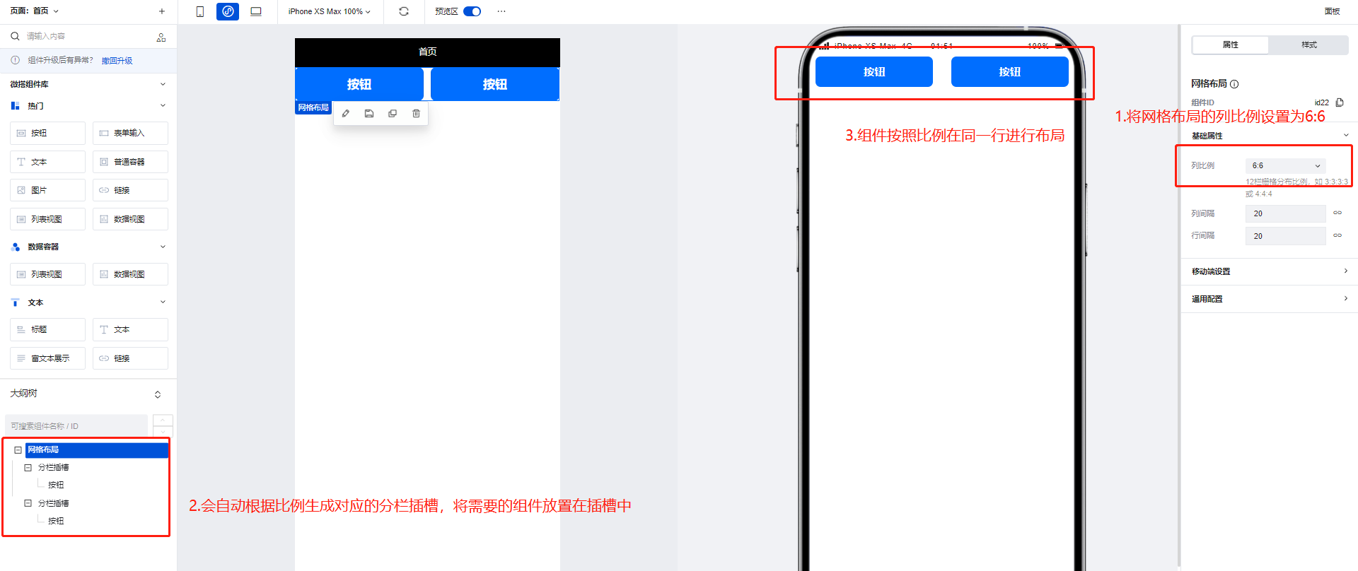
网格布局组件可以通过配置区生成对应比例的插槽,用于帮助更好的实现横向的排列效果。
|
|
12
|
+
|
|
13
|
+
|
|
14
|
+
|
|
15
|
+
|
|
16
|
+
## 属性介绍
|
|
17
|
+
|
|
18
|
+
import TableLayoutView from '../../common/tableView';
|
|
19
|
+
|
|
20
|
+
<TableLayoutView
|
|
21
|
+
componentKey="GridLayout"
|
|
22
|
+
type="attribute"
|
|
23
|
+
origin="lowCode"
|
|
24
|
+
></TableLayoutView>
|
|
25
|
+
|
|
26
|
+
## 事件介绍
|
|
27
|
+
|
|
28
|
+
<TableLayoutView
|
|
29
|
+
componentKey="GridLayout"
|
|
30
|
+
type="event"
|
|
31
|
+
origin="lowCode"
|
|
32
|
+
></TableLayoutView>
|
|
@@ -0,0 +1,31 @@
|
|
|
1
|
+
# 页头容器
|
|
2
|
+
|
|
3
|
+
<TableLayoutView
|
|
4
|
+
componentKey="Header"
|
|
5
|
+
type="description"
|
|
6
|
+
origin="lowCode"
|
|
7
|
+
></TableLayoutView>
|
|
8
|
+
|
|
9
|
+
## 使用说明
|
|
10
|
+
|
|
11
|
+
当组件放置在页头容器中时,组件位置便会固定展示在页面的顶部,常用于展示标题。
|
|
12
|
+
|
|
13
|
+
|
|
14
|
+
|
|
15
|
+
## 属性介绍
|
|
16
|
+
|
|
17
|
+
import TableLayoutView from '../../common/tableView';
|
|
18
|
+
|
|
19
|
+
<TableLayoutView
|
|
20
|
+
componentKey="Header"
|
|
21
|
+
type="attribute"
|
|
22
|
+
origin="lowCode"
|
|
23
|
+
></TableLayoutView>
|
|
24
|
+
|
|
25
|
+
## 事件介绍
|
|
26
|
+
|
|
27
|
+
<TableLayoutView
|
|
28
|
+
componentKey="Header"
|
|
29
|
+
type="event"
|
|
30
|
+
origin="lowCode"
|
|
31
|
+
></TableLayoutView>
|
|
@@ -0,0 +1,25 @@
|
|
|
1
|
+
# 垂直布局
|
|
2
|
+
|
|
3
|
+
<TableLayoutView
|
|
4
|
+
componentKey="Layout"
|
|
5
|
+
type="description"
|
|
6
|
+
origin="lowCode"
|
|
7
|
+
></TableLayoutView>
|
|
8
|
+
|
|
9
|
+
## 属性介绍
|
|
10
|
+
|
|
11
|
+
import TableLayoutView from '../../common/tableView';
|
|
12
|
+
|
|
13
|
+
<TableLayoutView
|
|
14
|
+
componentKey="Layout"
|
|
15
|
+
type="attribute"
|
|
16
|
+
origin="lowCode"
|
|
17
|
+
></TableLayoutView>
|
|
18
|
+
|
|
19
|
+
## 事件介绍
|
|
20
|
+
|
|
21
|
+
<TableLayoutView
|
|
22
|
+
componentKey="Layout"
|
|
23
|
+
type="event"
|
|
24
|
+
origin="lowCode"
|
|
25
|
+
></TableLayoutView>
|
|
@@ -0,0 +1,31 @@
|
|
|
1
|
+
# 分组列表容器
|
|
2
|
+
|
|
3
|
+
<TableLayoutView
|
|
4
|
+
componentKey="List"
|
|
5
|
+
type="description"
|
|
6
|
+
origin="lowCode"
|
|
7
|
+
></TableLayoutView>
|
|
8
|
+
|
|
9
|
+
## 使用说明
|
|
10
|
+
|
|
11
|
+
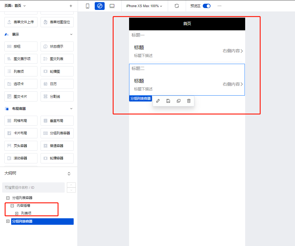
使用分组列表容器的自带插槽即可快速的实现列表的分组效果,常与**列表项**组件配合使用。
|
|
12
|
+
|
|
13
|
+
|
|
14
|
+
|
|
15
|
+
## 属性介绍
|
|
16
|
+
|
|
17
|
+
import TableLayoutView from '../../common/tableView';
|
|
18
|
+
|
|
19
|
+
<TableLayoutView
|
|
20
|
+
componentKey="List"
|
|
21
|
+
type="attribute"
|
|
22
|
+
origin="lowCode"
|
|
23
|
+
></TableLayoutView>
|
|
24
|
+
|
|
25
|
+
## 事件介绍
|
|
26
|
+
|
|
27
|
+
<TableLayoutView
|
|
28
|
+
componentKey="List"
|
|
29
|
+
type="event"
|
|
30
|
+
origin="lowCode"
|
|
31
|
+
></TableLayoutView>
|
|
@@ -0,0 +1,37 @@
|
|
|
1
|
+
# 滚动容器
|
|
2
|
+
|
|
3
|
+
<TableLayoutView
|
|
4
|
+
componentKey="ScrollView"
|
|
5
|
+
type="description"
|
|
6
|
+
origin="sourceCode"
|
|
7
|
+
></TableLayoutView>
|
|
8
|
+
|
|
9
|
+
## 使用说明
|
|
10
|
+
|
|
11
|
+
滚动容器可以实现页面或功能模块的滚动效果,当滚动容器内组件内容占用的总宽度/高度大于滚动容器本身的宽度/高度时,便会出现滚动条,通过滑动滚动条滑动来查看容器内的全部内容,示例如下:
|
|
12
|
+
|
|
13
|
+
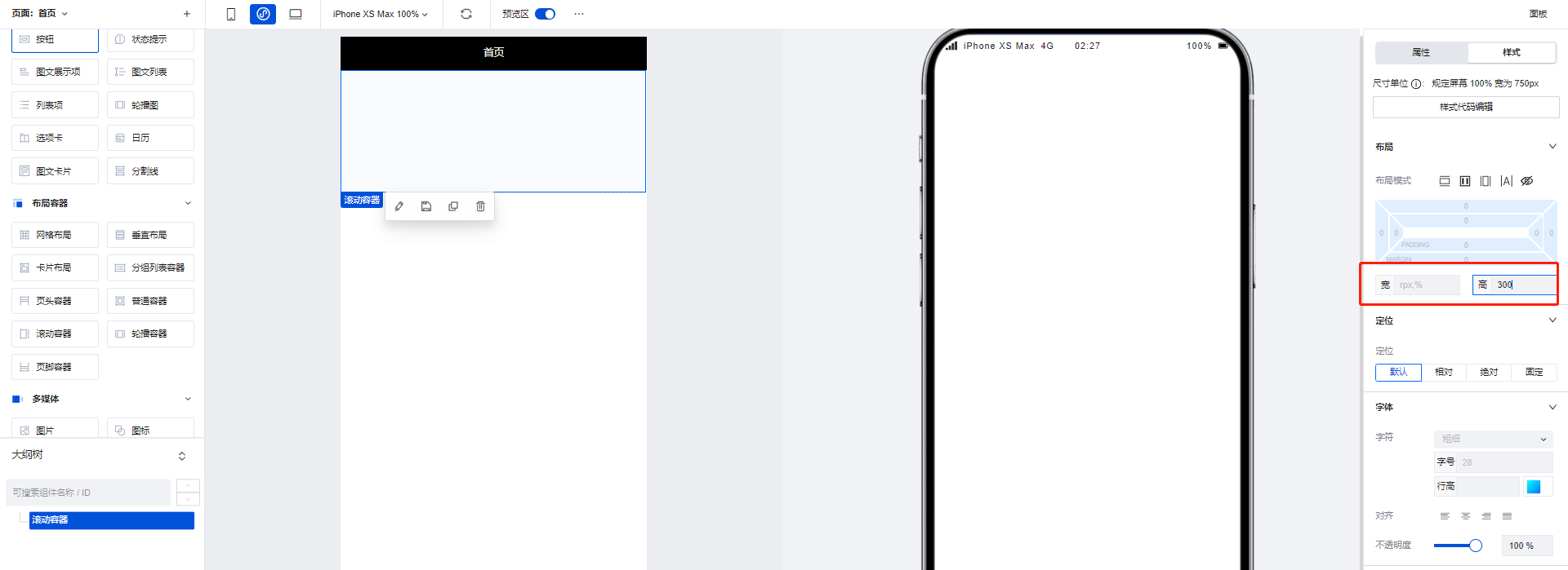
1. 拖入一个滚动容器组件,将高度设置为300
|
|
14
|
+
|
|
15
|
+
|
|
16
|
+
|
|
17
|
+
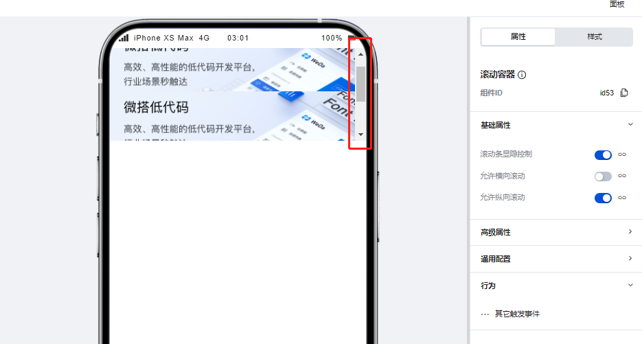
2. 在滚动容器中添加三个图片组件,每个图片组件的高度设为200,这样容器内的组件高度便大于了容器本身的高度,滚动条出现。
|
|
18
|
+
|
|
19
|
+
|
|
20
|
+
|
|
21
|
+
## 属性介绍
|
|
22
|
+
|
|
23
|
+
import TableLayoutView from '../../common/tableView';
|
|
24
|
+
|
|
25
|
+
<TableLayoutView
|
|
26
|
+
componentKey="ScrollView"
|
|
27
|
+
type="attribute"
|
|
28
|
+
origin="sourceCode"
|
|
29
|
+
></TableLayoutView>
|
|
30
|
+
|
|
31
|
+
## 事件介绍
|
|
32
|
+
|
|
33
|
+
<TableLayoutView
|
|
34
|
+
componentKey="ScrollView"
|
|
35
|
+
type="event"
|
|
36
|
+
origin="sourceCode"
|
|
37
|
+
></TableLayoutView>
|
|
@@ -0,0 +1,58 @@
|
|
|
1
|
+
# 轮播容器
|
|
2
|
+
|
|
3
|
+
<TableLayoutView
|
|
4
|
+
componentKey="Swiper"
|
|
5
|
+
type="description"
|
|
6
|
+
origin="sourceCode"
|
|
7
|
+
></TableLayoutView>
|
|
8
|
+
|
|
9
|
+
## 使用方法
|
|
10
|
+
|
|
11
|
+
### 通过数据源数据/变量控制对轮播图的展示内容进行控制
|
|
12
|
+
|
|
13
|
+
当存在需要使用数据进行轮播图内容管理的场景下,我们可以使用轮播容器组件实现,操作方式如下:
|
|
14
|
+
|
|
15
|
+
1. 在编辑区中添加一个轮播容器组件,并将图片组件添加轮播容器的子节点下
|
|
16
|
+
|
|
17
|
+
|
|
18
|
+
|
|
19
|
+
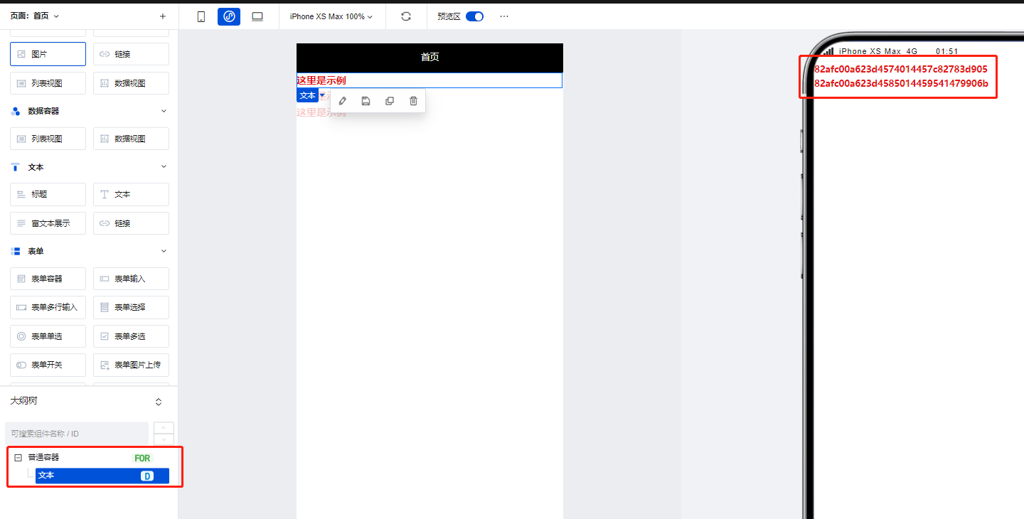
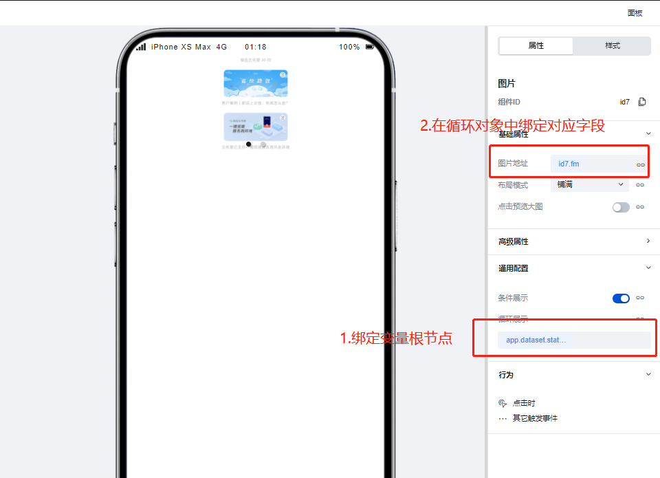
2. 为图片组件通过绑定循环功能,绑定用来控制轮播图内容的循环/普通变量,绑定完成后轮播图即可根据变量中的数据进行渲染
|
|
20
|
+
|
|
21
|
+
|
|
22
|
+
|
|
23
|
+
### 使用轮播容器实现高级的轮播场景
|
|
24
|
+
|
|
25
|
+
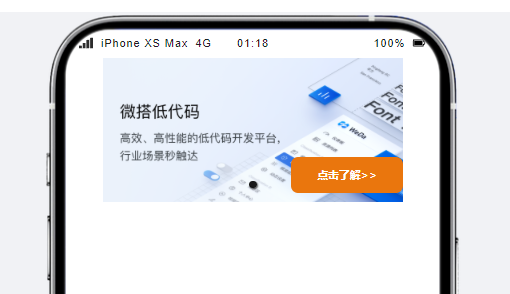
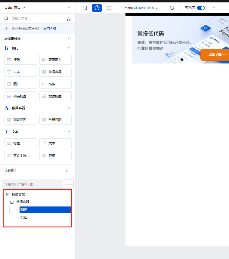
我们可以使用轮播容器实现更为复杂的轮播场景,如下图所示:
|
|
26
|
+
|
|
27
|
+
|
|
28
|
+
|
|
29
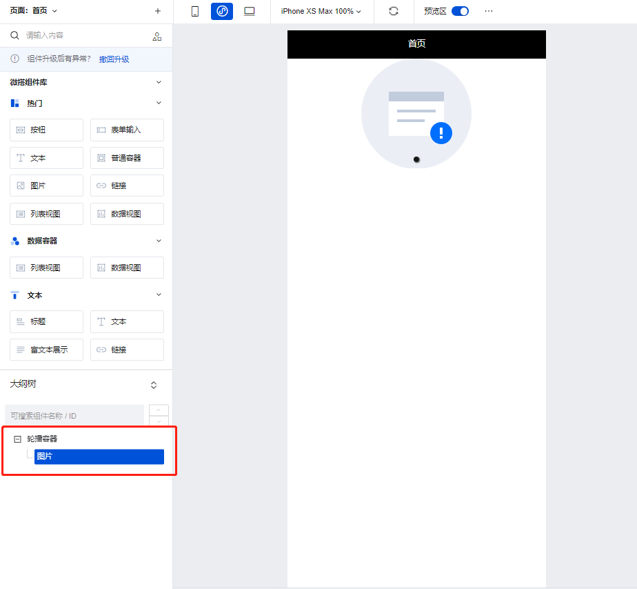
|
+
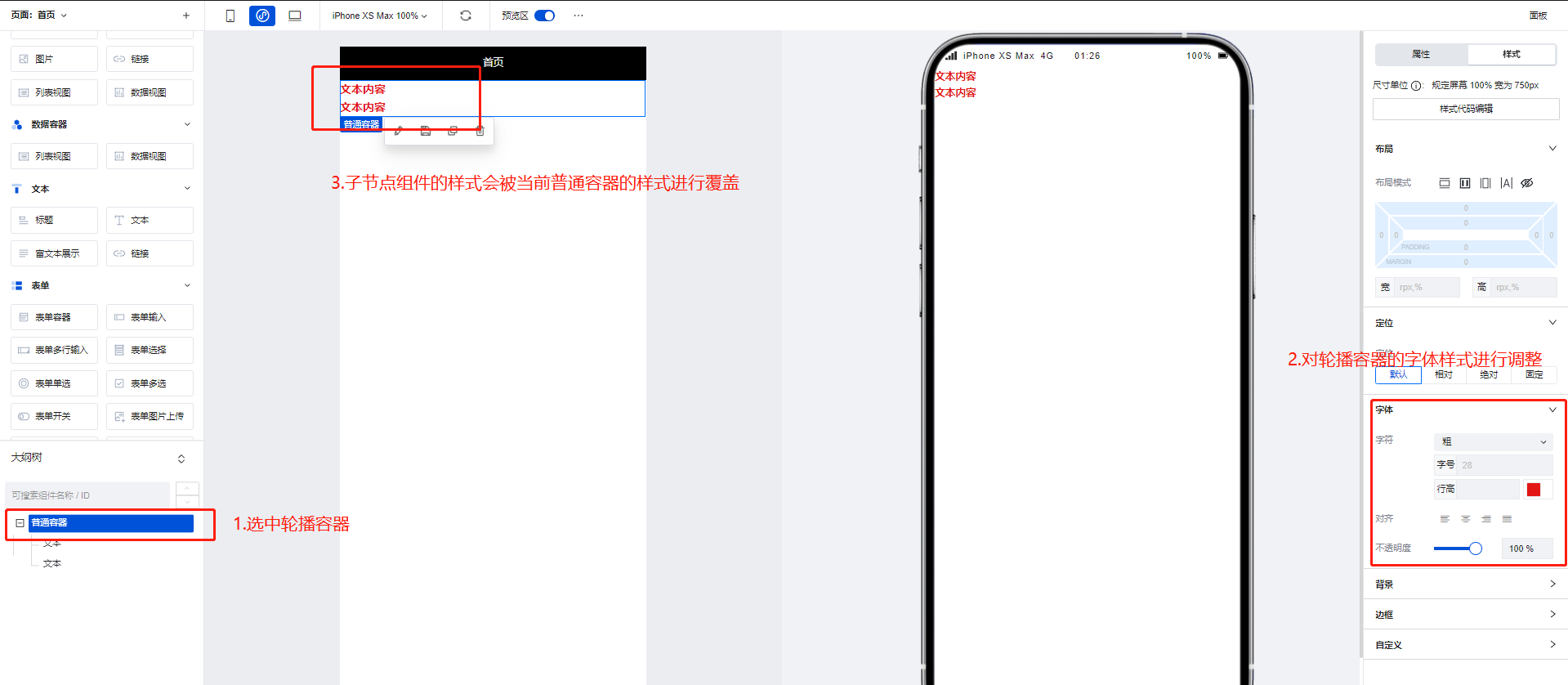
1. 为轮播容器的子节点下添加普通容器组件,并在普通容器组件的子节点下添加图片以及按钮组件
|
|
30
|
+
|
|
31
|
+
|
|
32
|
+
|
|
33
|
+
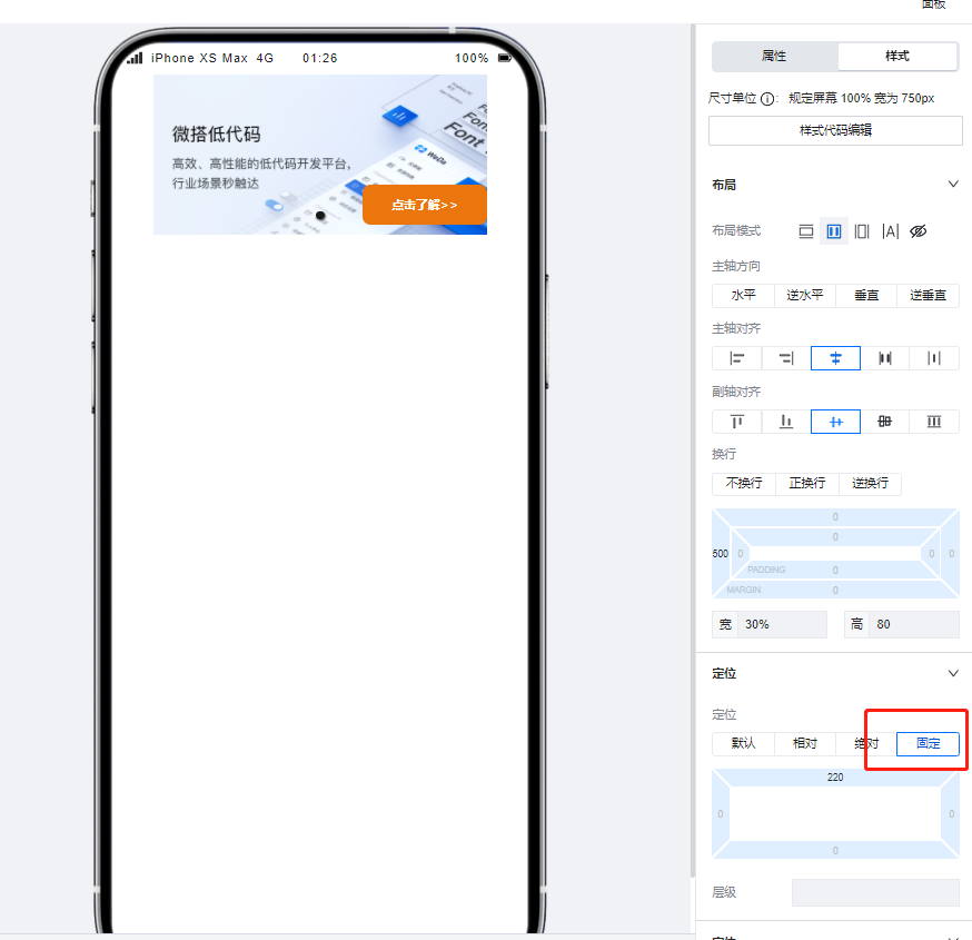
2. 设置按钮组件的定位模式为**固定**,并进行位置的调整后即可实现类似的复杂轮播场景。
|
|
34
|
+
|
|
35
|
+
|
|
36
|
+
|
|
37
|
+
|
|
38
|
+
## 属性介绍
|
|
39
|
+
|
|
40
|
+
import TableLayoutView from '../../common/tableView';
|
|
41
|
+
|
|
42
|
+
<TableLayoutView
|
|
43
|
+
componentKey="Swiper"
|
|
44
|
+
type="attribute"
|
|
45
|
+
origin="sourceCode"
|
|
46
|
+
></TableLayoutView>
|
|
47
|
+
|
|
48
|
+
## 事件介绍
|
|
49
|
+
|
|
50
|
+
<TableLayoutView
|
|
51
|
+
componentKey="Swiper"
|
|
52
|
+
type="event"
|
|
53
|
+
origin="sourceCode"
|
|
54
|
+
></TableLayoutView>
|
|
55
|
+
|
|
56
|
+
## 组件使用限制
|
|
57
|
+
|
|
58
|
+
需注意,由于小程序端样式限制问题,轮播容器中的图片高度不得设置为auto,否则将无法渲染。
|
|
@@ -0,0 +1 @@
|
|
|
1
|
+
{ "label": "布局容器", "position": 40 }
|
|
@@ -0,0 +1,31 @@
|
|
|
1
|
+
# 图标
|
|
2
|
+
|
|
3
|
+
<TableLayoutView
|
|
4
|
+
componentKey="Icon"
|
|
5
|
+
type="description"
|
|
6
|
+
origin="lowCode"
|
|
7
|
+
></TableLayoutView>
|
|
8
|
+
|
|
9
|
+
## 使用说明
|
|
10
|
+
|
|
11
|
+
可以通过在图标组件的配置区中选择微搭提供的内置icon实现图标的展示效果并调整图标颜色等参数,同时图标组件也支持用户对图标进行自定义的上传。
|
|
12
|
+
|
|
13
|
+
|
|
14
|
+
|
|
15
|
+
## 属性介绍
|
|
16
|
+
|
|
17
|
+
import TableLayoutView from '../../common/tableView';
|
|
18
|
+
|
|
19
|
+
<TableLayoutView
|
|
20
|
+
componentKey="Icon"
|
|
21
|
+
type="attribute"
|
|
22
|
+
origin="lowCode"
|
|
23
|
+
></TableLayoutView>
|
|
24
|
+
|
|
25
|
+
## 事件介绍
|
|
26
|
+
|
|
27
|
+
<TableLayoutView
|
|
28
|
+
componentKey="Icon"
|
|
29
|
+
type="event"
|
|
30
|
+
origin="lowCode"
|
|
31
|
+
></TableLayoutView>
|
|
@@ -0,0 +1,55 @@
|
|
|
1
|
+
# 图片
|
|
2
|
+
|
|
3
|
+
<TableLayoutView
|
|
4
|
+
componentKey="Image"
|
|
5
|
+
type="description"
|
|
6
|
+
origin="sourceCode"
|
|
7
|
+
></TableLayoutView>
|
|
8
|
+
|
|
9
|
+
## 使用说明
|
|
10
|
+
|
|
11
|
+
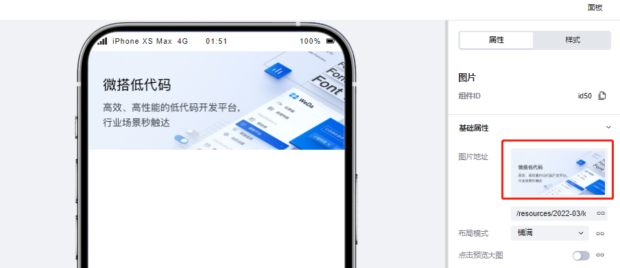
### 展示微搭素材中心图片
|
|
12
|
+
|
|
13
|
+
在图片组件的配置区中点击icon,即可调起微搭的素材中心,在素材中心上传或选择对应的图片素材后便可以在页面中进行图片的展示。
|
|
14
|
+
|
|
15
|
+
|
|
16
|
+
|
|
17
|
+
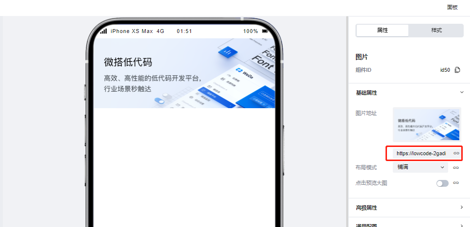
### 展示url图片
|
|
18
|
+
|
|
19
|
+
图片组件同样支持对图片url进行渲染展示,仅需在配置区中输入对应的图片url便可以完成图片的渲染。
|
|
20
|
+
|
|
21
|
+
|
|
22
|
+
|
|
23
|
+
### 绑定变量实现图片展示
|
|
24
|
+
|
|
25
|
+
当变量内容为图片url的时候,图片组件支持绑定变量并对其进行渲染,示例如下:
|
|
26
|
+
|
|
27
|
+
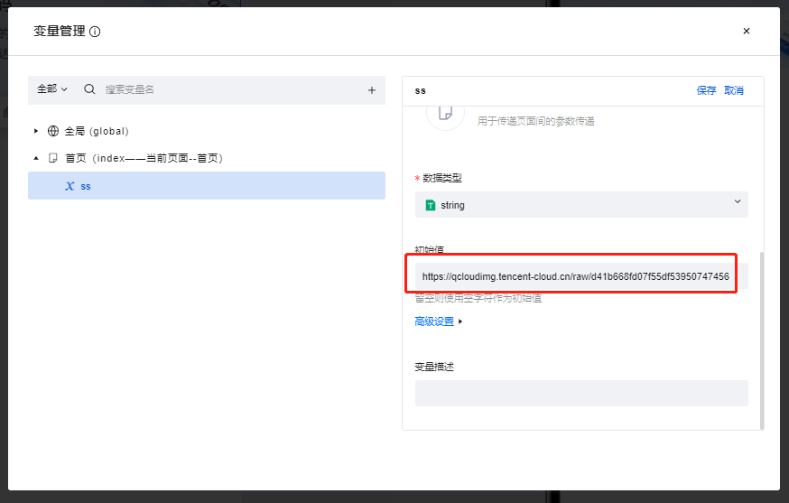
1. 创建一个普通变量,并将其初始值填写为图片的url
|
|
28
|
+
|
|
29
|
+
|
|
30
|
+
|
|
31
|
+
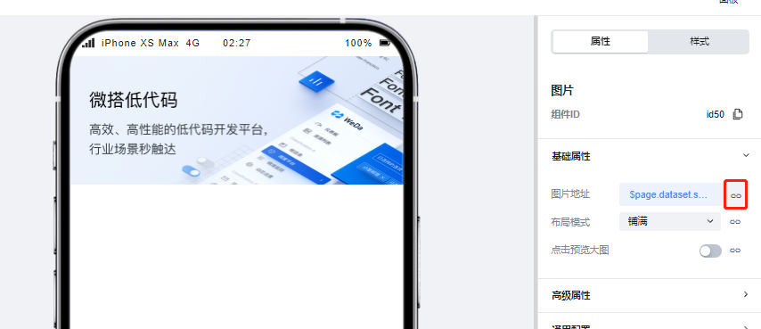
2. 点击图片组件配置区的绑定按钮,并绑定该变量,可以看到图片已经被正常渲染
|
|
32
|
+
|
|
33
|
+
|
|
34
|
+
|
|
35
|
+
## 属性介绍
|
|
36
|
+
|
|
37
|
+
import TableLayoutView from '../../common/tableView';
|
|
38
|
+
|
|
39
|
+
<TableLayoutView
|
|
40
|
+
componentKey="Image"
|
|
41
|
+
type="attribute"
|
|
42
|
+
origin="sourceCode"
|
|
43
|
+
></TableLayoutView>
|
|
44
|
+
|
|
45
|
+
## 事件介绍
|
|
46
|
+
|
|
47
|
+
<TableLayoutView
|
|
48
|
+
componentKey="Image"
|
|
49
|
+
type="event"
|
|
50
|
+
origin="sourceCode"
|
|
51
|
+
></TableLayoutView>
|
|
52
|
+
|
|
53
|
+
## 组件使用限制
|
|
54
|
+
|
|
55
|
+
需注意,由于小程序端样式限制问题,图片组件的高度不得设置为auto,否则将无法渲染。
|
|
@@ -0,0 +1 @@
|
|
|
1
|
+
{ "label": "多媒体", "position": 50 }
|
|
@@ -0,0 +1,20 @@
|
|
|
1
|
+
# 新增组件
|
|
2
|
+
|
|
3
|
+
## 适用场景
|
|
4
|
+
|
|
5
|
+
用于新增单条数据
|
|
6
|
+
|
|
7
|
+
## 使用说明
|
|
8
|
+
|
|
9
|
+
在创建模型应用、模型页面时,会自动在数据的新增页面生成该组件,并与数据的更新/查看/管理表格页面构建关联关系,实现对应的页面跳转逻辑
|
|
10
|
+
|
|
11
|
+
## 属性介绍
|
|
12
|
+
|
|
13
|
+
| 属性名 | 类型 | 属性分组 | 默认值 | 说明 |
|
|
14
|
+
| ---------- | -------- | -------- | ------ | ------------------ |
|
|
15
|
+
| 绑定数据源 | `object` | 基础属性 | - | 展示数据的数据来源 |
|
|
16
|
+
| 按钮 | `array` | 按钮配置 | - | 设置组件中的按钮 |
|
|
17
|
+
|
|
18
|
+
## 事件介绍
|
|
19
|
+
|
|
20
|
+
无
|
|
@@ -0,0 +1,20 @@
|
|
|
1
|
+
# 详情组件
|
|
2
|
+
|
|
3
|
+
## 适用场景
|
|
4
|
+
|
|
5
|
+
用于查看数据详情
|
|
6
|
+
|
|
7
|
+
## 使用说明
|
|
8
|
+
|
|
9
|
+
在创建模型应用、模型页面时,会自动在数据的查看页面生成该组件,并与数据的新增/更新/管理表格页面构建关联关系,实现对应的页面跳转逻辑
|
|
10
|
+
|
|
11
|
+
## 属性介绍
|
|
12
|
+
|
|
13
|
+
| 属性名 | 类型 | 属性分组 | 默认值 | 说明 |
|
|
14
|
+
| ---------- | -------- | -------- | ------ | ------------------ |
|
|
15
|
+
| 绑定数据源 | `object` | 基础属性 | - | 展示数据的数据来源 |
|
|
16
|
+
| 按钮 | `array` | 按钮配置 | - | 设置组件中的按钮 |
|
|
17
|
+
|
|
18
|
+
## 事件介绍
|
|
19
|
+
|
|
20
|
+
无
|
|
@@ -0,0 +1,24 @@
|
|
|
1
|
+
# 表格组件
|
|
2
|
+
|
|
3
|
+
## 适用场景
|
|
4
|
+
|
|
5
|
+
用于以表格形式展示列表数据
|
|
6
|
+
|
|
7
|
+
## 使用说明
|
|
8
|
+
|
|
9
|
+
在创建模型应用、模型页面时,会自动在数据的管理表格页面生成该组件,并与数据的新增/更新/查看页面构建关联关系,实现对应的页面跳转逻辑
|
|
10
|
+
|
|
11
|
+
|
|
12
|
+
## 属性介绍
|
|
13
|
+
|
|
14
|
+
| 属性名 | 类型 | 属性分组 | 默认值 | 说明 |
|
|
15
|
+
| ---------- | -------- | -------------- | ----------- | ------------------ |
|
|
16
|
+
| 绑定数据源 | `object` | 基础属性 | - | 展示数据的数据来源 |
|
|
17
|
+
| 搜索方式 | - | 基础属性 | "searchbox" | |
|
|
18
|
+
| 筛选字段 | - | 基础属性 | - | |
|
|
19
|
+
| 按钮 | `array` | 顶部按钮配置 | - | 设置组件中的按钮 |
|
|
20
|
+
| 按钮 | `array` | 操作列按钮配置 | - | 设置组件中的按钮 |
|
|
21
|
+
|
|
22
|
+
## 事件介绍
|
|
23
|
+
|
|
24
|
+
无
|
|
@@ -0,0 +1,21 @@
|
|
|
1
|
+
# 更新组件
|
|
2
|
+
|
|
3
|
+
## 适用场景
|
|
4
|
+
|
|
5
|
+
用于更新现有单条数据
|
|
6
|
+
|
|
7
|
+
## 使用说明
|
|
8
|
+
|
|
9
|
+
在创建模型应用、模型页面时,会自动在数据的更新页面生成该组件,并与数据的新增/查看/管理表格页面构建关联关系,实现对应的页面跳转逻辑
|
|
10
|
+
|
|
11
|
+
|
|
12
|
+
## 属性介绍
|
|
13
|
+
|
|
14
|
+
| 属性名 | 类型 | 属性分组 | 默认值 | 说明 |
|
|
15
|
+
| ---------- | -------- | -------- | ------ | ------------------ |
|
|
16
|
+
| 绑定数据源 | `object` | 基础属性 | - | 展示数据的数据来源 |
|
|
17
|
+
| 按钮 | `array` | 按钮配置 | - | 设置组件中的按钮 |
|
|
18
|
+
|
|
19
|
+
## 事件介绍
|
|
20
|
+
|
|
21
|
+
无
|
|
@@ -0,0 +1,21 @@
|
|
|
1
|
+
# 布局组件
|
|
2
|
+
|
|
3
|
+
## 适用场景
|
|
4
|
+
|
|
5
|
+
用于构建带有顶部导航的页面布局
|
|
6
|
+
|
|
7
|
+
## 使用说明
|
|
8
|
+
|
|
9
|
+
组件顶部区域标题可自定义,中间内容插槽区域中可放入其他组件用于构建页面内容
|
|
10
|
+
|
|
11
|
+
|
|
12
|
+
|
|
13
|
+
## 属性介绍
|
|
14
|
+
|
|
15
|
+
| 属性名 | 类型 | 属性分组 | 默认值 | 说明 |
|
|
16
|
+
| -------- | -------- | -------- | -------- | ---------------------- |
|
|
17
|
+
| 页面标题 | `string` | 基础属性 | 页面标题 | 组件顶部显示的标题内容 |
|
|
18
|
+
|
|
19
|
+
## 事件介绍
|
|
20
|
+
|
|
21
|
+
无
|
|
@@ -0,0 +1 @@
|
|
|
1
|
+
{ "label": "模型组件", "position": 75 }
|
|
@@ -0,0 +1,38 @@
|
|
|
1
|
+
# 侧边导航面板
|
|
2
|
+
|
|
3
|
+
<TableLayoutView
|
|
4
|
+
componentKey="Classification"
|
|
5
|
+
type="description"
|
|
6
|
+
origin="lowCode"
|
|
7
|
+
></TableLayoutView>
|
|
8
|
+
|
|
9
|
+
## 使用说明
|
|
10
|
+
|
|
11
|
+
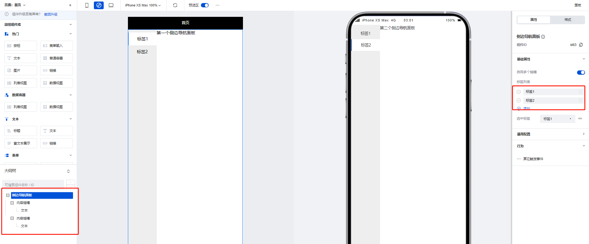
使用侧边导航面板组件可以实现页面的左侧Tab切换效果,当在组件配置区点击新增标签时,在大纲树中会生成对应的**内容插槽**,我们可以通过在内容插槽中放置对应组件实现不同Tab的的内容构建,以下文为例:
|
|
12
|
+
|
|
13
|
+
1. 在侧边导航面板组件的两个内容插槽中分别添加两个文本组件,并为两个文本组件设置不同的内容
|
|
14
|
+
|
|
15
|
+
|
|
16
|
+
|
|
17
|
+
2. 可以看到,当进行Tab切换时,不同的Tab便呈现出了不同的文本组件内容
|
|
18
|
+
|
|
19
|
+
|
|
20
|
+
|
|
21
|
+
|
|
22
|
+
## 属性介绍
|
|
23
|
+
|
|
24
|
+
import TableLayoutView from '../../common/tableView';
|
|
25
|
+
|
|
26
|
+
<TableLayoutView
|
|
27
|
+
componentKey="Classification"
|
|
28
|
+
type="attribute"
|
|
29
|
+
origin="lowCode"
|
|
30
|
+
></TableLayoutView>
|
|
31
|
+
|
|
32
|
+
## 事件介绍
|
|
33
|
+
|
|
34
|
+
<TableLayoutView
|
|
35
|
+
componentKey="Classification"
|
|
36
|
+
type="event"
|
|
37
|
+
origin="lowCode"
|
|
38
|
+
></TableLayoutView>
|
|
@@ -0,0 +1,43 @@
|
|
|
1
|
+
# 顶部导航
|
|
2
|
+
|
|
3
|
+
<TableLayoutView
|
|
4
|
+
componentKey="NavBar"
|
|
5
|
+
type="description"
|
|
6
|
+
origin="lowCode"
|
|
7
|
+
></TableLayoutView>
|
|
8
|
+
|
|
9
|
+
## 使用说明
|
|
10
|
+
|
|
11
|
+
通过配置区进行简单的配置即可快速实现页面的顶部导航效果,同时该组件提供了返回上级页面与返回主页的功能,当在组件区开启对应配置时该组件便会渲染出对应的按钮,点击后即可实现对应的页面跳转。
|
|
12
|
+
|
|
13
|
+
|
|
14
|
+
|
|
15
|
+
## 属性介绍
|
|
16
|
+
|
|
17
|
+
import TableLayoutView from '../../common/tableView';
|
|
18
|
+
|
|
19
|
+
<TableLayoutView
|
|
20
|
+
componentKey="NavBar"
|
|
21
|
+
type="attribute"
|
|
22
|
+
origin="lowCode"
|
|
23
|
+
></TableLayoutView>
|
|
24
|
+
|
|
25
|
+
## 事件介绍
|
|
26
|
+
|
|
27
|
+
<TableLayoutView
|
|
28
|
+
componentKey="NavBar"
|
|
29
|
+
type="event"
|
|
30
|
+
origin="lowCode"
|
|
31
|
+
></TableLayoutView>
|
|
32
|
+
|
|
33
|
+
## 限制说明
|
|
34
|
+
|
|
35
|
+
1. 小程序使用时,需在页面设置-页面样式-小程序导航中奖导航栏样式切换为「自定义样式」,否则小程序页面上方会显示出2个导航栏,同时导航栏中间会留有不可消除的空白间距
|
|
36
|
+
|
|
37
|
+
<img src="https://qcloudimg.tencent-cloud.cn/raw/4a22f88657f801a794fdbba6f9e515bc.png" width="50%" />
|
|
38
|
+
|
|
39
|
+
<img src="https://qcloudimg.tencent-cloud.cn/raw/2d6075e2a9941a9cb8964c925253422d.png" width="35%"/>
|
|
40
|
+
|
|
41
|
+
2. 如需在小程序顶部额外附加一个样式合理的导航栏,或者小程序/H5想实现更灵活的导航样式,推荐使用「页头容器」组件来进行导航栏的自定义
|
|
42
|
+
|
|
43
|
+
<img src="https://qcloudimg.tencent-cloud.cn/raw/fac09e42ed3a833d5ee364c78d01fc44.png" width="50%"/>
|
|
@@ -0,0 +1,30 @@
|
|
|
1
|
+
# 宫格导航
|
|
2
|
+
|
|
3
|
+
<TableLayoutView
|
|
4
|
+
componentKey="NavLayout"
|
|
5
|
+
type="description"
|
|
6
|
+
origin="sourceCode"
|
|
7
|
+
></TableLayoutView>
|
|
8
|
+
|
|
9
|
+
## 使用说明
|
|
10
|
+
|
|
11
|
+
支持灵活定义各个导航项目的图标文字内容、跳转交互、PC/移动多端列数和各项细致完备的样式属性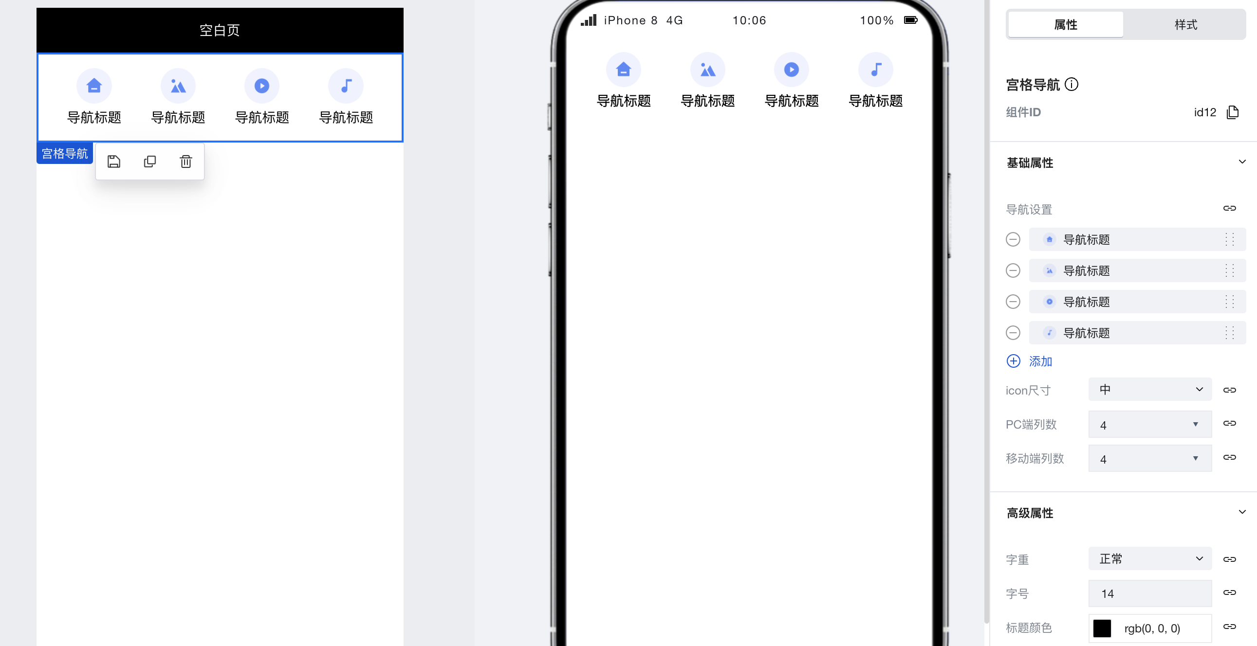
|
|
12
|
+
|
|
13
|
+
|
|
14
|
+
## 属性介绍
|
|
15
|
+
|
|
16
|
+
import TableLayoutView from '../../common/tableView';
|
|
17
|
+
|
|
18
|
+
<TableLayoutView
|
|
19
|
+
componentKey="NavLayout"
|
|
20
|
+
type="attribute"
|
|
21
|
+
origin="sourceCode"
|
|
22
|
+
></TableLayoutView>
|
|
23
|
+
|
|
24
|
+
## 事件介绍
|
|
25
|
+
|
|
26
|
+
<TableLayoutView
|
|
27
|
+
componentKey="NavLayout"
|
|
28
|
+
type="event"
|
|
29
|
+
origin="sourceCode"
|
|
30
|
+
></TableLayoutView>
|
|
@@ -0,0 +1,43 @@
|
|
|
1
|
+
# Tab 栏
|
|
2
|
+
|
|
3
|
+
<TableLayoutView
|
|
4
|
+
componentKey="TabBar"
|
|
5
|
+
type="description"
|
|
6
|
+
origin="lowCode"
|
|
7
|
+
></TableLayoutView>
|
|
8
|
+
|
|
9
|
+
## 使用说明
|
|
10
|
+
|
|
11
|
+
通过组件配置区即可快速实现Tab栏的实现,Tab栏除了基础的标题、图标配置外也可以通过配置区快速的实现页面跳转逻辑。
|
|
12
|
+
|
|
13
|
+
### 设置选中页面
|
|
14
|
+
|
|
15
|
+
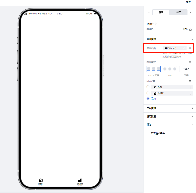
1. 首先在配置区中进行选中页面的设置,以首页为例
|
|
16
|
+
|
|
17
|
+
|
|
18
|
+
|
|
19
|
+
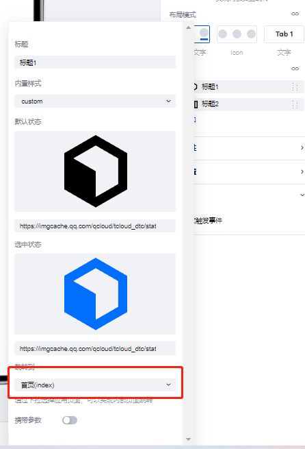
2. 随后为第一个Tab进行跳转页面-首页的相关配置
|
|
20
|
+
|
|
21
|
+
|
|
22
|
+
|
|
23
|
+
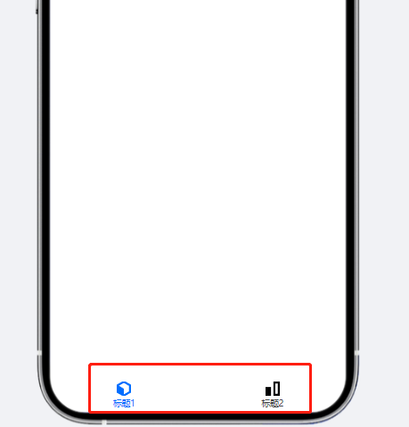
3. 可以看到,因为Tab的跳转页面与步骤1中设置的选中页面相同,该Tab的标题与图标便会变为激活状态。
|
|
24
|
+
|
|
25
|
+
|
|
26
|
+
|
|
27
|
+
## 属性介绍
|
|
28
|
+
|
|
29
|
+
import TableLayoutView from '../../common/tableView';
|
|
30
|
+
|
|
31
|
+
<TableLayoutView
|
|
32
|
+
componentKey="TabBar"
|
|
33
|
+
type="attribute"
|
|
34
|
+
origin="lowCode"
|
|
35
|
+
></TableLayoutView>
|
|
36
|
+
|
|
37
|
+
## 事件介绍
|
|
38
|
+
|
|
39
|
+
<TableLayoutView
|
|
40
|
+
componentKey="TabBar"
|
|
41
|
+
type="event"
|
|
42
|
+
origin="lowCode"
|
|
43
|
+
></TableLayoutView>
|