@choc-ui/chakra-autocomplete 5.8.0 → 6.0.0
This diff represents the content of publicly available package versions that have been released to one of the supported registries. The information contained in this diff is provided for informational purposes only and reflects changes between package versions as they appear in their respective public registries.
- package/README.md +187 -132
- package/dist/autocomplete-group.d.ts +2 -3
- package/dist/autocomplete-group.d.ts.map +1 -1
- package/dist/autocomplete-input.d.ts +1 -2
- package/dist/autocomplete-input.d.ts.map +1 -1
- package/dist/autocomplete-item.d.ts +1 -1
- package/dist/autocomplete-item.d.ts.map +1 -1
- package/dist/autocomplete-list.d.ts +3 -3
- package/dist/autocomplete-list.d.ts.map +1 -1
- package/dist/autocomplete-tag.d.ts +1 -1
- package/dist/autocomplete-tag.d.ts.map +1 -1
- package/dist/autocomplete.d.ts +1 -1
- package/dist/autocomplete.d.ts.map +1 -1
- package/dist/components/ui/close-button.d.ts +5 -0
- package/dist/components/ui/close-button.d.ts.map +1 -0
- package/dist/components/ui/input-group.d.ts +13 -0
- package/dist/components/ui/input-group.d.ts.map +1 -0
- package/dist/components/ui/popover.d.ts +18 -0
- package/dist/components/ui/popover.d.ts.map +1 -0
- package/dist/components/ui/tag.d.ts +10 -0
- package/dist/components/ui/tag.d.ts.map +1 -0
- package/dist/index.es.js +649 -495
- package/dist/index.js +1 -1
- package/dist/types.d.ts +2 -2
- package/dist/types.d.ts.map +1 -1
- package/dist/use-autocomplete.d.ts.map +1 -1
- package/dist/utils.d.ts +4 -0
- package/dist/utils.d.ts.map +1 -1
- package/package.json +7 -9
package/README.md
CHANGED
|
@@ -36,6 +36,18 @@
|
|
|
36
36
|
</sup>
|
|
37
37
|
</div>
|
|
38
38
|
|
|
39
|
+
## Chakra V3 and V2 Support
|
|
40
|
+
|
|
41
|
+
AutoComplete Version 6+ supports [Chakra UI V3](https://www.chakra-ui.com/). If you are using [Chakra UI V2](https://v2.chakra-ui.com/), please continue to use the current choc-autocomplete v5.X. We will continue to try and support Chakra V2 but will eventually be removed once V3 becomes more widely adopted.
|
|
42
|
+
|
|
43
|
+
For help migrating from Chakra UI V2 to V3, please see their [migration guide](https://chakra-ui.com/docs/get-started/migration)
|
|
44
|
+
|
|
45
|
+
The public API of the AutoComplete components have not changed with this migration.
|
|
46
|
+
|
|
47
|
+
## Known issues with Chakra V3
|
|
48
|
+
|
|
49
|
+
There is only 1 known display issue with Chakra V3. When using the `multiple` prop, it is no longer possible to replicate the same styling to the `Box` wrapper as what the underlying `Input` is using. We are still looking into ways to resolve this, but neither the Chakra nor next-themes teams have published guidance on this yet.
|
|
50
|
+
|
|
39
51
|
## Install
|
|
40
52
|
|
|
41
53
|
```bash
|
|
@@ -59,8 +71,7 @@ yarn add @choc-ui/chakra-autocomplete
|
|
|
59
71
|
### Basic Usage
|
|
60
72
|
|
|
61
73
|
```js
|
|
62
|
-
import { Flex,
|
|
63
|
-
import * as React from "react";
|
|
74
|
+
import { Flex, Field } from "@chakra-ui/react";
|
|
64
75
|
import {
|
|
65
76
|
AutoComplete,
|
|
66
77
|
AutoCompleteInput,
|
|
@@ -79,10 +90,10 @@ function App() {
|
|
|
79
90
|
|
|
80
91
|
return (
|
|
81
92
|
<Flex pt="48" justify="center" align="center" w="full">
|
|
82
|
-
<
|
|
83
|
-
<
|
|
93
|
+
<Field.Root w="60">
|
|
94
|
+
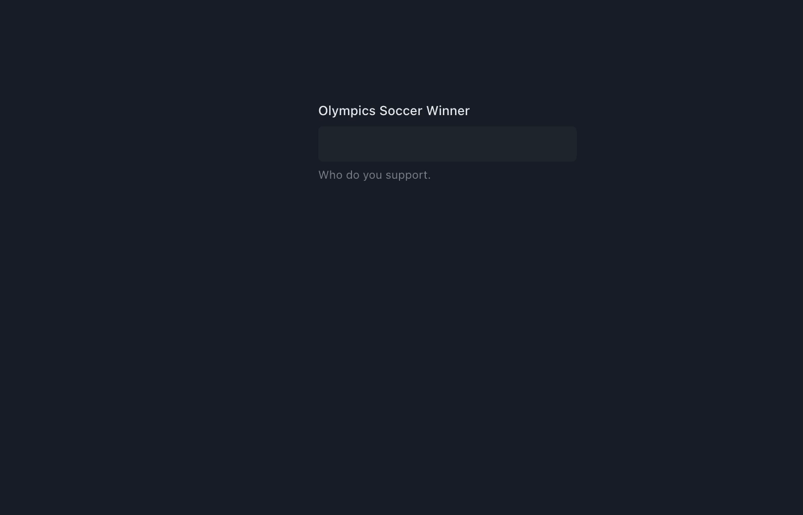
<Field.Label>Olympics Soccer Winner</Field.Label>
|
|
84
95
|
<AutoComplete openOnFocus>
|
|
85
|
-
<AutoCompleteInput variant="
|
|
96
|
+
<AutoCompleteInput variant="subtle" />
|
|
86
97
|
<AutoCompleteList>
|
|
87
98
|
{countries.map((country, cid) => (
|
|
88
99
|
<AutoCompleteItem
|
|
@@ -95,8 +106,8 @@ function App() {
|
|
|
95
106
|
))}
|
|
96
107
|
</AutoCompleteList>
|
|
97
108
|
</AutoComplete>
|
|
98
|
-
<
|
|
99
|
-
</
|
|
109
|
+
<Field.HelperText>Who do you support.</Field.HelperText>
|
|
110
|
+
</Field.Root>
|
|
100
111
|
</Flex>
|
|
101
112
|
);
|
|
102
113
|
}
|
|
@@ -111,8 +122,7 @@ export default App;
|
|
|
111
122
|
You can create groups with the `AutoCompleteGroup` Component, and add a title with the `AutoCompleteGroupTitle` component.
|
|
112
123
|
|
|
113
124
|
```js
|
|
114
|
-
import
|
|
115
|
-
import * as React from "react";
|
|
125
|
+
import React from "react";
|
|
116
126
|
import {
|
|
117
127
|
AutoComplete,
|
|
118
128
|
AutoCompleteGroup,
|
|
@@ -121,46 +131,41 @@ import {
|
|
|
121
131
|
AutoCompleteItem,
|
|
122
132
|
AutoCompleteList,
|
|
123
133
|
} from "@choc-ui/chakra-autocomplete";
|
|
134
|
+
import { Stack, Text } from "@chakra-ui/react";
|
|
124
135
|
|
|
125
|
-
function App() {
|
|
136
|
+
export default function App() {
|
|
126
137
|
const continents = {
|
|
127
138
|
africa: ["nigeria", "south africa"],
|
|
128
139
|
asia: ["japan", "south korea"],
|
|
129
140
|
europe: ["united kingdom", "russia"],
|
|
130
141
|
};
|
|
131
|
-
|
|
132
142
|
return (
|
|
133
|
-
<
|
|
134
|
-
<
|
|
135
|
-
|
|
136
|
-
<
|
|
137
|
-
|
|
138
|
-
|
|
139
|
-
{
|
|
140
|
-
<
|
|
141
|
-
|
|
142
|
-
|
|
143
|
-
|
|
144
|
-
|
|
145
|
-
|
|
146
|
-
|
|
147
|
-
|
|
148
|
-
|
|
149
|
-
|
|
150
|
-
|
|
151
|
-
|
|
152
|
-
|
|
153
|
-
|
|
154
|
-
|
|
155
|
-
|
|
156
|
-
|
|
157
|
-
<FormHelperText>Who do you support.</FormHelperText>
|
|
158
|
-
</FormControl>
|
|
159
|
-
</Flex>
|
|
143
|
+
<Stack direction="column">
|
|
144
|
+
<Text>Group </Text>
|
|
145
|
+
<AutoComplete openOnFocus>
|
|
146
|
+
<AutoCompleteInput placeholder="Search..." variant="subtle" />
|
|
147
|
+
<AutoCompleteList>
|
|
148
|
+
{Object.entries(continents).map(([continent, countries], co_id) => (
|
|
149
|
+
<AutoCompleteGroup key={co_id} showDivider>
|
|
150
|
+
<AutoCompleteGroupTitle textTransform="capitalize">
|
|
151
|
+
{continent}
|
|
152
|
+
</AutoCompleteGroupTitle>
|
|
153
|
+
{countries.map((country, c_id) => (
|
|
154
|
+
<AutoCompleteItem
|
|
155
|
+
key={c_id}
|
|
156
|
+
value={country}
|
|
157
|
+
textTransform="capitalize"
|
|
158
|
+
>
|
|
159
|
+
{country}
|
|
160
|
+
</AutoCompleteItem>
|
|
161
|
+
))}
|
|
162
|
+
</AutoCompleteGroup>
|
|
163
|
+
))}
|
|
164
|
+
</AutoCompleteList>
|
|
165
|
+
</AutoComplete>
|
|
166
|
+
</Stack>
|
|
160
167
|
);
|
|
161
168
|
}
|
|
162
|
-
|
|
163
|
-
export default App;
|
|
164
169
|
```
|
|
165
170
|
|
|
166
171
|
<img width="661" alt="CleanShot 2021-07-29 at 01 18 47@2x" src="https://user-images.githubusercontent.com/30869823/127412483-89639ae2-34a7-4f59-9da0-287cd83cd035.png">
|
|
@@ -172,12 +177,8 @@ To access the internal state of the `AutoComplete`, use a function as children (
|
|
|
172
177
|
```js
|
|
173
178
|
import {
|
|
174
179
|
Flex,
|
|
175
|
-
|
|
176
|
-
|
|
177
|
-
FormLabel,
|
|
178
|
-
Icon,
|
|
179
|
-
InputGroup,
|
|
180
|
-
InputRightElement,
|
|
180
|
+
Field,
|
|
181
|
+
Icon
|
|
181
182
|
} from "@chakra-ui/react";
|
|
182
183
|
import * as React from "react";
|
|
183
184
|
import {
|
|
@@ -187,6 +188,7 @@ import {
|
|
|
187
188
|
AutoCompleteList,
|
|
188
189
|
} from "@choc-ui/chakra-autocomplete";
|
|
189
190
|
import { FiChevronRight, FiChevronDown } from "react-icons/fi";
|
|
191
|
+
import { InputGroup } from "./components/ui/input-group";
|
|
190
192
|
|
|
191
193
|
function App() {
|
|
192
194
|
const countries = [
|
|
@@ -199,18 +201,15 @@ function App() {
|
|
|
199
201
|
|
|
200
202
|
return (
|
|
201
203
|
<Flex pt="48" justify="center" align="center" w="full">
|
|
202
|
-
<
|
|
203
|
-
<
|
|
204
|
+
<Field.Root w="60">
|
|
205
|
+
<Field.Label>Olympics Soccer Winner</Field.Label>
|
|
204
206
|
<AutoComplete openOnFocus>
|
|
205
207
|
{({ isOpen }) => (
|
|
206
208
|
<>
|
|
207
|
-
<InputGroup
|
|
208
|
-
<
|
|
209
|
-
|
|
210
|
-
|
|
211
|
-
<Icon as={isOpen ? FiChevronRight : FiChevronDown} />
|
|
212
|
-
}
|
|
213
|
-
/>
|
|
209
|
+
<InputGroup
|
|
210
|
+
endElement={<Icon>{isOpen ? <FiChevronRight /> : <FiChevronDown />}</Icon>}
|
|
211
|
+
>
|
|
212
|
+
<AutoCompleteInput variant="subtle" placeholder="Search..." />
|
|
214
213
|
</InputGroup>
|
|
215
214
|
<AutoCompleteList>
|
|
216
215
|
{countries.map((country, cid) => (
|
|
@@ -226,8 +225,8 @@ function App() {
|
|
|
226
225
|
</>
|
|
227
226
|
)}
|
|
228
227
|
</AutoComplete>
|
|
229
|
-
<
|
|
230
|
-
</
|
|
228
|
+
<Field.HelperText>Who do you support.</Field.HelperText>
|
|
229
|
+
</Field.Root>
|
|
231
230
|
</Flex>
|
|
232
231
|
);
|
|
233
232
|
}
|
|
@@ -242,41 +241,37 @@ export default App;
|
|
|
242
241
|
You can Render whatever you want. The `AutoComplete` Items are regular `Chakra` Boxes.
|
|
243
242
|
|
|
244
243
|
```js
|
|
245
|
-
import
|
|
246
|
-
Avatar,
|
|
247
|
-
Flex,
|
|
248
|
-
FormControl,
|
|
249
|
-
FormHelperText,
|
|
250
|
-
FormLabel,
|
|
251
|
-
Text,
|
|
252
|
-
} from "@chakra-ui/react";
|
|
253
|
-
import * as React from "react";
|
|
244
|
+
import React from "react";
|
|
254
245
|
import {
|
|
255
246
|
AutoComplete,
|
|
247
|
+
AutoCompleteGroup,
|
|
256
248
|
AutoCompleteInput,
|
|
257
249
|
AutoCompleteItem,
|
|
258
250
|
AutoCompleteList,
|
|
259
251
|
} from "@choc-ui/chakra-autocomplete";
|
|
252
|
+
import { Stack, Text } from "@chakra-ui/react";
|
|
253
|
+
import { Avatar } from "./components/ui/avatar";
|
|
260
254
|
|
|
261
|
-
function App() {
|
|
262
|
-
const
|
|
255
|
+
export default function App() {
|
|
256
|
+
const europeans = [
|
|
263
257
|
{ name: "Dan Abramov", image: "https://bit.ly/dan-abramov" },
|
|
264
258
|
{ name: "Kent Dodds", image: "https://bit.ly/kent-c-dodds" },
|
|
259
|
+
{ name: "Ryan Florence", image: "https://bit.ly/ryan-florence" },
|
|
260
|
+
];
|
|
261
|
+
const nigerians = [
|
|
265
262
|
{ name: "Segun Adebayo", image: "https://bit.ly/sage-adebayo" },
|
|
266
263
|
{ name: "Prosper Otemuyiwa", image: "https://bit.ly/prosper-baba" },
|
|
267
|
-
{ name: "Ryan Florence", image: "https://bit.ly/ryan-florence" },
|
|
268
264
|
];
|
|
269
|
-
|
|
270
265
|
return (
|
|
271
|
-
<
|
|
272
|
-
<
|
|
273
|
-
|
|
274
|
-
<
|
|
275
|
-
|
|
276
|
-
<
|
|
277
|
-
{
|
|
266
|
+
<Stack direction="column">
|
|
267
|
+
<Text>Custom Render </Text>
|
|
268
|
+
<AutoComplete rollNavigation>
|
|
269
|
+
<AutoCompleteInput variant="subtle" placeholder="Search..." />
|
|
270
|
+
<AutoCompleteList>
|
|
271
|
+
<AutoCompleteGroup title="Nigerians" showDivider>
|
|
272
|
+
{nigerians.map((person, oid) => (
|
|
278
273
|
<AutoCompleteItem
|
|
279
|
-
key={`
|
|
274
|
+
key={`nigeria-${oid}`}
|
|
280
275
|
value={person.name}
|
|
281
276
|
textTransform="capitalize"
|
|
282
277
|
align="center"
|
|
@@ -285,15 +280,26 @@ function App() {
|
|
|
285
280
|
<Text ml="4">{person.name}</Text>
|
|
286
281
|
</AutoCompleteItem>
|
|
287
282
|
))}
|
|
288
|
-
</
|
|
289
|
-
|
|
290
|
-
|
|
291
|
-
|
|
292
|
-
|
|
283
|
+
</AutoCompleteGroup>
|
|
284
|
+
<AutoCompleteGroup title="Europeans" showDivider>
|
|
285
|
+
{europeans.map((person, oid) => (
|
|
286
|
+
<AutoCompleteItem
|
|
287
|
+
key={`europe-${oid}`}
|
|
288
|
+
value={person.name}
|
|
289
|
+
textTransform="capitalize"
|
|
290
|
+
align="center"
|
|
291
|
+
>
|
|
292
|
+
<Avatar size="sm" name={person.name} src={person.image} />
|
|
293
|
+
<Text ml="4">{person.name}</Text>
|
|
294
|
+
</AutoCompleteItem>
|
|
295
|
+
))}
|
|
296
|
+
</AutoCompleteGroup>
|
|
297
|
+
</AutoCompleteList>
|
|
298
|
+
</AutoComplete>
|
|
299
|
+
</Stack>
|
|
293
300
|
);
|
|
294
301
|
}
|
|
295
302
|
|
|
296
|
-
export default App;
|
|
297
303
|
```
|
|
298
304
|
|
|
299
305
|
<img width="541" alt="CleanShot 2021-07-29 at 01 35 03@2x" src="https://user-images.githubusercontent.com/30869823/127413575-9cea8ee8-3fd3-4720-8d87-7e1f996144be.png">
|
|
@@ -305,9 +311,10 @@ The `onChange` prop now returns an array of the chosen `values`
|
|
|
305
311
|
|
|
306
312
|
Now you can map the tags with the `AutoCompleteTag` component or any other component of your choice. The `label` and the `onRemove` method are now exposed.
|
|
307
313
|
|
|
314
|
+
**Important** - With Chakra UI V3, it is no longer possible to replicate the same styling to the `Box` wrapper as what the underlying `Input` is using. We are still looking into ways to resolve this, but neither the Chakra nor next-themes teams have published guidance on this yet.
|
|
315
|
+
|
|
308
316
|
```js
|
|
309
|
-
import
|
|
310
|
-
import * as React from "react";
|
|
317
|
+
import React from "react";
|
|
311
318
|
import {
|
|
312
319
|
AutoComplete,
|
|
313
320
|
AutoCompleteInput,
|
|
@@ -315,8 +322,9 @@ import {
|
|
|
315
322
|
AutoCompleteList,
|
|
316
323
|
AutoCompleteTag,
|
|
317
324
|
} from "@choc-ui/chakra-autocomplete";
|
|
325
|
+
import { Stack, Text } from "@chakra-ui/react";
|
|
318
326
|
|
|
319
|
-
function App() {
|
|
327
|
+
export default function App() {
|
|
320
328
|
const countries = [
|
|
321
329
|
"nigeria",
|
|
322
330
|
"japan",
|
|
@@ -324,44 +332,38 @@ function App() {
|
|
|
324
332
|
"united states",
|
|
325
333
|
"south korea",
|
|
326
334
|
];
|
|
327
|
-
|
|
328
335
|
return (
|
|
329
|
-
<
|
|
330
|
-
<
|
|
331
|
-
|
|
332
|
-
<
|
|
333
|
-
|
|
334
|
-
|
|
335
|
-
|
|
336
|
-
|
|
337
|
-
|
|
338
|
-
|
|
339
|
-
|
|
340
|
-
|
|
341
|
-
|
|
342
|
-
|
|
343
|
-
|
|
344
|
-
|
|
345
|
-
|
|
346
|
-
|
|
347
|
-
|
|
348
|
-
|
|
349
|
-
|
|
350
|
-
|
|
351
|
-
|
|
352
|
-
|
|
353
|
-
|
|
354
|
-
|
|
355
|
-
|
|
356
|
-
|
|
357
|
-
|
|
358
|
-
<FormHelperText>Who do you support.</FormHelperText>
|
|
359
|
-
</FormControl>
|
|
360
|
-
</Flex>
|
|
336
|
+
<Stack direction="column">
|
|
337
|
+
<Text>Multi select with tags</Text>
|
|
338
|
+
<AutoComplete openOnFocus multiple onChange={(vals) => console.log(vals)}>
|
|
339
|
+
<AutoCompleteInput placeholder="Search..." variant="subtle">
|
|
340
|
+
{({ tags }) =>
|
|
341
|
+
tags.map((tag, tid) => (
|
|
342
|
+
<AutoCompleteTag
|
|
343
|
+
key={tid}
|
|
344
|
+
label={tag.label}
|
|
345
|
+
onRemove={tag.onRemove}
|
|
346
|
+
/>
|
|
347
|
+
))
|
|
348
|
+
}
|
|
349
|
+
</AutoCompleteInput>
|
|
350
|
+
<AutoCompleteList>
|
|
351
|
+
{countries.map((country, cid) => (
|
|
352
|
+
<AutoCompleteItem
|
|
353
|
+
key={`option-${cid}`}
|
|
354
|
+
value={country}
|
|
355
|
+
textTransform="capitalize"
|
|
356
|
+
_selected={{ bg: "whiteAlpha.50" }}
|
|
357
|
+
_focus={{ bg: "whiteAlpha.100" }}
|
|
358
|
+
>
|
|
359
|
+
{country}
|
|
360
|
+
</AutoCompleteItem>
|
|
361
|
+
))}
|
|
362
|
+
</AutoCompleteList>
|
|
363
|
+
</AutoComplete>
|
|
364
|
+
</Stack>
|
|
361
365
|
);
|
|
362
366
|
}
|
|
363
|
-
|
|
364
|
-
export default App;
|
|
365
367
|
```
|
|
366
368
|
|
|
367
369
|
|
|
@@ -373,6 +375,59 @@ I know that title hardly expresses the point, but yeah, naming is tough. You mig
|
|
|
373
375
|
First add the `creatable` prop to the `AutoComplete` component.
|
|
374
376
|
Then add the `AutoCompleteCreatable` component to the bottom of the list. Refer to the references for more info on this component.
|
|
375
377
|
|
|
378
|
+
```js
|
|
379
|
+
import React from "react";
|
|
380
|
+
import {
|
|
381
|
+
AutoComplete,
|
|
382
|
+
AutoCompleteCreatable,
|
|
383
|
+
AutoCompleteInput,
|
|
384
|
+
AutoCompleteItem,
|
|
385
|
+
AutoCompleteList,
|
|
386
|
+
AutoCompleteTag,
|
|
387
|
+
} from "@choc-ui/chakra-autocomplete";
|
|
388
|
+
import { Stack, Text } from "@chakra-ui/react";
|
|
389
|
+
|
|
390
|
+
export default function App() {
|
|
391
|
+
const options = ["apple", "appoint", "zap", "cap", "japan"];
|
|
392
|
+
return (
|
|
393
|
+
<Stack direction="column">
|
|
394
|
+
<Text>Creatable </Text>
|
|
395
|
+
<AutoComplete multiple rollNavigation creatable>
|
|
396
|
+
<AutoCompleteInput
|
|
397
|
+
variant="subtle"
|
|
398
|
+
placeholder="Search basic..."
|
|
399
|
+
autoFocus
|
|
400
|
+
>
|
|
401
|
+
{({ tags }) =>
|
|
402
|
+
tags.map((tag, tid) => (
|
|
403
|
+
<AutoCompleteTag
|
|
404
|
+
key={tid}
|
|
405
|
+
label={tag.value}
|
|
406
|
+
onRemove={tag.onRemove}
|
|
407
|
+
disabled={tag.label === "japan"}
|
|
408
|
+
/>
|
|
409
|
+
))
|
|
410
|
+
}
|
|
411
|
+
</AutoCompleteInput>
|
|
412
|
+
<AutoCompleteList>
|
|
413
|
+
{options.map((option, oid) => (
|
|
414
|
+
<AutoCompleteItem
|
|
415
|
+
key={`option-${oid}`}
|
|
416
|
+
value={option}
|
|
417
|
+
textTransform="capitalize"
|
|
418
|
+
>
|
|
419
|
+
{option}
|
|
420
|
+
</AutoCompleteItem>
|
|
421
|
+
))}
|
|
422
|
+
<AutoCompleteCreatable />
|
|
423
|
+
</AutoCompleteList>
|
|
424
|
+
</AutoComplete>
|
|
425
|
+
</Stack>
|
|
426
|
+
);
|
|
427
|
+
}
|
|
428
|
+
|
|
429
|
+
```
|
|
430
|
+
|
|
376
431
|
<img width="517" alt="CleanShot 2021-07-29 at 02 29 20@2x" src="https://user-images.githubusercontent.com/30869823/127417453-e78b9b48-26e8-4ff0-a264-1d6bb4717ab0.png">
|
|
377
432
|
|
|
378
433
|
## Loading State
|
|
@@ -412,7 +467,7 @@ ref.current?.removeItem(itemValue);
|
|
|
412
467
|
|
|
413
468
|
Wrapper and Provider for `AutoCompleteInput` and `AutoCompleteList`
|
|
414
469
|
|
|
415
|
-
**AutoComplete** composes [**Box**](https://chakra-ui.com/docs/
|
|
470
|
+
**AutoComplete** composes [**Box**](https://chakra-ui.com/docs/components/box) so you can pass all Box props to change its style.
|
|
416
471
|
|
|
417
472
|
**NB:** None of the props passed to it are required.
|
|
418
473
|
|
|
@@ -538,7 +593,7 @@ boolean | MaybeRenderProp<{ value: Item["value"] }>
|
|
|
538
593
|
<tr>
|
|
539
594
|
<td>matchWidth</td>
|
|
540
595
|
<td>boolean</td>
|
|
541
|
-
<td>Chakra UI Popover.
|
|
596
|
+
<td>Chakra UI <a href="https://chakra-ui.com/docs/components/popover#same-width">Popover.positioning.sameWidth</a> property to match the popover content's width to the width of the container</td>
|
|
542
597
|
<td>true</td>
|
|
543
598
|
</tr>
|
|
544
599
|
<tr>
|
|
@@ -633,7 +688,7 @@ boolean | MaybeRenderProp<{ value: Item["value"] }>
|
|
|
633
688
|
<tr>
|
|
634
689
|
<td>placement</td>
|
|
635
690
|
<td>PlacementWithLogical</td>
|
|
636
|
-
<td>where autocomplete list will display. Accepts any valid value from <a href="https://chakra-ui.com/docs/components/popover#
|
|
691
|
+
<td>where autocomplete list will display. Accepts any valid value from <a href="https://chakra-ui.com/docs/components/popover#placement">Popover</a> component</td>
|
|
637
692
|
<td>bottom</td>
|
|
638
693
|
</tr>
|
|
639
694
|
<tr>
|
|
@@ -697,7 +752,7 @@ string[]
|
|
|
697
752
|
|
|
698
753
|
Tags for multiple mode
|
|
699
754
|
|
|
700
|
-
**AutoCompleteTag** composes [**Tag**](https://chakra-ui.com/docs/
|
|
755
|
+
**AutoCompleteTag** composes [**Tag**](https://chakra-ui.com/docs/components/tag) so you can pass all Tag props to change its style.
|
|
701
756
|
|
|
702
757
|
<table>
|
|
703
758
|
<thead>
|
|
@@ -753,7 +808,7 @@ Tags for multiple mode
|
|
|
753
808
|
|
|
754
809
|
Input for `AutoComplete` value.
|
|
755
810
|
|
|
756
|
-
**AutoCompleteInput** composes [**Input**](https://chakra-ui.com/docs/
|
|
811
|
+
**AutoCompleteInput** composes [**Input**](https://chakra-ui.com/docs/components/input) so you can pass all Input props to change its style.
|
|
757
812
|
|
|
758
813
|
<table>
|
|
759
814
|
<thead>
|
|
@@ -783,7 +838,7 @@ callback that returns `ReactNode` and is provided with tags in `multiple` mode
|
|
|
783
838
|
e.g.
|
|
784
839
|
|
|
785
840
|
```js
|
|
786
|
-
<AutoCompleteInput variant="
|
|
841
|
+
<AutoCompleteInput variant="subtle">
|
|
787
842
|
{({ tags }) =>
|
|
788
843
|
tags.map((tag, tid) => (
|
|
789
844
|
<AutoCompleteTag key={tid} label={tag.label} onRemove={tag.onRemove} />
|
|
@@ -843,7 +898,7 @@ RefObject<HTMLInputElement>
|
|
|
843
898
|
|
|
844
899
|
Wrapper for `AutoCompleteGroup` and `AutoCompleteItem`
|
|
845
900
|
|
|
846
|
-
**AutoCompleteList** composes [**Box**](https://chakra-ui.com/docs/
|
|
901
|
+
**AutoCompleteList** composes [**Box**](https://chakra-ui.com/docs/components/box) so you can pass all Box props to change its style.
|
|
847
902
|
|
|
848
903
|
<table>
|
|
849
904
|
<thead>
|
|
@@ -870,7 +925,7 @@ Wrapper for `AutoCompleteGroup` and `AutoCompleteItem`
|
|
|
870
925
|
|
|
871
926
|
Wrapper for collections of `AutoCompleteItem`s
|
|
872
927
|
|
|
873
|
-
**AutoCompleteGroup** composes [**Box**](https://chakra-ui.com/docs/
|
|
928
|
+
**AutoCompleteGroup** composes [**Box**](https://chakra-ui.com/docs/components/box) so you can pass all Box props to change its style.
|
|
874
929
|
|
|
875
930
|
<Table>
|
|
876
931
|
<thead>
|
|
@@ -906,7 +961,7 @@ Wrapper for collections of `AutoCompleteItem`s
|
|
|
906
961
|
|
|
907
962
|
This Composes your suggestions
|
|
908
963
|
|
|
909
|
-
**AutoCompleteItem** composes [**Flex**](https://chakra-ui.com/docs/
|
|
964
|
+
**AutoCompleteItem** composes [**Flex**](https://chakra-ui.com/docs/components/flex) so you can pass all Flex props to change its style.
|
|
910
965
|
|
|
911
966
|
<table>
|
|
912
967
|
<thead>
|
|
@@ -1042,7 +1097,7 @@ val => val;
|
|
|
1042
1097
|
|
|
1043
1098
|
Used with the `AutoComplete` component's `creatable` prop, to allow users enter arbitrary values, not available in the provided options.
|
|
1044
1099
|
|
|
1045
|
-
**AutoCompleteCreatable** composes [**Flex**](https://chakra-ui.com/docs/
|
|
1100
|
+
**AutoCompleteCreatable** composes [**Flex**](https://chakra-ui.com/docs/components/flex) so you can pass all Flex props to change its style.
|
|
1046
1101
|
|
|
1047
1102
|
It also accepts a function as its `children` prop which is provided with the current `inputValue`.
|
|
1048
1103
|
|
|
@@ -1,10 +1,9 @@
|
|
|
1
1
|
import { BoxProps, FlexProps } from '@chakra-ui/react';
|
|
2
|
-
import { default as React } from 'react';
|
|
3
2
|
export interface AutoCompleteGroupProps extends BoxProps {
|
|
4
3
|
children?: React.ReactNode;
|
|
5
4
|
showDivider?: boolean;
|
|
6
5
|
dividerColor?: string;
|
|
7
6
|
}
|
|
8
|
-
export declare const AutoCompleteGroup: import('
|
|
9
|
-
export declare const AutoCompleteGroupTitle: import('
|
|
7
|
+
export declare const AutoCompleteGroup: import('react').ForwardRefExoticComponent<AutoCompleteGroupProps & import('react').RefAttributes<HTMLDivElement>>;
|
|
8
|
+
export declare const AutoCompleteGroupTitle: import('react').ForwardRefExoticComponent<FlexProps & import('react').RefAttributes<HTMLDivElement>>;
|
|
10
9
|
//# sourceMappingURL=autocomplete-group.d.ts.map
|
|
@@ -1 +1 @@
|
|
|
1
|
-
{"version":3,"file":"autocomplete-group.d.ts","sourceRoot":"","sources":["../src/autocomplete-group.tsx"],"names":[],"mappings":"AAAA,OAAO,EAEL,QAAQ,EAIR,SAAS,
|
|
1
|
+
{"version":3,"file":"autocomplete-group.d.ts","sourceRoot":"","sources":["../src/autocomplete-group.tsx"],"names":[],"mappings":"AAAA,OAAO,EAEL,QAAQ,EAIR,SAAS,EACV,MAAM,kBAAkB,CAAC;AAK1B,MAAM,WAAW,sBAAuB,SAAQ,QAAQ;IACtD,QAAQ,CAAC,EAAE,KAAK,CAAC,SAAS,CAAC;IAC3B,WAAW,CAAC,EAAE,OAAO,CAAC;IACtB,YAAY,CAAC,EAAE,MAAM,CAAC;CACvB;AAED,eAAO,MAAM,iBAAiB,mHAmB7B,CAAC;AAEF,eAAO,MAAM,sBAAsB,sGAIlC,CAAC"}
|
|
@@ -1,5 +1,4 @@
|
|
|
1
1
|
import { InputProps, SystemStyleObject } from '@chakra-ui/react';
|
|
2
|
-
import { default as React } from 'react';
|
|
3
2
|
import { MaybeRenderProp, UseAutoCompleteReturn } from './types';
|
|
4
3
|
export interface AutoCompleteInputProps extends Omit<InputProps, "children"> {
|
|
5
4
|
children?: MaybeRenderProp<{
|
|
@@ -9,5 +8,5 @@ export interface AutoCompleteInputProps extends Omit<InputProps, "children"> {
|
|
|
9
8
|
hidePlaceholder?: boolean;
|
|
10
9
|
loadingIcon?: React.ReactNode;
|
|
11
10
|
}
|
|
12
|
-
export declare const AutoCompleteInput: import('
|
|
11
|
+
export declare const AutoCompleteInput: import('react').ForwardRefExoticComponent<AutoCompleteInputProps & import('react').RefAttributes<HTMLInputElement>>;
|
|
13
12
|
//# sourceMappingURL=autocomplete-input.d.ts.map
|
|
@@ -1 +1 @@
|
|
|
1
|
-
{"version":3,"file":"autocomplete-input.d.ts","sourceRoot":"","sources":["../src/autocomplete-input.tsx"],"names":[],"mappings":"AAAA,OAAO,
|
|
1
|
+
{"version":3,"file":"autocomplete-input.d.ts","sourceRoot":"","sources":["../src/autocomplete-input.tsx"],"names":[],"mappings":"AAAA,OAAO,EAEL,UAAU,EAEV,iBAAiB,EAGlB,MAAM,kBAAkB,CAAC;AAM1B,OAAO,EAAE,eAAe,EAAE,qBAAqB,EAAE,MAAM,SAAS,CAAC;AAGjE,MAAM,WAAW,sBAAuB,SAAQ,IAAI,CAAC,UAAU,EAAE,UAAU,CAAC;IAC1E,QAAQ,CAAC,EAAE,eAAe,CAAC;QAAE,IAAI,EAAE,qBAAqB,CAAC,MAAM,CAAC,CAAA;KAAE,CAAC,CAAC;IACpE,UAAU,CAAC,EAAE,iBAAiB,CAAC;IAC/B,eAAe,CAAC,EAAE,OAAO,CAAC;IAC1B,WAAW,CAAC,EAAE,KAAK,CAAC,SAAS,CAAC;CAC/B;AAqBD,eAAO,MAAM,iBAAiB,qHAiF7B,CAAC"}
|
|
@@ -8,6 +8,6 @@ export interface AutoCompleteItemProps extends FlexProps {
|
|
|
8
8
|
_fixed?: SystemStyleObject;
|
|
9
9
|
getValue?: (item: AutoCompleteItemProps["value"]) => any;
|
|
10
10
|
}
|
|
11
|
-
export declare const AutoCompleteItem: import('
|
|
11
|
+
export declare const AutoCompleteItem: import('react').ForwardRefExoticComponent<AutoCompleteItemProps & import('react').RefAttributes<HTMLDivElement>>;
|
|
12
12
|
export declare const baseItemStyles: FlexProps;
|
|
13
13
|
//# sourceMappingURL=autocomplete-item.d.ts.map
|
|
@@ -1 +1 @@
|
|
|
1
|
-
{"version":3,"file":"autocomplete-item.d.ts","sourceRoot":"","sources":["../src/autocomplete-item.tsx"],"names":[],"mappings":"AAAA,OAAO,EACL,iBAAiB,EAEjB,SAAS,
|
|
1
|
+
{"version":3,"file":"autocomplete-item.d.ts","sourceRoot":"","sources":["../src/autocomplete-item.tsx"],"names":[],"mappings":"AAAA,OAAO,EACL,iBAAiB,EAEjB,SAAS,EACV,MAAM,kBAAkB,CAAC;AAM1B,MAAM,WAAW,qBAAsB,SAAQ,SAAS;IACtD,KAAK,EAAE,GAAG,CAAC;IACX,KAAK,CAAC,EAAE,MAAM,CAAC;IACf,KAAK,CAAC,EAAE,OAAO,CAAC;IAChB,MAAM,CAAC,EAAE,iBAAiB,GAAG,GAAG,CAAC;IACjC,QAAQ,CAAC,EAAE,OAAO,CAAC;IACnB,MAAM,CAAC,EAAE,iBAAiB,CAAC;IAC3B,QAAQ,CAAC,EAAE,CAAC,IAAI,EAAE,qBAAqB,CAAC,OAAO,CAAC,KAAK,GAAG,CAAC;CAC1D;AAED,eAAO,MAAM,gBAAgB,kHA6C5B,CAAC;AAIF,eAAO,MAAM,cAAc,EAAE,SAM5B,CAAC"}
|
|
@@ -1,7 +1,7 @@
|
|
|
1
|
-
import {
|
|
1
|
+
import { PopoverBodyProps } from '@chakra-ui/react';
|
|
2
2
|
import { default as React } from 'react';
|
|
3
|
-
export interface AutoCompleteListProps extends
|
|
3
|
+
export interface AutoCompleteListProps extends PopoverBodyProps {
|
|
4
4
|
loadingState?: React.ReactNode;
|
|
5
5
|
}
|
|
6
|
-
export declare const AutoCompleteList:
|
|
6
|
+
export declare const AutoCompleteList: React.ForwardRefExoticComponent<AutoCompleteListProps & React.RefAttributes<HTMLDivElement>>;
|
|
7
7
|
//# sourceMappingURL=autocomplete-list.d.ts.map
|
|
@@ -1 +1 @@
|
|
|
1
|
-
{"version":3,"file":"autocomplete-list.d.ts","sourceRoot":"","sources":["../src/autocomplete-list.tsx"],"names":[],"mappings":"AAAA,OAAO,
|
|
1
|
+
{"version":3,"file":"autocomplete-list.d.ts","sourceRoot":"","sources":["../src/autocomplete-list.tsx"],"names":[],"mappings":"AAAA,OAAO,EAEL,gBAAgB,EAEjB,MAAM,kBAAkB,CAAC;AAE1B,OAAO,KAAK,MAAM,OAAO,CAAC;AAO1B,MAAM,WAAW,qBAAsB,SAAQ,gBAAgB;IAC7D,YAAY,CAAC,EAAE,KAAK,CAAC,SAAS,CAAA;CAC/B;AAED,eAAO,MAAM,gBAAgB,8FA0B5B,CAAC"}
|
|
@@ -1 +1 @@
|
|
|
1
|
-
{"version":3,"file":"autocomplete-tag.d.ts","sourceRoot":"","sources":["../src/autocomplete-tag.tsx"],"names":[],"mappings":"AACA,OAAO,
|
|
1
|
+
{"version":3,"file":"autocomplete-tag.d.ts","sourceRoot":"","sources":["../src/autocomplete-tag.tsx"],"names":[],"mappings":"AACA,OAAO,KAAe,MAAM,OAAO,CAAC;AACpC,OAAO,EAAO,QAAQ,EAAE,MAAM,qBAAqB,CAAC;AAEpD,KAAK,oBAAoB,GAAG;IAC1B,QAAQ,CAAC,EAAE,OAAO,CAAC;IACnB,KAAK,EAAE,MAAM,CAAC;IACd,QAAQ,CAAC,EAAE,MAAM,IAAI,CAAC;CACvB,GAAG,QAAQ,CAAC;AAEb,eAAO,MAAM,eAAe,oCAAgB,oBAAoB,6CAe9D,CAAC"}
|
package/dist/autocomplete.d.ts
CHANGED
|
@@ -9,5 +9,5 @@ export interface AutoCompleteProps extends UseAutoCompleteProps {
|
|
|
9
9
|
children: MaybeRenderProp<AutoCompleteChildProps>;
|
|
10
10
|
ref?: React.RefObject<AutoCompleteRefMethods>;
|
|
11
11
|
}
|
|
12
|
-
export declare const AutoComplete:
|
|
12
|
+
export declare const AutoComplete: React.ForwardRefExoticComponent<Omit<AutoCompleteProps, "ref"> & React.RefAttributes<AutoCompleteRefMethods>>;
|
|
13
13
|
//# sourceMappingURL=autocomplete.d.ts.map
|
|
@@ -1 +1 @@
|
|
|
1
|
-
{"version":3,"file":"autocomplete.d.ts","sourceRoot":"","sources":["../src/autocomplete.tsx"],"names":[],"mappings":"AAAA,OAAO,
|
|
1
|
+
{"version":3,"file":"autocomplete.d.ts","sourceRoot":"","sources":["../src/autocomplete.tsx"],"names":[],"mappings":"AAAA,OAAO,KAA0C,MAAM,OAAO,CAAC;AAM/D,OAAO,EACL,sBAAsB,EACtB,oBAAoB,EACpB,eAAe,EAChB,MAAM,SAAS,CAAC;AAEjB,MAAM,MAAM,sBAAsB,GAAG;IACnC,MAAM,EAAE,OAAO,CAAC;IAChB,OAAO,EAAE,MAAM,IAAI,CAAC;IACpB,MAAM,EAAE,MAAM,IAAI,CAAC;CACpB,CAAC;AACF,MAAM,WAAW,iBAAkB,SAAQ,oBAAoB;IAC7D,QAAQ,EAAE,eAAe,CAAC,sBAAsB,CAAC,CAAC;IAClD,GAAG,CAAC,EAAE,KAAK,CAAC,SAAS,CAAC,sBAAsB,CAAC,CAAC;CAC/C;AAED,eAAO,MAAM,YAAY,+GAmCxB,CAAC"}
|
|
@@ -0,0 +1,5 @@
|
|
|
1
|
+
import { ButtonProps } from '@chakra-ui/react';
|
|
2
|
+
import * as React from "react";
|
|
3
|
+
export type CloseButtonProps = ButtonProps;
|
|
4
|
+
export declare const CloseButton: React.ForwardRefExoticComponent<ButtonProps & React.RefAttributes<HTMLButtonElement>>;
|
|
5
|
+
//# sourceMappingURL=close-button.d.ts.map
|
|
@@ -0,0 +1 @@
|
|
|
1
|
+
{"version":3,"file":"close-button.d.ts","sourceRoot":"","sources":["../../../src/components/ui/close-button.tsx"],"names":[],"mappings":"AAAA,OAAO,KAAK,EAAE,WAAW,EAAE,MAAM,kBAAkB,CAAA;AAEnD,OAAO,KAAK,KAAK,MAAM,OAAO,CAAA;AAG9B,MAAM,MAAM,gBAAgB,GAAG,WAAW,CAAA;AAE1C,eAAO,MAAM,WAAW,uFAStB,CAAA"}
|