@cashdoc/cashdoc-cms-design-system 2.5.1 → 2.6.0
This diff represents the content of publicly available package versions that have been released to one of the supported registries. The information contained in this diff is provided for informational purposes only and reflects changes between package versions as they appear in their respective public registries.
- package/dist/index.es.js +5033 -5017
- package/dist/index.es.js.map +1 -1
- package/dist/index.umd.js +61 -61
- package/dist/index.umd.js.map +1 -1
- package/dist/src/components/Accordion/variants.d.ts +6 -0
- package/dist/src/components/BarChart/index.d.ts +2 -1
- package/dist/src/components/ContentArea/ContentArea.d.ts +1 -4
- package/dist/src/components/ContentArea/variants.d.ts +3 -0
- package/dist/src/components/CountFilterChips/CountFilterChips.d.ts +1 -4
- package/dist/src/components/CountFilterChips/variants.d.ts +6 -0
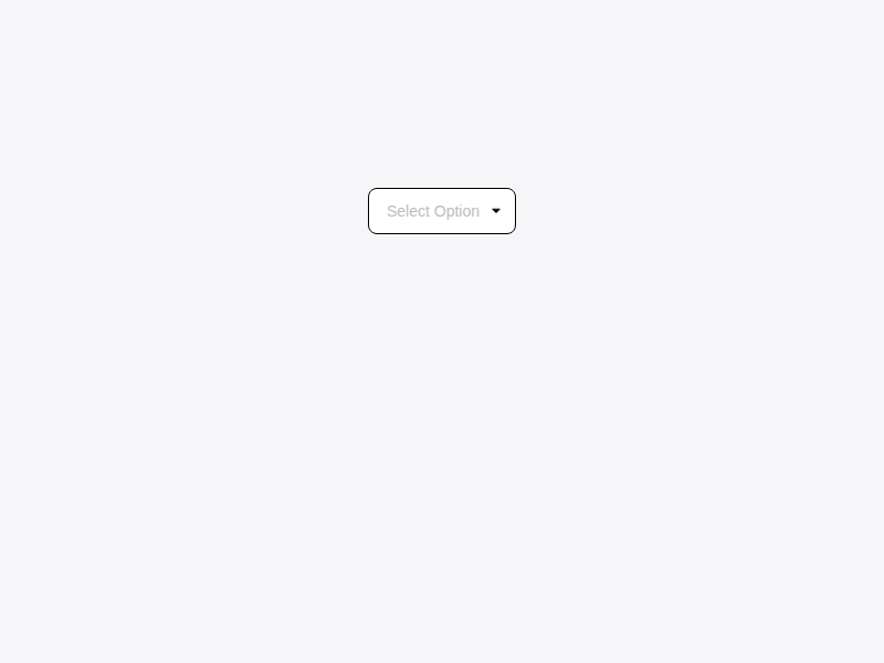
- package/dist/src/components/Dropdown/Dropdown.d.ts +15 -2
- package/dist/src/components/Dropdown/Select.d.ts +1 -1
- package/dist/src/components/Dropdown/index.d.ts +1 -1
- package/dist/src/components/FilterToggleGroup/index.d.ts +2 -1
- package/dist/src/components/RadioButton/RadioButton.d.ts +1 -4
- package/dist/src/components/RadioButton/index.d.ts +2 -1
- package/dist/src/components/RadioButton/variants.d.ts +8 -0
- package/dist/src/components/SideNavigation/index.d.ts +2 -1
- package/dist/src/components/Switch/Switch.d.ts +1 -3
- package/dist/src/components/Switch/index.d.ts +2 -1
- package/dist/src/components/Switch/variants.d.ts +3 -0
- package/dist/src/components/Table/Table.d.ts +1 -11
- package/dist/src/components/Table/variants.d.ts +10 -0
- package/dist/src/components/TagInput/TagInput.d.ts +1 -5
- package/dist/src/components/TagInput/index.d.ts +2 -1
- package/dist/src/components/TagInput/variants.d.ts +13 -0
- package/dist/src/components/TextArea/TextArea.d.ts +1 -6
- package/dist/src/components/TextArea/variants.d.ts +8 -0
- package/dist/src/components/TextInput/TextInput.d.ts +1 -5
- package/dist/src/components/TextInput/variants.d.ts +7 -0
- package/dist/src/components/Toast/Toast.d.ts +1 -12
- package/dist/src/components/Toast/variants.d.ts +12 -0
- package/dist/src/components/{ToolTip/ToolTip.d.ts → Tooltip/Tooltip.d.ts} +7 -7
- package/dist/src/components/Tooltip/index.d.ts +12 -0
- package/dist/src/components/index.d.ts +1 -1
- package/package.json +1 -1
- package/dist/src/components/ToolTip/index.d.ts +0 -2
|
@@ -0,0 +1,6 @@
|
|
|
1
|
+
export declare const accordionRootVariants: (props?: ({
|
|
2
|
+
variant?: "bordered" | "separated" | null | undefined;
|
|
3
|
+
} & import('class-variance-authority/types').ClassProp) | undefined) => string;
|
|
4
|
+
export declare const accordionItemVariants: (props?: ({
|
|
5
|
+
variant?: "bordered" | "separated" | null | undefined;
|
|
6
|
+
} & import('class-variance-authority/types').ClassProp) | undefined) => string;
|
|
@@ -1 +1,2 @@
|
|
|
1
|
-
export
|
|
1
|
+
export { BarChart } from './BarChart';
|
|
2
|
+
export type { BarChartDataItem, BarChartProps, } from './BarChart';
|
|
@@ -1,9 +1,7 @@
|
|
|
1
1
|
import { ComponentPropsWithoutRef } from 'react';
|
|
2
2
|
import { VariantProps } from 'class-variance-authority';
|
|
3
|
+
import { contentAreaVariants } from './variants';
|
|
3
4
|
|
|
4
|
-
declare const contentAreaVariants: (props?: ({
|
|
5
|
-
padding?: "sm" | "lg" | "none" | "md" | null | undefined;
|
|
6
|
-
} & import('class-variance-authority/types').ClassProp) | undefined) => string;
|
|
7
5
|
export type ContentAreaProps = {
|
|
8
6
|
/**
|
|
9
7
|
* 내부 padding 크기. 자식 컴포넌트가 자체 padding을 가질 때는 `"none"` 사용.
|
|
@@ -29,4 +27,3 @@ export declare const ContentArea: import('react').ForwardRefExoticComponent<{
|
|
|
29
27
|
Body: import('react').ForwardRefExoticComponent<Omit<import('react').DetailedHTMLProps<import('react').HTMLAttributes<HTMLDivElement>, HTMLDivElement>, "ref"> & import('react').RefAttributes<HTMLDivElement>>;
|
|
30
28
|
Footer: import('react').ForwardRefExoticComponent<Omit<import('react').DetailedHTMLProps<import('react').HTMLAttributes<HTMLElement>, HTMLElement>, "ref"> & import('react').RefAttributes<HTMLElement>>;
|
|
31
29
|
};
|
|
32
|
-
export {};
|
|
@@ -1,8 +1,6 @@
|
|
|
1
1
|
import { VariantProps } from 'class-variance-authority';
|
|
2
|
+
import { countFilterChipVariants } from './variants';
|
|
2
3
|
|
|
3
|
-
declare const countFilterChipVariants: (props?: ({
|
|
4
|
-
size?: "sm" | "lg" | "md" | null | undefined;
|
|
5
|
-
} & import('class-variance-authority/types').ClassProp) | undefined) => string;
|
|
6
4
|
export type CountFilterChipsSize = NonNullable<VariantProps<typeof countFilterChipVariants>["size"]>;
|
|
7
5
|
export type CountFilterChipsItem<T extends string | number> = {
|
|
8
6
|
/** 선택값으로 사용되는 식별자 */
|
|
@@ -87,4 +85,3 @@ export declare const CountFilterChips: {
|
|
|
87
85
|
<T extends string | number>({ items, value, onValueChange, size, className, itemClassName, ariaLabel, }: CountFilterChipsProps<T>): import("react/jsx-runtime").JSX.Element;
|
|
88
86
|
displayName: string;
|
|
89
87
|
};
|
|
90
|
-
export {};
|
|
@@ -0,0 +1,6 @@
|
|
|
1
|
+
export declare const countFilterChipVariants: (props?: ({
|
|
2
|
+
size?: "sm" | "lg" | "md" | null | undefined;
|
|
3
|
+
} & import('class-variance-authority/types').ClassProp) | undefined) => string;
|
|
4
|
+
export declare const countBadgeVariants: (props?: ({
|
|
5
|
+
size?: "sm" | "lg" | "md" | null | undefined;
|
|
6
|
+
} & import('class-variance-authority/types').ClassProp) | undefined) => string;
|
|
@@ -6,10 +6,23 @@ export type DropdownOption = {
|
|
|
6
6
|
value: string;
|
|
7
7
|
label: string;
|
|
8
8
|
disabled?: boolean;
|
|
9
|
+
/** 트리거에 표시할 짧은 이름. 생략 시 `label` 사용. */
|
|
10
|
+
displayLabel?: string;
|
|
9
11
|
children?: DropdownOption[];
|
|
10
12
|
};
|
|
13
|
+
/** 선택 불가능한 그룹 헤더. hover 시 서브메뉴로 하위 옵션을 펼칩니다. */
|
|
14
|
+
export type DropdownGroupOption = {
|
|
15
|
+
label: string;
|
|
16
|
+
group: DropdownOption[];
|
|
17
|
+
disabled?: boolean;
|
|
18
|
+
};
|
|
19
|
+
/**
|
|
20
|
+
* `options` prop에 전달할 수 있는 아이템 타입.
|
|
21
|
+
* 일반 옵션과 그룹 옵션을 혼합하여 사용할 수 있습니다.
|
|
22
|
+
*/
|
|
23
|
+
export type DropdownItem = DropdownOption | DropdownGroupOption;
|
|
11
24
|
type DropdownPropsBase = {
|
|
12
|
-
options:
|
|
25
|
+
options: DropdownItem[];
|
|
13
26
|
value?: string;
|
|
14
27
|
placeholder?: string;
|
|
15
28
|
/**
|
|
@@ -154,7 +167,7 @@ export type DropdownProps = DropdownPropsSingle | DropdownPropsMultiple;
|
|
|
154
167
|
* 
|
|
155
168
|
*/
|
|
156
169
|
declare const DropdownInternal: import('react').ForwardRefExoticComponent<{
|
|
157
|
-
options:
|
|
170
|
+
options: DropdownItem[];
|
|
158
171
|
value?: string;
|
|
159
172
|
placeholder?: string;
|
|
160
173
|
/**
|
|
@@ -92,7 +92,7 @@ export declare const Select: import('react').ForwardRefExoticComponent<{
|
|
|
92
92
|
error?: string;
|
|
93
93
|
required?: boolean;
|
|
94
94
|
} & Omit<{
|
|
95
|
-
options: import('./Dropdown').
|
|
95
|
+
options: import('./Dropdown').DropdownItem[];
|
|
96
96
|
value?: string;
|
|
97
97
|
placeholder?: string;
|
|
98
98
|
onValueChange?: (value: string) => void;
|
|
@@ -1,5 +1,5 @@
|
|
|
1
1
|
export { Dropdown } from './Dropdown';
|
|
2
|
-
export type { DropdownOption, DropdownProps } from './Dropdown';
|
|
2
|
+
export type { DropdownOption, DropdownGroupOption, DropdownItem, DropdownProps, } from './Dropdown';
|
|
3
3
|
export { dropdownTriggerVariants } from './variants';
|
|
4
4
|
export { Select, type SelectProps } from './Select';
|
|
5
5
|
export { Combobox, type ComboboxProps } from './Combobox';
|
|
@@ -1 +1,2 @@
|
|
|
1
|
-
export
|
|
1
|
+
export { FilterToggleGroup } from './FilterToggleGroup';
|
|
2
|
+
export type { FilterToggleGroupSize, FilterToggleGroupIntent, FilterToggleGroupAlign, FilterToggleGroupItem, FilterToggleGroupOption, FilterToggleGroupProps, } from './FilterToggleGroup';
|
|
@@ -1,5 +1,6 @@
|
|
|
1
1
|
import { default as React } from 'react';
|
|
2
2
|
import { VariantProps } from 'class-variance-authority';
|
|
3
|
+
import { radioGroupItemVariants } from './variants';
|
|
3
4
|
|
|
4
5
|
import * as RadioGroupPrimitives from "@radix-ui/react-radio-group";
|
|
5
6
|
/**
|
|
@@ -77,10 +78,6 @@ import * as RadioGroupPrimitives from "@radix-ui/react-radio-group";
|
|
|
77
78
|
* 
|
|
78
79
|
*/
|
|
79
80
|
declare const RadioGroup: React.ForwardRefExoticComponent<Omit<RadioGroupPrimitives.RadioGroupProps & React.RefAttributes<HTMLDivElement>, "ref"> & React.RefAttributes<HTMLDivElement>>;
|
|
80
|
-
declare const radioGroupItemVariants: (props?: ({
|
|
81
|
-
variant?: "default" | "green" | "black" | "blue" | "red" | null | undefined;
|
|
82
|
-
size?: "sm" | "lg" | "md" | null | undefined;
|
|
83
|
-
} & import('class-variance-authority/types').ClassProp) | undefined) => string;
|
|
84
81
|
export type RadioGroupItemProps = {} & React.ComponentPropsWithoutRef<typeof RadioGroupPrimitives.Item> & VariantProps<typeof radioGroupItemVariants>;
|
|
85
82
|
declare const RadioGroupItem: React.ForwardRefExoticComponent<Omit<RadioGroupPrimitives.RadioGroupItemProps & React.RefAttributes<HTMLButtonElement>, "ref"> & VariantProps<(props?: ({
|
|
86
83
|
variant?: "default" | "green" | "black" | "blue" | "red" | null | undefined;
|
|
@@ -1 +1,2 @@
|
|
|
1
|
-
export
|
|
1
|
+
export { RadioGroup, RadioGroupItem } from './RadioButton';
|
|
2
|
+
export type { RadioGroupItemProps } from './RadioButton';
|
|
@@ -0,0 +1,8 @@
|
|
|
1
|
+
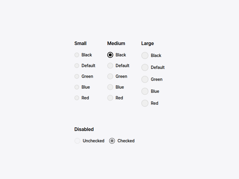
export declare const radioGroupItemVariants: (props?: ({
|
|
2
|
+
variant?: "default" | "green" | "black" | "blue" | "red" | null | undefined;
|
|
3
|
+
size?: "sm" | "lg" | "md" | null | undefined;
|
|
4
|
+
} & import('class-variance-authority/types').ClassProp) | undefined) => string;
|
|
5
|
+
export declare const radioGroupIndicatorVariants: (props?: ({
|
|
6
|
+
variant?: "default" | "green" | "black" | "blue" | "red" | null | undefined;
|
|
7
|
+
size?: "sm" | "lg" | "md" | null | undefined;
|
|
8
|
+
} & import('class-variance-authority/types').ClassProp) | undefined) => string;
|
|
@@ -1 +1,2 @@
|
|
|
1
|
-
export
|
|
1
|
+
export { SideNavigation } from './SideNavigation';
|
|
2
|
+
export type { SubMenuItem, MenuItem, SideNavigationProps, } from './SideNavigation';
|
|
@@ -1,10 +1,8 @@
|
|
|
1
1
|
import { default as React } from 'react';
|
|
2
2
|
import { VariantProps } from 'class-variance-authority';
|
|
3
|
+
import { switchVariants } from './variants';
|
|
3
4
|
|
|
4
5
|
import * as SwitchPrimitives from "@radix-ui/react-switch";
|
|
5
|
-
declare const switchVariants: (props?: ({
|
|
6
|
-
variant?: "default" | "primary" | "green" | "black" | "blue" | "red" | null | undefined;
|
|
7
|
-
} & import('class-variance-authority/types').ClassProp) | undefined) => string;
|
|
8
6
|
export type SwitchProps = {
|
|
9
7
|
/**
|
|
10
8
|
* 스위치 트랙의 가로 길이입니다.
|
|
@@ -1 +1,2 @@
|
|
|
1
|
-
export
|
|
1
|
+
export { Switch } from './Switch';
|
|
2
|
+
export type { SwitchProps } from './Switch';
|
|
@@ -1,9 +1,7 @@
|
|
|
1
1
|
import { default as React } from 'react';
|
|
2
2
|
import { VariantProps } from 'class-variance-authority';
|
|
3
|
+
import { tableVariants, tableRowVariants, tableCellVariants } from './variants';
|
|
3
4
|
|
|
4
|
-
declare const tableVariants: (props?: ({
|
|
5
|
-
bordered?: boolean | null | undefined;
|
|
6
|
-
} & import('class-variance-authority/types').ClassProp) | undefined) => string;
|
|
7
5
|
export type TableProps = {
|
|
8
6
|
/** zebra stripe 패턴 적용 여부 */
|
|
9
7
|
striped?: boolean;
|
|
@@ -149,10 +147,6 @@ export type TableFooterProps = {} & React.HTMLAttributes<HTMLTableSectionElement
|
|
|
149
147
|
* `<tfoot>` 태그를 렌더링하며, 합계나 요약 정보를 표시하는 데 사용됩니다.
|
|
150
148
|
*/
|
|
151
149
|
export declare const TableFooter: React.ForwardRefExoticComponent<React.HTMLAttributes<HTMLTableSectionElement> & React.RefAttributes<HTMLTableSectionElement>>;
|
|
152
|
-
declare const tableRowVariants: (props?: ({
|
|
153
|
-
hoverable?: boolean | null | undefined;
|
|
154
|
-
selected?: boolean | null | undefined;
|
|
155
|
-
} & import('class-variance-authority/types').ClassProp) | undefined) => string;
|
|
156
150
|
export type TableRowProps = {
|
|
157
151
|
/** 선택된 행 표시 여부 */
|
|
158
152
|
selected?: boolean;
|
|
@@ -190,9 +184,6 @@ export declare const TableHead: React.ForwardRefExoticComponent<{
|
|
|
190
184
|
/** 텍스트 정렬 방식 (default: "left") */
|
|
191
185
|
align?: "left" | "center" | "right";
|
|
192
186
|
} & Omit<React.ThHTMLAttributes<HTMLTableCellElement>, "align"> & React.RefAttributes<HTMLTableCellElement>>;
|
|
193
|
-
declare const tableCellVariants: (props?: ({
|
|
194
|
-
align?: "left" | "center" | "right" | null | undefined;
|
|
195
|
-
} & import('class-variance-authority/types').ClassProp) | undefined) => string;
|
|
196
187
|
export type TableCellProps = {
|
|
197
188
|
/** 텍스트 정렬 방식 */
|
|
198
189
|
align?: "left" | "center" | "right";
|
|
@@ -311,4 +302,3 @@ export type TableCaptionProps = {} & React.HTMLAttributes<HTMLTableCaptionElemen
|
|
|
311
302
|
* 설명하는 데 중요한 역할을 합니다.
|
|
312
303
|
*/
|
|
313
304
|
export declare const TableCaption: React.ForwardRefExoticComponent<React.HTMLAttributes<HTMLTableCaptionElement> & React.RefAttributes<HTMLTableCaptionElement>>;
|
|
314
|
-
export {};
|
|
@@ -0,0 +1,10 @@
|
|
|
1
|
+
export declare const tableVariants: (props?: ({
|
|
2
|
+
bordered?: boolean | null | undefined;
|
|
3
|
+
} & import('class-variance-authority/types').ClassProp) | undefined) => string;
|
|
4
|
+
export declare const tableRowVariants: (props?: ({
|
|
5
|
+
hoverable?: boolean | null | undefined;
|
|
6
|
+
selected?: boolean | null | undefined;
|
|
7
|
+
} & import('class-variance-authority/types').ClassProp) | undefined) => string;
|
|
8
|
+
export declare const tableCellVariants: (props?: ({
|
|
9
|
+
align?: "left" | "center" | "right" | null | undefined;
|
|
10
|
+
} & import('class-variance-authority/types').ClassProp) | undefined) => string;
|
|
@@ -1,10 +1,7 @@
|
|
|
1
1
|
import { default as React } from 'react';
|
|
2
2
|
import { VariantProps } from 'class-variance-authority';
|
|
3
|
+
import { tagInputContainerVariants } from './variants';
|
|
3
4
|
|
|
4
|
-
declare const tagInputContainerVariants: (props?: ({
|
|
5
|
-
readOnly?: boolean | null | undefined;
|
|
6
|
-
layout?: "row" | "column" | null | undefined;
|
|
7
|
-
} & import('class-variance-authority/types').ClassProp) | undefined) => string;
|
|
8
5
|
export type TagInputProps = {
|
|
9
6
|
label?: string;
|
|
10
7
|
required?: boolean;
|
|
@@ -161,4 +158,3 @@ export declare const TagInput: React.ForwardRefExoticComponent<{
|
|
|
161
158
|
readOnly?: boolean | null | undefined;
|
|
162
159
|
layout?: "row" | "column" | null | undefined;
|
|
163
160
|
} & import('class-variance-authority/types').ClassProp) | undefined) => string>, "readOnly"> & React.RefAttributes<HTMLDivElement>>;
|
|
164
|
-
export {};
|
|
@@ -1 +1,2 @@
|
|
|
1
|
-
export
|
|
1
|
+
export { TagInput } from './TagInput';
|
|
2
|
+
export type { TagInputProps } from './TagInput';
|
|
@@ -0,0 +1,13 @@
|
|
|
1
|
+
export declare const tagInputContainerVariants: (props?: ({
|
|
2
|
+
readOnly?: boolean | null | undefined;
|
|
3
|
+
layout?: "row" | "column" | null | undefined;
|
|
4
|
+
} & import('class-variance-authority/types').ClassProp) | undefined) => string;
|
|
5
|
+
export declare const tagVariants: (props?: ({
|
|
6
|
+
removable?: boolean | null | undefined;
|
|
7
|
+
} & import('class-variance-authority/types').ClassProp) | undefined) => string;
|
|
8
|
+
export declare const removeButtonVariants: (props?: import('class-variance-authority/types').ClassProp | undefined) => string;
|
|
9
|
+
export declare const inputVariants: (props?: import('class-variance-authority/types').ClassProp | undefined) => string;
|
|
10
|
+
export declare const labelVariants: (props?: import('class-variance-authority/types').ClassProp | undefined) => string;
|
|
11
|
+
export declare const helperTextVariants: (props?: import('class-variance-authority/types').ClassProp | undefined) => string;
|
|
12
|
+
export declare const errorMessageVariants: (props?: import('class-variance-authority/types').ClassProp | undefined) => string;
|
|
13
|
+
export declare const tagCountVariants: (props?: import('class-variance-authority/types').ClassProp | undefined) => string;
|
|
@@ -1,11 +1,7 @@
|
|
|
1
1
|
import { default as React } from 'react';
|
|
2
2
|
import { VariantProps } from 'class-variance-authority';
|
|
3
|
+
import { textAreaVariants } from './variants';
|
|
3
4
|
|
|
4
|
-
declare const textAreaVariants: (props?: ({
|
|
5
|
-
variant?: "default" | "error" | null | undefined;
|
|
6
|
-
fullWidth?: boolean | null | undefined;
|
|
7
|
-
resize?: "none" | "both" | "horizontal" | "vertical" | null | undefined;
|
|
8
|
-
} & import('class-variance-authority/types').ClassProp) | undefined) => string;
|
|
9
5
|
export type TextAreaProps = {
|
|
10
6
|
label?: string;
|
|
11
7
|
required?: boolean;
|
|
@@ -79,4 +75,3 @@ export declare const TextArea: React.ForwardRefExoticComponent<{
|
|
|
79
75
|
fullWidth?: boolean | null | undefined;
|
|
80
76
|
resize?: "none" | "both" | "horizontal" | "vertical" | null | undefined;
|
|
81
77
|
} & import('class-variance-authority/types').ClassProp) | undefined) => string> & React.RefAttributes<HTMLTextAreaElement>>;
|
|
82
|
-
export {};
|
|
@@ -0,0 +1,8 @@
|
|
|
1
|
+
export declare const textAreaVariants: (props?: ({
|
|
2
|
+
variant?: "default" | "error" | null | undefined;
|
|
3
|
+
fullWidth?: boolean | null | undefined;
|
|
4
|
+
resize?: "none" | "both" | "horizontal" | "vertical" | null | undefined;
|
|
5
|
+
} & import('class-variance-authority/types').ClassProp) | undefined) => string;
|
|
6
|
+
export declare const labelVariants: (props?: import('class-variance-authority/types').ClassProp | undefined) => string;
|
|
7
|
+
export declare const errorMessageVariants: (props?: import('class-variance-authority/types').ClassProp | undefined) => string;
|
|
8
|
+
export declare const helperTextVariants: (props?: import('class-variance-authority/types').ClassProp | undefined) => string;
|
|
@@ -1,10 +1,7 @@
|
|
|
1
1
|
import { default as React } from 'react';
|
|
2
2
|
import { VariantProps } from 'class-variance-authority';
|
|
3
|
+
import { textInputVariants } from './variants';
|
|
3
4
|
|
|
4
|
-
declare const textInputVariants: (props?: ({
|
|
5
|
-
variant?: "default" | "error" | null | undefined;
|
|
6
|
-
fullWidth?: boolean | null | undefined;
|
|
7
|
-
} & import('class-variance-authority/types').ClassProp) | undefined) => string;
|
|
8
5
|
export type TextInputProps = {
|
|
9
6
|
label?: string;
|
|
10
7
|
required?: boolean;
|
|
@@ -132,4 +129,3 @@ export declare const TextInput: React.ForwardRefExoticComponent<{
|
|
|
132
129
|
variant?: "default" | "error" | null | undefined;
|
|
133
130
|
fullWidth?: boolean | null | undefined;
|
|
134
131
|
} & import('class-variance-authority/types').ClassProp) | undefined) => string> & React.RefAttributes<HTMLInputElement>>;
|
|
135
|
-
export {};
|
|
@@ -0,0 +1,7 @@
|
|
|
1
|
+
export declare const textInputVariants: (props?: ({
|
|
2
|
+
variant?: "default" | "error" | null | undefined;
|
|
3
|
+
fullWidth?: boolean | null | undefined;
|
|
4
|
+
} & import('class-variance-authority/types').ClassProp) | undefined) => string;
|
|
5
|
+
export declare const labelVariants: (props?: import('class-variance-authority/types').ClassProp | undefined) => string;
|
|
6
|
+
export declare const errorMessageVariants: (props?: import('class-variance-authority/types').ClassProp | undefined) => string;
|
|
7
|
+
export declare const helperTextVariants: (props?: import('class-variance-authority/types').ClassProp | undefined) => string;
|
|
@@ -1,18 +1,7 @@
|
|
|
1
1
|
import { default as React } from 'react';
|
|
2
2
|
import { VariantProps } from 'class-variance-authority';
|
|
3
|
+
import { toastVariants } from './variants';
|
|
3
4
|
|
|
4
|
-
/**
|
|
5
|
-
* Toast 컴포넌트의 톤/intent variant 정의.
|
|
6
|
-
*
|
|
7
|
-
* 두 축으로 구성:
|
|
8
|
-
* - **intent**: 의미 (success / info / warning / error) — 좌측 아이콘 색만 결정
|
|
9
|
-
* - **theme**: light(기본) / dark — 배경·텍스트 톤 결정
|
|
10
|
-
*
|
|
11
|
-
* 두 축은 독립적이므로 `intent="warning" theme="light"` 같은 조합이 자유롭게 가능합니다.
|
|
12
|
-
*/
|
|
13
|
-
declare const toastVariants: (props?: ({
|
|
14
|
-
theme?: "dark" | "light" | null | undefined;
|
|
15
|
-
} & import('class-variance-authority/types').ClassProp) | undefined) => string;
|
|
16
5
|
declare const intentIcon: {
|
|
17
6
|
readonly success: React.ForwardRefExoticComponent<Omit<import('..').IconProps, "ref"> & React.RefAttributes<SVGSVGElement>>;
|
|
18
7
|
readonly info: React.ForwardRefExoticComponent<Omit<import('..').IconProps, "ref"> & React.RefAttributes<SVGSVGElement>>;
|
|
@@ -0,0 +1,12 @@
|
|
|
1
|
+
/**
|
|
2
|
+
* Toast 컴포넌트의 톤/intent variant 정의.
|
|
3
|
+
*
|
|
4
|
+
* 두 축으로 구성:
|
|
5
|
+
* - **intent**: 의미 (success / info / warning / error) — 좌측 아이콘 색만 결정
|
|
6
|
+
* - **theme**: light(기본) / dark — 배경·텍스트 톤 결정
|
|
7
|
+
*
|
|
8
|
+
* 두 축은 독립적이므로 `intent="warning" theme="light"` 같은 조합이 자유롭게 가능합니다.
|
|
9
|
+
*/
|
|
10
|
+
export declare const toastVariants: (props?: ({
|
|
11
|
+
theme?: "dark" | "light" | null | undefined;
|
|
12
|
+
} & import('class-variance-authority/types').ClassProp) | undefined) => string;
|
|
@@ -1,6 +1,6 @@
|
|
|
1
1
|
import { default as React } from 'react';
|
|
2
2
|
import * as TooltipPrimitive from "@radix-ui/react-tooltip";
|
|
3
|
-
export type
|
|
3
|
+
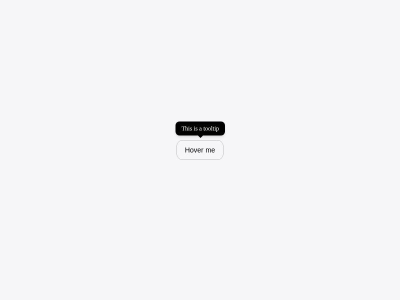
export type TooltipProps = {
|
|
4
4
|
/** 툴팁을 트리거하는 요소 */
|
|
5
5
|
children: React.ReactNode;
|
|
6
6
|
/** 툴팁에 표시할 내용 */
|
|
@@ -29,7 +29,7 @@ export type ToolTipProps = {
|
|
|
29
29
|
/**
|
|
30
30
|
* 마우스 호버나 포커스 시 간단한 힌트나 설명을 제공하는 툴팁 컴포넌트입니다.
|
|
31
31
|
*
|
|
32
|
-
* {@link
|
|
32
|
+
* {@link Tooltip}은 UI 요소에 대한 추가 정보를 간결하게 제공하여
|
|
33
33
|
* 사용자가 인터페이스를 더 쉽게 이해할 수 있도록 돕습니다.
|
|
34
34
|
*
|
|
35
35
|
* Radix UI의 Tooltip 컴포넌트를 기반으로 구현되어 접근성 기능이
|
|
@@ -82,23 +82,23 @@ export type ToolTipProps = {
|
|
|
82
82
|
* 아이콘 버튼에 툴팁 추가:
|
|
83
83
|
*
|
|
84
84
|
* ```tsx
|
|
85
|
-
* <
|
|
85
|
+
* <Tooltip content="설정">
|
|
86
86
|
* <Button variant="ghost" size="icon">
|
|
87
87
|
* <SettingsIcon />
|
|
88
88
|
* </Button>
|
|
89
|
-
* </
|
|
89
|
+
* </Tooltip>
|
|
90
90
|
* ```
|
|
91
91
|
*
|
|
92
92
|
* 위치와 지연 시간 커스터마이징:
|
|
93
93
|
*
|
|
94
94
|
* ```tsx
|
|
95
|
-
* <
|
|
95
|
+
* <Tooltip
|
|
96
96
|
* content="이 기능은 프리미엄 사용자만 이용할 수 있습니다"
|
|
97
97
|
* side="bottom"
|
|
98
98
|
* delayDuration={300}
|
|
99
99
|
* >
|
|
100
100
|
* <Button disabled>프리미엄 기능</Button>
|
|
101
|
-
* </
|
|
101
|
+
* </Tooltip>
|
|
102
102
|
* ```
|
|
103
103
|
* {@end-tool}
|
|
104
104
|
*
|
|
@@ -109,7 +109,7 @@ export type ToolTipProps = {
|
|
|
109
109
|
* ## 참고사진
|
|
110
110
|
* 
|
|
111
111
|
*/
|
|
112
|
-
export declare const
|
|
112
|
+
export declare const Tooltip: React.ForwardRefExoticComponent<{
|
|
113
113
|
/** 툴팁을 트리거하는 요소 */
|
|
114
114
|
children: React.ReactNode;
|
|
115
115
|
/** 툴팁에 표시할 내용 */
|
|
@@ -0,0 +1,12 @@
|
|
|
1
|
+
export { Tooltip } from './Tooltip';
|
|
2
|
+
export type { TooltipProps } from './Tooltip';
|
|
3
|
+
/**
|
|
4
|
+
* @deprecated `ToolTip`은 다음 메이저 버전에서 제거됩니다.
|
|
5
|
+
* `Tooltip`을 사용하세요.
|
|
6
|
+
*/
|
|
7
|
+
export { Tooltip as ToolTip } from './Tooltip';
|
|
8
|
+
/**
|
|
9
|
+
* @deprecated `ToolTipProps`는 다음 메이저 버전에서 제거됩니다.
|
|
10
|
+
* `TooltipProps`를 사용하세요.
|
|
11
|
+
*/
|
|
12
|
+
export type { TooltipProps as ToolTipProps } from './Tooltip';
|
|
@@ -21,7 +21,7 @@ export * from './Pagination';
|
|
|
21
21
|
export * from './Checkbox';
|
|
22
22
|
export * from './Modal';
|
|
23
23
|
export * from './Toast';
|
|
24
|
-
export * from './
|
|
24
|
+
export * from './Tooltip';
|
|
25
25
|
export * from './Table';
|
|
26
26
|
export * from './ImageUpload';
|
|
27
27
|
export * from './FileUpload';
|
package/package.json
CHANGED