@cashdoc/cashdoc-cms-design-system 1.4.0 → 1.4.1
This diff represents the content of publicly available package versions that have been released to one of the supported registries. The information contained in this diff is provided for informational purposes only and reflects changes between package versions as they appear in their respective public registries.
- package/README.md +10 -0
- package/dist/index.es.js +3998 -3908
- package/dist/index.es.js.map +1 -1
- package/dist/index.umd.js +26 -26
- package/dist/index.umd.js.map +1 -1
- package/dist/src/components/Button/Button.d.ts +5 -3
- package/dist/src/components/Checkbox/Checkbox.d.ts +6 -3
- package/dist/src/components/DatePicker/DatePicker.d.ts +2 -2
- package/dist/src/components/DateRangePicker/DateRangePicker.d.ts +4 -4
- package/dist/src/components/Dropdown/Combobox.d.ts +7 -3
- package/dist/src/components/Dropdown/Dropdown.d.ts +21 -5
- package/dist/src/components/Dropdown/Select.d.ts +8 -3
- package/dist/src/components/FileUpload/FileUpload.d.ts +2 -2
- package/dist/src/components/ImageUpload/ImageUpload.d.ts +4 -4
- package/dist/src/components/LoadingCircle/LoadingCircle.d.ts +2 -2
- package/dist/src/components/Modal/ConfirmModal.d.ts +2 -2
- package/dist/src/components/Modal/DeleteModal.d.ts +2 -2
- package/dist/src/components/Modal/ErrorModal.d.ts +2 -2
- package/dist/src/components/Modal/Modal.d.ts +2 -2
- package/dist/src/components/Modal/SuccessModal.d.ts +2 -2
- package/dist/src/components/Modal/WarningModal.d.ts +2 -2
- package/dist/src/components/Pagination/Pagination.d.ts +2 -2
- package/dist/src/components/Popover/PopoverMenuItem.d.ts +7 -3
- package/dist/src/components/RadioButton/RadioButton.d.ts +5 -3
- package/dist/src/components/SideNavigation/SideNavigation.d.ts +6 -6
- package/dist/src/components/Switch/Switch.d.ts +21 -3
- package/dist/src/components/Table/Table.d.ts +49 -24
- package/dist/src/components/TagInput/TagInput.d.ts +20 -3
- package/dist/src/components/Text/Text.d.ts +10 -3
- package/dist/src/components/TextInput/TextInput.d.ts +15 -3
- package/dist/src/components/TimePicker/TimePicker.d.ts +2 -2
- package/dist/src/components/ToolTip/ToolTip.d.ts +28 -3
- package/dist/src/components/icons/index.d.ts +3 -3
- package/dist/style.css +1 -1
- package/package.json +15 -12
|
@@ -2,8 +2,7 @@ import { VariantProps } from 'class-variance-authority';
|
|
|
2
2
|
import { ButtonHTMLAttributes } from 'react';
|
|
3
3
|
import { buttonVariants } from './variants';
|
|
4
4
|
|
|
5
|
-
export
|
|
6
|
-
}
|
|
5
|
+
export type ButtonProps = {} & ButtonHTMLAttributes<HTMLButtonElement> & VariantProps<typeof buttonVariants>;
|
|
7
6
|
/**
|
|
8
7
|
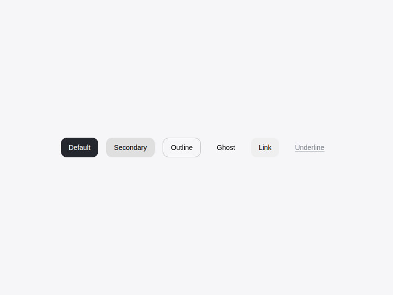
* 사용자의 클릭 동작을 통해 특정 액션을 실행하거나 페이지를 이동시키는 기본적인 컴포넌트입니다.
|
|
9
8
|
*
|
|
@@ -109,5 +108,8 @@ export interface ButtonProps extends ButtonHTMLAttributes<HTMLButtonElement>, Va
|
|
|
109
108
|
* ## 참고사진
|
|
110
109
|
* 
|
|
111
110
|
*/
|
|
112
|
-
declare const Button: import('react').ForwardRefExoticComponent<
|
|
111
|
+
declare const Button: import('react').ForwardRefExoticComponent<ButtonHTMLAttributes<HTMLButtonElement> & VariantProps<(props?: ({
|
|
112
|
+
variant?: "default" | "secondary" | "outline" | "ghost" | "link" | null | undefined;
|
|
113
|
+
size?: "default" | "sm" | "lg" | "icon" | null | undefined;
|
|
114
|
+
} & import('class-variance-authority/types').ClassProp) | undefined) => string> & import('react').RefAttributes<HTMLButtonElement>>;
|
|
113
115
|
export { Button };
|
|
@@ -1,10 +1,10 @@
|
|
|
1
1
|
import { default as React } from 'react';
|
|
2
2
|
|
|
3
3
|
import * as CheckboxPrimitive from "@radix-ui/react-checkbox";
|
|
4
|
-
export
|
|
4
|
+
export type CheckboxProps = {
|
|
5
5
|
label?: string;
|
|
6
6
|
id?: string;
|
|
7
|
-
}
|
|
7
|
+
} & React.ComponentPropsWithoutRef<typeof CheckboxPrimitive.Root>;
|
|
8
8
|
/**
|
|
9
9
|
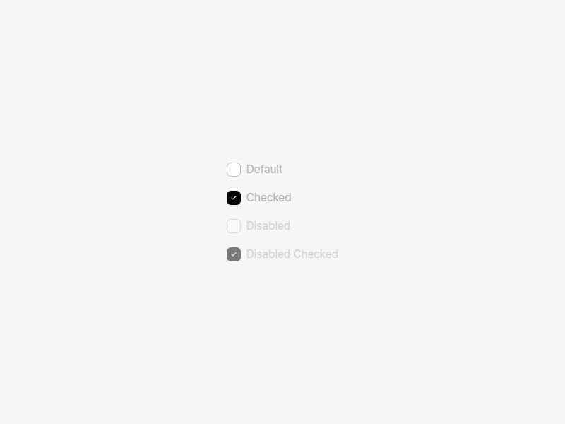
* 사용자가 여러 옵션 중 하나 이상을 선택하거나, 특정 항목의 활성화 상태를 제어할 때 사용하는 컴포넌트입니다.
|
|
10
10
|
*
|
|
@@ -87,4 +87,7 @@ export interface CheckboxProps extends React.ComponentPropsWithoutRef<typeof Che
|
|
|
87
87
|
* ## 참고사진
|
|
88
88
|
* 
|
|
89
89
|
*/
|
|
90
|
-
export declare const Checkbox: React.ForwardRefExoticComponent<
|
|
90
|
+
export declare const Checkbox: React.ForwardRefExoticComponent<{
|
|
91
|
+
label?: string;
|
|
92
|
+
id?: string;
|
|
93
|
+
} & Omit<CheckboxPrimitive.CheckboxProps & React.RefAttributes<HTMLButtonElement>, "ref"> & React.RefAttributes<HTMLButtonElement>>;
|
|
@@ -1,6 +1,6 @@
|
|
|
1
1
|
import { default as React } from 'react';
|
|
2
2
|
|
|
3
|
-
export
|
|
3
|
+
export type DatePickerProps = {
|
|
4
4
|
value?: string;
|
|
5
5
|
onChange?: (date: string) => void;
|
|
6
6
|
label?: string;
|
|
@@ -12,7 +12,7 @@ export interface DatePickerProps {
|
|
|
12
12
|
errorMessage?: string;
|
|
13
13
|
helperText?: string;
|
|
14
14
|
className?: string;
|
|
15
|
-
}
|
|
15
|
+
};
|
|
16
16
|
/**
|
|
17
17
|
* 사용자가 달력 인터페이스를 통해 특정 날짜를 선택할 수 있게 하는 컴포넌트입니다.
|
|
18
18
|
*
|
|
@@ -1,16 +1,16 @@
|
|
|
1
1
|
import { default as React } from 'react';
|
|
2
2
|
|
|
3
|
-
export
|
|
3
|
+
export type DateRange = {
|
|
4
4
|
start: string;
|
|
5
5
|
end: string;
|
|
6
|
-
}
|
|
7
|
-
export
|
|
6
|
+
};
|
|
7
|
+
export type DateRangePickerProps = {
|
|
8
8
|
value?: DateRange;
|
|
9
9
|
onChange?: (range: DateRange) => void;
|
|
10
10
|
startLabel?: string;
|
|
11
11
|
endLabel?: string;
|
|
12
12
|
className?: string;
|
|
13
|
-
}
|
|
13
|
+
};
|
|
14
14
|
/**
|
|
15
15
|
* 사용자가 특정 기간(시작일과 종료일)을 선택할 수 있게 하는 컴포넌트입니다.
|
|
16
16
|
*
|
|
@@ -1,10 +1,10 @@
|
|
|
1
1
|
import { DropdownProps } from './Dropdown';
|
|
2
2
|
|
|
3
|
-
export
|
|
3
|
+
export type ComboboxProps = {
|
|
4
4
|
loading?: boolean;
|
|
5
5
|
createable?: boolean;
|
|
6
6
|
onCreateOption?: (value: string) => void;
|
|
7
|
-
}
|
|
7
|
+
} & Omit<DropdownProps, "searchable">;
|
|
8
8
|
/**
|
|
9
9
|
* 텍스트 입력과 드롭다운 선택 기능이 결합되어, 목록에서 검색하거나 새로운 옵션을 생성할 수 있는 컴포넌트입니다.
|
|
10
10
|
*
|
|
@@ -83,4 +83,8 @@ export interface ComboboxProps extends Omit<DropdownProps, "searchable"> {
|
|
|
83
83
|
* - {@link TagInput}, 여러 개의 값을 검색하여 추가해야 할 때
|
|
84
84
|
* - {@link TextInput}, 단순한 텍스트 입력만 필요한 경우
|
|
85
85
|
*/
|
|
86
|
-
export declare const Combobox: import('react').ForwardRefExoticComponent<
|
|
86
|
+
export declare const Combobox: import('react').ForwardRefExoticComponent<{
|
|
87
|
+
loading?: boolean;
|
|
88
|
+
createable?: boolean;
|
|
89
|
+
onCreateOption?: (value: string) => void;
|
|
90
|
+
} & Omit<DropdownProps, "searchable"> & import('react').RefAttributes<HTMLButtonElement>>;
|
|
@@ -1,13 +1,13 @@
|
|
|
1
1
|
import { VariantProps } from 'class-variance-authority';
|
|
2
2
|
import { dropdownTriggerVariants } from './variants';
|
|
3
3
|
|
|
4
|
-
export
|
|
4
|
+
export type DropdownOption = {
|
|
5
5
|
value: string;
|
|
6
6
|
label: string;
|
|
7
7
|
disabled?: boolean;
|
|
8
8
|
children?: DropdownOption[];
|
|
9
|
-
}
|
|
10
|
-
export
|
|
9
|
+
};
|
|
10
|
+
export type DropdownProps = {
|
|
11
11
|
options: DropdownOption[];
|
|
12
12
|
value?: string;
|
|
13
13
|
placeholder?: string;
|
|
@@ -20,7 +20,7 @@ export interface DropdownProps extends VariantProps<typeof dropdownTriggerVarian
|
|
|
20
20
|
multiple?: boolean;
|
|
21
21
|
maxHeight?: number;
|
|
22
22
|
defaultOpen?: boolean;
|
|
23
|
-
}
|
|
23
|
+
} & VariantProps<typeof dropdownTriggerVariants>;
|
|
24
24
|
/**
|
|
25
25
|
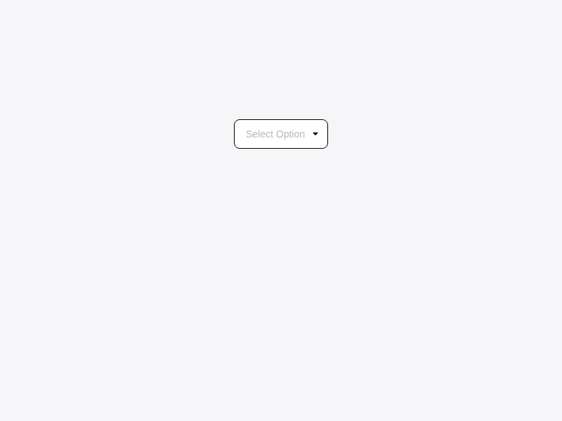
* 사용자가 목록에서 하나 또는 여러 개의 옵션을 선택할 수 있게 하는 컴포넌트입니다.
|
|
26
26
|
*
|
|
@@ -105,4 +105,20 @@ export interface DropdownProps extends VariantProps<typeof dropdownTriggerVarian
|
|
|
105
105
|
* ## 참고사진
|
|
106
106
|
* 
|
|
107
107
|
*/
|
|
108
|
-
export declare const Dropdown: import('react').ForwardRefExoticComponent<
|
|
108
|
+
export declare const Dropdown: import('react').ForwardRefExoticComponent<{
|
|
109
|
+
options: DropdownOption[];
|
|
110
|
+
value?: string;
|
|
111
|
+
placeholder?: string;
|
|
112
|
+
onValueChange?: (value: string) => void;
|
|
113
|
+
disabled?: boolean;
|
|
114
|
+
className?: string;
|
|
115
|
+
dropdownClassName?: string;
|
|
116
|
+
searchable?: boolean;
|
|
117
|
+
clearable?: boolean;
|
|
118
|
+
multiple?: boolean;
|
|
119
|
+
maxHeight?: number;
|
|
120
|
+
defaultOpen?: boolean;
|
|
121
|
+
} & VariantProps<(props?: ({
|
|
122
|
+
variant?: "default" | "outline" | "ghost" | null | undefined;
|
|
123
|
+
size?: "default" | "sm" | "lg" | null | undefined;
|
|
124
|
+
} & import('class-variance-authority/types').ClassProp) | undefined) => string> & import('react').RefAttributes<HTMLButtonElement>>;
|
|
@@ -1,11 +1,11 @@
|
|
|
1
1
|
import { DropdownProps } from './Dropdown';
|
|
2
2
|
|
|
3
|
-
export
|
|
3
|
+
export type SelectProps = {
|
|
4
4
|
label?: string;
|
|
5
5
|
helperText?: string;
|
|
6
6
|
error?: string;
|
|
7
7
|
required?: boolean;
|
|
8
|
-
}
|
|
8
|
+
} & Omit<DropdownProps, "multiple" | "searchable" | "clearable">;
|
|
9
9
|
/**
|
|
10
10
|
* 사용자에게 레이블, 도움말, 에러 메시지와 함께 단일 선택 드롭다운을 제공하는 컴포넌트입니다.
|
|
11
11
|
*
|
|
@@ -84,4 +84,9 @@ export interface SelectProps extends Omit<DropdownProps, "multiple" | "searchabl
|
|
|
84
84
|
* - {@link TextInput}, 텍스트 직접 입력이 필요한 경우
|
|
85
85
|
* - {@link RadioButton}, 옵션이 적고 한눈에 보여야 하는 경우
|
|
86
86
|
*/
|
|
87
|
-
export declare const Select: import('react').ForwardRefExoticComponent<
|
|
87
|
+
export declare const Select: import('react').ForwardRefExoticComponent<{
|
|
88
|
+
label?: string;
|
|
89
|
+
helperText?: string;
|
|
90
|
+
error?: string;
|
|
91
|
+
required?: boolean;
|
|
92
|
+
} & Omit<DropdownProps, "searchable" | "clearable" | "multiple"> & import('react').RefAttributes<HTMLButtonElement>>;
|
|
@@ -1,6 +1,6 @@
|
|
|
1
1
|
import { Accept } from 'react-dropzone';
|
|
2
2
|
|
|
3
|
-
export
|
|
3
|
+
export type FileUploadProps = {
|
|
4
4
|
value?: File[];
|
|
5
5
|
onChange?: (files: File[]) => void;
|
|
6
6
|
maxFiles?: number;
|
|
@@ -9,7 +9,7 @@ export interface FileUploadProps {
|
|
|
9
9
|
disabled?: boolean;
|
|
10
10
|
className?: string;
|
|
11
11
|
onError?: (error: string) => void;
|
|
12
|
-
}
|
|
12
|
+
};
|
|
13
13
|
/**
|
|
14
14
|
* 드래그 앤 드롭 및 클릭을 통해 파일을 업로드할 수 있는 컴포넌트입니다.
|
|
15
15
|
*
|
|
@@ -1,12 +1,12 @@
|
|
|
1
1
|
import { Accept } from 'react-dropzone';
|
|
2
2
|
|
|
3
|
-
export
|
|
3
|
+
export type ImageMetadata = {
|
|
4
4
|
width: number;
|
|
5
5
|
height: number;
|
|
6
6
|
aspectRatio: number;
|
|
7
7
|
size: number;
|
|
8
|
-
}
|
|
9
|
-
export
|
|
8
|
+
};
|
|
9
|
+
export type ImageUploadProps = {
|
|
10
10
|
value?: File[];
|
|
11
11
|
onChange?: (files: File[]) => void;
|
|
12
12
|
maxFiles?: number;
|
|
@@ -20,7 +20,7 @@ export interface ImageUploadProps {
|
|
|
20
20
|
validateImage?: (file: File, metadata: ImageMetadata) => string | null | Promise<string | null>;
|
|
21
21
|
placeholder?: string;
|
|
22
22
|
placeholderActive?: string;
|
|
23
|
-
}
|
|
23
|
+
};
|
|
24
24
|
/**
|
|
25
25
|
* 드래그 앤 드롭 및 클릭을 통해 이미지를 업로드할 수 있는 컴포넌트입니다.
|
|
26
26
|
*
|
|
@@ -1,6 +1,6 @@
|
|
|
1
1
|
import { default as React } from 'react';
|
|
2
2
|
|
|
3
|
-
export
|
|
3
|
+
export type ConfirmModalProps = {
|
|
4
4
|
open: boolean;
|
|
5
5
|
onOpenChange: (open: boolean) => void;
|
|
6
6
|
title?: string;
|
|
@@ -8,7 +8,7 @@ export interface ConfirmModalProps {
|
|
|
8
8
|
confirmText?: string;
|
|
9
9
|
onConfirm?: () => void;
|
|
10
10
|
className?: string;
|
|
11
|
-
}
|
|
11
|
+
};
|
|
12
12
|
/**
|
|
13
13
|
* 사용자에게 특정 작업에 대한 최종 확인을 받기 위한 단순화된 모달 컴포넌트입니다.
|
|
14
14
|
*
|
|
@@ -1,6 +1,6 @@
|
|
|
1
1
|
import { default as React } from 'react';
|
|
2
2
|
|
|
3
|
-
export
|
|
3
|
+
export type DeleteModalProps = {
|
|
4
4
|
open: boolean;
|
|
5
5
|
onOpenChange: (open: boolean) => void;
|
|
6
6
|
title?: string;
|
|
@@ -10,7 +10,7 @@ export interface DeleteModalProps {
|
|
|
10
10
|
onConfirm: () => void;
|
|
11
11
|
onCancel?: () => void;
|
|
12
12
|
className?: string;
|
|
13
|
-
}
|
|
13
|
+
};
|
|
14
14
|
/**
|
|
15
15
|
* 데이터를 삭제하거나 영구적인 작업을 수행하기 전, 사용자의 최종 승인을 받기 위한 경고 모달입니다.
|
|
16
16
|
*
|
|
@@ -1,6 +1,6 @@
|
|
|
1
1
|
import { default as React } from 'react';
|
|
2
2
|
|
|
3
|
-
export
|
|
3
|
+
export type ErrorModalProps = {
|
|
4
4
|
open: boolean;
|
|
5
5
|
onOpenChange: (open: boolean) => void;
|
|
6
6
|
title?: string;
|
|
@@ -8,7 +8,7 @@ export interface ErrorModalProps {
|
|
|
8
8
|
confirmText?: string;
|
|
9
9
|
onConfirm?: () => void;
|
|
10
10
|
className?: string;
|
|
11
|
-
}
|
|
11
|
+
};
|
|
12
12
|
/**
|
|
13
13
|
* 시스템 오류나 사용자의 잘못된 조작으로 인해 작업이 실패했음을 알리는 모달입니다.
|
|
14
14
|
*
|
|
@@ -1,6 +1,6 @@
|
|
|
1
1
|
import { default as React } from 'react';
|
|
2
2
|
|
|
3
|
-
export
|
|
3
|
+
export type ModalProps = {
|
|
4
4
|
open: boolean;
|
|
5
5
|
onOpenChange: (open: boolean) => void;
|
|
6
6
|
icon?: React.ReactNode;
|
|
@@ -10,7 +10,7 @@ export interface ModalProps {
|
|
|
10
10
|
className?: string;
|
|
11
11
|
showCloseButton?: boolean;
|
|
12
12
|
size?: "sm" | "md" | "lg";
|
|
13
|
-
}
|
|
13
|
+
};
|
|
14
14
|
/**
|
|
15
15
|
* 사용자에게 중요한 정보를 표시하거나 입력을 요구하는 오버레이 대화상자입니다.
|
|
16
16
|
*
|
|
@@ -1,6 +1,6 @@
|
|
|
1
1
|
import { default as React } from 'react';
|
|
2
2
|
|
|
3
|
-
export
|
|
3
|
+
export type SuccessModalProps = {
|
|
4
4
|
open: boolean;
|
|
5
5
|
onOpenChange: (open: boolean) => void;
|
|
6
6
|
title?: string;
|
|
@@ -8,7 +8,7 @@ export interface SuccessModalProps {
|
|
|
8
8
|
confirmText?: string;
|
|
9
9
|
onConfirm?: () => void;
|
|
10
10
|
className?: string;
|
|
11
|
-
}
|
|
11
|
+
};
|
|
12
12
|
/**
|
|
13
13
|
* 요청한 작업이 성공적으로 완료되었음을 축하하거나 알리는 모달입니다.
|
|
14
14
|
*
|
|
@@ -1,6 +1,6 @@
|
|
|
1
1
|
import { default as React } from 'react';
|
|
2
2
|
|
|
3
|
-
export
|
|
3
|
+
export type WarningModalProps = {
|
|
4
4
|
open: boolean;
|
|
5
5
|
onOpenChange: (open: boolean) => void;
|
|
6
6
|
title?: string;
|
|
@@ -10,7 +10,7 @@ export interface WarningModalProps {
|
|
|
10
10
|
cancelText?: string;
|
|
11
11
|
onCancel?: () => void;
|
|
12
12
|
className?: string;
|
|
13
|
-
}
|
|
13
|
+
};
|
|
14
14
|
/**
|
|
15
15
|
* 잠재적인 문제를 경고하거나 주의가 필요한 작업을 수행하기 전 사용자의 동의를 구하는 모달입니다.
|
|
16
16
|
*
|
|
@@ -1,6 +1,6 @@
|
|
|
1
1
|
import { default as React } from 'react';
|
|
2
2
|
|
|
3
|
-
export
|
|
3
|
+
export type PaginationProps = {
|
|
4
4
|
currentPage: number;
|
|
5
5
|
totalPages: number;
|
|
6
6
|
onPageChange: (page: number) => void;
|
|
@@ -8,7 +8,7 @@ export interface PaginationProps {
|
|
|
8
8
|
showPrevNext?: boolean;
|
|
9
9
|
disabled?: boolean;
|
|
10
10
|
className?: string;
|
|
11
|
-
}
|
|
11
|
+
};
|
|
12
12
|
/**
|
|
13
13
|
* 사용자가 여러 페이지로 나뉜 콘텐츠를 탐색할 수 있게 하는 페이지네이션 컴포넌트입니다.
|
|
14
14
|
*
|
|
@@ -2,9 +2,9 @@ import { VariantProps } from 'class-variance-authority';
|
|
|
2
2
|
import { ButtonHTMLAttributes } from 'react';
|
|
3
3
|
import { popoverMenuItemVariants } from './variants';
|
|
4
4
|
|
|
5
|
-
export
|
|
5
|
+
export type PopoverMenuItemProps = {
|
|
6
6
|
icon?: React.ReactNode;
|
|
7
|
-
}
|
|
7
|
+
} & ButtonHTMLAttributes<HTMLButtonElement> & VariantProps<typeof popoverMenuItemVariants>;
|
|
8
8
|
/**
|
|
9
9
|
* Popover 내부에 배치되는 개별 액션 항목 컴포넌트입니다.
|
|
10
10
|
*
|
|
@@ -30,5 +30,9 @@ export interface PopoverMenuItemProps extends ButtonHTMLAttributes<HTMLButtonEle
|
|
|
30
30
|
* </PopoverContent>
|
|
31
31
|
* ```
|
|
32
32
|
*/
|
|
33
|
-
declare const PopoverMenuItem: import('react').ForwardRefExoticComponent<
|
|
33
|
+
declare const PopoverMenuItem: import('react').ForwardRefExoticComponent<{
|
|
34
|
+
icon?: React.ReactNode;
|
|
35
|
+
} & ButtonHTMLAttributes<HTMLButtonElement> & VariantProps<(props?: ({
|
|
36
|
+
variant?: "default" | "destructive" | null | undefined;
|
|
37
|
+
} & import('class-variance-authority/types').ClassProp) | undefined) => string> & import('react').RefAttributes<HTMLButtonElement>>;
|
|
34
38
|
export { PopoverMenuItem };
|
|
@@ -81,7 +81,9 @@ declare const radioGroupItemVariants: (props?: ({
|
|
|
81
81
|
variant?: "default" | "green" | "black" | "blue" | "red" | null | undefined;
|
|
82
82
|
size?: "sm" | "lg" | "md" | null | undefined;
|
|
83
83
|
} & import('class-variance-authority/types').ClassProp) | undefined) => string;
|
|
84
|
-
export
|
|
85
|
-
|
|
86
|
-
|
|
84
|
+
export type RadioGroupItemProps = {} & React.ComponentPropsWithoutRef<typeof RadioGroupPrimitives.Item> & VariantProps<typeof radioGroupItemVariants>;
|
|
85
|
+
declare const RadioGroupItem: React.ForwardRefExoticComponent<Omit<RadioGroupPrimitives.RadioGroupItemProps & React.RefAttributes<HTMLButtonElement>, "ref"> & VariantProps<(props?: ({
|
|
86
|
+
variant?: "default" | "green" | "black" | "blue" | "red" | null | undefined;
|
|
87
|
+
size?: "sm" | "lg" | "md" | null | undefined;
|
|
88
|
+
} & import('class-variance-authority/types').ClassProp) | undefined) => string> & React.RefAttributes<HTMLButtonElement>>;
|
|
87
89
|
export { RadioGroup, RadioGroupItem };
|
|
@@ -1,23 +1,23 @@
|
|
|
1
1
|
import { default as React } from 'react';
|
|
2
2
|
|
|
3
|
-
export
|
|
3
|
+
export type SubMenuItem = {
|
|
4
4
|
url: string;
|
|
5
5
|
title: string;
|
|
6
|
-
}
|
|
7
|
-
export
|
|
6
|
+
};
|
|
7
|
+
export type MenuItem = {
|
|
8
8
|
url: string;
|
|
9
9
|
title: string;
|
|
10
10
|
icon?: React.ReactNode;
|
|
11
11
|
subMenu?: SubMenuItem[];
|
|
12
|
-
}
|
|
13
|
-
export
|
|
12
|
+
};
|
|
13
|
+
export type SideNavigationProps = {
|
|
14
14
|
title?: string;
|
|
15
15
|
menus: MenuItem[];
|
|
16
16
|
selectedUrl: string;
|
|
17
17
|
onMenuClick: (url: string) => void;
|
|
18
18
|
headerSlot?: React.ReactNode;
|
|
19
19
|
className?: string;
|
|
20
|
-
}
|
|
20
|
+
};
|
|
21
21
|
/**
|
|
22
22
|
* 어플리케이션의 주요 섹션 간 이동을 담당하는 왼쪽 사이드바 메뉴 컴포넌트입니다.
|
|
23
23
|
*
|
|
@@ -5,7 +5,7 @@ import * as SwitchPrimitives from "@radix-ui/react-switch";
|
|
|
5
5
|
declare const switchVariants: (props?: ({
|
|
6
6
|
variant?: "default" | "green" | "black" | "blue" | "red" | null | undefined;
|
|
7
7
|
} & import('class-variance-authority/types').ClassProp) | undefined) => string;
|
|
8
|
-
export
|
|
8
|
+
export type SwitchProps = {
|
|
9
9
|
/**
|
|
10
10
|
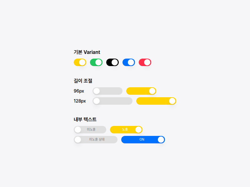
* 스위치 트랙의 가로 길이입니다.
|
|
11
11
|
* - `number` 입력 시 px 단위로 처리됩니다. (예: `96`)
|
|
@@ -21,7 +21,7 @@ export interface SwitchProps extends React.ComponentPropsWithoutRef<typeof Switc
|
|
|
21
21
|
* 스위치가 꺼짐(`unchecked`) 상태일 때, thumb 반대편(오른쪽 빈 영역)에 표시할 텍스트입니다.
|
|
22
22
|
*/
|
|
23
23
|
uncheckedLabel?: React.ReactNode;
|
|
24
|
-
}
|
|
24
|
+
} & React.ComponentPropsWithoutRef<typeof SwitchPrimitives.Root> & VariantProps<typeof switchVariants>;
|
|
25
25
|
/**
|
|
26
26
|
* 두 가지 상반된 상태(On/Off, 활성/비활성)를 즉각적으로 전환할 때 사용하는 컴포넌트입니다.
|
|
27
27
|
*
|
|
@@ -104,5 +104,23 @@ export interface SwitchProps extends React.ComponentPropsWithoutRef<typeof Switc
|
|
|
104
104
|
* ## 참고사진
|
|
105
105
|
* 
|
|
106
106
|
*/
|
|
107
|
-
declare const Switch: React.ForwardRefExoticComponent<
|
|
107
|
+
declare const Switch: React.ForwardRefExoticComponent<{
|
|
108
|
+
/**
|
|
109
|
+
* 스위치 트랙의 가로 길이입니다.
|
|
110
|
+
* - `number` 입력 시 px 단위로 처리됩니다. (예: `96`)
|
|
111
|
+
* - `string` 입력 시 CSS 길이값으로 처리됩니다. (예: `8rem`, `120px`)
|
|
112
|
+
* - 최소 길이는 기본 크기(40px)입니다.
|
|
113
|
+
*/
|
|
114
|
+
width?: number | string;
|
|
115
|
+
/**
|
|
116
|
+
* 스위치가 켜짐(`checked`) 상태일 때, thumb 반대편(왼쪽 빈 영역)에 표시할 텍스트입니다.
|
|
117
|
+
*/
|
|
118
|
+
checkedLabel?: React.ReactNode;
|
|
119
|
+
/**
|
|
120
|
+
* 스위치가 꺼짐(`unchecked`) 상태일 때, thumb 반대편(오른쪽 빈 영역)에 표시할 텍스트입니다.
|
|
121
|
+
*/
|
|
122
|
+
uncheckedLabel?: React.ReactNode;
|
|
123
|
+
} & Omit<SwitchPrimitives.SwitchProps & React.RefAttributes<HTMLButtonElement>, "ref"> & VariantProps<(props?: ({
|
|
124
|
+
variant?: "default" | "green" | "black" | "blue" | "red" | null | undefined;
|
|
125
|
+
} & import('class-variance-authority/types').ClassProp) | undefined) => string> & React.RefAttributes<HTMLButtonElement>>;
|
|
108
126
|
export { Switch };
|
|
@@ -4,7 +4,7 @@ import { VariantProps } from 'class-variance-authority';
|
|
|
4
4
|
declare const tableVariants: (props?: ({
|
|
5
5
|
bordered?: boolean | null | undefined;
|
|
6
6
|
} & import('class-variance-authority/types').ClassProp) | undefined) => string;
|
|
7
|
-
export
|
|
7
|
+
export type TableProps = {
|
|
8
8
|
/** zebra stripe 패턴 적용 여부 */
|
|
9
9
|
striped?: boolean;
|
|
10
10
|
/** row hover 효과 적용 여부 */
|
|
@@ -13,7 +13,7 @@ export interface TableProps extends React.TableHTMLAttributes<HTMLTableElement>,
|
|
|
13
13
|
bordered?: boolean;
|
|
14
14
|
/** 좁은 padding 적용 여부 */
|
|
15
15
|
compact?: boolean;
|
|
16
|
-
}
|
|
16
|
+
} & React.TableHTMLAttributes<HTMLTableElement> & VariantProps<typeof tableVariants>;
|
|
17
17
|
/**
|
|
18
18
|
* 데이터를 행과 열로 구조화하여 표시하는 테이블 컴포넌트입니다.
|
|
19
19
|
*
|
|
@@ -112,84 +112,109 @@ export interface TableProps extends React.TableHTMLAttributes<HTMLTableElement>,
|
|
|
112
112
|
* ## 참고사진
|
|
113
113
|
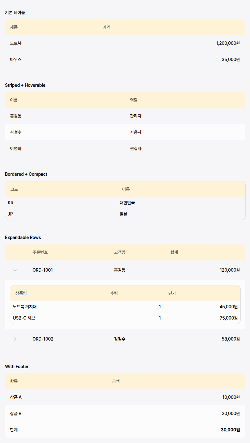
* 
|
|
114
114
|
*/
|
|
115
|
-
export declare const Table: React.ForwardRefExoticComponent<
|
|
116
|
-
|
|
117
|
-
|
|
115
|
+
export declare const Table: React.ForwardRefExoticComponent<{
|
|
116
|
+
/** zebra stripe 패턴 적용 여부 */
|
|
117
|
+
striped?: boolean;
|
|
118
|
+
/** row hover 효과 적용 여부 */
|
|
119
|
+
hoverable?: boolean;
|
|
120
|
+
/** 테두리 표시 여부 */
|
|
121
|
+
bordered?: boolean;
|
|
122
|
+
/** 좁은 padding 적용 여부 */
|
|
123
|
+
compact?: boolean;
|
|
124
|
+
} & React.TableHTMLAttributes<HTMLTableElement> & VariantProps<(props?: ({
|
|
125
|
+
bordered?: boolean | null | undefined;
|
|
126
|
+
} & import('class-variance-authority/types').ClassProp) | undefined) => string> & React.RefAttributes<HTMLTableElement>>;
|
|
127
|
+
export type TableHeaderProps = {} & React.HTMLAttributes<HTMLTableSectionElement>;
|
|
118
128
|
/**
|
|
119
129
|
* 테이블의 헤더 섹션을 정의하는 컴포넌트입니다.
|
|
120
130
|
*
|
|
121
131
|
* `<thead>` 태그를 렌더링하며, 보통 `TableRow`와 `TableHead`를 포함하여
|
|
122
132
|
* 열의 제목을 표시하는 데 사용됩니다.
|
|
123
133
|
*/
|
|
124
|
-
export declare const TableHeader: React.ForwardRefExoticComponent<
|
|
125
|
-
export
|
|
126
|
-
}
|
|
134
|
+
export declare const TableHeader: React.ForwardRefExoticComponent<React.HTMLAttributes<HTMLTableSectionElement> & React.RefAttributes<HTMLTableSectionElement>>;
|
|
135
|
+
export type TableBodyProps = {} & React.HTMLAttributes<HTMLTableSectionElement>;
|
|
127
136
|
/**
|
|
128
137
|
* 테이블의 본문 섹션을 정의하는 컴포넌트입니다.
|
|
129
138
|
*
|
|
130
139
|
* `<tbody>` 태그를 렌더링하며, 실제 데이터가 포함된 `TableRow`와 `TableCell`을
|
|
131
140
|
* 포함합니다.
|
|
132
141
|
*/
|
|
133
|
-
export declare const TableBody: React.ForwardRefExoticComponent<
|
|
134
|
-
export
|
|
135
|
-
}
|
|
142
|
+
export declare const TableBody: React.ForwardRefExoticComponent<React.HTMLAttributes<HTMLTableSectionElement> & React.RefAttributes<HTMLTableSectionElement>>;
|
|
143
|
+
export type TableFooterProps = {} & React.HTMLAttributes<HTMLTableSectionElement>;
|
|
136
144
|
/**
|
|
137
145
|
* 테이블의 푸터 섹션을 정의하는 컴포넌트입니다.
|
|
138
146
|
*
|
|
139
147
|
* `<tfoot>` 태그를 렌더링하며, 합계나 요약 정보를 표시하는 데 사용됩니다.
|
|
140
148
|
*/
|
|
141
|
-
export declare const TableFooter: React.ForwardRefExoticComponent<
|
|
149
|
+
export declare const TableFooter: React.ForwardRefExoticComponent<React.HTMLAttributes<HTMLTableSectionElement> & React.RefAttributes<HTMLTableSectionElement>>;
|
|
142
150
|
declare const tableRowVariants: (props?: ({
|
|
143
151
|
hoverable?: boolean | null | undefined;
|
|
144
152
|
selected?: boolean | null | undefined;
|
|
145
153
|
} & import('class-variance-authority/types').ClassProp) | undefined) => string;
|
|
146
|
-
export
|
|
154
|
+
export type TableRowProps = {
|
|
147
155
|
/** 선택된 행 표시 여부 */
|
|
148
156
|
selected?: boolean;
|
|
149
|
-
}
|
|
157
|
+
} & React.HTMLAttributes<HTMLTableRowElement> & VariantProps<typeof tableRowVariants>;
|
|
150
158
|
/**
|
|
151
159
|
* 테이블의 행(Row)을 정의하는 컴포넌트입니다.
|
|
152
160
|
*
|
|
153
161
|
* `<tr>` 태그를 렌더링하며, `hoverable`이나 `striped` 속성이 `Table` 컴포넌트에
|
|
154
162
|
* 적용되었을 때 이에 따른 스타일을 자동으로 적용합니다.
|
|
155
163
|
*/
|
|
156
|
-
export declare const TableRow: React.ForwardRefExoticComponent<
|
|
157
|
-
|
|
164
|
+
export declare const TableRow: React.ForwardRefExoticComponent<{
|
|
165
|
+
/** 선택된 행 표시 여부 */
|
|
166
|
+
selected?: boolean;
|
|
167
|
+
} & React.HTMLAttributes<HTMLTableRowElement> & VariantProps<(props?: ({
|
|
168
|
+
hoverable?: boolean | null | undefined;
|
|
169
|
+
selected?: boolean | null | undefined;
|
|
170
|
+
} & import('class-variance-authority/types').ClassProp) | undefined) => string> & React.RefAttributes<HTMLTableRowElement>>;
|
|
171
|
+
export type TableHeadProps = {
|
|
158
172
|
/** 정렬 가능 여부 */
|
|
159
173
|
sortable?: boolean;
|
|
160
174
|
/** 정렬 방향 */
|
|
161
175
|
sortDirection?: "asc" | "desc" | null;
|
|
162
176
|
/** 정렬 클릭 핸들러 */
|
|
163
177
|
onSort?: () => void;
|
|
164
|
-
}
|
|
178
|
+
} & React.ThHTMLAttributes<HTMLTableCellElement>;
|
|
165
179
|
/**
|
|
166
180
|
* 테이블의 헤더 셀을 정의하는 컴포넌트입니다.
|
|
167
181
|
*
|
|
168
182
|
* `<th>` 태그를 렌더링하며, 열의 제목을 표시합니다.
|
|
169
183
|
* 정렬 기능(`sortable`)을 지원하며, 정렬 방향에 따라 아이콘을 표시할 수 있습니다.
|
|
170
184
|
*/
|
|
171
|
-
export declare const TableHead: React.ForwardRefExoticComponent<
|
|
185
|
+
export declare const TableHead: React.ForwardRefExoticComponent<{
|
|
186
|
+
/** 정렬 가능 여부 */
|
|
187
|
+
sortable?: boolean;
|
|
188
|
+
/** 정렬 방향 */
|
|
189
|
+
sortDirection?: "asc" | "desc" | null;
|
|
190
|
+
/** 정렬 클릭 핸들러 */
|
|
191
|
+
onSort?: () => void;
|
|
192
|
+
} & React.ThHTMLAttributes<HTMLTableCellElement> & React.RefAttributes<HTMLTableCellElement>>;
|
|
172
193
|
declare const tableCellVariants: (props?: ({
|
|
173
194
|
align?: "center" | "right" | "left" | null | undefined;
|
|
174
195
|
} & import('class-variance-authority/types').ClassProp) | undefined) => string;
|
|
175
|
-
export
|
|
196
|
+
export type TableCellProps = {
|
|
176
197
|
/** 텍스트 정렬 방식 */
|
|
177
198
|
align?: "left" | "center" | "right";
|
|
178
|
-
}
|
|
199
|
+
} & React.TdHTMLAttributes<HTMLTableCellElement> & VariantProps<typeof tableCellVariants>;
|
|
179
200
|
/**
|
|
180
201
|
* 테이블의 데이터 셀을 정의하는 컴포넌트입니다.
|
|
181
202
|
*
|
|
182
203
|
* `<td>` 태그를 렌더링하며, 실제 데이터를 표시합니다.
|
|
183
204
|
* 텍스트 정렬(`align`)을 설정할 수 있습니다.
|
|
184
205
|
*/
|
|
185
|
-
export declare const TableCell: React.ForwardRefExoticComponent<
|
|
186
|
-
|
|
187
|
-
|
|
206
|
+
export declare const TableCell: React.ForwardRefExoticComponent<{
|
|
207
|
+
/** 텍스트 정렬 방식 */
|
|
208
|
+
align?: "left" | "center" | "right";
|
|
209
|
+
} & React.TdHTMLAttributes<HTMLTableCellElement> & VariantProps<(props?: ({
|
|
210
|
+
align?: "center" | "right" | "left" | null | undefined;
|
|
211
|
+
} & import('class-variance-authority/types').ClassProp) | undefined) => string> & React.RefAttributes<HTMLTableCellElement>>;
|
|
212
|
+
export type TableCaptionProps = {} & React.HTMLAttributes<HTMLTableCaptionElement>;
|
|
188
213
|
/**
|
|
189
214
|
* 테이블의 캡션(설명)을 정의하는 컴포넌트입니다.
|
|
190
215
|
*
|
|
191
216
|
* `<caption>` 태그를 렌더링하며, 스크린 리더 사용자에게 테이블의 목적을
|
|
192
217
|
* 설명하는 데 중요한 역할을 합니다.
|
|
193
218
|
*/
|
|
194
|
-
export declare const TableCaption: React.ForwardRefExoticComponent<
|
|
219
|
+
export declare const TableCaption: React.ForwardRefExoticComponent<React.HTMLAttributes<HTMLTableCaptionElement> & React.RefAttributes<HTMLTableCaptionElement>>;
|
|
195
220
|
export {};
|