@cashdoc/cashdoc-cms-design-system 1.15.3 → 2.0.1
This diff represents the content of publicly available package versions that have been released to one of the supported registries. The information contained in this diff is provided for informational purposes only and reflects changes between package versions as they appear in their respective public registries.
- package/dist/index.es.js +10569 -10033
- package/dist/index.es.js.map +1 -1
- package/dist/index.umd.js +110 -74
- package/dist/index.umd.js.map +1 -1
- package/dist/src/components/Button/Button.d.ts +2 -2
- package/dist/src/components/Button/variants.d.ts +13 -12
- package/dist/src/components/ContentArea/ContentArea.d.ts +32 -0
- package/dist/src/components/ContentArea/index.d.ts +2 -0
- package/dist/src/components/Dropdown/Select.d.ts +1 -1
- package/dist/src/components/FilterToggleGroup/FilterToggleGroup.d.ts +28 -27
- package/dist/src/components/Layout/Layout.d.ts +10 -0
- package/dist/src/components/Layout/index.d.ts +2 -0
- package/dist/src/components/Switch/Switch.d.ts +2 -2
- package/dist/src/components/TextInput/TextInput.d.ts +28 -2
- package/dist/src/components/ToggleButton/variants.d.ts +5 -7
- package/dist/src/components/index.d.ts +2 -0
- package/dist/style.css +1 -1
- package/package.json +1 -1
|
@@ -26,7 +26,7 @@ export type ButtonProps = {} & ButtonHTMLAttributes<HTMLButtonElement> & Variant
|
|
|
26
26
|
*
|
|
27
27
|
* ## Props
|
|
28
28
|
*
|
|
29
|
-
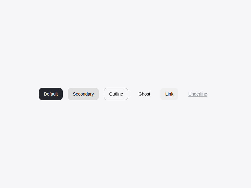
* - `variant`: `default` | `secondary` | `outline` | `ghost` | `link` | `underline`
|
|
29
|
+
* - `variant`: `default` | `secondary` | `outline` | `ghost` | `warning` | `danger` | `link` | `underline`
|
|
30
30
|
* - `size`: `default` | `sm` | `lg` | `icon`
|
|
31
31
|
* - `type`: 기본값 `"button"` — `<form>` 내부에서 의도치 않은 submit을 방지합니다. submit 버튼이 필요하면 `type="submit"`을 명시하세요.
|
|
32
32
|
*
|
|
@@ -74,7 +74,7 @@ export type ButtonProps = {} & ButtonHTMLAttributes<HTMLButtonElement> & Variant
|
|
|
74
74
|
* 
|
|
75
75
|
*/
|
|
76
76
|
declare const Button: import('react').ForwardRefExoticComponent<ButtonHTMLAttributes<HTMLButtonElement> & VariantProps<(props?: ({
|
|
77
|
-
variant?: "default" | "secondary" | "outline" | "ghost" | "warning" | "link" | "underline" | null | undefined;
|
|
77
|
+
variant?: "default" | "secondary" | "outline" | "ghost" | "warning" | "danger" | "link" | "underline" | null | undefined;
|
|
78
78
|
size?: "default" | "sm" | "lg" | "icon" | null | undefined;
|
|
79
79
|
} & import('class-variance-authority/types').ClassProp) | undefined) => string> & import('react').RefAttributes<HTMLButtonElement>>;
|
|
80
80
|
export { Button };
|
|
@@ -1,20 +1,21 @@
|
|
|
1
1
|
/**
|
|
2
2
|
* 버튼 컴포넌트의 스타일 variant를 정의합니다.
|
|
3
3
|
*
|
|
4
|
-
* @variant default - 기본
|
|
5
|
-
* @variant secondary - 보조
|
|
6
|
-
* @variant outline -
|
|
7
|
-
* @variant ghost -
|
|
8
|
-
* @variant warning -
|
|
9
|
-
* @variant
|
|
10
|
-
* @variant
|
|
4
|
+
* @variant default - 기본 CTA (다크 뉴트럴 배경)
|
|
5
|
+
* @variant secondary - 보조 액션 (밝은 그레이 배경)
|
|
6
|
+
* @variant outline - 테두리만 (흰색 배경)
|
|
7
|
+
* @variant ghost - 투명 배경, hover시 배경
|
|
8
|
+
* @variant warning - 소프트 위험 액션 (옅은 빨강 배경 + 빨간 텍스트)
|
|
9
|
+
* @variant danger - 강한 파괴적 액션 (빨간 솔리드 배경 + 흰 텍스트)
|
|
10
|
+
* @variant link - 링크 텍스트 (블루)
|
|
11
|
+
* @variant underline - 항상 밑줄 텍스트
|
|
11
12
|
*
|
|
12
|
-
* @size default - 기본
|
|
13
|
-
* @size sm - 작은
|
|
14
|
-
* @size lg - 큰
|
|
15
|
-
* @size icon - 아이콘
|
|
13
|
+
* @size default - 기본 (h-9, 36px)
|
|
14
|
+
* @size sm - 작은 (h-7, 30px)
|
|
15
|
+
* @size lg - 큰 (h-11, 44px)
|
|
16
|
+
* @size icon - 아이콘 정사각형 (36x36)
|
|
16
17
|
*/
|
|
17
18
|
export declare const buttonVariants: (props?: ({
|
|
18
|
-
variant?: "default" | "secondary" | "outline" | "ghost" | "warning" | "link" | "underline" | null | undefined;
|
|
19
|
+
variant?: "default" | "secondary" | "outline" | "ghost" | "warning" | "danger" | "link" | "underline" | null | undefined;
|
|
19
20
|
size?: "default" | "sm" | "lg" | "icon" | null | undefined;
|
|
20
21
|
} & import('class-variance-authority/types').ClassProp) | undefined) => string;
|
|
@@ -0,0 +1,32 @@
|
|
|
1
|
+
import { ComponentPropsWithoutRef } from 'react';
|
|
2
|
+
import { VariantProps } from 'class-variance-authority';
|
|
3
|
+
|
|
4
|
+
declare const contentAreaVariants: (props?: ({
|
|
5
|
+
padding?: "sm" | "lg" | "none" | "md" | null | undefined;
|
|
6
|
+
} & import('class-variance-authority/types').ClassProp) | undefined) => string;
|
|
7
|
+
export type ContentAreaProps = {
|
|
8
|
+
/**
|
|
9
|
+
* 내부 padding 크기. 자식 컴포넌트가 자체 padding을 가질 때는 `"none"` 사용.
|
|
10
|
+
* `ContentArea.Header` / `ContentArea.Body` / `ContentArea.Footer`를 함께
|
|
11
|
+
* 쓸 경우 항상 `"none"`을 사용하세요.
|
|
12
|
+
* @default "md"
|
|
13
|
+
*/
|
|
14
|
+
padding?: VariantProps<typeof contentAreaVariants>["padding"];
|
|
15
|
+
} & ComponentPropsWithoutRef<"div">;
|
|
16
|
+
export type ContentAreaHeaderProps = ComponentPropsWithoutRef<"header">;
|
|
17
|
+
export type ContentAreaBodyProps = ComponentPropsWithoutRef<"div">;
|
|
18
|
+
export type ContentAreaFooterProps = ComponentPropsWithoutRef<"footer">;
|
|
19
|
+
export declare const ContentArea: import('react').ForwardRefExoticComponent<{
|
|
20
|
+
/**
|
|
21
|
+
* 내부 padding 크기. 자식 컴포넌트가 자체 padding을 가질 때는 `"none"` 사용.
|
|
22
|
+
* `ContentArea.Header` / `ContentArea.Body` / `ContentArea.Footer`를 함께
|
|
23
|
+
* 쓸 경우 항상 `"none"`을 사용하세요.
|
|
24
|
+
* @default "md"
|
|
25
|
+
*/
|
|
26
|
+
padding?: VariantProps<typeof contentAreaVariants>["padding"];
|
|
27
|
+
} & Omit<import('react').DetailedHTMLProps<import('react').HTMLAttributes<HTMLDivElement>, HTMLDivElement>, "ref"> & import('react').RefAttributes<HTMLDivElement>> & {
|
|
28
|
+
Header: import('react').ForwardRefExoticComponent<Omit<import('react').DetailedHTMLProps<import('react').HTMLAttributes<HTMLElement>, HTMLElement>, "ref"> & import('react').RefAttributes<HTMLElement>>;
|
|
29
|
+
Body: import('react').ForwardRefExoticComponent<Omit<import('react').DetailedHTMLProps<import('react').HTMLAttributes<HTMLDivElement>, HTMLDivElement>, "ref"> & import('react').RefAttributes<HTMLDivElement>>;
|
|
30
|
+
Footer: import('react').ForwardRefExoticComponent<Omit<import('react').DetailedHTMLProps<import('react').HTMLAttributes<HTMLElement>, HTMLElement>, "ref"> & import('react').RefAttributes<HTMLElement>>;
|
|
31
|
+
};
|
|
32
|
+
export {};
|
|
@@ -112,4 +112,4 @@ export declare const Select: import('react').ForwardRefExoticComponent<{
|
|
|
112
112
|
} & import('class-variance-authority/types').ClassProp) | undefined) => string> & {
|
|
113
113
|
multiple?: false;
|
|
114
114
|
selectAll?: false;
|
|
115
|
-
}, "
|
|
115
|
+
}, "multiple" | "searchable" | "clearable" | "selectAll"> & import('react').RefAttributes<HTMLButtonElement>>;
|
|
@@ -2,50 +2,51 @@ import { ReactNode } from 'react';
|
|
|
2
2
|
|
|
3
3
|
declare const filterToggleGroupSizeClassMap: {
|
|
4
4
|
readonly sm: {
|
|
5
|
-
readonly item: "
|
|
6
|
-
readonly caption: "text-[10px]
|
|
7
|
-
readonly value: "text-
|
|
8
|
-
readonly label: "text-[
|
|
5
|
+
readonly item: "min-w-[84px] px-3 py-2";
|
|
6
|
+
readonly caption: "text-[10px]";
|
|
7
|
+
readonly value: "text-lg";
|
|
8
|
+
readonly label: "text-[11px] mt-1";
|
|
9
9
|
readonly icon: "[&>svg]:size-3";
|
|
10
10
|
};
|
|
11
11
|
readonly md: {
|
|
12
|
-
readonly item: "
|
|
13
|
-
readonly caption: "text-[
|
|
14
|
-
readonly value: "text-
|
|
15
|
-
readonly label: "text-[
|
|
12
|
+
readonly item: "min-w-24 px-3.5 py-2.5";
|
|
13
|
+
readonly caption: "text-[11px]";
|
|
14
|
+
readonly value: "text-[22px]";
|
|
15
|
+
readonly label: "text-[12px] mt-1.5";
|
|
16
16
|
readonly icon: "[&>svg]:size-3.5";
|
|
17
17
|
};
|
|
18
18
|
readonly lg: {
|
|
19
|
-
readonly item: "
|
|
20
|
-
readonly caption: "text-
|
|
21
|
-
readonly value: "text-
|
|
22
|
-
readonly label: "text-
|
|
19
|
+
readonly item: "min-w-28 px-4 py-3";
|
|
20
|
+
readonly caption: "text-[11px]";
|
|
21
|
+
readonly value: "text-[26px]";
|
|
22
|
+
readonly label: "text-[13px] mt-1.5";
|
|
23
23
|
readonly icon: "[&>svg]:size-4";
|
|
24
24
|
};
|
|
25
25
|
readonly xl: {
|
|
26
|
-
readonly item: "
|
|
27
|
-
readonly caption: "text-
|
|
28
|
-
readonly value: "text-
|
|
29
|
-
readonly label: "text-
|
|
26
|
+
readonly item: "min-w-32 px-[18px] py-3.5";
|
|
27
|
+
readonly caption: "text-[12px]";
|
|
28
|
+
readonly value: "text-[32px]";
|
|
29
|
+
readonly label: "text-[13px] mt-2";
|
|
30
30
|
readonly icon: "[&>svg]:size-5";
|
|
31
31
|
};
|
|
32
32
|
readonly "2xl": {
|
|
33
|
-
readonly item: "
|
|
34
|
-
readonly caption: "text-
|
|
35
|
-
readonly value: "text-
|
|
36
|
-
readonly label: "text-
|
|
33
|
+
readonly item: "min-w-36 px-5 py-4";
|
|
34
|
+
readonly caption: "text-[13px]";
|
|
35
|
+
readonly value: "text-[40px]";
|
|
36
|
+
readonly label: "text-[14px] mt-2";
|
|
37
37
|
readonly icon: "[&>svg]:size-6";
|
|
38
38
|
};
|
|
39
39
|
};
|
|
40
|
-
|
|
41
|
-
|
|
42
|
-
readonly
|
|
43
|
-
readonly
|
|
44
|
-
readonly
|
|
45
|
-
readonly
|
|
40
|
+
/** Intent dot color (replaces the previous top color bar). */
|
|
41
|
+
declare const filterToggleGroupIntentDotClassMap: {
|
|
42
|
+
readonly default: "bg-cms-gray-400";
|
|
43
|
+
readonly primary: "bg-cms-primary-200";
|
|
44
|
+
readonly success: "bg-cms-green-500";
|
|
45
|
+
readonly danger: "bg-cms-red-500";
|
|
46
|
+
readonly muted: "bg-cms-gray-400";
|
|
46
47
|
};
|
|
47
48
|
export type FilterToggleGroupSize = keyof typeof filterToggleGroupSizeClassMap;
|
|
48
|
-
export type FilterToggleGroupIntent = keyof typeof
|
|
49
|
+
export type FilterToggleGroupIntent = keyof typeof filterToggleGroupIntentDotClassMap;
|
|
49
50
|
export type FilterToggleGroupItem<T extends string | number> = {
|
|
50
51
|
value: T;
|
|
51
52
|
count: number | string;
|
|
@@ -0,0 +1,10 @@
|
|
|
1
|
+
import { ComponentPropsWithoutRef } from 'react';
|
|
2
|
+
|
|
3
|
+
export type LayoutRootProps = ComponentPropsWithoutRef<"div">;
|
|
4
|
+
export type LayoutSidebarProps = ComponentPropsWithoutRef<"aside">;
|
|
5
|
+
export type LayoutMainProps = ComponentPropsWithoutRef<"main">;
|
|
6
|
+
export declare const Layout: {
|
|
7
|
+
Root: import('react').ForwardRefExoticComponent<Omit<import('react').DetailedHTMLProps<import('react').HTMLAttributes<HTMLDivElement>, HTMLDivElement>, "ref"> & import('react').RefAttributes<HTMLDivElement>>;
|
|
8
|
+
Sidebar: import('react').ForwardRefExoticComponent<Omit<import('react').DetailedHTMLProps<import('react').HTMLAttributes<HTMLElement>, HTMLElement>, "ref"> & import('react').RefAttributes<HTMLElement>>;
|
|
9
|
+
Main: import('react').ForwardRefExoticComponent<Omit<import('react').DetailedHTMLProps<import('react').HTMLAttributes<HTMLElement>, HTMLElement>, "ref"> & import('react').RefAttributes<HTMLElement>>;
|
|
10
|
+
};
|
|
@@ -3,7 +3,7 @@ import { VariantProps } from 'class-variance-authority';
|
|
|
3
3
|
|
|
4
4
|
import * as SwitchPrimitives from "@radix-ui/react-switch";
|
|
5
5
|
declare const switchVariants: (props?: ({
|
|
6
|
-
variant?: "default" | "green" | "black" | "blue" | "red" | null | undefined;
|
|
6
|
+
variant?: "default" | "primary" | "green" | "black" | "blue" | "red" | null | undefined;
|
|
7
7
|
} & import('class-variance-authority/types').ClassProp) | undefined) => string;
|
|
8
8
|
export type SwitchProps = {
|
|
9
9
|
/**
|
|
@@ -121,6 +121,6 @@ declare const Switch: React.ForwardRefExoticComponent<{
|
|
|
121
121
|
*/
|
|
122
122
|
uncheckedLabel?: React.ReactNode;
|
|
123
123
|
} & Omit<SwitchPrimitives.SwitchProps & React.RefAttributes<HTMLButtonElement>, "ref"> & VariantProps<(props?: ({
|
|
124
|
-
variant?: "default" | "green" | "black" | "blue" | "red" | null | undefined;
|
|
124
|
+
variant?: "default" | "primary" | "green" | "black" | "blue" | "red" | null | undefined;
|
|
125
125
|
} & import('class-variance-authority/types').ClassProp) | undefined) => string> & React.RefAttributes<HTMLButtonElement>>;
|
|
126
126
|
export { Switch };
|
|
@@ -14,7 +14,9 @@ export type TextInputProps = {
|
|
|
14
14
|
showCharCount?: boolean;
|
|
15
15
|
labelLayout?: "vertical" | "horizontal";
|
|
16
16
|
labelWidth?: string;
|
|
17
|
-
|
|
17
|
+
prefix?: React.ReactNode;
|
|
18
|
+
suffix?: React.ReactNode;
|
|
19
|
+
} & Omit<React.InputHTMLAttributes<HTMLInputElement>, "size" | "prefix"> & VariantProps<typeof textInputVariants>;
|
|
18
20
|
/**
|
|
19
21
|
* 사용자로부터 텍스트, 이메일, 숫자 등의 단일 라인 데이터를 입력받는 필드입니다.
|
|
20
22
|
*
|
|
@@ -83,6 +85,28 @@ export type TextInputProps = {
|
|
|
83
85
|
* ```
|
|
84
86
|
* {@end-tool}
|
|
85
87
|
*
|
|
88
|
+
* {@tool snippet}
|
|
89
|
+
* 좌/우 affix(검색 아이콘, 단위 등):
|
|
90
|
+
*
|
|
91
|
+
* `prefix`/`suffix`는 `ReactNode`를 받아 input 내부에 absolute로 배치되며,
|
|
92
|
+
* 존재 시 input padding이 자동으로 보정됩니다(`pl-9` / `pr-9`). 기본적으로 장식용
|
|
93
|
+
* (`pointer-events-none`) 이므로, 인터랙티브하게 쓰려면 자식 요소에
|
|
94
|
+
* `pointer-events-auto`를 직접 지정하세요.
|
|
95
|
+
*
|
|
96
|
+
* ```tsx
|
|
97
|
+
* <TextInput
|
|
98
|
+
* prefix={<SearchIcon size={16} />}
|
|
99
|
+
* placeholder="병원명 · 대행사명 검색"
|
|
100
|
+
* />
|
|
101
|
+
*
|
|
102
|
+
* <TextInput
|
|
103
|
+
* suffix={<span className="text-sm text-cms-gray-500">원</span>}
|
|
104
|
+
* placeholder="0"
|
|
105
|
+
* type="number"
|
|
106
|
+
* />
|
|
107
|
+
* ```
|
|
108
|
+
* {@end-tool}
|
|
109
|
+
*
|
|
86
110
|
* See also:
|
|
87
111
|
*
|
|
88
112
|
* - {@link TextArea}, 여러 줄 텍스트 입력을 위한 컴포넌트
|
|
@@ -102,7 +126,9 @@ export declare const TextInput: React.ForwardRefExoticComponent<{
|
|
|
102
126
|
showCharCount?: boolean;
|
|
103
127
|
labelLayout?: "vertical" | "horizontal";
|
|
104
128
|
labelWidth?: string;
|
|
105
|
-
|
|
129
|
+
prefix?: React.ReactNode;
|
|
130
|
+
suffix?: React.ReactNode;
|
|
131
|
+
} & Omit<React.InputHTMLAttributes<HTMLInputElement>, "size" | "prefix"> & VariantProps<(props?: ({
|
|
106
132
|
variant?: "default" | "error" | null | undefined;
|
|
107
133
|
fullWidth?: boolean | null | undefined;
|
|
108
134
|
} & import('class-variance-authority/types').ClassProp) | undefined) => string> & React.RefAttributes<HTMLInputElement>>;
|
|
@@ -1,15 +1,13 @@
|
|
|
1
1
|
/**
|
|
2
2
|
* ToggleButton(눌림 상태가 유지되는 박스 토글)의 시각 variant를 정의합니다.
|
|
3
3
|
*
|
|
4
|
-
*
|
|
5
|
-
* `pressed` 상태에 따라 채워진(filled) ↔ 외곽선(outline) 스타일이
|
|
6
|
-
* 토글되며 상태가 유지됩니다.
|
|
4
|
+
* v2 family-look: `pressed` 상태는 다크 fill + 좌측 체크 표식으로 표현합니다.
|
|
7
5
|
*
|
|
8
|
-
* @variant default - 회색 톤 (기본). 눌림 상태에서 `cms-gray-
|
|
9
|
-
* @variant primary - 강조 톤. 눌림 상태에서 `cms-primary-
|
|
6
|
+
* @variant default - 회색 톤 (기본). 눌림 상태에서 `cms-gray-900` 외곽선·체크.
|
|
7
|
+
* @variant primary - 강조 톤. 눌림 상태에서 `cms-primary-200` (#FFD200) fill.
|
|
10
8
|
*
|
|
11
|
-
* @size sm - h-
|
|
12
|
-
* @size md - h-
|
|
9
|
+
* @size sm - h-7, text-[12px], px-2.5
|
|
10
|
+
* @size md - h-[34px], text-[13px], px-3.5 (기본)
|
|
13
11
|
*/
|
|
14
12
|
export declare const toggleButtonVariants: (props?: ({
|
|
15
13
|
variant?: "default" | "primary" | null | undefined;
|