@brightspace-ui/core 3.321.3 → 3.323.0
This diff represents the content of publicly available package versions that have been released to one of the supported registries. The information contained in this diff is provided for informational purposes only and reflects changes between package versions as they appear in their respective public registries.
- package/components/empty-state/README.md +13 -13
- package/components/empty-state/empty-state-action-button.js +2 -76
- package/components/empty-state/empty-state-action-link.js +2 -38
- package/components/empty-state/empty-state-illustrated.js +4 -126
- package/components/empty-state/empty-state-simple.js +7 -6
- package/components/empty-state/empty-state-styles.js +1 -88
- package/components/filter/filter.js +7 -7
- package/components/state/state-action-button.js +88 -0
- package/components/state/state-action-link.js +45 -0
- package/components/state/state-illustrated.js +129 -0
- package/components/{empty-state/empty-state-mixin.js → state/state-mixin.js} +3 -3
- package/components/state/state-styles.js +96 -0
- package/custom-elements.json +202 -18
- package/package.json +2 -2
- package/templates/primary-secondary/primary-secondary.js +44 -4
- /package/components/{empty-state → state}/images/assembly-line.svg +0 -0
- /package/components/{empty-state → state}/images/blueprint.svg +0 -0
- /package/components/{empty-state → state}/images/calendar.svg +0 -0
- /package/components/{empty-state → state}/images/cat-computer.svg +0 -0
- /package/components/{empty-state → state}/images/checklist.svg +0 -0
- /package/components/{empty-state → state}/images/data-tracking.svg +0 -0
- /package/components/{empty-state → state}/images/desert-road.svg +0 -0
- /package/components/{empty-state → state}/images/fish-hook.svg +0 -0
- /package/components/{empty-state → state}/images/oven.svg +0 -0
- /package/components/{empty-state → state}/images/pipeline.svg +0 -0
- /package/components/{empty-state → state}/images/race.svg +0 -0
- /package/components/{empty-state → state}/images/rockets.svg +0 -0
- /package/components/{empty-state → state}/images/tumbleweed.svg +0 -0
- /package/generated/{empty-state → state}/assembly-line.js +0 -0
- /package/generated/{empty-state → state}/blueprint.js +0 -0
- /package/generated/{empty-state → state}/calendar.js +0 -0
- /package/generated/{empty-state → state}/cat-computer.js +0 -0
- /package/generated/{empty-state → state}/checklist.js +0 -0
- /package/generated/{empty-state → state}/data-tracking.js +0 -0
- /package/generated/{empty-state → state}/desert-road.js +0 -0
- /package/generated/{empty-state → state}/fish-hook.js +0 -0
- /package/generated/{empty-state → state}/oven.js +0 -0
- /package/generated/{empty-state → state}/pipeline.js +0 -0
- /package/generated/{empty-state → state}/presetIllustrationLoader.js +0 -0
- /package/generated/{empty-state → state}/race.js +0 -0
- /package/generated/{empty-state → state}/rockets.js +0 -0
- /package/generated/{empty-state → state}/tumbleweed.js +0 -0
|
@@ -158,16 +158,16 @@ To add the link, place a `d2l-empty-state-action-link` component inside of the d
|
|
|
158
158
|
|
|
159
159
|
| Illustration | Name |
|
|
160
160
|
| :---: | :--- |
|
|
161
|
-
|  | assembly-line |
|
|
162
|
+
|  | blueprint |
|
|
163
|
+
|  | calendar |
|
|
164
|
+
|  | cat-computer |
|
|
165
|
+
|  | checklist |
|
|
166
|
+
| 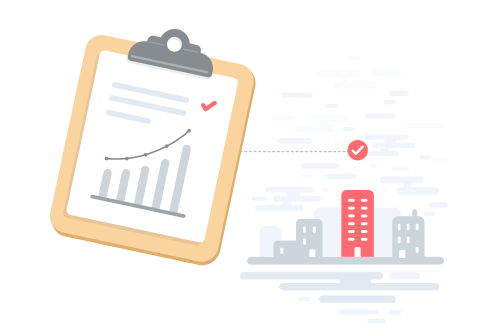 | data-tracking |
|
|
167
|
+
| 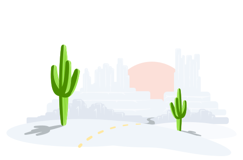 | desert-road |
|
|
168
|
+
| 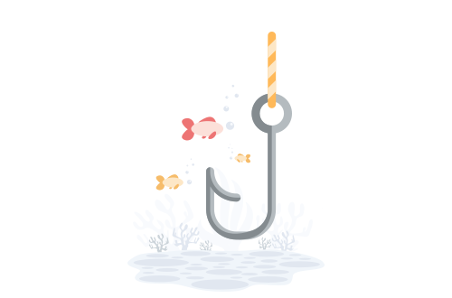 | fish-hook |
|
|
169
|
+
| 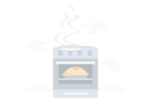 | oven |
|
|
170
|
+
| 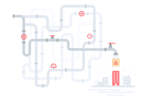 | pipeline |
|
|
171
|
+
| 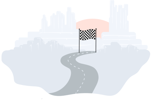 | race |
|
|
172
|
+
| 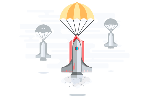 | rockets |
|
|
173
|
+
| 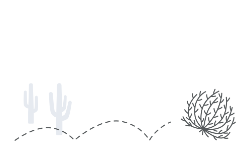 | tumbleweed |
|
|
@@ -1,84 +1,10 @@
|
|
|
1
|
-
import '../
|
|
2
|
-
import '../button/button-subtle.js';
|
|
3
|
-
import { css, html, LitElement, nothing } from 'lit';
|
|
4
|
-
import { FocusMixin } from '../../mixins/focus-mixin.js';
|
|
5
|
-
import { ifDefined } from 'lit/directives/if-defined.js';
|
|
6
|
-
import { PropertyRequiredMixin } from '../../mixins/property-required/property-required-mixin.js';
|
|
7
|
-
|
|
8
|
-
/**
|
|
9
|
-
* `d2l-empty-state-action-button` is an empty state action component that can be placed inside of the default slot of `empty-state-simple` or `empty-state-illustrated` to add a button action to the component.
|
|
10
|
-
* @fires d2l-empty-state-action - Dispatched when the action button is clicked
|
|
11
|
-
* @fires d2l-empty-state-illustrated-check - Internal event
|
|
12
|
-
*/
|
|
13
|
-
class EmptyStateActionButton extends FocusMixin(PropertyRequiredMixin(LitElement)) {
|
|
14
|
-
|
|
15
|
-
static properties = {
|
|
16
|
-
/**
|
|
17
|
-
* REQUIRED: The action text to be used in the button
|
|
18
|
-
* @type {string}
|
|
19
|
-
*/
|
|
20
|
-
text: { type: String, required: true },
|
|
21
|
-
/**
|
|
22
|
-
* This will change the action button to use a primary button instead of the default subtle button. The primary attribute is only valid when `d2l-empty-state-action-button` is placed within `d2l-empty-state-illustrated` components
|
|
23
|
-
* @type {boolean}
|
|
24
|
-
*/
|
|
25
|
-
primary: { type: Boolean },
|
|
26
|
-
_illustrated: { state: true }
|
|
27
|
-
};
|
|
28
|
-
|
|
29
|
-
static styles = css`
|
|
30
|
-
.d2l-empty-state-action {
|
|
31
|
-
vertical-align: top;
|
|
32
|
-
}
|
|
33
|
-
`;
|
|
34
|
-
|
|
35
|
-
constructor() {
|
|
36
|
-
super();
|
|
37
|
-
this._illustrated = false;
|
|
38
|
-
}
|
|
39
|
-
|
|
40
|
-
static get focusElementSelector() {
|
|
41
|
-
return '.d2l-empty-state-action';
|
|
42
|
-
}
|
|
43
|
-
|
|
44
|
-
connectedCallback() {
|
|
45
|
-
super.connectedCallback();
|
|
46
|
-
requestAnimationFrame(() => {
|
|
47
|
-
const e = new CustomEvent('d2l-empty-state-illustrated-check', {
|
|
48
|
-
bubbles: true,
|
|
49
|
-
detail: {}
|
|
50
|
-
});
|
|
51
|
-
this.dispatchEvent(e);
|
|
52
|
-
this._illustrated = e.detail.illustrated || false;
|
|
53
|
-
});
|
|
54
|
-
}
|
|
55
|
-
|
|
56
|
-
render() {
|
|
57
|
-
let actionButton = nothing;
|
|
58
|
-
if (this.text) {
|
|
59
|
-
actionButton = this._illustrated && this.primary
|
|
60
|
-
? html`<d2l-button
|
|
61
|
-
class="d2l-empty-state-action"
|
|
62
|
-
@click=${this._handleActionClick}
|
|
63
|
-
primary>
|
|
64
|
-
${this.text}
|
|
65
|
-
</d2l-button>`
|
|
66
|
-
: html`<d2l-button-subtle
|
|
67
|
-
class="d2l-empty-state-action"
|
|
68
|
-
@click=${this._handleActionClick}
|
|
69
|
-
h-align="${ifDefined(!this._illustrated ? 'text' : undefined)}"
|
|
70
|
-
?slim=${!this._illustrated}
|
|
71
|
-
text=${this.text}>
|
|
72
|
-
</d2l-button-subtle>`;
|
|
73
|
-
}
|
|
74
|
-
return html`${actionButton}`;
|
|
75
|
-
}
|
|
1
|
+
import { StateActionButton } from '../state/state-action-button.js';
|
|
76
2
|
|
|
3
|
+
class EmptyStateActionButton extends StateActionButton {
|
|
77
4
|
_handleActionClick(e) {
|
|
78
5
|
e.stopPropagation();
|
|
79
6
|
this.dispatchEvent(new CustomEvent('d2l-empty-state-action'));
|
|
80
7
|
}
|
|
81
|
-
|
|
82
8
|
}
|
|
83
9
|
|
|
84
10
|
customElements.define('d2l-empty-state-action-button', EmptyStateActionButton);
|
|
@@ -1,41 +1,5 @@
|
|
|
1
|
-
import {
|
|
2
|
-
import { bodyCompactStyles } from '../typography/styles.js';
|
|
3
|
-
import { FocusMixin } from '../../mixins/focus-mixin.js';
|
|
4
|
-
import { LinkMixin } from '../link/link-mixin.js';
|
|
5
|
-
import { linkStyles } from '../link/link.js';
|
|
6
|
-
import { PropertyRequiredMixin } from '../../mixins/property-required/property-required-mixin.js';
|
|
1
|
+
import { StateActionLink } from '../state/state-action-link.js';
|
|
7
2
|
|
|
8
|
-
|
|
9
|
-
* `d2l-empty-state-action-link` is an empty state action component that can be placed inside of the default slot of `empty-state-simple` or `empty-state-illustrated` to add a link action to the component.
|
|
10
|
-
*/
|
|
11
|
-
class EmptyStateActionLink extends LinkMixin(FocusMixin(PropertyRequiredMixin(LitElement))) {
|
|
12
|
-
|
|
13
|
-
static properties = {
|
|
14
|
-
/**
|
|
15
|
-
* REQUIRED: The action text to be used in the subtle button
|
|
16
|
-
* @type {string}
|
|
17
|
-
*/
|
|
18
|
-
text: { type: String, required: true },
|
|
19
|
-
/**
|
|
20
|
-
* REQUIRED: The action URL or URL fragment of the link
|
|
21
|
-
* @type {string}
|
|
22
|
-
*/
|
|
23
|
-
href: { type: String, required: true },
|
|
24
|
-
};
|
|
25
|
-
|
|
26
|
-
static styles = [super.styles, bodyCompactStyles, linkStyles];
|
|
27
|
-
|
|
28
|
-
static get focusElementSelector() {
|
|
29
|
-
return '.d2l-link';
|
|
30
|
-
}
|
|
31
|
-
|
|
32
|
-
render() {
|
|
33
|
-
if (!this.text || !this.href) return nothing;
|
|
34
|
-
const linkClasses = { 'd2l-body-compact': true, 'd2l-link': true };
|
|
35
|
-
const inner = html`${this.text}${this._renderNewWindowIcon()}`;
|
|
36
|
-
return this._render(inner, { linkClasses });
|
|
37
|
-
}
|
|
38
|
-
|
|
39
|
-
}
|
|
3
|
+
class EmptyStateActionLink extends StateActionLink {}
|
|
40
4
|
|
|
41
5
|
customElements.define('d2l-empty-state-action-link', EmptyStateActionLink);
|
|
@@ -1,129 +1,7 @@
|
|
|
1
|
-
import {
|
|
2
|
-
import {
|
|
3
|
-
|
|
4
|
-
|
|
5
|
-
import { EmptyStateMixin } from './empty-state-mixin.js';
|
|
6
|
-
import { LoadingCompleteMixin } from '../../mixins/loading-complete/loading-complete-mixin.js';
|
|
7
|
-
import { loadSvg } from '../../generated/empty-state/presetIllustrationLoader.js';
|
|
8
|
-
import { runAsync } from '../../directives/run-async/run-async.js';
|
|
9
|
-
import { styleMap } from 'lit/directives/style-map.js';
|
|
10
|
-
import { unsafeSVG } from 'lit/directives/unsafe-svg.js';
|
|
11
|
-
|
|
12
|
-
const illustrationAspectRatio = 500 / 330;
|
|
13
|
-
|
|
14
|
-
/**
|
|
15
|
-
* The `d2l-empty-state-illustrated` component is an empty state component that displays a title and description with an illustration. An empty state action component can be placed inside of the default slot to add an optional action.
|
|
16
|
-
* @slot - Slot for empty state actions
|
|
17
|
-
* @slot illustration - Slot for custom SVG content if `illustration-name` property is not set
|
|
18
|
-
*/
|
|
19
|
-
class EmptyStateIllustrated extends LoadingCompleteMixin(EmptyStateMixin(LitElement)) {
|
|
20
|
-
|
|
21
|
-
static properties = {
|
|
22
|
-
/**
|
|
23
|
-
* REQUIRED: A description giving details about the empty state
|
|
24
|
-
* @type {string}
|
|
25
|
-
*/
|
|
26
|
-
description: { type: String, required: true },
|
|
27
|
-
/**
|
|
28
|
-
* The name of the preset image you would like to display in the component
|
|
29
|
-
* @type {string}
|
|
30
|
-
*/
|
|
31
|
-
illustrationName: { type: String, attribute: 'illustration-name' },
|
|
32
|
-
/**
|
|
33
|
-
* REQUIRED: A title for the empty state
|
|
34
|
-
* @type {string}
|
|
35
|
-
*/
|
|
36
|
-
titleText: { type: String, attribute: 'title-text', required: true },
|
|
37
|
-
_contentHeight: { state: true },
|
|
38
|
-
_titleSmall: { state: true }
|
|
39
|
-
};
|
|
40
|
-
|
|
41
|
-
static styles = [bodyCompactStyles, emptyStateStyles, emptyStateIllustratedStyles];
|
|
42
|
-
|
|
43
|
-
constructor() {
|
|
44
|
-
super();
|
|
45
|
-
this._contentHeight = 330;
|
|
46
|
-
this._resizeObserver = new ResizeObserver(this._onResize.bind(this));
|
|
47
|
-
this._titleSmall = false;
|
|
48
|
-
}
|
|
49
|
-
|
|
50
|
-
connectedCallback() {
|
|
51
|
-
super.connectedCallback();
|
|
52
|
-
this.addEventListener('d2l-empty-state-illustrated-check', this.#handleEmptyStateIllustratedCheck);
|
|
53
|
-
this._resizeObserver.observe(this);
|
|
54
|
-
}
|
|
55
|
-
|
|
56
|
-
disconnectedCallback() {
|
|
57
|
-
super.disconnectedCallback();
|
|
58
|
-
this.removeEventListener('d2l-empty-state-illustrated-check', this.#handleEmptyStateIllustratedCheck);
|
|
59
|
-
this._resizeObserver.disconnect();
|
|
60
|
-
}
|
|
61
|
-
|
|
62
|
-
render() {
|
|
63
|
-
const titleClass = {
|
|
64
|
-
'd2l-empty-state-title': true,
|
|
65
|
-
'd2l-empty-state-title-small': this._titleSmall,
|
|
66
|
-
'd2l-empty-state-title-large': !this._titleSmall,
|
|
67
|
-
};
|
|
68
|
-
|
|
69
|
-
return html`
|
|
70
|
-
${this.#renderIllustration()}
|
|
71
|
-
<p class="${classMap(titleClass)}">${this.titleText}</p>
|
|
72
|
-
<p class="d2l-body-compact d2l-empty-state-description" tabindex="-1">${this.description}</p>
|
|
73
|
-
<slot class="action-slot"></slot>
|
|
74
|
-
`;
|
|
75
|
-
}
|
|
76
|
-
|
|
77
|
-
_onResize(entries) {
|
|
78
|
-
if (!entries || entries.length === 0) return;
|
|
79
|
-
const entry = entries[0];
|
|
80
|
-
|
|
81
|
-
const width = entry.contentRect.width;
|
|
82
|
-
if (width === 0) return; // ignore until visible
|
|
83
|
-
|
|
84
|
-
requestAnimationFrame(() => {
|
|
85
|
-
this._contentHeight = Math.min(entry.contentRect.right / illustrationAspectRatio, 330);
|
|
86
|
-
this._titleSmall = entry.contentRect.right <= 615;
|
|
87
|
-
});
|
|
88
|
-
}
|
|
89
|
-
|
|
90
|
-
async #getIllustration(illustrationName) {
|
|
91
|
-
if (!illustrationName) return;
|
|
92
|
-
|
|
93
|
-
const svg = await loadSvg(illustrationName);
|
|
94
|
-
if (!svg) setTimeout(() => {
|
|
95
|
-
throw new Error(`<d2l-empty-state-illustrated-${this._illustratedComponentType}>: Unable to retrieve requested illustration.`);
|
|
96
|
-
});
|
|
97
|
-
return svg ? html`${unsafeSVG(svg.val)}` : nothing;
|
|
98
|
-
}
|
|
99
|
-
|
|
100
|
-
#handleEmptyStateIllustratedCheck(e) {
|
|
101
|
-
e.stopPropagation();
|
|
102
|
-
e.detail.illustrated = true;
|
|
103
|
-
}
|
|
104
|
-
|
|
105
|
-
#renderIllustration() {
|
|
106
|
-
if (!this.illustrationName) {
|
|
107
|
-
this.resolveLoadingComplete();
|
|
108
|
-
return html`<slot class="illustration-slot" name="illustration"></slot>`;
|
|
109
|
-
}
|
|
110
|
-
const illustrationContainerStyle = {
|
|
111
|
-
height: `${this._contentHeight}px`,
|
|
112
|
-
};
|
|
113
|
-
const asyncVal = runAsync(
|
|
114
|
-
this.illustrationName,
|
|
115
|
-
() => this.#getIllustration(this.illustrationName),
|
|
116
|
-
{
|
|
117
|
-
success: illustration => {
|
|
118
|
-
this.resolveLoadingComplete();
|
|
119
|
-
return illustration;
|
|
120
|
-
}
|
|
121
|
-
},
|
|
122
|
-
{ pendingState: false }
|
|
123
|
-
);
|
|
124
|
-
return html`<div style="${styleMap(illustrationContainerStyle)}">${asyncVal}</div>`;
|
|
125
|
-
}
|
|
126
|
-
|
|
1
|
+
import { emptyStateStyles } from './empty-state-styles.js';
|
|
2
|
+
import { StateIllustrated } from '../state/state-illustrated.js';
|
|
3
|
+
class EmptyStateIllustrated extends StateIllustrated {
|
|
4
|
+
static styles = [super.styles, emptyStateStyles];
|
|
127
5
|
}
|
|
128
6
|
|
|
129
7
|
customElements.define('d2l-empty-state-illustrated', EmptyStateIllustrated);
|
|
@@ -1,14 +1,15 @@
|
|
|
1
1
|
import '../button/button-subtle.js';
|
|
2
|
-
import { emptyStateSimpleStyles, emptyStateStyles } from './empty-state-styles.js';
|
|
3
2
|
import { html, LitElement } from 'lit';
|
|
3
|
+
import { stateSimpleStyles, stateStyles } from '../state/state-styles.js';
|
|
4
4
|
import { bodyCompactStyles } from '../typography/styles.js';
|
|
5
|
-
import {
|
|
5
|
+
import { emptyStateStyles } from './empty-state-styles.js';
|
|
6
|
+
import { StateMixin } from '../state/state-mixin.js';
|
|
6
7
|
|
|
7
8
|
/**
|
|
8
9
|
* The `d2l-empty-state-simple` component is an empty state component that displays a description. An empty state action component can be placed inside of the default slot to add an optional action.
|
|
9
10
|
* @slot - Slot for empty state actions
|
|
10
11
|
*/
|
|
11
|
-
class EmptyStateSimple extends
|
|
12
|
+
class EmptyStateSimple extends StateMixin(LitElement) {
|
|
12
13
|
|
|
13
14
|
static properties = {
|
|
14
15
|
/**
|
|
@@ -18,12 +19,12 @@ class EmptyStateSimple extends EmptyStateMixin(LitElement) {
|
|
|
18
19
|
description: { type: String, required: true },
|
|
19
20
|
};
|
|
20
21
|
|
|
21
|
-
static styles = [bodyCompactStyles,
|
|
22
|
+
static styles = [bodyCompactStyles, stateStyles, stateSimpleStyles, emptyStateStyles];
|
|
22
23
|
|
|
23
24
|
render() {
|
|
24
25
|
return html`
|
|
25
|
-
<div class="
|
|
26
|
-
<p class="d2l-body-compact d2l-
|
|
26
|
+
<div class="state-container">
|
|
27
|
+
<p class="d2l-body-compact d2l-state-description" tabindex="-1">${this.description}</p>
|
|
27
28
|
<slot class="action-slot"></slot>
|
|
28
29
|
</div>
|
|
29
30
|
`;
|
|
@@ -1,96 +1,9 @@
|
|
|
1
|
-
import '../colors/colors.js';
|
|
2
1
|
import { css } from 'lit';
|
|
3
|
-
import { getFocusRingStyles } from '../../helpers/focus.js';
|
|
4
2
|
|
|
3
|
+
// Styles supporting old empty state action buttons and links
|
|
5
4
|
export const emptyStateStyles = css`
|
|
6
|
-
|
|
7
|
-
:host {
|
|
8
|
-
display: block;
|
|
9
|
-
}
|
|
10
|
-
|
|
11
|
-
:host([hidden]) {
|
|
12
|
-
display: none;
|
|
13
|
-
}
|
|
14
|
-
|
|
15
|
-
.action-slot::slotted(*) {
|
|
16
|
-
display: none;
|
|
17
|
-
}
|
|
18
|
-
|
|
19
5
|
.action-slot::slotted(d2l-empty-state-action-button:first-of-type),
|
|
20
6
|
.action-slot::slotted(d2l-empty-state-action-link:first-of-type) {
|
|
21
7
|
display: inline;
|
|
22
8
|
}
|
|
23
|
-
.d2l-empty-state-description {
|
|
24
|
-
--d2l-focus-ring-offset: 3px;
|
|
25
|
-
border-radius: 0.3rem;
|
|
26
|
-
}
|
|
27
|
-
${getFocusRingStyles('.d2l-empty-state-description')}
|
|
28
|
-
`;
|
|
29
|
-
|
|
30
|
-
export const emptyStateSimpleStyles = css`
|
|
31
|
-
|
|
32
|
-
:host {
|
|
33
|
-
border: 1px solid var(--d2l-color-mica);
|
|
34
|
-
border-radius: 0.3rem;
|
|
35
|
-
padding: 1.2rem 1.5rem;
|
|
36
|
-
}
|
|
37
|
-
|
|
38
|
-
:host([description]) .empty-state-container {
|
|
39
|
-
align-items: center;
|
|
40
|
-
column-gap: 0.75rem;
|
|
41
|
-
display: flex;
|
|
42
|
-
flex-wrap: wrap;
|
|
43
|
-
padding-inline-start: 0;
|
|
44
|
-
}
|
|
45
|
-
|
|
46
|
-
.d2l-empty-state-description {
|
|
47
|
-
margin: 0;
|
|
48
|
-
}
|
|
49
|
-
|
|
50
|
-
`;
|
|
51
|
-
|
|
52
|
-
export const emptyStateIllustratedStyles = css`
|
|
53
|
-
|
|
54
|
-
:host {
|
|
55
|
-
text-align: center;
|
|
56
|
-
}
|
|
57
|
-
|
|
58
|
-
.illustration-slot::slotted(*) {
|
|
59
|
-
display: none;
|
|
60
|
-
}
|
|
61
|
-
|
|
62
|
-
.illustration-slot::slotted(img:first-of-type),
|
|
63
|
-
.illustration-slot::slotted(svg:first-of-type) {
|
|
64
|
-
display: inline-block;
|
|
65
|
-
}
|
|
66
|
-
|
|
67
|
-
svg {
|
|
68
|
-
height: 100%;
|
|
69
|
-
max-width: 500px;
|
|
70
|
-
width: 100%;
|
|
71
|
-
}
|
|
72
|
-
|
|
73
|
-
.d2l-empty-state-title {
|
|
74
|
-
margin-bottom: 0.9rem;
|
|
75
|
-
}
|
|
76
|
-
|
|
77
|
-
.d2l-empty-state-title-large {
|
|
78
|
-
font-size: 1.5rem;
|
|
79
|
-
line-height: 1.8rem;
|
|
80
|
-
margin: 1rem 0 1.5rem 0;
|
|
81
|
-
}
|
|
82
|
-
|
|
83
|
-
.d2l-empty-state-title-small {
|
|
84
|
-
font-size: 1rem;
|
|
85
|
-
font-weight: 700;
|
|
86
|
-
line-height: 1.5rem;
|
|
87
|
-
margin-top: 0.5rem;
|
|
88
|
-
}
|
|
89
|
-
|
|
90
|
-
.d2l-empty-state-description {
|
|
91
|
-
margin: 0 auto 0.8rem;
|
|
92
|
-
max-width: 500px;
|
|
93
|
-
width: 100%;
|
|
94
|
-
}
|
|
95
|
-
|
|
96
9
|
`;
|
|
@@ -5,8 +5,8 @@ import '../button/button-subtle.js';
|
|
|
5
5
|
import '../dropdown/dropdown.js';
|
|
6
6
|
import '../dropdown/dropdown-content.js';
|
|
7
7
|
import '../dropdown/dropdown-menu.js';
|
|
8
|
-
import '../
|
|
9
|
-
import '../
|
|
8
|
+
import '../state/state-action-button.js';
|
|
9
|
+
import '../state/state-action-link.js';
|
|
10
10
|
import '../empty-state/empty-state-simple.js';
|
|
11
11
|
import '../expand-collapse/expand-collapse-content.js';
|
|
12
12
|
import '../hierarchical-view/hierarchical-view.js';
|
|
@@ -537,20 +537,20 @@ class Filter extends FocusMixin(LocalizeCoreElement(LitElement)) {
|
|
|
537
537
|
let emptyStateAction = nothing;
|
|
538
538
|
if (emptyState.actionText && emptyState.actionHref) {
|
|
539
539
|
emptyStateAction = html`
|
|
540
|
-
<d2l-
|
|
540
|
+
<d2l-state-action-link
|
|
541
541
|
href="${emptyState.actionHref}"
|
|
542
542
|
text="${emptyState.actionText}">
|
|
543
|
-
</d2l-
|
|
543
|
+
</d2l-state-action-link>
|
|
544
544
|
`;
|
|
545
545
|
}
|
|
546
546
|
else if (emptyState.actionText) {
|
|
547
547
|
emptyStateAction = html`
|
|
548
|
-
<d2l-
|
|
549
|
-
@d2l-
|
|
548
|
+
<d2l-state-action-button
|
|
549
|
+
@d2l-state-action="${this._handleEmptyStateAction}"
|
|
550
550
|
data-dimension-key="${dimensionKey}"
|
|
551
551
|
data-type="${emptyState.type}"
|
|
552
552
|
text="${emptyState.actionText}">
|
|
553
|
-
</d2l-
|
|
553
|
+
</d2l-state-action-button>
|
|
554
554
|
`;
|
|
555
555
|
}
|
|
556
556
|
return html`
|
|
@@ -0,0 +1,88 @@
|
|
|
1
|
+
import '../button/button.js';
|
|
2
|
+
import '../button/button-subtle.js';
|
|
3
|
+
import { css, html, LitElement, nothing } from 'lit';
|
|
4
|
+
import { FocusMixin } from '../../mixins/focus-mixin.js';
|
|
5
|
+
import { ifDefined } from 'lit/directives/if-defined.js';
|
|
6
|
+
import { PropertyRequiredMixin } from '../../mixins/property-required/property-required-mixin.js';
|
|
7
|
+
|
|
8
|
+
/**
|
|
9
|
+
* `d2l-state-action-button` is an state action component that can be placed inside of the default slot of state components to add a button action.
|
|
10
|
+
* @fires d2l-state-action - Dispatched when the action button is clicked
|
|
11
|
+
* @fires d2l-state-illustrated-check - Internal event
|
|
12
|
+
*/
|
|
13
|
+
export class StateActionButton extends FocusMixin(PropertyRequiredMixin(LitElement)) { // Exported to support old empty-state components, once they are removed this can be made internal only
|
|
14
|
+
|
|
15
|
+
static properties = {
|
|
16
|
+
/**
|
|
17
|
+
* REQUIRED: The action text to be used in the button
|
|
18
|
+
* @type {string}
|
|
19
|
+
*/
|
|
20
|
+
text: { type: String, required: true },
|
|
21
|
+
/**
|
|
22
|
+
* This will change the action button to use a primary button instead of the default subtle button. The primary attribute is only valid when `d2l-state-action-button` is placed within `d2l-state-illustrated` components
|
|
23
|
+
* @type {boolean}
|
|
24
|
+
*/
|
|
25
|
+
primary: { type: Boolean },
|
|
26
|
+
_illustrated: { state: true }
|
|
27
|
+
};
|
|
28
|
+
|
|
29
|
+
static styles = css`
|
|
30
|
+
.d2l-state-action {
|
|
31
|
+
vertical-align: top;
|
|
32
|
+
}
|
|
33
|
+
`;
|
|
34
|
+
|
|
35
|
+
constructor() {
|
|
36
|
+
super();
|
|
37
|
+
this._illustrated = false;
|
|
38
|
+
}
|
|
39
|
+
|
|
40
|
+
static get focusElementSelector() {
|
|
41
|
+
return '.d2l-state-action';
|
|
42
|
+
}
|
|
43
|
+
|
|
44
|
+
get isStateActionButton() {
|
|
45
|
+
return true;
|
|
46
|
+
}
|
|
47
|
+
|
|
48
|
+
connectedCallback() {
|
|
49
|
+
super.connectedCallback();
|
|
50
|
+
requestAnimationFrame(() => {
|
|
51
|
+
const e = new CustomEvent('d2l-state-illustrated-check', {
|
|
52
|
+
bubbles: true,
|
|
53
|
+
detail: {}
|
|
54
|
+
});
|
|
55
|
+
this.dispatchEvent(e);
|
|
56
|
+
this._illustrated = e.detail.illustrated || false;
|
|
57
|
+
});
|
|
58
|
+
}
|
|
59
|
+
|
|
60
|
+
render() {
|
|
61
|
+
let actionButton = nothing;
|
|
62
|
+
if (this.text) {
|
|
63
|
+
actionButton = this._illustrated && this.primary
|
|
64
|
+
? html`<d2l-button
|
|
65
|
+
class="d2l-state-action"
|
|
66
|
+
@click=${this._handleActionClick}
|
|
67
|
+
primary>
|
|
68
|
+
${this.text}
|
|
69
|
+
</d2l-button>`
|
|
70
|
+
: html`<d2l-button-subtle
|
|
71
|
+
class="d2l-state-action"
|
|
72
|
+
@click=${this._handleActionClick}
|
|
73
|
+
h-align="${ifDefined(!this._illustrated ? 'text' : undefined)}"
|
|
74
|
+
?slim=${!this._illustrated}
|
|
75
|
+
text=${this.text}>
|
|
76
|
+
</d2l-button-subtle>`;
|
|
77
|
+
}
|
|
78
|
+
return html`${actionButton}`;
|
|
79
|
+
}
|
|
80
|
+
|
|
81
|
+
_handleActionClick(e) {
|
|
82
|
+
e.stopPropagation();
|
|
83
|
+
this.dispatchEvent(new CustomEvent('d2l-state-action'));
|
|
84
|
+
}
|
|
85
|
+
|
|
86
|
+
}
|
|
87
|
+
|
|
88
|
+
customElements.define('d2l-state-action-button', StateActionButton);
|
|
@@ -0,0 +1,45 @@
|
|
|
1
|
+
import { html, LitElement, nothing } from 'lit';
|
|
2
|
+
import { bodyCompactStyles } from '../typography/styles.js';
|
|
3
|
+
import { FocusMixin } from '../../mixins/focus-mixin.js';
|
|
4
|
+
import { LinkMixin } from '../link/link-mixin.js';
|
|
5
|
+
import { linkStyles } from '../link/link.js';
|
|
6
|
+
import { PropertyRequiredMixin } from '../../mixins/property-required/property-required-mixin.js';
|
|
7
|
+
|
|
8
|
+
/**
|
|
9
|
+
* `d2l-state-action-link` is an state action component that can be placed inside of the default slot of state components to add a link action.
|
|
10
|
+
*/
|
|
11
|
+
export class StateActionLink extends LinkMixin(FocusMixin(PropertyRequiredMixin(LitElement))) { // Exported to support old empty-state components, once they are removed this can be made internal only
|
|
12
|
+
|
|
13
|
+
static properties = {
|
|
14
|
+
/**
|
|
15
|
+
* REQUIRED: The action text to be used in the link
|
|
16
|
+
* @type {string}
|
|
17
|
+
*/
|
|
18
|
+
text: { type: String, required: true },
|
|
19
|
+
/**
|
|
20
|
+
* REQUIRED: The action URL or URL fragment of the link
|
|
21
|
+
* @type {string}
|
|
22
|
+
*/
|
|
23
|
+
href: { type: String, required: true },
|
|
24
|
+
};
|
|
25
|
+
|
|
26
|
+
static styles = [super.styles, bodyCompactStyles, linkStyles];
|
|
27
|
+
|
|
28
|
+
static get focusElementSelector() {
|
|
29
|
+
return '.d2l-link';
|
|
30
|
+
}
|
|
31
|
+
|
|
32
|
+
get isStateActionLink() {
|
|
33
|
+
return true;
|
|
34
|
+
}
|
|
35
|
+
|
|
36
|
+
render() {
|
|
37
|
+
if (!this.text || !this.href) return nothing;
|
|
38
|
+
const linkClasses = { 'd2l-body-compact': true, 'd2l-link': true };
|
|
39
|
+
const inner = html`${this.text}${this._renderNewWindowIcon()}`;
|
|
40
|
+
return this._render(inner, { linkClasses });
|
|
41
|
+
}
|
|
42
|
+
|
|
43
|
+
}
|
|
44
|
+
|
|
45
|
+
customElements.define('d2l-state-action-link', StateActionLink);
|