@brightspace-ui/core 3.321.3 → 3.322.0
This diff represents the content of publicly available package versions that have been released to one of the supported registries. The information contained in this diff is provided for informational purposes only and reflects changes between package versions as they appear in their respective public registries.
- package/components/empty-state/README.md +13 -13
- package/components/empty-state/empty-state-action-button.js +2 -76
- package/components/empty-state/empty-state-action-link.js +2 -38
- package/components/empty-state/empty-state-illustrated.js +4 -126
- package/components/empty-state/empty-state-simple.js +7 -6
- package/components/empty-state/empty-state-styles.js +1 -88
- package/components/filter/filter.js +7 -7
- package/components/state/state-action-button.js +88 -0
- package/components/state/state-action-link.js +45 -0
- package/components/state/state-illustrated.js +129 -0
- package/components/{empty-state/empty-state-mixin.js → state/state-mixin.js} +3 -3
- package/components/state/state-styles.js +96 -0
- package/custom-elements.json +201 -17
- package/package.json +2 -2
- /package/components/{empty-state → state}/images/assembly-line.svg +0 -0
- /package/components/{empty-state → state}/images/blueprint.svg +0 -0
- /package/components/{empty-state → state}/images/calendar.svg +0 -0
- /package/components/{empty-state → state}/images/cat-computer.svg +0 -0
- /package/components/{empty-state → state}/images/checklist.svg +0 -0
- /package/components/{empty-state → state}/images/data-tracking.svg +0 -0
- /package/components/{empty-state → state}/images/desert-road.svg +0 -0
- /package/components/{empty-state → state}/images/fish-hook.svg +0 -0
- /package/components/{empty-state → state}/images/oven.svg +0 -0
- /package/components/{empty-state → state}/images/pipeline.svg +0 -0
- /package/components/{empty-state → state}/images/race.svg +0 -0
- /package/components/{empty-state → state}/images/rockets.svg +0 -0
- /package/components/{empty-state → state}/images/tumbleweed.svg +0 -0
- /package/generated/{empty-state → state}/assembly-line.js +0 -0
- /package/generated/{empty-state → state}/blueprint.js +0 -0
- /package/generated/{empty-state → state}/calendar.js +0 -0
- /package/generated/{empty-state → state}/cat-computer.js +0 -0
- /package/generated/{empty-state → state}/checklist.js +0 -0
- /package/generated/{empty-state → state}/data-tracking.js +0 -0
- /package/generated/{empty-state → state}/desert-road.js +0 -0
- /package/generated/{empty-state → state}/fish-hook.js +0 -0
- /package/generated/{empty-state → state}/oven.js +0 -0
- /package/generated/{empty-state → state}/pipeline.js +0 -0
- /package/generated/{empty-state → state}/presetIllustrationLoader.js +0 -0
- /package/generated/{empty-state → state}/race.js +0 -0
- /package/generated/{empty-state → state}/rockets.js +0 -0
- /package/generated/{empty-state → state}/tumbleweed.js +0 -0
|
@@ -158,16 +158,16 @@ To add the link, place a `d2l-empty-state-action-link` component inside of the d
|
|
|
158
158
|
|
|
159
159
|
| Illustration | Name |
|
|
160
160
|
| :---: | :--- |
|
|
161
|
-
|  | assembly-line |
|
|
162
|
+
| 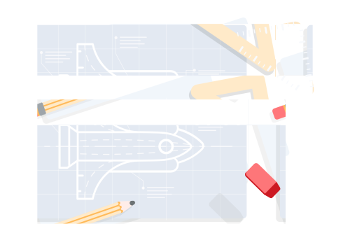 | blueprint |
|
|
163
|
+
| 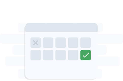 | calendar |
|
|
164
|
+
| 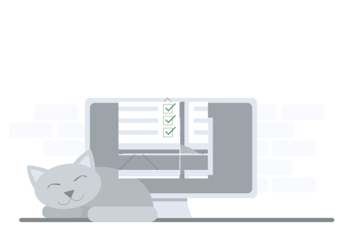 | cat-computer |
|
|
165
|
+
| 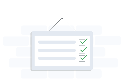 | checklist |
|
|
166
|
+
| 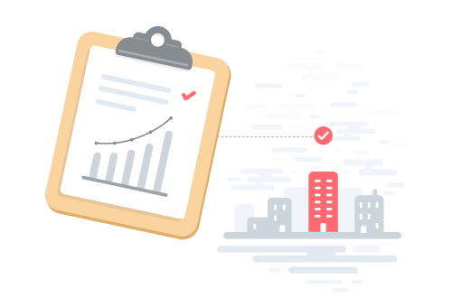 | data-tracking |
|
|
167
|
+
| 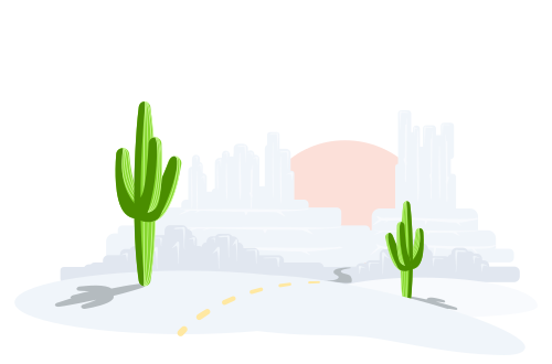 | desert-road |
|
|
168
|
+
| 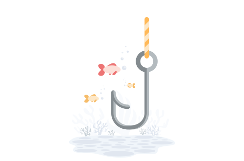 | fish-hook |
|
|
169
|
+
| 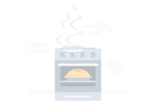 | oven |
|
|
170
|
+
| 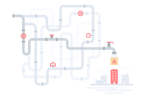 | pipeline |
|
|
171
|
+
| 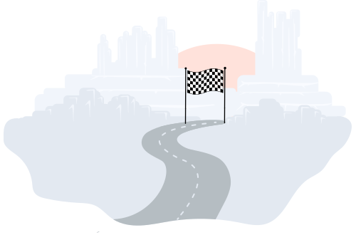 | race |
|
|
172
|
+
| 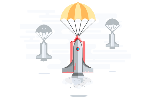 | rockets |
|
|
173
|
+
| 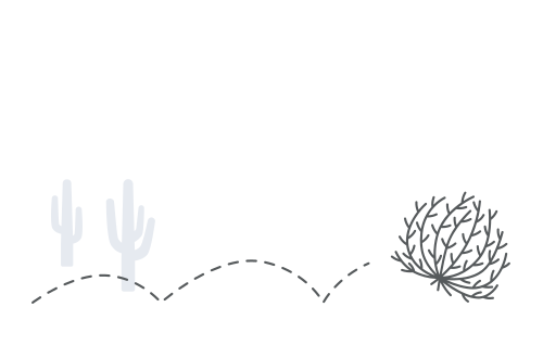 | tumbleweed |
|
|
@@ -1,84 +1,10 @@
|
|
|
1
|
-
import '../
|
|
2
|
-
import '../button/button-subtle.js';
|
|
3
|
-
import { css, html, LitElement, nothing } from 'lit';
|
|
4
|
-
import { FocusMixin } from '../../mixins/focus-mixin.js';
|
|
5
|
-
import { ifDefined } from 'lit/directives/if-defined.js';
|
|
6
|
-
import { PropertyRequiredMixin } from '../../mixins/property-required/property-required-mixin.js';
|
|
7
|
-
|
|
8
|
-
/**
|
|
9
|
-
* `d2l-empty-state-action-button` is an empty state action component that can be placed inside of the default slot of `empty-state-simple` or `empty-state-illustrated` to add a button action to the component.
|
|
10
|
-
* @fires d2l-empty-state-action - Dispatched when the action button is clicked
|
|
11
|
-
* @fires d2l-empty-state-illustrated-check - Internal event
|
|
12
|
-
*/
|
|
13
|
-
class EmptyStateActionButton extends FocusMixin(PropertyRequiredMixin(LitElement)) {
|
|
14
|
-
|
|
15
|
-
static properties = {
|
|
16
|
-
/**
|
|
17
|
-
* REQUIRED: The action text to be used in the button
|
|
18
|
-
* @type {string}
|
|
19
|
-
*/
|
|
20
|
-
text: { type: String, required: true },
|
|
21
|
-
/**
|
|
22
|
-
* This will change the action button to use a primary button instead of the default subtle button. The primary attribute is only valid when `d2l-empty-state-action-button` is placed within `d2l-empty-state-illustrated` components
|
|
23
|
-
* @type {boolean}
|
|
24
|
-
*/
|
|
25
|
-
primary: { type: Boolean },
|
|
26
|
-
_illustrated: { state: true }
|
|
27
|
-
};
|
|
28
|
-
|
|
29
|
-
static styles = css`
|
|
30
|
-
.d2l-empty-state-action {
|
|
31
|
-
vertical-align: top;
|
|
32
|
-
}
|
|
33
|
-
`;
|
|
34
|
-
|
|
35
|
-
constructor() {
|
|
36
|
-
super();
|
|
37
|
-
this._illustrated = false;
|
|
38
|
-
}
|
|
39
|
-
|
|
40
|
-
static get focusElementSelector() {
|
|
41
|
-
return '.d2l-empty-state-action';
|
|
42
|
-
}
|
|
43
|
-
|
|
44
|
-
connectedCallback() {
|
|
45
|
-
super.connectedCallback();
|
|
46
|
-
requestAnimationFrame(() => {
|
|
47
|
-
const e = new CustomEvent('d2l-empty-state-illustrated-check', {
|
|
48
|
-
bubbles: true,
|
|
49
|
-
detail: {}
|
|
50
|
-
});
|
|
51
|
-
this.dispatchEvent(e);
|
|
52
|
-
this._illustrated = e.detail.illustrated || false;
|
|
53
|
-
});
|
|
54
|
-
}
|
|
55
|
-
|
|
56
|
-
render() {
|
|
57
|
-
let actionButton = nothing;
|
|
58
|
-
if (this.text) {
|
|
59
|
-
actionButton = this._illustrated && this.primary
|
|
60
|
-
? html`<d2l-button
|
|
61
|
-
class="d2l-empty-state-action"
|
|
62
|
-
@click=${this._handleActionClick}
|
|
63
|
-
primary>
|
|
64
|
-
${this.text}
|
|
65
|
-
</d2l-button>`
|
|
66
|
-
: html`<d2l-button-subtle
|
|
67
|
-
class="d2l-empty-state-action"
|
|
68
|
-
@click=${this._handleActionClick}
|
|
69
|
-
h-align="${ifDefined(!this._illustrated ? 'text' : undefined)}"
|
|
70
|
-
?slim=${!this._illustrated}
|
|
71
|
-
text=${this.text}>
|
|
72
|
-
</d2l-button-subtle>`;
|
|
73
|
-
}
|
|
74
|
-
return html`${actionButton}`;
|
|
75
|
-
}
|
|
1
|
+
import { StateActionButton } from '../state/state-action-button.js';
|
|
76
2
|
|
|
3
|
+
class EmptyStateActionButton extends StateActionButton {
|
|
77
4
|
_handleActionClick(e) {
|
|
78
5
|
e.stopPropagation();
|
|
79
6
|
this.dispatchEvent(new CustomEvent('d2l-empty-state-action'));
|
|
80
7
|
}
|
|
81
|
-
|
|
82
8
|
}
|
|
83
9
|
|
|
84
10
|
customElements.define('d2l-empty-state-action-button', EmptyStateActionButton);
|
|
@@ -1,41 +1,5 @@
|
|
|
1
|
-
import {
|
|
2
|
-
import { bodyCompactStyles } from '../typography/styles.js';
|
|
3
|
-
import { FocusMixin } from '../../mixins/focus-mixin.js';
|
|
4
|
-
import { LinkMixin } from '../link/link-mixin.js';
|
|
5
|
-
import { linkStyles } from '../link/link.js';
|
|
6
|
-
import { PropertyRequiredMixin } from '../../mixins/property-required/property-required-mixin.js';
|
|
1
|
+
import { StateActionLink } from '../state/state-action-link.js';
|
|
7
2
|
|
|
8
|
-
|
|
9
|
-
* `d2l-empty-state-action-link` is an empty state action component that can be placed inside of the default slot of `empty-state-simple` or `empty-state-illustrated` to add a link action to the component.
|
|
10
|
-
*/
|
|
11
|
-
class EmptyStateActionLink extends LinkMixin(FocusMixin(PropertyRequiredMixin(LitElement))) {
|
|
12
|
-
|
|
13
|
-
static properties = {
|
|
14
|
-
/**
|
|
15
|
-
* REQUIRED: The action text to be used in the subtle button
|
|
16
|
-
* @type {string}
|
|
17
|
-
*/
|
|
18
|
-
text: { type: String, required: true },
|
|
19
|
-
/**
|
|
20
|
-
* REQUIRED: The action URL or URL fragment of the link
|
|
21
|
-
* @type {string}
|
|
22
|
-
*/
|
|
23
|
-
href: { type: String, required: true },
|
|
24
|
-
};
|
|
25
|
-
|
|
26
|
-
static styles = [super.styles, bodyCompactStyles, linkStyles];
|
|
27
|
-
|
|
28
|
-
static get focusElementSelector() {
|
|
29
|
-
return '.d2l-link';
|
|
30
|
-
}
|
|
31
|
-
|
|
32
|
-
render() {
|
|
33
|
-
if (!this.text || !this.href) return nothing;
|
|
34
|
-
const linkClasses = { 'd2l-body-compact': true, 'd2l-link': true };
|
|
35
|
-
const inner = html`${this.text}${this._renderNewWindowIcon()}`;
|
|
36
|
-
return this._render(inner, { linkClasses });
|
|
37
|
-
}
|
|
38
|
-
|
|
39
|
-
}
|
|
3
|
+
class EmptyStateActionLink extends StateActionLink {}
|
|
40
4
|
|
|
41
5
|
customElements.define('d2l-empty-state-action-link', EmptyStateActionLink);
|
|
@@ -1,129 +1,7 @@
|
|
|
1
|
-
import {
|
|
2
|
-
import {
|
|
3
|
-
|
|
4
|
-
|
|
5
|
-
import { EmptyStateMixin } from './empty-state-mixin.js';
|
|
6
|
-
import { LoadingCompleteMixin } from '../../mixins/loading-complete/loading-complete-mixin.js';
|
|
7
|
-
import { loadSvg } from '../../generated/empty-state/presetIllustrationLoader.js';
|
|
8
|
-
import { runAsync } from '../../directives/run-async/run-async.js';
|
|
9
|
-
import { styleMap } from 'lit/directives/style-map.js';
|
|
10
|
-
import { unsafeSVG } from 'lit/directives/unsafe-svg.js';
|
|
11
|
-
|
|
12
|
-
const illustrationAspectRatio = 500 / 330;
|
|
13
|
-
|
|
14
|
-
/**
|
|
15
|
-
* The `d2l-empty-state-illustrated` component is an empty state component that displays a title and description with an illustration. An empty state action component can be placed inside of the default slot to add an optional action.
|
|
16
|
-
* @slot - Slot for empty state actions
|
|
17
|
-
* @slot illustration - Slot for custom SVG content if `illustration-name` property is not set
|
|
18
|
-
*/
|
|
19
|
-
class EmptyStateIllustrated extends LoadingCompleteMixin(EmptyStateMixin(LitElement)) {
|
|
20
|
-
|
|
21
|
-
static properties = {
|
|
22
|
-
/**
|
|
23
|
-
* REQUIRED: A description giving details about the empty state
|
|
24
|
-
* @type {string}
|
|
25
|
-
*/
|
|
26
|
-
description: { type: String, required: true },
|
|
27
|
-
/**
|
|
28
|
-
* The name of the preset image you would like to display in the component
|
|
29
|
-
* @type {string}
|
|
30
|
-
*/
|
|
31
|
-
illustrationName: { type: String, attribute: 'illustration-name' },
|
|
32
|
-
/**
|
|
33
|
-
* REQUIRED: A title for the empty state
|
|
34
|
-
* @type {string}
|
|
35
|
-
*/
|
|
36
|
-
titleText: { type: String, attribute: 'title-text', required: true },
|
|
37
|
-
_contentHeight: { state: true },
|
|
38
|
-
_titleSmall: { state: true }
|
|
39
|
-
};
|
|
40
|
-
|
|
41
|
-
static styles = [bodyCompactStyles, emptyStateStyles, emptyStateIllustratedStyles];
|
|
42
|
-
|
|
43
|
-
constructor() {
|
|
44
|
-
super();
|
|
45
|
-
this._contentHeight = 330;
|
|
46
|
-
this._resizeObserver = new ResizeObserver(this._onResize.bind(this));
|
|
47
|
-
this._titleSmall = false;
|
|
48
|
-
}
|
|
49
|
-
|
|
50
|
-
connectedCallback() {
|
|
51
|
-
super.connectedCallback();
|
|
52
|
-
this.addEventListener('d2l-empty-state-illustrated-check', this.#handleEmptyStateIllustratedCheck);
|
|
53
|
-
this._resizeObserver.observe(this);
|
|
54
|
-
}
|
|
55
|
-
|
|
56
|
-
disconnectedCallback() {
|
|
57
|
-
super.disconnectedCallback();
|
|
58
|
-
this.removeEventListener('d2l-empty-state-illustrated-check', this.#handleEmptyStateIllustratedCheck);
|
|
59
|
-
this._resizeObserver.disconnect();
|
|
60
|
-
}
|
|
61
|
-
|
|
62
|
-
render() {
|
|
63
|
-
const titleClass = {
|
|
64
|
-
'd2l-empty-state-title': true,
|
|
65
|
-
'd2l-empty-state-title-small': this._titleSmall,
|
|
66
|
-
'd2l-empty-state-title-large': !this._titleSmall,
|
|
67
|
-
};
|
|
68
|
-
|
|
69
|
-
return html`
|
|
70
|
-
${this.#renderIllustration()}
|
|
71
|
-
<p class="${classMap(titleClass)}">${this.titleText}</p>
|
|
72
|
-
<p class="d2l-body-compact d2l-empty-state-description" tabindex="-1">${this.description}</p>
|
|
73
|
-
<slot class="action-slot"></slot>
|
|
74
|
-
`;
|
|
75
|
-
}
|
|
76
|
-
|
|
77
|
-
_onResize(entries) {
|
|
78
|
-
if (!entries || entries.length === 0) return;
|
|
79
|
-
const entry = entries[0];
|
|
80
|
-
|
|
81
|
-
const width = entry.contentRect.width;
|
|
82
|
-
if (width === 0) return; // ignore until visible
|
|
83
|
-
|
|
84
|
-
requestAnimationFrame(() => {
|
|
85
|
-
this._contentHeight = Math.min(entry.contentRect.right / illustrationAspectRatio, 330);
|
|
86
|
-
this._titleSmall = entry.contentRect.right <= 615;
|
|
87
|
-
});
|
|
88
|
-
}
|
|
89
|
-
|
|
90
|
-
async #getIllustration(illustrationName) {
|
|
91
|
-
if (!illustrationName) return;
|
|
92
|
-
|
|
93
|
-
const svg = await loadSvg(illustrationName);
|
|
94
|
-
if (!svg) setTimeout(() => {
|
|
95
|
-
throw new Error(`<d2l-empty-state-illustrated-${this._illustratedComponentType}>: Unable to retrieve requested illustration.`);
|
|
96
|
-
});
|
|
97
|
-
return svg ? html`${unsafeSVG(svg.val)}` : nothing;
|
|
98
|
-
}
|
|
99
|
-
|
|
100
|
-
#handleEmptyStateIllustratedCheck(e) {
|
|
101
|
-
e.stopPropagation();
|
|
102
|
-
e.detail.illustrated = true;
|
|
103
|
-
}
|
|
104
|
-
|
|
105
|
-
#renderIllustration() {
|
|
106
|
-
if (!this.illustrationName) {
|
|
107
|
-
this.resolveLoadingComplete();
|
|
108
|
-
return html`<slot class="illustration-slot" name="illustration"></slot>`;
|
|
109
|
-
}
|
|
110
|
-
const illustrationContainerStyle = {
|
|
111
|
-
height: `${this._contentHeight}px`,
|
|
112
|
-
};
|
|
113
|
-
const asyncVal = runAsync(
|
|
114
|
-
this.illustrationName,
|
|
115
|
-
() => this.#getIllustration(this.illustrationName),
|
|
116
|
-
{
|
|
117
|
-
success: illustration => {
|
|
118
|
-
this.resolveLoadingComplete();
|
|
119
|
-
return illustration;
|
|
120
|
-
}
|
|
121
|
-
},
|
|
122
|
-
{ pendingState: false }
|
|
123
|
-
);
|
|
124
|
-
return html`<div style="${styleMap(illustrationContainerStyle)}">${asyncVal}</div>`;
|
|
125
|
-
}
|
|
126
|
-
|
|
1
|
+
import { emptyStateStyles } from './empty-state-styles.js';
|
|
2
|
+
import { StateIllustrated } from '../state/state-illustrated.js';
|
|
3
|
+
class EmptyStateIllustrated extends StateIllustrated {
|
|
4
|
+
static styles = [super.styles, emptyStateStyles];
|
|
127
5
|
}
|
|
128
6
|
|
|
129
7
|
customElements.define('d2l-empty-state-illustrated', EmptyStateIllustrated);
|
|
@@ -1,14 +1,15 @@
|
|
|
1
1
|
import '../button/button-subtle.js';
|
|
2
|
-
import { emptyStateSimpleStyles, emptyStateStyles } from './empty-state-styles.js';
|
|
3
2
|
import { html, LitElement } from 'lit';
|
|
3
|
+
import { stateSimpleStyles, stateStyles } from '../state/state-styles.js';
|
|
4
4
|
import { bodyCompactStyles } from '../typography/styles.js';
|
|
5
|
-
import {
|
|
5
|
+
import { emptyStateStyles } from './empty-state-styles.js';
|
|
6
|
+
import { StateMixin } from '../state/state-mixin.js';
|
|
6
7
|
|
|
7
8
|
/**
|
|
8
9
|
* The `d2l-empty-state-simple` component is an empty state component that displays a description. An empty state action component can be placed inside of the default slot to add an optional action.
|
|
9
10
|
* @slot - Slot for empty state actions
|
|
10
11
|
*/
|
|
11
|
-
class EmptyStateSimple extends
|
|
12
|
+
class EmptyStateSimple extends StateMixin(LitElement) {
|
|
12
13
|
|
|
13
14
|
static properties = {
|
|
14
15
|
/**
|
|
@@ -18,12 +19,12 @@ class EmptyStateSimple extends EmptyStateMixin(LitElement) {
|
|
|
18
19
|
description: { type: String, required: true },
|
|
19
20
|
};
|
|
20
21
|
|
|
21
|
-
static styles = [bodyCompactStyles,
|
|
22
|
+
static styles = [bodyCompactStyles, stateStyles, stateSimpleStyles, emptyStateStyles];
|
|
22
23
|
|
|
23
24
|
render() {
|
|
24
25
|
return html`
|
|
25
|
-
<div class="
|
|
26
|
-
<p class="d2l-body-compact d2l-
|
|
26
|
+
<div class="state-container">
|
|
27
|
+
<p class="d2l-body-compact d2l-state-description" tabindex="-1">${this.description}</p>
|
|
27
28
|
<slot class="action-slot"></slot>
|
|
28
29
|
</div>
|
|
29
30
|
`;
|
|
@@ -1,96 +1,9 @@
|
|
|
1
|
-
import '../colors/colors.js';
|
|
2
1
|
import { css } from 'lit';
|
|
3
|
-
import { getFocusRingStyles } from '../../helpers/focus.js';
|
|
4
2
|
|
|
3
|
+
// Styles supporting old empty state action buttons and links
|
|
5
4
|
export const emptyStateStyles = css`
|
|
6
|
-
|
|
7
|
-
:host {
|
|
8
|
-
display: block;
|
|
9
|
-
}
|
|
10
|
-
|
|
11
|
-
:host([hidden]) {
|
|
12
|
-
display: none;
|
|
13
|
-
}
|
|
14
|
-
|
|
15
|
-
.action-slot::slotted(*) {
|
|
16
|
-
display: none;
|
|
17
|
-
}
|
|
18
|
-
|
|
19
5
|
.action-slot::slotted(d2l-empty-state-action-button:first-of-type),
|
|
20
6
|
.action-slot::slotted(d2l-empty-state-action-link:first-of-type) {
|
|
21
7
|
display: inline;
|
|
22
8
|
}
|
|
23
|
-
.d2l-empty-state-description {
|
|
24
|
-
--d2l-focus-ring-offset: 3px;
|
|
25
|
-
border-radius: 0.3rem;
|
|
26
|
-
}
|
|
27
|
-
${getFocusRingStyles('.d2l-empty-state-description')}
|
|
28
|
-
`;
|
|
29
|
-
|
|
30
|
-
export const emptyStateSimpleStyles = css`
|
|
31
|
-
|
|
32
|
-
:host {
|
|
33
|
-
border: 1px solid var(--d2l-color-mica);
|
|
34
|
-
border-radius: 0.3rem;
|
|
35
|
-
padding: 1.2rem 1.5rem;
|
|
36
|
-
}
|
|
37
|
-
|
|
38
|
-
:host([description]) .empty-state-container {
|
|
39
|
-
align-items: center;
|
|
40
|
-
column-gap: 0.75rem;
|
|
41
|
-
display: flex;
|
|
42
|
-
flex-wrap: wrap;
|
|
43
|
-
padding-inline-start: 0;
|
|
44
|
-
}
|
|
45
|
-
|
|
46
|
-
.d2l-empty-state-description {
|
|
47
|
-
margin: 0;
|
|
48
|
-
}
|
|
49
|
-
|
|
50
|
-
`;
|
|
51
|
-
|
|
52
|
-
export const emptyStateIllustratedStyles = css`
|
|
53
|
-
|
|
54
|
-
:host {
|
|
55
|
-
text-align: center;
|
|
56
|
-
}
|
|
57
|
-
|
|
58
|
-
.illustration-slot::slotted(*) {
|
|
59
|
-
display: none;
|
|
60
|
-
}
|
|
61
|
-
|
|
62
|
-
.illustration-slot::slotted(img:first-of-type),
|
|
63
|
-
.illustration-slot::slotted(svg:first-of-type) {
|
|
64
|
-
display: inline-block;
|
|
65
|
-
}
|
|
66
|
-
|
|
67
|
-
svg {
|
|
68
|
-
height: 100%;
|
|
69
|
-
max-width: 500px;
|
|
70
|
-
width: 100%;
|
|
71
|
-
}
|
|
72
|
-
|
|
73
|
-
.d2l-empty-state-title {
|
|
74
|
-
margin-bottom: 0.9rem;
|
|
75
|
-
}
|
|
76
|
-
|
|
77
|
-
.d2l-empty-state-title-large {
|
|
78
|
-
font-size: 1.5rem;
|
|
79
|
-
line-height: 1.8rem;
|
|
80
|
-
margin: 1rem 0 1.5rem 0;
|
|
81
|
-
}
|
|
82
|
-
|
|
83
|
-
.d2l-empty-state-title-small {
|
|
84
|
-
font-size: 1rem;
|
|
85
|
-
font-weight: 700;
|
|
86
|
-
line-height: 1.5rem;
|
|
87
|
-
margin-top: 0.5rem;
|
|
88
|
-
}
|
|
89
|
-
|
|
90
|
-
.d2l-empty-state-description {
|
|
91
|
-
margin: 0 auto 0.8rem;
|
|
92
|
-
max-width: 500px;
|
|
93
|
-
width: 100%;
|
|
94
|
-
}
|
|
95
|
-
|
|
96
9
|
`;
|
|
@@ -5,8 +5,8 @@ import '../button/button-subtle.js';
|
|
|
5
5
|
import '../dropdown/dropdown.js';
|
|
6
6
|
import '../dropdown/dropdown-content.js';
|
|
7
7
|
import '../dropdown/dropdown-menu.js';
|
|
8
|
-
import '../
|
|
9
|
-
import '../
|
|
8
|
+
import '../state/state-action-button.js';
|
|
9
|
+
import '../state/state-action-link.js';
|
|
10
10
|
import '../empty-state/empty-state-simple.js';
|
|
11
11
|
import '../expand-collapse/expand-collapse-content.js';
|
|
12
12
|
import '../hierarchical-view/hierarchical-view.js';
|
|
@@ -537,20 +537,20 @@ class Filter extends FocusMixin(LocalizeCoreElement(LitElement)) {
|
|
|
537
537
|
let emptyStateAction = nothing;
|
|
538
538
|
if (emptyState.actionText && emptyState.actionHref) {
|
|
539
539
|
emptyStateAction = html`
|
|
540
|
-
<d2l-
|
|
540
|
+
<d2l-state-action-link
|
|
541
541
|
href="${emptyState.actionHref}"
|
|
542
542
|
text="${emptyState.actionText}">
|
|
543
|
-
</d2l-
|
|
543
|
+
</d2l-state-action-link>
|
|
544
544
|
`;
|
|
545
545
|
}
|
|
546
546
|
else if (emptyState.actionText) {
|
|
547
547
|
emptyStateAction = html`
|
|
548
|
-
<d2l-
|
|
549
|
-
@d2l-
|
|
548
|
+
<d2l-state-action-button
|
|
549
|
+
@d2l-state-action="${this._handleEmptyStateAction}"
|
|
550
550
|
data-dimension-key="${dimensionKey}"
|
|
551
551
|
data-type="${emptyState.type}"
|
|
552
552
|
text="${emptyState.actionText}">
|
|
553
|
-
</d2l-
|
|
553
|
+
</d2l-state-action-button>
|
|
554
554
|
`;
|
|
555
555
|
}
|
|
556
556
|
return html`
|
|
@@ -0,0 +1,88 @@
|
|
|
1
|
+
import '../button/button.js';
|
|
2
|
+
import '../button/button-subtle.js';
|
|
3
|
+
import { css, html, LitElement, nothing } from 'lit';
|
|
4
|
+
import { FocusMixin } from '../../mixins/focus-mixin.js';
|
|
5
|
+
import { ifDefined } from 'lit/directives/if-defined.js';
|
|
6
|
+
import { PropertyRequiredMixin } from '../../mixins/property-required/property-required-mixin.js';
|
|
7
|
+
|
|
8
|
+
/**
|
|
9
|
+
* `d2l-state-action-button` is an state action component that can be placed inside of the default slot of state components to add a button action.
|
|
10
|
+
* @fires d2l-state-action - Dispatched when the action button is clicked
|
|
11
|
+
* @fires d2l-state-illustrated-check - Internal event
|
|
12
|
+
*/
|
|
13
|
+
export class StateActionButton extends FocusMixin(PropertyRequiredMixin(LitElement)) { // Exported to support old empty-state components, once they are removed this can be made internal only
|
|
14
|
+
|
|
15
|
+
static properties = {
|
|
16
|
+
/**
|
|
17
|
+
* REQUIRED: The action text to be used in the button
|
|
18
|
+
* @type {string}
|
|
19
|
+
*/
|
|
20
|
+
text: { type: String, required: true },
|
|
21
|
+
/**
|
|
22
|
+
* This will change the action button to use a primary button instead of the default subtle button. The primary attribute is only valid when `d2l-state-action-button` is placed within `d2l-state-illustrated` components
|
|
23
|
+
* @type {boolean}
|
|
24
|
+
*/
|
|
25
|
+
primary: { type: Boolean },
|
|
26
|
+
_illustrated: { state: true }
|
|
27
|
+
};
|
|
28
|
+
|
|
29
|
+
static styles = css`
|
|
30
|
+
.d2l-state-action {
|
|
31
|
+
vertical-align: top;
|
|
32
|
+
}
|
|
33
|
+
`;
|
|
34
|
+
|
|
35
|
+
constructor() {
|
|
36
|
+
super();
|
|
37
|
+
this._illustrated = false;
|
|
38
|
+
}
|
|
39
|
+
|
|
40
|
+
static get focusElementSelector() {
|
|
41
|
+
return '.d2l-state-action';
|
|
42
|
+
}
|
|
43
|
+
|
|
44
|
+
get isStateActionButton() {
|
|
45
|
+
return true;
|
|
46
|
+
}
|
|
47
|
+
|
|
48
|
+
connectedCallback() {
|
|
49
|
+
super.connectedCallback();
|
|
50
|
+
requestAnimationFrame(() => {
|
|
51
|
+
const e = new CustomEvent('d2l-state-illustrated-check', {
|
|
52
|
+
bubbles: true,
|
|
53
|
+
detail: {}
|
|
54
|
+
});
|
|
55
|
+
this.dispatchEvent(e);
|
|
56
|
+
this._illustrated = e.detail.illustrated || false;
|
|
57
|
+
});
|
|
58
|
+
}
|
|
59
|
+
|
|
60
|
+
render() {
|
|
61
|
+
let actionButton = nothing;
|
|
62
|
+
if (this.text) {
|
|
63
|
+
actionButton = this._illustrated && this.primary
|
|
64
|
+
? html`<d2l-button
|
|
65
|
+
class="d2l-state-action"
|
|
66
|
+
@click=${this._handleActionClick}
|
|
67
|
+
primary>
|
|
68
|
+
${this.text}
|
|
69
|
+
</d2l-button>`
|
|
70
|
+
: html`<d2l-button-subtle
|
|
71
|
+
class="d2l-state-action"
|
|
72
|
+
@click=${this._handleActionClick}
|
|
73
|
+
h-align="${ifDefined(!this._illustrated ? 'text' : undefined)}"
|
|
74
|
+
?slim=${!this._illustrated}
|
|
75
|
+
text=${this.text}>
|
|
76
|
+
</d2l-button-subtle>`;
|
|
77
|
+
}
|
|
78
|
+
return html`${actionButton}`;
|
|
79
|
+
}
|
|
80
|
+
|
|
81
|
+
_handleActionClick(e) {
|
|
82
|
+
e.stopPropagation();
|
|
83
|
+
this.dispatchEvent(new CustomEvent('d2l-state-action'));
|
|
84
|
+
}
|
|
85
|
+
|
|
86
|
+
}
|
|
87
|
+
|
|
88
|
+
customElements.define('d2l-state-action-button', StateActionButton);
|
|
@@ -0,0 +1,45 @@
|
|
|
1
|
+
import { html, LitElement, nothing } from 'lit';
|
|
2
|
+
import { bodyCompactStyles } from '../typography/styles.js';
|
|
3
|
+
import { FocusMixin } from '../../mixins/focus-mixin.js';
|
|
4
|
+
import { LinkMixin } from '../link/link-mixin.js';
|
|
5
|
+
import { linkStyles } from '../link/link.js';
|
|
6
|
+
import { PropertyRequiredMixin } from '../../mixins/property-required/property-required-mixin.js';
|
|
7
|
+
|
|
8
|
+
/**
|
|
9
|
+
* `d2l-state-action-link` is an state action component that can be placed inside of the default slot of state components to add a link action.
|
|
10
|
+
*/
|
|
11
|
+
export class StateActionLink extends LinkMixin(FocusMixin(PropertyRequiredMixin(LitElement))) { // Exported to support old empty-state components, once they are removed this can be made internal only
|
|
12
|
+
|
|
13
|
+
static properties = {
|
|
14
|
+
/**
|
|
15
|
+
* REQUIRED: The action text to be used in the link
|
|
16
|
+
* @type {string}
|
|
17
|
+
*/
|
|
18
|
+
text: { type: String, required: true },
|
|
19
|
+
/**
|
|
20
|
+
* REQUIRED: The action URL or URL fragment of the link
|
|
21
|
+
* @type {string}
|
|
22
|
+
*/
|
|
23
|
+
href: { type: String, required: true },
|
|
24
|
+
};
|
|
25
|
+
|
|
26
|
+
static styles = [super.styles, bodyCompactStyles, linkStyles];
|
|
27
|
+
|
|
28
|
+
static get focusElementSelector() {
|
|
29
|
+
return '.d2l-link';
|
|
30
|
+
}
|
|
31
|
+
|
|
32
|
+
get isStateActionLink() {
|
|
33
|
+
return true;
|
|
34
|
+
}
|
|
35
|
+
|
|
36
|
+
render() {
|
|
37
|
+
if (!this.text || !this.href) return nothing;
|
|
38
|
+
const linkClasses = { 'd2l-body-compact': true, 'd2l-link': true };
|
|
39
|
+
const inner = html`${this.text}${this._renderNewWindowIcon()}`;
|
|
40
|
+
return this._render(inner, { linkClasses });
|
|
41
|
+
}
|
|
42
|
+
|
|
43
|
+
}
|
|
44
|
+
|
|
45
|
+
customElements.define('d2l-state-action-link', StateActionLink);
|
|
@@ -0,0 +1,129 @@
|
|
|
1
|
+
import { html, LitElement, nothing } from 'lit';
|
|
2
|
+
import { stateIllustratedStyles, stateStyles } from './state-styles.js';
|
|
3
|
+
import { bodyCompactStyles } from '../typography/styles.js';
|
|
4
|
+
import { classMap } from 'lit/directives/class-map.js';
|
|
5
|
+
import { LoadingCompleteMixin } from '../../mixins/loading-complete/loading-complete-mixin.js';
|
|
6
|
+
import { loadSvg } from '../../generated/state/presetIllustrationLoader.js';
|
|
7
|
+
import { runAsync } from '../../directives/run-async/run-async.js';
|
|
8
|
+
import { StateMixin } from './state-mixin.js';
|
|
9
|
+
import { styleMap } from 'lit/directives/style-map.js';
|
|
10
|
+
import { unsafeSVG } from 'lit/directives/unsafe-svg.js';
|
|
11
|
+
|
|
12
|
+
const illustrationAspectRatio = 500 / 330;
|
|
13
|
+
|
|
14
|
+
/**
|
|
15
|
+
* The `d2l-state-illustrated` component is an state component that displays a title and description with an illustration. An state action component can be placed inside of the default slot to add an optional action.
|
|
16
|
+
* @slot - Slot for state actions
|
|
17
|
+
* @slot illustration - Slot for custom SVG content if `illustration-name` property is not set
|
|
18
|
+
*/
|
|
19
|
+
export class StateIllustrated extends LoadingCompleteMixin(StateMixin(LitElement)) { // Exported to support old empty-state components, once they are removed this can be made internal only
|
|
20
|
+
|
|
21
|
+
static properties = {
|
|
22
|
+
/**
|
|
23
|
+
* REQUIRED: A description giving details about the state
|
|
24
|
+
* @type {string}
|
|
25
|
+
*/
|
|
26
|
+
description: { type: String, required: true },
|
|
27
|
+
/**
|
|
28
|
+
* The name of the preset image you would like to display in the component
|
|
29
|
+
* @type {string}
|
|
30
|
+
*/
|
|
31
|
+
illustrationName: { type: String, attribute: 'illustration-name' },
|
|
32
|
+
/**
|
|
33
|
+
* REQUIRED: A title for the state
|
|
34
|
+
* @type {string}
|
|
35
|
+
*/
|
|
36
|
+
titleText: { type: String, attribute: 'title-text', required: true },
|
|
37
|
+
_contentHeight: { state: true },
|
|
38
|
+
_titleSmall: { state: true }
|
|
39
|
+
};
|
|
40
|
+
|
|
41
|
+
static styles = [bodyCompactStyles, stateStyles, stateIllustratedStyles];
|
|
42
|
+
|
|
43
|
+
constructor() {
|
|
44
|
+
super();
|
|
45
|
+
this._contentHeight = 330;
|
|
46
|
+
this._resizeObserver = new ResizeObserver(this._onResize.bind(this));
|
|
47
|
+
this._titleSmall = false;
|
|
48
|
+
}
|
|
49
|
+
|
|
50
|
+
connectedCallback() {
|
|
51
|
+
super.connectedCallback();
|
|
52
|
+
this.addEventListener('d2l-state-illustrated-check', this.#handleStateIllustratedCheck);
|
|
53
|
+
this._resizeObserver.observe(this);
|
|
54
|
+
}
|
|
55
|
+
|
|
56
|
+
disconnectedCallback() {
|
|
57
|
+
super.disconnectedCallback();
|
|
58
|
+
this.removeEventListener('d2l-state-illustrated-check', this.#handleStateIllustratedCheck);
|
|
59
|
+
this._resizeObserver.disconnect();
|
|
60
|
+
}
|
|
61
|
+
|
|
62
|
+
render() {
|
|
63
|
+
const titleClass = {
|
|
64
|
+
'd2l-state-title': true,
|
|
65
|
+
'd2l-state-title-small': this._titleSmall,
|
|
66
|
+
'd2l-state-title-large': !this._titleSmall,
|
|
67
|
+
};
|
|
68
|
+
|
|
69
|
+
return html`
|
|
70
|
+
${this.#renderIllustration()}
|
|
71
|
+
<p class="${classMap(titleClass)}">${this.titleText}</p>
|
|
72
|
+
<p class="d2l-body-compact d2l-state-description" tabindex="-1">${this.description}</p>
|
|
73
|
+
<slot class="action-slot"></slot>
|
|
74
|
+
`;
|
|
75
|
+
}
|
|
76
|
+
|
|
77
|
+
_onResize(entries) {
|
|
78
|
+
if (!entries || entries.length === 0) return;
|
|
79
|
+
const entry = entries[0];
|
|
80
|
+
|
|
81
|
+
const width = entry.contentRect.width;
|
|
82
|
+
if (width === 0) return; // ignore until visible
|
|
83
|
+
|
|
84
|
+
requestAnimationFrame(() => {
|
|
85
|
+
this._contentHeight = Math.min(entry.contentRect.right / illustrationAspectRatio, 330);
|
|
86
|
+
this._titleSmall = entry.contentRect.right <= 615;
|
|
87
|
+
});
|
|
88
|
+
}
|
|
89
|
+
|
|
90
|
+
async #getIllustration(illustrationName) {
|
|
91
|
+
if (!illustrationName) return;
|
|
92
|
+
|
|
93
|
+
const svg = await loadSvg(illustrationName);
|
|
94
|
+
if (!svg) setTimeout(() => {
|
|
95
|
+
throw new Error(`<d2l-state-illustrated-${this._illustratedComponentType}>: Unable to retrieve requested illustration.`);
|
|
96
|
+
});
|
|
97
|
+
return svg ? html`${unsafeSVG(svg.val)}` : nothing;
|
|
98
|
+
}
|
|
99
|
+
|
|
100
|
+
#handleStateIllustratedCheck(e) {
|
|
101
|
+
e.stopPropagation();
|
|
102
|
+
e.detail.illustrated = true;
|
|
103
|
+
}
|
|
104
|
+
|
|
105
|
+
#renderIllustration() {
|
|
106
|
+
if (!this.illustrationName) {
|
|
107
|
+
this.resolveLoadingComplete();
|
|
108
|
+
return html`<slot class="illustration-slot" name="illustration"></slot>`;
|
|
109
|
+
}
|
|
110
|
+
const illustrationContainerStyle = {
|
|
111
|
+
height: `${this._contentHeight}px`,
|
|
112
|
+
};
|
|
113
|
+
const asyncVal = runAsync(
|
|
114
|
+
this.illustrationName,
|
|
115
|
+
() => this.#getIllustration(this.illustrationName),
|
|
116
|
+
{
|
|
117
|
+
success: illustration => {
|
|
118
|
+
this.resolveLoadingComplete();
|
|
119
|
+
return illustration;
|
|
120
|
+
}
|
|
121
|
+
},
|
|
122
|
+
{ pendingState: false }
|
|
123
|
+
);
|
|
124
|
+
return html`<div style="${styleMap(illustrationContainerStyle)}">${asyncVal}</div>`;
|
|
125
|
+
}
|
|
126
|
+
|
|
127
|
+
}
|
|
128
|
+
|
|
129
|
+
customElements.define('d2l-state-illustrated', StateIllustrated);
|
|
@@ -1,19 +1,19 @@
|
|
|
1
1
|
import { PropertyRequiredMixin } from '../../mixins/property-required/property-required-mixin.js';
|
|
2
2
|
|
|
3
|
-
export const
|
|
3
|
+
export const StateMixin = superclass => class extends PropertyRequiredMixin(superclass) {
|
|
4
4
|
|
|
5
5
|
focus() {
|
|
6
6
|
if (!this.hasUpdated) {
|
|
7
7
|
return;
|
|
8
8
|
}
|
|
9
9
|
const action = this.shadowRoot?.querySelector('.action-slot').assignedElements().find(
|
|
10
|
-
el => el.
|
|
10
|
+
el => el.isStateActionButton || el.isStateActionLink
|
|
11
11
|
);
|
|
12
12
|
if (action !== undefined) {
|
|
13
13
|
action.focus();
|
|
14
14
|
return;
|
|
15
15
|
}
|
|
16
|
-
const title = this.shadowRoot?.querySelector('.d2l-
|
|
16
|
+
const title = this.shadowRoot?.querySelector('.d2l-state-description');
|
|
17
17
|
if (title !== null) {
|
|
18
18
|
title.focus();
|
|
19
19
|
}
|
|
@@ -0,0 +1,96 @@
|
|
|
1
|
+
import '../colors/colors.js';
|
|
2
|
+
import { css } from 'lit';
|
|
3
|
+
import { getFocusRingStyles } from '../../helpers/focus.js';
|
|
4
|
+
|
|
5
|
+
export const stateStyles = css`
|
|
6
|
+
|
|
7
|
+
:host {
|
|
8
|
+
display: block;
|
|
9
|
+
}
|
|
10
|
+
|
|
11
|
+
:host([hidden]) {
|
|
12
|
+
display: none;
|
|
13
|
+
}
|
|
14
|
+
|
|
15
|
+
.action-slot::slotted(*) {
|
|
16
|
+
display: none;
|
|
17
|
+
}
|
|
18
|
+
|
|
19
|
+
.action-slot::slotted(d2l-state-action-button:first-of-type),
|
|
20
|
+
.action-slot::slotted(d2l-state-action-link:first-of-type) {
|
|
21
|
+
display: inline;
|
|
22
|
+
}
|
|
23
|
+
.d2l-state-description {
|
|
24
|
+
--d2l-focus-ring-offset: 3px;
|
|
25
|
+
border-radius: 0.3rem;
|
|
26
|
+
}
|
|
27
|
+
${getFocusRingStyles('.d2l-state-description')}
|
|
28
|
+
`;
|
|
29
|
+
|
|
30
|
+
export const stateSimpleStyles = css`
|
|
31
|
+
|
|
32
|
+
:host {
|
|
33
|
+
border: 1px solid var(--d2l-color-mica);
|
|
34
|
+
border-radius: 0.3rem;
|
|
35
|
+
padding: 1.2rem 1.5rem;
|
|
36
|
+
}
|
|
37
|
+
|
|
38
|
+
:host([description]) .state-container {
|
|
39
|
+
align-items: center;
|
|
40
|
+
column-gap: 0.75rem;
|
|
41
|
+
display: flex;
|
|
42
|
+
flex-wrap: wrap;
|
|
43
|
+
padding-inline-start: 0;
|
|
44
|
+
}
|
|
45
|
+
|
|
46
|
+
.d2l-state-description {
|
|
47
|
+
margin: 0;
|
|
48
|
+
}
|
|
49
|
+
|
|
50
|
+
`;
|
|
51
|
+
|
|
52
|
+
export const stateIllustratedStyles = css`
|
|
53
|
+
|
|
54
|
+
:host {
|
|
55
|
+
text-align: center;
|
|
56
|
+
}
|
|
57
|
+
|
|
58
|
+
.illustration-slot::slotted(*) {
|
|
59
|
+
display: none;
|
|
60
|
+
}
|
|
61
|
+
|
|
62
|
+
.illustration-slot::slotted(img:first-of-type),
|
|
63
|
+
.illustration-slot::slotted(svg:first-of-type) {
|
|
64
|
+
display: inline-block;
|
|
65
|
+
}
|
|
66
|
+
|
|
67
|
+
svg {
|
|
68
|
+
height: 100%;
|
|
69
|
+
max-width: 500px;
|
|
70
|
+
width: 100%;
|
|
71
|
+
}
|
|
72
|
+
|
|
73
|
+
.d2l-state-title {
|
|
74
|
+
margin-bottom: 0.9rem;
|
|
75
|
+
}
|
|
76
|
+
|
|
77
|
+
.d2l-state-title-large {
|
|
78
|
+
font-size: 1.5rem;
|
|
79
|
+
line-height: 1.8rem;
|
|
80
|
+
margin: 1rem 0 1.5rem 0;
|
|
81
|
+
}
|
|
82
|
+
|
|
83
|
+
.d2l-state-title-small {
|
|
84
|
+
font-size: 1rem;
|
|
85
|
+
font-weight: 700;
|
|
86
|
+
line-height: 1.5rem;
|
|
87
|
+
margin-top: 0.5rem;
|
|
88
|
+
}
|
|
89
|
+
|
|
90
|
+
.d2l-state-description {
|
|
91
|
+
margin: 0 auto 0.8rem;
|
|
92
|
+
max-width: 500px;
|
|
93
|
+
width: 100%;
|
|
94
|
+
}
|
|
95
|
+
|
|
96
|
+
`;
|
package/custom-elements.json
CHANGED
|
@@ -4511,7 +4511,6 @@
|
|
|
4511
4511
|
{
|
|
4512
4512
|
"name": "d2l-empty-state-action-button",
|
|
4513
4513
|
"path": "./components/empty-state/empty-state-action-button.js",
|
|
4514
|
-
"description": "`d2l-empty-state-action-button` is an empty state action component that can be placed inside of the default slot of `empty-state-simple` or `empty-state-illustrated` to add a button action to the component.",
|
|
4515
4514
|
"attributes": [
|
|
4516
4515
|
{
|
|
4517
4516
|
"name": "text",
|
|
@@ -4520,7 +4519,7 @@
|
|
|
4520
4519
|
},
|
|
4521
4520
|
{
|
|
4522
4521
|
"name": "primary",
|
|
4523
|
-
"description": "This will change the action button to use a primary button instead of the default subtle button. The primary attribute is only valid when `d2l-
|
|
4522
|
+
"description": "This will change the action button to use a primary button instead of the default subtle button. The primary attribute is only valid when `d2l-state-action-button` is placed within `d2l-state-illustrated` components",
|
|
4524
4523
|
"type": "boolean"
|
|
4525
4524
|
}
|
|
4526
4525
|
],
|
|
@@ -4534,21 +4533,28 @@
|
|
|
4534
4533
|
{
|
|
4535
4534
|
"name": "primary",
|
|
4536
4535
|
"attribute": "primary",
|
|
4537
|
-
"description": "This will change the action button to use a primary button instead of the default subtle button. The primary attribute is only valid when `d2l-
|
|
4536
|
+
"description": "This will change the action button to use a primary button instead of the default subtle button. The primary attribute is only valid when `d2l-state-action-button` is placed within `d2l-state-illustrated` components",
|
|
4538
4537
|
"type": "boolean"
|
|
4539
4538
|
},
|
|
4540
4539
|
{
|
|
4541
4540
|
"name": "styles",
|
|
4542
|
-
"default": "\"css`\\n\\t\\t.d2l-
|
|
4541
|
+
"default": "\"css`\\n\\t\\t.d2l-state-action {\\n\\t\\t\\tvertical-align: top;\\n\\t\\t}\\n\\t`\""
|
|
4542
|
+
},
|
|
4543
|
+
{
|
|
4544
|
+
"name": "isStateActionButton",
|
|
4545
|
+
"type": "boolean"
|
|
4543
4546
|
}
|
|
4544
4547
|
],
|
|
4545
4548
|
"events": [
|
|
4546
4549
|
{
|
|
4547
|
-
"name": "d2l-empty-state-action"
|
|
4550
|
+
"name": "d2l-empty-state-action"
|
|
4551
|
+
},
|
|
4552
|
+
{
|
|
4553
|
+
"name": "d2l-state-action",
|
|
4548
4554
|
"description": "Dispatched when the action button is clicked"
|
|
4549
4555
|
},
|
|
4550
4556
|
{
|
|
4551
|
-
"name": "d2l-
|
|
4557
|
+
"name": "d2l-state-illustrated-check",
|
|
4552
4558
|
"description": "Internal event"
|
|
4553
4559
|
}
|
|
4554
4560
|
]
|
|
@@ -4556,11 +4562,10 @@
|
|
|
4556
4562
|
{
|
|
4557
4563
|
"name": "d2l-empty-state-action-link",
|
|
4558
4564
|
"path": "./components/empty-state/empty-state-action-link.js",
|
|
4559
|
-
"description": "`d2l-empty-state-action-link` is an empty state action component that can be placed inside of the default slot of `empty-state-simple` or `empty-state-illustrated` to add a link action to the component.",
|
|
4560
4565
|
"attributes": [
|
|
4561
4566
|
{
|
|
4562
4567
|
"name": "text",
|
|
4563
|
-
"description": "REQUIRED: The action text to be used in the
|
|
4568
|
+
"description": "REQUIRED: The action text to be used in the link",
|
|
4564
4569
|
"type": "string"
|
|
4565
4570
|
},
|
|
4566
4571
|
{
|
|
@@ -4583,9 +4588,13 @@
|
|
|
4583
4588
|
{
|
|
4584
4589
|
"name": "text",
|
|
4585
4590
|
"attribute": "text",
|
|
4586
|
-
"description": "REQUIRED: The action text to be used in the
|
|
4591
|
+
"description": "REQUIRED: The action text to be used in the link",
|
|
4587
4592
|
"type": "string"
|
|
4588
4593
|
},
|
|
4594
|
+
{
|
|
4595
|
+
"name": "isStateActionLink",
|
|
4596
|
+
"type": "boolean"
|
|
4597
|
+
},
|
|
4589
4598
|
{
|
|
4590
4599
|
"name": "download",
|
|
4591
4600
|
"attribute": "download",
|
|
@@ -4614,11 +4623,10 @@
|
|
|
4614
4623
|
{
|
|
4615
4624
|
"name": "d2l-empty-state-illustrated",
|
|
4616
4625
|
"path": "./components/empty-state/empty-state-illustrated.js",
|
|
4617
|
-
"description": "The `d2l-empty-state-illustrated` component is an empty state component that displays a title and description with an illustration. An empty state action component can be placed inside of the default slot to add an optional action.",
|
|
4618
4626
|
"attributes": [
|
|
4619
4627
|
{
|
|
4620
4628
|
"name": "description",
|
|
4621
|
-
"description": "REQUIRED: A description giving details about the
|
|
4629
|
+
"description": "REQUIRED: A description giving details about the state",
|
|
4622
4630
|
"type": "string"
|
|
4623
4631
|
},
|
|
4624
4632
|
{
|
|
@@ -4628,7 +4636,7 @@
|
|
|
4628
4636
|
},
|
|
4629
4637
|
{
|
|
4630
4638
|
"name": "title-text",
|
|
4631
|
-
"description": "REQUIRED: A title for the
|
|
4639
|
+
"description": "REQUIRED: A title for the state",
|
|
4632
4640
|
"type": "string"
|
|
4633
4641
|
}
|
|
4634
4642
|
],
|
|
@@ -4636,7 +4644,7 @@
|
|
|
4636
4644
|
{
|
|
4637
4645
|
"name": "description",
|
|
4638
4646
|
"attribute": "description",
|
|
4639
|
-
"description": "REQUIRED: A description giving details about the
|
|
4647
|
+
"description": "REQUIRED: A description giving details about the state",
|
|
4640
4648
|
"type": "string"
|
|
4641
4649
|
},
|
|
4642
4650
|
{
|
|
@@ -4648,13 +4656,13 @@
|
|
|
4648
4656
|
{
|
|
4649
4657
|
"name": "titleText",
|
|
4650
4658
|
"attribute": "title-text",
|
|
4651
|
-
"description": "REQUIRED: A title for the
|
|
4659
|
+
"description": "REQUIRED: A title for the state",
|
|
4652
4660
|
"type": "string"
|
|
4653
4661
|
},
|
|
4654
4662
|
{
|
|
4655
4663
|
"name": "styles",
|
|
4656
4664
|
"type": "array",
|
|
4657
|
-
"default": "[\"
|
|
4665
|
+
"default": "[\"styles\",\"emptyStateStyles\"]"
|
|
4658
4666
|
},
|
|
4659
4667
|
{
|
|
4660
4668
|
"name": "loadingComplete",
|
|
@@ -4668,7 +4676,7 @@
|
|
|
4668
4676
|
"slots": [
|
|
4669
4677
|
{
|
|
4670
4678
|
"name": "",
|
|
4671
|
-
"description": "Slot for
|
|
4679
|
+
"description": "Slot for state actions"
|
|
4672
4680
|
},
|
|
4673
4681
|
{
|
|
4674
4682
|
"name": "illustration",
|
|
@@ -4697,7 +4705,7 @@
|
|
|
4697
4705
|
{
|
|
4698
4706
|
"name": "styles",
|
|
4699
4707
|
"type": "array",
|
|
4700
|
-
"default": "[\"bodyCompactStyles\",\"
|
|
4708
|
+
"default": "[\"bodyCompactStyles\",\"stateStyles\",\"stateSimpleStyles\",\"emptyStateStyles\"]"
|
|
4701
4709
|
}
|
|
4702
4710
|
],
|
|
4703
4711
|
"slots": [
|
|
@@ -15867,6 +15875,182 @@
|
|
|
15867
15875
|
}
|
|
15868
15876
|
]
|
|
15869
15877
|
},
|
|
15878
|
+
{
|
|
15879
|
+
"name": "d2l-state-action-button",
|
|
15880
|
+
"path": "./components/state/state-action-button.js",
|
|
15881
|
+
"description": "`d2l-state-action-button` is an state action component that can be placed inside of the default slot of state components to add a button action.",
|
|
15882
|
+
"attributes": [
|
|
15883
|
+
{
|
|
15884
|
+
"name": "text",
|
|
15885
|
+
"description": "REQUIRED: The action text to be used in the button",
|
|
15886
|
+
"type": "string"
|
|
15887
|
+
},
|
|
15888
|
+
{
|
|
15889
|
+
"name": "primary",
|
|
15890
|
+
"description": "This will change the action button to use a primary button instead of the default subtle button. The primary attribute is only valid when `d2l-state-action-button` is placed within `d2l-state-illustrated` components",
|
|
15891
|
+
"type": "boolean"
|
|
15892
|
+
}
|
|
15893
|
+
],
|
|
15894
|
+
"properties": [
|
|
15895
|
+
{
|
|
15896
|
+
"name": "text",
|
|
15897
|
+
"attribute": "text",
|
|
15898
|
+
"description": "REQUIRED: The action text to be used in the button",
|
|
15899
|
+
"type": "string"
|
|
15900
|
+
},
|
|
15901
|
+
{
|
|
15902
|
+
"name": "primary",
|
|
15903
|
+
"attribute": "primary",
|
|
15904
|
+
"description": "This will change the action button to use a primary button instead of the default subtle button. The primary attribute is only valid when `d2l-state-action-button` is placed within `d2l-state-illustrated` components",
|
|
15905
|
+
"type": "boolean"
|
|
15906
|
+
},
|
|
15907
|
+
{
|
|
15908
|
+
"name": "styles",
|
|
15909
|
+
"default": "\"css`\\n\\t\\t.d2l-state-action {\\n\\t\\t\\tvertical-align: top;\\n\\t\\t}\\n\\t`\""
|
|
15910
|
+
},
|
|
15911
|
+
{
|
|
15912
|
+
"name": "isStateActionButton",
|
|
15913
|
+
"type": "boolean"
|
|
15914
|
+
}
|
|
15915
|
+
],
|
|
15916
|
+
"events": [
|
|
15917
|
+
{
|
|
15918
|
+
"name": "d2l-state-action",
|
|
15919
|
+
"description": "Dispatched when the action button is clicked"
|
|
15920
|
+
},
|
|
15921
|
+
{
|
|
15922
|
+
"name": "d2l-state-illustrated-check",
|
|
15923
|
+
"description": "Internal event"
|
|
15924
|
+
}
|
|
15925
|
+
]
|
|
15926
|
+
},
|
|
15927
|
+
{
|
|
15928
|
+
"name": "d2l-state-action-link",
|
|
15929
|
+
"path": "./components/state/state-action-link.js",
|
|
15930
|
+
"description": "`d2l-state-action-link` is an state action component that can be placed inside of the default slot of state components to add a link action.",
|
|
15931
|
+
"attributes": [
|
|
15932
|
+
{
|
|
15933
|
+
"name": "text",
|
|
15934
|
+
"description": "REQUIRED: The action text to be used in the link",
|
|
15935
|
+
"type": "string"
|
|
15936
|
+
},
|
|
15937
|
+
{
|
|
15938
|
+
"name": "download",
|
|
15939
|
+
"description": "Prompts the user to save the linked URL instead of navigating to it.\nMust be to a resource on the same origin.\nCan be used with or without a value, when set the value becomes the filename.",
|
|
15940
|
+
"type": "string"
|
|
15941
|
+
},
|
|
15942
|
+
{
|
|
15943
|
+
"name": "href",
|
|
15944
|
+
"description": "REQUIRED: The action URL or URL fragment of the link",
|
|
15945
|
+
"type": "string"
|
|
15946
|
+
},
|
|
15947
|
+
{
|
|
15948
|
+
"name": "target",
|
|
15949
|
+
"description": "Where to display the linked URL",
|
|
15950
|
+
"type": "string"
|
|
15951
|
+
}
|
|
15952
|
+
],
|
|
15953
|
+
"properties": [
|
|
15954
|
+
{
|
|
15955
|
+
"name": "text",
|
|
15956
|
+
"attribute": "text",
|
|
15957
|
+
"description": "REQUIRED: The action text to be used in the link",
|
|
15958
|
+
"type": "string"
|
|
15959
|
+
},
|
|
15960
|
+
{
|
|
15961
|
+
"name": "isStateActionLink",
|
|
15962
|
+
"type": "boolean"
|
|
15963
|
+
},
|
|
15964
|
+
{
|
|
15965
|
+
"name": "download",
|
|
15966
|
+
"attribute": "download",
|
|
15967
|
+
"description": "Prompts the user to save the linked URL instead of navigating to it.\nMust be to a resource on the same origin.\nCan be used with or without a value, when set the value becomes the filename.",
|
|
15968
|
+
"type": "string"
|
|
15969
|
+
},
|
|
15970
|
+
{
|
|
15971
|
+
"name": "href",
|
|
15972
|
+
"attribute": "href",
|
|
15973
|
+
"description": "REQUIRED: The action URL or URL fragment of the link",
|
|
15974
|
+
"type": "string"
|
|
15975
|
+
},
|
|
15976
|
+
{
|
|
15977
|
+
"name": "target",
|
|
15978
|
+
"attribute": "target",
|
|
15979
|
+
"description": "Where to display the linked URL",
|
|
15980
|
+
"type": "string"
|
|
15981
|
+
},
|
|
15982
|
+
{
|
|
15983
|
+
"name": "styles",
|
|
15984
|
+
"type": "array",
|
|
15985
|
+
"default": "[\"styles\",\"bodyCompactStyles\",\"linkStyles\"]"
|
|
15986
|
+
}
|
|
15987
|
+
]
|
|
15988
|
+
},
|
|
15989
|
+
{
|
|
15990
|
+
"name": "d2l-state-illustrated",
|
|
15991
|
+
"path": "./components/state/state-illustrated.js",
|
|
15992
|
+
"description": "The `d2l-state-illustrated` component is an state component that displays a title and description with an illustration. An state action component can be placed inside of the default slot to add an optional action.",
|
|
15993
|
+
"attributes": [
|
|
15994
|
+
{
|
|
15995
|
+
"name": "description",
|
|
15996
|
+
"description": "REQUIRED: A description giving details about the state",
|
|
15997
|
+
"type": "string"
|
|
15998
|
+
},
|
|
15999
|
+
{
|
|
16000
|
+
"name": "illustration-name",
|
|
16001
|
+
"description": "The name of the preset image you would like to display in the component",
|
|
16002
|
+
"type": "string"
|
|
16003
|
+
},
|
|
16004
|
+
{
|
|
16005
|
+
"name": "title-text",
|
|
16006
|
+
"description": "REQUIRED: A title for the state",
|
|
16007
|
+
"type": "string"
|
|
16008
|
+
}
|
|
16009
|
+
],
|
|
16010
|
+
"properties": [
|
|
16011
|
+
{
|
|
16012
|
+
"name": "description",
|
|
16013
|
+
"attribute": "description",
|
|
16014
|
+
"description": "REQUIRED: A description giving details about the state",
|
|
16015
|
+
"type": "string"
|
|
16016
|
+
},
|
|
16017
|
+
{
|
|
16018
|
+
"name": "illustrationName",
|
|
16019
|
+
"attribute": "illustration-name",
|
|
16020
|
+
"description": "The name of the preset image you would like to display in the component",
|
|
16021
|
+
"type": "string"
|
|
16022
|
+
},
|
|
16023
|
+
{
|
|
16024
|
+
"name": "titleText",
|
|
16025
|
+
"attribute": "title-text",
|
|
16026
|
+
"description": "REQUIRED: A title for the state",
|
|
16027
|
+
"type": "string"
|
|
16028
|
+
},
|
|
16029
|
+
{
|
|
16030
|
+
"name": "styles",
|
|
16031
|
+
"type": "array",
|
|
16032
|
+
"default": "[\"bodyCompactStyles\",\"stateStyles\",\"stateIllustratedStyles\"]"
|
|
16033
|
+
},
|
|
16034
|
+
{
|
|
16035
|
+
"name": "loadingComplete",
|
|
16036
|
+
"type": "Promise<any>"
|
|
16037
|
+
},
|
|
16038
|
+
{
|
|
16039
|
+
"name": "resolveLoadingComplete",
|
|
16040
|
+
"type": "() => void"
|
|
16041
|
+
}
|
|
16042
|
+
],
|
|
16043
|
+
"slots": [
|
|
16044
|
+
{
|
|
16045
|
+
"name": "",
|
|
16046
|
+
"description": "Slot for state actions"
|
|
16047
|
+
},
|
|
16048
|
+
{
|
|
16049
|
+
"name": "illustration",
|
|
16050
|
+
"description": "Slot for custom SVG content if `illustration-name` property is not set"
|
|
16051
|
+
}
|
|
16052
|
+
]
|
|
16053
|
+
},
|
|
15870
16054
|
{
|
|
15871
16055
|
"name": "d2l-status-indicator",
|
|
15872
16056
|
"path": "./components/status-indicator/status-indicator.js",
|
package/package.json
CHANGED
|
@@ -1,6 +1,6 @@
|
|
|
1
1
|
{
|
|
2
2
|
"name": "@brightspace-ui/core",
|
|
3
|
-
"version": "3.
|
|
3
|
+
"version": "3.322.0",
|
|
4
4
|
"description": "A collection of accessible, free, open-source web components for building Brightspace applications",
|
|
5
5
|
"type": "module",
|
|
6
6
|
"repository": "https://github.com/BrightspaceUI/core.git",
|
|
@@ -11,7 +11,7 @@
|
|
|
11
11
|
"scripts": {
|
|
12
12
|
"build:clean": "node ./cli/clean.js",
|
|
13
13
|
"build:icons": "node ./cli/icon-generator.js",
|
|
14
|
-
"build:illustrations": "node ./cli/
|
|
14
|
+
"build:illustrations": "node ./cli/state-illustration-generator.js",
|
|
15
15
|
"build:sass": "sass ./test/sass.scss > ./test/sass.output.css",
|
|
16
16
|
"build:wca": "node ./cli/wca.js \"{components,mixins,templates}/**/*.js\"",
|
|
17
17
|
"build": "npm run build:clean && npm run build:icons && npm run build:illustrations && npm run build:sass && npm run build:wca",
|
|
File without changes
|
|
File without changes
|
|
File without changes
|
|
File without changes
|
|
File without changes
|
|
File without changes
|
|
File without changes
|
|
File without changes
|
|
File without changes
|
|
File without changes
|
|
File without changes
|
|
File without changes
|
|
File without changes
|
|
File without changes
|
|
File without changes
|
|
File without changes
|
|
File without changes
|
|
File without changes
|
|
File without changes
|
|
File without changes
|
|
File without changes
|
|
File without changes
|
|
File without changes
|
|
File without changes
|
|
File without changes
|
|
File without changes
|
|
File without changes
|