@blockquote-web-components/blockquote-base-style-helpers 1.0.4 → 1.0.5
This diff represents the content of publicly available package versions that have been released to one of the supported registries. The information contained in this diff is provided for informational purposes only and reflects changes between package versions as they appear in their respective public registries.
- package/README.js +109 -34
- package/README.md +102 -28
- package/index.js +1 -2
- package/package.json +2 -2
- package/src/setDocumentStyles.js +4 -12
package/README.js
CHANGED
|
@@ -31,12 +31,12 @@ import { css } from 'lit';
|
|
|
31
31
|
import { setComponentSharedStyles } from blockquote-base-style-helpers.js;
|
|
32
32
|
|
|
33
33
|
setComponentSharedStyles('x-foo-shared-styles', css`
|
|
34
|
-
|
|
35
|
-
|
|
36
|
-
|
|
37
|
-
|
|
38
|
-
|
|
39
|
-
|
|
34
|
+
:host {
|
|
35
|
+
background-color: red;
|
|
36
|
+
}
|
|
37
|
+
p {
|
|
38
|
+
color: blue;
|
|
39
|
+
}
|
|
40
40
|
`);
|
|
41
41
|
```
|
|
42
42
|
|
|
@@ -51,52 +51,127 @@ import { LitElement, html, css } from 'lit';
|
|
|
51
51
|
import { getComponentSharedStyles } from 'blockquote-base-style-helpers';
|
|
52
52
|
|
|
53
53
|
class XFoo extends LitElement {
|
|
54
|
-
|
|
55
|
-
|
|
56
|
-
|
|
57
|
-
|
|
58
|
-
|
|
59
|
-
|
|
54
|
+
static get styles() {
|
|
55
|
+
return [
|
|
56
|
+
css`...`,
|
|
57
|
+
getComponentSharedStyles('x-foo-shared-styles)
|
|
58
|
+
];
|
|
59
|
+
}
|
|
60
60
|
}
|
|
61
61
|
```
|
|
62
62
|
|
|
63
63
|
## Document-level styles
|
|
64
64
|
|
|
65
|
-
[Adaptation of the Polymer ideas so for defining styles in the main document](https://polymer-library.polymer-project.org/2.0/docs/devguide/style-shadow-dom#custom-style)
|
|
65
|
+
#### [Adaptation of the Polymer ideas so for defining styles in the main document](https://polymer-library.polymer-project.org/2.0/docs/devguide/style-shadow-dom#custom-style)
|
|
66
66
|
|
|
67
|
-
|
|
67
|
+
---
|
|
68
68
|
|
|
69
|
-
|
|
70
|
-
|
|
71
|
-
- support
|
|
69
|
+
### Define reusable design tokens
|
|
70
|
+
|
|
71
|
+
Lit provide a perfect API, [adoptStyles](https://lit.dev/docs/api/styles/#adoptStyles) & [css](https://lit.dev/docs/api/styles/#css) for Built-in support Theming and managing tokens for a design system.
|
|
72
72
|
|
|
73
|
-
|
|
73
|
+
The last step in the Built-in theme support creation is to [provide the CSS variables to be able to inherit, lit.dev theming](https://lit.dev/docs/components/styles/#theming)
|
|
74
74
|
|
|
75
|
-
|
|
75
|
+
> But the function `adoptStyles` does not preserve any existing StyleSheets added via adoptedStyleSheets.
|
|
76
|
+
>
|
|
77
|
+
> - [preserveExisting option to adoptStyles](https://github.com/lit/lit/issues/2984#issuecomment-1150224373)
|
|
76
78
|
|
|
77
|
-
|
|
78
|
-
- [customstyleinterface](https://github.com/webcomponents/polyfills/tree/master/packages/shadycss#about-customstyleinterface)
|
|
79
|
+
---
|
|
79
80
|
|
|
80
|
-
|
|
81
|
+
### 1. From tokens to CSS variables
|
|
81
82
|
|
|
82
|
-
|
|
83
|
+
```js
|
|
84
|
+
export const theme = {
|
|
85
|
+
colors: {
|
|
86
|
+
...tertiary0,
|
|
87
|
+
...tertiary1,
|
|
88
|
+
...tertiary2,
|
|
89
|
+
...neutral,
|
|
90
|
+
},
|
|
91
|
+
fontFace: {
|
|
92
|
+
...fontFace,
|
|
93
|
+
},
|
|
94
|
+
fonts: {
|
|
95
|
+
main: 'Kaisei HarunoUmi, serif',
|
|
96
|
+
},
|
|
97
|
+
};
|
|
98
|
+
|
|
99
|
+
const THEME = `
|
|
100
|
+
:root {
|
|
101
|
+
--red-300: ${theme.colors['--red-300']};
|
|
102
|
+
--red-400: ${theme.colors['--red-400']};
|
|
103
|
+
--red-500: ${theme.colors['--red-500']};
|
|
104
|
+
--red-600: ${theme.colors['--red-600']};
|
|
105
|
+
--red-700: ${theme.colors['--red-700']};
|
|
106
|
+
|
|
107
|
+
--green-300: ${theme.colors['--green-300']};
|
|
108
|
+
--green-400: ${theme.colors['--green-400']};
|
|
109
|
+
--green-500: ${theme.colors['--green-500']};
|
|
110
|
+
--green-600: ${theme.colors['--green-600']};
|
|
111
|
+
--green-700: ${theme.colors['--green-700']};
|
|
112
|
+
|
|
113
|
+
--blue-300: ${theme.colors['--blue-300']};
|
|
114
|
+
--blue-400: ${theme.colors['--blue-400']};
|
|
115
|
+
--blue-500: ${theme.colors['--blue-500']};
|
|
116
|
+
--blue-600: ${theme.colors['--blue-600']};
|
|
117
|
+
--blue-700: ${theme.colors['--blue-700']};
|
|
118
|
+
|
|
119
|
+
--neutral-300: ${theme.colors['--neutral-300']};
|
|
120
|
+
--neutral-400: ${theme.colors['--neutral-400']};
|
|
121
|
+
--neutral-500: ${theme.colors['--neutral-500']};
|
|
122
|
+
--neutral-600: ${theme.colors['--neutral-600']};
|
|
123
|
+
--neutral-700: ${theme.colors['--neutral-700']};
|
|
124
|
+
|
|
125
|
+
font: normal medium/1.25 sans-serif;
|
|
126
|
+
|
|
127
|
+
}`;
|
|
128
|
+
```
|
|
83
129
|
|
|
84
|
-
|
|
130
|
+
#### 2. Styles are injected in document, adoptedStyleSheets, or inside `<style>` tags in the document's `<head>`
|
|
85
131
|
|
|
86
132
|
```js
|
|
87
|
-
|
|
88
|
-
import { setDocumentCustomStyles } from 'document-styles';
|
|
133
|
+
// Two call (setDocumentStyles) preserves any existing StyleSheets added via adoptedStyleSheets
|
|
89
134
|
|
|
90
|
-
|
|
91
|
-
|
|
92
|
-
|
|
93
|
-
|
|
94
|
-
|
|
95
|
-
|
|
96
|
-
padding: 0.25rem 0.5rem;
|
|
97
|
-
}
|
|
135
|
+
setDocumentStyles(css`
|
|
136
|
+
${unsafeCSS(theme.fontFace.root)}
|
|
137
|
+
`);
|
|
138
|
+
|
|
139
|
+
setDocumentStyles(css`
|
|
140
|
+
${unsafeCSS(THEME)}
|
|
98
141
|
`);
|
|
99
142
|
```
|
|
143
|
+
|
|
144
|
+
#### 3. Themable component
|
|
145
|
+
|
|
146
|
+
ThemeTokens-styles.js
|
|
147
|
+
|
|
148
|
+
```js
|
|
149
|
+
// CSS var fallback from the same theme just a source of truth
|
|
150
|
+
import { css, unsafeCSS } from 'lit';
|
|
151
|
+
import { theme } from '../theme/theme.js';
|
|
152
|
+
|
|
153
|
+
export default css`
|
|
154
|
+
:host {
|
|
155
|
+
display: block;
|
|
156
|
+
color: var(--neutral-600, ${unsafeCSS(theme.colors['--neutral-600'])});
|
|
157
|
+
}
|
|
158
|
+
`;
|
|
159
|
+
```
|
|
160
|
+
|
|
161
|
+
|
|
162
|
+
|
|
163
|
+
#### Demo
|
|
164
|
+
|
|
165
|
+
- [stackblitz](https://stackblitz.com/github/oscarmarina/theme-tokens?file=src%2FsetDocumentStyles.js&terminal=start)
|
|
166
|
+
|
|
167
|
+
---
|
|
168
|
+
|
|
169
|
+
### Progressive Enhancement:
|
|
170
|
+
|
|
171
|
+
- support browsers without native `Shadow DOM`
|
|
172
|
+
- support browsers with native `Shadow DOM` but without `adoptedStyleSheets`
|
|
173
|
+
- support browsers with native `Shadow DOM` and `adoptedStyleSheets`
|
|
174
|
+
|
|
100
175
|
@tagname blockquote-base-style-helpers
|
|
101
176
|
@element blockquote-base-style-helpers
|
|
102
177
|
*/
|
package/README.md
CHANGED
|
@@ -33,10 +33,10 @@ import { setComponentSharedStyles } from blockquote-base-style-helpers.js;
|
|
|
33
33
|
|
|
34
34
|
setComponentSharedStyles('x-foo-shared-styles', css`
|
|
35
35
|
:host {
|
|
36
|
-
|
|
36
|
+
background-color: red;
|
|
37
37
|
}
|
|
38
38
|
p {
|
|
39
|
-
|
|
39
|
+
color: blue;
|
|
40
40
|
}
|
|
41
41
|
`);
|
|
42
42
|
```
|
|
@@ -53,48 +53,122 @@ import { getComponentSharedStyles } from 'blockquote-base-style-helpers';
|
|
|
53
53
|
|
|
54
54
|
class XFoo extends LitElement {
|
|
55
55
|
static get styles() {
|
|
56
|
-
|
|
57
|
-
|
|
58
|
-
|
|
59
|
-
|
|
56
|
+
return [
|
|
57
|
+
css`...`,
|
|
58
|
+
getComponentSharedStyles('x-foo-shared-styles)
|
|
59
|
+
];
|
|
60
60
|
}
|
|
61
61
|
}
|
|
62
62
|
```
|
|
63
63
|
|
|
64
64
|
## Document-level styles
|
|
65
65
|
|
|
66
|
-
[Adaptation of the Polymer ideas so for defining styles in the main document](https://polymer-library.polymer-project.org/2.0/docs/devguide/style-shadow-dom#custom-style)
|
|
66
|
+
#### [Adaptation of the Polymer ideas so for defining styles in the main document](https://polymer-library.polymer-project.org/2.0/docs/devguide/style-shadow-dom#custom-style)
|
|
67
67
|
|
|
68
|
-
|
|
68
|
+
---
|
|
69
69
|
|
|
70
|
-
|
|
71
|
-
- support browsers with native `Shadow DOM` but without `adoptedStyleSheets`
|
|
72
|
-
- support browsers with native `Shadow DOM` and `adoptedStyleSheets`
|
|
70
|
+
### Define reusable design tokens
|
|
73
71
|
|
|
74
|
-
|
|
72
|
+
Lit provide a perfect API, [adoptStyles](https://lit.dev/docs/api/styles/#adoptStyles) & [css](https://lit.dev/docs/api/styles/#css) for Built-in support Theming and managing tokens for a design system.
|
|
75
73
|
|
|
76
|
-
The
|
|
74
|
+
The last step in the Built-in theme support creation is to [provide the CSS variables to be able to inherit, lit.dev theming](https://lit.dev/docs/components/styles/#theming)
|
|
77
75
|
|
|
78
|
-
|
|
79
|
-
|
|
76
|
+
> But the function `adoptStyles` does not preserve any existing StyleSheets added via adoptedStyleSheets.
|
|
77
|
+
>
|
|
78
|
+
> - [preserveExisting option to adoptStyles](https://github.com/lit/lit/issues/2984#issuecomment-1150224373)
|
|
80
79
|
|
|
81
|
-
|
|
80
|
+
---
|
|
82
81
|
|
|
83
|
-
|
|
82
|
+
### 1. From tokens to CSS variables
|
|
83
|
+
|
|
84
|
+
```js
|
|
85
|
+
export const theme = {
|
|
86
|
+
colors: {
|
|
87
|
+
...tertiary0,
|
|
88
|
+
...tertiary1,
|
|
89
|
+
...tertiary2,
|
|
90
|
+
...neutral,
|
|
91
|
+
},
|
|
92
|
+
fontFace: {
|
|
93
|
+
...fontFace,
|
|
94
|
+
},
|
|
95
|
+
fonts: {
|
|
96
|
+
main: 'Kaisei HarunoUmi, serif',
|
|
97
|
+
},
|
|
98
|
+
};
|
|
99
|
+
|
|
100
|
+
const THEME = `
|
|
101
|
+
:root {
|
|
102
|
+
--red-300: ${theme.colors['--red-300']};
|
|
103
|
+
--red-400: ${theme.colors['--red-400']};
|
|
104
|
+
--red-500: ${theme.colors['--red-500']};
|
|
105
|
+
--red-600: ${theme.colors['--red-600']};
|
|
106
|
+
--red-700: ${theme.colors['--red-700']};
|
|
107
|
+
|
|
108
|
+
--green-300: ${theme.colors['--green-300']};
|
|
109
|
+
--green-400: ${theme.colors['--green-400']};
|
|
110
|
+
--green-500: ${theme.colors['--green-500']};
|
|
111
|
+
--green-600: ${theme.colors['--green-600']};
|
|
112
|
+
--green-700: ${theme.colors['--green-700']};
|
|
113
|
+
|
|
114
|
+
--blue-300: ${theme.colors['--blue-300']};
|
|
115
|
+
--blue-400: ${theme.colors['--blue-400']};
|
|
116
|
+
--blue-500: ${theme.colors['--blue-500']};
|
|
117
|
+
--blue-600: ${theme.colors['--blue-600']};
|
|
118
|
+
--blue-700: ${theme.colors['--blue-700']};
|
|
119
|
+
|
|
120
|
+
--neutral-300: ${theme.colors['--neutral-300']};
|
|
121
|
+
--neutral-400: ${theme.colors['--neutral-400']};
|
|
122
|
+
--neutral-500: ${theme.colors['--neutral-500']};
|
|
123
|
+
--neutral-600: ${theme.colors['--neutral-600']};
|
|
124
|
+
--neutral-700: ${theme.colors['--neutral-700']};
|
|
125
|
+
|
|
126
|
+
font: normal medium/1.25 sans-serif;
|
|
127
|
+
|
|
128
|
+
}`;
|
|
129
|
+
```
|
|
84
130
|
|
|
85
|
-
|
|
131
|
+
#### 2. Styles are injected in document, adoptedStyleSheets, or inside `<style>` tags in the document's `<head>`
|
|
86
132
|
|
|
87
133
|
```js
|
|
88
|
-
|
|
89
|
-
import { setDocumentCustomStyles } from 'document-styles';
|
|
134
|
+
// Two call (setDocumentStyles) preserves any existing StyleSheets added via adoptedStyleSheets
|
|
90
135
|
|
|
91
|
-
|
|
92
|
-
|
|
93
|
-
--bg-color: rgba(0, 0, 255, 0.5);
|
|
94
|
-
}
|
|
95
|
-
p {
|
|
96
|
-
background-color: rgba(255, 0, 0, 0.5);
|
|
97
|
-
padding: 0.25rem 0.5rem;
|
|
98
|
-
}
|
|
136
|
+
setDocumentStyles(css`
|
|
137
|
+
${unsafeCSS(theme.fontFace.root)}
|
|
99
138
|
`);
|
|
139
|
+
|
|
140
|
+
setDocumentStyles(css`
|
|
141
|
+
${unsafeCSS(THEME)}
|
|
142
|
+
`);
|
|
143
|
+
```
|
|
144
|
+
|
|
145
|
+
#### 3. Themable component
|
|
146
|
+
|
|
147
|
+
ThemeTokens-styles.js
|
|
148
|
+
|
|
149
|
+
```js
|
|
150
|
+
// CSS var fallback from the same theme just a source of truth
|
|
151
|
+
import { css, unsafeCSS } from 'lit';
|
|
152
|
+
import { theme } from '../theme/theme.js';
|
|
153
|
+
|
|
154
|
+
export default css`
|
|
155
|
+
:host {
|
|
156
|
+
display: block;
|
|
157
|
+
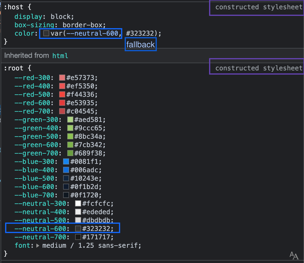
color: var(--neutral-600, ${unsafeCSS(theme.colors['--neutral-600'])});
|
|
158
|
+
}
|
|
159
|
+
`;
|
|
100
160
|
```
|
|
161
|
+
|
|
162
|
+

|
|
163
|
+
|
|
164
|
+
#### Demo
|
|
165
|
+
|
|
166
|
+
- [stackblitz](https://stackblitz.com/github/oscarmarina/theme-tokens?file=src%2FsetDocumentStyles.js&terminal=start)
|
|
167
|
+
|
|
168
|
+
---
|
|
169
|
+
|
|
170
|
+
### Progressive Enhancement:
|
|
171
|
+
|
|
172
|
+
- support browsers without native `Shadow DOM`
|
|
173
|
+
- support browsers with native `Shadow DOM` but without `adoptedStyleSheets`
|
|
174
|
+
- support browsers with native `Shadow DOM` and `adoptedStyleSheets`
|
package/index.js
CHANGED
package/package.json
CHANGED
|
@@ -1,6 +1,6 @@
|
|
|
1
1
|
{
|
|
2
2
|
"name": "@blockquote-web-components/blockquote-base-style-helpers",
|
|
3
|
-
"version": "1.0.
|
|
3
|
+
"version": "1.0.5",
|
|
4
4
|
"description": "Webcomponent blockquote-base-style-helpers following open-wc recommendations",
|
|
5
5
|
"keywords": [
|
|
6
6
|
"lit",
|
|
@@ -136,5 +136,5 @@
|
|
|
136
136
|
"access": "public"
|
|
137
137
|
},
|
|
138
138
|
"customElements": "custom-elements.json",
|
|
139
|
-
"gitHead": "
|
|
139
|
+
"gitHead": "24ceb7931b1dc3ddf9192201cc153b560082ca31"
|
|
140
140
|
}
|
package/src/setDocumentStyles.js
CHANGED
|
@@ -1,8 +1,6 @@
|
|
|
1
|
-
import { supportsAdoptingStyleSheets
|
|
1
|
+
import { supportsAdoptingStyleSheets } from 'lit';
|
|
2
2
|
import '@blockquote/polymer/lib/elements/custom-style.js';
|
|
3
3
|
|
|
4
|
-
export { supportsAdoptingStyleSheets /* adoptStyles */ } from 'lit';
|
|
5
|
-
|
|
6
4
|
export const supportCustomStyleInterface =
|
|
7
5
|
/* c8 ignore next */
|
|
8
6
|
window.ShadyCSS && window.ShadyCSS.CustomStyleInterface && !window.ShadyCSS.nativeShadow;
|
|
@@ -11,9 +9,9 @@ const renderDocumentRoot =
|
|
|
11
9
|
/* c8 ignore next */
|
|
12
10
|
supportsAdoptingStyleSheets ? document : document.head;
|
|
13
11
|
|
|
14
|
-
export const
|
|
12
|
+
export const adoptDocumentStyles = (renderRoot, styles) => {
|
|
15
13
|
if (supportsAdoptingStyleSheets) {
|
|
16
|
-
// https://github.com/lit/lit/
|
|
14
|
+
// https://github.com/lit/lit/issues/2984#issuecomment-1150224373
|
|
17
15
|
// eslint-disable-next-line no-param-reassign
|
|
18
16
|
renderRoot.adoptedStyleSheets = [
|
|
19
17
|
...renderRoot.adoptedStyleSheets,
|
|
@@ -22,11 +20,6 @@ export const adoptStyles = (renderRoot, styles) => {
|
|
|
22
20
|
} else {
|
|
23
21
|
styles.forEach(s => {
|
|
24
22
|
const style = document.createElement('style');
|
|
25
|
-
// eslint-disable-next-line dot-notation
|
|
26
|
-
const nonce = window['litNonce'];
|
|
27
|
-
if (nonce !== undefined) {
|
|
28
|
-
style.setAttribute('nonce', nonce);
|
|
29
|
-
}
|
|
30
23
|
style.textContent = s.cssText;
|
|
31
24
|
renderRoot.appendChild(style);
|
|
32
25
|
});
|
|
@@ -39,11 +32,10 @@ const documentCustomStyle = s => {
|
|
|
39
32
|
style.textContent = s.cssText;
|
|
40
33
|
customStyle.appendChild(style);
|
|
41
34
|
document.head.appendChild(customStyle);
|
|
42
|
-
return customStyle;
|
|
43
35
|
};
|
|
44
36
|
|
|
45
37
|
export const setDocumentStyles = styles => {
|
|
46
38
|
supportCustomStyleInterface
|
|
47
39
|
? documentCustomStyle(styles)
|
|
48
|
-
:
|
|
40
|
+
: adoptDocumentStyles(renderDocumentRoot, [styles]);
|
|
49
41
|
};
|