@blockquote-web-components/blockquote-base-style-helpers 1.0.20 → 1.0.21
This diff represents the content of publicly available package versions that have been released to one of the supported registries. The information contained in this diff is provided for informational purposes only and reflects changes between package versions as they appear in their respective public registries.
- package/README.md +69 -10
- package/index.js +0 -1
- package/package.json +19 -10
- package/src/getComponentSharedStyles.js +171 -0
- package/README.js +0 -175
package/README.md
CHANGED
|
@@ -1,5 +1,3 @@
|
|
|
1
|
-
# blockquote-base-style-helpers
|
|
2
|
-
|
|
3
1
|

|
|
4
2
|
|
|
5
3
|
`BlockquoteBaseStyleHelpers` offers a set of helper functions for working with CSS.
|
|
@@ -52,12 +50,12 @@ import { LitElement, html, css } from 'lit';
|
|
|
52
50
|
import { getComponentSharedStyles } from 'blockquote-base-style-helpers';
|
|
53
51
|
|
|
54
52
|
class XFoo extends LitElement {
|
|
55
|
-
static get styles() {
|
|
56
|
-
|
|
57
|
-
|
|
58
|
-
|
|
59
|
-
|
|
60
|
-
}
|
|
53
|
+
static get styles() {
|
|
54
|
+
return [
|
|
55
|
+
css`...`,
|
|
56
|
+
getComponentSharedStyles('x-foo-shared-styles)
|
|
57
|
+
];
|
|
58
|
+
}
|
|
61
59
|
}
|
|
62
60
|
```
|
|
63
61
|
|
|
@@ -157,8 +155,6 @@ export default css`
|
|
|
157
155
|
`;
|
|
158
156
|
```
|
|
159
157
|
|
|
160
|
-
|
|
161
|
-
|
|
162
158
|
#### Demo
|
|
163
159
|
|
|
164
160
|
- [stackblitz](https://stackblitz.com/github/oscarmarina/theme-tokens?file=src%2FsetDocumentStyles.js&terminal=start)
|
|
@@ -169,3 +165,66 @@ export default css`
|
|
|
169
165
|
|
|
170
166
|
- support browsers with native `Shadow DOM` but without `adoptedStyleSheets`
|
|
171
167
|
- support browsers with native `Shadow DOM` and `adoptedStyleSheets`
|
|
168
|
+
|
|
169
|
+
|
|
170
|
+
### `src/getComponentSharedStyles.js`:
|
|
171
|
+
|
|
172
|
+
#### Functions
|
|
173
|
+
|
|
174
|
+
| Name | Description | Parameters | Return |
|
|
175
|
+
| -------------------------- | --------------------------------------------------------------------------------------------------------------------------- | ------------ | ------ |
|
|
176
|
+
| `getComponentSharedStyles` | Get styles (as cssResult) already associated to provided ID string (using setComponentSharedStyles helper) and returns them | `id: String` | |
|
|
177
|
+
|
|
178
|
+
<hr/>
|
|
179
|
+
|
|
180
|
+
#### Exports
|
|
181
|
+
|
|
182
|
+
| Kind | Name | Declaration | Module | Package |
|
|
183
|
+
| ---- | -------------------------- | ------------------------ | ------------------------------- | ------- |
|
|
184
|
+
| `js` | `README` | README | src/getComponentSharedStyles.js | |
|
|
185
|
+
| `js` | `getComponentSharedStyles` | getComponentSharedStyles | src/getComponentSharedStyles.js | |
|
|
186
|
+
|
|
187
|
+
### `src/setComponentSharedStyles.js`:
|
|
188
|
+
|
|
189
|
+
#### Functions
|
|
190
|
+
|
|
191
|
+
| Name | Description | Parameters | Return |
|
|
192
|
+
| -------------------------- | ---------------------------------------------------------------------------------------------------- | ------------------------------- | ------ |
|
|
193
|
+
| `setComponentSharedStyles` | Set styles (as cssResult) associated to provided ID string which can then be retrieved by components | `id: String, styles: CSSResult` | |
|
|
194
|
+
|
|
195
|
+
<hr/>
|
|
196
|
+
|
|
197
|
+
#### Exports
|
|
198
|
+
|
|
199
|
+
| Kind | Name | Declaration | Module | Package |
|
|
200
|
+
| ---- | -------------------------- | ------------------------ | ------------------------------- | ------- |
|
|
201
|
+
| `js` | `setComponentSharedStyles` | setComponentSharedStyles | src/setComponentSharedStyles.js | |
|
|
202
|
+
|
|
203
|
+
### `src/setDocumentStyles.js`:
|
|
204
|
+
|
|
205
|
+
#### Functions
|
|
206
|
+
|
|
207
|
+
| Name | Description | Parameters | Return |
|
|
208
|
+
| --------------------- | ----------- | -------------------- | ------ |
|
|
209
|
+
| `adoptDocumentStyles` | | `renderRoot, styles` | |
|
|
210
|
+
| `setDocumentStyles` | | `styles` | |
|
|
211
|
+
|
|
212
|
+
<hr/>
|
|
213
|
+
|
|
214
|
+
#### Exports
|
|
215
|
+
|
|
216
|
+
| Kind | Name | Declaration | Module | Package |
|
|
217
|
+
| ---- | --------------------- | ------------------- | ------------------------ | ------- |
|
|
218
|
+
| `js` | `adoptDocumentStyles` | adoptDocumentStyles | src/setDocumentStyles.js | |
|
|
219
|
+
| `js` | `setDocumentStyles` | setDocumentStyles | src/setDocumentStyles.js | |
|
|
220
|
+
|
|
221
|
+
### `index.js`:
|
|
222
|
+
|
|
223
|
+
#### Exports
|
|
224
|
+
|
|
225
|
+
| Kind | Name | Declaration | Module | Package |
|
|
226
|
+
| ---- | -------------------------- | ------------------------ | --------------------------------- | ------- |
|
|
227
|
+
| `js` | `setDocumentStyles` | setDocumentStyles | ./src/setDocumentStyles.js | |
|
|
228
|
+
| `js` | `adoptDocumentStyles` | adoptDocumentStyles | ./src/setDocumentStyles.js | |
|
|
229
|
+
| `js` | `setComponentSharedStyles` | setComponentSharedStyles | ./src/setComponentSharedStyles.js | |
|
|
230
|
+
| `js` | `getComponentSharedStyles` | getComponentSharedStyles | ./src/getComponentSharedStyles.js | |
|
package/index.js
CHANGED
package/package.json
CHANGED
|
@@ -1,6 +1,6 @@
|
|
|
1
1
|
{
|
|
2
2
|
"name": "@blockquote-web-components/blockquote-base-style-helpers",
|
|
3
|
-
"version": "1.0.
|
|
3
|
+
"version": "1.0.21",
|
|
4
4
|
"description": "Webcomponent blockquote-base-style-helpers following open-wc recommendations",
|
|
5
5
|
"keywords": [
|
|
6
6
|
"lit",
|
|
@@ -90,15 +90,23 @@
|
|
|
90
90
|
"parserOptions": {
|
|
91
91
|
"ecmaVersion": "latest"
|
|
92
92
|
},
|
|
93
|
-
"plugins": [
|
|
94
|
-
"log-filenames"
|
|
95
|
-
],
|
|
96
93
|
"extends": [
|
|
97
94
|
"@open-wc",
|
|
98
95
|
"prettier"
|
|
99
96
|
],
|
|
100
97
|
"rules": {
|
|
101
98
|
"class-methods-use-this": "off",
|
|
99
|
+
"indent": [
|
|
100
|
+
"error",
|
|
101
|
+
2,
|
|
102
|
+
{
|
|
103
|
+
"SwitchCase": 1,
|
|
104
|
+
"ignoredNodes": [
|
|
105
|
+
"PropertyDefinition",
|
|
106
|
+
"TemplateLiteral > *"
|
|
107
|
+
]
|
|
108
|
+
}
|
|
109
|
+
],
|
|
102
110
|
"no-unused-expressions": [
|
|
103
111
|
"error",
|
|
104
112
|
{
|
|
@@ -125,7 +133,8 @@
|
|
|
125
133
|
}
|
|
126
134
|
],
|
|
127
135
|
"import/no-unresolved": "off",
|
|
128
|
-
"import/prefer-default-export": "off"
|
|
136
|
+
"import/prefer-default-export": "off",
|
|
137
|
+
"lit/no-native-attributes": "off"
|
|
129
138
|
}
|
|
130
139
|
},
|
|
131
140
|
"stylelint": {
|
|
@@ -139,16 +148,16 @@
|
|
|
139
148
|
}
|
|
140
149
|
},
|
|
141
150
|
"dependencies": {
|
|
142
|
-
"@blockquote-web-components/blockquote-base-meta": "^1.0.
|
|
151
|
+
"@blockquote-web-components/blockquote-base-meta": "^1.0.23"
|
|
143
152
|
},
|
|
144
153
|
"devDependencies": {
|
|
145
|
-
"@blockquote-web-components/blockquote-base-common-dev-dependencies": "^1.
|
|
146
|
-
"@blockquote-web-components/blockquote-base-embedded-webview": "^1.5.
|
|
147
|
-
"lit": "^2.0
|
|
154
|
+
"@blockquote-web-components/blockquote-base-common-dev-dependencies": "^1.5.0",
|
|
155
|
+
"@blockquote-web-components/blockquote-base-embedded-webview": "^1.5.3",
|
|
156
|
+
"lit": "^2.8.0"
|
|
148
157
|
},
|
|
149
158
|
"publishConfig": {
|
|
150
159
|
"access": "public"
|
|
151
160
|
},
|
|
152
161
|
"customElements": "custom-elements.json",
|
|
153
|
-
"gitHead": "
|
|
162
|
+
"gitHead": "1d99c84686394229dadc9d1e19f446588a33c8b6"
|
|
154
163
|
}
|
|
@@ -1,5 +1,176 @@
|
|
|
1
1
|
import { BlockquoteBaseMeta } from '@blockquote-web-components/blockquote-base-meta';
|
|
2
2
|
|
|
3
|
+
/**
|
|
4
|
+
* 
|
|
5
|
+
*
|
|
6
|
+
* `BlockquoteBaseStyleHelpers` offers a set of helper functions for working with CSS.
|
|
7
|
+
*
|
|
8
|
+
* There are two kinds of helps:
|
|
9
|
+
*
|
|
10
|
+
* - Shared styles between components
|
|
11
|
+
* - Document-level styles
|
|
12
|
+
*
|
|
13
|
+
* ## Shared styles between components
|
|
14
|
+
*
|
|
15
|
+
* [Adaptation of the Polymer ideas so that components can share styles, using native JS modules](https://polymer-library.polymer-project.org/2.0/docs/devguide/style-shadow-dom#share-styles-between-elements)
|
|
16
|
+
*
|
|
17
|
+
* Using the shared styles is a two-step process:
|
|
18
|
+
*
|
|
19
|
+
* - setComponentSharedStyles
|
|
20
|
+
* - getComponentSharedStyles
|
|
21
|
+
*
|
|
22
|
+
* ### setComponentSharedStyles
|
|
23
|
+
*
|
|
24
|
+
* Define a shared-style inside a JS module.
|
|
25
|
+
*
|
|
26
|
+
* The id attribute specifies the name you'll use to reference your shared styles, multiple shared styles can be registered using the same ID.
|
|
27
|
+
* These will be applied to the component in the order they were registered.
|
|
28
|
+
*
|
|
29
|
+
* __shared-styles__
|
|
30
|
+
*
|
|
31
|
+
* ```js
|
|
32
|
+
* import { css } from 'lit';
|
|
33
|
+
* import { setComponentSharedStyles } from blockquote-base-style-helpers.js;
|
|
34
|
+
*
|
|
35
|
+
* setComponentSharedStyles('x-foo-shared-styles', css`
|
|
36
|
+
* :host {
|
|
37
|
+
* background-color: red;
|
|
38
|
+
* }
|
|
39
|
+
* p {
|
|
40
|
+
* color: blue;
|
|
41
|
+
* }
|
|
42
|
+
* `);
|
|
43
|
+
* ```
|
|
44
|
+
*
|
|
45
|
+
* ### getComponentSharedStyles
|
|
46
|
+
*
|
|
47
|
+
* A component can use `getComponentSharedStyles` for retrieving style blocks and add it to its local styles extending or overriding it.
|
|
48
|
+
*
|
|
49
|
+
* __Component__
|
|
50
|
+
*
|
|
51
|
+
* ```js
|
|
52
|
+
* import { LitElement, html, css } from 'lit';
|
|
53
|
+
* import { getComponentSharedStyles } from 'blockquote-base-style-helpers';
|
|
54
|
+
*
|
|
55
|
+
* class XFoo extends LitElement {
|
|
56
|
+
* static get styles() {
|
|
57
|
+
* return [
|
|
58
|
+
* css`...`,
|
|
59
|
+
* getComponentSharedStyles('x-foo-shared-styles)
|
|
60
|
+
* ];
|
|
61
|
+
* }
|
|
62
|
+
* }
|
|
63
|
+
* ```
|
|
64
|
+
*
|
|
65
|
+
* ## Document-level styles
|
|
66
|
+
*
|
|
67
|
+
* #### [Adaptation of the Polymer ideas so for defining styles in the main document](https://polymer-library.polymer-project.org/2.0/docs/devguide/style-shadow-dom#custom-style)
|
|
68
|
+
*
|
|
69
|
+
* ---
|
|
70
|
+
*
|
|
71
|
+
* ### Define reusable design tokens
|
|
72
|
+
*
|
|
73
|
+
* Lit provide a perfect API, [adoptStyles](https://lit.dev/docs/api/styles/#adoptStyles) & [css](https://lit.dev/docs/api/styles/#css) for Built-in support Theming and managing tokens for a design system.
|
|
74
|
+
*
|
|
75
|
+
* The last step in the Built-in theme support creation is to [provide the CSS variables to be able to inherit, lit.dev theming](https://lit.dev/docs/components/styles/#theming)
|
|
76
|
+
*
|
|
77
|
+
* > But the function `adoptStyles` does not preserve any existing StyleSheets added via adoptedStyleSheets.
|
|
78
|
+
* >
|
|
79
|
+
* > - [preserveExisting option to adoptStyles](https://github.com/lit/lit/issues/2984#issuecomment-1150224373)
|
|
80
|
+
*
|
|
81
|
+
* ---
|
|
82
|
+
*
|
|
83
|
+
* ### 1. From tokens to CSS variables
|
|
84
|
+
*
|
|
85
|
+
* ```js
|
|
86
|
+
* export const theme = {
|
|
87
|
+
* colors: {
|
|
88
|
+
* ...tertiary0,
|
|
89
|
+
* ...tertiary1,
|
|
90
|
+
* ...tertiary2,
|
|
91
|
+
* ...neutral,
|
|
92
|
+
* },
|
|
93
|
+
* fontFace: {
|
|
94
|
+
* ...fontFace,
|
|
95
|
+
* },
|
|
96
|
+
* fonts: {
|
|
97
|
+
* main: 'Kaisei HarunoUmi, serif',
|
|
98
|
+
* },
|
|
99
|
+
* };
|
|
100
|
+
*
|
|
101
|
+
* const THEME = `
|
|
102
|
+
* :root {
|
|
103
|
+
* --red-300: ${theme.colors['--red-300']};
|
|
104
|
+
* --red-400: ${theme.colors['--red-400']};
|
|
105
|
+
* --red-500: ${theme.colors['--red-500']};
|
|
106
|
+
* --red-600: ${theme.colors['--red-600']};
|
|
107
|
+
* --red-700: ${theme.colors['--red-700']};
|
|
108
|
+
*
|
|
109
|
+
* --green-300: ${theme.colors['--green-300']};
|
|
110
|
+
* --green-400: ${theme.colors['--green-400']};
|
|
111
|
+
* --green-500: ${theme.colors['--green-500']};
|
|
112
|
+
* --green-600: ${theme.colors['--green-600']};
|
|
113
|
+
* --green-700: ${theme.colors['--green-700']};
|
|
114
|
+
*
|
|
115
|
+
* --blue-300: ${theme.colors['--blue-300']};
|
|
116
|
+
* --blue-400: ${theme.colors['--blue-400']};
|
|
117
|
+
* --blue-500: ${theme.colors['--blue-500']};
|
|
118
|
+
* --blue-600: ${theme.colors['--blue-600']};
|
|
119
|
+
* --blue-700: ${theme.colors['--blue-700']};
|
|
120
|
+
*
|
|
121
|
+
* --neutral-300: ${theme.colors['--neutral-300']};
|
|
122
|
+
* --neutral-400: ${theme.colors['--neutral-400']};
|
|
123
|
+
* --neutral-500: ${theme.colors['--neutral-500']};
|
|
124
|
+
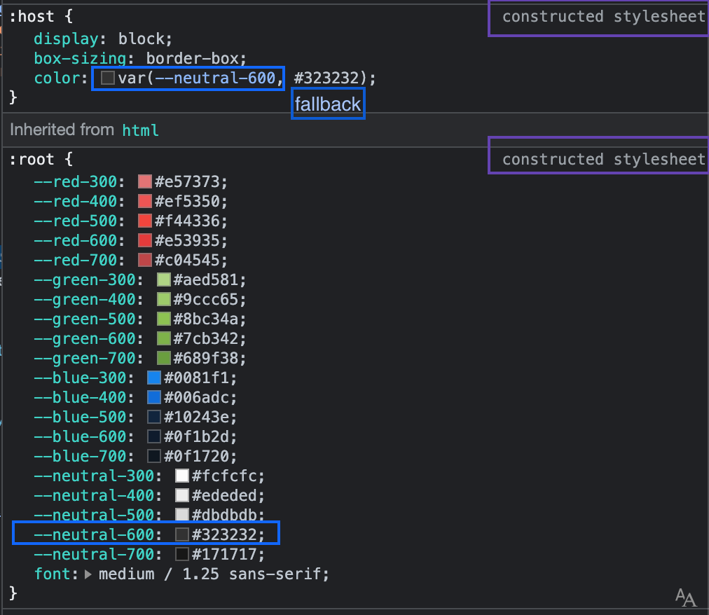
* --neutral-600: ${theme.colors['--neutral-600']};
|
|
125
|
+
* --neutral-700: ${theme.colors['--neutral-700']};
|
|
126
|
+
*
|
|
127
|
+
* font: normal medium/1.25 sans-serif;
|
|
128
|
+
*
|
|
129
|
+
* }`;
|
|
130
|
+
* ```
|
|
131
|
+
*
|
|
132
|
+
* #### 2. Styles are injected in document, adoptedStyleSheets, or inside `<style>` tags in the document's `<head>`
|
|
133
|
+
*
|
|
134
|
+
* ```js
|
|
135
|
+
* // Two call (setDocumentStyles) preserves any existing StyleSheets added via adoptedStyleSheets
|
|
136
|
+
*
|
|
137
|
+
* setDocumentStyles(css`
|
|
138
|
+
* ${unsafeCSS(theme.fontFace.root)}
|
|
139
|
+
* `);
|
|
140
|
+
*
|
|
141
|
+
* setDocumentStyles(css`
|
|
142
|
+
* ${unsafeCSS(THEME)}
|
|
143
|
+
* `);
|
|
144
|
+
* ```
|
|
145
|
+
*
|
|
146
|
+
* #### 3. Themable component
|
|
147
|
+
*
|
|
148
|
+
* ```js
|
|
149
|
+
* // CSS var fallback from the same theme just a source of truth
|
|
150
|
+
* import { css, unsafeCSS } from 'lit';
|
|
151
|
+
* import { theme } from '../theme/theme.js';
|
|
152
|
+
*
|
|
153
|
+
* export default css`
|
|
154
|
+
* :host {
|
|
155
|
+
* display: block;
|
|
156
|
+
* color: var(--neutral-600, ${unsafeCSS(theme.colors['--neutral-600'])});
|
|
157
|
+
* }
|
|
158
|
+
* `;
|
|
159
|
+
* ```
|
|
160
|
+
*
|
|
161
|
+
* #### Demo
|
|
162
|
+
*
|
|
163
|
+
* - [stackblitz](https://stackblitz.com/github/oscarmarina/theme-tokens?file=src%2FsetDocumentStyles.js&terminal=start)
|
|
164
|
+
*
|
|
165
|
+
* ---
|
|
166
|
+
*
|
|
167
|
+
* ### Progressive Enhancement:
|
|
168
|
+
*
|
|
169
|
+
* - support browsers with native `Shadow DOM` but without `adoptedStyleSheets`
|
|
170
|
+
* - support browsers with native `Shadow DOM` and `adoptedStyleSheets`
|
|
171
|
+
*/
|
|
172
|
+
export class README extends Text {}
|
|
173
|
+
|
|
3
174
|
const meta = new BlockquoteBaseMeta({
|
|
4
175
|
type: 'sharedStyles',
|
|
5
176
|
});
|
package/README.js
DELETED
|
@@ -1,175 +0,0 @@
|
|
|
1
|
-
/**
|
|
2
|
-

|
|
3
|
-
|
|
4
|
-
`BlockquoteBaseStyleHelpers` offers a set of helper functions for working with CSS.
|
|
5
|
-
|
|
6
|
-
There are two kinds of helps:
|
|
7
|
-
|
|
8
|
-
- Shared styles between components
|
|
9
|
-
- Document-level styles
|
|
10
|
-
|
|
11
|
-
## Shared styles between components
|
|
12
|
-
|
|
13
|
-
[Adaptation of the Polymer ideas so that components can share styles, using native JS modules](https://polymer-library.polymer-project.org/2.0/docs/devguide/style-shadow-dom#share-styles-between-elements)
|
|
14
|
-
|
|
15
|
-
Using the shared styles is a two-step process:
|
|
16
|
-
|
|
17
|
-
- setComponentSharedStyles
|
|
18
|
-
- getComponentSharedStyles
|
|
19
|
-
|
|
20
|
-
### setComponentSharedStyles
|
|
21
|
-
|
|
22
|
-
Define a shared-style inside a JS module.
|
|
23
|
-
|
|
24
|
-
The id attribute specifies the name you'll use to reference your shared styles, multiple shared styles can be registered using the same ID.
|
|
25
|
-
These will be applied to the component in the order they were registered.
|
|
26
|
-
|
|
27
|
-
__shared-styles__
|
|
28
|
-
|
|
29
|
-
```js
|
|
30
|
-
import { css } from 'lit';
|
|
31
|
-
import { setComponentSharedStyles } from blockquote-base-style-helpers.js;
|
|
32
|
-
|
|
33
|
-
setComponentSharedStyles('x-foo-shared-styles', css`
|
|
34
|
-
:host {
|
|
35
|
-
background-color: red;
|
|
36
|
-
}
|
|
37
|
-
p {
|
|
38
|
-
color: blue;
|
|
39
|
-
}
|
|
40
|
-
`);
|
|
41
|
-
```
|
|
42
|
-
|
|
43
|
-
### getComponentSharedStyles
|
|
44
|
-
|
|
45
|
-
A component can use `getComponentSharedStyles` for retrieving style blocks and add it to its local styles extending or overriding it.
|
|
46
|
-
|
|
47
|
-
__Component__
|
|
48
|
-
|
|
49
|
-
```js
|
|
50
|
-
import { LitElement, html, css } from 'lit';
|
|
51
|
-
import { getComponentSharedStyles } from 'blockquote-base-style-helpers';
|
|
52
|
-
|
|
53
|
-
class XFoo extends LitElement {
|
|
54
|
-
static get styles() {
|
|
55
|
-
return [
|
|
56
|
-
css`...`,
|
|
57
|
-
getComponentSharedStyles('x-foo-shared-styles)
|
|
58
|
-
];
|
|
59
|
-
}
|
|
60
|
-
}
|
|
61
|
-
```
|
|
62
|
-
|
|
63
|
-
## Document-level styles
|
|
64
|
-
|
|
65
|
-
#### [Adaptation of the Polymer ideas so for defining styles in the main document](https://polymer-library.polymer-project.org/2.0/docs/devguide/style-shadow-dom#custom-style)
|
|
66
|
-
|
|
67
|
-
---
|
|
68
|
-
|
|
69
|
-
### Define reusable design tokens
|
|
70
|
-
|
|
71
|
-
Lit provide a perfect API, [adoptStyles](https://lit.dev/docs/api/styles/#adoptStyles) & [css](https://lit.dev/docs/api/styles/#css) for Built-in support Theming and managing tokens for a design system.
|
|
72
|
-
|
|
73
|
-
The last step in the Built-in theme support creation is to [provide the CSS variables to be able to inherit, lit.dev theming](https://lit.dev/docs/components/styles/#theming)
|
|
74
|
-
|
|
75
|
-
> But the function `adoptStyles` does not preserve any existing StyleSheets added via adoptedStyleSheets.
|
|
76
|
-
>
|
|
77
|
-
> - [preserveExisting option to adoptStyles](https://github.com/lit/lit/issues/2984#issuecomment-1150224373)
|
|
78
|
-
|
|
79
|
-
---
|
|
80
|
-
|
|
81
|
-
### 1. From tokens to CSS variables
|
|
82
|
-
|
|
83
|
-
```js
|
|
84
|
-
export const theme = {
|
|
85
|
-
colors: {
|
|
86
|
-
...tertiary0,
|
|
87
|
-
...tertiary1,
|
|
88
|
-
...tertiary2,
|
|
89
|
-
...neutral,
|
|
90
|
-
},
|
|
91
|
-
fontFace: {
|
|
92
|
-
...fontFace,
|
|
93
|
-
},
|
|
94
|
-
fonts: {
|
|
95
|
-
main: 'Kaisei HarunoUmi, serif',
|
|
96
|
-
},
|
|
97
|
-
};
|
|
98
|
-
|
|
99
|
-
const THEME = `
|
|
100
|
-
:root {
|
|
101
|
-
--red-300: ${theme.colors['--red-300']};
|
|
102
|
-
--red-400: ${theme.colors['--red-400']};
|
|
103
|
-
--red-500: ${theme.colors['--red-500']};
|
|
104
|
-
--red-600: ${theme.colors['--red-600']};
|
|
105
|
-
--red-700: ${theme.colors['--red-700']};
|
|
106
|
-
|
|
107
|
-
--green-300: ${theme.colors['--green-300']};
|
|
108
|
-
--green-400: ${theme.colors['--green-400']};
|
|
109
|
-
--green-500: ${theme.colors['--green-500']};
|
|
110
|
-
--green-600: ${theme.colors['--green-600']};
|
|
111
|
-
--green-700: ${theme.colors['--green-700']};
|
|
112
|
-
|
|
113
|
-
--blue-300: ${theme.colors['--blue-300']};
|
|
114
|
-
--blue-400: ${theme.colors['--blue-400']};
|
|
115
|
-
--blue-500: ${theme.colors['--blue-500']};
|
|
116
|
-
--blue-600: ${theme.colors['--blue-600']};
|
|
117
|
-
--blue-700: ${theme.colors['--blue-700']};
|
|
118
|
-
|
|
119
|
-
--neutral-300: ${theme.colors['--neutral-300']};
|
|
120
|
-
--neutral-400: ${theme.colors['--neutral-400']};
|
|
121
|
-
--neutral-500: ${theme.colors['--neutral-500']};
|
|
122
|
-
--neutral-600: ${theme.colors['--neutral-600']};
|
|
123
|
-
--neutral-700: ${theme.colors['--neutral-700']};
|
|
124
|
-
|
|
125
|
-
font: normal medium/1.25 sans-serif;
|
|
126
|
-
|
|
127
|
-
}`;
|
|
128
|
-
```
|
|
129
|
-
|
|
130
|
-
#### 2. Styles are injected in document, adoptedStyleSheets, or inside `<style>` tags in the document's `<head>`
|
|
131
|
-
|
|
132
|
-
```js
|
|
133
|
-
// Two call (setDocumentStyles) preserves any existing StyleSheets added via adoptedStyleSheets
|
|
134
|
-
|
|
135
|
-
setDocumentStyles(css`
|
|
136
|
-
${unsafeCSS(theme.fontFace.root)}
|
|
137
|
-
`);
|
|
138
|
-
|
|
139
|
-
setDocumentStyles(css`
|
|
140
|
-
${unsafeCSS(THEME)}
|
|
141
|
-
`);
|
|
142
|
-
```
|
|
143
|
-
|
|
144
|
-
#### 3. Themable component
|
|
145
|
-
|
|
146
|
-
```js
|
|
147
|
-
// CSS var fallback from the same theme just a source of truth
|
|
148
|
-
import { css, unsafeCSS } from 'lit';
|
|
149
|
-
import { theme } from '../theme/theme.js';
|
|
150
|
-
|
|
151
|
-
export default css`
|
|
152
|
-
:host {
|
|
153
|
-
display: block;
|
|
154
|
-
color: var(--neutral-600, ${unsafeCSS(theme.colors['--neutral-600'])});
|
|
155
|
-
}
|
|
156
|
-
`;
|
|
157
|
-
```
|
|
158
|
-
|
|
159
|
-

|
|
160
|
-
|
|
161
|
-
#### Demo
|
|
162
|
-
|
|
163
|
-
- [stackblitz](https://stackblitz.com/github/oscarmarina/theme-tokens?file=src%2FsetDocumentStyles.js&terminal=start)
|
|
164
|
-
|
|
165
|
-
---
|
|
166
|
-
|
|
167
|
-
### Progressive Enhancement:
|
|
168
|
-
|
|
169
|
-
- support browsers with native `Shadow DOM` but without `adoptedStyleSheets`
|
|
170
|
-
- support browsers with native `Shadow DOM` and `adoptedStyleSheets`
|
|
171
|
-
|
|
172
|
-
@tagname blockquote-base-style-helpers
|
|
173
|
-
@element blockquote-base-style-helpers
|
|
174
|
-
*/
|
|
175
|
-
export class ReadmElement extends HTMLElement {}
|