@birdnet/advanced-react-dates 0.0.0-stage → 1.0.0
This diff represents the content of publicly available package versions that have been released to one of the supported registries. The information contained in this diff is provided for informational purposes only and reflects changes between package versions as they appear in their respective public registries.
- package/.babelrc +67 -0
- package/.eslintrc +66 -0
- package/.nvmrc +1 -0
- package/.nyc_output/4d8efcd220c2aec1f2b4ffd49d875001.json +1 -0
- package/.nyc_output/66d34779498a5d49bcf9d757dfc7fdb5.json +1 -0
- package/.nyc_output/8ca7e04140934515928bc7d4ae476b73.json +1 -0
- package/.nyc_output/afc270bb597bfc50e690436959c2ae54.json +1 -0
- package/.nycrc +19 -0
- package/.travis.yml +13 -0
- package/CHANGELOG.md +665 -0
- package/CLAUDE.md +56 -0
- package/INTHEWILD.md +9 -0
- package/LICENSE +21 -0
- package/README.md +421 -2
- package/constants.js +2 -0
- package/esm/components/CalendarDay.js +321 -0
- package/esm/components/CalendarIcon.js +11 -0
- package/esm/components/CalendarMonth.js +254 -0
- package/esm/components/CalendarMonthGrid.js +365 -0
- package/esm/components/CalendarWeek.js +11 -0
- package/esm/components/ChevronDown.js +11 -0
- package/esm/components/ChevronUp.js +11 -0
- package/esm/components/CloseButton.js +12 -0
- package/esm/components/CustomizableCalendarDay.js +341 -0
- package/esm/components/DateInput.js +344 -0
- package/esm/components/DateRangePicker.js +647 -0
- package/esm/components/DateRangePickerInput.js +341 -0
- package/esm/components/DateRangePickerInputController.js +348 -0
- package/esm/components/DayPicker.js +1167 -0
- package/esm/components/DayPickerKeyboardShortcuts.js +364 -0
- package/esm/components/DayPickerNavigation.js +314 -0
- package/esm/components/DayPickerRangeController.js +1202 -0
- package/esm/components/DayPickerSingleDateController.js +690 -0
- package/esm/components/KeyboardShortcutRow.js +69 -0
- package/esm/components/LeftArrow.js +11 -0
- package/esm/components/RightArrow.js +11 -0
- package/esm/components/SingleDatePicker.js +605 -0
- package/esm/components/SingleDatePickerInput.js +264 -0
- package/esm/components/SingleDatePickerInputController.js +260 -0
- package/esm/constants.js +28 -0
- package/esm/defaultPhrases.js +225 -0
- package/esm/index.js +20 -0
- package/esm/initialize.js +2 -0
- package/esm/shapes/AnchorDirectionShape.js +3 -0
- package/esm/shapes/CalendarInfoPositionShape.js +3 -0
- package/esm/shapes/DateRangePickerShape.js +101 -0
- package/esm/shapes/DayOfWeekShape.js +3 -0
- package/esm/shapes/DisabledShape.js +3 -0
- package/esm/shapes/FocusedInputShape.js +3 -0
- package/esm/shapes/IconPositionShape.js +3 -0
- package/esm/shapes/ModifiersShape.js +18 -0
- package/esm/shapes/NavPositionShape.js +3 -0
- package/esm/shapes/OpenDirectionShape.js +3 -0
- package/esm/shapes/OrientationShape.js +3 -0
- package/esm/shapes/ScrollableOrientationShape.js +3 -0
- package/esm/shapes/SingleDatePickerShape.js +90 -0
- package/esm/theme/DefaultTheme.js +176 -0
- package/esm/utils/calculateDimension.js +28 -0
- package/esm/utils/disableScroll.js +67 -0
- package/esm/utils/getActiveElement.js +3 -0
- package/esm/utils/getCalendarDaySettings.js +48 -0
- package/esm/utils/getCalendarMonthWeeks.js +37 -0
- package/esm/utils/getCalendarMonthWidth.js +4 -0
- package/esm/utils/getDetachedContainerStyles.js +36 -0
- package/esm/utils/getInputHeight.js +42 -0
- package/esm/utils/getNumberOfCalendarMonthWeeks.js +11 -0
- package/esm/utils/getPhrase.js +7 -0
- package/esm/utils/getPhrasePropTypes.js +9 -0
- package/esm/utils/getPooledMoment.js +8 -0
- package/esm/utils/getPreviousMonthMemoLast.js +9 -0
- package/esm/utils/getResponsiveContainerStyles.js +8 -0
- package/esm/utils/getSelectedDateOffset.js +8 -0
- package/esm/utils/getTransformStyles.js +8 -0
- package/esm/utils/getVisibleDays.js +42 -0
- package/esm/utils/isAfterDay.js +7 -0
- package/esm/utils/isBeforeDay.js +13 -0
- package/esm/utils/isDayVisible.js +38 -0
- package/esm/utils/isInclusivelyAfterDay.js +6 -0
- package/esm/utils/isInclusivelyBeforeDay.js +6 -0
- package/esm/utils/isNextDay.js +7 -0
- package/esm/utils/isNextMonth.js +6 -0
- package/esm/utils/isPrevMonth.js +6 -0
- package/esm/utils/isPreviousDay.js +7 -0
- package/esm/utils/isSameDay.js +7 -0
- package/esm/utils/isSameMonth.js +7 -0
- package/esm/utils/isTransitionEndSupported.js +3 -0
- package/esm/utils/modifiers.js +94 -0
- package/esm/utils/noflip.js +10 -0
- package/esm/utils/registerCSSInterfaceWithDefaultTheme.js +5 -0
- package/esm/utils/registerInterfaceWithDefaultTheme.js +6 -0
- package/esm/utils/toISODateString.js +12 -0
- package/esm/utils/toISOMonthString.js +12 -0
- package/esm/utils/toLocalizedDateString.js +8 -0
- package/esm/utils/toMomentObject.js +7 -0
- package/index.js +2 -0
- package/initialize.js +2 -0
- package/karma.conf.js +82 -0
- package/lib/components/CalendarDay.js +327 -0
- package/lib/components/CalendarIcon.js +18 -0
- package/lib/components/CalendarMonth.js +259 -0
- package/lib/components/CalendarMonthGrid.js +372 -0
- package/lib/components/CalendarWeek.js +18 -0
- package/lib/components/ChevronDown.js +18 -0
- package/lib/components/ChevronUp.js +18 -0
- package/lib/components/CloseButton.js +19 -0
- package/lib/components/CustomizableCalendarDay.js +347 -0
- package/lib/components/DateInput.js +351 -0
- package/lib/components/DateRangePicker.js +653 -0
- package/lib/components/DateRangePickerInput.js +348 -0
- package/lib/components/DateRangePickerInputController.js +354 -0
- package/lib/components/DayPicker.js +1175 -0
- package/lib/components/DayPickerKeyboardShortcuts.js +371 -0
- package/lib/components/DayPickerNavigation.js +321 -0
- package/lib/components/DayPickerRangeController.js +1208 -0
- package/lib/components/DayPickerSingleDateController.js +695 -0
- package/lib/components/KeyboardShortcutRow.js +76 -0
- package/lib/components/LeftArrow.js +18 -0
- package/lib/components/RightArrow.js +18 -0
- package/lib/components/SingleDatePicker.js +611 -0
- package/lib/components/SingleDatePickerInput.js +271 -0
- package/lib/components/SingleDatePickerInputController.js +266 -0
- package/lib/constants.js +34 -0
- package/lib/css/_datepicker.css +886 -0
- package/lib/defaultPhrases.js +231 -0
- package/lib/index.js +146 -0
- package/lib/initialize.js +5 -0
- package/lib/shapes/AnchorDirectionShape.js +10 -0
- package/lib/shapes/CalendarInfoPositionShape.js +10 -0
- package/lib/shapes/DateRangePickerShape.js +108 -0
- package/lib/shapes/DayOfWeekShape.js +10 -0
- package/lib/shapes/DisabledShape.js +10 -0
- package/lib/shapes/FocusedInputShape.js +10 -0
- package/lib/shapes/IconPositionShape.js +10 -0
- package/lib/shapes/ModifiersShape.js +25 -0
- package/lib/shapes/NavPositionShape.js +10 -0
- package/lib/shapes/OpenDirectionShape.js +10 -0
- package/lib/shapes/OrientationShape.js +10 -0
- package/lib/shapes/ScrollableOrientationShape.js +10 -0
- package/lib/shapes/SingleDatePickerShape.js +97 -0
- package/lib/theme/DefaultTheme.js +182 -0
- package/lib/utils/calculateDimension.js +34 -0
- package/lib/utils/disableScroll.js +75 -0
- package/lib/utils/getActiveElement.js +9 -0
- package/lib/utils/getCalendarDaySettings.js +55 -0
- package/lib/utils/getCalendarMonthWeeks.js +44 -0
- package/lib/utils/getCalendarMonthWidth.js +10 -0
- package/lib/utils/getDetachedContainerStyles.js +41 -0
- package/lib/utils/getInputHeight.js +48 -0
- package/lib/utils/getNumberOfCalendarMonthWeeks.js +18 -0
- package/lib/utils/getPhrase.js +13 -0
- package/lib/utils/getPhrasePropTypes.js +16 -0
- package/lib/utils/getPooledMoment.js +15 -0
- package/lib/utils/getPreviousMonthMemoLast.js +15 -0
- package/lib/utils/getResponsiveContainerStyles.js +15 -0
- package/lib/utils/getSelectedDateOffset.js +14 -0
- package/lib/utils/getTransformStyles.js +14 -0
- package/lib/utils/getVisibleDays.js +49 -0
- package/lib/utils/isAfterDay.js +14 -0
- package/lib/utils/isBeforeDay.js +20 -0
- package/lib/utils/isDayVisible.js +45 -0
- package/lib/utils/isInclusivelyAfterDay.js +13 -0
- package/lib/utils/isInclusivelyBeforeDay.js +13 -0
- package/lib/utils/isNextDay.js +14 -0
- package/lib/utils/isNextMonth.js +13 -0
- package/lib/utils/isPrevMonth.js +13 -0
- package/lib/utils/isPreviousDay.js +14 -0
- package/lib/utils/isSameDay.js +14 -0
- package/lib/utils/isSameMonth.js +14 -0
- package/lib/utils/isTransitionEndSupported.js +9 -0
- package/lib/utils/modifiers.js +102 -0
- package/lib/utils/noflip.js +16 -0
- package/lib/utils/registerCSSInterfaceWithDefaultTheme.js +12 -0
- package/lib/utils/registerInterfaceWithDefaultTheme.js +13 -0
- package/lib/utils/toISODateString.js +19 -0
- package/lib/utils/toISOMonthString.js +19 -0
- package/lib/utils/toLocalizedDateString.js +15 -0
- package/lib/utils/toMomentObject.js +14 -0
- package/package.json +141 -4
- package/scripts/.eslintrc +7 -0
- package/scripts/buildCSS.js +37 -0
- package/scripts/pure-component-fallback.js +70 -0
- package/scripts/renderAllComponents.jsx +25 -0
- package/src/components/CalendarDay.jsx +366 -0
- package/src/components/CalendarIcon.jsx +3 -0
- package/src/components/CalendarMonth.jsx +300 -0
- package/src/components/CalendarMonthGrid.jsx +427 -0
- package/src/components/CalendarWeek.jsx +17 -0
- package/src/components/ChevronDown.jsx +3 -0
- package/src/components/ChevronUp.jsx +3 -0
- package/src/components/CloseButton.jsx +3 -0
- package/src/components/CustomizableCalendarDay.jsx +382 -0
- package/src/components/DateInput.jsx +401 -0
- package/src/components/DateRangePicker.jsx +777 -0
- package/src/components/DateRangePickerInput.jsx +434 -0
- package/src/components/DateRangePickerInputController.jsx +379 -0
- package/src/components/DayPicker.jsx +1407 -0
- package/src/components/DayPickerKeyboardShortcuts.jsx +443 -0
- package/src/components/DayPickerNavigation.jsx +445 -0
- package/src/components/DayPickerRangeController.jsx +1409 -0
- package/src/components/DayPickerSingleDateController.jsx +769 -0
- package/src/components/KeyboardShortcutRow.jsx +93 -0
- package/src/components/LeftArrow.jsx +3 -0
- package/src/components/RightArrow.jsx +3 -0
- package/src/components/SingleDatePicker.jsx +731 -0
- package/src/components/SingleDatePickerInput.jsx +329 -0
- package/src/components/SingleDatePickerInputController.jsx +280 -0
- package/src/constants.js +37 -0
- package/src/defaultPhrases.js +215 -0
- package/src/index.js +20 -0
- package/src/initialize.js +3 -0
- package/src/shapes/AnchorDirectionShape.js +8 -0
- package/src/shapes/CalendarInfoPositionShape.js +15 -0
- package/src/shapes/DateRangePickerShape.js +111 -0
- package/src/shapes/DayOfWeekShape.js +5 -0
- package/src/shapes/DisabledShape.js +5 -0
- package/src/shapes/FocusedInputShape.js +8 -0
- package/src/shapes/IconPositionShape.js +8 -0
- package/src/shapes/ModifiersShape.js +20 -0
- package/src/shapes/NavPositionShape.js +8 -0
- package/src/shapes/OpenDirectionShape.js +8 -0
- package/src/shapes/OrientationShape.js +8 -0
- package/src/shapes/ScrollableOrientationShape.js +13 -0
- package/src/shapes/SingleDatePickerShape.js +100 -0
- package/src/svg/arrow-left.svg +1 -0
- package/src/svg/arrow-right.svg +1 -0
- package/src/svg/calendar.svg +1 -0
- package/src/svg/chevron-down.svg +1 -0
- package/src/svg/chevron-up.svg +1 -0
- package/src/svg/close.svg +1 -0
- package/src/theme/DefaultTheme.js +196 -0
- package/src/utils/calculateDimension.js +32 -0
- package/src/utils/disableScroll.js +65 -0
- package/src/utils/getActiveElement.js +3 -0
- package/src/utils/getCalendarDaySettings.js +61 -0
- package/src/utils/getCalendarMonthWeeks.js +49 -0
- package/src/utils/getCalendarMonthWidth.js +3 -0
- package/src/utils/getDetachedContainerStyles.js +39 -0
- package/src/utils/getInputHeight.js +67 -0
- package/src/utils/getNumberOfCalendarMonthWeeks.js +15 -0
- package/src/utils/getPhrase.jsx +9 -0
- package/src/utils/getPhrasePropTypes.js +9 -0
- package/src/utils/getPooledMoment.js +10 -0
- package/src/utils/getPreviousMonthMemoLast.js +11 -0
- package/src/utils/getResponsiveContainerStyles.js +18 -0
- package/src/utils/getSelectedDateOffset.js +6 -0
- package/src/utils/getTransformStyles.js +8 -0
- package/src/utils/getVisibleDays.js +54 -0
- package/src/utils/isAfterDay.js +9 -0
- package/src/utils/isBeforeDay.js +18 -0
- package/src/utils/isDayVisible.js +57 -0
- package/src/utils/isInclusivelyAfterDay.js +8 -0
- package/src/utils/isInclusivelyBeforeDay.js +8 -0
- package/src/utils/isNextDay.js +9 -0
- package/src/utils/isNextMonth.js +8 -0
- package/src/utils/isPrevMonth.js +8 -0
- package/src/utils/isPreviousDay.js +9 -0
- package/src/utils/isSameDay.js +10 -0
- package/src/utils/isSameMonth.js +9 -0
- package/src/utils/isTransitionEndSupported.js +3 -0
- package/src/utils/modifiers.js +116 -0
- package/src/utils/noflip.js +11 -0
- package/src/utils/registerCSSInterfaceWithDefaultTheme.js +7 -0
- package/src/utils/registerInterfaceWithDefaultTheme.js +7 -0
- package/src/utils/toISODateString.js +14 -0
- package/src/utils/toISOMonthString.js +14 -0
- package/src/utils/toLocalizedDateString.js +12 -0
- package/src/utils/toMomentObject.js +12 -0
package/CLAUDE.md
ADDED
|
@@ -0,0 +1,56 @@
|
|
|
1
|
+
# CLAUDE.md
|
|
2
|
+
|
|
3
|
+
This file provides guidance to Claude Code (claude.ai/code) when working with code in this repository.
|
|
4
|
+
|
|
5
|
+
`react-dates` is a responsive, accessible, internationalizable date picker library for React. It is published to npm; `src/` is authored source and the committed `index.js`/`constants.js`/`initialize.js` at the repo root are thin shims that re-export the compiled `lib/` build.
|
|
6
|
+
|
|
7
|
+
## Commands
|
|
8
|
+
|
|
9
|
+
- `npm test` — the full CI flow: installs the enzyme React adapter, builds `lib/` + `esm/` + CSS, compiles tests, then lints and runs mocha with coverage. Slow; run it before publishing or when build config changes.
|
|
10
|
+
- `npm run lint` — ESLint over `src` and `test` (`.js`,`.jsx`). `pretest` runs this automatically.
|
|
11
|
+
- `npm run tests-only` — runs mocha+nyc against the **already-compiled** `test-build/`. Does **not** rebuild — run a build first if `src/` or `test/` changed.
|
|
12
|
+
- `npm run build` — builds `build:cjs` (`lib/`), `build:esm` (`esm/`), and `build:css`. `postbuild` also runs `build:test` → `test-build/`.
|
|
13
|
+
- `npm run storybook` — live playground at http://localhost:6006 (the examples double as manual/visual tests). `storybook:css` runs it against the compiled CSS build.
|
|
14
|
+
|
|
15
|
+
### Running a single test
|
|
16
|
+
Tests execute from the **compiled** `test-build/` directory, not `test/`. To iterate on one spec:
|
|
17
|
+
```sh
|
|
18
|
+
npm run build # once, so lib/ exists (tests import from lib/, see below)
|
|
19
|
+
BABEL_ENV=test babel test/components/DateRangePicker_spec.jsx -o test-build/components/DateRangePicker_spec.js
|
|
20
|
+
mocha ./test-build/_helpers ./test-build/components/DateRangePicker_spec.js
|
|
21
|
+
```
|
|
22
|
+
`./test-build/_helpers` must be passed first — it is the enzyme/react-with-styles setup that every spec depends on. Alternatively, add `.only` to a `describe`/`it` and run the normal `tests-only`.
|
|
23
|
+
|
|
24
|
+
### React version
|
|
25
|
+
Enzyme needs an adapter matched to the installed React. `npm run react` runs `enzyme-adapter-react-install 16`. Change the trailing number to test against a different major React version (the CI matrix does this).
|
|
26
|
+
|
|
27
|
+
## Architecture
|
|
28
|
+
|
|
29
|
+
### Layered component composition
|
|
30
|
+
The public pickers are built by stacking three responsibilities. Working on behavior means finding the right layer:
|
|
31
|
+
|
|
32
|
+
1. **Picker** (`DateRangePicker`, `SingleDatePicker`) — top-level styled component. Owns input↔calendar layout, portals (`withPortal`/`appendToBody`), open/close, outside-click, responsive positioning. Wrapped in `withStyles(...)`.
|
|
33
|
+
2. **InputController** (`DateRangePickerInputController`, `SingleDatePickerInputController`) — parses typed text into moments (`toMomentObject`), validates, and drives the `DateRangePickerInput` / `SingleDatePickerInput` presentational inputs.
|
|
34
|
+
3. **DayPicker…Controller** (`DayPickerRangeController`, `DayPickerSingleDateController`) — the calendar brain. Computes **visible days and their modifiers** (selected, blocked, hovered-span, etc.) and handles day selection/hover logic. These are also exported publicly as calendar-only pickers.
|
|
35
|
+
4. **`DayPicker`** — pure calendar renderer: month grid, navigation, keyboard shortcuts, vertical/horizontal/scrollable orientation. Renders `CalendarMonthGrid` → `CalendarMonth` → `CalendarDay`.
|
|
36
|
+
|
|
37
|
+
A change to "which days are selectable/highlighted" belongs in a `…Controller`; "how the calendar looks/navigates" belongs in `DayPicker` and below; "how the input/popover behaves" belongs in the top-level picker.
|
|
38
|
+
|
|
39
|
+
### Modifiers system
|
|
40
|
+
The calendar's visual state is a set of string **modifiers** per day (see `src/utils/modifiers.js`, `getVisibleDays.js`, and `BLOCKED_MODIFIER` in `src/constants.js`). The controllers maintain a `visibleDays` map of ISO-date → Set-of-modifiers and mutate it with `addModifier`/`deleteModifier` in response to props and hover/selection. `CalendarDay` turns those modifiers into styles. This is the hot path and the trickiest logic — prefer editing modifiers over ad-hoc per-day conditionals.
|
|
41
|
+
|
|
42
|
+
### Styling: react-with-styles, not plain CSS
|
|
43
|
+
Styles are **not** written as CSS files. Components use `react-with-styles` (`withStyles`/`css`) against `src/theme/DefaultTheme.js`. Consumers pick an interface:
|
|
44
|
+
- `react-dates/initialize` (shim for `src/initialize.js`) registers the **CSS interface** + default theme, and consumers import the prebuilt `lib/css/_datepicker.css`.
|
|
45
|
+
- Advanced consumers register the **Aphrodite interface** + a custom theme instead (see README "Advanced").
|
|
46
|
+
|
|
47
|
+
`scripts/buildCSS.js` generates `_datepicker.css` by rendering every component (`scripts/renderAllComponents.jsx`) through the CSS compiler interface. If you add/rename styled components or theme keys, the CSS build must be re-run; the build **throws on any console warning/error**, so unused or malformed styles fail the build. ESLint's `react-with-styles/no-unused-styles` is set to error for the same reason.
|
|
48
|
+
|
|
49
|
+
### Build outputs & the src/lib indirection
|
|
50
|
+
`BABEL_ENV` selects the target (`.babelrc`): `cjs`→`lib/`, `esm`→`esm/`, `test`→`test-build/`. Tests are compiled with the `import-path-replace` plugin that rewrites `../src/` imports to `../lib/`, so **specs exercise the compiled library, not raw source** — this is why a build is required before tests pass. Root `index.js`/`constants.js`/`initialize.js` only `require('./lib...')`.
|
|
51
|
+
|
|
52
|
+
### Conventions
|
|
53
|
+
- Peer deps: `moment` (single shared instance for localization), `react`/`react-dom` (0.14–16), `@babel/runtime`. Keep Node ≥0.10 / old-React compatibility in mind — this is why `object.assign`, `object.values`, and `airbnb-js-shims` are used instead of native/newer syntax.
|
|
54
|
+
- Props are locked down with `forbidExtraProps` + shared shapes in `src/shapes/`. UI strings live in `src/defaultPhrases.js` and are overridable via the `phrases` prop — all user-facing text must be phrase-driven for i18n.
|
|
55
|
+
- `svg/*.svg` are inlined at build time via `babel-plugin-inline-react-svg`.
|
|
56
|
+
- Every user-facing change must add a `CHANGELOG.md` entry; `preversion` enforces that CHANGELOG is edited and that *only* CHANGELOG has uncommitted changes.
|
package/INTHEWILD.md
ADDED
|
@@ -0,0 +1,9 @@
|
|
|
1
|
+
Please use [pull requests](https://github.com/react-dates/react-dates/pull/new) to add your organization and/or project to this document!
|
|
2
|
+
|
|
3
|
+
Organizations
|
|
4
|
+
----------
|
|
5
|
+
- [Airbnb](https://github.com/airbnb)
|
|
6
|
+
- [Стрелочка](https://strelchka.ru)
|
|
7
|
+
|
|
8
|
+
Projects
|
|
9
|
+
----------
|
package/LICENSE
ADDED
|
@@ -0,0 +1,21 @@
|
|
|
1
|
+
The MIT License (MIT)
|
|
2
|
+
|
|
3
|
+
Copyright (c) 2016 Airbnb
|
|
4
|
+
|
|
5
|
+
Permission is hereby granted, free of charge, to any person obtaining a copy
|
|
6
|
+
of this software and associated documentation files (the "Software"), to deal
|
|
7
|
+
in the Software without restriction, including without limitation the rights
|
|
8
|
+
to use, copy, modify, merge, publish, distribute, sublicense, and/or sell
|
|
9
|
+
copies of the Software, and to permit persons to whom the Software is
|
|
10
|
+
furnished to do so, subject to the following conditions:
|
|
11
|
+
|
|
12
|
+
The above copyright notice and this permission notice shall be included in all
|
|
13
|
+
copies or substantial portions of the Software.
|
|
14
|
+
|
|
15
|
+
THE SOFTWARE IS PROVIDED "AS IS", WITHOUT WARRANTY OF ANY KIND, EXPRESS OR
|
|
16
|
+
IMPLIED, INCLUDING BUT NOT LIMITED TO THE WARRANTIES OF MERCHANTABILITY,
|
|
17
|
+
FITNESS FOR A PARTICULAR PURPOSE AND NONINFRINGEMENT. IN NO EVENT SHALL THE
|
|
18
|
+
AUTHORS OR COPYRIGHT HOLDERS BE LIABLE FOR ANY CLAIM, DAMAGES OR OTHER
|
|
19
|
+
LIABILITY, WHETHER IN AN ACTION OF CONTRACT, TORT OR OTHERWISE, ARISING FROM,
|
|
20
|
+
OUT OF OR IN CONNECTION WITH THE SOFTWARE OR THE USE OR OTHER DEALINGS IN THE
|
|
21
|
+
SOFTWARE.
|
package/README.md
CHANGED
|
@@ -1,3 +1,422 @@
|
|
|
1
|
-
#
|
|
1
|
+
# advanced-react-dates <sup>[![Version Badge][npm-version-svg]][package-url]</sup>
|
|
2
2
|
|
|
3
|
-
|
|
3
|
+
[![Build Status][travis-svg]][travis-url]
|
|
4
|
+
[![dependency status][deps-svg]][deps-url]
|
|
5
|
+
[![dev dependency status][dev-deps-svg]][dev-deps-url]
|
|
6
|
+
[![License][license-image]][license-url]
|
|
7
|
+
[![Downloads][downloads-image]][downloads-url]
|
|
8
|
+
|
|
9
|
+
[![npm badge][npm-badge-png]][package-url]
|
|
10
|
+
|
|
11
|
+
> An easily internationalizable, accessible, mobile-friendly datepicker library for the web.
|
|
12
|
+
|
|
13
|
+
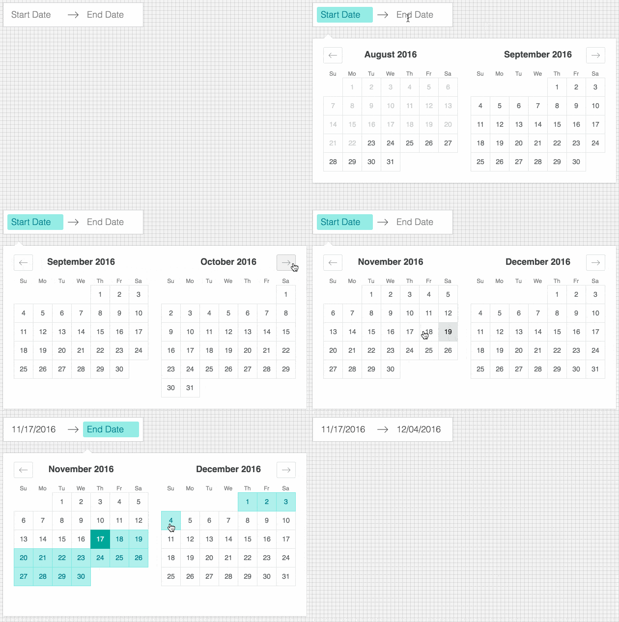
|
|
14
|
+
|
|
15
|
+
## Live Playground
|
|
16
|
+
|
|
17
|
+
For examples of the datepicker in action, go to [react-dates.github.io](https://react-dates.github.io/react-dates/).
|
|
18
|
+
|
|
19
|
+
OR
|
|
20
|
+
|
|
21
|
+
To run that demo on your own computer:
|
|
22
|
+
* Clone this repository
|
|
23
|
+
* `npm install`
|
|
24
|
+
* `npm run storybook`
|
|
25
|
+
* Visit http://localhost:6006/
|
|
26
|
+
|
|
27
|
+
## Getting Started
|
|
28
|
+
### Install dependencies
|
|
29
|
+
Ensure packages are installed with correct version numbers by running (from your command line):
|
|
30
|
+
```sh
|
|
31
|
+
(
|
|
32
|
+
export PKG=react-dates;
|
|
33
|
+
npm info "$PKG" peerDependencies --json | command sed 's/[\{\},]//g ; s/: /@/g; s/ *//g' | xargs npm install --save "$PKG"
|
|
34
|
+
)
|
|
35
|
+
```
|
|
36
|
+
|
|
37
|
+
Which produces and runs a command like:
|
|
38
|
+
|
|
39
|
+
```sh
|
|
40
|
+
npm install --save react-dates moment@>=#.## react@>=#.## react-dom@>=#.##
|
|
41
|
+
```
|
|
42
|
+
|
|
43
|
+
> If you are running Windows, that command will not work, but if you are running npm 5 or higher, you can run `npx install-peerdeps react-dates` on any platform
|
|
44
|
+
|
|
45
|
+
### Initialize
|
|
46
|
+
```js
|
|
47
|
+
import 'react-dates/initialize';
|
|
48
|
+
```
|
|
49
|
+
|
|
50
|
+
As of v13.0.0 of `react-dates`, this project relies on `react-with-styles`. If you want to continue using CSS stylesheets and classes, there is a little bit of extra set-up required to get things going. As such, you need to import `react-dates/initialize` to set up class names on our components. This import should go at the top of your application as you won't be able to import any `react-dates` components without it.
|
|
51
|
+
|
|
52
|
+
Note: This component assumes `box-sizing: border-box` is set globally in your page's CSS.
|
|
53
|
+
|
|
54
|
+
### Include component
|
|
55
|
+
```js
|
|
56
|
+
import { DateRangePicker, SingleDatePicker, DayPickerRangeController } from 'react-dates';
|
|
57
|
+
```
|
|
58
|
+
|
|
59
|
+
#### Webpack
|
|
60
|
+
Using Webpack with CSS loader, add the following import to your app:
|
|
61
|
+
```js
|
|
62
|
+
import 'react-dates/lib/css/_datepicker.css';
|
|
63
|
+
```
|
|
64
|
+
|
|
65
|
+
#### Without Webpack:
|
|
66
|
+
Create a CSS file with the contents of `require.resolve('react-dates/lib/css/_datepicker.css')` and include it in your html `<head>` section.
|
|
67
|
+
|
|
68
|
+
To see this in action, you can check out https://github.com/majapw/react-dates-demo which adds `react-dates` on top of a simple `create-react-app` setup.
|
|
69
|
+
|
|
70
|
+
#### Overriding Base Class
|
|
71
|
+
By default `react-dates` will use `PureComponent` conditionally if it is available. However, it is possible to override this setting and use `Component` and `shouldComponentUpdate` instead. It is also possible to override the logic in `build/util/baseClass` if you know that you are using a React version with `PureComponent`.
|
|
72
|
+
```javascript
|
|
73
|
+
import React from 'react';
|
|
74
|
+
export default React.PureComponent;
|
|
75
|
+
export const pureComponentAvailable = true;
|
|
76
|
+
```
|
|
77
|
+
|
|
78
|
+
#### Overriding styles
|
|
79
|
+
Right now, the easiest way to tweak `react-dates` to your heart's content is to create another stylesheet to override the default react-dates styles. For example, you could create a file named `react_dates_overrides.css` with the following contents (Make sure when you import said file to your `app.js`, you import it after the `react-dates` styles):
|
|
80
|
+
|
|
81
|
+
```css
|
|
82
|
+
// NOTE: the order of these styles DO matter
|
|
83
|
+
|
|
84
|
+
// Will edit everything selected including everything between a range of dates
|
|
85
|
+
.CalendarDay__selected_span {
|
|
86
|
+
background: #82e0aa; //background
|
|
87
|
+
color: white; //text
|
|
88
|
+
border: 1px solid $light-red; //default styles include a border
|
|
89
|
+
}
|
|
90
|
+
|
|
91
|
+
// Will edit selected date or the endpoints of a range of dates
|
|
92
|
+
.CalendarDay__selected {
|
|
93
|
+
background: $dark-red;
|
|
94
|
+
color: white;
|
|
95
|
+
}
|
|
96
|
+
|
|
97
|
+
// Will edit when hovered over. _span style also has this property
|
|
98
|
+
.CalendarDay__selected:hover {
|
|
99
|
+
background: orange;
|
|
100
|
+
color: white;
|
|
101
|
+
}
|
|
102
|
+
|
|
103
|
+
// Will edit when the second date (end date) in a range of dates
|
|
104
|
+
// is not yet selected. Edits the dates between your mouse and said date
|
|
105
|
+
.CalendarDay__hovered_span:hover,
|
|
106
|
+
.CalendarDay__hovered_span {
|
|
107
|
+
background: brown;
|
|
108
|
+
}
|
|
109
|
+
```
|
|
110
|
+
|
|
111
|
+
This would override the background and text colors applied to highlighted calendar days. You can use this method with the default set-up to override any aspect of the calendar to have it better fit to your particular needs. If there are any styles that you need that aren't listed here, you can always check the source css of each element.
|
|
112
|
+
|
|
113
|
+
### Make some awesome datepickers
|
|
114
|
+
|
|
115
|
+
We provide a handful of components for your use. If you supply essential props to each component, you'll get a full featured interactive date picker. With additional optional props, you can customize the look and feel of the inputs, calendar, etc. You can see what each of the props do in the [live demo](http://airbnb.io/react-dates/) or explore
|
|
116
|
+
how to properly wrap the pickers in the [examples folder](https://github.com/react-dates/react-dates/tree/HEAD/examples).
|
|
117
|
+
|
|
118
|
+
#### DateRangePicker
|
|
119
|
+
The `DateRangePicker` is a fully controlled component that allows users to select a date range. You can control the selected
|
|
120
|
+
dates using the `startDate`, `endDate`, and `onDatesChange` props as shown below. The `DateRangePicker` also manages internal
|
|
121
|
+
state for partial dates entered by typing (although `onDatesChange` will not trigger until a date has been entered
|
|
122
|
+
completely in that case). Similarly, you can control which input is focused as well as calendar visibility (the calendar is
|
|
123
|
+
only visible if `focusedInput` is defined) with the `focusedInput` and `onFocusChange` props as shown below.
|
|
124
|
+
|
|
125
|
+
Here is the minimum *REQUIRED* setup you need to get the `DateRangePicker` working:
|
|
126
|
+
```jsx
|
|
127
|
+
<DateRangePicker
|
|
128
|
+
startDate={this.state.startDate} // momentPropTypes.momentObj or null,
|
|
129
|
+
startDateId="your_unique_start_date_id" // PropTypes.string.isRequired,
|
|
130
|
+
endDate={this.state.endDate} // momentPropTypes.momentObj or null,
|
|
131
|
+
endDateId="your_unique_end_date_id" // PropTypes.string.isRequired,
|
|
132
|
+
onDatesChange={({ startDate, endDate }) => this.setState({ startDate, endDate })} // PropTypes.func.isRequired,
|
|
133
|
+
focusedInput={this.state.focusedInput} // PropTypes.oneOf([START_DATE, END_DATE]) or null,
|
|
134
|
+
onFocusChange={focusedInput => this.setState({ focusedInput })} // PropTypes.func.isRequired,
|
|
135
|
+
/>
|
|
136
|
+
```
|
|
137
|
+
|
|
138
|
+
The following is a list of other *OPTIONAL* props you may provide to the `DateRangePicker` to customize appearance and behavior to your heart's desire. All constants (indicated by `ALL_CAPS`) are provided as named exports in `react-dates/constants`. Please explore the [storybook](http://airbnb.io/react-dates/?selectedKind=DRP%20-%20Input%20Props&selectedStory=default&full=0&down=1&left=1&panelRight=0&downPanel=kadirahq%2Fstorybook-addon-actions%2Factions-panel) for more information on what each of these props do.
|
|
139
|
+
```js
|
|
140
|
+
// input related props
|
|
141
|
+
startDatePlaceholderText: PropTypes.string,
|
|
142
|
+
endDatePlaceholderText: PropTypes.string,
|
|
143
|
+
startDateAriaLabel: PropTypes.string,
|
|
144
|
+
endDateAriaLabel: PropTypes.string,
|
|
145
|
+
startDateTitleText: PropTypes.string,
|
|
146
|
+
endDateTitleText: PropTypes.string,
|
|
147
|
+
disabled: PropTypes.oneOfType([PropTypes.bool, PropTypes.oneOf([START_DATE, END_DATE])]),
|
|
148
|
+
required: PropTypes.bool,
|
|
149
|
+
readOnly: PropTypes.bool,
|
|
150
|
+
screenReaderInputMessage: PropTypes.string,
|
|
151
|
+
showClearDates: PropTypes.bool,
|
|
152
|
+
showDefaultInputIcon: PropTypes.bool,
|
|
153
|
+
customInputIcon: PropTypes.node,
|
|
154
|
+
customArrowIcon: PropTypes.node,
|
|
155
|
+
customCloseIcon: PropTypes.node,
|
|
156
|
+
inputIconPosition: PropTypes.oneOf([ICON_BEFORE_POSITION, ICON_AFTER_POSITION]),
|
|
157
|
+
noBorder: PropTypes.bool,
|
|
158
|
+
block: PropTypes.bool,
|
|
159
|
+
small: PropTypes.bool,
|
|
160
|
+
regular: PropTypes.bool,
|
|
161
|
+
autoComplete: PropTypes.string,
|
|
162
|
+
|
|
163
|
+
// calendar presentation and interaction related props
|
|
164
|
+
renderMonthText: mutuallyExclusiveProps(PropTypes.func, 'renderMonthText', 'renderMonthElement'), // (month) => PropTypes.string,
|
|
165
|
+
orientation: PropTypes.oneOf([HORIZONTAL_ORIENTATION, VERTICAL_ORIENTATION]),
|
|
166
|
+
anchorDirection: PropTypes.oneOf([ANCHOR_LEFT, ANCHOR_RIGHT]),
|
|
167
|
+
openDirection: PropTypes.oneOf([OPEN_DOWN, OPEN_UP]),
|
|
168
|
+
horizontalMargin: PropTypes.number,
|
|
169
|
+
withPortal: PropTypes.bool,
|
|
170
|
+
withFullScreenPortal: PropTypes.bool,
|
|
171
|
+
appendToBody: PropTypes.bool,
|
|
172
|
+
disableScroll: PropTypes.bool,
|
|
173
|
+
daySize: nonNegativeInteger,
|
|
174
|
+
isRTL: PropTypes.bool,
|
|
175
|
+
initialVisibleMonth: PropTypes.func,
|
|
176
|
+
firstDayOfWeek: PropTypes.oneOf([0, 1, 2, 3, 4, 5, 6]),
|
|
177
|
+
numberOfMonths: PropTypes.number,
|
|
178
|
+
keepOpenOnDateSelect: PropTypes.bool,
|
|
179
|
+
reopenPickerOnClearDates: PropTypes.bool,
|
|
180
|
+
renderCalendarInfo: PropTypes.func,
|
|
181
|
+
renderMonthElement: mutuallyExclusiveProps(PropTypes.func, 'renderMonthText', 'renderMonthElement'), PropTypes.func, // ({ month, onMonthSelect, onYearSelect, isVisible }) => PropTypes.node,
|
|
182
|
+
hideKeyboardShortcutsPanel: PropTypes.bool,
|
|
183
|
+
verticalSpacing: PropTypes.number,
|
|
184
|
+
|
|
185
|
+
// navigation related props
|
|
186
|
+
navPrev: PropTypes.node,
|
|
187
|
+
navNext: PropTypes.node,
|
|
188
|
+
onPrevMonthClick: PropTypes.func,
|
|
189
|
+
onNextMonthClick: PropTypes.func,
|
|
190
|
+
onClose: PropTypes.func,
|
|
191
|
+
transitionDuration: nonNegativeInteger, // milliseconds
|
|
192
|
+
|
|
193
|
+
// day presentation and interaction related props
|
|
194
|
+
renderCalendarDay: PropTypes.func,
|
|
195
|
+
renderDayContents: PropTypes.func,
|
|
196
|
+
minimumNights: PropTypes.number,
|
|
197
|
+
minDate: momentPropTypes.momentObj,
|
|
198
|
+
maxDate: momentPropTypes.momentObj,
|
|
199
|
+
enableOutsideDays: PropTypes.bool,
|
|
200
|
+
isDayBlocked: PropTypes.func,
|
|
201
|
+
isOutsideRange: PropTypes.func,
|
|
202
|
+
isDayHighlighted: PropTypes.func,
|
|
203
|
+
|
|
204
|
+
// internationalization props
|
|
205
|
+
displayFormat: PropTypes.oneOfType([PropTypes.string, PropTypes.func]),
|
|
206
|
+
monthFormat: PropTypes.string,
|
|
207
|
+
weekDayFormat: PropTypes.string,
|
|
208
|
+
phrases: PropTypes.shape(getPhrasePropTypes(DateRangePickerPhrases)),
|
|
209
|
+
dayAriaLabelFormat: PropTypes.string,
|
|
210
|
+
```
|
|
211
|
+
|
|
212
|
+
#### SingleDatePicker
|
|
213
|
+
The `SingleDatePicker` is a fully controlled component that allows users to select a single date. You can control the selected
|
|
214
|
+
date using the `date` and `onDateChange` props as shown below. The `SingleDatePicker` also manages internal
|
|
215
|
+
state for partial dates entered by typing (although `onDateChange` will not trigger until a date has been entered
|
|
216
|
+
completely in that case). Similarly, you can control whether or not the input is focused (calendar visibility is also
|
|
217
|
+
controlled with the same props) with the `focused` and `onFocusChange` props as shown below.
|
|
218
|
+
|
|
219
|
+
Here is the minimum *REQUIRED* setup you need to get the `SingleDatePicker` working:
|
|
220
|
+
```jsx
|
|
221
|
+
<SingleDatePicker
|
|
222
|
+
date={this.state.date} // momentPropTypes.momentObj or null
|
|
223
|
+
onDateChange={date => this.setState({ date })} // PropTypes.func.isRequired
|
|
224
|
+
focused={this.state.focused} // PropTypes.bool
|
|
225
|
+
onFocusChange={({ focused }) => this.setState({ focused })} // PropTypes.func.isRequired
|
|
226
|
+
id="your_unique_id" // PropTypes.string.isRequired,
|
|
227
|
+
/>
|
|
228
|
+
```
|
|
229
|
+
|
|
230
|
+
The following is a list of other *OPTIONAL* props you may provide to the `SingleDatePicker` to customize appearance and behavior to your heart's desire. All constants (indicated by `ALL_CAPS`) are provided as named exports in `react-dates/constants`. Please explore the [storybook](http://airbnb.io/react-dates/?selectedKind=SDP%20-%20Input%20Props&selectedStory=default&full=0&down=1&left=1&panelRight=0&downPanel=kadirahq%2Fstorybook-addon-actions%2Factions-panel) for more information on what each of these props do.
|
|
231
|
+
```js
|
|
232
|
+
// input related props
|
|
233
|
+
placeholder: PropTypes.string,
|
|
234
|
+
ariaLabel: PropTypes.string,
|
|
235
|
+
titleText: PropTypes.string,
|
|
236
|
+
disabled: PropTypes.bool,
|
|
237
|
+
required: PropTypes.bool,
|
|
238
|
+
readOnly: PropTypes.bool,
|
|
239
|
+
screenReaderInputMessage: PropTypes.string,
|
|
240
|
+
showClearDate: PropTypes.bool,
|
|
241
|
+
customCloseIcon: PropTypes.node,
|
|
242
|
+
showDefaultInputIcon: PropTypes.bool,
|
|
243
|
+
customInputIcon: PropTypes.node,
|
|
244
|
+
inputIconPosition: PropTypes.oneOf([ICON_BEFORE_POSITION, ICON_AFTER_POSITION]),
|
|
245
|
+
noBorder: PropTypes.bool,
|
|
246
|
+
block: PropTypes.bool,
|
|
247
|
+
small: PropTypes.bool,
|
|
248
|
+
regular: PropTypes.bool,
|
|
249
|
+
autoComplete: PropTypes.string,
|
|
250
|
+
|
|
251
|
+
// calendar presentation and interaction related props
|
|
252
|
+
renderMonthText: mutuallyExclusiveProps(PropTypes.func, 'renderMonthText', 'renderMonthElement'), // (month) => PropTypes.string,
|
|
253
|
+
orientation: PropTypes.oneOf([HORIZONTAL_ORIENTATION, VERTICAL_ORIENTATION]),
|
|
254
|
+
anchorDirection: PropTypes.oneOf([ANCHOR_LEFT, ANCHOR_RIGHT]),
|
|
255
|
+
openDirection: PropTypes.oneOf([OPEN_DOWN, OPEN_UP]),
|
|
256
|
+
horizontalMargin: PropTypes.number,
|
|
257
|
+
withPortal: PropTypes.bool,
|
|
258
|
+
withFullScreenPortal: PropTypes.bool,
|
|
259
|
+
appendToBody: PropTypes.bool,
|
|
260
|
+
disableScroll: PropTypes.bool,
|
|
261
|
+
initialVisibleMonth: PropTypes.func,
|
|
262
|
+
firstDayOfWeek: PropTypes.oneOf([0, 1, 2, 3, 4, 5, 6]),
|
|
263
|
+
numberOfMonths: PropTypes.number,
|
|
264
|
+
keepOpenOnDateSelect: PropTypes.bool,
|
|
265
|
+
reopenPickerOnClearDate: PropTypes.bool,
|
|
266
|
+
renderCalendarInfo: PropTypes.func,
|
|
267
|
+
renderMonthElement: mutuallyExclusiveProps(PropTypes.func, 'renderMonthText', 'renderMonthElement'), // ({ month, onMonthSelect, onYearSelect, isVisible }) => PropTypes.node,
|
|
268
|
+
hideKeyboardShortcutsPanel: PropTypes.bool,
|
|
269
|
+
daySize: nonNegativeInteger,
|
|
270
|
+
isRTL: PropTypes.bool,
|
|
271
|
+
verticalSpacing: PropTypes.number,
|
|
272
|
+
|
|
273
|
+
// navigation related props
|
|
274
|
+
navPrev: PropTypes.node,
|
|
275
|
+
navNext: PropTypes.node,
|
|
276
|
+
onPrevMonthClick: PropTypes.func,
|
|
277
|
+
onNextMonthClick: PropTypes.func,
|
|
278
|
+
onClose: PropTypes.func,
|
|
279
|
+
transitionDuration: nonNegativeInteger, // milliseconds
|
|
280
|
+
|
|
281
|
+
// day presentation and interaction related props
|
|
282
|
+
renderCalendarDay: PropTypes.func,
|
|
283
|
+
renderDayContents: PropTypes.func,
|
|
284
|
+
enableOutsideDays: PropTypes.bool,
|
|
285
|
+
isDayBlocked: PropTypes.func,
|
|
286
|
+
isOutsideRange: PropTypes.func,
|
|
287
|
+
isDayHighlighted: PropTypes.func,
|
|
288
|
+
|
|
289
|
+
// internationalization props
|
|
290
|
+
displayFormat: PropTypes.oneOfType([PropTypes.string, PropTypes.func]),
|
|
291
|
+
monthFormat: PropTypes.string,
|
|
292
|
+
weekDayFormat: PropTypes.string,
|
|
293
|
+
phrases: PropTypes.shape(getPhrasePropTypes(SingleDatePickerPhrases)),
|
|
294
|
+
dayAriaLabelFormat: PropTypes.string,
|
|
295
|
+
```
|
|
296
|
+
|
|
297
|
+
#### DayPickerRangeController
|
|
298
|
+
The `DayPickerRangeController` is a calendar-only version of the `DateRangePicker`. There are no inputs (which also means
|
|
299
|
+
that currently, it is not keyboard accessible) and the calendar is always visible, but you can select a date range much in the same way you would with the `DateRangePicker`. You can control the selected
|
|
300
|
+
dates using the `startDate`, `endDate`, and `onDatesChange` props as shown below. Similarly, you can control which input is focused with the `focusedInput` and `onFocusChange` props as shown below. The user will only be able to select a date if `focusedInput` is provided.
|
|
301
|
+
|
|
302
|
+
Here is the minimum *REQUIRED* setup you need to get the `DayPickerRangeController` working:
|
|
303
|
+
```jsx
|
|
304
|
+
<DayPickerRangeController
|
|
305
|
+
startDate={this.state.startDate} // momentPropTypes.momentObj or null,
|
|
306
|
+
endDate={this.state.endDate} // momentPropTypes.momentObj or null,
|
|
307
|
+
onDatesChange={({ startDate, endDate }) => this.setState({ startDate, endDate })} // PropTypes.func.isRequired,
|
|
308
|
+
focusedInput={this.state.focusedInput} // PropTypes.oneOf([START_DATE, END_DATE]) or null,
|
|
309
|
+
onFocusChange={focusedInput => this.setState({ focusedInput })} // PropTypes.func.isRequired,
|
|
310
|
+
initialVisibleMonth={() => moment().add(2, "M")} // PropTypes.func or null,
|
|
311
|
+
/>
|
|
312
|
+
```
|
|
313
|
+
|
|
314
|
+
The following is a list of other *OPTIONAL* props you may provide to the `DayPickerRangeController` to customize appearance and behavior to your heart's desire. Again, please explore the [storybook](http://airbnb.io/react-dates/?selectedKind=DayPickerRangeController&selectedStory=default&full=0&down=1&left=1&panelRight=0&downPanel=kadirahq%2Fstorybook-addon-actions%2Factions-panel) for more information on what each of these props do.
|
|
315
|
+
```js
|
|
316
|
+
// calendar presentation and interaction related props
|
|
317
|
+
enableOutsideDays: PropTypes.bool,
|
|
318
|
+
numberOfMonths: PropTypes.number,
|
|
319
|
+
orientation: ScrollableOrientationShape,
|
|
320
|
+
withPortal: PropTypes.bool,
|
|
321
|
+
initialVisibleMonth: PropTypes.func,
|
|
322
|
+
renderCalendarInfo: PropTypes.func,
|
|
323
|
+
renderMonthElement: mutuallyExclusiveProps(PropTypes.func, 'renderMonthText', 'renderMonthElement'), // ({ month, onMonthSelect, onYearSelect, isVisible }) => PropTypes.node,
|
|
324
|
+
onOutsideClick: PropTypes.func,
|
|
325
|
+
keepOpenOnDateSelect: PropTypes.bool,
|
|
326
|
+
noBorder: PropTypes.bool,
|
|
327
|
+
|
|
328
|
+
// navigation related props
|
|
329
|
+
navPrev: PropTypes.node,
|
|
330
|
+
navNext: PropTypes.node,
|
|
331
|
+
onPrevMonthClick: PropTypes.func,
|
|
332
|
+
onNextMonthClick: PropTypes.func,
|
|
333
|
+
transitionDuration: nonNegativeInteger, // milliseconds
|
|
334
|
+
|
|
335
|
+
// day presentation and interaction related props
|
|
336
|
+
renderCalendarDay: PropTypes.func,
|
|
337
|
+
renderDayContents: PropTypes.func,
|
|
338
|
+
minimumNights: PropTypes.number,
|
|
339
|
+
isOutsideRange: PropTypes.func,
|
|
340
|
+
isDayBlocked: PropTypes.func,
|
|
341
|
+
isDayHighlighted: PropTypes.func,
|
|
342
|
+
|
|
343
|
+
// internationalization props
|
|
344
|
+
monthFormat: PropTypes.string,
|
|
345
|
+
weekDayFormat: PropTypes.string,
|
|
346
|
+
phrases: PropTypes.shape(getPhrasePropTypes(DayPickerPhrases)),
|
|
347
|
+
dayAriaLabelFormat: PropTypes.string,
|
|
348
|
+
/>
|
|
349
|
+
```
|
|
350
|
+
|
|
351
|
+
## Localization
|
|
352
|
+
|
|
353
|
+
[Moment.js](http://momentjs.com) is a peer dependency of `react-dates`. The latter then uses a single instance of `moment` which is imported in one’s project. Loading a locale is done by calling `moment.locale(..)` in the component where `moment` is imported, with the [locale key](http://momentjs.com/docs/#/i18n/) of choice. For instance:
|
|
354
|
+
|
|
355
|
+
```js
|
|
356
|
+
moment.locale('pl'); // Polish
|
|
357
|
+
```
|
|
358
|
+
|
|
359
|
+
However, this only solves date localization. For complete internationalization of the components, `react-dates` defines a certain amount of [user interface strings](https://github.com/react-dates/react-dates/blob/HEAD/src/defaultPhrases.js) in English which can be changed through the `phrases` prop (explore the [storybook](http://airbnb.io/react-dates/?selectedKind=DateRangePicker%20%28DRP%29&selectedStory=non-english%20locale&full=0&addons=1&stories=1&panelRight=0&addonPanel=kadirahq%2Fstorybook-addon-actions%2Factions-panel) for examples). For accessibility and usability concerns, **all these UI elements should be translated**.
|
|
360
|
+
|
|
361
|
+
## Advanced
|
|
362
|
+
|
|
363
|
+
`react-dates` no longer relies strictly on CSS, but rather relies on `react-with-styles` as an abstraction layer between how styles are applied and how they are written. The instructions above will get the project working out of the box, but there's a lot more customization that can be done.
|
|
364
|
+
|
|
365
|
+
### Interfaces
|
|
366
|
+
|
|
367
|
+
The `react-dates/initialize` script actually relies on [react-with-styles-interface-css](https://github.com/airbnb/react-with-styles-interface-css) under the hood. If you are interested in a different solution for styling in your project, you can do your own initialization of a another [interface](https://github.com/airbnb/react-with-styles/blob/HEAD/README.md#interfaces). At Airbnb, for instance, we rely on [Aphrodite](https://github.com/Khan/aphrodite) under the hood and therefore use the Aphrodite interface for `react-with-styles`. If you want to do the same, you would use the following pattern:
|
|
368
|
+
```js
|
|
369
|
+
import ThemedStyleSheet from 'react-with-styles/lib/ThemedStyleSheet';
|
|
370
|
+
import aphroditeInterface from 'react-with-styles-interface-aphrodite';
|
|
371
|
+
import DefaultTheme from 'react-dates/lib/theme/DefaultTheme';
|
|
372
|
+
|
|
373
|
+
ThemedStyleSheet.registerInterface(aphroditeInterface);
|
|
374
|
+
ThemedStyleSheet.registerTheme(DefaultTheme);
|
|
375
|
+
```
|
|
376
|
+
|
|
377
|
+
The above code has to be run before any `react-dates` component is imported. Otherwise, you will get an error. Also note that if you register any custom interface manually, you *must* also manually register a theme.
|
|
378
|
+
|
|
379
|
+
### Theming
|
|
380
|
+
`react-dates` also now supports a different way to theme. You can see the default theme values in [this file](https://github.com/react-dates/react-dates/blob/HEAD/src/theme/DefaultTheme.js) and you would override them in the following manner:
|
|
381
|
+
```js
|
|
382
|
+
import ThemedStyleSheet from 'react-with-styles/lib/ThemedStyleSheet';
|
|
383
|
+
import aphroditeInterface from 'react-with-styles-interface-aphrodite';
|
|
384
|
+
import DefaultTheme from 'react-dates/lib/theme/DefaultTheme';
|
|
385
|
+
|
|
386
|
+
ThemedStyleSheet.registerInterface(aphroditeInterface);
|
|
387
|
+
ThemedStyleSheet.registerTheme({
|
|
388
|
+
reactDates: {
|
|
389
|
+
...DefaultTheme.reactDates,
|
|
390
|
+
color: {
|
|
391
|
+
...DefaultTheme.reactDates.color,
|
|
392
|
+
highlighted: {
|
|
393
|
+
backgroundColor: '#82E0AA',
|
|
394
|
+
backgroundColor_active: '#58D68D',
|
|
395
|
+
backgroundColor_hover: '#58D68D',
|
|
396
|
+
color: '#186A3B',
|
|
397
|
+
color_active: '#186A3B',
|
|
398
|
+
color_hover: '#186A3B',
|
|
399
|
+
},
|
|
400
|
+
},
|
|
401
|
+
},
|
|
402
|
+
});
|
|
403
|
+
```
|
|
404
|
+
|
|
405
|
+
The above code would use shades of green instead of shades of yellow for the highlight color on `CalendarDay` components. Note that you *must* register an interface if you manually register a theme. One will not work without the other.
|
|
406
|
+
|
|
407
|
+
#### A note on using `react-with-styles-interface-css`
|
|
408
|
+
The default interface that `react-dates` ships with is the [CSS interface](https://github.com/airbnb/react-with-styles-interface-css). If you want to use this interface along with the theme registration method, you will need to rebuild the core `_datepicker.css` file. We do not currently expose a utility method to build this file, but you can follow along with the code in https://github.com/react-dates/react-dates/blob/HEAD/scripts/buildCSS.js to build your own custom themed CSS file.
|
|
409
|
+
|
|
410
|
+
[package-url]: https://npmjs.org/package/react-dates
|
|
411
|
+
[npm-version-svg]: http://versionbadg.es/react-dates/react-dates.svg
|
|
412
|
+
[travis-svg]: https://travis-ci.org/react-dates/react-dates.svg
|
|
413
|
+
[travis-url]: https://travis-ci.org/react-dates/react-dates
|
|
414
|
+
[deps-svg]: https://david-dm.org/react-dates/react-dates.svg
|
|
415
|
+
[deps-url]: https://david-dm.org/react-dates/react-dates
|
|
416
|
+
[dev-deps-svg]: https://david-dm.org/react-dates/react-dates/dev-status.svg
|
|
417
|
+
[dev-deps-url]: https://david-dm.org/react-dates/react-dates#info=devDependencies
|
|
418
|
+
[npm-badge-png]: https://nodei.co/npm/react-dates.png?downloads=true&stars=true
|
|
419
|
+
[license-image]: http://img.shields.io/npm/l/react-dates.svg
|
|
420
|
+
[license-url]: LICENSE
|
|
421
|
+
[downloads-image]: http://img.shields.io/npm/dm/react-dates.svg
|
|
422
|
+
[downloads-url]: http://npm-stat.com/charts.html?package=react-dates
|
package/constants.js
ADDED