@atomazing-org/design-system 2.0.1 → 3.7.2
This diff represents the content of publicly available package versions that have been released to one of the supported registries. The information contained in this diff is provided for informational purposes only and reflects changes between package versions as they appear in their respective public registries.
- package/AGENTS.md +92 -0
- package/README.MD +263 -335
- package/dist/index.d.ts +11 -15
- package/dist/index.js +22 -22
- package/dist/presets/index.d.ts +15 -2
- package/dist/presets/index.js +315 -313
- package/dist/themePresets-CwgG5XEL.d.ts +65 -0
- package/dist/themePresets-CwgG5XEL.js +1 -0
- package/migrations/README.UPDATE.md +34 -20
- package/migrations/docs/migrations/design-system/README.md +48 -17
- package/migrations/docs/migrations/design-system/routes/adopt-existing/AEROCRM-EXAMPLE.md +197 -0
- package/migrations/docs/migrations/design-system/routes/adopt-existing/RUNBOOK.md +185 -25
- package/migrations/docs/migrations/design-system/routes/adopt-existing/migration.spec.json +84 -20
- package/migrations/docs/migrations/design-system/routes/greenfield/RUNBOOK.md +57 -25
- package/migrations/docs/migrations/design-system/routes/greenfield/migration.spec.json +37 -14
- package/migrations/docs/migrations/design-system/routes/mui4-to-latest/RUNBOOK.md +136 -77
- package/migrations/docs/migrations/design-system/routes/mui4-to-latest/migration.spec.json +104 -29
- package/migrations/docs/migrations/design-system/shared/WORKING-RULES.md +194 -0
- package/migrations/docs/migrations/design-system/shared/acceptance.md +76 -20
- package/migrations/docs/migrations/design-system/shared/common-regressions.md +218 -0
- package/migrations/docs/migrations/design-system/shared/gates.md +39 -3
- package/migrations/docs/migrations/design-system/shared/manual-qa-matrix.md +70 -0
- package/migrations/docs/migrations/design-system/shared/phase-exit-criteria.md +129 -0
- package/migrations/docs/migrations/design-system/shared/phases.md +377 -0
- package/migrations/skills/design-system-consumer-agent/SKILL.md +84 -0
- package/migrations/skills/design-system-migration-agent/SKILL.md +75 -9
- package/package.json +14 -4
- package/dist/typography-B-BeIk0v.d.ts +0 -120
package/README.MD
CHANGED
|
@@ -1,232 +1,214 @@
|
|
|
1
1
|
# @atomazing-org/design-system
|
|
2
2
|
|
|
3
|
-
Modern MUI v7 + Emotion design system
|
|
3
|
+
Modern MUI v7 + Emotion design system built around visual presets, explicit
|
|
4
|
+
light and dark schemes, SSR-safe theming, and persisted runtime settings.
|
|
4
5
|
|
|
5
6
|
## Preview
|
|
6
|
-
|
|
7
|
-
|
|
8
|
-
## Why use it
|
|
9
|
-
|
|
10
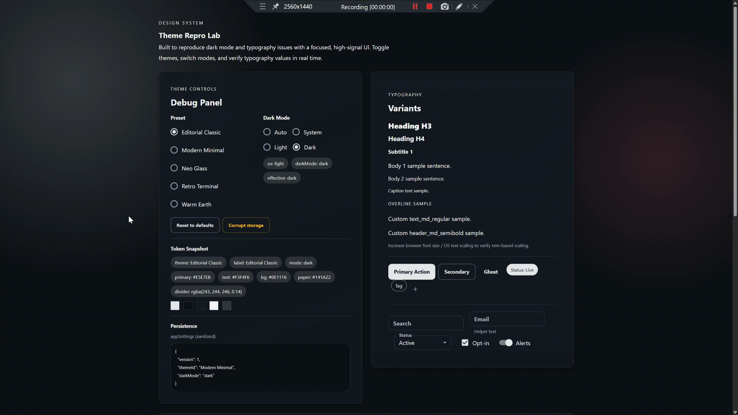
|
-
- **True light/dark themes**: each preset ships **two curated schemes** (`light` + `dark`), so backgrounds, cards, and text actually change (not just `palette.mode`).
|
|
11
|
-
- **Works out of the box**: includes ready-made presets you can use immediately.
|
|
12
|
-
- **Easy to extend**: bring your own presets, or combine defaults + custom.
|
|
13
|
-
- **Consistent UI**: global styles + MUI component overrides for predictable visuals.
|
|
14
|
-
- **Safe persistence**: remembers selected theme + dark mode with SSR-safe guards.
|
|
15
|
-
|
|
16
|
-
---
|
|
17
7
|
|
|
8
|
+

|
|
9
|
+
|
|
10
|
+
## At A Glance
|
|
11
|
+
|
|
12
|
+
- React 18 and 19 support
|
|
13
|
+
- MUI 7 + Emotion 11
|
|
14
|
+
- Preset-first theming via `ThemePreset`
|
|
15
|
+
- Runtime theme and dark-mode switching
|
|
16
|
+
- SSR-safe provider flow
|
|
17
|
+
- Curated root API plus `/presets` entrypoint
|
|
18
|
+
|
|
19
|
+
## Contents
|
|
20
|
+
|
|
21
|
+
- [Why This Library](#why-this-library)
|
|
22
|
+
- [Installation](#installation)
|
|
23
|
+
- [Package Format](#package-format)
|
|
24
|
+
- [Quick Start](#quick-start)
|
|
25
|
+
- [Built-In Presets](#built-in-presets)
|
|
26
|
+
- [Dark Mode](#dark-mode)
|
|
27
|
+
- [Custom Presets](#custom-presets)
|
|
28
|
+
- [Persistence](#persistence)
|
|
29
|
+
- [SSR Notes](#ssr-notes)
|
|
30
|
+
- [API Reference](#api-reference)
|
|
31
|
+
- [Migration Docs](#migration-docs)
|
|
32
|
+
- [Examples](#examples)
|
|
33
|
+
- [Troubleshooting](#troubleshooting)
|
|
34
|
+
- [Contributing](#contributing)
|
|
35
|
+
- [Releases](#releases)
|
|
36
|
+
- [License](#license)
|
|
37
|
+
|
|
38
|
+
## Why This Library
|
|
39
|
+
|
|
40
|
+
- Preset-first theming built on `ThemePreset`, not ad hoc per-app theme files
|
|
41
|
+
- True light and dark schemes via `colorSchemes`, not only `palette.mode`
|
|
42
|
+
- Strong visual differentiation between presets instead of subtle palette swaps
|
|
43
|
+
- Runtime theme selection and dark-mode switching with persisted settings
|
|
44
|
+
- SSR-safe provider flow with no browser APIs touched at module scope
|
|
45
|
+
- Curated public API for app integrations and consumer documentation
|
|
46
|
+
- Test coverage for contrast, baseline preset shape, and SSR behavior
|
|
18
47
|
|
|
19
48
|
## Installation
|
|
20
49
|
|
|
21
|
-
|
|
50
|
+
### npm
|
|
22
51
|
|
|
23
52
|
```bash
|
|
24
|
-
npm install @atomazing-org/design-system
|
|
53
|
+
npm install @atomazing-org/design-system react react-dom @mui/material @emotion/react @emotion/styled
|
|
25
54
|
```
|
|
26
55
|
|
|
27
|
-
|
|
56
|
+
### pnpm
|
|
28
57
|
|
|
29
58
|
```bash
|
|
30
|
-
|
|
59
|
+
pnpm add @atomazing-org/design-system react react-dom @mui/material @emotion/react @emotion/styled
|
|
31
60
|
```
|
|
32
61
|
|
|
33
|
-
Optional
|
|
62
|
+
Optional peer:
|
|
34
63
|
|
|
35
|
-
- `@mui/icons-material`
|
|
36
|
-
- `@emotion/css` (only if your project uses Emotion `css` helpers)
|
|
64
|
+
- `@mui/icons-material`
|
|
37
65
|
|
|
38
|
-
|
|
39
|
-
npm install @mui/icons-material @emotion/css
|
|
40
|
-
```
|
|
66
|
+
Expected ecosystem:
|
|
41
67
|
|
|
42
|
-
|
|
68
|
+
- React `^18 || ^19`
|
|
69
|
+
- React DOM `^18 || ^19`
|
|
70
|
+
- MUI `^7`
|
|
71
|
+
- Emotion `^11`
|
|
43
72
|
|
|
44
|
-
|
|
45
|
-
Use ESM imports (`import ... from ...`). CommonJS `require()` is not supported.
|
|
73
|
+
## Package Format
|
|
46
74
|
|
|
47
|
-
|
|
75
|
+
- ESM-only package
|
|
76
|
+
- Public entrypoints:
|
|
77
|
+
- `@atomazing-org/design-system`
|
|
78
|
+
- `@atomazing-org/design-system/presets`
|
|
48
79
|
|
|
49
|
-
|
|
80
|
+
The root entrypoint is intentionally curated. Preset registries and individual
|
|
81
|
+
presets live under the `/presets` subpath.
|
|
50
82
|
|
|
51
|
-
|
|
83
|
+
## Quick Start
|
|
52
84
|
|
|
53
85
|
```tsx
|
|
86
|
+
import ReactDOM from "react-dom/client";
|
|
54
87
|
import { ThemeProviderWrapper } from "@atomazing-org/design-system";
|
|
55
88
|
import { defaultThemes } from "@atomazing-org/design-system/presets";
|
|
56
89
|
|
|
57
|
-
|
|
58
|
-
return (
|
|
59
|
-
<ThemeProviderWrapper themes={defaultThemes}>
|
|
60
|
-
{/* your app */}
|
|
61
|
-
</ThemeProviderWrapper>
|
|
62
|
-
);
|
|
63
|
-
}
|
|
64
|
-
```
|
|
65
|
-
|
|
66
|
-
Notes:
|
|
67
|
-
- `themes` can be **default presets**, **your presets**, or **both**.
|
|
68
|
-
- Theme choice + dark mode are persisted (storage key: `appSettings`).
|
|
69
|
-
|
|
70
|
-
---
|
|
71
|
-
|
|
72
|
-
## Built-in presets
|
|
73
|
-
|
|
74
|
-
Built-in presets are **ready-made theme packs shipped with the library**.
|
|
75
|
-
You can use them as-is, or add your own presets alongside them.
|
|
76
|
-
|
|
77
|
-
| Preset | Stable id | Best for |
|
|
78
|
-
|---|---|---|
|
|
79
|
-
| Warm Earth | `warm-earth` | Warm and friendly apps |
|
|
80
|
-
| Editorial Classic | `editorial-classic` | Content-heavy UIs |
|
|
81
|
-
| Modern Minimal | `modern-minimal` | Dashboards and tooling |
|
|
82
|
-
| Neo Glass | `neo-glass` | Modern “glass” style UIs |
|
|
83
|
-
| Retro Terminal | `retro-terminal` | Terminal-inspired branding |
|
|
84
|
-
|
|
85
|
-
Import them from:
|
|
86
|
-
|
|
87
|
-
```ts
|
|
88
|
-
import { defaultThemes } from "@atomazing-org/design-system/presets";
|
|
89
|
-
```
|
|
90
|
-
|
|
91
|
-
## Switching theme (UI)
|
|
92
|
-
|
|
93
|
-
Build a simple theme switcher using the library’s theme settings hook.
|
|
94
|
-
|
|
95
|
-
```tsx
|
|
96
|
-
import { ToggleButton, ToggleButtonGroup } from "@mui/material";
|
|
97
|
-
import { useThemeSettings } from "@atomazing-org/design-system";
|
|
98
|
-
import { defaultThemes } from "@atomazing-org/design-system/presets";
|
|
99
|
-
|
|
100
|
-
export function ThemeSwitcher() {
|
|
101
|
-
const { theme, setTheme } = useThemeSettings();
|
|
90
|
+
import App from "./App";
|
|
102
91
|
|
|
103
|
-
|
|
104
|
-
|
|
105
|
-
|
|
106
|
-
|
|
107
|
-
|
|
108
|
-
onChange={(_, next) => next && setTheme(next)}
|
|
109
|
-
>
|
|
110
|
-
{defaultThemes.map((t) => (
|
|
111
|
-
<ToggleButton key={t.id} value={t.id}>
|
|
112
|
-
{t.label}
|
|
113
|
-
</ToggleButton>
|
|
114
|
-
))}
|
|
115
|
-
</ToggleButtonGroup>
|
|
116
|
-
);
|
|
117
|
-
}
|
|
92
|
+
ReactDOM.createRoot(document.getElementById("root")!).render(
|
|
93
|
+
<ThemeProviderWrapper themes={defaultThemes}>
|
|
94
|
+
<App />
|
|
95
|
+
</ThemeProviderWrapper>,
|
|
96
|
+
);
|
|
118
97
|
```
|
|
119
98
|
|
|
120
|
-
|
|
121
|
-
|
|
122
|
-
## Dark mode
|
|
99
|
+
Use `useThemeSettings()` when you need runtime access to:
|
|
123
100
|
|
|
124
|
-
|
|
101
|
+
- the selected preset id
|
|
102
|
+
- the current dark-mode setting
|
|
103
|
+
- setters for both
|
|
125
104
|
|
|
126
|
-
|
|
127
|
-
|
|
128
|
-
- `light` — always use the preset’s light scheme
|
|
129
|
-
- `dark` — always use the preset’s dark scheme
|
|
130
|
-
- `system` — follow OS/browser preference (`prefers-color-scheme`)
|
|
131
|
-
|
|
132
|
-
### Why `system` exists
|
|
133
|
-
|
|
134
|
-
It’s the most common UX: the app automatically follows the user’s OS preference without custom code in every project.
|
|
135
|
-
|
|
136
|
-
Example selector:
|
|
105
|
+
Example:
|
|
137
106
|
|
|
138
107
|
```tsx
|
|
139
|
-
import { RadioGroup, FormControlLabel, Radio } from "@mui/material";
|
|
140
108
|
import { useThemeSettings } from "@atomazing-org/design-system";
|
|
141
109
|
|
|
142
|
-
export function
|
|
143
|
-
const { darkMode, setDarkMode } = useThemeSettings();
|
|
110
|
+
export function ThemeDebug() {
|
|
111
|
+
const { theme, darkMode, setTheme, setDarkMode } = useThemeSettings();
|
|
144
112
|
|
|
145
113
|
return (
|
|
146
|
-
|
|
147
|
-
<
|
|
148
|
-
<
|
|
149
|
-
<
|
|
150
|
-
|
|
114
|
+
<>
|
|
115
|
+
<button onClick={() => setTheme("modern-minimal")}>Modern Minimal</button>
|
|
116
|
+
<button onClick={() => setDarkMode("dark")}>Dark</button>
|
|
117
|
+
<pre>{JSON.stringify({ theme, darkMode }, null, 2)}</pre>
|
|
118
|
+
</>
|
|
151
119
|
);
|
|
152
120
|
}
|
|
153
121
|
```
|
|
154
122
|
|
|
155
|
-
|
|
123
|
+
## Built-In Presets
|
|
156
124
|
|
|
157
|
-
|
|
158
|
-
|
|
159
|
-
```tsx
|
|
160
|
-
import { ThemeProviderWrapper } from "@atomazing-org/design-system";
|
|
161
|
-
import { defaultThemes } from "@atomazing-org/design-system/presets";
|
|
125
|
+
Ship-ready preset packs live under `@atomazing-org/design-system/presets`.
|
|
162
126
|
|
|
163
|
-
|
|
164
|
-
|
|
165
|
-
|
|
166
|
-
|
|
167
|
-
|
|
168
|
-
|
|
169
|
-
}
|
|
127
|
+
```ts
|
|
128
|
+
import {
|
|
129
|
+
allBuiltInThemes,
|
|
130
|
+
defaultThemes,
|
|
131
|
+
landingPageThemes,
|
|
132
|
+
modernMinimal,
|
|
133
|
+
} from "@atomazing-org/design-system/presets";
|
|
170
134
|
```
|
|
171
135
|
|
|
172
|
-
|
|
173
|
-
|
|
174
|
-
---
|
|
175
|
-
|
|
176
|
-
## Persistence (`appSettings`)
|
|
136
|
+
### `defaultThemes`
|
|
177
137
|
|
|
178
|
-
|
|
138
|
+
Baseline application presets:
|
|
179
139
|
|
|
180
|
-
|
|
181
|
-
|
|
182
|
-
|
|
183
|
-
|
|
184
|
-
|
|
140
|
+
- `Editorial Classic`
|
|
141
|
+
- `Airport Ops`
|
|
142
|
+
- `Modern Minimal`
|
|
143
|
+
- `Neo Glass`
|
|
144
|
+
- `Retro Terminal`
|
|
145
|
+
- `Warm Earth`
|
|
185
146
|
|
|
186
|
-
|
|
187
|
-
- v2 stores only `themeId` and `darkMode`.
|
|
188
|
-
- v2 does not migrate legacy stored formats (`theme`, `version`, `auto`); invalid/legacy payloads reset to defaults.
|
|
147
|
+
### `landingPageThemes`
|
|
189
148
|
|
|
190
|
-
|
|
149
|
+
Extended pack for landing pages, brand-heavy surfaces, and more expressive
|
|
150
|
+
visual directions. Representative families include:
|
|
191
151
|
|
|
192
|
-
|
|
152
|
+
- `Flow Editorial`
|
|
153
|
+
- `Acid Editorial`
|
|
154
|
+
- `Bauhaus Ops`
|
|
155
|
+
- `Neon Bauhaus Grid`
|
|
156
|
+
- `Neon Bauhaus Ops`
|
|
157
|
+
- `Brutalist Sprint`
|
|
158
|
+
- `Brand Neon Motion`
|
|
159
|
+
- `Glass Reactor`
|
|
160
|
+
- `Holographic Ledger`
|
|
161
|
+
- `Kintsugi Protocol`
|
|
162
|
+
- `Solarpunk Enterprise`
|
|
193
163
|
|
|
194
|
-
|
|
164
|
+
### `allBuiltInThemes`
|
|
195
165
|
|
|
196
|
-
|
|
197
|
-
- `migrations/docs/migrations/design-system/routes/*`
|
|
166
|
+
Combined pack of `defaultThemes` and `landingPageThemes`.
|
|
198
167
|
|
|
199
|
-
|
|
200
|
-
`examples/next-app-router` is the canonical Next.js App Router SSR reference consumer (`npm run smoke:next`).
|
|
168
|
+
## Dark Mode
|
|
201
169
|
|
|
202
|
-
|
|
170
|
+
Supported dark-mode values:
|
|
203
171
|
|
|
204
|
-
|
|
172
|
+
- `light`
|
|
173
|
+
- `dark`
|
|
174
|
+
- `system`
|
|
205
175
|
|
|
206
|
-
|
|
176
|
+
`ThemeProviderWrapper` resolves the effective scheme from the selected dark-mode
|
|
177
|
+
value and the current system preference. The root export `darkModeOptions` is
|
|
178
|
+
available for building dark-mode UI controls.
|
|
207
179
|
|
|
208
|
-
|
|
180
|
+
```tsx
|
|
181
|
+
import { darkModeOptions, useThemeSettings } from "@atomazing-org/design-system";
|
|
182
|
+
import { FormControlLabel, Radio, RadioGroup } from "@mui/material";
|
|
209
183
|
|
|
210
|
-
|
|
211
|
-
|
|
212
|
-
| `id` | `string` | Stable identifier used for persistence and deduplication. Must be unique. |
|
|
213
|
-
| `label` | `string` | Name shown in UI selectors. |
|
|
214
|
-
| `colorSchemes.light` | `ThemeOptions` | MUI ThemeOptions for light mode. |
|
|
215
|
-
| `colorSchemes.dark` | `ThemeOptions` | MUI ThemeOptions for dark mode. |
|
|
184
|
+
export function DarkModeSelector() {
|
|
185
|
+
const { darkMode, setDarkMode } = useThemeSettings();
|
|
216
186
|
|
|
217
|
-
|
|
187
|
+
return (
|
|
188
|
+
<RadioGroup
|
|
189
|
+
row
|
|
190
|
+
value={darkMode}
|
|
191
|
+
onChange={(event) => setDarkMode(event.target.value as typeof darkMode)}
|
|
192
|
+
>
|
|
193
|
+
{darkModeOptions.map((option) => (
|
|
194
|
+
<FormControlLabel
|
|
195
|
+
key={option.value}
|
|
196
|
+
control={<Radio />}
|
|
197
|
+
label={option.label}
|
|
198
|
+
value={option.value}
|
|
199
|
+
/>
|
|
200
|
+
))}
|
|
201
|
+
</RadioGroup>
|
|
202
|
+
);
|
|
203
|
+
}
|
|
204
|
+
```
|
|
218
205
|
|
|
219
|
-
|
|
220
|
-
- `palette.background.default` — page background
|
|
221
|
-
- `palette.background.paper` — Card/Paper background
|
|
222
|
-
- `palette.text.primary`
|
|
223
|
-
- `palette.text.secondary`
|
|
224
|
-
- `palette.divider`
|
|
206
|
+
## Custom Presets
|
|
225
207
|
|
|
226
|
-
|
|
208
|
+
Custom presets should follow the `ThemePreset` contract.
|
|
227
209
|
|
|
228
210
|
```ts
|
|
229
|
-
import type { ThemePreset } from "@atomazing-org/design-system";
|
|
211
|
+
import type { ThemePreset } from "@atomazing-org/design-system/presets";
|
|
230
212
|
|
|
231
213
|
export const myPreset: ThemePreset = {
|
|
232
214
|
id: "my-brand",
|
|
@@ -236,241 +218,187 @@ export const myPreset: ThemePreset = {
|
|
|
236
218
|
palette: {
|
|
237
219
|
background: { default: "#ffffff", paper: "#ffffff" },
|
|
238
220
|
text: { primary: "#111111", secondary: "#444444" },
|
|
239
|
-
divider: "rgba(0,0,0,0.12)",
|
|
221
|
+
divider: "rgba(0, 0, 0, 0.12)",
|
|
240
222
|
},
|
|
241
223
|
},
|
|
242
224
|
dark: {
|
|
243
225
|
palette: {
|
|
244
226
|
background: { default: "#0f1115", paper: "#151922" },
|
|
245
227
|
text: { primary: "#f1f3f5", secondary: "#c6cbd1" },
|
|
246
|
-
divider: "rgba(241,243,245,0.16)",
|
|
228
|
+
divider: "rgba(241, 243, 245, 0.16)",
|
|
247
229
|
},
|
|
248
230
|
},
|
|
249
231
|
},
|
|
250
232
|
};
|
|
251
233
|
```
|
|
252
234
|
|
|
253
|
-
|
|
235
|
+
Merge custom presets with the built-ins:
|
|
254
236
|
|
|
255
237
|
```ts
|
|
256
|
-
import { defaultThemes } from "@atomazing-org/design-system/presets";
|
|
257
|
-
|
|
258
238
|
const themes = [...defaultThemes, myPreset];
|
|
259
239
|
```
|
|
260
240
|
|
|
261
|
-
|
|
241
|
+
Rules worth keeping in mind:
|
|
262
242
|
|
|
263
|
-
|
|
243
|
+
- preset ids must be unique and non-empty
|
|
244
|
+
- duplicate ids are deduped by id with last-wins token resolution
|
|
245
|
+
- first occurrence order is preserved for the visible preset list
|
|
264
246
|
|
|
265
|
-
##
|
|
247
|
+
## Persistence
|
|
266
248
|
|
|
267
|
-
|
|
249
|
+
Theme settings are stored in `localStorage` under `appSettings` by default.
|
|
268
250
|
|
|
269
|
-
|
|
270
|
-
import { Typography } from "@mui/material";
|
|
251
|
+
Current JSON shape:
|
|
271
252
|
|
|
272
|
-
|
|
273
|
-
|
|
274
|
-
<>
|
|
275
|
-
<Typography variant="header_lg_bold">Page title</Typography>
|
|
276
|
-
<Typography variant="text_md_regular">Body text</Typography>
|
|
277
|
-
<Typography variant="text_sm_bold">Caption / label</Typography>
|
|
278
|
-
</>
|
|
279
|
-
);
|
|
280
|
-
}
|
|
253
|
+
```json
|
|
254
|
+
{ "themeId": "editorial-classic", "darkMode": "system" }
|
|
281
255
|
```
|
|
282
256
|
|
|
283
|
-
|
|
284
|
-
|
|
285
|
-
- Variants are defined in the design system theme (no local “one-off” styles needed).
|
|
286
|
-
|
|
287
|
-
---
|
|
288
|
-
|
|
289
|
-
## Global styles
|
|
290
|
-
|
|
291
|
-
`ThemeProviderWrapper` applies global styles (via Emotion) and MUI component defaults, so the app looks consistent immediately.
|
|
292
|
-
|
|
293
|
-
Set a custom font stack:
|
|
257
|
+
If multiple applications share the same origin, override the storage key with
|
|
258
|
+
`settingsStorageKey` on `ThemeProviderWrapper`.
|
|
294
259
|
|
|
295
260
|
```tsx
|
|
296
|
-
|
|
297
|
-
|
|
298
|
-
|
|
299
|
-
|
|
300
|
-
|
|
301
|
-
|
|
302
|
-
</ThemeProviderWrapper>
|
|
303
|
-
);
|
|
304
|
-
}
|
|
261
|
+
<ThemeProviderWrapper
|
|
262
|
+
themes={defaultThemes}
|
|
263
|
+
settingsStorageKey="pampaLegacyThemeSettings"
|
|
264
|
+
>
|
|
265
|
+
<App />
|
|
266
|
+
</ThemeProviderWrapper>
|
|
305
267
|
```
|
|
306
268
|
|
|
307
|
-
|
|
308
|
-
|
|
309
|
-
## Animations
|
|
269
|
+
## SSR Notes
|
|
310
270
|
|
|
311
|
-
|
|
271
|
+
- Keep `ThemeProviderWrapper` inside a client boundary for Next.js and other SSR
|
|
272
|
+
apps.
|
|
273
|
+
- Do not access `window`, `document`, or `localStorage` at module scope.
|
|
274
|
+
- When dark mode uses `system`, the effective mode resolves on the client after
|
|
275
|
+
hydration.
|
|
312
276
|
|
|
313
|
-
|
|
314
|
-
import styled from "@emotion/styled";
|
|
315
|
-
import { fadeIn } from "@atomazing-org/design-system";
|
|
277
|
+
## API Reference
|
|
316
278
|
|
|
317
|
-
|
|
318
|
-
animation: ${fadeIn} 240ms ease-in both;
|
|
319
|
-
`;
|
|
279
|
+
### `ThemeProviderWrapper`
|
|
320
280
|
|
|
321
|
-
|
|
322
|
-
|
|
323
|
-
|
|
324
|
-
|
|
281
|
+
| Prop | Type | Default | Description |
|
|
282
|
+
| --- | --- | --- | --- |
|
|
283
|
+
| `themes` | `ThemePreset[]` | `defaultThemes` | Preset list used by the provider. |
|
|
284
|
+
| `fontFamily` | `string` | `undefined` | Optional global font stack applied by `GlobalStyles`. |
|
|
285
|
+
| `darkMode` | `"light" \| "dark" \| "system"` | `undefined` | Optional hard override for dark mode. |
|
|
286
|
+
| `initialThemeId` | `string` | `undefined` | Fallback theme id when persisted settings are absent. |
|
|
287
|
+
| `initialDarkMode` | `"light" \| "dark" \| "system"` | `undefined` | Fallback dark mode when persisted settings are absent. |
|
|
288
|
+
| `settingsStorageKey` | `string` | `"appSettings"` | Optional localStorage key override. |
|
|
289
|
+
| `children` | `ReactNode` | required | Application content. |
|
|
325
290
|
|
|
326
|
-
|
|
291
|
+
If `darkMode` is passed as a prop, `setDarkMode()` becomes a no-op because the
|
|
292
|
+
provider is operating in controlled override mode.
|
|
327
293
|
|
|
328
|
-
|
|
294
|
+
### `useThemeSettings()`
|
|
329
295
|
|
|
330
|
-
|
|
331
|
-
- If you use **system** dark mode, the effective mode is derived from `prefers-color-scheme` on the client.
|
|
332
|
-
- In Next.js, place the provider inside a client boundary (e.g., a component with `"use client"`), then wrap your app with `ThemeProviderWrapper`.
|
|
296
|
+
Returns:
|
|
333
297
|
|
|
334
|
-
|
|
298
|
+
- `theme`
|
|
299
|
+
- `setTheme(themeId)`
|
|
300
|
+
- `darkMode`
|
|
301
|
+
- `setDarkMode(mode)`
|
|
302
|
+
- `themes`
|
|
303
|
+
- `selectedTheme`
|
|
304
|
+
- `defaultThemeName`
|
|
335
305
|
|
|
336
|
-
|
|
306
|
+
### Root Exports
|
|
337
307
|
|
|
338
|
-
|
|
308
|
+
The curated root entrypoint exports:
|
|
339
309
|
|
|
340
|
-
|
|
310
|
+
- `ThemeProviderWrapper`
|
|
311
|
+
- `useThemeSettings`
|
|
312
|
+
- `mergeThemes`
|
|
313
|
+
- `normalizeThemes`
|
|
314
|
+
- `resolveDefaultThemeName`
|
|
315
|
+
- `resolveThemeById`
|
|
316
|
+
- `GlobalStyles`
|
|
317
|
+
- `buildMuiTheme`
|
|
318
|
+
- `resolveEffectiveMode`
|
|
319
|
+
- `selectThemeOptions`
|
|
320
|
+
- `validateSchemeTokens`
|
|
321
|
+
- `darkModeOptions`
|
|
322
|
+
- `useSystemTheme`
|
|
323
|
+
- `readAppSettings`
|
|
324
|
+
- `writeAppSettings`
|
|
341
325
|
|
|
342
|
-
|
|
326
|
+
Preset registries and individual presets live under
|
|
327
|
+
`@atomazing-org/design-system/presets`.
|
|
343
328
|
|
|
344
|
-
|
|
345
|
-
pnpm lint
|
|
346
|
-
pnpm build
|
|
347
|
-
pnpm test
|
|
348
|
-
pnpm -C examples/react-app dev
|
|
349
|
-
pnpm -C examples/next-app-router dev
|
|
350
|
-
```
|
|
329
|
+
## Migration Docs
|
|
351
330
|
|
|
352
|
-
|
|
331
|
+
If you are migrating an existing app to this package, start with:
|
|
353
332
|
|
|
354
|
-
|
|
355
|
-
|
|
356
|
-
|
|
357
|
-
|
|
358
|
-
- `
|
|
359
|
-
- `react-dom`
|
|
360
|
-
- `@mui/material`
|
|
361
|
-
- `@mui/icons-material` (optional, only if you use icons from MUI)
|
|
362
|
-
- `@emotion/react`
|
|
363
|
-
- `@emotion/styled`
|
|
364
|
-
- `@emotion/css` (optional)
|
|
365
|
-
|
|
366
|
-
---
|
|
367
|
-
|
|
368
|
-
## Troubleshooting
|
|
369
|
-
|
|
370
|
-
### Dark mode switches, but background/cards do not change
|
|
371
|
-
- Ensure your preset provides **both schemes**:
|
|
372
|
-
- `colorSchemes.light.palette.background.default/paper`
|
|
373
|
-
- `colorSchemes.dark.palette.background.default/paper`
|
|
374
|
-
- Avoid hardcoded colors in overrides. Use `theme.palette.*` tokens.
|
|
375
|
-
|
|
376
|
-
### Text is hard to read in dark mode
|
|
377
|
-
- Do not reuse light “ink” constants in dark mode.
|
|
378
|
-
- Check:
|
|
379
|
-
- `palette.text.primary` vs `palette.background.default`
|
|
380
|
-
- `palette.text.secondary` vs `palette.background.paper`
|
|
333
|
+
- `migrations/README.UPDATE.md`
|
|
334
|
+
- `migrations/docs/migrations/design-system/README.md`
|
|
335
|
+
- `migrations/docs/migrations/design-system/shared/WORKING-RULES.md`
|
|
336
|
+
- `migrations/skills/design-system-consumer-agent/SKILL.md`
|
|
337
|
+
- `migrations/skills/design-system-migration-agent/SKILL.md`
|
|
381
338
|
|
|
382
|
-
|
|
383
|
-
- Create a `ThemePreset` with `colorSchemes.light` and `colorSchemes.dark`.
|
|
384
|
-
- Combine with defaults: `const themes = [...defaultThemes, myPreset];`
|
|
339
|
+
## Examples
|
|
385
340
|
|
|
386
|
-
|
|
341
|
+
Run examples from the repository root after `pnpm install`.
|
|
387
342
|
|
|
388
|
-
|
|
389
|
-
- preset switching
|
|
390
|
-
- dark mode switching
|
|
391
|
-
- background + card surfaces changing correctly
|
|
392
|
-
- token/debug view (if enabled in the example)
|
|
393
|
-
- Next.js App Router SSR integration with a client provider boundary
|
|
343
|
+
### React App Smoke Consumer
|
|
394
344
|
|
|
395
|
-
|
|
345
|
+
Fastest local validation path for presets and runtime theme switching:
|
|
396
346
|
|
|
397
347
|
```bash
|
|
398
|
-
pnpm
|
|
399
|
-
pnpm -C examples/next-app-router dev
|
|
348
|
+
pnpm --dir examples/react-app dev
|
|
400
349
|
```
|
|
401
350
|
|
|
402
|
-
|
|
403
|
-
- switching to **dark** changes the **page background** and **Card/Paper** background
|
|
404
|
-
- text stays readable on both backgrounds
|
|
405
|
-
- inputs, buttons, menus, and dialogs remain usable
|
|
406
|
-
- Next.js example keeps SSR stable while theme state finalizes on the client
|
|
351
|
+
### Next.js App Router Reference
|
|
407
352
|
|
|
408
|
-
|
|
409
|
-
|
|
410
|
-
## API reference — `ThemeProviderWrapper`
|
|
411
|
-
|
|
412
|
-
`ThemeProviderWrapper` wires MUI ThemeProvider, global styles, and persisted settings.
|
|
413
|
-
|
|
414
|
-
| Prop | Type | Default | What it does |
|
|
415
|
-
|---|---|---|---|
|
|
416
|
-
| `themes` | `ThemePreset[]` (or built-in `defaultThemes`) | `defaultThemes` | List of presets available to the user. |
|
|
417
|
-
| `fontFamily` | `string` | (theme default) | Optional global font stack for the whole app. |
|
|
418
|
-
| `darkMode` | `DarkModeOptions` | - | Forces mode regardless of persisted settings and system preference. |
|
|
419
|
-
| `children` | `ReactNode` | — | Your application tree. |
|
|
420
|
-
|
|
421
|
-
Minimal usage:
|
|
422
|
-
|
|
423
|
-
```tsx
|
|
424
|
-
import { ThemeProviderWrapper } from "@atomazing-org/design-system";
|
|
425
|
-
import { defaultThemes } from "@atomazing-org/design-system/presets";
|
|
353
|
+
Starter reference for SSR-safe integration:
|
|
426
354
|
|
|
427
|
-
|
|
428
|
-
|
|
429
|
-
<ThemeProviderWrapper themes={defaultThemes}>
|
|
430
|
-
{/* your app */}
|
|
431
|
-
</ThemeProviderWrapper>
|
|
432
|
-
);
|
|
433
|
-
}
|
|
355
|
+
```bash
|
|
356
|
+
pnpm --dir examples/next-app-router dev
|
|
434
357
|
```
|
|
435
358
|
|
|
436
|
-
|
|
437
|
-
|
|
438
|
-
## Public exports (recommended imports)
|
|
359
|
+
## Troubleshooting
|
|
439
360
|
|
|
440
|
-
|
|
361
|
+
- Dark mode does not visibly change the app:
|
|
362
|
+
Ensure both `colorSchemes.light` and `colorSchemes.dark` define
|
|
363
|
+
`palette.background.default`, `palette.background.paper`, and readable text
|
|
364
|
+
colors.
|
|
365
|
+
- Preset switching appears stuck:
|
|
366
|
+
Check for duplicate or empty preset ids and clear the relevant
|
|
367
|
+
`localStorage` key if invalid persisted state exists.
|
|
368
|
+
- One app keeps overwriting another app's theme:
|
|
369
|
+
Use a custom `settingsStorageKey` instead of the shared default key.
|
|
370
|
+
- SSR build or hydration warnings appear:
|
|
371
|
+
Make sure the provider is mounted in a client boundary and that no browser API
|
|
372
|
+
access happens at module scope.
|
|
373
|
+
|
|
374
|
+
## Contributing
|
|
441
375
|
|
|
442
|
-
|
|
443
|
-
|
|
444
|
-
|
|
445
|
-
|
|
446
|
-
|
|
447
|
-
|
|
448
|
-
|
|
449
|
-
|
|
376
|
+
```bash
|
|
377
|
+
pnpm lint
|
|
378
|
+
pnpm test
|
|
379
|
+
pnpm build
|
|
380
|
+
pnpm run smoke:esm
|
|
381
|
+
pnpm run smoke:react-app
|
|
382
|
+
pnpm run smoke:next
|
|
383
|
+
pnpm run check:migration-readiness
|
|
450
384
|
```
|
|
451
385
|
|
|
452
|
-
|
|
453
|
-
- Avoid deep imports from internal folders. They may change during refactors.
|
|
386
|
+
## Releases
|
|
454
387
|
|
|
455
|
-
|
|
388
|
+
This repo uses Changesets for package versioning and release automation.
|
|
456
389
|
|
|
457
|
-
|
|
390
|
+
Intended flow:
|
|
458
391
|
|
|
459
|
-
|
|
460
|
-
|
|
461
|
-
|
|
462
|
-
|
|
463
|
-
2) Ensure each scheme defines the required tokens:
|
|
464
|
-
- `background.default`, `background.paper`
|
|
465
|
-
- `text.primary`, `text.secondary`
|
|
466
|
-
- `divider`
|
|
467
|
-
3) Pass presets into the provider:
|
|
468
|
-
- `themes={[...defaultThemes, myPreset]}` or only `[myPreset]`
|
|
392
|
+
- run `pnpm changeset`
|
|
393
|
+
- merge changes into `master`
|
|
394
|
+
- GitHub Actions opens or updates a release PR
|
|
395
|
+
- merge the release PR to publish to npm
|
|
469
396
|
|
|
470
|
-
|
|
471
|
-
- dark mode changes **real palette tokens**, so backgrounds/cards/text update together.
|
|
397
|
+
See:
|
|
472
398
|
|
|
473
|
-
|
|
399
|
+
- `RELEASING.md` for the release checklist and example changeset
|
|
400
|
+
- `RELEASE-STATUS.md` if automation is temporarily blocked by GitHub
|
|
401
|
+
organization permissions
|
|
474
402
|
|
|
475
403
|
## License
|
|
476
404
|
|