@atomazing-org/design-system 1.2.2 → 1.2.4
This diff represents the content of publicly available package versions that have been released to one of the supported registries. The information contained in this diff is provided for informational purposes only and reflects changes between package versions as they appear in their respective public registries.
- package/README.MD +337 -170
- package/dist/chunk-OYZ4FCLV.mjs +2 -0
- package/dist/{chunk-JBLCVRJT.mjs.map → chunk-OYZ4FCLV.mjs.map} +1 -1
- package/dist/index.js +4 -4
- package/dist/index.js.map +1 -1
- package/dist/index.mjs +1 -1
- package/dist/presets/index.js +1 -1
- package/dist/presets/index.js.map +1 -1
- package/dist/presets/index.mjs +1 -1
- package/package.json +1 -1
- package/dist/chunk-JBLCVRJT.mjs +0 -2
package/README.MD
CHANGED
|
@@ -5,105 +5,175 @@ Modern MUI v7 + Emotion design system with strongly differentiated visual preset
|
|
|
5
5
|
## Preview
|
|
6
6
|
|
|
7
7
|
|
|
8
|
-
##
|
|
9
|
-
|
|
10
|
-
-
|
|
11
|
-
-
|
|
12
|
-
-
|
|
13
|
-
-
|
|
14
|
-
-
|
|
15
|
-
|
|
16
|
-
|
|
17
|
-
|
|
18
|
-
- Troubleshooting
|
|
19
|
-
- Consumer alias guidance
|
|
20
|
-
- Contributing
|
|
21
|
-
- Release notes
|
|
22
|
-
- License
|
|
23
|
-
|
|
24
|
-
## Why this library
|
|
25
|
-
- True light/dark presets via colorSchemes (not just palette.mode)
|
|
26
|
-
- Distinct preset identities (minimal, liquid glass, editorial, warm organic, retro terminal)
|
|
27
|
-
- Persisted theme and darkMode with safe defaults
|
|
28
|
-
- SSR-safe (no module-scope browser APIs)
|
|
29
|
-
- MUI v7 + Emotion ready, with typography variants and component overrides
|
|
30
|
-
- Guardrails: contrast checks on preset tokens
|
|
31
|
-
- Easy to extend with custom presets
|
|
8
|
+
## Why use it
|
|
9
|
+
|
|
10
|
+
- **True light/dark themes**: each preset ships **two curated schemes** (`light` + `dark`), so backgrounds, cards, and text actually change (not just `palette.mode`).
|
|
11
|
+
- **Works out of the box**: includes ready-made presets you can use immediately.
|
|
12
|
+
- **Easy to extend**: bring your own presets, or combine defaults + custom.
|
|
13
|
+
- **Consistent UI**: global styles + MUI component overrides for predictable visuals.
|
|
14
|
+
- **Safe persistence**: remembers selected theme + dark mode with SSR-safe guards.
|
|
15
|
+
|
|
16
|
+
---
|
|
17
|
+
|
|
32
18
|
|
|
33
19
|
## Installation
|
|
20
|
+
|
|
21
|
+
Install the library:
|
|
22
|
+
|
|
34
23
|
```bash
|
|
35
24
|
npm install @atomazing-org/design-system
|
|
36
|
-
npm install @mui/material @mui/icons-material @emotion/react @emotion/styled @emotion/css
|
|
37
25
|
```
|
|
38
26
|
|
|
39
|
-
|
|
27
|
+
Install required peer dependencies (MUI v7 + Emotion):
|
|
28
|
+
|
|
29
|
+
```bash
|
|
30
|
+
npm install @mui/material @mui/icons-material @emotion/react @emotion/styled
|
|
31
|
+
```
|
|
32
|
+
|
|
33
|
+
Optional (only if your project uses Emotion `css` helpers):
|
|
34
|
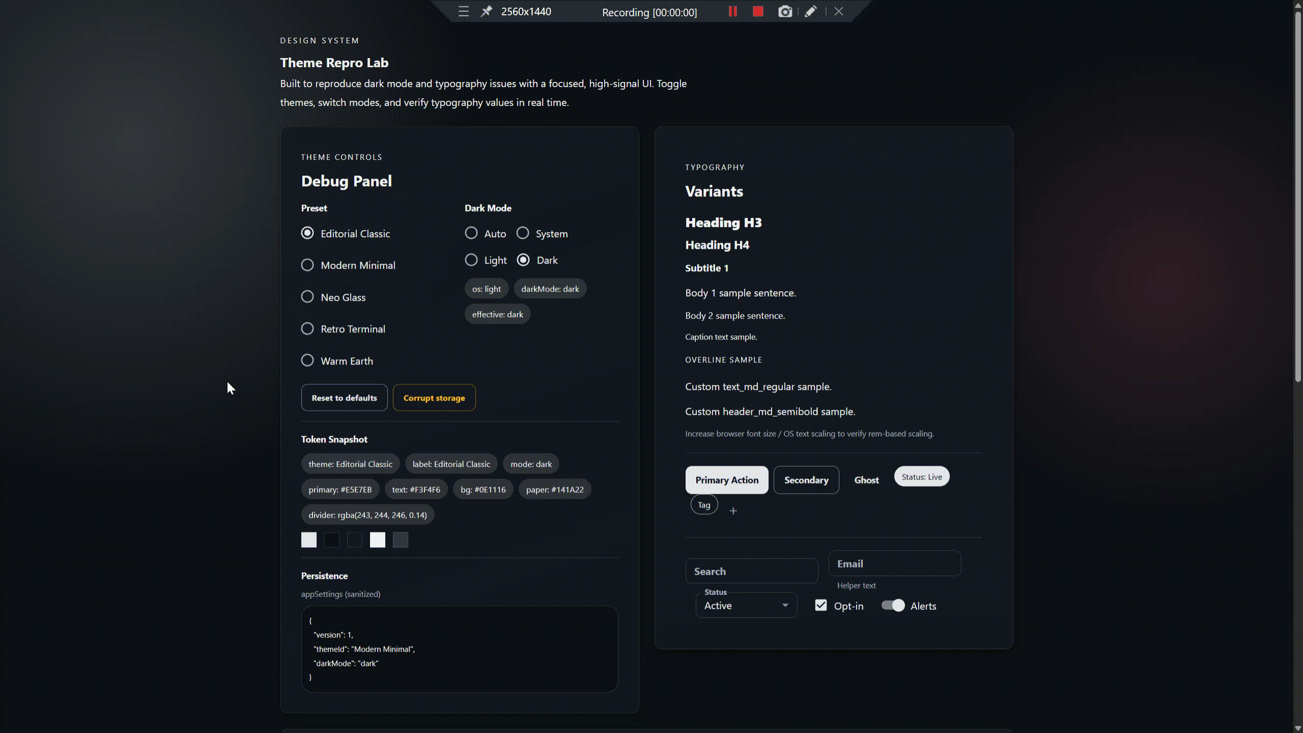
+
|
|
35
|
+
```bash
|
|
36
|
+
npm install @emotion/css
|
|
37
|
+
```
|
|
38
|
+
|
|
39
|
+
---
|
|
40
|
+
|
|
41
|
+
## Quick start
|
|
42
|
+
|
|
43
|
+
Use built-in presets (recommended starting point):
|
|
44
|
+
|
|
40
45
|
```tsx
|
|
41
|
-
import React from "react";
|
|
42
|
-
import ReactDOM from "react-dom/client";
|
|
43
46
|
import { ThemeProviderWrapper } from "@atomazing-org/design-system";
|
|
44
47
|
import { defaultThemes } from "@atomazing-org/design-system/presets";
|
|
45
48
|
|
|
46
|
-
|
|
47
|
-
|
|
48
|
-
|
|
49
|
-
|
|
50
|
-
|
|
51
|
-
|
|
52
|
-
|
|
49
|
+
export function App() {
|
|
50
|
+
return (
|
|
51
|
+
<ThemeProviderWrapper themes={defaultThemes}>
|
|
52
|
+
{/* your app */}
|
|
53
|
+
</ThemeProviderWrapper>
|
|
54
|
+
);
|
|
55
|
+
}
|
|
53
56
|
```
|
|
54
57
|
|
|
55
|
-
|
|
56
|
-
|
|
58
|
+
Notes:
|
|
59
|
+
- `themes` can be **default presets**, **your presets**, or **both**.
|
|
60
|
+
- Theme choice + dark mode are persisted (storage key: `appSettings`).
|
|
61
|
+
|
|
62
|
+
---
|
|
63
|
+
|
|
64
|
+
## Built-in presets
|
|
65
|
+
|
|
66
|
+
Built-in presets are **ready-made theme packs shipped with the library**.
|
|
67
|
+
You can use them as-is, or add your own presets alongside them.
|
|
68
|
+
|
|
69
|
+
| Preset | Stable id | Best for |
|
|
70
|
+
|---|---|---|
|
|
71
|
+
| Warm Earth | `warm-earth` | Warm and friendly apps |
|
|
72
|
+
| Editorial Classic | `editorial-classic` | Content-heavy UIs |
|
|
73
|
+
| Modern Minimal | `modern-minimal` | Dashboards and tooling |
|
|
74
|
+
| Neo Glass | `neo-glass` | Modern “glass” style UIs |
|
|
75
|
+
| Retro Terminal | `retro-terminal` | Terminal-inspired branding |
|
|
76
|
+
|
|
77
|
+
Import them from:
|
|
57
78
|
|
|
58
79
|
```ts
|
|
59
|
-
import { defaultThemes
|
|
80
|
+
import { defaultThemes } from "@atomazing-org/design-system/presets";
|
|
60
81
|
```
|
|
61
82
|
|
|
62
|
-
|
|
63
|
-
|
|
64
|
-
|
|
65
|
-
|
|
66
|
-
|
|
67
|
-
|
|
68
|
-
|
|
83
|
+
## Switching theme (UI)
|
|
84
|
+
|
|
85
|
+
Build a simple theme switcher using the library’s theme settings hook.
|
|
86
|
+
|
|
87
|
+
```tsx
|
|
88
|
+
import { ToggleButton, ToggleButtonGroup } from "@mui/material";
|
|
89
|
+
import { useThemeSettings } from "@atomazing-org/design-system";
|
|
90
|
+
import { defaultThemes } from "@atomazing-org/design-system/presets";
|
|
91
|
+
|
|
92
|
+
export function ThemeSwitcher() {
|
|
93
|
+
const { themeId, setThemeId } = useThemeSettings();
|
|
94
|
+
|
|
95
|
+
return (
|
|
96
|
+
<ToggleButtonGroup
|
|
97
|
+
size="small"
|
|
98
|
+
exclusive
|
|
99
|
+
value={themeId}
|
|
100
|
+
onChange={(_, next) => next && setThemeId(next)}
|
|
101
|
+
>
|
|
102
|
+
{defaultThemes.map((t) => (
|
|
103
|
+
<ToggleButton key={t.id} value={t.id}>
|
|
104
|
+
{t.label}
|
|
105
|
+
</ToggleButton>
|
|
106
|
+
))}
|
|
107
|
+
</ToggleButtonGroup>
|
|
108
|
+
);
|
|
109
|
+
}
|
|
110
|
+
```
|
|
111
|
+
|
|
112
|
+
---
|
|
69
113
|
|
|
70
114
|
## Dark mode
|
|
71
|
-
`darkMode` controls which scheme is active. Supported values:
|
|
72
|
-
- `light`
|
|
73
|
-
- `dark`
|
|
74
|
-
- `system`
|
|
75
|
-
- `auto` (alias of `system`)
|
|
76
115
|
|
|
77
|
-
|
|
116
|
+
Dark mode switches the active **scheme** inside the current preset.
|
|
117
|
+
|
|
118
|
+
### Supported values
|
|
119
|
+
|
|
120
|
+
- `light` — always use the preset’s light scheme
|
|
121
|
+
- `dark` — always use the preset’s dark scheme
|
|
122
|
+
- `system` — follow OS/browser preference (`prefers-color-scheme`)
|
|
123
|
+
|
|
124
|
+
### Why `system` exists
|
|
125
|
+
|
|
126
|
+
It’s the most common UX: the app automatically follows the user’s OS preference without custom code in every project.
|
|
127
|
+
|
|
128
|
+
### What about `auto`?
|
|
129
|
+
|
|
130
|
+
`auto` is a **legacy alias** of `system` kept for backward compatibility (e.g., older stored settings).
|
|
131
|
+
Recommendation: show **System** in UI, but accept `auto` as input and normalize it to `system`.
|
|
132
|
+
|
|
133
|
+
Example selector:
|
|
78
134
|
|
|
79
135
|
```tsx
|
|
80
|
-
import {
|
|
81
|
-
import {
|
|
136
|
+
import { RadioGroup, FormControlLabel, Radio } from "@mui/material";
|
|
137
|
+
import { useThemeSettings } from "@atomazing-org/design-system";
|
|
82
138
|
|
|
83
139
|
export function DarkModeSelector() {
|
|
84
140
|
const { darkMode, setDarkMode } = useThemeSettings();
|
|
85
141
|
|
|
86
142
|
return (
|
|
87
|
-
<RadioGroup
|
|
88
|
-
|
|
89
|
-
value={
|
|
90
|
-
|
|
91
|
-
>
|
|
92
|
-
{darkModeOptions.map((option) => (
|
|
93
|
-
<FormControlLabel
|
|
94
|
-
key={option.value}
|
|
95
|
-
control={<Radio />}
|
|
96
|
-
label={option.label}
|
|
97
|
-
value={option.value}
|
|
98
|
-
/>
|
|
99
|
-
))}
|
|
143
|
+
<RadioGroup row value={darkMode} onChange={(e) => setDarkMode(e.target.value as any)}>
|
|
144
|
+
<FormControlLabel value="system" control={<Radio />} label="System" />
|
|
145
|
+
<FormControlLabel value="light" control={<Radio />} label="Light" />
|
|
146
|
+
<FormControlLabel value="dark" control={<Radio />} label="Dark" />
|
|
100
147
|
</RadioGroup>
|
|
101
148
|
);
|
|
102
149
|
}
|
|
103
150
|
```
|
|
104
151
|
|
|
105
|
-
|
|
106
|
-
|
|
152
|
+
---
|
|
153
|
+
|
|
154
|
+
## Custom themes
|
|
155
|
+
|
|
156
|
+
Provide your own preset(s) to the provider. A preset is one identifiable theme with **two schemes**: `light` and `dark`.
|
|
157
|
+
|
|
158
|
+
### API reference — `ThemePreset`
|
|
159
|
+
|
|
160
|
+
| Field | Type | What it means |
|
|
161
|
+
|---|---|---|
|
|
162
|
+
| `id` | `string` | Stable identifier used for persistence and deduplication. Must be unique. |
|
|
163
|
+
| `label` | `string` | Name shown in UI selectors. |
|
|
164
|
+
| `colorSchemes.light` | `ThemeOptions` | MUI ThemeOptions for light mode. |
|
|
165
|
+
| `colorSchemes.dark` | `ThemeOptions` | MUI ThemeOptions for dark mode. |
|
|
166
|
+
|
|
167
|
+
### Minimum required tokens per scheme
|
|
168
|
+
|
|
169
|
+
Each scheme must define:
|
|
170
|
+
- `palette.background.default` — page background
|
|
171
|
+
- `palette.background.paper` — Card/Paper background
|
|
172
|
+
- `palette.text.primary`
|
|
173
|
+
- `palette.text.secondary`
|
|
174
|
+
- `palette.divider`
|
|
175
|
+
|
|
176
|
+
Example:
|
|
107
177
|
|
|
108
178
|
```ts
|
|
109
179
|
import type { ThemePreset } from "@atomazing-org/design-system";
|
|
@@ -130,116 +200,97 @@ export const myPreset: ThemePreset = {
|
|
|
130
200
|
};
|
|
131
201
|
```
|
|
132
202
|
|
|
133
|
-
|
|
203
|
+
### Using defaults + custom presets
|
|
204
|
+
|
|
134
205
|
```ts
|
|
206
|
+
import { defaultThemes } from "@atomazing-org/design-system/presets";
|
|
207
|
+
|
|
135
208
|
const themes = [...defaultThemes, myPreset];
|
|
136
209
|
```
|
|
137
210
|
|
|
138
|
-
|
|
139
|
-
|
|
140
|
-
## API reference
|
|
141
|
-
|
|
142
|
-
### ThemeProviderWrapper
|
|
143
|
-
| Prop | Type | Default | Description |
|
|
144
|
-
| --- | --- | --- | --- |
|
|
145
|
-
| `themes` | `ThemesInput` | `Default` preset | `ThemePreset[]` list used for runtime preset selection. |
|
|
146
|
-
| `fontFamily` | `string` | `undefined` | Optional global font stack. |
|
|
147
|
-
| `children` | `ReactNode` | required | Application content. |
|
|
148
|
-
|
|
149
|
-
`ThemeProviderWrapper` no longer supports legacy theme tuple/object contracts (`Theme1`, `ThemeN`, `ThemesProp`) and expects `ThemePreset[]` only.
|
|
150
|
-
|
|
151
|
-
### ThemePreset
|
|
152
|
-
| Field | Type | Description |
|
|
153
|
-
| --- | --- | --- |
|
|
154
|
-
| `id` | `string` | Stable preset identifier (used for selection + persistence). |
|
|
155
|
-
| `label` | `string` | Human-friendly preset name. |
|
|
156
|
-
| `colorSchemes.light` | `ThemeOptions` | Light scheme tokens. |
|
|
157
|
-
| `colorSchemes.dark` | `ThemeOptions` | Dark scheme tokens. |
|
|
158
|
-
| `description` | `string?` | Optional description. |
|
|
159
|
-
| `tags` | `string[]?` | Optional tags. |
|
|
160
|
-
| `version` | `string?` | Optional preset version. |
|
|
161
|
-
|
|
162
|
-
### DarkModeSetting
|
|
163
|
-
| Value | Meaning |
|
|
164
|
-
| --- | --- |
|
|
165
|
-
| `light` | Force light scheme |
|
|
166
|
-
| `dark` | Force dark scheme |
|
|
167
|
-
| `system` | Follow OS preference |
|
|
168
|
-
| `auto` | Alias of `system` |
|
|
169
|
-
|
|
170
|
-
### useThemeSettings
|
|
171
|
-
Returns:
|
|
172
|
-
- `theme`, `setTheme`
|
|
173
|
-
- `darkMode`, `setDarkMode`
|
|
174
|
-
- `themes`, `selectedTheme`, `defaultThemeName`
|
|
175
|
-
|
|
176
|
-
### Presets exports
|
|
177
|
-
`@atomazing-org/design-system/presets` exports:
|
|
178
|
-
- `defaultThemes`
|
|
179
|
-
- `editorialClassic`, `modernMinimal`, `neoGlass`, `retroTerminal`, `warmEarth`
|
|
180
|
-
|
|
181
|
-
## Examples
|
|
182
|
-
The repro app is the fastest way to validate presets and dark mode:
|
|
211
|
+
Then pass `themes` into `ThemeProviderWrapper`.
|
|
183
212
|
|
|
184
|
-
|
|
185
|
-
|
|
186
|
-
|
|
213
|
+
---
|
|
214
|
+
|
|
215
|
+
## Typography variants
|
|
216
|
+
|
|
217
|
+
The library adds extra typography variants (beyond MUI defaults) so your text styles are consistent across the app.
|
|
218
|
+
|
|
219
|
+
```tsx
|
|
220
|
+
import { Typography } from "@mui/material";
|
|
221
|
+
|
|
222
|
+
export function TypographyDemo() {
|
|
223
|
+
return (
|
|
224
|
+
<>
|
|
225
|
+
<Typography variant="header_lg_bold">Page title</Typography>
|
|
226
|
+
<Typography variant="text_md_regular">Body text</Typography>
|
|
227
|
+
<Typography variant="text_sm_bold">Caption / label</Typography>
|
|
228
|
+
</>
|
|
229
|
+
);
|
|
230
|
+
}
|
|
187
231
|
```
|
|
188
232
|
|
|
189
|
-
|
|
190
|
-
-
|
|
191
|
-
-
|
|
192
|
-
- Smoke Gate checklist and overlay demos
|
|
233
|
+
Notes:
|
|
234
|
+
- Typography sizing is expected to be **rem-based** (scales with the user’s browser font size settings).
|
|
235
|
+
- Variants are defined in the design system theme (no local “one-off” styles needed).
|
|
193
236
|
|
|
194
|
-
|
|
195
|
-
|
|
196
|
-
|
|
197
|
-
|
|
198
|
-
|
|
199
|
-
|
|
200
|
-
|
|
201
|
-
|
|
202
|
-
|
|
203
|
-
|
|
204
|
-
|
|
205
|
-
|
|
206
|
-
|
|
207
|
-
|
|
208
|
-
|
|
209
|
-
|
|
210
|
-
|
|
211
|
-
```json
|
|
212
|
-
{
|
|
213
|
-
"compilerOptions": {
|
|
214
|
-
"baseUrl": ".",
|
|
215
|
-
"paths": {
|
|
216
|
-
"@/*": ["src/*"],
|
|
217
|
-
"@components/*": ["src/components/*"],
|
|
218
|
-
"@features/*": ["src/features/*"]
|
|
219
|
-
}
|
|
220
|
-
}
|
|
237
|
+
---
|
|
238
|
+
|
|
239
|
+
## Global styles
|
|
240
|
+
|
|
241
|
+
`ThemeProviderWrapper` applies global styles (via Emotion) and MUI component defaults, so the app looks consistent immediately.
|
|
242
|
+
|
|
243
|
+
Set a custom font stack:
|
|
244
|
+
|
|
245
|
+
```tsx
|
|
246
|
+
import { ThemeProviderWrapper } from "@atomazing-org/design-system";
|
|
247
|
+
|
|
248
|
+
export function App() {
|
|
249
|
+
return (
|
|
250
|
+
<ThemeProviderWrapper fontFamily="Inter, system-ui, -apple-system, 'Segoe UI', Roboto, Arial, sans-serif">
|
|
251
|
+
{/* your app */}
|
|
252
|
+
</ThemeProviderWrapper>
|
|
253
|
+
);
|
|
221
254
|
}
|
|
222
255
|
```
|
|
223
256
|
|
|
224
|
-
|
|
225
|
-
|
|
226
|
-
|
|
227
|
-
|
|
228
|
-
|
|
229
|
-
|
|
230
|
-
|
|
231
|
-
|
|
232
|
-
|
|
233
|
-
|
|
234
|
-
|
|
235
|
-
|
|
236
|
-
|
|
237
|
-
|
|
238
|
-
|
|
239
|
-
|
|
257
|
+
---
|
|
258
|
+
|
|
259
|
+
## Animations
|
|
260
|
+
|
|
261
|
+
The library exports reusable keyframes so you can keep motion consistent.
|
|
262
|
+
|
|
263
|
+
```tsx
|
|
264
|
+
import styled from "@emotion/styled";
|
|
265
|
+
import { fadeIn } from "@atomazing-org/design-system";
|
|
266
|
+
|
|
267
|
+
const Panel = styled.div`
|
|
268
|
+
animation: ${fadeIn} 240ms ease-in both;
|
|
269
|
+
`;
|
|
270
|
+
|
|
271
|
+
export function AnimatedPanel() {
|
|
272
|
+
return <Panel>Content</Panel>;
|
|
273
|
+
}
|
|
240
274
|
```
|
|
241
275
|
|
|
242
|
-
|
|
276
|
+
---
|
|
277
|
+
|
|
278
|
+
## SSR notes
|
|
279
|
+
|
|
280
|
+
- The library is written to be **SSR-safe**: no `window`/`document`/`localStorage` access at module scope.
|
|
281
|
+
- If you use **system** dark mode, the effective mode is derived from `prefers-color-scheme` on the client.
|
|
282
|
+
- In Next.js, place the provider inside a client boundary (e.g., a component with `"use client"`), then wrap your app with `ThemeProviderWrapper`.
|
|
283
|
+
|
|
284
|
+
## Consumer alias guidance (optional)
|
|
285
|
+
|
|
286
|
+
Aliases are **optional**. They help you avoid long relative imports **inside your app**.
|
|
287
|
+
|
|
288
|
+
---
|
|
289
|
+
|
|
290
|
+
## Local development (repo)
|
|
291
|
+
|
|
292
|
+
From the repository root:
|
|
293
|
+
|
|
243
294
|
```bash
|
|
244
295
|
pnpm lint
|
|
245
296
|
pnpm build
|
|
@@ -247,11 +298,127 @@ pnpm test
|
|
|
247
298
|
pnpm -C examples/repro dev
|
|
248
299
|
```
|
|
249
300
|
|
|
250
|
-
|
|
251
|
-
|
|
252
|
-
|
|
253
|
-
|
|
254
|
-
|
|
301
|
+
---
|
|
302
|
+
|
|
303
|
+
## Peer dependencies
|
|
304
|
+
|
|
305
|
+
Make sure your app installs these (MUI v7 + Emotion):
|
|
306
|
+
|
|
307
|
+
- `react`
|
|
308
|
+
- `react-dom`
|
|
309
|
+
- `@mui/material`
|
|
310
|
+
- `@mui/icons-material` (optional, only if you use icons from MUI)
|
|
311
|
+
- `@emotion/react`
|
|
312
|
+
- `@emotion/styled`
|
|
313
|
+
- `@emotion/css` (optional)
|
|
314
|
+
|
|
315
|
+
---
|
|
316
|
+
|
|
317
|
+
## Troubleshooting
|
|
318
|
+
|
|
319
|
+
### Dark mode switches, but background/cards do not change
|
|
320
|
+
- Ensure your preset provides **both schemes**:
|
|
321
|
+
- `colorSchemes.light.palette.background.default/paper`
|
|
322
|
+
- `colorSchemes.dark.palette.background.default/paper`
|
|
323
|
+
- Avoid hardcoded colors in overrides. Use `theme.palette.*` tokens.
|
|
324
|
+
|
|
325
|
+
### Text is hard to read in dark mode
|
|
326
|
+
- Do not reuse light “ink” constants in dark mode.
|
|
327
|
+
- Check:
|
|
328
|
+
- `palette.text.primary` vs `palette.background.default`
|
|
329
|
+
- `palette.text.secondary` vs `palette.background.paper`
|
|
330
|
+
|
|
331
|
+
### I want to add my own presets
|
|
332
|
+
- Create a `ThemePreset` with `colorSchemes.light` and `colorSchemes.dark`.
|
|
333
|
+
- Combine with defaults: `const themes = [...defaultThemes, myPreset];`
|
|
334
|
+
|
|
335
|
+
## Examples (examples/repro)
|
|
336
|
+
|
|
337
|
+
The repo includes a runnable example app that demonstrates:
|
|
338
|
+
- preset switching
|
|
339
|
+
- dark mode switching
|
|
340
|
+
- background + card surfaces changing correctly
|
|
341
|
+
- token/debug view (if enabled in the example)
|
|
342
|
+
|
|
343
|
+
Run it from the repository root:
|
|
344
|
+
|
|
345
|
+
```bash
|
|
346
|
+
pnpm -C examples/repro dev
|
|
347
|
+
```
|
|
348
|
+
|
|
349
|
+
What to check in the UI:
|
|
350
|
+
- switching to **dark** changes the **page background** and **Card/Paper** background
|
|
351
|
+
- text stays readable on both backgrounds
|
|
352
|
+
- inputs, buttons, menus, and dialogs remain usable
|
|
353
|
+
|
|
354
|
+
---
|
|
355
|
+
|
|
356
|
+
## API reference — `ThemeProviderWrapper`
|
|
357
|
+
|
|
358
|
+
`ThemeProviderWrapper` wires MUI ThemeProvider, global styles, and persisted settings.
|
|
359
|
+
|
|
360
|
+
| Prop | Type | Default | What it does |
|
|
361
|
+
|---|---|---|---|
|
|
362
|
+
| `themes` | `ThemePreset[]` (or built-in `defaultThemes`) | `defaultThemes` | List of presets available to the user. |
|
|
363
|
+
| `fontFamily` | `string` | (theme default) | Optional global font stack for the whole app. |
|
|
364
|
+
| `children` | `ReactNode` | — | Your application tree. |
|
|
365
|
+
|
|
366
|
+
Minimal usage:
|
|
367
|
+
|
|
368
|
+
```tsx
|
|
369
|
+
import { ThemeProviderWrapper } from "@atomazing-org/design-system";
|
|
370
|
+
import { defaultThemes } from "@atomazing-org/design-system/presets";
|
|
371
|
+
|
|
372
|
+
export function App() {
|
|
373
|
+
return (
|
|
374
|
+
<ThemeProviderWrapper themes={defaultThemes}>
|
|
375
|
+
{/* your app */}
|
|
376
|
+
</ThemeProviderWrapper>
|
|
377
|
+
);
|
|
378
|
+
}
|
|
379
|
+
```
|
|
380
|
+
|
|
381
|
+
---
|
|
382
|
+
|
|
383
|
+
## Public exports (recommended imports)
|
|
384
|
+
|
|
385
|
+
Use only these stable entry points:
|
|
386
|
+
|
|
387
|
+
### Core API
|
|
388
|
+
```ts
|
|
389
|
+
import { ThemeProviderWrapper, useThemeSettings } from "@atomazing-org/design-system";
|
|
390
|
+
```
|
|
391
|
+
|
|
392
|
+
### Built-in presets
|
|
393
|
+
```ts
|
|
394
|
+
import { defaultThemes } from "@atomazing-org/design-system/presets";
|
|
395
|
+
```
|
|
396
|
+
|
|
397
|
+
Tip:
|
|
398
|
+
- Avoid deep imports from internal folders. They may change during refactors.
|
|
399
|
+
|
|
400
|
+
---
|
|
401
|
+
|
|
402
|
+
## Migration notes (if upgrading)
|
|
403
|
+
|
|
404
|
+
If you previously passed a single theme object or a legacy “theme list”:
|
|
405
|
+
1) Move your theme into a preset shape with **two schemes**:
|
|
406
|
+
- `colorSchemes.light`
|
|
407
|
+
- `colorSchemes.dark`
|
|
408
|
+
2) Ensure each scheme defines the required tokens:
|
|
409
|
+
- `background.default`, `background.paper`
|
|
410
|
+
- `text.primary`, `text.secondary`
|
|
411
|
+
- `divider`
|
|
412
|
+
3) Pass presets into the provider:
|
|
413
|
+
- `themes={[...defaultThemes, myPreset]}` or only `[myPreset]`
|
|
414
|
+
|
|
415
|
+
Goal:
|
|
416
|
+
- dark mode changes **real palette tokens**, so backgrounds/cards/text update together.
|
|
417
|
+
|
|
418
|
+
---
|
|
255
419
|
|
|
256
420
|
## License
|
|
421
|
+
|
|
257
422
|
MIT
|
|
423
|
+
|
|
424
|
+
|