@atomazing-org/design-system 1.1.1 → 1.2.0
This diff represents the content of publicly available package versions that have been released to one of the supported registries. The information contained in this diff is provided for informational purposes only and reflects changes between package versions as they appear in their respective public registries.
- package/README.MD +257 -345
- package/dist/chunk-JBLCVRJT.mjs +2 -0
- package/dist/chunk-JBLCVRJT.mjs.map +1 -0
- package/dist/index.d.mts +957 -207
- package/dist/index.d.ts +957 -207
- package/dist/index.js +30 -29
- package/dist/index.js.map +1 -1
- package/dist/index.mjs +31 -30
- package/dist/index.mjs.map +1 -1
- package/dist/presets/index.d.mts +17 -0
- package/dist/presets/index.d.ts +17 -0
- package/dist/presets/index.js +2 -0
- package/dist/presets/index.js.map +1 -0
- package/dist/presets/index.mjs +2 -0
- package/dist/presets/index.mjs.map +1 -0
- package/dist/typography-Dq0wCojD.d.mts +121 -0
- package/dist/typography-Dq0wCojD.d.ts +121 -0
- package/package.json +9 -2
package/README.MD
CHANGED
|
@@ -1,345 +1,257 @@
|
|
|
1
|
-
@atomazing-org/design-system
|
|
2
|
-
|
|
3
|
-
Modern MUI + Emotion design system with
|
|
4
|
-
|
|
5
|
-
|
|
6
|
-
-
|
|
7
|
-
|
|
8
|
-
|
|
9
|
-
-
|
|
10
|
-
-
|
|
11
|
-
-
|
|
12
|
-
-
|
|
13
|
-
-
|
|
14
|
-
-
|
|
15
|
-
-
|
|
16
|
-
-
|
|
17
|
-
-
|
|
18
|
-
-
|
|
19
|
-
-
|
|
20
|
-
-
|
|
21
|
-
-
|
|
22
|
-
-
|
|
23
|
-
|
|
24
|
-
|
|
25
|
-
|
|
26
|
-
|
|
27
|
-
|
|
28
|
-
|
|
29
|
-
|
|
30
|
-
|
|
31
|
-
|
|
32
|
-
|
|
33
|
-
|
|
34
|
-
```
|
|
35
|
-
|
|
36
|
-
|
|
37
|
-
|
|
38
|
-
|
|
39
|
-
|
|
40
|
-
|
|
41
|
-
|
|
42
|
-
|
|
43
|
-
}
|
|
44
|
-
|
|
45
|
-
|
|
46
|
-
|
|
47
|
-
|
|
48
|
-
|
|
49
|
-
|
|
50
|
-
|
|
51
|
-
|
|
52
|
-
|
|
53
|
-
|
|
54
|
-
|
|
55
|
-
|
|
56
|
-
|
|
57
|
-
|
|
58
|
-
```
|
|
59
|
-
|
|
60
|
-
|
|
61
|
-
|
|
62
|
-
|
|
63
|
-
|
|
64
|
-
|
|
65
|
-
|
|
66
|
-
|
|
67
|
-
|
|
68
|
-
|
|
69
|
-
|
|
70
|
-
|
|
71
|
-
|
|
72
|
-
|
|
73
|
-
|
|
74
|
-
|
|
75
|
-
|
|
76
|
-
|
|
77
|
-
|
|
78
|
-
|
|
79
|
-
|
|
80
|
-
|
|
81
|
-
|
|
82
|
-
|
|
83
|
-
|
|
84
|
-
|
|
85
|
-
|
|
86
|
-
|
|
87
|
-
|
|
88
|
-
|
|
89
|
-
|
|
90
|
-
|
|
91
|
-
|
|
92
|
-
|
|
93
|
-
|
|
94
|
-
|
|
95
|
-
|
|
96
|
-
|
|
97
|
-
|
|
98
|
-
|
|
99
|
-
|
|
100
|
-
|
|
101
|
-
|
|
102
|
-
|
|
103
|
-
|
|
104
|
-
|
|
105
|
-
|
|
106
|
-
|
|
107
|
-
|
|
108
|
-
|
|
109
|
-
|
|
110
|
-
|
|
111
|
-
|
|
112
|
-
|
|
113
|
-
|
|
114
|
-
|
|
115
|
-
|
|
116
|
-
|
|
117
|
-
|
|
118
|
-
|
|
119
|
-
|
|
120
|
-
|
|
121
|
-
|
|
122
|
-
|
|
123
|
-
|
|
124
|
-
|
|
125
|
-
|
|
126
|
-
|
|
127
|
-
|
|
128
|
-
|
|
129
|
-
|
|
130
|
-
|
|
131
|
-
|
|
132
|
-
|
|
133
|
-
|
|
134
|
-
|
|
135
|
-
|
|
136
|
-
|
|
137
|
-
|
|
138
|
-
|
|
139
|
-
|
|
140
|
-
|
|
141
|
-
|
|
142
|
-
|
|
143
|
-
|
|
144
|
-
|
|
145
|
-
|
|
146
|
-
|
|
147
|
-
|
|
148
|
-
|
|
149
|
-
|
|
150
|
-
|
|
151
|
-
|
|
152
|
-
|
|
153
|
-
|
|
154
|
-
|
|
155
|
-
|
|
156
|
-
|
|
157
|
-
|
|
158
|
-
|
|
159
|
-
|
|
160
|
-
|
|
161
|
-
|
|
162
|
-
|
|
163
|
-
|
|
164
|
-
|
|
165
|
-
|
|
166
|
-
|
|
167
|
-
|
|
168
|
-
|
|
169
|
-
|
|
170
|
-
|
|
171
|
-
|
|
172
|
-
|
|
173
|
-
|
|
174
|
-
|
|
175
|
-
|
|
176
|
-
|
|
177
|
-
|
|
178
|
-
|
|
179
|
-
|
|
180
|
-
|
|
181
|
-
|
|
182
|
-
|
|
183
|
-
|
|
184
|
-
|
|
185
|
-
|
|
186
|
-
|
|
187
|
-
|
|
188
|
-
|
|
189
|
-
|
|
190
|
-
|
|
191
|
-
|
|
192
|
-
|
|
193
|
-
|
|
194
|
-
|
|
195
|
-
|
|
196
|
-
|
|
197
|
-
|
|
198
|
-
|
|
199
|
-
-
|
|
200
|
-
-
|
|
201
|
-
-
|
|
202
|
-
-
|
|
203
|
-
|
|
204
|
-
|
|
205
|
-
|
|
206
|
-
|
|
207
|
-
|
|
208
|
-
|
|
209
|
-
|
|
210
|
-
|
|
211
|
-
|
|
212
|
-
|
|
213
|
-
|
|
214
|
-
|
|
215
|
-
|
|
216
|
-
|
|
217
|
-
|
|
218
|
-
|
|
219
|
-
|
|
220
|
-
|
|
221
|
-
|
|
222
|
-
|
|
223
|
-
|
|
224
|
-
|
|
225
|
-
|
|
226
|
-
|
|
227
|
-
|
|
228
|
-
|
|
229
|
-
|
|
230
|
-
|
|
231
|
-
|
|
232
|
-
|
|
233
|
-
|
|
234
|
-
|
|
235
|
-
|
|
236
|
-
|
|
237
|
-
|
|
238
|
-
|
|
239
|
-
|
|
240
|
-
|
|
241
|
-
|
|
242
|
-
|
|
243
|
-
|
|
244
|
-
|
|
245
|
-
|
|
246
|
-
|
|
247
|
-
|
|
248
|
-
|
|
249
|
-
|
|
250
|
-
|
|
251
|
-
|
|
252
|
-
|
|
253
|
-
|
|
254
|
-
|
|
255
|
-
|
|
256
|
-
|
|
257
|
-
|
|
258
|
-
|
|
259
|
-
```tsx
|
|
260
|
-
<ThemeProviderWrapper fontFamily="Inter, system-ui, -apple-system, 'Segoe UI', Roboto, Arial, sans-serif">
|
|
261
|
-
{/* ... */}
|
|
262
|
-
</ThemeProviderWrapper>
|
|
263
|
-
```
|
|
264
|
-
|
|
265
|
-
Animations
|
|
266
|
-
Keyframes ready for use in Emotion/MUI `sx`:
|
|
267
|
-
|
|
268
|
-
```tsx
|
|
269
|
-
import { keyframes } from '@emotion/react';
|
|
270
|
-
import { fadeIn, slideIn, scale, pulseAnimation, progressPulse } from '@atomazing-org/design-system';
|
|
271
|
-
import styled from '@emotion/styled';
|
|
272
|
-
|
|
273
|
-
const Card = styled.div`
|
|
274
|
-
animation: ${fadeIn} 300ms ease-in both;
|
|
275
|
-
`;
|
|
276
|
-
|
|
277
|
-
const Glowing = styled.div`
|
|
278
|
-
animation: ${progressPulse('#9FA9EA')} 2s ease-in-out infinite;
|
|
279
|
-
`;
|
|
280
|
-
```
|
|
281
|
-
|
|
282
|
-
Components
|
|
283
|
-
- ErrorBoundary
|
|
284
|
-
```tsx
|
|
285
|
-
import { ErrorBoundary } from '@atomazing-org/design-system';
|
|
286
|
-
|
|
287
|
-
<ErrorBoundary>
|
|
288
|
-
<App />
|
|
289
|
-
</ErrorBoundary>
|
|
290
|
-
```
|
|
291
|
-
|
|
292
|
-
- Loading
|
|
293
|
-
```tsx
|
|
294
|
-
import { Loading } from '@atomazing-org/design-system';
|
|
295
|
-
|
|
296
|
-
<Loading />
|
|
297
|
-
```
|
|
298
|
-
|
|
299
|
-
- PathName / DialogBtn
|
|
300
|
-
```tsx
|
|
301
|
-
import { PathName, DialogBtn } from '@atomazing-org/design-system';
|
|
302
|
-
|
|
303
|
-
<PathName>/settings/profile</PathName>
|
|
304
|
-
<DialogBtn variant="contained" color="brand">OK</DialogBtn>
|
|
305
|
-
```
|
|
306
|
-
|
|
307
|
-
Utilities
|
|
308
|
-
```tsx
|
|
309
|
-
import {
|
|
310
|
-
getFontColor, isFontLight, isHexColor,
|
|
311
|
-
timeAgo, timeAgoFromStart,
|
|
312
|
-
useResponsiveDisplay, useSystemTheme,
|
|
313
|
-
displayGreeting, getDayIdentifier,
|
|
314
|
-
systemInfo,
|
|
315
|
-
} from '@atomazing-org/design-system';
|
|
316
|
-
|
|
317
|
-
// Colors
|
|
318
|
-
getFontColor('#ffffff'); // '#101727' | '#f0f0f0'
|
|
319
|
-
isFontLight('#222');
|
|
320
|
-
isHexColor('#abc');
|
|
321
|
-
|
|
322
|
-
// Time
|
|
323
|
-
timeAgo(new Date(Date.now() - 3600_000));
|
|
324
|
-
timeAgoFromStart(new Date(Date.now() + 90_000));
|
|
325
|
-
|
|
326
|
-
// Device
|
|
327
|
-
const isMobile = useResponsiveDisplay(768);
|
|
328
|
-
const sysTheme = useSystemTheme(); // 'light' | 'dark' | 'unknown'
|
|
329
|
-
|
|
330
|
-
// Misc
|
|
331
|
-
displayGreeting(); // Good morning / afternoon / evening
|
|
332
|
-
getDayIdentifier(new Date()); // 'YYYY-MM-DD'
|
|
333
|
-
console.log(systemInfo.os, systemInfo.browser);
|
|
334
|
-
```
|
|
335
|
-
|
|
336
|
-
SSR Notes
|
|
337
|
-
- The library guards `localStorage`/`navigator`. Use normally in SSR apps; hydration updates settings on client.
|
|
338
|
-
- For Next.js, place the provider in a client boundary (e.g., `layout.tsx` with `"use client"`).
|
|
339
|
-
|
|
340
|
-
Peer Dependencies
|
|
341
|
-
- `@mui/material` ^7
|
|
342
|
-
- `@mui/icons-material` ^7
|
|
343
|
-
- `@emotion/react` ^11
|
|
344
|
-
- `@emotion/styled` ^11
|
|
345
|
-
- `@emotion/css` ^11 (optional)
|
|
1
|
+
# @atomazing-org/design-system
|
|
2
|
+
|
|
3
|
+
Modern MUI v7 + Emotion design system with strongly differentiated visual presets, scheme-based light/dark tokens, SSR-safe theming, and persistence.
|
|
4
|
+
|
|
5
|
+
## Preview
|
|
6
|
+
|
|
7
|
+
|
|
8
|
+
## Contents
|
|
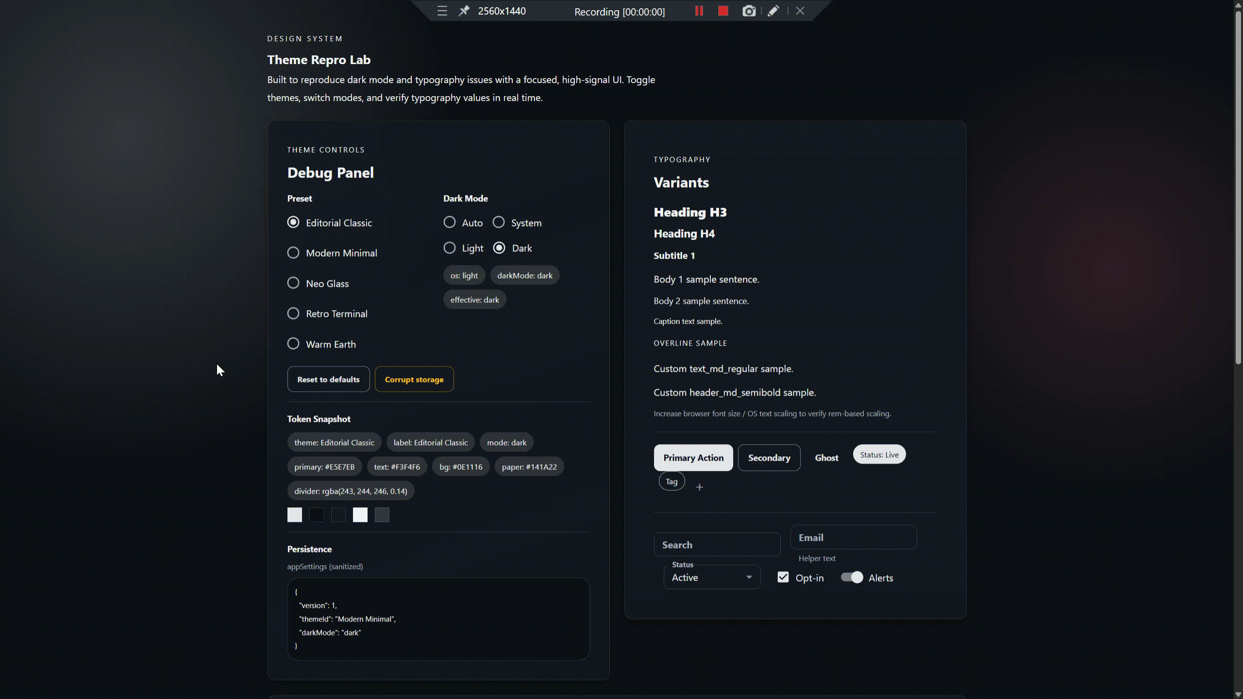
9
|
+
- Preview
|
|
10
|
+
- Why this library
|
|
11
|
+
- Installation
|
|
12
|
+
- Quickstart
|
|
13
|
+
- Presets
|
|
14
|
+
- Dark mode
|
|
15
|
+
- Custom presets
|
|
16
|
+
- API reference
|
|
17
|
+
- Examples
|
|
18
|
+
- Troubleshooting
|
|
19
|
+
- Consumer alias guidance
|
|
20
|
+
- Contributing
|
|
21
|
+
- Release notes
|
|
22
|
+
- License
|
|
23
|
+
|
|
24
|
+
## Why this library
|
|
25
|
+
- True light/dark presets via colorSchemes (not just palette.mode)
|
|
26
|
+
- Distinct preset identities (minimal, liquid glass, editorial, warm organic, retro terminal)
|
|
27
|
+
- Persisted theme and darkMode with safe defaults
|
|
28
|
+
- SSR-safe (no module-scope browser APIs)
|
|
29
|
+
- MUI v7 + Emotion ready, with typography variants and component overrides
|
|
30
|
+
- Guardrails: contrast checks on preset tokens
|
|
31
|
+
- Easy to extend with custom presets
|
|
32
|
+
|
|
33
|
+
## Installation
|
|
34
|
+
```bash
|
|
35
|
+
npm install @atomazing-org/design-system
|
|
36
|
+
npm install @mui/material @mui/icons-material @emotion/react @emotion/styled @emotion/css
|
|
37
|
+
```
|
|
38
|
+
|
|
39
|
+
## Quickstart
|
|
40
|
+
```tsx
|
|
41
|
+
import React from "react";
|
|
42
|
+
import ReactDOM from "react-dom/client";
|
|
43
|
+
import { ThemeProviderWrapper } from "@atomazing-org/design-system";
|
|
44
|
+
import { defaultThemes } from "@atomazing-org/design-system/presets";
|
|
45
|
+
|
|
46
|
+
import App from "./App";
|
|
47
|
+
|
|
48
|
+
ReactDOM.createRoot(document.getElementById("root")!).render(
|
|
49
|
+
<ThemeProviderWrapper themes={defaultThemes}>
|
|
50
|
+
<App />
|
|
51
|
+
</ThemeProviderWrapper>
|
|
52
|
+
);
|
|
53
|
+
```
|
|
54
|
+
|
|
55
|
+
## Presets
|
|
56
|
+
Ship-ready presets live under the `/presets` subpath. `defaultThemes` contains all built-in presets.
|
|
57
|
+
|
|
58
|
+
```ts
|
|
59
|
+
import { defaultThemes, modernMinimal } from "@atomazing-org/design-system/presets";
|
|
60
|
+
```
|
|
61
|
+
|
|
62
|
+
Built-in presets:
|
|
63
|
+
- Warm Earth
|
|
64
|
+
- Editorial Classic
|
|
65
|
+
- Modern Minimal
|
|
66
|
+
- Neo Glass
|
|
67
|
+
- Retro Terminal
|
|
68
|
+
- Kids Cartoon
|
|
69
|
+
|
|
70
|
+
## Dark mode
|
|
71
|
+
`darkMode` controls which scheme is active. Supported values:
|
|
72
|
+
- `light`
|
|
73
|
+
- `dark`
|
|
74
|
+
- `system`
|
|
75
|
+
- `auto` (alias of `system`)
|
|
76
|
+
|
|
77
|
+
`effectiveMode` is derived from `darkMode` + the OS preference. If the system preference is unknown, the library falls back to `light`.
|
|
78
|
+
|
|
79
|
+
```tsx
|
|
80
|
+
import { useThemeSettings, darkModeOptions } from "@atomazing-org/design-system";
|
|
81
|
+
import { FormControlLabel, Radio, RadioGroup } from "@mui/material";
|
|
82
|
+
|
|
83
|
+
export function DarkModeSelector() {
|
|
84
|
+
const { darkMode, setDarkMode } = useThemeSettings();
|
|
85
|
+
|
|
86
|
+
return (
|
|
87
|
+
<RadioGroup
|
|
88
|
+
row
|
|
89
|
+
value={darkMode}
|
|
90
|
+
onChange={(event) => setDarkMode(event.target.value as typeof darkMode)}
|
|
91
|
+
>
|
|
92
|
+
{darkModeOptions.map((option) => (
|
|
93
|
+
<FormControlLabel
|
|
94
|
+
key={option.value}
|
|
95
|
+
control={<Radio />}
|
|
96
|
+
label={option.label}
|
|
97
|
+
value={option.value}
|
|
98
|
+
/>
|
|
99
|
+
))}
|
|
100
|
+
</RadioGroup>
|
|
101
|
+
);
|
|
102
|
+
}
|
|
103
|
+
```
|
|
104
|
+
|
|
105
|
+
## Custom presets
|
|
106
|
+
Define a `ThemePreset` with `colorSchemes.light` and `colorSchemes.dark`.
|
|
107
|
+
|
|
108
|
+
```ts
|
|
109
|
+
import type { ThemePreset } from "@atomazing-org/design-system";
|
|
110
|
+
|
|
111
|
+
export const myPreset: ThemePreset = {
|
|
112
|
+
id: "my-brand",
|
|
113
|
+
label: "My Brand",
|
|
114
|
+
colorSchemes: {
|
|
115
|
+
light: {
|
|
116
|
+
palette: {
|
|
117
|
+
background: { default: "#ffffff", paper: "#ffffff" },
|
|
118
|
+
text: { primary: "#111111", secondary: "#444444" },
|
|
119
|
+
divider: "rgba(0,0,0,0.12)",
|
|
120
|
+
},
|
|
121
|
+
},
|
|
122
|
+
dark: {
|
|
123
|
+
palette: {
|
|
124
|
+
background: { default: "#0f1115", paper: "#151922" },
|
|
125
|
+
text: { primary: "#f1f3f5", secondary: "#c6cbd1" },
|
|
126
|
+
divider: "rgba(241,243,245,0.16)",
|
|
127
|
+
},
|
|
128
|
+
},
|
|
129
|
+
},
|
|
130
|
+
};
|
|
131
|
+
```
|
|
132
|
+
|
|
133
|
+
Merge with built-ins:
|
|
134
|
+
```ts
|
|
135
|
+
const themes = [...defaultThemes, myPreset];
|
|
136
|
+
```
|
|
137
|
+
|
|
138
|
+
Duplicate preset ids are resolved by last-wins while preserving the first-occurrence order.
|
|
139
|
+
|
|
140
|
+
## API reference
|
|
141
|
+
|
|
142
|
+
### ThemeProviderWrapper
|
|
143
|
+
| Prop | Type | Default | Description |
|
|
144
|
+
| --- | --- | --- | --- |
|
|
145
|
+
| `themes` | `ThemesInput` | `Default` preset | `ThemePreset[]` list used for runtime preset selection. |
|
|
146
|
+
| `fontFamily` | `string` | `undefined` | Optional global font stack. |
|
|
147
|
+
| `children` | `ReactNode` | required | Application content. |
|
|
148
|
+
|
|
149
|
+
`ThemeProviderWrapper` no longer supports legacy theme tuple/object contracts (`Theme1`, `ThemeN`, `ThemesProp`) and expects `ThemePreset[]` only.
|
|
150
|
+
|
|
151
|
+
### ThemePreset
|
|
152
|
+
| Field | Type | Description |
|
|
153
|
+
| --- | --- | --- |
|
|
154
|
+
| `id` | `string` | Stable preset identifier (used for selection + persistence). |
|
|
155
|
+
| `label` | `string` | Human-friendly preset name. |
|
|
156
|
+
| `colorSchemes.light` | `ThemeOptions` | Light scheme tokens. |
|
|
157
|
+
| `colorSchemes.dark` | `ThemeOptions` | Dark scheme tokens. |
|
|
158
|
+
| `description` | `string?` | Optional description. |
|
|
159
|
+
| `tags` | `string[]?` | Optional tags. |
|
|
160
|
+
| `version` | `string?` | Optional preset version. |
|
|
161
|
+
|
|
162
|
+
### DarkModeSetting
|
|
163
|
+
| Value | Meaning |
|
|
164
|
+
| --- | --- |
|
|
165
|
+
| `light` | Force light scheme |
|
|
166
|
+
| `dark` | Force dark scheme |
|
|
167
|
+
| `system` | Follow OS preference |
|
|
168
|
+
| `auto` | Alias of `system` |
|
|
169
|
+
|
|
170
|
+
### useThemeSettings
|
|
171
|
+
Returns:
|
|
172
|
+
- `theme`, `setTheme`
|
|
173
|
+
- `darkMode`, `setDarkMode`
|
|
174
|
+
- `themes`, `selectedTheme`, `defaultThemeName`
|
|
175
|
+
|
|
176
|
+
### Presets exports
|
|
177
|
+
`@atomazing-org/design-system/presets` exports:
|
|
178
|
+
- `defaultThemes`
|
|
179
|
+
- `editorialClassic`, `modernMinimal`, `neoGlass`, `retroTerminal`, `warmEarth`
|
|
180
|
+
|
|
181
|
+
## Examples
|
|
182
|
+
The repro app is the fastest way to validate presets and dark mode:
|
|
183
|
+
|
|
184
|
+
```bash
|
|
185
|
+
pnpm -C examples/repro install
|
|
186
|
+
pnpm -C examples/repro dev
|
|
187
|
+
```
|
|
188
|
+
|
|
189
|
+
Look for:
|
|
190
|
+
- Theme controls (preset + mode)
|
|
191
|
+
- Token Debug Panel (tokens + persistence)
|
|
192
|
+
- Smoke Gate checklist and overlay demos
|
|
193
|
+
|
|
194
|
+
## Troubleshooting
|
|
195
|
+
- Dark mode does not change background:
|
|
196
|
+
- Ensure both `colorSchemes.light` and `colorSchemes.dark` set `palette.background.default` and `palette.background.paper`.
|
|
197
|
+
- Remove hardcoded `#fff`/`#000` from layouts that override theme tokens.
|
|
198
|
+
- Text is unreadable in dark mode:
|
|
199
|
+
- Verify `palette.text.primary`/`secondary` for dark schemes.
|
|
200
|
+
- Check divider and surface contrast in the repro app.
|
|
201
|
+
- Preset switching does not update:
|
|
202
|
+
- Ensure preset ids are unique and non-empty.
|
|
203
|
+
- Clear `localStorage` key `appSettings` if persisted values are invalid.
|
|
204
|
+
- SSR warnings:
|
|
205
|
+
- Ensure the provider is mounted inside a client boundary for SSR apps.
|
|
206
|
+
|
|
207
|
+
## Consumer alias guidance
|
|
208
|
+
These aliases are for your application code (not library internals).
|
|
209
|
+
|
|
210
|
+
`tsconfig.json`:
|
|
211
|
+
```json
|
|
212
|
+
{
|
|
213
|
+
"compilerOptions": {
|
|
214
|
+
"baseUrl": ".",
|
|
215
|
+
"paths": {
|
|
216
|
+
"@/*": ["src/*"],
|
|
217
|
+
"@components/*": ["src/components/*"],
|
|
218
|
+
"@features/*": ["src/features/*"]
|
|
219
|
+
}
|
|
220
|
+
}
|
|
221
|
+
}
|
|
222
|
+
```
|
|
223
|
+
|
|
224
|
+
`vite.config.ts`:
|
|
225
|
+
```ts
|
|
226
|
+
import { defineConfig } from "vite";
|
|
227
|
+
import react from "@vitejs/plugin-react";
|
|
228
|
+
import { resolve } from "path";
|
|
229
|
+
|
|
230
|
+
export default defineConfig({
|
|
231
|
+
plugins: [react()],
|
|
232
|
+
resolve: {
|
|
233
|
+
alias: {
|
|
234
|
+
"@": resolve(__dirname, "src"),
|
|
235
|
+
"@components": resolve(__dirname, "src/components"),
|
|
236
|
+
"@features": resolve(__dirname, "src/features"),
|
|
237
|
+
},
|
|
238
|
+
},
|
|
239
|
+
});
|
|
240
|
+
```
|
|
241
|
+
|
|
242
|
+
## Contributing
|
|
243
|
+
```bash
|
|
244
|
+
pnpm lint
|
|
245
|
+
pnpm build
|
|
246
|
+
pnpm test
|
|
247
|
+
pnpm -C examples/repro dev
|
|
248
|
+
```
|
|
249
|
+
|
|
250
|
+
## Release notes
|
|
251
|
+
Current release highlights:
|
|
252
|
+
- Scheme-based presets with explicit light/dark schemes
|
|
253
|
+
- Improved dark mode and persistence alignment
|
|
254
|
+
- Stable `@atomazing-org/design-system/presets` subpath export
|
|
255
|
+
|
|
256
|
+
## License
|
|
257
|
+
MIT
|