@agentic-design-kits/swiss-minimal 2026.1113.1 → 2026.1114.0
This diff represents the content of publicly available package versions that have been released to one of the supported registries. The information contained in this diff is provided for informational purposes only and reflects changes between package versions as they appear in their respective public registries.
- package/COMPONENTS.md +5 -4
- package/DESIGN.md +38 -1
- package/README.md +26 -105
- package/kit/astro/PostFeature.astro +14 -9
- package/kit/theme.css +10 -4
- package/package.json +1 -1
package/COMPONENTS.md
CHANGED
|
@@ -289,6 +289,7 @@ A row of outlined buttons that narrows a list to one category. One choice at a t
|
|
|
289
289
|
- Announce the result in a polite live region outside the accordion: `<p class="sr-only" aria-live="polite">Showing 5 Writing items</p>`.
|
|
290
290
|
- With `FavoriteStar`, add a **Favorites** chip after All, its count in `<span class="chip-count" data-favorites-count>0</span>`. It filters like a category, using the starred ids. When it shows nothing, say how to add some in a `muted` line under the accordion.
|
|
291
291
|
- Listen for `filter:reset` and go back to All (`JumpToCurrent` sends it when the current item is filtered out).
|
|
292
|
+
- A chip that can't be chosen right now takes `disabled`: it fades to 60% and doesn't fill on hover. Say why near the row.
|
|
292
293
|
|
|
293
294
|
## FavoriteStar
|
|
294
295
|
|
|
@@ -833,7 +834,7 @@ In Astro, `<PostList posts={posts} />`, each a `Post` (`title`, `href`, `date`,
|
|
|
833
834
|
|
|
834
835
|
## PostFeature
|
|
835
836
|
|
|
836
|
-
One post at the top of a blog's index,
|
|
837
|
+
One post at the top of a blog's index, in one of two layouts. **Split**, like a split `Hero`: the text and a square image 50/50 from 768px, text first on phones. **Wide**: the text across the full width, then the image under it at 16:9. The `PostList` of the other posts follows it.
|
|
837
838
|
|
|
838
839
|
**Markup.**
|
|
839
840
|
|
|
@@ -850,15 +851,15 @@ One post at the top of a blog's index, set like a split `Hero`: the text and a s
|
|
|
850
851
|
</article>
|
|
851
852
|
```
|
|
852
853
|
|
|
853
|
-
In Astro, `<PostFeature post={post} image={art} alt="What it shows" />`, with the same `Post` as `PostList` and an imported image. `label` (default "Featured") and `action` (default "Read post") change the two short labels; `level="h1"` when nothing else on the page is the `h1`.
|
|
854
|
+
In Astro, `<PostFeature post={post} image={art} alt="What it shows" />`, with the same `Post` as `PostList` and an imported image. The image's shape picks the layout: wide for a landscape image, split for a square or portrait one. `layout="wide"` or `layout="split"` overrides it. `label` (default "Featured") and `action` (default "Read post") change the two short labels; `level="h1"` when nothing else on the page is the `h1`.
|
|
854
855
|
|
|
855
856
|
- It takes a hero's place and space: `space-12` above, more from 768px. A page with a `PostFeature` has no `Hero` or `PageTitle`; give it an `h1` (visually hidden is fine) naming the page.
|
|
856
857
|
- The label is small, bold and `accent-text`; the title is bold and tight at `clamp(2.5rem, 5.5vw, 5rem)`, and underlines (3px) on hover.
|
|
857
858
|
- The primary button is the page's one main action. Its name adds the post's title, so it says where it goes.
|
|
858
|
-
-
|
|
859
|
+
- Split crops the image square (`.media--1x1`); wide crops it 16:9 (`.media--16x9`) and adds `post-feature--wide` to the article, which also gives the summary a longer measure. Either way it loads eagerly, like a hero's. Give wide a landscape original and split a square or portrait one, so the crop takes little.
|
|
859
860
|
- Only one per page. Don't repeat the featured post in the list below it.
|
|
860
861
|
|
|
861
|
-
**Other media.** `image` and `alt` are optional. To show something other than a raster image, such as an SVG that follows the theme, leave them out and fill the `media` slot: `<PostFeature post={post}><svg slot="media" …></svg></PostFeature>`. Keep it square, and give it its own text alternative if it says anything.
|
|
862
|
+
**Other media.** `image` and `alt` are optional. To show something other than a raster image, such as an SVG that follows the theme, leave them out and fill the `media` slot: `<PostFeature post={post}><svg slot="media" …></svg></PostFeature>`. Keep it square, or 16:9 with `layout="wide"`, and give it its own text alternative if it says anything.
|
|
862
863
|
|
|
863
864
|
## Pager
|
|
864
865
|
|
package/DESIGN.md
CHANGED
|
@@ -74,6 +74,43 @@ One family, `--font-sans` (Overused Grotesk, falling back to Helvetica Neue, Hel
|
|
|
74
74
|
- Long labels that would otherwise be caps take `.prose-sentence`.
|
|
75
75
|
- Code is plain HTML, no class: inline `<code>` sits in the line with no tint behind it; a `<pre>` block is square with a 1px `rule` border and `space-4` padding, and scrolls sideways rather than wrapping (give a long one `tabindex="0"` so the keyboard can scroll it); `<kbd>` is outlined in `currentColor`, like the top-bar buttons. Terminal output and logs go on a dark block (`.pre--bar`), with commands in bold and errors in the accent; see CodeBlock in `COMPONENTS.md`. Monospace never goes beyond code: not for labels, numbers or headings.
|
|
76
76
|
|
|
77
|
+
### OpenType features
|
|
78
|
+
|
|
79
|
+
Overused Grotesk has alternate letters, boxed and circled figures and a few numeric features. The kit sets only tabular figures, in `.num`; everything else is off. The demo's Type and color page shows each one off and on.
|
|
80
|
+
|
|
81
|
+
| Feature | What it changes | Use |
|
|
82
|
+
| --- | --- | --- |
|
|
83
|
+
| `ss01` | Single-storey a | Site-wide, if the site wants a friendlier a |
|
|
84
|
+
| `ss02` | Bottom-curled l | Where l, I and 1 must be told apart: codes, names, tables |
|
|
85
|
+
| `ss03` | Round dots on i, j, umlauts and punctuation | Site-wide, if chosen |
|
|
86
|
+
| `ss04` | Spurless G | Site-wide, if chosen |
|
|
87
|
+
| `ss05` | Straight-legged R | Site-wide, if chosen |
|
|
88
|
+
| `ss06` | Alternative J | Site-wide, if chosen |
|
|
89
|
+
| `ss07` | Alternative y | Site-wide, if chosen |
|
|
90
|
+
| `ss08` | Arcless t | Site-wide, if chosen |
|
|
91
|
+
| `ss09` | Alternative asterisk | Site-wide, if chosen |
|
|
92
|
+
| `ss10` | u with no stem | Site-wide, if chosen |
|
|
93
|
+
| `ss11` | Serif I | With `ss02`, where I and l must be told apart |
|
|
94
|
+
| `cv01`, `cv02` | Figures in solid or outlined squares | Keys and step numbers only, never running text |
|
|
95
|
+
| `cv03`, `cv04` | Figures in solid or outlined circles | Keys and step numbers only, never running text |
|
|
96
|
+
| `cv05` | a with a spur | Site-wide, if chosen; works with `ss01` |
|
|
97
|
+
| `tnum` | Tabular figures | Through `.num`, on numbers that line up in a column |
|
|
98
|
+
| `zero` | Slashed zero | Where 0 and O could be confused: codes, IDs |
|
|
99
|
+
| `frac` | Fractions | On the fraction only |
|
|
100
|
+
| `sups`, `subs` | Superscript, subscript figures | On the figures only |
|
|
101
|
+
|
|
102
|
+
- **Choose alternates once.** Set a site's alternate letters on `body`, so a letter has one shape everywhere. Don't switch them word by word.
|
|
103
|
+
- **Prefer `font-variant-*`** where it exists: `font-variant-numeric: tabular-nums`, `slashed-zero` or `diagonal-fractions`, and `font-variant-position: super` or `sub`. These combine on their own. Stylistic sets and character variants have no such property, so they need `font-feature-settings`.
|
|
104
|
+
- **`font-feature-settings` replaces, it doesn't add.** Setting it on an element drops every feature it inherited. To let features stack, give each its own custom property and list them all in one rule:
|
|
105
|
+
|
|
106
|
+
```css
|
|
107
|
+
body { font-feature-settings: var(--ff-ss01, "ss01" 0), var(--ff-ss02, "ss02" 0), var(--ff-zero, "zero" 0); }
|
|
108
|
+
.codes { --ff-ss02: "ss02" 1; --ff-zero: "zero" 1; }
|
|
109
|
+
```
|
|
110
|
+
|
|
111
|
+
- **Features change looks, not text.** A screen reader reads, and copy and paste gives, the characters typed: a boxed 3 is still "3". Never let a box or circle carry meaning on its own.
|
|
112
|
+
- **Not available:** ligatures, case-sensitive forms, old-style figures and small caps; the font has none. `ss12` changes Bulgarian Cyrillic only. Don't use the slant axis (`slnt`): in this version of the font only some letters slant.
|
|
113
|
+
|
|
77
114
|
## Layout
|
|
78
115
|
|
|
79
116
|
- Content width `page-max` (88rem), centered in `.page`, with `gutter` side padding (1rem, 2rem from 640px).
|
|
@@ -89,7 +126,7 @@ One family, `--font-sans` (Overused Grotesk, falling back to Helvetica Neue, Hel
|
|
|
89
126
|
|
|
90
127
|
## Iconography
|
|
91
128
|
|
|
92
|
-
- **Type and CSS come first.** Draw UI chrome in CSS: the plus/minus is two bars (`.acc-icon`), the menu button is three bars (`.burger`). Use the font's own glyphs where they exist: "Site ↗" (the arrow at 1.3em of the label size), the ▲ / ▼ of a jump button.
|
|
129
|
+
- **Type and CSS come first.** Draw UI chrome in CSS: the plus/minus is two bars (`.acc-icon`), the menu button is three bars (`.burger`). Use the font's own glyphs where they exist: "Site ↗" (the arrow at 1.3em of the label size), the ▲ / ▼ of a jump button. Overused Grotesk has 22 arrows (← ↑ → ↓ ↔ ↕ ↖ ↗ ↘ ↙ ↺ ↻ ⇄ ⇆ ⇋ ⇌ ⇐ ⇑ ⇒ ⇓ ⇔ ⇕) and 23 shapes (▲ △ ▶ ▷ ▼ ▽ ◀ ◁ ■ □ ◆ ◇ ◊ ● ○ ◐ ◑ ◒ ◓ ◢ ◣ ◤ ◥), plus fractions, math signs, currency and typographic marks; the demo's Type and color page shows them all. Use one of these before reaching for an icon set, and give a glyph that acts as a control an `aria-label`, as screen readers read glyphs by their Unicode names.
|
|
93
130
|
- **An icon set is allowed for two things only:**
|
|
94
131
|
1. Third-party brand marks (YouTube, Spotify, Apple Music) where the mark is the clearest label. Use Simple Icons.
|
|
95
132
|
2. A few action icons with no good glyph, such as copy and remove. Use Material Symbols, outline style.
|
package/README.md
CHANGED
|
@@ -1,67 +1,16 @@
|
|
|
1
|
-
|
|
1
|
+
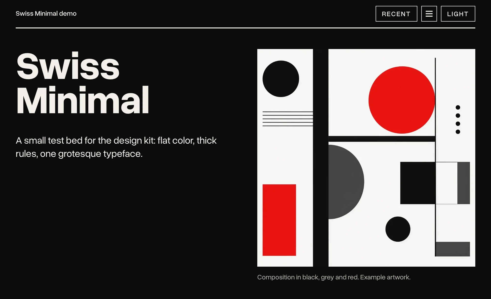
|
|
2
2
|
|
|
3
|
-
[
|
|
4
|
-
[](https://nodejs.org/)
|
|
5
|
-
[](https://astro.build/)
|
|
6
|
-
[](https://tailwindcss.com/)
|
|
7
|
-
[](LICENSE)
|
|
8
|
-
[](https://github.com/danny-englander/agentic-design-kits/commits/main)
|
|
3
|
+
[swissminimal.ch](https://www.swissminimal.ch)
|
|
9
4
|
|
|
10
|
-
|
|
5
|
+
# Swiss Minimal Design Kit
|
|
11
6
|
|
|
12
|
-
A kit
|
|
7
|
+
A design kit your AI agent can implement, for Astro and Tailwind v4. Swiss / Bauhaus: type-led, flat color, thick rules, one typeface.
|
|
13
8
|
|
|
14
|
-
|
|
9
|
+
It is not a library of components to copy and paste. It is a set of rules, and an agent that follows them: what each color is for, which weights to use, where a rule goes, and when not to add anything at all. Say what the site should do, and a coding agent picks the components, writes the code and checks it against the rules. See [Agents](https://www.swissminimal.ch/agents/) on the demo site.
|
|
15
10
|
|
|
16
|
-
|
|
17
|
-
| --- | --- | --- | --- |
|
|
18
|
-
| **Swiss Minimal** | [swissminimal.ch](https://www.swissminimal.ch) | Swiss / Bauhaus: type-led, flat color, thick rules, one typeface (Overused Grotesk). One accent for each site, vermilion or verdigris. | the repository's root |
|
|
19
|
-
| **Verdigris** | [verdigris.ch](https://verdigris.ch) | Swiss Minimal's strict grid, set in Cormorant, in copper green and copper, with engraved line work. No capitals anywhere. | [`verdigris/`](verdigris) |
|
|
11
|
+
Swiss Minimal is one of the [Agentic Design Kits](https://github.com/danny-englander/agentic-design-kits). [Verdigris](https://www.npmjs.com/package/@agentic-design-kits/verdigris) is built on it.
|
|
20
12
|
|
|
21
|
-
|
|
22
|
-
|
|
23
|
-
Each demo site has an Agents page with prompts to start from: [swissminimal.ch/agents](https://www.swissminimal.ch/agents/) and [verdigris.ch/agents](https://verdigris.ch/agents/).
|
|
24
|
-
|
|
25
|
-
## What a kit is made of
|
|
26
|
-
|
|
27
|
-
Each kit has the same parts, written so that an agent can read them and a person can check the result.
|
|
28
|
-
|
|
29
|
-
- **`DESIGN.md`:** the rules (color, type, layout, images, motion, accessibility, the Tailwind setup) and a "Do not" list.
|
|
30
|
-
- **`COMPONENTS.md`:** the markup, behavior and do's and don'ts for each component.
|
|
31
|
-
- **`AGENTS.md`** (also `CLAUDE.md`): notes for AI agents on three tasks: working on the kit, starting a new site with it, and restyling an existing one.
|
|
32
|
-
- **`tokens.json`:** every token value, light and dark, with a note on what each is for.
|
|
33
|
-
- **`kit/`:** the CSS (plain, with a Tailwind v4 entry point), a few small plain scripts and the Astro components.
|
|
34
|
-
- **`fonts/`:** the kit's typeface.
|
|
35
|
-
- **`demo/`:** a small Astro site that uses every component, and the tests that scan it.
|
|
36
|
-
|
|
37
|
-
## In this repository
|
|
38
|
-
|
|
39
|
-
The repository is one npm workspace. Each demo installs its kit as a package through that workspace, so it always runs the files in `kit/` and `fonts/` beside it.
|
|
40
|
-
|
|
41
|
-
**Swiss Minimal**, at the root:
|
|
42
|
-
|
|
43
|
-
- [`DESIGN.md`](DESIGN.md), [`COMPONENTS.md`](COMPONENTS.md), [`AGENTS.md`](AGENTS.md) and [`tokens.json`](tokens.json).
|
|
44
|
-
- [`kit/`](kit): `tailwind.css`, `theme.css`, the scripts (`panel.js`, `new-dot.js`, `drawer.js`, `jump.js`, `marquee.js`, `file-pick.js`, `output.js`, `dialog.js`, `favorites.js`, `icon-controls.js`) and the Astro components.
|
|
45
|
-
- [`fonts/`](fonts): Overused Grotesk, and Source Code Pro for code (both SIL OFL 1.1).
|
|
46
|
-
- [`demo/`](demo): the site at swissminimal.ch.
|
|
47
|
-
|
|
48
|
-
**Verdigris**, in [`verdigris/`](verdigris), with its own [`README`](verdigris/README.md):
|
|
49
|
-
|
|
50
|
-
- [`DESIGN.md`](verdigris/DESIGN.md), [`COMPONENTS.md`](verdigris/COMPONENTS.md), [`AGENTS.md`](verdigris/AGENTS.md) and [`tokens.json`](verdigris/tokens.json).
|
|
51
|
-
- [`verdigris/kit/`](verdigris/kit): only what makes it Verdigris: `tailwind.css`, `verdigris.css`, `fonts.css` and the components written there (`BaseLayout`, `Mark`, `Rosette`). `kit/shared/` passes on Swiss Minimal's components and scripts, so a site imports all of them from `@agentic-design-kits/verdigris`.
|
|
52
|
-
- [`verdigris/fonts/`](verdigris/fonts): Cormorant (SIL OFL 1.1).
|
|
53
|
-
- [`verdigris/demo/`](verdigris/demo): the site at verdigris.ch.
|
|
54
|
-
|
|
55
|
-
**For both kits:**
|
|
56
|
-
|
|
57
|
-
- [`TOOLING.md`](TOOLING.md): recipes for accessibility tests (Playwright and axe) and date-tagged releases, and a manual checklist.
|
|
58
|
-
- [`scripts/`](scripts): the release and packing scripts.
|
|
59
|
-
|
|
60
|
-
## Install a kit
|
|
61
|
-
|
|
62
|
-
Both kits are on npm, under the `@agentic-design-kits` scope.
|
|
63
|
-
|
|
64
|
-
Swiss Minimal:
|
|
13
|
+
## Install
|
|
65
14
|
|
|
66
15
|
```bash
|
|
67
16
|
npm install @agentic-design-kits/swiss-minimal
|
|
@@ -71,61 +20,33 @@ npm install @agentic-design-kits/swiss-minimal
|
|
|
71
20
|
@import "@agentic-design-kits/swiss-minimal/tailwind.css";
|
|
72
21
|
```
|
|
73
22
|
|
|
74
|
-
|
|
75
|
-
|
|
76
|
-
```bash
|
|
77
|
-
npm install @agentic-design-kits/verdigris
|
|
78
|
-
```
|
|
79
|
-
|
|
80
|
-
```css
|
|
81
|
-
@import "@agentic-design-kits/verdigris/tailwind.css";
|
|
82
|
-
```
|
|
83
|
-
|
|
84
|
-
To update, run `npm update`, or the same command again. Versions follow the release date: `2026.1113.0` is the first release on 13 November 2026, and `2026.1113.1` a second that day. The steps after that (the layout, the menu, a blog, code in Markdown) are under "Starting a new site with the kit" in each kit's `AGENTS.md`.
|
|
85
|
-
|
|
86
|
-
## Run a demo
|
|
87
|
-
|
|
88
|
-
Needs Node 24 or later (each demo's `.nvmrc` pins 24). Swiss Minimal:
|
|
23
|
+
That one import, at the top of the site's global stylesheet, loads Tailwind and the kit. Components, types and scripts are imported by name:
|
|
89
24
|
|
|
90
|
-
```
|
|
91
|
-
|
|
92
|
-
|
|
93
|
-
|
|
94
|
-
|
|
25
|
+
```astro
|
|
26
|
+
---
|
|
27
|
+
import BaseLayout from '@agentic-design-kits/swiss-minimal/astro/BaseLayout.astro';
|
|
28
|
+
import Hero from '@agentic-design-kits/swiss-minimal/astro/Hero.astro';
|
|
29
|
+
import type { MenuItem } from '@agentic-design-kits/swiss-minimal/types';
|
|
30
|
+
---
|
|
95
31
|
```
|
|
96
32
|
|
|
97
|
-
|
|
33
|
+
To update, run `npm update`. Versions follow the release date: `2026.1113.0` is the first release on 13 November 2026, and `2026.1113.1` a second that day.
|
|
98
34
|
|
|
99
|
-
|
|
35
|
+
Each site picks one accent: vermilion (the default, a red leaning toward orange) or verdigris (the blue-green of copper patina), with `<BaseLayout accent="verdigris">` or `<html data-accent="verdigris">`.
|
|
100
36
|
|
|
101
|
-
|
|
37
|
+
## In the package
|
|
102
38
|
|
|
103
|
-
|
|
104
|
-
|
|
105
|
-
|
|
106
|
-
|
|
107
|
-
|
|
39
|
+
- `DESIGN.md`: the rules (color, type, layout, images, motion, accessibility, the Tailwind setup) and a "Do not" list. Read it first.
|
|
40
|
+
- `COMPONENTS.md`: the markup, behavior and do's and don'ts for each component.
|
|
41
|
+
- `TOOLING.md`: recipes for accessibility tests (Playwright and axe), and a manual checklist.
|
|
42
|
+
- `tokens.json`: every token value, light and dark, for both accents.
|
|
43
|
+
- `kit/`: `tailwind.css`, `theme.css`, a few small plain scripts and the Astro components.
|
|
44
|
+
- `fonts/`: Overused Grotesk, and Source Code Pro for code.
|
|
108
45
|
|
|
109
|
-
For
|
|
110
|
-
|
|
111
|
-
```bash
|
|
112
|
-
npm run shared
|
|
113
|
-
```
|
|
114
|
-
|
|
115
|
-
## Releases
|
|
116
|
-
|
|
117
|
-
Each release is a date tag on main (`v2026.10.19`, or `v2026.10.19.2` for a second that day) with a GitHub Release. One release covers both kits: its notes come from each demo's Features list (`demo/src/data/features.ts` and `verdigris/demo/src/data/features.ts`), and both kits are published to npm (`@agentic-design-kits/swiss-minimal`, `@agentic-design-kits/verdigris`) with the date as their version. At the repository's root:
|
|
118
|
-
|
|
119
|
-
```bash
|
|
120
|
-
npm run release -- --dry-run
|
|
121
|
-
```
|
|
122
|
-
|
|
123
|
-
```bash
|
|
124
|
-
npm run release
|
|
125
|
-
```
|
|
46
|
+
## For AI agents
|
|
126
47
|
|
|
127
|
-
The
|
|
48
|
+
The notes for agents are in the repository: [AGENTS.md](https://github.com/danny-englander/agentic-design-kits/blob/main/AGENTS.md) covers starting a new site with the kit and restyling an existing one. The demo site's [Agents](https://www.swissminimal.ch/agents/) page has prompts to start from.
|
|
128
49
|
|
|
129
50
|
## License
|
|
130
51
|
|
|
131
|
-
MIT
|
|
52
|
+
MIT. The fonts keep their own license, SIL OFL 1.1; each license file is beside its font in `fonts/`.
|
|
@@ -1,9 +1,10 @@
|
|
|
1
1
|
---
|
|
2
|
-
// One post at the top of a blog's index (PostFeature in COMPONENTS.md)
|
|
3
|
-
//
|
|
4
|
-
//
|
|
5
|
-
//
|
|
6
|
-
// image
|
|
2
|
+
// One post at the top of a blog's index (PostFeature in COMPONENTS.md), where a Hero would go,
|
|
3
|
+
// before the PostList of the other posts. Two layouts, picked by the image's shape unless
|
|
4
|
+
// `layout` says otherwise: a square or portrait image sits beside the text, 50/50 from 768px and
|
|
5
|
+
// cropped square; a landscape image goes under text that runs the full width, cropped 16:9.
|
|
6
|
+
// Import the image so Astro knows its size. For something other than a raster image, such as an
|
|
7
|
+
// SVG that follows the theme, leave out image and alt and fill the media slot instead.
|
|
7
8
|
import { Image } from 'astro:assets';
|
|
8
9
|
import type { ImageMetadata } from 'astro';
|
|
9
10
|
import type { Post } from './types';
|
|
@@ -18,8 +19,12 @@ interface Props {
|
|
|
18
19
|
/** The button's text. One or two words. */
|
|
19
20
|
action?: string;
|
|
20
21
|
level?: 'h1' | 'h2';
|
|
22
|
+
/** 'split': text beside a square image. 'wide': full-width text over a 16:9 image. By default,
|
|
23
|
+
* wide for a landscape image and split for any other. */
|
|
24
|
+
layout?: 'split' | 'wide';
|
|
21
25
|
}
|
|
22
26
|
const { post, image, alt, label = 'Featured', action = 'Read post', level: Title = 'h2' } = Astro.props;
|
|
27
|
+
const wide = (Astro.props.layout ?? (image && image.width > image.height ? 'wide' : 'split')) === 'wide';
|
|
23
28
|
|
|
24
29
|
// Dates are plain days, so format them in UTC or they can slip back a day.
|
|
25
30
|
const date = new Date(post.date).toLocaleDateString('en-US', {
|
|
@@ -30,7 +35,7 @@ const date = new Date(post.date).toLocaleDateString('en-US', {
|
|
|
30
35
|
});
|
|
31
36
|
---
|
|
32
37
|
|
|
33
|
-
<article class=
|
|
38
|
+
<article class:list={['post-feature', { 'post-feature--wide': wide }]}>
|
|
34
39
|
<div>
|
|
35
40
|
<p class="post-feature-label">{label}</p>
|
|
36
41
|
<Title class="post-feature-title">
|
|
@@ -46,11 +51,11 @@ const date = new Date(post.date).toLocaleDateString('en-US', {
|
|
|
46
51
|
{
|
|
47
52
|
image && (
|
|
48
53
|
<Image
|
|
49
|
-
class=
|
|
54
|
+
class:list={['media', wide ? 'media--16x9' : 'media--1x1']}
|
|
50
55
|
src={image}
|
|
51
56
|
alt={alt ?? ''}
|
|
52
|
-
widths={[480, 800, 1200, 1600].filter((w) => w <= image.width)}
|
|
53
|
-
sizes=
|
|
57
|
+
widths={[480, 800, 1200, 1600, 2000].filter((w) => w <= image.width)}
|
|
58
|
+
sizes={wide ? '(min-width: 88rem) 88rem, 100vw' : '(min-width: 768px) 50vw, 100vw'}
|
|
54
59
|
loading="eager"
|
|
55
60
|
fetchpriority="high"
|
|
56
61
|
/>
|
package/kit/theme.css
CHANGED
|
@@ -420,6 +420,8 @@ html[data-drawer-open] .topbar { --tb-bg: var(--bar); --tb-fg: var(--bar-ink); }
|
|
|
420
420
|
transition: background-color 150ms, color 150ms;
|
|
421
421
|
}
|
|
422
422
|
.chip:hover, .chip[aria-pressed="true"] { background: var(--ink); color: var(--paper); }
|
|
423
|
+
.chip:disabled { opacity: 0.6; } /* faded like a disabled .choice */
|
|
424
|
+
.chip:disabled:hover { background: transparent; color: var(--ink); } /* and it doesn't fill */
|
|
423
425
|
.chip-count { font-size: var(--size-100); font-variant-numeric: tabular-nums; opacity: 0.75; } /* how many items it shows */
|
|
424
426
|
.chip-group { display: flex; flex-wrap: wrap; gap: 0.5rem; }
|
|
425
427
|
|
|
@@ -729,7 +731,7 @@ html[data-drawer-open] { overflow: hidden; } /* stop the page scrolling behind
|
|
|
729
731
|
.post-list > li:last-child { border-bottom: 0; }
|
|
730
732
|
@media (min-width: 640px) { .post-list > li { grid-template-columns: 10rem minmax(0, 1fr); } }
|
|
731
733
|
.post-list time {
|
|
732
|
-
font-size: var(--size-
|
|
734
|
+
font-size: var(--size-200); font-weight: var(--weight-medium); line-height: 1.375;
|
|
733
735
|
font-variant-numeric: tabular-nums; color: var(--muted);
|
|
734
736
|
}
|
|
735
737
|
@media (min-width: 640px) { .post-list time { padding-top: 0.5rem; } }
|
|
@@ -770,7 +772,7 @@ html[data-drawer-open] { overflow: hidden; } /* stop the page scrolling behind
|
|
|
770
772
|
|
|
771
773
|
/* ---------- Post feature: one post at the top of a blog's index ---------- */
|
|
772
774
|
/* Built like .hero--split: text and a square image 50/50 from 768px, stacked text first on
|
|
773
|
-
phones, with a hero's space around it. A small accent-text label, the title as a link, the
|
|
775
|
+
phones, with a hero's space around it (.post-feature--wide, below, stacks it at every width). A small accent-text label, the title as a link, the
|
|
774
776
|
summary in lead size, a meta line and the primary button. The image is cropped square. */
|
|
775
777
|
.post-feature { display: grid; gap: 2.5rem; padding: 3rem 0 4rem 0; }
|
|
776
778
|
@media (min-width: 768px) {
|
|
@@ -778,7 +780,7 @@ html[data-drawer-open] { overflow: hidden; } /* stop the page scrolling behind
|
|
|
778
780
|
}
|
|
779
781
|
.post-feature-label {
|
|
780
782
|
margin: 0;
|
|
781
|
-
font-size: var(--size-
|
|
783
|
+
font-size: var(--size-200); font-weight: var(--weight-strong); letter-spacing: var(--label-tracking); text-transform: var(--label-case);
|
|
782
784
|
color: var(--accent-text);
|
|
783
785
|
}
|
|
784
786
|
.post-feature-title {
|
|
@@ -789,8 +791,12 @@ html[data-drawer-open] { overflow: hidden; } /* stop the page scrolling behind
|
|
|
789
791
|
.post-feature-title a { color: inherit; text-decoration: none; }
|
|
790
792
|
.post-feature-title a:hover { text-decoration: underline; text-decoration-thickness: 3px; text-underline-offset: 0.12em; }
|
|
791
793
|
.post-feature-summary { margin: 1.5rem 0 0 0; max-width: 32rem; }
|
|
792
|
-
.post-feature-meta { margin: 1rem 0 0 0; font-size: var(--size-
|
|
794
|
+
.post-feature-meta { margin: 1rem 0 0 0; font-size: var(--size-200); line-height: 1.375; color: var(--muted); }
|
|
793
795
|
.post-feature .btn { margin-top: 2rem; text-decoration: none; }
|
|
796
|
+
/* Wide: the text runs the full width, the summary at a longer measure, and the image goes under
|
|
797
|
+
it cropped 16:9. For a landscape image. */
|
|
798
|
+
@media (min-width: 768px) { .post-feature--wide { grid-template-columns: minmax(0, 1fr); gap: 3.5rem; } }
|
|
799
|
+
.post-feature--wide .post-feature-summary { max-width: 48rem; }
|
|
794
800
|
|
|
795
801
|
/* ---------- Post header: the top of an article ---------- */
|
|
796
802
|
/* A small label back to the index, the title (between page-title and h2 in size, since titles
|
package/package.json
CHANGED
|
@@ -1,6 +1,6 @@
|
|
|
1
1
|
{
|
|
2
2
|
"name": "@agentic-design-kits/swiss-minimal",
|
|
3
|
-
"version": "2026.
|
|
3
|
+
"version": "2026.1114.0",
|
|
4
4
|
"description": "A type-led design kit: plain CSS, a few small scripts and Astro components, for Tailwind v4 sites.",
|
|
5
5
|
"license": "MIT",
|
|
6
6
|
"author": "Danny Englander",
|