@agentic-design-kits/swiss-minimal 2026.1113.0 → 2026.1113.2
This diff represents the content of publicly available package versions that have been released to one of the supported registries. The information contained in this diff is provided for informational purposes only and reflects changes between package versions as they appear in their respective public registries.
- package/README.md +26 -105
- package/kit/astro/BaseLayout.astro +1 -1
- package/package.json +1 -1
package/README.md
CHANGED
|
@@ -1,67 +1,16 @@
|
|
|
1
|
-
|
|
1
|
+
|
|
2
2
|
|
|
3
|
-
[
|
|
4
|
-
[](https://nodejs.org/)
|
|
5
|
-
[](https://astro.build/)
|
|
6
|
-
[](https://tailwindcss.com/)
|
|
7
|
-
[](LICENSE)
|
|
8
|
-
[](https://github.com/danny-englander/agentic-design-kits/commits/main)
|
|
3
|
+
[swissminimal.ch](https://www.swissminimal.ch)
|
|
9
4
|
|
|
10
|
-
|
|
5
|
+
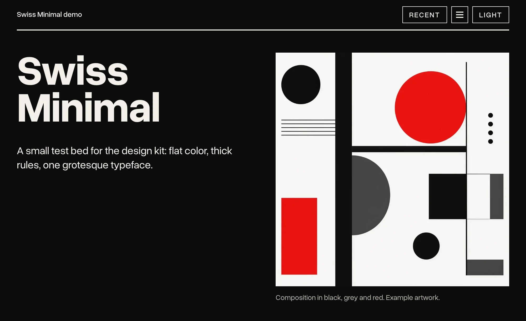
# Swiss Minimal Design Kit
|
|
11
6
|
|
|
12
|
-
A kit
|
|
7
|
+
A design kit your AI agent can implement, for Astro and Tailwind v4. Swiss / Bauhaus: type-led, flat color, thick rules, one typeface.
|
|
13
8
|
|
|
14
|
-
|
|
9
|
+
It is not a library of components to copy and paste. It is a set of rules, and an agent that follows them: what each color is for, which weights to use, where a rule goes, and when not to add anything at all. Say what the site should do, and a coding agent picks the components, writes the code and checks it against the rules. See [Agents](https://www.swissminimal.ch/agents/) on the demo site.
|
|
15
10
|
|
|
16
|
-
|
|
17
|
-
| --- | --- | --- | --- |
|
|
18
|
-
| **Swiss Minimal** | [swissminimal.ch](https://www.swissminimal.ch) | Swiss / Bauhaus: type-led, flat color, thick rules, one typeface (Overused Grotesk). One accent for each site, vermilion or verdigris. | the repository's root |
|
|
19
|
-
| **Verdigris** | [verdigris.ch](https://verdigris.ch) | Swiss Minimal's strict grid, set in Cormorant, in copper green and copper, with engraved line work. No capitals anywhere. | [`verdigris/`](verdigris) |
|
|
11
|
+
Swiss Minimal is one of the [Agentic Design Kits](https://github.com/danny-englander/agentic-design-kits). [Verdigris](https://www.npmjs.com/package/@agentic-design-kits/verdigris) is built on it.
|
|
20
12
|
|
|
21
|
-
|
|
22
|
-
|
|
23
|
-
Each demo site has an Agents page with prompts to start from: [swissminimal.ch/agents](https://www.swissminimal.ch/agents/) and [verdigris.ch/agents](https://verdigris.ch/agents/).
|
|
24
|
-
|
|
25
|
-
## What a kit is made of
|
|
26
|
-
|
|
27
|
-
Each kit has the same parts, written so that an agent can read them and a person can check the result.
|
|
28
|
-
|
|
29
|
-
- **`DESIGN.md`:** the rules (color, type, layout, images, motion, accessibility, the Tailwind setup) and a "Do not" list.
|
|
30
|
-
- **`COMPONENTS.md`:** the markup, behavior and do's and don'ts for each component.
|
|
31
|
-
- **`AGENTS.md`** (also `CLAUDE.md`): notes for AI agents on three tasks: working on the kit, starting a new site with it, and restyling an existing one.
|
|
32
|
-
- **`tokens.json`:** every token value, light and dark, with a note on what each is for.
|
|
33
|
-
- **`kit/`:** the CSS (plain, with a Tailwind v4 entry point), a few small plain scripts and the Astro components.
|
|
34
|
-
- **`fonts/`:** the kit's typeface.
|
|
35
|
-
- **`demo/`:** a small Astro site that uses every component, and the tests that scan it.
|
|
36
|
-
|
|
37
|
-
## In this repository
|
|
38
|
-
|
|
39
|
-
The repository is one npm workspace. Each demo installs its kit as a package through that workspace, so it always runs the files in `kit/` and `fonts/` beside it.
|
|
40
|
-
|
|
41
|
-
**Swiss Minimal**, at the root:
|
|
42
|
-
|
|
43
|
-
- [`DESIGN.md`](DESIGN.md), [`COMPONENTS.md`](COMPONENTS.md), [`AGENTS.md`](AGENTS.md) and [`tokens.json`](tokens.json).
|
|
44
|
-
- [`kit/`](kit): `tailwind.css`, `theme.css`, the scripts (`panel.js`, `new-dot.js`, `drawer.js`, `jump.js`, `marquee.js`, `file-pick.js`, `output.js`, `dialog.js`, `favorites.js`, `icon-controls.js`) and the Astro components.
|
|
45
|
-
- [`fonts/`](fonts): Overused Grotesk, and Source Code Pro for code (both SIL OFL 1.1).
|
|
46
|
-
- [`demo/`](demo): the site at swissminimal.ch.
|
|
47
|
-
|
|
48
|
-
**Verdigris**, in [`verdigris/`](verdigris), with its own [`README`](verdigris/README.md):
|
|
49
|
-
|
|
50
|
-
- [`DESIGN.md`](verdigris/DESIGN.md), [`COMPONENTS.md`](verdigris/COMPONENTS.md), [`AGENTS.md`](verdigris/AGENTS.md) and [`tokens.json`](verdigris/tokens.json).
|
|
51
|
-
- [`verdigris/kit/`](verdigris/kit): only what makes it Verdigris: `tailwind.css`, `verdigris.css`, `fonts.css` and the components written there (`BaseLayout`, `Mark`, `Rosette`). `kit/shared/` passes on Swiss Minimal's components and scripts, so a site imports all of them from `@agentic-design-kits/verdigris`.
|
|
52
|
-
- [`verdigris/fonts/`](verdigris/fonts): Cormorant (SIL OFL 1.1).
|
|
53
|
-
- [`verdigris/demo/`](verdigris/demo): the site at verdigris.ch.
|
|
54
|
-
|
|
55
|
-
**For both kits:**
|
|
56
|
-
|
|
57
|
-
- [`TOOLING.md`](TOOLING.md): recipes for accessibility tests (Playwright and axe) and date-tagged releases, and a manual checklist.
|
|
58
|
-
- [`scripts/`](scripts): the release and packing scripts.
|
|
59
|
-
|
|
60
|
-
## Install a kit
|
|
61
|
-
|
|
62
|
-
Both kits are on npm, under the `@agentic-design-kits` scope.
|
|
63
|
-
|
|
64
|
-
Swiss Minimal:
|
|
13
|
+
## Install
|
|
65
14
|
|
|
66
15
|
```bash
|
|
67
16
|
npm install @agentic-design-kits/swiss-minimal
|
|
@@ -71,61 +20,33 @@ npm install @agentic-design-kits/swiss-minimal
|
|
|
71
20
|
@import "@agentic-design-kits/swiss-minimal/tailwind.css";
|
|
72
21
|
```
|
|
73
22
|
|
|
74
|
-
|
|
75
|
-
|
|
76
|
-
```bash
|
|
77
|
-
npm install @agentic-design-kits/verdigris
|
|
78
|
-
```
|
|
79
|
-
|
|
80
|
-
```css
|
|
81
|
-
@import "@agentic-design-kits/verdigris/tailwind.css";
|
|
82
|
-
```
|
|
83
|
-
|
|
84
|
-
To update, run `npm update`, or the same command again. Versions follow the release date: `2026.1113.0` is the first release on 13 November 2026, and `2026.1113.1` a second that day. The steps after that (the layout, the menu, a blog, code in Markdown) are under "Starting a new site with the kit" in each kit's `AGENTS.md`.
|
|
85
|
-
|
|
86
|
-
## Run a demo
|
|
87
|
-
|
|
88
|
-
Needs Node 24 or later (each demo's `.nvmrc` pins 24). Swiss Minimal:
|
|
23
|
+
That one import, at the top of the site's global stylesheet, loads Tailwind and the kit. Components, types and scripts are imported by name:
|
|
89
24
|
|
|
90
|
-
```
|
|
91
|
-
|
|
92
|
-
|
|
93
|
-
|
|
94
|
-
|
|
25
|
+
```astro
|
|
26
|
+
---
|
|
27
|
+
import BaseLayout from '@agentic-design-kits/swiss-minimal/astro/BaseLayout.astro';
|
|
28
|
+
import Hero from '@agentic-design-kits/swiss-minimal/astro/Hero.astro';
|
|
29
|
+
import type { MenuItem } from '@agentic-design-kits/swiss-minimal/types';
|
|
30
|
+
---
|
|
95
31
|
```
|
|
96
32
|
|
|
97
|
-
|
|
33
|
+
To update, run `npm update`. Versions follow the release date: `2026.1113.0` is the first release on 13 November 2026, and `2026.1113.1` a second that day.
|
|
98
34
|
|
|
99
|
-
|
|
35
|
+
Each site picks one accent: vermilion (the default, a red leaning toward orange) or verdigris (the blue-green of copper patina), with `<BaseLayout accent="verdigris">` or `<html data-accent="verdigris">`.
|
|
100
36
|
|
|
101
|
-
|
|
37
|
+
## In the package
|
|
102
38
|
|
|
103
|
-
|
|
104
|
-
|
|
105
|
-
|
|
106
|
-
|
|
107
|
-
|
|
39
|
+
- `DESIGN.md`: the rules (color, type, layout, images, motion, accessibility, the Tailwind setup) and a "Do not" list. Read it first.
|
|
40
|
+
- `COMPONENTS.md`: the markup, behavior and do's and don'ts for each component.
|
|
41
|
+
- `TOOLING.md`: recipes for accessibility tests (Playwright and axe), and a manual checklist.
|
|
42
|
+
- `tokens.json`: every token value, light and dark, for both accents.
|
|
43
|
+
- `kit/`: `tailwind.css`, `theme.css`, a few small plain scripts and the Astro components.
|
|
44
|
+
- `fonts/`: Overused Grotesk, and Source Code Pro for code.
|
|
108
45
|
|
|
109
|
-
For
|
|
110
|
-
|
|
111
|
-
```bash
|
|
112
|
-
npm run shared
|
|
113
|
-
```
|
|
114
|
-
|
|
115
|
-
## Releases
|
|
116
|
-
|
|
117
|
-
Each release is a date tag on main (`v2026.10.19`, or `v2026.10.19.2` for a second that day) with a GitHub Release. One release covers both kits: its notes come from each demo's Features list (`demo/src/data/features.ts` and `verdigris/demo/src/data/features.ts`), and both kits are published to npm (`@agentic-design-kits/swiss-minimal`, `@agentic-design-kits/verdigris`) with the date as their version. At the repository's root:
|
|
118
|
-
|
|
119
|
-
```bash
|
|
120
|
-
npm run release -- --dry-run
|
|
121
|
-
```
|
|
122
|
-
|
|
123
|
-
```bash
|
|
124
|
-
npm run release
|
|
125
|
-
```
|
|
46
|
+
## For AI agents
|
|
126
47
|
|
|
127
|
-
The
|
|
48
|
+
The notes for agents are in the repository: [AGENTS.md](https://github.com/danny-englander/agentic-design-kits/blob/main/AGENTS.md) covers starting a new site with the kit and restyling an existing one. The demo site's [Agents](https://www.swissminimal.ch/agents/) page has prompts to start from.
|
|
128
49
|
|
|
129
50
|
## License
|
|
130
51
|
|
|
131
|
-
MIT
|
|
52
|
+
MIT. The fonts keep their own license, SIL OFL 1.1; each license file is beside its font in `fonts/`.
|
|
@@ -89,7 +89,7 @@ const tabContent = await Promise.all(
|
|
|
89
89
|
<a class="skip-link" href="#main">Skip to main content</a>
|
|
90
90
|
<div class="topbar">
|
|
91
91
|
<div class="page">
|
|
92
|
-
<div class="flex items-center justify-between border-b-2 border-current py-3">
|
|
92
|
+
<div class="flex items-center justify-between gap-3 border-b-2 border-current py-3">
|
|
93
93
|
<p class="text-base font-medium">
|
|
94
94
|
{
|
|
95
95
|
homeHref !== false && tagline ? (
|
package/package.json
CHANGED
|
@@ -1,6 +1,6 @@
|
|
|
1
1
|
{
|
|
2
2
|
"name": "@agentic-design-kits/swiss-minimal",
|
|
3
|
-
"version": "2026.1113.
|
|
3
|
+
"version": "2026.1113.2",
|
|
4
4
|
"description": "A type-led design kit: plain CSS, a few small scripts and Astro components, for Tailwind v4 sites.",
|
|
5
5
|
"license": "MIT",
|
|
6
6
|
"author": "Danny Englander",
|