@a4ui/core 0.8.0 → 0.9.0
This diff represents the content of publicly available package versions that have been released to one of the supported registries. The information contained in this diff is provided for informational purposes only and reflects changes between package versions as they appear in their respective public registries.
- package/README.md +83 -29
- package/dist/Checkbox-CC3EGilW.js +173 -0
- package/dist/commerce/CartLine.d.ts +32 -0
- package/dist/commerce/CartSummary.d.ts +32 -0
- package/dist/commerce/FilterGroup.d.ts +28 -0
- package/dist/commerce/PriceTag.d.ts +25 -0
- package/dist/commerce/ProductCard.d.ts +33 -0
- package/dist/commerce/ProductGrid.d.ts +16 -0
- package/dist/commerce/QuantityStepper.d.ts +21 -0
- package/dist/commerce/index.d.ts +7 -0
- package/dist/commerce.js +281 -0
- package/dist/elements.css +71 -0
- package/dist/elements.iife.js +1 -1
- package/dist/elements.js +14 -5
- package/dist/index.d.ts +5 -1
- package/dist/index.js +2410 -2068
- package/dist/ui/Calendar.d.ts +4 -4
- package/dist/ui/DateRangePicker.d.ts +29 -0
- package/dist/ui/DateTimeField.d.ts +28 -0
- package/dist/ui/Form.d.ts +57 -0
- package/dist/ui/TimeField.d.ts +27 -0
- package/dist/ui/internal/CalendarCore.d.ts +26 -0
- package/package.json +22 -6
package/README.md
CHANGED
|
@@ -1,5 +1,9 @@
|
|
|
1
1
|
# A4ui
|
|
2
2
|
|
|
3
|
+
<!-- TODO: hero screenshot / GIF (dark+light, components, SpaceBackground, theme switch) -->
|
|
4
|
+
|
|
5
|
+
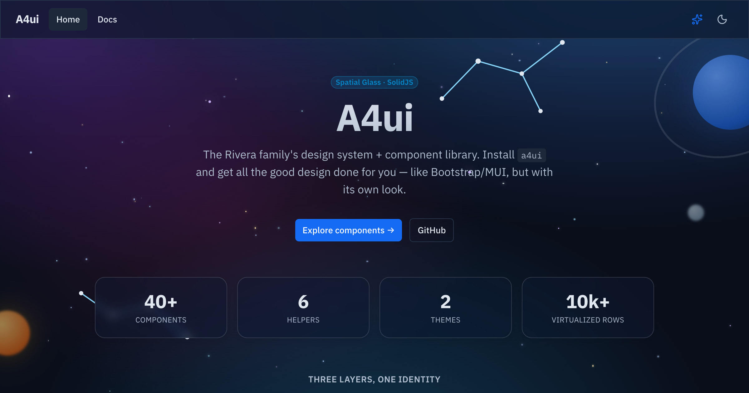
|
|
6
|
+
|
|
3
7
|
[](https://www.npmjs.com/package/@a4ui/core)
|
|
4
8
|
[](./LICENSE)
|
|
5
9
|
[](https://a4uikit.github.io/a4ui/lighthouse.html)
|
|
@@ -9,9 +13,9 @@
|
|
|
9
13
|
[](https://www.npmjs.com/package/@a4ui/core)
|
|
10
14
|
[](https://bundlephobia.com/package/@a4ui/core)
|
|
11
15
|
|
|
12
|
-
**Spatial Glass**
|
|
13
|
-
|
|
14
|
-
people in the Rivera family. 🙂
|
|
16
|
+
Accessible SolidJS **Spatial Glass** component library — 75+ components,
|
|
17
|
+
layouts, runtime themes, a motion system, and framework-agnostic Web
|
|
18
|
+
Components. Named after the 4 people in the Rivera family. 🙂
|
|
15
19
|
|
|
16
20
|
**📚 Docs & live examples:** https://a4uikit.github.io/a4ui/
|
|
17
21
|
|
|
@@ -33,28 +37,48 @@ Peer dependency: `solid-js` (>= 1.9).
|
|
|
33
37
|
|
|
34
38
|
## Use
|
|
35
39
|
|
|
36
|
-
|
|
37
|
-
|
|
38
|
-
import a4ui from '@a4ui/core/preset'
|
|
39
|
-
export default {
|
|
40
|
-
presets: [a4ui],
|
|
41
|
-
content: ['./src/**/*.{ts,tsx}', './node_modules/@a4ui/core/dist/**/*.js'],
|
|
42
|
-
}
|
|
43
|
-
```
|
|
40
|
+
A4ui works **out of the box, with no Tailwind required** — the styles ship
|
|
41
|
+
precompiled in `styles.css`:
|
|
44
42
|
|
|
45
43
|
```tsx
|
|
46
44
|
// entry (once)
|
|
47
45
|
import '@a4ui/core/styles.css'
|
|
48
46
|
|
|
49
47
|
// anywhere
|
|
50
|
-
import { Button
|
|
48
|
+
import { Button } from '@a4ui/core'
|
|
49
|
+
|
|
50
|
+
export default () => <Button variant="primary">Save</Button>
|
|
51
|
+
```
|
|
52
|
+
|
|
53
|
+
Dark is the default; add `data-theme="light"` on `<html>` (or use the
|
|
54
|
+
exported `toggleTheme()` / `<ThemeToggle />`) for the light palette.
|
|
55
|
+
|
|
56
|
+
### Optional: Tailwind preset
|
|
57
|
+
|
|
58
|
+
If your app already uses Tailwind, add the A4ui preset so utilities like
|
|
59
|
+
`bg-primary/90` and the `.card` / `.glow-edge` glass surface classes resolve
|
|
60
|
+
against A4ui's tokens instead of your own config:
|
|
61
|
+
|
|
62
|
+
```js
|
|
63
|
+
// tailwind.config.js
|
|
64
|
+
import a4ui from '@a4ui/core/preset'
|
|
65
|
+
|
|
66
|
+
export default {
|
|
67
|
+
presets: [a4ui],
|
|
68
|
+
content: ['./index.html', './src/**/*.{ts,tsx}', './node_modules/@a4ui/core/dist/**/*.js'],
|
|
69
|
+
}
|
|
51
70
|
```
|
|
52
71
|
|
|
72
|
+
This is purely additive — components render fully styled with just
|
|
73
|
+
`styles.css`; the preset only matters if you also want A4ui's tokens
|
|
74
|
+
available as Tailwind utilities in _your own_ markup.
|
|
75
|
+
|
|
53
76
|
## Customization
|
|
54
77
|
|
|
55
78
|
Colors, radius and fonts are driven by CSS variables (the `@a4ui/core/preset`
|
|
56
|
-
maps Tailwind's semantic names to them). Override any token in
|
|
57
|
-
scope it to `:root` (or `:root[data-theme='light']`) after
|
|
79
|
+
maps Tailwind's semantic names to them, if you use it). Override any token in
|
|
80
|
+
your own CSS — scope it to `:root` (or `:root[data-theme='light']`) after
|
|
81
|
+
importing the styles:
|
|
58
82
|
|
|
59
83
|
```css
|
|
60
84
|
@import '@a4ui/core/styles.css';
|
|
@@ -65,15 +89,12 @@ scope it to `:root` (or `:root[data-theme='light']`) after importing the styles:
|
|
|
65
89
|
}
|
|
66
90
|
```
|
|
67
91
|
|
|
68
|
-
Dark is the default; add `data-theme="light"` on `<html>` (or use the exported
|
|
69
|
-
`toggleTheme()` / `<ThemeToggle />`) for the light palette.
|
|
70
|
-
|
|
71
92
|
### Themes
|
|
72
93
|
|
|
73
94
|
A **theme** is a full color palette (all 15 tokens, dark + light). A4ui ships
|
|
74
|
-
several — `space` (the default), `dino`, `doctor`, `scientist`, `soccer
|
|
75
|
-
you can swap them at runtime; the whole UI recolors
|
|
76
|
-
remembered:
|
|
95
|
+
several — `space` (the default), `dino`, `doctor`, `scientist`, `soccer`,
|
|
96
|
+
`snow`, `christmas` — and you can swap them at runtime; the whole UI recolors
|
|
97
|
+
instantly and the choice is remembered:
|
|
77
98
|
|
|
78
99
|
```tsx
|
|
79
100
|
import { initTheme, selectTheme, themes } from '@a4ui/core'
|
|
@@ -88,6 +109,44 @@ recolors live, then copy the exported CSS or JSON and apply it as a
|
|
|
88
109
|
`ThemeDefinition`. This is separate from the light/dark `setTheme`/`toggleTheme`
|
|
89
110
|
mode switch — a theme recolors underneath either mode.
|
|
90
111
|
|
|
112
|
+
## Components
|
|
113
|
+
|
|
114
|
+
75+ components across six categories (this is a sample — see the
|
|
115
|
+
**[docs site](https://a4uikit.github.io/a4ui/)** or `src/index.ts` for the
|
|
116
|
+
full list):
|
|
117
|
+
|
|
118
|
+
| Category | Representative components |
|
|
119
|
+
| -------------- | ----------------------------------------------------------------------------------------------------- |
|
|
120
|
+
| Forms | `Input`, `Select`, `Checkbox`, `DateField`, `Combobox`, `TagInput`, `Slider`, `NumberInput` |
|
|
121
|
+
| Overlays | `Modal`, `Drawer`, `Popover`, `Tooltip`, `AlertDialog`, `ContextMenu`, `HoverCard` |
|
|
122
|
+
| Data & display | `Table`, `DataGrid`, `Tree`, `Calendar`, `Timeline`, `Stat`, `Descriptions`, `CalendarHeatmap` |
|
|
123
|
+
| Navigation | `Tabs`, `Breadcrumb`, `Pagination`, `Command`, `Anchor`, `Stepper`, `BottomNavigation` |
|
|
124
|
+
| Feedback | `Alert`, `Toast`, `Progress`, `Skeleton`, `Empty`, `Result`, `NotificationCenter` |
|
|
125
|
+
| Layout | `AppShell`, `SpaceBackground`, `ThemedScenery`, `Card`, `Splitter`, `Affix`, `NavGroup` |
|
|
126
|
+
| Commerce | `ProductCard`, `ProductGrid`, `PriceTag`, `QuantityStepper`, `CartLine`, `CartSummary`, `FilterGroup` |
|
|
127
|
+
|
|
128
|
+
Domain-specific sets ship as **subpath entries** so the base package stays lean —
|
|
129
|
+
e.g. commerce components import from `@a4ui/core/commerce`:
|
|
130
|
+
|
|
131
|
+
```tsx
|
|
132
|
+
import { ProductCard, CartSummary } from '@a4ui/core/commerce'
|
|
133
|
+
```
|
|
134
|
+
|
|
135
|
+
## Why A4ui
|
|
136
|
+
|
|
137
|
+
| | **A4ui** | Kobalte | shadcn-solid | Hope UI |
|
|
138
|
+
| ----------------------- | -------------------------------------------------- | ---------------------- | --------------------------------- | ---------------------- |
|
|
139
|
+
| Styled components | ✅ ships styled, ready to use | ❌ unstyled primitives | ⚠️ copy-paste into your repo | ✅ styled |
|
|
140
|
+
| Web Components bundle | ✅ `@a4ui/core/elements`, framework-agnostic | ❌ | ❌ | ❌ |
|
|
141
|
+
| Built-in runtime themes | ✅ multiple palettes + live theme builder | ❌ | ❌ (edit CSS vars by hand) | ⚠️ static theme config |
|
|
142
|
+
| Motion system | ✅ transitions, count-up, calm/reduced-motion mode | ❌ (behavior only) | ❌ | ⚠️ minimal |
|
|
143
|
+
| AI-agent docs | ✅ `llms.txt` + JSDoc `@example` in `.d.ts` | ❌ | ❌ | ❌ |
|
|
144
|
+
| Glass visual identity | ✅ signature Spatial Glass look | ❌ (no visuals) | ⚠️ depends on your Tailwind theme | ❌ |
|
|
145
|
+
|
|
146
|
+
Kobalte is what A4ui builds _on_ for behavior/a11y — not a competitor so much
|
|
147
|
+
as a foundation. shadcn-solid and Hope UI are solid choices if you want a
|
|
148
|
+
different look or prefer owning the component source directly.
|
|
149
|
+
|
|
91
150
|
## Framework integration
|
|
92
151
|
|
|
93
152
|
A4ui is a **SolidJS** library. It works natively in **Vite + Solid**,
|
|
@@ -111,13 +170,6 @@ starfield and theme rely on the DOM/`localStorage`). Importing the package is
|
|
|
111
170
|
SSR-safe (no crash at import), but for **SolidStart** render the components on the
|
|
112
171
|
client, e.g. via `clientOnly(() => import('...'))`.
|
|
113
172
|
|
|
114
|
-
## What's inside
|
|
115
|
-
|
|
116
|
-
~40 components across actions, forms, data, overlays, feedback, navigation and
|
|
117
|
-
layout — plus a virtualized list, motion helpers, and a generic `AppShell` with
|
|
118
|
-
the animated `SpaceBackground`. Browse them all (with live prop controls and
|
|
119
|
-
copyable code) in the **[docs site](https://a4uikit.github.io/a4ui/)**.
|
|
120
|
-
|
|
121
173
|
## Using with AI agents
|
|
122
174
|
|
|
123
175
|
Everything an AI coding agent (Claude Code, Codex, Cursor, …) needs to use A4ui
|
|
@@ -133,8 +185,8 @@ Drop this into your project's `AGENTS.md` / `CLAUDE.md` to prime your agent:
|
|
|
133
185
|
|
|
134
186
|
> This project uses **@a4ui/core** (SolidJS design system). Import components as
|
|
135
187
|
> named exports from `@a4ui/core`; import `@a4ui/core/styles.css` once in the app
|
|
136
|
-
> entry; add `@a4ui/core/preset` to `tailwind.config
|
|
137
|
-
> JSDoc/`@example` in the package's `.d.ts`. Full component list:
|
|
188
|
+
> entry; add `@a4ui/core/preset` to `tailwind.config` (optional). Props are typed
|
|
189
|
+
> with JSDoc/`@example` in the package's `.d.ts`. Full component list:
|
|
138
190
|
> https://a4uikit.github.io/a4ui/llms.txt
|
|
139
191
|
|
|
140
192
|
## Develop
|
|
@@ -154,3 +206,5 @@ See **[CONTRIBUTING.md](./CONTRIBUTING.md)** and **[AGENTS.md](./AGENTS.md)**.
|
|
|
154
206
|
## License
|
|
155
207
|
|
|
156
208
|
[MIT](./LICENSE) © Luis Alfredo Rivera Acuña
|
|
209
|
+
</content>
|
|
210
|
+
</invoke>
|
|
@@ -0,0 +1,173 @@
|
|
|
1
|
+
import { spread as g, mergeProps as f, insert as i, template as d, createComponent as v, effect as h, setAttribute as x, className as y, delegateEvents as E } from "solid-js/web";
|
|
2
|
+
import { splitProps as m, createSignal as S, Show as L, For as p } from "solid-js";
|
|
3
|
+
import { Star as C } from "lucide-solid";
|
|
4
|
+
import { clsx as B } from "clsx";
|
|
5
|
+
import { twMerge as R } from "tailwind-merge";
|
|
6
|
+
function c(...e) {
|
|
7
|
+
return R(B(e));
|
|
8
|
+
}
|
|
9
|
+
var T = /* @__PURE__ */ d("<span>");
|
|
10
|
+
const D = {
|
|
11
|
+
neutral: "bg-muted text-muted-foreground ring-border",
|
|
12
|
+
success: "bg-emerald-500/15 text-emerald-600 ring-emerald-500/30",
|
|
13
|
+
warning: "bg-amber-500/15 text-amber-600 ring-amber-500/30",
|
|
14
|
+
danger: "bg-rose-500/15 text-rose-600 ring-rose-500/30",
|
|
15
|
+
info: "bg-sky-500/15 text-sky-600 ring-sky-500/30"
|
|
16
|
+
}, N = "badge inline-flex items-center gap-1 rounded-full px-2 py-0.5 text-xs font-semibold ring-1 ring-inset whitespace-nowrap";
|
|
17
|
+
function K(e) {
|
|
18
|
+
const [r, n] = m(e, ["tone", "class", "children"]);
|
|
19
|
+
return (() => {
|
|
20
|
+
var t = T();
|
|
21
|
+
return g(t, f({
|
|
22
|
+
get class() {
|
|
23
|
+
return c(N, D[r.tone ?? "neutral"], r.class);
|
|
24
|
+
}
|
|
25
|
+
}, n), !1, !0), i(t, () => r.children), t;
|
|
26
|
+
})();
|
|
27
|
+
}
|
|
28
|
+
var M = /* @__PURE__ */ d("<button>");
|
|
29
|
+
const G = {
|
|
30
|
+
primary: "bg-primary text-primary-foreground hover:bg-primary/90",
|
|
31
|
+
secondary: "bg-muted text-foreground hover:bg-muted/70",
|
|
32
|
+
outline: "border border-border bg-transparent text-foreground hover:bg-muted",
|
|
33
|
+
ghost: "bg-transparent text-foreground hover:bg-muted"
|
|
34
|
+
}, H = "inline-flex items-center justify-center rounded-md px-3 py-2 text-sm font-medium transition-[color,background-color,transform] duration-150 active:scale-[0.97] focus:outline-none focus:ring-2 focus:ring-ring disabled:pointer-events-none disabled:opacity-50";
|
|
35
|
+
function Q(e) {
|
|
36
|
+
const [r, n] = m(e, ["variant", "class", "type", "children"]);
|
|
37
|
+
return (() => {
|
|
38
|
+
var t = M();
|
|
39
|
+
return g(t, f({
|
|
40
|
+
get type() {
|
|
41
|
+
return r.type ?? "button";
|
|
42
|
+
},
|
|
43
|
+
get class() {
|
|
44
|
+
return c(H, G[r.variant ?? "primary"], r.class);
|
|
45
|
+
}
|
|
46
|
+
}, n), !1, !0), i(t, () => r.children), t;
|
|
47
|
+
})();
|
|
48
|
+
}
|
|
49
|
+
var $ = /* @__PURE__ */ d("<div>"), O = /* @__PURE__ */ d("<h2>");
|
|
50
|
+
function W(e) {
|
|
51
|
+
const [r, n] = m(e, ["class", "children", "glass", "glow"]), t = () => (r.glow ?? r.glass) === !0;
|
|
52
|
+
return (() => {
|
|
53
|
+
var u = $();
|
|
54
|
+
return g(u, f({
|
|
55
|
+
get class() {
|
|
56
|
+
return c(r.glass ? "card rounded-xl text-card-foreground" : "rounded-xl border border-border bg-card text-card-foreground shadow-sm", t() && "glow-edge", r.class);
|
|
57
|
+
}
|
|
58
|
+
}, n), !1, !0), i(u, () => r.children), u;
|
|
59
|
+
})();
|
|
60
|
+
}
|
|
61
|
+
function X(e) {
|
|
62
|
+
const [r, n] = m(e, ["class", "children"]);
|
|
63
|
+
return (() => {
|
|
64
|
+
var t = $();
|
|
65
|
+
return g(t, f({
|
|
66
|
+
get class() {
|
|
67
|
+
return c("flex flex-col space-y-1.5 p-6", r.class);
|
|
68
|
+
}
|
|
69
|
+
}, n), !1, !0), i(t, () => r.children), t;
|
|
70
|
+
})();
|
|
71
|
+
}
|
|
72
|
+
function Y(e) {
|
|
73
|
+
const [r, n] = m(e, ["class", "children"]);
|
|
74
|
+
return (() => {
|
|
75
|
+
var t = O();
|
|
76
|
+
return g(t, f({
|
|
77
|
+
get class() {
|
|
78
|
+
return c("text-lg font-semibold leading-none tracking-tight", r.class);
|
|
79
|
+
}
|
|
80
|
+
}, n), !1, !0), i(t, () => r.children), t;
|
|
81
|
+
})();
|
|
82
|
+
}
|
|
83
|
+
function Z(e) {
|
|
84
|
+
const [r, n] = m(e, ["class", "children"]);
|
|
85
|
+
return (() => {
|
|
86
|
+
var t = $();
|
|
87
|
+
return g(t, f({
|
|
88
|
+
get class() {
|
|
89
|
+
return c("p-6 pt-0", r.class);
|
|
90
|
+
}
|
|
91
|
+
}, n), !1, !0), i(t, () => r.children), t;
|
|
92
|
+
})();
|
|
93
|
+
}
|
|
94
|
+
var P = /* @__PURE__ */ d("<div role=radiogroup>"), U = /* @__PURE__ */ d("<div role=img>"), j = /* @__PURE__ */ d('<button type=button role=radio class="rounded outline-none focus-visible:ring-2 focus-visible:ring-ring/40">');
|
|
95
|
+
function ee(e) {
|
|
96
|
+
const [r, n] = S(0), t = () => e.max ?? 5, u = () => Array.from({
|
|
97
|
+
length: t()
|
|
98
|
+
}, (o, a) => a + 1), A = () => r() > 0 ? r() : e.value, b = (o) => {
|
|
99
|
+
var a;
|
|
100
|
+
e.readonly || (a = e.onChange) == null || a.call(e, o);
|
|
101
|
+
}, w = (o) => c("h-5 w-5 transition-colors", o <= A() ? "fill-primary text-primary" : "fill-transparent text-muted-foreground");
|
|
102
|
+
return v(L, {
|
|
103
|
+
get when() {
|
|
104
|
+
return !e.readonly;
|
|
105
|
+
},
|
|
106
|
+
get fallback() {
|
|
107
|
+
return (() => {
|
|
108
|
+
var o = U();
|
|
109
|
+
return i(o, v(p, {
|
|
110
|
+
get each() {
|
|
111
|
+
return u();
|
|
112
|
+
},
|
|
113
|
+
children: (a) => v(C, {
|
|
114
|
+
get class() {
|
|
115
|
+
return w(a);
|
|
116
|
+
},
|
|
117
|
+
"aria-hidden": "true"
|
|
118
|
+
})
|
|
119
|
+
})), h((a) => {
|
|
120
|
+
var s = c("inline-flex items-center gap-1", e.class), l = `Rating ${e.value} of ${t()}`;
|
|
121
|
+
return s !== a.e && y(o, a.e = s), l !== a.t && x(o, "aria-label", a.t = l), a;
|
|
122
|
+
}, {
|
|
123
|
+
e: void 0,
|
|
124
|
+
t: void 0
|
|
125
|
+
}), o;
|
|
126
|
+
})();
|
|
127
|
+
},
|
|
128
|
+
get children() {
|
|
129
|
+
var o = P();
|
|
130
|
+
return o.addEventListener("mouseleave", () => n(0)), i(o, v(p, {
|
|
131
|
+
get each() {
|
|
132
|
+
return u();
|
|
133
|
+
},
|
|
134
|
+
children: (a) => (() => {
|
|
135
|
+
var s = j();
|
|
136
|
+
return s.$$keydown = (l) => {
|
|
137
|
+
l.key === "ArrowRight" || l.key === "ArrowUp" ? (l.preventDefault(), b(Math.min(e.value + 1, t()))) : (l.key === "ArrowLeft" || l.key === "ArrowDown") && (l.preventDefault(), b(Math.max(e.value - 1, 0)));
|
|
138
|
+
}, s.$$click = () => b(a), s.addEventListener("blur", () => n(0)), s.addEventListener("focus", () => n(a)), s.addEventListener("mouseenter", () => n(a)), i(s, v(C, {
|
|
139
|
+
get class() {
|
|
140
|
+
return w(a);
|
|
141
|
+
},
|
|
142
|
+
"aria-hidden": "true"
|
|
143
|
+
})), h((l) => {
|
|
144
|
+
var k = e.value === a, _ = `Rate ${a} of ${t()}`;
|
|
145
|
+
return k !== l.e && x(s, "aria-checked", l.e = k), _ !== l.t && x(s, "aria-label", l.t = _), l;
|
|
146
|
+
}, {
|
|
147
|
+
e: void 0,
|
|
148
|
+
t: void 0
|
|
149
|
+
}), s;
|
|
150
|
+
})()
|
|
151
|
+
})), h(() => y(o, c("inline-flex items-center gap-1", e.class))), o;
|
|
152
|
+
}
|
|
153
|
+
});
|
|
154
|
+
}
|
|
155
|
+
E(["click", "keydown"]);
|
|
156
|
+
var F = /* @__PURE__ */ d('<label><input type=checkbox class="h-4 w-4 rounded border-input accent-primary">');
|
|
157
|
+
function re(e) {
|
|
158
|
+
return (() => {
|
|
159
|
+
var r = F(), n = r.firstChild;
|
|
160
|
+
return n.addEventListener("change", (t) => e.onChange(t.currentTarget.checked)), i(r, () => e.label, null), h(() => y(r, c("inline-flex items-center gap-2 text-sm text-foreground", e.class))), h(() => n.checked = e.checked), r;
|
|
161
|
+
})();
|
|
162
|
+
}
|
|
163
|
+
export {
|
|
164
|
+
K as B,
|
|
165
|
+
W as C,
|
|
166
|
+
ee as R,
|
|
167
|
+
Q as a,
|
|
168
|
+
re as b,
|
|
169
|
+
c,
|
|
170
|
+
Z as d,
|
|
171
|
+
X as e,
|
|
172
|
+
Y as f
|
|
173
|
+
};
|
|
@@ -0,0 +1,32 @@
|
|
|
1
|
+
import { JSX } from 'solid-js';
|
|
2
|
+
export interface CartLineProps {
|
|
3
|
+
title: string;
|
|
4
|
+
/** Unit price. */
|
|
5
|
+
price: number;
|
|
6
|
+
quantity: number;
|
|
7
|
+
image?: string;
|
|
8
|
+
/** ISO 4217 currency code. Defaults to `'USD'`. */
|
|
9
|
+
currency?: string;
|
|
10
|
+
/** BCP 47 locale used for formatting. Defaults to `'en-US'`. */
|
|
11
|
+
locale?: string;
|
|
12
|
+
onQuantityChange?: (quantity: number) => void;
|
|
13
|
+
onRemove?: () => void;
|
|
14
|
+
class?: string;
|
|
15
|
+
}
|
|
16
|
+
/**
|
|
17
|
+
* One line item in a shopping cart: thumbnail, title with unit price, a
|
|
18
|
+
* {@link QuantityStepper}, the line total, and an optional remove action.
|
|
19
|
+
*
|
|
20
|
+
* @example
|
|
21
|
+
* ```tsx
|
|
22
|
+
* <CartLine
|
|
23
|
+
* title="Wireless Mouse"
|
|
24
|
+
* price={29.99}
|
|
25
|
+
* quantity={2}
|
|
26
|
+
* image="/mouse.jpg"
|
|
27
|
+
* onQuantityChange={setQty}
|
|
28
|
+
* onRemove={() => removeLine(id)}
|
|
29
|
+
* />
|
|
30
|
+
* ```
|
|
31
|
+
*/
|
|
32
|
+
export declare function CartLine(props: CartLineProps): JSX.Element;
|
|
@@ -0,0 +1,32 @@
|
|
|
1
|
+
import { JSX } from 'solid-js';
|
|
2
|
+
export interface CartSummaryItem {
|
|
3
|
+
label: string;
|
|
4
|
+
amount: number;
|
|
5
|
+
}
|
|
6
|
+
export interface CartSummaryProps {
|
|
7
|
+
/** Itemized rows, e.g. Subtotal, Shipping, Tax. */
|
|
8
|
+
lines: CartSummaryItem[];
|
|
9
|
+
total: number;
|
|
10
|
+
/** ISO 4217 currency code. Defaults to `'USD'`. */
|
|
11
|
+
currency?: string;
|
|
12
|
+
/** BCP 47 locale used for formatting. Defaults to `'en-US'`. */
|
|
13
|
+
locale?: string;
|
|
14
|
+
/** Label for the checkout button. Defaults to `'Checkout'`. */
|
|
15
|
+
checkoutLabel?: string;
|
|
16
|
+
onCheckout?: () => void;
|
|
17
|
+
class?: string;
|
|
18
|
+
}
|
|
19
|
+
/**
|
|
20
|
+
* Order summary panel listing itemized amounts (subtotal, shipping, tax,
|
|
21
|
+
* ...), a bold total, and an optional full-width checkout button.
|
|
22
|
+
*
|
|
23
|
+
* @example
|
|
24
|
+
* ```tsx
|
|
25
|
+
* <CartSummary
|
|
26
|
+
* lines={[{ label: 'Subtotal', amount: 59.98 }, { label: 'Shipping', amount: 4.99 }]}
|
|
27
|
+
* total={64.97}
|
|
28
|
+
* onCheckout={() => goToCheckout()}
|
|
29
|
+
* />
|
|
30
|
+
* ```
|
|
31
|
+
*/
|
|
32
|
+
export declare function CartSummary(props: CartSummaryProps): JSX.Element;
|
|
@@ -0,0 +1,28 @@
|
|
|
1
|
+
import { JSX } from 'solid-js';
|
|
2
|
+
export interface FacetOption {
|
|
3
|
+
value: string;
|
|
4
|
+
label: string;
|
|
5
|
+
count?: number;
|
|
6
|
+
}
|
|
7
|
+
export interface FilterGroupProps {
|
|
8
|
+
title: string;
|
|
9
|
+
options: FacetOption[];
|
|
10
|
+
selected: string[];
|
|
11
|
+
onChange: (selected: string[]) => void;
|
|
12
|
+
class?: string;
|
|
13
|
+
}
|
|
14
|
+
/**
|
|
15
|
+
* Titled group of checkbox facet options (e.g. size, color, brand), each with
|
|
16
|
+
* an optional result count, for faceted search/filter sidebars.
|
|
17
|
+
*
|
|
18
|
+
* @example
|
|
19
|
+
* ```tsx
|
|
20
|
+
* <FilterGroup
|
|
21
|
+
* title="Size"
|
|
22
|
+
* options={[{ value: 'sm', label: 'Small', count: 12 }, { value: 'md', label: 'Medium', count: 8 }]}
|
|
23
|
+
* selected={selected()}
|
|
24
|
+
* onChange={setSelected}
|
|
25
|
+
* />
|
|
26
|
+
* ```
|
|
27
|
+
*/
|
|
28
|
+
export declare function FilterGroup(props: FilterGroupProps): JSX.Element;
|
|
@@ -0,0 +1,25 @@
|
|
|
1
|
+
import { JSX } from 'solid-js';
|
|
2
|
+
/** Text size of a {@link PriceTag}'s main amount. Defaults to `'md'`. */
|
|
3
|
+
export type PriceTagSize = 'sm' | 'md' | 'lg';
|
|
4
|
+
export interface PriceTagProps {
|
|
5
|
+
amount: number;
|
|
6
|
+
/** Original price; shown struck-through when greater than `amount`. */
|
|
7
|
+
compareAt?: number;
|
|
8
|
+
/** ISO 4217 currency code. Defaults to `'USD'`. */
|
|
9
|
+
currency?: string;
|
|
10
|
+
/** BCP 47 locale used for formatting. Defaults to `'en-US'`. */
|
|
11
|
+
locale?: string;
|
|
12
|
+
/** Text size of the main price. Defaults to `'md'`. */
|
|
13
|
+
size?: PriceTagSize;
|
|
14
|
+
class?: string;
|
|
15
|
+
}
|
|
16
|
+
/**
|
|
17
|
+
* Formatted price display with an optional struck-through compare-at price
|
|
18
|
+
* and a discount-percent badge when the item is on sale.
|
|
19
|
+
*
|
|
20
|
+
* @example
|
|
21
|
+
* ```tsx
|
|
22
|
+
* <PriceTag amount={29.99} compareAt={39.99} currency="USD" />
|
|
23
|
+
* ```
|
|
24
|
+
*/
|
|
25
|
+
export declare function PriceTag(props: PriceTagProps): JSX.Element;
|
|
@@ -0,0 +1,33 @@
|
|
|
1
|
+
import { JSX } from 'solid-js';
|
|
2
|
+
export interface ProductCardProps {
|
|
3
|
+
title: string;
|
|
4
|
+
price: number;
|
|
5
|
+
compareAt?: number;
|
|
6
|
+
image: string;
|
|
7
|
+
/** Rating from 0-5; renders a readonly {@link Rating} when present. */
|
|
8
|
+
rating?: number;
|
|
9
|
+
/** Small overlay label shown over the image top-left, e.g. `'New'`. */
|
|
10
|
+
badge?: string;
|
|
11
|
+
currency?: string;
|
|
12
|
+
locale?: string;
|
|
13
|
+
onAddToCart?: () => void;
|
|
14
|
+
class?: string;
|
|
15
|
+
}
|
|
16
|
+
/**
|
|
17
|
+
* Card summarizing a single product: image, title, optional rating, price
|
|
18
|
+
* (with compare-at/discount), and an optional "Add to cart" button.
|
|
19
|
+
*
|
|
20
|
+
* @example
|
|
21
|
+
* ```tsx
|
|
22
|
+
* <ProductCard
|
|
23
|
+
* title="Wireless Headphones"
|
|
24
|
+
* price={79.99}
|
|
25
|
+
* compareAt={99.99}
|
|
26
|
+
* image="/headphones.jpg"
|
|
27
|
+
* rating={4}
|
|
28
|
+
* badge="New"
|
|
29
|
+
* onAddToCart={() => addToCart(sku)}
|
|
30
|
+
* />
|
|
31
|
+
* ```
|
|
32
|
+
*/
|
|
33
|
+
export declare function ProductCard(props: ProductCardProps): JSX.Element;
|
|
@@ -0,0 +1,16 @@
|
|
|
1
|
+
import { JSX, ParentProps } from 'solid-js';
|
|
2
|
+
export interface ProductGridProps extends ParentProps {
|
|
3
|
+
class?: string;
|
|
4
|
+
}
|
|
5
|
+
/**
|
|
6
|
+
* Responsive grid wrapper: 2 columns by default, 3 at `sm`, 4 at `lg`.
|
|
7
|
+
* Typically used to lay out a list of {@link ProductCard}s.
|
|
8
|
+
*
|
|
9
|
+
* @example
|
|
10
|
+
* ```tsx
|
|
11
|
+
* <ProductGrid>
|
|
12
|
+
* <For each={products()}>{(p) => <ProductCard {...p} />}</For>
|
|
13
|
+
* </ProductGrid>
|
|
14
|
+
* ```
|
|
15
|
+
*/
|
|
16
|
+
export declare function ProductGrid(props: ProductGridProps): JSX.Element;
|
|
@@ -0,0 +1,21 @@
|
|
|
1
|
+
import { JSX } from 'solid-js';
|
|
2
|
+
export interface QuantityStepperProps {
|
|
3
|
+
value: number;
|
|
4
|
+
onChange: (value: number) => void;
|
|
5
|
+
/** Minimum allowed value. Defaults to `0`. */
|
|
6
|
+
min?: number;
|
|
7
|
+
/** Maximum allowed value. Defaults to `Number.MAX_SAFE_INTEGER`. */
|
|
8
|
+
max?: number;
|
|
9
|
+
disabled?: boolean;
|
|
10
|
+
class?: string;
|
|
11
|
+
}
|
|
12
|
+
/**
|
|
13
|
+
* Bordered "−"/value/"+" control for adjusting an integer quantity, clamped to
|
|
14
|
+
* `[min, max]`.
|
|
15
|
+
*
|
|
16
|
+
* @example
|
|
17
|
+
* ```tsx
|
|
18
|
+
* <QuantityStepper value={qty()} onChange={setQty} min={1} max={10} />
|
|
19
|
+
* ```
|
|
20
|
+
*/
|
|
21
|
+
export declare function QuantityStepper(props: QuantityStepperProps): JSX.Element;
|
|
@@ -0,0 +1,7 @@
|
|
|
1
|
+
export { PriceTag, type PriceTagProps } from './PriceTag';
|
|
2
|
+
export { QuantityStepper, type QuantityStepperProps } from './QuantityStepper';
|
|
3
|
+
export { ProductCard, type ProductCardProps } from './ProductCard';
|
|
4
|
+
export { ProductGrid, type ProductGridProps } from './ProductGrid';
|
|
5
|
+
export { CartLine, type CartLineProps } from './CartLine';
|
|
6
|
+
export { CartSummary, type CartSummaryProps, type CartSummaryItem } from './CartSummary';
|
|
7
|
+
export { FilterGroup, type FilterGroupProps, type FacetOption } from './FilterGroup';
|