@a4ui/core 0.8.0 → 0.8.1
This diff represents the content of publicly available package versions that have been released to one of the supported registries. The information contained in this diff is provided for informational purposes only and reflects changes between package versions as they appear in their respective public registries.
- package/README.md +75 -29
- package/dist/elements.css +29 -0
- package/dist/elements.iife.js +1 -1
- package/dist/elements.js +14 -5
- package/dist/index.d.ts +3 -1
- package/dist/index.js +2216 -1908
- package/dist/ui/Calendar.d.ts +4 -4
- package/dist/ui/DateTimeField.d.ts +28 -0
- package/dist/ui/TimeField.d.ts +27 -0
- package/dist/ui/internal/CalendarCore.d.ts +22 -0
- package/package.json +17 -6
package/README.md
CHANGED
|
@@ -1,5 +1,9 @@
|
|
|
1
1
|
# A4ui
|
|
2
2
|
|
|
3
|
+
<!-- TODO: hero screenshot / GIF (dark+light, components, SpaceBackground, theme switch) -->
|
|
4
|
+
|
|
5
|
+
|
|
6
|
+
|
|
3
7
|
[](https://www.npmjs.com/package/@a4ui/core)
|
|
4
8
|
[](./LICENSE)
|
|
5
9
|
[](https://a4uikit.github.io/a4ui/lighthouse.html)
|
|
@@ -9,9 +13,9 @@
|
|
|
9
13
|
[](https://www.npmjs.com/package/@a4ui/core)
|
|
10
14
|
[](https://bundlephobia.com/package/@a4ui/core)
|
|
11
15
|
|
|
12
|
-
**Spatial Glass**
|
|
13
|
-
|
|
14
|
-
people in the Rivera family. 🙂
|
|
16
|
+
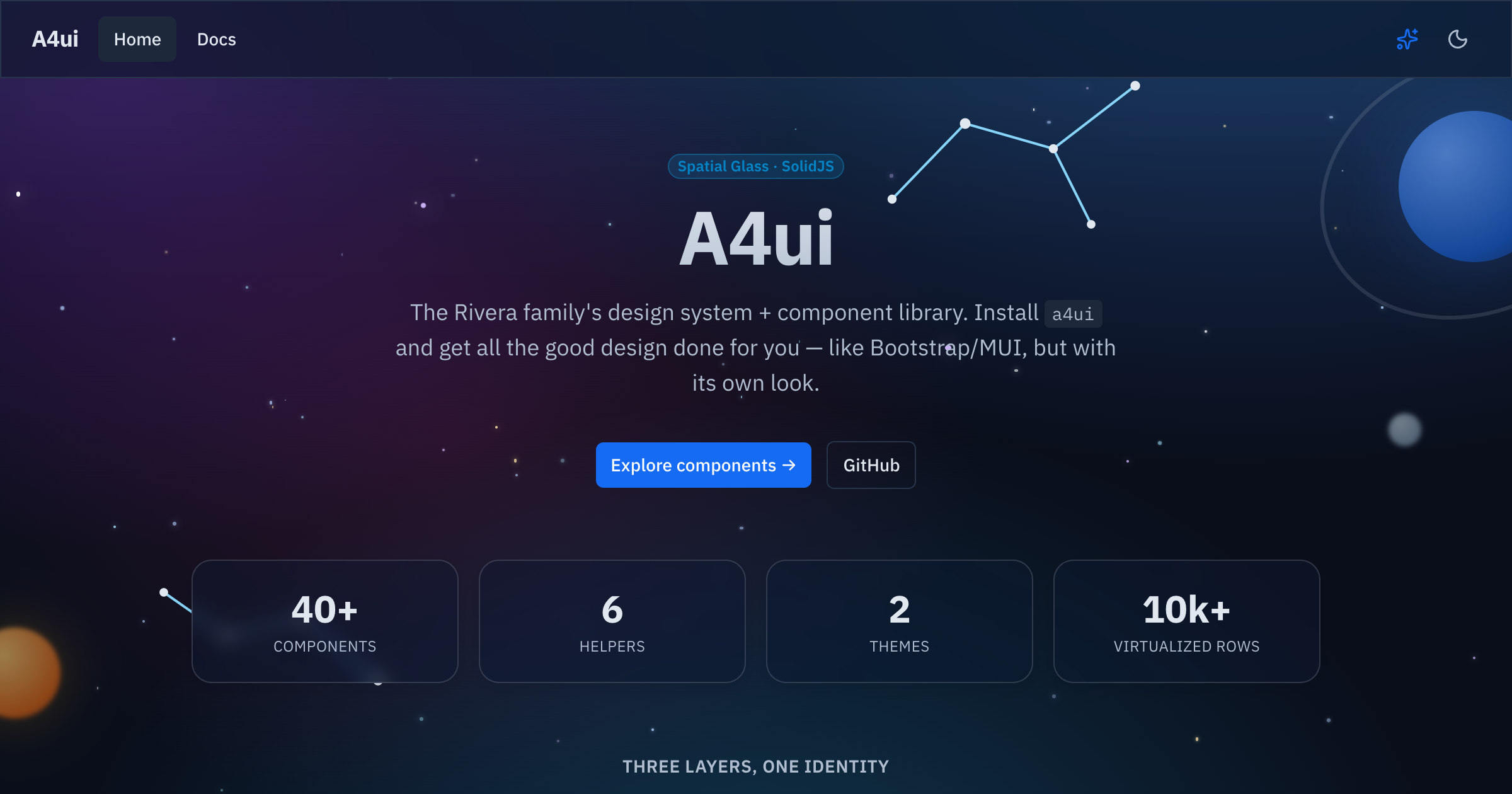
Accessible SolidJS **Spatial Glass** component library — 75+ components,
|
|
17
|
+
layouts, runtime themes, a motion system, and framework-agnostic Web
|
|
18
|
+
Components. Named after the 4 people in the Rivera family. 🙂
|
|
15
19
|
|
|
16
20
|
**📚 Docs & live examples:** https://a4uikit.github.io/a4ui/
|
|
17
21
|
|
|
@@ -33,28 +37,48 @@ Peer dependency: `solid-js` (>= 1.9).
|
|
|
33
37
|
|
|
34
38
|
## Use
|
|
35
39
|
|
|
36
|
-
|
|
37
|
-
|
|
38
|
-
import a4ui from '@a4ui/core/preset'
|
|
39
|
-
export default {
|
|
40
|
-
presets: [a4ui],
|
|
41
|
-
content: ['./src/**/*.{ts,tsx}', './node_modules/@a4ui/core/dist/**/*.js'],
|
|
42
|
-
}
|
|
43
|
-
```
|
|
40
|
+
A4ui works **out of the box, with no Tailwind required** — the styles ship
|
|
41
|
+
precompiled in `styles.css`:
|
|
44
42
|
|
|
45
43
|
```tsx
|
|
46
44
|
// entry (once)
|
|
47
45
|
import '@a4ui/core/styles.css'
|
|
48
46
|
|
|
49
47
|
// anywhere
|
|
50
|
-
import { Button
|
|
48
|
+
import { Button } from '@a4ui/core'
|
|
49
|
+
|
|
50
|
+
export default () => <Button variant="primary">Save</Button>
|
|
51
|
+
```
|
|
52
|
+
|
|
53
|
+
Dark is the default; add `data-theme="light"` on `<html>` (or use the
|
|
54
|
+
exported `toggleTheme()` / `<ThemeToggle />`) for the light palette.
|
|
55
|
+
|
|
56
|
+
### Optional: Tailwind preset
|
|
57
|
+
|
|
58
|
+
If your app already uses Tailwind, add the A4ui preset so utilities like
|
|
59
|
+
`bg-primary/90` and the `.card` / `.glow-edge` glass surface classes resolve
|
|
60
|
+
against A4ui's tokens instead of your own config:
|
|
61
|
+
|
|
62
|
+
```js
|
|
63
|
+
// tailwind.config.js
|
|
64
|
+
import a4ui from '@a4ui/core/preset'
|
|
65
|
+
|
|
66
|
+
export default {
|
|
67
|
+
presets: [a4ui],
|
|
68
|
+
content: ['./index.html', './src/**/*.{ts,tsx}', './node_modules/@a4ui/core/dist/**/*.js'],
|
|
69
|
+
}
|
|
51
70
|
```
|
|
52
71
|
|
|
72
|
+
This is purely additive — components render fully styled with just
|
|
73
|
+
`styles.css`; the preset only matters if you also want A4ui's tokens
|
|
74
|
+
available as Tailwind utilities in _your own_ markup.
|
|
75
|
+
|
|
53
76
|
## Customization
|
|
54
77
|
|
|
55
78
|
Colors, radius and fonts are driven by CSS variables (the `@a4ui/core/preset`
|
|
56
|
-
maps Tailwind's semantic names to them). Override any token in
|
|
57
|
-
scope it to `:root` (or `:root[data-theme='light']`) after
|
|
79
|
+
maps Tailwind's semantic names to them, if you use it). Override any token in
|
|
80
|
+
your own CSS — scope it to `:root` (or `:root[data-theme='light']`) after
|
|
81
|
+
importing the styles:
|
|
58
82
|
|
|
59
83
|
```css
|
|
60
84
|
@import '@a4ui/core/styles.css';
|
|
@@ -65,15 +89,12 @@ scope it to `:root` (or `:root[data-theme='light']`) after importing the styles:
|
|
|
65
89
|
}
|
|
66
90
|
```
|
|
67
91
|
|
|
68
|
-
Dark is the default; add `data-theme="light"` on `<html>` (or use the exported
|
|
69
|
-
`toggleTheme()` / `<ThemeToggle />`) for the light palette.
|
|
70
|
-
|
|
71
92
|
### Themes
|
|
72
93
|
|
|
73
94
|
A **theme** is a full color palette (all 15 tokens, dark + light). A4ui ships
|
|
74
|
-
several — `space` (the default), `dino`, `doctor`, `scientist`, `soccer
|
|
75
|
-
you can swap them at runtime; the whole UI recolors
|
|
76
|
-
remembered:
|
|
95
|
+
several — `space` (the default), `dino`, `doctor`, `scientist`, `soccer`,
|
|
96
|
+
`snow`, `christmas` — and you can swap them at runtime; the whole UI recolors
|
|
97
|
+
instantly and the choice is remembered:
|
|
77
98
|
|
|
78
99
|
```tsx
|
|
79
100
|
import { initTheme, selectTheme, themes } from '@a4ui/core'
|
|
@@ -88,6 +109,36 @@ recolors live, then copy the exported CSS or JSON and apply it as a
|
|
|
88
109
|
`ThemeDefinition`. This is separate from the light/dark `setTheme`/`toggleTheme`
|
|
89
110
|
mode switch — a theme recolors underneath either mode.
|
|
90
111
|
|
|
112
|
+
## Components
|
|
113
|
+
|
|
114
|
+
75+ components across six categories (this is a sample — see the
|
|
115
|
+
**[docs site](https://a4uikit.github.io/a4ui/)** or `src/index.ts` for the
|
|
116
|
+
full list):
|
|
117
|
+
|
|
118
|
+
| Category | Representative components |
|
|
119
|
+
| -------------- | ---------------------------------------------------------------------------------------------- |
|
|
120
|
+
| Forms | `Input`, `Select`, `Checkbox`, `DateField`, `Combobox`, `TagInput`, `Slider`, `NumberInput` |
|
|
121
|
+
| Overlays | `Modal`, `Drawer`, `Popover`, `Tooltip`, `AlertDialog`, `ContextMenu`, `HoverCard` |
|
|
122
|
+
| Data & display | `Table`, `DataGrid`, `Tree`, `Calendar`, `Timeline`, `Stat`, `Descriptions`, `CalendarHeatmap` |
|
|
123
|
+
| Navigation | `Tabs`, `Breadcrumb`, `Pagination`, `Command`, `Anchor`, `Stepper`, `BottomNavigation` |
|
|
124
|
+
| Feedback | `Alert`, `Toast`, `Progress`, `Skeleton`, `Empty`, `Result`, `NotificationCenter` |
|
|
125
|
+
| Layout | `AppShell`, `SpaceBackground`, `ThemedScenery`, `Card`, `Splitter`, `Affix`, `NavGroup` |
|
|
126
|
+
|
|
127
|
+
## Why A4ui
|
|
128
|
+
|
|
129
|
+
| | **A4ui** | Kobalte | shadcn-solid | Hope UI |
|
|
130
|
+
| ----------------------- | -------------------------------------------------- | ---------------------- | --------------------------------- | ---------------------- |
|
|
131
|
+
| Styled components | ✅ ships styled, ready to use | ❌ unstyled primitives | ⚠️ copy-paste into your repo | ✅ styled |
|
|
132
|
+
| Web Components bundle | ✅ `@a4ui/core/elements`, framework-agnostic | ❌ | ❌ | ❌ |
|
|
133
|
+
| Built-in runtime themes | ✅ multiple palettes + live theme builder | ❌ | ❌ (edit CSS vars by hand) | ⚠️ static theme config |
|
|
134
|
+
| Motion system | ✅ transitions, count-up, calm/reduced-motion mode | ❌ (behavior only) | ❌ | ⚠️ minimal |
|
|
135
|
+
| AI-agent docs | ✅ `llms.txt` + JSDoc `@example` in `.d.ts` | ❌ | ❌ | ❌ |
|
|
136
|
+
| Glass visual identity | ✅ signature Spatial Glass look | ❌ (no visuals) | ⚠️ depends on your Tailwind theme | ❌ |
|
|
137
|
+
|
|
138
|
+
Kobalte is what A4ui builds _on_ for behavior/a11y — not a competitor so much
|
|
139
|
+
as a foundation. shadcn-solid and Hope UI are solid choices if you want a
|
|
140
|
+
different look or prefer owning the component source directly.
|
|
141
|
+
|
|
91
142
|
## Framework integration
|
|
92
143
|
|
|
93
144
|
A4ui is a **SolidJS** library. It works natively in **Vite + Solid**,
|
|
@@ -111,13 +162,6 @@ starfield and theme rely on the DOM/`localStorage`). Importing the package is
|
|
|
111
162
|
SSR-safe (no crash at import), but for **SolidStart** render the components on the
|
|
112
163
|
client, e.g. via `clientOnly(() => import('...'))`.
|
|
113
164
|
|
|
114
|
-
## What's inside
|
|
115
|
-
|
|
116
|
-
~40 components across actions, forms, data, overlays, feedback, navigation and
|
|
117
|
-
layout — plus a virtualized list, motion helpers, and a generic `AppShell` with
|
|
118
|
-
the animated `SpaceBackground`. Browse them all (with live prop controls and
|
|
119
|
-
copyable code) in the **[docs site](https://a4uikit.github.io/a4ui/)**.
|
|
120
|
-
|
|
121
165
|
## Using with AI agents
|
|
122
166
|
|
|
123
167
|
Everything an AI coding agent (Claude Code, Codex, Cursor, …) needs to use A4ui
|
|
@@ -133,8 +177,8 @@ Drop this into your project's `AGENTS.md` / `CLAUDE.md` to prime your agent:
|
|
|
133
177
|
|
|
134
178
|
> This project uses **@a4ui/core** (SolidJS design system). Import components as
|
|
135
179
|
> named exports from `@a4ui/core`; import `@a4ui/core/styles.css` once in the app
|
|
136
|
-
> entry; add `@a4ui/core/preset` to `tailwind.config
|
|
137
|
-
> JSDoc/`@example` in the package's `.d.ts`. Full component list:
|
|
180
|
+
> entry; add `@a4ui/core/preset` to `tailwind.config` (optional). Props are typed
|
|
181
|
+
> with JSDoc/`@example` in the package's `.d.ts`. Full component list:
|
|
138
182
|
> https://a4uikit.github.io/a4ui/llms.txt
|
|
139
183
|
|
|
140
184
|
## Develop
|
|
@@ -154,3 +198,5 @@ See **[CONTRIBUTING.md](./CONTRIBUTING.md)** and **[AGENTS.md](./AGENTS.md)**.
|
|
|
154
198
|
## License
|
|
155
199
|
|
|
156
200
|
[MIT](./LICENSE) © Luis Alfredo Rivera Acuña
|
|
201
|
+
</content>
|
|
202
|
+
</invoke>
|
package/dist/elements.css
CHANGED
|
@@ -1617,6 +1617,9 @@ html.calm .tile-glass {
|
|
|
1617
1617
|
.h-64 {
|
|
1618
1618
|
height: 16rem;
|
|
1619
1619
|
}
|
|
1620
|
+
.h-7 {
|
|
1621
|
+
height: 1.75rem;
|
|
1622
|
+
}
|
|
1620
1623
|
.h-8 {
|
|
1621
1624
|
height: 2rem;
|
|
1622
1625
|
}
|
|
@@ -1641,6 +1644,9 @@ html.calm .tile-glass {
|
|
|
1641
1644
|
.max-h-48 {
|
|
1642
1645
|
max-height: 12rem;
|
|
1643
1646
|
}
|
|
1647
|
+
.max-h-56 {
|
|
1648
|
+
max-height: 14rem;
|
|
1649
|
+
}
|
|
1644
1650
|
.max-h-60 {
|
|
1645
1651
|
max-height: 15rem;
|
|
1646
1652
|
}
|
|
@@ -1701,6 +1707,9 @@ html.calm .tile-glass {
|
|
|
1701
1707
|
.w-4 {
|
|
1702
1708
|
width: 1rem;
|
|
1703
1709
|
}
|
|
1710
|
+
.w-44 {
|
|
1711
|
+
width: 11rem;
|
|
1712
|
+
}
|
|
1704
1713
|
.w-48 {
|
|
1705
1714
|
width: 12rem;
|
|
1706
1715
|
}
|
|
@@ -1713,6 +1722,9 @@ html.calm .tile-glass {
|
|
|
1713
1722
|
.w-6 {
|
|
1714
1723
|
width: 1.5rem;
|
|
1715
1724
|
}
|
|
1725
|
+
.w-7 {
|
|
1726
|
+
width: 1.75rem;
|
|
1727
|
+
}
|
|
1716
1728
|
.w-72 {
|
|
1717
1729
|
width: 18rem;
|
|
1718
1730
|
}
|
|
@@ -1743,9 +1755,15 @@ html.calm .tile-glass {
|
|
|
1743
1755
|
.min-w-0 {
|
|
1744
1756
|
min-width: 0px;
|
|
1745
1757
|
}
|
|
1758
|
+
.min-w-32 {
|
|
1759
|
+
min-width: 8rem;
|
|
1760
|
+
}
|
|
1746
1761
|
.min-w-4 {
|
|
1747
1762
|
min-width: 1rem;
|
|
1748
1763
|
}
|
|
1764
|
+
.min-w-40 {
|
|
1765
|
+
min-width: 10rem;
|
|
1766
|
+
}
|
|
1749
1767
|
.min-w-\[1\.5rem\] {
|
|
1750
1768
|
min-width: 1.5rem;
|
|
1751
1769
|
}
|
|
@@ -1861,6 +1879,9 @@ html.calm .tile-glass {
|
|
|
1861
1879
|
.grid-cols-1 {
|
|
1862
1880
|
grid-template-columns: repeat(1, minmax(0, 1fr));
|
|
1863
1881
|
}
|
|
1882
|
+
.grid-cols-3 {
|
|
1883
|
+
grid-template-columns: repeat(3, minmax(0, 1fr));
|
|
1884
|
+
}
|
|
1864
1885
|
.grid-cols-7 {
|
|
1865
1886
|
grid-template-columns: repeat(7, minmax(0, 1fr));
|
|
1866
1887
|
}
|
|
@@ -1936,6 +1957,11 @@ html.calm .tile-glass {
|
|
|
1936
1957
|
margin-top: calc(1rem * calc(1 - var(--tw-space-y-reverse)));
|
|
1937
1958
|
margin-bottom: calc(1rem * var(--tw-space-y-reverse));
|
|
1938
1959
|
}
|
|
1960
|
+
.divide-x > :not([hidden]) ~ :not([hidden]) {
|
|
1961
|
+
--tw-divide-x-reverse: 0;
|
|
1962
|
+
border-right-width: calc(1px * var(--tw-divide-x-reverse));
|
|
1963
|
+
border-left-width: calc(1px * calc(1 - var(--tw-divide-x-reverse)));
|
|
1964
|
+
}
|
|
1939
1965
|
.divide-y > :not([hidden]) ~ :not([hidden]) {
|
|
1940
1966
|
--tw-divide-y-reverse: 0;
|
|
1941
1967
|
border-top-width: calc(1px * calc(1 - var(--tw-divide-y-reverse)));
|
|
@@ -2297,6 +2323,9 @@ html.calm .tile-glass {
|
|
|
2297
2323
|
.pb-4 {
|
|
2298
2324
|
padding-bottom: 1rem;
|
|
2299
2325
|
}
|
|
2326
|
+
.pl-1 {
|
|
2327
|
+
padding-left: 0.25rem;
|
|
2328
|
+
}
|
|
2300
2329
|
.pl-2 {
|
|
2301
2330
|
padding-left: 0.5rem;
|
|
2302
2331
|
}
|