@a4ui/core 0.7.0 → 0.8.1
This diff represents the content of publicly available package versions that have been released to one of the supported registries. The information contained in this diff is provided for informational purposes only and reflects changes between package versions as they appear in their respective public registries.
- package/README.md +91 -29
- package/dist/elements.css +2932 -0
- package/dist/elements.d.ts +2 -0
- package/dist/elements.iife.js +6 -0
- package/dist/elements.js +6495 -0
- package/dist/index.d.ts +5 -1
- package/dist/index.js +2606 -1968
- package/dist/ui/Calendar.d.ts +4 -4
- package/dist/ui/Clock.d.ts +28 -0
- package/dist/ui/Countdown.d.ts +2 -1
- package/dist/ui/DateTimeField.d.ts +28 -0
- package/dist/ui/Sortable.d.ts +33 -0
- package/dist/ui/TimeField.d.ts +27 -0
- package/dist/ui/internal/CalendarCore.d.ts +22 -0
- package/package.json +23 -6
- package/preset.js +3 -1
package/README.md
CHANGED
|
@@ -1,5 +1,9 @@
|
|
|
1
1
|
# A4ui
|
|
2
2
|
|
|
3
|
+
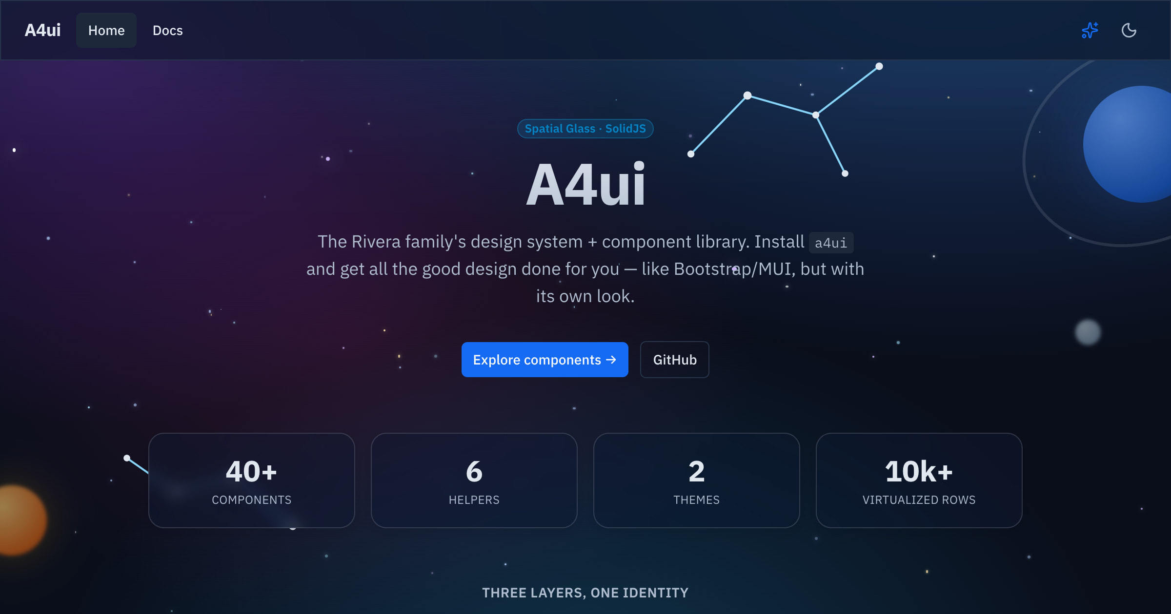
<!-- TODO: hero screenshot / GIF (dark+light, components, SpaceBackground, theme switch) -->
|
|
4
|
+
|
|
5
|
+
|
|
6
|
+
|
|
3
7
|
[](https://www.npmjs.com/package/@a4ui/core)
|
|
4
8
|
[](./LICENSE)
|
|
5
9
|
[](https://a4uikit.github.io/a4ui/lighthouse.html)
|
|
@@ -9,9 +13,9 @@
|
|
|
9
13
|
[](https://www.npmjs.com/package/@a4ui/core)
|
|
10
14
|
[](https://bundlephobia.com/package/@a4ui/core)
|
|
11
15
|
|
|
12
|
-
**Spatial Glass**
|
|
13
|
-
|
|
14
|
-
people in the Rivera family. 🙂
|
|
16
|
+
Accessible SolidJS **Spatial Glass** component library — 75+ components,
|
|
17
|
+
layouts, runtime themes, a motion system, and framework-agnostic Web
|
|
18
|
+
Components. Named after the 4 people in the Rivera family. 🙂
|
|
15
19
|
|
|
16
20
|
**📚 Docs & live examples:** https://a4uikit.github.io/a4ui/
|
|
17
21
|
|
|
@@ -33,28 +37,48 @@ Peer dependency: `solid-js` (>= 1.9).
|
|
|
33
37
|
|
|
34
38
|
## Use
|
|
35
39
|
|
|
36
|
-
|
|
37
|
-
|
|
38
|
-
import a4ui from '@a4ui/core/preset'
|
|
39
|
-
export default {
|
|
40
|
-
presets: [a4ui],
|
|
41
|
-
content: ['./src/**/*.{ts,tsx}', './node_modules/@a4ui/core/dist/**/*.js'],
|
|
42
|
-
}
|
|
43
|
-
```
|
|
40
|
+
A4ui works **out of the box, with no Tailwind required** — the styles ship
|
|
41
|
+
precompiled in `styles.css`:
|
|
44
42
|
|
|
45
43
|
```tsx
|
|
46
44
|
// entry (once)
|
|
47
45
|
import '@a4ui/core/styles.css'
|
|
48
46
|
|
|
49
47
|
// anywhere
|
|
50
|
-
import { Button
|
|
48
|
+
import { Button } from '@a4ui/core'
|
|
49
|
+
|
|
50
|
+
export default () => <Button variant="primary">Save</Button>
|
|
51
51
|
```
|
|
52
52
|
|
|
53
|
+
Dark is the default; add `data-theme="light"` on `<html>` (or use the
|
|
54
|
+
exported `toggleTheme()` / `<ThemeToggle />`) for the light palette.
|
|
55
|
+
|
|
56
|
+
### Optional: Tailwind preset
|
|
57
|
+
|
|
58
|
+
If your app already uses Tailwind, add the A4ui preset so utilities like
|
|
59
|
+
`bg-primary/90` and the `.card` / `.glow-edge` glass surface classes resolve
|
|
60
|
+
against A4ui's tokens instead of your own config:
|
|
61
|
+
|
|
62
|
+
```js
|
|
63
|
+
// tailwind.config.js
|
|
64
|
+
import a4ui from '@a4ui/core/preset'
|
|
65
|
+
|
|
66
|
+
export default {
|
|
67
|
+
presets: [a4ui],
|
|
68
|
+
content: ['./index.html', './src/**/*.{ts,tsx}', './node_modules/@a4ui/core/dist/**/*.js'],
|
|
69
|
+
}
|
|
70
|
+
```
|
|
71
|
+
|
|
72
|
+
This is purely additive — components render fully styled with just
|
|
73
|
+
`styles.css`; the preset only matters if you also want A4ui's tokens
|
|
74
|
+
available as Tailwind utilities in _your own_ markup.
|
|
75
|
+
|
|
53
76
|
## Customization
|
|
54
77
|
|
|
55
78
|
Colors, radius and fonts are driven by CSS variables (the `@a4ui/core/preset`
|
|
56
|
-
maps Tailwind's semantic names to them). Override any token in
|
|
57
|
-
scope it to `:root` (or `:root[data-theme='light']`) after
|
|
79
|
+
maps Tailwind's semantic names to them, if you use it). Override any token in
|
|
80
|
+
your own CSS — scope it to `:root` (or `:root[data-theme='light']`) after
|
|
81
|
+
importing the styles:
|
|
58
82
|
|
|
59
83
|
```css
|
|
60
84
|
@import '@a4ui/core/styles.css';
|
|
@@ -65,15 +89,12 @@ scope it to `:root` (or `:root[data-theme='light']`) after importing the styles:
|
|
|
65
89
|
}
|
|
66
90
|
```
|
|
67
91
|
|
|
68
|
-
Dark is the default; add `data-theme="light"` on `<html>` (or use the exported
|
|
69
|
-
`toggleTheme()` / `<ThemeToggle />`) for the light palette.
|
|
70
|
-
|
|
71
92
|
### Themes
|
|
72
93
|
|
|
73
94
|
A **theme** is a full color palette (all 15 tokens, dark + light). A4ui ships
|
|
74
|
-
several — `space` (the default), `dino`, `doctor`, `scientist`, `soccer
|
|
75
|
-
you can swap them at runtime; the whole UI recolors
|
|
76
|
-
remembered:
|
|
95
|
+
several — `space` (the default), `dino`, `doctor`, `scientist`, `soccer`,
|
|
96
|
+
`snow`, `christmas` — and you can swap them at runtime; the whole UI recolors
|
|
97
|
+
instantly and the choice is remembered:
|
|
77
98
|
|
|
78
99
|
```tsx
|
|
79
100
|
import { initTheme, selectTheme, themes } from '@a4ui/core'
|
|
@@ -88,6 +109,52 @@ recolors live, then copy the exported CSS or JSON and apply it as a
|
|
|
88
109
|
`ThemeDefinition`. This is separate from the light/dark `setTheme`/`toggleTheme`
|
|
89
110
|
mode switch — a theme recolors underneath either mode.
|
|
90
111
|
|
|
112
|
+
## Components
|
|
113
|
+
|
|
114
|
+
75+ components across six categories (this is a sample — see the
|
|
115
|
+
**[docs site](https://a4uikit.github.io/a4ui/)** or `src/index.ts` for the
|
|
116
|
+
full list):
|
|
117
|
+
|
|
118
|
+
| Category | Representative components |
|
|
119
|
+
| -------------- | ---------------------------------------------------------------------------------------------- |
|
|
120
|
+
| Forms | `Input`, `Select`, `Checkbox`, `DateField`, `Combobox`, `TagInput`, `Slider`, `NumberInput` |
|
|
121
|
+
| Overlays | `Modal`, `Drawer`, `Popover`, `Tooltip`, `AlertDialog`, `ContextMenu`, `HoverCard` |
|
|
122
|
+
| Data & display | `Table`, `DataGrid`, `Tree`, `Calendar`, `Timeline`, `Stat`, `Descriptions`, `CalendarHeatmap` |
|
|
123
|
+
| Navigation | `Tabs`, `Breadcrumb`, `Pagination`, `Command`, `Anchor`, `Stepper`, `BottomNavigation` |
|
|
124
|
+
| Feedback | `Alert`, `Toast`, `Progress`, `Skeleton`, `Empty`, `Result`, `NotificationCenter` |
|
|
125
|
+
| Layout | `AppShell`, `SpaceBackground`, `ThemedScenery`, `Card`, `Splitter`, `Affix`, `NavGroup` |
|
|
126
|
+
|
|
127
|
+
## Why A4ui
|
|
128
|
+
|
|
129
|
+
| | **A4ui** | Kobalte | shadcn-solid | Hope UI |
|
|
130
|
+
| ----------------------- | -------------------------------------------------- | ---------------------- | --------------------------------- | ---------------------- |
|
|
131
|
+
| Styled components | ✅ ships styled, ready to use | ❌ unstyled primitives | ⚠️ copy-paste into your repo | ✅ styled |
|
|
132
|
+
| Web Components bundle | ✅ `@a4ui/core/elements`, framework-agnostic | ❌ | ❌ | ❌ |
|
|
133
|
+
| Built-in runtime themes | ✅ multiple palettes + live theme builder | ❌ | ❌ (edit CSS vars by hand) | ⚠️ static theme config |
|
|
134
|
+
| Motion system | ✅ transitions, count-up, calm/reduced-motion mode | ❌ (behavior only) | ❌ | ⚠️ minimal |
|
|
135
|
+
| AI-agent docs | ✅ `llms.txt` + JSDoc `@example` in `.d.ts` | ❌ | ❌ | ❌ |
|
|
136
|
+
| Glass visual identity | ✅ signature Spatial Glass look | ❌ (no visuals) | ⚠️ depends on your Tailwind theme | ❌ |
|
|
137
|
+
|
|
138
|
+
Kobalte is what A4ui builds _on_ for behavior/a11y — not a competitor so much
|
|
139
|
+
as a foundation. shadcn-solid and Hope UI are solid choices if you want a
|
|
140
|
+
different look or prefer owning the component source directly.
|
|
141
|
+
|
|
142
|
+
## Framework integration
|
|
143
|
+
|
|
144
|
+
A4ui is a **SolidJS** library. It works natively in **Vite + Solid**,
|
|
145
|
+
**SolidStart** (SSR), and **Astro** (as Solid islands). For **React / Next.js**,
|
|
146
|
+
**Vue**, or plain HTML, ship the self-contained **Web Components** bundle
|
|
147
|
+
(`@a4ui/core/elements` — Solid is compiled in, no Solid toolchain needed):
|
|
148
|
+
|
|
149
|
+
```html
|
|
150
|
+
<link rel="stylesheet" href="…/@a4ui/core/dist/elements.css" />
|
|
151
|
+
<script type="module" src="…/@a4ui/core/dist/elements.js"></script>
|
|
152
|
+
<a4-button variant="primary" label="Save"></a4-button>
|
|
153
|
+
```
|
|
154
|
+
|
|
155
|
+
Full setup for each stack — including the honest React/Next caveat and the SSR
|
|
156
|
+
notes — is in **[INTEGRATIONS.md](./INTEGRATIONS.md)**.
|
|
157
|
+
|
|
91
158
|
## Server rendering
|
|
92
159
|
|
|
93
160
|
A4ui is **client-first** — the components render in the browser (the glass,
|
|
@@ -95,13 +162,6 @@ starfield and theme rely on the DOM/`localStorage`). Importing the package is
|
|
|
95
162
|
SSR-safe (no crash at import), but for **SolidStart** render the components on the
|
|
96
163
|
client, e.g. via `clientOnly(() => import('...'))`.
|
|
97
164
|
|
|
98
|
-
## What's inside
|
|
99
|
-
|
|
100
|
-
~40 components across actions, forms, data, overlays, feedback, navigation and
|
|
101
|
-
layout — plus a virtualized list, motion helpers, and a generic `AppShell` with
|
|
102
|
-
the animated `SpaceBackground`. Browse them all (with live prop controls and
|
|
103
|
-
copyable code) in the **[docs site](https://a4uikit.github.io/a4ui/)**.
|
|
104
|
-
|
|
105
165
|
## Using with AI agents
|
|
106
166
|
|
|
107
167
|
Everything an AI coding agent (Claude Code, Codex, Cursor, …) needs to use A4ui
|
|
@@ -117,8 +177,8 @@ Drop this into your project's `AGENTS.md` / `CLAUDE.md` to prime your agent:
|
|
|
117
177
|
|
|
118
178
|
> This project uses **@a4ui/core** (SolidJS design system). Import components as
|
|
119
179
|
> named exports from `@a4ui/core`; import `@a4ui/core/styles.css` once in the app
|
|
120
|
-
> entry; add `@a4ui/core/preset` to `tailwind.config
|
|
121
|
-
> JSDoc/`@example` in the package's `.d.ts`. Full component list:
|
|
180
|
+
> entry; add `@a4ui/core/preset` to `tailwind.config` (optional). Props are typed
|
|
181
|
+
> with JSDoc/`@example` in the package's `.d.ts`. Full component list:
|
|
122
182
|
> https://a4uikit.github.io/a4ui/llms.txt
|
|
123
183
|
|
|
124
184
|
## Develop
|
|
@@ -138,3 +198,5 @@ See **[CONTRIBUTING.md](./CONTRIBUTING.md)** and **[AGENTS.md](./AGENTS.md)**.
|
|
|
138
198
|
## License
|
|
139
199
|
|
|
140
200
|
[MIT](./LICENSE) © Luis Alfredo Rivera Acuña
|
|
201
|
+
</content>
|
|
202
|
+
</invoke>
|