@a4ui/core 0.24.1 → 0.24.2
This diff represents the content of publicly available package versions that have been released to one of the supported registries. The information contained in this diff is provided for informational purposes only and reflects changes between package versions as they appear in their respective public registries.
- package/README.md +10 -0
- package/dist/commerce.js +1 -1
- package/dist/elements.css +6 -6
- package/dist/full.css +6 -6
- package/dist/index.d.ts +1 -1
- package/dist/index.js +4 -4
- package/dist/styles.css +2 -2
- package/package.json +1 -1
- package/src/commerce/PriceBlock.tsx +1 -1
- package/src/index.ts +1 -1
- package/src/themes/palettes.ts +2 -2
- package/src/ui/SegmentedControl.tsx +1 -1
package/README.md
CHANGED
|
@@ -206,6 +206,16 @@ import { ProductCard, CartSummary } from '@a4ui/core/commerce'
|
|
|
206
206
|
import { DonutChart, Sparkline } from '@a4ui/core/charts'
|
|
207
207
|
```
|
|
208
208
|
|
|
209
|
+
## Example pages
|
|
210
|
+
|
|
211
|
+
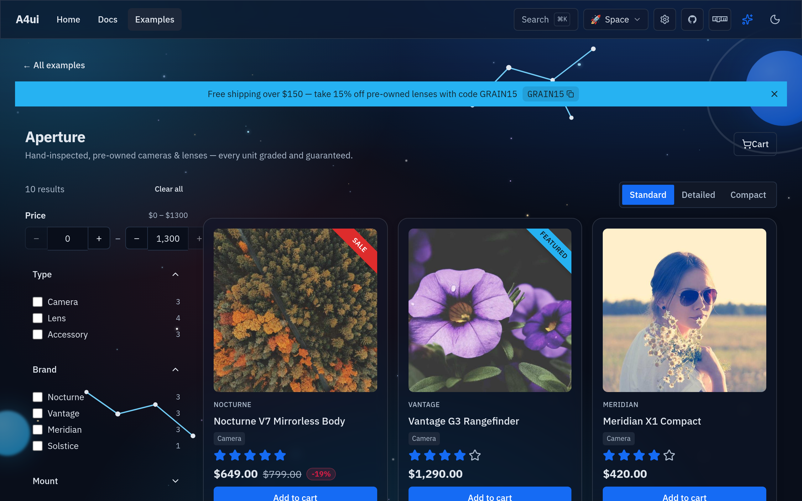
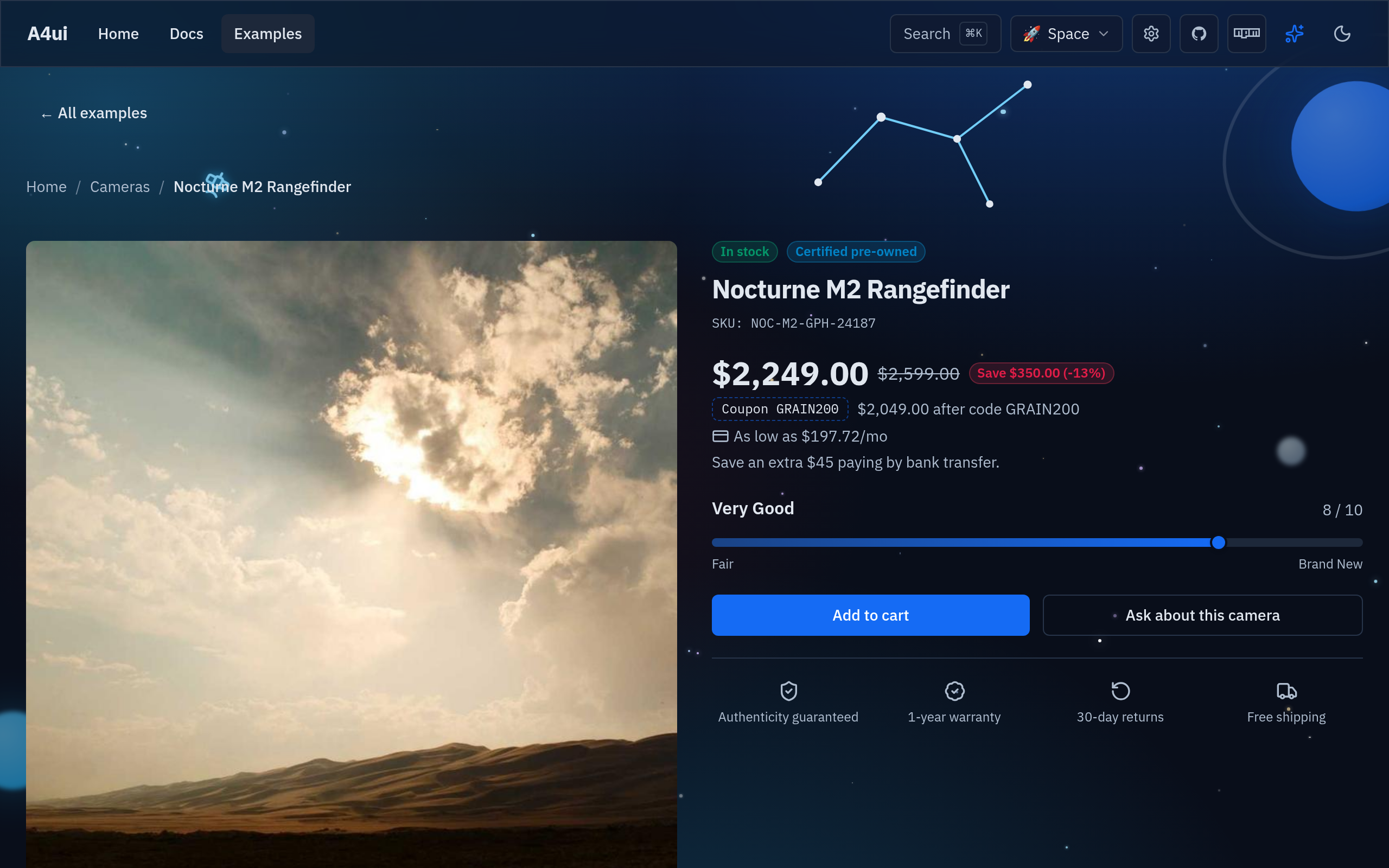
Full-page templates built entirely with the components above — browse the whole
|
|
212
|
+
gallery at **[a4ui.pages.dev/#/examples](https://a4ui.pages.dev/#/examples)**. Each
|
|
213
|
+
one reskins under every theme.
|
|
214
|
+
|
|
215
|
+
[](https://a4ui.pages.dev/#/examples/boutique)
|
|
216
|
+
|
|
217
|
+
[](https://a4ui.pages.dev/#/examples/showpiece)
|
|
218
|
+
|
|
209
219
|
## Why A4ui
|
|
210
220
|
|
|
211
221
|
| | **A4ui** | Kobalte | shadcn-solid | Hope UI |
|
package/dist/commerce.js
CHANGED
|
@@ -471,7 +471,7 @@ function ze(e) {
|
|
|
471
471
|
})();
|
|
472
472
|
}
|
|
473
473
|
A(["click"]);
|
|
474
|
-
var Se = /* @__PURE__ */ v('<span class="text-muted-foreground line-through">'), ke = /* @__PURE__ */ v('<span class="inline-flex items-center gap-1 text-sm text-muted-foreground">As low as <!>/mo'), Ae = /* @__PURE__ */ v('<div><div class="flex flex-wrap items-center gap-2"><span>'), Me = /* @__PURE__ */ v('<span class="text-sm text-muted-foreground"> after code '), Pe = /* @__PURE__ */ v('<div class="flex flex-wrap items-center gap-2"><span class="inline-flex items-center gap-1 rounded-md border border-dashed border-primary/50 px-2 py-0.5 text-xs font-mono text-
|
|
474
|
+
var Se = /* @__PURE__ */ v('<span class="text-muted-foreground line-through">'), ke = /* @__PURE__ */ v('<span class="inline-flex items-center gap-1 text-sm text-muted-foreground">As low as <!>/mo'), Ae = /* @__PURE__ */ v('<div><div class="flex flex-wrap items-center gap-2"><span>'), Me = /* @__PURE__ */ v('<span class="text-sm text-muted-foreground"> after code '), Pe = /* @__PURE__ */ v('<div class="flex flex-wrap items-center gap-2"><span class="inline-flex items-center gap-1 rounded-md border border-dashed border-primary/50 px-2 py-0.5 text-xs font-mono text-foreground"> ');
|
|
475
475
|
const Te = {
|
|
476
476
|
md: "text-xl",
|
|
477
477
|
lg: "text-3xl"
|
package/dist/elements.css
CHANGED
|
@@ -22,7 +22,7 @@
|
|
|
22
22
|
--primary: 217 91% 52%;
|
|
23
23
|
--primary-foreground: 0 0% 100%;
|
|
24
24
|
--accent: 199 89% 55%;
|
|
25
|
-
--accent-foreground:
|
|
25
|
+
--accent-foreground: 199 45% 12%;
|
|
26
26
|
--ring: 217 91% 52%;
|
|
27
27
|
--destructive: 0 72% 52%;
|
|
28
28
|
--destructive-foreground: 0 0% 100%;
|
|
@@ -58,7 +58,7 @@
|
|
|
58
58
|
--primary: 217 91% 52%;
|
|
59
59
|
--primary-foreground: 0 0% 100%;
|
|
60
60
|
--accent: 199 89% 48%;
|
|
61
|
-
--accent-foreground:
|
|
61
|
+
--accent-foreground: 199 45% 12%;
|
|
62
62
|
--ring: 217 91% 52%;
|
|
63
63
|
--destructive: 0 72% 50%;
|
|
64
64
|
--destructive-foreground: 0 0% 100%;
|
|
@@ -3450,6 +3450,10 @@ html.calm .tile-glass {
|
|
|
3450
3450
|
--tw-bg-opacity: 1;
|
|
3451
3451
|
background-color: hsl(var(--primary) / var(--tw-bg-opacity, 1));
|
|
3452
3452
|
}
|
|
3453
|
+
.data-\[checked\]\:text-primary-foreground[data-checked] {
|
|
3454
|
+
--tw-text-opacity: 1;
|
|
3455
|
+
color: hsl(var(--primary-foreground) / var(--tw-text-opacity, 1));
|
|
3456
|
+
}
|
|
3453
3457
|
.data-\[pressed\]\:text-primary-foreground[data-pressed] {
|
|
3454
3458
|
--tw-text-opacity: 1;
|
|
3455
3459
|
color: hsl(var(--primary-foreground) / var(--tw-text-opacity, 1));
|
|
@@ -3458,10 +3462,6 @@ html.calm .tile-glass {
|
|
|
3458
3462
|
--tw-text-opacity: 1;
|
|
3459
3463
|
color: hsl(var(--foreground) / var(--tw-text-opacity, 1));
|
|
3460
3464
|
}
|
|
3461
|
-
.data-\[selected\]\:text-primary-foreground[data-selected] {
|
|
3462
|
-
--tw-text-opacity: 1;
|
|
3463
|
-
color: hsl(var(--primary-foreground) / var(--tw-text-opacity, 1));
|
|
3464
|
-
}
|
|
3465
3465
|
.data-\[disabled\]\:opacity-50[data-disabled] {
|
|
3466
3466
|
opacity: 0.5;
|
|
3467
3467
|
}
|
package/dist/full.css
CHANGED
|
@@ -22,7 +22,7 @@
|
|
|
22
22
|
--primary: 217 91% 52%;
|
|
23
23
|
--primary-foreground: 0 0% 100%;
|
|
24
24
|
--accent: 199 89% 55%;
|
|
25
|
-
--accent-foreground:
|
|
25
|
+
--accent-foreground: 199 45% 12%;
|
|
26
26
|
--ring: 217 91% 52%;
|
|
27
27
|
--destructive: 0 72% 52%;
|
|
28
28
|
--destructive-foreground: 0 0% 100%;
|
|
@@ -58,7 +58,7 @@
|
|
|
58
58
|
--primary: 217 91% 52%;
|
|
59
59
|
--primary-foreground: 0 0% 100%;
|
|
60
60
|
--accent: 199 89% 48%;
|
|
61
|
-
--accent-foreground:
|
|
61
|
+
--accent-foreground: 199 45% 12%;
|
|
62
62
|
--ring: 217 91% 52%;
|
|
63
63
|
--destructive: 0 72% 50%;
|
|
64
64
|
--destructive-foreground: 0 0% 100%;
|
|
@@ -3450,6 +3450,10 @@ html.calm .tile-glass {
|
|
|
3450
3450
|
--tw-bg-opacity: 1;
|
|
3451
3451
|
background-color: hsl(var(--primary) / var(--tw-bg-opacity, 1));
|
|
3452
3452
|
}
|
|
3453
|
+
.data-\[checked\]\:text-primary-foreground[data-checked] {
|
|
3454
|
+
--tw-text-opacity: 1;
|
|
3455
|
+
color: hsl(var(--primary-foreground) / var(--tw-text-opacity, 1));
|
|
3456
|
+
}
|
|
3453
3457
|
.data-\[pressed\]\:text-primary-foreground[data-pressed] {
|
|
3454
3458
|
--tw-text-opacity: 1;
|
|
3455
3459
|
color: hsl(var(--primary-foreground) / var(--tw-text-opacity, 1));
|
|
@@ -3458,10 +3462,6 @@ html.calm .tile-glass {
|
|
|
3458
3462
|
--tw-text-opacity: 1;
|
|
3459
3463
|
color: hsl(var(--foreground) / var(--tw-text-opacity, 1));
|
|
3460
3464
|
}
|
|
3461
|
-
.data-\[selected\]\:text-primary-foreground[data-selected] {
|
|
3462
|
-
--tw-text-opacity: 1;
|
|
3463
|
-
color: hsl(var(--primary-foreground) / var(--tw-text-opacity, 1));
|
|
3464
|
-
}
|
|
3465
3465
|
.data-\[disabled\]\:opacity-50[data-disabled] {
|
|
3466
3466
|
opacity: 0.5;
|
|
3467
3467
|
}
|
package/dist/index.d.ts
CHANGED
|
@@ -1,4 +1,4 @@
|
|
|
1
|
-
export declare const A4UI_VERSION = "0.24.
|
|
1
|
+
export declare const A4UI_VERSION = "0.24.2";
|
|
2
2
|
export { cn } from './lib/cn';
|
|
3
3
|
export { useTheme, toggleTheme, setTheme, storedTheme, applyTheme, toggled, type Theme } from './lib/theme';
|
|
4
4
|
export { useEffects, isCalm, setEffects } from './lib/effects';
|
package/dist/index.js
CHANGED
|
@@ -2262,7 +2262,7 @@ function Hu(e) {
|
|
|
2262
2262
|
get value() {
|
|
2263
2263
|
return t.value;
|
|
2264
2264
|
},
|
|
2265
|
-
class: "relative z-10 flex cursor-pointer items-center px-3 py-1.5 text-sm font-medium text-muted-foreground transition-colors data-[
|
|
2265
|
+
class: "relative z-10 flex cursor-pointer items-center px-3 py-1.5 text-sm font-medium text-muted-foreground transition-colors data-[checked]:text-primary-foreground",
|
|
2266
2266
|
get children() {
|
|
2267
2267
|
return [o(Ie.ItemInput, {}), o(Ie.ItemLabel, {
|
|
2268
2268
|
get children() {
|
|
@@ -6918,7 +6918,7 @@ const wd = [
|
|
|
6918
6918
|
primary: "217 91% 52%",
|
|
6919
6919
|
"primary-foreground": "0 0% 100%",
|
|
6920
6920
|
accent: "199 89% 55%",
|
|
6921
|
-
"accent-foreground": "
|
|
6921
|
+
"accent-foreground": "199 45% 12%",
|
|
6922
6922
|
ring: "217 91% 52%",
|
|
6923
6923
|
destructive: "0 72% 52%",
|
|
6924
6924
|
"destructive-foreground": "0 0% 100%"
|
|
@@ -6935,7 +6935,7 @@ const wd = [
|
|
|
6935
6935
|
primary: "217 91% 52%",
|
|
6936
6936
|
"primary-foreground": "0 0% 100%",
|
|
6937
6937
|
accent: "199 89% 48%",
|
|
6938
|
-
"accent-foreground": "
|
|
6938
|
+
"accent-foreground": "199 45% 12%",
|
|
6939
6939
|
ring: "217 91% 52%",
|
|
6940
6940
|
destructive: "0 72% 50%",
|
|
6941
6941
|
"destructive-foreground": "0 0% 100%"
|
|
@@ -7222,7 +7222,7 @@ function ff() {
|
|
|
7222
7222
|
}
|
|
7223
7223
|
Id(e && hr(e) || gt);
|
|
7224
7224
|
}
|
|
7225
|
-
const mf = "0.24.
|
|
7225
|
+
const mf = "0.24.2";
|
|
7226
7226
|
export {
|
|
7227
7227
|
mf as A4UI_VERSION,
|
|
7228
7228
|
du as Accordion,
|
package/dist/styles.css
CHANGED
|
@@ -21,7 +21,7 @@
|
|
|
21
21
|
--primary: 217 91% 52%;
|
|
22
22
|
--primary-foreground: 0 0% 100%;
|
|
23
23
|
--accent: 199 89% 55%;
|
|
24
|
-
--accent-foreground:
|
|
24
|
+
--accent-foreground: 199 45% 12%;
|
|
25
25
|
--ring: 217 91% 52%;
|
|
26
26
|
--destructive: 0 72% 52%;
|
|
27
27
|
--destructive-foreground: 0 0% 100%;
|
|
@@ -57,7 +57,7 @@
|
|
|
57
57
|
--primary: 217 91% 52%;
|
|
58
58
|
--primary-foreground: 0 0% 100%;
|
|
59
59
|
--accent: 199 89% 48%;
|
|
60
|
-
--accent-foreground:
|
|
60
|
+
--accent-foreground: 199 45% 12%;
|
|
61
61
|
--ring: 217 91% 52%;
|
|
62
62
|
--destructive: 0 72% 50%;
|
|
63
63
|
--destructive-foreground: 0 0% 100%;
|
package/package.json
CHANGED
|
@@ -110,7 +110,7 @@ export function PriceBlock(props: PriceBlockProps): JSX.Element {
|
|
|
110
110
|
<Show when={props.coupon}>
|
|
111
111
|
{(coupon) => (
|
|
112
112
|
<div class="flex flex-wrap items-center gap-2">
|
|
113
|
-
<span class="inline-flex items-center gap-1 rounded-md border border-dashed border-primary/50 px-2 py-0.5 text-xs font-mono text-
|
|
113
|
+
<span class="inline-flex items-center gap-1 rounded-md border border-dashed border-primary/50 px-2 py-0.5 text-xs font-mono text-foreground">
|
|
114
114
|
{coupon().label ?? 'Coupon'} {coupon().code}
|
|
115
115
|
</span>
|
|
116
116
|
<Show when={coupon().amount !== undefined}>
|
package/src/index.ts
CHANGED
|
@@ -8,7 +8,7 @@
|
|
|
8
8
|
// import '@a4ui/core/styles.css'
|
|
9
9
|
// import { Button, Card, Modal } from '@a4ui/core'
|
|
10
10
|
|
|
11
|
-
export const A4UI_VERSION = '0.24.
|
|
11
|
+
export const A4UI_VERSION = '0.24.2'
|
|
12
12
|
|
|
13
13
|
// Helpers (src/lib) — generic, framework-level utilities.
|
|
14
14
|
export { cn } from './lib/cn'
|
package/src/themes/palettes.ts
CHANGED
|
@@ -82,7 +82,7 @@ export const space: ThemeDefinition = {
|
|
|
82
82
|
primary: '217 91% 52%',
|
|
83
83
|
'primary-foreground': '0 0% 100%',
|
|
84
84
|
accent: '199 89% 55%',
|
|
85
|
-
'accent-foreground': '
|
|
85
|
+
'accent-foreground': '199 45% 12%',
|
|
86
86
|
ring: '217 91% 52%',
|
|
87
87
|
destructive: '0 72% 52%',
|
|
88
88
|
'destructive-foreground': '0 0% 100%',
|
|
@@ -99,7 +99,7 @@ export const space: ThemeDefinition = {
|
|
|
99
99
|
primary: '217 91% 52%',
|
|
100
100
|
'primary-foreground': '0 0% 100%',
|
|
101
101
|
accent: '199 89% 48%',
|
|
102
|
-
'accent-foreground': '
|
|
102
|
+
'accent-foreground': '199 45% 12%',
|
|
103
103
|
ring: '217 91% 52%',
|
|
104
104
|
destructive: '0 72% 50%',
|
|
105
105
|
'destructive-foreground': '0 0% 100%',
|
|
@@ -49,7 +49,7 @@ export function SegmentedControl(props: SegmentedControlProps): JSX.Element {
|
|
|
49
49
|
{(option) => (
|
|
50
50
|
<KSegmentedControl.Item
|
|
51
51
|
value={option.value}
|
|
52
|
-
class="relative z-10 flex cursor-pointer items-center px-3 py-1.5 text-sm font-medium text-muted-foreground transition-colors data-[
|
|
52
|
+
class="relative z-10 flex cursor-pointer items-center px-3 py-1.5 text-sm font-medium text-muted-foreground transition-colors data-[checked]:text-primary-foreground"
|
|
53
53
|
>
|
|
54
54
|
<KSegmentedControl.ItemInput />
|
|
55
55
|
<KSegmentedControl.ItemLabel>{option.label}</KSegmentedControl.ItemLabel>
|