playbook_ui_docs 13.15.0 → 13.16.0.pre.alpha.PLAY11641991
This diff represents the content of publicly available package versions that have been released to one of the supported registries. The information contained in this diff is provided for informational purposes only and reflects changes between package versions as they appear in their respective public registries.
- checksums.yaml +4 -4
- data/app/pb_kits/playbook/pb_collapsible/docs/_collapsible_colors_swift.md +27 -0
- data/app/pb_kits/playbook/pb_collapsible/docs/_collapsible_default_swift.md +22 -0
- data/app/pb_kits/playbook/pb_collapsible/docs/_collapsible_props_table.md +8 -0
- data/app/pb_kits/playbook/pb_collapsible/docs/_collapsible_sizes_swift.md +26 -0
- data/app/pb_kits/playbook/pb_collapsible/docs/example.yml +6 -0
- data/app/pb_kits/playbook/pb_icon/docs/_icon_custom.html.erb +5 -11
- data/app/pb_kits/playbook/pb_icon/docs/_icon_custom.jsx +44 -18
- data/app/pb_kits/playbook/pb_icon/docs/_icon_custom.md +7 -12
- data/app/pb_kits/playbook/pb_nav/docs/_nav_horizontal_bold_swift.md +17 -0
- data/app/pb_kits/playbook/pb_nav/docs/_nav_horizontal_default_swift.md +17 -0
- data/app/pb_kits/playbook/pb_nav/docs/_nav_horizontal_subtle_no_highlight_swift.md +18 -0
- data/app/pb_kits/playbook/pb_nav/docs/_nav_horizontal_subtle_swift.md +18 -0
- data/app/pb_kits/playbook/pb_nav/docs/_nav_props_swift.md +11 -0
- data/app/pb_kits/playbook/pb_nav/docs/_nav_vertical_bold_swift.md +18 -0
- data/app/pb_kits/playbook/pb_nav/docs/_nav_vertical_default_swift.md +18 -0
- data/app/pb_kits/playbook/pb_nav/docs/_nav_vertical_subtle_no_highlight_swift.md +19 -0
- data/app/pb_kits/playbook/pb_nav/docs/_nav_vertical_subtle_swift.md +17 -0
- data/app/pb_kits/playbook/pb_nav/docs/example.yml +17 -0
- data/app/pb_kits/playbook/pb_select/docs/_select_inline_show_arrow.html.erb +24 -0
- data/app/pb_kits/playbook/pb_select/docs/_select_inline_show_arrow.jsx +38 -0
- data/app/pb_kits/playbook/pb_select/docs/example.yml +2 -0
- data/app/pb_kits/playbook/pb_select/docs/index.js +1 -0
- data/dist/playbook-doc.js +7 -7
- metadata +22 -7
checksums.yaml
CHANGED
|
@@ -1,7 +1,7 @@
|
|
|
1
1
|
---
|
|
2
2
|
SHA256:
|
|
3
|
-
metadata.gz:
|
|
4
|
-
data.tar.gz:
|
|
3
|
+
metadata.gz: 3125b3ce3a546d8b9b99c229f6e08ecf0a79aeca2a8fb38441a97681f7b7bf02
|
|
4
|
+
data.tar.gz: 7205570b0b740c53edbc12b2de5fbcff89dfd08744d389a63af037403f06d81c
|
|
5
5
|
SHA512:
|
|
6
|
-
metadata.gz:
|
|
7
|
-
data.tar.gz:
|
|
6
|
+
metadata.gz: fedc053d72eceae7183d9ecf9358bbfb38ce6f44e6df7d09f19dd29a6c17c1f659065d33ba3dac3c7cfbde4174ff583170d4b9768224dabb416af5497acf5832
|
|
7
|
+
data.tar.gz: 4cc759514e53459de46209401e148cbba2701d6feff5e9ab5fb5b75fa7e5ab14cef1f97fa39d062c0716a9f53bbe6e4eae186da2cec7ca083762af9a4bc1c95a
|
|
@@ -0,0 +1,27 @@
|
|
|
1
|
+

|
|
2
|
+
|
|
3
|
+
```swift
|
|
4
|
+
let iconSize: PBIcon.IconSize
|
|
5
|
+
let iconColor: CollapsibleIconColor
|
|
6
|
+
let text: String
|
|
7
|
+
@State private var isCollapsed = true
|
|
8
|
+
let lorem =
|
|
9
|
+
"
|
|
10
|
+
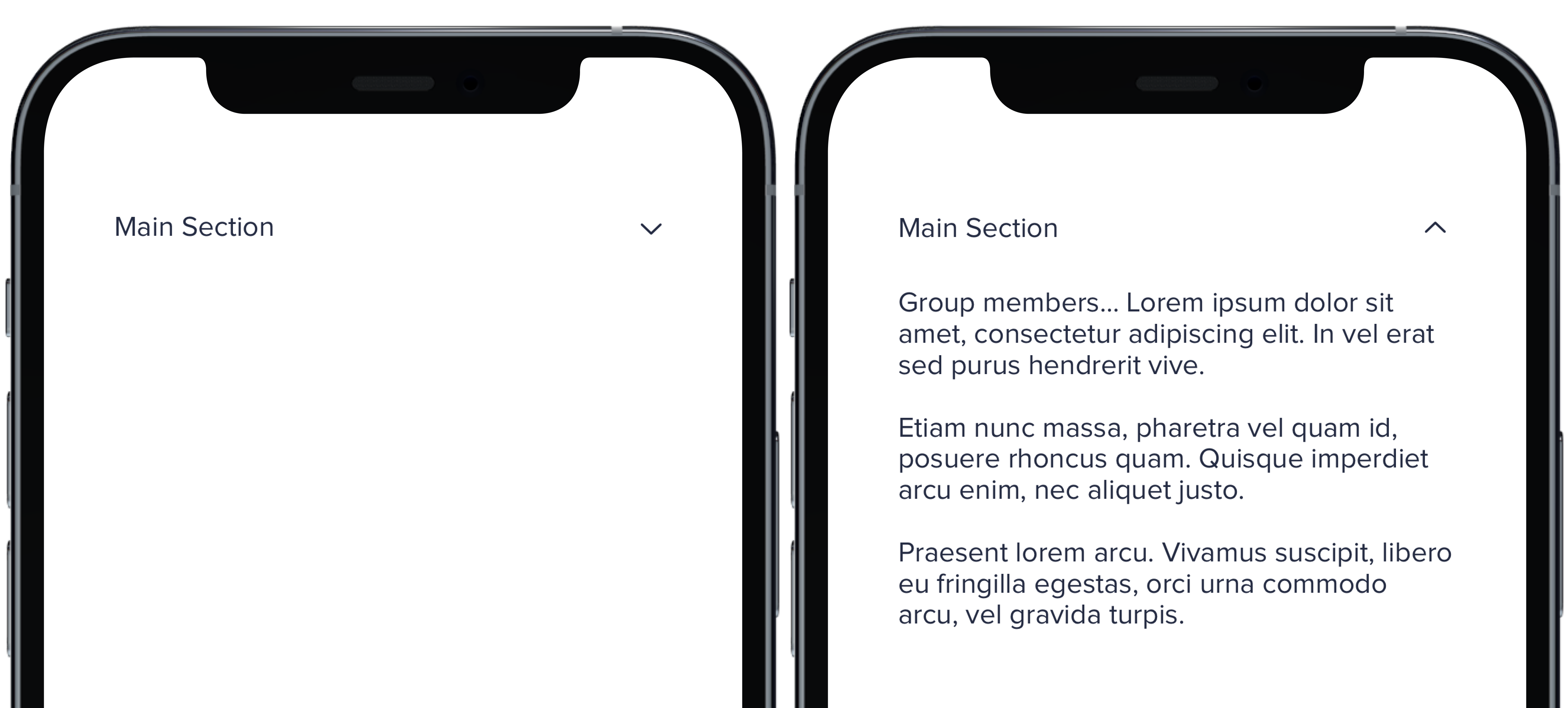
Group members... Lorem ipsum dolor sit amet, consectetur adipiscing elit. In vel erat sed purus hendrerit vive.
|
|
11
|
+
Etiam nunc massa, pharetra vel quam id, posuere rhoncus quam. Quisque imperdiet arcu enim, nec aliquet justo.
|
|
12
|
+
Praesent lorem arcu. Vivamus suscipit, libero eu fringilla egestas, orci urna commodo arcu, vel gravida turpis.
|
|
13
|
+
"
|
|
14
|
+
PBCollapsible(isCollapsed: $isCollapsed, iconSize: iconSize, iconColor: iconColor) {
|
|
15
|
+
VStack(spacing: Spacing.medium) {
|
|
16
|
+
CollapsibleDoc(iconColor: .default, text: "Default Section")
|
|
17
|
+
CollapsibleDoc(iconColor: .light, text: "Light Section")
|
|
18
|
+
CollapsibleDoc(iconColor: .lighter, text: "Lighter Section")
|
|
19
|
+
CollapsibleDoc(iconColor: .link, text: "Link Section")
|
|
20
|
+
CollapsibleDoc(iconColor: .error, text: "Error Section")
|
|
21
|
+
CollapsibleDoc(iconColor: .success, text: "Success Section")
|
|
22
|
+
}
|
|
23
|
+
} content: {
|
|
24
|
+
Text(lorem).pbFont(.body)
|
|
25
|
+
}
|
|
26
|
+
|
|
27
|
+
```
|
|
@@ -0,0 +1,22 @@
|
|
|
1
|
+
|
|
2
|
+
|
|
3
|
+
|
|
4
|
+
```swift
|
|
5
|
+
let iconSize: PBIcon.IconSize
|
|
6
|
+
let iconColor: CollapsibleIconColor
|
|
7
|
+
let text: String
|
|
8
|
+
@State private var isCollapsed = true
|
|
9
|
+
let lorem =
|
|
10
|
+
"
|
|
11
|
+
Group members... Lorem ipsum dolor sit amet, consectetur adipiscing elit. In vel erat sed purus hendrerit vive.
|
|
12
|
+
Etiam nunc massa, pharetra vel quam id, posuere rhoncus quam. Quisque imperdiet arcu enim, nec aliquet justo.
|
|
13
|
+
Praesent lorem arcu. Vivamus suscipit, libero eu fringilla egestas, orci urna commodo arcu, vel gravida turpis.
|
|
14
|
+
"
|
|
15
|
+
|
|
16
|
+
PBCollapsible(isCollapsed: $isCollapsed, iconSize: iconSize, iconColor: iconColor) {
|
|
17
|
+
CollapsibleDoc(text: "Main Section")
|
|
18
|
+
} content: {
|
|
19
|
+
Text(lorem).pbFont(.body)
|
|
20
|
+
}
|
|
21
|
+
|
|
22
|
+
```
|
|
@@ -0,0 +1,8 @@
|
|
|
1
|
+
### Props
|
|
2
|
+
| Name | Type | Description | Default | Values |
|
|
3
|
+
| --- | ----------- | --------- | --------- | --------- |
|
|
4
|
+
| **isCollapsed** | `Bool` | Value for whether or not the dropdown is closed or open | `false` | `true` `false` |
|
|
5
|
+
| **headerView** | `View` | Title of dropdown | | |
|
|
6
|
+
| **contentView** | `View` | Content of dropdown | | |
|
|
7
|
+
| **iconSize** | `PBIcon.IconSize` | Sets size of chevron icon | `.small` | `xSmall` `small` `large` `x1` `x2` `x3` `x4` `x5` `x6` `x7` `x8` `x9` `x10` |
|
|
8
|
+
| **iconColor** | `CollapsibleIconColor` | Sets color of chevron icon | `.default` | `default` `light` `lighter` `link` `error` `success` |
|
|
@@ -0,0 +1,26 @@
|
|
|
1
|
+

|
|
2
|
+
|
|
3
|
+
```swift
|
|
4
|
+
let iconSize: PBIcon.IconSize
|
|
5
|
+
let iconColor: CollapsibleIconColor
|
|
6
|
+
let text: String
|
|
7
|
+
@State private var isCollapsed = true
|
|
8
|
+
let lorem =
|
|
9
|
+
"
|
|
10
|
+
Group members... Lorem ipsum dolor sit amet, consectetur adipiscing elit. In vel erat sed purus hendrerit vive.
|
|
11
|
+
Etiam nunc massa, pharetra vel quam id, posuere rhoncus quam. Quisque imperdiet arcu enim, nec aliquet justo.
|
|
12
|
+
Praesent lorem arcu. Vivamus suscipit, libero eu fringilla egestas, orci urna commodo arcu, vel gravida turpis.
|
|
13
|
+
"
|
|
14
|
+
|
|
15
|
+
PBCollapsible(isCollapsed: $isCollapsed, iconSize: iconSize, iconColor: iconColor) {
|
|
16
|
+
VStack(spacing: Spacing.medium) {
|
|
17
|
+
CollapsibleDoc(iconSize: .xSmall, text: "Extra Small Section")
|
|
18
|
+
CollapsibleDoc(iconSize: .small, text: "Small Section")
|
|
19
|
+
CollapsibleDoc(text: "Default Section")
|
|
20
|
+
CollapsibleDoc(iconSize: .large, text: "Large Section")
|
|
21
|
+
}
|
|
22
|
+
} content: {
|
|
23
|
+
Text(lorem).pbFont(.body)
|
|
24
|
+
}
|
|
25
|
+
|
|
26
|
+
```
|
|
@@ -14,3 +14,9 @@ examples:
|
|
|
14
14
|
- collapsible_color: Icon Color
|
|
15
15
|
- collapsible_icons: Custom Icons
|
|
16
16
|
- collapsible_state: useCollapsible Hook
|
|
17
|
+
|
|
18
|
+
swift:
|
|
19
|
+
- collapsible_default_swift: Default
|
|
20
|
+
- collapsible_sizes_swift: Sizes
|
|
21
|
+
- collapsible_colors_swift: Colors
|
|
22
|
+
- collapsible_props_table: ""
|
|
@@ -2,15 +2,9 @@
|
|
|
2
2
|
<div class="icon-wrapper">
|
|
3
3
|
|
|
4
4
|
<% svg_url = "https://upload.wikimedia.org/wikipedia/commons/3/3b/Wrench_font_awesome.svg" %>
|
|
5
|
-
<p><%= pb_rails("icon", props: {
|
|
6
|
-
<p><%= pb_rails("icon", props: { rotation: 90,
|
|
7
|
-
<p><%= pb_rails("icon", props: { spin: true,
|
|
8
|
-
<p><%= pb_rails("icon", props: { size: "5x",
|
|
9
|
-
<p><%= pb_rails("icon", props: { flip: "horizontal", size: "5x",
|
|
10
|
-
|
|
11
|
-
<%= pb_rails("body", props: {
|
|
12
|
-
text: "Custom icons are compatible with other icon props (size, rotation,
|
|
13
|
-
spin, flip, etc). Their SVG fill colors will be inherited from
|
|
14
|
-
parent element's css color properties."
|
|
15
|
-
} ) %>
|
|
5
|
+
<p><%= pb_rails("icon", props: { icon: svg_url } ) %></p>
|
|
6
|
+
<p><%= pb_rails("icon", props: { rotation: 90, icon: svg_url, size: "2x" } ) %></p>
|
|
7
|
+
<p><%= pb_rails("icon", props: { spin: true, icon: svg_url, size: "3x" } ) %></p>
|
|
8
|
+
<p><%= pb_rails("icon", props: { size: "5x", icon: svg_url } ) %></p>
|
|
9
|
+
<p><%= pb_rails("icon", props: { flip: "horizontal", size: "5x", icon: svg_url } ) %></p>
|
|
16
10
|
</div>
|
|
@@ -1,33 +1,59 @@
|
|
|
1
1
|
import React from 'react'
|
|
2
2
|
import { Icon } from '../../'
|
|
3
3
|
|
|
4
|
-
// import Icons as config from 'power-icons'
|
|
5
4
|
const config = {
|
|
6
|
-
|
|
7
|
-
<svg
|
|
8
|
-
ariaHidden="true"
|
|
9
|
-
focusable="false"
|
|
10
|
-
role="img"
|
|
11
|
-
viewBox="0 0 512 512"
|
|
5
|
+
icon: (
|
|
6
|
+
<svg viewBox="0 -256 1792 1792"
|
|
12
7
|
xmlns="http://www.w3.org/2000/svg"
|
|
13
8
|
>
|
|
14
|
-
<
|
|
15
|
-
d="
|
|
16
|
-
|
|
17
|
-
/>
|
|
9
|
+
<g transform="matrix(1,0,0,-1,53.152542,1217.0847)">
|
|
10
|
+
<path d="m 384,64 q 0,26 -19,45 -19,19 -45,19 -26,0 -45,-19 -19,-19 -19,-45 0,-26 19,-45 19,-19 45,-19 26,0 45,19 19,19 19,45 z m 644,420 -682,-682 q -37,-37 -90,-37 -52,0 -91,37 L 59,-90 Q 21,-54 21,0 21,53 59,91 L 740,772 Q 779,674 854.5,598.5 930,523 1028,484 z m 634,435 q 0,-39 -23,-106 Q 1592,679 1474.5,595.5 1357,512 1216,512 1031,512 899.5,643.5 768,775 768,960 q 0,185 131.5,316.5 131.5,131.5 316.5,131.5 58,0 121.5,-16.5 63.5,-16.5 107.5,-46.5 16,-11 16,-28 0,-17 -16,-28 L 1152,1120 V 896 l 193,-107 q 5,3 79,48.5 74,45.5 135.5,81 61.5,35.5 70.5,35.5 15,0 23.5,-10 8.5,-10 8.5,-25 z" />
|
|
11
|
+
</g>
|
|
18
12
|
</svg>
|
|
19
13
|
),
|
|
20
14
|
}
|
|
21
15
|
|
|
22
16
|
const IconCustom = (props) => {
|
|
23
17
|
return (
|
|
24
|
-
<
|
|
25
|
-
<
|
|
26
|
-
|
|
27
|
-
|
|
28
|
-
|
|
29
|
-
|
|
30
|
-
|
|
18
|
+
<React.Fragment>
|
|
19
|
+
<p>
|
|
20
|
+
<Icon
|
|
21
|
+
icon={config.icon}
|
|
22
|
+
{...props}
|
|
23
|
+
/>
|
|
24
|
+
</p>
|
|
25
|
+
<p>
|
|
26
|
+
<Icon
|
|
27
|
+
icon={config.icon}
|
|
28
|
+
rotation={90}
|
|
29
|
+
size="2x"
|
|
30
|
+
{...props}
|
|
31
|
+
/>
|
|
32
|
+
</p>
|
|
33
|
+
<p>
|
|
34
|
+
<Icon
|
|
35
|
+
icon={config.icon}
|
|
36
|
+
size="3x"
|
|
37
|
+
spin
|
|
38
|
+
{...props}
|
|
39
|
+
/>
|
|
40
|
+
</p>
|
|
41
|
+
<p>
|
|
42
|
+
<Icon
|
|
43
|
+
icon={config.icon}
|
|
44
|
+
size="5x"
|
|
45
|
+
{...props}
|
|
46
|
+
/>
|
|
47
|
+
</p>
|
|
48
|
+
<p>
|
|
49
|
+
<Icon
|
|
50
|
+
flip="horizontal"
|
|
51
|
+
icon={config.icon}
|
|
52
|
+
size="5x"
|
|
53
|
+
{...props}
|
|
54
|
+
/>
|
|
55
|
+
</p>
|
|
56
|
+
</React.Fragment>
|
|
31
57
|
)
|
|
32
58
|
}
|
|
33
59
|
|
|
@@ -1,19 +1,14 @@
|
|
|
1
1
|
# Tips for Custom Icons
|
|
2
2
|
|
|
3
|
-
When using custom icons it is important to introduce a "clean" SVG. In order to ensure these custom icons perform as intended within your kit(s), ensure these things have been modified from the original SVG markup:
|
|
4
|
-
|
|
5
|
-
Attributes must be React compatible e.g. <code>xmlns:xlink</code> should be <code>xmlnsXlink</code> and so on. <strong>There should be no hyphenated attributes and no semi-colons!.</strong>
|
|
6
|
-
|
|
7
|
-
Fill colors with regards to <code>g</code> or <code>path</code> nodes, e.g. <code>fill="black"</code>, should be replaced with <code>currentColor</code> ala <code>fill="currentColor"</code>. Your mileage may vary depending on the complexity of your SVG.
|
|
8
|
-
|
|
9
|
-
Pay attention to your custom icon's dimensions and `viewBox` attribute. It is best to use a `viewBox="0 0 512 512"` starting point __when designing instead of trying to retrofit the viewbox afterwards__!
|
|
10
|
-
|
|
11
|
-
You must source *your own SVG into component/view* you are working on. This can easily be done in programmatic and maintainable ways.
|
|
12
|
-
|
|
13
3
|
### React
|
|
14
4
|
|
|
15
|
-
|
|
5
|
+
- Providing a valid React `<SVG>` element to the `icon` prop results in an `<SVG>` node within the working view.
|
|
6
|
+
- Sending the absolute path to your SVG (e.g. `/my/path/to/icon.svg`) results in an `img` node with the `src` attribute set to the provided path:
|
|
7
|
+
|
|
8
|
+
```html
|
|
9
|
+
<img src="host.com/my/path/to/icon.svg" />
|
|
10
|
+
```
|
|
16
11
|
|
|
17
12
|
### Rails
|
|
18
13
|
|
|
19
|
-
|
|
14
|
+
Sending the absolute path to the `icon` prop results in an `<SVG>` tag within the working view.
|
|
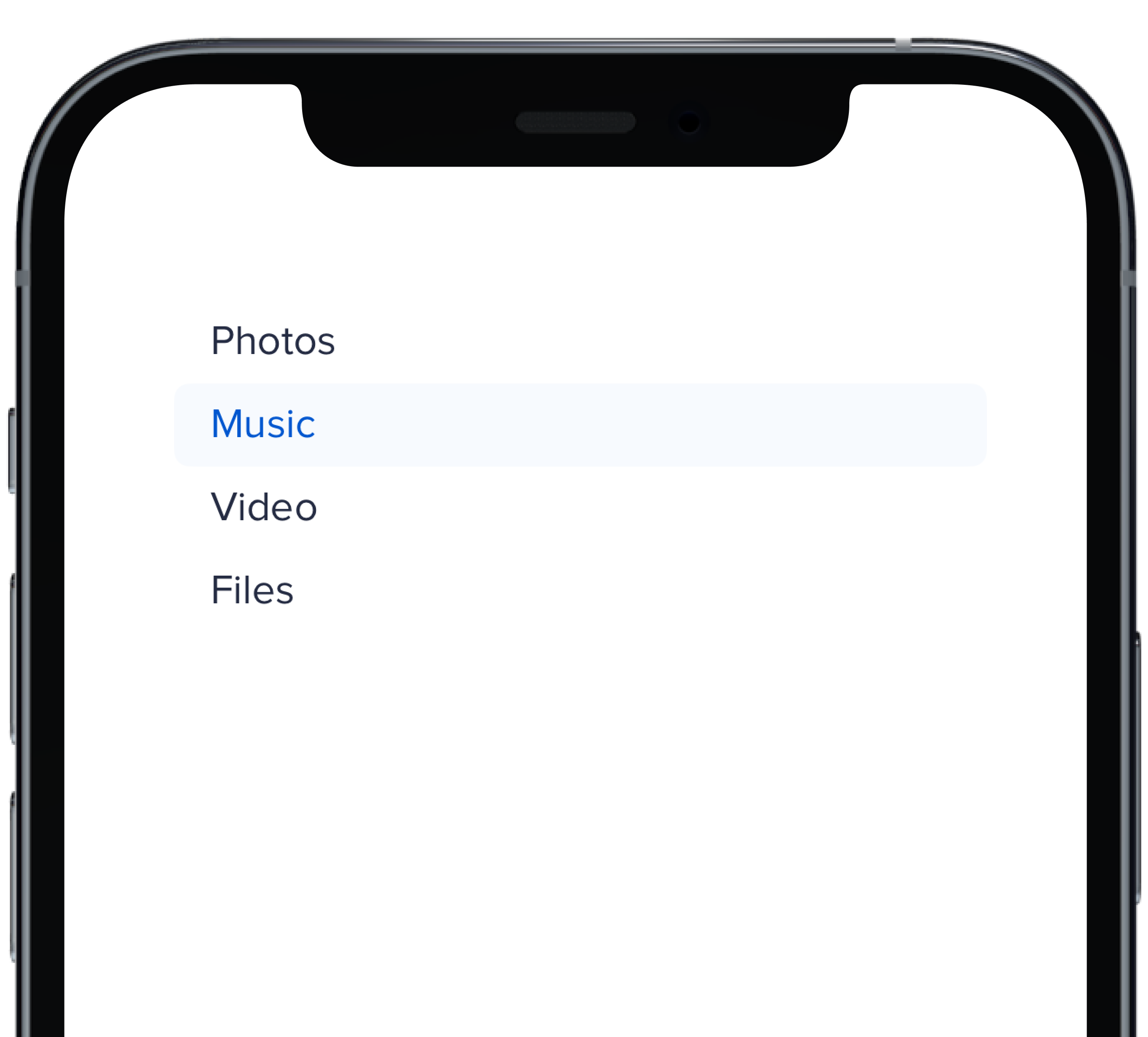
@@ -0,0 +1,17 @@
|
|
|
1
|
+
|
|
2
|
+
|
|
3
|
+
```swift
|
|
4
|
+
@State private var selectedHBold: Int = 1
|
|
5
|
+
|
|
6
|
+
PBNav(
|
|
7
|
+
selected: $selectedHBold,
|
|
8
|
+
variant: .bold,
|
|
9
|
+
orientation: .horizontal,
|
|
10
|
+
borders: false
|
|
11
|
+
) {
|
|
12
|
+
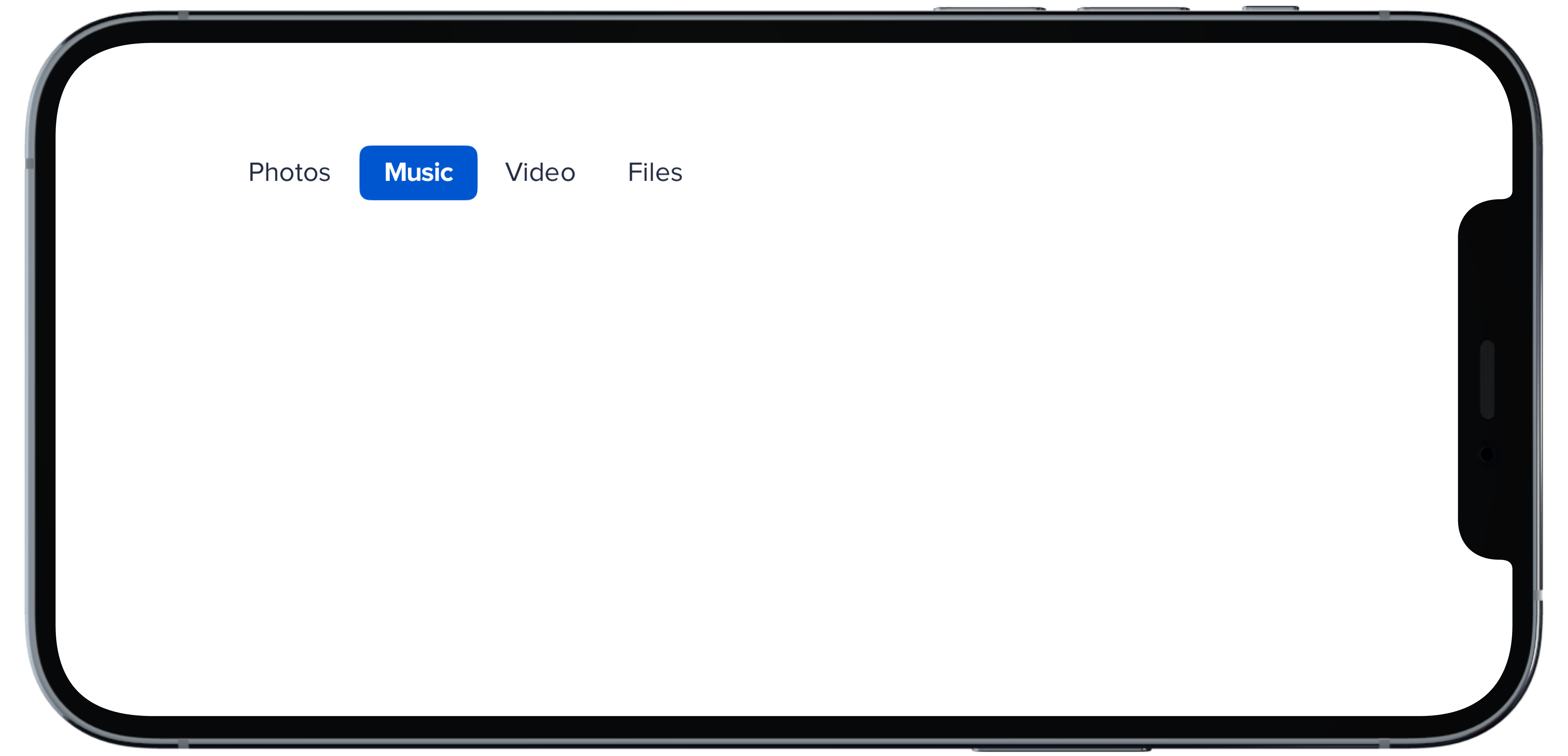
PBNavItem("Photos")
|
|
13
|
+
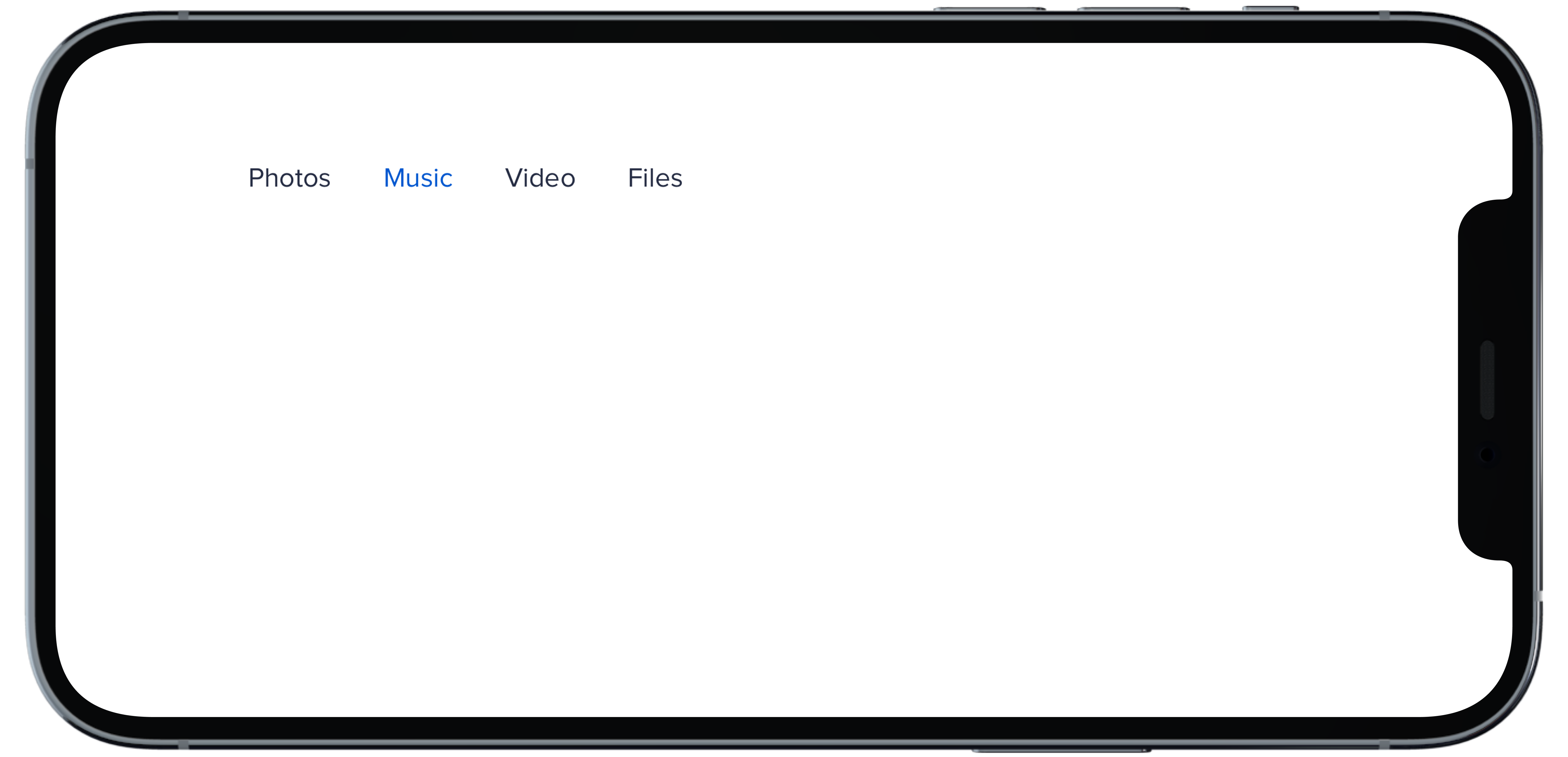
PBNavItem("Music")
|
|
14
|
+
PBNavItem("Video")
|
|
15
|
+
PBNavItem("Files")
|
|
16
|
+
}
|
|
17
|
+
```
|
|
@@ -0,0 +1,17 @@
|
|
|
1
|
+
|
|
2
|
+
|
|
3
|
+
```swift
|
|
4
|
+
@State private var selectedHDefault: Int = 1
|
|
5
|
+
|
|
6
|
+
PBNav(
|
|
7
|
+
selected: $selectedHDefault,
|
|
8
|
+
variant: .normal,
|
|
9
|
+
orientation: .horizontal
|
|
10
|
+
) {
|
|
11
|
+
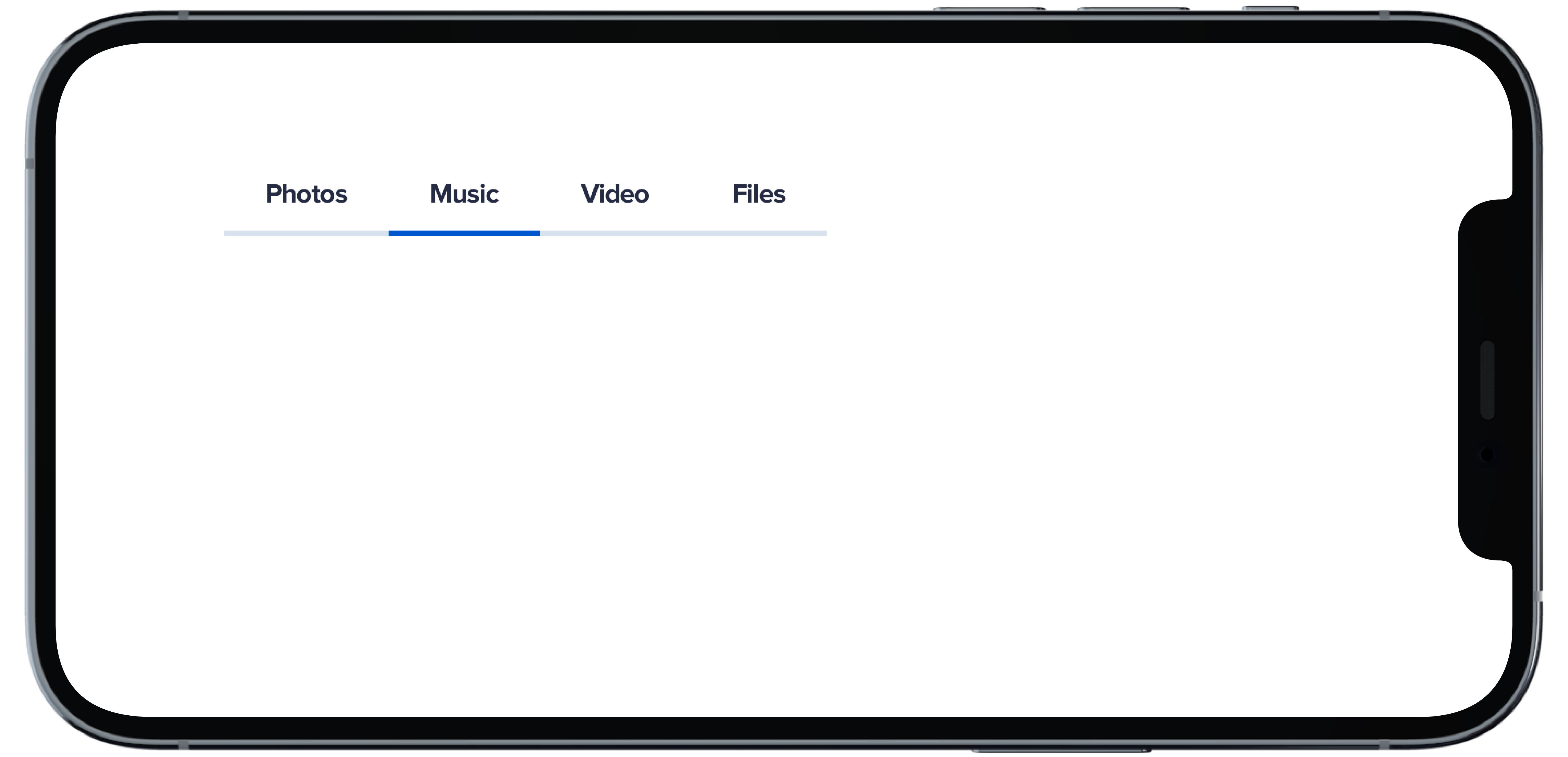
PBNavItem("Photos")
|
|
12
|
+
PBNavItem("Music")
|
|
13
|
+
PBNavItem("Video")
|
|
14
|
+
PBNavItem("Files")
|
|
15
|
+
}
|
|
16
|
+
|
|
17
|
+
```
|
|
@@ -0,0 +1,18 @@
|
|
|
1
|
+
|
|
2
|
+
|
|
3
|
+
```swift
|
|
4
|
+
@State private var selectedHSubtleNoHighlight: Int = 1
|
|
5
|
+
|
|
6
|
+
PBNav(
|
|
7
|
+
selected: $selectedHSubtleNoHighlight,
|
|
8
|
+
variant: .subtle,
|
|
9
|
+
orientation: .horizontal,
|
|
10
|
+
borders: false,
|
|
11
|
+
highlight: false
|
|
12
|
+
) {
|
|
13
|
+
PBNavItem("Photos")
|
|
14
|
+
PBNavItem("Music")
|
|
15
|
+
PBNavItem("Video")
|
|
16
|
+
PBNavItem("Files")
|
|
17
|
+
}
|
|
18
|
+
```
|
|
@@ -0,0 +1,18 @@
|
|
|
1
|
+
|
|
2
|
+
|
|
3
|
+
```swift
|
|
4
|
+
@State private var selectedHSubtle: Int = 1
|
|
5
|
+
|
|
6
|
+
PBNav(
|
|
7
|
+
selected: $selectedHSubtle,
|
|
8
|
+
variant: .subtle,
|
|
9
|
+
orientation: .horizontal,
|
|
10
|
+
borders: false
|
|
11
|
+
) {
|
|
12
|
+
PBNavItem("Photos")
|
|
13
|
+
PBNavItem("Music")
|
|
14
|
+
PBNavItem("Video")
|
|
15
|
+
PBNavItem("Files")
|
|
16
|
+
}
|
|
17
|
+
|
|
18
|
+
```
|
|
@@ -0,0 +1,11 @@
|
|
|
1
|
+
### Props
|
|
2
|
+
| Name | Type | Description | Default | Values |
|
|
3
|
+
| --- | ----------- | --------- | --------- | --------- |
|
|
4
|
+
| **selected** | `Int` | Sets selected to current index | `0` | |
|
|
5
|
+
| **currentHover** | `Int?` | Sets the current hover state to the current index| | |
|
|
6
|
+
| **variant** | `Variant` | Sets variant for nav | `.normal` | `normal` `subtle` `bold` |
|
|
7
|
+
| **orientation** | `Orientation` | Changes the orientation of nav | `.vertical` | `horizontal` `verticle` |
|
|
8
|
+
| **title** | `String?` | Sets title of nav | | |
|
|
9
|
+
| **borders** | `Bool` | Boolean value for whether nav items have a border or not | `true` | `true` `false` |
|
|
10
|
+
| **highlight** | `Bool` | Boolean value for adding a highlight to nav | `true` | `true` `false` |
|
|
11
|
+
| **views** | `[AnyView]` | An Array of AnyView | | |
|
|
@@ -0,0 +1,18 @@
|
|
|
1
|
+
|
|
2
|
+
|
|
3
|
+
```swift
|
|
4
|
+
@State private var selectedVBold: Int = 1
|
|
5
|
+
|
|
6
|
+
PBNav(
|
|
7
|
+
selected: $selectedVBold,
|
|
8
|
+
variant: .bold,
|
|
9
|
+
orientation: .vertical,
|
|
10
|
+
borders: false
|
|
11
|
+
) {
|
|
12
|
+
PBNavItem("Photos")
|
|
13
|
+
PBNavItem("Music")
|
|
14
|
+
PBNavItem("Video")
|
|
15
|
+
PBNavItem("Files")
|
|
16
|
+
}
|
|
17
|
+
|
|
18
|
+
```
|
|
@@ -0,0 +1,18 @@
|
|
|
1
|
+
|
|
2
|
+
|
|
3
|
+
```swift
|
|
4
|
+
@State private var selectedVDefault: Int = 1
|
|
5
|
+
|
|
6
|
+
PBNav(
|
|
7
|
+
selected: $selectedVDefault,
|
|
8
|
+
variant: .normal,
|
|
9
|
+
orientation: .vertical,
|
|
10
|
+
title: "Menu"
|
|
11
|
+
) {
|
|
12
|
+
PBNavItem("Photos")
|
|
13
|
+
PBNavItem("Music")
|
|
14
|
+
PBNavItem("Video")
|
|
15
|
+
PBNavItem("Files")
|
|
16
|
+
}
|
|
17
|
+
|
|
18
|
+
```
|
|
@@ -0,0 +1,19 @@
|
|
|
1
|
+
|
|
2
|
+
|
|
3
|
+
```swift
|
|
4
|
+
@State private var selectedVSubtleNoHighlight: Int = 1
|
|
5
|
+
|
|
6
|
+
PBNav(
|
|
7
|
+
selected: $selectedVSubtleNoHighlight,
|
|
8
|
+
variant: .subtle,
|
|
9
|
+
orientation: .vertical,
|
|
10
|
+
borders: false,
|
|
11
|
+
highlight: false
|
|
12
|
+
) {
|
|
13
|
+
PBNavItem("Photos")
|
|
14
|
+
PBNavItem("Music")
|
|
15
|
+
PBNavItem("Video")
|
|
16
|
+
PBNavItem("Files")
|
|
17
|
+
}
|
|
18
|
+
|
|
19
|
+
```
|
|
@@ -0,0 +1,17 @@
|
|
|
1
|
+
|
|
2
|
+
|
|
3
|
+
```swift
|
|
4
|
+
@State private var selectedVSubtle: Int = 1
|
|
5
|
+
|
|
6
|
+
PBNav(
|
|
7
|
+
selected: $selectedVSubtle,
|
|
8
|
+
variant: .subtle,
|
|
9
|
+
orientation: .vertical,
|
|
10
|
+
borders: false
|
|
11
|
+
) {
|
|
12
|
+
PBNavItem("Photos")
|
|
13
|
+
PBNavItem("Music")
|
|
14
|
+
PBNavItem("Video")
|
|
15
|
+
PBNavItem("Files")
|
|
16
|
+
}
|
|
17
|
+
```
|
|
@@ -42,3 +42,20 @@ examples:
|
|
|
42
42
|
- block_nav: Block
|
|
43
43
|
- block_no_title_nav: Without Title
|
|
44
44
|
- new_tab: Open in a New Tab
|
|
45
|
+
|
|
46
|
+
swift:
|
|
47
|
+
- nav_vertical_default_swift: Vertical Default
|
|
48
|
+
- nav_vertical_subtle_swift: Vertical Subtle
|
|
49
|
+
- nav_vertical_subtle_no_highlight_swift: Vertical Subtle No Highlight
|
|
50
|
+
- nav_vertical_bold_swift: Vertical Bold
|
|
51
|
+
- nav_horizontal_default_swift: Horizontal Default
|
|
52
|
+
- nav_horizontal_subtle_swift: Horizontal Subtle
|
|
53
|
+
- nav_horizontal_subtle_no_highlight_swift: Horizontal Subtle No Highlight
|
|
54
|
+
- nav_horizontal_bold_swift: Horizontal Bold
|
|
55
|
+
- nav_props_swift: ""
|
|
56
|
+
|
|
57
|
+
|
|
58
|
+
|
|
59
|
+
|
|
60
|
+
|
|
61
|
+
|
|
@@ -0,0 +1,24 @@
|
|
|
1
|
+
<%= pb_rails("select", props: {
|
|
2
|
+
label: "Favorite Food",
|
|
3
|
+
name: "food",
|
|
4
|
+
inline: true,
|
|
5
|
+
options: [
|
|
6
|
+
{
|
|
7
|
+
value: "1",
|
|
8
|
+
value_text: "Burgers",
|
|
9
|
+
},
|
|
10
|
+
{
|
|
11
|
+
value: "2",
|
|
12
|
+
value_text: "Pizza",
|
|
13
|
+
},
|
|
14
|
+
{
|
|
15
|
+
value: "3",
|
|
16
|
+
value_text: "Tacos",
|
|
17
|
+
},
|
|
18
|
+
{
|
|
19
|
+
value: "4",
|
|
20
|
+
value_text: "BBQ",
|
|
21
|
+
},
|
|
22
|
+
],
|
|
23
|
+
show_arrow: true
|
|
24
|
+
}) %>
|
|
@@ -0,0 +1,38 @@
|
|
|
1
|
+
import React from 'react'
|
|
2
|
+
import { Body, Select } from '../..'
|
|
3
|
+
|
|
4
|
+
const SelectInlineShowArrow = (props) => {
|
|
5
|
+
const options = [
|
|
6
|
+
{
|
|
7
|
+
value: '1',
|
|
8
|
+
text: 'Burgers',
|
|
9
|
+
},
|
|
10
|
+
{
|
|
11
|
+
value: '2',
|
|
12
|
+
text: 'Pizza',
|
|
13
|
+
},
|
|
14
|
+
{
|
|
15
|
+
value: '3',
|
|
16
|
+
text: 'Tacos',
|
|
17
|
+
},
|
|
18
|
+
]
|
|
19
|
+
|
|
20
|
+
return (
|
|
21
|
+
<div>
|
|
22
|
+
<Select
|
|
23
|
+
inline
|
|
24
|
+
label="Favorite Food"
|
|
25
|
+
name="food"
|
|
26
|
+
options={options}
|
|
27
|
+
showArrow
|
|
28
|
+
{...props}
|
|
29
|
+
/>
|
|
30
|
+
<Body
|
|
31
|
+
status="negative"
|
|
32
|
+
{...props}
|
|
33
|
+
/>
|
|
34
|
+
</div>
|
|
35
|
+
)
|
|
36
|
+
}
|
|
37
|
+
|
|
38
|
+
export default SelectInlineShowArrow
|
|
@@ -10,6 +10,7 @@ examples:
|
|
|
10
10
|
- select_custom_select: Custom Select
|
|
11
11
|
- select_error: Select w/ Error
|
|
12
12
|
- select_inline: Select Inline
|
|
13
|
+
- select_inline_show_arrow: Select Inline (Always Show Arrow)
|
|
13
14
|
- select_inline_compact: Select Inline Compact
|
|
14
15
|
- select_attributes: Select W/ Attributes
|
|
15
16
|
- select_multiple: Select Multiple
|
|
@@ -26,6 +27,7 @@ examples:
|
|
|
26
27
|
- select_custom_select: Custom Select
|
|
27
28
|
- select_error: Select w/ Error
|
|
28
29
|
- select_inline: Select Inline
|
|
30
|
+
- select_inline_show_arrow: Select Inline (Always Show Arrow)
|
|
29
31
|
- select_inline_compact: Select Inline Compact
|
|
30
32
|
- select_multiple: Select Multiple
|
|
31
33
|
|
|
@@ -7,5 +7,6 @@ export { default as SelectCustomSelect } from './_select_custom_select.jsx'
|
|
|
7
7
|
export { default as SelectValueTextSame } from './_select_value_text_same.jsx'
|
|
8
8
|
export { default as SelectError } from './_select_error.jsx'
|
|
9
9
|
export { default as SelectInline } from './_select_inline.jsx'
|
|
10
|
+
export { default as SelectInlineShowArrow } from './_select_inline_show_arrow.jsx'
|
|
10
11
|
export { default as SelectInlineCompact } from './_select_inline_compact.jsx'
|
|
11
12
|
export { default as SelectMultiple } from './_select_multiple.jsx'
|