playbook_ui_docs 13.15.0 → 13.16.0
Sign up to get free protection for your applications and to get access to all the features.
- checksums.yaml +4 -4
- data/app/pb_kits/playbook/pb_collapsible/docs/_collapsible_colors_swift.md +27 -0
- data/app/pb_kits/playbook/pb_collapsible/docs/_collapsible_default_swift.md +22 -0
- data/app/pb_kits/playbook/pb_collapsible/docs/_collapsible_props_table.md +8 -0
- data/app/pb_kits/playbook/pb_collapsible/docs/_collapsible_sizes_swift.md +26 -0
- data/app/pb_kits/playbook/pb_collapsible/docs/example.yml +6 -0
- data/app/pb_kits/playbook/pb_nav/docs/_nav_horizontal_bold_swift.md +17 -0
- data/app/pb_kits/playbook/pb_nav/docs/_nav_horizontal_default_swift.md +17 -0
- data/app/pb_kits/playbook/pb_nav/docs/_nav_horizontal_subtle_no_highlight_swift.md +18 -0
- data/app/pb_kits/playbook/pb_nav/docs/_nav_horizontal_subtle_swift.md +18 -0
- data/app/pb_kits/playbook/pb_nav/docs/_nav_props_swift.md +11 -0
- data/app/pb_kits/playbook/pb_nav/docs/_nav_vertical_bold_swift.md +18 -0
- data/app/pb_kits/playbook/pb_nav/docs/_nav_vertical_default_swift.md +18 -0
- data/app/pb_kits/playbook/pb_nav/docs/_nav_vertical_subtle_no_highlight_swift.md +19 -0
- data/app/pb_kits/playbook/pb_nav/docs/_nav_vertical_subtle_swift.md +17 -0
- data/app/pb_kits/playbook/pb_nav/docs/example.yml +17 -0
- data/app/pb_kits/playbook/pb_select/docs/_select_inline_show_arrow.html.erb +24 -0
- data/app/pb_kits/playbook/pb_select/docs/_select_inline_show_arrow.jsx +38 -0
- data/app/pb_kits/playbook/pb_select/docs/example.yml +2 -0
- data/app/pb_kits/playbook/pb_select/docs/index.js +1 -0
- data/dist/playbook-doc.js +5 -5
- metadata +17 -2
checksums.yaml
CHANGED
|
@@ -1,7 +1,7 @@
|
|
|
1
1
|
---
|
|
2
2
|
SHA256:
|
|
3
|
-
metadata.gz:
|
|
4
|
-
data.tar.gz:
|
|
3
|
+
metadata.gz: '09cb0161c92d483683299475241b3c36f5ed733469a6ba4400259417e2374f54'
|
|
4
|
+
data.tar.gz: 12c574aae35c58f4e0fff3477778751868ffd57557f3ff64f1fae7df00226263
|
|
5
5
|
SHA512:
|
|
6
|
-
metadata.gz:
|
|
7
|
-
data.tar.gz:
|
|
6
|
+
metadata.gz: 9910a2a1bc1d2196771b7db54cd4a5c77a95f96e10e27123626a8ef930962ea65d6a4e5f84ce2f02cf2a2bd8b93d529b8a96bc35828ff3db20e434d0d89af901
|
|
7
|
+
data.tar.gz: e211c1c5dcf9dd752a2372d0354d5bfe76363b4daef4c3ac53cd3ca78c09500bb0266c943b6568bf71de7dede70fdfd2fc981d0590d49c9a483864038f111bb5
|
|
@@ -0,0 +1,27 @@
|
|
|
1
|
+

|
|
2
|
+
|
|
3
|
+
```swift
|
|
4
|
+
let iconSize: PBIcon.IconSize
|
|
5
|
+
let iconColor: CollapsibleIconColor
|
|
6
|
+
let text: String
|
|
7
|
+
@State private var isCollapsed = true
|
|
8
|
+
let lorem =
|
|
9
|
+
"
|
|
10
|
+
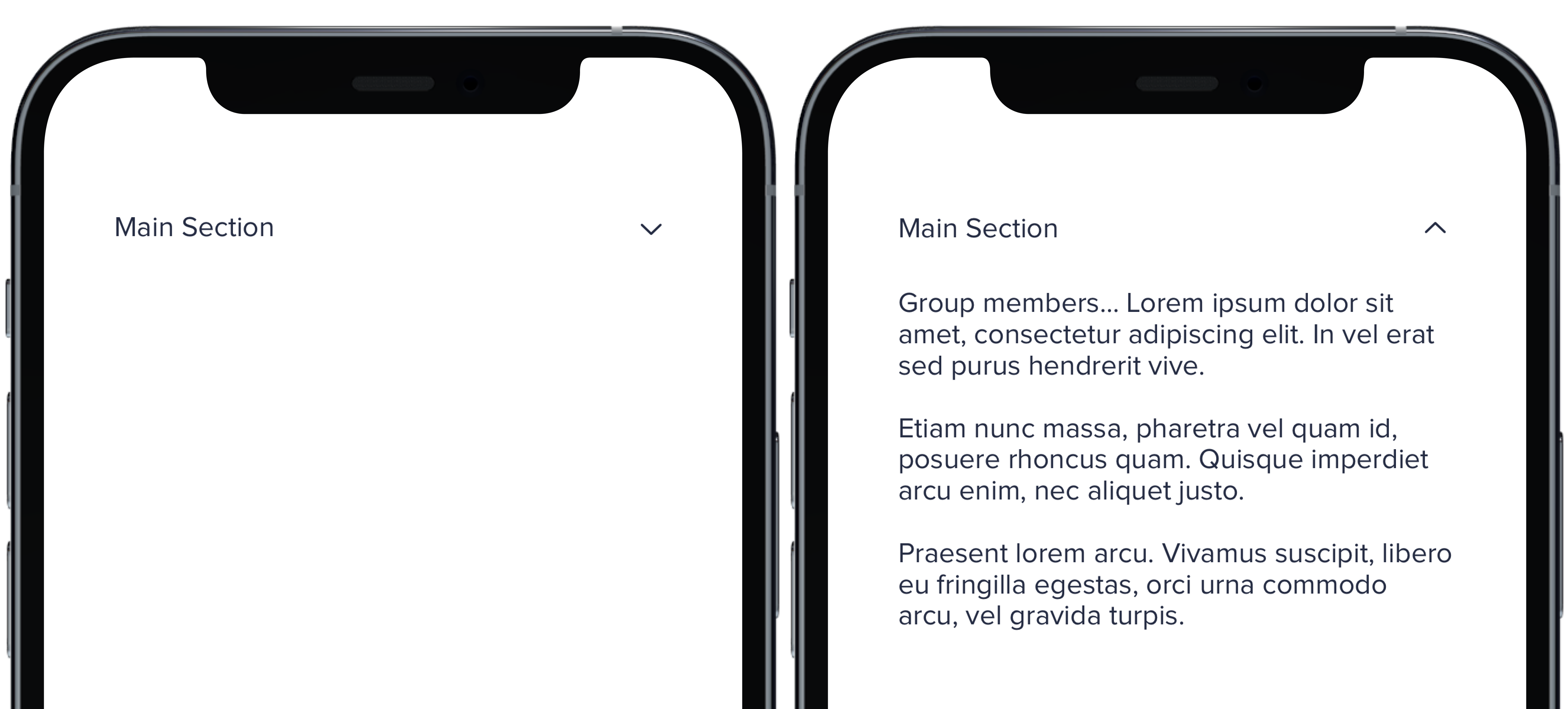
Group members... Lorem ipsum dolor sit amet, consectetur adipiscing elit. In vel erat sed purus hendrerit vive.
|
|
11
|
+
Etiam nunc massa, pharetra vel quam id, posuere rhoncus quam. Quisque imperdiet arcu enim, nec aliquet justo.
|
|
12
|
+
Praesent lorem arcu. Vivamus suscipit, libero eu fringilla egestas, orci urna commodo arcu, vel gravida turpis.
|
|
13
|
+
"
|
|
14
|
+
PBCollapsible(isCollapsed: $isCollapsed, iconSize: iconSize, iconColor: iconColor) {
|
|
15
|
+
VStack(spacing: Spacing.medium) {
|
|
16
|
+
CollapsibleDoc(iconColor: .default, text: "Default Section")
|
|
17
|
+
CollapsibleDoc(iconColor: .light, text: "Light Section")
|
|
18
|
+
CollapsibleDoc(iconColor: .lighter, text: "Lighter Section")
|
|
19
|
+
CollapsibleDoc(iconColor: .link, text: "Link Section")
|
|
20
|
+
CollapsibleDoc(iconColor: .error, text: "Error Section")
|
|
21
|
+
CollapsibleDoc(iconColor: .success, text: "Success Section")
|
|
22
|
+
}
|
|
23
|
+
} content: {
|
|
24
|
+
Text(lorem).pbFont(.body)
|
|
25
|
+
}
|
|
26
|
+
|
|
27
|
+
```
|
|
@@ -0,0 +1,22 @@
|
|
|
1
|
+
|
|
2
|
+
|
|
3
|
+
|
|
4
|
+
```swift
|
|
5
|
+
let iconSize: PBIcon.IconSize
|
|
6
|
+
let iconColor: CollapsibleIconColor
|
|
7
|
+
let text: String
|
|
8
|
+
@State private var isCollapsed = true
|
|
9
|
+
let lorem =
|
|
10
|
+
"
|
|
11
|
+
Group members... Lorem ipsum dolor sit amet, consectetur adipiscing elit. In vel erat sed purus hendrerit vive.
|
|
12
|
+
Etiam nunc massa, pharetra vel quam id, posuere rhoncus quam. Quisque imperdiet arcu enim, nec aliquet justo.
|
|
13
|
+
Praesent lorem arcu. Vivamus suscipit, libero eu fringilla egestas, orci urna commodo arcu, vel gravida turpis.
|
|
14
|
+
"
|
|
15
|
+
|
|
16
|
+
PBCollapsible(isCollapsed: $isCollapsed, iconSize: iconSize, iconColor: iconColor) {
|
|
17
|
+
CollapsibleDoc(text: "Main Section")
|
|
18
|
+
} content: {
|
|
19
|
+
Text(lorem).pbFont(.body)
|
|
20
|
+
}
|
|
21
|
+
|
|
22
|
+
```
|
|
@@ -0,0 +1,8 @@
|
|
|
1
|
+
### Props
|
|
2
|
+
| Name | Type | Description | Default | Values |
|
|
3
|
+
| --- | ----------- | --------- | --------- | --------- |
|
|
4
|
+
| **isCollapsed** | `Bool` | Value for whether or not the dropdown is closed or open | `false` | `true` `false` |
|
|
5
|
+
| **headerView** | `View` | Title of dropdown | | |
|
|
6
|
+
| **contentView** | `View` | Content of dropdown | | |
|
|
7
|
+
| **iconSize** | `PBIcon.IconSize` | Sets size of chevron icon | `.small` | `xSmall` `small` `large` `x1` `x2` `x3` `x4` `x5` `x6` `x7` `x8` `x9` `x10` |
|
|
8
|
+
| **iconColor** | `CollapsibleIconColor` | Sets color of chevron icon | `.default` | `default` `light` `lighter` `link` `error` `success` |
|
|
@@ -0,0 +1,26 @@
|
|
|
1
|
+

|
|
2
|
+
|
|
3
|
+
```swift
|
|
4
|
+
let iconSize: PBIcon.IconSize
|
|
5
|
+
let iconColor: CollapsibleIconColor
|
|
6
|
+
let text: String
|
|
7
|
+
@State private var isCollapsed = true
|
|
8
|
+
let lorem =
|
|
9
|
+
"
|
|
10
|
+
Group members... Lorem ipsum dolor sit amet, consectetur adipiscing elit. In vel erat sed purus hendrerit vive.
|
|
11
|
+
Etiam nunc massa, pharetra vel quam id, posuere rhoncus quam. Quisque imperdiet arcu enim, nec aliquet justo.
|
|
12
|
+
Praesent lorem arcu. Vivamus suscipit, libero eu fringilla egestas, orci urna commodo arcu, vel gravida turpis.
|
|
13
|
+
"
|
|
14
|
+
|
|
15
|
+
PBCollapsible(isCollapsed: $isCollapsed, iconSize: iconSize, iconColor: iconColor) {
|
|
16
|
+
VStack(spacing: Spacing.medium) {
|
|
17
|
+
CollapsibleDoc(iconSize: .xSmall, text: "Extra Small Section")
|
|
18
|
+
CollapsibleDoc(iconSize: .small, text: "Small Section")
|
|
19
|
+
CollapsibleDoc(text: "Default Section")
|
|
20
|
+
CollapsibleDoc(iconSize: .large, text: "Large Section")
|
|
21
|
+
}
|
|
22
|
+
} content: {
|
|
23
|
+
Text(lorem).pbFont(.body)
|
|
24
|
+
}
|
|
25
|
+
|
|
26
|
+
```
|
|
@@ -14,3 +14,9 @@ examples:
|
|
|
14
14
|
- collapsible_color: Icon Color
|
|
15
15
|
- collapsible_icons: Custom Icons
|
|
16
16
|
- collapsible_state: useCollapsible Hook
|
|
17
|
+
|
|
18
|
+
swift:
|
|
19
|
+
- collapsible_default_swift: Default
|
|
20
|
+
- collapsible_sizes_swift: Sizes
|
|
21
|
+
- collapsible_colors_swift: Colors
|
|
22
|
+
- collapsible_props_table: ""
|
|
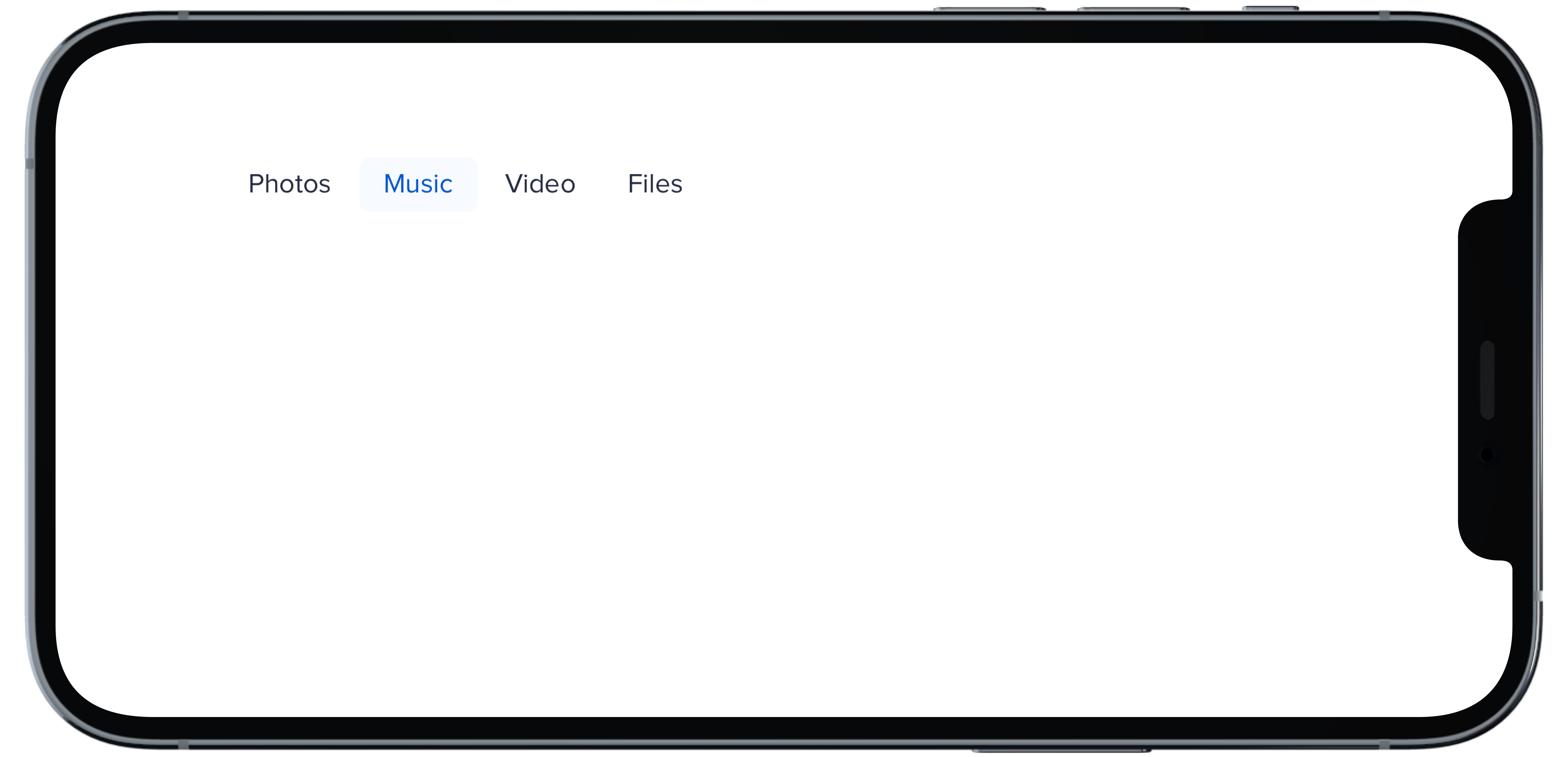
@@ -0,0 +1,17 @@
|
|
|
1
|
+
|
|
2
|
+
|
|
3
|
+
```swift
|
|
4
|
+
@State private var selectedHBold: Int = 1
|
|
5
|
+
|
|
6
|
+
PBNav(
|
|
7
|
+
selected: $selectedHBold,
|
|
8
|
+
variant: .bold,
|
|
9
|
+
orientation: .horizontal,
|
|
10
|
+
borders: false
|
|
11
|
+
) {
|
|
12
|
+
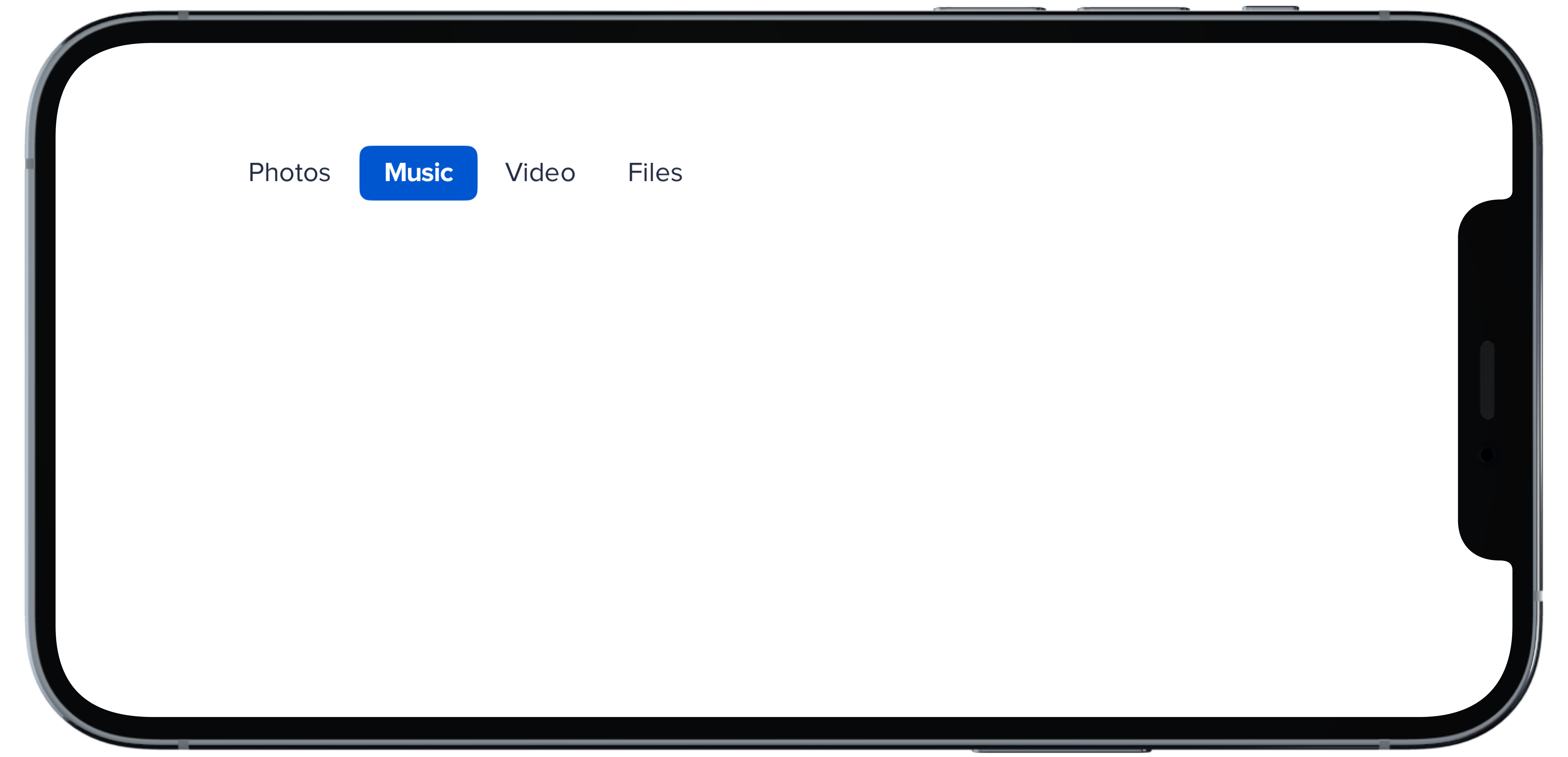
PBNavItem("Photos")
|
|
13
|
+
PBNavItem("Music")
|
|
14
|
+
PBNavItem("Video")
|
|
15
|
+
PBNavItem("Files")
|
|
16
|
+
}
|
|
17
|
+
```
|
|
@@ -0,0 +1,17 @@
|
|
|
1
|
+
|
|
2
|
+
|
|
3
|
+
```swift
|
|
4
|
+
@State private var selectedHDefault: Int = 1
|
|
5
|
+
|
|
6
|
+
PBNav(
|
|
7
|
+
selected: $selectedHDefault,
|
|
8
|
+
variant: .normal,
|
|
9
|
+
orientation: .horizontal
|
|
10
|
+
) {
|
|
11
|
+
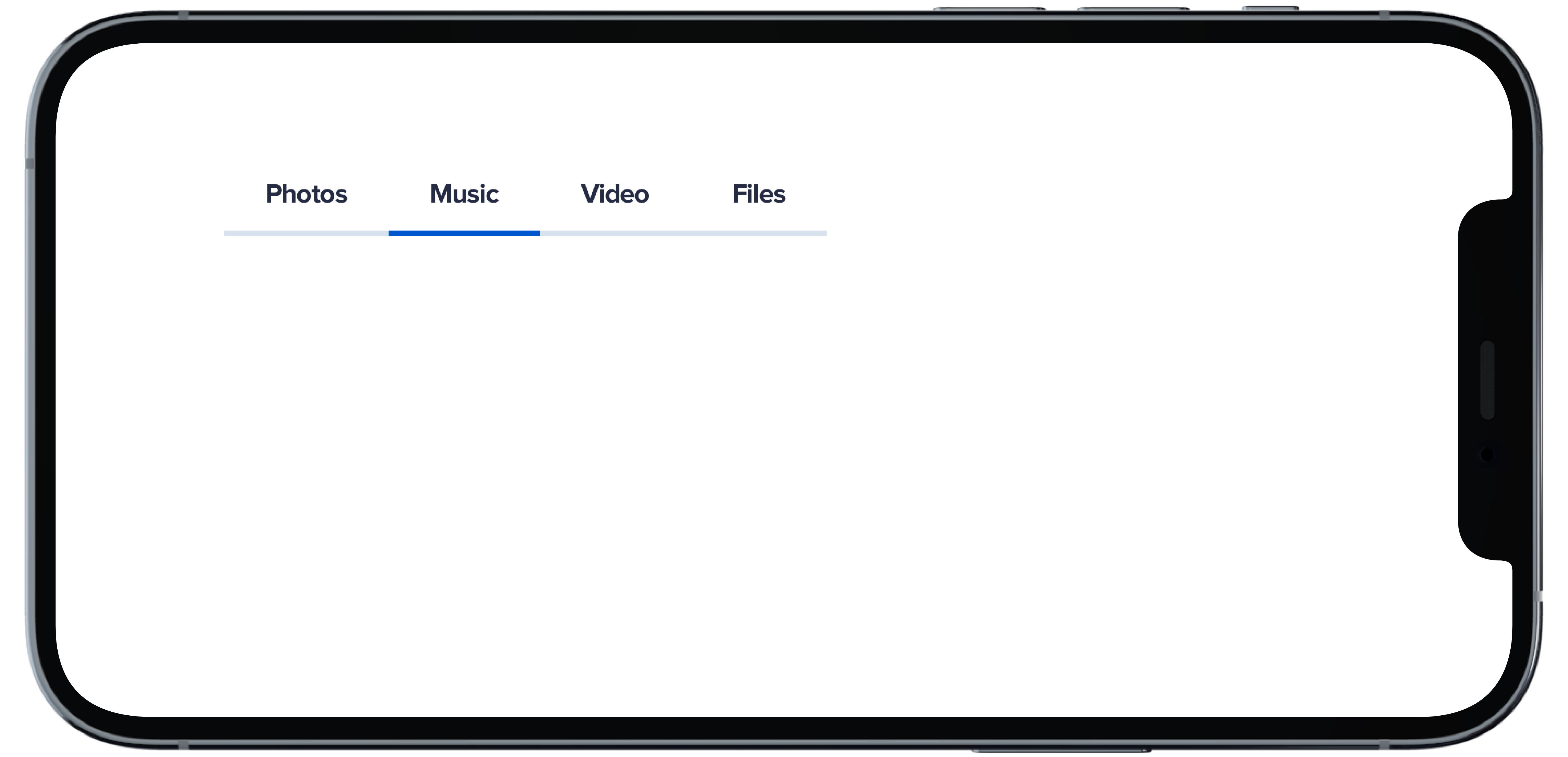
PBNavItem("Photos")
|
|
12
|
+
PBNavItem("Music")
|
|
13
|
+
PBNavItem("Video")
|
|
14
|
+
PBNavItem("Files")
|
|
15
|
+
}
|
|
16
|
+
|
|
17
|
+
```
|
|
@@ -0,0 +1,18 @@
|
|
|
1
|
+
|
|
2
|
+
|
|
3
|
+
```swift
|
|
4
|
+
@State private var selectedHSubtleNoHighlight: Int = 1
|
|
5
|
+
|
|
6
|
+
PBNav(
|
|
7
|
+
selected: $selectedHSubtleNoHighlight,
|
|
8
|
+
variant: .subtle,
|
|
9
|
+
orientation: .horizontal,
|
|
10
|
+
borders: false,
|
|
11
|
+
highlight: false
|
|
12
|
+
) {
|
|
13
|
+
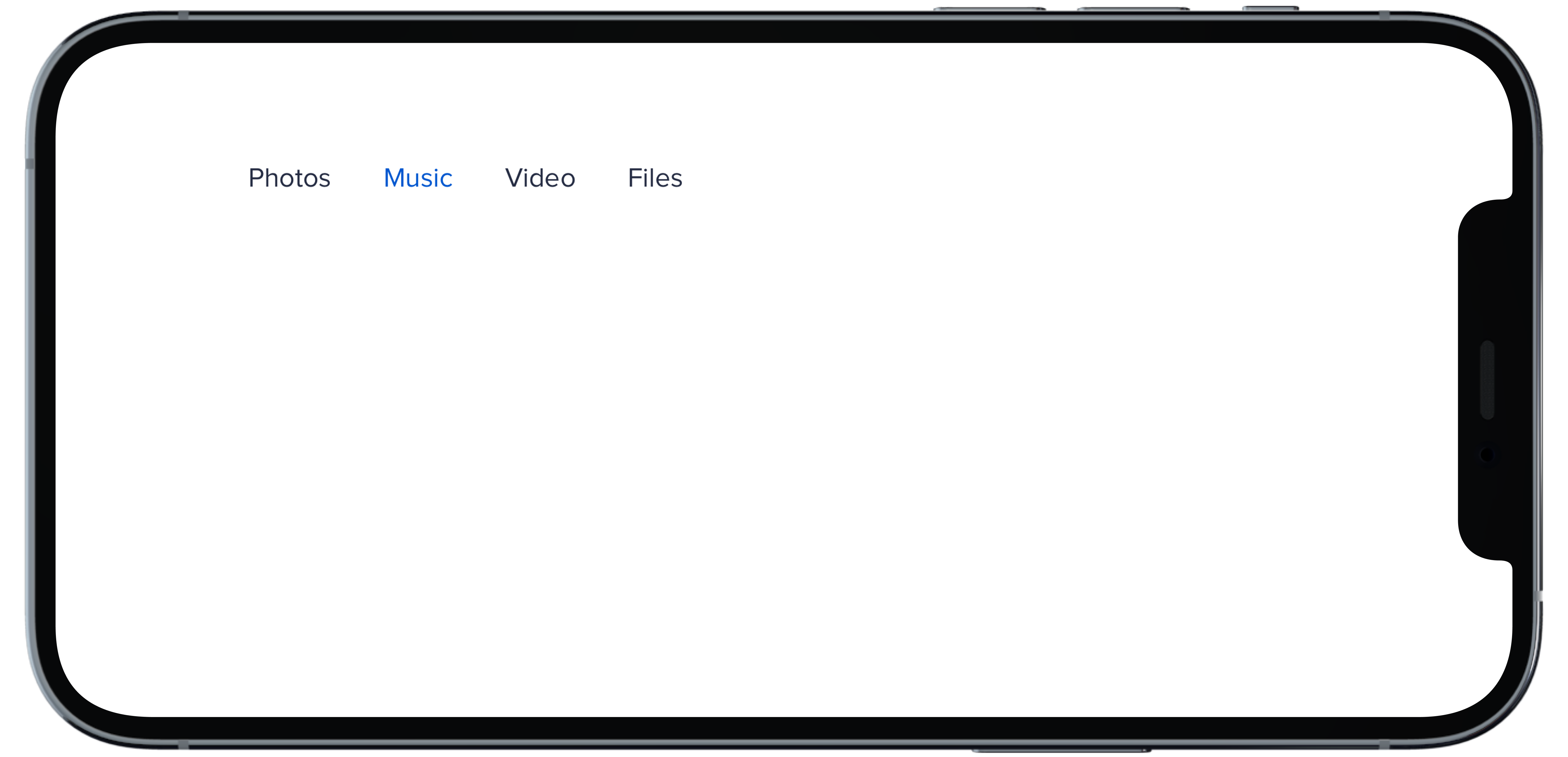
PBNavItem("Photos")
|
|
14
|
+
PBNavItem("Music")
|
|
15
|
+
PBNavItem("Video")
|
|
16
|
+
PBNavItem("Files")
|
|
17
|
+
}
|
|
18
|
+
```
|
|
@@ -0,0 +1,18 @@
|
|
|
1
|
+
|
|
2
|
+
|
|
3
|
+
```swift
|
|
4
|
+
@State private var selectedHSubtle: Int = 1
|
|
5
|
+
|
|
6
|
+
PBNav(
|
|
7
|
+
selected: $selectedHSubtle,
|
|
8
|
+
variant: .subtle,
|
|
9
|
+
orientation: .horizontal,
|
|
10
|
+
borders: false
|
|
11
|
+
) {
|
|
12
|
+
PBNavItem("Photos")
|
|
13
|
+
PBNavItem("Music")
|
|
14
|
+
PBNavItem("Video")
|
|
15
|
+
PBNavItem("Files")
|
|
16
|
+
}
|
|
17
|
+
|
|
18
|
+
```
|
|
@@ -0,0 +1,11 @@
|
|
|
1
|
+
### Props
|
|
2
|
+
| Name | Type | Description | Default | Values |
|
|
3
|
+
| --- | ----------- | --------- | --------- | --------- |
|
|
4
|
+
| **selected** | `Int` | Sets selected to current index | `0` | |
|
|
5
|
+
| **currentHover** | `Int?` | Sets the current hover state to the current index| | |
|
|
6
|
+
| **variant** | `Variant` | Sets variant for nav | `.normal` | `normal` `subtle` `bold` |
|
|
7
|
+
| **orientation** | `Orientation` | Changes the orientation of nav | `.vertical` | `horizontal` `verticle` |
|
|
8
|
+
| **title** | `String?` | Sets title of nav | | |
|
|
9
|
+
| **borders** | `Bool` | Boolean value for whether nav items have a border or not | `true` | `true` `false` |
|
|
10
|
+
| **highlight** | `Bool` | Boolean value for adding a highlight to nav | `true` | `true` `false` |
|
|
11
|
+
| **views** | `[AnyView]` | An Array of AnyView | | |
|
|
@@ -0,0 +1,18 @@
|
|
|
1
|
+
|
|
2
|
+
|
|
3
|
+
```swift
|
|
4
|
+
@State private var selectedVBold: Int = 1
|
|
5
|
+
|
|
6
|
+
PBNav(
|
|
7
|
+
selected: $selectedVBold,
|
|
8
|
+
variant: .bold,
|
|
9
|
+
orientation: .vertical,
|
|
10
|
+
borders: false
|
|
11
|
+
) {
|
|
12
|
+
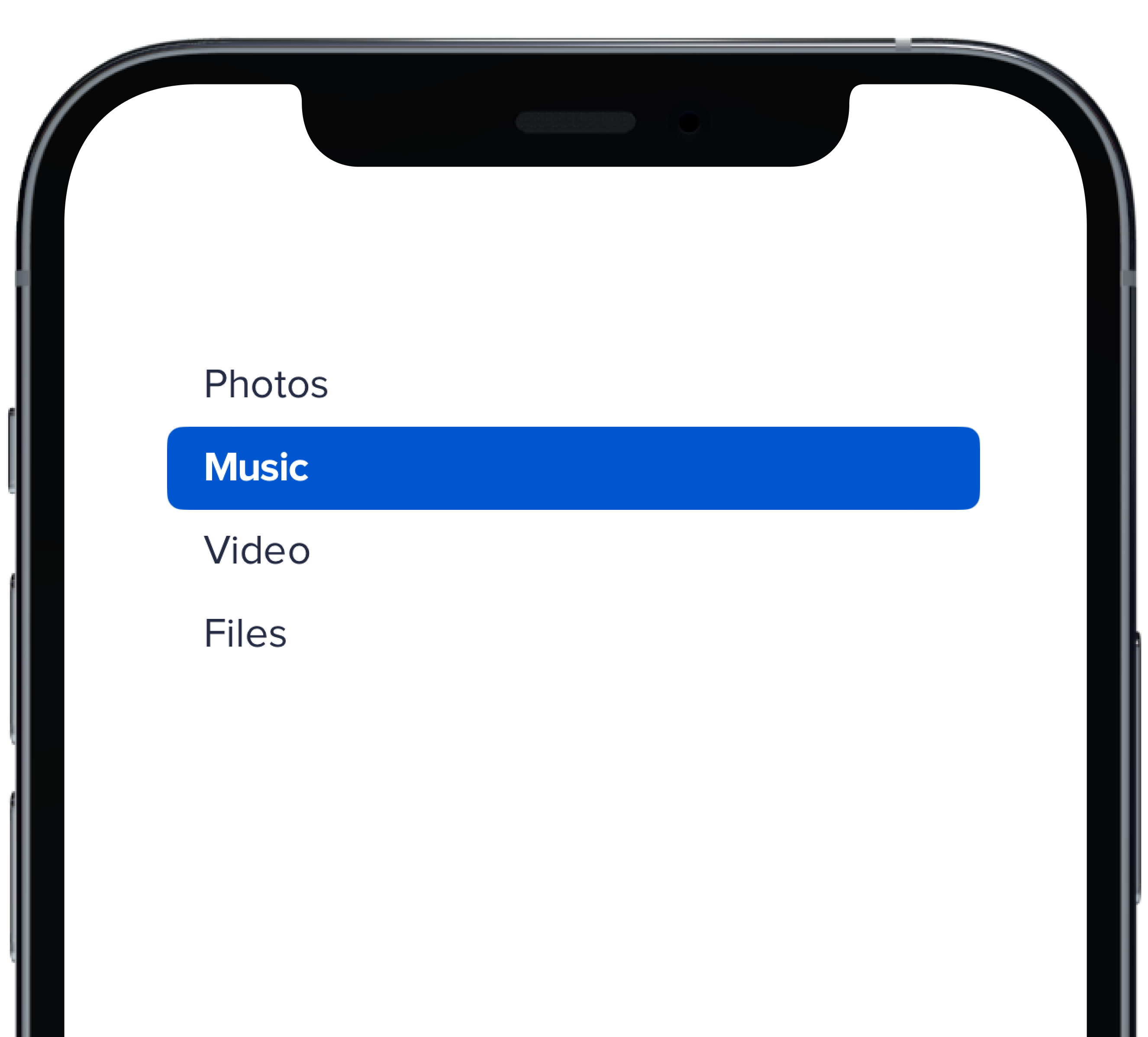
PBNavItem("Photos")
|
|
13
|
+
PBNavItem("Music")
|
|
14
|
+
PBNavItem("Video")
|
|
15
|
+
PBNavItem("Files")
|
|
16
|
+
}
|
|
17
|
+
|
|
18
|
+
```
|
|
@@ -0,0 +1,18 @@
|
|
|
1
|
+
|
|
2
|
+
|
|
3
|
+
```swift
|
|
4
|
+
@State private var selectedVDefault: Int = 1
|
|
5
|
+
|
|
6
|
+
PBNav(
|
|
7
|
+
selected: $selectedVDefault,
|
|
8
|
+
variant: .normal,
|
|
9
|
+
orientation: .vertical,
|
|
10
|
+
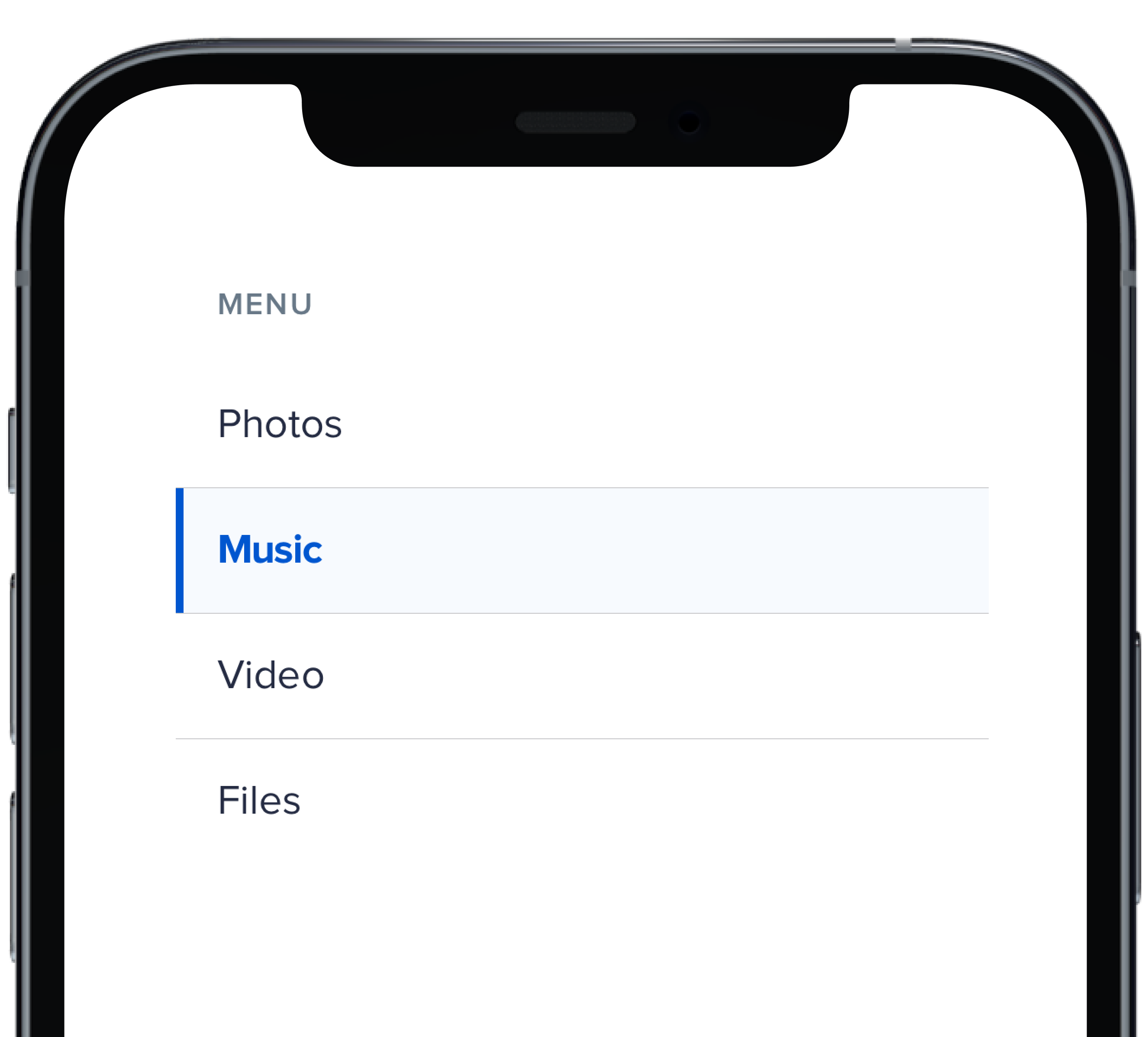
title: "Menu"
|
|
11
|
+
) {
|
|
12
|
+
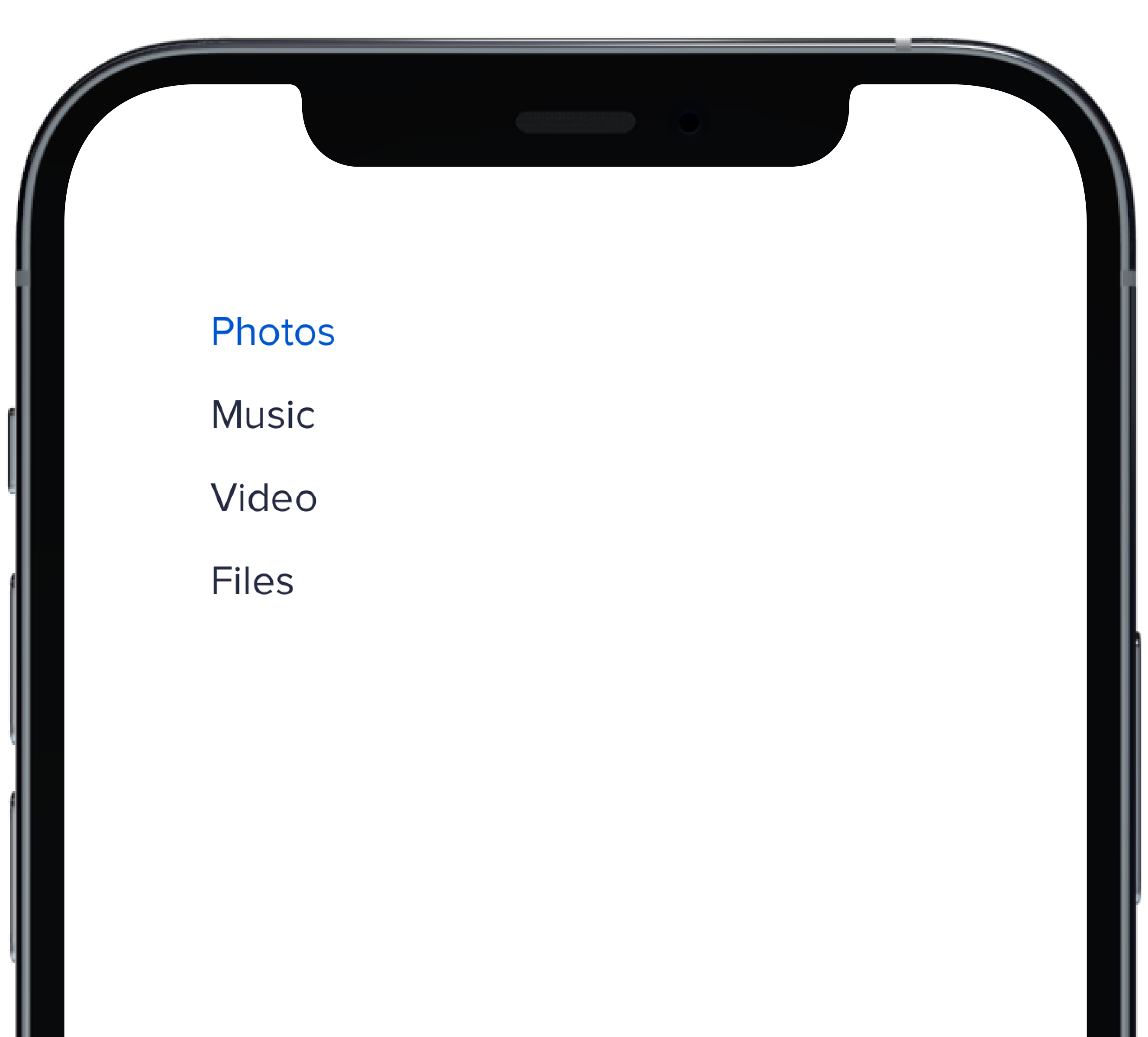
PBNavItem("Photos")
|
|
13
|
+
PBNavItem("Music")
|
|
14
|
+
PBNavItem("Video")
|
|
15
|
+
PBNavItem("Files")
|
|
16
|
+
}
|
|
17
|
+
|
|
18
|
+
```
|
|
@@ -0,0 +1,19 @@
|
|
|
1
|
+
|
|
2
|
+
|
|
3
|
+
```swift
|
|
4
|
+
@State private var selectedVSubtleNoHighlight: Int = 1
|
|
5
|
+
|
|
6
|
+
PBNav(
|
|
7
|
+
selected: $selectedVSubtleNoHighlight,
|
|
8
|
+
variant: .subtle,
|
|
9
|
+
orientation: .vertical,
|
|
10
|
+
borders: false,
|
|
11
|
+
highlight: false
|
|
12
|
+
) {
|
|
13
|
+
PBNavItem("Photos")
|
|
14
|
+
PBNavItem("Music")
|
|
15
|
+
PBNavItem("Video")
|
|
16
|
+
PBNavItem("Files")
|
|
17
|
+
}
|
|
18
|
+
|
|
19
|
+
```
|
|
@@ -0,0 +1,17 @@
|
|
|
1
|
+
|
|
2
|
+
|
|
3
|
+
```swift
|
|
4
|
+
@State private var selectedVSubtle: Int = 1
|
|
5
|
+
|
|
6
|
+
PBNav(
|
|
7
|
+
selected: $selectedVSubtle,
|
|
8
|
+
variant: .subtle,
|
|
9
|
+
orientation: .vertical,
|
|
10
|
+
borders: false
|
|
11
|
+
) {
|
|
12
|
+
PBNavItem("Photos")
|
|
13
|
+
PBNavItem("Music")
|
|
14
|
+
PBNavItem("Video")
|
|
15
|
+
PBNavItem("Files")
|
|
16
|
+
}
|
|
17
|
+
```
|
|
@@ -42,3 +42,20 @@ examples:
|
|
|
42
42
|
- block_nav: Block
|
|
43
43
|
- block_no_title_nav: Without Title
|
|
44
44
|
- new_tab: Open in a New Tab
|
|
45
|
+
|
|
46
|
+
swift:
|
|
47
|
+
- nav_vertical_default_swift: Vertical Default
|
|
48
|
+
- nav_vertical_subtle_swift: Vertical Subtle
|
|
49
|
+
- nav_vertical_subtle_no_highlight_swift: Vertical Subtle No Highlight
|
|
50
|
+
- nav_vertical_bold_swift: Vertical Bold
|
|
51
|
+
- nav_horizontal_default_swift: Horizontal Default
|
|
52
|
+
- nav_horizontal_subtle_swift: Horizontal Subtle
|
|
53
|
+
- nav_horizontal_subtle_no_highlight_swift: Horizontal Subtle No Highlight
|
|
54
|
+
- nav_horizontal_bold_swift: Horizontal Bold
|
|
55
|
+
- nav_props_swift: ""
|
|
56
|
+
|
|
57
|
+
|
|
58
|
+
|
|
59
|
+
|
|
60
|
+
|
|
61
|
+
|
|
@@ -0,0 +1,24 @@
|
|
|
1
|
+
<%= pb_rails("select", props: {
|
|
2
|
+
label: "Favorite Food",
|
|
3
|
+
name: "food",
|
|
4
|
+
inline: true,
|
|
5
|
+
options: [
|
|
6
|
+
{
|
|
7
|
+
value: "1",
|
|
8
|
+
value_text: "Burgers",
|
|
9
|
+
},
|
|
10
|
+
{
|
|
11
|
+
value: "2",
|
|
12
|
+
value_text: "Pizza",
|
|
13
|
+
},
|
|
14
|
+
{
|
|
15
|
+
value: "3",
|
|
16
|
+
value_text: "Tacos",
|
|
17
|
+
},
|
|
18
|
+
{
|
|
19
|
+
value: "4",
|
|
20
|
+
value_text: "BBQ",
|
|
21
|
+
},
|
|
22
|
+
],
|
|
23
|
+
show_arrow: true
|
|
24
|
+
}) %>
|
|
@@ -0,0 +1,38 @@
|
|
|
1
|
+
import React from 'react'
|
|
2
|
+
import { Body, Select } from '../..'
|
|
3
|
+
|
|
4
|
+
const SelectInlineShowArrow = (props) => {
|
|
5
|
+
const options = [
|
|
6
|
+
{
|
|
7
|
+
value: '1',
|
|
8
|
+
text: 'Burgers',
|
|
9
|
+
},
|
|
10
|
+
{
|
|
11
|
+
value: '2',
|
|
12
|
+
text: 'Pizza',
|
|
13
|
+
},
|
|
14
|
+
{
|
|
15
|
+
value: '3',
|
|
16
|
+
text: 'Tacos',
|
|
17
|
+
},
|
|
18
|
+
]
|
|
19
|
+
|
|
20
|
+
return (
|
|
21
|
+
<div>
|
|
22
|
+
<Select
|
|
23
|
+
inline
|
|
24
|
+
label="Favorite Food"
|
|
25
|
+
name="food"
|
|
26
|
+
options={options}
|
|
27
|
+
showArrow
|
|
28
|
+
{...props}
|
|
29
|
+
/>
|
|
30
|
+
<Body
|
|
31
|
+
status="negative"
|
|
32
|
+
{...props}
|
|
33
|
+
/>
|
|
34
|
+
</div>
|
|
35
|
+
)
|
|
36
|
+
}
|
|
37
|
+
|
|
38
|
+
export default SelectInlineShowArrow
|
|
@@ -10,6 +10,7 @@ examples:
|
|
|
10
10
|
- select_custom_select: Custom Select
|
|
11
11
|
- select_error: Select w/ Error
|
|
12
12
|
- select_inline: Select Inline
|
|
13
|
+
- select_inline_show_arrow: Select Inline (Always Show Arrow)
|
|
13
14
|
- select_inline_compact: Select Inline Compact
|
|
14
15
|
- select_attributes: Select W/ Attributes
|
|
15
16
|
- select_multiple: Select Multiple
|
|
@@ -26,6 +27,7 @@ examples:
|
|
|
26
27
|
- select_custom_select: Custom Select
|
|
27
28
|
- select_error: Select w/ Error
|
|
28
29
|
- select_inline: Select Inline
|
|
30
|
+
- select_inline_show_arrow: Select Inline (Always Show Arrow)
|
|
29
31
|
- select_inline_compact: Select Inline Compact
|
|
30
32
|
- select_multiple: Select Multiple
|
|
31
33
|
|
|
@@ -7,5 +7,6 @@ export { default as SelectCustomSelect } from './_select_custom_select.jsx'
|
|
|
7
7
|
export { default as SelectValueTextSame } from './_select_value_text_same.jsx'
|
|
8
8
|
export { default as SelectError } from './_select_error.jsx'
|
|
9
9
|
export { default as SelectInline } from './_select_inline.jsx'
|
|
10
|
+
export { default as SelectInlineShowArrow } from './_select_inline_show_arrow.jsx'
|
|
10
11
|
export { default as SelectInlineCompact } from './_select_inline_compact.jsx'
|
|
11
12
|
export { default as SelectMultiple } from './_select_multiple.jsx'
|