playbook_ui_docs 13.15.0.pre.alpha.1132globalpropdatepickerspacing1929 → 13.15.0
Sign up to get free protection for your applications and to get access to all the features.
- checksums.yaml +4 -4
- data/app/pb_kits/playbook/pb_collapsible/docs/example.yml +0 -6
- data/app/pb_kits/playbook/pb_nav/docs/example.yml +0 -17
- data/dist/playbook-doc.js +7 -7
- metadata +7 -20
- data/app/pb_kits/playbook/pb_collapsible/docs/_collapsible_colors_swift.md +0 -27
- data/app/pb_kits/playbook/pb_collapsible/docs/_collapsible_default_swift.md +0 -22
- data/app/pb_kits/playbook/pb_collapsible/docs/_collapsible_props_table.md +0 -8
- data/app/pb_kits/playbook/pb_collapsible/docs/_collapsible_sizes_swift.md +0 -26
- data/app/pb_kits/playbook/pb_nav/docs/_nav_horizontal_bold_swift.md +0 -17
- data/app/pb_kits/playbook/pb_nav/docs/_nav_horizontal_default_swift.md +0 -17
- data/app/pb_kits/playbook/pb_nav/docs/_nav_horizontal_subtle_no_highlight_swift.md +0 -18
- data/app/pb_kits/playbook/pb_nav/docs/_nav_horizontal_subtle_swift.md +0 -18
- data/app/pb_kits/playbook/pb_nav/docs/_nav_props_swift.md +0 -11
- data/app/pb_kits/playbook/pb_nav/docs/_nav_vertical_bold_swift.md +0 -18
- data/app/pb_kits/playbook/pb_nav/docs/_nav_vertical_default_swift.md +0 -18
- data/app/pb_kits/playbook/pb_nav/docs/_nav_vertical_subtle_no_highlight_swift.md +0 -19
- data/app/pb_kits/playbook/pb_nav/docs/_nav_vertical_subtle_swift.md +0 -17
metadata
CHANGED
|
@@ -1,15 +1,15 @@
|
|
|
1
1
|
--- !ruby/object:Gem::Specification
|
|
2
2
|
name: playbook_ui_docs
|
|
3
3
|
version: !ruby/object:Gem::Version
|
|
4
|
-
version: 13.15.0
|
|
4
|
+
version: 13.15.0
|
|
5
5
|
platform: ruby
|
|
6
6
|
authors:
|
|
7
7
|
- Power UX
|
|
8
8
|
- Power Devs
|
|
9
|
-
autorequire:
|
|
9
|
+
autorequire:
|
|
10
10
|
bindir: bin
|
|
11
11
|
cert_chain: []
|
|
12
|
-
date: 2024-01-
|
|
12
|
+
date: 2024-01-03 00:00:00.000000000 Z
|
|
13
13
|
dependencies:
|
|
14
14
|
- !ruby/object:Gem::Dependency
|
|
15
15
|
name: playbook_ui
|
|
@@ -306,10 +306,8 @@ files:
|
|
|
306
306
|
- app/pb_kits/playbook/pb_collapsible/docs/_collapsible_color.html.erb
|
|
307
307
|
- app/pb_kits/playbook/pb_collapsible/docs/_collapsible_color.jsx
|
|
308
308
|
- app/pb_kits/playbook/pb_collapsible/docs/_collapsible_color.md
|
|
309
|
-
- app/pb_kits/playbook/pb_collapsible/docs/_collapsible_colors_swift.md
|
|
310
309
|
- app/pb_kits/playbook/pb_collapsible/docs/_collapsible_default.html.erb
|
|
311
310
|
- app/pb_kits/playbook/pb_collapsible/docs/_collapsible_default.jsx
|
|
312
|
-
- app/pb_kits/playbook/pb_collapsible/docs/_collapsible_default_swift.md
|
|
313
311
|
- app/pb_kits/playbook/pb_collapsible/docs/_collapsible_external_controls.html.erb
|
|
314
312
|
- app/pb_kits/playbook/pb_collapsible/docs/_collapsible_external_controls.md
|
|
315
313
|
- app/pb_kits/playbook/pb_collapsible/docs/_collapsible_external_controls_multiple.html.erb
|
|
@@ -317,11 +315,9 @@ files:
|
|
|
317
315
|
- app/pb_kits/playbook/pb_collapsible/docs/_collapsible_icons.html.erb
|
|
318
316
|
- app/pb_kits/playbook/pb_collapsible/docs/_collapsible_icons.jsx
|
|
319
317
|
- app/pb_kits/playbook/pb_collapsible/docs/_collapsible_icons.md
|
|
320
|
-
- app/pb_kits/playbook/pb_collapsible/docs/_collapsible_props_table.md
|
|
321
318
|
- app/pb_kits/playbook/pb_collapsible/docs/_collapsible_size.html.erb
|
|
322
319
|
- app/pb_kits/playbook/pb_collapsible/docs/_collapsible_size.jsx
|
|
323
320
|
- app/pb_kits/playbook/pb_collapsible/docs/_collapsible_size.md
|
|
324
|
-
- app/pb_kits/playbook/pb_collapsible/docs/_collapsible_sizes_swift.md
|
|
325
321
|
- app/pb_kits/playbook/pb_collapsible/docs/_collapsible_state.jsx
|
|
326
322
|
- app/pb_kits/playbook/pb_collapsible/docs/_collapsible_state.md
|
|
327
323
|
- app/pb_kits/playbook/pb_collapsible/docs/example.yml
|
|
@@ -1023,15 +1019,6 @@ files:
|
|
|
1023
1019
|
- app/pb_kits/playbook/pb_nav/docs/_description.md
|
|
1024
1020
|
- app/pb_kits/playbook/pb_nav/docs/_horizontal_nav.html.erb
|
|
1025
1021
|
- app/pb_kits/playbook/pb_nav/docs/_horizontal_nav.jsx
|
|
1026
|
-
- app/pb_kits/playbook/pb_nav/docs/_nav_horizontal_bold_swift.md
|
|
1027
|
-
- app/pb_kits/playbook/pb_nav/docs/_nav_horizontal_default_swift.md
|
|
1028
|
-
- app/pb_kits/playbook/pb_nav/docs/_nav_horizontal_subtle_no_highlight_swift.md
|
|
1029
|
-
- app/pb_kits/playbook/pb_nav/docs/_nav_horizontal_subtle_swift.md
|
|
1030
|
-
- app/pb_kits/playbook/pb_nav/docs/_nav_props_swift.md
|
|
1031
|
-
- app/pb_kits/playbook/pb_nav/docs/_nav_vertical_bold_swift.md
|
|
1032
|
-
- app/pb_kits/playbook/pb_nav/docs/_nav_vertical_default_swift.md
|
|
1033
|
-
- app/pb_kits/playbook/pb_nav/docs/_nav_vertical_subtle_no_highlight_swift.md
|
|
1034
|
-
- app/pb_kits/playbook/pb_nav/docs/_nav_vertical_subtle_swift.md
|
|
1035
1022
|
- app/pb_kits/playbook/pb_nav/docs/_nav_with_font_control.html.erb
|
|
1036
1023
|
- app/pb_kits/playbook/pb_nav/docs/_nav_with_font_control.jsx
|
|
1037
1024
|
- app/pb_kits/playbook/pb_nav/docs/_nav_with_font_control.md
|
|
@@ -1739,7 +1726,7 @@ homepage: https://playbook.powerapp.cloud/
|
|
|
1739
1726
|
licenses:
|
|
1740
1727
|
- ISC
|
|
1741
1728
|
metadata: {}
|
|
1742
|
-
post_install_message:
|
|
1729
|
+
post_install_message:
|
|
1743
1730
|
rdoc_options: []
|
|
1744
1731
|
require_paths:
|
|
1745
1732
|
- lib
|
|
@@ -1750,12 +1737,12 @@ required_ruby_version: !ruby/object:Gem::Requirement
|
|
|
1750
1737
|
version: '0'
|
|
1751
1738
|
required_rubygems_version: !ruby/object:Gem::Requirement
|
|
1752
1739
|
requirements:
|
|
1753
|
-
- - "
|
|
1740
|
+
- - ">="
|
|
1754
1741
|
- !ruby/object:Gem::Version
|
|
1755
|
-
version:
|
|
1742
|
+
version: '0'
|
|
1756
1743
|
requirements: []
|
|
1757
1744
|
rubygems_version: 3.3.7
|
|
1758
|
-
signing_key:
|
|
1745
|
+
signing_key:
|
|
1759
1746
|
specification_version: 4
|
|
1760
1747
|
summary: Playbook Design System Docs
|
|
1761
1748
|
test_files: []
|
|
@@ -1,27 +0,0 @@
|
|
|
1
|
-

|
|
2
|
-
|
|
3
|
-
```swift
|
|
4
|
-
let iconSize: PBIcon.IconSize
|
|
5
|
-
let iconColor: CollapsibleIconColor
|
|
6
|
-
let text: String
|
|
7
|
-
@State private var isCollapsed = true
|
|
8
|
-
let lorem =
|
|
9
|
-
"
|
|
10
|
-
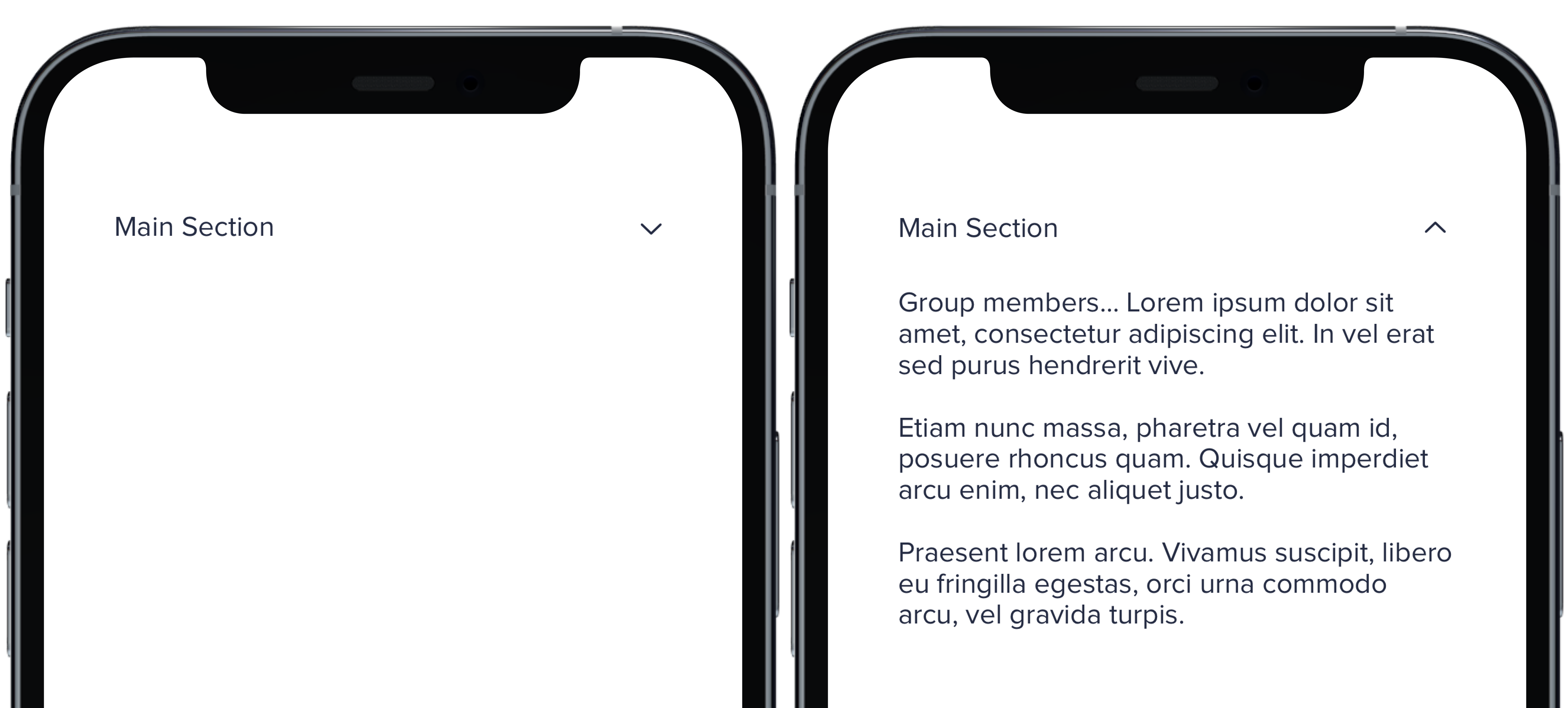
Group members... Lorem ipsum dolor sit amet, consectetur adipiscing elit. In vel erat sed purus hendrerit vive.
|
|
11
|
-
Etiam nunc massa, pharetra vel quam id, posuere rhoncus quam. Quisque imperdiet arcu enim, nec aliquet justo.
|
|
12
|
-
Praesent lorem arcu. Vivamus suscipit, libero eu fringilla egestas, orci urna commodo arcu, vel gravida turpis.
|
|
13
|
-
"
|
|
14
|
-
PBCollapsible(isCollapsed: $isCollapsed, iconSize: iconSize, iconColor: iconColor) {
|
|
15
|
-
VStack(spacing: Spacing.medium) {
|
|
16
|
-
CollapsibleDoc(iconColor: .default, text: "Default Section")
|
|
17
|
-
CollapsibleDoc(iconColor: .light, text: "Light Section")
|
|
18
|
-
CollapsibleDoc(iconColor: .lighter, text: "Lighter Section")
|
|
19
|
-
CollapsibleDoc(iconColor: .link, text: "Link Section")
|
|
20
|
-
CollapsibleDoc(iconColor: .error, text: "Error Section")
|
|
21
|
-
CollapsibleDoc(iconColor: .success, text: "Success Section")
|
|
22
|
-
}
|
|
23
|
-
} content: {
|
|
24
|
-
Text(lorem).pbFont(.body)
|
|
25
|
-
}
|
|
26
|
-
|
|
27
|
-
```
|
|
@@ -1,22 +0,0 @@
|
|
|
1
|
-
|
|
2
|
-
|
|
3
|
-
|
|
4
|
-
```swift
|
|
5
|
-
let iconSize: PBIcon.IconSize
|
|
6
|
-
let iconColor: CollapsibleIconColor
|
|
7
|
-
let text: String
|
|
8
|
-
@State private var isCollapsed = true
|
|
9
|
-
let lorem =
|
|
10
|
-
"
|
|
11
|
-
Group members... Lorem ipsum dolor sit amet, consectetur adipiscing elit. In vel erat sed purus hendrerit vive.
|
|
12
|
-
Etiam nunc massa, pharetra vel quam id, posuere rhoncus quam. Quisque imperdiet arcu enim, nec aliquet justo.
|
|
13
|
-
Praesent lorem arcu. Vivamus suscipit, libero eu fringilla egestas, orci urna commodo arcu, vel gravida turpis.
|
|
14
|
-
"
|
|
15
|
-
|
|
16
|
-
PBCollapsible(isCollapsed: $isCollapsed, iconSize: iconSize, iconColor: iconColor) {
|
|
17
|
-
CollapsibleDoc(text: "Main Section")
|
|
18
|
-
} content: {
|
|
19
|
-
Text(lorem).pbFont(.body)
|
|
20
|
-
}
|
|
21
|
-
|
|
22
|
-
```
|
|
@@ -1,8 +0,0 @@
|
|
|
1
|
-
### Props
|
|
2
|
-
| Name | Type | Description | Default | Values |
|
|
3
|
-
| --- | ----------- | --------- | --------- | --------- |
|
|
4
|
-
| **isCollapsed** | `Bool` | Value for whether or not the dropdown is closed or open | `false` | `true` `false` |
|
|
5
|
-
| **headerView** | `View` | Title of dropdown | | |
|
|
6
|
-
| **contentView** | `View` | Content of dropdown | | |
|
|
7
|
-
| **iconSize** | `PBIcon.IconSize` | Sets size of chevron icon | `.small` | `xSmall` `small` `large` `x1` `x2` `x3` `x4` `x5` `x6` `x7` `x8` `x9` `x10` |
|
|
8
|
-
| **iconColor** | `CollapsibleIconColor` | Sets color of chevron icon | `.default` | `default` `light` `lighter` `link` `error` `success` |
|
|
@@ -1,26 +0,0 @@
|
|
|
1
|
-

|
|
2
|
-
|
|
3
|
-
```swift
|
|
4
|
-
let iconSize: PBIcon.IconSize
|
|
5
|
-
let iconColor: CollapsibleIconColor
|
|
6
|
-
let text: String
|
|
7
|
-
@State private var isCollapsed = true
|
|
8
|
-
let lorem =
|
|
9
|
-
"
|
|
10
|
-
Group members... Lorem ipsum dolor sit amet, consectetur adipiscing elit. In vel erat sed purus hendrerit vive.
|
|
11
|
-
Etiam nunc massa, pharetra vel quam id, posuere rhoncus quam. Quisque imperdiet arcu enim, nec aliquet justo.
|
|
12
|
-
Praesent lorem arcu. Vivamus suscipit, libero eu fringilla egestas, orci urna commodo arcu, vel gravida turpis.
|
|
13
|
-
"
|
|
14
|
-
|
|
15
|
-
PBCollapsible(isCollapsed: $isCollapsed, iconSize: iconSize, iconColor: iconColor) {
|
|
16
|
-
VStack(spacing: Spacing.medium) {
|
|
17
|
-
CollapsibleDoc(iconSize: .xSmall, text: "Extra Small Section")
|
|
18
|
-
CollapsibleDoc(iconSize: .small, text: "Small Section")
|
|
19
|
-
CollapsibleDoc(text: "Default Section")
|
|
20
|
-
CollapsibleDoc(iconSize: .large, text: "Large Section")
|
|
21
|
-
}
|
|
22
|
-
} content: {
|
|
23
|
-
Text(lorem).pbFont(.body)
|
|
24
|
-
}
|
|
25
|
-
|
|
26
|
-
```
|
|
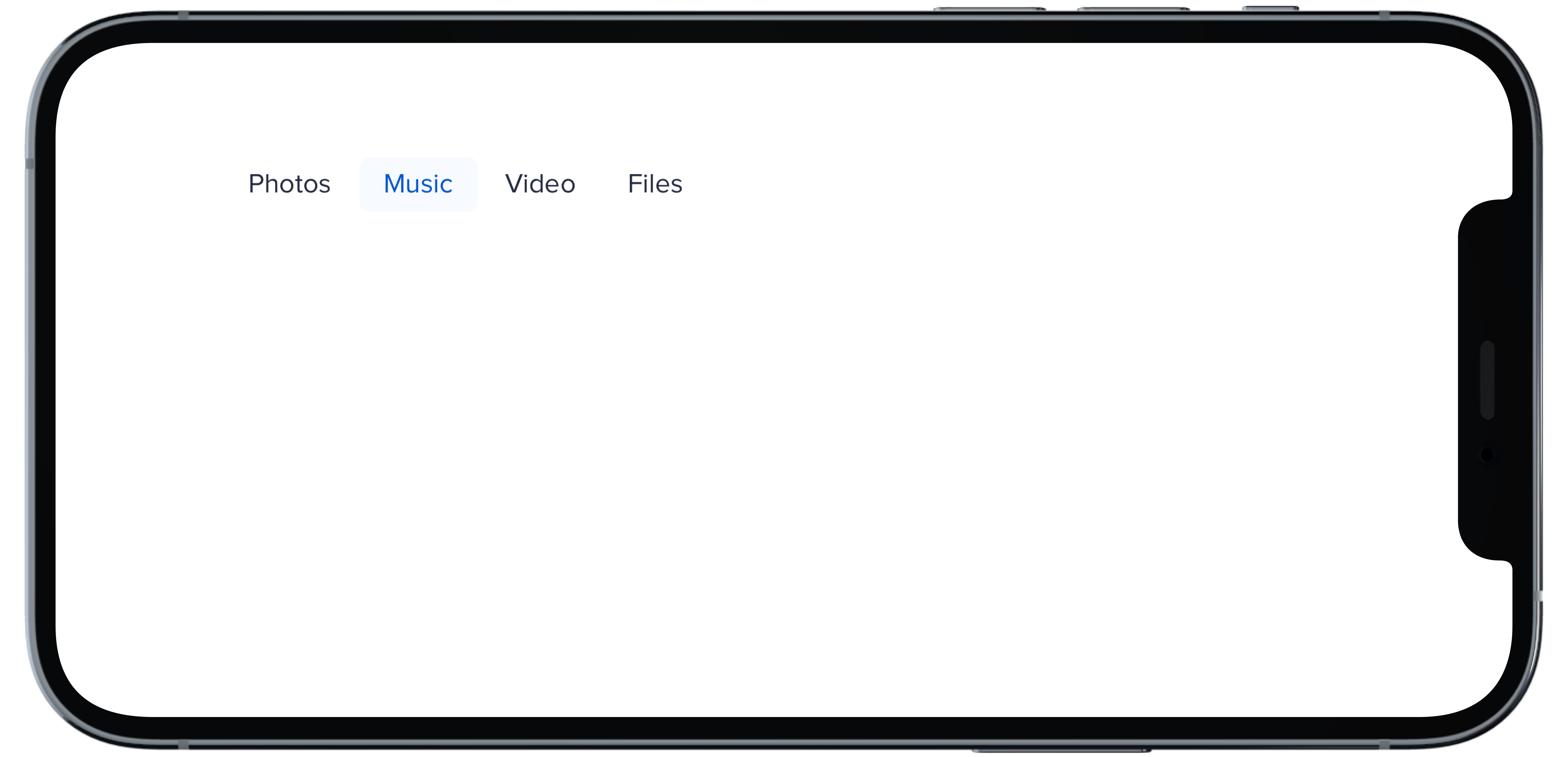
@@ -1,17 +0,0 @@
|
|
|
1
|
-
|
|
2
|
-
|
|
3
|
-
```swift
|
|
4
|
-
@State private var selectedHBold: Int = 1
|
|
5
|
-
|
|
6
|
-
PBNav(
|
|
7
|
-
selected: $selectedHBold,
|
|
8
|
-
variant: .bold,
|
|
9
|
-
orientation: .horizontal,
|
|
10
|
-
borders: false
|
|
11
|
-
) {
|
|
12
|
-
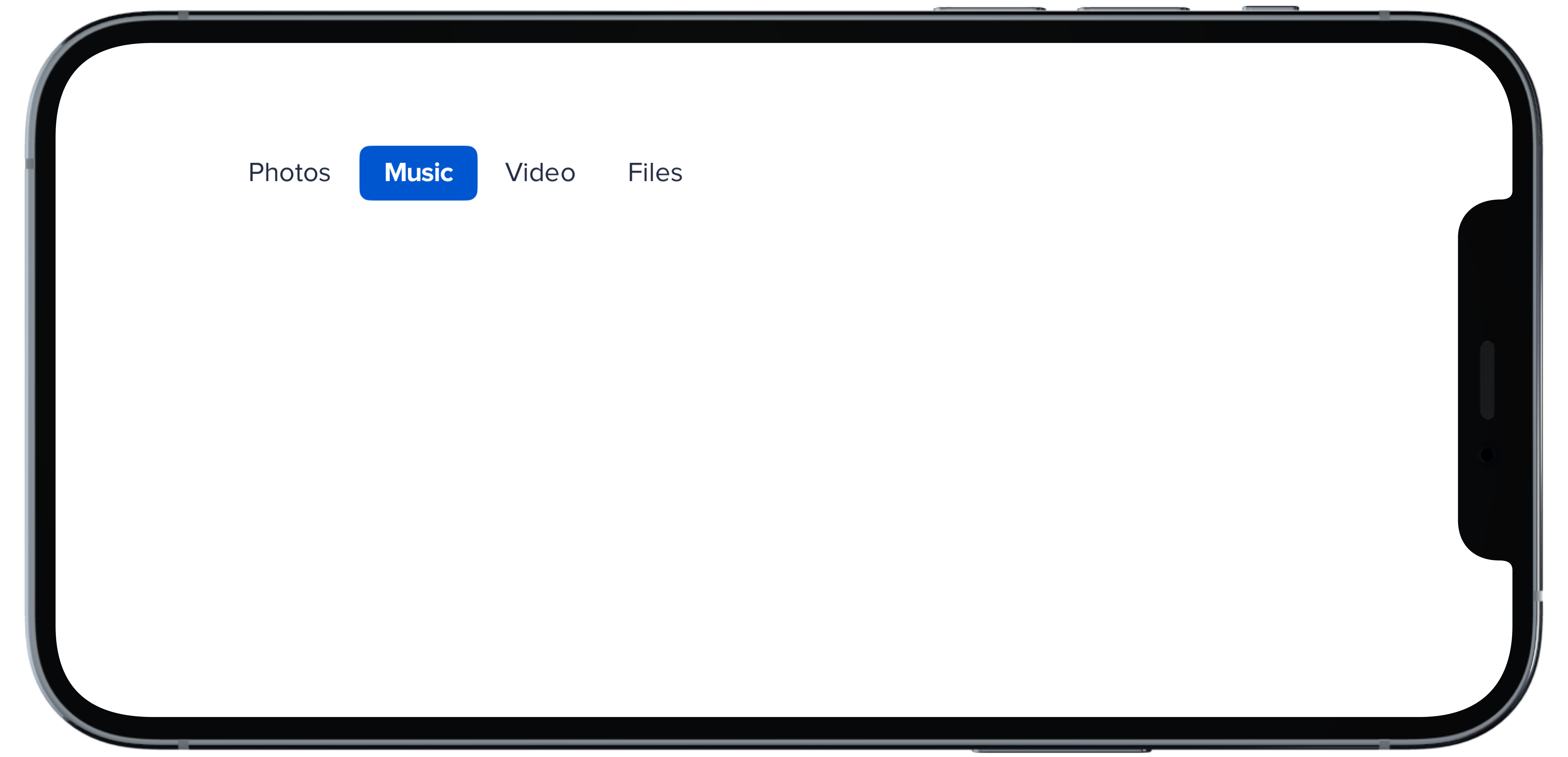
PBNavItem("Photos")
|
|
13
|
-
PBNavItem("Music")
|
|
14
|
-
PBNavItem("Video")
|
|
15
|
-
PBNavItem("Files")
|
|
16
|
-
}
|
|
17
|
-
```
|
|
@@ -1,17 +0,0 @@
|
|
|
1
|
-
|
|
2
|
-
|
|
3
|
-
```swift
|
|
4
|
-
@State private var selectedHDefault: Int = 1
|
|
5
|
-
|
|
6
|
-
PBNav(
|
|
7
|
-
selected: $selectedHDefault,
|
|
8
|
-
variant: .normal,
|
|
9
|
-
orientation: .horizontal
|
|
10
|
-
) {
|
|
11
|
-
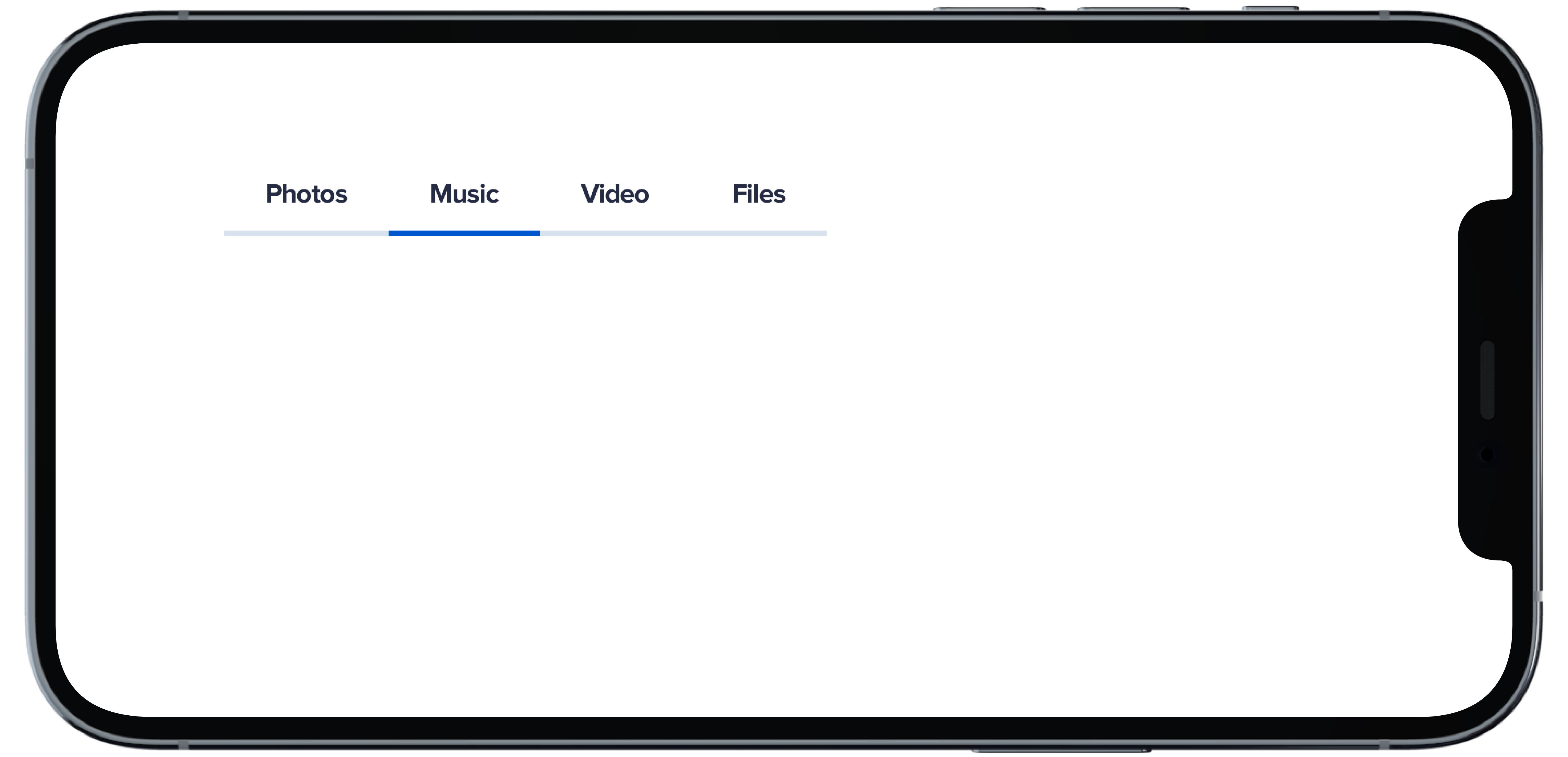
PBNavItem("Photos")
|
|
12
|
-
PBNavItem("Music")
|
|
13
|
-
PBNavItem("Video")
|
|
14
|
-
PBNavItem("Files")
|
|
15
|
-
}
|
|
16
|
-
|
|
17
|
-
```
|
|
@@ -1,18 +0,0 @@
|
|
|
1
|
-
|
|
2
|
-
|
|
3
|
-
```swift
|
|
4
|
-
@State private var selectedHSubtleNoHighlight: Int = 1
|
|
5
|
-
|
|
6
|
-
PBNav(
|
|
7
|
-
selected: $selectedHSubtleNoHighlight,
|
|
8
|
-
variant: .subtle,
|
|
9
|
-
orientation: .horizontal,
|
|
10
|
-
borders: false,
|
|
11
|
-
highlight: false
|
|
12
|
-
) {
|
|
13
|
-
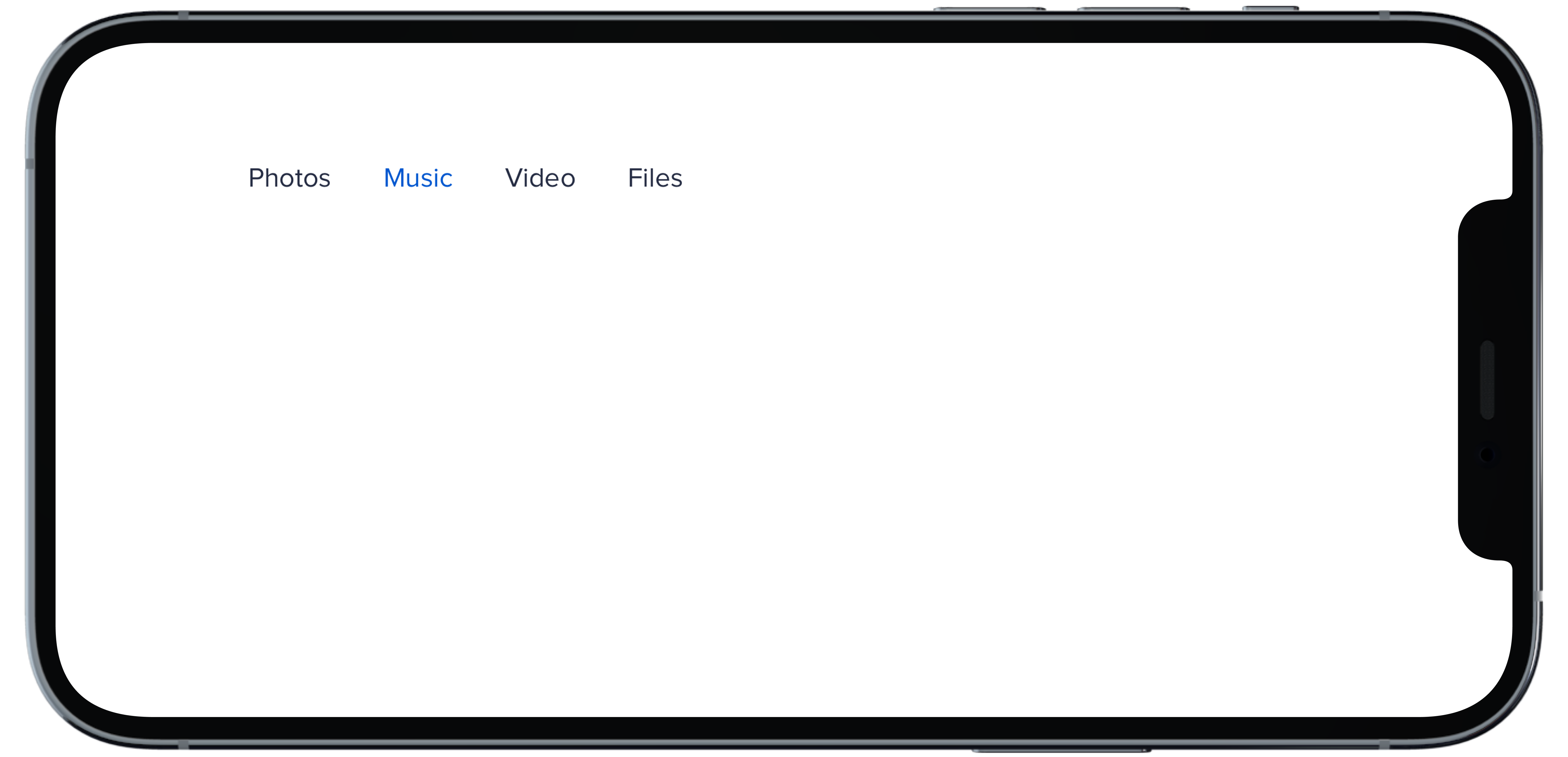
PBNavItem("Photos")
|
|
14
|
-
PBNavItem("Music")
|
|
15
|
-
PBNavItem("Video")
|
|
16
|
-
PBNavItem("Files")
|
|
17
|
-
}
|
|
18
|
-
```
|
|
@@ -1,18 +0,0 @@
|
|
|
1
|
-
|
|
2
|
-
|
|
3
|
-
```swift
|
|
4
|
-
@State private var selectedHSubtle: Int = 1
|
|
5
|
-
|
|
6
|
-
PBNav(
|
|
7
|
-
selected: $selectedHSubtle,
|
|
8
|
-
variant: .subtle,
|
|
9
|
-
orientation: .horizontal,
|
|
10
|
-
borders: false
|
|
11
|
-
) {
|
|
12
|
-
PBNavItem("Photos")
|
|
13
|
-
PBNavItem("Music")
|
|
14
|
-
PBNavItem("Video")
|
|
15
|
-
PBNavItem("Files")
|
|
16
|
-
}
|
|
17
|
-
|
|
18
|
-
```
|
|
@@ -1,11 +0,0 @@
|
|
|
1
|
-
### Props
|
|
2
|
-
| Name | Type | Description | Default | Values |
|
|
3
|
-
| --- | ----------- | --------- | --------- | --------- |
|
|
4
|
-
| **selected** | `Int` | Sets selected to current index | `0` | |
|
|
5
|
-
| **currentHover** | `Int?` | Sets the current hover state to the current index| | |
|
|
6
|
-
| **variant** | `Variant` | Sets variant for nav | `.normal` | `normal` `subtle` `bold` |
|
|
7
|
-
| **orientation** | `Orientation` | Changes the orientation of nav | `.vertical` | `horizontal` `verticle` |
|
|
8
|
-
| **title** | `String?` | Sets title of nav | | |
|
|
9
|
-
| **borders** | `Bool` | Boolean value for whether nav items have a border or not | `true` | `true` `false` |
|
|
10
|
-
| **highlight** | `Bool` | Boolean value for adding a highlight to nav | `true` | `true` `false` |
|
|
11
|
-
| **views** | `[AnyView]` | An Array of AnyView | | |
|
|
@@ -1,18 +0,0 @@
|
|
|
1
|
-
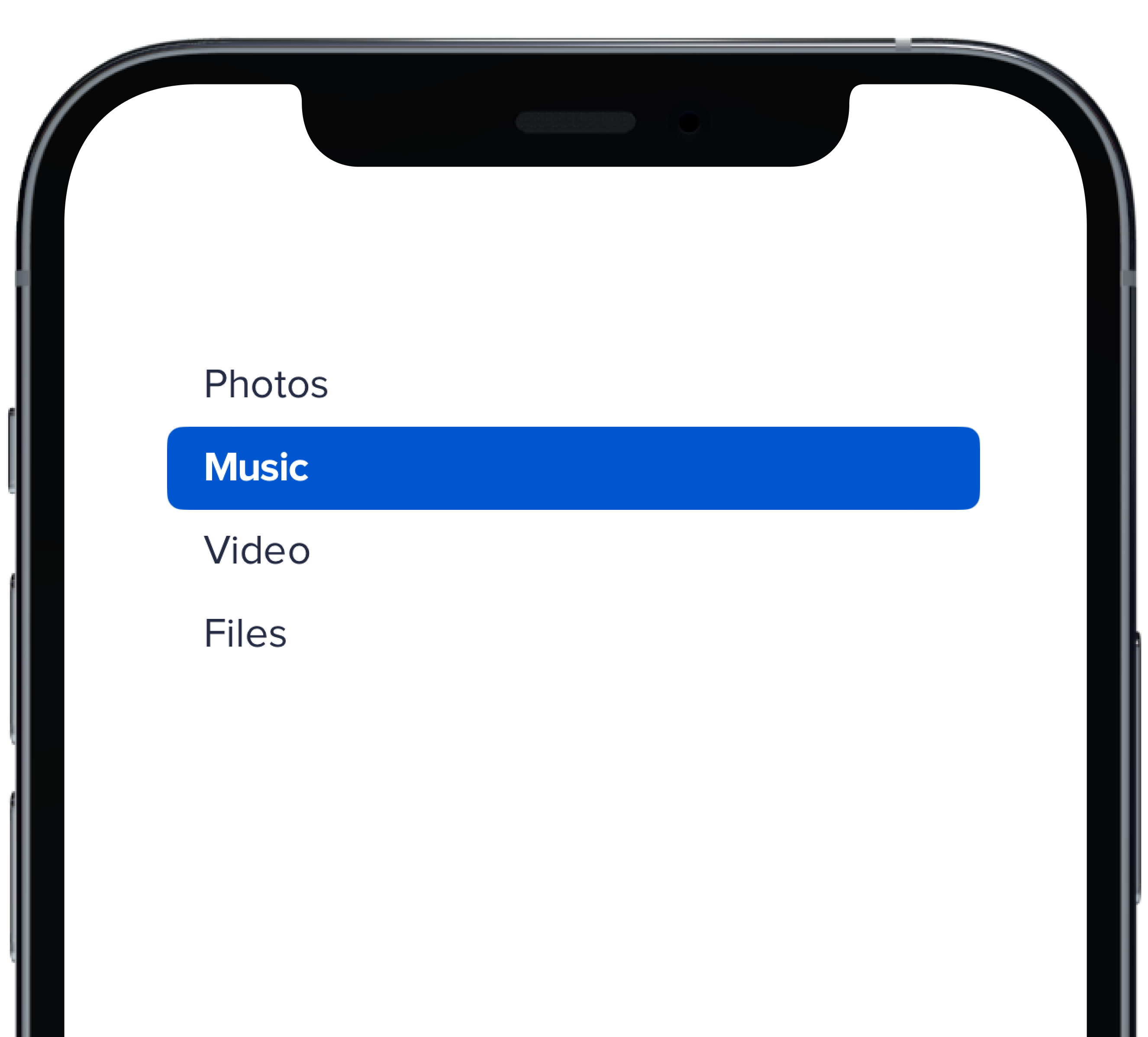
|
|
2
|
-
|
|
3
|
-
```swift
|
|
4
|
-
@State private var selectedVBold: Int = 1
|
|
5
|
-
|
|
6
|
-
PBNav(
|
|
7
|
-
selected: $selectedVBold,
|
|
8
|
-
variant: .bold,
|
|
9
|
-
orientation: .vertical,
|
|
10
|
-
borders: false
|
|
11
|
-
) {
|
|
12
|
-
PBNavItem("Photos")
|
|
13
|
-
PBNavItem("Music")
|
|
14
|
-
PBNavItem("Video")
|
|
15
|
-
PBNavItem("Files")
|
|
16
|
-
}
|
|
17
|
-
|
|
18
|
-
```
|
|
@@ -1,18 +0,0 @@
|
|
|
1
|
-
|
|
2
|
-
|
|
3
|
-
```swift
|
|
4
|
-
@State private var selectedVDefault: Int = 1
|
|
5
|
-
|
|
6
|
-
PBNav(
|
|
7
|
-
selected: $selectedVDefault,
|
|
8
|
-
variant: .normal,
|
|
9
|
-
orientation: .vertical,
|
|
10
|
-
title: "Menu"
|
|
11
|
-
) {
|
|
12
|
-
PBNavItem("Photos")
|
|
13
|
-
PBNavItem("Music")
|
|
14
|
-
PBNavItem("Video")
|
|
15
|
-
PBNavItem("Files")
|
|
16
|
-
}
|
|
17
|
-
|
|
18
|
-
```
|
|
@@ -1,19 +0,0 @@
|
|
|
1
|
-
|
|
2
|
-
|
|
3
|
-
```swift
|
|
4
|
-
@State private var selectedVSubtleNoHighlight: Int = 1
|
|
5
|
-
|
|
6
|
-
PBNav(
|
|
7
|
-
selected: $selectedVSubtleNoHighlight,
|
|
8
|
-
variant: .subtle,
|
|
9
|
-
orientation: .vertical,
|
|
10
|
-
borders: false,
|
|
11
|
-
highlight: false
|
|
12
|
-
) {
|
|
13
|
-
PBNavItem("Photos")
|
|
14
|
-
PBNavItem("Music")
|
|
15
|
-
PBNavItem("Video")
|
|
16
|
-
PBNavItem("Files")
|
|
17
|
-
}
|
|
18
|
-
|
|
19
|
-
```
|
|
@@ -1,17 +0,0 @@
|
|
|
1
|
-
|
|
2
|
-
|
|
3
|
-
```swift
|
|
4
|
-
@State private var selectedVSubtle: Int = 1
|
|
5
|
-
|
|
6
|
-
PBNav(
|
|
7
|
-
selected: $selectedVSubtle,
|
|
8
|
-
variant: .subtle,
|
|
9
|
-
orientation: .vertical,
|
|
10
|
-
borders: false
|
|
11
|
-
) {
|
|
12
|
-
PBNavItem("Photos")
|
|
13
|
-
PBNavItem("Music")
|
|
14
|
-
PBNavItem("Video")
|
|
15
|
-
PBNavItem("Files")
|
|
16
|
-
}
|
|
17
|
-
```
|