playbook_ui_docs 13.14.0 → 13.15.0.pre.alpha.reactselectbump581876
This diff represents the content of publicly available package versions that have been released to one of the supported registries. The information contained in this diff is provided for informational purposes only and reflects changes between package versions as they appear in their respective public registries.
- checksums.yaml +4 -4
- data/app/pb_kits/playbook/pb_button/docs/_button_props_swift.md +11 -0
- data/app/pb_kits/playbook/pb_button/docs/_button_reaction_swift.md +26 -0
- data/app/pb_kits/playbook/pb_button/docs/example.yml +1 -0
- data/app/pb_kits/playbook/pb_card/docs/_card_background.jsx +5 -4
- data/app/pb_kits/playbook/pb_collapsible/docs/_collapsible_colors_swift.md +27 -0
- data/app/pb_kits/playbook/pb_collapsible/docs/_collapsible_default_swift.md +22 -0
- data/app/pb_kits/playbook/pb_collapsible/docs/_collapsible_props_table.md +8 -0
- data/app/pb_kits/playbook/pb_collapsible/docs/_collapsible_sizes_swift.md +26 -0
- data/app/pb_kits/playbook/pb_collapsible/docs/example.yml +6 -0
- data/app/pb_kits/playbook/pb_dialog/docs/_dialog_default_swift.md +11 -0
- data/app/pb_kits/playbook/pb_dialog/docs/_dialog_full_height.jsx +8 -4
- data/app/pb_kits/playbook/pb_dialog/docs/_dialog_full_height_placement.jsx +8 -4
- data/app/pb_kits/playbook/pb_dialog/docs/_dialog_props_table.md +13 -0
- data/app/pb_kits/playbook/pb_dialog/docs/_dialog_scrollable.jsx +4 -2
- data/app/pb_kits/playbook/pb_dialog/docs/_dialog_sizes_swift.md +18 -0
- data/app/pb_kits/playbook/pb_dialog/docs/_dialog_status.jsx +1 -1
- data/app/pb_kits/playbook/pb_dialog/docs/_dialog_status_swift.md +14 -0
- data/app/pb_kits/playbook/pb_dialog/docs/example.yml +7 -0
- data/app/pb_kits/playbook/pb_nav/docs/_nav_horizontal_bold_swift.md +17 -0
- data/app/pb_kits/playbook/pb_nav/docs/_nav_horizontal_default_swift.md +17 -0
- data/app/pb_kits/playbook/pb_nav/docs/_nav_horizontal_subtle_no_highlight_swift.md +18 -0
- data/app/pb_kits/playbook/pb_nav/docs/_nav_horizontal_subtle_swift.md +18 -0
- data/app/pb_kits/playbook/pb_nav/docs/_nav_props_swift.md +11 -0
- data/app/pb_kits/playbook/pb_nav/docs/_nav_vertical_bold_swift.md +18 -0
- data/app/pb_kits/playbook/pb_nav/docs/_nav_vertical_default_swift.md +18 -0
- data/app/pb_kits/playbook/pb_nav/docs/_nav_vertical_subtle_no_highlight_swift.md +19 -0
- data/app/pb_kits/playbook/pb_nav/docs/_nav_vertical_subtle_swift.md +17 -0
- data/app/pb_kits/playbook/pb_nav/docs/example.yml +17 -0
- data/app/pb_kits/playbook/pb_person/docs/_person_default_swift.md +8 -0
- data/app/pb_kits/playbook/pb_person/docs/_person_props_swift.md +5 -0
- data/app/pb_kits/playbook/pb_person/docs/example.yml +4 -0
- data/app/pb_kits/playbook/pb_select/docs/_select_default_swift.md +15 -0
- data/app/pb_kits/playbook/pb_select/docs/_select_error_swift.md +18 -0
- data/app/pb_kits/playbook/pb_select/docs/_select_props_table.md +8 -0
- data/app/pb_kits/playbook/pb_select/docs/example.yml +5 -0
- data/app/pb_kits/playbook/pb_user/docs/_user_horizontal_swift.md +37 -0
- data/app/pb_kits/playbook/pb_user/docs/_user_props_table.md +10 -0
- data/app/pb_kits/playbook/pb_user/docs/_user_size_swift.md +35 -0
- data/app/pb_kits/playbook/pb_user/docs/_user_text_only_swift.md +27 -0
- data/app/pb_kits/playbook/pb_user/docs/_user_vertical_size_swift.md +35 -0
- data/app/pb_kits/playbook/pb_user/docs/example.yml +7 -0
- data/dist/playbook-doc.js +8 -8
- metadata +35 -7
checksums.yaml
CHANGED
|
@@ -1,7 +1,7 @@
|
|
|
1
1
|
---
|
|
2
2
|
SHA256:
|
|
3
|
-
metadata.gz:
|
|
4
|
-
data.tar.gz:
|
|
3
|
+
metadata.gz: 62b710fbaa7cee47825cc961545cf2f810261cf473d98e812ecabaa12bd4eef5
|
|
4
|
+
data.tar.gz: 294f08aac7ff0fcf4811eb7b8eed9e5aaf108c6e9dea849cac15cfaaf6a5d850
|
|
5
5
|
SHA512:
|
|
6
|
-
metadata.gz:
|
|
7
|
-
data.tar.gz:
|
|
6
|
+
metadata.gz: 571c7ddbc397d2eb789420ac0a1a5be97d38d6280ae84fd8c5962d849f3d21c139d52a107bd443e33e9eefb1dca160b55e2319abc8a285033225232bdd8d0cd7
|
|
7
|
+
data.tar.gz: 1deca47860882cf1bad831172d5ef05de4778604491f77ee0aaebea105405d1d50183d4c6facab150ef7c4805451e28b8c58805d79ed2cb3cb4a09a718668d00
|
|
@@ -9,3 +9,14 @@
|
|
|
9
9
|
| **Icon** | `PBIcon` | Adds an icon to the Button | `nil` | |
|
|
10
10
|
| **Icon Position** | `IconPosition` | Adjusts the icon's position | `.left` | `.left` `.right` |
|
|
11
11
|
| **Action** | `(() -> Void)` | Adds an action for the Button to perform | `{}` | |
|
|
12
|
+
|
|
13
|
+
### Reaction Button Props
|
|
14
|
+
| Name | Type | Description | Default | Values |
|
|
15
|
+
| --- | ----------- | --------- | --------- | --------- |
|
|
16
|
+
| **count** | `Int` | Tracks number of times a reaction button has been pressed | `0` | |
|
|
17
|
+
| **isHighlighted** | `Bool` | Boolean for whether or not a reaction button has a highlight | ` false` | `true` `false` |
|
|
18
|
+
| **isHovering** | `Bool` | Boolean for whether or not a mouse is hovering over the reaction button | `false` | `true` `false` |
|
|
19
|
+
| **icon** | `String` | Allows user to use a unicode string for an emoji reaction button | | |
|
|
20
|
+
| **pbIcon** | `PBIcon` | A PlayBook Icon option for reaction button | | |
|
|
21
|
+
| **isInteractive** | `Bool` | Boolean for whether or not a reaction button is interactive | `false` | `true` `false` |
|
|
22
|
+
|
|
@@ -0,0 +1,26 @@
|
|
|
1
|
+
|
|
2
|
+
|
|
3
|
+
```swift
|
|
4
|
+
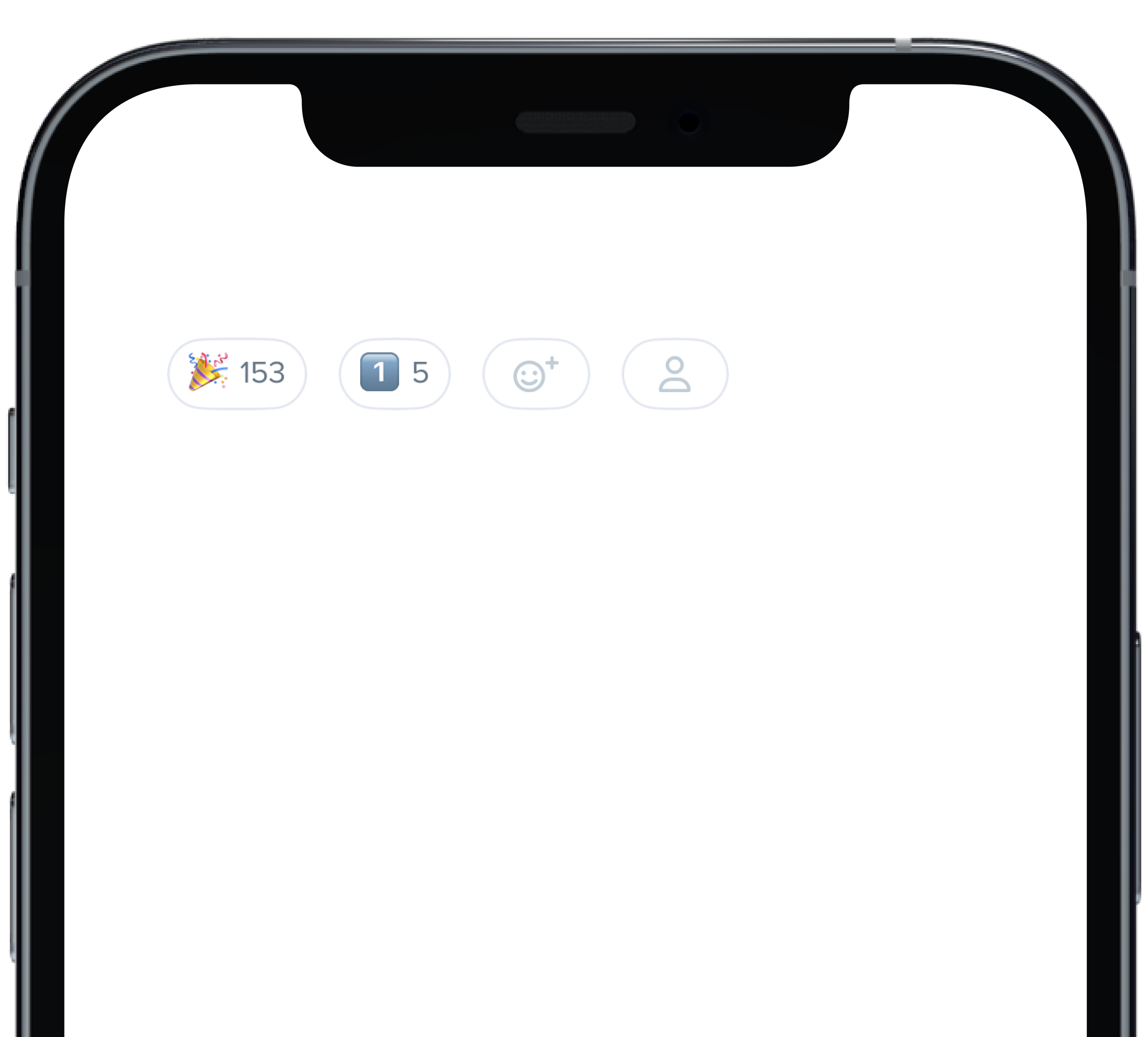
@State private var count: Int = 153
|
|
5
|
+
@State private var count1: Int = 5
|
|
6
|
+
|
|
7
|
+
HStack(alignment: .center, spacing: 12) {
|
|
8
|
+
PBReactionButton(
|
|
9
|
+
count: $count,
|
|
10
|
+
icon: "\u{1F389}",
|
|
11
|
+
isInteractive: true
|
|
12
|
+
)
|
|
13
|
+
PBReactionButton(
|
|
14
|
+
count: $count1,
|
|
15
|
+
icon: "1️⃣",
|
|
16
|
+
isInteractive: false
|
|
17
|
+
)
|
|
18
|
+
PBReactionButton(
|
|
19
|
+
isInteractive: false
|
|
20
|
+
)
|
|
21
|
+
PBReactionButton(
|
|
22
|
+
pbIcon: PBIcon(FontAwesome.user),
|
|
23
|
+
isInteractive: false
|
|
24
|
+
)
|
|
25
|
+
}
|
|
26
|
+
```
|
|
@@ -57,7 +57,7 @@ const CardBackground = (props) => {
|
|
|
57
57
|
background="product_1_background"
|
|
58
58
|
marginBottom="sm"
|
|
59
59
|
{...props}
|
|
60
|
-
|
|
60
|
+
>
|
|
61
61
|
<Body
|
|
62
62
|
dark
|
|
63
63
|
text="Product 1 Background"
|
|
@@ -69,11 +69,12 @@ const CardBackground = (props) => {
|
|
|
69
69
|
<Card
|
|
70
70
|
background="product_7_highlight"
|
|
71
71
|
marginBottom="sm"
|
|
72
|
-
{...props}
|
|
72
|
+
{...props}
|
|
73
|
+
>
|
|
73
74
|
<Body
|
|
74
75
|
dark
|
|
75
|
-
text="Product 7 Highlight"
|
|
76
|
-
|
|
76
|
+
text="Product 7 Highlight"
|
|
77
|
+
/>
|
|
77
78
|
</Card>
|
|
78
79
|
|
|
79
80
|
|
|
@@ -0,0 +1,27 @@
|
|
|
1
|
+

|
|
2
|
+
|
|
3
|
+
```swift
|
|
4
|
+
let iconSize: PBIcon.IconSize
|
|
5
|
+
let iconColor: CollapsibleIconColor
|
|
6
|
+
let text: String
|
|
7
|
+
@State private var isCollapsed = true
|
|
8
|
+
let lorem =
|
|
9
|
+
"
|
|
10
|
+
Group members... Lorem ipsum dolor sit amet, consectetur adipiscing elit. In vel erat sed purus hendrerit vive.
|
|
11
|
+
Etiam nunc massa, pharetra vel quam id, posuere rhoncus quam. Quisque imperdiet arcu enim, nec aliquet justo.
|
|
12
|
+
Praesent lorem arcu. Vivamus suscipit, libero eu fringilla egestas, orci urna commodo arcu, vel gravida turpis.
|
|
13
|
+
"
|
|
14
|
+
PBCollapsible(isCollapsed: $isCollapsed, iconSize: iconSize, iconColor: iconColor) {
|
|
15
|
+
VStack(spacing: Spacing.medium) {
|
|
16
|
+
CollapsibleDoc(iconColor: .default, text: "Default Section")
|
|
17
|
+
CollapsibleDoc(iconColor: .light, text: "Light Section")
|
|
18
|
+
CollapsibleDoc(iconColor: .lighter, text: "Lighter Section")
|
|
19
|
+
CollapsibleDoc(iconColor: .link, text: "Link Section")
|
|
20
|
+
CollapsibleDoc(iconColor: .error, text: "Error Section")
|
|
21
|
+
CollapsibleDoc(iconColor: .success, text: "Success Section")
|
|
22
|
+
}
|
|
23
|
+
} content: {
|
|
24
|
+
Text(lorem).pbFont(.body)
|
|
25
|
+
}
|
|
26
|
+
|
|
27
|
+
```
|
|
@@ -0,0 +1,22 @@
|
|
|
1
|
+
|
|
2
|
+
|
|
3
|
+
|
|
4
|
+
```swift
|
|
5
|
+
let iconSize: PBIcon.IconSize
|
|
6
|
+
let iconColor: CollapsibleIconColor
|
|
7
|
+
let text: String
|
|
8
|
+
@State private var isCollapsed = true
|
|
9
|
+
let lorem =
|
|
10
|
+
"
|
|
11
|
+
Group members... Lorem ipsum dolor sit amet, consectetur adipiscing elit. In vel erat sed purus hendrerit vive.
|
|
12
|
+
Etiam nunc massa, pharetra vel quam id, posuere rhoncus quam. Quisque imperdiet arcu enim, nec aliquet justo.
|
|
13
|
+
Praesent lorem arcu. Vivamus suscipit, libero eu fringilla egestas, orci urna commodo arcu, vel gravida turpis.
|
|
14
|
+
"
|
|
15
|
+
|
|
16
|
+
PBCollapsible(isCollapsed: $isCollapsed, iconSize: iconSize, iconColor: iconColor) {
|
|
17
|
+
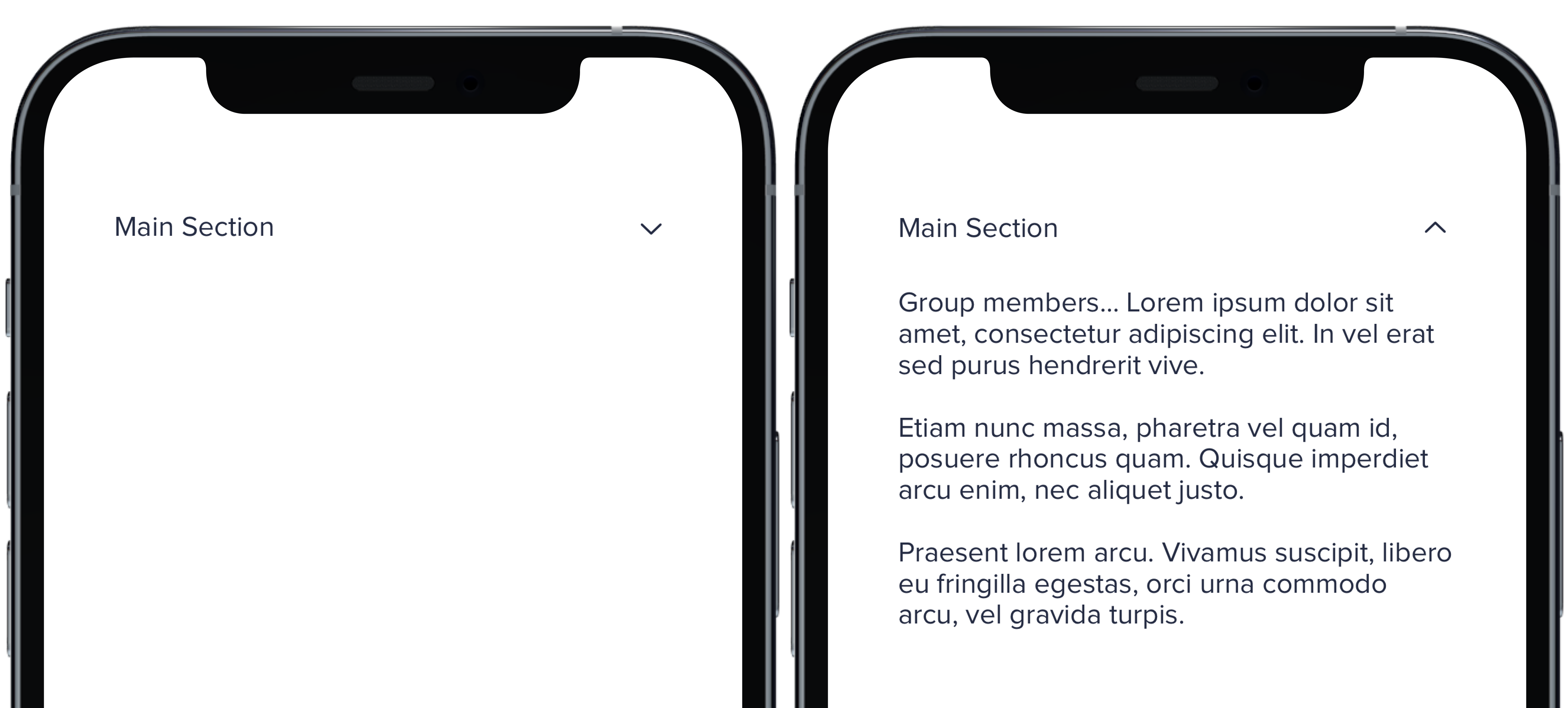
CollapsibleDoc(text: "Main Section")
|
|
18
|
+
} content: {
|
|
19
|
+
Text(lorem).pbFont(.body)
|
|
20
|
+
}
|
|
21
|
+
|
|
22
|
+
```
|
|
@@ -0,0 +1,8 @@
|
|
|
1
|
+
### Props
|
|
2
|
+
| Name | Type | Description | Default | Values |
|
|
3
|
+
| --- | ----------- | --------- | --------- | --------- |
|
|
4
|
+
| **isCollapsed** | `Bool` | Value for whether or not the dropdown is closed or open | `false` | `true` `false` |
|
|
5
|
+
| **headerView** | `View` | Title of dropdown | | |
|
|
6
|
+
| **contentView** | `View` | Content of dropdown | | |
|
|
7
|
+
| **iconSize** | `PBIcon.IconSize` | Sets size of chevron icon | `.small` | `xSmall` `small` `large` `x1` `x2` `x3` `x4` `x5` `x6` `x7` `x8` `x9` `x10` |
|
|
8
|
+
| **iconColor** | `CollapsibleIconColor` | Sets color of chevron icon | `.default` | `default` `light` `lighter` `link` `error` `success` |
|
|
@@ -0,0 +1,26 @@
|
|
|
1
|
+

|
|
2
|
+
|
|
3
|
+
```swift
|
|
4
|
+
let iconSize: PBIcon.IconSize
|
|
5
|
+
let iconColor: CollapsibleIconColor
|
|
6
|
+
let text: String
|
|
7
|
+
@State private var isCollapsed = true
|
|
8
|
+
let lorem =
|
|
9
|
+
"
|
|
10
|
+
Group members... Lorem ipsum dolor sit amet, consectetur adipiscing elit. In vel erat sed purus hendrerit vive.
|
|
11
|
+
Etiam nunc massa, pharetra vel quam id, posuere rhoncus quam. Quisque imperdiet arcu enim, nec aliquet justo.
|
|
12
|
+
Praesent lorem arcu. Vivamus suscipit, libero eu fringilla egestas, orci urna commodo arcu, vel gravida turpis.
|
|
13
|
+
"
|
|
14
|
+
|
|
15
|
+
PBCollapsible(isCollapsed: $isCollapsed, iconSize: iconSize, iconColor: iconColor) {
|
|
16
|
+
VStack(spacing: Spacing.medium) {
|
|
17
|
+
CollapsibleDoc(iconSize: .xSmall, text: "Extra Small Section")
|
|
18
|
+
CollapsibleDoc(iconSize: .small, text: "Small Section")
|
|
19
|
+
CollapsibleDoc(text: "Default Section")
|
|
20
|
+
CollapsibleDoc(iconSize: .large, text: "Large Section")
|
|
21
|
+
}
|
|
22
|
+
} content: {
|
|
23
|
+
Text(lorem).pbFont(.body)
|
|
24
|
+
}
|
|
25
|
+
|
|
26
|
+
```
|
|
@@ -14,3 +14,9 @@ examples:
|
|
|
14
14
|
- collapsible_color: Icon Color
|
|
15
15
|
- collapsible_icons: Custom Icons
|
|
16
16
|
- collapsible_state: useCollapsible Hook
|
|
17
|
+
|
|
18
|
+
swift:
|
|
19
|
+
- collapsible_default_swift: Default
|
|
20
|
+
- collapsible_sizes_swift: Sizes
|
|
21
|
+
- collapsible_colors_swift: Colors
|
|
22
|
+
- collapsible_props_table: ""
|
|
@@ -0,0 +1,11 @@
|
|
|
1
|
+

|
|
2
|
+
|
|
3
|
+
```swift
|
|
4
|
+
PBDialog(
|
|
5
|
+
title: "This is some informative text",
|
|
6
|
+
message: infoMessage,
|
|
7
|
+
cancelButton: ("Cancel", closeToast),
|
|
8
|
+
confirmButton: ("Okay", closeToast)
|
|
9
|
+
)
|
|
10
|
+
```
|
|
11
|
+
|
|
@@ -49,15 +49,18 @@ const DialogFullHeight = () => {
|
|
|
49
49
|
<Flex wrap>
|
|
50
50
|
<Button id="sm"
|
|
51
51
|
marginRight="md"
|
|
52
|
-
onClick={toggleHeaderSeparatorDialog}
|
|
52
|
+
onClick={toggleHeaderSeparatorDialog}
|
|
53
|
+
>
|
|
53
54
|
{"Small Dialog"}
|
|
54
55
|
</Button>
|
|
55
56
|
<Button marginRight="md"
|
|
56
|
-
onClick={toggleFooterSeparatorDialog}
|
|
57
|
+
onClick={toggleFooterSeparatorDialog}
|
|
58
|
+
>
|
|
57
59
|
{"Medium Dialog"}
|
|
58
60
|
</Button>
|
|
59
61
|
<Button marginRight="md"
|
|
60
|
-
onClick={toggleBothSeparatorsDialog}
|
|
62
|
+
onClick={toggleBothSeparatorsDialog}
|
|
63
|
+
>
|
|
61
64
|
{"Large Dialog"}
|
|
62
65
|
</Button>
|
|
63
66
|
</Flex>
|
|
@@ -89,7 +92,8 @@ const DialogFullHeight = () => {
|
|
|
89
92
|
<Dialog.Footer>
|
|
90
93
|
<Button onClick={toggle}>{"Send My Issue"}</Button>
|
|
91
94
|
<Button onClick={toggle}
|
|
92
|
-
variant="link"
|
|
95
|
+
variant="link"
|
|
96
|
+
>
|
|
93
97
|
{"Back"}
|
|
94
98
|
</Button>
|
|
95
99
|
</Dialog.Footer>
|
|
@@ -48,15 +48,18 @@ const DialogFullHeightPlacement = () => {
|
|
|
48
48
|
<Flex wrap>
|
|
49
49
|
<Button id="sm"
|
|
50
50
|
marginRight="md"
|
|
51
|
-
onClick={toggleHeaderSeparatorDialog}
|
|
51
|
+
onClick={toggleHeaderSeparatorDialog}
|
|
52
|
+
>
|
|
52
53
|
{"Left Dialog"}
|
|
53
54
|
</Button>
|
|
54
55
|
<Button marginRight="xl"
|
|
55
|
-
onClick={toggleFooterSeparatorDialog}
|
|
56
|
+
onClick={toggleFooterSeparatorDialog}
|
|
57
|
+
>
|
|
56
58
|
{"Center Dialog"}
|
|
57
59
|
</Button>
|
|
58
60
|
<Button marginRight="xl"
|
|
59
|
-
onClick={toggleBothSeparatorsDialog}
|
|
61
|
+
onClick={toggleBothSeparatorsDialog}
|
|
62
|
+
>
|
|
60
63
|
{"Right Dialog"}
|
|
61
64
|
</Button>
|
|
62
65
|
</Flex>
|
|
@@ -88,7 +91,8 @@ const DialogFullHeightPlacement = () => {
|
|
|
88
91
|
<Dialog.Footer>
|
|
89
92
|
<Button onClick={toggle}>{"Send My Issue"}</Button>
|
|
90
93
|
<Button onClick={toggle}
|
|
91
|
-
variant="link"
|
|
94
|
+
variant="link"
|
|
95
|
+
>
|
|
92
96
|
{"Back"}
|
|
93
97
|
</Button>
|
|
94
98
|
</Dialog.Footer>
|
|
@@ -0,0 +1,13 @@
|
|
|
1
|
+
### Props
|
|
2
|
+
| Name | Type | Description | Default | Values |
|
|
3
|
+
| --- | ----------- | --------- | --------- | --------- |
|
|
4
|
+
| **content** | `Content` | Sets the View content | | |
|
|
5
|
+
| **title** | `String` | Sets title for dialog header | | |
|
|
6
|
+
| **message** | `String` | Sets dialog message| | |
|
|
7
|
+
| **variant** | `DialogVariant` | Changes variant of dialog | `.default` | `.default` `.status()` |
|
|
8
|
+
| **isStacked** | `isStacked` | Changes whether the dialog buttons are stacked or inline | `false` | `true` `false` |
|
|
9
|
+
| **cancelButton** | `Action` | Dismisses the dialog | | |
|
|
10
|
+
| **confirmButton** | `Action` | Confirms dialog message was received | | |
|
|
11
|
+
| **onClose** | `Action` | Starts action when dialog is closed | | |
|
|
12
|
+
| **size** | `DialogSize` | Determines size of dialog | `.medium`| `.small` `.medium` `large` |
|
|
13
|
+
| **shouldCloseOnOverlay** | `Bool` | Determines if overlay should close | `false` | `true` `false` |
|
|
@@ -16,10 +16,12 @@ const DialogScrollable = () => {
|
|
|
16
16
|
return (
|
|
17
17
|
<>
|
|
18
18
|
<Button marginRight="md"
|
|
19
|
-
onClick={toggleDialog1}
|
|
19
|
+
onClick={toggleDialog1}
|
|
20
|
+
>{'Open Dialog'}
|
|
20
21
|
</Button>
|
|
21
22
|
<Button marginRight="md"
|
|
22
|
-
onClick={toggleDialog2}
|
|
23
|
+
onClick={toggleDialog2}
|
|
24
|
+
>{'Open Full Height Dialog'}
|
|
23
25
|
</Button>
|
|
24
26
|
<Dialog
|
|
25
27
|
cancelButton="Cancel"
|
|
@@ -0,0 +1,18 @@
|
|
|
1
|
+

|
|
2
|
+
|
|
3
|
+
```swift
|
|
4
|
+
@State private var presentSmallDialog: Bool = false
|
|
5
|
+
@State private var presentMediumDialog: Bool = false
|
|
6
|
+
@State private var presentLargeDialog: Bool = false
|
|
7
|
+
let infoMessage = "This is a message for informational purposes only and requires no action."
|
|
8
|
+
|
|
9
|
+
PBDialog(
|
|
10
|
+
title: "Large",
|
|
11
|
+
message: infoMessage,
|
|
12
|
+
variant: .default,
|
|
13
|
+
isStacked: false,
|
|
14
|
+
cancelButton: ("Cancel", {}),
|
|
15
|
+
confirmButton: ("Okay", {}),
|
|
16
|
+
size: .large
|
|
17
|
+
)
|
|
18
|
+
```
|
|
@@ -0,0 +1,14 @@
|
|
|
1
|
+

|
|
2
|
+
|
|
3
|
+
```swift
|
|
4
|
+
|
|
5
|
+
PBDialog(
|
|
6
|
+
title: "Success!",
|
|
7
|
+
message: infoMessage,
|
|
8
|
+
variant: .status(.success),
|
|
9
|
+
isStacked: true,
|
|
10
|
+
cancelButton: ("Cancel", closeToast),
|
|
11
|
+
confirmButton: ("Okay", closeToast),
|
|
12
|
+
size: .small
|
|
13
|
+
)
|
|
14
|
+
```
|
|
@@ -22,3 +22,10 @@ examples:
|
|
|
22
22
|
- dialog_stacked_alert: Stacked Button Alert
|
|
23
23
|
- dialog_full_height: Full Height
|
|
24
24
|
- dialog_full_height_placement: Full Height Placement
|
|
25
|
+
|
|
26
|
+
swift:
|
|
27
|
+
- dialog_default_swift: Simple
|
|
28
|
+
- dialog_sizes_swift: Sizes
|
|
29
|
+
- dialog_status_swift: Status
|
|
30
|
+
- dialog_props_table: ""
|
|
31
|
+
|
|
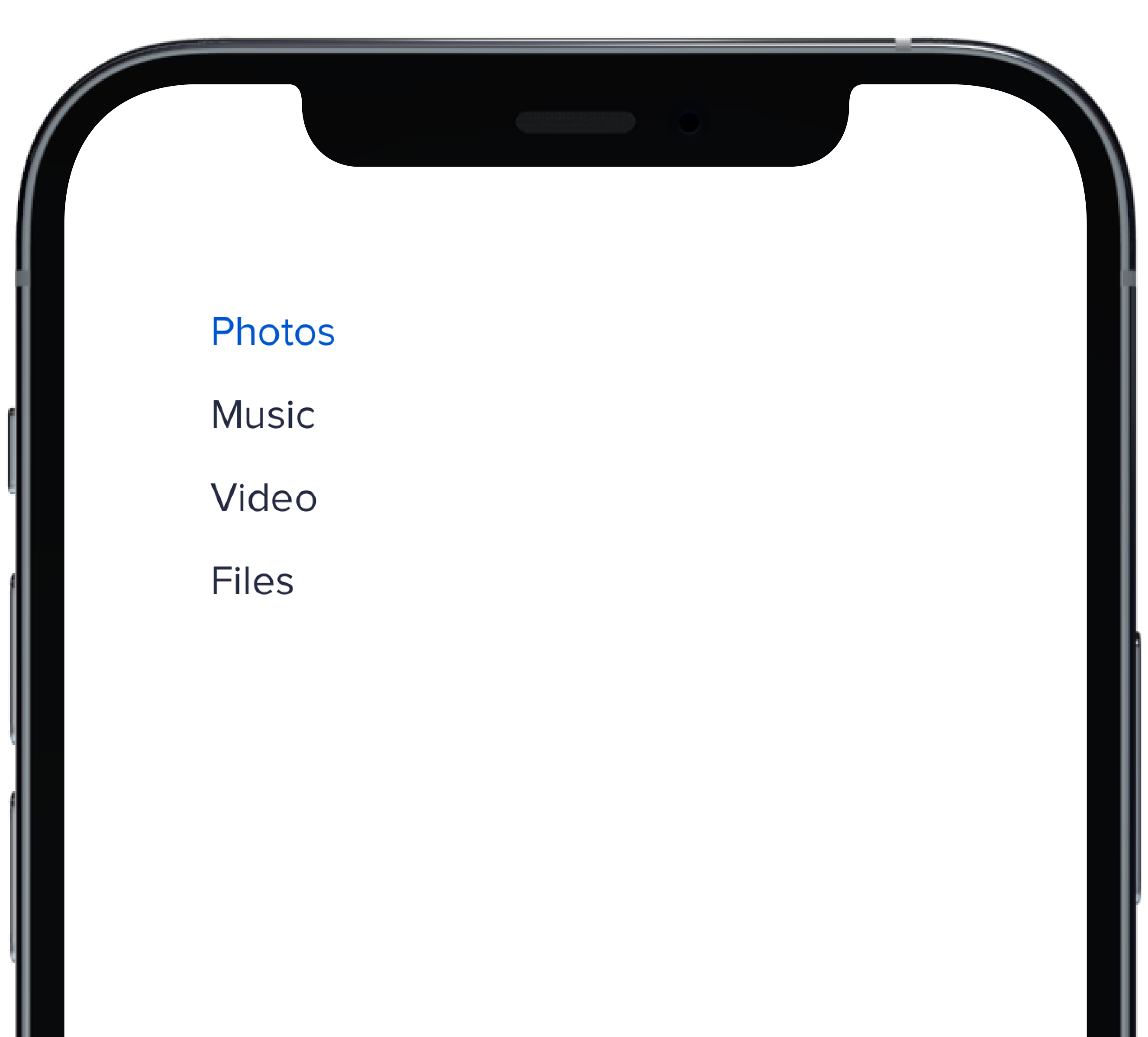
@@ -0,0 +1,17 @@
|
|
|
1
|
+
|
|
2
|
+
|
|
3
|
+
```swift
|
|
4
|
+
@State private var selectedHBold: Int = 1
|
|
5
|
+
|
|
6
|
+
PBNav(
|
|
7
|
+
selected: $selectedHBold,
|
|
8
|
+
variant: .bold,
|
|
9
|
+
orientation: .horizontal,
|
|
10
|
+
borders: false
|
|
11
|
+
) {
|
|
12
|
+
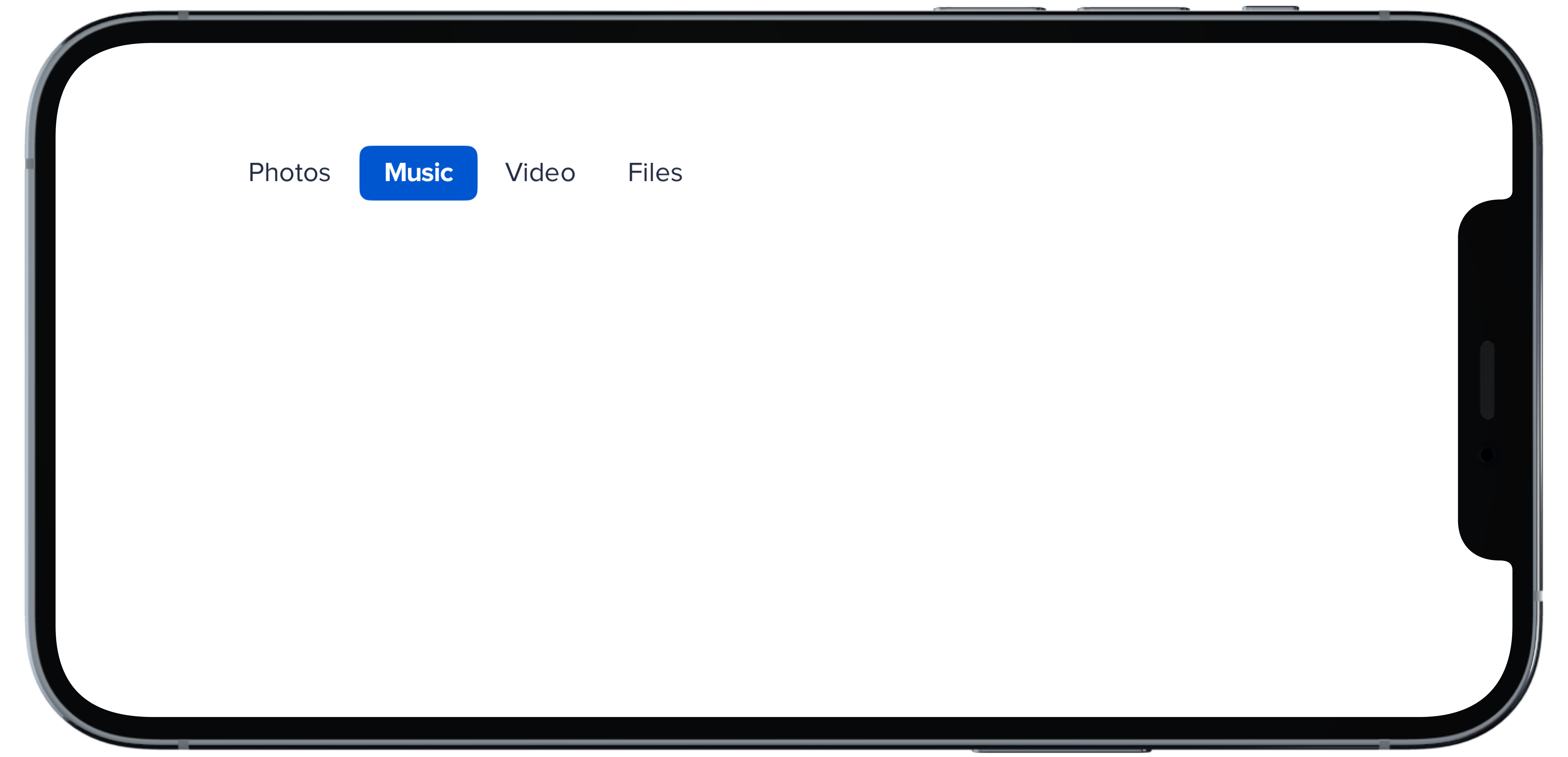
PBNavItem("Photos")
|
|
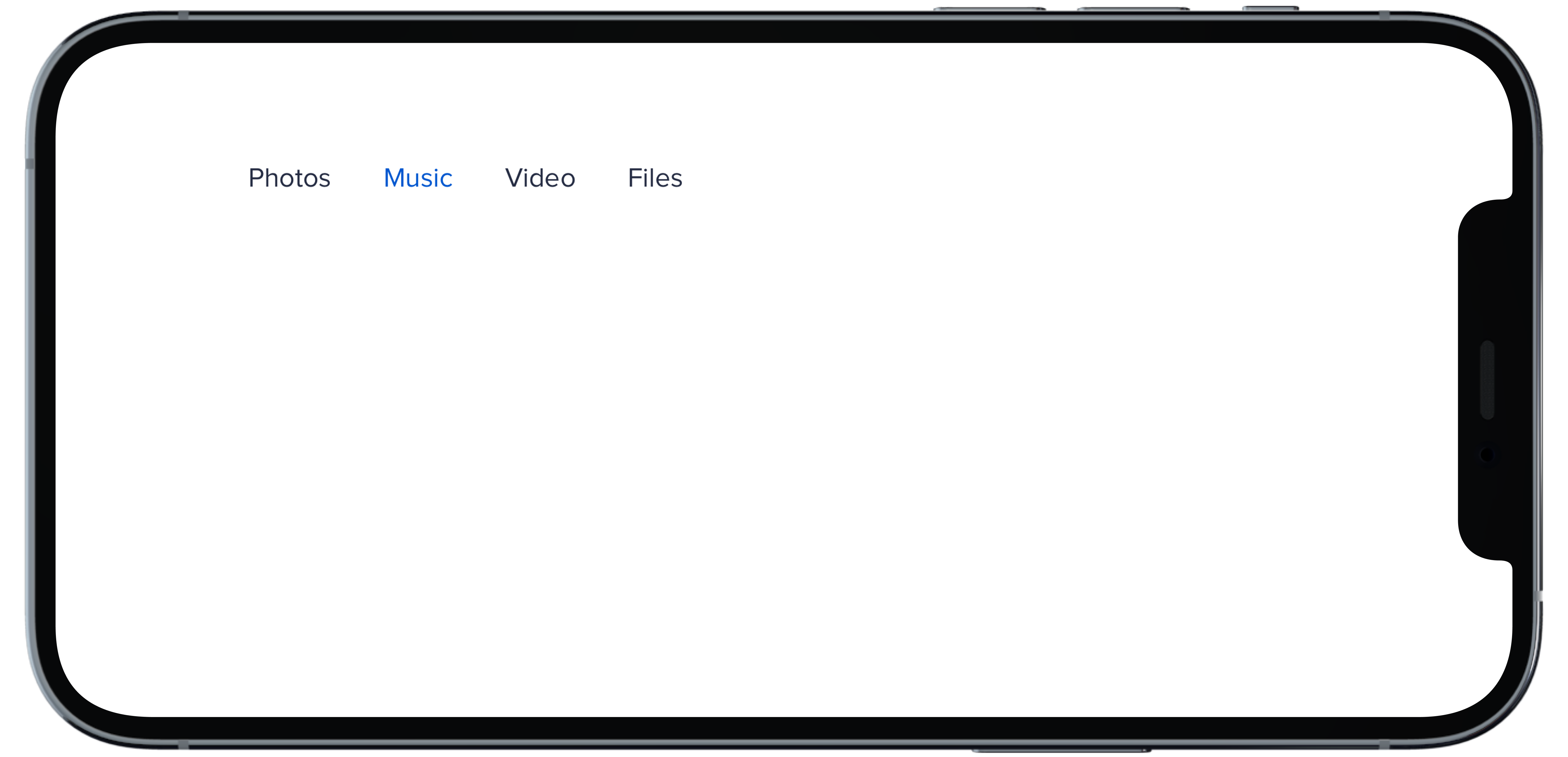
13
|
+
PBNavItem("Music")
|
|
14
|
+
PBNavItem("Video")
|
|
15
|
+
PBNavItem("Files")
|
|
16
|
+
}
|
|
17
|
+
```
|
|
@@ -0,0 +1,17 @@
|
|
|
1
|
+
|
|
2
|
+
|
|
3
|
+
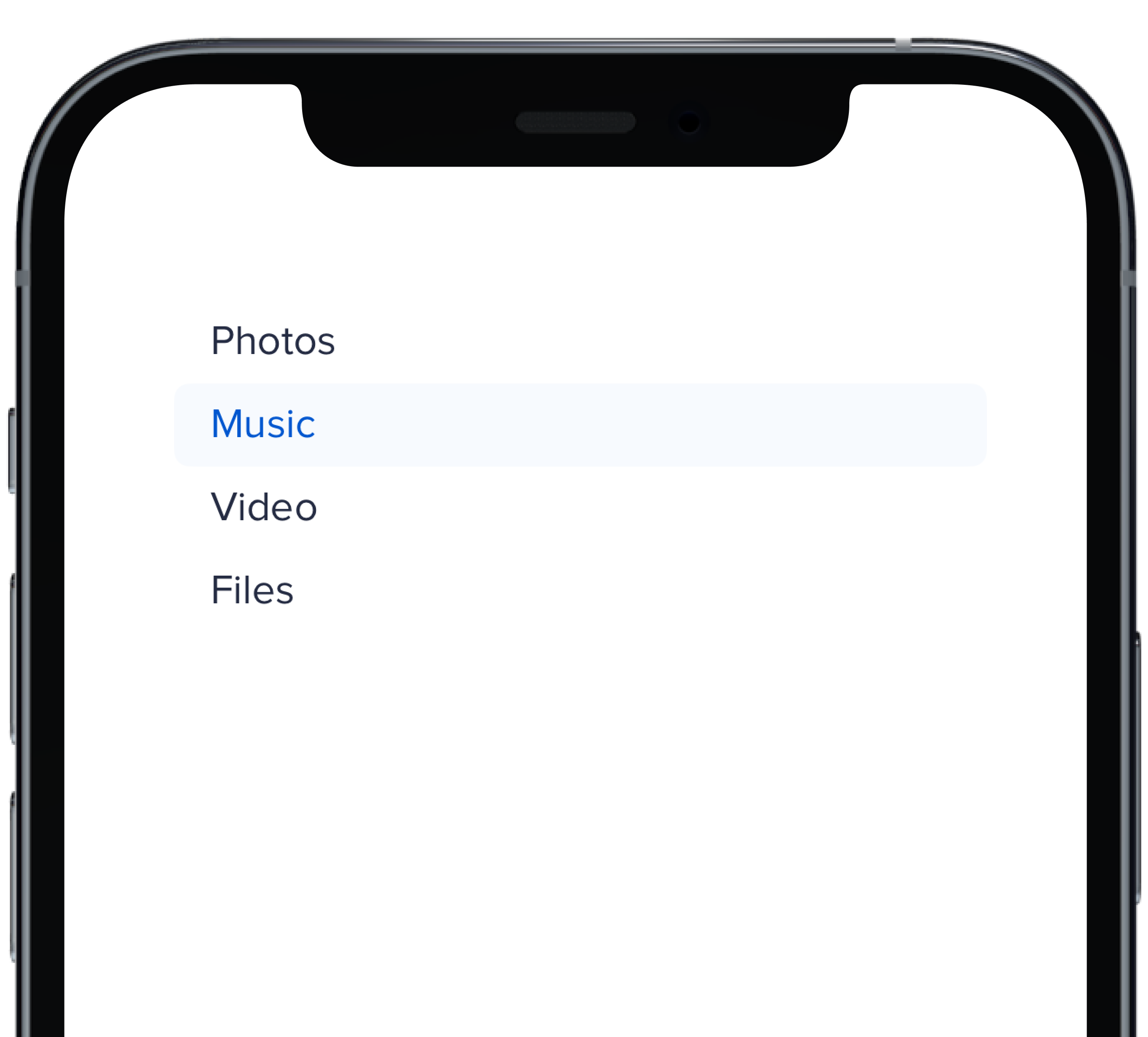
```swift
|
|
4
|
+
@State private var selectedHDefault: Int = 1
|
|
5
|
+
|
|
6
|
+
PBNav(
|
|
7
|
+
selected: $selectedHDefault,
|
|
8
|
+
variant: .normal,
|
|
9
|
+
orientation: .horizontal
|
|
10
|
+
) {
|
|
11
|
+
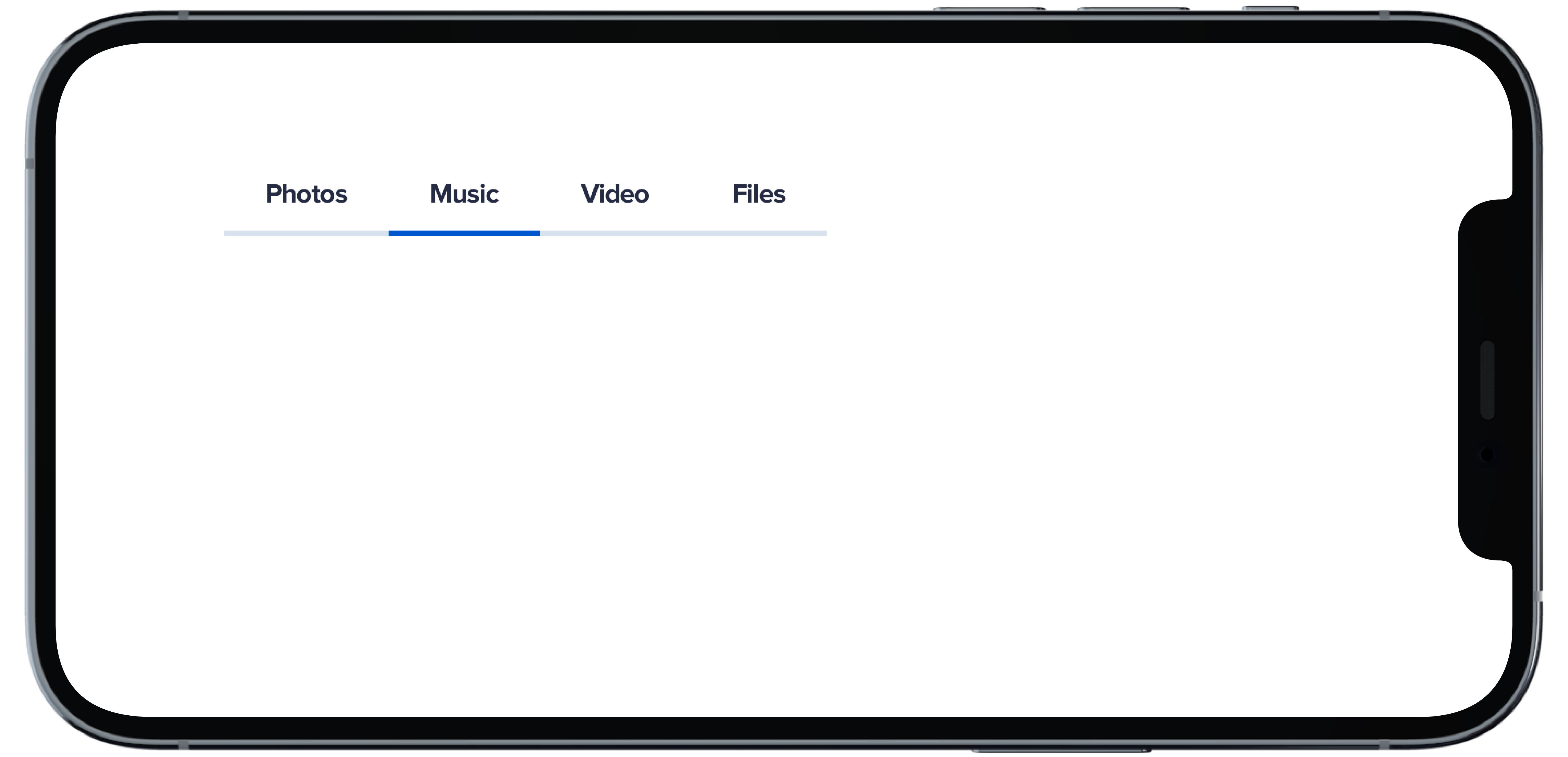
PBNavItem("Photos")
|
|
12
|
+
PBNavItem("Music")
|
|
13
|
+
PBNavItem("Video")
|
|
14
|
+
PBNavItem("Files")
|
|
15
|
+
}
|
|
16
|
+
|
|
17
|
+
```
|
|
@@ -0,0 +1,18 @@
|
|
|
1
|
+
|
|
2
|
+
|
|
3
|
+
```swift
|
|
4
|
+
@State private var selectedHSubtleNoHighlight: Int = 1
|
|
5
|
+
|
|
6
|
+
PBNav(
|
|
7
|
+
selected: $selectedHSubtleNoHighlight,
|
|
8
|
+
variant: .subtle,
|
|
9
|
+
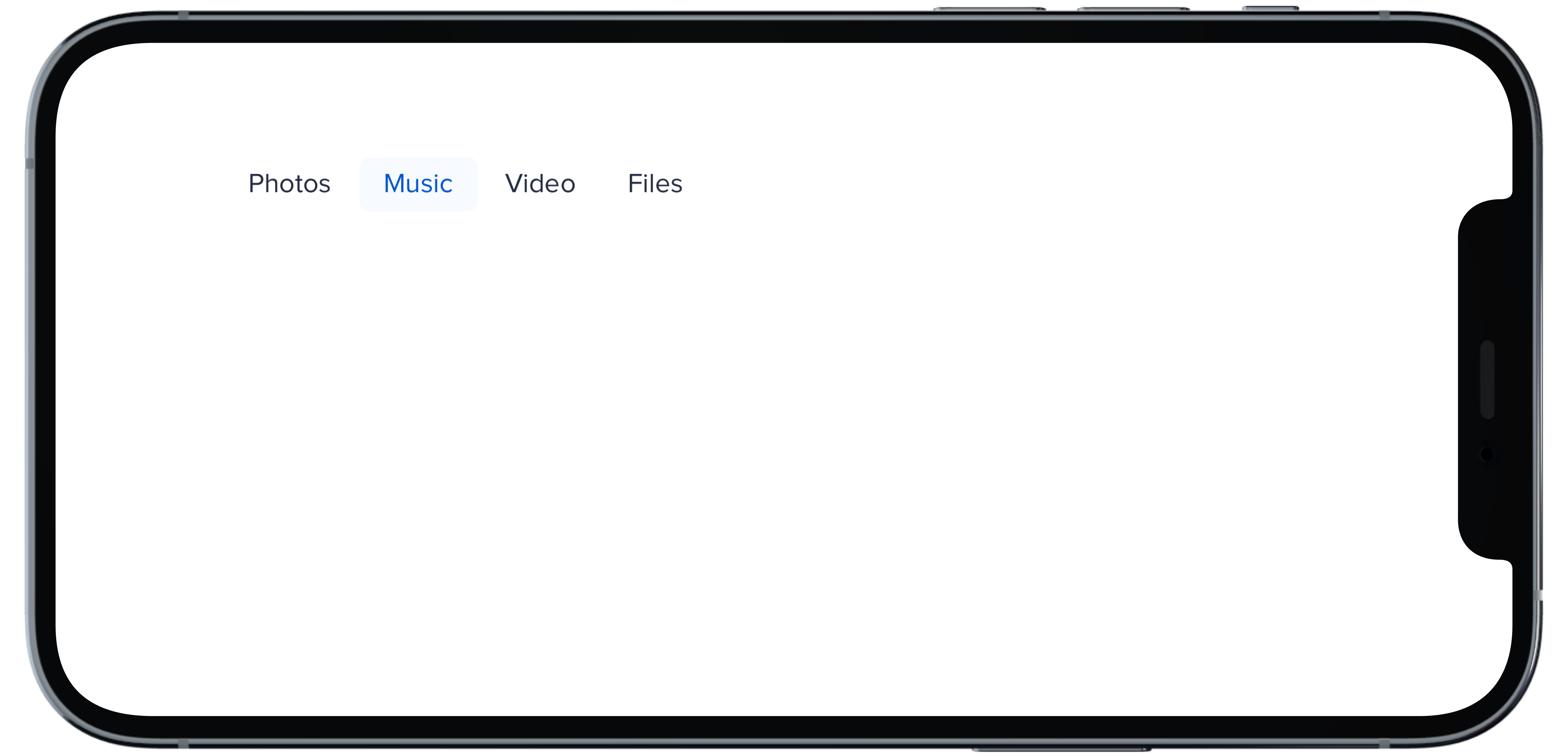
orientation: .horizontal,
|
|
10
|
+
borders: false,
|
|
11
|
+
highlight: false
|
|
12
|
+
) {
|
|
13
|
+
PBNavItem("Photos")
|
|
14
|
+
PBNavItem("Music")
|
|
15
|
+
PBNavItem("Video")
|
|
16
|
+
PBNavItem("Files")
|
|
17
|
+
}
|
|
18
|
+
```
|
|
@@ -0,0 +1,18 @@
|
|
|
1
|
+
|
|
2
|
+
|
|
3
|
+
```swift
|
|
4
|
+
@State private var selectedHSubtle: Int = 1
|
|
5
|
+
|
|
6
|
+
PBNav(
|
|
7
|
+
selected: $selectedHSubtle,
|
|
8
|
+
variant: .subtle,
|
|
9
|
+
orientation: .horizontal,
|
|
10
|
+
borders: false
|
|
11
|
+
) {
|
|
12
|
+
PBNavItem("Photos")
|
|
13
|
+
PBNavItem("Music")
|
|
14
|
+
PBNavItem("Video")
|
|
15
|
+
PBNavItem("Files")
|
|
16
|
+
}
|
|
17
|
+
|
|
18
|
+
```
|
|
@@ -0,0 +1,11 @@
|
|
|
1
|
+
### Props
|
|
2
|
+
| Name | Type | Description | Default | Values |
|
|
3
|
+
| --- | ----------- | --------- | --------- | --------- |
|
|
4
|
+
| **selected** | `Int` | Sets selected to current index | `0` | |
|
|
5
|
+
| **currentHover** | `Int?` | Sets the current hover state to the current index| | |
|
|
6
|
+
| **variant** | `Variant` | Sets variant for nav | `.normal` | `normal` `subtle` `bold` |
|
|
7
|
+
| **orientation** | `Orientation` | Changes the orientation of nav | `.vertical` | `horizontal` `verticle` |
|
|
8
|
+
| **title** | `String?` | Sets title of nav | | |
|
|
9
|
+
| **borders** | `Bool` | Boolean value for whether nav items have a border or not | `true` | `true` `false` |
|
|
10
|
+
| **highlight** | `Bool` | Boolean value for adding a highlight to nav | `true` | `true` `false` |
|
|
11
|
+
| **views** | `[AnyView]` | An Array of AnyView | | |
|
|
@@ -0,0 +1,18 @@
|
|
|
1
|
+
|
|
2
|
+
|
|
3
|
+
```swift
|
|
4
|
+
@State private var selectedVBold: Int = 1
|
|
5
|
+
|
|
6
|
+
PBNav(
|
|
7
|
+
selected: $selectedVBold,
|
|
8
|
+
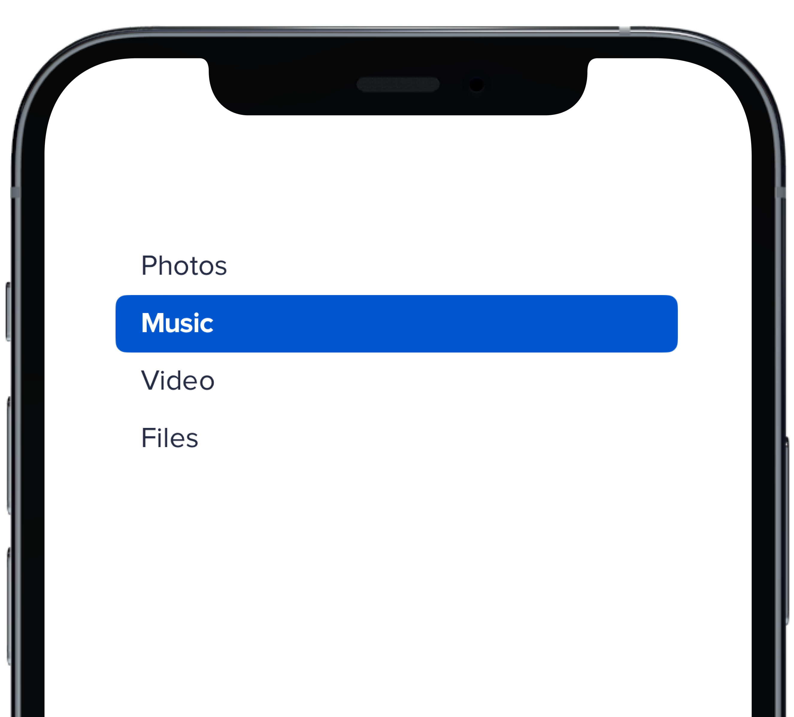
variant: .bold,
|
|
9
|
+
orientation: .vertical,
|
|
10
|
+
borders: false
|
|
11
|
+
) {
|
|
12
|
+
PBNavItem("Photos")
|
|
13
|
+
PBNavItem("Music")
|
|
14
|
+
PBNavItem("Video")
|
|
15
|
+
PBNavItem("Files")
|
|
16
|
+
}
|
|
17
|
+
|
|
18
|
+
```
|
|
@@ -0,0 +1,18 @@
|
|
|
1
|
+
|
|
2
|
+
|
|
3
|
+
```swift
|
|
4
|
+
@State private var selectedVDefault: Int = 1
|
|
5
|
+
|
|
6
|
+
PBNav(
|
|
7
|
+
selected: $selectedVDefault,
|
|
8
|
+
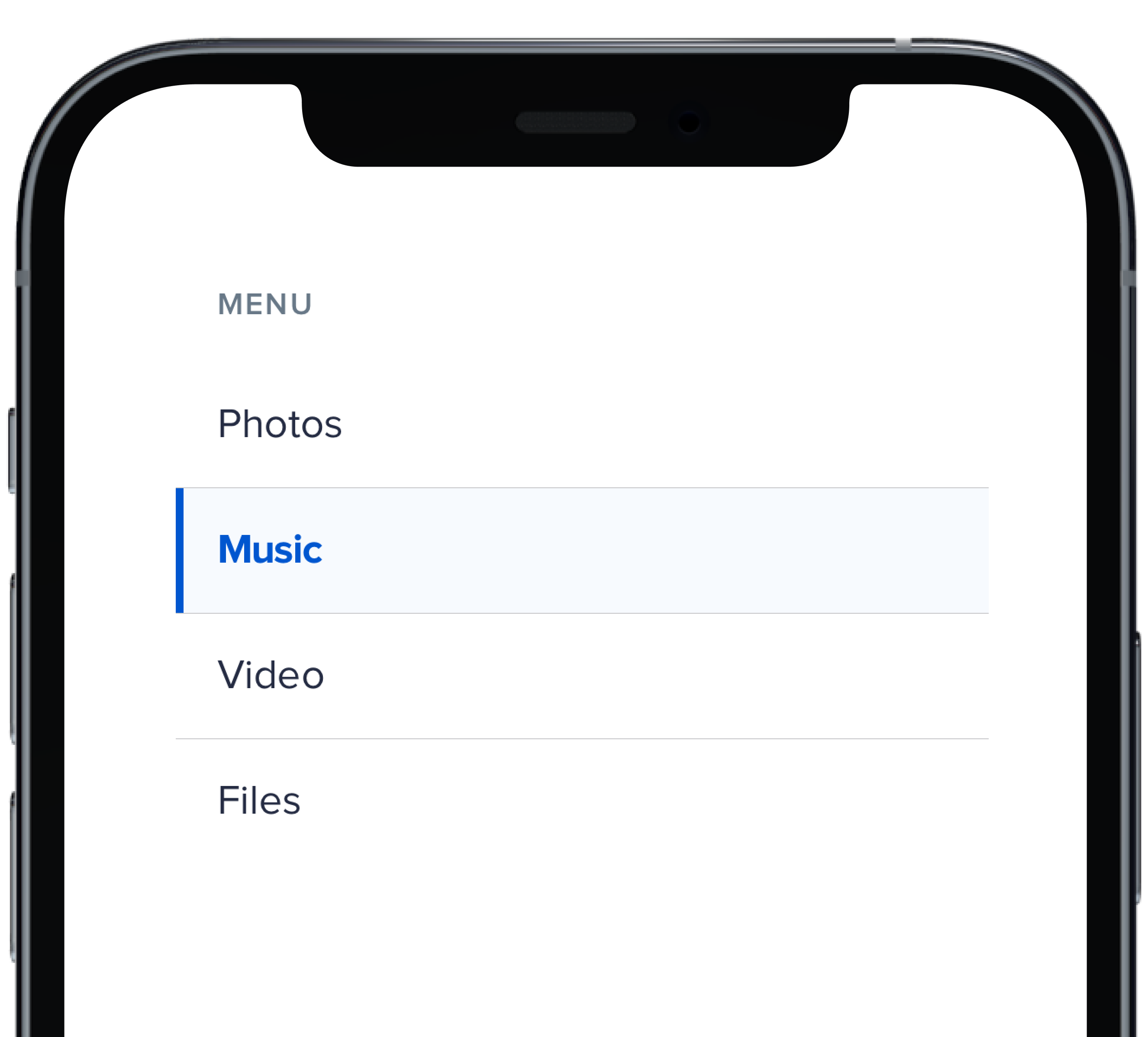
variant: .normal,
|
|
9
|
+
orientation: .vertical,
|
|
10
|
+
title: "Menu"
|
|
11
|
+
) {
|
|
12
|
+
PBNavItem("Photos")
|
|
13
|
+
PBNavItem("Music")
|
|
14
|
+
PBNavItem("Video")
|
|
15
|
+
PBNavItem("Files")
|
|
16
|
+
}
|
|
17
|
+
|
|
18
|
+
```
|
|
@@ -0,0 +1,19 @@
|
|
|
1
|
+
|
|
2
|
+
|
|
3
|
+
```swift
|
|
4
|
+
@State private var selectedVSubtleNoHighlight: Int = 1
|
|
5
|
+
|
|
6
|
+
PBNav(
|
|
7
|
+
selected: $selectedVSubtleNoHighlight,
|
|
8
|
+
variant: .subtle,
|
|
9
|
+
orientation: .vertical,
|
|
10
|
+
borders: false,
|
|
11
|
+
highlight: false
|
|
12
|
+
) {
|
|
13
|
+
PBNavItem("Photos")
|
|
14
|
+
PBNavItem("Music")
|
|
15
|
+
PBNavItem("Video")
|
|
16
|
+
PBNavItem("Files")
|
|
17
|
+
}
|
|
18
|
+
|
|
19
|
+
```
|
|
@@ -0,0 +1,17 @@
|
|
|
1
|
+
|
|
2
|
+
|
|
3
|
+
```swift
|
|
4
|
+
@State private var selectedVSubtle: Int = 1
|
|
5
|
+
|
|
6
|
+
PBNav(
|
|
7
|
+
selected: $selectedVSubtle,
|
|
8
|
+
variant: .subtle,
|
|
9
|
+
orientation: .vertical,
|
|
10
|
+
borders: false
|
|
11
|
+
) {
|
|
12
|
+
PBNavItem("Photos")
|
|
13
|
+
PBNavItem("Music")
|
|
14
|
+
PBNavItem("Video")
|
|
15
|
+
PBNavItem("Files")
|
|
16
|
+
}
|
|
17
|
+
```
|
|
@@ -42,3 +42,20 @@ examples:
|
|
|
42
42
|
- block_nav: Block
|
|
43
43
|
- block_no_title_nav: Without Title
|
|
44
44
|
- new_tab: Open in a New Tab
|
|
45
|
+
|
|
46
|
+
swift:
|
|
47
|
+
- nav_vertical_default_swift: Vertical Default
|
|
48
|
+
- nav_vertical_subtle_swift: Vertical Subtle
|
|
49
|
+
- nav_vertical_subtle_no_highlight_swift: Vertical Subtle No Highlight
|
|
50
|
+
- nav_vertical_bold_swift: Vertical Bold
|
|
51
|
+
- nav_horizontal_default_swift: Horizontal Default
|
|
52
|
+
- nav_horizontal_subtle_swift: Horizontal Subtle
|
|
53
|
+
- nav_horizontal_subtle_no_highlight_swift: Horizontal Subtle No Highlight
|
|
54
|
+
- nav_horizontal_bold_swift: Horizontal Bold
|
|
55
|
+
- nav_props_swift: ""
|
|
56
|
+
|
|
57
|
+
|
|
58
|
+
|
|
59
|
+
|
|
60
|
+
|
|
61
|
+
|
|
@@ -0,0 +1,15 @@
|
|
|
1
|
+

|
|
2
|
+
|
|
3
|
+
|
|
4
|
+
```swift
|
|
5
|
+
let defaultOptions = [
|
|
6
|
+
(value: "1", text: "Burgers"),
|
|
7
|
+
(value: "2", text: "Pizza"),
|
|
8
|
+
(value: "3", text: "Tacos")
|
|
9
|
+
]
|
|
10
|
+
@State private var defaultState = ""
|
|
11
|
+
|
|
12
|
+
PBSelect(title: "Favorite Food", options: defaultOptions, style: .default) { selected in
|
|
13
|
+
defaultState = selected
|
|
14
|
+
}
|
|
15
|
+
```
|
|
@@ -0,0 +1,18 @@
|
|
|
1
|
+

|
|
2
|
+
|
|
3
|
+
```swift
|
|
4
|
+
let defaultOptions = [
|
|
5
|
+
(value: "1", text: "Burgers"),
|
|
6
|
+
(value: "2", text: "Pizza"),
|
|
7
|
+
(value: "3", text: "Tacos")
|
|
8
|
+
]
|
|
9
|
+
@State private var errorState = ""
|
|
10
|
+
|
|
11
|
+
PBSelect(
|
|
12
|
+
title: "Favorite Food",
|
|
13
|
+
options: defaultOptions,
|
|
14
|
+
style: .error("Please make a valid selection")
|
|
15
|
+
) { selected in
|
|
16
|
+
errorState = selected
|
|
17
|
+
}
|
|
18
|
+
```
|
|
@@ -0,0 +1,8 @@
|
|
|
1
|
+
### Props
|
|
2
|
+
| Name | Type | Description | Default | Values |
|
|
3
|
+
| --- | ----------- | --------- | --------- | --------- |
|
|
4
|
+
| **title** | `String` | Sets label title for dropdown | | |
|
|
5
|
+
| **options** | `(String, String)` | Displays the list of dropdown options | | |
|
|
6
|
+
| **style** | `Variant` | Options for the state of dropdown | `.default` | `default` `disabled` `error` |
|
|
7
|
+
| **selectedOption** | `String` | Changes selected value when new value is selected | | |
|
|
8
|
+
| **selected** | `String` | Changes the value of the option selected in dropdown | | |
|