playbook_ui_docs 13.14.0.pre.alpha.play1106filter1748 → 13.14.0.pre.alpha.play1120lintdatepicker1797
Sign up to get free protection for your applications and to get access to all the features.
- checksums.yaml +4 -4
- data/app/pb_kits/playbook/pb_button/docs/_button_props_swift.md +11 -0
- data/app/pb_kits/playbook/pb_button/docs/_button_reaction_swift.md +26 -0
- data/app/pb_kits/playbook/pb_button/docs/example.yml +1 -0
- data/app/pb_kits/playbook/pb_card/docs/_card_background.jsx +5 -4
- data/app/pb_kits/playbook/pb_dialog/docs/_dialog_default_swift.md +11 -0
- data/app/pb_kits/playbook/pb_dialog/docs/_dialog_full_height.jsx +8 -4
- data/app/pb_kits/playbook/pb_dialog/docs/_dialog_full_height_placement.jsx +8 -4
- data/app/pb_kits/playbook/pb_dialog/docs/_dialog_props_table.md +13 -0
- data/app/pb_kits/playbook/pb_dialog/docs/_dialog_scrollable.jsx +4 -2
- data/app/pb_kits/playbook/pb_dialog/docs/_dialog_sizes_swift.md +18 -0
- data/app/pb_kits/playbook/pb_dialog/docs/_dialog_status.jsx +1 -1
- data/app/pb_kits/playbook/pb_dialog/docs/_dialog_status_swift.md +14 -0
- data/app/pb_kits/playbook/pb_dialog/docs/example.yml +7 -0
- data/app/pb_kits/playbook/pb_person/docs/_person_default_swift.md +8 -0
- data/app/pb_kits/playbook/pb_person/docs/_person_props_swift.md +5 -0
- data/app/pb_kits/playbook/pb_person/docs/example.yml +4 -0
- data/app/pb_kits/playbook/pb_select/docs/_select_default_swift.md +15 -0
- data/app/pb_kits/playbook/pb_select/docs/_select_error_swift.md +18 -0
- data/app/pb_kits/playbook/pb_select/docs/_select_props_table.md +8 -0
- data/app/pb_kits/playbook/pb_select/docs/example.yml +5 -0
- data/app/pb_kits/playbook/pb_user/docs/_user_horizontal_swift.md +37 -0
- data/app/pb_kits/playbook/pb_user/docs/_user_props_table.md +10 -0
- data/app/pb_kits/playbook/pb_user/docs/_user_size_swift.md +35 -0
- data/app/pb_kits/playbook/pb_user/docs/_user_text_only_swift.md +27 -0
- data/app/pb_kits/playbook/pb_user/docs/_user_vertical_size_swift.md +35 -0
- data/app/pb_kits/playbook/pb_user/docs/example.yml +7 -0
- data/dist/playbook-doc.js +8 -8
- metadata +17 -2
checksums.yaml
CHANGED
|
@@ -1,7 +1,7 @@
|
|
|
1
1
|
---
|
|
2
2
|
SHA256:
|
|
3
|
-
metadata.gz:
|
|
4
|
-
data.tar.gz:
|
|
3
|
+
metadata.gz: 7d11fdb5b7aa5ac2c1bb5531f87d0c35d7b9605f1af41b63049f4e0def1b75f7
|
|
4
|
+
data.tar.gz: 79b251e2cde527275489f5d8a1d7c3112e9363a2bd84de8569ad824e6d8345da
|
|
5
5
|
SHA512:
|
|
6
|
-
metadata.gz:
|
|
7
|
-
data.tar.gz:
|
|
6
|
+
metadata.gz: a14db56bda06774e771c122398bca60231f3668614b7082d857f458332349ff6a486e041b604c9f3d712cb4b2d0ae05e416e660b77385e187f3c13121dbf291c
|
|
7
|
+
data.tar.gz: 30ddd1f384742c02f4364d8a66054b0e4107029b87821b82d3df802d16a73cbce81b13b981cb7afa37f8aea2a6b05f51aadb1f5b07ecbeeaaa293ca3986bdc1d
|
|
@@ -9,3 +9,14 @@
|
|
|
9
9
|
| **Icon** | `PBIcon` | Adds an icon to the Button | `nil` | |
|
|
10
10
|
| **Icon Position** | `IconPosition` | Adjusts the icon's position | `.left` | `.left` `.right` |
|
|
11
11
|
| **Action** | `(() -> Void)` | Adds an action for the Button to perform | `{}` | |
|
|
12
|
+
|
|
13
|
+
### Reaction Button Props
|
|
14
|
+
| Name | Type | Description | Default | Values |
|
|
15
|
+
| --- | ----------- | --------- | --------- | --------- |
|
|
16
|
+
| **count** | `Int` | Tracks number of times a reaction button has been pressed | `0` | |
|
|
17
|
+
| **isHighlighted** | `Bool` | Boolean for whether or not a reaction button has a highlight | ` false` | `true` `false` |
|
|
18
|
+
| **isHovering** | `Bool` | Boolean for whether or not a mouse is hovering over the reaction button | `false` | `true` `false` |
|
|
19
|
+
| **icon** | `String` | Allows user to use a unicode string for an emoji reaction button | | |
|
|
20
|
+
| **pbIcon** | `PBIcon` | A PlayBook Icon option for reaction button | | |
|
|
21
|
+
| **isInteractive** | `Bool` | Boolean for whether or not a reaction button is interactive | `false` | `true` `false` |
|
|
22
|
+
|
|
@@ -0,0 +1,26 @@
|
|
|
1
|
+
|
|
2
|
+
|
|
3
|
+
```swift
|
|
4
|
+
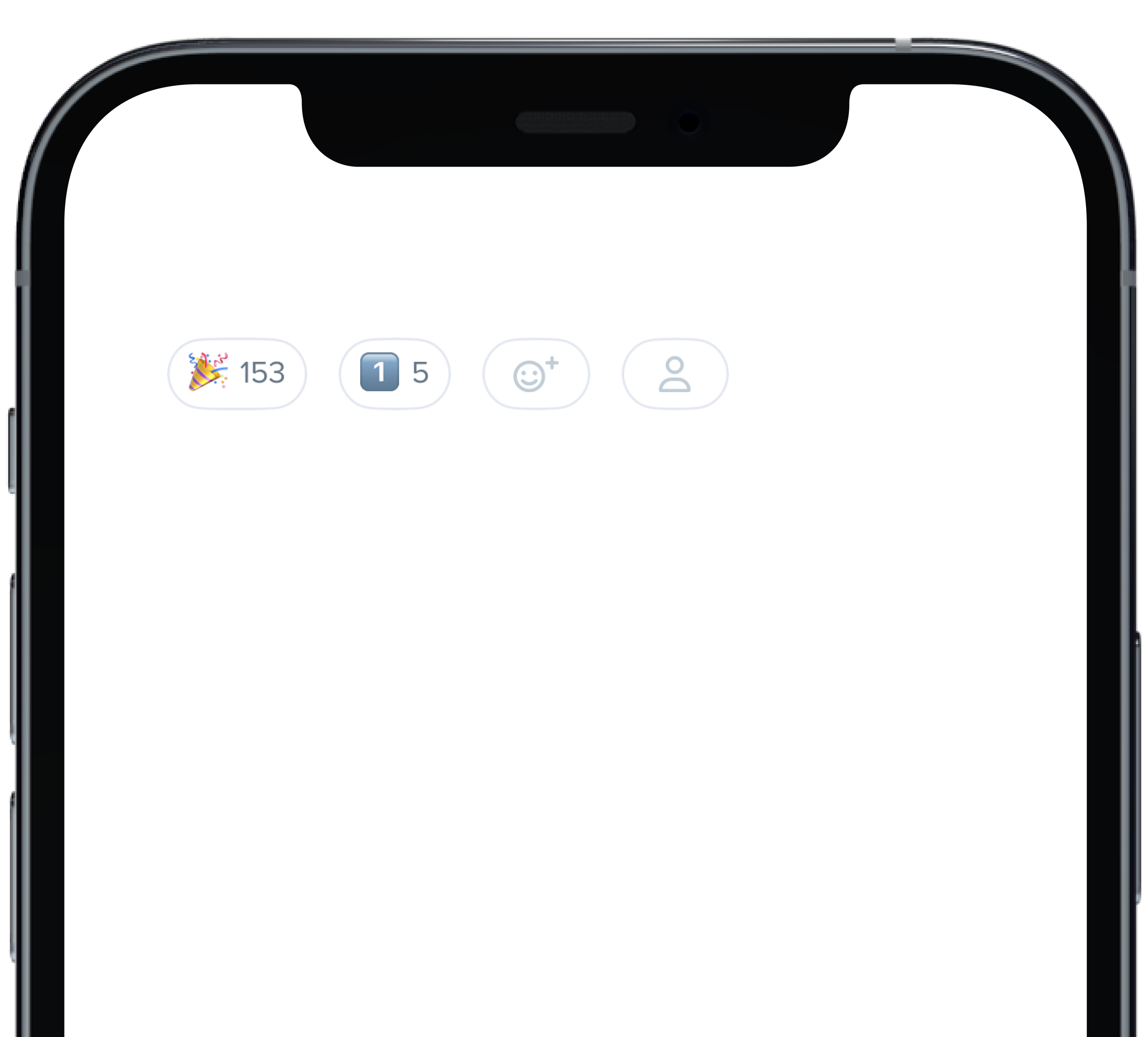
@State private var count: Int = 153
|
|
5
|
+
@State private var count1: Int = 5
|
|
6
|
+
|
|
7
|
+
HStack(alignment: .center, spacing: 12) {
|
|
8
|
+
PBReactionButton(
|
|
9
|
+
count: $count,
|
|
10
|
+
icon: "\u{1F389}",
|
|
11
|
+
isInteractive: true
|
|
12
|
+
)
|
|
13
|
+
PBReactionButton(
|
|
14
|
+
count: $count1,
|
|
15
|
+
icon: "1️⃣",
|
|
16
|
+
isInteractive: false
|
|
17
|
+
)
|
|
18
|
+
PBReactionButton(
|
|
19
|
+
isInteractive: false
|
|
20
|
+
)
|
|
21
|
+
PBReactionButton(
|
|
22
|
+
pbIcon: PBIcon(FontAwesome.user),
|
|
23
|
+
isInteractive: false
|
|
24
|
+
)
|
|
25
|
+
}
|
|
26
|
+
```
|
|
@@ -57,7 +57,7 @@ const CardBackground = (props) => {
|
|
|
57
57
|
background="product_1_background"
|
|
58
58
|
marginBottom="sm"
|
|
59
59
|
{...props}
|
|
60
|
-
|
|
60
|
+
>
|
|
61
61
|
<Body
|
|
62
62
|
dark
|
|
63
63
|
text="Product 1 Background"
|
|
@@ -69,11 +69,12 @@ const CardBackground = (props) => {
|
|
|
69
69
|
<Card
|
|
70
70
|
background="product_7_highlight"
|
|
71
71
|
marginBottom="sm"
|
|
72
|
-
{...props}
|
|
72
|
+
{...props}
|
|
73
|
+
>
|
|
73
74
|
<Body
|
|
74
75
|
dark
|
|
75
|
-
text="Product 7 Highlight"
|
|
76
|
-
|
|
76
|
+
text="Product 7 Highlight"
|
|
77
|
+
/>
|
|
77
78
|
</Card>
|
|
78
79
|
|
|
79
80
|
|
|
@@ -0,0 +1,11 @@
|
|
|
1
|
+

|
|
2
|
+
|
|
3
|
+
```swift
|
|
4
|
+
PBDialog(
|
|
5
|
+
title: "This is some informative text",
|
|
6
|
+
message: infoMessage,
|
|
7
|
+
cancelButton: ("Cancel", closeToast),
|
|
8
|
+
confirmButton: ("Okay", closeToast)
|
|
9
|
+
)
|
|
10
|
+
```
|
|
11
|
+
|
|
@@ -49,15 +49,18 @@ const DialogFullHeight = () => {
|
|
|
49
49
|
<Flex wrap>
|
|
50
50
|
<Button id="sm"
|
|
51
51
|
marginRight="md"
|
|
52
|
-
onClick={toggleHeaderSeparatorDialog}
|
|
52
|
+
onClick={toggleHeaderSeparatorDialog}
|
|
53
|
+
>
|
|
53
54
|
{"Small Dialog"}
|
|
54
55
|
</Button>
|
|
55
56
|
<Button marginRight="md"
|
|
56
|
-
onClick={toggleFooterSeparatorDialog}
|
|
57
|
+
onClick={toggleFooterSeparatorDialog}
|
|
58
|
+
>
|
|
57
59
|
{"Medium Dialog"}
|
|
58
60
|
</Button>
|
|
59
61
|
<Button marginRight="md"
|
|
60
|
-
onClick={toggleBothSeparatorsDialog}
|
|
62
|
+
onClick={toggleBothSeparatorsDialog}
|
|
63
|
+
>
|
|
61
64
|
{"Large Dialog"}
|
|
62
65
|
</Button>
|
|
63
66
|
</Flex>
|
|
@@ -89,7 +92,8 @@ const DialogFullHeight = () => {
|
|
|
89
92
|
<Dialog.Footer>
|
|
90
93
|
<Button onClick={toggle}>{"Send My Issue"}</Button>
|
|
91
94
|
<Button onClick={toggle}
|
|
92
|
-
variant="link"
|
|
95
|
+
variant="link"
|
|
96
|
+
>
|
|
93
97
|
{"Back"}
|
|
94
98
|
</Button>
|
|
95
99
|
</Dialog.Footer>
|
|
@@ -48,15 +48,18 @@ const DialogFullHeightPlacement = () => {
|
|
|
48
48
|
<Flex wrap>
|
|
49
49
|
<Button id="sm"
|
|
50
50
|
marginRight="md"
|
|
51
|
-
onClick={toggleHeaderSeparatorDialog}
|
|
51
|
+
onClick={toggleHeaderSeparatorDialog}
|
|
52
|
+
>
|
|
52
53
|
{"Left Dialog"}
|
|
53
54
|
</Button>
|
|
54
55
|
<Button marginRight="xl"
|
|
55
|
-
onClick={toggleFooterSeparatorDialog}
|
|
56
|
+
onClick={toggleFooterSeparatorDialog}
|
|
57
|
+
>
|
|
56
58
|
{"Center Dialog"}
|
|
57
59
|
</Button>
|
|
58
60
|
<Button marginRight="xl"
|
|
59
|
-
onClick={toggleBothSeparatorsDialog}
|
|
61
|
+
onClick={toggleBothSeparatorsDialog}
|
|
62
|
+
>
|
|
60
63
|
{"Right Dialog"}
|
|
61
64
|
</Button>
|
|
62
65
|
</Flex>
|
|
@@ -88,7 +91,8 @@ const DialogFullHeightPlacement = () => {
|
|
|
88
91
|
<Dialog.Footer>
|
|
89
92
|
<Button onClick={toggle}>{"Send My Issue"}</Button>
|
|
90
93
|
<Button onClick={toggle}
|
|
91
|
-
variant="link"
|
|
94
|
+
variant="link"
|
|
95
|
+
>
|
|
92
96
|
{"Back"}
|
|
93
97
|
</Button>
|
|
94
98
|
</Dialog.Footer>
|
|
@@ -0,0 +1,13 @@
|
|
|
1
|
+
### Props
|
|
2
|
+
| Name | Type | Description | Default | Values |
|
|
3
|
+
| --- | ----------- | --------- | --------- | --------- |
|
|
4
|
+
| **content** | `Content` | Sets the View content | | |
|
|
5
|
+
| **title** | `String` | Sets title for dialog header | | |
|
|
6
|
+
| **message** | `String` | Sets dialog message| | |
|
|
7
|
+
| **variant** | `DialogVariant` | Changes variant of dialog | `.default` | `.default` `.status()` |
|
|
8
|
+
| **isStacked** | `isStacked` | Changes whether the dialog buttons are stacked or inline | `false` | `true` `false` |
|
|
9
|
+
| **cancelButton** | `Action` | Dismisses the dialog | | |
|
|
10
|
+
| **confirmButton** | `Action` | Confirms dialog message was received | | |
|
|
11
|
+
| **onClose** | `Action` | Starts action when dialog is closed | | |
|
|
12
|
+
| **size** | `DialogSize` | Determines size of dialog | `.medium`| `.small` `.medium` `large` |
|
|
13
|
+
| **shouldCloseOnOverlay** | `Bool` | Determines if overlay should close | `false` | `true` `false` |
|
|
@@ -16,10 +16,12 @@ const DialogScrollable = () => {
|
|
|
16
16
|
return (
|
|
17
17
|
<>
|
|
18
18
|
<Button marginRight="md"
|
|
19
|
-
onClick={toggleDialog1}
|
|
19
|
+
onClick={toggleDialog1}
|
|
20
|
+
>{'Open Dialog'}
|
|
20
21
|
</Button>
|
|
21
22
|
<Button marginRight="md"
|
|
22
|
-
onClick={toggleDialog2}
|
|
23
|
+
onClick={toggleDialog2}
|
|
24
|
+
>{'Open Full Height Dialog'}
|
|
23
25
|
</Button>
|
|
24
26
|
<Dialog
|
|
25
27
|
cancelButton="Cancel"
|
|
@@ -0,0 +1,18 @@
|
|
|
1
|
+

|
|
2
|
+
|
|
3
|
+
```swift
|
|
4
|
+
@State private var presentSmallDialog: Bool = false
|
|
5
|
+
@State private var presentMediumDialog: Bool = false
|
|
6
|
+
@State private var presentLargeDialog: Bool = false
|
|
7
|
+
let infoMessage = "This is a message for informational purposes only and requires no action."
|
|
8
|
+
|
|
9
|
+
PBDialog(
|
|
10
|
+
title: "Large",
|
|
11
|
+
message: infoMessage,
|
|
12
|
+
variant: .default,
|
|
13
|
+
isStacked: false,
|
|
14
|
+
cancelButton: ("Cancel", {}),
|
|
15
|
+
confirmButton: ("Okay", {}),
|
|
16
|
+
size: .large
|
|
17
|
+
)
|
|
18
|
+
```
|
|
@@ -0,0 +1,14 @@
|
|
|
1
|
+

|
|
2
|
+
|
|
3
|
+
```swift
|
|
4
|
+
|
|
5
|
+
PBDialog(
|
|
6
|
+
title: "Success!",
|
|
7
|
+
message: infoMessage,
|
|
8
|
+
variant: .status(.success),
|
|
9
|
+
isStacked: true,
|
|
10
|
+
cancelButton: ("Cancel", closeToast),
|
|
11
|
+
confirmButton: ("Okay", closeToast),
|
|
12
|
+
size: .small
|
|
13
|
+
)
|
|
14
|
+
```
|
|
@@ -22,3 +22,10 @@ examples:
|
|
|
22
22
|
- dialog_stacked_alert: Stacked Button Alert
|
|
23
23
|
- dialog_full_height: Full Height
|
|
24
24
|
- dialog_full_height_placement: Full Height Placement
|
|
25
|
+
|
|
26
|
+
swift:
|
|
27
|
+
- dialog_default_swift: Simple
|
|
28
|
+
- dialog_sizes_swift: Sizes
|
|
29
|
+
- dialog_status_swift: Status
|
|
30
|
+
- dialog_props_table: ""
|
|
31
|
+
|
|
@@ -0,0 +1,15 @@
|
|
|
1
|
+

|
|
2
|
+
|
|
3
|
+
|
|
4
|
+
```swift
|
|
5
|
+
let defaultOptions = [
|
|
6
|
+
(value: "1", text: "Burgers"),
|
|
7
|
+
(value: "2", text: "Pizza"),
|
|
8
|
+
(value: "3", text: "Tacos")
|
|
9
|
+
]
|
|
10
|
+
@State private var defaultState = ""
|
|
11
|
+
|
|
12
|
+
PBSelect(title: "Favorite Food", options: defaultOptions, style: .default) { selected in
|
|
13
|
+
defaultState = selected
|
|
14
|
+
}
|
|
15
|
+
```
|
|
@@ -0,0 +1,18 @@
|
|
|
1
|
+

|
|
2
|
+
|
|
3
|
+
```swift
|
|
4
|
+
let defaultOptions = [
|
|
5
|
+
(value: "1", text: "Burgers"),
|
|
6
|
+
(value: "2", text: "Pizza"),
|
|
7
|
+
(value: "3", text: "Tacos")
|
|
8
|
+
]
|
|
9
|
+
@State private var errorState = ""
|
|
10
|
+
|
|
11
|
+
PBSelect(
|
|
12
|
+
title: "Favorite Food",
|
|
13
|
+
options: defaultOptions,
|
|
14
|
+
style: .error("Please make a valid selection")
|
|
15
|
+
) { selected in
|
|
16
|
+
errorState = selected
|
|
17
|
+
}
|
|
18
|
+
```
|
|
@@ -0,0 +1,8 @@
|
|
|
1
|
+
### Props
|
|
2
|
+
| Name | Type | Description | Default | Values |
|
|
3
|
+
| --- | ----------- | --------- | --------- | --------- |
|
|
4
|
+
| **title** | `String` | Sets label title for dropdown | | |
|
|
5
|
+
| **options** | `(String, String)` | Displays the list of dropdown options | | |
|
|
6
|
+
| **style** | `Variant` | Options for the state of dropdown | `.default` | `default` `disabled` `error` |
|
|
7
|
+
| **selectedOption** | `String` | Changes selected value when new value is selected | | |
|
|
8
|
+
| **selected** | `String` | Changes the value of the option selected in dropdown | | |
|
|
@@ -0,0 +1,37 @@
|
|
|
1
|
+

|
|
2
|
+
|
|
3
|
+
```swift
|
|
4
|
+
|
|
5
|
+
let img = Image("andrew", bundle: .module)
|
|
6
|
+
let name = "Andrew K"
|
|
7
|
+
let title = "Rebels Developer"
|
|
8
|
+
|
|
9
|
+
VStack(alignment: .leading, spacing: Spacing.small) {
|
|
10
|
+
PBUser(
|
|
11
|
+
name: name,
|
|
12
|
+
image: img,
|
|
13
|
+
territory: "PHL",
|
|
14
|
+
title: title
|
|
15
|
+
)
|
|
16
|
+
|
|
17
|
+
PBUser(
|
|
18
|
+
name: name,
|
|
19
|
+
territory: "PHL",
|
|
20
|
+
title: title
|
|
21
|
+
)
|
|
22
|
+
|
|
23
|
+
PBUser(
|
|
24
|
+
name: name,
|
|
25
|
+
image: img,
|
|
26
|
+
size: .small,
|
|
27
|
+
title: title
|
|
28
|
+
)
|
|
29
|
+
|
|
30
|
+
PBUser(
|
|
31
|
+
name: name,
|
|
32
|
+
image: img,
|
|
33
|
+
size: .small
|
|
34
|
+
)
|
|
35
|
+
}
|
|
36
|
+
|
|
37
|
+
```
|
|
@@ -0,0 +1,10 @@
|
|
|
1
|
+
### Props
|
|
2
|
+
| Name | Type | Description | Default | Values |
|
|
3
|
+
| --- | ----------- | --------- | --------- | --------- |
|
|
4
|
+
| **name** | `String` | Sets the User's name | | |
|
|
5
|
+
| **displayAvatar** | `Bool` | Displays the User's avatar | `true` | `true` `false` |
|
|
6
|
+
| **image** | `Image` | Sets image for the avatar | | |
|
|
7
|
+
| **orientation** | `Orientation` | Changes the orientation of the User | `.horizontal` | `.horizontal` `.verticle` |
|
|
8
|
+
| **size** | `UserAvatarSize` | Changes the size of the User | `.medium` | `.small` `.medium` `.large` |
|
|
9
|
+
| **territory** | `String` | Adds the User's territory | | |
|
|
10
|
+
| **title** | `String` | Adds a title | | |
|
|
@@ -0,0 +1,35 @@
|
|
|
1
|
+

|
|
2
|
+
|
|
3
|
+
|
|
4
|
+
```swift
|
|
5
|
+
|
|
6
|
+
let img = Image("andrew", bundle: .module)
|
|
7
|
+
let name = "Andrew K"
|
|
8
|
+
let title = "Rebels Developer"
|
|
9
|
+
|
|
10
|
+
VStack(alignment: .leading, spacing: Spacing.small) {
|
|
11
|
+
PBUser(
|
|
12
|
+
name: name,
|
|
13
|
+
image: img,
|
|
14
|
+
size: .small,
|
|
15
|
+
territory: "PHL",
|
|
16
|
+
title: title
|
|
17
|
+
)
|
|
18
|
+
|
|
19
|
+
PBUser(
|
|
20
|
+
name: name,
|
|
21
|
+
image: img,
|
|
22
|
+
territory: "PHL",
|
|
23
|
+
title: title
|
|
24
|
+
)
|
|
25
|
+
|
|
26
|
+
PBUser(
|
|
27
|
+
name: name,
|
|
28
|
+
image: img,
|
|
29
|
+
size: .large,
|
|
30
|
+
territory: "PHL",
|
|
31
|
+
title: title
|
|
32
|
+
)
|
|
33
|
+
}
|
|
34
|
+
|
|
35
|
+
```
|
|
@@ -0,0 +1,27 @@
|
|
|
1
|
+

|
|
2
|
+
|
|
3
|
+
|
|
4
|
+
```swift
|
|
5
|
+
|
|
6
|
+
let img = Image("andrew", bundle: .module)
|
|
7
|
+
let name = "Andrew K"
|
|
8
|
+
let title = "Rebels Developer"
|
|
9
|
+
|
|
10
|
+
VStack(spacing: Spacing.small) {
|
|
11
|
+
PBUser(
|
|
12
|
+
name: name,
|
|
13
|
+
displayAvatar: false,
|
|
14
|
+
size: .large,
|
|
15
|
+
territory: "PHL",
|
|
16
|
+
title: title
|
|
17
|
+
)
|
|
18
|
+
|
|
19
|
+
PBUser(
|
|
20
|
+
name: name,
|
|
21
|
+
displayAvatar: false,
|
|
22
|
+
territory: "PHL",
|
|
23
|
+
title: title
|
|
24
|
+
)
|
|
25
|
+
}
|
|
26
|
+
|
|
27
|
+
```
|
|
@@ -0,0 +1,35 @@
|
|
|
1
|
+

|
|
2
|
+
|
|
3
|
+
|
|
4
|
+
```swift
|
|
5
|
+
|
|
6
|
+
let img = Image("andrew", bundle: .module)
|
|
7
|
+
let name = "Andrew K"
|
|
8
|
+
let title = "Rebels Developer"
|
|
9
|
+
|
|
10
|
+
VStack(alignment: .leading, spacing: Spacing.small) {
|
|
11
|
+
PBUser(
|
|
12
|
+
name: name,
|
|
13
|
+
image: img,
|
|
14
|
+
orientation: .vertical,
|
|
15
|
+
size: .small,
|
|
16
|
+
title: title
|
|
17
|
+
)
|
|
18
|
+
|
|
19
|
+
PBUser(
|
|
20
|
+
name: name,
|
|
21
|
+
image: img,
|
|
22
|
+
orientation: .vertical,
|
|
23
|
+
title: title
|
|
24
|
+
)
|
|
25
|
+
|
|
26
|
+
PBUser(
|
|
27
|
+
name: name,
|
|
28
|
+
image: img,
|
|
29
|
+
orientation: .vertical,
|
|
30
|
+
size: .large,
|
|
31
|
+
title: title
|
|
32
|
+
)
|
|
33
|
+
}
|
|
34
|
+
|
|
35
|
+
```
|
|
@@ -17,3 +17,10 @@ examples:
|
|
|
17
17
|
- user_vertical_size: Vertical Size
|
|
18
18
|
- user_subtitle: Subtitle
|
|
19
19
|
- user_block_content_subtitle_react: Block Content Subtitle
|
|
20
|
+
|
|
21
|
+
swift:
|
|
22
|
+
- user_horizontal_swift: Horizontal
|
|
23
|
+
- user_vertical_size_swift: Vertical
|
|
24
|
+
- user_text_only_swift: Text Only
|
|
25
|
+
- user_size_swift: Horizontal Size
|
|
26
|
+
- user_props_table: ""
|