playbook_ui_docs 13.14.0.pre.alpha.PLAY1109bugdisplaypropblocksfontcolor1784 → 13.14.0.pre.alpha.play1101betaicons1825
This diff represents the content of publicly available package versions that have been released to one of the supported registries. The information contained in this diff is provided for informational purposes only and reflects changes between package versions as they appear in their respective public registries.
- checksums.yaml +4 -4
- data/app/pb_kits/playbook/pb_beta_icon/docs/_description.md +1 -0
- data/app/pb_kits/playbook/pb_beta_icon/docs/_footer.md +2 -0
- data/app/pb_kits/playbook/pb_beta_icon/docs/_icon_animate.html.erb +3 -0
- data/app/pb_kits/playbook/pb_beta_icon/docs/_icon_animate.jsx +35 -0
- data/app/pb_kits/playbook/pb_beta_icon/docs/_icon_animate.md +1 -0
- data/app/pb_kits/playbook/pb_beta_icon/docs/_icon_border.html.erb +1 -0
- data/app/pb_kits/playbook/pb_beta_icon/docs/_icon_border.jsx +19 -0
- data/app/pb_kits/playbook/pb_beta_icon/docs/_icon_border_swift.md +7 -0
- data/app/pb_kits/playbook/pb_beta_icon/docs/_icon_custom.html.erb +16 -0
- data/app/pb_kits/playbook/pb_beta_icon/docs/_icon_custom.jsx +34 -0
- data/app/pb_kits/playbook/pb_beta_icon/docs/_icon_custom.md +19 -0
- data/app/pb_kits/playbook/pb_beta_icon/docs/_icon_default.html.erb +1 -0
- data/app/pb_kits/playbook/pb_beta_icon/docs/_icon_default.jsx +17 -0
- data/app/pb_kits/playbook/pb_beta_icon/docs/_icon_default_swift.md +7 -0
- data/app/pb_kits/playbook/pb_beta_icon/docs/_icon_fa_kit.html.erb +1 -0
- data/app/pb_kits/playbook/pb_beta_icon/docs/_icon_fa_kit.jsx +21 -0
- data/app/pb_kits/playbook/pb_beta_icon/docs/_icon_fa_kit.md +7 -0
- data/app/pb_kits/playbook/pb_beta_icon/docs/_icon_flip.html.erb +3 -0
- data/app/pb_kits/playbook/pb_beta_icon/docs/_icon_flip.jsx +33 -0
- data/app/pb_kits/playbook/pb_beta_icon/docs/_icon_flip_swift.md +11 -0
- data/app/pb_kits/playbook/pb_beta_icon/docs/_icon_props_swift.md +8 -0
- data/app/pb_kits/playbook/pb_beta_icon/docs/_icon_pull.html.erb +2 -0
- data/app/pb_kits/playbook/pb_beta_icon/docs/_icon_pull.jsx +26 -0
- data/app/pb_kits/playbook/pb_beta_icon/docs/_icon_pull.md +1 -0
- data/app/pb_kits/playbook/pb_beta_icon/docs/_icon_rotate.html.erb +3 -0
- data/app/pb_kits/playbook/pb_beta_icon/docs/_icon_rotate.jsx +33 -0
- data/app/pb_kits/playbook/pb_beta_icon/docs/_icon_rotate_swift.md +11 -0
- data/app/pb_kits/playbook/pb_beta_icon/docs/_icon_sizes.html.erb +16 -0
- data/app/pb_kits/playbook/pb_beta_icon/docs/_icon_sizes.jsx +133 -0
- data/app/pb_kits/playbook/pb_beta_icon/docs/_icon_sizes_swift.md +46 -0
- data/app/pb_kits/playbook/pb_beta_icon/docs/example.yml +30 -0
- data/app/pb_kits/playbook/pb_beta_icon/docs/index.js +9 -0
- data/app/pb_kits/playbook/pb_button/docs/_button_props_swift.md +11 -0
- data/app/pb_kits/playbook/pb_button/docs/_button_reaction_swift.md +26 -0
- data/app/pb_kits/playbook/pb_button/docs/example.yml +1 -0
- data/app/pb_kits/playbook/pb_card/docs/_card_background.jsx +5 -4
- data/app/pb_kits/playbook/pb_dialog/docs/_dialog_default_swift.md +11 -0
- data/app/pb_kits/playbook/pb_dialog/docs/_dialog_full_height.jsx +8 -4
- data/app/pb_kits/playbook/pb_dialog/docs/_dialog_full_height_placement.jsx +8 -4
- data/app/pb_kits/playbook/pb_dialog/docs/_dialog_props_table.md +13 -0
- data/app/pb_kits/playbook/pb_dialog/docs/_dialog_scrollable.jsx +4 -2
- data/app/pb_kits/playbook/pb_dialog/docs/_dialog_sizes_swift.md +18 -0
- data/app/pb_kits/playbook/pb_dialog/docs/_dialog_status.jsx +1 -1
- data/app/pb_kits/playbook/pb_dialog/docs/_dialog_status_swift.md +14 -0
- data/app/pb_kits/playbook/pb_dialog/docs/example.yml +7 -0
- data/app/pb_kits/playbook/pb_select/docs/_select_default_swift.md +15 -0
- data/app/pb_kits/playbook/pb_select/docs/_select_error_swift.md +18 -0
- data/app/pb_kits/playbook/pb_select/docs/_select_props_table.md +8 -0
- data/app/pb_kits/playbook/pb_select/docs/example.yml +5 -0
- data/dist/playbook-doc.js +8 -8
- metadata +42 -2
|
@@ -0,0 +1,26 @@
|
|
|
1
|
+
|
|
2
|
+
|
|
3
|
+
```swift
|
|
4
|
+
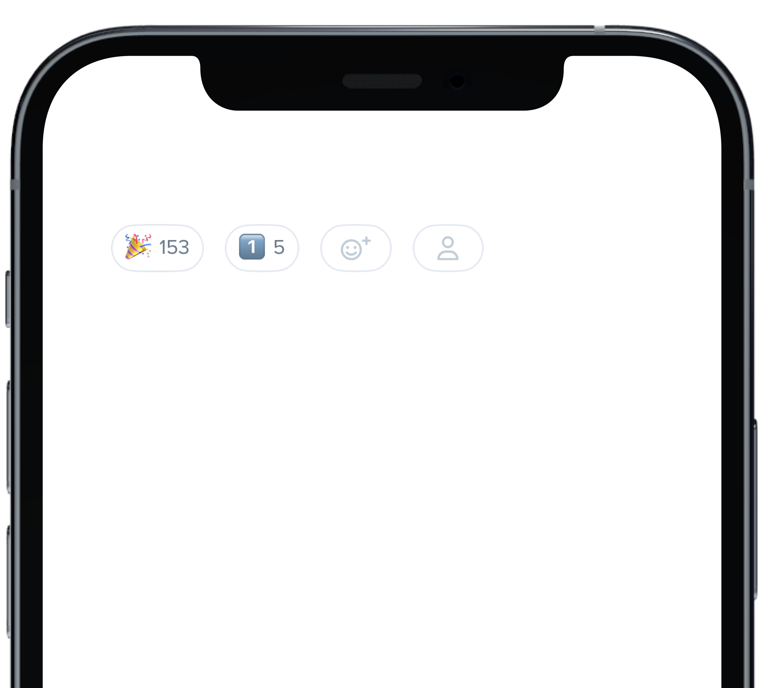
@State private var count: Int = 153
|
|
5
|
+
@State private var count1: Int = 5
|
|
6
|
+
|
|
7
|
+
HStack(alignment: .center, spacing: 12) {
|
|
8
|
+
PBReactionButton(
|
|
9
|
+
count: $count,
|
|
10
|
+
icon: "\u{1F389}",
|
|
11
|
+
isInteractive: true
|
|
12
|
+
)
|
|
13
|
+
PBReactionButton(
|
|
14
|
+
count: $count1,
|
|
15
|
+
icon: "1️⃣",
|
|
16
|
+
isInteractive: false
|
|
17
|
+
)
|
|
18
|
+
PBReactionButton(
|
|
19
|
+
isInteractive: false
|
|
20
|
+
)
|
|
21
|
+
PBReactionButton(
|
|
22
|
+
pbIcon: PBIcon(FontAwesome.user),
|
|
23
|
+
isInteractive: false
|
|
24
|
+
)
|
|
25
|
+
}
|
|
26
|
+
```
|
|
@@ -57,7 +57,7 @@ const CardBackground = (props) => {
|
|
|
57
57
|
background="product_1_background"
|
|
58
58
|
marginBottom="sm"
|
|
59
59
|
{...props}
|
|
60
|
-
|
|
60
|
+
>
|
|
61
61
|
<Body
|
|
62
62
|
dark
|
|
63
63
|
text="Product 1 Background"
|
|
@@ -69,11 +69,12 @@ const CardBackground = (props) => {
|
|
|
69
69
|
<Card
|
|
70
70
|
background="product_7_highlight"
|
|
71
71
|
marginBottom="sm"
|
|
72
|
-
{...props}
|
|
72
|
+
{...props}
|
|
73
|
+
>
|
|
73
74
|
<Body
|
|
74
75
|
dark
|
|
75
|
-
text="Product 7 Highlight"
|
|
76
|
-
|
|
76
|
+
text="Product 7 Highlight"
|
|
77
|
+
/>
|
|
77
78
|
</Card>
|
|
78
79
|
|
|
79
80
|
|
|
@@ -0,0 +1,11 @@
|
|
|
1
|
+

|
|
2
|
+
|
|
3
|
+
```swift
|
|
4
|
+
PBDialog(
|
|
5
|
+
title: "This is some informative text",
|
|
6
|
+
message: infoMessage,
|
|
7
|
+
cancelButton: ("Cancel", closeToast),
|
|
8
|
+
confirmButton: ("Okay", closeToast)
|
|
9
|
+
)
|
|
10
|
+
```
|
|
11
|
+
|
|
@@ -49,15 +49,18 @@ const DialogFullHeight = () => {
|
|
|
49
49
|
<Flex wrap>
|
|
50
50
|
<Button id="sm"
|
|
51
51
|
marginRight="md"
|
|
52
|
-
onClick={toggleHeaderSeparatorDialog}
|
|
52
|
+
onClick={toggleHeaderSeparatorDialog}
|
|
53
|
+
>
|
|
53
54
|
{"Small Dialog"}
|
|
54
55
|
</Button>
|
|
55
56
|
<Button marginRight="md"
|
|
56
|
-
onClick={toggleFooterSeparatorDialog}
|
|
57
|
+
onClick={toggleFooterSeparatorDialog}
|
|
58
|
+
>
|
|
57
59
|
{"Medium Dialog"}
|
|
58
60
|
</Button>
|
|
59
61
|
<Button marginRight="md"
|
|
60
|
-
onClick={toggleBothSeparatorsDialog}
|
|
62
|
+
onClick={toggleBothSeparatorsDialog}
|
|
63
|
+
>
|
|
61
64
|
{"Large Dialog"}
|
|
62
65
|
</Button>
|
|
63
66
|
</Flex>
|
|
@@ -89,7 +92,8 @@ const DialogFullHeight = () => {
|
|
|
89
92
|
<Dialog.Footer>
|
|
90
93
|
<Button onClick={toggle}>{"Send My Issue"}</Button>
|
|
91
94
|
<Button onClick={toggle}
|
|
92
|
-
variant="link"
|
|
95
|
+
variant="link"
|
|
96
|
+
>
|
|
93
97
|
{"Back"}
|
|
94
98
|
</Button>
|
|
95
99
|
</Dialog.Footer>
|
|
@@ -48,15 +48,18 @@ const DialogFullHeightPlacement = () => {
|
|
|
48
48
|
<Flex wrap>
|
|
49
49
|
<Button id="sm"
|
|
50
50
|
marginRight="md"
|
|
51
|
-
onClick={toggleHeaderSeparatorDialog}
|
|
51
|
+
onClick={toggleHeaderSeparatorDialog}
|
|
52
|
+
>
|
|
52
53
|
{"Left Dialog"}
|
|
53
54
|
</Button>
|
|
54
55
|
<Button marginRight="xl"
|
|
55
|
-
onClick={toggleFooterSeparatorDialog}
|
|
56
|
+
onClick={toggleFooterSeparatorDialog}
|
|
57
|
+
>
|
|
56
58
|
{"Center Dialog"}
|
|
57
59
|
</Button>
|
|
58
60
|
<Button marginRight="xl"
|
|
59
|
-
onClick={toggleBothSeparatorsDialog}
|
|
61
|
+
onClick={toggleBothSeparatorsDialog}
|
|
62
|
+
>
|
|
60
63
|
{"Right Dialog"}
|
|
61
64
|
</Button>
|
|
62
65
|
</Flex>
|
|
@@ -88,7 +91,8 @@ const DialogFullHeightPlacement = () => {
|
|
|
88
91
|
<Dialog.Footer>
|
|
89
92
|
<Button onClick={toggle}>{"Send My Issue"}</Button>
|
|
90
93
|
<Button onClick={toggle}
|
|
91
|
-
variant="link"
|
|
94
|
+
variant="link"
|
|
95
|
+
>
|
|
92
96
|
{"Back"}
|
|
93
97
|
</Button>
|
|
94
98
|
</Dialog.Footer>
|
|
@@ -0,0 +1,13 @@
|
|
|
1
|
+
### Props
|
|
2
|
+
| Name | Type | Description | Default | Values |
|
|
3
|
+
| --- | ----------- | --------- | --------- | --------- |
|
|
4
|
+
| **content** | `Content` | Sets the View content | | |
|
|
5
|
+
| **title** | `String` | Sets title for dialog header | | |
|
|
6
|
+
| **message** | `String` | Sets dialog message| | |
|
|
7
|
+
| **variant** | `DialogVariant` | Changes variant of dialog | `.default` | `.default` `.status()` |
|
|
8
|
+
| **isStacked** | `isStacked` | Changes whether the dialog buttons are stacked or inline | `false` | `true` `false` |
|
|
9
|
+
| **cancelButton** | `Action` | Dismisses the dialog | | |
|
|
10
|
+
| **confirmButton** | `Action` | Confirms dialog message was received | | |
|
|
11
|
+
| **onClose** | `Action` | Starts action when dialog is closed | | |
|
|
12
|
+
| **size** | `DialogSize` | Determines size of dialog | `.medium`| `.small` `.medium` `large` |
|
|
13
|
+
| **shouldCloseOnOverlay** | `Bool` | Determines if overlay should close | `false` | `true` `false` |
|
|
@@ -16,10 +16,12 @@ const DialogScrollable = () => {
|
|
|
16
16
|
return (
|
|
17
17
|
<>
|
|
18
18
|
<Button marginRight="md"
|
|
19
|
-
onClick={toggleDialog1}
|
|
19
|
+
onClick={toggleDialog1}
|
|
20
|
+
>{'Open Dialog'}
|
|
20
21
|
</Button>
|
|
21
22
|
<Button marginRight="md"
|
|
22
|
-
onClick={toggleDialog2}
|
|
23
|
+
onClick={toggleDialog2}
|
|
24
|
+
>{'Open Full Height Dialog'}
|
|
23
25
|
</Button>
|
|
24
26
|
<Dialog
|
|
25
27
|
cancelButton="Cancel"
|
|
@@ -0,0 +1,18 @@
|
|
|
1
|
+

|
|
2
|
+
|
|
3
|
+
```swift
|
|
4
|
+
@State private var presentSmallDialog: Bool = false
|
|
5
|
+
@State private var presentMediumDialog: Bool = false
|
|
6
|
+
@State private var presentLargeDialog: Bool = false
|
|
7
|
+
let infoMessage = "This is a message for informational purposes only and requires no action."
|
|
8
|
+
|
|
9
|
+
PBDialog(
|
|
10
|
+
title: "Large",
|
|
11
|
+
message: infoMessage,
|
|
12
|
+
variant: .default,
|
|
13
|
+
isStacked: false,
|
|
14
|
+
cancelButton: ("Cancel", {}),
|
|
15
|
+
confirmButton: ("Okay", {}),
|
|
16
|
+
size: .large
|
|
17
|
+
)
|
|
18
|
+
```
|
|
@@ -0,0 +1,14 @@
|
|
|
1
|
+

|
|
2
|
+
|
|
3
|
+
```swift
|
|
4
|
+
|
|
5
|
+
PBDialog(
|
|
6
|
+
title: "Success!",
|
|
7
|
+
message: infoMessage,
|
|
8
|
+
variant: .status(.success),
|
|
9
|
+
isStacked: true,
|
|
10
|
+
cancelButton: ("Cancel", closeToast),
|
|
11
|
+
confirmButton: ("Okay", closeToast),
|
|
12
|
+
size: .small
|
|
13
|
+
)
|
|
14
|
+
```
|
|
@@ -22,3 +22,10 @@ examples:
|
|
|
22
22
|
- dialog_stacked_alert: Stacked Button Alert
|
|
23
23
|
- dialog_full_height: Full Height
|
|
24
24
|
- dialog_full_height_placement: Full Height Placement
|
|
25
|
+
|
|
26
|
+
swift:
|
|
27
|
+
- dialog_default_swift: Simple
|
|
28
|
+
- dialog_sizes_swift: Sizes
|
|
29
|
+
- dialog_status_swift: Status
|
|
30
|
+
- dialog_props_table: ""
|
|
31
|
+
|
|
@@ -0,0 +1,15 @@
|
|
|
1
|
+

|
|
2
|
+
|
|
3
|
+
|
|
4
|
+
```swift
|
|
5
|
+
let defaultOptions = [
|
|
6
|
+
(value: "1", text: "Burgers"),
|
|
7
|
+
(value: "2", text: "Pizza"),
|
|
8
|
+
(value: "3", text: "Tacos")
|
|
9
|
+
]
|
|
10
|
+
@State private var defaultState = ""
|
|
11
|
+
|
|
12
|
+
PBSelect(title: "Favorite Food", options: defaultOptions, style: .default) { selected in
|
|
13
|
+
defaultState = selected
|
|
14
|
+
}
|
|
15
|
+
```
|
|
@@ -0,0 +1,18 @@
|
|
|
1
|
+

|
|
2
|
+
|
|
3
|
+
```swift
|
|
4
|
+
let defaultOptions = [
|
|
5
|
+
(value: "1", text: "Burgers"),
|
|
6
|
+
(value: "2", text: "Pizza"),
|
|
7
|
+
(value: "3", text: "Tacos")
|
|
8
|
+
]
|
|
9
|
+
@State private var errorState = ""
|
|
10
|
+
|
|
11
|
+
PBSelect(
|
|
12
|
+
title: "Favorite Food",
|
|
13
|
+
options: defaultOptions,
|
|
14
|
+
style: .error("Please make a valid selection")
|
|
15
|
+
) { selected in
|
|
16
|
+
errorState = selected
|
|
17
|
+
}
|
|
18
|
+
```
|
|
@@ -0,0 +1,8 @@
|
|
|
1
|
+
### Props
|
|
2
|
+
| Name | Type | Description | Default | Values |
|
|
3
|
+
| --- | ----------- | --------- | --------- | --------- |
|
|
4
|
+
| **title** | `String` | Sets label title for dropdown | | |
|
|
5
|
+
| **options** | `(String, String)` | Displays the list of dropdown options | | |
|
|
6
|
+
| **style** | `Variant` | Options for the state of dropdown | `.default` | `default` `disabled` `error` |
|
|
7
|
+
| **selectedOption** | `String` | Changes selected value when new value is selected | | |
|
|
8
|
+
| **selected** | `String` | Changes the value of the option selected in dropdown | | |
|