playbook_ui_docs 13.13.0 → 13.14.0.pre.alpha.play1101betaicons1798
This diff represents the content of publicly available package versions that have been released to one of the supported registries. The information contained in this diff is provided for informational purposes only and reflects changes between package versions as they appear in their respective public registries.
- checksums.yaml +4 -4
- data/app/pb_kits/playbook/pb_beta_icon/docs/_description.md +1 -0
- data/app/pb_kits/playbook/pb_beta_icon/docs/_footer.md +2 -0
- data/app/pb_kits/playbook/pb_beta_icon/docs/_icon_animate.html.erb +3 -0
- data/app/pb_kits/playbook/pb_beta_icon/docs/_icon_animate.jsx +35 -0
- data/app/pb_kits/playbook/pb_beta_icon/docs/_icon_animate.md +1 -0
- data/app/pb_kits/playbook/pb_beta_icon/docs/_icon_border.html.erb +1 -0
- data/app/pb_kits/playbook/pb_beta_icon/docs/_icon_border.jsx +19 -0
- data/app/pb_kits/playbook/pb_beta_icon/docs/_icon_border_swift.md +7 -0
- data/app/pb_kits/playbook/pb_beta_icon/docs/_icon_custom.html.erb +16 -0
- data/app/pb_kits/playbook/pb_beta_icon/docs/_icon_custom.jsx +34 -0
- data/app/pb_kits/playbook/pb_beta_icon/docs/_icon_custom.md +19 -0
- data/app/pb_kits/playbook/pb_beta_icon/docs/_icon_default.html.erb +1 -0
- data/app/pb_kits/playbook/pb_beta_icon/docs/_icon_default.jsx +17 -0
- data/app/pb_kits/playbook/pb_beta_icon/docs/_icon_default_swift.md +7 -0
- data/app/pb_kits/playbook/pb_beta_icon/docs/_icon_fa_kit.html.erb +1 -0
- data/app/pb_kits/playbook/pb_beta_icon/docs/_icon_fa_kit.jsx +21 -0
- data/app/pb_kits/playbook/pb_beta_icon/docs/_icon_fa_kit.md +7 -0
- data/app/pb_kits/playbook/pb_beta_icon/docs/_icon_flip.html.erb +3 -0
- data/app/pb_kits/playbook/pb_beta_icon/docs/_icon_flip.jsx +33 -0
- data/app/pb_kits/playbook/pb_beta_icon/docs/_icon_flip_swift.md +11 -0
- data/app/pb_kits/playbook/pb_beta_icon/docs/_icon_props_swift.md +8 -0
- data/app/pb_kits/playbook/pb_beta_icon/docs/_icon_pull.html.erb +2 -0
- data/app/pb_kits/playbook/pb_beta_icon/docs/_icon_pull.jsx +26 -0
- data/app/pb_kits/playbook/pb_beta_icon/docs/_icon_pull.md +1 -0
- data/app/pb_kits/playbook/pb_beta_icon/docs/_icon_rotate.html.erb +3 -0
- data/app/pb_kits/playbook/pb_beta_icon/docs/_icon_rotate.jsx +33 -0
- data/app/pb_kits/playbook/pb_beta_icon/docs/_icon_rotate_swift.md +11 -0
- data/app/pb_kits/playbook/pb_beta_icon/docs/_icon_sizes.html.erb +16 -0
- data/app/pb_kits/playbook/pb_beta_icon/docs/_icon_sizes.jsx +133 -0
- data/app/pb_kits/playbook/pb_beta_icon/docs/_icon_sizes_swift.md +46 -0
- data/app/pb_kits/playbook/pb_beta_icon/docs/example.yml +30 -0
- data/app/pb_kits/playbook/pb_beta_icon/docs/index.js +9 -0
- data/app/pb_kits/playbook/pb_button/docs/_button_props_swift.md +11 -0
- data/app/pb_kits/playbook/pb_button/docs/_button_reaction_swift.md +26 -0
- data/app/pb_kits/playbook/pb_button/docs/example.yml +1 -0
- data/app/pb_kits/playbook/pb_card/docs/_card_background.jsx +5 -4
- data/app/pb_kits/playbook/pb_contact/docs/_contact_default_swift.md +14 -0
- data/app/pb_kits/playbook/pb_contact/docs/_contact_props_swift.md +6 -0
- data/app/pb_kits/playbook/pb_contact/docs/_contact_with_detail_swift.md +14 -0
- data/app/pb_kits/playbook/pb_contact/docs/example.yml +6 -0
- data/app/pb_kits/playbook/pb_date/docs/_date_alignment_swift.md +11 -0
- data/app/pb_kits/playbook/pb_date/docs/_date_default_swift.md +16 -0
- data/app/pb_kits/playbook/pb_date/docs/_date_props_swift.md +8 -0
- data/app/pb_kits/playbook/pb_date/docs/_date_unstyled_swift.md +11 -0
- data/app/pb_kits/playbook/pb_date/docs/_date_variants_swift.md +14 -0
- data/app/pb_kits/playbook/pb_date/docs/example.yml +7 -0
- data/app/pb_kits/playbook/pb_date_picker/docs/_date_picker_quick_pick_custom.html.erb +29 -0
- data/app/pb_kits/playbook/pb_date_picker/docs/_date_picker_quick_pick_custom.jsx +34 -0
- data/app/pb_kits/playbook/pb_date_picker/docs/_date_picker_quick_pick_custom.md +7 -0
- data/app/pb_kits/playbook/pb_date_picker/docs/_date_picker_quick_pick_custom_override.html.erb +28 -0
- data/app/pb_kits/playbook/pb_date_picker/docs/_date_picker_quick_pick_custom_override.jsx +34 -0
- data/app/pb_kits/playbook/pb_date_picker/docs/_date_picker_quick_pick_custom_override.md +1 -0
- data/app/pb_kits/playbook/pb_date_picker/docs/_date_picker_quick_pick_react.jsx +2 -2
- data/app/pb_kits/playbook/pb_date_picker/docs/example.yml +4 -0
- data/app/pb_kits/playbook/pb_date_picker/docs/index.js +2 -0
- data/app/pb_kits/playbook/pb_dialog/docs/_dialog_default_swift.md +11 -0
- data/app/pb_kits/playbook/pb_dialog/docs/_dialog_full_height.jsx +8 -4
- data/app/pb_kits/playbook/pb_dialog/docs/_dialog_full_height_placement.jsx +8 -4
- data/app/pb_kits/playbook/pb_dialog/docs/_dialog_props_table.md +13 -0
- data/app/pb_kits/playbook/pb_dialog/docs/_dialog_scrollable.jsx +4 -2
- data/app/pb_kits/playbook/pb_dialog/docs/_dialog_sizes_swift.md +18 -0
- data/app/pb_kits/playbook/pb_dialog/docs/_dialog_status.jsx +1 -1
- data/app/pb_kits/playbook/pb_dialog/docs/_dialog_status_swift.md +14 -0
- data/app/pb_kits/playbook/pb_dialog/docs/example.yml +7 -0
- data/app/pb_kits/playbook/pb_home_address_street/docs/_home_address_street_default_swift.md +18 -0
- data/app/pb_kits/playbook/pb_home_address_street/docs/_home_address_street_emphasis_swift.md +34 -0
- data/app/pb_kits/playbook/pb_home_address_street/docs/_home_address_street_link_swift.md +18 -0
- data/app/pb_kits/playbook/pb_home_address_street/docs/_home_address_street_modified_swift.md +13 -0
- data/app/pb_kits/playbook/pb_home_address_street/docs/_home_address_street_props_swift.md +14 -0
- data/app/pb_kits/playbook/pb_home_address_street/docs/example.yml +6 -0
- data/app/pb_kits/playbook/pb_person/docs/_person_default_swift.md +8 -0
- data/app/pb_kits/playbook/pb_person/docs/_person_props_swift.md +5 -0
- data/app/pb_kits/playbook/pb_person/docs/example.yml +4 -0
- data/app/pb_kits/playbook/pb_select/docs/_select_default_swift.md +15 -0
- data/app/pb_kits/playbook/pb_select/docs/_select_error_swift.md +18 -0
- data/app/pb_kits/playbook/pb_select/docs/_select_props_table.md +8 -0
- data/app/pb_kits/playbook/pb_select/docs/example.yml +5 -0
- data/app/pb_kits/playbook/pb_star_rating/docs/_star_rating_background_options.html.erb +2 -0
- data/app/pb_kits/playbook/pb_star_rating/docs/_star_rating_background_options.jsx +25 -0
- data/app/pb_kits/playbook/pb_star_rating/docs/_star_rating_color_options.html.erb +3 -0
- data/app/pb_kits/playbook/pb_star_rating/docs/_star_rating_color_options.jsx +31 -0
- data/app/pb_kits/playbook/pb_star_rating/docs/_star_rating_default.html.erb +6 -8
- data/app/pb_kits/playbook/pb_star_rating/docs/_star_rating_default.jsx +19 -6
- data/app/pb_kits/playbook/pb_star_rating/docs/_star_rating_hide.html.erb +4 -1
- data/app/pb_kits/playbook/pb_star_rating/docs/_star_rating_hide.jsx +30 -5
- data/app/pb_kits/playbook/pb_star_rating/docs/_star_rating_number_config.html.erb +6 -0
- data/app/pb_kits/playbook/pb_star_rating/docs/_star_rating_number_config.jsx +58 -0
- data/app/pb_kits/playbook/pb_star_rating/docs/_star_rating_size_options.html.erb +16 -0
- data/app/pb_kits/playbook/pb_star_rating/docs/_star_rating_size_options.jsx +60 -0
- data/app/pb_kits/playbook/pb_star_rating/docs/example.yml +12 -5
- data/app/pb_kits/playbook/pb_star_rating/docs/index.js +8 -0
- data/app/pb_kits/playbook/pb_user/docs/_user_horizontal_swift.md +37 -0
- data/app/pb_kits/playbook/pb_user/docs/_user_props_table.md +10 -0
- data/app/pb_kits/playbook/pb_user/docs/_user_size_swift.md +35 -0
- data/app/pb_kits/playbook/pb_user/docs/_user_text_only_swift.md +27 -0
- data/app/pb_kits/playbook/pb_user/docs/_user_vertical_size_swift.md +35 -0
- data/app/pb_kits/playbook/pb_user/docs/example.yml +7 -0
- data/dist/menu.yml +240 -168
- data/dist/playbook-doc.js +8 -8
- metadata +81 -7
|
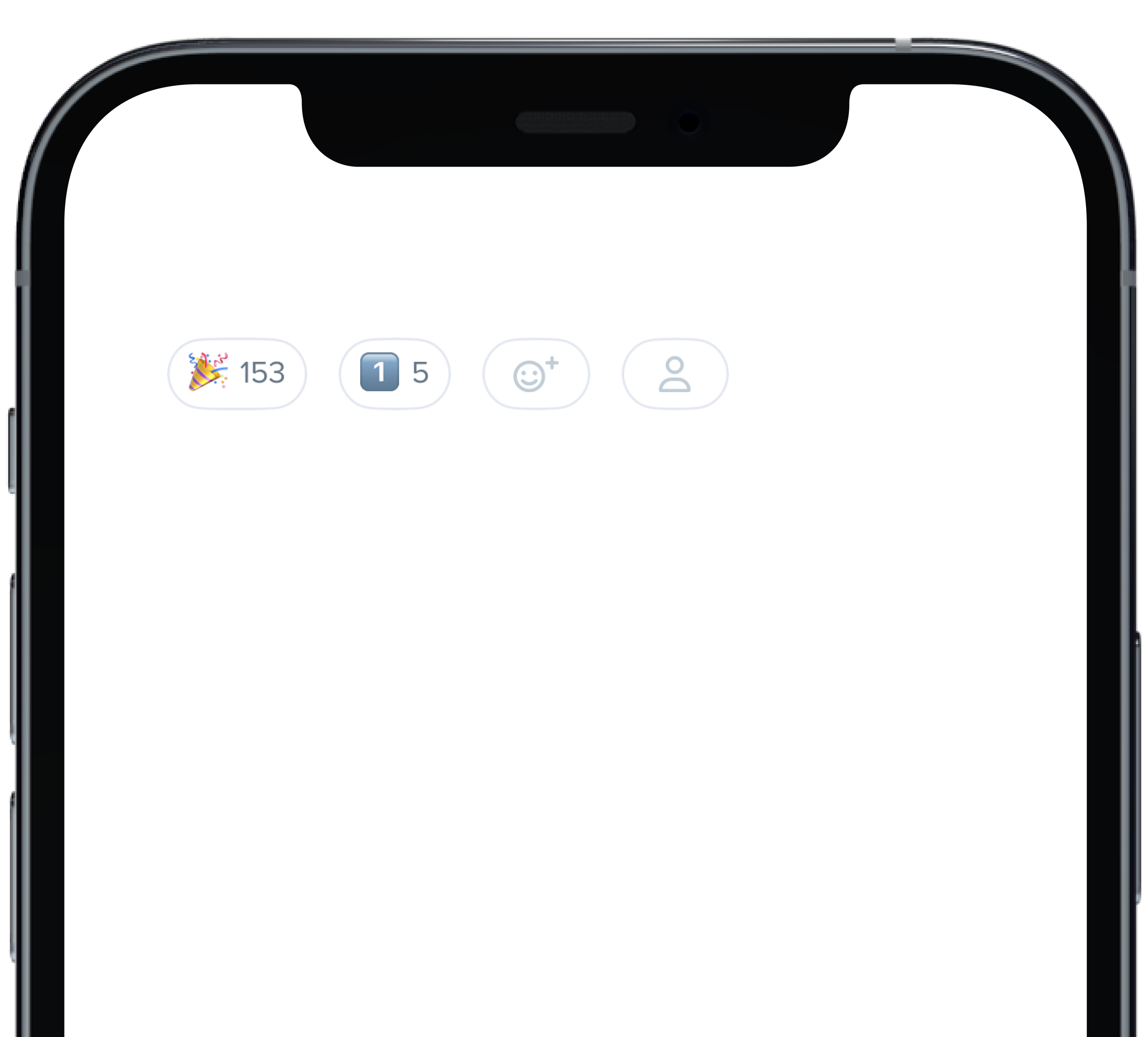
@@ -0,0 +1,26 @@
|
|
|
1
|
+
|
|
2
|
+
|
|
3
|
+
```swift
|
|
4
|
+
@State private var count: Int = 153
|
|
5
|
+
@State private var count1: Int = 5
|
|
6
|
+
|
|
7
|
+
HStack(alignment: .center, spacing: 12) {
|
|
8
|
+
PBReactionButton(
|
|
9
|
+
count: $count,
|
|
10
|
+
icon: "\u{1F389}",
|
|
11
|
+
isInteractive: true
|
|
12
|
+
)
|
|
13
|
+
PBReactionButton(
|
|
14
|
+
count: $count1,
|
|
15
|
+
icon: "1️⃣",
|
|
16
|
+
isInteractive: false
|
|
17
|
+
)
|
|
18
|
+
PBReactionButton(
|
|
19
|
+
isInteractive: false
|
|
20
|
+
)
|
|
21
|
+
PBReactionButton(
|
|
22
|
+
pbIcon: PBIcon(FontAwesome.user),
|
|
23
|
+
isInteractive: false
|
|
24
|
+
)
|
|
25
|
+
}
|
|
26
|
+
```
|
|
@@ -57,7 +57,7 @@ const CardBackground = (props) => {
|
|
|
57
57
|
background="product_1_background"
|
|
58
58
|
marginBottom="sm"
|
|
59
59
|
{...props}
|
|
60
|
-
|
|
60
|
+
>
|
|
61
61
|
<Body
|
|
62
62
|
dark
|
|
63
63
|
text="Product 1 Background"
|
|
@@ -69,11 +69,12 @@ const CardBackground = (props) => {
|
|
|
69
69
|
<Card
|
|
70
70
|
background="product_7_highlight"
|
|
71
71
|
marginBottom="sm"
|
|
72
|
-
{...props}
|
|
72
|
+
{...props}
|
|
73
|
+
>
|
|
73
74
|
<Body
|
|
74
75
|
dark
|
|
75
|
-
text="Product 7 Highlight"
|
|
76
|
-
|
|
76
|
+
text="Product 7 Highlight"
|
|
77
|
+
/>
|
|
77
78
|
</Card>
|
|
78
79
|
|
|
79
80
|
|
|
@@ -0,0 +1,14 @@
|
|
|
1
|
+

|
|
2
|
+
|
|
3
|
+
```swift
|
|
4
|
+
|
|
5
|
+
VStack(alignment: .leading, spacing: Spacing.small) {
|
|
6
|
+
PBContact(type: .cell, value: "3491859988")
|
|
7
|
+
PBContact(value: "5555555555")
|
|
8
|
+
PBContact(type: .email, value: "email@example.com")
|
|
9
|
+
PBContact(type: .work, value: "3245627482")
|
|
10
|
+
PBContact(type: .workCell, value: "3245627482")
|
|
11
|
+
}
|
|
12
|
+
|
|
13
|
+
|
|
14
|
+
```
|
|
@@ -0,0 +1,6 @@
|
|
|
1
|
+
### Props
|
|
2
|
+
| Name | Type | Description | Default | Values |
|
|
3
|
+
| --- | ----------- | --------- | --------- | --------- |
|
|
4
|
+
| **detail** | `Bool` | Displays text describing the Contact's type | `false` | `true` `false` |
|
|
5
|
+
| **contactValue** | `String` | Sets the Contact's text value | | |
|
|
6
|
+
| **type** | `ContactType` | Sets the icon | `.home` | `cell` `email` `home` `work` `workCell` `wrongPhone` `ext` `custom` |
|
|
@@ -0,0 +1,14 @@
|
|
|
1
|
+

|
|
2
|
+
|
|
3
|
+
```swift
|
|
4
|
+
|
|
5
|
+
VStack(alignment: .leading, spacing: Spacing.small) {
|
|
6
|
+
PBContact(type: .cell, value: "3491859988", detail: true)
|
|
7
|
+
PBContact(value: "5555555555", detail: true)
|
|
8
|
+
PBContact(type: .email, value: "email@example.com", detail: true)
|
|
9
|
+
PBContact(type: .work, value: "3245627482", detail: true)
|
|
10
|
+
PBContact(type: .ext, value: "1234", detail: true)
|
|
11
|
+
}
|
|
12
|
+
|
|
13
|
+
|
|
14
|
+
```
|
|
@@ -0,0 +1,11 @@
|
|
|
1
|
+

|
|
2
|
+
|
|
3
|
+
```swift
|
|
4
|
+
|
|
5
|
+
VStack(spacing: Spacing.small) {
|
|
6
|
+
PBDate(Date(), variant: .standard, typography: .title4, alignment: .leading)
|
|
7
|
+
PBDate(Date(), variant: .withIcon(isStandard: true), typography: .title4, iconSize: .x1, alignment: .center)
|
|
8
|
+
PBDate(Date(), variant: .short, typography: .title4, alignment: .trailing)
|
|
9
|
+
}
|
|
10
|
+
|
|
11
|
+
```
|
|
@@ -0,0 +1,16 @@
|
|
|
1
|
+

|
|
2
|
+
|
|
3
|
+
|
|
4
|
+
```swift
|
|
5
|
+
|
|
6
|
+
VStack(alignment: .leading, spacing: Spacing.small) {
|
|
7
|
+
PBDate(Date(), variant: .short)
|
|
8
|
+
PBDate(Date(), variant: .dayDate)
|
|
9
|
+
PBDate(Date(), variant: .standard)
|
|
10
|
+
Spacer()
|
|
11
|
+
PBDate(Date(), variant: .short, typography: .title4)
|
|
12
|
+
PBDate(Date(), variant: .dayDate, typography: .title4)
|
|
13
|
+
PBDate(Date(), variant: .standard, typography: .title4)
|
|
14
|
+
}
|
|
15
|
+
|
|
16
|
+
```
|
|
@@ -0,0 +1,8 @@
|
|
|
1
|
+
### Props
|
|
2
|
+
| Name | Type | Description | Default | Values |
|
|
3
|
+
| --- | ----------- | --------- | --------- | --------- |
|
|
4
|
+
| **datestamp** | `Date` | Sets the date | | |
|
|
5
|
+
| **variant** | `Variant` | Changes the style | `.short` | `.short` `.dayDate` `.standard` `.withIcon(isStandard: true)` `withIcon(isStandard: false)` |
|
|
6
|
+
| **typography** | `PBFont` | Sets the font | `.caption` | `.title1` `.title2` `.title3` `.title4` `.body` `.buttonText` `.largeCaption` `.caption` `.subcaption` `.monogram` `.badgeText` `.detail` |
|
|
7
|
+
| **iconSize** | `PBIcon.IconSize` | Chances the icon's size | `.x1` | `xSmall` `small` `large` `x1` `x2` `x3` `x4` `x5` `x6` `x7` `x8` `x9` `x10` |
|
|
8
|
+
| **alignment** | `Alignment` | Changes the alignment | `.leading` | `.leading` `.trailing` |
|
|
@@ -0,0 +1,11 @@
|
|
|
1
|
+

|
|
2
|
+
|
|
3
|
+
```swift
|
|
4
|
+
|
|
5
|
+
VStack(alignment: .leading, spacing: Spacing.small) {
|
|
6
|
+
PBDate(Date(), variant: .short, typography: .body)
|
|
7
|
+
PBDate(Date(), variant: .standard, typography: .title1)
|
|
8
|
+
PBDate(Date(), variant: .withIcon(isStandard: false), typography: .subcaption, iconSize: .xSmall)
|
|
9
|
+
}
|
|
10
|
+
|
|
11
|
+
```
|
|
@@ -0,0 +1,14 @@
|
|
|
1
|
+

|
|
2
|
+
|
|
3
|
+
|
|
4
|
+
```swift
|
|
5
|
+
|
|
6
|
+
VStack(alignment: .leading, spacing: Spacing.small) {
|
|
7
|
+
PBDate(Date(), variant: .withIcon(isStandard: true), typography: .caption, iconSize: .xSmall)
|
|
8
|
+
PBDate(Date(), variant: .standard, typography: .title4)
|
|
9
|
+
PBDate(Date(), variant: .withIcon(isStandard: true), typography: .title4, iconSize: .x1)
|
|
10
|
+
PBDate(Date(), variant: .dayDate, typography: .title4)
|
|
11
|
+
PBDate(Date(), variant: .withIcon(isStandard: false), typography: .title4, iconSize: .x1)
|
|
12
|
+
}
|
|
13
|
+
|
|
14
|
+
```
|
|
@@ -12,3 +12,10 @@ examples:
|
|
|
12
12
|
- date_variants: Variants
|
|
13
13
|
- date_alignment: Alignment
|
|
14
14
|
- date_unstyled: Unstyled
|
|
15
|
+
|
|
16
|
+
swift:
|
|
17
|
+
- date_default_swift: Default
|
|
18
|
+
- date_variants_swift: Variants
|
|
19
|
+
- date_alignment_swift: Alignment
|
|
20
|
+
- date_unstyled_swift: Unstyled
|
|
21
|
+
- date_props_swift: ""
|
|
@@ -0,0 +1,29 @@
|
|
|
1
|
+
<%= pb_rails("date_picker", props: {
|
|
2
|
+
allow_input: true,
|
|
3
|
+
custom_quick_pick_dates: {
|
|
4
|
+
dates: [
|
|
5
|
+
# Allow Playbook to handle the logic...
|
|
6
|
+
{
|
|
7
|
+
label: "Last 15 months",
|
|
8
|
+
value: {
|
|
9
|
+
timePeriod: "months",
|
|
10
|
+
amount: 15,
|
|
11
|
+
},
|
|
12
|
+
},
|
|
13
|
+
# Or, be explicit with an exact date range for more control...
|
|
14
|
+
{
|
|
15
|
+
label: "First Week of June 2022",
|
|
16
|
+
value: ["06/01/2022", "06/07/2022"],
|
|
17
|
+
},
|
|
18
|
+
],
|
|
19
|
+
},
|
|
20
|
+
end_date_id: "quick-pick-end-date",
|
|
21
|
+
end_date_name: "quick-pick-end-date",
|
|
22
|
+
mode: "range",
|
|
23
|
+
picker_id: "date-picker-quick-pick-custom",
|
|
24
|
+
placeholder: "mm/dd/yyyy to mm/dd/yyyy",
|
|
25
|
+
selection_type: "quickpick",
|
|
26
|
+
start_date_id: "quick-pick-start-date",
|
|
27
|
+
start_date_name: "quick-pick-start-date"
|
|
28
|
+
}) %>
|
|
29
|
+
|
|
@@ -0,0 +1,34 @@
|
|
|
1
|
+
import React from "react"
|
|
2
|
+
import DatePicker from "../_date_picker"
|
|
3
|
+
|
|
4
|
+
const DatePickerQuickPickCustom = (props) => (
|
|
5
|
+
<>
|
|
6
|
+
<DatePicker
|
|
7
|
+
allowInput
|
|
8
|
+
customQuickPickDates={{
|
|
9
|
+
dates: [
|
|
10
|
+
// Allow Playbook to handle the logic...
|
|
11
|
+
{
|
|
12
|
+
label: "Last 15 months",
|
|
13
|
+
value: {
|
|
14
|
+
timePeriod: "months",
|
|
15
|
+
amount: 15,
|
|
16
|
+
},
|
|
17
|
+
},
|
|
18
|
+
// Or, be explicit with an exact date range for more control...
|
|
19
|
+
{
|
|
20
|
+
label: "First Week of June 2022",
|
|
21
|
+
value: ["06/01/2022", "06/07/2022"],
|
|
22
|
+
},
|
|
23
|
+
],
|
|
24
|
+
}}
|
|
25
|
+
mode='range'
|
|
26
|
+
pickerId='date-picker-quick-pick-custom-override'
|
|
27
|
+
placeholder='mm/dd/yyyy to mm/dd/yyyy'
|
|
28
|
+
selectionType='quickpick'
|
|
29
|
+
{...props}
|
|
30
|
+
/>
|
|
31
|
+
</>
|
|
32
|
+
)
|
|
33
|
+
|
|
34
|
+
export default DatePickerQuickPickCustom
|
|
@@ -0,0 +1,7 @@
|
|
|
1
|
+
The customQuickPickDates/custom_quick_pick_dates prop allows for the user/dev to define their own quick pick dates.
|
|
2
|
+
The prop accepts an object with two key/value pairs: dates & override (separate doc example below).
|
|
3
|
+
|
|
4
|
+
The dates property accepts an array of objects. Each object in the array has label and value properties. The label is what will be displayed in the UI of the dropdown menu. The value property is just the date that is going to be passed to the datepicker. The value property can be an array of two strings that represent a range, allowing for the dev to be extremely specific. Additionally, the dates array allows for a clean, simple API under that automatically converts dates in a common vernacular.
|
|
5
|
+
|
|
6
|
+
The timePeriod property accepts "days", "weeks", "months", "quarters" or "years", representing past time periods.
|
|
7
|
+
The amount property accepts any number.
|
data/app/pb_kits/playbook/pb_date_picker/docs/_date_picker_quick_pick_custom_override.html.erb
ADDED
|
@@ -0,0 +1,28 @@
|
|
|
1
|
+
<%= pb_rails("date_picker", props: {
|
|
2
|
+
allow_input: true,
|
|
3
|
+
custom_quick_pick_dates: {
|
|
4
|
+
override: false,
|
|
5
|
+
dates: [
|
|
6
|
+
{
|
|
7
|
+
label: "Last 15 months",
|
|
8
|
+
value: {
|
|
9
|
+
timePeriod: "months",
|
|
10
|
+
amount: 15,
|
|
11
|
+
},
|
|
12
|
+
},
|
|
13
|
+
{
|
|
14
|
+
label: "First Week of June 2022",
|
|
15
|
+
value: ["06/01/2022", "06/07/2022"],
|
|
16
|
+
},
|
|
17
|
+
],
|
|
18
|
+
},
|
|
19
|
+
end_date_id: "quick-pick-end-date",
|
|
20
|
+
end_date_name: "quick-pick-end-date",
|
|
21
|
+
mode: "range",
|
|
22
|
+
picker_id: "date-picker-quick-pick-override",
|
|
23
|
+
placeholder: "mm/dd/yyyy to mm/dd/yyyy",
|
|
24
|
+
selection_type: "quickpick",
|
|
25
|
+
start_date_id: "quick-pick-start-date",
|
|
26
|
+
start_date_name: "quick-pick-start-date"
|
|
27
|
+
}) %>
|
|
28
|
+
|
|
@@ -0,0 +1,34 @@
|
|
|
1
|
+
import React from "react"
|
|
2
|
+
import DatePicker from "../_date_picker"
|
|
3
|
+
|
|
4
|
+
const DatePickerQuickPickCustomOverride = (props) => (
|
|
5
|
+
<>
|
|
6
|
+
<DatePicker
|
|
7
|
+
allowInput
|
|
8
|
+
customQuickPickDates={{
|
|
9
|
+
override: false,
|
|
10
|
+
dates: [
|
|
11
|
+
{
|
|
12
|
+
label: "Last 15 months",
|
|
13
|
+
value: {
|
|
14
|
+
timePeriod: "months",
|
|
15
|
+
amount: 15,
|
|
16
|
+
},
|
|
17
|
+
},
|
|
18
|
+
{
|
|
19
|
+
label: "First Week of June 2022",
|
|
20
|
+
value: ["06/01/2022", "06/07/2022"],
|
|
21
|
+
},
|
|
22
|
+
],
|
|
23
|
+
}}
|
|
24
|
+
marginTop='lg'
|
|
25
|
+
mode='range'
|
|
26
|
+
pickerId='date-picker-quick-pick-custom'
|
|
27
|
+
placeholder='mm/dd/yyyy to mm/dd/yyyy'
|
|
28
|
+
selectionType='quickpick'
|
|
29
|
+
{...props}
|
|
30
|
+
/>
|
|
31
|
+
</>
|
|
32
|
+
)
|
|
33
|
+
|
|
34
|
+
export default DatePickerQuickPickCustomOverride
|
|
@@ -0,0 +1 @@
|
|
|
1
|
+
The customQuickPickDates/custom_quick_pick_dates prop allows for an override boolean. The override allows for the user to completely override the quick pick dates that ship with the component. Default of `override` is set to true. If you would like to simply append your dates to the default quick pick dates, set this prop to false explicitly.
|
|
@@ -10,6 +10,8 @@ examples:
|
|
|
10
10
|
- date_picker_range: Range
|
|
11
11
|
- date_picker_quick_pick_rails: Range (Quick Pick)
|
|
12
12
|
- date_picker_quick_pick_range_limit: Range (Quick Pick w/ “This” Range limit)
|
|
13
|
+
- date_picker_quick_pick_custom: Custom Quick Pick Dates
|
|
14
|
+
- date_picker_quick_pick_custom_override: Custom Quick Pick Dates (append to defaults)
|
|
13
15
|
- date_picker_format: Format
|
|
14
16
|
- date_picker_disabled: Disabled Dates
|
|
15
17
|
- date_picker_min_max: Min Max
|
|
@@ -37,6 +39,8 @@ examples:
|
|
|
37
39
|
- date_picker_range: Range
|
|
38
40
|
- date_picker_quick_pick_react: Range (Quick Pick)
|
|
39
41
|
- date_picker_quick_pick_range_limit: Range (Quick Pick w/ “This” Range limit)
|
|
42
|
+
- date_picker_quick_pick_custom: Custom Quick Pick Dates
|
|
43
|
+
- date_picker_quick_pick_custom_override: Custom Quick Pick Dates (append to defaults)
|
|
40
44
|
- date_picker_format: Format
|
|
41
45
|
- date_picker_disabled: Disabled Dates
|
|
42
46
|
- date_picker_min_max: Min Max
|
|
@@ -22,3 +22,5 @@ export { default as DatePickerAllowInput } from './_date_picker_allow_input'
|
|
|
22
22
|
export { default as DatePickerQuickPickReact } from './_date_picker_quick_pick_react'
|
|
23
23
|
export { default as DatePickerQuickPickRangeLimit } from './_date_picker_quick_pick_range_limit'
|
|
24
24
|
export { default as DatePickerOnClose } from './_date_picker_on_close.jsx'
|
|
25
|
+
export { default as DatePickerQuickPickCustom } from './_date_picker_quick_pick_custom'
|
|
26
|
+
export { default as DatePickerQuickPickCustomOverride } from './_date_picker_quick_pick_custom_override'
|
|
@@ -0,0 +1,11 @@
|
|
|
1
|
+

|
|
2
|
+
|
|
3
|
+
```swift
|
|
4
|
+
PBDialog(
|
|
5
|
+
title: "This is some informative text",
|
|
6
|
+
message: infoMessage,
|
|
7
|
+
cancelButton: ("Cancel", closeToast),
|
|
8
|
+
confirmButton: ("Okay", closeToast)
|
|
9
|
+
)
|
|
10
|
+
```
|
|
11
|
+
|
|
@@ -49,15 +49,18 @@ const DialogFullHeight = () => {
|
|
|
49
49
|
<Flex wrap>
|
|
50
50
|
<Button id="sm"
|
|
51
51
|
marginRight="md"
|
|
52
|
-
onClick={toggleHeaderSeparatorDialog}
|
|
52
|
+
onClick={toggleHeaderSeparatorDialog}
|
|
53
|
+
>
|
|
53
54
|
{"Small Dialog"}
|
|
54
55
|
</Button>
|
|
55
56
|
<Button marginRight="md"
|
|
56
|
-
onClick={toggleFooterSeparatorDialog}
|
|
57
|
+
onClick={toggleFooterSeparatorDialog}
|
|
58
|
+
>
|
|
57
59
|
{"Medium Dialog"}
|
|
58
60
|
</Button>
|
|
59
61
|
<Button marginRight="md"
|
|
60
|
-
onClick={toggleBothSeparatorsDialog}
|
|
62
|
+
onClick={toggleBothSeparatorsDialog}
|
|
63
|
+
>
|
|
61
64
|
{"Large Dialog"}
|
|
62
65
|
</Button>
|
|
63
66
|
</Flex>
|
|
@@ -89,7 +92,8 @@ const DialogFullHeight = () => {
|
|
|
89
92
|
<Dialog.Footer>
|
|
90
93
|
<Button onClick={toggle}>{"Send My Issue"}</Button>
|
|
91
94
|
<Button onClick={toggle}
|
|
92
|
-
variant="link"
|
|
95
|
+
variant="link"
|
|
96
|
+
>
|
|
93
97
|
{"Back"}
|
|
94
98
|
</Button>
|
|
95
99
|
</Dialog.Footer>
|
|
@@ -48,15 +48,18 @@ const DialogFullHeightPlacement = () => {
|
|
|
48
48
|
<Flex wrap>
|
|
49
49
|
<Button id="sm"
|
|
50
50
|
marginRight="md"
|
|
51
|
-
onClick={toggleHeaderSeparatorDialog}
|
|
51
|
+
onClick={toggleHeaderSeparatorDialog}
|
|
52
|
+
>
|
|
52
53
|
{"Left Dialog"}
|
|
53
54
|
</Button>
|
|
54
55
|
<Button marginRight="xl"
|
|
55
|
-
onClick={toggleFooterSeparatorDialog}
|
|
56
|
+
onClick={toggleFooterSeparatorDialog}
|
|
57
|
+
>
|
|
56
58
|
{"Center Dialog"}
|
|
57
59
|
</Button>
|
|
58
60
|
<Button marginRight="xl"
|
|
59
|
-
onClick={toggleBothSeparatorsDialog}
|
|
61
|
+
onClick={toggleBothSeparatorsDialog}
|
|
62
|
+
>
|
|
60
63
|
{"Right Dialog"}
|
|
61
64
|
</Button>
|
|
62
65
|
</Flex>
|
|
@@ -88,7 +91,8 @@ const DialogFullHeightPlacement = () => {
|
|
|
88
91
|
<Dialog.Footer>
|
|
89
92
|
<Button onClick={toggle}>{"Send My Issue"}</Button>
|
|
90
93
|
<Button onClick={toggle}
|
|
91
|
-
variant="link"
|
|
94
|
+
variant="link"
|
|
95
|
+
>
|
|
92
96
|
{"Back"}
|
|
93
97
|
</Button>
|
|
94
98
|
</Dialog.Footer>
|
|
@@ -0,0 +1,13 @@
|
|
|
1
|
+
### Props
|
|
2
|
+
| Name | Type | Description | Default | Values |
|
|
3
|
+
| --- | ----------- | --------- | --------- | --------- |
|
|
4
|
+
| **content** | `Content` | Sets the View content | | |
|
|
5
|
+
| **title** | `String` | Sets title for dialog header | | |
|
|
6
|
+
| **message** | `String` | Sets dialog message| | |
|
|
7
|
+
| **variant** | `DialogVariant` | Changes variant of dialog | `.default` | `.default` `.status()` |
|
|
8
|
+
| **isStacked** | `isStacked` | Changes whether the dialog buttons are stacked or inline | `false` | `true` `false` |
|
|
9
|
+
| **cancelButton** | `Action` | Dismisses the dialog | | |
|
|
10
|
+
| **confirmButton** | `Action` | Confirms dialog message was received | | |
|
|
11
|
+
| **onClose** | `Action` | Starts action when dialog is closed | | |
|
|
12
|
+
| **size** | `DialogSize` | Determines size of dialog | `.medium`| `.small` `.medium` `large` |
|
|
13
|
+
| **shouldCloseOnOverlay** | `Bool` | Determines if overlay should close | `false` | `true` `false` |
|
|
@@ -16,10 +16,12 @@ const DialogScrollable = () => {
|
|
|
16
16
|
return (
|
|
17
17
|
<>
|
|
18
18
|
<Button marginRight="md"
|
|
19
|
-
onClick={toggleDialog1}
|
|
19
|
+
onClick={toggleDialog1}
|
|
20
|
+
>{'Open Dialog'}
|
|
20
21
|
</Button>
|
|
21
22
|
<Button marginRight="md"
|
|
22
|
-
onClick={toggleDialog2}
|
|
23
|
+
onClick={toggleDialog2}
|
|
24
|
+
>{'Open Full Height Dialog'}
|
|
23
25
|
</Button>
|
|
24
26
|
<Dialog
|
|
25
27
|
cancelButton="Cancel"
|
|
@@ -0,0 +1,18 @@
|
|
|
1
|
+

|
|
2
|
+
|
|
3
|
+
```swift
|
|
4
|
+
@State private var presentSmallDialog: Bool = false
|
|
5
|
+
@State private var presentMediumDialog: Bool = false
|
|
6
|
+
@State private var presentLargeDialog: Bool = false
|
|
7
|
+
let infoMessage = "This is a message for informational purposes only and requires no action."
|
|
8
|
+
|
|
9
|
+
PBDialog(
|
|
10
|
+
title: "Large",
|
|
11
|
+
message: infoMessage,
|
|
12
|
+
variant: .default,
|
|
13
|
+
isStacked: false,
|
|
14
|
+
cancelButton: ("Cancel", {}),
|
|
15
|
+
confirmButton: ("Okay", {}),
|
|
16
|
+
size: .large
|
|
17
|
+
)
|
|
18
|
+
```
|
|
@@ -0,0 +1,14 @@
|
|
|
1
|
+

|
|
2
|
+
|
|
3
|
+
```swift
|
|
4
|
+
|
|
5
|
+
PBDialog(
|
|
6
|
+
title: "Success!",
|
|
7
|
+
message: infoMessage,
|
|
8
|
+
variant: .status(.success),
|
|
9
|
+
isStacked: true,
|
|
10
|
+
cancelButton: ("Cancel", closeToast),
|
|
11
|
+
confirmButton: ("Okay", closeToast),
|
|
12
|
+
size: .small
|
|
13
|
+
)
|
|
14
|
+
```
|
|
@@ -22,3 +22,10 @@ examples:
|
|
|
22
22
|
- dialog_stacked_alert: Stacked Button Alert
|
|
23
23
|
- dialog_full_height: Full Height
|
|
24
24
|
- dialog_full_height_placement: Full Height Placement
|
|
25
|
+
|
|
26
|
+
swift:
|
|
27
|
+
- dialog_default_swift: Simple
|
|
28
|
+
- dialog_sizes_swift: Sizes
|
|
29
|
+
- dialog_status_swift: Status
|
|
30
|
+
- dialog_props_table: ""
|
|
31
|
+
|
|
@@ -0,0 +1,18 @@
|
|
|
1
|
+
|
|
2
|
+
|
|
3
|
+
```swift
|
|
4
|
+
|
|
5
|
+
PBHomeAddressStreet(
|
|
6
|
+
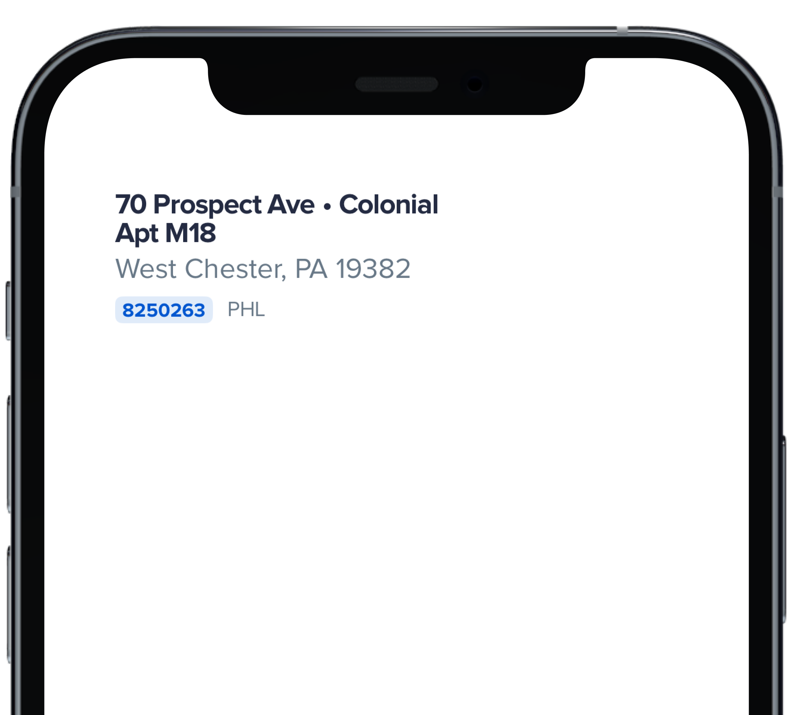
address: "70 Prospect Ave",
|
|
7
|
+
withBullet: true,
|
|
8
|
+
houseStyle: "Colonial",
|
|
9
|
+
addressCont: "Apt M18",
|
|
10
|
+
city: "West Chester",
|
|
11
|
+
homeId: "8250263",
|
|
12
|
+
homeUrl: "https://powerhrg.com/",
|
|
13
|
+
state: "PA",
|
|
14
|
+
territory: "PHL",
|
|
15
|
+
zipcode: "19382"
|
|
16
|
+
)
|
|
17
|
+
|
|
18
|
+
```
|
|
@@ -0,0 +1,34 @@
|
|
|
1
|
+
|
|
2
|
+
|
|
3
|
+
```swift
|
|
4
|
+
|
|
5
|
+
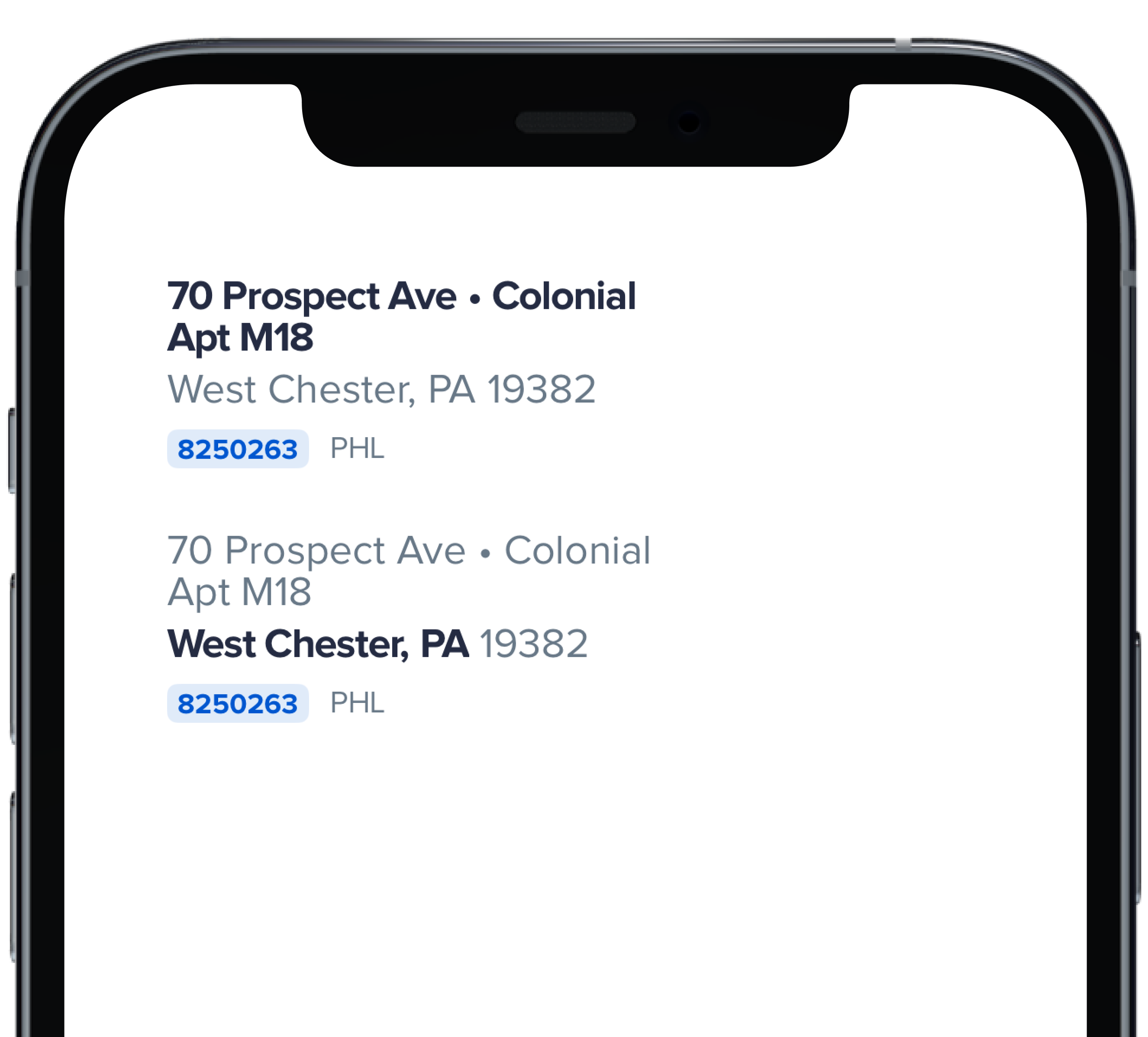
PBHomeAddressStreet(
|
|
6
|
+
address: "70 Prospect Ave",
|
|
7
|
+
withBullet: true,
|
|
8
|
+
houseStyle: "Colonial",
|
|
9
|
+
addressCont: "Apt M18",
|
|
10
|
+
city: "West Chester",
|
|
11
|
+
homeId: "8250263",
|
|
12
|
+
homeUrl: "https://powerhrg.com/",
|
|
13
|
+
state: "PA",
|
|
14
|
+
territory: "PHL",
|
|
15
|
+
zipcode: "19382"
|
|
16
|
+
)
|
|
17
|
+
|
|
18
|
+
Spacer(minLength: Spacing.medium)
|
|
19
|
+
|
|
20
|
+
PBHomeAddressStreet(
|
|
21
|
+
address: "70 Prospect Ave",
|
|
22
|
+
withBullet: true,
|
|
23
|
+
houseStyle: "Colonial",
|
|
24
|
+
addressCont: "Apt M18",
|
|
25
|
+
city: "West Chester",
|
|
26
|
+
homeId: "8250263",
|
|
27
|
+
homeUrl: "https://powerhrg.com/",
|
|
28
|
+
state: "PA",
|
|
29
|
+
territory: "PHL",
|
|
30
|
+
zipcode: "19382",
|
|
31
|
+
emphasize: .city
|
|
32
|
+
)
|
|
33
|
+
|
|
34
|
+
```
|
|
@@ -0,0 +1,18 @@
|
|
|
1
|
+

|
|
2
|
+
|
|
3
|
+
```swift
|
|
4
|
+
|
|
5
|
+
PBHomeAddressStreet(
|
|
6
|
+
address: "70 Prospect Ave",
|
|
7
|
+
withBullet: true,
|
|
8
|
+
houseStyle: "Colonial",
|
|
9
|
+
addressCont: "Apt M18",
|
|
10
|
+
city: "West Chester",
|
|
11
|
+
homeId: "8250263",
|
|
12
|
+
homeUrl: "https://powerhrg.com/",
|
|
13
|
+
state: "PA",
|
|
14
|
+
territory: "PHL",
|
|
15
|
+
zipcode: "19382"
|
|
16
|
+
)
|
|
17
|
+
|
|
18
|
+
```
|
|
@@ -0,0 +1,13 @@
|
|
|
1
|
+
|
|
2
|
+
|
|
3
|
+
```swift
|
|
4
|
+
|
|
5
|
+
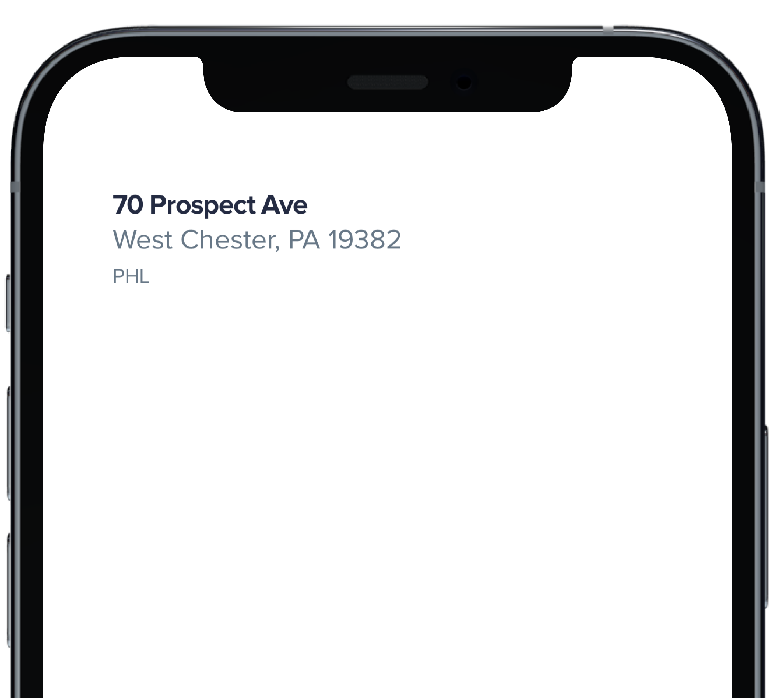
PBHomeAddressStreet(
|
|
6
|
+
address: "70 Prospect Ave",
|
|
7
|
+
city: "West Chester",
|
|
8
|
+
state: "PA",
|
|
9
|
+
territory: "PHL",
|
|
10
|
+
zipcode: "19382"
|
|
11
|
+
)
|
|
12
|
+
|
|
13
|
+
```
|
|
@@ -0,0 +1,14 @@
|
|
|
1
|
+
### Props
|
|
2
|
+
| Name | Type | Description | Default | Values |
|
|
3
|
+
| --- | ----------- | --------- | --------- | --------- |
|
|
4
|
+
| **address** | `String` | Sets the address | | |
|
|
5
|
+
| **withBullet** | `Bool` | Adds a bullet after the address | `false` | `false` `true` |
|
|
6
|
+
| **houseStyle** | `String` | Sets the house style | `nil` | |
|
|
7
|
+
| **addressCont** | `String` | Sets additional address text | `nil` | |
|
|
8
|
+
| **city** | `String` | Sets the city | | |
|
|
9
|
+
| **homeId** | `String` | Sets the home ID | `nil` | |
|
|
10
|
+
| **homeUrl** | `String` | Adds a URL to the homeID | `nil` | |
|
|
11
|
+
| **state** | `String` | Sets the state | | |
|
|
12
|
+
| **territory** | `String` | Sets the territory | | |
|
|
13
|
+
| **zipcode** | `String` | Sets the zipcode | | |
|
|
14
|
+
| **emphasize** | `Emphasize` | Changes text to bold | `.address` | `.address` `.city` `.cityWithZipcode` |
|
|
@@ -12,3 +12,9 @@ examples:
|
|
|
12
12
|
- home_address_street_modified: Modified
|
|
13
13
|
- home_address_street_link: Link
|
|
14
14
|
|
|
15
|
+
swift:
|
|
16
|
+
- home_address_street_default_swift: Default
|
|
17
|
+
- home_address_street_emphasis_swift: Emphasis
|
|
18
|
+
- home_address_street_modified_swift: Modified
|
|
19
|
+
- home_address_street_link_swift: Link
|
|
20
|
+
- home_address_street_props_swift: ""
|