playbook_ui_docs 13.11.1.pre.alpha.play900startratingasinput1530 → 13.11.1
Sign up to get free protection for your applications and to get access to all the features.
- checksums.yaml +4 -4
- data/app/pb_kits/playbook/pb_collapsible/docs/example.yml +0 -2
- data/app/pb_kits/playbook/pb_icon/docs/example.yml +0 -8
- data/app/pb_kits/playbook/pb_image/docs/example.yml +0 -5
- data/app/pb_kits/playbook/pb_label_value/docs/example.yml +0 -6
- data/app/pb_kits/playbook/pb_message/docs/example.yml +0 -4
- data/app/pb_kits/playbook/pb_star_rating/docs/_star_rating_default.html.erb +1 -11
- data/app/pb_kits/playbook/pb_star_rating/docs/_star_rating_default.jsx +2 -17
- data/app/pb_kits/playbook/pb_star_rating/docs/_star_rating_hide.html.erb +1 -6
- data/app/pb_kits/playbook/pb_star_rating/docs/_star_rating_hide.jsx +5 -22
- data/app/pb_kits/playbook/pb_star_rating/docs/example.yml +5 -10
- data/app/pb_kits/playbook/pb_star_rating/docs/index.js +0 -6
- data/app/pb_kits/playbook/pb_table/docs/_table_header.html.erb +4 -4
- data/app/pb_kits/playbook/pb_tooltip/docs/_tooltip_default.html.erb +1 -1
- data/app/pb_kits/playbook/pb_tooltip/docs/_tooltip_default_react.jsx +2 -0
- data/app/pb_kits/playbook/pb_tooltip/docs/_tooltip_delay.jsx +1 -0
- data/app/pb_kits/playbook/pb_tooltip/docs/_tooltip_interaction.jsx +1 -0
- data/app/pb_kits/playbook/pb_tooltip/docs/_tooltip_margin.jsx +1 -0
- data/app/pb_kits/playbook/pb_tooltip/docs/_tooltip_selectors.html.erb +1 -1
- data/app/pb_kits/playbook/pb_tooltip/docs/example.yml +0 -3
- data/app/pb_kits/playbook/pb_tooltip/docs/index.js +0 -1
- data/dist/playbook-doc.js +8 -8
- metadata +7 -37
- data/app/pb_kits/playbook/pb_collapsible/docs/_collapsible_external_controls.html.erb +0 -22
- data/app/pb_kits/playbook/pb_collapsible/docs/_collapsible_external_controls.md +0 -3
- data/app/pb_kits/playbook/pb_collapsible/docs/_collapsible_external_controls_multiple.html.erb +0 -40
- data/app/pb_kits/playbook/pb_collapsible/docs/_collapsible_external_controls_multiple.md +0 -1
- data/app/pb_kits/playbook/pb_icon/docs/_icon_border_swift.md +0 -7
- data/app/pb_kits/playbook/pb_icon/docs/_icon_default_swift.md +0 -7
- data/app/pb_kits/playbook/pb_icon/docs/_icon_flip_swift.md +0 -11
- data/app/pb_kits/playbook/pb_icon/docs/_icon_props_swift.md +0 -8
- data/app/pb_kits/playbook/pb_icon/docs/_icon_rotate_swift.md +0 -11
- data/app/pb_kits/playbook/pb_icon/docs/_icon_sizes_swift.md +0 -46
- data/app/pb_kits/playbook/pb_image/docs/_image_props_swift.md +0 -7
- data/app/pb_kits/playbook/pb_image/docs/_rounded_image_swift.md +0 -47
- data/app/pb_kits/playbook/pb_image/docs/_size_image_swift.md +0 -47
- data/app/pb_kits/playbook/pb_image/docs/_size_none_image_swift.md +0 -15
- data/app/pb_kits/playbook/pb_label_value/docs/_label_value_default_swift.md +0 -11
- data/app/pb_kits/playbook/pb_label_value/docs/_label_value_details_examples_swift.md +0 -72
- data/app/pb_kits/playbook/pb_label_value/docs/_label_value_details_swift.md +0 -41
- data/app/pb_kits/playbook/pb_label_value/docs/_label_value_props_swift.md +0 -11
- data/app/pb_kits/playbook/pb_message/docs/_message_default_swift.md +0 -57
- data/app/pb_kits/playbook/pb_message/docs/_message_props_swift.md +0 -12
- data/app/pb_kits/playbook/pb_star_rating/docs/_star_rating_color_options.html.erb +0 -7
- data/app/pb_kits/playbook/pb_star_rating/docs/_star_rating_color_options.jsx +0 -40
- data/app/pb_kits/playbook/pb_star_rating/docs/_star_rating_number_config.html.erb +0 -12
- data/app/pb_kits/playbook/pb_star_rating/docs/_star_rating_number_config.jsx +0 -57
- data/app/pb_kits/playbook/pb_star_rating/docs/_star_rating_size_options.html.erb +0 -23
- data/app/pb_kits/playbook/pb_star_rating/docs/_star_rating_size_options.jsx +0 -59
- data/app/pb_kits/playbook/pb_tooltip/docs/_tooltip_show_tooltip.html.erb +0 -39
- data/app/pb_kits/playbook/pb_tooltip/docs/_tooltip_show_tooltip.md +0 -5
- data/app/pb_kits/playbook/pb_tooltip/docs/_tooltip_show_tooltip_react.jsx +0 -45
- data/app/pb_kits/playbook/pb_tooltip/docs/_tooltip_show_tooltip_react.md +0 -3
metadata
CHANGED
|
@@ -1,15 +1,15 @@
|
|
|
1
1
|
--- !ruby/object:Gem::Specification
|
|
2
2
|
name: playbook_ui_docs
|
|
3
3
|
version: !ruby/object:Gem::Version
|
|
4
|
-
version: 13.11.1
|
|
4
|
+
version: 13.11.1
|
|
5
5
|
platform: ruby
|
|
6
6
|
authors:
|
|
7
7
|
- Power UX
|
|
8
8
|
- Power Devs
|
|
9
|
-
autorequire:
|
|
9
|
+
autorequire:
|
|
10
10
|
bindir: bin
|
|
11
11
|
cert_chain: []
|
|
12
|
-
date: 2023-11-
|
|
12
|
+
date: 2023-11-13 00:00:00.000000000 Z
|
|
13
13
|
dependencies:
|
|
14
14
|
- !ruby/object:Gem::Dependency
|
|
15
15
|
name: playbook_ui
|
|
@@ -307,10 +307,6 @@ files:
|
|
|
307
307
|
- app/pb_kits/playbook/pb_collapsible/docs/_collapsible_color.md
|
|
308
308
|
- app/pb_kits/playbook/pb_collapsible/docs/_collapsible_default.html.erb
|
|
309
309
|
- app/pb_kits/playbook/pb_collapsible/docs/_collapsible_default.jsx
|
|
310
|
-
- app/pb_kits/playbook/pb_collapsible/docs/_collapsible_external_controls.html.erb
|
|
311
|
-
- app/pb_kits/playbook/pb_collapsible/docs/_collapsible_external_controls.md
|
|
312
|
-
- app/pb_kits/playbook/pb_collapsible/docs/_collapsible_external_controls_multiple.html.erb
|
|
313
|
-
- app/pb_kits/playbook/pb_collapsible/docs/_collapsible_external_controls_multiple.md
|
|
314
310
|
- app/pb_kits/playbook/pb_collapsible/docs/_collapsible_icons.html.erb
|
|
315
311
|
- app/pb_kits/playbook/pb_collapsible/docs/_collapsible_icons.jsx
|
|
316
312
|
- app/pb_kits/playbook/pb_collapsible/docs/_collapsible_icons.md
|
|
@@ -716,29 +712,23 @@ files:
|
|
|
716
712
|
- app/pb_kits/playbook/pb_icon/docs/_icon_animate.md
|
|
717
713
|
- app/pb_kits/playbook/pb_icon/docs/_icon_border.html.erb
|
|
718
714
|
- app/pb_kits/playbook/pb_icon/docs/_icon_border.jsx
|
|
719
|
-
- app/pb_kits/playbook/pb_icon/docs/_icon_border_swift.md
|
|
720
715
|
- app/pb_kits/playbook/pb_icon/docs/_icon_custom.html.erb
|
|
721
716
|
- app/pb_kits/playbook/pb_icon/docs/_icon_custom.jsx
|
|
722
717
|
- app/pb_kits/playbook/pb_icon/docs/_icon_custom.md
|
|
723
718
|
- app/pb_kits/playbook/pb_icon/docs/_icon_default.html.erb
|
|
724
719
|
- app/pb_kits/playbook/pb_icon/docs/_icon_default.jsx
|
|
725
|
-
- app/pb_kits/playbook/pb_icon/docs/_icon_default_swift.md
|
|
726
720
|
- app/pb_kits/playbook/pb_icon/docs/_icon_fa_kit.html.erb
|
|
727
721
|
- app/pb_kits/playbook/pb_icon/docs/_icon_fa_kit.jsx
|
|
728
722
|
- app/pb_kits/playbook/pb_icon/docs/_icon_fa_kit.md
|
|
729
723
|
- app/pb_kits/playbook/pb_icon/docs/_icon_flip.html.erb
|
|
730
724
|
- app/pb_kits/playbook/pb_icon/docs/_icon_flip.jsx
|
|
731
|
-
- app/pb_kits/playbook/pb_icon/docs/_icon_flip_swift.md
|
|
732
|
-
- app/pb_kits/playbook/pb_icon/docs/_icon_props_swift.md
|
|
733
725
|
- app/pb_kits/playbook/pb_icon/docs/_icon_pull.html.erb
|
|
734
726
|
- app/pb_kits/playbook/pb_icon/docs/_icon_pull.jsx
|
|
735
727
|
- app/pb_kits/playbook/pb_icon/docs/_icon_pull.md
|
|
736
728
|
- app/pb_kits/playbook/pb_icon/docs/_icon_rotate.html.erb
|
|
737
729
|
- app/pb_kits/playbook/pb_icon/docs/_icon_rotate.jsx
|
|
738
|
-
- app/pb_kits/playbook/pb_icon/docs/_icon_rotate_swift.md
|
|
739
730
|
- app/pb_kits/playbook/pb_icon/docs/_icon_sizes.html.erb
|
|
740
731
|
- app/pb_kits/playbook/pb_icon/docs/_icon_sizes.jsx
|
|
741
|
-
- app/pb_kits/playbook/pb_icon/docs/_icon_sizes_swift.md
|
|
742
732
|
- app/pb_kits/playbook/pb_icon/docs/example.yml
|
|
743
733
|
- app/pb_kits/playbook/pb_icon/docs/index.js
|
|
744
734
|
- app/pb_kits/playbook/pb_icon_circle/docs/_description.md
|
|
@@ -781,12 +771,8 @@ files:
|
|
|
781
771
|
- app/pb_kits/playbook/pb_image/docs/_default_image.html.erb
|
|
782
772
|
- app/pb_kits/playbook/pb_image/docs/_default_image.jsx
|
|
783
773
|
- app/pb_kits/playbook/pb_image/docs/_description.md
|
|
784
|
-
- app/pb_kits/playbook/pb_image/docs/_image_props_swift.md
|
|
785
774
|
- app/pb_kits/playbook/pb_image/docs/_rounded_image.html.erb
|
|
786
775
|
- app/pb_kits/playbook/pb_image/docs/_rounded_image.jsx
|
|
787
|
-
- app/pb_kits/playbook/pb_image/docs/_rounded_image_swift.md
|
|
788
|
-
- app/pb_kits/playbook/pb_image/docs/_size_image_swift.md
|
|
789
|
-
- app/pb_kits/playbook/pb_image/docs/_size_none_image_swift.md
|
|
790
776
|
- app/pb_kits/playbook/pb_image/docs/_transition_image.html.erb
|
|
791
777
|
- app/pb_kits/playbook/pb_image/docs/_transition_image.jsx
|
|
792
778
|
- app/pb_kits/playbook/pb_image/docs/_transition_image.md
|
|
@@ -804,15 +790,11 @@ files:
|
|
|
804
790
|
- app/pb_kits/playbook/pb_label_value/docs/_label_value_default.html.erb
|
|
805
791
|
- app/pb_kits/playbook/pb_label_value/docs/_label_value_default.jsx
|
|
806
792
|
- app/pb_kits/playbook/pb_label_value/docs/_label_value_default.md
|
|
807
|
-
- app/pb_kits/playbook/pb_label_value/docs/_label_value_default_swift.md
|
|
808
793
|
- app/pb_kits/playbook/pb_label_value/docs/_label_value_details.html.erb
|
|
809
794
|
- app/pb_kits/playbook/pb_label_value/docs/_label_value_details.jsx
|
|
810
795
|
- app/pb_kits/playbook/pb_label_value/docs/_label_value_details.md
|
|
811
796
|
- app/pb_kits/playbook/pb_label_value/docs/_label_value_details_examples.html.erb
|
|
812
797
|
- app/pb_kits/playbook/pb_label_value/docs/_label_value_details_examples.jsx
|
|
813
|
-
- app/pb_kits/playbook/pb_label_value/docs/_label_value_details_examples_swift.md
|
|
814
|
-
- app/pb_kits/playbook/pb_label_value/docs/_label_value_details_swift.md
|
|
815
|
-
- app/pb_kits/playbook/pb_label_value/docs/_label_value_props_swift.md
|
|
816
798
|
- app/pb_kits/playbook/pb_label_value/docs/example.yml
|
|
817
799
|
- app/pb_kits/playbook/pb_label_value/docs/index.js
|
|
818
800
|
- app/pb_kits/playbook/pb_layout/docs/_description.md
|
|
@@ -917,13 +899,11 @@ files:
|
|
|
917
899
|
- app/pb_kits/playbook/pb_message/docs/_message_default.html.erb
|
|
918
900
|
- app/pb_kits/playbook/pb_message/docs/_message_default.jsx
|
|
919
901
|
- app/pb_kits/playbook/pb_message/docs/_message_default.md
|
|
920
|
-
- app/pb_kits/playbook/pb_message/docs/_message_default_swift.md
|
|
921
902
|
- app/pb_kits/playbook/pb_message/docs/_message_hover.html.erb
|
|
922
903
|
- app/pb_kits/playbook/pb_message/docs/_message_hover.jsx
|
|
923
904
|
- app/pb_kits/playbook/pb_message/docs/_message_mentions.html.erb
|
|
924
905
|
- app/pb_kits/playbook/pb_message/docs/_message_mentions.jsx
|
|
925
906
|
- app/pb_kits/playbook/pb_message/docs/_message_mentions.md
|
|
926
|
-
- app/pb_kits/playbook/pb_message/docs/_message_props_swift.md
|
|
927
907
|
- app/pb_kits/playbook/pb_message/docs/_message_timestamp.html.erb
|
|
928
908
|
- app/pb_kits/playbook/pb_message/docs/_message_timestamp.jsx
|
|
929
909
|
- app/pb_kits/playbook/pb_message/docs/example.yml
|
|
@@ -1298,16 +1278,10 @@ files:
|
|
|
1298
1278
|
- app/pb_kits/playbook/pb_source/docs/example.yml
|
|
1299
1279
|
- app/pb_kits/playbook/pb_source/docs/index.js
|
|
1300
1280
|
- app/pb_kits/playbook/pb_star_rating/docs/_description.md
|
|
1301
|
-
- app/pb_kits/playbook/pb_star_rating/docs/_star_rating_color_options.html.erb
|
|
1302
|
-
- app/pb_kits/playbook/pb_star_rating/docs/_star_rating_color_options.jsx
|
|
1303
1281
|
- app/pb_kits/playbook/pb_star_rating/docs/_star_rating_default.html.erb
|
|
1304
1282
|
- app/pb_kits/playbook/pb_star_rating/docs/_star_rating_default.jsx
|
|
1305
1283
|
- app/pb_kits/playbook/pb_star_rating/docs/_star_rating_hide.html.erb
|
|
1306
1284
|
- app/pb_kits/playbook/pb_star_rating/docs/_star_rating_hide.jsx
|
|
1307
|
-
- app/pb_kits/playbook/pb_star_rating/docs/_star_rating_number_config.html.erb
|
|
1308
|
-
- app/pb_kits/playbook/pb_star_rating/docs/_star_rating_number_config.jsx
|
|
1309
|
-
- app/pb_kits/playbook/pb_star_rating/docs/_star_rating_size_options.html.erb
|
|
1310
|
-
- app/pb_kits/playbook/pb_star_rating/docs/_star_rating_size_options.jsx
|
|
1311
1285
|
- app/pb_kits/playbook/pb_star_rating/docs/example.yml
|
|
1312
1286
|
- app/pb_kits/playbook/pb_star_rating/docs/index.js
|
|
1313
1287
|
- app/pb_kits/playbook/pb_stat_change/docs/_description.md
|
|
@@ -1553,10 +1527,6 @@ files:
|
|
|
1553
1527
|
- app/pb_kits/playbook/pb_tooltip/docs/_tooltip_margin.md
|
|
1554
1528
|
- app/pb_kits/playbook/pb_tooltip/docs/_tooltip_selectors.html.erb
|
|
1555
1529
|
- app/pb_kits/playbook/pb_tooltip/docs/_tooltip_selectors.md
|
|
1556
|
-
- app/pb_kits/playbook/pb_tooltip/docs/_tooltip_show_tooltip.html.erb
|
|
1557
|
-
- app/pb_kits/playbook/pb_tooltip/docs/_tooltip_show_tooltip.md
|
|
1558
|
-
- app/pb_kits/playbook/pb_tooltip/docs/_tooltip_show_tooltip_react.jsx
|
|
1559
|
-
- app/pb_kits/playbook/pb_tooltip/docs/_tooltip_show_tooltip_react.md
|
|
1560
1530
|
- app/pb_kits/playbook/pb_tooltip/docs/_tooltip_with_icon_circle.html.erb
|
|
1561
1531
|
- app/pb_kits/playbook/pb_tooltip/docs/example.yml
|
|
1562
1532
|
- app/pb_kits/playbook/pb_tooltip/docs/index.js
|
|
@@ -1664,7 +1634,7 @@ homepage: https://playbook.powerapp.cloud/
|
|
|
1664
1634
|
licenses:
|
|
1665
1635
|
- ISC
|
|
1666
1636
|
metadata: {}
|
|
1667
|
-
post_install_message:
|
|
1637
|
+
post_install_message:
|
|
1668
1638
|
rdoc_options: []
|
|
1669
1639
|
require_paths:
|
|
1670
1640
|
- lib
|
|
@@ -1675,12 +1645,12 @@ required_ruby_version: !ruby/object:Gem::Requirement
|
|
|
1675
1645
|
version: '0'
|
|
1676
1646
|
required_rubygems_version: !ruby/object:Gem::Requirement
|
|
1677
1647
|
requirements:
|
|
1678
|
-
- - "
|
|
1648
|
+
- - ">="
|
|
1679
1649
|
- !ruby/object:Gem::Version
|
|
1680
|
-
version:
|
|
1650
|
+
version: '0'
|
|
1681
1651
|
requirements: []
|
|
1682
1652
|
rubygems_version: 3.3.7
|
|
1683
|
-
signing_key:
|
|
1653
|
+
signing_key:
|
|
1684
1654
|
specification_version: 4
|
|
1685
1655
|
summary: Playbook Design System Docs
|
|
1686
1656
|
test_files: []
|
|
@@ -1,22 +0,0 @@
|
|
|
1
|
-
<div onclick="toggleCollapsibleById('collapsed-toggle')">
|
|
2
|
-
<%= pb_rails("button", props: { text: "Toggle Collapsible", variant:"link"}) %>
|
|
3
|
-
</div>
|
|
4
|
-
|
|
5
|
-
<%= pb_rails("collapsible", props: { name: "default-example" }) do %>
|
|
6
|
-
<%= pb_rails("collapsible/collapsible_main", props: { padding: "md", name: "default-main"}) do %>
|
|
7
|
-
<%= pb_rails("body", props: { text: "Main Section"}) %>
|
|
8
|
-
<% end %>
|
|
9
|
-
<%= pb_rails("collapsible/collapsible_content", props: { padding: "md", collapsed: false, id:"collapsed-toggle" }) do %>
|
|
10
|
-
Lorem ipsum dolor sit amet, consectetur adipiscing elit. Donec iaculis, risus a fringilla luctus, sapien eros sodales ex, quis molestie est nulla non turpis. Vestibulum aliquet at ipsum eget posuere. Morbi sed laoreet erat. Sed commodo posuere lectus, at porta nulla ornare a. Suspendisse quam est, sollicitudin ut enim sit amet, commodo placerat enim. Donec laoreet metus ac mauris pellentesque mattis. Pellentesque luctus vel mauris non aliquam. Mauris hendrerit mattis porttitor. Curabitur vehicula justo non ex consectetur commodo. Quisque posuere aliquet quam. Maecenas malesuada magna mauris, ac tempor metus euismod at.
|
|
11
|
-
<br><br>
|
|
12
|
-
Cras ornare fermentum magna mollis efficitur. Sed vitae nulla vel purus ultrices mollis. Maecenas id nulla id libero faucibus feugiat quis sit amet turpis. In commodo pellentesque risus at fringilla. Integer non interdum leo, non commodo ante. Lorem ipsum dolor sit amet, consectetur adipiscing elit. Ut mi augue, dignissim at orci vel, egestas aliquam mi. Proin finibus aliquet tempor. Integer cursus, ex quis gravida rhoncus, nisi elit viverra ipsum, non efficitur est ex ac tortor. Praesent vitae odio massa.
|
|
13
|
-
<% end %>
|
|
14
|
-
<% end %>
|
|
15
|
-
|
|
16
|
-
|
|
17
|
-
|
|
18
|
-
<script>
|
|
19
|
-
const toggleCollapsibleById = (id) => {
|
|
20
|
-
document.dispatchEvent(new CustomEvent(id));
|
|
21
|
-
};
|
|
22
|
-
</script>
|
|
@@ -1,3 +0,0 @@
|
|
|
1
|
-
The `collapsed` prop (boolean; default = true) handles the collapsed state of a collapsible. Set it to 'false' and the collapsible will render in an expanded state on page load.
|
|
2
|
-
|
|
3
|
-
You can also control the collapsed state using an external control (like a button). To do this, you must first apply a unique id to the collapsible/collapsible_content child element. You can then attach an eventListner to the external control of your choice, pass it the id as an argument and use `document.dispatchEvent(new CustomEvent(id))` to trigger the action. See the code example below for details.
|
data/app/pb_kits/playbook/pb_collapsible/docs/_collapsible_external_controls_multiple.html.erb
DELETED
|
@@ -1,40 +0,0 @@
|
|
|
1
|
-
<%= pb_rails("button", props: { variant:"link", text: "Toggle All", id: "toggle-button-example"}) %>
|
|
2
|
-
|
|
3
|
-
<%= pb_rails("collapsible", props: { name: "default-example" }) do %>
|
|
4
|
-
<%= pb_rails("collapsible/collapsible_main", props: { padding: "xs", name: "default-main"}) do %>
|
|
5
|
-
<%= pb_rails("body", props: { text: "Main Section"}) %>
|
|
6
|
-
<% end %>
|
|
7
|
-
<%= pb_rails("collapsible/collapsible_content", props: { padding: "md", id:"collapse-toggle-1" }) do %>
|
|
8
|
-
Cras ornare fermentum magna mollis efficitur. Sed vitae nulla vel purus ultrices mollis. Maecenas id nulla id libero faucibus feugiat quis sit amet turpis. In commodo pellentesque risus at fringilla. Integer non interdum leo, non commodo ante. Lorem ipsum dolor sit amet, consectetur adipiscing elit. Ut mi augue, dignissim at orci vel, egestas aliquam mi. Proin finibus aliquet tempor. Integer cursus, ex quis gravida rhoncus, nisi elit viverra ipsum, non efficitur est ex ac tortor. Praesent vitae odio massa.
|
|
9
|
-
<% end %>
|
|
10
|
-
<% end %>
|
|
11
|
-
<%= pb_rails("collapsible", props: { name: "default-example-2" }) do %>
|
|
12
|
-
<%= pb_rails("collapsible/collapsible_main", props: { padding: "xs", name: "default-main"}) do %>
|
|
13
|
-
<%= pb_rails("body", props: { text: "Main Section"}) %>
|
|
14
|
-
<% end %>
|
|
15
|
-
<%= pb_rails("collapsible/collapsible_content", props: { padding: "md", id:"collapse-toggle-2" }) do %>
|
|
16
|
-
Cras ornare fermentum magna mollis efficitur. Sed vitae nulla vel purus ultrices mollis. Maecenas id nulla id libero faucibus feugiat quis sit amet turpis. In commodo pellentesque risus at fringilla. Integer non interdum leo, non commodo ante. Lorem ipsum dolor sit amet, consectetur adipiscing elit. Ut mi augue, dignissim at orci vel, egestas aliquam mi. Proin finibus aliquet tempor. Integer cursus, ex quis gravida rhoncus, nisi elit viverra ipsum, non efficitur est ex ac tortor. Praesent vitae odio massa.
|
|
17
|
-
<% end %>
|
|
18
|
-
<% end %>
|
|
19
|
-
<%= pb_rails("collapsible", props: { name: "default-example-3" }) do %>
|
|
20
|
-
<%= pb_rails("collapsible/collapsible_main", props: { padding: "xs", name: "default-main"}) do %>
|
|
21
|
-
<%= pb_rails("body", props: { text: "Main Section"}) %>
|
|
22
|
-
<% end %>
|
|
23
|
-
<%= pb_rails("collapsible/collapsible_content", props: { padding: "md", id:"collapse-toggle-3" }) do %>
|
|
24
|
-
Cras ornare fermentum magna mollis efficitur. Sed vitae nulla vel purus ultrices mollis. Maecenas id nulla id libero faucibus feugiat quis sit amet turpis. In commodo pellentesque risus at fringilla. Integer non interdum leo, non commodo ante. Lorem ipsum dolor sit amet, consectetur adipiscing elit. Ut mi augue, dignissim at orci vel, egestas aliquam mi. Proin finibus aliquet tempor. Integer cursus, ex quis gravida rhoncus, nisi elit viverra ipsum, non efficitur est ex ac tortor. Praesent vitae odio massa.
|
|
25
|
-
<% end %>
|
|
26
|
-
<% end %>
|
|
27
|
-
|
|
28
|
-
|
|
29
|
-
|
|
30
|
-
<script>
|
|
31
|
-
window.addEventListener('DOMContentLoaded', () => {
|
|
32
|
-
const collapsibles = document.querySelectorAll('[id^="collapse-toggle"]');
|
|
33
|
-
const button = document.querySelector("#toggle-button-example");
|
|
34
|
-
button.addEventListener("click", () => {
|
|
35
|
-
collapsibles.forEach(collapsible => {
|
|
36
|
-
document.dispatchEvent(new CustomEvent(collapsible.id));
|
|
37
|
-
})
|
|
38
|
-
})
|
|
39
|
-
})
|
|
40
|
-
</script>
|
|
@@ -1 +0,0 @@
|
|
|
1
|
-
The external control functionality can also be used to toggle multiple collapsibles with the same control. See the code example below to see this in action.
|
|
@@ -1,11 +0,0 @@
|
|
|
1
|
-

|
|
2
|
-
|
|
3
|
-
```swift
|
|
4
|
-
|
|
5
|
-
HStack(spacing: Spacing.xSmall) {
|
|
6
|
-
PBIcon(FontAwesome.questionCircle, flipped: [.horizontal])
|
|
7
|
-
PBIcon(FontAwesome.questionCircle, flipped: [.vertical])
|
|
8
|
-
PBIcon(FontAwesome.questionCircle, flipped: [.horizontal, .vertical])
|
|
9
|
-
}
|
|
10
|
-
|
|
11
|
-
```
|
|
@@ -1,8 +0,0 @@
|
|
|
1
|
-
### Props
|
|
2
|
-
| Name | Type | Description | Default | Values |
|
|
3
|
-
| --- | ----------- | --------- | --------- | --------- |
|
|
4
|
-
| **Icon** | `PlaybookGenericIcon` | Sets the kit's Icon | | |
|
|
5
|
-
| **Size** | `IconSize` | Changes the size of the Icon | `.x1` | `xSmall` `small` `large` `x1` `x2` `x3` `x4` `x5` `x6` `x7` `x8` `x9` `x10` |
|
|
6
|
-
| **Rotation** | `IconRotation` | Rotates the Icon | `.zero` | `.zero` `.right` `.straight` `.obtuse` |
|
|
7
|
-
| **Border** | `Bool` | Adds a border | `false` | `true` `false` |
|
|
8
|
-
| **Flipped** | `[Axis]` | Flips the Icon | `nil` | `[.horizontal]` `[.vertical]` `[.horizontal, .vertical]` |
|
|
@@ -1,11 +0,0 @@
|
|
|
1
|
-

|
|
2
|
-
|
|
3
|
-
```swift
|
|
4
|
-
|
|
5
|
-
HStack(spacing: Spacing.xSmall) {
|
|
6
|
-
PBIcon(FontAwesome.user, rotation: .right)
|
|
7
|
-
PBIcon(FontAwesome.user, rotation: .zero)
|
|
8
|
-
PBIcon(FontAwesome.user, rotation: .obtuse)
|
|
9
|
-
}
|
|
10
|
-
|
|
11
|
-
```
|
|
@@ -1,46 +0,0 @@
|
|
|
1
|
-

|
|
2
|
-
|
|
3
|
-
```swift
|
|
4
|
-
|
|
5
|
-
HStack(spacing: Spacing.xSmall) {
|
|
6
|
-
PBIcon.fontAwesome(.atlas, size: .xSmall)
|
|
7
|
-
Text("xSmall")
|
|
8
|
-
|
|
9
|
-
PBIcon.fontAwesome(.atlas, size: .small)
|
|
10
|
-
Text("small")
|
|
11
|
-
|
|
12
|
-
PBIcon.fontAwesome(.atlas, size: .large)
|
|
13
|
-
Text("large")
|
|
14
|
-
|
|
15
|
-
PBIcon.fontAwesome(.atlas, size: .x1)
|
|
16
|
-
Text("x1")
|
|
17
|
-
|
|
18
|
-
PBIcon.fontAwesome(.atlas, size: .x2)
|
|
19
|
-
Text("x2")
|
|
20
|
-
|
|
21
|
-
PBIcon.fontAwesome(.atlas, size: .x3)
|
|
22
|
-
Text("x3")
|
|
23
|
-
|
|
24
|
-
PBIcon.fontAwesome(.atlas, size: .x4)
|
|
25
|
-
Text("x4")
|
|
26
|
-
|
|
27
|
-
PBIcon.fontAwesome(.atlas, size: .x5)
|
|
28
|
-
Text("x5")
|
|
29
|
-
|
|
30
|
-
PBIcon.fontAwesome(.atlas, size: .x6)
|
|
31
|
-
Text("x6")
|
|
32
|
-
|
|
33
|
-
PBIcon.fontAwesome(.atlas, size: .x7)
|
|
34
|
-
Text("x7")
|
|
35
|
-
|
|
36
|
-
PBIcon.fontAwesome(.atlas, size: .x8)
|
|
37
|
-
Text("x8")
|
|
38
|
-
|
|
39
|
-
PBIcon.fontAwesome(.atlas, size: .x9)
|
|
40
|
-
Text("x9")
|
|
41
|
-
|
|
42
|
-
PBIcon.fontAwesome(.atlas, size: .x10)
|
|
43
|
-
Text("x10")
|
|
44
|
-
}
|
|
45
|
-
|
|
46
|
-
```
|
|
@@ -1,7 +0,0 @@
|
|
|
1
|
-
### Props
|
|
2
|
-
| Name | Type | Description | Default | Values |
|
|
3
|
-
| --- | ----------- | --------- | --------- | --------- |
|
|
4
|
-
| **Image** | `Image` | Sets the Image | | |
|
|
5
|
-
| **Place Holder** | `Image` | sets the placeholder Image | `nil` | |
|
|
6
|
-
| **Size** | `Size` | Changes the size of the Image | `nil` | `.xSmall` `.small` `.medium` `.large` `.xLarge` |
|
|
7
|
-
| **Rounded** | `ImageCornerRadius` | Adds rounded corners to the Image | `.sharp` | `.rounded` `.sharp` |
|
|
@@ -1,47 +0,0 @@
|
|
|
1
|
-

|
|
2
|
-
|
|
3
|
-
```swift
|
|
4
|
-
|
|
5
|
-
VStack(alignment: .leading, spacing: Spacing.small) {
|
|
6
|
-
Text("xSmall").pbFont(.detail(true), color: .text(.default))
|
|
7
|
-
PBImage(
|
|
8
|
-
image: nil,
|
|
9
|
-
placeholder: Image("Forest", bundle: .module),
|
|
10
|
-
size: .xSmall,
|
|
11
|
-
rounded: .rounded
|
|
12
|
-
)
|
|
13
|
-
|
|
14
|
-
Text("small").pbFont(.detail(true), color: .text(.default))
|
|
15
|
-
PBImage(
|
|
16
|
-
image: nil,
|
|
17
|
-
placeholder: Image("Forest", bundle: .module),
|
|
18
|
-
size: .small,
|
|
19
|
-
rounded: .rounded
|
|
20
|
-
)
|
|
21
|
-
|
|
22
|
-
Text("medium").pbFont(.detail(true), color: .text(.default))
|
|
23
|
-
PBImage(
|
|
24
|
-
image: nil,
|
|
25
|
-
placeholder: Image("Forest", bundle: .module),
|
|
26
|
-
size: .medium,
|
|
27
|
-
rounded: .rounded
|
|
28
|
-
)
|
|
29
|
-
|
|
30
|
-
Text("large").pbFont(.detail(true), color: .text(.default))
|
|
31
|
-
PBImage(
|
|
32
|
-
image: nil,
|
|
33
|
-
placeholder: Image("Forest", bundle: .module),
|
|
34
|
-
size: .large,
|
|
35
|
-
rounded: .rounded
|
|
36
|
-
)
|
|
37
|
-
|
|
38
|
-
Text("xLarge").pbFont(.detail(true), color: .text(.default))
|
|
39
|
-
PBImage(
|
|
40
|
-
image: nil,
|
|
41
|
-
placeholder: Image("Forest", bundle: .module),
|
|
42
|
-
size: .xLarge,
|
|
43
|
-
rounded: .rounded
|
|
44
|
-
)
|
|
45
|
-
}
|
|
46
|
-
|
|
47
|
-
```
|
|
@@ -1,47 +0,0 @@
|
|
|
1
|
-

|
|
2
|
-
|
|
3
|
-
```swift
|
|
4
|
-
|
|
5
|
-
VStack(alignment: .leading, spacing: Spacing.small) {
|
|
6
|
-
Text("xSmall").pbFont(.detail(true), color: .text(.default))
|
|
7
|
-
PBImage(
|
|
8
|
-
image: nil,
|
|
9
|
-
placeholder: Image("Forest", bundle: .module),
|
|
10
|
-
size: .xSmall,
|
|
11
|
-
rounded: .sharp
|
|
12
|
-
)
|
|
13
|
-
|
|
14
|
-
Text("small").pbFont(.detail(true), color: .text(.default))
|
|
15
|
-
PBImage(
|
|
16
|
-
image: nil,
|
|
17
|
-
placeholder: Image("Forest", bundle: .module),
|
|
18
|
-
size: .small,
|
|
19
|
-
rounded: .sharp
|
|
20
|
-
)
|
|
21
|
-
|
|
22
|
-
Text("medium").pbFont(.detail(true), color: .text(.default))
|
|
23
|
-
PBImage(
|
|
24
|
-
image: nil,
|
|
25
|
-
placeholder: Image("Forest", bundle: .module),
|
|
26
|
-
size: .medium,
|
|
27
|
-
rounded: .sharp
|
|
28
|
-
)
|
|
29
|
-
|
|
30
|
-
Text("large").pbFont(.detail(true), color: .text(.default))
|
|
31
|
-
PBImage(
|
|
32
|
-
image: nil,
|
|
33
|
-
placeholder: Image("Forest", bundle: .module),
|
|
34
|
-
size: .large,
|
|
35
|
-
rounded: .sharp
|
|
36
|
-
)
|
|
37
|
-
|
|
38
|
-
Text("xLarge").pbFont(.detail(true), color: .text(.default))
|
|
39
|
-
PBImage(
|
|
40
|
-
image: nil,
|
|
41
|
-
placeholder: Image("Forest", bundle: .module),
|
|
42
|
-
size: .xLarge,
|
|
43
|
-
rounded: .sharp
|
|
44
|
-
)
|
|
45
|
-
}
|
|
46
|
-
|
|
47
|
-
```
|
|
@@ -1,15 +0,0 @@
|
|
|
1
|
-

|
|
2
|
-
|
|
3
|
-
```swift
|
|
4
|
-
|
|
5
|
-
VStack(alignment: .leading) {
|
|
6
|
-
Text("None").pbFont(.detail(true), color: .text(.default))
|
|
7
|
-
PBImage(
|
|
8
|
-
image: nil,
|
|
9
|
-
placeholder: Image("Forest", bundle: .module),
|
|
10
|
-
size: .none,
|
|
11
|
-
rounded: .sharp
|
|
12
|
-
)
|
|
13
|
-
}
|
|
14
|
-
|
|
15
|
-
```
|
|
@@ -1,11 +0,0 @@
|
|
|
1
|
-
|
|
2
|
-
|
|
3
|
-
```swift
|
|
4
|
-
|
|
5
|
-
VStack(alignment: .leading, spacing: Spacing.small) {
|
|
6
|
-
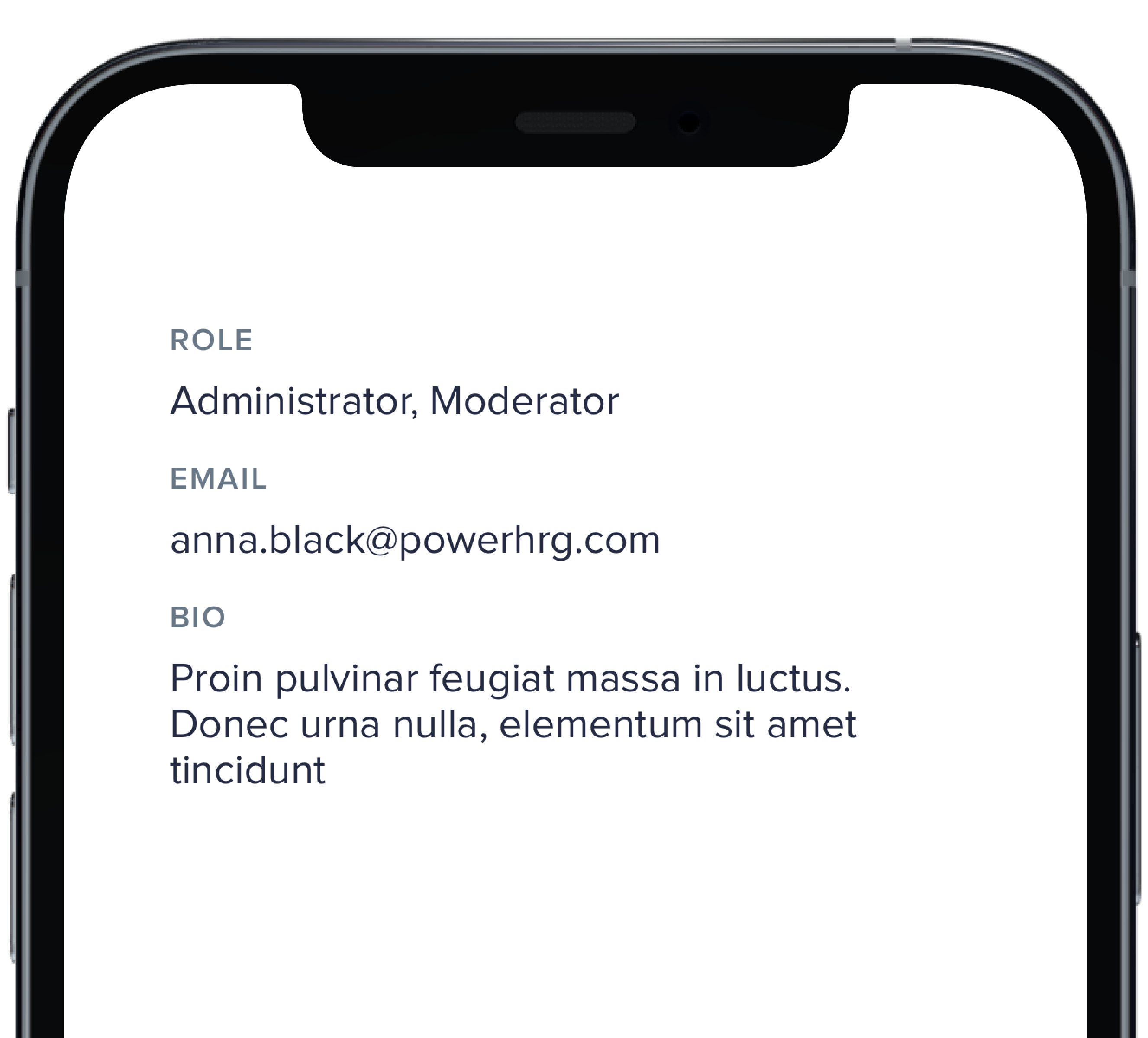
PBLabelValue("Role", "Administrator, Moderator")
|
|
7
|
-
PBLabelValue("Email", "anna.black@powerhrg.com")
|
|
8
|
-
PBLabelValue("Bio", longText)
|
|
9
|
-
}
|
|
10
|
-
|
|
11
|
-
```
|
|
@@ -1,72 +0,0 @@
|
|
|
1
|
-
|
|
2
|
-
|
|
3
|
-
|
|
4
|
-
```swift
|
|
5
|
-
|
|
6
|
-
VStack(alignment: .leading, spacing: Spacing.small) {
|
|
7
|
-
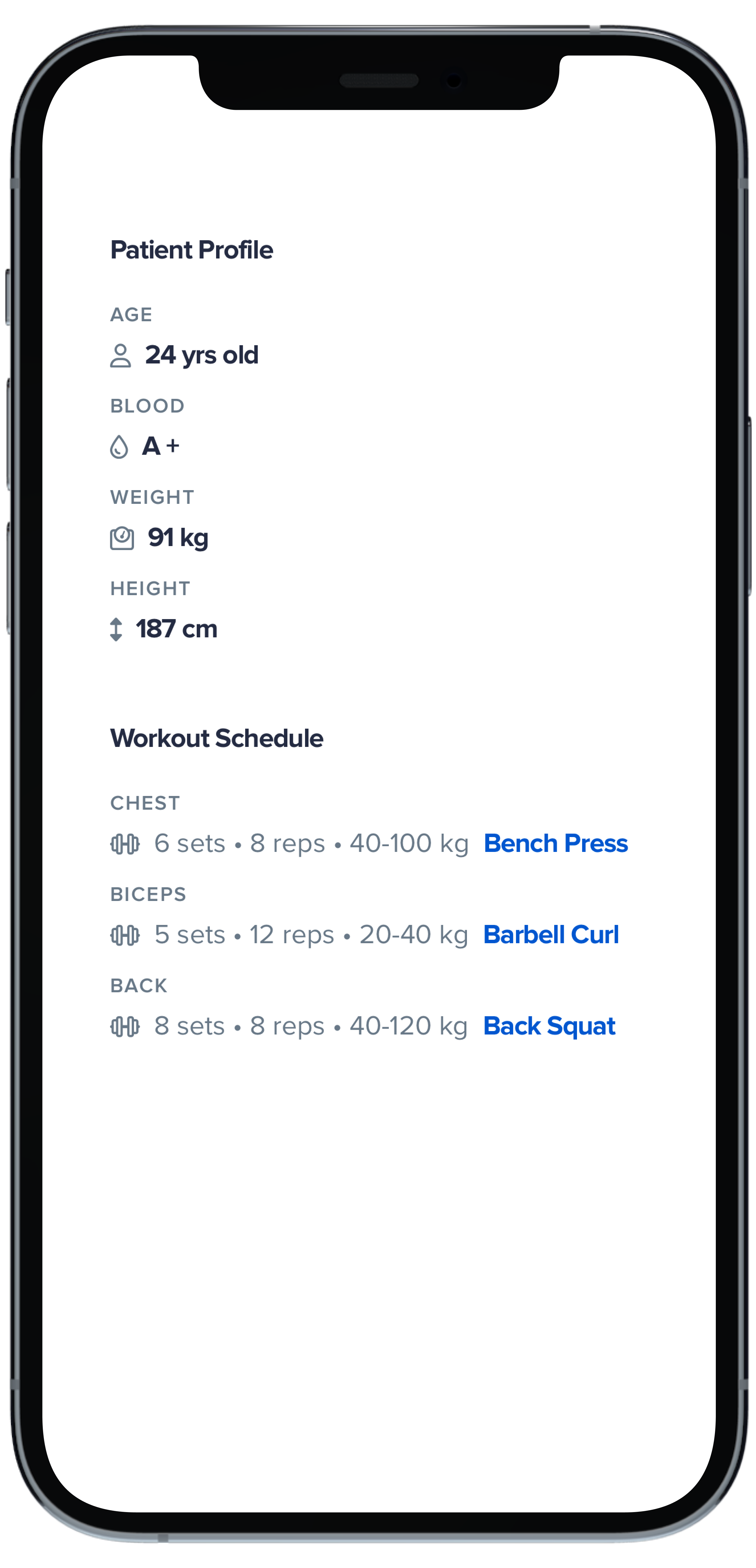
Text("Patient Profile")
|
|
8
|
-
.pbFont(.title4)
|
|
9
|
-
.padding(.bottom, Spacing.xSmall)
|
|
10
|
-
|
|
11
|
-
PBLabelValue(
|
|
12
|
-
"Age",
|
|
13
|
-
variant: .details,
|
|
14
|
-
icon: FontAwesome.user,
|
|
15
|
-
title: "24 yrs old"
|
|
16
|
-
)
|
|
17
|
-
|
|
18
|
-
PBLabelValue(
|
|
19
|
-
"Blood",
|
|
20
|
-
variant: .details,
|
|
21
|
-
icon: FontAwesome.tint,
|
|
22
|
-
title: "A +"
|
|
23
|
-
)
|
|
24
|
-
|
|
25
|
-
PBLabelValue(
|
|
26
|
-
"Weight",
|
|
27
|
-
variant: .details,
|
|
28
|
-
icon: FontAwesome.weight,
|
|
29
|
-
title: "91 kg"
|
|
30
|
-
)
|
|
31
|
-
|
|
32
|
-
PBLabelValue(
|
|
33
|
-
"Height",
|
|
34
|
-
variant: .details,
|
|
35
|
-
icon: FontAwesome.arrowsAltV,
|
|
36
|
-
title: "187 cm"
|
|
37
|
-
)
|
|
38
|
-
|
|
39
|
-
Text("Workout Schedule")
|
|
40
|
-
.pbFont(.title4)
|
|
41
|
-
.padding(.top, Spacing.large)
|
|
42
|
-
.padding(.bottom, Spacing.xSmall)
|
|
43
|
-
|
|
44
|
-
PBLabelValue(
|
|
45
|
-
"Chest",
|
|
46
|
-
variant: .details,
|
|
47
|
-
icon: FontAwesome.dumbbell,
|
|
48
|
-
description: "6 sets • 8 reps • 40-100 kg",
|
|
49
|
-
title: "Bench Press",
|
|
50
|
-
active: true
|
|
51
|
-
)
|
|
52
|
-
|
|
53
|
-
PBLabelValue(
|
|
54
|
-
"Biceps",
|
|
55
|
-
variant: .details,
|
|
56
|
-
icon: FontAwesome.dumbbell,
|
|
57
|
-
description: "5 sets • 12 reps • 20-40 kg",
|
|
58
|
-
title: "Barbell Curl",
|
|
59
|
-
active: true
|
|
60
|
-
)
|
|
61
|
-
|
|
62
|
-
PBLabelValue(
|
|
63
|
-
"Back",
|
|
64
|
-
variant: .details,
|
|
65
|
-
icon: FontAwesome.dumbbell,
|
|
66
|
-
description: "8 sets • 8 reps • 40-120 kg",
|
|
67
|
-
title: "Back Squat",
|
|
68
|
-
active: true
|
|
69
|
-
)
|
|
70
|
-
}
|
|
71
|
-
|
|
72
|
-
```
|
|
@@ -1,41 +0,0 @@
|
|
|
1
|
-

|
|
2
|
-
|
|
3
|
-
```swift
|
|
4
|
-
|
|
5
|
-
VStack(alignment: .leading, spacing: Spacing.small) {
|
|
6
|
-
PBLabelValue(
|
|
7
|
-
"Installer",
|
|
8
|
-
variant: .details,
|
|
9
|
-
icon: FontAwesome.truck,
|
|
10
|
-
title: "JD Installations LLC"
|
|
11
|
-
)
|
|
12
|
-
|
|
13
|
-
PBLabelValue(
|
|
14
|
-
"Project",
|
|
15
|
-
variant: .details,
|
|
16
|
-
icon: FontAwesome.home,
|
|
17
|
-
description: "33-12345",
|
|
18
|
-
title: "Jefferson-Smith"
|
|
19
|
-
)
|
|
20
|
-
|
|
21
|
-
PBLabelValue(
|
|
22
|
-
"Project",
|
|
23
|
-
variant: .details,
|
|
24
|
-
icon: FontAwesome.home,
|
|
25
|
-
description: "33-12345",
|
|
26
|
-
title: "Jefferson-Smith",
|
|
27
|
-
date: Date()
|
|
28
|
-
)
|
|
29
|
-
|
|
30
|
-
PBLabelValue(
|
|
31
|
-
"Project",
|
|
32
|
-
variant: .details,
|
|
33
|
-
icon: FontAwesome.home,
|
|
34
|
-
description: "33-12345",
|
|
35
|
-
title: "Jefferson-Smith",
|
|
36
|
-
date: Date(),
|
|
37
|
-
active: true
|
|
38
|
-
)
|
|
39
|
-
}
|
|
40
|
-
|
|
41
|
-
```
|
|
@@ -1,11 +0,0 @@
|
|
|
1
|
-
### Props
|
|
2
|
-
| Name | Type | Description | Default | Values |
|
|
3
|
-
| --- | ----------- | --------- | --------- | --------- |
|
|
4
|
-
| **Label** | `String` | Sets the label text | | |
|
|
5
|
-
| **Value** | `String` | Sets the value | `nil` | |
|
|
6
|
-
| **Variant** | `Variant` | Changes the style of the Label Value | `.default` | `.default` `.details` |
|
|
7
|
-
| **Icon** | `PlaybookGenericIcon` | Adds an icon next to the title | `nil` | |
|
|
8
|
-
| **Description** | `String` | Sets the description | `nil` | |
|
|
9
|
-
| **Title** | `String` | Sets the title | `nil` | |
|
|
10
|
-
| **Date** | `Date` | Adds a date | `nil` | |
|
|
11
|
-
| **Active** | `Bool` | Changes the style of the Label Value | `false` | `true` `false` |
|
|
@@ -1,57 +0,0 @@
|
|
|
1
|
-

|
|
2
|
-
|
|
3
|
-
```swift
|
|
4
|
-
|
|
5
|
-
VStack(alignment: .leading, spacing: Spacing.small) {
|
|
6
|
-
PBMessage(
|
|
7
|
-
avatar: AnyView(picAnna),
|
|
8
|
-
label: "Anna Black",
|
|
9
|
-
message: "How can we assist you today?",
|
|
10
|
-
timestamp: Date().addingTimeInterval(-20)
|
|
11
|
-
)
|
|
12
|
-
|
|
13
|
-
PBMessage(
|
|
14
|
-
avatar: AnyView(picPatric),
|
|
15
|
-
label: "Patrick Welch",
|
|
16
|
-
message: "We will escalate this issue to a Senior Support agent.",
|
|
17
|
-
timestamp: Date().addingTimeInterval(-540),
|
|
18
|
-
timestampAlignment: .leading
|
|
19
|
-
)
|
|
20
|
-
|
|
21
|
-
PBMessage(
|
|
22
|
-
avatar: AnyView(picLuccile),
|
|
23
|
-
label: "Lucille Sanchez",
|
|
24
|
-
message: "Application for Kate Smith is waiting for your approval",
|
|
25
|
-
timestamp: Date().addingTimeInterval(-200000)
|
|
26
|
-
)
|
|
27
|
-
|
|
28
|
-
PBMessage(
|
|
29
|
-
avatar: AnyView(PBAvatar(name: "Beverly Reyes", size: .xSmall)),
|
|
30
|
-
label: "Beverly Reyes",
|
|
31
|
-
message: "We are so sorry you had a bad experience!",
|
|
32
|
-
timestamp: Date().addingTimeInterval(-200000)
|
|
33
|
-
)
|
|
34
|
-
|
|
35
|
-
PBMessage(
|
|
36
|
-
label: "Keith Craig",
|
|
37
|
-
message: "Please hold for one moment, I will check with my manager.",
|
|
38
|
-
timestamp: Date().addingTimeInterval(-200000)
|
|
39
|
-
) {}
|
|
40
|
-
|
|
41
|
-
PBMessage(
|
|
42
|
-
label: "Keith Craig",
|
|
43
|
-
timestamp: Date().addingTimeInterval(-200000)
|
|
44
|
-
) {
|
|
45
|
-
Image("Forest", bundle: .module).resizable().frame(width: 240, height: 240)
|
|
46
|
-
}
|
|
47
|
-
|
|
48
|
-
PBMessage(
|
|
49
|
-
label: "Keith Craig",
|
|
50
|
-
message: "Please hold for one moment, I will check with my manager.",
|
|
51
|
-
timestamp: Date().addingTimeInterval(-200000)
|
|
52
|
-
) {
|
|
53
|
-
Image("Forest", bundle: .module).resizable().frame(width: 240, height: 240)
|
|
54
|
-
}
|
|
55
|
-
}
|
|
56
|
-
|
|
57
|
-
```
|
|
@@ -1,12 +0,0 @@
|
|
|
1
|
-
### Props
|
|
2
|
-
| Name | Type | Description | Default | Values |
|
|
3
|
-
| --- | ----------- | --------- | --------- | --------- |
|
|
4
|
-
| **Avatar** | `AnyView` | Sets avatar image | `nil` | |
|
|
5
|
-
| **Label** | `String` | Sets the name of the sender | `""` | |
|
|
6
|
-
| **Message** | `String` | Sets the message text | `nil` | |
|
|
7
|
-
| **Timestamp** | `Date` | Adds a date | | `nil` |
|
|
8
|
-
| **Timestamp Alignment** | `TimestampAlignment` | Changes the style of the timestamp | `.trailing` | `.leading` `.trailing` |
|
|
9
|
-
| **Change TimeStamp On Hover** | `Bool` | Changes the timestamp hover functionality | `false` | `true` `false` |
|
|
10
|
-
| **Vertical Padding** | `CGFloat` | Changes vertical padding | `Spacing.xSmall` | `Spacing.none` `Spacing.xxSmall` `Spacing.xSmall` `Spacing.small` `Spacing.medium` `Spacing.large` `Spacing.xLarge` |
|
|
11
|
-
| **Horizontal Padding** | `CGFloat` | Changes horizontal padding | `Spacing.xSmall` | `Spacing.none` `Spacing.xxSmall` `Spacing.xSmall` `Spacing.small` `Spacing.medium` `Spacing.large` `Spacing.xLarge` |
|
|
12
|
-
| **Timestamp Variant** | `PBTimestamp.Variant` | Changes the style of the Message | `.standard` | `.standard` `.hideUserElapsed` |
|