playbook_ui_docs 13.10.0.pre.alpha.play978makehighchartsadevdependencypoc1322 → 13.10.0.pre.alpha.play1054tableheadersortconsolidation1416
This diff represents the content of publicly available package versions that have been released to one of the supported registries. The information contained in this diff is provided for informational purposes only and reflects changes between package versions as they appear in their respective public registries.
- checksums.yaml +4 -4
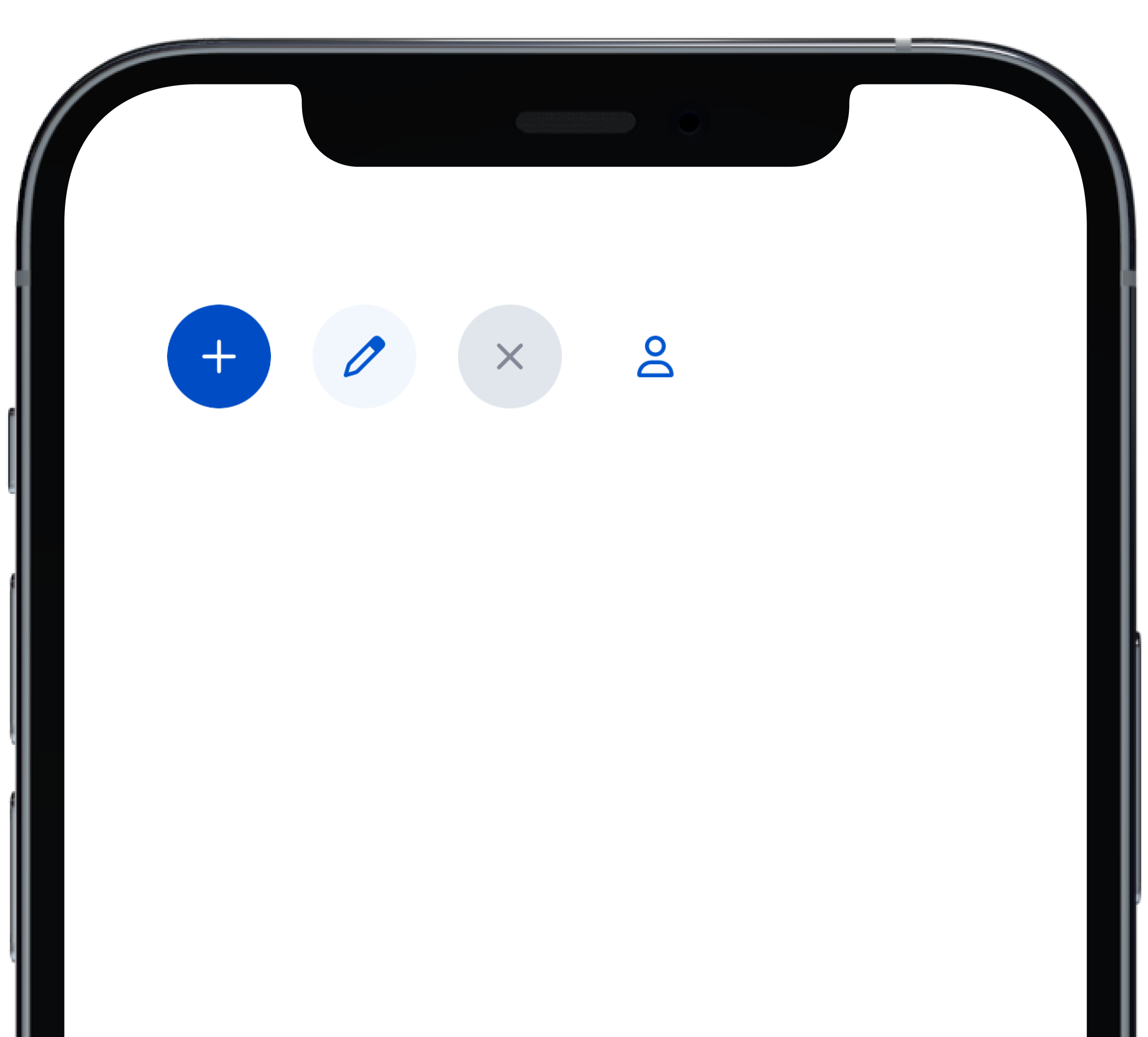
- data/app/pb_kits/playbook/pb_button/docs/_button_circle_swift.md +28 -0
- data/app/pb_kits/playbook/pb_button/docs/_button_default_swift.md +23 -0
- data/app/pb_kits/playbook/pb_button/docs/_button_full_width_swift.md +9 -0
- data/app/pb_kits/playbook/pb_button/docs/_button_icon_options_swift.md +18 -0
- data/app/pb_kits/playbook/pb_button/docs/_button_props_swift.md +11 -0
- data/app/pb_kits/playbook/pb_button/docs/_button_size_swift.md +20 -0
- data/app/pb_kits/playbook/pb_button/docs/example.yml +8 -0
- data/app/pb_kits/playbook/pb_card/docs/_card_background_swift.md +29 -0
- data/app/pb_kits/playbook/pb_card/docs/_card_border_none_swift.md +7 -0
- data/app/pb_kits/playbook/pb_card/docs/_card_border_radius_swift.md +33 -0
- data/app/pb_kits/playbook/pb_card/docs/_card_header_swift.md +33 -0
- data/app/pb_kits/playbook/pb_card/docs/_card_highlight_swift.md +17 -0
- data/app/pb_kits/playbook/pb_card/docs/_card_light_swift.md +7 -0
- data/app/pb_kits/playbook/pb_card/docs/_card_padding_swift.md +33 -0
- data/app/pb_kits/playbook/pb_card/docs/_card_props_swift.md +10 -0
- data/app/pb_kits/playbook/pb_card/docs/_card_selected_swift.md +0 -0
- data/app/pb_kits/playbook/pb_card/docs/_card_separator_swift.md +11 -0
- data/app/pb_kits/playbook/pb_card/docs/_card_shadow_swift.md +21 -0
- data/app/pb_kits/playbook/pb_card/docs/_card_styles_swift.md +17 -0
- data/app/pb_kits/playbook/pb_card/docs/_card_tag_swift.md +0 -0
- data/app/pb_kits/playbook/pb_card/docs/example.yml +12 -0
- data/app/pb_kits/playbook/pb_table/docs/_table_header.html.erb +47 -31
- data/app/pb_kits/playbook/pb_table/docs/_table_header.md +5 -0
- data/dist/playbook-doc.js +8 -8
- metadata +21 -2
checksums.yaml
CHANGED
|
@@ -1,7 +1,7 @@
|
|
|
1
1
|
---
|
|
2
2
|
SHA256:
|
|
3
|
-
metadata.gz:
|
|
4
|
-
data.tar.gz:
|
|
3
|
+
metadata.gz: e5eb25edc1069011c282a4e1c558b0547baf246826e5d5228b024fcf37af0fb8
|
|
4
|
+
data.tar.gz: 4cd65286dd086567be934643f724b2e2f4ede07d627890acd9742ef7fce28ed5
|
|
5
5
|
SHA512:
|
|
6
|
-
metadata.gz:
|
|
7
|
-
data.tar.gz:
|
|
6
|
+
metadata.gz: 9b2ec76abab585650d7c79dce400c38ba46cd7aadb03bf16590d57b9f73de08b0f794376b211c1a72e6e827beb94799c725243f3027f76319547693f557ad411
|
|
7
|
+
data.tar.gz: ea75b1a948b189d32d4293936a2be2d6a414b4c7a682ea4014f50e1e0e1992aab701ab4f24c36f0f08fe2f4d9324c5236300d30ccafba18e36f1de17c0897d9d
|
|
@@ -0,0 +1,28 @@
|
|
|
1
|
+
|
|
2
|
+
|
|
3
|
+
```swift
|
|
4
|
+
VStack(alignment: .leading, spacing: Spacing.small) {
|
|
5
|
+
PBButton(
|
|
6
|
+
shape: .circle,
|
|
7
|
+
icon: PBIcon.fontAwesome(.plus, size: .x1),
|
|
8
|
+
action: {}
|
|
9
|
+
)
|
|
10
|
+
PBButton(
|
|
11
|
+
variant: .secondary,
|
|
12
|
+
shape: .circle,
|
|
13
|
+
icon: PBIcon.fontAwesome(.pen, size: .x1),
|
|
14
|
+
action: {}
|
|
15
|
+
)
|
|
16
|
+
PBButton(
|
|
17
|
+
variant: .disabled,
|
|
18
|
+
shape: .circle,
|
|
19
|
+
icon: PBIcon.fontAwesome(.times, size: .x1)
|
|
20
|
+
)
|
|
21
|
+
PBButton(
|
|
22
|
+
variant: .link,
|
|
23
|
+
shape: .circle,
|
|
24
|
+
icon: PBIcon.fontAwesome(.user, size: .x1),
|
|
25
|
+
action: {}
|
|
26
|
+
)
|
|
27
|
+
}
|
|
28
|
+
```
|
|
@@ -0,0 +1,23 @@
|
|
|
1
|
+

|
|
2
|
+
|
|
3
|
+
```swift
|
|
4
|
+
VStack(alignment: .leading, spacing: Spacing.small) {
|
|
5
|
+
PBButton(
|
|
6
|
+
title: "Button Primary",
|
|
7
|
+
action: {}
|
|
8
|
+
)
|
|
9
|
+
PBButton(
|
|
10
|
+
variant: .secondary,
|
|
11
|
+
title: "Button Secondary",
|
|
12
|
+
action: {})
|
|
13
|
+
PBButton(
|
|
14
|
+
variant: .link,
|
|
15
|
+
title: "Button Link",
|
|
16
|
+
action: {}
|
|
17
|
+
)
|
|
18
|
+
PBButton(
|
|
19
|
+
variant: .disabled,
|
|
20
|
+
title: "Button Disabled"
|
|
21
|
+
)
|
|
22
|
+
}
|
|
23
|
+
```
|
|
@@ -0,0 +1,18 @@
|
|
|
1
|
+

|
|
2
|
+
|
|
3
|
+
|
|
4
|
+
```swift
|
|
5
|
+
VStack(alignment: .leading, spacing: Spacing.small) {
|
|
6
|
+
PBButton(
|
|
7
|
+
title: "Button with Icon on Left",
|
|
8
|
+
icon: PBIcon.fontAwesome(.user, size: .x1),
|
|
9
|
+
action: {}
|
|
10
|
+
)
|
|
11
|
+
PBButton(
|
|
12
|
+
title: "Button with Icon on Right",
|
|
13
|
+
icon: PBIcon.fontAwesome(.user, size: .x1),
|
|
14
|
+
iconPosition: .right,
|
|
15
|
+
action: {}
|
|
16
|
+
)
|
|
17
|
+
}
|
|
18
|
+
```
|
|
@@ -0,0 +1,11 @@
|
|
|
1
|
+
### Props
|
|
2
|
+
| Name | Type | Description | Default | Values |
|
|
3
|
+
| --- | ----------- | --------- | --------- | --------- |
|
|
4
|
+
| **Full Width** | `Bool` | Sets Button to full width | `false` | `true` `false` |
|
|
5
|
+
| **Variant** | `PBButtonVariant` | Changes the color of the Button | ` .primary` | `.primary` `.secondary` `.link` `.disabled` |
|
|
6
|
+
| **Size** | `Size` | Adjusts Button size | `.medium` | `.small` `.medium` `.large` |
|
|
7
|
+
| **Shape** | `Shape` | Changes the shape of the Button | `.primary` | `.primary` `.circle` |
|
|
8
|
+
| **Title** | `String` | Sets Button text | `nil` | |
|
|
9
|
+
| **Icon** | `PBIcon` | Adds an icon to the Button | `nil` | |
|
|
10
|
+
| **Icon Position** | `IconPosition` | Adjusts the icon's position | `.left` | `.left` `.right` |
|
|
11
|
+
| **Action** | `(() -> Void)` | Adds an action for the Button to perform | `{}` | |
|
|
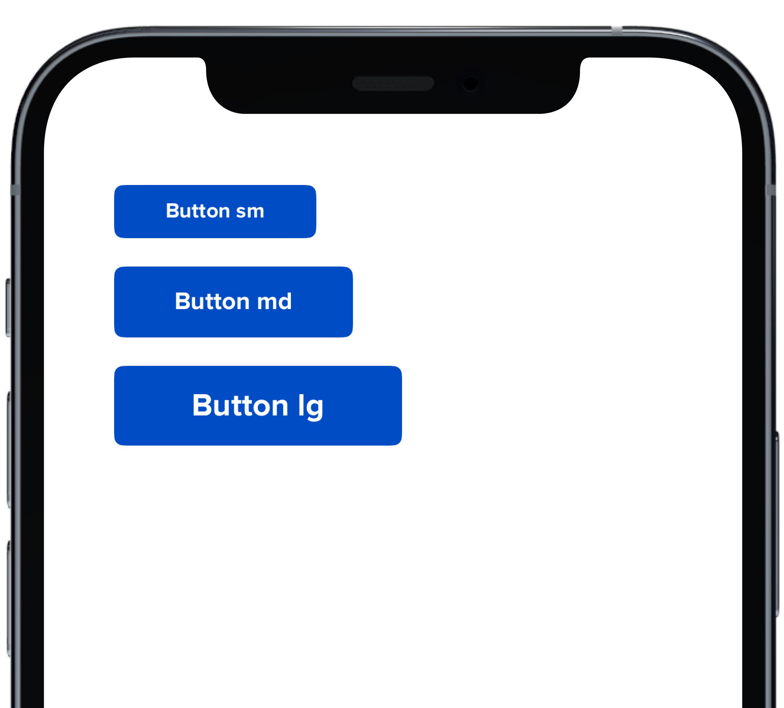
@@ -0,0 +1,20 @@
|
|
|
1
|
+
|
|
2
|
+
|
|
3
|
+
```swift
|
|
4
|
+
VStack(alignment: .leading, spacing: Spacing.small) {
|
|
5
|
+
PBButton(
|
|
6
|
+
size: .small,
|
|
7
|
+
title: "Button sm",
|
|
8
|
+
action: {}
|
|
9
|
+
)
|
|
10
|
+
PBButton(
|
|
11
|
+
title: "Button md",
|
|
12
|
+
action: {}
|
|
13
|
+
)
|
|
14
|
+
PBButton(
|
|
15
|
+
size: .large,
|
|
16
|
+
title: "Button lg",
|
|
17
|
+
action: {}
|
|
18
|
+
)
|
|
19
|
+
}
|
|
20
|
+
```
|
|
@@ -25,3 +25,11 @@ examples:
|
|
|
25
25
|
- button_size: Button Size
|
|
26
26
|
- button_form: Button Form Attribute
|
|
27
27
|
- button_hover: Button Hover
|
|
28
|
+
|
|
29
|
+
swift:
|
|
30
|
+
- button_default_swift: Button Variants
|
|
31
|
+
- button_full_width_swift: Button Full Width
|
|
32
|
+
- button_icon_options_swift: Button Icon Options
|
|
33
|
+
- button_circle_swift: Circle Button
|
|
34
|
+
- button_size_swift: Button Size
|
|
35
|
+
- button_props_swift: ""
|
|
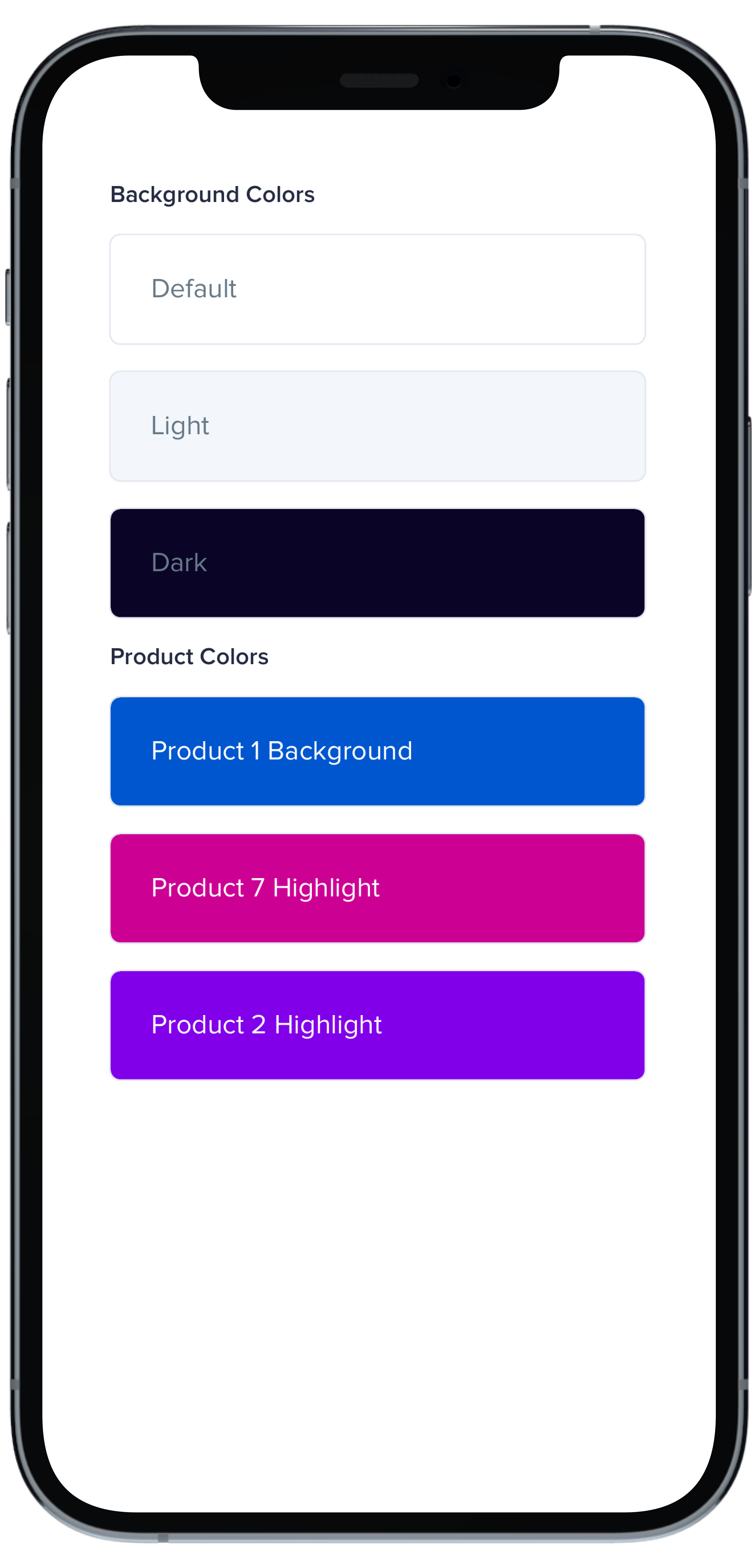
@@ -0,0 +1,29 @@
|
|
|
1
|
+
|
|
2
|
+
|
|
3
|
+
```swift
|
|
4
|
+
VStack(alignment: .leading, spacing: Spacing.small) {
|
|
5
|
+
PBCard {
|
|
6
|
+
Text(text).pbFont(.body)
|
|
7
|
+
}
|
|
8
|
+
|
|
9
|
+
PBCard(backgroundColor: .background(.light)) {
|
|
10
|
+
Text("Light").pbFont(.body, color: .text(.light))
|
|
11
|
+
}
|
|
12
|
+
|
|
13
|
+
PBCard(backgroundColor: .background(.dark)) {
|
|
14
|
+
Text("Dark").pbFont(.body, color: .text(.light))
|
|
15
|
+
}
|
|
16
|
+
|
|
17
|
+
PBCard(backgroundColor: .product(.product1, category: .background)) {
|
|
18
|
+
Text("Product 1 Background").pbFont(.body, color: .white)
|
|
19
|
+
}
|
|
20
|
+
|
|
21
|
+
PBCard(backgroundColor: .product(.product7, category: .highlight)) {
|
|
22
|
+
Text("Product 7 Highlight").pbFont(.body, color: .white)
|
|
23
|
+
}
|
|
24
|
+
|
|
25
|
+
PBCard(backgroundColor: .product(.product2, category: .highlight)) {
|
|
26
|
+
Text("Product 2 Highlight").pbFont(.body, color: .white)
|
|
27
|
+
}
|
|
28
|
+
}
|
|
29
|
+
```
|
|
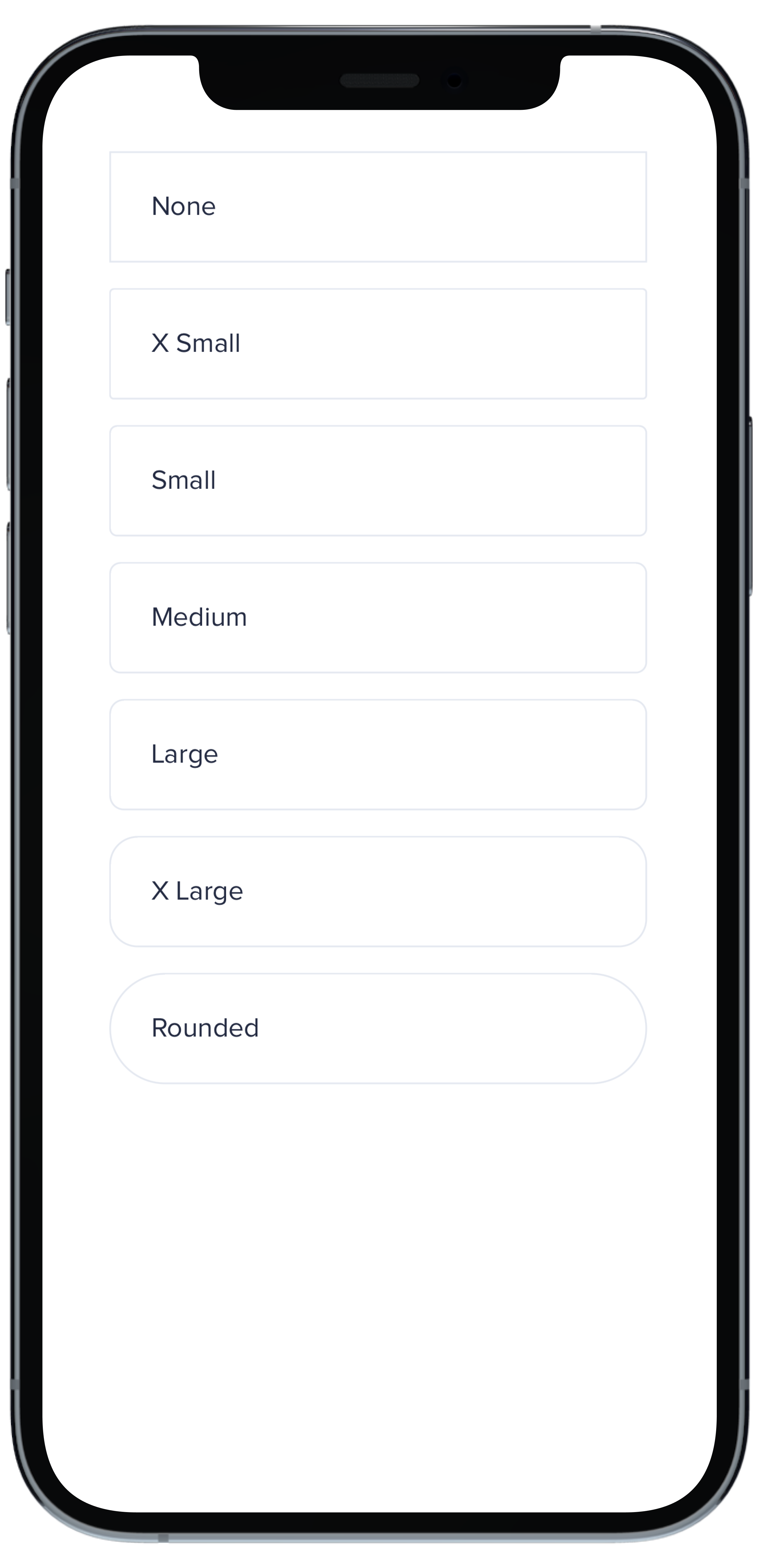
@@ -0,0 +1,33 @@
|
|
|
1
|
+
|
|
2
|
+
|
|
3
|
+
```swift
|
|
4
|
+
VStack(spacing: Spacing.small) {
|
|
5
|
+
PBCard(borderRadius: BorderRadius.none) {
|
|
6
|
+
Text("None").pbFont(.body)
|
|
7
|
+
}
|
|
8
|
+
|
|
9
|
+
PBCard(borderRadius: BorderRadius.xSmall) {
|
|
10
|
+
Text("X Small").pbFont(.body)
|
|
11
|
+
}
|
|
12
|
+
|
|
13
|
+
PBCard(borderRadius: BorderRadius.small) {
|
|
14
|
+
Text("Small").pbFont(.body)
|
|
15
|
+
}
|
|
16
|
+
|
|
17
|
+
PBCard(borderRadius: BorderRadius.medium) {
|
|
18
|
+
Text("Medium").pbFont(.body)
|
|
19
|
+
}
|
|
20
|
+
|
|
21
|
+
PBCard(borderRadius: BorderRadius.large) {
|
|
22
|
+
Text("Large").pbFont(.body)
|
|
23
|
+
}
|
|
24
|
+
|
|
25
|
+
PBCard(borderRadius: BorderRadius.xLarge) {
|
|
26
|
+
Text("X Large").pbFont(.body)
|
|
27
|
+
}
|
|
28
|
+
|
|
29
|
+
PBCard(borderRadius: BorderRadius.rounded) {
|
|
30
|
+
Text("Rounded").pbFont(.body)
|
|
31
|
+
}
|
|
32
|
+
}
|
|
33
|
+
``````
|
|
@@ -0,0 +1,33 @@
|
|
|
1
|
+
|
|
2
|
+
|
|
3
|
+
```swift
|
|
4
|
+
Stack(spacing: Spacing.small) {
|
|
5
|
+
PBCard(padding: Spacing.none) {
|
|
6
|
+
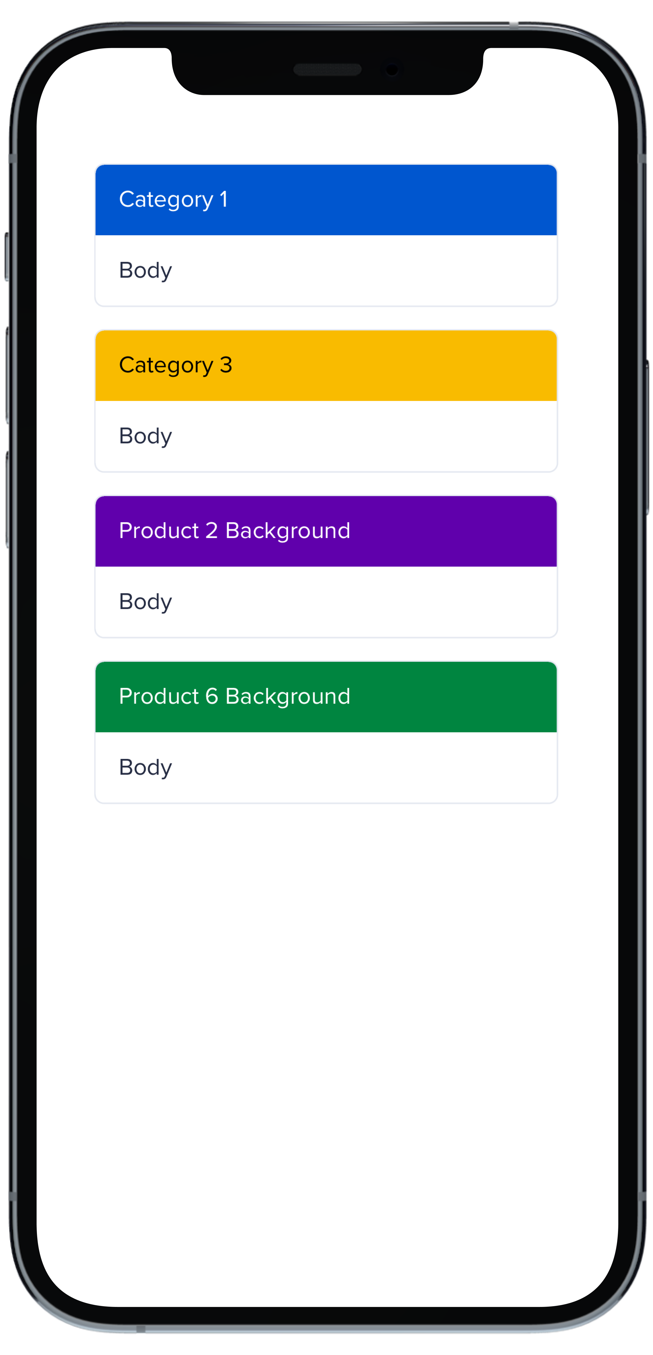
PBCardHeader(color: .category(.category1)) {
|
|
7
|
+
Text("Category 1").pbFont(.body, color: .white).padding(Spacing.small)
|
|
8
|
+
}
|
|
9
|
+
Text("Body").pbFont(.body, color: .text(.default)).padding(Spacing.small)
|
|
10
|
+
}
|
|
11
|
+
|
|
12
|
+
PBCard(padding: Spacing.none) {
|
|
13
|
+
PBCardHeader(color: .category(.category3)) {
|
|
14
|
+
Text("Category 3").pbFont(.body, color: .black).padding(Spacing.small)
|
|
15
|
+
}
|
|
16
|
+
Text("Body").pbFont(.body, color: .text(.default)).padding(Spacing.small)
|
|
17
|
+
}
|
|
18
|
+
|
|
19
|
+
PBCard(padding: Spacing.none) {
|
|
20
|
+
PBCardHeader(color: .product(.product2, category: .background)) {
|
|
21
|
+
Text("Product 2 Background").pbFont(.body, color: .white).padding(Spacing.small)
|
|
22
|
+
}
|
|
23
|
+
Text("Body").pbFont(.body, color: .text(.default)).padding(Spacing.small)
|
|
24
|
+
}
|
|
25
|
+
|
|
26
|
+
PBCard(padding: Spacing.none) {
|
|
27
|
+
PBCardHeader(color: .product(.product6, category: .background)) {
|
|
28
|
+
Text("Product 6 Background").pbFont(.body, color: .white).padding(Spacing.small)
|
|
29
|
+
}
|
|
30
|
+
Text("Body").pbFont(.body, color: .text(.default)).padding(Spacing.small)
|
|
31
|
+
}
|
|
32
|
+
}
|
|
33
|
+
```
|
|
@@ -0,0 +1,17 @@
|
|
|
1
|
+
|
|
2
|
+
|
|
3
|
+
```swift
|
|
4
|
+
VStack(spacing: Spacing.small) {
|
|
5
|
+
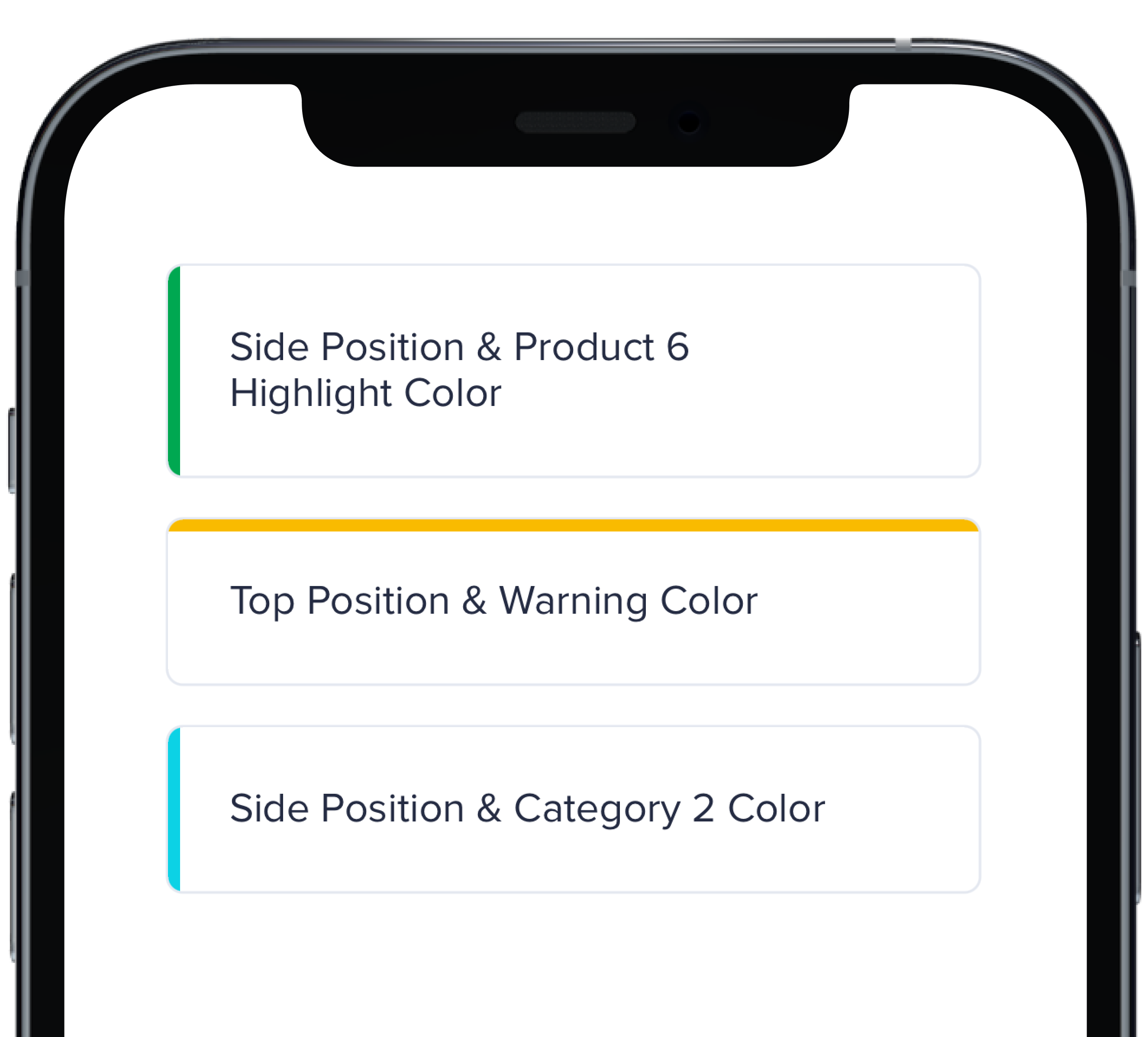
PBCard(highlight: .side(.product(.product6, category: .highlight))) {
|
|
6
|
+
Text("Side Position & Product 6 Highlight Color").pbFont(.body)
|
|
7
|
+
}
|
|
8
|
+
|
|
9
|
+
PBCard(highlight: .top(.status(.warning))) {
|
|
10
|
+
Text("Top Position & Warning Color").pbFont(.body)
|
|
11
|
+
}
|
|
12
|
+
|
|
13
|
+
PBCard(highlight: .side(.category(.category2))) {
|
|
14
|
+
Text("Side Position & Category 2 Color").pbFont(.body)
|
|
15
|
+
}
|
|
16
|
+
}
|
|
17
|
+
```
|
|
@@ -0,0 +1,33 @@
|
|
|
1
|
+
|
|
2
|
+
|
|
3
|
+
```swift
|
|
4
|
+
VStack(spacing: Spacing.small) {
|
|
5
|
+
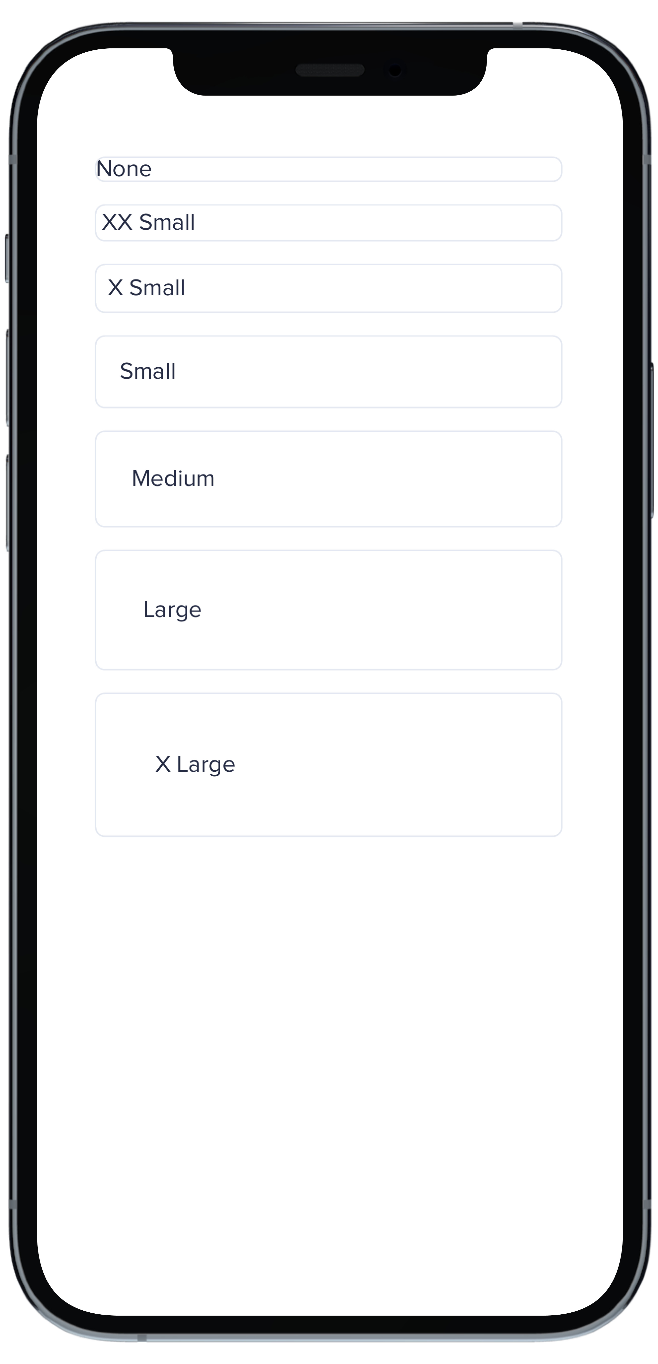
PBCard(padding: Spacing.none) {
|
|
6
|
+
Text("None").pbFont(.body)
|
|
7
|
+
}
|
|
8
|
+
|
|
9
|
+
PBCard(padding: Spacing.xxSmall) {
|
|
10
|
+
Text("XX Small").pbFont(.body)
|
|
11
|
+
}
|
|
12
|
+
|
|
13
|
+
PBCard(padding: Spacing.xSmall) {
|
|
14
|
+
Text("X Small").pbFont(.body)
|
|
15
|
+
}
|
|
16
|
+
|
|
17
|
+
PBCard(padding: Spacing.small) {
|
|
18
|
+
Text("Small").pbFont(.body)
|
|
19
|
+
}
|
|
20
|
+
|
|
21
|
+
PBCard(padding: Spacing.medium) {
|
|
22
|
+
Text("Medium").pbFont(.body)
|
|
23
|
+
}
|
|
24
|
+
|
|
25
|
+
PBCard(padding: Spacing.large) {
|
|
26
|
+
Text("Large").pbFont(.body)
|
|
27
|
+
}
|
|
28
|
+
|
|
29
|
+
PBCard(padding: Spacing.xLarge) {
|
|
30
|
+
Text("X Large").pbFont(.body)
|
|
31
|
+
}
|
|
32
|
+
}
|
|
33
|
+
```
|
|
@@ -0,0 +1,10 @@
|
|
|
1
|
+
### Props
|
|
2
|
+
| Name | Type | Description | Default | Values |
|
|
3
|
+
| --- | ----------- | --------- | --------- | --------- |
|
|
4
|
+
| **Background Color** | `Color` | Changes background color | `.card` | `Color` |
|
|
5
|
+
| **Border** | `Bool` | Adds border around the Card | `true` | `true` `false` |
|
|
6
|
+
| **Border Radius** | `CGFloat` | Specifies the roundness of the Card | `BorderRadius.medium` | `BorderRadius.none` `BorderRadius.xSmall` `BorderRadius.small` `BorderRadius.medium` `BorderRadius.large` `BorderRadius.xLarge` `BorderRadius.rounded` |
|
|
7
|
+
| **Highlight** | `Highlight` | Adds a border accent color | `.none` | `Color` |
|
|
8
|
+
| **Padding** | `CGFloat` | Applies padding between text and border | `Spacing.medium` | `Spacing.none` `Spacing.xxSmall` `Spacing.xSmall` `Spacing.small` `Spacing.medium` `Spacing.large` `Spacing.xLarge` |
|
|
9
|
+
| **Style** | `PBCardStyle` | Specifies the color of the border | `.default` | `.default` `.selected` `.error` `.inline` |
|
|
10
|
+
| **Shadow** | `Shadow` | Applies shadow | `nil` | `Shadow.deep` `Shadow.deeper` `Shadow.deepest` `Shadow.none` |
|
|
File without changes
|
|
@@ -0,0 +1,11 @@
|
|
|
1
|
+
|
|
2
|
+
|
|
3
|
+
```swift
|
|
4
|
+
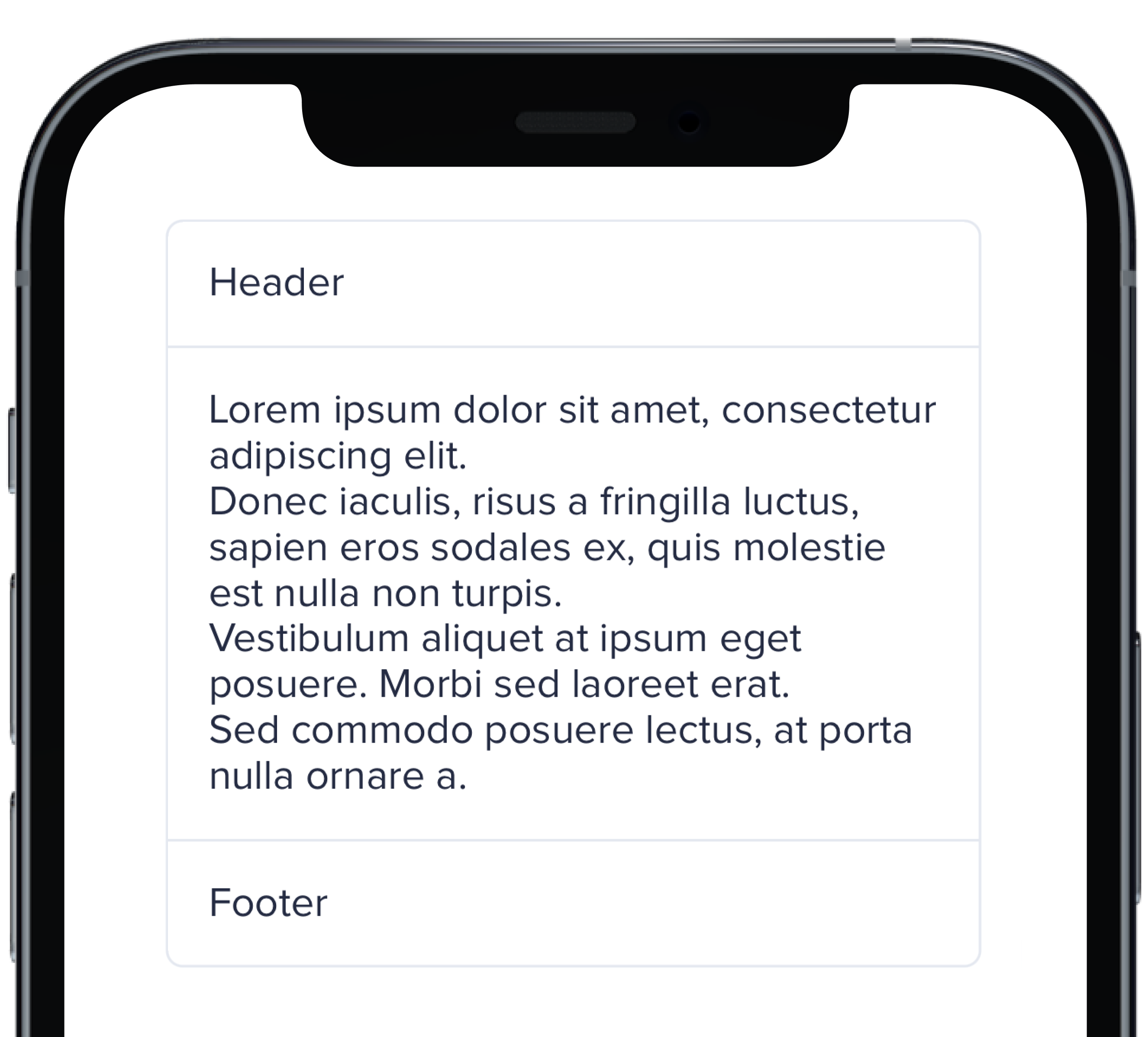
PBCard(padding: Spacing.none) {
|
|
5
|
+
Text("Header").pbFont(.body).padding(Spacing.small)
|
|
6
|
+
PBSectionSeparator()
|
|
7
|
+
Text(loremIpsum).pbFont(.body).padding(Spacing.small)
|
|
8
|
+
PBSectionSeparator()
|
|
9
|
+
Text("Footer").pbFont(.body).padding(Spacing.small)
|
|
10
|
+
}
|
|
11
|
+
```
|
|
@@ -0,0 +1,21 @@
|
|
|
1
|
+

|
|
2
|
+
|
|
3
|
+
```swift
|
|
4
|
+
VStack(spacing: Spacing.small) {
|
|
5
|
+
PBCard(shadow: Shadow.deep) {
|
|
6
|
+
Text("Deep").pbFont(.body)
|
|
7
|
+
}
|
|
8
|
+
|
|
9
|
+
PBCard(shadow: Shadow.deeper) {
|
|
10
|
+
Text("Deeper").pbFont(.body)
|
|
11
|
+
}
|
|
12
|
+
|
|
13
|
+
PBCard(shadow: Shadow.deepest) {
|
|
14
|
+
Text("Deepest").pbFont(.body)
|
|
15
|
+
}
|
|
16
|
+
|
|
17
|
+
PBCard(shadow: Shadow.none) {
|
|
18
|
+
Text("None").pbFont(.body)
|
|
19
|
+
}
|
|
20
|
+
}
|
|
21
|
+
```
|
|
@@ -0,0 +1,17 @@
|
|
|
1
|
+
|
|
2
|
+
|
|
3
|
+
```swift
|
|
4
|
+
VStack(alignment: .leading, spacing: Spacing.small) {
|
|
5
|
+
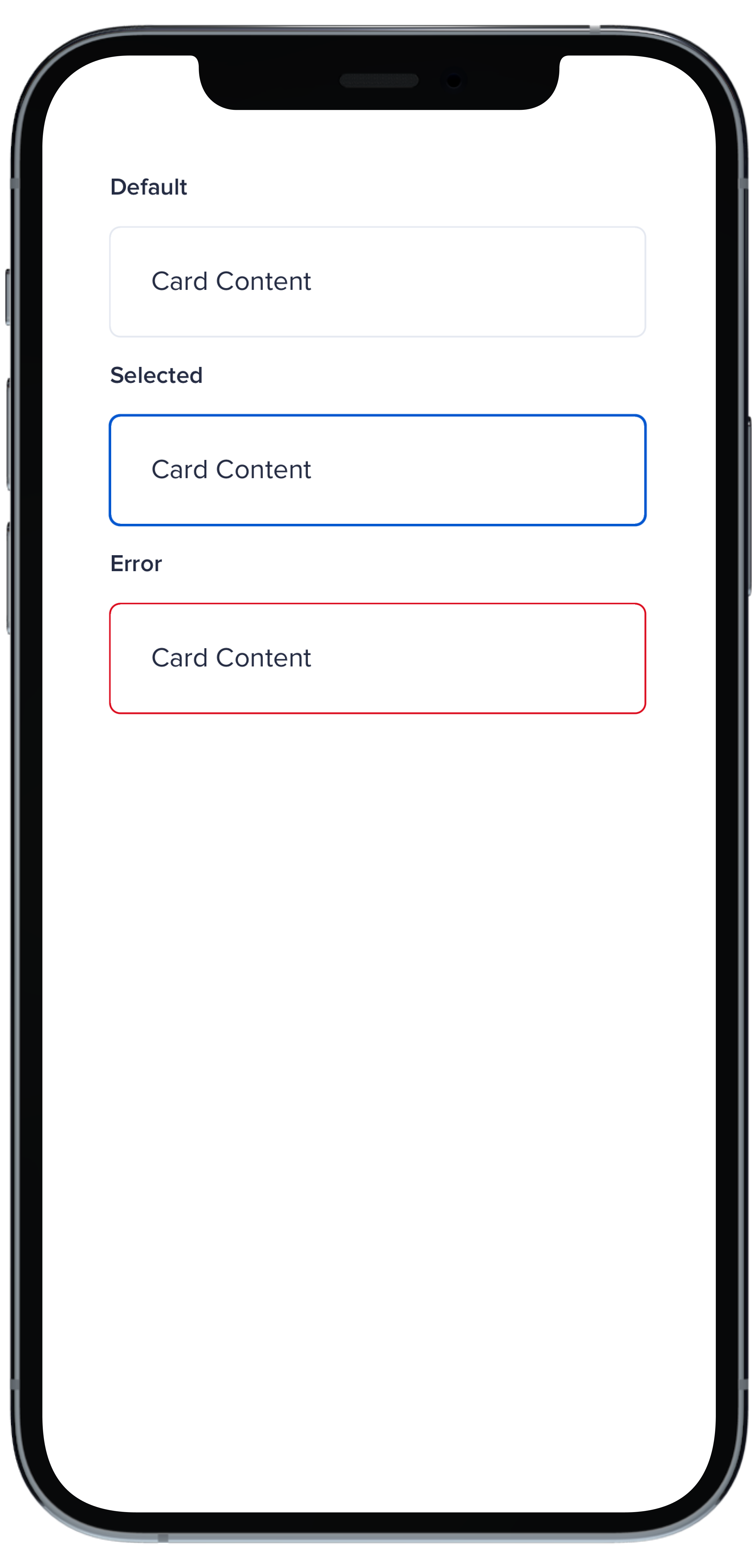
PBCard {
|
|
6
|
+
Text("Card Context").pbFont(.body)
|
|
7
|
+
}
|
|
8
|
+
|
|
9
|
+
PBCard(style: .selected()) {
|
|
10
|
+
Text("Card Context").pbFont(.body)
|
|
11
|
+
}
|
|
12
|
+
|
|
13
|
+
PBCard(style: .error) {
|
|
14
|
+
Text("Card Context").pbFont(.body)
|
|
15
|
+
}
|
|
16
|
+
}
|
|
17
|
+
```
|
|
File without changes
|
|
@@ -25,3 +25,15 @@ examples:
|
|
|
25
25
|
- card_separator: Separator Card
|
|
26
26
|
- card_border_none: No Border
|
|
27
27
|
- card_border_radius: Border Radius
|
|
28
|
+
swift:
|
|
29
|
+
- card_light_swift: Default
|
|
30
|
+
- card_background_swift: Card Backgrounds
|
|
31
|
+
- card_highlight_swift: Highlight Cards
|
|
32
|
+
- card_header_swift: Header Cards
|
|
33
|
+
- card_padding_swift: Padding Size
|
|
34
|
+
- card_shadow_swift: Shadow Size
|
|
35
|
+
- card_separator_swift: Separator Card
|
|
36
|
+
- card_border_none_swift: No Border
|
|
37
|
+
- card_border_radius_swift: Border Radius
|
|
38
|
+
- card_styles_swift: Styles
|
|
39
|
+
- card_props_swift: ""
|
|
@@ -1,12 +1,37 @@
|
|
|
1
|
-
|
|
1
|
+
<%# Example data for demonstration purposes %>
|
|
2
|
+
<% data_rows = [
|
|
3
|
+
{ 'territory' => 'North', 'firstname' => 'John', 'lastname' => 'Doe', 'age' => 30, 'job' => 'Engineer' },
|
|
4
|
+
{ 'territory' => 'South', 'firstname' => 'Alice', 'lastname' => 'Smith', 'age' => 28, 'job' => 'Designer' },
|
|
5
|
+
{ 'territory' => 'East', 'firstname' => 'Mike', 'lastname' => 'Johnson', 'age' => 35, 'job' => 'Manager' },
|
|
6
|
+
{ 'territory' => 'West', 'firstname' => 'Sarah', 'lastname' => 'Brown', 'age' => 29, 'job' => 'Developer' },
|
|
7
|
+
{ 'territory' => 'Central', 'firstname' => 'David', 'lastname' => 'Wilson', 'age' => 32, 'job' => 'Analyst' }
|
|
8
|
+
]
|
|
9
|
+
%>
|
|
10
|
+
|
|
11
|
+
<%# Example sort method for demonstration purposes %>
|
|
12
|
+
<% if params["sort"] %>
|
|
13
|
+
<% sort_param = params["sort"].gsub(/_(asc|desc)\z/, "") %>
|
|
14
|
+
<% sort_direction = params["sort"].end_with?("_asc") ? 1 : -1 %>
|
|
15
|
+
<% data_rows.sort! do |a, b|
|
|
16
|
+
value_a = a[sort_param]
|
|
17
|
+
value_b = b[sort_param]
|
|
18
|
+
|
|
19
|
+
value_a = value_a.to_i if value_a.is_a?(String) && value_a.match?(/^\d+$/)
|
|
20
|
+
value_b = value_b.to_i if value_b.is_a?(String) && value_b.match?(/^\d+$/)
|
|
21
|
+
|
|
22
|
+
sort_direction * (value_a <=> value_b)
|
|
23
|
+
end %>
|
|
24
|
+
<% end %>
|
|
25
|
+
|
|
26
|
+
<%= pb_rails("table", props: { data_table: true, vertical_border: true, id: "table-header" } ) do %>
|
|
2
27
|
<thead>
|
|
3
28
|
<tr>
|
|
4
29
|
<%= pb_rails("table/table_header", props: {
|
|
5
30
|
text: "Territory",
|
|
6
31
|
id: "territory",
|
|
7
32
|
sort_menu: [
|
|
8
|
-
{ item: "Territory", link: "?sort=
|
|
9
|
-
{ item: "Territory", link: "?sort=
|
|
33
|
+
{ item: "Territory", link: "?sort=territory_asc#table-header", active: params["sort"] == "territory_asc", direction: "asc" },
|
|
34
|
+
{ item: "Territory", link: "?sort=territory_desc#table-header", active: params["sort"] == "territory_desc", direction: "desc" }
|
|
10
35
|
],
|
|
11
36
|
}) %>
|
|
12
37
|
<%= pb_rails("table/table_header", props: {
|
|
@@ -14,45 +39,36 @@
|
|
|
14
39
|
text: "Full Name",
|
|
15
40
|
colspan: 2,
|
|
16
41
|
sort_menu: [
|
|
17
|
-
{ item: "First Name
|
|
18
|
-
{ item: "First Name
|
|
19
|
-
{ item: "Last Name
|
|
20
|
-
{ item: "Last Name
|
|
42
|
+
{ item: "First Name", link: "?sort=firstname_desc#table-header", active: params["sort"] == "firstname_desc", direction: "desc" },
|
|
43
|
+
{ item: "First Name", link: "?sort=firstname_asc#table-header", active: params["sort"] == "firstname_asc", direction: "asc" },
|
|
44
|
+
{ item: "Last Name", link: "?sort=lastname_desc#table-header", active: params["sort"] == "lastname_desc", direction: "desc" },
|
|
45
|
+
{ item: "Last Name", link: "?sort=lastname_asc#table-header", active: params["sort"] == "lastname_asc", direction: "asc" }
|
|
21
46
|
],
|
|
22
47
|
}) %>
|
|
23
48
|
<%= pb_rails("table/table_header", props: {
|
|
24
49
|
text: "Age",
|
|
25
50
|
id: "age",
|
|
26
|
-
sort_dropdown: true,
|
|
27
51
|
sort_menu: [
|
|
28
|
-
{ item: "Age Descending", link: "?sort=age_desc", active: params["sort"] == "age_desc", direction: "desc" },
|
|
29
|
-
{ item: "Age Ascending", link: "?sort=age_asc", active: params["sort"] == "age_asc", direction: "asc" }
|
|
52
|
+
{ item: "Age Descending", link: "?sort=age_desc#table-header", active: params["sort"] == "age_desc", direction: "desc" },
|
|
53
|
+
{ item: "Age Ascending", link: "?sort=age_asc#table-header", active: params["sort"] == "age_asc", direction: "asc" }
|
|
30
54
|
],
|
|
31
55
|
}) %>
|
|
32
56
|
<%= pb_rails("table/table_header", props: { text: "Job Title" }) %>
|
|
33
57
|
</tr>
|
|
34
58
|
</thead>
|
|
35
59
|
<tbody>
|
|
36
|
-
|
|
37
|
-
<
|
|
38
|
-
|
|
39
|
-
|
|
40
|
-
|
|
41
|
-
|
|
42
|
-
|
|
43
|
-
|
|
44
|
-
|
|
45
|
-
|
|
46
|
-
|
|
47
|
-
|
|
48
|
-
|
|
49
|
-
</tr>
|
|
50
|
-
<tr>
|
|
51
|
-
<td>Ter 3</td>
|
|
52
|
-
<td>First Name 3</td>
|
|
53
|
-
<td>Last Name 3</td>
|
|
54
|
-
<td>Age 3</td>
|
|
55
|
-
<td>Job 3</td>
|
|
56
|
-
</tr>
|
|
60
|
+
<% data_rows.each do |row| %>
|
|
61
|
+
<tr>
|
|
62
|
+
<% row.each do |key, value| %>
|
|
63
|
+
<%= pb_rails("background", props: {
|
|
64
|
+
background_color: (params["sort"] && params["sort"].start_with?(key) ? "info_subtle" : "card_light"),
|
|
65
|
+
text_align: (value.is_a?(Integer) ? "right" : ""),
|
|
66
|
+
tag: "td"
|
|
67
|
+
}) do %>
|
|
68
|
+
<%= value %>
|
|
69
|
+
<% end %>
|
|
70
|
+
<% end %>
|
|
71
|
+
</tr>
|
|
72
|
+
<% end %>
|
|
57
73
|
</tbody>
|
|
58
74
|
<% end %>
|
|
@@ -6,3 +6,8 @@ presence of `sort_menu` enables the sort link within the header
|
|
|
6
6
|
* `sort_dropdown` (boolean) optionally declares that (true) clicking a header's sort link opens a dropdown of sort options, or (false) each sort link click cycles through available sort_menu items in the order they are passed
|
|
7
7
|
* passing a valid `colspan` will render sort options within a dropdown by default, without requiring `sort_dropdown` explicitly. Alternatively, the default sort dropdown can be prevented on headers with `colspan` by setting `sort_dropdown: false`, which reverts the column to sorting to multi-click default (each click of the sort link cycles through the available sort_menu items in the order they are passed)
|
|
8
8
|
* `id` (string) is required for headers that have a dropdown (for popover reference); otherwise they are optional
|
|
9
|
+
|
|
10
|
+
</br>
|
|
11
|
+
<div class="pb_pill_kit_warning"><div class="pb_title_kit_size_4 pb_pill_text">Disclaimer</div></div>
|
|
12
|
+
|
|
13
|
+
This example uses a custom sort method that may need to be modified or replaced within your project.
|