playbook_ui_docs 13.10.0.pre.alpha.play845addswiftkitspage1332 → 13.10.0.pre.alpha.play1054tableheadersortconsolidation1416
This diff represents the content of publicly available package versions that have been released to one of the supported registries. The information contained in this diff is provided for informational purposes only and reflects changes between package versions as they appear in their respective public registries.
- checksums.yaml +4 -4
- data/app/pb_kits/playbook/pb_button/docs/_button_circle_swift.md +28 -0
- data/app/pb_kits/playbook/pb_button/docs/_button_default_swift.md +23 -0
- data/app/pb_kits/playbook/pb_button/docs/_button_full_width_swift.md +9 -0
- data/app/pb_kits/playbook/pb_button/docs/_button_icon_options_swift.md +18 -0
- data/app/pb_kits/playbook/pb_button/docs/_button_props_swift.md +11 -0
- data/app/pb_kits/playbook/pb_button/docs/_button_size_swift.md +20 -0
- data/app/pb_kits/playbook/pb_button/docs/example.yml +8 -0
- data/app/pb_kits/playbook/pb_card/docs/_card_background_swift.md +29 -0
- data/app/pb_kits/playbook/pb_card/docs/_card_border_none_swift.md +7 -0
- data/app/pb_kits/playbook/pb_card/docs/_card_border_radius_swift.md +33 -0
- data/app/pb_kits/playbook/pb_card/docs/_card_header_swift.md +33 -0
- data/app/pb_kits/playbook/pb_card/docs/_card_highlight_swift.md +17 -0
- data/app/pb_kits/playbook/pb_card/docs/_card_light_swift.md +7 -0
- data/app/pb_kits/playbook/pb_card/docs/_card_padding_swift.md +33 -0
- data/app/pb_kits/playbook/pb_card/docs/_card_props_swift.md +10 -0
- data/app/pb_kits/playbook/pb_card/docs/_card_selected_swift.md +0 -0
- data/app/pb_kits/playbook/pb_card/docs/_card_separator_swift.md +11 -0
- data/app/pb_kits/playbook/pb_card/docs/_card_shadow_swift.md +21 -0
- data/app/pb_kits/playbook/pb_card/docs/_card_styles_swift.md +17 -0
- data/app/pb_kits/playbook/pb_card/docs/_card_tag_swift.md +0 -0
- data/app/pb_kits/playbook/pb_card/docs/example.yml +12 -0
- data/app/pb_kits/playbook/pb_table/docs/_table_header.html.erb +47 -31
- data/app/pb_kits/playbook/pb_table/docs/_table_header.md +5 -0
- data/dist/app/components/playbook/pb_docs/kit_example.html.erb +2 -8
- data/dist/app/components/playbook/pb_docs/kit_example.rb +0 -4
- data/dist/menu.yml +110 -281
- data/dist/pb_doc_helper.rb +6 -11
- metadata +21 -2
checksums.yaml
CHANGED
|
@@ -1,7 +1,7 @@
|
|
|
1
1
|
---
|
|
2
2
|
SHA256:
|
|
3
|
-
metadata.gz:
|
|
4
|
-
data.tar.gz:
|
|
3
|
+
metadata.gz: e5eb25edc1069011c282a4e1c558b0547baf246826e5d5228b024fcf37af0fb8
|
|
4
|
+
data.tar.gz: 4cd65286dd086567be934643f724b2e2f4ede07d627890acd9742ef7fce28ed5
|
|
5
5
|
SHA512:
|
|
6
|
-
metadata.gz:
|
|
7
|
-
data.tar.gz:
|
|
6
|
+
metadata.gz: 9b2ec76abab585650d7c79dce400c38ba46cd7aadb03bf16590d57b9f73de08b0f794376b211c1a72e6e827beb94799c725243f3027f76319547693f557ad411
|
|
7
|
+
data.tar.gz: ea75b1a948b189d32d4293936a2be2d6a414b4c7a682ea4014f50e1e0e1992aab701ab4f24c36f0f08fe2f4d9324c5236300d30ccafba18e36f1de17c0897d9d
|
|
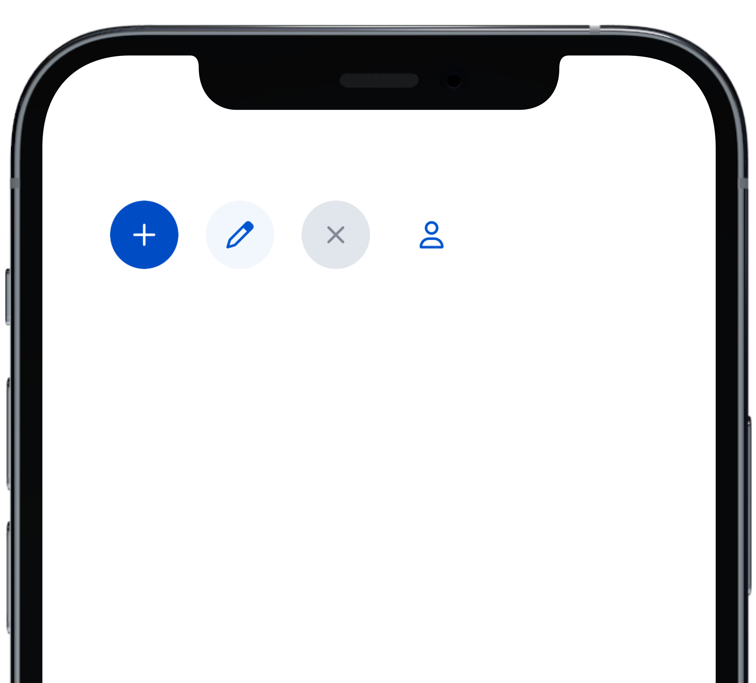
@@ -0,0 +1,28 @@
|
|
|
1
|
+
|
|
2
|
+
|
|
3
|
+
```swift
|
|
4
|
+
VStack(alignment: .leading, spacing: Spacing.small) {
|
|
5
|
+
PBButton(
|
|
6
|
+
shape: .circle,
|
|
7
|
+
icon: PBIcon.fontAwesome(.plus, size: .x1),
|
|
8
|
+
action: {}
|
|
9
|
+
)
|
|
10
|
+
PBButton(
|
|
11
|
+
variant: .secondary,
|
|
12
|
+
shape: .circle,
|
|
13
|
+
icon: PBIcon.fontAwesome(.pen, size: .x1),
|
|
14
|
+
action: {}
|
|
15
|
+
)
|
|
16
|
+
PBButton(
|
|
17
|
+
variant: .disabled,
|
|
18
|
+
shape: .circle,
|
|
19
|
+
icon: PBIcon.fontAwesome(.times, size: .x1)
|
|
20
|
+
)
|
|
21
|
+
PBButton(
|
|
22
|
+
variant: .link,
|
|
23
|
+
shape: .circle,
|
|
24
|
+
icon: PBIcon.fontAwesome(.user, size: .x1),
|
|
25
|
+
action: {}
|
|
26
|
+
)
|
|
27
|
+
}
|
|
28
|
+
```
|
|
@@ -0,0 +1,23 @@
|
|
|
1
|
+

|
|
2
|
+
|
|
3
|
+
```swift
|
|
4
|
+
VStack(alignment: .leading, spacing: Spacing.small) {
|
|
5
|
+
PBButton(
|
|
6
|
+
title: "Button Primary",
|
|
7
|
+
action: {}
|
|
8
|
+
)
|
|
9
|
+
PBButton(
|
|
10
|
+
variant: .secondary,
|
|
11
|
+
title: "Button Secondary",
|
|
12
|
+
action: {})
|
|
13
|
+
PBButton(
|
|
14
|
+
variant: .link,
|
|
15
|
+
title: "Button Link",
|
|
16
|
+
action: {}
|
|
17
|
+
)
|
|
18
|
+
PBButton(
|
|
19
|
+
variant: .disabled,
|
|
20
|
+
title: "Button Disabled"
|
|
21
|
+
)
|
|
22
|
+
}
|
|
23
|
+
```
|
|
@@ -0,0 +1,18 @@
|
|
|
1
|
+

|
|
2
|
+
|
|
3
|
+
|
|
4
|
+
```swift
|
|
5
|
+
VStack(alignment: .leading, spacing: Spacing.small) {
|
|
6
|
+
PBButton(
|
|
7
|
+
title: "Button with Icon on Left",
|
|
8
|
+
icon: PBIcon.fontAwesome(.user, size: .x1),
|
|
9
|
+
action: {}
|
|
10
|
+
)
|
|
11
|
+
PBButton(
|
|
12
|
+
title: "Button with Icon on Right",
|
|
13
|
+
icon: PBIcon.fontAwesome(.user, size: .x1),
|
|
14
|
+
iconPosition: .right,
|
|
15
|
+
action: {}
|
|
16
|
+
)
|
|
17
|
+
}
|
|
18
|
+
```
|
|
@@ -0,0 +1,11 @@
|
|
|
1
|
+
### Props
|
|
2
|
+
| Name | Type | Description | Default | Values |
|
|
3
|
+
| --- | ----------- | --------- | --------- | --------- |
|
|
4
|
+
| **Full Width** | `Bool` | Sets Button to full width | `false` | `true` `false` |
|
|
5
|
+
| **Variant** | `PBButtonVariant` | Changes the color of the Button | ` .primary` | `.primary` `.secondary` `.link` `.disabled` |
|
|
6
|
+
| **Size** | `Size` | Adjusts Button size | `.medium` | `.small` `.medium` `.large` |
|
|
7
|
+
| **Shape** | `Shape` | Changes the shape of the Button | `.primary` | `.primary` `.circle` |
|
|
8
|
+
| **Title** | `String` | Sets Button text | `nil` | |
|
|
9
|
+
| **Icon** | `PBIcon` | Adds an icon to the Button | `nil` | |
|
|
10
|
+
| **Icon Position** | `IconPosition` | Adjusts the icon's position | `.left` | `.left` `.right` |
|
|
11
|
+
| **Action** | `(() -> Void)` | Adds an action for the Button to perform | `{}` | |
|
|
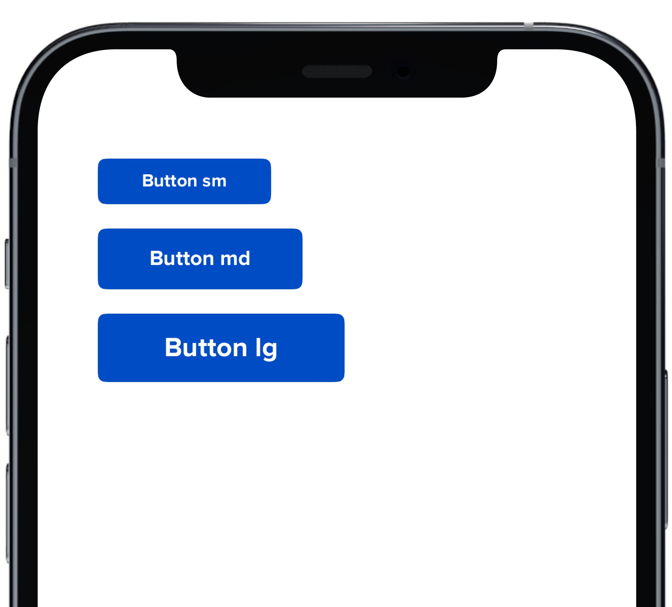
@@ -0,0 +1,20 @@
|
|
|
1
|
+
|
|
2
|
+
|
|
3
|
+
```swift
|
|
4
|
+
VStack(alignment: .leading, spacing: Spacing.small) {
|
|
5
|
+
PBButton(
|
|
6
|
+
size: .small,
|
|
7
|
+
title: "Button sm",
|
|
8
|
+
action: {}
|
|
9
|
+
)
|
|
10
|
+
PBButton(
|
|
11
|
+
title: "Button md",
|
|
12
|
+
action: {}
|
|
13
|
+
)
|
|
14
|
+
PBButton(
|
|
15
|
+
size: .large,
|
|
16
|
+
title: "Button lg",
|
|
17
|
+
action: {}
|
|
18
|
+
)
|
|
19
|
+
}
|
|
20
|
+
```
|
|
@@ -25,3 +25,11 @@ examples:
|
|
|
25
25
|
- button_size: Button Size
|
|
26
26
|
- button_form: Button Form Attribute
|
|
27
27
|
- button_hover: Button Hover
|
|
28
|
+
|
|
29
|
+
swift:
|
|
30
|
+
- button_default_swift: Button Variants
|
|
31
|
+
- button_full_width_swift: Button Full Width
|
|
32
|
+
- button_icon_options_swift: Button Icon Options
|
|
33
|
+
- button_circle_swift: Circle Button
|
|
34
|
+
- button_size_swift: Button Size
|
|
35
|
+
- button_props_swift: ""
|
|
@@ -0,0 +1,29 @@
|
|
|
1
|
+
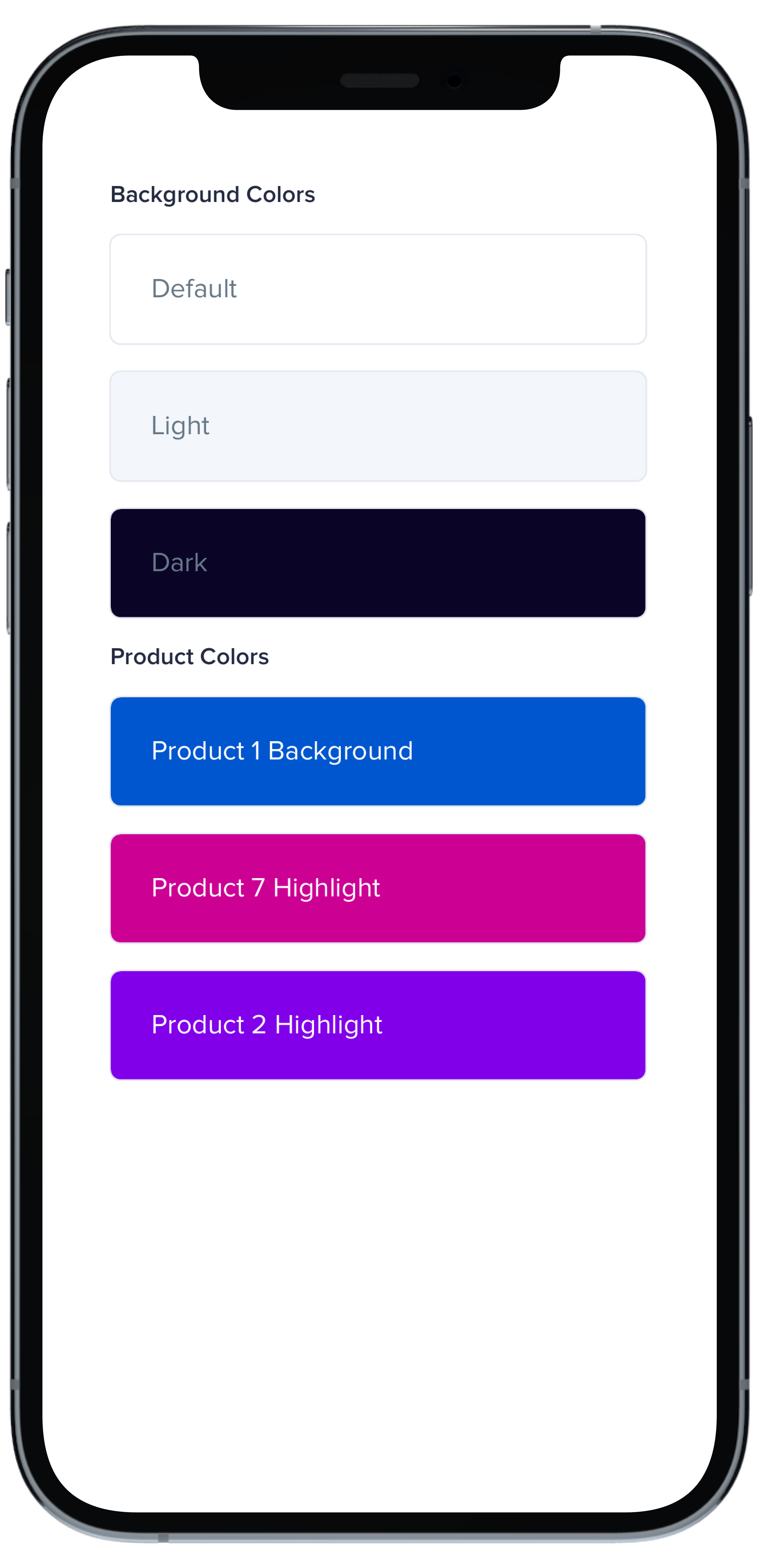
|
|
2
|
+
|
|
3
|
+
```swift
|
|
4
|
+
VStack(alignment: .leading, spacing: Spacing.small) {
|
|
5
|
+
PBCard {
|
|
6
|
+
Text(text).pbFont(.body)
|
|
7
|
+
}
|
|
8
|
+
|
|
9
|
+
PBCard(backgroundColor: .background(.light)) {
|
|
10
|
+
Text("Light").pbFont(.body, color: .text(.light))
|
|
11
|
+
}
|
|
12
|
+
|
|
13
|
+
PBCard(backgroundColor: .background(.dark)) {
|
|
14
|
+
Text("Dark").pbFont(.body, color: .text(.light))
|
|
15
|
+
}
|
|
16
|
+
|
|
17
|
+
PBCard(backgroundColor: .product(.product1, category: .background)) {
|
|
18
|
+
Text("Product 1 Background").pbFont(.body, color: .white)
|
|
19
|
+
}
|
|
20
|
+
|
|
21
|
+
PBCard(backgroundColor: .product(.product7, category: .highlight)) {
|
|
22
|
+
Text("Product 7 Highlight").pbFont(.body, color: .white)
|
|
23
|
+
}
|
|
24
|
+
|
|
25
|
+
PBCard(backgroundColor: .product(.product2, category: .highlight)) {
|
|
26
|
+
Text("Product 2 Highlight").pbFont(.body, color: .white)
|
|
27
|
+
}
|
|
28
|
+
}
|
|
29
|
+
```
|
|
@@ -0,0 +1,33 @@
|
|
|
1
|
+
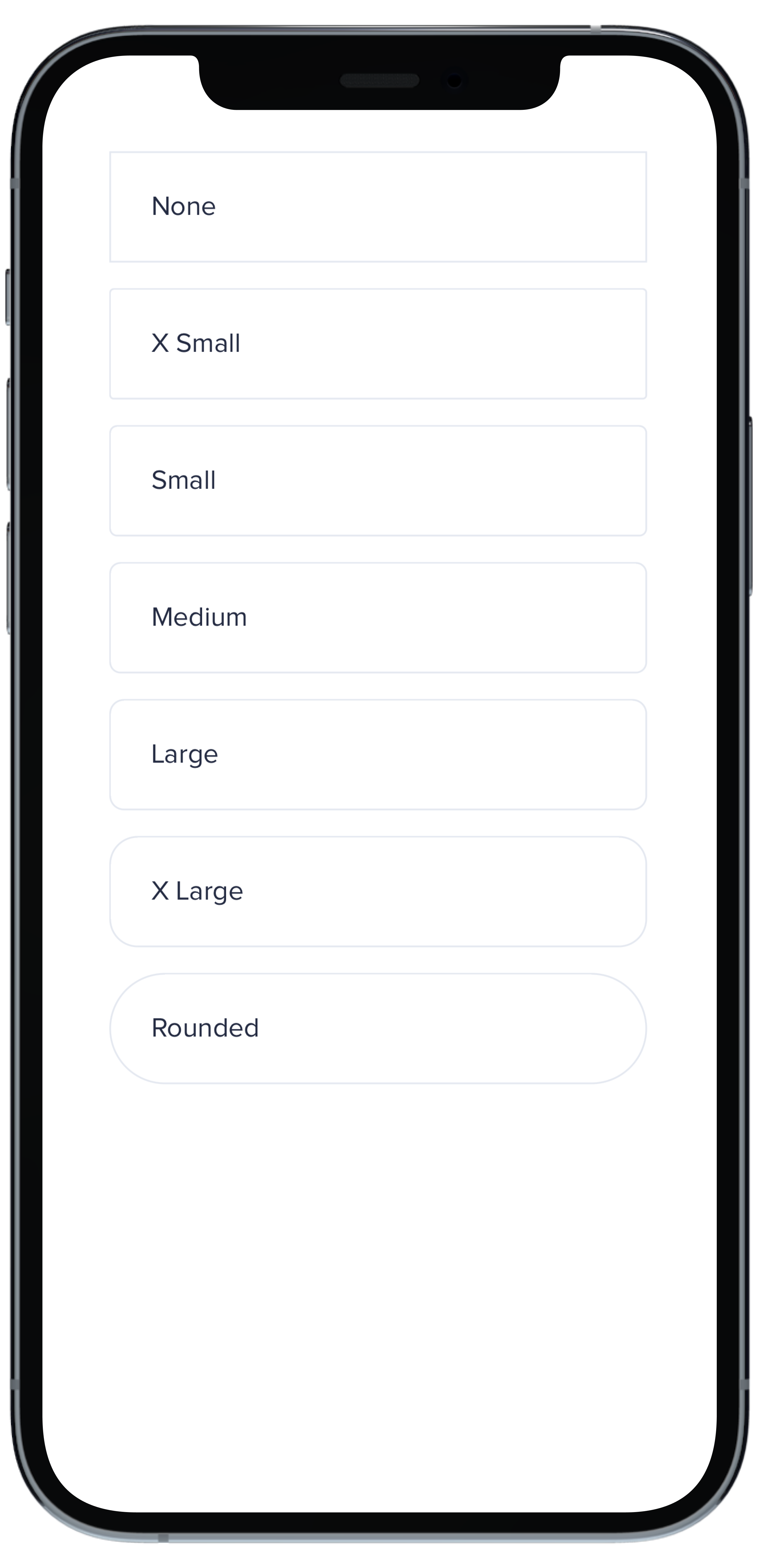
|
|
2
|
+
|
|
3
|
+
```swift
|
|
4
|
+
VStack(spacing: Spacing.small) {
|
|
5
|
+
PBCard(borderRadius: BorderRadius.none) {
|
|
6
|
+
Text("None").pbFont(.body)
|
|
7
|
+
}
|
|
8
|
+
|
|
9
|
+
PBCard(borderRadius: BorderRadius.xSmall) {
|
|
10
|
+
Text("X Small").pbFont(.body)
|
|
11
|
+
}
|
|
12
|
+
|
|
13
|
+
PBCard(borderRadius: BorderRadius.small) {
|
|
14
|
+
Text("Small").pbFont(.body)
|
|
15
|
+
}
|
|
16
|
+
|
|
17
|
+
PBCard(borderRadius: BorderRadius.medium) {
|
|
18
|
+
Text("Medium").pbFont(.body)
|
|
19
|
+
}
|
|
20
|
+
|
|
21
|
+
PBCard(borderRadius: BorderRadius.large) {
|
|
22
|
+
Text("Large").pbFont(.body)
|
|
23
|
+
}
|
|
24
|
+
|
|
25
|
+
PBCard(borderRadius: BorderRadius.xLarge) {
|
|
26
|
+
Text("X Large").pbFont(.body)
|
|
27
|
+
}
|
|
28
|
+
|
|
29
|
+
PBCard(borderRadius: BorderRadius.rounded) {
|
|
30
|
+
Text("Rounded").pbFont(.body)
|
|
31
|
+
}
|
|
32
|
+
}
|
|
33
|
+
``````
|
|
@@ -0,0 +1,33 @@
|
|
|
1
|
+
|
|
2
|
+
|
|
3
|
+
```swift
|
|
4
|
+
Stack(spacing: Spacing.small) {
|
|
5
|
+
PBCard(padding: Spacing.none) {
|
|
6
|
+
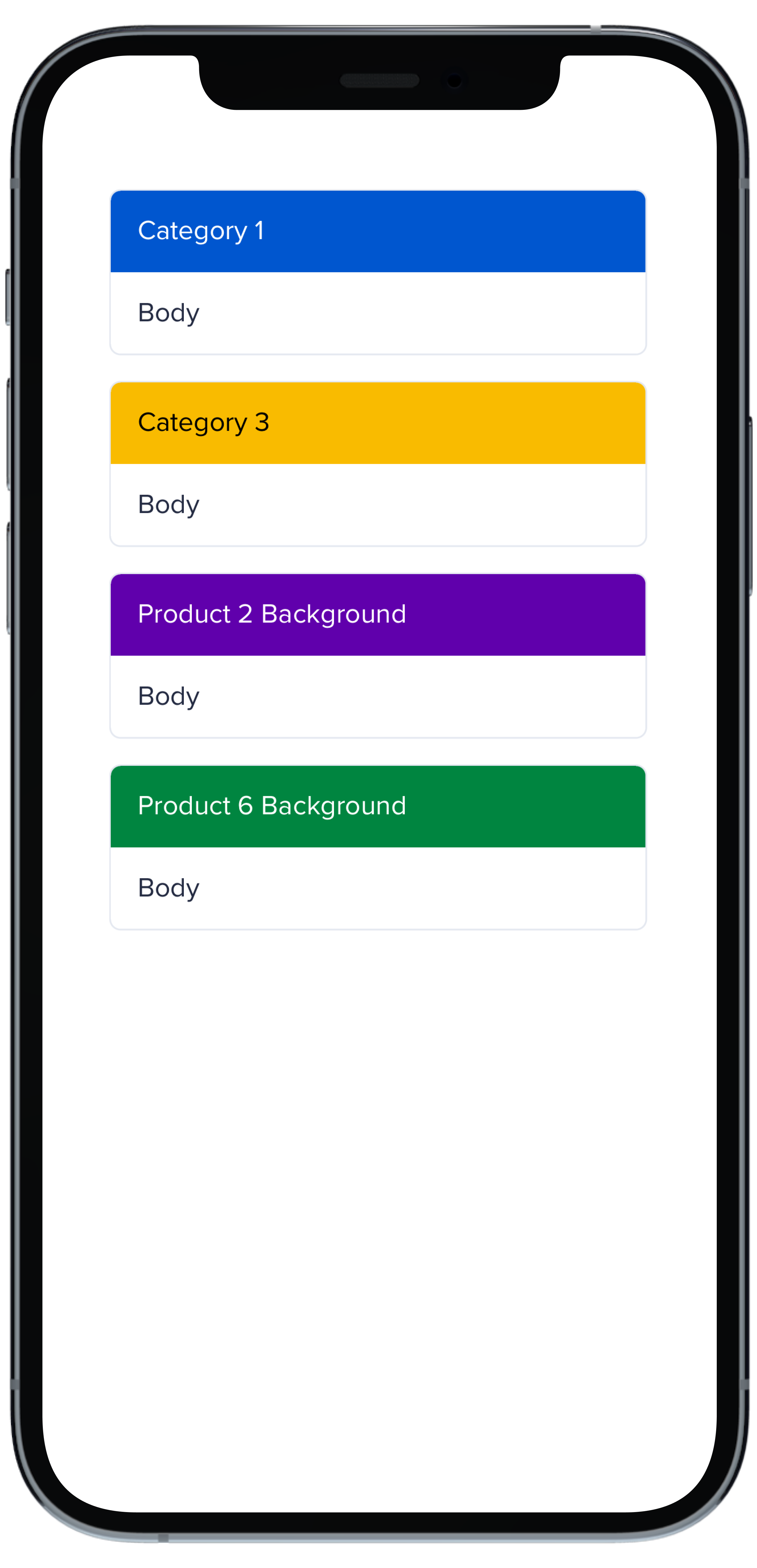
PBCardHeader(color: .category(.category1)) {
|
|
7
|
+
Text("Category 1").pbFont(.body, color: .white).padding(Spacing.small)
|
|
8
|
+
}
|
|
9
|
+
Text("Body").pbFont(.body, color: .text(.default)).padding(Spacing.small)
|
|
10
|
+
}
|
|
11
|
+
|
|
12
|
+
PBCard(padding: Spacing.none) {
|
|
13
|
+
PBCardHeader(color: .category(.category3)) {
|
|
14
|
+
Text("Category 3").pbFont(.body, color: .black).padding(Spacing.small)
|
|
15
|
+
}
|
|
16
|
+
Text("Body").pbFont(.body, color: .text(.default)).padding(Spacing.small)
|
|
17
|
+
}
|
|
18
|
+
|
|
19
|
+
PBCard(padding: Spacing.none) {
|
|
20
|
+
PBCardHeader(color: .product(.product2, category: .background)) {
|
|
21
|
+
Text("Product 2 Background").pbFont(.body, color: .white).padding(Spacing.small)
|
|
22
|
+
}
|
|
23
|
+
Text("Body").pbFont(.body, color: .text(.default)).padding(Spacing.small)
|
|
24
|
+
}
|
|
25
|
+
|
|
26
|
+
PBCard(padding: Spacing.none) {
|
|
27
|
+
PBCardHeader(color: .product(.product6, category: .background)) {
|
|
28
|
+
Text("Product 6 Background").pbFont(.body, color: .white).padding(Spacing.small)
|
|
29
|
+
}
|
|
30
|
+
Text("Body").pbFont(.body, color: .text(.default)).padding(Spacing.small)
|
|
31
|
+
}
|
|
32
|
+
}
|
|
33
|
+
```
|
|
@@ -0,0 +1,17 @@
|
|
|
1
|
+
|
|
2
|
+
|
|
3
|
+
```swift
|
|
4
|
+
VStack(spacing: Spacing.small) {
|
|
5
|
+
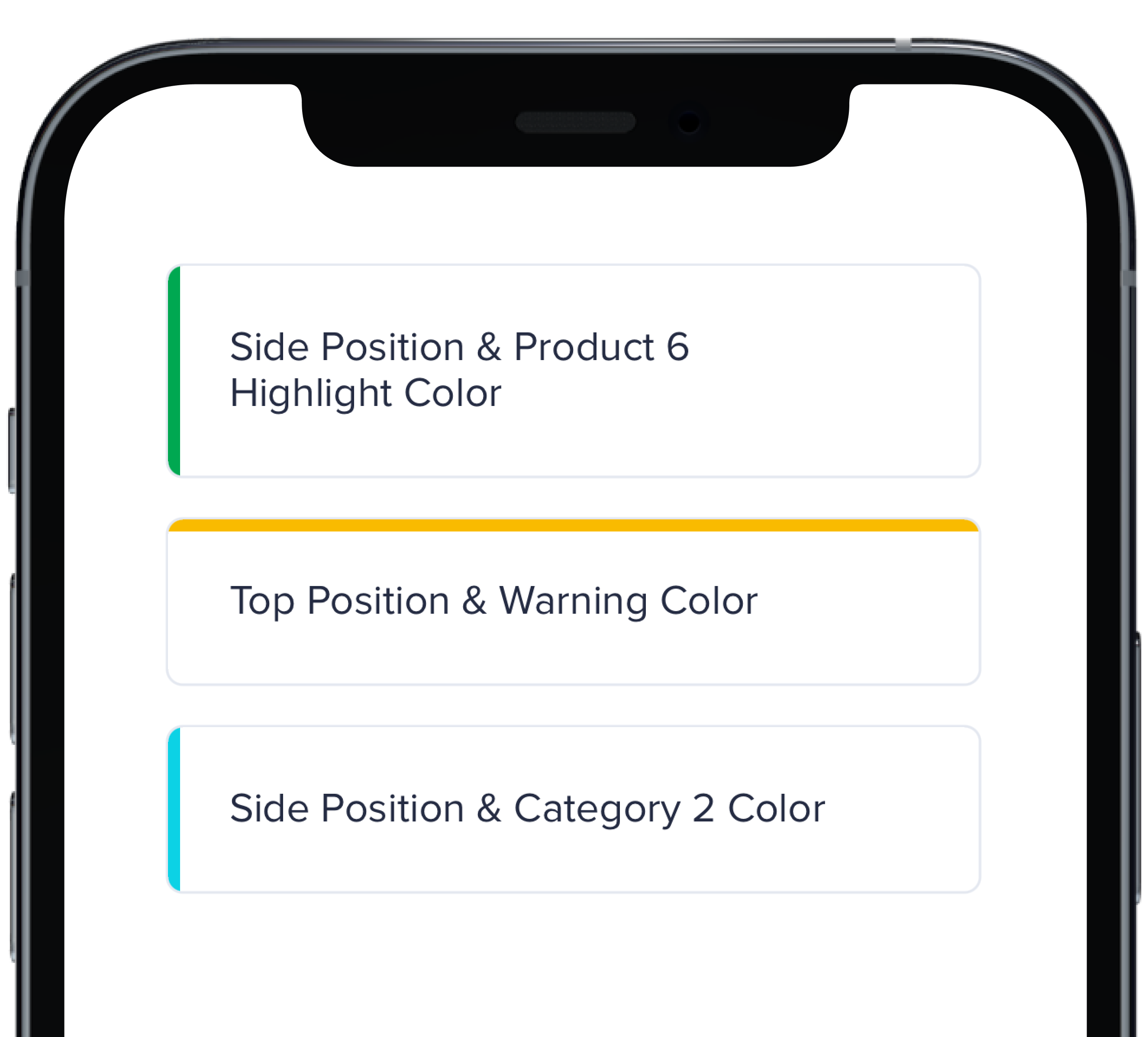
PBCard(highlight: .side(.product(.product6, category: .highlight))) {
|
|
6
|
+
Text("Side Position & Product 6 Highlight Color").pbFont(.body)
|
|
7
|
+
}
|
|
8
|
+
|
|
9
|
+
PBCard(highlight: .top(.status(.warning))) {
|
|
10
|
+
Text("Top Position & Warning Color").pbFont(.body)
|
|
11
|
+
}
|
|
12
|
+
|
|
13
|
+
PBCard(highlight: .side(.category(.category2))) {
|
|
14
|
+
Text("Side Position & Category 2 Color").pbFont(.body)
|
|
15
|
+
}
|
|
16
|
+
}
|
|
17
|
+
```
|
|
@@ -0,0 +1,33 @@
|
|
|
1
|
+
|
|
2
|
+
|
|
3
|
+
```swift
|
|
4
|
+
VStack(spacing: Spacing.small) {
|
|
5
|
+
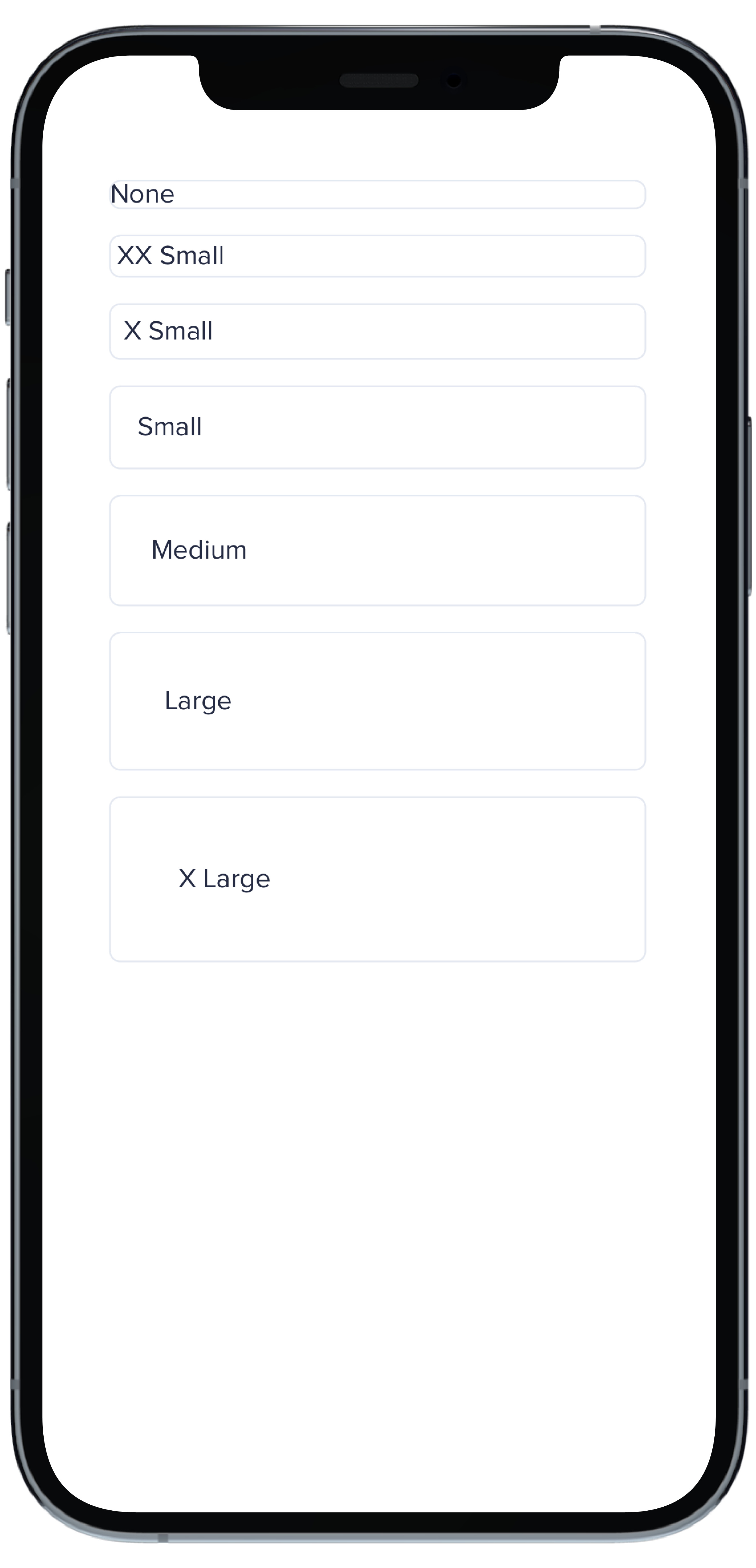
PBCard(padding: Spacing.none) {
|
|
6
|
+
Text("None").pbFont(.body)
|
|
7
|
+
}
|
|
8
|
+
|
|
9
|
+
PBCard(padding: Spacing.xxSmall) {
|
|
10
|
+
Text("XX Small").pbFont(.body)
|
|
11
|
+
}
|
|
12
|
+
|
|
13
|
+
PBCard(padding: Spacing.xSmall) {
|
|
14
|
+
Text("X Small").pbFont(.body)
|
|
15
|
+
}
|
|
16
|
+
|
|
17
|
+
PBCard(padding: Spacing.small) {
|
|
18
|
+
Text("Small").pbFont(.body)
|
|
19
|
+
}
|
|
20
|
+
|
|
21
|
+
PBCard(padding: Spacing.medium) {
|
|
22
|
+
Text("Medium").pbFont(.body)
|
|
23
|
+
}
|
|
24
|
+
|
|
25
|
+
PBCard(padding: Spacing.large) {
|
|
26
|
+
Text("Large").pbFont(.body)
|
|
27
|
+
}
|
|
28
|
+
|
|
29
|
+
PBCard(padding: Spacing.xLarge) {
|
|
30
|
+
Text("X Large").pbFont(.body)
|
|
31
|
+
}
|
|
32
|
+
}
|
|
33
|
+
```
|
|
@@ -0,0 +1,10 @@
|
|
|
1
|
+
### Props
|
|
2
|
+
| Name | Type | Description | Default | Values |
|
|
3
|
+
| --- | ----------- | --------- | --------- | --------- |
|
|
4
|
+
| **Background Color** | `Color` | Changes background color | `.card` | `Color` |
|
|
5
|
+
| **Border** | `Bool` | Adds border around the Card | `true` | `true` `false` |
|
|
6
|
+
| **Border Radius** | `CGFloat` | Specifies the roundness of the Card | `BorderRadius.medium` | `BorderRadius.none` `BorderRadius.xSmall` `BorderRadius.small` `BorderRadius.medium` `BorderRadius.large` `BorderRadius.xLarge` `BorderRadius.rounded` |
|
|
7
|
+
| **Highlight** | `Highlight` | Adds a border accent color | `.none` | `Color` |
|
|
8
|
+
| **Padding** | `CGFloat` | Applies padding between text and border | `Spacing.medium` | `Spacing.none` `Spacing.xxSmall` `Spacing.xSmall` `Spacing.small` `Spacing.medium` `Spacing.large` `Spacing.xLarge` |
|
|
9
|
+
| **Style** | `PBCardStyle` | Specifies the color of the border | `.default` | `.default` `.selected` `.error` `.inline` |
|
|
10
|
+
| **Shadow** | `Shadow` | Applies shadow | `nil` | `Shadow.deep` `Shadow.deeper` `Shadow.deepest` `Shadow.none` |
|
|
File without changes
|
|
@@ -0,0 +1,11 @@
|
|
|
1
|
+
|
|
2
|
+
|
|
3
|
+
```swift
|
|
4
|
+
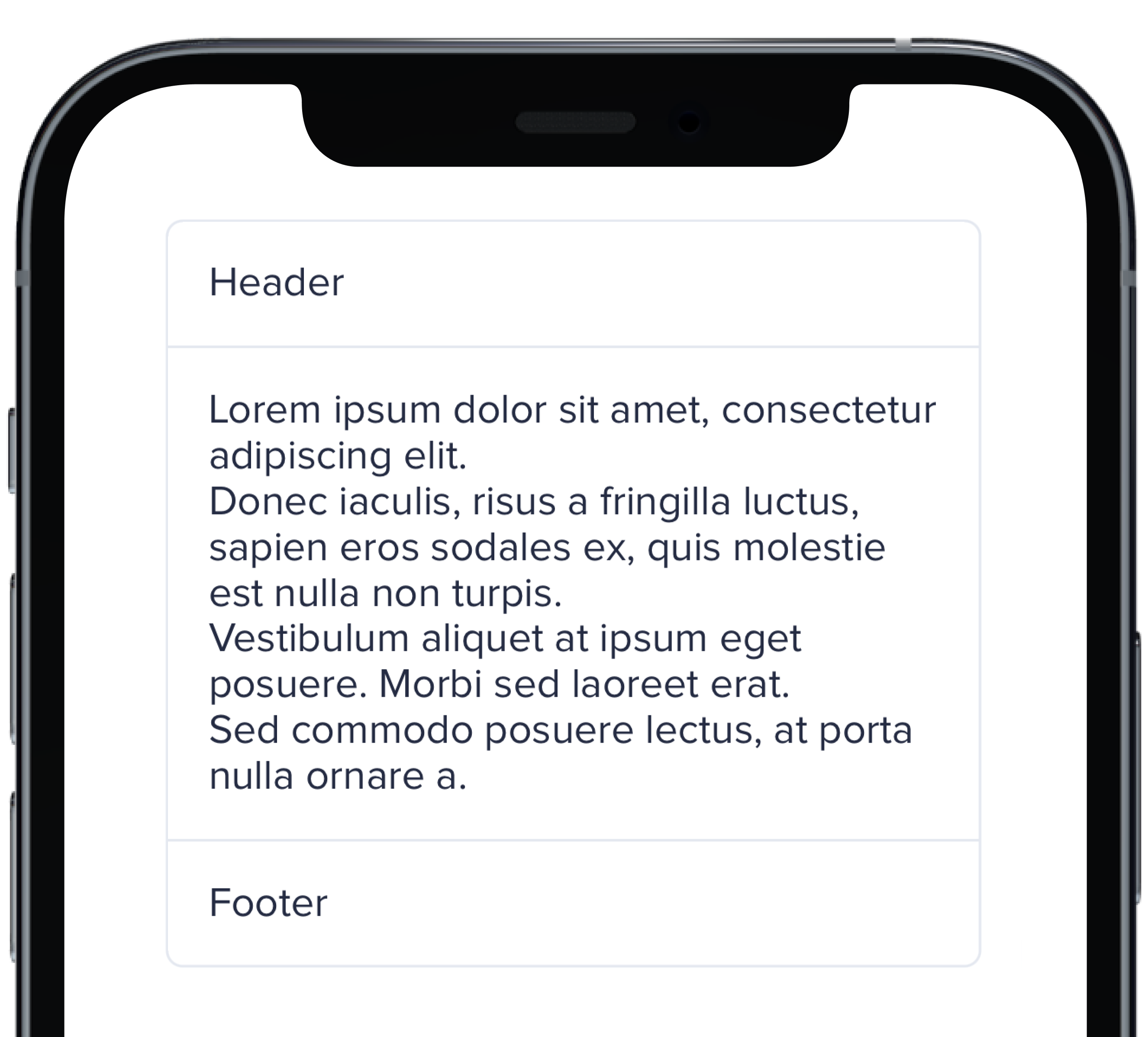
PBCard(padding: Spacing.none) {
|
|
5
|
+
Text("Header").pbFont(.body).padding(Spacing.small)
|
|
6
|
+
PBSectionSeparator()
|
|
7
|
+
Text(loremIpsum).pbFont(.body).padding(Spacing.small)
|
|
8
|
+
PBSectionSeparator()
|
|
9
|
+
Text("Footer").pbFont(.body).padding(Spacing.small)
|
|
10
|
+
}
|
|
11
|
+
```
|
|
@@ -0,0 +1,21 @@
|
|
|
1
|
+

|
|
2
|
+
|
|
3
|
+
```swift
|
|
4
|
+
VStack(spacing: Spacing.small) {
|
|
5
|
+
PBCard(shadow: Shadow.deep) {
|
|
6
|
+
Text("Deep").pbFont(.body)
|
|
7
|
+
}
|
|
8
|
+
|
|
9
|
+
PBCard(shadow: Shadow.deeper) {
|
|
10
|
+
Text("Deeper").pbFont(.body)
|
|
11
|
+
}
|
|
12
|
+
|
|
13
|
+
PBCard(shadow: Shadow.deepest) {
|
|
14
|
+
Text("Deepest").pbFont(.body)
|
|
15
|
+
}
|
|
16
|
+
|
|
17
|
+
PBCard(shadow: Shadow.none) {
|
|
18
|
+
Text("None").pbFont(.body)
|
|
19
|
+
}
|
|
20
|
+
}
|
|
21
|
+
```
|
|
@@ -0,0 +1,17 @@
|
|
|
1
|
+
|
|
2
|
+
|
|
3
|
+
```swift
|
|
4
|
+
VStack(alignment: .leading, spacing: Spacing.small) {
|
|
5
|
+
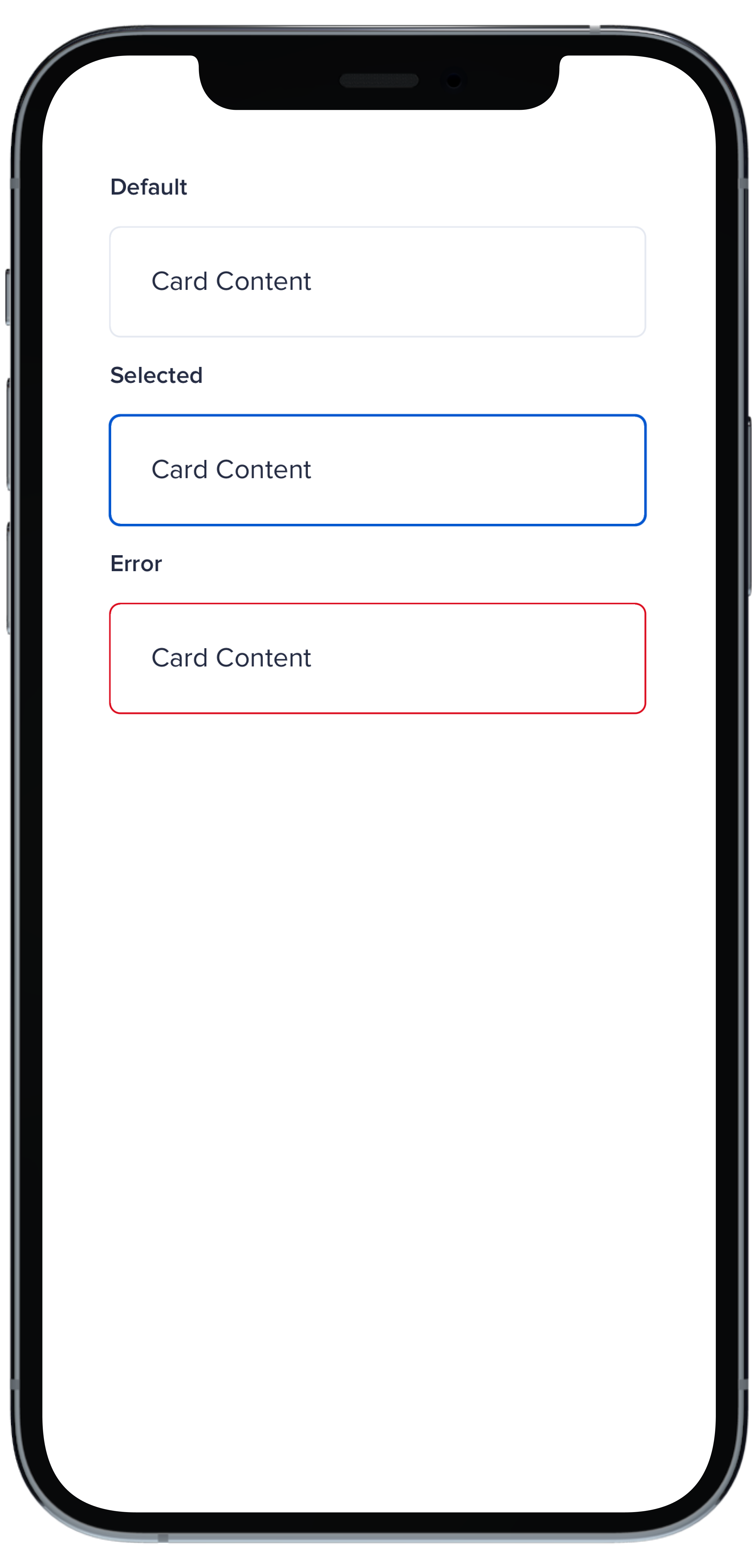
PBCard {
|
|
6
|
+
Text("Card Context").pbFont(.body)
|
|
7
|
+
}
|
|
8
|
+
|
|
9
|
+
PBCard(style: .selected()) {
|
|
10
|
+
Text("Card Context").pbFont(.body)
|
|
11
|
+
}
|
|
12
|
+
|
|
13
|
+
PBCard(style: .error) {
|
|
14
|
+
Text("Card Context").pbFont(.body)
|
|
15
|
+
}
|
|
16
|
+
}
|
|
17
|
+
```
|
|
File without changes
|
|
@@ -25,3 +25,15 @@ examples:
|
|
|
25
25
|
- card_separator: Separator Card
|
|
26
26
|
- card_border_none: No Border
|
|
27
27
|
- card_border_radius: Border Radius
|
|
28
|
+
swift:
|
|
29
|
+
- card_light_swift: Default
|
|
30
|
+
- card_background_swift: Card Backgrounds
|
|
31
|
+
- card_highlight_swift: Highlight Cards
|
|
32
|
+
- card_header_swift: Header Cards
|
|
33
|
+
- card_padding_swift: Padding Size
|
|
34
|
+
- card_shadow_swift: Shadow Size
|
|
35
|
+
- card_separator_swift: Separator Card
|
|
36
|
+
- card_border_none_swift: No Border
|
|
37
|
+
- card_border_radius_swift: Border Radius
|
|
38
|
+
- card_styles_swift: Styles
|
|
39
|
+
- card_props_swift: ""
|
|
@@ -1,12 +1,37 @@
|
|
|
1
|
-
|
|
1
|
+
<%# Example data for demonstration purposes %>
|
|
2
|
+
<% data_rows = [
|
|
3
|
+
{ 'territory' => 'North', 'firstname' => 'John', 'lastname' => 'Doe', 'age' => 30, 'job' => 'Engineer' },
|
|
4
|
+
{ 'territory' => 'South', 'firstname' => 'Alice', 'lastname' => 'Smith', 'age' => 28, 'job' => 'Designer' },
|
|
5
|
+
{ 'territory' => 'East', 'firstname' => 'Mike', 'lastname' => 'Johnson', 'age' => 35, 'job' => 'Manager' },
|
|
6
|
+
{ 'territory' => 'West', 'firstname' => 'Sarah', 'lastname' => 'Brown', 'age' => 29, 'job' => 'Developer' },
|
|
7
|
+
{ 'territory' => 'Central', 'firstname' => 'David', 'lastname' => 'Wilson', 'age' => 32, 'job' => 'Analyst' }
|
|
8
|
+
]
|
|
9
|
+
%>
|
|
10
|
+
|
|
11
|
+
<%# Example sort method for demonstration purposes %>
|
|
12
|
+
<% if params["sort"] %>
|
|
13
|
+
<% sort_param = params["sort"].gsub(/_(asc|desc)\z/, "") %>
|
|
14
|
+
<% sort_direction = params["sort"].end_with?("_asc") ? 1 : -1 %>
|
|
15
|
+
<% data_rows.sort! do |a, b|
|
|
16
|
+
value_a = a[sort_param]
|
|
17
|
+
value_b = b[sort_param]
|
|
18
|
+
|
|
19
|
+
value_a = value_a.to_i if value_a.is_a?(String) && value_a.match?(/^\d+$/)
|
|
20
|
+
value_b = value_b.to_i if value_b.is_a?(String) && value_b.match?(/^\d+$/)
|
|
21
|
+
|
|
22
|
+
sort_direction * (value_a <=> value_b)
|
|
23
|
+
end %>
|
|
24
|
+
<% end %>
|
|
25
|
+
|
|
26
|
+
<%= pb_rails("table", props: { data_table: true, vertical_border: true, id: "table-header" } ) do %>
|
|
2
27
|
<thead>
|
|
3
28
|
<tr>
|
|
4
29
|
<%= pb_rails("table/table_header", props: {
|
|
5
30
|
text: "Territory",
|
|
6
31
|
id: "territory",
|
|
7
32
|
sort_menu: [
|
|
8
|
-
{ item: "Territory", link: "?sort=
|
|
9
|
-
{ item: "Territory", link: "?sort=
|
|
33
|
+
{ item: "Territory", link: "?sort=territory_asc#table-header", active: params["sort"] == "territory_asc", direction: "asc" },
|
|
34
|
+
{ item: "Territory", link: "?sort=territory_desc#table-header", active: params["sort"] == "territory_desc", direction: "desc" }
|
|
10
35
|
],
|
|
11
36
|
}) %>
|
|
12
37
|
<%= pb_rails("table/table_header", props: {
|
|
@@ -14,45 +39,36 @@
|
|
|
14
39
|
text: "Full Name",
|
|
15
40
|
colspan: 2,
|
|
16
41
|
sort_menu: [
|
|
17
|
-
{ item: "First Name
|
|
18
|
-
{ item: "First Name
|
|
19
|
-
{ item: "Last Name
|
|
20
|
-
{ item: "Last Name
|
|
42
|
+
{ item: "First Name", link: "?sort=firstname_desc#table-header", active: params["sort"] == "firstname_desc", direction: "desc" },
|
|
43
|
+
{ item: "First Name", link: "?sort=firstname_asc#table-header", active: params["sort"] == "firstname_asc", direction: "asc" },
|
|
44
|
+
{ item: "Last Name", link: "?sort=lastname_desc#table-header", active: params["sort"] == "lastname_desc", direction: "desc" },
|
|
45
|
+
{ item: "Last Name", link: "?sort=lastname_asc#table-header", active: params["sort"] == "lastname_asc", direction: "asc" }
|
|
21
46
|
],
|
|
22
47
|
}) %>
|
|
23
48
|
<%= pb_rails("table/table_header", props: {
|
|
24
49
|
text: "Age",
|
|
25
50
|
id: "age",
|
|
26
|
-
sort_dropdown: true,
|
|
27
51
|
sort_menu: [
|
|
28
|
-
{ item: "Age Descending", link: "?sort=age_desc", active: params["sort"] == "age_desc", direction: "desc" },
|
|
29
|
-
{ item: "Age Ascending", link: "?sort=age_asc", active: params["sort"] == "age_asc", direction: "asc" }
|
|
52
|
+
{ item: "Age Descending", link: "?sort=age_desc#table-header", active: params["sort"] == "age_desc", direction: "desc" },
|
|
53
|
+
{ item: "Age Ascending", link: "?sort=age_asc#table-header", active: params["sort"] == "age_asc", direction: "asc" }
|
|
30
54
|
],
|
|
31
55
|
}) %>
|
|
32
56
|
<%= pb_rails("table/table_header", props: { text: "Job Title" }) %>
|
|
33
57
|
</tr>
|
|
34
58
|
</thead>
|
|
35
59
|
<tbody>
|
|
36
|
-
|
|
37
|
-
<
|
|
38
|
-
|
|
39
|
-
|
|
40
|
-
|
|
41
|
-
|
|
42
|
-
|
|
43
|
-
|
|
44
|
-
|
|
45
|
-
|
|
46
|
-
|
|
47
|
-
|
|
48
|
-
|
|
49
|
-
</tr>
|
|
50
|
-
<tr>
|
|
51
|
-
<td>Ter 3</td>
|
|
52
|
-
<td>First Name 3</td>
|
|
53
|
-
<td>Last Name 3</td>
|
|
54
|
-
<td>Age 3</td>
|
|
55
|
-
<td>Job 3</td>
|
|
56
|
-
</tr>
|
|
60
|
+
<% data_rows.each do |row| %>
|
|
61
|
+
<tr>
|
|
62
|
+
<% row.each do |key, value| %>
|
|
63
|
+
<%= pb_rails("background", props: {
|
|
64
|
+
background_color: (params["sort"] && params["sort"].start_with?(key) ? "info_subtle" : "card_light"),
|
|
65
|
+
text_align: (value.is_a?(Integer) ? "right" : ""),
|
|
66
|
+
tag: "td"
|
|
67
|
+
}) do %>
|
|
68
|
+
<%= value %>
|
|
69
|
+
<% end %>
|
|
70
|
+
<% end %>
|
|
71
|
+
</tr>
|
|
72
|
+
<% end %>
|
|
57
73
|
</tbody>
|
|
58
74
|
<% end %>
|
|
@@ -6,3 +6,8 @@ presence of `sort_menu` enables the sort link within the header
|
|
|
6
6
|
* `sort_dropdown` (boolean) optionally declares that (true) clicking a header's sort link opens a dropdown of sort options, or (false) each sort link click cycles through available sort_menu items in the order they are passed
|
|
7
7
|
* passing a valid `colspan` will render sort options within a dropdown by default, without requiring `sort_dropdown` explicitly. Alternatively, the default sort dropdown can be prevented on headers with `colspan` by setting `sort_dropdown: false`, which reverts the column to sorting to multi-click default (each click of the sort link cycles through the available sort_menu items in the order they are passed)
|
|
8
8
|
* `id` (string) is required for headers that have a dropdown (for popover reference); otherwise they are optional
|
|
9
|
+
|
|
10
|
+
</br>
|
|
11
|
+
<div class="pb_pill_kit_warning"><div class="pb_title_kit_size_4 pb_pill_text">Disclaimer</div></div>
|
|
12
|
+
|
|
13
|
+
This example uses a custom sort method that may need to be modified or replaced within your project.
|
|
@@ -15,7 +15,7 @@
|
|
|
15
15
|
</div>
|
|
16
16
|
<% end %>
|
|
17
17
|
<% if show_code %>
|
|
18
|
-
<div class="markdown pb--kit-example-markdown markdown <%=
|
|
18
|
+
<div class="markdown pb--kit-example-markdown markdown <%= dark ? "dark" : "" %>">
|
|
19
19
|
<%= render_markdown(description) %>
|
|
20
20
|
</div>
|
|
21
21
|
<div id="code-wrapper">
|
|
@@ -27,7 +27,7 @@
|
|
|
27
27
|
</li>
|
|
28
28
|
<li>
|
|
29
29
|
<%= pb_rails("button", props: { icon: "code", id:"toggle-open-opened", text: "Close Code", variant: "link", size: "sm", display: "none" }) %>
|
|
30
|
-
<%= pb_rails("button", props: { icon: "code", id:"toggle-open-closed", text: "Show Code", variant: "link", size: "sm"
|
|
30
|
+
<%= pb_rails("button", props: { icon: "code", id:"toggle-open-closed", text: "Show Code", variant: "link", size: "sm" }) %>
|
|
31
31
|
</li>
|
|
32
32
|
</ul>
|
|
33
33
|
</div>
|
|
@@ -78,9 +78,3 @@
|
|
|
78
78
|
})
|
|
79
79
|
}
|
|
80
80
|
</script>
|
|
81
|
-
|
|
82
|
-
<style>
|
|
83
|
-
.swift-hide-code-button {
|
|
84
|
-
display: none;
|
|
85
|
-
}
|
|
86
|
-
</style>
|
data/dist/menu.yml
CHANGED
|
@@ -1,282 +1,111 @@
|
|
|
1
|
-
web: &web ["rails", "react"]
|
|
2
|
-
all: &all ["rails", "react", "swift"]
|
|
3
|
-
rails_only: &rails_only ["rails"]
|
|
4
|
-
react_only: &react_only ["react"]
|
|
5
|
-
|
|
6
1
|
kits:
|
|
7
|
-
-
|
|
8
|
-
|
|
9
|
-
|
|
10
|
-
|
|
11
|
-
|
|
12
|
-
|
|
13
|
-
|
|
14
|
-
|
|
15
|
-
|
|
16
|
-
|
|
17
|
-
|
|
18
|
-
|
|
19
|
-
-
|
|
20
|
-
|
|
21
|
-
|
|
22
|
-
|
|
23
|
-
|
|
24
|
-
|
|
25
|
-
|
|
26
|
-
|
|
27
|
-
|
|
28
|
-
|
|
29
|
-
|
|
30
|
-
|
|
31
|
-
|
|
32
|
-
|
|
33
|
-
|
|
34
|
-
|
|
35
|
-
|
|
36
|
-
|
|
37
|
-
|
|
38
|
-
|
|
39
|
-
|
|
40
|
-
|
|
41
|
-
|
|
42
|
-
|
|
43
|
-
|
|
44
|
-
|
|
45
|
-
|
|
46
|
-
|
|
47
|
-
|
|
48
|
-
|
|
49
|
-
|
|
50
|
-
|
|
51
|
-
|
|
52
|
-
|
|
53
|
-
|
|
54
|
-
|
|
55
|
-
|
|
56
|
-
|
|
57
|
-
|
|
58
|
-
|
|
59
|
-
-
|
|
60
|
-
|
|
61
|
-
|
|
62
|
-
|
|
63
|
-
-
|
|
64
|
-
|
|
65
|
-
|
|
66
|
-
|
|
67
|
-
-
|
|
68
|
-
|
|
69
|
-
|
|
70
|
-
|
|
71
|
-
-
|
|
72
|
-
|
|
73
|
-
|
|
74
|
-
|
|
75
|
-
|
|
76
|
-
|
|
77
|
-
|
|
78
|
-
|
|
79
|
-
|
|
80
|
-
|
|
81
|
-
|
|
82
|
-
|
|
83
|
-
|
|
84
|
-
|
|
85
|
-
|
|
86
|
-
|
|
87
|
-
|
|
88
|
-
|
|
89
|
-
|
|
90
|
-
|
|
91
|
-
|
|
92
|
-
|
|
93
|
-
|
|
94
|
-
|
|
95
|
-
|
|
96
|
-
|
|
97
|
-
|
|
98
|
-
|
|
99
|
-
|
|
100
|
-
|
|
101
|
-
|
|
102
|
-
|
|
103
|
-
|
|
104
|
-
|
|
105
|
-
|
|
106
|
-
|
|
107
|
-
|
|
108
|
-
|
|
109
|
-
|
|
110
|
-
|
|
111
|
-
|
|
112
|
-
|
|
113
|
-
|
|
114
|
-
|
|
115
|
-
|
|
116
|
-
|
|
117
|
-
- name: "icon"
|
|
118
|
-
components:
|
|
119
|
-
- name: "icon"
|
|
120
|
-
platforms: *web
|
|
121
|
-
- name: "icon_circle"
|
|
122
|
-
components:
|
|
123
|
-
- name: "icon_circle"
|
|
124
|
-
platforms: *web
|
|
125
|
-
- name: "icon_stat_value"
|
|
126
|
-
components:
|
|
127
|
-
- name: "icon_stat_value"
|
|
128
|
-
platforms: *web
|
|
129
|
-
- name: "icon_value"
|
|
130
|
-
components:
|
|
131
|
-
- name: "icon_value"
|
|
132
|
-
platforms: *web
|
|
133
|
-
- name: "image"
|
|
134
|
-
components:
|
|
135
|
-
- name: "image"
|
|
136
|
-
platforms: *web
|
|
137
|
-
- name: "layouts"
|
|
138
|
-
components:
|
|
139
|
-
- name: "flex"
|
|
140
|
-
platforms: *web
|
|
141
|
-
- name: "layout"
|
|
142
|
-
platforms: *web
|
|
143
|
-
- name: "lightbox"
|
|
144
|
-
components:
|
|
145
|
-
- name: "lightbox"
|
|
146
|
-
platforms: *react_only
|
|
147
|
-
- name: "list"
|
|
148
|
-
components:
|
|
149
|
-
- name: "list"
|
|
150
|
-
platforms: *web
|
|
151
|
-
- name: "loading_inline"
|
|
152
|
-
components:
|
|
153
|
-
- name: "loading_inline"
|
|
154
|
-
platforms: *web
|
|
155
|
-
- name: "map"
|
|
156
|
-
components:
|
|
157
|
-
- name: "map"
|
|
158
|
-
platforms: *react_only
|
|
159
|
-
- name: "nav"
|
|
160
|
-
components:
|
|
161
|
-
- name: "nav"
|
|
162
|
-
platforms: *web
|
|
163
|
-
- name: "pagination"
|
|
164
|
-
components:
|
|
165
|
-
- name: "pagination"
|
|
166
|
-
platforms: *rails_only
|
|
167
|
-
- name: "popover"
|
|
168
|
-
components:
|
|
169
|
-
- name: "popover"
|
|
170
|
-
platforms: *web
|
|
171
|
-
- name: "progress"
|
|
172
|
-
components:
|
|
173
|
-
- name: "progress_pills"
|
|
174
|
-
platforms: *web
|
|
175
|
-
- name: "progress_simple"
|
|
176
|
-
platforms: *web
|
|
177
|
-
- name: "progress_step"
|
|
178
|
-
platforms: *web
|
|
179
|
-
- name: "section_separator"
|
|
180
|
-
components:
|
|
181
|
-
- name: "section_separator"
|
|
182
|
-
platforms: *web
|
|
183
|
-
- name: "star_rating"
|
|
184
|
-
components:
|
|
185
|
-
- name: "star_rating"
|
|
186
|
-
platforms: *web
|
|
187
|
-
- name: "table"
|
|
188
|
-
components:
|
|
189
|
-
- name: "table"
|
|
190
|
-
platforms: *web
|
|
191
|
-
- name: "tags"
|
|
192
|
-
components:
|
|
193
|
-
- name: "tags"
|
|
194
|
-
platforms: *web
|
|
195
|
-
- name: "badge"
|
|
196
|
-
platforms: *web
|
|
197
|
-
- name: "hashtag"
|
|
198
|
-
platforms: *web
|
|
199
|
-
- name: "pill"
|
|
200
|
-
platforms: *all
|
|
201
|
-
- name: "timeline"
|
|
202
|
-
components:
|
|
203
|
-
- name: "timeline"
|
|
204
|
-
platforms: *web
|
|
205
|
-
- name: "time_and_date"
|
|
206
|
-
components:
|
|
207
|
-
- name: "date"
|
|
208
|
-
platforms: *web
|
|
209
|
-
- name: "date_range_inline"
|
|
210
|
-
platforms: *web
|
|
211
|
-
- name: "date_range_stacked"
|
|
212
|
-
platforms: *web
|
|
213
|
-
- name: "date_stacked"
|
|
214
|
-
platforms: *web
|
|
215
|
-
- name: "date_time"
|
|
216
|
-
platforms: *web
|
|
217
|
-
- name: "date_time_stacked"
|
|
218
|
-
platforms: *web
|
|
219
|
-
- name: "date_year_stacked"
|
|
220
|
-
platforms: *web
|
|
221
|
-
- name: "time"
|
|
222
|
-
platforms: *web
|
|
223
|
-
- name: "time_range_inline"
|
|
224
|
-
platforms: *web
|
|
225
|
-
- name: "time_stacked"
|
|
226
|
-
platforms: *web
|
|
227
|
-
- name: "timestamp"
|
|
228
|
-
platforms: *all
|
|
229
|
-
- name: "weekday_stacked"
|
|
230
|
-
platforms: *web
|
|
231
|
-
- name: "tooltip"
|
|
232
|
-
components:
|
|
233
|
-
- name: "tooltip"
|
|
234
|
-
platforms: *web
|
|
235
|
-
- name: "typography"
|
|
236
|
-
components:
|
|
237
|
-
- name: "body"
|
|
238
|
-
platforms: *web
|
|
239
|
-
- name: "caption"
|
|
240
|
-
platforms: *web
|
|
241
|
-
- name: "detail"
|
|
242
|
-
platforms: *web
|
|
243
|
-
- name: "title"
|
|
244
|
-
platforms: *web
|
|
245
|
-
- name: "typography_patterns"
|
|
246
|
-
components:
|
|
247
|
-
- name: "contact"
|
|
248
|
-
platforms: *web
|
|
249
|
-
- name: "currency"
|
|
250
|
-
platforms: *web
|
|
251
|
-
- name: "dashboard_value"
|
|
252
|
-
platforms: *web
|
|
253
|
-
- name: "home_address_street"
|
|
254
|
-
platforms: *web
|
|
255
|
-
- name: "label_pill"
|
|
256
|
-
platforms: *web
|
|
257
|
-
- name: "label_value"
|
|
258
|
-
platforms: *web
|
|
259
|
-
- name: "message"
|
|
260
|
-
platforms: *web
|
|
261
|
-
- name: "person"
|
|
262
|
-
platforms: *web
|
|
263
|
-
- name: "person_contact"
|
|
264
|
-
platforms: *web
|
|
265
|
-
- name: "source"
|
|
266
|
-
platforms: *web
|
|
267
|
-
- name: "stat_change"
|
|
268
|
-
platforms: *web
|
|
269
|
-
- name: "stat_value"
|
|
270
|
-
platforms: *web
|
|
271
|
-
- name: "title_count"
|
|
272
|
-
platforms: *web
|
|
273
|
-
- name: "title_detail"
|
|
274
|
-
platforms: *web
|
|
275
|
-
- name: "user_badge"
|
|
276
|
-
components:
|
|
277
|
-
- name: "user_badge"
|
|
278
|
-
platforms: *web
|
|
279
|
-
- name: "walkthrough"
|
|
280
|
-
components:
|
|
281
|
-
- name: "walkthrough"
|
|
282
|
-
platforms: *web
|
|
2
|
+
- avatars:
|
|
3
|
+
- avatar
|
|
4
|
+
- avatar_action_button
|
|
5
|
+
- multiple_users
|
|
6
|
+
- multiple_users_stacked
|
|
7
|
+
- user
|
|
8
|
+
- background
|
|
9
|
+
- bread_crumbs
|
|
10
|
+
- buttons:
|
|
11
|
+
- button
|
|
12
|
+
- button_toolbar
|
|
13
|
+
- circle_icon_button
|
|
14
|
+
- card
|
|
15
|
+
- collapsible
|
|
16
|
+
- charts_and_graphs:
|
|
17
|
+
- bar_graph
|
|
18
|
+
- circle_chart
|
|
19
|
+
- distribution_bar
|
|
20
|
+
- gauge
|
|
21
|
+
- legend
|
|
22
|
+
- line_graph
|
|
23
|
+
- treemap_chart
|
|
24
|
+
- dialog
|
|
25
|
+
- filter
|
|
26
|
+
- fixed_confirmation_toast
|
|
27
|
+
- forms:
|
|
28
|
+
- checkbox
|
|
29
|
+
- date_picker
|
|
30
|
+
- file_upload
|
|
31
|
+
- form
|
|
32
|
+
- form_group
|
|
33
|
+
- form_pill
|
|
34
|
+
- multi_level_select
|
|
35
|
+
- passphrase
|
|
36
|
+
- phone_number_input
|
|
37
|
+
- radio
|
|
38
|
+
- rich_text_editor
|
|
39
|
+
- select
|
|
40
|
+
- selectable_card
|
|
41
|
+
- selectable_card_icon
|
|
42
|
+
- selectable_icon
|
|
43
|
+
- selectable_list
|
|
44
|
+
- text_input
|
|
45
|
+
- textarea
|
|
46
|
+
- toggle
|
|
47
|
+
- typeahead
|
|
48
|
+
- highlight
|
|
49
|
+
- icon
|
|
50
|
+
- icon_circle
|
|
51
|
+
- icon_stat_value
|
|
52
|
+
- icon_value
|
|
53
|
+
- image
|
|
54
|
+
- layouts:
|
|
55
|
+
- flex
|
|
56
|
+
- layout
|
|
57
|
+
- lightbox
|
|
58
|
+
- list
|
|
59
|
+
- loading_inline
|
|
60
|
+
- map
|
|
61
|
+
- nav
|
|
62
|
+
- tags:
|
|
63
|
+
- badge
|
|
64
|
+
- hashtag
|
|
65
|
+
- pill
|
|
66
|
+
- pagination
|
|
67
|
+
- popover
|
|
68
|
+
- progress:
|
|
69
|
+
- progress_pills
|
|
70
|
+
- progress_simple
|
|
71
|
+
- progress_step
|
|
72
|
+
- section_separator
|
|
73
|
+
- star_rating
|
|
74
|
+
- table
|
|
75
|
+
- timeline
|
|
76
|
+
- time_and_date:
|
|
77
|
+
- date
|
|
78
|
+
- date_range_inline
|
|
79
|
+
- date_range_stacked
|
|
80
|
+
- date_stacked
|
|
81
|
+
- date_time
|
|
82
|
+
- date_time_stacked
|
|
83
|
+
- date_year_stacked
|
|
84
|
+
- time
|
|
85
|
+
- time_range_inline
|
|
86
|
+
- time_stacked
|
|
87
|
+
- timestamp
|
|
88
|
+
- weekday_stacked
|
|
89
|
+
- tooltip
|
|
90
|
+
- typography:
|
|
91
|
+
- body
|
|
92
|
+
- caption
|
|
93
|
+
- detail
|
|
94
|
+
- title
|
|
95
|
+
- typography_patterns:
|
|
96
|
+
- contact
|
|
97
|
+
- currency
|
|
98
|
+
- dashboard_value
|
|
99
|
+
- home_address_street
|
|
100
|
+
- label_pill
|
|
101
|
+
- label_value
|
|
102
|
+
- message
|
|
103
|
+
- person
|
|
104
|
+
- person_contact
|
|
105
|
+
- source
|
|
106
|
+
- stat_change
|
|
107
|
+
- stat_value
|
|
108
|
+
- title_count
|
|
109
|
+
- title_detail
|
|
110
|
+
- user_badge
|
|
111
|
+
- walkthrough
|
data/dist/pb_doc_helper.rb
CHANGED
|
@@ -14,7 +14,7 @@ module PlaybookWebsite
|
|
|
14
14
|
kit: kit,
|
|
15
15
|
example_title: example.values.first,
|
|
16
16
|
example_key: example.keys.first,
|
|
17
|
-
show_code:
|
|
17
|
+
show_code: show_code,
|
|
18
18
|
type: type,
|
|
19
19
|
dark: dark_mode,
|
|
20
20
|
}
|
|
@@ -33,9 +33,9 @@ module PlaybookWebsite
|
|
|
33
33
|
kits.each do |kit|
|
|
34
34
|
if kit.is_a?(Hash)
|
|
35
35
|
nav_hash_array(kit).each do |sub_kit|
|
|
36
|
-
display_kits << render_pb_doc_kit(sub_kit, type, limit_examples, false, dark_mode)
|
|
36
|
+
display_kits << render_pb_doc_kit(sub_kit, type, limit_examples, false, dark_mode)
|
|
37
37
|
end
|
|
38
|
-
|
|
38
|
+
else
|
|
39
39
|
display_kits << render_pb_doc_kit(kit, type, limit_examples, false, dark_mode)
|
|
40
40
|
end
|
|
41
41
|
end
|
|
@@ -44,14 +44,9 @@ module PlaybookWebsite
|
|
|
44
44
|
# rubocop:enable Style/StringConcatenation
|
|
45
45
|
|
|
46
46
|
# rubocop:disable Naming/AccessorMethodName
|
|
47
|
-
|
|
48
|
-
|
|
49
|
-
|
|
50
|
-
# end
|
|
51
|
-
def get_kits(_type = "rails")
|
|
52
|
-
aggregate_kits || []
|
|
53
|
-
# Filter kits that have at least one component compatible with the type
|
|
54
|
-
# Empty array
|
|
47
|
+
def get_kits
|
|
48
|
+
menu = YAML.load_file(Playbook::Engine.root.join("dist/menu.yml"))
|
|
49
|
+
menu["kits"]
|
|
55
50
|
end
|
|
56
51
|
|
|
57
52
|
def get_kits_pb_website
|
metadata
CHANGED
|
@@ -1,7 +1,7 @@
|
|
|
1
1
|
--- !ruby/object:Gem::Specification
|
|
2
2
|
name: playbook_ui_docs
|
|
3
3
|
version: !ruby/object:Gem::Version
|
|
4
|
-
version: 13.10.0.pre.alpha.
|
|
4
|
+
version: 13.10.0.pre.alpha.play1054tableheadersortconsolidation1416
|
|
5
5
|
platform: ruby
|
|
6
6
|
authors:
|
|
7
7
|
- Power UX
|
|
@@ -9,7 +9,7 @@ authors:
|
|
|
9
9
|
autorequire:
|
|
10
10
|
bindir: bin
|
|
11
11
|
cert_chain: []
|
|
12
|
-
date: 2023-
|
|
12
|
+
date: 2023-11-06 00:00:00.000000000 Z
|
|
13
13
|
dependencies:
|
|
14
14
|
- !ruby/object:Gem::Dependency
|
|
15
15
|
name: playbook_ui
|
|
@@ -150,19 +150,23 @@ files:
|
|
|
150
150
|
- app/pb_kits/playbook/pb_button/docs/_button_block_content.html.erb
|
|
151
151
|
- app/pb_kits/playbook/pb_button/docs/_button_block_content.jsx
|
|
152
152
|
- app/pb_kits/playbook/pb_button/docs/_button_block_content.md
|
|
153
|
+
- app/pb_kits/playbook/pb_button/docs/_button_circle_swift.md
|
|
153
154
|
- app/pb_kits/playbook/pb_button/docs/_button_default.html.erb
|
|
154
155
|
- app/pb_kits/playbook/pb_button/docs/_button_default.jsx
|
|
155
156
|
- app/pb_kits/playbook/pb_button/docs/_button_default.md
|
|
157
|
+
- app/pb_kits/playbook/pb_button/docs/_button_default_swift.md
|
|
156
158
|
- app/pb_kits/playbook/pb_button/docs/_button_form.html.erb
|
|
157
159
|
- app/pb_kits/playbook/pb_button/docs/_button_form.jsx
|
|
158
160
|
- app/pb_kits/playbook/pb_button/docs/_button_full_width.html.erb
|
|
159
161
|
- app/pb_kits/playbook/pb_button/docs/_button_full_width.jsx
|
|
160
162
|
- app/pb_kits/playbook/pb_button/docs/_button_full_width.md
|
|
163
|
+
- app/pb_kits/playbook/pb_button/docs/_button_full_width_swift.md
|
|
161
164
|
- app/pb_kits/playbook/pb_button/docs/_button_hover.html.erb
|
|
162
165
|
- app/pb_kits/playbook/pb_button/docs/_button_hover.jsx
|
|
163
166
|
- app/pb_kits/playbook/pb_button/docs/_button_icon_options.html.erb
|
|
164
167
|
- app/pb_kits/playbook/pb_button/docs/_button_icon_options.jsx
|
|
165
168
|
- app/pb_kits/playbook/pb_button/docs/_button_icon_options.md
|
|
169
|
+
- app/pb_kits/playbook/pb_button/docs/_button_icon_options_swift.md
|
|
166
170
|
- app/pb_kits/playbook/pb_button/docs/_button_link.html.erb
|
|
167
171
|
- app/pb_kits/playbook/pb_button/docs/_button_link.jsx
|
|
168
172
|
- app/pb_kits/playbook/pb_button/docs/_button_link.md
|
|
@@ -171,12 +175,14 @@ files:
|
|
|
171
175
|
- app/pb_kits/playbook/pb_button/docs/_button_loading.md
|
|
172
176
|
- app/pb_kits/playbook/pb_button/docs/_button_options.html.erb
|
|
173
177
|
- app/pb_kits/playbook/pb_button/docs/_button_options.jsx
|
|
178
|
+
- app/pb_kits/playbook/pb_button/docs/_button_props_swift.md
|
|
174
179
|
- app/pb_kits/playbook/pb_button/docs/_button_reaction.html.erb
|
|
175
180
|
- app/pb_kits/playbook/pb_button/docs/_button_reaction.jsx
|
|
176
181
|
- app/pb_kits/playbook/pb_button/docs/_button_reaction.md
|
|
177
182
|
- app/pb_kits/playbook/pb_button/docs/_button_size.html.erb
|
|
178
183
|
- app/pb_kits/playbook/pb_button/docs/_button_size.jsx
|
|
179
184
|
- app/pb_kits/playbook/pb_button/docs/_button_size.md
|
|
185
|
+
- app/pb_kits/playbook/pb_button/docs/_button_size_swift.md
|
|
180
186
|
- app/pb_kits/playbook/pb_button/docs/_footer.md
|
|
181
187
|
- app/pb_kits/playbook/pb_button/docs/example.yml
|
|
182
188
|
- app/pb_kits/playbook/pb_button/docs/index.js
|
|
@@ -201,33 +207,46 @@ files:
|
|
|
201
207
|
- app/pb_kits/playbook/pb_card/docs/_card_background.html.erb
|
|
202
208
|
- app/pb_kits/playbook/pb_card/docs/_card_background.jsx
|
|
203
209
|
- app/pb_kits/playbook/pb_card/docs/_card_background.md
|
|
210
|
+
- app/pb_kits/playbook/pb_card/docs/_card_background_swift.md
|
|
204
211
|
- app/pb_kits/playbook/pb_card/docs/_card_border_none.html.erb
|
|
205
212
|
- app/pb_kits/playbook/pb_card/docs/_card_border_none.jsx
|
|
206
213
|
- app/pb_kits/playbook/pb_card/docs/_card_border_none.md
|
|
214
|
+
- app/pb_kits/playbook/pb_card/docs/_card_border_none_swift.md
|
|
207
215
|
- app/pb_kits/playbook/pb_card/docs/_card_border_radius.html.erb
|
|
208
216
|
- app/pb_kits/playbook/pb_card/docs/_card_border_radius.jsx
|
|
209
217
|
- app/pb_kits/playbook/pb_card/docs/_card_border_radius.md
|
|
218
|
+
- app/pb_kits/playbook/pb_card/docs/_card_border_radius_swift.md
|
|
210
219
|
- app/pb_kits/playbook/pb_card/docs/_card_content.html.erb
|
|
211
220
|
- app/pb_kits/playbook/pb_card/docs/_card_content.jsx
|
|
212
221
|
- app/pb_kits/playbook/pb_card/docs/_card_header.html.erb
|
|
213
222
|
- app/pb_kits/playbook/pb_card/docs/_card_header.jsx
|
|
214
223
|
- app/pb_kits/playbook/pb_card/docs/_card_header.md
|
|
224
|
+
- app/pb_kits/playbook/pb_card/docs/_card_header_swift.md
|
|
215
225
|
- app/pb_kits/playbook/pb_card/docs/_card_highlight.html.erb
|
|
216
226
|
- app/pb_kits/playbook/pb_card/docs/_card_highlight.jsx
|
|
217
227
|
- app/pb_kits/playbook/pb_card/docs/_card_highlight.md
|
|
228
|
+
- app/pb_kits/playbook/pb_card/docs/_card_highlight_swift.md
|
|
218
229
|
- app/pb_kits/playbook/pb_card/docs/_card_light.html.erb
|
|
219
230
|
- app/pb_kits/playbook/pb_card/docs/_card_light.jsx
|
|
220
231
|
- app/pb_kits/playbook/pb_card/docs/_card_light.md
|
|
232
|
+
- app/pb_kits/playbook/pb_card/docs/_card_light_swift.md
|
|
221
233
|
- app/pb_kits/playbook/pb_card/docs/_card_padding.html.erb
|
|
222
234
|
- app/pb_kits/playbook/pb_card/docs/_card_padding.jsx
|
|
235
|
+
- app/pb_kits/playbook/pb_card/docs/_card_padding_swift.md
|
|
236
|
+
- app/pb_kits/playbook/pb_card/docs/_card_props_swift.md
|
|
223
237
|
- app/pb_kits/playbook/pb_card/docs/_card_selected.html.erb
|
|
224
238
|
- app/pb_kits/playbook/pb_card/docs/_card_selected.jsx
|
|
239
|
+
- app/pb_kits/playbook/pb_card/docs/_card_selected_swift.md
|
|
225
240
|
- app/pb_kits/playbook/pb_card/docs/_card_separator.html.erb
|
|
226
241
|
- app/pb_kits/playbook/pb_card/docs/_card_separator.jsx
|
|
242
|
+
- app/pb_kits/playbook/pb_card/docs/_card_separator_swift.md
|
|
227
243
|
- app/pb_kits/playbook/pb_card/docs/_card_shadow.html.erb
|
|
228
244
|
- app/pb_kits/playbook/pb_card/docs/_card_shadow.jsx
|
|
245
|
+
- app/pb_kits/playbook/pb_card/docs/_card_shadow_swift.md
|
|
246
|
+
- app/pb_kits/playbook/pb_card/docs/_card_styles_swift.md
|
|
229
247
|
- app/pb_kits/playbook/pb_card/docs/_card_tag.html.erb
|
|
230
248
|
- app/pb_kits/playbook/pb_card/docs/_card_tag.jsx
|
|
249
|
+
- app/pb_kits/playbook/pb_card/docs/_card_tag_swift.md
|
|
231
250
|
- app/pb_kits/playbook/pb_card/docs/example.yml
|
|
232
251
|
- app/pb_kits/playbook/pb_card/docs/index.js
|
|
233
252
|
- app/pb_kits/playbook/pb_checkbox/docs/_checkbox_checked.html.erb
|