playbook_ui_docs 13.10.0.pre.alpha.play1054tableheadersortconsolidation1416 → 13.10.0.pre.alpha.play10481357
This diff represents the content of publicly available package versions that have been released to one of the supported registries. The information contained in this diff is provided for informational purposes only and reflects changes between package versions as they appear in their respective public registries.
- checksums.yaml +4 -4
- data/app/pb_kits/playbook/pb_button/docs/example.yml +0 -8
- data/app/pb_kits/playbook/pb_card/docs/example.yml +0 -12
- data/app/pb_kits/playbook/pb_rich_text_editor/docs/_rich_text_editor_toolbar_disabled.jsx +33 -0
- data/app/pb_kits/playbook/pb_rich_text_editor/docs/_rich_text_editor_toolbar_disabled.md +3 -0
- data/app/pb_kits/playbook/pb_rich_text_editor/docs/example.yml +1 -0
- data/app/pb_kits/playbook/pb_rich_text_editor/docs/index.js +2 -1
- data/app/pb_kits/playbook/pb_table/docs/_table_header.html.erb +31 -47
- data/app/pb_kits/playbook/pb_table/docs/_table_header.md +0 -5
- data/dist/playbook-doc.js +3 -3
- metadata +4 -21
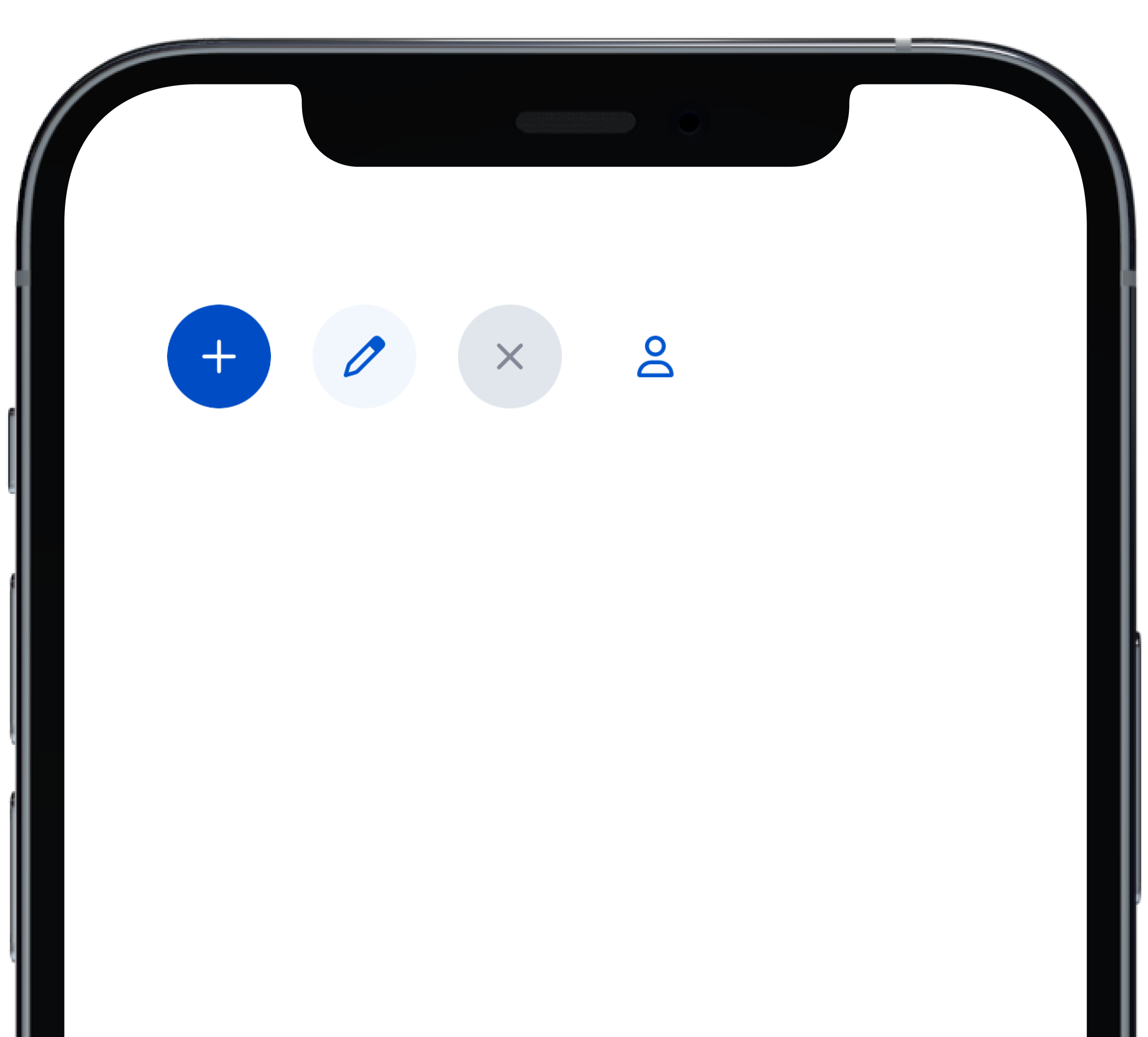
- data/app/pb_kits/playbook/pb_button/docs/_button_circle_swift.md +0 -28
- data/app/pb_kits/playbook/pb_button/docs/_button_default_swift.md +0 -23
- data/app/pb_kits/playbook/pb_button/docs/_button_full_width_swift.md +0 -9
- data/app/pb_kits/playbook/pb_button/docs/_button_icon_options_swift.md +0 -18
- data/app/pb_kits/playbook/pb_button/docs/_button_props_swift.md +0 -11
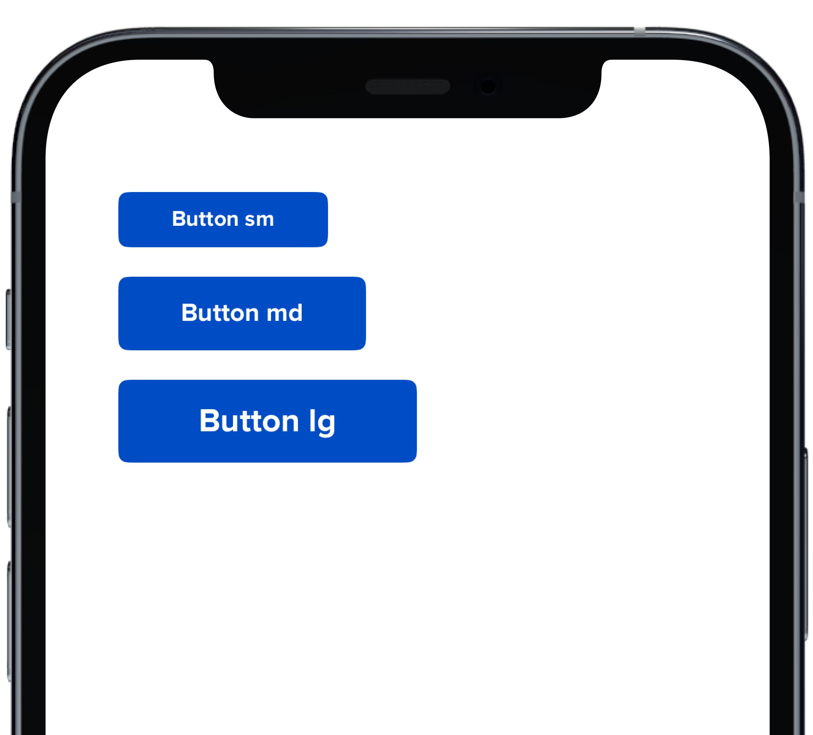
- data/app/pb_kits/playbook/pb_button/docs/_button_size_swift.md +0 -20
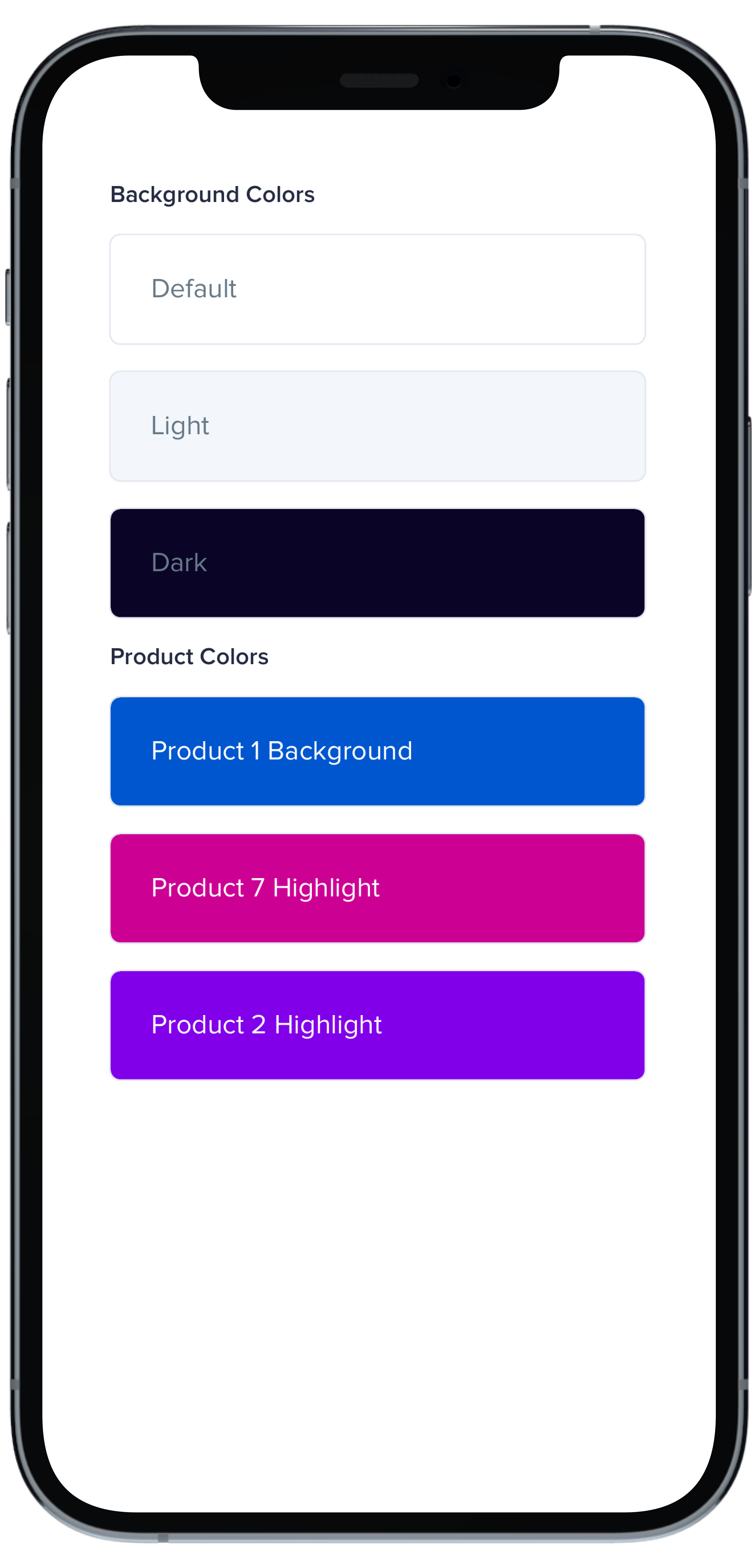
- data/app/pb_kits/playbook/pb_card/docs/_card_background_swift.md +0 -29
- data/app/pb_kits/playbook/pb_card/docs/_card_border_none_swift.md +0 -7
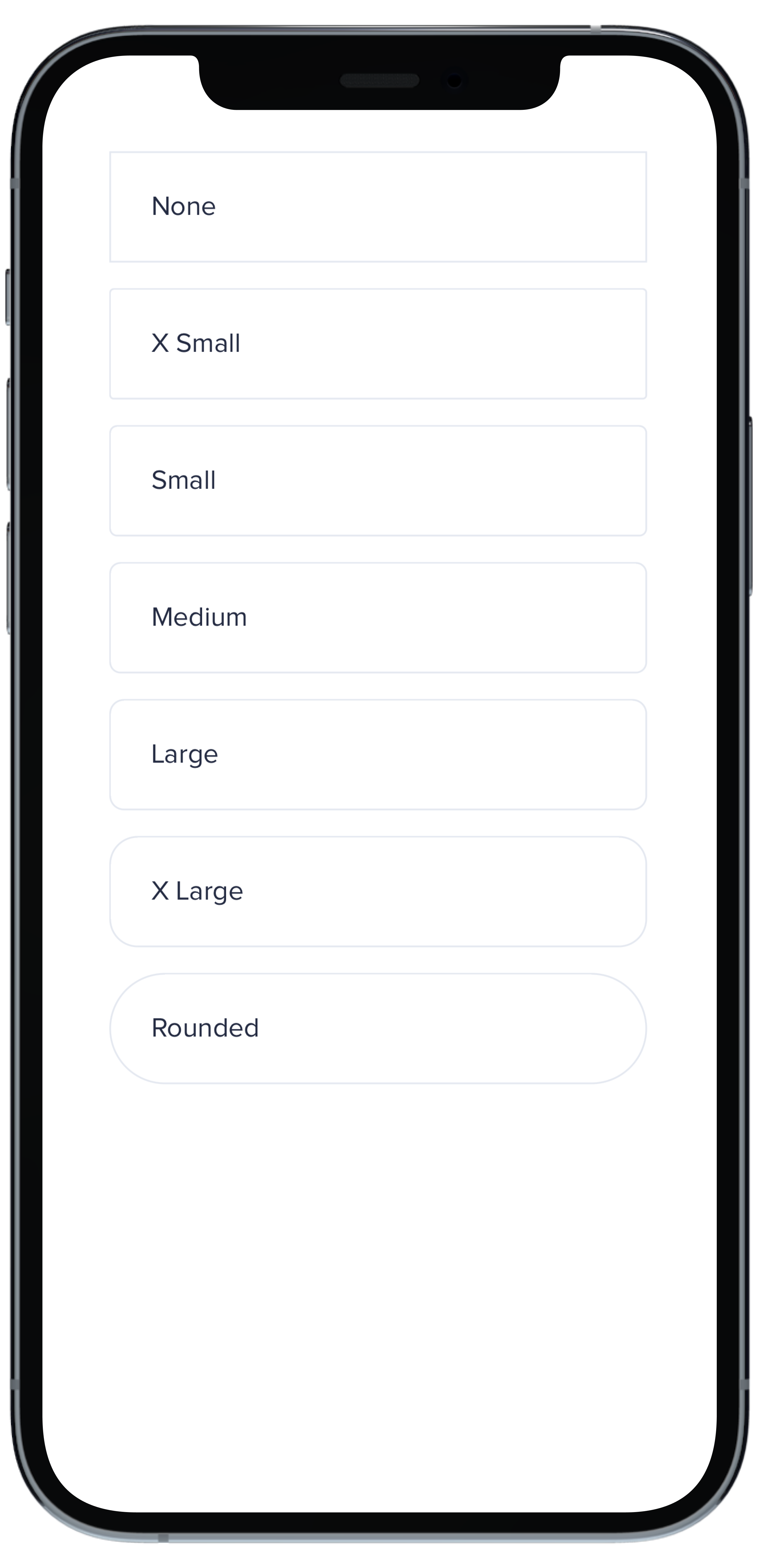
- data/app/pb_kits/playbook/pb_card/docs/_card_border_radius_swift.md +0 -33
- data/app/pb_kits/playbook/pb_card/docs/_card_header_swift.md +0 -33
- data/app/pb_kits/playbook/pb_card/docs/_card_highlight_swift.md +0 -17
- data/app/pb_kits/playbook/pb_card/docs/_card_light_swift.md +0 -7
- data/app/pb_kits/playbook/pb_card/docs/_card_padding_swift.md +0 -33
- data/app/pb_kits/playbook/pb_card/docs/_card_props_swift.md +0 -10
- data/app/pb_kits/playbook/pb_card/docs/_card_selected_swift.md +0 -0
- data/app/pb_kits/playbook/pb_card/docs/_card_separator_swift.md +0 -11
- data/app/pb_kits/playbook/pb_card/docs/_card_shadow_swift.md +0 -21
- data/app/pb_kits/playbook/pb_card/docs/_card_styles_swift.md +0 -17
- data/app/pb_kits/playbook/pb_card/docs/_card_tag_swift.md +0 -0
metadata
CHANGED
|
@@ -1,7 +1,7 @@
|
|
|
1
1
|
--- !ruby/object:Gem::Specification
|
|
2
2
|
name: playbook_ui_docs
|
|
3
3
|
version: !ruby/object:Gem::Version
|
|
4
|
-
version: 13.10.0.pre.alpha.
|
|
4
|
+
version: 13.10.0.pre.alpha.play10481357
|
|
5
5
|
platform: ruby
|
|
6
6
|
authors:
|
|
7
7
|
- Power UX
|
|
@@ -9,7 +9,7 @@ authors:
|
|
|
9
9
|
autorequire:
|
|
10
10
|
bindir: bin
|
|
11
11
|
cert_chain: []
|
|
12
|
-
date: 2023-
|
|
12
|
+
date: 2023-10-30 00:00:00.000000000 Z
|
|
13
13
|
dependencies:
|
|
14
14
|
- !ruby/object:Gem::Dependency
|
|
15
15
|
name: playbook_ui
|
|
@@ -150,23 +150,19 @@ files:
|
|
|
150
150
|
- app/pb_kits/playbook/pb_button/docs/_button_block_content.html.erb
|
|
151
151
|
- app/pb_kits/playbook/pb_button/docs/_button_block_content.jsx
|
|
152
152
|
- app/pb_kits/playbook/pb_button/docs/_button_block_content.md
|
|
153
|
-
- app/pb_kits/playbook/pb_button/docs/_button_circle_swift.md
|
|
154
153
|
- app/pb_kits/playbook/pb_button/docs/_button_default.html.erb
|
|
155
154
|
- app/pb_kits/playbook/pb_button/docs/_button_default.jsx
|
|
156
155
|
- app/pb_kits/playbook/pb_button/docs/_button_default.md
|
|
157
|
-
- app/pb_kits/playbook/pb_button/docs/_button_default_swift.md
|
|
158
156
|
- app/pb_kits/playbook/pb_button/docs/_button_form.html.erb
|
|
159
157
|
- app/pb_kits/playbook/pb_button/docs/_button_form.jsx
|
|
160
158
|
- app/pb_kits/playbook/pb_button/docs/_button_full_width.html.erb
|
|
161
159
|
- app/pb_kits/playbook/pb_button/docs/_button_full_width.jsx
|
|
162
160
|
- app/pb_kits/playbook/pb_button/docs/_button_full_width.md
|
|
163
|
-
- app/pb_kits/playbook/pb_button/docs/_button_full_width_swift.md
|
|
164
161
|
- app/pb_kits/playbook/pb_button/docs/_button_hover.html.erb
|
|
165
162
|
- app/pb_kits/playbook/pb_button/docs/_button_hover.jsx
|
|
166
163
|
- app/pb_kits/playbook/pb_button/docs/_button_icon_options.html.erb
|
|
167
164
|
- app/pb_kits/playbook/pb_button/docs/_button_icon_options.jsx
|
|
168
165
|
- app/pb_kits/playbook/pb_button/docs/_button_icon_options.md
|
|
169
|
-
- app/pb_kits/playbook/pb_button/docs/_button_icon_options_swift.md
|
|
170
166
|
- app/pb_kits/playbook/pb_button/docs/_button_link.html.erb
|
|
171
167
|
- app/pb_kits/playbook/pb_button/docs/_button_link.jsx
|
|
172
168
|
- app/pb_kits/playbook/pb_button/docs/_button_link.md
|
|
@@ -175,14 +171,12 @@ files:
|
|
|
175
171
|
- app/pb_kits/playbook/pb_button/docs/_button_loading.md
|
|
176
172
|
- app/pb_kits/playbook/pb_button/docs/_button_options.html.erb
|
|
177
173
|
- app/pb_kits/playbook/pb_button/docs/_button_options.jsx
|
|
178
|
-
- app/pb_kits/playbook/pb_button/docs/_button_props_swift.md
|
|
179
174
|
- app/pb_kits/playbook/pb_button/docs/_button_reaction.html.erb
|
|
180
175
|
- app/pb_kits/playbook/pb_button/docs/_button_reaction.jsx
|
|
181
176
|
- app/pb_kits/playbook/pb_button/docs/_button_reaction.md
|
|
182
177
|
- app/pb_kits/playbook/pb_button/docs/_button_size.html.erb
|
|
183
178
|
- app/pb_kits/playbook/pb_button/docs/_button_size.jsx
|
|
184
179
|
- app/pb_kits/playbook/pb_button/docs/_button_size.md
|
|
185
|
-
- app/pb_kits/playbook/pb_button/docs/_button_size_swift.md
|
|
186
180
|
- app/pb_kits/playbook/pb_button/docs/_footer.md
|
|
187
181
|
- app/pb_kits/playbook/pb_button/docs/example.yml
|
|
188
182
|
- app/pb_kits/playbook/pb_button/docs/index.js
|
|
@@ -207,46 +201,33 @@ files:
|
|
|
207
201
|
- app/pb_kits/playbook/pb_card/docs/_card_background.html.erb
|
|
208
202
|
- app/pb_kits/playbook/pb_card/docs/_card_background.jsx
|
|
209
203
|
- app/pb_kits/playbook/pb_card/docs/_card_background.md
|
|
210
|
-
- app/pb_kits/playbook/pb_card/docs/_card_background_swift.md
|
|
211
204
|
- app/pb_kits/playbook/pb_card/docs/_card_border_none.html.erb
|
|
212
205
|
- app/pb_kits/playbook/pb_card/docs/_card_border_none.jsx
|
|
213
206
|
- app/pb_kits/playbook/pb_card/docs/_card_border_none.md
|
|
214
|
-
- app/pb_kits/playbook/pb_card/docs/_card_border_none_swift.md
|
|
215
207
|
- app/pb_kits/playbook/pb_card/docs/_card_border_radius.html.erb
|
|
216
208
|
- app/pb_kits/playbook/pb_card/docs/_card_border_radius.jsx
|
|
217
209
|
- app/pb_kits/playbook/pb_card/docs/_card_border_radius.md
|
|
218
|
-
- app/pb_kits/playbook/pb_card/docs/_card_border_radius_swift.md
|
|
219
210
|
- app/pb_kits/playbook/pb_card/docs/_card_content.html.erb
|
|
220
211
|
- app/pb_kits/playbook/pb_card/docs/_card_content.jsx
|
|
221
212
|
- app/pb_kits/playbook/pb_card/docs/_card_header.html.erb
|
|
222
213
|
- app/pb_kits/playbook/pb_card/docs/_card_header.jsx
|
|
223
214
|
- app/pb_kits/playbook/pb_card/docs/_card_header.md
|
|
224
|
-
- app/pb_kits/playbook/pb_card/docs/_card_header_swift.md
|
|
225
215
|
- app/pb_kits/playbook/pb_card/docs/_card_highlight.html.erb
|
|
226
216
|
- app/pb_kits/playbook/pb_card/docs/_card_highlight.jsx
|
|
227
217
|
- app/pb_kits/playbook/pb_card/docs/_card_highlight.md
|
|
228
|
-
- app/pb_kits/playbook/pb_card/docs/_card_highlight_swift.md
|
|
229
218
|
- app/pb_kits/playbook/pb_card/docs/_card_light.html.erb
|
|
230
219
|
- app/pb_kits/playbook/pb_card/docs/_card_light.jsx
|
|
231
220
|
- app/pb_kits/playbook/pb_card/docs/_card_light.md
|
|
232
|
-
- app/pb_kits/playbook/pb_card/docs/_card_light_swift.md
|
|
233
221
|
- app/pb_kits/playbook/pb_card/docs/_card_padding.html.erb
|
|
234
222
|
- app/pb_kits/playbook/pb_card/docs/_card_padding.jsx
|
|
235
|
-
- app/pb_kits/playbook/pb_card/docs/_card_padding_swift.md
|
|
236
|
-
- app/pb_kits/playbook/pb_card/docs/_card_props_swift.md
|
|
237
223
|
- app/pb_kits/playbook/pb_card/docs/_card_selected.html.erb
|
|
238
224
|
- app/pb_kits/playbook/pb_card/docs/_card_selected.jsx
|
|
239
|
-
- app/pb_kits/playbook/pb_card/docs/_card_selected_swift.md
|
|
240
225
|
- app/pb_kits/playbook/pb_card/docs/_card_separator.html.erb
|
|
241
226
|
- app/pb_kits/playbook/pb_card/docs/_card_separator.jsx
|
|
242
|
-
- app/pb_kits/playbook/pb_card/docs/_card_separator_swift.md
|
|
243
227
|
- app/pb_kits/playbook/pb_card/docs/_card_shadow.html.erb
|
|
244
228
|
- app/pb_kits/playbook/pb_card/docs/_card_shadow.jsx
|
|
245
|
-
- app/pb_kits/playbook/pb_card/docs/_card_shadow_swift.md
|
|
246
|
-
- app/pb_kits/playbook/pb_card/docs/_card_styles_swift.md
|
|
247
229
|
- app/pb_kits/playbook/pb_card/docs/_card_tag.html.erb
|
|
248
230
|
- app/pb_kits/playbook/pb_card/docs/_card_tag.jsx
|
|
249
|
-
- app/pb_kits/playbook/pb_card/docs/_card_tag_swift.md
|
|
250
231
|
- app/pb_kits/playbook/pb_card/docs/example.yml
|
|
251
232
|
- app/pb_kits/playbook/pb_card/docs/index.js
|
|
252
233
|
- app/pb_kits/playbook/pb_checkbox/docs/_checkbox_checked.html.erb
|
|
@@ -1159,6 +1140,8 @@ files:
|
|
|
1159
1140
|
- app/pb_kits/playbook/pb_rich_text_editor/docs/_rich_text_editor_templates.jsx
|
|
1160
1141
|
- app/pb_kits/playbook/pb_rich_text_editor/docs/_rich_text_editor_toolbar_bottom.html.erb
|
|
1161
1142
|
- app/pb_kits/playbook/pb_rich_text_editor/docs/_rich_text_editor_toolbar_bottom.jsx
|
|
1143
|
+
- app/pb_kits/playbook/pb_rich_text_editor/docs/_rich_text_editor_toolbar_disabled.jsx
|
|
1144
|
+
- app/pb_kits/playbook/pb_rich_text_editor/docs/_rich_text_editor_toolbar_disabled.md
|
|
1162
1145
|
- app/pb_kits/playbook/pb_rich_text_editor/docs/example.yml
|
|
1163
1146
|
- app/pb_kits/playbook/pb_rich_text_editor/docs/index.js
|
|
1164
1147
|
- app/pb_kits/playbook/pb_rich_text_editor/docs/templates.js
|
|
@@ -1,28 +0,0 @@
|
|
|
1
|
-
|
|
2
|
-
|
|
3
|
-
```swift
|
|
4
|
-
VStack(alignment: .leading, spacing: Spacing.small) {
|
|
5
|
-
PBButton(
|
|
6
|
-
shape: .circle,
|
|
7
|
-
icon: PBIcon.fontAwesome(.plus, size: .x1),
|
|
8
|
-
action: {}
|
|
9
|
-
)
|
|
10
|
-
PBButton(
|
|
11
|
-
variant: .secondary,
|
|
12
|
-
shape: .circle,
|
|
13
|
-
icon: PBIcon.fontAwesome(.pen, size: .x1),
|
|
14
|
-
action: {}
|
|
15
|
-
)
|
|
16
|
-
PBButton(
|
|
17
|
-
variant: .disabled,
|
|
18
|
-
shape: .circle,
|
|
19
|
-
icon: PBIcon.fontAwesome(.times, size: .x1)
|
|
20
|
-
)
|
|
21
|
-
PBButton(
|
|
22
|
-
variant: .link,
|
|
23
|
-
shape: .circle,
|
|
24
|
-
icon: PBIcon.fontAwesome(.user, size: .x1),
|
|
25
|
-
action: {}
|
|
26
|
-
)
|
|
27
|
-
}
|
|
28
|
-
```
|
|
@@ -1,23 +0,0 @@
|
|
|
1
|
-

|
|
2
|
-
|
|
3
|
-
```swift
|
|
4
|
-
VStack(alignment: .leading, spacing: Spacing.small) {
|
|
5
|
-
PBButton(
|
|
6
|
-
title: "Button Primary",
|
|
7
|
-
action: {}
|
|
8
|
-
)
|
|
9
|
-
PBButton(
|
|
10
|
-
variant: .secondary,
|
|
11
|
-
title: "Button Secondary",
|
|
12
|
-
action: {})
|
|
13
|
-
PBButton(
|
|
14
|
-
variant: .link,
|
|
15
|
-
title: "Button Link",
|
|
16
|
-
action: {}
|
|
17
|
-
)
|
|
18
|
-
PBButton(
|
|
19
|
-
variant: .disabled,
|
|
20
|
-
title: "Button Disabled"
|
|
21
|
-
)
|
|
22
|
-
}
|
|
23
|
-
```
|
|
@@ -1,18 +0,0 @@
|
|
|
1
|
-

|
|
2
|
-
|
|
3
|
-
|
|
4
|
-
```swift
|
|
5
|
-
VStack(alignment: .leading, spacing: Spacing.small) {
|
|
6
|
-
PBButton(
|
|
7
|
-
title: "Button with Icon on Left",
|
|
8
|
-
icon: PBIcon.fontAwesome(.user, size: .x1),
|
|
9
|
-
action: {}
|
|
10
|
-
)
|
|
11
|
-
PBButton(
|
|
12
|
-
title: "Button with Icon on Right",
|
|
13
|
-
icon: PBIcon.fontAwesome(.user, size: .x1),
|
|
14
|
-
iconPosition: .right,
|
|
15
|
-
action: {}
|
|
16
|
-
)
|
|
17
|
-
}
|
|
18
|
-
```
|
|
@@ -1,11 +0,0 @@
|
|
|
1
|
-
### Props
|
|
2
|
-
| Name | Type | Description | Default | Values |
|
|
3
|
-
| --- | ----------- | --------- | --------- | --------- |
|
|
4
|
-
| **Full Width** | `Bool` | Sets Button to full width | `false` | `true` `false` |
|
|
5
|
-
| **Variant** | `PBButtonVariant` | Changes the color of the Button | ` .primary` | `.primary` `.secondary` `.link` `.disabled` |
|
|
6
|
-
| **Size** | `Size` | Adjusts Button size | `.medium` | `.small` `.medium` `.large` |
|
|
7
|
-
| **Shape** | `Shape` | Changes the shape of the Button | `.primary` | `.primary` `.circle` |
|
|
8
|
-
| **Title** | `String` | Sets Button text | `nil` | |
|
|
9
|
-
| **Icon** | `PBIcon` | Adds an icon to the Button | `nil` | |
|
|
10
|
-
| **Icon Position** | `IconPosition` | Adjusts the icon's position | `.left` | `.left` `.right` |
|
|
11
|
-
| **Action** | `(() -> Void)` | Adds an action for the Button to perform | `{}` | |
|
|
@@ -1,20 +0,0 @@
|
|
|
1
|
-
|
|
2
|
-
|
|
3
|
-
```swift
|
|
4
|
-
VStack(alignment: .leading, spacing: Spacing.small) {
|
|
5
|
-
PBButton(
|
|
6
|
-
size: .small,
|
|
7
|
-
title: "Button sm",
|
|
8
|
-
action: {}
|
|
9
|
-
)
|
|
10
|
-
PBButton(
|
|
11
|
-
title: "Button md",
|
|
12
|
-
action: {}
|
|
13
|
-
)
|
|
14
|
-
PBButton(
|
|
15
|
-
size: .large,
|
|
16
|
-
title: "Button lg",
|
|
17
|
-
action: {}
|
|
18
|
-
)
|
|
19
|
-
}
|
|
20
|
-
```
|
|
@@ -1,29 +0,0 @@
|
|
|
1
|
-
|
|
2
|
-
|
|
3
|
-
```swift
|
|
4
|
-
VStack(alignment: .leading, spacing: Spacing.small) {
|
|
5
|
-
PBCard {
|
|
6
|
-
Text(text).pbFont(.body)
|
|
7
|
-
}
|
|
8
|
-
|
|
9
|
-
PBCard(backgroundColor: .background(.light)) {
|
|
10
|
-
Text("Light").pbFont(.body, color: .text(.light))
|
|
11
|
-
}
|
|
12
|
-
|
|
13
|
-
PBCard(backgroundColor: .background(.dark)) {
|
|
14
|
-
Text("Dark").pbFont(.body, color: .text(.light))
|
|
15
|
-
}
|
|
16
|
-
|
|
17
|
-
PBCard(backgroundColor: .product(.product1, category: .background)) {
|
|
18
|
-
Text("Product 1 Background").pbFont(.body, color: .white)
|
|
19
|
-
}
|
|
20
|
-
|
|
21
|
-
PBCard(backgroundColor: .product(.product7, category: .highlight)) {
|
|
22
|
-
Text("Product 7 Highlight").pbFont(.body, color: .white)
|
|
23
|
-
}
|
|
24
|
-
|
|
25
|
-
PBCard(backgroundColor: .product(.product2, category: .highlight)) {
|
|
26
|
-
Text("Product 2 Highlight").pbFont(.body, color: .white)
|
|
27
|
-
}
|
|
28
|
-
}
|
|
29
|
-
```
|
|
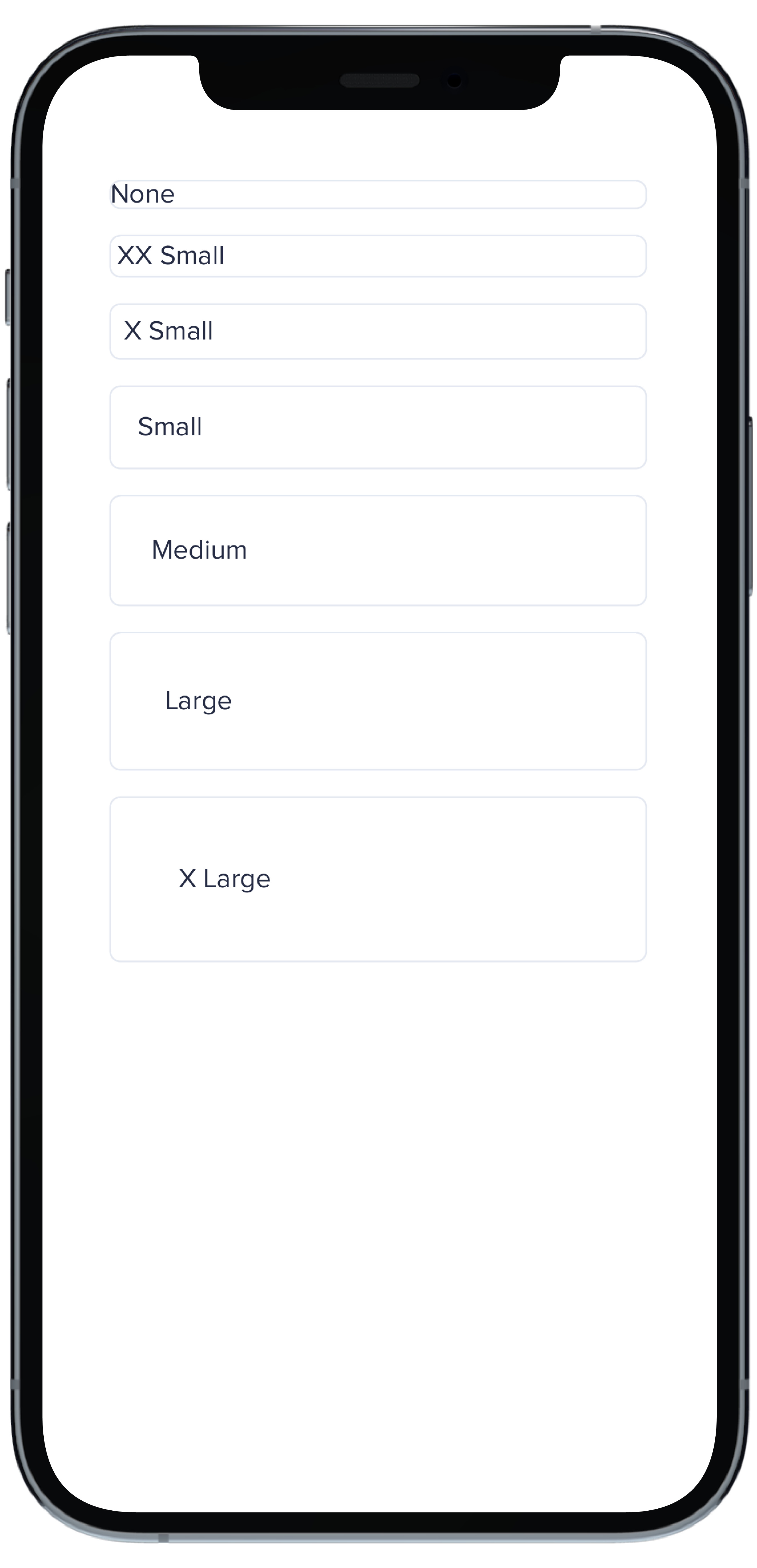
@@ -1,33 +0,0 @@
|
|
|
1
|
-
|
|
2
|
-
|
|
3
|
-
```swift
|
|
4
|
-
VStack(spacing: Spacing.small) {
|
|
5
|
-
PBCard(borderRadius: BorderRadius.none) {
|
|
6
|
-
Text("None").pbFont(.body)
|
|
7
|
-
}
|
|
8
|
-
|
|
9
|
-
PBCard(borderRadius: BorderRadius.xSmall) {
|
|
10
|
-
Text("X Small").pbFont(.body)
|
|
11
|
-
}
|
|
12
|
-
|
|
13
|
-
PBCard(borderRadius: BorderRadius.small) {
|
|
14
|
-
Text("Small").pbFont(.body)
|
|
15
|
-
}
|
|
16
|
-
|
|
17
|
-
PBCard(borderRadius: BorderRadius.medium) {
|
|
18
|
-
Text("Medium").pbFont(.body)
|
|
19
|
-
}
|
|
20
|
-
|
|
21
|
-
PBCard(borderRadius: BorderRadius.large) {
|
|
22
|
-
Text("Large").pbFont(.body)
|
|
23
|
-
}
|
|
24
|
-
|
|
25
|
-
PBCard(borderRadius: BorderRadius.xLarge) {
|
|
26
|
-
Text("X Large").pbFont(.body)
|
|
27
|
-
}
|
|
28
|
-
|
|
29
|
-
PBCard(borderRadius: BorderRadius.rounded) {
|
|
30
|
-
Text("Rounded").pbFont(.body)
|
|
31
|
-
}
|
|
32
|
-
}
|
|
33
|
-
``````
|
|
@@ -1,33 +0,0 @@
|
|
|
1
|
-
|
|
2
|
-
|
|
3
|
-
```swift
|
|
4
|
-
Stack(spacing: Spacing.small) {
|
|
5
|
-
PBCard(padding: Spacing.none) {
|
|
6
|
-
PBCardHeader(color: .category(.category1)) {
|
|
7
|
-
Text("Category 1").pbFont(.body, color: .white).padding(Spacing.small)
|
|
8
|
-
}
|
|
9
|
-
Text("Body").pbFont(.body, color: .text(.default)).padding(Spacing.small)
|
|
10
|
-
}
|
|
11
|
-
|
|
12
|
-
PBCard(padding: Spacing.none) {
|
|
13
|
-
PBCardHeader(color: .category(.category3)) {
|
|
14
|
-
Text("Category 3").pbFont(.body, color: .black).padding(Spacing.small)
|
|
15
|
-
}
|
|
16
|
-
Text("Body").pbFont(.body, color: .text(.default)).padding(Spacing.small)
|
|
17
|
-
}
|
|
18
|
-
|
|
19
|
-
PBCard(padding: Spacing.none) {
|
|
20
|
-
PBCardHeader(color: .product(.product2, category: .background)) {
|
|
21
|
-
Text("Product 2 Background").pbFont(.body, color: .white).padding(Spacing.small)
|
|
22
|
-
}
|
|
23
|
-
Text("Body").pbFont(.body, color: .text(.default)).padding(Spacing.small)
|
|
24
|
-
}
|
|
25
|
-
|
|
26
|
-
PBCard(padding: Spacing.none) {
|
|
27
|
-
PBCardHeader(color: .product(.product6, category: .background)) {
|
|
28
|
-
Text("Product 6 Background").pbFont(.body, color: .white).padding(Spacing.small)
|
|
29
|
-
}
|
|
30
|
-
Text("Body").pbFont(.body, color: .text(.default)).padding(Spacing.small)
|
|
31
|
-
}
|
|
32
|
-
}
|
|
33
|
-
```
|
|
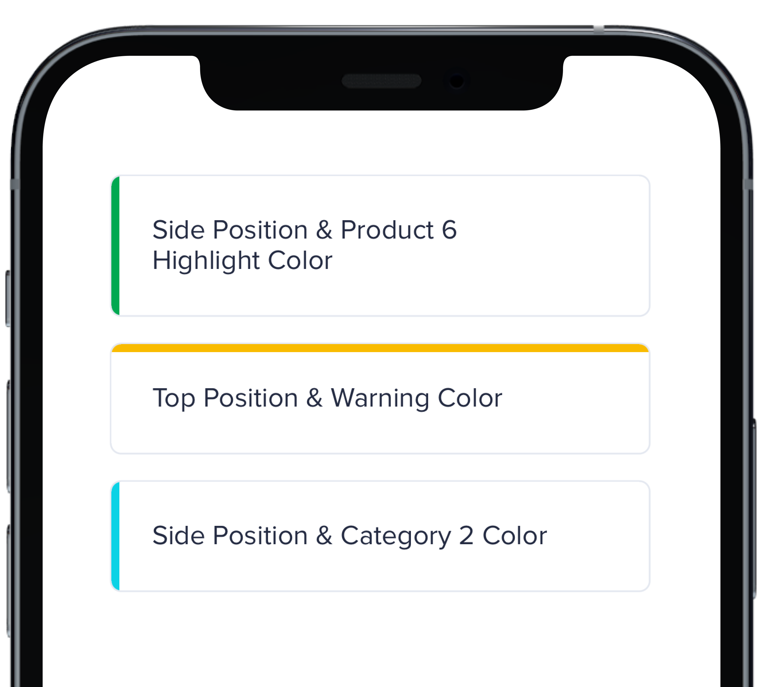
@@ -1,17 +0,0 @@
|
|
|
1
|
-
|
|
2
|
-
|
|
3
|
-
```swift
|
|
4
|
-
VStack(spacing: Spacing.small) {
|
|
5
|
-
PBCard(highlight: .side(.product(.product6, category: .highlight))) {
|
|
6
|
-
Text("Side Position & Product 6 Highlight Color").pbFont(.body)
|
|
7
|
-
}
|
|
8
|
-
|
|
9
|
-
PBCard(highlight: .top(.status(.warning))) {
|
|
10
|
-
Text("Top Position & Warning Color").pbFont(.body)
|
|
11
|
-
}
|
|
12
|
-
|
|
13
|
-
PBCard(highlight: .side(.category(.category2))) {
|
|
14
|
-
Text("Side Position & Category 2 Color").pbFont(.body)
|
|
15
|
-
}
|
|
16
|
-
}
|
|
17
|
-
```
|
|
@@ -1,33 +0,0 @@
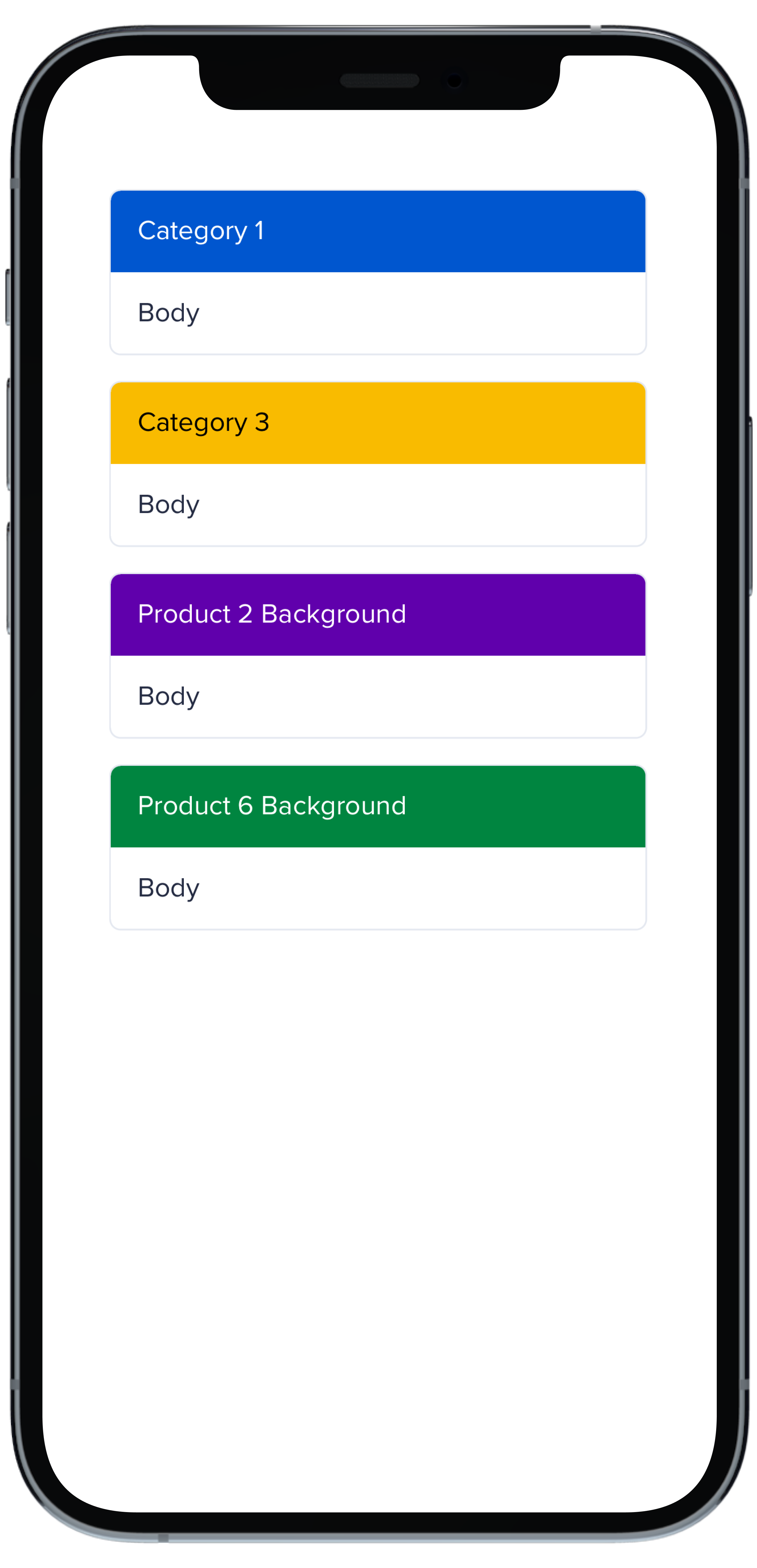
|
|
|
1
|
-
|
|
2
|
-
|
|
3
|
-
```swift
|
|
4
|
-
VStack(spacing: Spacing.small) {
|
|
5
|
-
PBCard(padding: Spacing.none) {
|
|
6
|
-
Text("None").pbFont(.body)
|
|
7
|
-
}
|
|
8
|
-
|
|
9
|
-
PBCard(padding: Spacing.xxSmall) {
|
|
10
|
-
Text("XX Small").pbFont(.body)
|
|
11
|
-
}
|
|
12
|
-
|
|
13
|
-
PBCard(padding: Spacing.xSmall) {
|
|
14
|
-
Text("X Small").pbFont(.body)
|
|
15
|
-
}
|
|
16
|
-
|
|
17
|
-
PBCard(padding: Spacing.small) {
|
|
18
|
-
Text("Small").pbFont(.body)
|
|
19
|
-
}
|
|
20
|
-
|
|
21
|
-
PBCard(padding: Spacing.medium) {
|
|
22
|
-
Text("Medium").pbFont(.body)
|
|
23
|
-
}
|
|
24
|
-
|
|
25
|
-
PBCard(padding: Spacing.large) {
|
|
26
|
-
Text("Large").pbFont(.body)
|
|
27
|
-
}
|
|
28
|
-
|
|
29
|
-
PBCard(padding: Spacing.xLarge) {
|
|
30
|
-
Text("X Large").pbFont(.body)
|
|
31
|
-
}
|
|
32
|
-
}
|
|
33
|
-
```
|
|
@@ -1,10 +0,0 @@
|
|
|
1
|
-
### Props
|
|
2
|
-
| Name | Type | Description | Default | Values |
|
|
3
|
-
| --- | ----------- | --------- | --------- | --------- |
|
|
4
|
-
| **Background Color** | `Color` | Changes background color | `.card` | `Color` |
|
|
5
|
-
| **Border** | `Bool` | Adds border around the Card | `true` | `true` `false` |
|
|
6
|
-
| **Border Radius** | `CGFloat` | Specifies the roundness of the Card | `BorderRadius.medium` | `BorderRadius.none` `BorderRadius.xSmall` `BorderRadius.small` `BorderRadius.medium` `BorderRadius.large` `BorderRadius.xLarge` `BorderRadius.rounded` |
|
|
7
|
-
| **Highlight** | `Highlight` | Adds a border accent color | `.none` | `Color` |
|
|
8
|
-
| **Padding** | `CGFloat` | Applies padding between text and border | `Spacing.medium` | `Spacing.none` `Spacing.xxSmall` `Spacing.xSmall` `Spacing.small` `Spacing.medium` `Spacing.large` `Spacing.xLarge` |
|
|
9
|
-
| **Style** | `PBCardStyle` | Specifies the color of the border | `.default` | `.default` `.selected` `.error` `.inline` |
|
|
10
|
-
| **Shadow** | `Shadow` | Applies shadow | `nil` | `Shadow.deep` `Shadow.deeper` `Shadow.deepest` `Shadow.none` |
|
|
File without changes
|
|
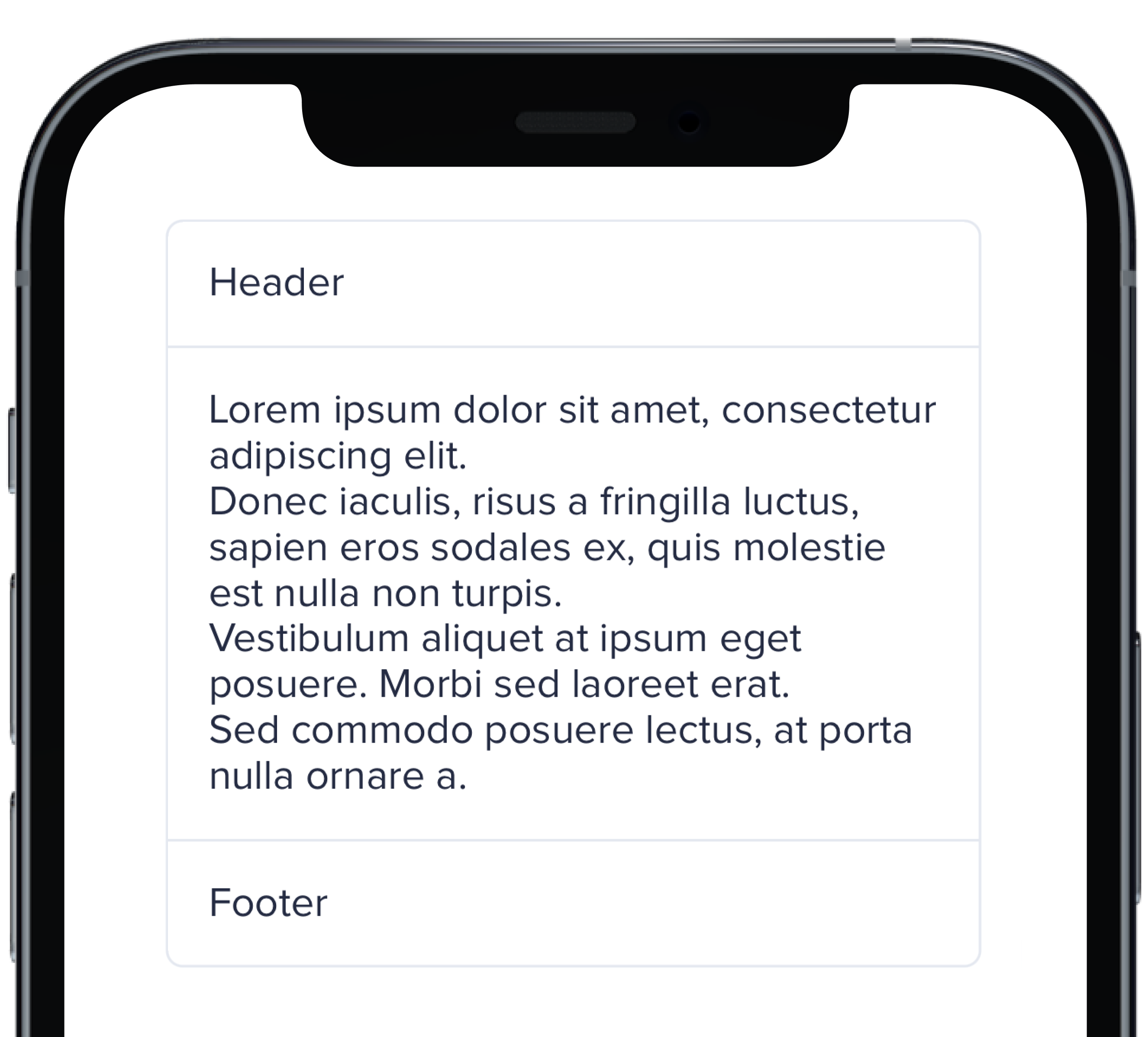
@@ -1,11 +0,0 @@
|
|
|
1
|
-
|
|
2
|
-
|
|
3
|
-
```swift
|
|
4
|
-
PBCard(padding: Spacing.none) {
|
|
5
|
-
Text("Header").pbFont(.body).padding(Spacing.small)
|
|
6
|
-
PBSectionSeparator()
|
|
7
|
-
Text(loremIpsum).pbFont(.body).padding(Spacing.small)
|
|
8
|
-
PBSectionSeparator()
|
|
9
|
-
Text("Footer").pbFont(.body).padding(Spacing.small)
|
|
10
|
-
}
|
|
11
|
-
```
|
|
@@ -1,21 +0,0 @@
|
|
|
1
|
-

|
|
2
|
-
|
|
3
|
-
```swift
|
|
4
|
-
VStack(spacing: Spacing.small) {
|
|
5
|
-
PBCard(shadow: Shadow.deep) {
|
|
6
|
-
Text("Deep").pbFont(.body)
|
|
7
|
-
}
|
|
8
|
-
|
|
9
|
-
PBCard(shadow: Shadow.deeper) {
|
|
10
|
-
Text("Deeper").pbFont(.body)
|
|
11
|
-
}
|
|
12
|
-
|
|
13
|
-
PBCard(shadow: Shadow.deepest) {
|
|
14
|
-
Text("Deepest").pbFont(.body)
|
|
15
|
-
}
|
|
16
|
-
|
|
17
|
-
PBCard(shadow: Shadow.none) {
|
|
18
|
-
Text("None").pbFont(.body)
|
|
19
|
-
}
|
|
20
|
-
}
|
|
21
|
-
```
|
|
@@ -1,17 +0,0 @@
|
|
|
1
|
-
|
|
2
|
-
|
|
3
|
-
```swift
|
|
4
|
-
VStack(alignment: .leading, spacing: Spacing.small) {
|
|
5
|
-
PBCard {
|
|
6
|
-
Text("Card Context").pbFont(.body)
|
|
7
|
-
}
|
|
8
|
-
|
|
9
|
-
PBCard(style: .selected()) {
|
|
10
|
-
Text("Card Context").pbFont(.body)
|
|
11
|
-
}
|
|
12
|
-
|
|
13
|
-
PBCard(style: .error) {
|
|
14
|
-
Text("Card Context").pbFont(.body)
|
|
15
|
-
}
|
|
16
|
-
}
|
|
17
|
-
```
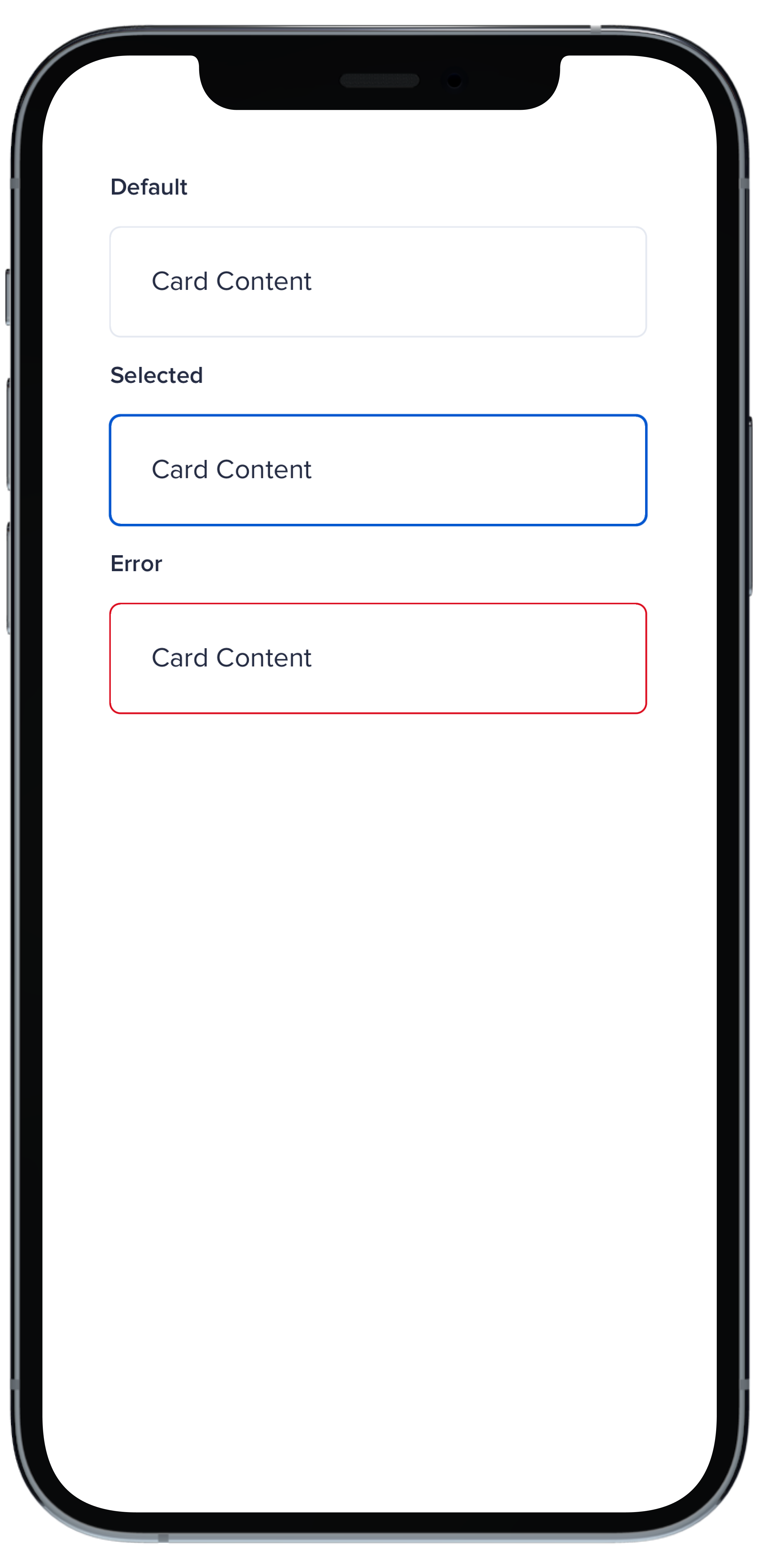
|
|
File without changes
|