playbook_ui_docs 13.10.0.pre.alpha.PLAY1046multilevelsingleselectphase21358 → 13.10.0.pre.alpha.dependabotnpmandyarntiptapextensionlink21121407
This diff represents the content of publicly available package versions that have been released to one of the supported registries. The information contained in this diff is provided for informational purposes only and reflects changes between package versions as they appear in their respective public registries.
- checksums.yaml +4 -4
- data/app/pb_kits/playbook/pb_button/docs/_button_circle_swift.md +28 -0
- data/app/pb_kits/playbook/pb_button/docs/_button_default_swift.md +23 -0
- data/app/pb_kits/playbook/pb_button/docs/_button_full_width_swift.md +9 -0
- data/app/pb_kits/playbook/pb_button/docs/_button_icon_options_swift.md +18 -0
- data/app/pb_kits/playbook/pb_button/docs/_button_props_swift.md +11 -0
- data/app/pb_kits/playbook/pb_button/docs/_button_size_swift.md +20 -0
- data/app/pb_kits/playbook/pb_button/docs/example.yml +8 -0
- data/app/pb_kits/playbook/pb_card/docs/_card_background_swift.md +29 -0
- data/app/pb_kits/playbook/pb_card/docs/_card_border_none_swift.md +7 -0
- data/app/pb_kits/playbook/pb_card/docs/_card_border_radius_swift.md +33 -0
- data/app/pb_kits/playbook/pb_card/docs/_card_header_swift.md +33 -0
- data/app/pb_kits/playbook/pb_card/docs/_card_highlight_swift.md +17 -0
- data/app/pb_kits/playbook/pb_card/docs/_card_light_swift.md +7 -0
- data/app/pb_kits/playbook/pb_card/docs/_card_padding_swift.md +33 -0
- data/app/pb_kits/playbook/pb_card/docs/_card_props_swift.md +10 -0
- data/app/pb_kits/playbook/pb_card/docs/_card_selected_swift.md +0 -0
- data/app/pb_kits/playbook/pb_card/docs/_card_separator_swift.md +11 -0
- data/app/pb_kits/playbook/pb_card/docs/_card_shadow_swift.md +21 -0
- data/app/pb_kits/playbook/pb_card/docs/_card_styles_swift.md +17 -0
- data/app/pb_kits/playbook/pb_card/docs/_card_tag_swift.md +0 -0
- data/app/pb_kits/playbook/pb_card/docs/example.yml +12 -0
- data/app/pb_kits/playbook/pb_multi_level_select/docs/_multi_level_select_selected_ids.html.erb +1 -0
- data/app/pb_kits/playbook/pb_multi_level_select/docs/_multi_level_select_single.html.erb +45 -104
- data/app/pb_kits/playbook/pb_multi_level_select/docs/_multi_level_select_single.jsx +43 -100
- data/app/pb_kits/playbook/pb_multi_level_select/docs/example.yml +0 -2
- data/app/pb_kits/playbook/pb_multi_level_select/docs/index.js +0 -1
- data/app/pb_kits/playbook/pb_table/docs/_table_header.html.erb +47 -31
- data/app/pb_kits/playbook/pb_table/docs/_table_header.md +5 -0
- data/dist/playbook-doc.js +8 -8
- metadata +21 -4
- data/app/pb_kits/playbook/pb_multi_level_select/docs/_multi_level_select_single_children_only.html.erb +0 -133
- data/app/pb_kits/playbook/pb_multi_level_select/docs/_multi_level_select_single_children_only.jsx +0 -145
checksums.yaml
CHANGED
|
@@ -1,7 +1,7 @@
|
|
|
1
1
|
---
|
|
2
2
|
SHA256:
|
|
3
|
-
metadata.gz:
|
|
4
|
-
data.tar.gz:
|
|
3
|
+
metadata.gz: b3d7342a19f45b4d924c816433d7829068b6621b233b4b9aafb6cd69c25b3b71
|
|
4
|
+
data.tar.gz: '08df5b04ba9fbcf2749f0be76283c122b78286e2c22183200329ce99e0757410'
|
|
5
5
|
SHA512:
|
|
6
|
-
metadata.gz:
|
|
7
|
-
data.tar.gz:
|
|
6
|
+
metadata.gz: 37fdef42723e7b2014ce8198ea82928f4a4ae468566bad03bda9978a14d11edb8f5290051811e3c2d6d92433d8d2506c2991b60ae145f6bb24e3b02e97dd419d
|
|
7
|
+
data.tar.gz: '097f6915aab670d1846688086c2ee25827d8fe9272938037f20b8fa7a8dfab93738bc300f43f56f94c1bea8221ae2f5616d66da6b95a70b9cae45a916c34a9c4'
|
|
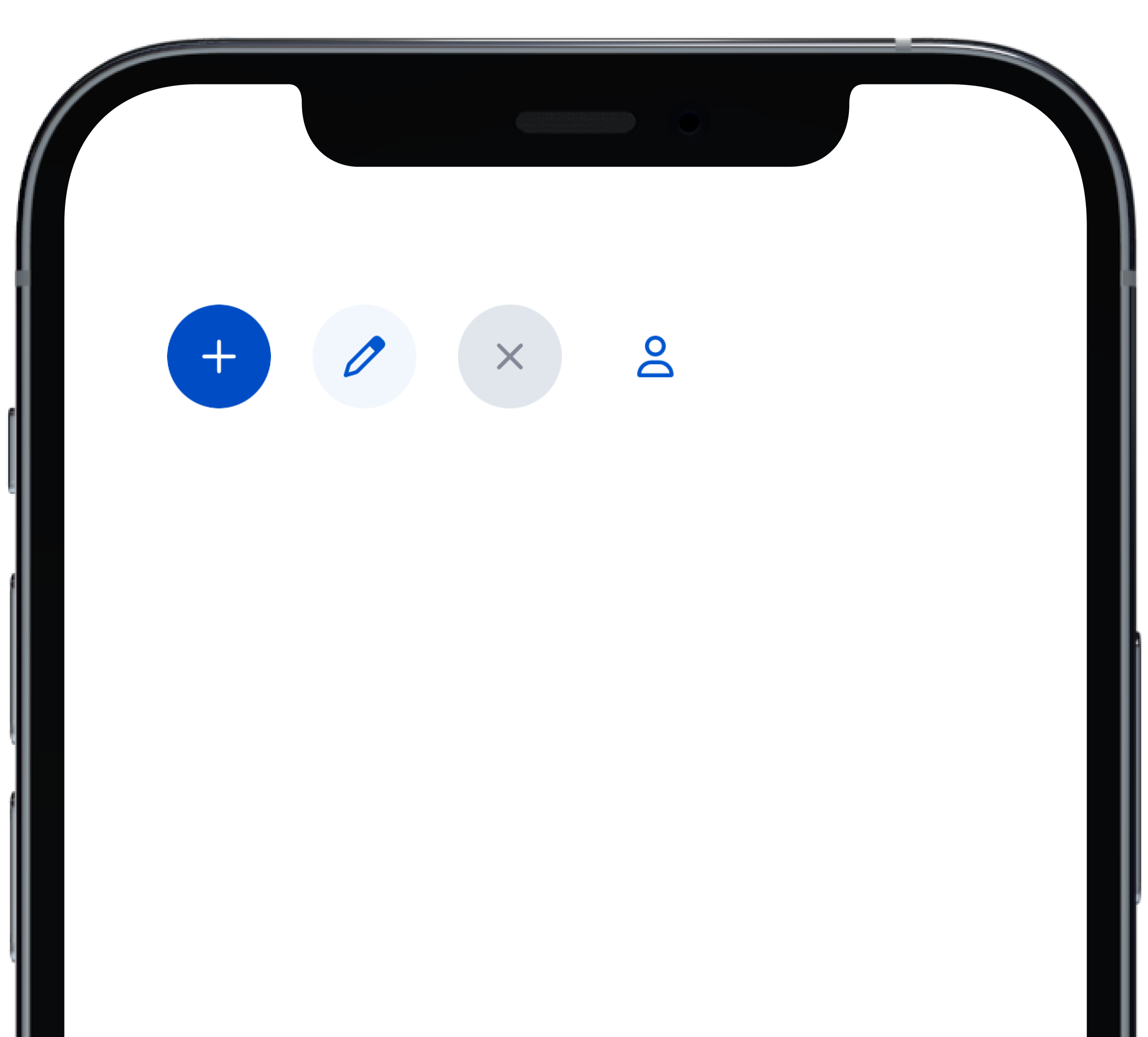
@@ -0,0 +1,28 @@
|
|
|
1
|
+
|
|
2
|
+
|
|
3
|
+
```swift
|
|
4
|
+
VStack(alignment: .leading, spacing: Spacing.small) {
|
|
5
|
+
PBButton(
|
|
6
|
+
shape: .circle,
|
|
7
|
+
icon: PBIcon.fontAwesome(.plus, size: .x1),
|
|
8
|
+
action: {}
|
|
9
|
+
)
|
|
10
|
+
PBButton(
|
|
11
|
+
variant: .secondary,
|
|
12
|
+
shape: .circle,
|
|
13
|
+
icon: PBIcon.fontAwesome(.pen, size: .x1),
|
|
14
|
+
action: {}
|
|
15
|
+
)
|
|
16
|
+
PBButton(
|
|
17
|
+
variant: .disabled,
|
|
18
|
+
shape: .circle,
|
|
19
|
+
icon: PBIcon.fontAwesome(.times, size: .x1)
|
|
20
|
+
)
|
|
21
|
+
PBButton(
|
|
22
|
+
variant: .link,
|
|
23
|
+
shape: .circle,
|
|
24
|
+
icon: PBIcon.fontAwesome(.user, size: .x1),
|
|
25
|
+
action: {}
|
|
26
|
+
)
|
|
27
|
+
}
|
|
28
|
+
```
|
|
@@ -0,0 +1,23 @@
|
|
|
1
|
+

|
|
2
|
+
|
|
3
|
+
```swift
|
|
4
|
+
VStack(alignment: .leading, spacing: Spacing.small) {
|
|
5
|
+
PBButton(
|
|
6
|
+
title: "Button Primary",
|
|
7
|
+
action: {}
|
|
8
|
+
)
|
|
9
|
+
PBButton(
|
|
10
|
+
variant: .secondary,
|
|
11
|
+
title: "Button Secondary",
|
|
12
|
+
action: {})
|
|
13
|
+
PBButton(
|
|
14
|
+
variant: .link,
|
|
15
|
+
title: "Button Link",
|
|
16
|
+
action: {}
|
|
17
|
+
)
|
|
18
|
+
PBButton(
|
|
19
|
+
variant: .disabled,
|
|
20
|
+
title: "Button Disabled"
|
|
21
|
+
)
|
|
22
|
+
}
|
|
23
|
+
```
|
|
@@ -0,0 +1,18 @@
|
|
|
1
|
+

|
|
2
|
+
|
|
3
|
+
|
|
4
|
+
```swift
|
|
5
|
+
VStack(alignment: .leading, spacing: Spacing.small) {
|
|
6
|
+
PBButton(
|
|
7
|
+
title: "Button with Icon on Left",
|
|
8
|
+
icon: PBIcon.fontAwesome(.user, size: .x1),
|
|
9
|
+
action: {}
|
|
10
|
+
)
|
|
11
|
+
PBButton(
|
|
12
|
+
title: "Button with Icon on Right",
|
|
13
|
+
icon: PBIcon.fontAwesome(.user, size: .x1),
|
|
14
|
+
iconPosition: .right,
|
|
15
|
+
action: {}
|
|
16
|
+
)
|
|
17
|
+
}
|
|
18
|
+
```
|
|
@@ -0,0 +1,11 @@
|
|
|
1
|
+
### Props
|
|
2
|
+
| Name | Type | Description | Default | Values |
|
|
3
|
+
| --- | ----------- | --------- | --------- | --------- |
|
|
4
|
+
| **Full Width** | `Bool` | Sets Button to full width | `false` | `true` `false` |
|
|
5
|
+
| **Variant** | `PBButtonVariant` | Changes the color of the Button | ` .primary` | `.primary` `.secondary` `.link` `.disabled` |
|
|
6
|
+
| **Size** | `Size` | Adjusts Button size | `.medium` | `.small` `.medium` `.large` |
|
|
7
|
+
| **Shape** | `Shape` | Changes the shape of the Button | `.primary` | `.primary` `.circle` |
|
|
8
|
+
| **Title** | `String` | Sets Button text | `nil` | |
|
|
9
|
+
| **Icon** | `PBIcon` | Adds an icon to the Button | `nil` | |
|
|
10
|
+
| **Icon Position** | `IconPosition` | Adjusts the icon's position | `.left` | `.left` `.right` |
|
|
11
|
+
| **Action** | `(() -> Void)` | Adds an action for the Button to perform | `{}` | |
|
|
@@ -0,0 +1,20 @@
|
|
|
1
|
+
|
|
2
|
+
|
|
3
|
+
```swift
|
|
4
|
+
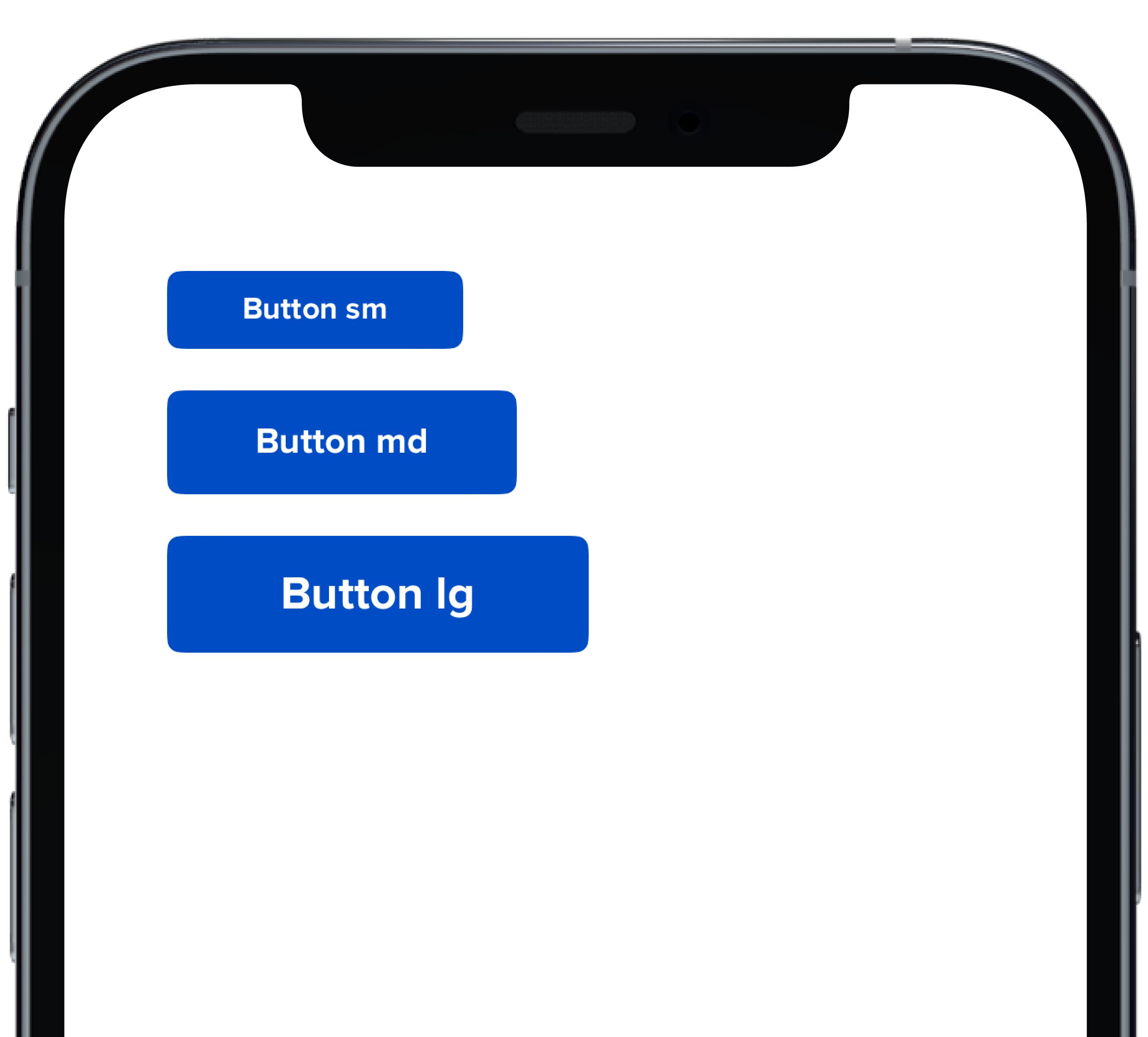
VStack(alignment: .leading, spacing: Spacing.small) {
|
|
5
|
+
PBButton(
|
|
6
|
+
size: .small,
|
|
7
|
+
title: "Button sm",
|
|
8
|
+
action: {}
|
|
9
|
+
)
|
|
10
|
+
PBButton(
|
|
11
|
+
title: "Button md",
|
|
12
|
+
action: {}
|
|
13
|
+
)
|
|
14
|
+
PBButton(
|
|
15
|
+
size: .large,
|
|
16
|
+
title: "Button lg",
|
|
17
|
+
action: {}
|
|
18
|
+
)
|
|
19
|
+
}
|
|
20
|
+
```
|
|
@@ -25,3 +25,11 @@ examples:
|
|
|
25
25
|
- button_size: Button Size
|
|
26
26
|
- button_form: Button Form Attribute
|
|
27
27
|
- button_hover: Button Hover
|
|
28
|
+
|
|
29
|
+
swift:
|
|
30
|
+
- button_default_swift: Button Variants
|
|
31
|
+
- button_full_width_swift: Button Full Width
|
|
32
|
+
- button_icon_options_swift: Button Icon Options
|
|
33
|
+
- button_circle_swift: Circle Button
|
|
34
|
+
- button_size_swift: Button Size
|
|
35
|
+
- button_props_swift: ""
|
|
@@ -0,0 +1,29 @@
|
|
|
1
|
+
|
|
2
|
+
|
|
3
|
+
```swift
|
|
4
|
+
VStack(alignment: .leading, spacing: Spacing.small) {
|
|
5
|
+
PBCard {
|
|
6
|
+
Text(text).pbFont(.body)
|
|
7
|
+
}
|
|
8
|
+
|
|
9
|
+
PBCard(backgroundColor: .background(.light)) {
|
|
10
|
+
Text("Light").pbFont(.body, color: .text(.light))
|
|
11
|
+
}
|
|
12
|
+
|
|
13
|
+
PBCard(backgroundColor: .background(.dark)) {
|
|
14
|
+
Text("Dark").pbFont(.body, color: .text(.light))
|
|
15
|
+
}
|
|
16
|
+
|
|
17
|
+
PBCard(backgroundColor: .product(.product1, category: .background)) {
|
|
18
|
+
Text("Product 1 Background").pbFont(.body, color: .white)
|
|
19
|
+
}
|
|
20
|
+
|
|
21
|
+
PBCard(backgroundColor: .product(.product7, category: .highlight)) {
|
|
22
|
+
Text("Product 7 Highlight").pbFont(.body, color: .white)
|
|
23
|
+
}
|
|
24
|
+
|
|
25
|
+
PBCard(backgroundColor: .product(.product2, category: .highlight)) {
|
|
26
|
+
Text("Product 2 Highlight").pbFont(.body, color: .white)
|
|
27
|
+
}
|
|
28
|
+
}
|
|
29
|
+
```
|
|
@@ -0,0 +1,33 @@
|
|
|
1
|
+
|
|
2
|
+
|
|
3
|
+
```swift
|
|
4
|
+
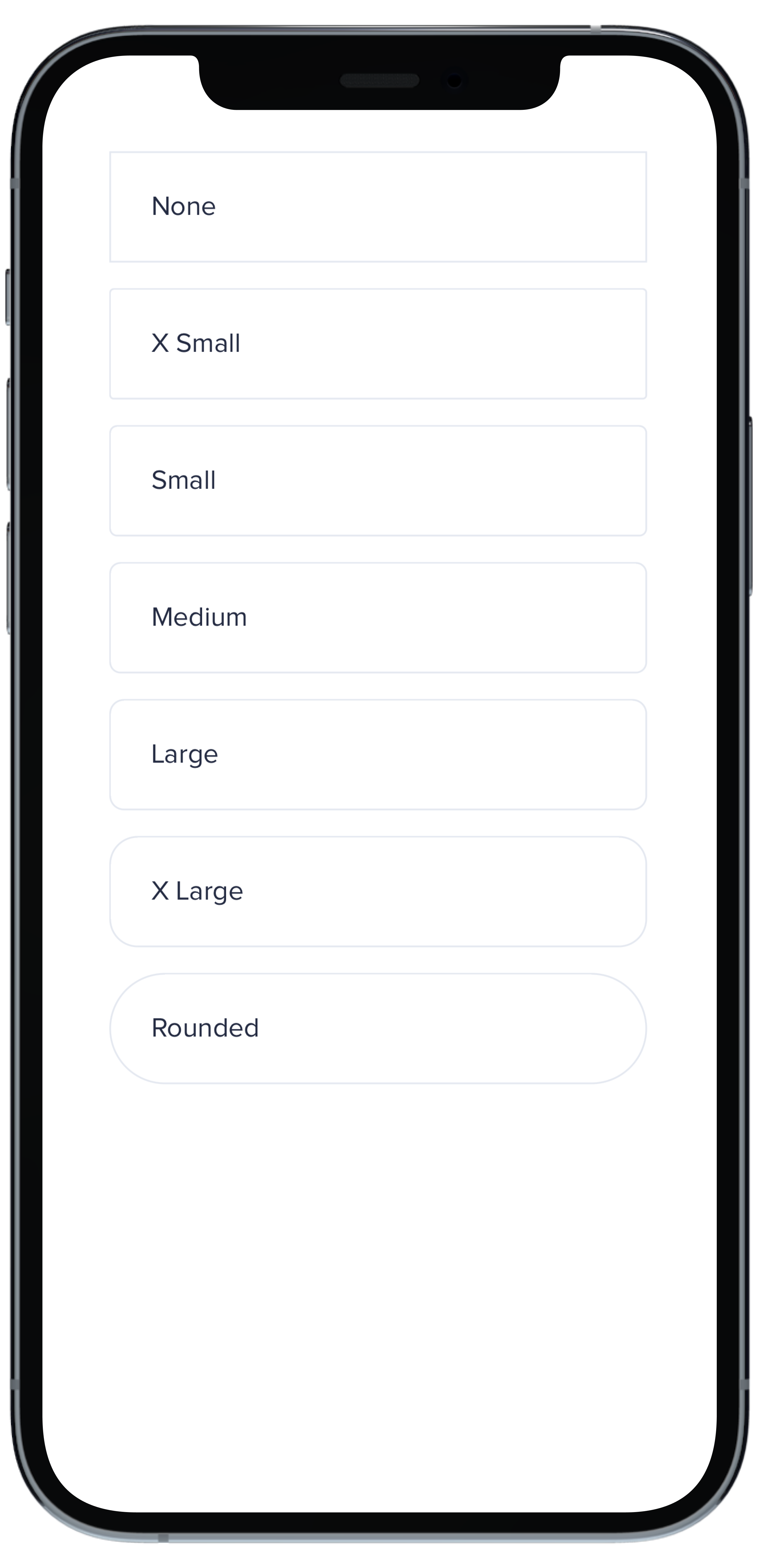
VStack(spacing: Spacing.small) {
|
|
5
|
+
PBCard(borderRadius: BorderRadius.none) {
|
|
6
|
+
Text("None").pbFont(.body)
|
|
7
|
+
}
|
|
8
|
+
|
|
9
|
+
PBCard(borderRadius: BorderRadius.xSmall) {
|
|
10
|
+
Text("X Small").pbFont(.body)
|
|
11
|
+
}
|
|
12
|
+
|
|
13
|
+
PBCard(borderRadius: BorderRadius.small) {
|
|
14
|
+
Text("Small").pbFont(.body)
|
|
15
|
+
}
|
|
16
|
+
|
|
17
|
+
PBCard(borderRadius: BorderRadius.medium) {
|
|
18
|
+
Text("Medium").pbFont(.body)
|
|
19
|
+
}
|
|
20
|
+
|
|
21
|
+
PBCard(borderRadius: BorderRadius.large) {
|
|
22
|
+
Text("Large").pbFont(.body)
|
|
23
|
+
}
|
|
24
|
+
|
|
25
|
+
PBCard(borderRadius: BorderRadius.xLarge) {
|
|
26
|
+
Text("X Large").pbFont(.body)
|
|
27
|
+
}
|
|
28
|
+
|
|
29
|
+
PBCard(borderRadius: BorderRadius.rounded) {
|
|
30
|
+
Text("Rounded").pbFont(.body)
|
|
31
|
+
}
|
|
32
|
+
}
|
|
33
|
+
``````
|
|
@@ -0,0 +1,33 @@
|
|
|
1
|
+
|
|
2
|
+
|
|
3
|
+
```swift
|
|
4
|
+
Stack(spacing: Spacing.small) {
|
|
5
|
+
PBCard(padding: Spacing.none) {
|
|
6
|
+
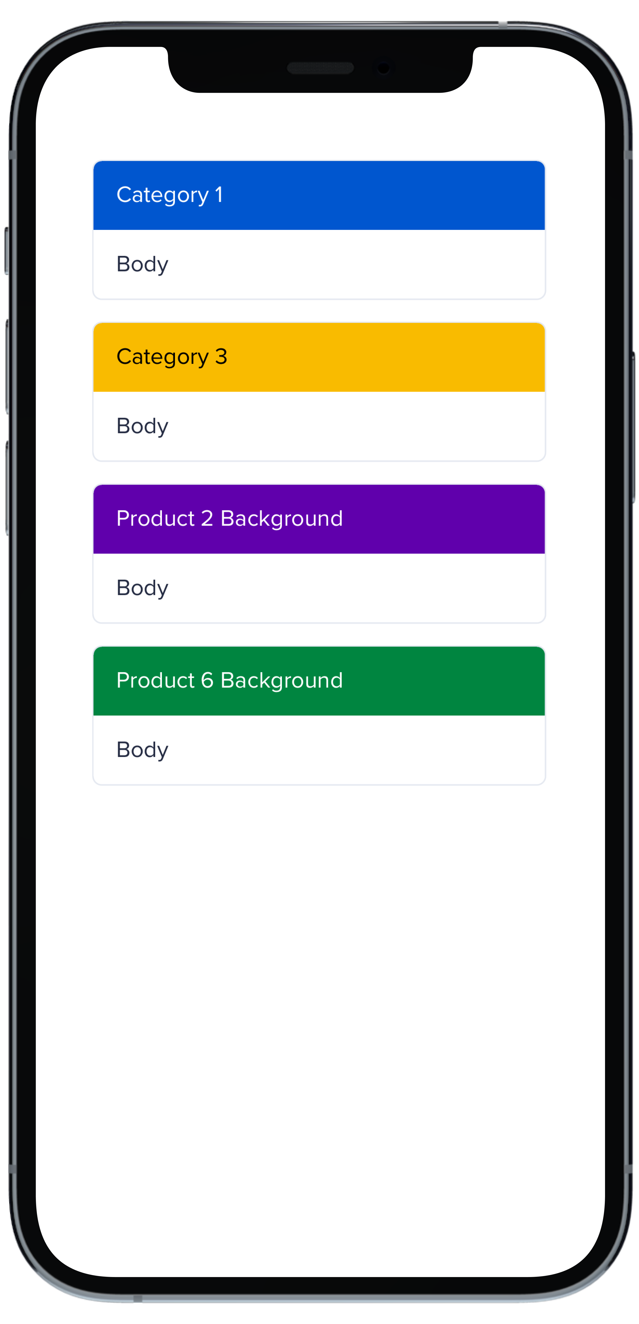
PBCardHeader(color: .category(.category1)) {
|
|
7
|
+
Text("Category 1").pbFont(.body, color: .white).padding(Spacing.small)
|
|
8
|
+
}
|
|
9
|
+
Text("Body").pbFont(.body, color: .text(.default)).padding(Spacing.small)
|
|
10
|
+
}
|
|
11
|
+
|
|
12
|
+
PBCard(padding: Spacing.none) {
|
|
13
|
+
PBCardHeader(color: .category(.category3)) {
|
|
14
|
+
Text("Category 3").pbFont(.body, color: .black).padding(Spacing.small)
|
|
15
|
+
}
|
|
16
|
+
Text("Body").pbFont(.body, color: .text(.default)).padding(Spacing.small)
|
|
17
|
+
}
|
|
18
|
+
|
|
19
|
+
PBCard(padding: Spacing.none) {
|
|
20
|
+
PBCardHeader(color: .product(.product2, category: .background)) {
|
|
21
|
+
Text("Product 2 Background").pbFont(.body, color: .white).padding(Spacing.small)
|
|
22
|
+
}
|
|
23
|
+
Text("Body").pbFont(.body, color: .text(.default)).padding(Spacing.small)
|
|
24
|
+
}
|
|
25
|
+
|
|
26
|
+
PBCard(padding: Spacing.none) {
|
|
27
|
+
PBCardHeader(color: .product(.product6, category: .background)) {
|
|
28
|
+
Text("Product 6 Background").pbFont(.body, color: .white).padding(Spacing.small)
|
|
29
|
+
}
|
|
30
|
+
Text("Body").pbFont(.body, color: .text(.default)).padding(Spacing.small)
|
|
31
|
+
}
|
|
32
|
+
}
|
|
33
|
+
```
|
|
@@ -0,0 +1,17 @@
|
|
|
1
|
+
|
|
2
|
+
|
|
3
|
+
```swift
|
|
4
|
+
VStack(spacing: Spacing.small) {
|
|
5
|
+
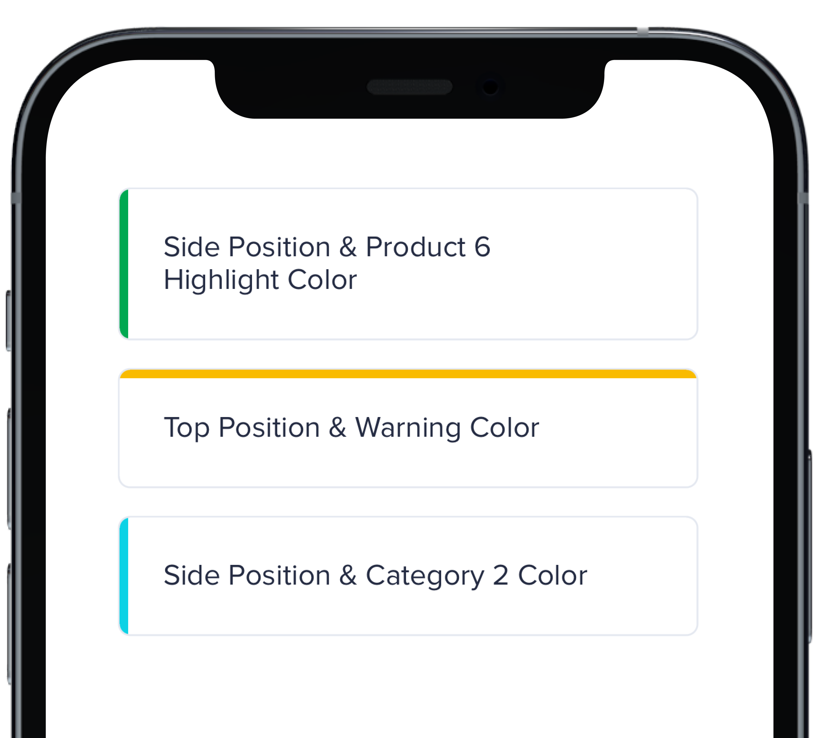
PBCard(highlight: .side(.product(.product6, category: .highlight))) {
|
|
6
|
+
Text("Side Position & Product 6 Highlight Color").pbFont(.body)
|
|
7
|
+
}
|
|
8
|
+
|
|
9
|
+
PBCard(highlight: .top(.status(.warning))) {
|
|
10
|
+
Text("Top Position & Warning Color").pbFont(.body)
|
|
11
|
+
}
|
|
12
|
+
|
|
13
|
+
PBCard(highlight: .side(.category(.category2))) {
|
|
14
|
+
Text("Side Position & Category 2 Color").pbFont(.body)
|
|
15
|
+
}
|
|
16
|
+
}
|
|
17
|
+
```
|
|
@@ -0,0 +1,33 @@
|
|
|
1
|
+
|
|
2
|
+
|
|
3
|
+
```swift
|
|
4
|
+
VStack(spacing: Spacing.small) {
|
|
5
|
+
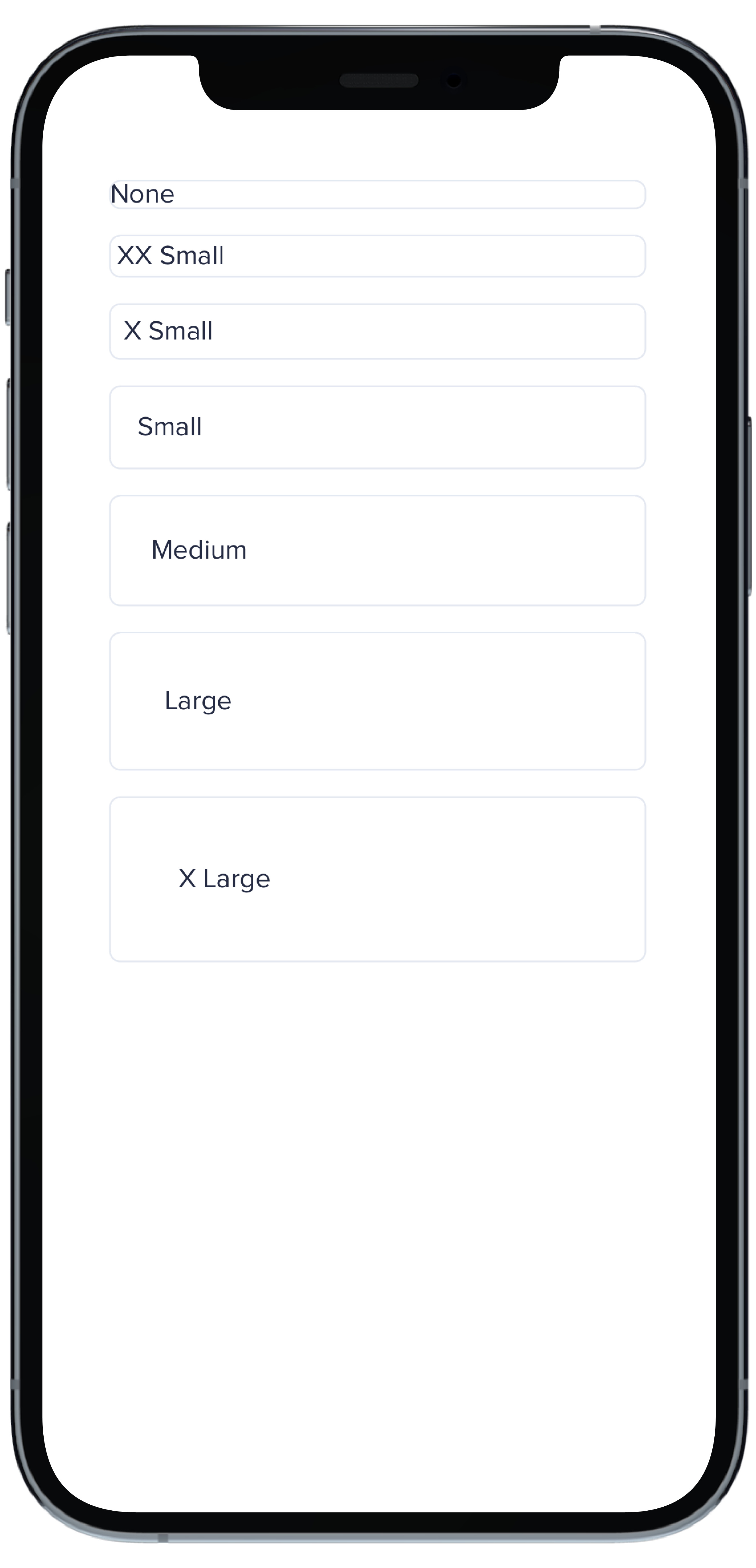
PBCard(padding: Spacing.none) {
|
|
6
|
+
Text("None").pbFont(.body)
|
|
7
|
+
}
|
|
8
|
+
|
|
9
|
+
PBCard(padding: Spacing.xxSmall) {
|
|
10
|
+
Text("XX Small").pbFont(.body)
|
|
11
|
+
}
|
|
12
|
+
|
|
13
|
+
PBCard(padding: Spacing.xSmall) {
|
|
14
|
+
Text("X Small").pbFont(.body)
|
|
15
|
+
}
|
|
16
|
+
|
|
17
|
+
PBCard(padding: Spacing.small) {
|
|
18
|
+
Text("Small").pbFont(.body)
|
|
19
|
+
}
|
|
20
|
+
|
|
21
|
+
PBCard(padding: Spacing.medium) {
|
|
22
|
+
Text("Medium").pbFont(.body)
|
|
23
|
+
}
|
|
24
|
+
|
|
25
|
+
PBCard(padding: Spacing.large) {
|
|
26
|
+
Text("Large").pbFont(.body)
|
|
27
|
+
}
|
|
28
|
+
|
|
29
|
+
PBCard(padding: Spacing.xLarge) {
|
|
30
|
+
Text("X Large").pbFont(.body)
|
|
31
|
+
}
|
|
32
|
+
}
|
|
33
|
+
```
|
|
@@ -0,0 +1,10 @@
|
|
|
1
|
+
### Props
|
|
2
|
+
| Name | Type | Description | Default | Values |
|
|
3
|
+
| --- | ----------- | --------- | --------- | --------- |
|
|
4
|
+
| **Background Color** | `Color` | Changes background color | `.card` | `Color` |
|
|
5
|
+
| **Border** | `Bool` | Adds border around the Card | `true` | `true` `false` |
|
|
6
|
+
| **Border Radius** | `CGFloat` | Specifies the roundness of the Card | `BorderRadius.medium` | `BorderRadius.none` `BorderRadius.xSmall` `BorderRadius.small` `BorderRadius.medium` `BorderRadius.large` `BorderRadius.xLarge` `BorderRadius.rounded` |
|
|
7
|
+
| **Highlight** | `Highlight` | Adds a border accent color | `.none` | `Color` |
|
|
8
|
+
| **Padding** | `CGFloat` | Applies padding between text and border | `Spacing.medium` | `Spacing.none` `Spacing.xxSmall` `Spacing.xSmall` `Spacing.small` `Spacing.medium` `Spacing.large` `Spacing.xLarge` |
|
|
9
|
+
| **Style** | `PBCardStyle` | Specifies the color of the border | `.default` | `.default` `.selected` `.error` `.inline` |
|
|
10
|
+
| **Shadow** | `Shadow` | Applies shadow | `nil` | `Shadow.deep` `Shadow.deeper` `Shadow.deepest` `Shadow.none` |
|
|
File without changes
|
|
@@ -0,0 +1,11 @@
|
|
|
1
|
+
|
|
2
|
+
|
|
3
|
+
```swift
|
|
4
|
+
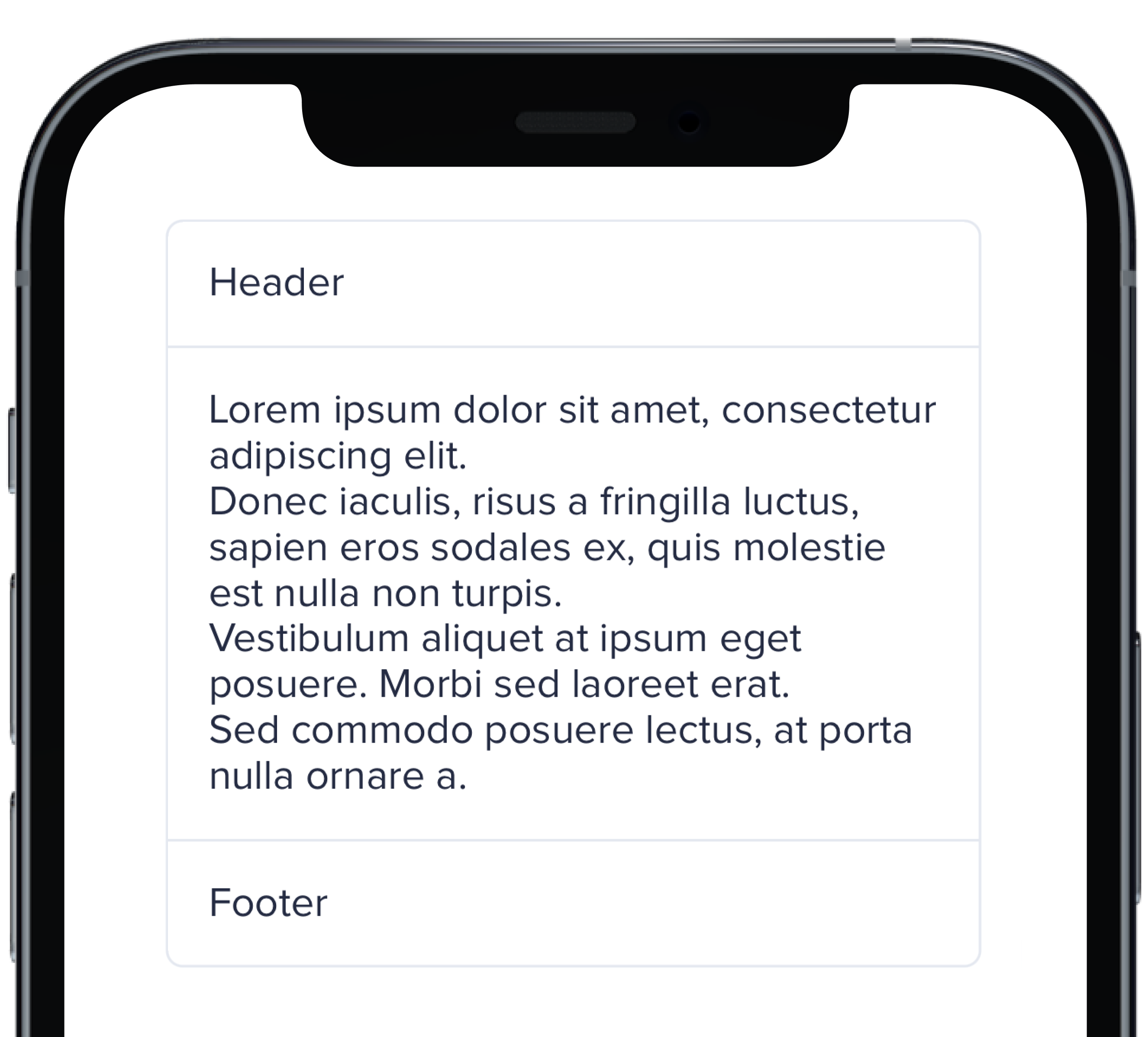
PBCard(padding: Spacing.none) {
|
|
5
|
+
Text("Header").pbFont(.body).padding(Spacing.small)
|
|
6
|
+
PBSectionSeparator()
|
|
7
|
+
Text(loremIpsum).pbFont(.body).padding(Spacing.small)
|
|
8
|
+
PBSectionSeparator()
|
|
9
|
+
Text("Footer").pbFont(.body).padding(Spacing.small)
|
|
10
|
+
}
|
|
11
|
+
```
|
|
@@ -0,0 +1,21 @@
|
|
|
1
|
+

|
|
2
|
+
|
|
3
|
+
```swift
|
|
4
|
+
VStack(spacing: Spacing.small) {
|
|
5
|
+
PBCard(shadow: Shadow.deep) {
|
|
6
|
+
Text("Deep").pbFont(.body)
|
|
7
|
+
}
|
|
8
|
+
|
|
9
|
+
PBCard(shadow: Shadow.deeper) {
|
|
10
|
+
Text("Deeper").pbFont(.body)
|
|
11
|
+
}
|
|
12
|
+
|
|
13
|
+
PBCard(shadow: Shadow.deepest) {
|
|
14
|
+
Text("Deepest").pbFont(.body)
|
|
15
|
+
}
|
|
16
|
+
|
|
17
|
+
PBCard(shadow: Shadow.none) {
|
|
18
|
+
Text("None").pbFont(.body)
|
|
19
|
+
}
|
|
20
|
+
}
|
|
21
|
+
```
|
|
@@ -0,0 +1,17 @@
|
|
|
1
|
+
|
|
2
|
+
|
|
3
|
+
```swift
|
|
4
|
+
VStack(alignment: .leading, spacing: Spacing.small) {
|
|
5
|
+
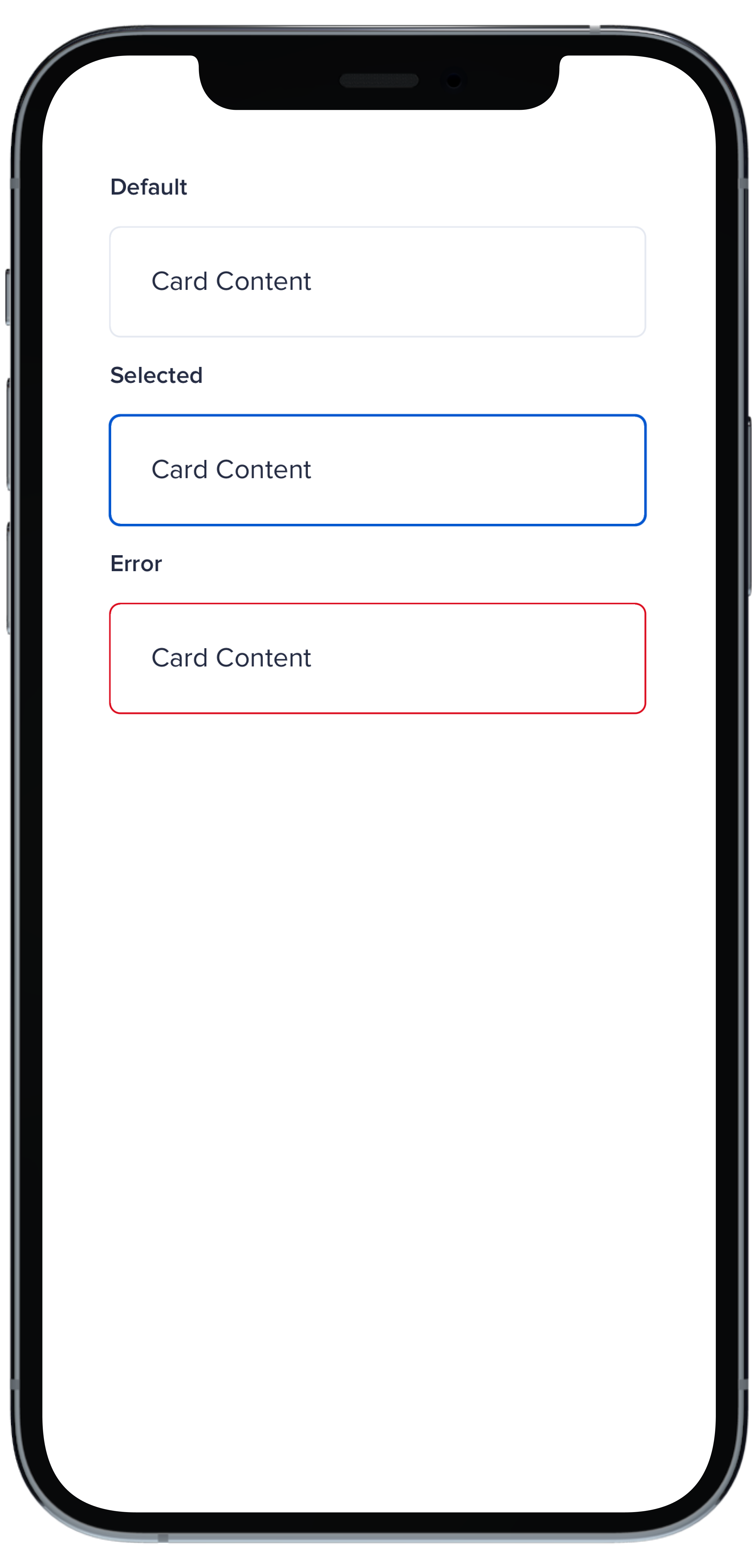
PBCard {
|
|
6
|
+
Text("Card Context").pbFont(.body)
|
|
7
|
+
}
|
|
8
|
+
|
|
9
|
+
PBCard(style: .selected()) {
|
|
10
|
+
Text("Card Context").pbFont(.body)
|
|
11
|
+
}
|
|
12
|
+
|
|
13
|
+
PBCard(style: .error) {
|
|
14
|
+
Text("Card Context").pbFont(.body)
|
|
15
|
+
}
|
|
16
|
+
}
|
|
17
|
+
```
|
|
File without changes
|
|
@@ -25,3 +25,15 @@ examples:
|
|
|
25
25
|
- card_separator: Separator Card
|
|
26
26
|
- card_border_none: No Border
|
|
27
27
|
- card_border_radius: Border Radius
|
|
28
|
+
swift:
|
|
29
|
+
- card_light_swift: Default
|
|
30
|
+
- card_background_swift: Card Backgrounds
|
|
31
|
+
- card_highlight_swift: Highlight Cards
|
|
32
|
+
- card_header_swift: Header Cards
|
|
33
|
+
- card_padding_swift: Padding Size
|
|
34
|
+
- card_shadow_swift: Shadow Size
|
|
35
|
+
- card_separator_swift: Separator Card
|
|
36
|
+
- card_border_none_swift: No Border
|
|
37
|
+
- card_border_radius_swift: Border Radius
|
|
38
|
+
- card_styles_swift: Styles
|
|
39
|
+
- card_props_swift: ""
|
|
@@ -1,127 +1,68 @@
|
|
|
1
|
-
<% treeData = [
|
|
2
|
-
|
|
3
|
-
|
|
4
|
-
|
|
5
|
-
|
|
1
|
+
<% treeData = [{
|
|
2
|
+
label: "Power Home Remodeling",
|
|
3
|
+
value: "Power Home Remodeling",
|
|
4
|
+
id: "200",
|
|
5
|
+
expanded: true,
|
|
6
6
|
children: [
|
|
7
7
|
{
|
|
8
|
-
label: "
|
|
9
|
-
value: "
|
|
10
|
-
id: "
|
|
11
|
-
|
|
12
|
-
{
|
|
13
|
-
label: "Marketing & Sales PHL",
|
|
14
|
-
value: "Marketing & Sales PHL",
|
|
15
|
-
id: "marketing1",
|
|
16
|
-
},
|
|
17
|
-
{
|
|
18
|
-
label: "Installation Office PHL",
|
|
19
|
-
value: "Installation Office PHL",
|
|
20
|
-
id: "installation1",
|
|
21
|
-
},
|
|
22
|
-
{
|
|
23
|
-
label: "Warehouse PHL",
|
|
24
|
-
value: "Warehouse PHL",
|
|
25
|
-
id: "warehouse1",
|
|
26
|
-
},
|
|
27
|
-
]
|
|
28
|
-
},
|
|
29
|
-
{
|
|
30
|
-
label: "New Jersey",
|
|
31
|
-
value: "New Jersey",
|
|
32
|
-
id: "nj",
|
|
33
|
-
children: [
|
|
34
|
-
{
|
|
35
|
-
label: "New Jersey",
|
|
36
|
-
value: "New Jersey",
|
|
37
|
-
id: "nj1",
|
|
8
|
+
label: "People",
|
|
9
|
+
value: "People",
|
|
10
|
+
id: "201",
|
|
11
|
+
expanded: true,
|
|
38
12
|
children: [
|
|
39
13
|
{
|
|
40
|
-
label: "
|
|
41
|
-
value: "
|
|
42
|
-
id: "
|
|
14
|
+
label: "Talent Acquisition",
|
|
15
|
+
value: "Talent Acquisition",
|
|
16
|
+
id: "202",
|
|
43
17
|
},
|
|
44
18
|
{
|
|
45
|
-
label: "
|
|
46
|
-
value: "
|
|
47
|
-
id: "
|
|
19
|
+
label: "Business Affairs",
|
|
20
|
+
value: "Business Affairs",
|
|
21
|
+
id: "203",
|
|
22
|
+
children: [
|
|
23
|
+
{
|
|
24
|
+
label: "Initiatives",
|
|
25
|
+
value: "Initiatives",
|
|
26
|
+
id: "204",
|
|
27
|
+
},
|
|
28
|
+
{
|
|
29
|
+
label: "Learning & Development",
|
|
30
|
+
value: "Learning & Development",
|
|
31
|
+
id: "205",
|
|
32
|
+
},
|
|
33
|
+
],
|
|
48
34
|
},
|
|
49
35
|
{
|
|
50
|
-
label: "
|
|
51
|
-
value: "
|
|
52
|
-
id: "
|
|
36
|
+
label: "People Experience",
|
|
37
|
+
value: "People Experience",
|
|
38
|
+
id: "206",
|
|
53
39
|
},
|
|
54
40
|
],
|
|
55
41
|
},
|
|
56
42
|
{
|
|
57
|
-
label: "
|
|
58
|
-
value: "
|
|
59
|
-
id: "
|
|
43
|
+
label: "Contact Center",
|
|
44
|
+
value: "Contact Center",
|
|
45
|
+
id: "207",
|
|
60
46
|
children: [
|
|
61
47
|
{
|
|
62
|
-
label: "
|
|
63
|
-
value: "
|
|
64
|
-
id: "
|
|
48
|
+
label: "Appointment Management",
|
|
49
|
+
value: "Appointment Management",
|
|
50
|
+
id: "208",
|
|
65
51
|
},
|
|
66
52
|
{
|
|
67
|
-
label: "
|
|
68
|
-
value: "
|
|
69
|
-
id: "
|
|
53
|
+
label: "Customer Service",
|
|
54
|
+
value: "Customer Service",
|
|
55
|
+
id: "209",
|
|
70
56
|
},
|
|
71
57
|
{
|
|
72
|
-
label: "
|
|
73
|
-
value: "
|
|
74
|
-
id: "
|
|
58
|
+
label: "Energy",
|
|
59
|
+
value: "Energy",
|
|
60
|
+
id: "210",
|
|
75
61
|
},
|
|
76
|
-
]
|
|
77
|
-
},
|
|
78
|
-
]
|
|
79
|
-
},
|
|
80
|
-
{
|
|
81
|
-
label: "Maryland",
|
|
82
|
-
value: "Maryland",
|
|
83
|
-
id: "MD",
|
|
84
|
-
children: [
|
|
85
|
-
{
|
|
86
|
-
label: "Marketing & Sales MD",
|
|
87
|
-
value: "Marketing & Sales MD",
|
|
88
|
-
id: "marketing4",
|
|
89
|
-
},
|
|
90
|
-
{
|
|
91
|
-
label: "Installation Office MD",
|
|
92
|
-
value: "Installation Office MD",
|
|
93
|
-
id: "installation4",
|
|
94
|
-
},
|
|
95
|
-
{
|
|
96
|
-
label: "Warehouse MD",
|
|
97
|
-
value: "Warehouse MD",
|
|
98
|
-
id: "warehouse4",
|
|
99
|
-
},
|
|
100
|
-
]
|
|
101
|
-
},
|
|
102
|
-
{
|
|
103
|
-
label: "Connecticut",
|
|
104
|
-
value: "Connecticut",
|
|
105
|
-
id: "CT",
|
|
106
|
-
children: [
|
|
107
|
-
{
|
|
108
|
-
label: "Marketing & Sales CT",
|
|
109
|
-
value: "Marketing & Sales CT",
|
|
110
|
-
id: "marketing5",
|
|
111
|
-
},
|
|
112
|
-
{
|
|
113
|
-
label: "Installation Office CT",
|
|
114
|
-
value: "Installation Office CT",
|
|
115
|
-
id: "installation5",
|
|
116
|
-
},
|
|
117
|
-
{
|
|
118
|
-
label: "Warehouse CT",
|
|
119
|
-
value: "Warehouse CT",
|
|
120
|
-
id: "warehouse5",
|
|
62
|
+
],
|
|
121
63
|
},
|
|
122
|
-
]
|
|
123
|
-
|
|
124
|
-
]; %>
|
|
64
|
+
],
|
|
65
|
+
}] %>
|
|
125
66
|
|
|
126
67
|
<%= pb_rails("multi_level_select", props: {
|
|
127
68
|
id: "multi-level-select-single-rails",
|