playbook_ui 13.15.0.pre.alpha.1132globalpropdatepickerspacing1929 → 13.15.0
This diff represents the content of publicly available package versions that have been released to one of the supported registries. The information contained in this diff is provided for informational purposes only and reflects changes between package versions as they appear in their respective public registries.
- checksums.yaml +4 -4
- data/app/pb_kits/playbook/pb_collapsible/docs/example.yml +0 -6
- data/app/pb_kits/playbook/pb_dashboard/pbChartsDarkTheme.ts +2 -4
- data/app/pb_kits/playbook/pb_dashboard/pbChartsLightTheme.ts +3 -5
- data/app/pb_kits/playbook/pb_date_picker/_date_picker.scss +3 -2
- data/app/pb_kits/playbook/pb_date_picker/_date_picker.tsx +1 -43
- data/app/pb_kits/playbook/pb_date_picker/date_picker.html.erb +1 -2
- data/app/pb_kits/playbook/pb_date_picker/date_picker.rb +1 -15
- data/app/pb_kits/playbook/pb_date_picker/sass_partials/_input_styles.scss +2 -1
- data/app/pb_kits/playbook/pb_nav/docs/example.yml +0 -17
- data/app/pb_kits/playbook/pb_text_input/_text_input.scss +1 -0
- data/app/pb_kits/playbook/pb_text_input/_text_input.tsx +1 -4
- data/app/pb_kits/playbook/pb_text_input/text_input.rb +1 -5
- data/dist/playbook-rails.js +1 -1
- data/lib/playbook/version.rb +2 -2
- metadata +7 -20
- data/app/pb_kits/playbook/pb_collapsible/docs/_collapsible_colors_swift.md +0 -27
- data/app/pb_kits/playbook/pb_collapsible/docs/_collapsible_default_swift.md +0 -22
- data/app/pb_kits/playbook/pb_collapsible/docs/_collapsible_props_table.md +0 -8
- data/app/pb_kits/playbook/pb_collapsible/docs/_collapsible_sizes_swift.md +0 -26
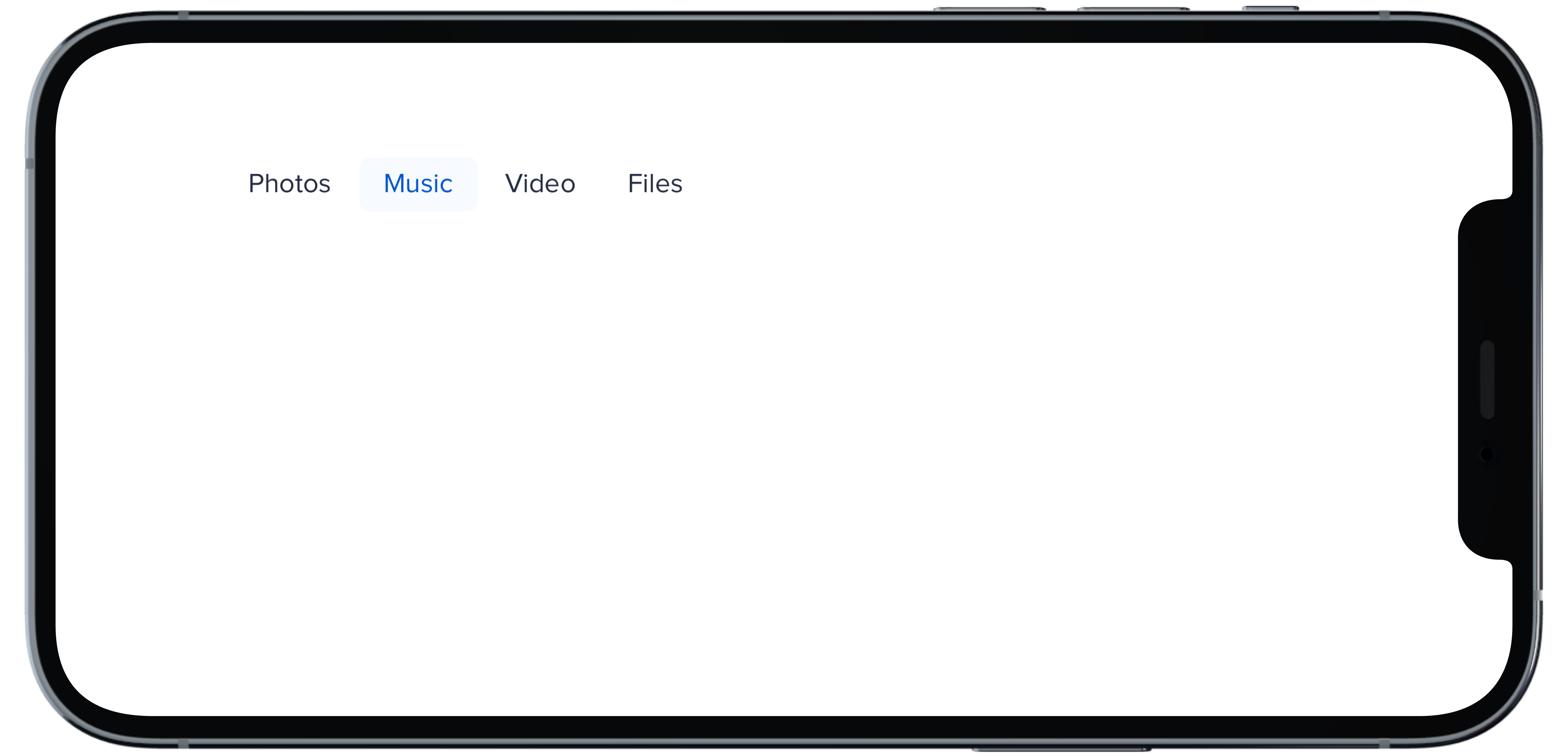
- data/app/pb_kits/playbook/pb_nav/docs/_nav_horizontal_bold_swift.md +0 -17
- data/app/pb_kits/playbook/pb_nav/docs/_nav_horizontal_default_swift.md +0 -17
- data/app/pb_kits/playbook/pb_nav/docs/_nav_horizontal_subtle_no_highlight_swift.md +0 -18
- data/app/pb_kits/playbook/pb_nav/docs/_nav_horizontal_subtle_swift.md +0 -18
- data/app/pb_kits/playbook/pb_nav/docs/_nav_props_swift.md +0 -11
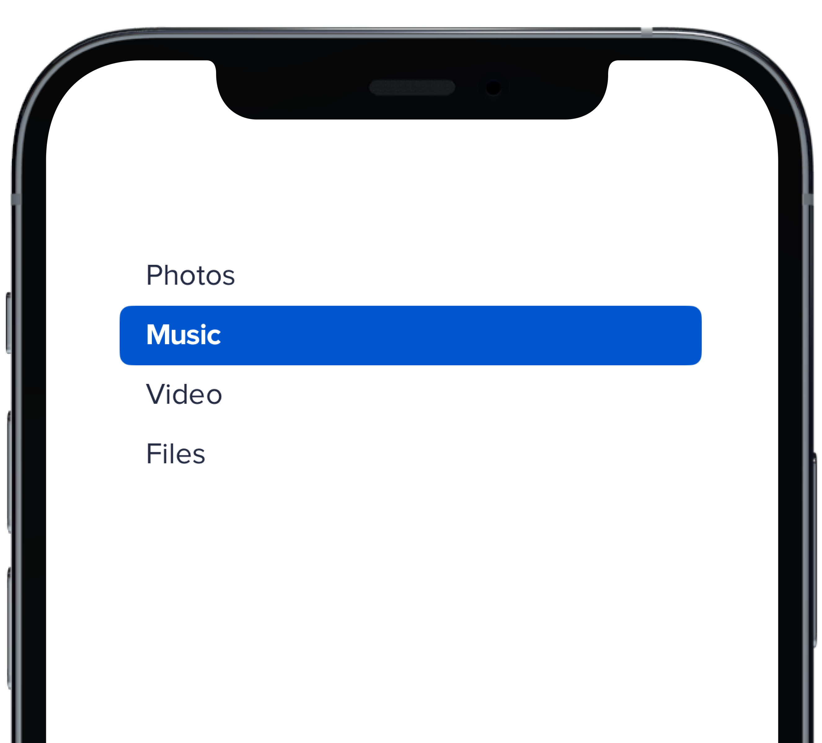
- data/app/pb_kits/playbook/pb_nav/docs/_nav_vertical_bold_swift.md +0 -18
- data/app/pb_kits/playbook/pb_nav/docs/_nav_vertical_default_swift.md +0 -18
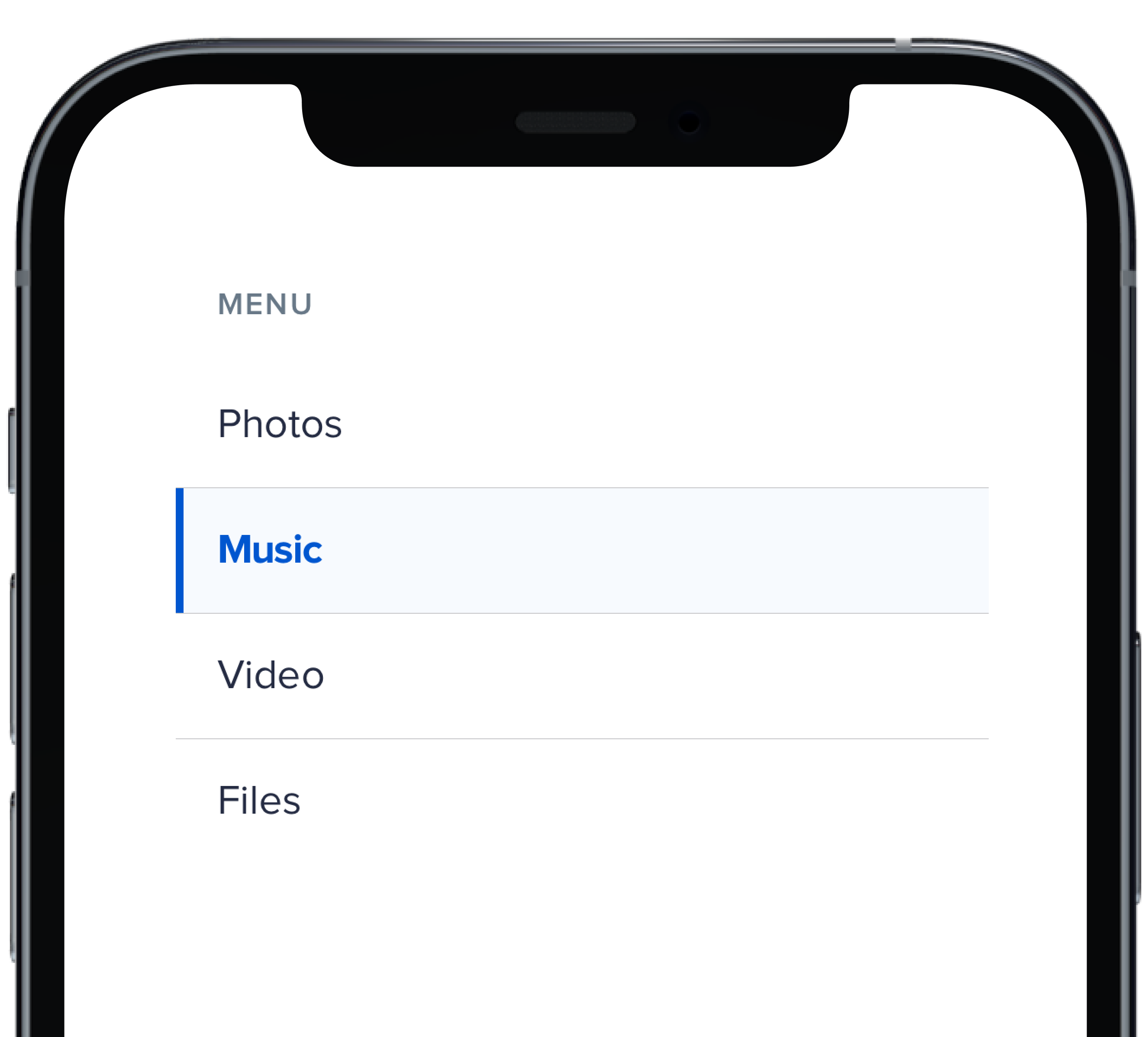
- data/app/pb_kits/playbook/pb_nav/docs/_nav_vertical_subtle_no_highlight_swift.md +0 -19
- data/app/pb_kits/playbook/pb_nav/docs/_nav_vertical_subtle_swift.md +0 -17
data/lib/playbook/version.rb
CHANGED
metadata
CHANGED
|
@@ -1,15 +1,15 @@
|
|
|
1
1
|
--- !ruby/object:Gem::Specification
|
|
2
2
|
name: playbook_ui
|
|
3
3
|
version: !ruby/object:Gem::Version
|
|
4
|
-
version: 13.15.0
|
|
4
|
+
version: 13.15.0
|
|
5
5
|
platform: ruby
|
|
6
6
|
authors:
|
|
7
7
|
- Power UX
|
|
8
8
|
- Power Devs
|
|
9
|
-
autorequire:
|
|
9
|
+
autorequire:
|
|
10
10
|
bindir: bin
|
|
11
11
|
cert_chain: []
|
|
12
|
-
date: 2024-01-
|
|
12
|
+
date: 2024-01-03 00:00:00.000000000 Z
|
|
13
13
|
dependencies:
|
|
14
14
|
- !ruby/object:Gem::Dependency
|
|
15
15
|
name: actionpack
|
|
@@ -637,10 +637,8 @@ files:
|
|
|
637
637
|
- app/pb_kits/playbook/pb_collapsible/docs/_collapsible_color.html.erb
|
|
638
638
|
- app/pb_kits/playbook/pb_collapsible/docs/_collapsible_color.jsx
|
|
639
639
|
- app/pb_kits/playbook/pb_collapsible/docs/_collapsible_color.md
|
|
640
|
-
- app/pb_kits/playbook/pb_collapsible/docs/_collapsible_colors_swift.md
|
|
641
640
|
- app/pb_kits/playbook/pb_collapsible/docs/_collapsible_default.html.erb
|
|
642
641
|
- app/pb_kits/playbook/pb_collapsible/docs/_collapsible_default.jsx
|
|
643
|
-
- app/pb_kits/playbook/pb_collapsible/docs/_collapsible_default_swift.md
|
|
644
642
|
- app/pb_kits/playbook/pb_collapsible/docs/_collapsible_external_controls.html.erb
|
|
645
643
|
- app/pb_kits/playbook/pb_collapsible/docs/_collapsible_external_controls.md
|
|
646
644
|
- app/pb_kits/playbook/pb_collapsible/docs/_collapsible_external_controls_multiple.html.erb
|
|
@@ -648,11 +646,9 @@ files:
|
|
|
648
646
|
- app/pb_kits/playbook/pb_collapsible/docs/_collapsible_icons.html.erb
|
|
649
647
|
- app/pb_kits/playbook/pb_collapsible/docs/_collapsible_icons.jsx
|
|
650
648
|
- app/pb_kits/playbook/pb_collapsible/docs/_collapsible_icons.md
|
|
651
|
-
- app/pb_kits/playbook/pb_collapsible/docs/_collapsible_props_table.md
|
|
652
649
|
- app/pb_kits/playbook/pb_collapsible/docs/_collapsible_size.html.erb
|
|
653
650
|
- app/pb_kits/playbook/pb_collapsible/docs/_collapsible_size.jsx
|
|
654
651
|
- app/pb_kits/playbook/pb_collapsible/docs/_collapsible_size.md
|
|
655
|
-
- app/pb_kits/playbook/pb_collapsible/docs/_collapsible_sizes_swift.md
|
|
656
652
|
- app/pb_kits/playbook/pb_collapsible/docs/_collapsible_state.jsx
|
|
657
653
|
- app/pb_kits/playbook/pb_collapsible/docs/_collapsible_state.md
|
|
658
654
|
- app/pb_kits/playbook/pb_collapsible/docs/example.yml
|
|
@@ -1657,15 +1653,6 @@ files:
|
|
|
1657
1653
|
- app/pb_kits/playbook/pb_nav/docs/_description.md
|
|
1658
1654
|
- app/pb_kits/playbook/pb_nav/docs/_horizontal_nav.html.erb
|
|
1659
1655
|
- app/pb_kits/playbook/pb_nav/docs/_horizontal_nav.jsx
|
|
1660
|
-
- app/pb_kits/playbook/pb_nav/docs/_nav_horizontal_bold_swift.md
|
|
1661
|
-
- app/pb_kits/playbook/pb_nav/docs/_nav_horizontal_default_swift.md
|
|
1662
|
-
- app/pb_kits/playbook/pb_nav/docs/_nav_horizontal_subtle_no_highlight_swift.md
|
|
1663
|
-
- app/pb_kits/playbook/pb_nav/docs/_nav_horizontal_subtle_swift.md
|
|
1664
|
-
- app/pb_kits/playbook/pb_nav/docs/_nav_props_swift.md
|
|
1665
|
-
- app/pb_kits/playbook/pb_nav/docs/_nav_vertical_bold_swift.md
|
|
1666
|
-
- app/pb_kits/playbook/pb_nav/docs/_nav_vertical_default_swift.md
|
|
1667
|
-
- app/pb_kits/playbook/pb_nav/docs/_nav_vertical_subtle_no_highlight_swift.md
|
|
1668
|
-
- app/pb_kits/playbook/pb_nav/docs/_nav_vertical_subtle_swift.md
|
|
1669
1656
|
- app/pb_kits/playbook/pb_nav/docs/_nav_with_font_control.html.erb
|
|
1670
1657
|
- app/pb_kits/playbook/pb_nav/docs/_nav_with_font_control.jsx
|
|
1671
1658
|
- app/pb_kits/playbook/pb_nav/docs/_nav_with_font_control.md
|
|
@@ -2791,7 +2778,7 @@ homepage: https://playbook.powerapp.cloud/
|
|
|
2791
2778
|
licenses:
|
|
2792
2779
|
- ISC
|
|
2793
2780
|
metadata: {}
|
|
2794
|
-
post_install_message:
|
|
2781
|
+
post_install_message:
|
|
2795
2782
|
rdoc_options: []
|
|
2796
2783
|
require_paths:
|
|
2797
2784
|
- lib
|
|
@@ -2802,12 +2789,12 @@ required_ruby_version: !ruby/object:Gem::Requirement
|
|
|
2802
2789
|
version: '0'
|
|
2803
2790
|
required_rubygems_version: !ruby/object:Gem::Requirement
|
|
2804
2791
|
requirements:
|
|
2805
|
-
- - "
|
|
2792
|
+
- - ">="
|
|
2806
2793
|
- !ruby/object:Gem::Version
|
|
2807
|
-
version:
|
|
2794
|
+
version: '0'
|
|
2808
2795
|
requirements: []
|
|
2809
2796
|
rubygems_version: 3.3.7
|
|
2810
|
-
signing_key:
|
|
2797
|
+
signing_key:
|
|
2811
2798
|
specification_version: 4
|
|
2812
2799
|
summary: Playbook Design System
|
|
2813
2800
|
test_files: []
|
|
@@ -1,27 +0,0 @@
|
|
|
1
|
-

|
|
2
|
-
|
|
3
|
-
```swift
|
|
4
|
-
let iconSize: PBIcon.IconSize
|
|
5
|
-
let iconColor: CollapsibleIconColor
|
|
6
|
-
let text: String
|
|
7
|
-
@State private var isCollapsed = true
|
|
8
|
-
let lorem =
|
|
9
|
-
"
|
|
10
|
-
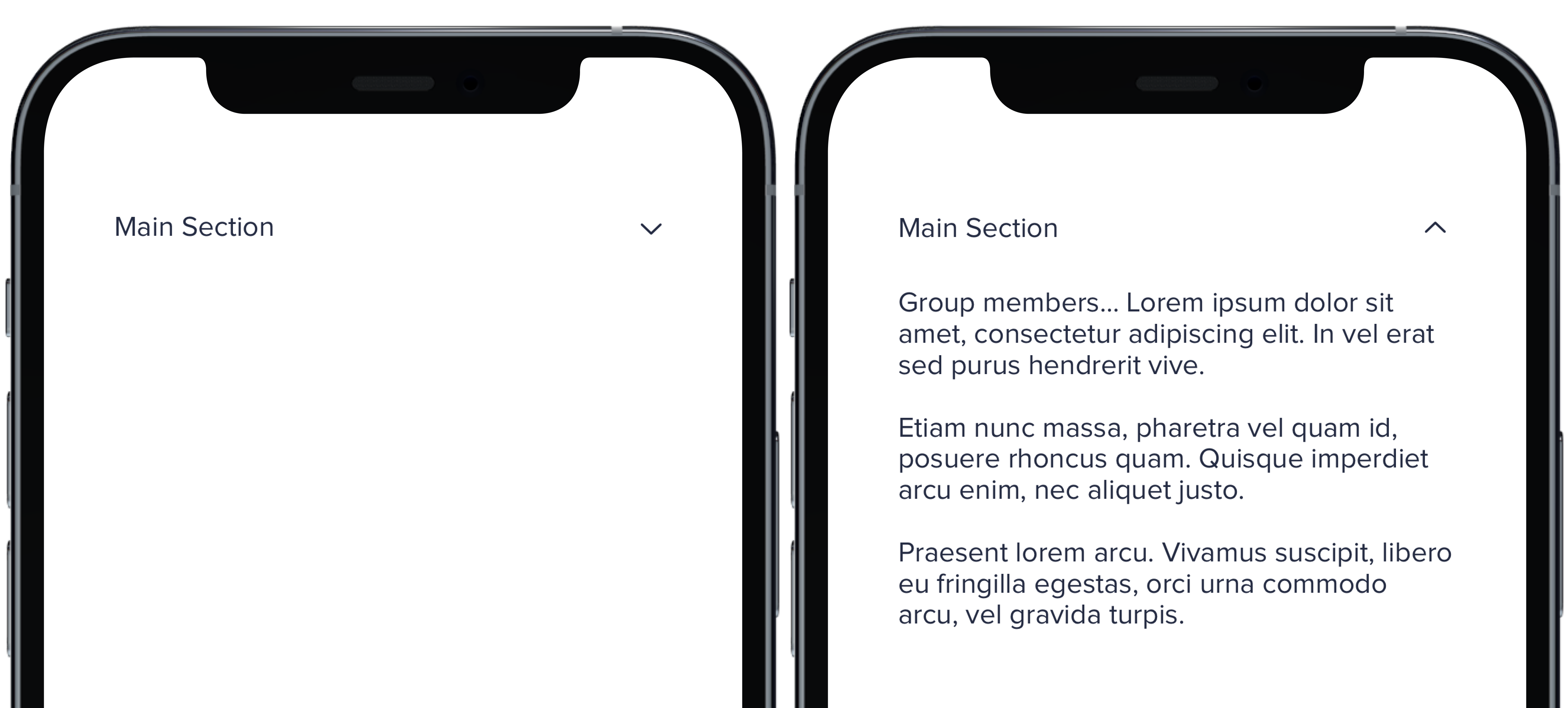
Group members... Lorem ipsum dolor sit amet, consectetur adipiscing elit. In vel erat sed purus hendrerit vive.
|
|
11
|
-
Etiam nunc massa, pharetra vel quam id, posuere rhoncus quam. Quisque imperdiet arcu enim, nec aliquet justo.
|
|
12
|
-
Praesent lorem arcu. Vivamus suscipit, libero eu fringilla egestas, orci urna commodo arcu, vel gravida turpis.
|
|
13
|
-
"
|
|
14
|
-
PBCollapsible(isCollapsed: $isCollapsed, iconSize: iconSize, iconColor: iconColor) {
|
|
15
|
-
VStack(spacing: Spacing.medium) {
|
|
16
|
-
CollapsibleDoc(iconColor: .default, text: "Default Section")
|
|
17
|
-
CollapsibleDoc(iconColor: .light, text: "Light Section")
|
|
18
|
-
CollapsibleDoc(iconColor: .lighter, text: "Lighter Section")
|
|
19
|
-
CollapsibleDoc(iconColor: .link, text: "Link Section")
|
|
20
|
-
CollapsibleDoc(iconColor: .error, text: "Error Section")
|
|
21
|
-
CollapsibleDoc(iconColor: .success, text: "Success Section")
|
|
22
|
-
}
|
|
23
|
-
} content: {
|
|
24
|
-
Text(lorem).pbFont(.body)
|
|
25
|
-
}
|
|
26
|
-
|
|
27
|
-
```
|
|
@@ -1,22 +0,0 @@
|
|
|
1
|
-
|
|
2
|
-
|
|
3
|
-
|
|
4
|
-
```swift
|
|
5
|
-
let iconSize: PBIcon.IconSize
|
|
6
|
-
let iconColor: CollapsibleIconColor
|
|
7
|
-
let text: String
|
|
8
|
-
@State private var isCollapsed = true
|
|
9
|
-
let lorem =
|
|
10
|
-
"
|
|
11
|
-
Group members... Lorem ipsum dolor sit amet, consectetur adipiscing elit. In vel erat sed purus hendrerit vive.
|
|
12
|
-
Etiam nunc massa, pharetra vel quam id, posuere rhoncus quam. Quisque imperdiet arcu enim, nec aliquet justo.
|
|
13
|
-
Praesent lorem arcu. Vivamus suscipit, libero eu fringilla egestas, orci urna commodo arcu, vel gravida turpis.
|
|
14
|
-
"
|
|
15
|
-
|
|
16
|
-
PBCollapsible(isCollapsed: $isCollapsed, iconSize: iconSize, iconColor: iconColor) {
|
|
17
|
-
CollapsibleDoc(text: "Main Section")
|
|
18
|
-
} content: {
|
|
19
|
-
Text(lorem).pbFont(.body)
|
|
20
|
-
}
|
|
21
|
-
|
|
22
|
-
```
|
|
@@ -1,8 +0,0 @@
|
|
|
1
|
-
### Props
|
|
2
|
-
| Name | Type | Description | Default | Values |
|
|
3
|
-
| --- | ----------- | --------- | --------- | --------- |
|
|
4
|
-
| **isCollapsed** | `Bool` | Value for whether or not the dropdown is closed or open | `false` | `true` `false` |
|
|
5
|
-
| **headerView** | `View` | Title of dropdown | | |
|
|
6
|
-
| **contentView** | `View` | Content of dropdown | | |
|
|
7
|
-
| **iconSize** | `PBIcon.IconSize` | Sets size of chevron icon | `.small` | `xSmall` `small` `large` `x1` `x2` `x3` `x4` `x5` `x6` `x7` `x8` `x9` `x10` |
|
|
8
|
-
| **iconColor** | `CollapsibleIconColor` | Sets color of chevron icon | `.default` | `default` `light` `lighter` `link` `error` `success` |
|
|
@@ -1,26 +0,0 @@
|
|
|
1
|
-

|
|
2
|
-
|
|
3
|
-
```swift
|
|
4
|
-
let iconSize: PBIcon.IconSize
|
|
5
|
-
let iconColor: CollapsibleIconColor
|
|
6
|
-
let text: String
|
|
7
|
-
@State private var isCollapsed = true
|
|
8
|
-
let lorem =
|
|
9
|
-
"
|
|
10
|
-
Group members... Lorem ipsum dolor sit amet, consectetur adipiscing elit. In vel erat sed purus hendrerit vive.
|
|
11
|
-
Etiam nunc massa, pharetra vel quam id, posuere rhoncus quam. Quisque imperdiet arcu enim, nec aliquet justo.
|
|
12
|
-
Praesent lorem arcu. Vivamus suscipit, libero eu fringilla egestas, orci urna commodo arcu, vel gravida turpis.
|
|
13
|
-
"
|
|
14
|
-
|
|
15
|
-
PBCollapsible(isCollapsed: $isCollapsed, iconSize: iconSize, iconColor: iconColor) {
|
|
16
|
-
VStack(spacing: Spacing.medium) {
|
|
17
|
-
CollapsibleDoc(iconSize: .xSmall, text: "Extra Small Section")
|
|
18
|
-
CollapsibleDoc(iconSize: .small, text: "Small Section")
|
|
19
|
-
CollapsibleDoc(text: "Default Section")
|
|
20
|
-
CollapsibleDoc(iconSize: .large, text: "Large Section")
|
|
21
|
-
}
|
|
22
|
-
} content: {
|
|
23
|
-
Text(lorem).pbFont(.body)
|
|
24
|
-
}
|
|
25
|
-
|
|
26
|
-
```
|
|
@@ -1,17 +0,0 @@
|
|
|
1
|
-
|
|
2
|
-
|
|
3
|
-
```swift
|
|
4
|
-
@State private var selectedHBold: Int = 1
|
|
5
|
-
|
|
6
|
-
PBNav(
|
|
7
|
-
selected: $selectedHBold,
|
|
8
|
-
variant: .bold,
|
|
9
|
-
orientation: .horizontal,
|
|
10
|
-
borders: false
|
|
11
|
-
) {
|
|
12
|
-
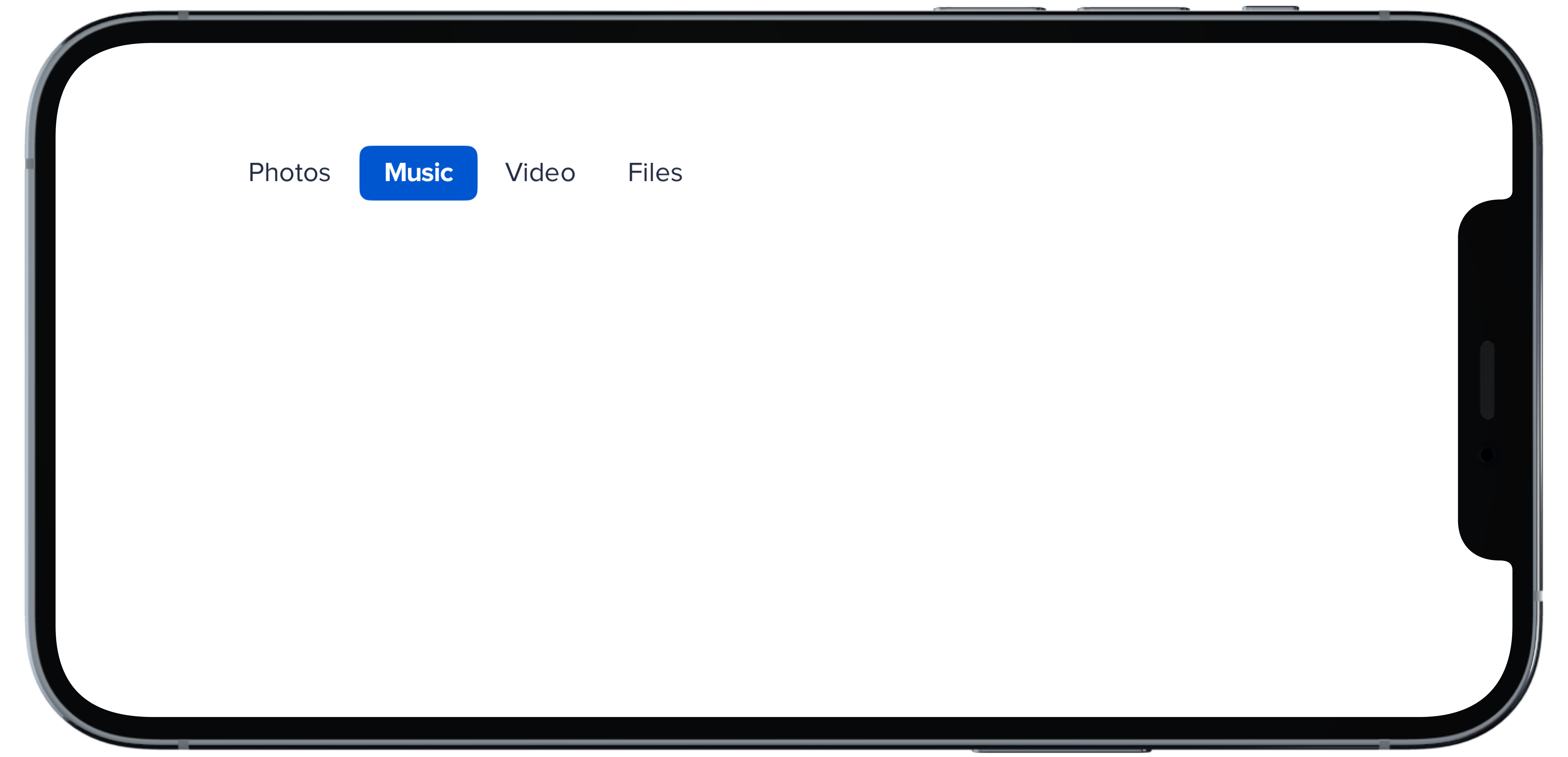
PBNavItem("Photos")
|
|
13
|
-
PBNavItem("Music")
|
|
14
|
-
PBNavItem("Video")
|
|
15
|
-
PBNavItem("Files")
|
|
16
|
-
}
|
|
17
|
-
```
|
|
@@ -1,17 +0,0 @@
|
|
|
1
|
-
|
|
2
|
-
|
|
3
|
-
```swift
|
|
4
|
-
@State private var selectedHDefault: Int = 1
|
|
5
|
-
|
|
6
|
-
PBNav(
|
|
7
|
-
selected: $selectedHDefault,
|
|
8
|
-
variant: .normal,
|
|
9
|
-
orientation: .horizontal
|
|
10
|
-
) {
|
|
11
|
-
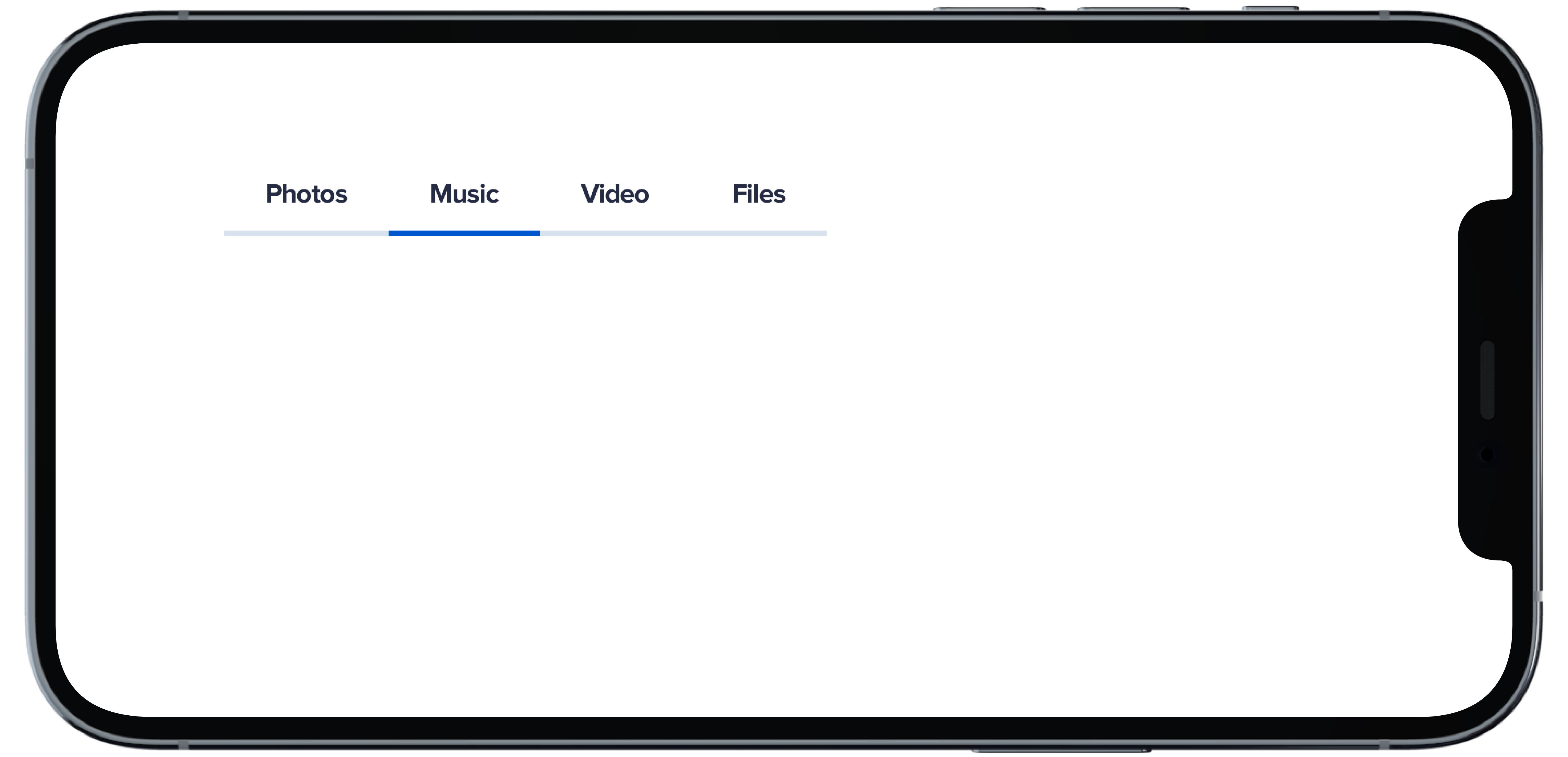
PBNavItem("Photos")
|
|
12
|
-
PBNavItem("Music")
|
|
13
|
-
PBNavItem("Video")
|
|
14
|
-
PBNavItem("Files")
|
|
15
|
-
}
|
|
16
|
-
|
|
17
|
-
```
|
|
@@ -1,18 +0,0 @@
|
|
|
1
|
-
|
|
2
|
-
|
|
3
|
-
```swift
|
|
4
|
-
@State private var selectedHSubtleNoHighlight: Int = 1
|
|
5
|
-
|
|
6
|
-
PBNav(
|
|
7
|
-
selected: $selectedHSubtleNoHighlight,
|
|
8
|
-
variant: .subtle,
|
|
9
|
-
orientation: .horizontal,
|
|
10
|
-
borders: false,
|
|
11
|
-
highlight: false
|
|
12
|
-
) {
|
|
13
|
-
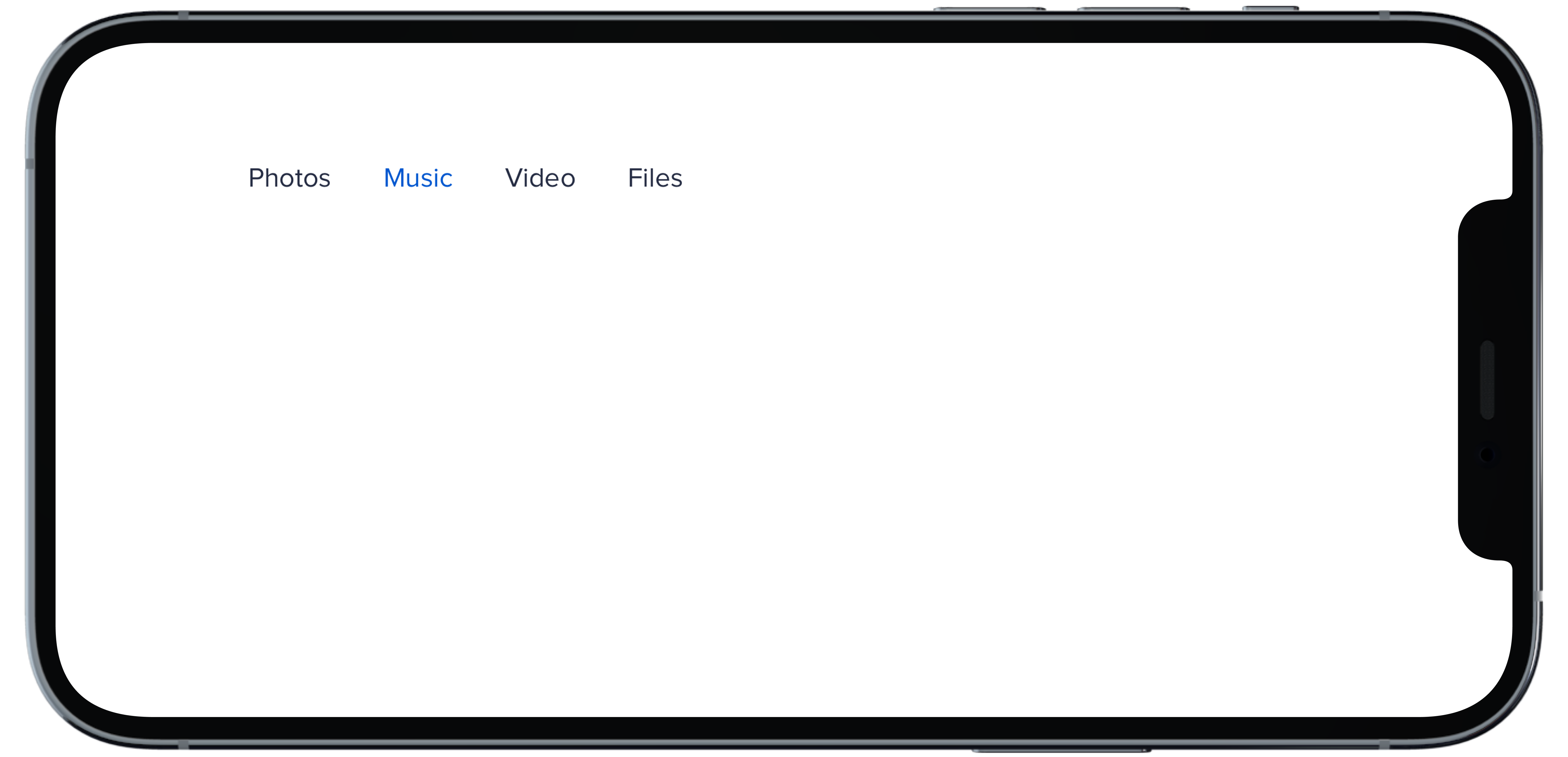
PBNavItem("Photos")
|
|
14
|
-
PBNavItem("Music")
|
|
15
|
-
PBNavItem("Video")
|
|
16
|
-
PBNavItem("Files")
|
|
17
|
-
}
|
|
18
|
-
```
|
|
@@ -1,18 +0,0 @@
|
|
|
1
|
-
|
|
2
|
-
|
|
3
|
-
```swift
|
|
4
|
-
@State private var selectedHSubtle: Int = 1
|
|
5
|
-
|
|
6
|
-
PBNav(
|
|
7
|
-
selected: $selectedHSubtle,
|
|
8
|
-
variant: .subtle,
|
|
9
|
-
orientation: .horizontal,
|
|
10
|
-
borders: false
|
|
11
|
-
) {
|
|
12
|
-
PBNavItem("Photos")
|
|
13
|
-
PBNavItem("Music")
|
|
14
|
-
PBNavItem("Video")
|
|
15
|
-
PBNavItem("Files")
|
|
16
|
-
}
|
|
17
|
-
|
|
18
|
-
```
|
|
@@ -1,11 +0,0 @@
|
|
|
1
|
-
### Props
|
|
2
|
-
| Name | Type | Description | Default | Values |
|
|
3
|
-
| --- | ----------- | --------- | --------- | --------- |
|
|
4
|
-
| **selected** | `Int` | Sets selected to current index | `0` | |
|
|
5
|
-
| **currentHover** | `Int?` | Sets the current hover state to the current index| | |
|
|
6
|
-
| **variant** | `Variant` | Sets variant for nav | `.normal` | `normal` `subtle` `bold` |
|
|
7
|
-
| **orientation** | `Orientation` | Changes the orientation of nav | `.vertical` | `horizontal` `verticle` |
|
|
8
|
-
| **title** | `String?` | Sets title of nav | | |
|
|
9
|
-
| **borders** | `Bool` | Boolean value for whether nav items have a border or not | `true` | `true` `false` |
|
|
10
|
-
| **highlight** | `Bool` | Boolean value for adding a highlight to nav | `true` | `true` `false` |
|
|
11
|
-
| **views** | `[AnyView]` | An Array of AnyView | | |
|
|
@@ -1,18 +0,0 @@
|
|
|
1
|
-
|
|
2
|
-
|
|
3
|
-
```swift
|
|
4
|
-
@State private var selectedVBold: Int = 1
|
|
5
|
-
|
|
6
|
-
PBNav(
|
|
7
|
-
selected: $selectedVBold,
|
|
8
|
-
variant: .bold,
|
|
9
|
-
orientation: .vertical,
|
|
10
|
-
borders: false
|
|
11
|
-
) {
|
|
12
|
-
PBNavItem("Photos")
|
|
13
|
-
PBNavItem("Music")
|
|
14
|
-
PBNavItem("Video")
|
|
15
|
-
PBNavItem("Files")
|
|
16
|
-
}
|
|
17
|
-
|
|
18
|
-
```
|
|
@@ -1,18 +0,0 @@
|
|
|
1
|
-
|
|
2
|
-
|
|
3
|
-
```swift
|
|
4
|
-
@State private var selectedVDefault: Int = 1
|
|
5
|
-
|
|
6
|
-
PBNav(
|
|
7
|
-
selected: $selectedVDefault,
|
|
8
|
-
variant: .normal,
|
|
9
|
-
orientation: .vertical,
|
|
10
|
-
title: "Menu"
|
|
11
|
-
) {
|
|
12
|
-
PBNavItem("Photos")
|
|
13
|
-
PBNavItem("Music")
|
|
14
|
-
PBNavItem("Video")
|
|
15
|
-
PBNavItem("Files")
|
|
16
|
-
}
|
|
17
|
-
|
|
18
|
-
```
|
|
@@ -1,19 +0,0 @@
|
|
|
1
|
-
|
|
2
|
-
|
|
3
|
-
```swift
|
|
4
|
-
@State private var selectedVSubtleNoHighlight: Int = 1
|
|
5
|
-
|
|
6
|
-
PBNav(
|
|
7
|
-
selected: $selectedVSubtleNoHighlight,
|
|
8
|
-
variant: .subtle,
|
|
9
|
-
orientation: .vertical,
|
|
10
|
-
borders: false,
|
|
11
|
-
highlight: false
|
|
12
|
-
) {
|
|
13
|
-
PBNavItem("Photos")
|
|
14
|
-
PBNavItem("Music")
|
|
15
|
-
PBNavItem("Video")
|
|
16
|
-
PBNavItem("Files")
|
|
17
|
-
}
|
|
18
|
-
|
|
19
|
-
```
|
|
@@ -1,17 +0,0 @@
|
|
|
1
|
-
|
|
2
|
-
|
|
3
|
-
```swift
|
|
4
|
-
@State private var selectedVSubtle: Int = 1
|
|
5
|
-
|
|
6
|
-
PBNav(
|
|
7
|
-
selected: $selectedVSubtle,
|
|
8
|
-
variant: .subtle,
|
|
9
|
-
orientation: .vertical,
|
|
10
|
-
borders: false
|
|
11
|
-
) {
|
|
12
|
-
PBNavItem("Photos")
|
|
13
|
-
PBNavItem("Music")
|
|
14
|
-
PBNavItem("Video")
|
|
15
|
-
PBNavItem("Files")
|
|
16
|
-
}
|
|
17
|
-
```
|