playbook_ui 13.14.0 → 13.15.0
Sign up to get free protection for your applications and to get access to all the features.
- checksums.yaml +4 -4
- data/app/pb_kits/playbook/_playbook.scss +1 -0
- data/app/pb_kits/playbook/pb_avatar/_avatar.tsx +5 -5
- data/app/pb_kits/playbook/pb_avatar_action_button/_avatar_action_button.tsx +3 -3
- data/app/pb_kits/playbook/pb_background/_background.tsx +9 -9
- data/app/pb_kits/playbook/pb_badge/_badge.tsx +2 -2
- data/app/pb_kits/playbook/pb_bar_graph/_bar_graph.tsx +3 -3
- data/app/pb_kits/playbook/pb_body/_body.scss +0 -5
- data/app/pb_kits/playbook/pb_body/_body.tsx +5 -9
- data/app/pb_kits/playbook/pb_body/_body_mixins.scss +0 -20
- data/app/pb_kits/playbook/pb_body/body.rb +1 -8
- data/app/pb_kits/playbook/pb_bread_crumbs/_bread_crumb_item.tsx +3 -4
- data/app/pb_kits/playbook/pb_bread_crumbs/_bread_crumbs.tsx +3 -3
- data/app/pb_kits/playbook/pb_button/_button.tsx +40 -37
- data/app/pb_kits/playbook/pb_button/docs/_button_props_swift.md +11 -0
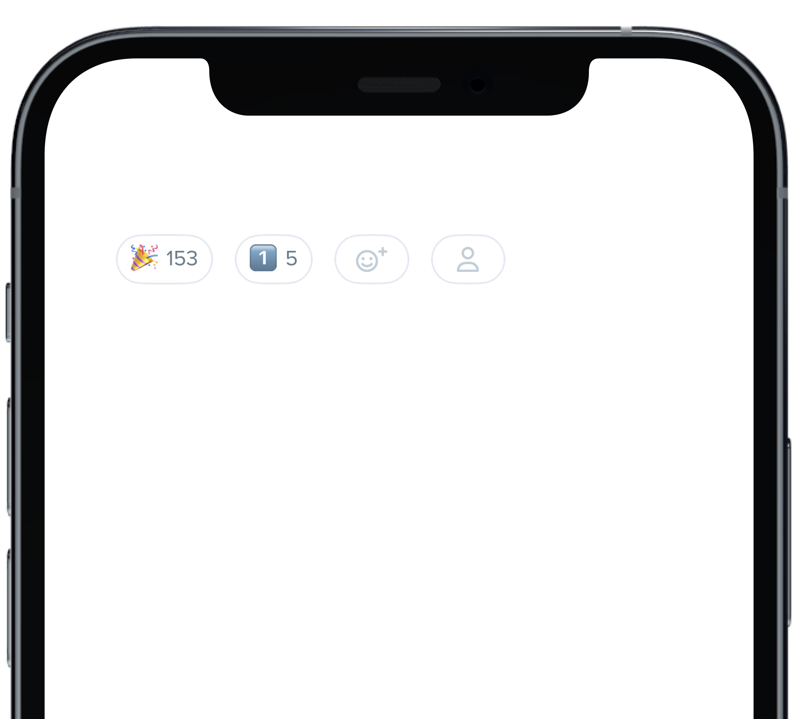
- data/app/pb_kits/playbook/pb_button/docs/_button_reaction_swift.md +26 -0
- data/app/pb_kits/playbook/pb_button/docs/example.yml +1 -0
- data/app/pb_kits/playbook/pb_button_toolbar/_button_toolbar.tsx +3 -3
- data/app/pb_kits/playbook/pb_caption/_caption.tsx +1 -1
- data/app/pb_kits/playbook/pb_card/_card.tsx +2 -2
- data/app/pb_kits/playbook/pb_card/docs/_card_background.jsx +5 -4
- data/app/pb_kits/playbook/pb_checkbox/_checkbox.tsx +3 -3
- data/app/pb_kits/playbook/pb_circle_chart/_circle_chart.tsx +9 -9
- data/app/pb_kits/playbook/pb_circle_icon_button/_circle_icon_button.tsx +1 -1
- data/app/pb_kits/playbook/pb_collapsible/_collapsible.tsx +5 -7
- data/app/pb_kits/playbook/pb_collapsible/_helper_functions.ts +2 -2
- data/app/pb_kits/playbook/pb_collapsible/child_kits/CollapsibleContent.tsx +5 -4
- data/app/pb_kits/playbook/pb_collapsible/child_kits/CollapsibleMain.tsx +16 -12
- data/app/pb_kits/playbook/pb_contact/_contact.tsx +3 -3
- data/app/pb_kits/playbook/pb_currency/_currency.tsx +2 -2
- data/app/pb_kits/playbook/pb_dashboard/pbChartsColorsHelper.ts +1 -1
- data/app/pb_kits/playbook/pb_dashboard/pbChartsDarkTheme.ts +4 -57
- data/app/pb_kits/playbook/pb_dashboard/pbChartsLightTheme.ts +4 -57
- data/app/pb_kits/playbook/pb_dashboard/themeTypes.ts +20 -16
- data/app/pb_kits/playbook/pb_dashboard_value/_dashboard_value.tsx +1 -1
- data/app/pb_kits/playbook/pb_date/_date.tsx +7 -7
- data/app/pb_kits/playbook/pb_date_picker/_date_picker.tsx +1 -1
- data/app/pb_kits/playbook/pb_date_range_inline/_date_range_inline.tsx +2 -2
- data/app/pb_kits/playbook/pb_date_range_stacked/_date_range_stacked.tsx +2 -2
- data/app/pb_kits/playbook/pb_date_stacked/_date_stacked.tsx +8 -8
- data/app/pb_kits/playbook/pb_date_time/_date_time.tsx +2 -2
- data/app/pb_kits/playbook/pb_date_time_stacked/_date_time_stacked.tsx +1 -1
- data/app/pb_kits/playbook/pb_date_year_stacked/_date_year_stacked.tsx +2 -2
- data/app/pb_kits/playbook/pb_date_year_stacked/date_year_stacked.test.js +6 -3
- data/app/pb_kits/playbook/pb_detail/_detail.scss +2 -2
- data/app/pb_kits/playbook/pb_detail/_detail.tsx +5 -5
- data/app/pb_kits/playbook/pb_detail/detail.rb +1 -1
- data/app/pb_kits/playbook/pb_detail/detail.test.jsx +2 -2
- data/app/pb_kits/playbook/pb_dialog/_close_icon.tsx +2 -2
- data/app/pb_kits/playbook/pb_dialog/_dialog.tsx +42 -34
- data/app/pb_kits/playbook/pb_dialog/child_kits/_dialog_body.tsx +1 -1
- data/app/pb_kits/playbook/pb_dialog/child_kits/_dialog_footer.tsx +4 -5
- data/app/pb_kits/playbook/pb_dialog/child_kits/_dialog_header.tsx +4 -4
- data/app/pb_kits/playbook/pb_dialog/docs/_dialog_default_swift.md +11 -0
- data/app/pb_kits/playbook/pb_dialog/docs/_dialog_full_height.jsx +8 -4
- data/app/pb_kits/playbook/pb_dialog/docs/_dialog_full_height_placement.jsx +8 -4
- data/app/pb_kits/playbook/pb_dialog/docs/_dialog_props_table.md +13 -0
- data/app/pb_kits/playbook/pb_dialog/docs/_dialog_scrollable.jsx +4 -2
- data/app/pb_kits/playbook/pb_dialog/docs/_dialog_sizes_swift.md +18 -0
- data/app/pb_kits/playbook/pb_dialog/docs/_dialog_status.jsx +1 -1
- data/app/pb_kits/playbook/pb_dialog/docs/_dialog_status_swift.md +14 -0
- data/app/pb_kits/playbook/pb_dialog/docs/example.yml +7 -0
- data/app/pb_kits/playbook/pb_distribution_bar/_distribution_bar.tsx +5 -5
- data/app/pb_kits/playbook/pb_file_upload/_file_upload.tsx +1 -1
- data/app/pb_kits/playbook/pb_fixed_confirmation_toast/_fixed_confirmation_toast.tsx +1 -1
- data/app/pb_kits/playbook/pb_flex/_flex.tsx +1 -1
- data/app/pb_kits/playbook/pb_flex/_flex_item.tsx +1 -1
- data/app/pb_kits/playbook/pb_form_group/_form_group.tsx +1 -1
- data/app/pb_kits/playbook/pb_form_pill/_form_pill.tsx +1 -1
- data/app/pb_kits/playbook/pb_gauge/_gauge.tsx +1 -1
- data/app/pb_kits/playbook/pb_hashtag/_hashtag.tsx +1 -1
- data/app/pb_kits/playbook/pb_highlight/_highlight.tsx +1 -1
- data/app/pb_kits/playbook/pb_home_address_street/_home_address_street.tsx +1 -1
- data/app/pb_kits/playbook/pb_icon/_icon.tsx +1 -1
- data/app/pb_kits/playbook/pb_icon_circle/_icon_circle.tsx +1 -1
- data/app/pb_kits/playbook/pb_icon_stat_value/_icon_stat_value.tsx +1 -1
- data/app/pb_kits/playbook/pb_icon_value/_icon_value.tsx +1 -1
- data/app/pb_kits/playbook/pb_image/_image.tsx +1 -1
- data/app/pb_kits/playbook/pb_label_pill/_label_pill.tsx +1 -1
- data/app/pb_kits/playbook/pb_label_value/_label_value.tsx +1 -1
- data/app/pb_kits/playbook/pb_layout/_layout.tsx +1 -1
- data/app/pb_kits/playbook/pb_legend/_legend.tsx +1 -1
- data/app/pb_kits/playbook/pb_lightbox/Header/_lightbox_header.tsx +1 -1
- data/app/pb_kits/playbook/pb_lightbox/_lightbox.tsx +1 -1
- data/app/pb_kits/playbook/pb_line_graph/_line_graph.tsx +1 -1
- data/app/pb_kits/playbook/pb_list/_list.tsx +1 -1
- data/app/pb_kits/playbook/pb_list/_list_item.tsx +1 -1
- data/app/pb_kits/playbook/pb_loading_inline/_loading_inline.tsx +1 -1
- data/app/pb_kits/playbook/pb_map/_map.tsx +1 -1
- data/app/pb_kits/playbook/pb_message/_message.tsx +1 -1
- data/app/pb_kits/playbook/pb_message/_message_mention.tsx +1 -1
- data/app/pb_kits/playbook/pb_multi_level_select/_multi_level_select.tsx +1 -1
- data/app/pb_kits/playbook/pb_multiple_users/_multiple_users.tsx +1 -1
- data/app/pb_kits/playbook/pb_multiple_users_stacked/_multiple_users_stacked.tsx +1 -1
- data/app/pb_kits/playbook/pb_nav/_item.tsx +1 -1
- data/app/pb_kits/playbook/pb_nav/_nav.tsx +1 -1
- data/app/pb_kits/playbook/pb_online_status/_online_status.tsx +1 -1
- data/app/pb_kits/playbook/pb_passphrase/_passphrase.tsx +1 -1
- data/app/pb_kits/playbook/pb_person/_person.tsx +1 -1
- data/app/pb_kits/playbook/pb_person/docs/_person_default_swift.md +8 -0
- data/app/pb_kits/playbook/pb_person/docs/_person_props_swift.md +5 -0
- data/app/pb_kits/playbook/pb_person/docs/example.yml +4 -0
- data/app/pb_kits/playbook/pb_person_contact/_person_contact.tsx +1 -1
- data/app/pb_kits/playbook/pb_phone_number_input/_phone_number_input.tsx +1 -1
- data/app/pb_kits/playbook/pb_pill/_pill.tsx +1 -1
- data/app/pb_kits/playbook/pb_popover/_popover.tsx +1 -1
- data/app/pb_kits/playbook/pb_progress_pills/_progress_pills.tsx +1 -1
- data/app/pb_kits/playbook/pb_progress_simple/_progress_simple.tsx +1 -1
- data/app/pb_kits/playbook/pb_progress_step/_progress_step.tsx +1 -1
- data/app/pb_kits/playbook/pb_progress_step/_progress_step_item.tsx +1 -1
- data/app/pb_kits/playbook/pb_radio/_radio.tsx +1 -1
- data/app/pb_kits/playbook/pb_rich_text_editor/_rich_text_editor.tsx +1 -1
- data/app/pb_kits/playbook/pb_section_separator/_section_separator.tsx +1 -1
- data/app/pb_kits/playbook/pb_select/_select.tsx +1 -1
- data/app/pb_kits/playbook/pb_select/docs/_select_default_swift.md +15 -0
- data/app/pb_kits/playbook/pb_select/docs/_select_error_swift.md +18 -0
- data/app/pb_kits/playbook/pb_select/docs/_select_props_table.md +8 -0
- data/app/pb_kits/playbook/pb_select/docs/example.yml +5 -0
- data/app/pb_kits/playbook/pb_selectable_card/_selectable_card.tsx +1 -1
- data/app/pb_kits/playbook/pb_selectable_card_icon/_selectable_card_icon.tsx +1 -1
- data/app/pb_kits/playbook/pb_selectable_icon/_selectable_icon.tsx +1 -1
- data/app/pb_kits/playbook/pb_selectable_list/_item.tsx +1 -1
- data/app/pb_kits/playbook/pb_selectable_list/_selectable_list.tsx +1 -1
- data/app/pb_kits/playbook/pb_source/_source.tsx +1 -1
- data/app/pb_kits/playbook/pb_star_rating/_star_rating.tsx +1 -1
- data/app/pb_kits/playbook/pb_stat_change/_stat_change.tsx +1 -1
- data/app/pb_kits/playbook/pb_stat_value/_stat_value.tsx +1 -1
- data/app/pb_kits/playbook/pb_table/_table.tsx +1 -1
- data/app/pb_kits/playbook/pb_table/_table_row.tsx +1 -1
- data/app/pb_kits/playbook/pb_text_input/_text_input.tsx +1 -1
- data/app/pb_kits/playbook/pb_textarea/_textarea.tsx +1 -1
- data/app/pb_kits/playbook/pb_time/_time.tsx +1 -1
- data/app/pb_kits/playbook/pb_time_range_inline/_time_range_inline.tsx +1 -1
- data/app/pb_kits/playbook/pb_time_stacked/_time_stacked.tsx +1 -1
- data/app/pb_kits/playbook/pb_timeline/_item.tsx +1 -1
- data/app/pb_kits/playbook/pb_timeline/_timeline.tsx +1 -1
- data/app/pb_kits/playbook/pb_timestamp/_timestamp.tsx +1 -1
- data/app/pb_kits/playbook/pb_title/_title.scss +0 -5
- data/app/pb_kits/playbook/pb_title/_title.tsx +2 -5
- data/app/pb_kits/playbook/pb_title/_title_mixin.scss +0 -19
- data/app/pb_kits/playbook/pb_title/title.rb +2 -9
- data/app/pb_kits/playbook/pb_title_count/_title_count.tsx +1 -1
- data/app/pb_kits/playbook/pb_title_detail/_title_detail.tsx +1 -1
- data/app/pb_kits/playbook/pb_toggle/_toggle.tsx +1 -1
- data/app/pb_kits/playbook/pb_tooltip/_tooltip.tsx +1 -1
- data/app/pb_kits/playbook/pb_treemap_chart/_treemap_chart.tsx +1 -1
- data/app/pb_kits/playbook/pb_typeahead/_typeahead.tsx +1 -1
- data/app/pb_kits/playbook/pb_user/_user.tsx +1 -1
- data/app/pb_kits/playbook/pb_user/docs/_user_horizontal_swift.md +37 -0
- data/app/pb_kits/playbook/pb_user/docs/_user_props_table.md +10 -0
- data/app/pb_kits/playbook/pb_user/docs/_user_size_swift.md +35 -0
- data/app/pb_kits/playbook/pb_user/docs/_user_text_only_swift.md +27 -0
- data/app/pb_kits/playbook/pb_user/docs/_user_vertical_size_swift.md +35 -0
- data/app/pb_kits/playbook/pb_user/docs/example.yml +7 -0
- data/app/pb_kits/playbook/pb_user_badge/_user_badge.tsx +1 -1
- data/app/pb_kits/playbook/pb_walkthrough/_walkthrough.tsx +1 -1
- data/app/pb_kits/playbook/pb_weekday_stacked/_weekday_stacked.tsx +1 -1
- data/app/pb_kits/playbook/tokens/exports/exports.d.ts +1 -0
- data/app/pb_kits/playbook/utilities/_truncate.scss +20 -0
- data/app/pb_kits/playbook/utilities/globalProps.ts +13 -2
- data/app/pb_kits/playbook/utilities/props.ts +2 -2
- data/app/pb_kits/playbook/utilities/test/globalProps/truncate.test.js +21 -0
- data/dist/playbook-rails.js +4 -4
- data/lib/playbook/classnames.rb +1 -0
- data/lib/playbook/kit_base.rb +2 -0
- data/lib/playbook/truncate.rb +29 -0
- data/lib/playbook/version.rb +2 -2
- metadata +21 -2
checksums.yaml
CHANGED
|
@@ -1,7 +1,7 @@
|
|
|
1
1
|
---
|
|
2
2
|
SHA256:
|
|
3
|
-
metadata.gz:
|
|
4
|
-
data.tar.gz:
|
|
3
|
+
metadata.gz: fd6f86769005f1cf4bd5400be7f925bf38d3e16560fbec5da24158c969873663
|
|
4
|
+
data.tar.gz: 5c879bd8ecc90a4e2d02adbab1d208f81098708f949e60ece5c95eb2875bd81e
|
|
5
5
|
SHA512:
|
|
6
|
-
metadata.gz:
|
|
7
|
-
data.tar.gz:
|
|
6
|
+
metadata.gz: 3d4bfff63b93a145834de3cfe80f3ecfa04f3d29ef10e7194fe2ad9149111a61efaeb70557b289db0fe499b1297e150ef0008af6f712289f45a84eaa83eab120
|
|
7
|
+
data.tar.gz: 94718a4b5a91761a32365bcb149b47c4e2aaea0a58fbc9860773117069875627018e92ea69626de9556d064fa50fde854107eee264e86bbede4d5bf0e14054da
|
|
@@ -12,7 +12,7 @@ export type AvatarProps = {
|
|
|
12
12
|
className?: string,
|
|
13
13
|
data?: {[key: string]: string},
|
|
14
14
|
dark?: boolean,
|
|
15
|
-
htmlOptions?: {[key: string]: string | number | boolean |
|
|
15
|
+
htmlOptions?: {[key: string]: string | number | boolean | (() => void)},
|
|
16
16
|
id?: string,
|
|
17
17
|
imageAlt?: string,
|
|
18
18
|
imageUrl?: string,
|
|
@@ -32,7 +32,7 @@ const Avatar = (props: AvatarProps): React.ReactElement => {
|
|
|
32
32
|
className,
|
|
33
33
|
data = {},
|
|
34
34
|
htmlOptions = {},
|
|
35
|
-
name =
|
|
35
|
+
name = undefined,
|
|
36
36
|
id = '',
|
|
37
37
|
imageAlt = '',
|
|
38
38
|
imageUrl,
|
|
@@ -40,8 +40,8 @@ const Avatar = (props: AvatarProps): React.ReactElement => {
|
|
|
40
40
|
status = null,
|
|
41
41
|
dark = false,
|
|
42
42
|
} = props
|
|
43
|
-
const dataProps: {[key: string]:
|
|
44
|
-
const ariaProps: {[key: string]:
|
|
43
|
+
const dataProps: {[key: string]: string} = buildDataProps(data)
|
|
44
|
+
const ariaProps: {[key: string]: string} = buildAriaProps(aria)
|
|
45
45
|
const htmlProps = buildHtmlProps(htmlOptions);
|
|
46
46
|
const classes = classnames(
|
|
47
47
|
buildCss('pb_avatar_kit', `size_${size}`),
|
|
@@ -50,7 +50,7 @@ const Avatar = (props: AvatarProps): React.ReactElement => {
|
|
|
50
50
|
)
|
|
51
51
|
|
|
52
52
|
const initials = name && firstTwoInitials(name)
|
|
53
|
-
dataProps['data-initials'] = initials
|
|
53
|
+
dataProps['data-initials'] = (initials as string)
|
|
54
54
|
|
|
55
55
|
const [error, setError] = useState(false)
|
|
56
56
|
const handleError = () => setError(true)
|
|
@@ -19,8 +19,8 @@ type AvatarActionButtonProps = {
|
|
|
19
19
|
linkAriaLabel?: string,
|
|
20
20
|
className?: string,
|
|
21
21
|
dark?: boolean,
|
|
22
|
-
data?:
|
|
23
|
-
htmlOptions?: {[key: string]: string | number | boolean |
|
|
22
|
+
data?: {[key: string]: string},
|
|
23
|
+
htmlOptions?: {[key: string]: string | number | boolean | (() => void)},
|
|
24
24
|
id?: string,
|
|
25
25
|
imageAlt?: string,
|
|
26
26
|
imageUrl?: string,
|
|
@@ -31,7 +31,7 @@ type AvatarActionButtonProps = {
|
|
|
31
31
|
size?: "md" | "lg" | "sm" | "xl" | "xs" | "xxs",
|
|
32
32
|
}
|
|
33
33
|
|
|
34
|
-
const AvatarActionButton = (props: AvatarActionButtonProps) => {
|
|
34
|
+
const AvatarActionButton = (props: AvatarActionButtonProps): React.ReactElement => {
|
|
35
35
|
const {
|
|
36
36
|
action = 'add',
|
|
37
37
|
aria = {},
|
|
@@ -23,7 +23,7 @@ type BackgroundProps = {
|
|
|
23
23
|
className?: string,
|
|
24
24
|
customColor?: string,
|
|
25
25
|
data?: {[key: string]: string},
|
|
26
|
-
htmlOptions?: {[key: string]: string | number | boolean |
|
|
26
|
+
htmlOptions?: {[key: string]: string | number | boolean | (() => void)},
|
|
27
27
|
id?: string,
|
|
28
28
|
padding?: 'none' | 'xs' | 'sm' | 'md' | 'lg' | 'xl',
|
|
29
29
|
tag?: 'h1' | 'h2' | 'h3' | 'h4' | 'h5' | 'h6' | 'p' | 'span' | 'div' | 'tr' | 'th' | 'td' | 'thead' | 'col',
|
|
@@ -63,7 +63,7 @@ const getResponsiveValue = <T extends string | undefined>(prop: ResponsiveProp<T
|
|
|
63
63
|
return prop?.default || undefined;
|
|
64
64
|
};
|
|
65
65
|
|
|
66
|
-
const Background = (props: BackgroundProps) => {
|
|
66
|
+
const Background = (props: BackgroundProps): React.ReactElement => {
|
|
67
67
|
const {
|
|
68
68
|
alt = '',
|
|
69
69
|
aria = {},
|
|
@@ -144,13 +144,13 @@ const Background = (props: BackgroundProps) => {
|
|
|
144
144
|
|
|
145
145
|
return (
|
|
146
146
|
<Tag
|
|
147
|
-
|
|
148
|
-
|
|
149
|
-
|
|
150
|
-
|
|
151
|
-
|
|
152
|
-
|
|
153
|
-
|
|
147
|
+
{...ariaProps}
|
|
148
|
+
{...dataProps}
|
|
149
|
+
{...htmlProps}
|
|
150
|
+
alt={alt}
|
|
151
|
+
className={classes}
|
|
152
|
+
id={id}
|
|
153
|
+
style={backgroundStyle}
|
|
154
154
|
>
|
|
155
155
|
{children}
|
|
156
156
|
</Tag>
|
|
@@ -19,7 +19,7 @@ type BadgeProps = {
|
|
|
19
19
|
onTouchEnd?: React.TouchEventHandler<HTMLSpanElement>,
|
|
20
20
|
},
|
|
21
21
|
data?: {[key: string]: string},
|
|
22
|
-
htmlOptions?: {[key: string]: string | number | boolean |
|
|
22
|
+
htmlOptions?: {[key: string]: string | number | boolean | (() => void)},
|
|
23
23
|
id?: string,
|
|
24
24
|
removeIcon?: boolean,
|
|
25
25
|
removeOnClick?: React.MouseEventHandler<HTMLSpanElement>,
|
|
@@ -27,7 +27,7 @@ type BadgeProps = {
|
|
|
27
27
|
text?: string,
|
|
28
28
|
variant?: "error" | "info" | "neutral" | "notification" | "primary" | "success" | "warning",
|
|
29
29
|
} & GlobalProps
|
|
30
|
-
const Badge = (props: BadgeProps) => {
|
|
30
|
+
const Badge = (props: BadgeProps): React.ReactElement => {
|
|
31
31
|
const {
|
|
32
32
|
aria = {},
|
|
33
33
|
className,
|
|
@@ -19,9 +19,9 @@ type BarGraphProps = {
|
|
|
19
19
|
yAxisMax: number;
|
|
20
20
|
chartData: { name: string; data: number[] }[];
|
|
21
21
|
className?: string;
|
|
22
|
-
|
|
23
|
-
|
|
24
|
-
|
|
22
|
+
id: string;
|
|
23
|
+
pointStart: number;
|
|
24
|
+
htmlOptions?: {[key: string]: string | number | boolean | (() => void)},
|
|
25
25
|
subTitle?: string;
|
|
26
26
|
title: string;
|
|
27
27
|
type?: string;
|
|
@@ -37,15 +37,10 @@
|
|
|
37
37
|
font-size: $font_smaller;
|
|
38
38
|
letter-spacing: $lspace_loose;
|
|
39
39
|
}
|
|
40
|
-
|
|
41
|
-
&[class*=_truncate] {
|
|
42
|
-
@include body_truncate;
|
|
43
|
-
}
|
|
44
40
|
|
|
45
41
|
@each $status_name, $status_value in $pb_body_status {
|
|
46
42
|
&[class*=#{$status_name}] {
|
|
47
43
|
@include pb_body($status_value);
|
|
48
|
-
@include body_truncate;
|
|
49
44
|
}
|
|
50
45
|
}
|
|
51
46
|
|
|
@@ -15,12 +15,11 @@ type BodyProps = {
|
|
|
15
15
|
data?: {[key: string]: string},
|
|
16
16
|
highlightedText?: string[],
|
|
17
17
|
highlighting?: boolean,
|
|
18
|
-
htmlOptions?: {[key: string]: string | number | boolean |
|
|
18
|
+
htmlOptions?: {[key: string]: string | number | boolean | (() => void)},
|
|
19
19
|
id?: string,
|
|
20
20
|
status?: 'neutral' | 'negative' | 'positive',
|
|
21
21
|
tag?: 'h1' | 'h2' | 'h3' | 'h4' | 'h5' | 'h6' | 'p' | 'span' | 'div',
|
|
22
22
|
text?: string,
|
|
23
|
-
truncate?: null | '1' | '2' | '3' | '4' | '5',
|
|
24
23
|
variant?: null | 'link',
|
|
25
24
|
} & GlobalProps
|
|
26
25
|
|
|
@@ -39,21 +38,18 @@ const Body = (props: BodyProps): React.ReactElement => {
|
|
|
39
38
|
status = null,
|
|
40
39
|
tag = 'div',
|
|
41
40
|
text = '',
|
|
42
|
-
truncate = null,
|
|
43
41
|
variant = null,
|
|
44
42
|
} = props
|
|
45
43
|
|
|
46
|
-
const ariaProps: {[key: string]:
|
|
47
|
-
const dataProps: {[key: string]:
|
|
44
|
+
const ariaProps: {[key: string]: string} = buildAriaProps(aria)
|
|
45
|
+
const dataProps: {[key: string]: string} = buildDataProps(data)
|
|
48
46
|
const htmlProps = buildHtmlProps(htmlOptions);
|
|
49
|
-
const isTruncated = truncate ? `truncate_${truncate}` : ''
|
|
50
47
|
const classes = classnames(
|
|
51
|
-
buildCss('pb_body_kit', color, variant, status
|
|
48
|
+
buildCss('pb_body_kit', color, variant, status),
|
|
52
49
|
globalProps(props),
|
|
53
50
|
className
|
|
54
51
|
)
|
|
55
|
-
const Tag:
|
|
56
|
-
|
|
52
|
+
const Tag: keyof JSX.IntrinsicElements = `${tag}`
|
|
57
53
|
|
|
58
54
|
return (
|
|
59
55
|
<Tag
|
|
@@ -36,26 +36,6 @@ $pb_body_status: (
|
|
|
36
36
|
font-family: $font-family-base;
|
|
37
37
|
}
|
|
38
38
|
|
|
39
|
-
$pb_body_truncate: (
|
|
40
|
-
truncate_1: 1,
|
|
41
|
-
truncate_2: 2,
|
|
42
|
-
truncate_3: 3,
|
|
43
|
-
truncate_4: 4,
|
|
44
|
-
truncate_5: 5
|
|
45
|
-
);
|
|
46
|
-
|
|
47
|
-
@mixin body_truncate {
|
|
48
|
-
@each $name, $number in $pb_body_truncate {
|
|
49
|
-
&[class*=_#{$name}] {
|
|
50
|
-
overflow: hidden;
|
|
51
|
-
display: -webkit-box;
|
|
52
|
-
-webkit-line-clamp: $number;
|
|
53
|
-
-webkit-box-orient: vertical;
|
|
54
|
-
}
|
|
55
|
-
}
|
|
56
|
-
}
|
|
57
|
-
|
|
58
|
-
|
|
59
39
|
// Colors ======================
|
|
60
40
|
@mixin pb_body_light {
|
|
61
41
|
@include pb_body($text_lt_light);
|
|
@@ -18,12 +18,9 @@ module Playbook
|
|
|
18
18
|
default: false
|
|
19
19
|
prop :highlighted_text, type: Playbook::Props::Array,
|
|
20
20
|
default: []
|
|
21
|
-
prop :truncate, type: Playbook::Props::Enum,
|
|
22
|
-
values: [nil, "1", "2", "3", "4", "5"],
|
|
23
|
-
default: nil
|
|
24
21
|
|
|
25
22
|
def classname
|
|
26
|
-
generate_classname("pb_body_kit", color_class, status_class
|
|
23
|
+
generate_classname("pb_body_kit", color_class, status_class)
|
|
27
24
|
end
|
|
28
25
|
|
|
29
26
|
def content
|
|
@@ -31,10 +28,6 @@ module Playbook
|
|
|
31
28
|
highlighting ? apply_highlight(body_text) : body_text
|
|
32
29
|
end
|
|
33
30
|
|
|
34
|
-
def is_truncated
|
|
35
|
-
truncate ? "truncate_#{truncate}" : nil
|
|
36
|
-
end
|
|
37
|
-
|
|
38
31
|
private
|
|
39
32
|
|
|
40
33
|
def apply_highlight(text)
|
|
@@ -13,15 +13,14 @@ import {
|
|
|
13
13
|
type BreadCrumbItemProps = {
|
|
14
14
|
aria?: {[key: string]: string},
|
|
15
15
|
className?: string,
|
|
16
|
-
data?:
|
|
17
|
-
htmlOptions?: {[key: string]: string | number | boolean |
|
|
16
|
+
data?: {[key: string]: string},
|
|
17
|
+
htmlOptions?: {[key: string]: string | number | boolean | (() => void)},
|
|
18
18
|
id?: string,
|
|
19
19
|
component?: "a" | "span",
|
|
20
20
|
[x:string]: any;
|
|
21
21
|
}
|
|
22
22
|
|
|
23
|
-
|
|
24
|
-
const BreadCrumbItem = (props: BreadCrumbItemProps) => {
|
|
23
|
+
const BreadCrumbItem = (props: BreadCrumbItemProps): React.ReactElement => {
|
|
25
24
|
const {
|
|
26
25
|
aria = {},
|
|
27
26
|
className,
|
|
@@ -12,13 +12,13 @@ import {
|
|
|
12
12
|
type BreadCrumbsProps = {
|
|
13
13
|
aria?: {[key: string]: string},
|
|
14
14
|
className?: string,
|
|
15
|
-
data?:
|
|
16
|
-
htmlOptions?: {[key: string]: string | number | boolean |
|
|
15
|
+
data?: {[key: string]: string},
|
|
16
|
+
htmlOptions?: {[key: string]: string | number | boolean | (() => void)},
|
|
17
17
|
id?: string,
|
|
18
18
|
text?: string,
|
|
19
19
|
children?: React.ReactChild[] | React.ReactNode,
|
|
20
20
|
}
|
|
21
|
-
const BreadCrumbs = (props: BreadCrumbsProps) => {
|
|
21
|
+
const BreadCrumbs = (props: BreadCrumbsProps): React.ReactElement => {
|
|
22
22
|
const {
|
|
23
23
|
aria = { label: 'Breadcrumb Navigation' },
|
|
24
24
|
className,
|
|
@@ -21,7 +21,7 @@ type ButtonPropTypes = {
|
|
|
21
21
|
form?: string,
|
|
22
22
|
fullWidth?: boolean,
|
|
23
23
|
highlight?: boolean,
|
|
24
|
-
htmlOptions?: {[key: string]: string | number | boolean |
|
|
24
|
+
htmlOptions?: {[key: string]: string | number | boolean | (() => void)},
|
|
25
25
|
icon?: string,
|
|
26
26
|
iconRight?: boolean,
|
|
27
27
|
id?: string,
|
|
@@ -66,7 +66,7 @@ const buttonClassName = (props: ButtonPropTypes) => {
|
|
|
66
66
|
return className
|
|
67
67
|
}
|
|
68
68
|
|
|
69
|
-
const Button = (props: ButtonPropTypes) => {
|
|
69
|
+
const Button = (props: ButtonPropTypes): React.ReactElement => {
|
|
70
70
|
const {
|
|
71
71
|
aria = {},
|
|
72
72
|
children,
|
|
@@ -150,16 +150,16 @@ const Button = (props: ButtonPropTypes) => {
|
|
|
150
150
|
if (link) {
|
|
151
151
|
return (
|
|
152
152
|
<a
|
|
153
|
-
|
|
154
|
-
|
|
155
|
-
|
|
156
|
-
|
|
157
|
-
|
|
158
|
-
|
|
159
|
-
|
|
160
|
-
|
|
161
|
-
|
|
162
|
-
|
|
153
|
+
{...ariaProps}
|
|
154
|
+
{...dataProps}
|
|
155
|
+
{...htmlProps}
|
|
156
|
+
className={css}
|
|
157
|
+
href={link}
|
|
158
|
+
id={id}
|
|
159
|
+
rel={target !== "child" ? "noreferrer" : null}
|
|
160
|
+
role="link"
|
|
161
|
+
tabIndex={tabIndex}
|
|
162
|
+
target={getTargetAttribute()}
|
|
163
163
|
>
|
|
164
164
|
{ifLoading()}
|
|
165
165
|
</a>
|
|
@@ -167,24 +167,27 @@ const Button = (props: ButtonPropTypes) => {
|
|
|
167
167
|
} else if (variant === "reaction") {
|
|
168
168
|
return (
|
|
169
169
|
<button
|
|
170
|
-
|
|
171
|
-
|
|
172
|
-
|
|
173
|
-
|
|
174
|
-
|
|
175
|
-
|
|
176
|
-
|
|
177
|
-
|
|
178
|
-
|
|
179
|
-
|
|
180
|
-
|
|
181
|
-
|
|
170
|
+
{...ariaProps}
|
|
171
|
+
{...dataProps}
|
|
172
|
+
{...htmlProps}
|
|
173
|
+
className={css}
|
|
174
|
+
disabled={disabled}
|
|
175
|
+
form={form}
|
|
176
|
+
id={id}
|
|
177
|
+
onClick={onClick}
|
|
178
|
+
role="button"
|
|
179
|
+
tabIndex={tabIndex}
|
|
180
|
+
type={htmlType}
|
|
181
|
+
value={value}
|
|
182
182
|
>
|
|
183
183
|
{icon && isValidEmoji(icon) && (
|
|
184
184
|
<Flex align='center'>
|
|
185
185
|
<Icon icon={icon} />
|
|
186
186
|
{count && (
|
|
187
|
-
<Caption
|
|
187
|
+
<Caption
|
|
188
|
+
paddingLeft="xxs"
|
|
189
|
+
size="xs"
|
|
190
|
+
>
|
|
188
191
|
{count}
|
|
189
192
|
</Caption>
|
|
190
193
|
)}
|
|
@@ -203,18 +206,18 @@ const Button = (props: ButtonPropTypes) => {
|
|
|
203
206
|
} else {
|
|
204
207
|
return (
|
|
205
208
|
<button
|
|
206
|
-
|
|
207
|
-
|
|
208
|
-
|
|
209
|
-
|
|
210
|
-
|
|
211
|
-
|
|
212
|
-
|
|
213
|
-
|
|
214
|
-
|
|
215
|
-
|
|
216
|
-
|
|
217
|
-
|
|
209
|
+
{...ariaProps}
|
|
210
|
+
{...dataProps}
|
|
211
|
+
{...htmlProps}
|
|
212
|
+
className={css}
|
|
213
|
+
disabled={disabled}
|
|
214
|
+
form={form}
|
|
215
|
+
id={id}
|
|
216
|
+
onClick={onClick}
|
|
217
|
+
role="button"
|
|
218
|
+
tabIndex={tabIndex}
|
|
219
|
+
type={htmlType}
|
|
220
|
+
value={value}
|
|
218
221
|
>
|
|
219
222
|
{ifLoading()}
|
|
220
223
|
</button>
|
|
@@ -9,3 +9,14 @@
|
|
|
9
9
|
| **Icon** | `PBIcon` | Adds an icon to the Button | `nil` | |
|
|
10
10
|
| **Icon Position** | `IconPosition` | Adjusts the icon's position | `.left` | `.left` `.right` |
|
|
11
11
|
| **Action** | `(() -> Void)` | Adds an action for the Button to perform | `{}` | |
|
|
12
|
+
|
|
13
|
+
### Reaction Button Props
|
|
14
|
+
| Name | Type | Description | Default | Values |
|
|
15
|
+
| --- | ----------- | --------- | --------- | --------- |
|
|
16
|
+
| **count** | `Int` | Tracks number of times a reaction button has been pressed | `0` | |
|
|
17
|
+
| **isHighlighted** | `Bool` | Boolean for whether or not a reaction button has a highlight | ` false` | `true` `false` |
|
|
18
|
+
| **isHovering** | `Bool` | Boolean for whether or not a mouse is hovering over the reaction button | `false` | `true` `false` |
|
|
19
|
+
| **icon** | `String` | Allows user to use a unicode string for an emoji reaction button | | |
|
|
20
|
+
| **pbIcon** | `PBIcon` | A PlayBook Icon option for reaction button | | |
|
|
21
|
+
| **isInteractive** | `Bool` | Boolean for whether or not a reaction button is interactive | `false` | `true` `false` |
|
|
22
|
+
|
|
@@ -0,0 +1,26 @@
|
|
|
1
|
+
|
|
2
|
+
|
|
3
|
+
```swift
|
|
4
|
+
@State private var count: Int = 153
|
|
5
|
+
@State private var count1: Int = 5
|
|
6
|
+
|
|
7
|
+
HStack(alignment: .center, spacing: 12) {
|
|
8
|
+
PBReactionButton(
|
|
9
|
+
count: $count,
|
|
10
|
+
icon: "\u{1F389}",
|
|
11
|
+
isInteractive: true
|
|
12
|
+
)
|
|
13
|
+
PBReactionButton(
|
|
14
|
+
count: $count1,
|
|
15
|
+
icon: "1️⃣",
|
|
16
|
+
isInteractive: false
|
|
17
|
+
)
|
|
18
|
+
PBReactionButton(
|
|
19
|
+
isInteractive: false
|
|
20
|
+
)
|
|
21
|
+
PBReactionButton(
|
|
22
|
+
pbIcon: PBIcon(FontAwesome.user),
|
|
23
|
+
isInteractive: false
|
|
24
|
+
)
|
|
25
|
+
}
|
|
26
|
+
```
|
|
@@ -12,8 +12,8 @@ type ButtonToolbarProps = {
|
|
|
12
12
|
children?: React.ReactChild[] | React.ReactChild,
|
|
13
13
|
className?: string,
|
|
14
14
|
connected?: boolean,
|
|
15
|
-
data?:
|
|
16
|
-
htmlOptions?: {[key: string]: string | number | boolean |
|
|
15
|
+
data?: {[key: string]: string},
|
|
16
|
+
htmlOptions?: {[key: string]: string | number | boolean | (() => void)},
|
|
17
17
|
id?: string,
|
|
18
18
|
onClick?: React.MouseEventHandler<HTMLSpanElement>,
|
|
19
19
|
orientation?: "horizontal" | "vertical",
|
|
@@ -21,7 +21,7 @@ type ButtonToolbarProps = {
|
|
|
21
21
|
variant?: "primary" | "secondary",
|
|
22
22
|
}
|
|
23
23
|
|
|
24
|
-
const ButtonToolbar = (props: ButtonToolbarProps) => {
|
|
24
|
+
const ButtonToolbar = (props: ButtonToolbarProps): React.ReactElement => {
|
|
25
25
|
const {
|
|
26
26
|
aria = {},
|
|
27
27
|
children,
|
|
@@ -9,7 +9,7 @@ type CaptionProps = {
|
|
|
9
9
|
className?: string,
|
|
10
10
|
color?: "default" | "light" | "lighter" | "success" | "error" | "link",
|
|
11
11
|
data?: {[key: string]: string},
|
|
12
|
-
htmlOptions?: {[key: string]: string | number | boolean |
|
|
12
|
+
htmlOptions?: {[key: string]: string | number | boolean | (() => void)},
|
|
13
13
|
id?: string,
|
|
14
14
|
size?: "xs" | "sm" | "md" | "lg" | "xl",
|
|
15
15
|
tag?: "h1" | "h2" | "h3" | "h4" | "h5" | "h6" | "p" | "span" | "div" | "caption",
|
|
@@ -16,7 +16,7 @@ type CardPropTypes = {
|
|
|
16
16
|
children: React.ReactChild[] | React.ReactChild | number,
|
|
17
17
|
className?: string,
|
|
18
18
|
data?: {[key: string]: string},
|
|
19
|
-
htmlOptions?: {[key: string]: string | number | boolean |
|
|
19
|
+
htmlOptions?: {[key: string]: string | number | boolean | (() => void)},
|
|
20
20
|
highlight?: {
|
|
21
21
|
position?: "side" | "top",
|
|
22
22
|
color?: string,
|
|
@@ -69,7 +69,7 @@ const Body = (props: CardBodyProps) => {
|
|
|
69
69
|
)
|
|
70
70
|
}
|
|
71
71
|
|
|
72
|
-
const Card = (props: CardPropTypes) => {
|
|
72
|
+
const Card = (props: CardPropTypes): React.ReactElement => {
|
|
73
73
|
const {
|
|
74
74
|
aria = {},
|
|
75
75
|
background = 'none',
|
|
@@ -57,7 +57,7 @@ const CardBackground = (props) => {
|
|
|
57
57
|
background="product_1_background"
|
|
58
58
|
marginBottom="sm"
|
|
59
59
|
{...props}
|
|
60
|
-
|
|
60
|
+
>
|
|
61
61
|
<Body
|
|
62
62
|
dark
|
|
63
63
|
text="Product 1 Background"
|
|
@@ -69,11 +69,12 @@ const CardBackground = (props) => {
|
|
|
69
69
|
<Card
|
|
70
70
|
background="product_7_highlight"
|
|
71
71
|
marginBottom="sm"
|
|
72
|
-
{...props}
|
|
72
|
+
{...props}
|
|
73
|
+
>
|
|
73
74
|
<Body
|
|
74
75
|
dark
|
|
75
|
-
text="Product 7 Highlight"
|
|
76
|
-
|
|
76
|
+
text="Product 7 Highlight"
|
|
77
|
+
/>
|
|
77
78
|
</Card>
|
|
78
79
|
|
|
79
80
|
|
|
@@ -13,7 +13,7 @@ type CheckboxProps = {
|
|
|
13
13
|
dark?: boolean,
|
|
14
14
|
data?: {[key: string]: string},
|
|
15
15
|
error?: boolean,
|
|
16
|
-
htmlOptions?: {[key: string]: string | number | boolean |
|
|
16
|
+
htmlOptions?: {[key: string]: string | number | boolean | (() => void)},
|
|
17
17
|
id?: string,
|
|
18
18
|
indeterminate?: boolean,
|
|
19
19
|
name?: string,
|
|
@@ -23,7 +23,7 @@ type CheckboxProps = {
|
|
|
23
23
|
value?: string,
|
|
24
24
|
} & GlobalProps
|
|
25
25
|
|
|
26
|
-
const Checkbox = (props: CheckboxProps):
|
|
26
|
+
const Checkbox = (props: CheckboxProps): React.ReactElement => {
|
|
27
27
|
const {
|
|
28
28
|
aria = {},
|
|
29
29
|
checked = false,
|
|
@@ -73,7 +73,7 @@ const Checkbox = (props: CheckboxProps): JSX.Element => {
|
|
|
73
73
|
tabIndex={tabIndex}
|
|
74
74
|
type="checkbox"
|
|
75
75
|
value={value}
|
|
76
|
-
|
|
76
|
+
/>)
|
|
77
77
|
}
|
|
78
78
|
|
|
79
79
|
return (
|
|
@@ -18,12 +18,12 @@ type CircleChartProps = {
|
|
|
18
18
|
children?: Node;
|
|
19
19
|
className?: string;
|
|
20
20
|
colors?: string[];
|
|
21
|
-
dark?:
|
|
22
|
-
data?:
|
|
21
|
+
dark?: boolean;
|
|
22
|
+
data?: {[key: string]: string},
|
|
23
23
|
dataLabelHtml?: string;
|
|
24
24
|
dataLabels?: boolean;
|
|
25
25
|
height?: string;
|
|
26
|
-
htmlOptions?: { [key: string]: string | number | boolean |
|
|
26
|
+
htmlOptions?: { [key: string]: string | number | boolean | (() => void) };
|
|
27
27
|
id?: string;
|
|
28
28
|
innerSize?: "sm" | "md" | "lg" | "none";
|
|
29
29
|
legend?: boolean;
|
|
@@ -180,29 +180,29 @@ const CircleChart = ({
|
|
|
180
180
|
{children ? (
|
|
181
181
|
<div id={`wrapper-circle-chart-${id}`}>
|
|
182
182
|
<HighchartsReact
|
|
183
|
-
|
|
183
|
+
containerProps={{
|
|
184
184
|
className: classnames("pb_circle_chart", globalProps(props)),
|
|
185
185
|
id: id,
|
|
186
186
|
...ariaProps,
|
|
187
187
|
...dataProps,
|
|
188
188
|
...htmlProps,
|
|
189
189
|
}}
|
|
190
|
-
|
|
191
|
-
|
|
190
|
+
highcharts={Highcharts}
|
|
191
|
+
options={options}
|
|
192
192
|
/>
|
|
193
193
|
<div className="pb-circle-chart-block">{children}</div>
|
|
194
194
|
</div>
|
|
195
195
|
) : (
|
|
196
196
|
<HighchartsReact
|
|
197
|
-
|
|
197
|
+
containerProps={{
|
|
198
198
|
className: classnames("pb_circle_chart", globalProps(props)),
|
|
199
199
|
id: id,
|
|
200
200
|
...ariaProps,
|
|
201
201
|
...dataProps,
|
|
202
202
|
...htmlProps,
|
|
203
203
|
}}
|
|
204
|
-
|
|
205
|
-
|
|
204
|
+
highcharts={Highcharts}
|
|
205
|
+
options={options}
|
|
206
206
|
/>
|
|
207
207
|
)}
|
|
208
208
|
</>
|
|
@@ -13,7 +13,7 @@ type CircleIconButtonProps = {
|
|
|
13
13
|
data?: { [key: string]: string },
|
|
14
14
|
disabled?: boolean,
|
|
15
15
|
icon: string,
|
|
16
|
-
htmlOptions?: {[key: string]: string | number | boolean |
|
|
16
|
+
htmlOptions?: {[key: string]: string | number | boolean | (() => void)},
|
|
17
17
|
id?: string,
|
|
18
18
|
link?: string,
|
|
19
19
|
onClick?: React.MouseEventHandler<HTMLElement>,
|